Archive

Archive for June, 2020

No Second Chance at a Strong First Impression: Best Practices for Ecommerce Homepage Design

June 4th, 2020 No comments
ecommerce homepage design

In many ways, your website homepage design can make or break your business. A sleek, sophisticated site that functions well and is easy to use sends a powerful and positive message about your brand. At the same time, an awkward, out-of-date alternative could reflect on your business credibility. To maintain an ecommerce business that resonates with consumers and speaks clearly to your brand, you need a website that wows, not repels.

The experts agree. Says Katie Lundin, a design and marketing specialist with Crowdspring, “An eye-catching ad design steeped in your visual brand will help to keep your business fresh in your customers’ minds. Pair that compelling design with a valuable offer and repeat customers will flock to your site to take advantage.”

The wrong ecommerce website design can be a big problem for your brand, but these best practices can help you excel, no matter what you want to accomplish.

Your Ecommerce Homepage Is Your First Impression

As the popular albeit cliché saying goes, you never have a second chance to make a first impression. When your business functions entirely online with no opportunity for customers to greet you face-to-face, your website is the be-all and end-all of impressions. If a potential customer isn’t captivated by what they see on your homepage, they’re not going to stick around to decide if you’re worth it.

The average bounce rate for a retail site is around 20% to 40%, indicating that nearly half of website visitors aren’t going to stay long enough to make a purchase. However, a lousy homepage can result in a higher rate, leaving much money on the table. By letting an outdated or inefficient website drive away shoppers, you’re closing yourself off from a corner of the market, putting revenue in the pockets of your competition.

A typical web user takes around 15 seconds to evaluate a website before deciding to stay or go, so you need to pack a punch from start to finish.

Factors that Impact Your Homepage Design

A lot goes into homepage design, and to see success, your homepage’s functions have to be as good as its looks. From colors to content, many factors impact your homepage design.

1. Color Schemes.

Site substance matters, but so does style. A customer’s first impression is primarily based on appearances because there’s not much time to consider anything else. As such, the color schemes used on your site need to be warm, inviting, and representative of your brand. 94% of first impressions are design-based, including color, text, and images. Further, the same study found that 46% of web users use visual appeal and aesthetics to determine whether a company is credible.

The colors you choose say a lot about your brand and your business, so be sure you select a combination that represents who you are, what you offer, and, perhaps most importantly, what customers want to see.

2. CTAs.

The purpose of ecommerce sites is clear: to sell things. Regardless, how you appeal to site visitors can have an impact on whether or not they follow through on spending money.

Calls to action are commonly seen as a standard part of copywriting, but not everyone realizes their actual importance. How a CTA is phrased and what it communicates to a client can make a big difference in response. A generic CTA, for example, doesn’t do much for customers, but more specific CTAs can improve site visitor reactions.

Further, designs involving CTAs can be more influential than you may realize. For example, a CTA located above the fold can yield conversion rates over 300% higher than one below the fold.

3. Site Speed.

Hate waiting for pages to load? So does everyone else. When your site is lagging and big, clunky graphics are visible in fragments that appear slowly over time, customers are going to take their business elsewhere.

Slow-loading websites are a significant point of contention for web users, for an understandable reason. With so many advances in web technology, there’s no excuse for a slow, sluggish website. A penchant for speed shows in the numbers, too — pages that take five seconds or less to load experience sessions up to 70% longer than older, slower sites. Even a 100-millisecond delay in load times can lead to a 7% drop in conversion rates.

Instead of choosing huge image files or outdated Flash animations, stick with clean, simple layouts that send the right message without slowing things down.

Design Tips for Creating the Best Ecommerce Homepage

Building a great ecommerce website is about more than doing a few things right — it’s about doing everything right. From featuring products to highlighting positive customer reactions, several strategies can help you make the most of your homepage redesign.

1. Display your unique selling proposition.

A unique selling proposition, also known as a USP, describes the position your business would like to occupy in the marketplace. It’s what makes your business stand apart from all the other similar companies out there. Differentiation is the key to providing memorable service and being the kind of name customers remember — and recommend to others.

However, having a USP and being able to outline it on your website appropriately are two different things. The best way to do this is to first identify the driving force behind your brand, followed by the problem that needs solving, and the path you took to establish your company.

Your brand has a personality and a story, and your website needs to show this in the best way possible. Take, for example, the upscale bonbon shop Bon Bon Bon.

Source

The site emphasizes a few different things: a fun, feminine brand, delightful candy collections, and even swag for fans to purchase. The story told by the homepage is instantly inviting, and customers can easily get a sense of what Bon Bon Bon is all about.

No matter what you have to communicate to your customers, make sure your site says it loudly and proudly.

2. Feature your best products.

All of your products may be great, but some will inevitably be more popular than others. These are the products that should be showcased on your website.

When you’re trying to drive sales, you want to provide customers with the best possible information, and that means showing them what they’re most likely to buy. Your best products are those that made you a well-known name or are at the cornerstone of your brand.

Take LARQ, for example: a water bottle start-up that uses innovative technology to keep our oceans free from trash and purify drinking water for the ultimate in drinking safety. LARQ showcases its popular water bottles front and center with comprehensive product descriptions and vibrant, attractive images and designs.

Source

While LARQ does sell other products, including bottle accessories, this isn’t how the company is known. By highlighting their flagship LARQ Bottle, the company can make sure customers know exactly what makes them popular.

3. Include contact information in the footer.

A good website covers as many bases as possible, but some customers inevitably have questions or want to know more about you. They might not call or email often, but sooner or later, they’ll want to reach out.

Digging through a website to find contact information can be deeply frustrating, especially when there’s no clear contact link, which is even truer for companies with multiple locations or that have different phone numbers for different services.

Instead of starting customer relationships off on the wrong foot, make contact information easily available at the bottom on the homepage. Contact information doesn’t have to be big or ostentatious or throw off your design, — Mrs. Meyer’s uses a minimalistic footer that includes the bare minimum in a way that’s still easy to find and use.

Source

4. Make customer service a priority.

Ecommerce is sometimes thought of as a hands-off industry because, in many ways, it is. Customers manage most of their interactions with you digitally, whether via your site or through email marketing messages. However, this doesn’t mean the art of customer service isn’t an essential part of operating ecommerce businesses, because it is.

No customer finds everything they need from you every time without any questions, so channels of communication are extremely important to ensure customers feel they can trust you. Customer service exists in a few different forms on a digital platform, but everything from an FAQ with more details about how the business functions to a built-in chat feature can keep customers informed and engaged.

Even for those who do make a successful purchase without reaching out, little details, like being able to opt into text alerts for shipping updates during checkout, can make customers feel cared for. The little things matter, especially when there are no in-person interactions to fall back on.

5. Display trust marks.

Making online purchases can be a little daunting for consumers, especially when buying from previously unknown brands, but trust marks can make a big difference in instilling consumer confidence. For some customers, trust marks are key to making a purchase; one study found that 61% of consumers have foregone purchasing due to a lack of trust marks.

Trust marks, or logos verifying association or approval from companies related to legitimacy, authenticity, or safety, can send a message that your brand is dependable. It’s especially important in an ecommerce environment where customers can’t see, hold, or try products prior to making a purchase.

If your site works with any of the bigger names in trust marks, like McAfee, Verisign, or PayPal, it’s important to highlight this on your homepage and ecommerce pages. In creating an effective site, you want to give potential buyers as many reasons as possible to have confidence in both your brand and your products. CBDistillery is an excellent example of this; the homepage features not only respected news outlets but also numerous stamps involving certification and testing.

6. Highlight special offers.

Special offers and sales can be a great way to drive business — but that only works when your customers know about them. Instead of sticking solely to email blasts or social media, any offers you have available need to be showcased front and center.

The psychological effects on purchasing behavior when savings can be had are well known. Online shoppers regularly scour emails, coupon sites, and ecommerce site content looking for ways to save, so when you have something available, make sure it’s obvious.

The same is true for new products or any announcements you want customers to see. Mrs. Meyer’s, for example, recently launched a new product: candles in tins. It’s the first thing visible on the top of the homepage, making sure customers are aware of the details surrounding product launch and able to make a purchase easily.

7. Display customer testimonials.

Ecommerce can be a challenging environment in which to build trust. Unlike a traditional retail environment where customers can hold products, sample them, use them, or even try them on, ecommerce customers are limited to a virtual experience. While this isn’t inherently a bad thing, particularly for companies with great products, it can be a limitation — although customer reviews can go a long way toward bridging this gap.

Around 95% of online shoppers read reviews before buying a product online, using the advice and feedback of others for decision-making. Companies who collect and curate these reviews on their websites can be one step ahead of the curve, providing customers with the information they need without going to other sites.

LARQ is a great example of a site that showcases extensive reviews. The homepage features reviews from news sources, while product pages and the review page delve into more in-depth feedback about the company’s top-rated products.

Executive Summary

A great homepage requires a comprehensive approach that tackles both form and function.

From perfecting CTAs to curating content that counts, every detail needs to be just right for your site to succeed. Make sure to test the success of your homepage design through marketing analytic tools. Through the tools you can make adjustments to your homepage that reflects your customers’ needs.

If you want a winning website for your ecommerce business, we’re here to help. Let us help you find the perfect platform for you.

Categories: Others Tags:

#BlackLivesMatter

June 4th, 2020 No comments

#BlackLivesMatter

#BlackLivesMatter

Vitaly Friedman

2020-06-04T10:00:00+00:00
2020-06-05T00:36:57+00:00

Contributing to positive change is difficult, but it’s the right pursuit, no matter how much effort it takes. For years here at Smashing, we’ve been working with our dear authors and speakers, as well as students and professionals around the world, to share insights and practical techniques to work better and faster. We’re very much committed to that mission, and it’s always an incredible feeling to meet somebody who has read one of our articles, or attended one of our workshops, who still remembers their experience as that one little step that helped progress their career as a result.

Yet that’s only one part of a larger story — a story of injustice, denial of opportunity, and inequality in our world. For years, we’ve been addressing this issue head-on by diversifying our authors and line-ups, introducing new voices to the stage, mentoring students around the world, coaching tech speakers, and providing diversity and student tickets for our conferences. It’s a constant and very dedicated effort that reflects the values and principles of our little team, and we are committed to it for years to come.

We stand firmly behind the Black Lives Matter movement. We stand strongly behind introducing a wide range of Black voices to Smashing publications and conferences. We remain committed to providing a platform for the Black community to use our platform to make their voices heard. The entire team is committed to introducing and promoting the work of underrepresented people in our community, and to bringing a more diverse lineup to the magazine and conferences.

Categories: Others Tags:

How To Test A Design Concept For Effectiveness

June 4th, 2020 No comments
Aricle titled: Google's Marissa Mayers Assaults Designers With Data

How To Test A Design Concept For Effectiveness

How To Test A Design Concept For Effectiveness

Paul Boag

2020-06-04T09:30:00+00:00
2020-06-05T00:36:57+00:00

Most of us are reasonably comfortable with the idea of carrying out usability testing on a website or prototype. We don’t always get the opportunity, but most people accept that it is a good idea.

However, when it comes to a design concept, opinion is more divided. Some designers feel it undermines their role, a view that seems to be somewhat backed up by the famous “Forty Shades of Blue” episode, where Google tested which one of forty shades of blue to use for link color.

Aricle titled: Google's Marissa Mayers Assaults Designers With Data

Google undermined the role of the designer by placing an overwhelming emphasis on testing. (Large preview)

It is a position I can sympathize with, and testing certainly doesn’t tell us everything. For example, it cannot come up with the right solution, only judge a design that already exists. Neither is the kind of obsessional testing demonstrated by Google healthy for morale, or most companies bottom line.

That said, in this post, I want to explore some of the advantages testing design concepts can provide to us as designers, and demonstrate that we can do it cheaply and without slowing down the delivery of the overall project.

Let’s begin by asking why a designer might favor testing of their design concepts.

Why You Should Embrace Testing Design Concepts

Every designer has stories of being caught in revision hell. Endlessly tweaking colors and adjusting layout in the hopes of finally getting sign off from the client.

It’s not always like that, but every project is a gamble. Will the client, sign off immediately, or will you end up with a design concept named “Final-Version-21.sketch”? And that is the problem; you just do not know, which makes project planning and budgeting extremely difficult.

Testing Makes the Design Process Predictable

People tend to consider testing a design as a luxury that a project cannot afford. They see it as too time-consuming and expensive. However, in truth, it brings some much-needed predictability to a project that can, in many cases, make things quicker and cheaper.

Yes, if everything goes smoothly with design sign-off, design testing can slow things down and cost a little money. But, that rarely happens. Usually, a design goes through at least a few rounds of iteration, and occasionally it has to be thrown out entirely.

Rarely is this because the design is terrible. Instead, it is because stakeholders are unhappy with it.

By contrast, testing creates a framework for deciding whether a design is right, that is not based on personal preference. Some quick testing could approve a design without the need for further iteration or at worse would lead to some relatively minor amendments if the designer has done their job.

In most cases, this proves faster and less expensive than an endless discussion over the direction. However, even when it does not, it is more predictable, which improves product planning.

Testing also has another related advantage. It changes the basis upon which we assess the design.

Testing Encourages the Right Focus and Avoids Conflict

The design has a job to do. In most cases, it has to connect with a user emotionally, while also enabling them to use the website as efficiently as possible. Unfortunately, most design is not assessed on this basis.

Instead, we often evaluate a design on the simple criteria of whether or not the client likes it. It is this conflict between the role of a design and how it is evaluated that causes disagreements.

By carrying out testing on a design, you refocus the stakeholders on what matters because you build the test around those criteria instead.

That has another advantage as well. It helps avoid a lot of the disagreement over the design direction. That is especially true when many people are inputting on the design.

Because design is subjective, the more people who look at it, the more disagreement there will be. The way this is typically resolved is through a compromise that produces a design that pleases nobody and is often not fit for purpose.

Testing provides an alternative to that. It leads to less conflict between stakeholders and also ensures the integrity of the design, which ultimately leads to a better product.

Testing Improves Results

By using testing to avoid design by committee and focus stakeholders on the right assessment criteria, it almost guarantees a better design in the end.

However, there is another factor that ensures testing produces better design; that is the fact that we, as designers are not infallible.

Sometimes we misjudge the tone of the design or the mental model of the user. Sometimes we fail to spot how an image undermines the call to action or that the font is too small for an elderly audience. Testing helps us identify these issues early, while they are still easy to fix. Updating a mockup in Sketch or Figma is a lot easier than on a working website.

So hopefully now you see that design testing is a good idea for all parties concerned. The next question then becomes; how do we carry out design testing?

How to Implement Design Testing

Before you can test how well a design concept is working, you first need to be clear about what you are testing. Earlier I said that a design had two jobs. It had to connect with users emotionally and enable people to use the site as efficiently as possible.

With that in mind, we want to test two things:

  • The brand and personality of the design, which is what dictates whether a design connects with the user emotionally.
  • The usability and visual hierarchy, which enables people to use the site more efficiently.

It is important to note as well that for the sake of this article, I am presuming all we have is a static mockup of the design, with no interactivity.

So, let’s start by looking at how we test brand and personality.

Test Brand and Personality

Before somebody is willing to act on a website, they have to trust that website. Users have to form a positive first impression.

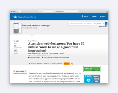
In a study published in the Journal of Behaviour and Information Technology, they found that the brain makes decisions in just a 20th of a second of viewing a webpage. What is more, these decisions have a lasting impact.

Article Titled: Attention Web Designers, you have 50 milliseconds to make a good first impression

According to a study in the Journal of Behaviour and Information Technology you have 50 milliseconds to make a first impression. (Large preview)

In that length of time, the user is judging the website purely on aesthetics, and so we need to ensure those aesthetics communicate the right things.

We have three ways we can test this, but let’s begin with my personal favorite.

Semantic Differential Survey

A semantic differential survey is a fancy name for a simple idea. Before you begin designing, first agree on a list of keywords that you want the design to signal to the end-user. These might be terms like trustworthy, fun or approachable.

Once you have created the design, you can now test whether it communicates these impressions in the user by running a semantic differential survey.

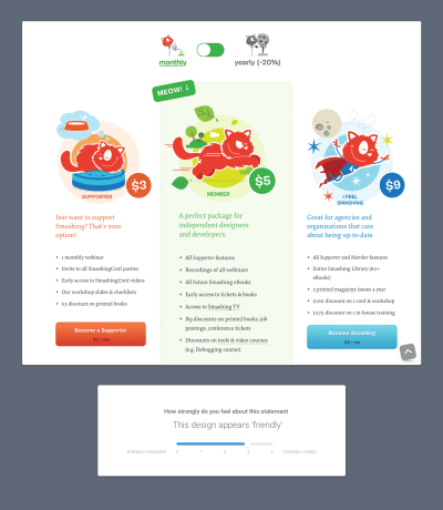
Simply show the user the design and ask them to rate the design against each of your keywords.

Example Survey taken from Smashing Magazine's Membership landing page

You can use a simple survey to understand whether a design is communicating the right message. (Large preview)

The great thing is that if the design rates well against all of the agreed words, not only do you know it is doing its job, it is also hard for stakeholders to reject the design because they don’t like some aspect of it.

You can use this method to ascertain the most effective approach from multiple designs. However, there is a much simpler test you can also adopt when you have more than one design concept.

Preference Tests

A preference test is what it sounds like. You simply show several design concepts to users and ask them to select which approach they prefer.

However, instead of just asking users to select which design they like most, ask them to select a design based on your keywords. You can ask users to select which design they feel best conveys the keywords you chose.

You can also apply the same principle of comparison to your competition.

Competition Testing

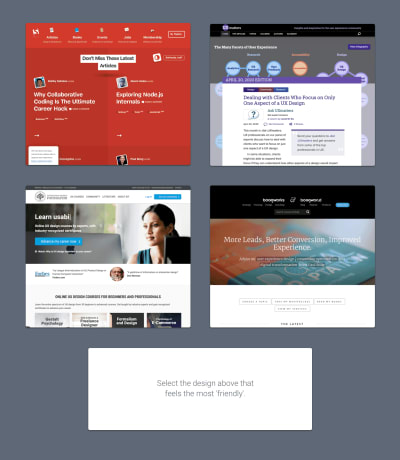
You can run precisely the same kind of preference test as above, but instead, compare your design concept against competitors’ websites. That will help you understand whether your design does a better job of communicating the desired keywords compared to the competition.

Example competitor preference test

A preference test can be used to see how your design compares to the competition. (Large preview)

The advantage of both types of preference testing is that it discourages stakeholders from adopting a pick-and-mix approach to design. In other words, it encourages them to compare designs in their entirety, rather than selecting different design elements from the competition or different versions, and asking you to combine them into a Frankenstein approach.

By combining both semantic differential surveys and preference testing, you can build up a clear picture of whether a design’s aesthetics are communicating the right impression. However, we still need to ensure it is usable and that people can find the information or features they need.

Test Usability and Visual Hierarchy

A website can look great and give the user the right feel, but if it is hard to use it will have still failed to do its job.

Once you have a fully built website or even a prototype, testing for usability is easy by combining A/B testing (quantitive) with usability testing (qualitative).

However, when all you have is a static mockup of the design, it can appear harder to test. Fortunately, that impression is incorrect. What is more, it is worth testing at this early stage, because things will be much easier to fix.

We have two tests we can do to ascertain usability. The first focuses on navigation and the second on visual hierarchy.

First-Click Tests

An influential study into usability, by Bob Bailey and Cari Wolfson, demonstrated the importance of ensuring that the user makes an excellent first choice when navigating your website. They proved that if users got their first click right, they had an 87% chance of completing their task correctly; however, if they got it wrong that dropped to just 46%.

Fortunately, we can test whether users will make the right first click using an imaginatively named “first click test”.

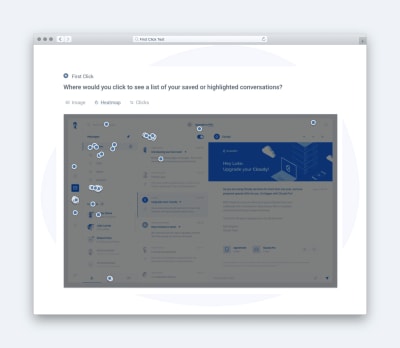
In the first click, test users are given a task (e.g. “Where would you click to contact the website owners?”), and then they are shown the design concept.

The user then clicks the appropriate place on the concept that they believe is correct, and the results are recorded. It is that simple.

Example first-click test

First Click Tests help you understand whether your navigation is clear. (Large preview)

The advantage of running a first-click test from the designers perspective is that it can resolve disagreements about information architecture by demonstrating whether users understand labeling and the site’s overall structure.

However, usability isn’t all about clicking. It is also essential that users spot critical content and calls to action. To test for that, you need a 5-second test.

5-Second Tests

Research seems to indicate that on average, you have about 8 seconds to grab a users attention and that many leave a website within 10 to 20 seconds. That means our interfaces have to present information we want users to see in the most obvious way possible. Put another way; we need to distinguish between the most important and less important information.

Testing this kind of visual hierarchy can be achieved using a 5-second test.

Usability Hub describe a five-second test in this way:

“A five-second test is run by showing an image to a participant for just five seconds, after which the participant answers questions based on their memory and impression of the design.”

It is important to note not only whether users remembered seeing critical screen elements, but also how quickly they recalled those elements. If users mention less essential elements first, this might indicate they have too much prominence.

The great thing about a 5-second test is that it can reassure clients concerns that a user might overlook an interface element. Hopefully, that will reduce the number of “make my logo bigger” requests you receive.

As you can see, testing can help both improve your designs and make design sign off less painful. However, it may be that you have concerns about implementing these tests. Fortunately, it is more straightforward than you think.

Who and How to Test?

The good news is that there are some great tools out there to help you run the tests I have outlined in this post. In fact Usability Hub offers all five tests we have covered and more.

Usability Hub Homepage

Usability Hub allows me to run all the tests I need to assess a design concept. (Large preview)

You simply create your test and then share the website address they give you with users.

Of course, finding those users can be challenging, so let’s talk about that.

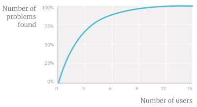
When it comes to testing usability, we do not need many users. The Nielsen Norman Group suggests you only need to test with five people because beyond that you see diminishing returns.

Graph showing the diminishing returns from adding more people to usability testing

After approximately five users you receive diminishing returns from usability testing. (Large preview)

These users can be quickly recruited either from your existing customer base or via friends and family. However, if you want to be a bit pickier about your demographics, services like Usability Hub will recruit participants for as little as a dollar per person.

Testing aesthetics is trickier because as we have already established design is subjective. That means we need more people to remove any statistical anomalies.

Once again, the Nielsen Norman Group suggest a number. They say when you want statistically significant results, you should look for at least 20 people.

It is also worth noting that in the case of aesthetics, you should test with demographically accurate individuals, something that your testing platform should be able to help you recruit.

Although that will cost a small amount of money, it will be insignificant compared to the person-hours that would go into debating the best design approach.

There is also often a concern that it will take a long time. However, in my experience, you can typically get 20 responses in an hour or less. When was the last time you got design approval in under an hour?

Worth a Try

Testing a design concept will not solve all your designer woes. However, it will lead to better designs and has the potential to help with the management of stakeholders significantly. And when you consider the minimal investment in making it happen, it makes little sense not to try it on at least one project.

(ra, il)

Categories: Others Tags:

The Best Design System Tool is Slack

June 4th, 2020 No comments

There’s a series questions I have struggled with for as long as I can remember. The questions have to do with how design systems work: Where should we document things? Do we make a separate app? Do we use a third-party tool to document our components? How should that tie into Figma or Sketch? What about written documentation? Should we invest a lot of time into making a giant Polaris-like wiki of how to build things?

The issue with all these tools and links and repositories is that it can become increasingly difficult to remember where to go for what kind of information. Designers should go here and engineers should go there — unless, of course, you’re an iOS engineer, then you need this special resource instead. It can be overwhelming and confusing for everyone that doesn’t live within the orbit of design systems drama and is just trying to ship a feature on time.

After years of struggling with these questions, I think my current advice to my past (and current) self is this: meet the people where they are. And where are most people asking questions about design systems, whether that’s a color variable or a component or a design pattern?

In Slack!

The other day I thought it would be neat to set up some Slackbot custom responses to do a rather simple thing. When someone types color me into a channel, I all the color variables and their hex values are pasted. That way, no one needs to learn a new tool or bookmark yet another link.

Here’s how it works.

We first have to open up the settings of the organization you’re in and click the “Customize” item in this dropdown:

That pops open a new tab with the “Customize your Workspace” settings. If you select “Slackbot” from the options, then you can then see all of the custom responses that have been set up already. From there, we can create a new response like this:

That n is what breaks things onto a new line so that I can now test it out in a chat with myself once I’ve saved this:

Because this takes up so much darn space, I also made separate answers for each color, like blue and purple. But all of this has me wondering: how else can we use Slack — or whatever chat app or communication tool — to extend the cause of good design systems work?

I bet there’s a ton of other things we can do to improve our lives within tools like this and make design systems work even easier.

The post The Best Design System Tool is Slack appeared first on CSS-Tricks.

Categories: Designing, Others Tags:

Adding CSS to a Page via HTTP Headers

June 4th, 2020 No comments

Only Firefox supports it, but if you return a request with a header like this:

Header add Link "<style.css>;rel=stylesheet;media=all"

…that will link to that stylesheet without you having to do it in the HTML. Louis Lazaris digs into it:

[…] the only thing I can think of that could justify use for this in production is as a way to include some Firefox-only CSS, which Eric Meyer mentions as a possibility in an old post on this subject. But it’s not guaranteed to always only work in Firefox, so that’s still a problem.

Do with this what you like, but it’s extremely unlikely that this will have any use in a real project.

I appreciate some classic CSS trickery.

Direct Link to ArticlePermalink

The post Adding CSS to a Page via HTTP Headers appeared first on CSS-Tricks.

Categories: Designing, Others Tags:

Jumping Into Webmentions With NextJS (or Not)

June 3rd, 2020 No comments

Webmention is a W3C recommendation last published on January 12, 2017. And what exactly is a Webmention? It’s described as…

[…] a simple way to notify any URL when you mention it on your site. From the receiver’s perspective, it’s a way to request notifications when other sites mention it.

In a nutshell, it’s a way of letting a website know it has been mentioned somewhere, by someone, in some way. The Webmention spec also describes it as a way for a website to let others know it cited them. What that basically bails down to is that your website is an active social media channel, channeling communication from other channels (e.g. Twitter, Instagram, Mastodon, Facebook, etc.).

How does a site implement Webmentions? In some cases, like WordPress, it’s as trivial as installing a couple of plugins. Other cases may not be quite so simple, but it’s still pretty straightforward. In fact, let’s do that now!

Here’s our plan

  1. Declare an endpoint to receive Webmentions
  2. Process social media interactions to Webmentions
  3. Get those mentions into a website/app
  4. Set the outbound Webmentions

Luckily for us, there are services in place that make things extremely simple. Well, except that third point, but hey, it’s not so bad and I’ll walk through how I did it on my own atila.io site.

My site is a server-side blog that’s pre-rendered and written with NextJS. I have opted to make Webmention requests client-side; therefore, it will work easily in any other React app and with very little refactoring in any other JavaScript application.

Step 1: Declare an endpoint to receive Webmentions

In order to have an endpoint we can use to accept Webmentions, we need to either write the script and add to our own server, or use a service such as Webmention.io (which is what I did).

Webmention.io is free and you only need to confirm ownership over the domain you register. Verification can happen a number of ways. I did it by adding a rel="me" attribute to a link in my website to my social media profiles. It only takes one such link, but I went ahead and did it for all of my accounts.

<a
  href="https://twitter.com/atilafassina"
  target="_blank"
  rel="me noopener noreferrer"
>
  @AtilaFassina
</a>

Verifying this way, we also need to make sure there’s a link pointing back to our website in that Twitter profile. Once we’ve done that, we can head back to Webmention.io and add the URL.

This gives us an endpoint for accepting Webmentions! All we need to do now is wire it up as tags in the of our webpages in order to collect those mentions.

<head>
  <link rel="webmention" href="https://webmention.io/{user}/webmention" />
  <link rel="pingback" href="https://webmention.io/{user}/xmlrpc" />
  <!-- ... -->
</head>

Remember to replace {user} with your Webmention.io username.

Step 2: Process social media interactions into Webmentions

We are ready for the Webmentions to start flowing! But wait, we have a slight problem: nobody actually uses them. I mean, I do, you do, Max Böck does, Swyx does, and… that’s about it. So, now we need to start converting all those juicy social media interactions into Webmentions.

And guess what? There’s an awesome free service for it. Fair warning though: you’d better start loving the IndieWeb because we’re about to get all up in it.

Bridgy connects all our syndicated content and converts them into proper Webmentions so we can consume it. With a SSO, we can get each of our profiles lined up, one by one.

Step 3: Get those mentions into a website/app

Now it’s our turn to do some heavy lifting. Sure, third-party services can handle all our data, but it’s still up to us to use it and display it.

We’re going to break this up into a few stages. First, we’ll get the number of Webmentions. From there, we’ll fetch the mentions themselves. Then we’ll hook that data up to NextJS (but you don’t have to), and display it.

Get the number of mentions

type TMentionsCountResponse = {
  count: number
  type: {
    like: number
    mention: number
    reply: number
    repost: number
  }
}

That is an example of an object we get back from the Webmention.io endpoint. I formatted the response a bit to better suit our needs. I’ll walk through how I did that in just a bit, but here’s the object we will get:

type TMentionsCount = {
  mentions: number
  likes: number
  total: number
}

The endpoint is located at:

https://webmention.io/api/count.json?target=${post_url}

The request will not fail without it, but the data won’t come either. Both Max Böck and Swyx combine likes with reposts and mentions with replies. In Twitter, they are analogous.

const getMentionsCount = async (postURL: string): TMentionsCount => {
  const resp = await fetch(
    `https://webmention.io/api/count.json?target=${postURL}/`
  )
  const { type, count } = await resp.json()


  return {
    likes: type.like + type.repost,
    mentions: type.mention + type.reply,
    total: count,
  }
}

Get the actual mentions

Before getting to the response, please note that the response is paginated, where the endpoint accepts three parameters in the query:

  • page: the page being requested
  • per-page: the number of mentions to display on the page
  • target: the URL where Webmentions are being fetched

Once we hit https://webmention.io/api/mentions and pass the these params, the successful response will be an object with a single key links which is an array of mentions matching the type below:

type TMention = {
  source: string
  verified: boolean
  verified_date: string // date string
  id: number
  private: boolean
  data: {
    author: {
      name: string
      url: string
      photo: string // url, hosted in webmention.io
    }
    url: string
    name: string
    content: string // encoded HTML
    published: string // date string
    published_ts: number // ms
  }
  activity: {
    type: 'link' | 'reply' | 'repost' | 'like'
    sentence: string // pure text, shortened
    sentence_html: string // encoded html
  }
  target: string
}

The above data is more than enough to show a comment-like section list on our site. Here’s how the fetch request looks in TypeScript:

const getMentions = async (
  page: string,
  postsPerPage: number,
  postURL: string
): { links: TWebMention[] } => {
  const resp = await fetch(
    `https://webmention.io/api/mentions?page=${page}&per-page=${postsPerPage}&target=${postURL}`
  )
  const list = await resp.json()
  return list.links
}

Hook it all up in NextJS

We’re going to work in NextJS for a moment. It’s all good if you aren’t using NextJS or even have a web app. We already have all the data, so those of you not working in NextJS can simply move ahead to Step 4. The rest of us will meet you there.

As of version 9.3.0, NextJS has three different methods for fetching data:

  1. getStaticProps: fetches data on build time
  2. getStaticPaths: specifies dynamic routes to pre-render based on the fetched data
  3. getServerSideProps: fetches data on each request

Now is the moment to decide at which point we will be making the first request for fetching mentions. We can pre-render the data on the server with the first batch of mentions, or we can make the entire thing client-side. I opted to go client-side.

If you’re going client-side as well, I recommend using SWR. It’s a custom hook built by the Vercel team that provides good caching, error and loading states — it and even supports React.Suspense.

Display the Webmention count

Many blogs show the number of comments on a post in two places: at the top of a blog post (like this one) and at the bottom, right above a list of comments. Let’s follow that same pattern for Webmentions.

First off, let’s create a component for the count:

const MentionsCounter = ({ postUrl }) => {
  const { t } = useTranslation()
  // Setting a default value for `data` because I don't want a loading state
  // otherwise you could set: if(!data) return <div>loading...</div>
  const { data = {}, error } = useSWR(postUrl, getMentionsCount)


  if (error) {
    return <ErrorMessage>{t('common:errorWebmentions')}</ErrorMessage>
  }


  // The default values cover the loading state
  const { likes = '-', mentions = '-' } = data


  return (
    <MentionCounter>
      <li>
        <Heart title="Likes" />
        <CounterData>{Number.isNaN(likes) ? 0 : likes}</CounterData>
      </li>
      <li>
        <Comment title="Mentions" />{' '}
        <CounterData>{Number.isNaN(mentions) ? 0 : mentions}</CounterData>
      </li>
    </MentionCounter>
  )
}

Thanks to SWR, even though we are using two instances of the WebmentionsCounter component, only one request is made and they both profit from the same cache.

Feel free to peek at my source code to see what’s happening:

Display the mentions

Now that we have placed the component, it’s time to get all that social juice flowing!

At of the time of this writing, useSWRpages is not documented. Add to that the fact that the webmention.io endpoint doesn’t offer collection information on a response (i.e. no offset or total number of pages), I couldn’t find a way to use SWR here.

So, my current implementation uses a state to keep the current page stored, another state to handle the mentions array, and useEffect to handle the request. The “Load More” button is disabled once the last request brings back an empty array.

const Webmentions = ({ postUrl }) => {
  const { t } = useTranslation()
  const [page, setPage] = useState(0)
  const [mentions, addMentions] = useState([])


  useEffect(() => {
    const fetchMentions = async () => {
      const olderMentions = await getMentions(page, 50, postUrl)
      addMentions((mentions) => [...mentions, ...olderMentions])
    }
    fetchMentions()
  }, [page])


  return (
    <>
      {mentions.map((mention, index) => (
        <Mention key={mention.data.author.name + index}>
          <AuthorAvatar src={mention.data.author.photo} lazy />
          <MentionContent>
            <MentionText
              data={mention.data}
              activity={mention.activity.type}
            />
          </MentionContent>
        </Mention>
      ))}
      </MentionList>
      {mentions.length > 0 && (
        <MoreButton
          type="button"
          onClick={() => {
          setPage(page + 1)
        }}
        >
        {t('common:more')}
      </MoreButton>
    )}
    </>
  )
}

The code is simplified to allow focus on the subject of this article. Again, feel free to peek at the full implementation:

Step 4: Handling outbound mentions

Thanks to Remy Sharp, handling outbound mentions from one website to others is quite easy and provides an option for each use case or preference possible.

The quickest and easiest way is to head over to Webmention.app, get an API token, and set up a web hook. Now, if you have RSS feed in place, the same thing is just as easy with an IFTT applet, or even a deploy hook.

If you prefer to avoid using yet another third-party service for this feature (which I totally get), Remy has open-sourced a CLI package called wm which can be ran as a postbuild script.

But that’s not enough to handle outbound mentions. In order for our mentions to include more than simply the originating URL, we need to add microformats to our information. Microformats are key because it’s a standardized way for sites to distribute content in a way that Webmention-enabled sites can consume.

At their most basic, microformats are a kind of class-based notations in markup that provide extra semantic meaning to each piece. In the case of a blog post, we will use two kinds of microformats:

  • h-entry: the post entry
  • h-card: the author of the post

Most of the required information for h-entry is usually in the header of the page, so the header component may end up looking something like this:

<header class="h-entry">
  <!-- the post date and time -->
  <time datetime="2020-04-22T00:00:00.000Z" class="dt-published">
    2020-04-22
  </time>
  <!-- the post title -->
  <h1 class="p-name">
    Webmentions with NextJS
  </h1>
</header>

And that’s it. If you’re writing in JSX, remember to replace class with className, that datetime is camelCase (dateTime), and that you can use the new Date('2020-04-22').toISOString() function.

It’s pretty similar for h-card. In most cases (like mine), author information is below the article. Here’s how my page’s footer looks:

<footer class="h-card">
  <!-- the author name -->
  <span class="p-author">Atila Fassina</span>
  <!-- the authot image-->
  <img
    alt="Author's photograph: Atila Fassina"
    class="u-photo"
    src="/images/internal-avatar.jpg"
    lazy
  />
</footer>

Now, whenever we send an outbound mention from this blog post, it will display the full information to whomever is receiving it.

Wrapping up

I hope this post has helped you getting to know more about Webmentions (or even about IndieWeb as a whole), and perhaps even helped you add this feature to your own website or app. If it did, please consider sharing this post to your network. I will be super grateful! ?

References

Further reading

The post Jumping Into Webmentions With NextJS (or Not) appeared first on CSS-Tricks.

Categories: Designing, Others Tags:

On fixed elements and backgrounds

June 3rd, 2020 No comments

After just playing with apsect-ratio and being pleasantly surprised at how intuitive it is, here’s an example of CSS acting unintuitively:

If you have a fixed element on your page, which means it doesn’t move when you scroll, you might realise that it no longer acts fixed if you apply a CSS filter on its nearest ancestor. Go ahead, try it on the CodePen.

This is because applying a filter on the fixed element’s immediate parent makes it becoming the containing block instead of the viewport.

Hui Jing has more to teach in there about scrolling, rendering performance, and trickery with using pseudo elements to avoid issues.

I find this kind of thing among the most challenging CSS concepts to wrap my mind around, like Block Formatting Contexts (BFCs). A BFC Is A Mini Layout In Your Layout. ?

Direct Link to ArticlePermalink

The post On fixed elements and backgrounds appeared first on CSS-Tricks.

Categories: Designing, Others Tags:

Why Healthcare is Turning to AI & Chatbot for Patient Care

June 3rd, 2020 No comments

No, that isn’t a doctor talking. That is an artificial intelligence-driven (AI) chatbot, which is giving patients new ways to deal with getting the correct consideration at their place of need. Chatbots take on an assortment of structures.

Their assignments fluctuate and may incorporate robotizing manual capacities for both healthcare providers and patients, giving day in and day out care, offering enthusiastic and physical prosperity support, expanding treatment adherence, and more.

For healthcare providers and patients, this is a win-win. Patient-driven outcomes are the goal, and AI chatbots can vastly improve healthcare functions and patient engagement, and ultimately, financial and healthcare results.

In this day and age of instant gratification, individuals need fast solutions and healthcare isn’t an exception. They would prefer not to hold up in long lines outside the center or medical clinic and they need a platform that keeps them updated on their issues all day, every day. Along these lines, AI and AI-empowered chatbots for healthcare are coordinated into applications and sites and they are turning into a favored decision for both the human services specialist co-ops and patients. Here is a gander at why the healthcare industry is going to AI and chatbot for persistent consideration.

AI and Healthcare

Artificial intelligence and chatbot have surprised numerous industries and like the various businesses, healthcare is going to observe perspective changes. Chatbot and healthcare mobile applications have just limited human mediation in the medical clinic enrollment, counsel, and charging process in numerous pieces of the United States. This is as of now an incredible help to the older patients and children who can and should possibly visit the specialist when in critical need only. Additionally, in the present quick paced life, the hold up is unsatisfactory. Thusly, chatbots are being actualized in most of the regular checkup applications and self-drug applications, for example, WebMD, Epocrates, and First Aid – American Red Cross.

Mobile Prescription and First Aid

Mobile app development for healthcare has helped patients to move on to mobile prescription stages where the specialists can educate them on the premise regarding their indications through video calls and messages. Be that as it may, this is just the situation with non-difficult issues, for example, normal diseases, fever, little wounds, and so on. On account of extreme infections and mishaps, specialists can straightforwardly visit the patient, send an ambulance, or recommend certain tests for better conclusion and care. Indeed, even in the Indian subcontinent, understanding applications like Practo, DocsApp, BookMyDoctor, and Qikwell are quickly changing the healthcare industry. A significant number of these applications offer data about a specialist’s accessibility in a particular medical clinic/private office, appointment booking, and online solutions. The applications team up with qualified specialists over all the significant major cities in the nation.

Then again, healthcare applications like First Aid – American Red Cross offer emergency treatment data on fingertips. The application is centered around advising the individuals about security tips in an outrageous climate alongside the emergency treatment in regular day to day existence and on account of mishaps. The application likewise has a crisis include that can straightforwardly encourage calls to 911 and Emergency Medical Services (EMS). The application has increased tremendous ubiquity in the United States and has in excess of 100,000 affirmed installations.

Self Medication and Drug Use

Another part of mobile AI is concentrating on people who are as of now very much aware of their wellbeing and prosperity. Such people want to maintain a strategic distance from a malady by identifying the manifestations and changing the way of life and taking medication in like manner. This is a decent methodology as a rule and it helps individuals in keeping up a sound way of life also. Certain applications center around this viewpoint and give data that is important and helpful. WebMD is a major name in this aspect as it to a great extent obliges the data situated crowd by giving exhaustive data on human services and sicknesses. The application includes a symptom checker, doctor dictionary, drug interaction checker, and numerous different tools that can support patients and individuals when all is said in done.

The future of AI Chatbots in Healthcare

Today, chatbots are at the cutting edge of business-to-customer correspondence. In 2019, the chatbot business arrived at a market estimation of $17.17 billion and is anticipated to reach $102.29 billion by 2025, and the healthcare industry will unquestionably notice through progressions.

1. PHYSICAL-FORM BOTS

AI chatbots may very well help patients with their healthcare requirements. A fully-functional AI-powered robot nurse has already started incorporating in the healthcare industry which can assist nurses with time-consuming, non-patient facing roles.

2. PATIENT-ENABLING BOTS

Mobilization Robots: At present, Honda’s Hoko Assist robot helps individuals incapacitated starting from the waist genuinely walk upstanding, though they would need to utilize a wheelchair in any case. Later on, such robots that make up for body parts may become standard and surpass seated assistants, for example, wheelchairs.

Staff-Assisting Robots: Health care center bots may gain enough empathy to be able to instruct patients through physical therapy, help them with bedside care, and other tasks where staff might be short.

3. AI CHATBOT ADVANCEMENTS

Gamification: Chatbots may utilize wellbeing and treatment-related games, and prize patients which focus on treatment adherence.

Understanding New Disease States: ML-empowered chatbots can help HCPs with seeing new medicines in a split second. The PC will filter through important information to make recommendations. On the patient front, they will have the option to distinguish the top HCPs for offered sicknesses and get limitlessly improved substitute guidance when help is inaccessible.

Given the technology’s potential healthcare industry usage and cost-effectiveness, the healthcare industry will continue to advance and hone this new technology. Considering the humanism of existing chatbots, a vast improvement in their abilities to mimic humans in behavior and services is in the future forecast.

The Healthcare business has consistently battled with consistent patient engagement and issue management. Expanding consumerism and the ascent of AI and AI-empowered chatbots have decreased the distinctions in both the perspectives and it has pushed patients to not be compelled to pick among cost and adequacy.

Categories: Others Tags:

Perfect Your Feedback Process With BugHerd

June 3rd, 2020 No comments

When you’re designing a website, the single most important thing you can do is gather strong feedback, so your team knows what’s approved, what needs improvement, and what direction to take the project.

Unfortunately, the most important group to gather feedback from, your stakeholders, is also all-too-often the least technically able.

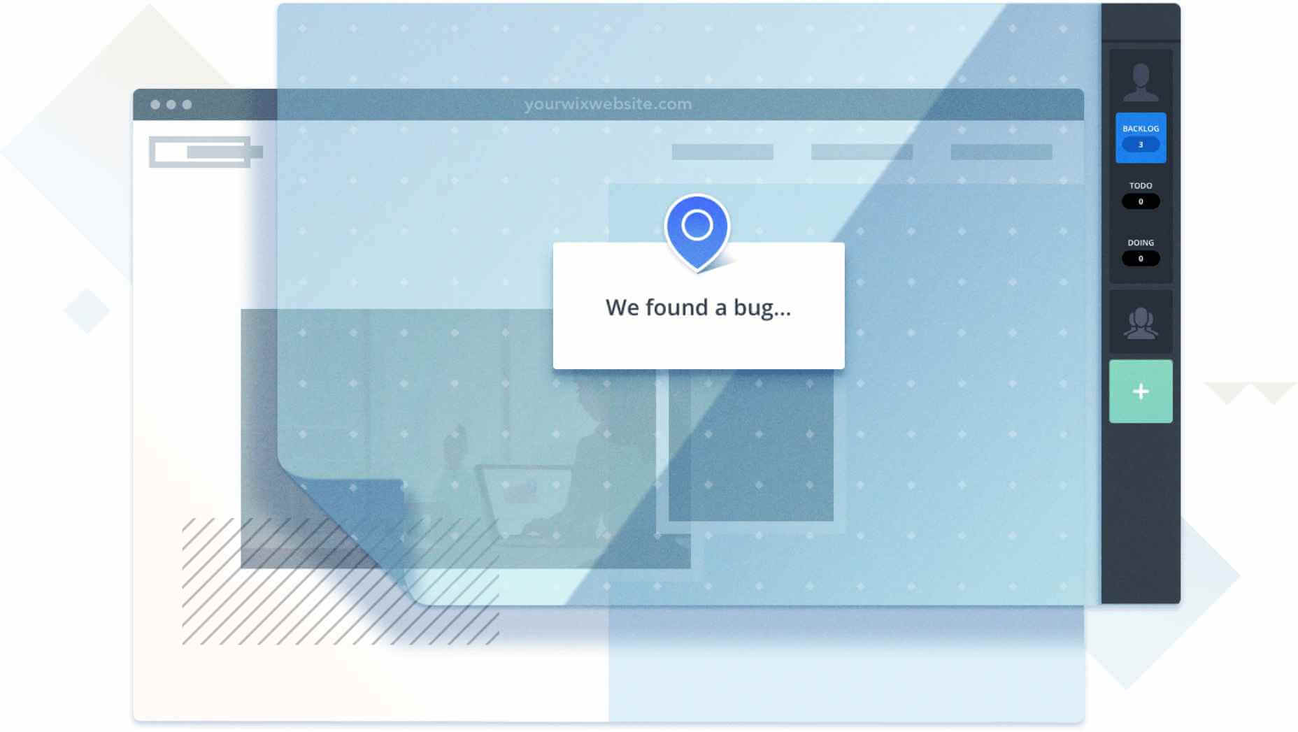
BugHerd should be your primary tool for gathering website feedback, especially from non-technical users, because it’s perfected and simplified the feedback process; stakeholders can communicate their thoughts and ideas effectively, in a way that syncs beautifully with how your team prefers to work.

Like Adding Digital Sticky Notes To Your Screen

The web is awash with clichés about designers. One of the most commonly repeated is the image of a team of designers standing around discussing a wall of sticky notes, moving them around, adding a few, removing others.

Do you know why designers and sticky notes are such a cliché? Because they work! Sticking little yellow notes to designs has been an integral part of design crits for decades. It’s a tried-and-trusted method of hammering out the fine details of a design.

What BugHerd has done, with enormous success, is create a digital form of every design agency’s favorite feedback technique.

With BugHerd, your clients don’t need to know technical terms, they just point, click, and type a comment. It’s super-easy. We’ve found that using BugHerd not only speeds up the process of feedback and QA, but it actually opens up new creative directions, because when clients are comfortable with the communication tool, they’re free to bring their expertise to the table.

Just about anyone can use BugHerd, and while many users in management roles struggle with technology, we’ve found that they enjoy using BugHerd because they’re able to forget the tool, and focus on what they want to say. And when clients enjoy working with you on a project, magic happens.

Everything You Need to Get the Job Done

We all know stakeholders are busy, probably not as busy as you, but they certainly don’t have time to type essay-length emails every few days. And the last thing you want to do when a client is feeling frustrated is call them up to find out what they meant by “the widget on the left” or “the greyest box”.

Even worse, how many times have you been on a conference call, as someone struggles to describe a bug they’ve found that you just can’t reproduce. (Nine times out of ten, it’s that dodgy ad-blocker they installed anyway, right?)

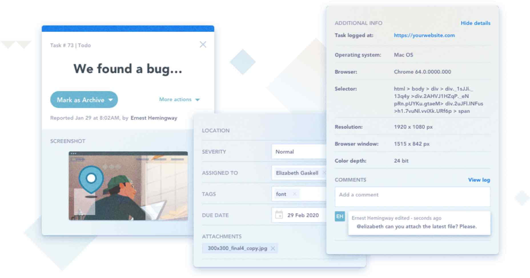
Well, BugHerd has your back here. When someone pins a task onto a page BugHerd appends meta data about the issue, including CSS selector data, and a browser profile. On premium plans you even get automated screen shots. With just one point and click BugHerd gathers everything you need to reproduce, and resolve the issue, fuss free.

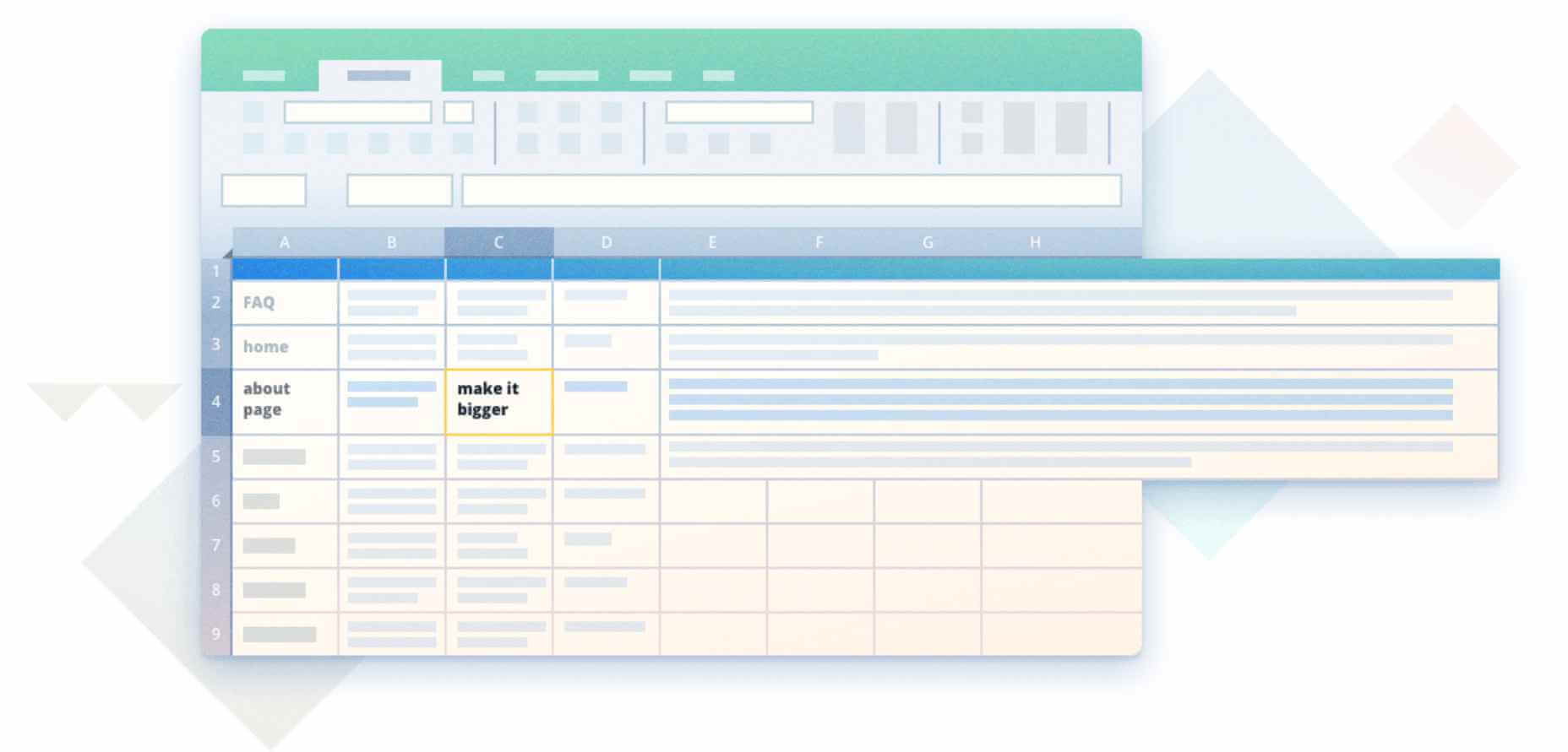
Should your client want to send extra feedback, that’s possible as well. BugHerd allows users to annotate screenshots with as much design feedback as they wish — so they can ask you to make the logo bigger, as if we don’t all take that one as read.

BugHerd makes it easy for your clients to communicate what they mean, with nothing lost in translation, making your revision process more streamlined, and your life easier.

A Secure System for Remote Teams

BugHerd’s an awesome tool for non-technical users, but just because stakeholders love its point and click, doesn’t mean it isn’t a powerful tool for you.

BugHerd passes all of its tasks into a customizable Kanban board. On top of that BugHerd integrates with the 3rd-party tools you’re probably already using including GitHub, JIRA, Zapier, Basecamp, Zendesk, and Slack. And for seriously committed power-users, you can even access your task list via BugHerd’s API. However your team works, BugHerd will fit right in.

BugHerd is the ideal feedback tool for remote working. It cuts out all of the miscommunication, and keeps your entire team on the same page. But if adding a layer of easy-access sticky notes to your website sounds like a recipe for disaster, rest assured it is strictly limited to those users you invite.

Short of a face-to-face meeting with actual sticky notes, BugHerd is the most effective way of enabling your clients to give you the feedback you need to meet their goals.

Try BugHerd for Free

BugHerd is packed with incredible features. But sometimes, there’s just no substitute for trying something out yourself. That’s why BugHerd offers a free 14-day trial. Meaning you can afford to sign-up, introduce your stakeholders and your team to the app, and judge for yourself.

A word of warning though: once you see how painless website feedback and revisions are with BugHerd, you won’t ever want to go back to those email chains.

Head over to BugHerd.com today, to claim your free 14-day trial, no credit card upfront.

[– This is a sponsored post on behalf of BugHerd –]

Source

Categories: Designing, Others Tags:

Consuming REST APIs In React With Fetch And Axios

June 3rd, 2020 No comments
Initial App Screen

Consuming REST APIs In React With Fetch And Axios

Consuming REST APIs In React With Fetch And Axios

Shedrack Akintayo

2020-06-03T10:30:00+00:00
2020-06-05T00:36:57+00:00

Consuming REST APIs in a React Application can be done in various ways, but in this tutorial, we will be discussing how we can consume REST APIs using two of the most popular methods known as Axios (a promise-based HTTP client) and Fetch API (a browser in-built web API). I will discuss and implement each of these methods in detail and shed light on some of the cool features each of them have to offer.

APIs are what we can use to supercharge our React applications with data. There are certain operations that can’t be done on the client-side, so these operations are implemented on the server-side. We can then use the APIs to consume the data on the client-side.

APIs consist of a set of data, that is often in JSON format with specified endpoints. When we access data from an API, we want to access specific endpoints within that API framework. We can also say that an API is a contractual agreement between two services over the shape of request and response. The code is just a byproduct. It also contains the terms of this data exchange.

In React, there are various ways we can consume REST APIs in our applications, these ways include using the JavaScript inbuilt fetch() method and Axios which is a promise-based HTTP client for the browser and Node.js.

Note: A good knowledge of ReactJS, React Hooks, JavaScript and CSS will come in handy as you work your way throughout this tutorial.

Let’s get started with learning more about the REST API.

What Is A REST API

A REST API is an API that follows what is structured in accordance with the REST Structure for APIs. REST stands for “Representational State Transfer”. It consists of various rules that developers follow when creating APIs.

The Benefits Of REST APIs

  1. Very easy to learn and understand;
  2. It provides developers with the ability to organize complicated applications into simple resources;
  3. It easy for external clients to build on your REST API without any complications;
  4. It is very easy to scale;
  5. A REST API is not language or platform-specific, but can be consumed with any language or run on any platform.

An Example Of A REST API Response

The way a REST API is structured depends on the product it’s been made for — but the rules of REST must be followed.

The sample response below is from the Github Open API. We’ll be using this API to build a React app later on in this tutorial.

{
"login": "hacktivist123",
"id": 26572907,
"node_id": "MDQ6VXNlcjI2NTcyOTA3",
"avatar_url": "https://avatars3.githubusercontent.com/u/26572907?v=4",
"gravatar_id": "",
"url": "https://api.github.com/users/hacktivist123",
"html_url": "https://github.com/hacktivist123",
"followers_url": "https://api.github.com/users/hacktivist123/followers",
"following_url": "https://api.github.com/users/hacktivist123/following{/other_user}",
"gists_url": "https://api.github.com/users/hacktivist123/gists{/gist_id}",
"starred_url": "https://api.github.com/users/hacktivist123/starred{/owner}{/repo}",
"subscriptions_url": "https://api.github.com/users/hacktivist123/subscriptions",
"organizations_url": "https://api.github.com/users/hacktivist123/orgs",
"repos_url": "https://api.github.com/users/hacktivist123/repos",
"events_url": "https://api.github.com/users/hacktivist123/events{/privacy}",
"received_events_url": "https://api.github.com/users/hacktivist123/received_events",
"type": "User",
"site_admin": false,
"name": "Shedrack akintayo",
"company": null,
"blog": "https://sheddy.xyz",
"location": "Lagos, Nigeria ",
"email": null,
"hireable": true,
"bio": "☕ Software Engineer | | Developer Advocate🥑|| ❤ Everything JavaScript",
"public_repos": 68,
"public_gists": 1,
"followers": 130,
"following": 246,
"created_at": "2017-03-21T12:55:48Z",
"updated_at": "2020-05-11T13:02:57Z"
} 

The response above is from the Github REST API when I make a GET request to the following endpoint https://api.github.com/users/hacktivist123. It returns all the stored data about a user called hacktivist123. With this response, we can decide to render it whichever way we like in our React app.

Consuming APIs Using The Fetch API

The fetch() API is an inbuilt JavaScript method for getting resources from a server or an API endpoint. It’s similar to XMLHttpRequest, but the fetch API provides a more powerful and flexible feature set.

It defines concepts such as CORS and the HTTP Origin header semantics, supplanting their separate definitions elsewhere.

The fetch() API method always takes in a compulsory argument, which is the path or URL to the resource you want to fetch. It returns a promise that points to the response from the request, whether the request is successful or not. You can also optionally pass in an init options object as the second argument.

Once a response has been fetched, there are several inbuilt methods available to define what the body content is and how it should be handled.

The Difference Between The Fetch API And jQuery Ajax

The Fetch API is different from jQuery Ajax in three main ways, which are:

  1. The promise returned from a fetch() request will not reject when there’s an HTTP error, no matter the nature of the response status. Instead, it will resolve the request normally, if the response status code is a 400 or 500 type code, it’ll set the ok status. A request will only be rejected either because of network failure or if something is preventing the request from completing
  2. fetch() will not allow the use of cross-site cookies i.e you cannot carry out a cross-site session using fetch()
  3. fetch() will also not send cookies by default unless you set the credentials in the init option.

Parameters For The Fetch API

  • resource
    This is the path to the resource you want to fetch, this can either be a direct link to the resource path or a request object
  • init
    This is an object containing any custom setting or credentials you’ll like to provide for your fetch() request. The following are a few of the possible options that can be contained in the init object:

    • method
      This is for specifying the HTTP request method e.g GET, POST, etc.
    • headers
      This is for specifying any headers you would like to add to your request, usually contained in an object or an object literal.
    • body
      This is for specifying a body that you want to add to your request: this can be a Blob, BufferSource, FormData, URLSearchParams, USVString, or ReadableStream object
    • mode
      This is for specifying the mode you want to use for the request, e.g., cors, no-cors, or same-origin.
    • credentials
      This for specifying the request credentials you want to use for the request, this option must be provided if you consider sending cookies automatically for the current domain.

Basic Syntax for Using the Fetch() API

A basic fetch request is really simple to write, take a look at the following code:

fetch('https://api.github.com/users/hacktivist123/repos')
  .then(response => response.json())
  .then(data => console.log(data));

In the code above, we are fetching data from a URL that returns data as JSON and then printing it to the console. The simplest form of using fetch() often takes just one argument which is the path to the resource you want to fetch and then return a promise containing the response from the fetch request. This response is an object.

The response is just a regular HTTP response and not the actual JSON. In other to get the JSON body content from the response, we’d have to change the response to actual JSON using the json() method on the response.

Using Fetch API In React Apps

Using the Fetch API in React Apps is the normal way we’d use the Fetch API in javascript, there is no change in syntax, the only issue is deciding where to make the fetch request in our React app. Most fetch requests or any HTTP request of any sort is usually done in a React Component.

This request can either be made inside a Lifecycle Method if your component is a Class Component or inside a useEffect() React Hook if your component is a Functional Component.

For example, In the code below, we will make a fetch request inside a class component, which means we’ll have to do it inside a lifecycle method. In this particular case, our fetch request will be made inside a componentDidMount lifecycle method because we want to make the request just after our React Component has mounted.

import React from 'react';

class myComponent extends React.Component {
  componentDidMount() {
    const apiUrl = 'https://api.github.com/users/hacktivist123/repos';
    fetch(apiUrl)
      .then((response) => response.json())
      .then((data) => console.log('This is your data', data));
  }
  render() {
    return <h1>my Component has Mounted, Check the browser 'console' </h1>;
  }
}
export default myComponent;

In the code above, we are creating a very simple class component that makes a fetch request that logs the final data from the fetch request we have made to the API URL into the browser console after the React component has finished mounting.

The fetch() method takes in the path to the resource we want to fetch, which is assigned to a variable called apiUrl. After the fetch request has been completed it returns a promise that contains a response object. Then, we are extracting the JSON body content from the response using the json() method, finally we log the final data from the promise into the console.

Let’s Consume A REST API With Fetch Method

In this section, we will be building a simple react application that consumes an external API, we will be using the Fetch method to consume the API.

The simple application will display all the repositories and their description that belongs to a particular user. For this tutorial, I’ll be using my GitHub username, you can also use yours if you wish.

The first thing we need to do is to generate our React app by using create-react-app:

npx create-react-app myRepos

The command above will bootstrap a new React app for us. As soon as our new app has been created, all that’s left to do is to run the following command and begin coding:

npm start

If our React is created properly we should see this in our browser window when we navigate to localhost:3000 after running the above command.

Initial App Screen

(Large preview)

In your src folder, create a new folder called component. This folder will hold all of our React components. In the new folder, create two files titled List.js and withListLoading.js. These two files will hold the components that will be needed in our app.

The List.js file will handle the display of our Repositories in the form of a list, and the withListLoading.js file will hold a higher-order component that will be displayed when the Fetch request we will be making is still ongoing.

In the List.js file we created inside the components folder, let’s paste in the following code:


import React from 'react';
const List = (props) => {
  const { repos } = props;
  if (repos.length === 0 || !repos) return <p>No repos, sorry</p>;
  return (
    <ul>
      <h2 className='list-head'>Available Public Repositories</h2>
      {repos.map((repo) => {
        return (
          <li key={repo.id} className='list'>
            <span className='repo-text'>{repo.name} </span>
            <span className='repo-description'>{repo.description}</span>
          </li>
        );
      })}
    </ul>
  );
};
export default List;

The code above is a basic React list component that would display the data, in this case, the repositories name and their descriptions in a list.

Now, Let me explain the code bit by bit.

const { repos } = props;

We are initializing a prop for the component called repos.

if (repos.length === 0 || !repos) return <p>No repos, sorry</p>;

Here, all we are doing is making a conditional statement that will render a message when the length of the repos we get from the request we make is equal to zero.

return (
    <ul>
      <h2 className='list-head'>Available Public Repositories</h2>
      {repos.map((repo) => {
        return (
          <li key={repo.id} className='list'>
            <span className='repo-text'>{repo.name} </span>
            <span className='repo-description'>{repo.description}</span>
          </li>
        );
      })}
    </ul>
  );

Here, we are mapping through each of the repositories that will be provided by the API request we make and extracting each of the repositories names and their descriptions then we are displaying each of them in a list.

export default List;

Here we are exporting our List component so that we can use it somewhere else.

In the withListLoading.js file we created inside the components folder, let’s paste in the following code:

import React from 'react';

function WithListLoading(Component) {
  return function WihLoadingComponent({ isLoading, ...props }) {
    if (!isLoading) return <Component {...props} />;
    return (
      <p style={{ textAlign: 'center', fontSize: '30px' }}>
        Hold on, fetching data may take some time :)
      </p>
    );
  };
}
export default WithListLoading;

The code above is a higher-order React component that takes in another component and then returns some logic. In our case, our higher component will wait to check if the current isLoading state of the component it takes is true or false. If the current isLoading state is true, it will display a message Hold on, fetching data may take some time 🙂. Immediately the isLoading state changes to false it’ll render the component it took in. In our case, it’ll render the List component.

In your *App.js file inside the src folder, let’s paste in the following code:


import React, { useEffect, useState } from 'react';
import './App.css';
import List from './components/List';
import withListLoading from './components/withListLoading';
function App() {
  const ListLoading = withListLoading(List);
  const [appState, setAppState] = useState({
    loading: false,
    repos: null,
  });

  useEffect(() => {
    setAppState({ loading: true });
    const user = `https://api.github.com/users/hacktivist123/repos`;
    fetch(user)
      .then((res) => res.json())
      .then((repos) => {
        setAppState({ loading: false, repos: repos });
      });
  }, [setAppState]);
  return (
    <div className='App'>
      <div className='container'>
        <h1>My Repositories</h1>
      </div>
      <div className='repo-container'>
        <ListLoading isLoading={appState.loading} repos={appState.repos} />
      </div>
      <footer>
        <div className='footer'>
          Built{' '}
          <span role='img' aria-label='love'>
            💚
          </span>{' '}
          with by Shedrack Akintayo
        </div>
      </footer>
    </div>
  );
}
export default App;

Our App.js is a functional component that makes use of React Hooks for handling state and also side effects. If you’re not familiar with React Hooks, read my Getting Started with React Hooks Guide.

Let me explain the code above bit by bit.

import React, { useEffect, useState } from 'react';
import './App.css';
import List from './components/List';
import withListLoading from './components/withListLoading';

Here, we are importing all the external files we need and also the components we created in our components folder. We are also importing the React Hooks we need from React.


const ListLoading = withListLoading(List);
  const [appState, setAppState] = useState({
    loading: false,
    repos: null,
  });

Here, we are creating a new component called ListLoading and assigning our withListLoading higher-order component wrapped around our list component. We are then creating our state values loading and repos using the useState() React Hook.


useEffect(() => {
    setAppState({ loading: true });
    const user = `https://api.github.com/users/hacktivist123/repos`;
    fetch(user)
      .then((res) => res.json())
      .then((repos) => {
        setAppState({ loading: false, repos: repos });
      });
  }, [setAppState]);

Here, we are initializing a useEffect() React Hook. In the useEffect() hook, we are setting our initial loading state to true, while this is true, our higher-order component will display a message.
We are then creating a constant variable called user and assigning the API URL we’ll be getting the repositories data from.

We are then making a basic fetch() request like we discussed above and then after the request is done we are setting the app loading state to false and populating the repos state with the data we got from the request.

return (
    <div className='App'>
      <div className='container'>
        <h1>My Repositories</h1>
      </div>
      <div className='repo-container'>
        <ListLoading isLoading={AppState.loading} repos={AppState.repos} />
      </div>
    </div>
  );
}
export default App;

Here we are basically just rendering the Component we assigned our higher-order component to and also filling the isLoading prop and repos prop with their state value.

Now, we should see this in our browser, when the fetch request is still being made, courtesy of our withListLoading higher-order component:

App Loading State

(Large preview)

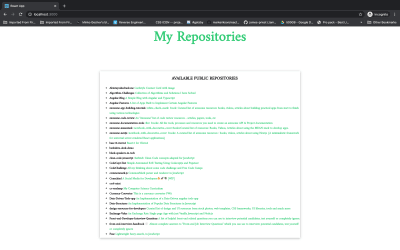
Now, when the fetch request has completed successfully, we should see the repositories displayed in a list format as below:

Finished App

(Large preview)

Now, let’s style our project a little bit, in your App.css file, copy and paste this code.

@import url('https://fonts.googleapis.com/css2?family=Amiri&display=swap');
:root {
  --basic-color: #23cc71;
}
.App {
  box-sizing: border-box;
  display: flex;
  justify-content: center;
  align-items: center;
  flex-direction: column;
  font-family: 'Amiri', serif;
  overflow: hidden;
}
.container {
  display: flex;
  flex-direction: row;
}
.container h1 {
  font-size: 60px;
  text-align: center;
  color: var(--basic-color);
}
.repo-container {
  width: 50%;
  height: 700px;
  margin: 50px;
  box-shadow: 0 2px 10px rgba(0, 0, 0, 0.3);
  overflow: scroll;
}
@media screen and (max-width: 600px) {
  .repo-container {
    width: 100%;
    margin: 0;
    box-shadow: none;
  }
}
.repo-text {
  font-weight: 600;
}
.repo-description {
  font-weight: 600;
  font-style: bold;
  color: var(--basic-color);
}
.list-head {
  text-align: center;
  font-weight: 800;
  text-transform: uppercase;
}
.footer {
  font-size: 15px;
  font-weight: 600;
}
.list {
  list-style: circle;
}

So in the code above, we are styling our app to look more pleasing to the eyes, we have assigned various class names to each element in our App.js file and thus we are using these class names to style our app.

Once we’ve applied our styling, our app should look like this:

Styled App

(Large preview)

Now our app looks much better. ?

So that’s how we can use the Fetch API to consume a REST API. In the next section, we’ll be discussing Axios and how we can use it to consume the same API in the same App.

Consuming APIs With Axios

Axios is an easy to use promise-based HTTP client for the browser and node.js. Since Axios is promise-based, we can take advantage of async and await for more readable and asynchronous code. With Axios, we get the ability to intercept and cancel request, it also has a built-in feature that provides client-side protection against cross-site request forgery.

Features Of Axios

  • Request and response interception
  • Streamlined error handling
  • Protection against XSRF
  • Support for upload progress
  • Response timeout
  • The ability to cancel requests
  • Support for older browsers
  • Automatic JSON data transformation

Making Requests With Axios

Making HTTP Requests with Axios is quite easy. The code below is basically how to make an HTTP request.

// Make a GET request
axios({
  method: 'get',
  url: 'https://api.github.com/users/hacktivist123',
});

// Make a Post Request
axios({
  method: 'post',
  url: '/login',
  data: {
    firstName: 'shedrack',
    lastName: 'akintayo'
  }
});

The code above shows the basic ways we can make a GET and POST HTTP request with Axios.

Axios also provides a set of shorthand method for performing different HTTP requests. The Methods are as follows:

  • axios.request(config)
  • axios.get(url[, config])
  • axios.delete(url[, config])
  • axios.head(url[, config])
  • axios.options(url[, config])
  • axios.post(url[, data[, config]])
  • axios.put(url[, data[, config]])
  • axios.patch(url[, data[, config]])

For example, if we want to make a similar request like the example code above but with the shorthand methods we can do it like so:


// Make a GET request with a shorthand method
axios.get('https://api.github.com/users/hacktivist123');

// Make a Post Request with a shorthand method
axios.post('/signup', {
    firstName: 'shedrack',
    lastName: 'akintayo'
});

In the code above, we are making the same request as what we did above but this time with the shorthand method. Axios provides flexibility and makes your HTTP requests even more readable.

Making Multiple Requests With Axios

Axios provides developers the ability to make and handle simultaneous HTTP requests using the axios.all() method. This method takes in an array of arguments and it returns a single promise object that resolves only when all arguments passed in the array have resolved.

For example, we can make multiple requests to the GitHub api using the axios.all() method like so:

axios.all([
  axios.get('https://api.github.com/users/hacktivist123'),
  axios.get('https://api.github.com/users/adenekan41')
])
.then(response => {
  console.log('Date created: ', response[0].data.created_at);
  console.log('Date created: ', response[1].data.created_at);
});

The code above makes simultaneous requests to an array of arguments in parallel and returns the response data, in our case, it will log to the console the created_at object from each of the API responses.

Let’s Consume A REST API With Axios Client

In this section, all we’ll be doing is replacing fetch() method with Axios in our existing React Application. All we need to do is to install Axios and then use it in our App.js file for making the HTTP request to the GitHub API.

Now let’s install Axios in our React app by running either of the following:

With NPM:

npm install axios

With Yarn:

yarn add axios

After installation is complete, we have to import axios into our App.js. In our App.js we’ll add the following line to the top of our App.js file:

import axios from 'axios'

After adding the line of code our App.js all we have to do inside our useEffect() is to write the following code:


useEffect(() => {
    setAppState({ loading: true });
    const reposUrl = 'https://api.github.com/users/hacktivist123/repos';
    axios.get(user).then((repos) => {
      const allRepos = repos.data;
      setAppState({ loading: false, repos: allRepos });
    });
  }, [setAppState]);

If you’ve noticed, we have replaced the fetch API there with the Axios shorthand method axios.get to make a get request to the API.


axios.get(user).then((repos) => {
      const allRepos = repos.data;
      setAppState({ loading: false, repos: allRepos });
    });

In this block of code, we are making a GET request then we are returning a promise that contains the repos data and assigning the data to a constant variable called allRepos. We are then setting the current loading state to false and also passing the data from the request to the repos state variable.

If we did everything correctly, we should see our app still render the same way without any change.

App with Axios

(Large preview)

So this is how we can use Axios client to consume a REST API.

Fetch vs Axios

In this section, I will be listing our certain features and then I’ll talk about how well Fetch and Axios support these features.

  1. Basic Syntax
    Both Fetch and Axios have very simple syntaxes for making requests. But Axios has an upper hand because Axios automatically converts a response to JSON, so when using Axios we skip the step of converting the response to JSON, unlike Fetch() where we’d still have to convert the response to JSON. Lastly, Axios shorthand methods allow us to make specific HTTP Requests easier.

  2. Browser Compatibility
    One of the many reasons why developers would prefer Axios over Fetch is because Axios is supported across major browsers and versions unlike Fetch that is only supported in Chrome 42+, Firefox 39+, Edge 14+, and Safari 10.1+.

  3. Handling Response Timeout
    Setting a timeout for responses is very easy to do in Axios by making use of the timeout option inside the request object. But in Fetch, it is not that easy to do this. Fetch provides a similar feature by using the AbortController() interface but it takes more time to implement and can get confusing.

  4. Intercepting HTTP Requests
    Axios allows developers to intercept HTTP requests. HTTP interceptors are needed when we need to change HTTP requests from our application to the server. Interceptors give us the ability to do that without having to write extra code.

  5. Making Multiple Requests Simultaneously
    Axios allows us to make multiple HTTP requests with the use of the axios.all() method ( I talked about this above). fetch() provides the same feature with the use of the promise.all() method, we can make multiple fetch() requests inside it.

Conclusion

Axios and fetch() are all great ways of consuming APIs but I advise you to use fetch() when building relatively small applications and make use of Axios when building large applications for scalability reasons.
I hope you enjoyed working through this tutorial, you could always read more on Consuming REST APIs with either Fetch or Axios from the references below. If you have any questions, you can leave it in the comments section below and I’ll be happy to answer every single one.

Related Resources

(ks, ra, il)

Categories: Others Tags: