Archive

Archive for June, 2020

Behind the Source: Cassie Evans

June 2nd, 2020 No comments

I feel like the tech industry takes itself far too seriously sometimes. I get frustrated by all the posturing and gatekeeping – “You’re not a real developer unless you use x framework”, “CSS isn’t a real programming language”.

I think this kind of rhetoric often puts new developers off, and the ones that don’t get put off are more inclined to skip over learning things like semantic markup and accessibility in favour of learning the latest framework.

Having a deeper knowledge of HTML and CSS is often devalued.

Posturing and gatekeeping, indeed. I’ve yet to witness a conversation where discussing what is or isn’t “real” programming was fruitful for anybody.


Related sentiment from Mehdi Zed about PHP:

Most developers who hate PHP hate it out of elitism or ignorance. Either way it’s dumb.

Direct Link to ArticlePermalink

The post Behind the Source: Cassie Evans appeared first on CSS-Tricks.

Categories: Designing, Others Tags:

Chrome 83 Form Element Styles

June 2nd, 2020 No comments

There have been some aesthetic changes to what form elements look like as of Chrome 83. Anything with gradient colorization is gone (notably the extra-shiny stuff). The consistency across the board is nice, particularly between inputs and textareas. Not a big fan of the new styling, but I hear a lot of accessibility research went into this, so it’s hard to complain there — plus you can always change it.

Hakim has a nice comparison tweet:

Chrome’s new default form styles are out ? pic.twitter.com/Pr6qi1LpPn

— Hakim El Hattab (@hakimel) May 26, 2020

The Jetpack plugin for WordPress has a new comparison block and I’m going to try it out here. You can swipe between the items, just for fun (drag the slider in the middle):

This is not accompanied by new standardized ways to change the look of form elements with CSS, although browsers are well aware of that and seem to draw nearer and nearer all the time. I believe is was a step along that path.

I also see there is a new as well. The old version looked like this and offered no UI controls:

Now we get this beast with controls:

There are no visual indicators or buttons, but you can scroll those columns.

Reddit notes that it uses the same pseudo element that date pickers use, so if you want it gone, you can scope it to these types of inputs (or not) and remove it.

input[type="time"]::-webkit-calendar-picker-indicator {
  display: none;
}

I’d call it an improvement (I like UI controls for things), but it does continue to highlight the need to be able to style these things, particularly if the goal is to have people actually use them and not (poorly) rebuild them.

The post Chrome 83 Form Element Styles appeared first on CSS-Tricks.

Categories: Designing, Others Tags:

A New Way to Delay Keyframes Animations

June 2nd, 2020 No comments

If you’ve ever wanted to add a pause between each iteration of your CSS @keyframes animation, you’ve probably been frustrated to find there’s no built-in way to do it in CSS. Sure, we can delay the start of a set of @keyframes with animation-delay, but there’s no way to add time between the first iteration through the keyframes and each subsequent run.

This came up when I wanted to adapt this shooting stars animation for use as the background of the homepage banner in a space-themed employee portal. I wanted to use fewer stars to reduce distraction from the main content, keep CPUs from melting, and still have the shooting stars seem random.

No pausing

For comparisons sake.

CodePen Embed Fallback

The “original” delay method

Here’s an example of where I applied the traditional keyframes delay technique to my fork of the shooting stars.

CodePen Embed Fallback

This approach involves figuring out how long we want the delay between iterations to be, and then compressing the keyframes to a fraction of 100%. Then, we maintain the final state of the animation until it reaches 100% to achieve the pause.

@keyframes my-animation {
  /* Animation happens between 0% and 50% */
  0% {
    width: 0;
  }
  15% {
    width: 100px;
  }
  /* Animation is paused/delayed between 50% and 100% */
  50%, 100% {
    width: 0;
  }
}

I experienced the main drawback of this approach: each keyframe has to be manually tweaked, which is mildly painful and certainly prone to error. It’s also harder to understand what the animation is doing if it requires mentally transposing all the keyframes back up to 100%.

New technique: hide during the delay

Another technique is to create a new set of @keyframes that is responsible for hiding the animation during the delay. Then, apply that with the original animation, at the same time.

.target-of-animation {
  animation: my-awesome-beboop 1s, pause-between-iterations 4s;
}

@keyframes my-awesome-beboop {
  ...
}

@keyframes pause-between-iterations {
  /* Other animation is visible for 25% of the time */
  0% {
    opacity: 1;
  }
  25% {
    opacity: 1;
  }
  /* Other animation is hidden for 75% of the time */
  25.1% {
    opacity: 0;	
  }
  100% {
    opacity: 0;
  }
}

A limitation of this technique is that the pause between animations must be an integer multiple of the “paused” keyframes. That’s because keyframes that repeat infinitely will immediately execute again, even if there are longer running keyframes being applied to the same element.

Interesting aside: When I started this article, I mistakenly thought that an easing function is applied at 0% and ends at 100%.. Turns out that the easing function is applied to each CSS property, starting at the first keyframe where a value is defined and ending at the next keyframe where a value is defined (e.g., an easing curve would be applied from 25% to 75%, if the keyframes were 25% { left: 0 } 75% { left: 50px}). In retrospect, this totally makes sense because it would be hard to adjust your animation if it was a subset of the total easing curve, but my mind is slightly blown.

In the my-awesome-beboop keyframes example above, my-awesome-beboop will run three times behind the scenes during the pause-between-animations keyframes before being revealed for what appears to be its second loop to the user (which is really the fifth time it’s been executed).

Here’s an example that uses this to add a delay between the shooting stars:

CodePen Embed Fallback

Can’t hide your animation during the delay?

If you need to keep your animation on screen during the delay, there is another option besides hiding. You can still use a second set of @keyframes, but animate a CSS property in a way that counteracts or nullifies the motion of the primary animation. For example, if your main animation uses translateX, you can animate left or margin-left in your set of delay @keyframes.

Here’s a couple of examples:

Pause by changing transform-origin:

CodePen Embed Fallback

Pause by counter-acting transform: translateX by animating the left property:

CodePen Embed Fallback

In the case of the pausing the translateX animation, you’ll need to get fancier with the @keyframes if you need to pause the animation for more than just a single iteration:

/* pausing the animation for three iterations */
@keyframes slide-left-pause {
  25%, 50%, 75% {
    left: 0;
  }
  37.5%, 62.5%, 87.5% {
    left: -100px;
  }
  100% {
    left: 0;
  }
}

You may get some slight jitter during the pause. In the translateX example above, there’s some minor vibration on the ball during the slide-left-pause as the animations fight each other for dominance.

Wrap up

The best option performance-wise is to hide the element during the delay or animate transform. Animating properties like left, margin, width are much more intense on a processor than animating opacity (although the contain property appears to be changing that).

If you have any insights or comments on this idea, let me know!


Thanks to Yusuke Nakaya for the original shooting stars CSS animation that I forked on CodePen.

The post A New Way to Delay Keyframes Animations appeared first on CSS-Tricks.

Categories: Designing, Others Tags:

Jetpack Scan

June 2nd, 2020 No comments

Fresh from the Jetpack team at Automattic, today, comes Jetpack Scan. Jetpack Scan scans all the files on your site looking for anything suspicious or malicious and lets you know, or literally fixes it for you with your one-click approval.

This kind of security scanning is very important to me. It’s one of those sleep better at night features, where I know I’m doing all I can do for the safety of my site.

It’s not fun to admit, but I bet in my decade-and-a-half of building WordPress sites, I’ve had half a dozen of them probably have some kind of malicious thing happen. It’s been a long time because I know more, take security way more seriously, and use proper tooling like this to make sure it can’t. But an example is that a malicious actor somehow edits files on your site. One edit to your wp-config.php file could easily take down your site. One edit to your single.php file could put malicious/spammy content on every single blog post. One sketchy plugin can literally do anything to your site. I want to know when any foul play is detected like this.

The new Jetpack.com Dashboard

I’m comforted by the idea that it is Automattic themselves who are checking my site every day and making sure it is clean. Aside from the fact that this is a paid service so they have all that incentive to make sure this does its job, they have the reputation of WordPress itself to uphold here, which is the kind of alignment I like to see in products.

If you’re a user or are familiar with VaultPress, which did backups and security scans, this is an evolution of that. This brings that world into a new dashboard on Jetpack.com (for scans and backup), meaning you can manage all this right from there. Note that this dashboard is for new customers of Jetpack Scan and Backup right now and will soon be available for all existing customers also.

That’s what Jetpack, more broadly, does: it brings powerful abilities of the WordPress.com cloud to your site. For example, backups, CDN hosted assets, instant search, related posts, automatic plugin updates, and more. All of that burden is lifted from your site and done on theirs.

Our page going into the many features of Jetpack we use on this site.

This is also another step toward more à la carte offerings from Jetpack. If you only want this feature and not anything else Jetpack offers, well, you’re in luck. Just like backups, that’s how this feature is sold. Want it? Pay just for it. Don’t want it? Don’t pay for it.

The intro offer (limited time) is $7/month or $70/year. So getting Jetpack Scan right away is your best value.

Their announcement post is out too. High five gang, very nice release.

The post Jetpack Scan appeared first on CSS-Tricks.

Categories: Designing, Others Tags:

How to identify and fix the SEO mistakes of your Ecommerce website?

June 2nd, 2020 No comments

SEO has gained an inevitable significance in this digital era. No matter what industry you are in, ignoring your online presence means you are shutting down a plethora of opportunities.

E-commerce SEO has helped so many businesses boost their ROI and attract relevant leads. Whether it is a plumbing agency, a real estate agent, or a criminal law firm- SEO will help a business attain unimaginable heights. But eCommerce SEO comes with its own challenges. It requires a lot of time, it is competitive and quite complicated. If you are thinking of giving Ecommerce SEO a shot or if you have already jumped on the bandwagon and are facing some issues, this blog will be able to help you determine the right way to identify and avoid some of the most common SEO mistakes.

1. Duplicate page titles

Each page on your website needs a unique page title so that Google can differentiate you from your competitors. You can find the page titles appear on the top of your browser. These Page titles explain what your page is about. Google needs to know what you are selling so that you can appear in the search results whenever a potential customer is exploring the internet. If your page has identical titles when compared to the other pages, search engines will find it difficult to understand which page to recommend as all the pages have similar titles. Hence, neither of the pages appear.

The solution:

To review your page titles, you can check them out in your CMS and change them manually. You can do this with the help of a tool called Screaming Frog. This tool will scrape all the pages on your site and allow you to export your list to Excel. This is one simple way to identify and change duplicate page titles.

2. Duplicate Meta Descriptions

Meta descriptions allow Google to know a bit about your content. A lot of people think that Meta is only used to determine the ranking of your website. This isn’t true. Metas are very useful for a potential customer browsing over the internet, hence they’re naturally very important to you too. Often, you can see these descriptions duplicated. When your website has a generic meta description, it is unlikely that customers will feel interested enough to click on the link. Especially if your competitor has a super-specific summary, then undoubtedly you customers will shift to the competitor. Meta descriptions are a great way to help you stand out from the competition. Outlining the core benefits of your content, with precise information and with a compelling call to action can encourage those all-important click-throughs.

The solution:

Meta descriptions can be edited on your website manually by CMS. It is also possible to change the meta descriptions programmatically with a similar formula to your page titles. The best way is to simply use your target keywords in your meta description. However, this will not directly help with your Google ranking. But these words will be bolded in your description thereby helping in drawing a searcher’s attention. Make sure that you don’t fill in too much information in the meta description, keep it concise and to the point. If your description exceeds 160 characters it will be cropped off by the search engine.

3. Missing product category page

No matter how good your products are or how many appealing images you have on the website, if your website does not have a product category page then it will be a huge hurdle for your customer experiences and it will impact your rankings as well. A customer will search for a product and information based on category-based keywords. Your category pages can help you gain higher traffic to your product pages, so make sure you update them. This way you have amazing chances of ranking in general items. If your website does not have a category page yet, here is what you can do.

The solution:

First things first, don’t stuff the category page with keywords and long paragraphs. Just give your potential customers some really useful and helpful descriptions that will actually be able to help them to differentiate various products from each other. If you fail to do so, your category page is really just a spin-off of your products, with duplicate information.

You can also add content on the category pages with the help of a template. Even one introductory sentence can be a game-changer. Explain a little about who you are, what you do, answer some FAQs- just add content that would help a potential customer to know your brand better. Just do this and the Search engines will thank you for it.

4. You‘re using a ‘non-www.’ redirect

Don’t completely ditch the non-www. Redirect, you need it to redirect to the www. a version of the address. Or vice versa. Let’s say, when you type in this version of your website http://domain.com, it should redirect you to http://www.domain.com. Or it can be the other way around. Google and various other search engines can’t tell the difference between these two domain versions of your website. Hence, this ends up in a whole stack of doubled-up content. Two pages with the same content affect your running as the Google crawlers will only recommend unique content.

The solution:

Some website hosting companies may be able to fix up this redirect for you. You can get in touch with those professionals and they will do the needful. Get in touch with them and explain to them what you need and they will surely figure something out for you. Otherwise, you can redirect all non-www versions of your URLs to the www version. It is a tricky thing to do hence it is best to leave it up to the professionals. These were some of the main mistakes that people make during local business SEO. Getting in touch with a professional web development company and a digital marketing agency is the best way to ensure that your website functions smoothly and ranks on top of SERPs.

Categories: Others Tags:

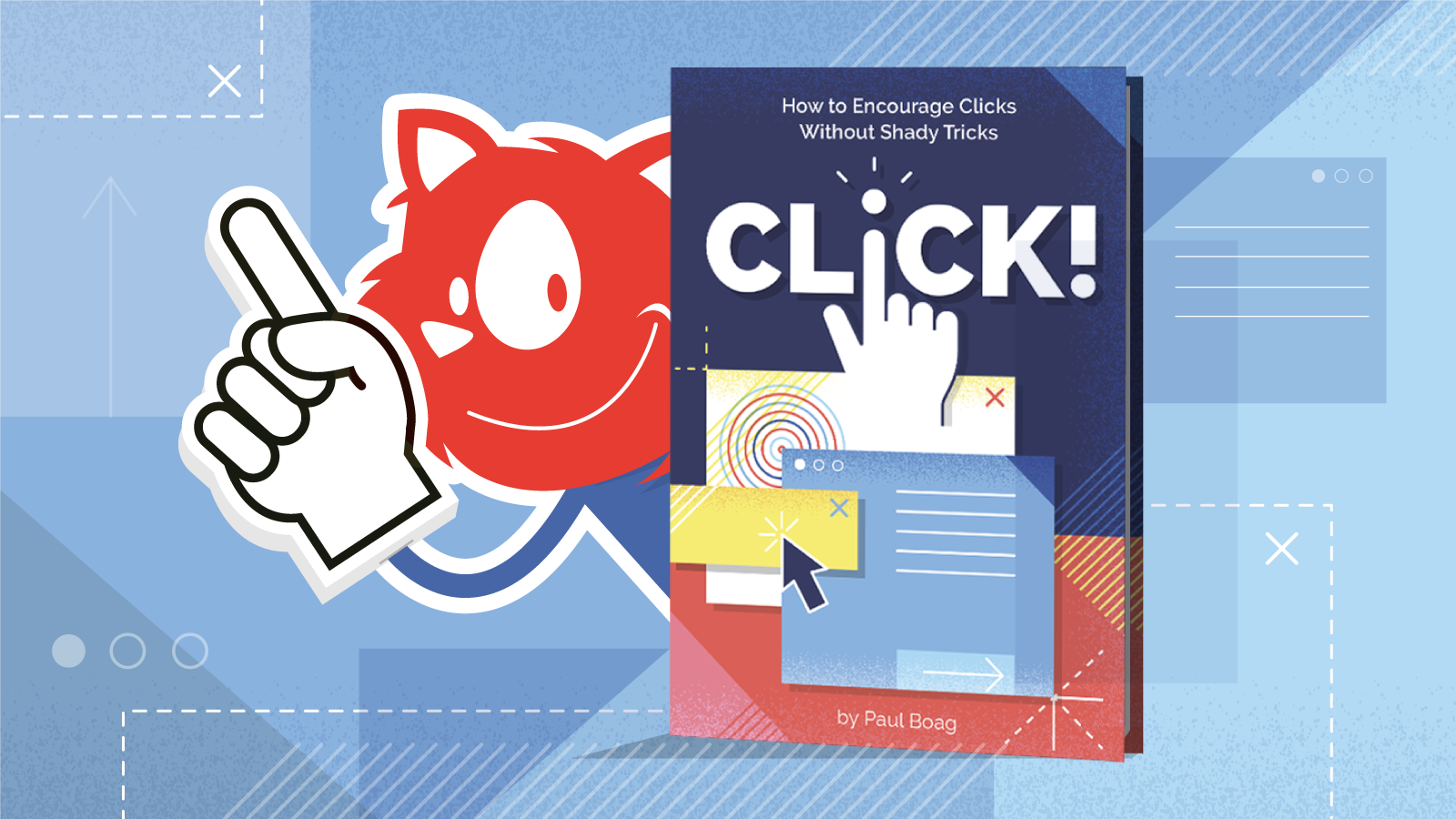
Click! Here: Meet Our New Smashing Book

June 2nd, 2020 No comments

Click! Here: Meet Our New Smashing Book

Click! Here: Meet Our New Smashing Book

Vitaly Friedman

2020-06-02T12:00:00+00:00
2020-06-05T00:36:57+00:00

You’ve been there before, haven’t you? Perhaps your manager insists on using a dark pattern to trick customers into buying. Or an A/B test has just shown that an annoying pop-up does increase sign-ups. Or maybe you always end up firefighting negative reviews and angry customer inquiries and your calls to action don’t perform well.

Whether we are designers, marketers, entrepreneurs, or product owners, we are all in the same boat. We want to give users a good experience, but we also need them to take action. More often than not, these things are considered to be mutually exclusive, but they don’t have to be.

That’s why we’ve teamed up with Paul Boag to work on Click! How To Encourage Clicks Without Shady Tricks, a detailed guide on how to increase conversion and boost business KPIs without alienating customers along the way. A book that shows how to increase clicks, build trust, loyalty and drive leads while keeping users respected and happy at the same time. Jump to table of contents and download a free PDF excerpt (17.3 MB).


Print + eBook

$
39.00

Quality hardcover. Free worldwide shipping. 100 days money-back-guarantee.

eBook

$
19.00


Free!

DRM-free, of course.

ePUB, Kindle, PDF.
Included with Smashing Membership.


Get the eBook

Download PDF, ePUB, Kindle.
Thanks for being smashing! ??

About The Book

There is no shortage of books on marketing and user experience. But when it comes to bridging the gap between the two, many of us struggle to find the right balance. As businesses, we need to meet out targets — be it with install app prompts, newsletter overlays, or infamous chat widgets. But as designers, we don’t want to end up with a frustrating user experience. We really need both, and we need a strategy to get there.


That’s why we’ve written Click! — a guide with practical strategies for improving conversion and retention while building user’s loyalty and trust. The book explores how to effectively address user concerns, overcome skepticism, and encourage users to act — helping you meet your business targets and KPIs along the way. Whether you are a designer, marketer, entrepreneur or product owner, this book will surely help you avoid hidden costs and drive sales.

Here’s a short video message from Paul Boag, the author of Click!, explaining why he’s written the book and what it’s all about:

By reading this book, you will learn to:

  • Measure and boost business KPIs effectively,
  • Build a user-centric sales funnel,
  • Reduce risks and address objections,
  • Build trust and overcome skepticism,
  • Persuade people without alienating them,
  • Establish a strategy for higher conversion.
  • Psst! A little surprise shipped with the first 500 books.
  • Download a free PDF sample (17.3 MB) and get the book right away.


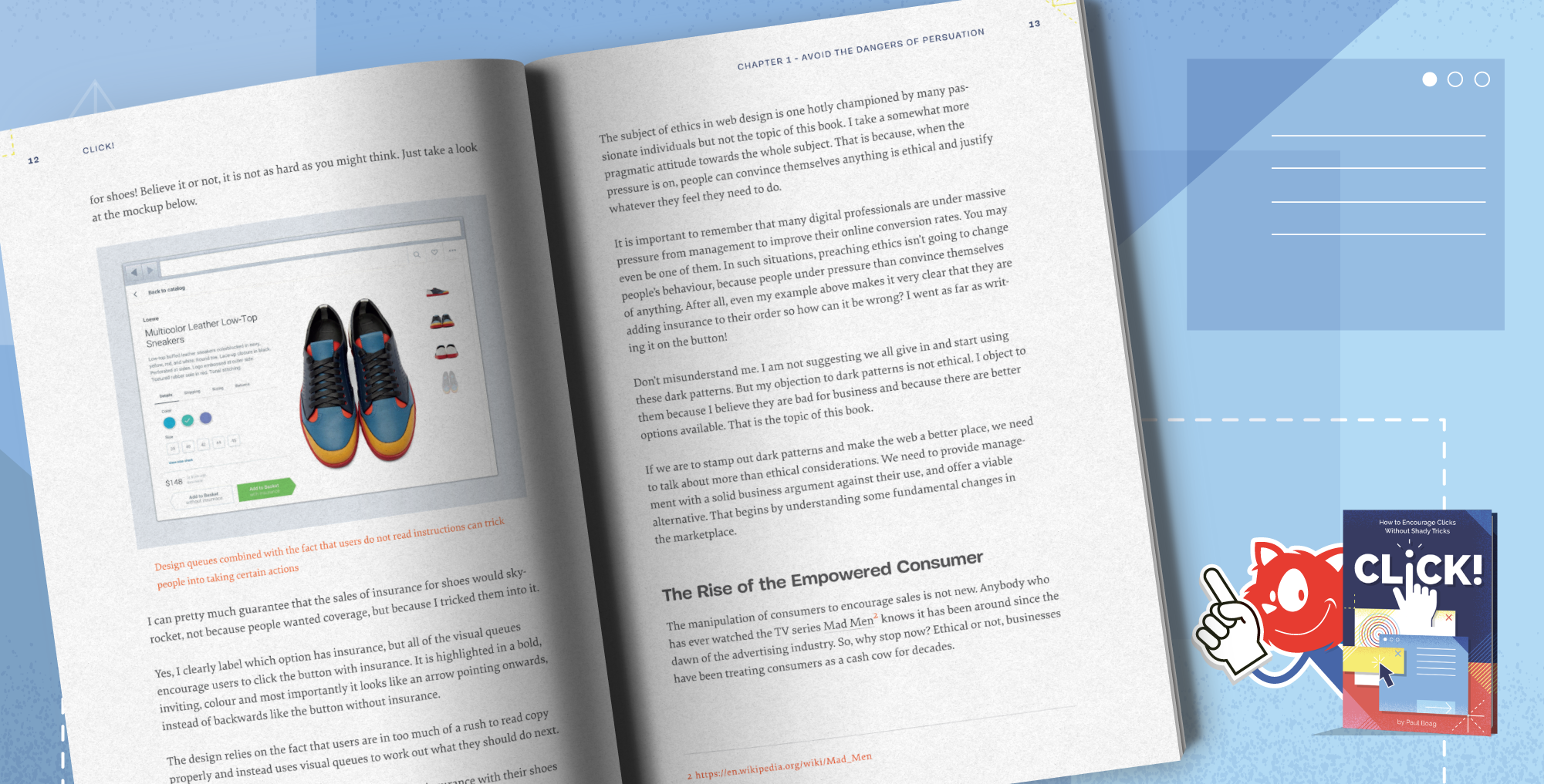
The book features interface design examples that take ethical design principles into account. Large preview.

The cover and chapter illustrations carefully designed by Veerle Pieters.

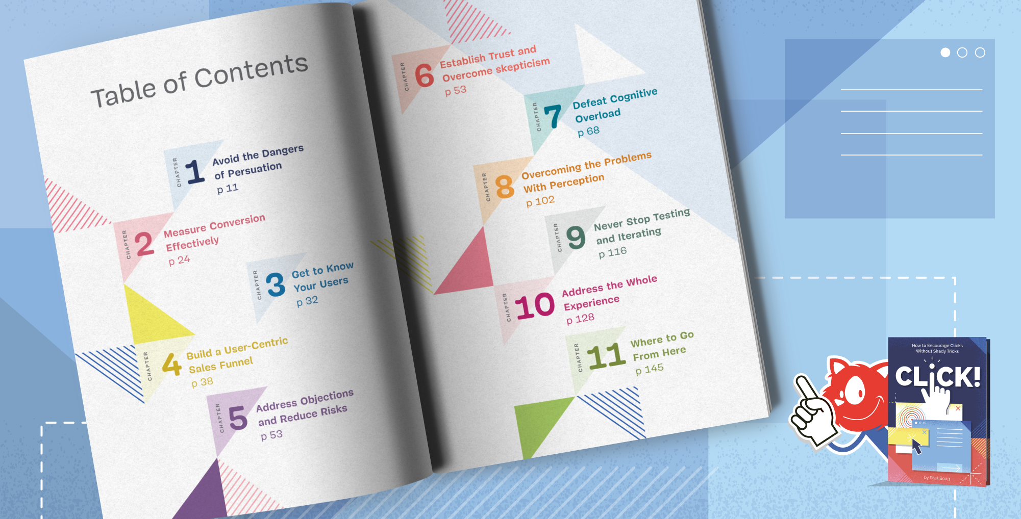
Table Of Contents

The book is split into 11 chapters. We’ll start by exploring the psychology of decision making and how to measure conversion. Then we’ll build a user-centric sales funnel and address user concerns effectively. Finally, we’ll explore how to encourage users to act without alienating them.

1. Avoid the Dangers of Persuasion

+

Paul begins your journey with a rock-solid business case you can take to management or clients to avoid the more manipulative techniques you see online.

You will learn:

  • How online choice has empowered the consumer.
  • The hidden marketing costs of manipulation.
  • The dangers of buyers remorse.
2. Measure Conversion Effectively

+

You cannot improve what you are not measuring. That is why, in Paul’s second chapter, he explores how to measure your conversion rate effectively. Only then can you start to improve it.

You will learn:

  • The dangers of having no metrics or bad ones.
  • How to establish your key performance indicators.
  • What to track and how to track it.
3. Get to Know Your Users

+

If you want to persuade people to act, you need to understand how they think and what they want. To do that you need to carry out at least some user research. In this chapter, Paul introduces you to easy to use techniques that will get the job done with the minimum of investment.

You will learn:

  • What exactly you need to understand about your audience.
  • How to consolidate all you know about your users.
  • How to carry out lightweight user research.
4. Build a User-Centric Sales Funnel

+

The decision to act doesn’t take place in isolation and is part of the broader user journey. In this chapter, Paul explains how to understand that journey and build a sales funnel that supports the user’s experience, rather than seeking to interrupt it.

You will learn:

  • What a sales funnel is and how it helps.
  • How to map your customer’s journey.
  • How to build a sales funnel around the user’s journey.
5. Address Objections and Reduce Risks

+

This chapter explores one of the most important aspects of encouraging users to act — addressing their concerns. We’ll see how to identify user’s objections and then overcome them, so reducing the risk of taking action in the minds of users.

You will learn:

  • How to identify the concerns your audience has about taking action.
  • How to address common concerns.
  • A process for handling any objection users might have.
6. Establish Trust and Overcome Scepticism

+

People will not hand over money or personal information if they do not trust you. To make matters worse users have learned to be sceptical online. In this chapter, you will learn how to build a connection with your audience and help them learn to trust you.

You will learn:

  • Why trust is essential for improving conversion.
  • How to build trust through openness and empathy.
  • The role of social proof and connecting consumers in building trust.
7. Defeat Cognitive Overload

+

In this chapter, you will discover how to reach an audience that is distracted and time-poor. You will learn the importance of not making users think and learn valuable techniques for making acting with you an effortless experience.

You will learn:

  • What cognitive load is and why it is so dangerous for your conversion rate.
  • Methods for reducing the cognitive load of your websites.
  • Techniques for keeping any interface simple.
8. Overcoming the Problem With Perception

+

Are your users taking away the right message from your website? Do they understand what you offer or that it is relevant to them? It is easy to leave a website without acting because you had the wrong impression. This chapter shows you how to address this genuine danger.

You will learn:

  • How to position our products and services in a positive light.
  • The role that mental models play in conversion.
  • Techniques for ensuring your content reflects the user’s mindset.
9. Never Stop Testing and Iterating

+

While Click! is packed with great tips and techniques, the real key to success is a programme of ongoing testing and iteration. In this chapter, Paul shows you how to put in place a methodology that will keep your conversion rate growing for years to come.

You will learn:

  • Techniques for ensuring you are working on the right projects to improve conversion.
  • Ways to test how compelling a design concept is.
  • How to integrate testing into every aspect of your development cycle.
10. Address the Whole Experience

+

While marketers and UX designers have an enormous impact on conversion, they are only a part of the story. That is why in this chapter, we explore how to address the whole user experience and start encouraging colleagues to help improve the conversion rate too.

You will learn:

  • The role of your developer in improving your conversion rate.
  • How to use other digital channels to improve your website conversion rate.
  • How broader organisational changes can help boost revenue and online leads.
11. Where to Go From Here

+

With a book packed with advice, it can be overwhelming. The book concludes with some practical next steps that you can take, wherever you are on your journey to improve conversion.

You will learn:

  • Quick wins that can get you started today.
  • Budget testing techniques you can implement immediately.
  • A more ambitious and ongoing approach to optimisation.

“This is a great book on how to practically, and ethically, optimise website conversion rates. Before, I was roughly aware of what CRO was, but now I feel confident to start implementing these techniques in projects. As you would expect, Paul explains all of the concepts in an easy-to-follow and friendly manner.”

— Dave Smyth, Agency Owner

Per Axbom“I picked up a super simple testing idea, and saw a 42% lift in conversion rate. It was surprising to me, so I ran it again to significance with the same result. That equates to about 2.5 million USD/year in revenue at no additional cost. So I’d say I got my money’s worth!”

— Brandon Austin Kinney, Director of Lead Generation

304 pages. The eBook is available (PDF, ePUB, Amazon Kindle) and printed copies are shipping now. For designers, marketers, entrepreneurs and product owners. Written by Paul Boag. Designed by Veerle Pieters.


Print + eBook

$
39.00

Quality hardcover. Free worldwide shipping. 100 days money-back-guarantee.

eBook

$
19.00


Free!

DRM-free, of course.

ePUB, Kindle, PDF.
Included with Smashing Membership.


Get the eBook

Download PDF, ePUB, Kindle.
Thanks for being smashing! ??

<!–

About The Author

Paul is a leader in conversion rate optimisation and user experience design thinking. He has over 25 years experience working with clients such as Doctors Without Borders and PUMA. He is the author of six books and a well respected presenter.

–>

About the Author

Paul Boag is a leader in conversion rate optimisation and user experience design thinking. He has over 25 years experience working with clients such as Doctors Without Borders and PUMA. He is the author of six books and a well respected presenter.

Technical Details

  • ISBN: 978-3-945749-83-8 (print)
  • Quality hardcover, stitched binding, ribbon page marker.
  • Free worldwide airmail shipping from Germany. (Check your delivery times). Due to Covid-19 and import restrictions, there could be some delays. But you can start reading the eBook right away.
  • eBook is available as PDF, ePUB, and Amazon Kindle.
  • Get the book right away.


A quality hardcover with a bookmark. Designed with love by Veerle Pieters. Photo by Marc Thiele.


A quality hardcover with a bookmark. Designed with love by Veerle Pieters. Photo by Marc Thiele.

Community Matters ??

With Click!, we’ve tried to create a very focused handbook with pragmatic solutions to help everyone create a better digital product that doesn’t get abandoned due to the sheer number of pop-ups, install prompt and newsletter box overlays.

There is quite a bit of work to do on the web, but our hope is that with this book, you will be equipped with enough techniques to increase conversion and the number of happy customers.

Producing a book takes quite a bit of time, and we couldn’t pull it off without the support of our wonderful community. A huge shout-out to Smashing Members for their ongoing support in our adventures. As a result, the eBook is and always will be free for Smashing Members. Plus, Members get a friendly discount when purchasing their printed copy.

Stay smashing, and thank you for your ongoing support, everyone!


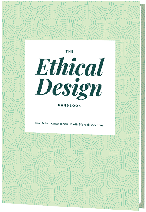
The Ethical Design Handbook

Print + eBook

$
39.00

Quality hardcover. Free worldwide shipping. 100 days money-back-guarantee.

eBook

$
19.00


Free!

DRM-free, of course.

ePUB, Kindle, PDF.
Included with Smashing Membership.


Get the eBook

Download PDF, ePUB, Kindle.
Thanks for being smashing! ??

More Smashing Books

Promoting best practices and providing you with practical tips to master your daily coding and design challenges has always been (and will be) at the core of everything we do at Smashing.

In the past few years, we were very lucky to have worked together with some talented, caring people from the web community to publish their wealth of experience as printed books that stand the test of time. Trine, Alla and Adam are some of these people. Have you checked out their books already?

Ethical Design Handbook

Ethical Design Handbook

A practical guide on ethical design for digital products.

Add to cart $39

Design Systems

Design Systems

A practical guide to creating design languages for digital products.

Add to cart $39

Form Design Patterns

Form Design Patterns

A practical guide to designing and coding simple and inclusive forms.

Add to cart $39

Categories: Others Tags:

Your University Content Strategy: Engaging Student Prospects

June 2nd, 2020 No comments

For any organization, business, or institution, a content strategy is one of the key ways to improve marketing efforts and boost constituent engagements. The same goes for your university or college.

Your university’s content strategy likely revolves around your website. After all, this is the place users will go to learn anything about your institution, whether they’re looking into upcoming campus events or information on a specific major.

A dedicated university content campaign and website is often the best way to not only keep faculty, staff, and existing students informed, but also to attract prospective students.

Since your content strategy is so crucial to your university’s success, it makes sense to attempt to develop it as much as possible. In this guide, we’ll walk through some top tips and best practices for evolving your content strategy:

  1. Optimize your university website content.
  2. Ensure university website accessibility and compliance.
  3. Continue engagement with top prospective students.

Don’t make the mistake of letting your content strategy fall by the wayside. After all, the materials you put out reflect your university. Let’s begin!

1. Optimize your university website content.

As you know, your university’s website is a huge component of your content strategy. According to this OmniUpdate article on higher education website design trends, over 76 percent of high school sophomores, juniors, and seniors start with the website when researching universities. It’s vital that you consider the content on your current website and determine if you’re offering all that you can.

Remember, your website is the hub for all university information and should cater to the needs of any user, especially prospective students. Ensure your website gives visitors access to the following resources:

  • Admissions guidelines
  • Campus life information
  • Course catalogues
  • A calendar of campus events
  • A list of clubs and organizations
  • Financial aid and scholarship information

The above are the most common pages and details that a prospective student will look for when exploring your website. While it’s important that this information is simply on the site, it’s also crucial that it’s clearly laid out within the website’s menu in a navigable way. A good tip is to separate your menu into categories, with one of them being “For prospective students.”

As you’re curating the content on your website, also consider how students might find it. By reviewing the insights from this article on higher education trends in 2019, you’ll find that the majority of prospective students researching colleges and universities online do so in the following ways:

  1. Searching for a specific major
  2. Using superlatives like “best colleges for math” in searches
  3. Conducting searches without a specific institution in mind

This tells us that many prospective students are seeking information not on specific schools, but more on programs and majors that interest them. Take a look at where your school is already excelling at and try to use this to your advantage.

For example, if your university has a stellar basketball program, make sure to advertise this front and center on your homepage. Include an eye-catching graphics as well as links to pages with additional information on that topic.

To ensure that your content strategy is successful, people need to interact with your information. How will prospective students learn about your university if they don’t know where to find the information that you create? That’s why your digital marketing strategy is so crucial.

2. Ensure university website accessibility and compliance.

Along with optimizing your university website’s content, you need to ensure that it is accessible and maintains regulatory compliance.

Web accessibility refers to the idea that visitors of all abilities and disabilities can experience your website. For instance, a visually impaired user may have trouble viewing images or videos, so consider providing alternate text or an audio tool to help. Here are some easy ways to improve website accessibility:

  • All non-text content (image, video, audio) should also have a text alternative.
  • Don’t overuse sensory tools such as sound and appearance for critical information that all users should know.
  • Stay away from flashes and other bright lights to protect those who are seizure-prone.
  • Display an easily navigable menu with clear fields and titles.

To better determine if your website is adhering to accessibility guidelines, consider using an accessibility checker like this.

Regulatory compliance involves ensuring that your website is up to code with laws. All state education agencies, like your university, must comply with a number of federal civil right laws that are against discrimination in any form. Some of these laws include:

  • Title VI of the Civil Rights Act of 1964: This prohibits discriminating on the basis of race, color, and national origin.
  • Section 504 of the Rehabilitation Act of 1973: This outlaws discrimination of disabilities.
  • Title IX of the Education Amendments of 1972: This prohibits discrimination on the basis of sex.
  • Age Discrimination Act of 1975: This probitis discrimination on the basis of age.
  • Americans with Disabilities Act of 1990: This prohibits disability discrimination in any public entities.

These laws cover accessibility issues regarding physical locations and in-person teaching methodologies to HIPAA and digital compliance.

Optimizing your web content and increasing accessibility can work wonders for your content strategy and can help generate new prospective student leads. It not only ensures that your website meets the needs of prospective student site visitors but also ensures that you’re doing all you can to not turn anyone away due to poor usability.

3. Continue engagement with top prospects.

Once prospective students have made it onto your university’s website, hopefully, your content has already piqued their interest. To encourage engagement even after the prospective student leaves your website, consider including the following:

  • An email subscription form where users can input their email addresses and sign up for a newsletter
  • Social media feeds and links so that users can choose to follow your university’s accounts if they’d like
  • A phone number form if the user wants to sign up for text engagements

These forms and links should be embedded within your website, whether as a field on your homepage, a link in your menu, or as information in your site’s footer or header.

As your website visitors opt-in to email lists and follow your social media accounts, you’ll get a sense of who your top prospective students are. As you engage with your top prospects, you should still carefully consider your university content strategy. What types of emails send and other questions likely plague your mind.

Here are some helpful tips for content creation:

  • Email newsletters: To further engage prospective students, create a newsletter specifically catered to this audience. Within it, you can include information on different school activities, tips on applying, and campus live details. You can even create different email lists to further target student prospects. For example, consider embedding an email form box within a specific major information page. That way, those who are interested in becoming pre-med can get email updates pertaining to that subject.
  • Social media posts: Social media is one of the top ways to engage with current and prospective students. After all, most teenagers and young adults are already familiar with the platform. A good idea is to partner up with your admissions office as well as a group of current students to curate content for your social media feeds. The admissions workers can provide accurate details on how to apply to your school while current students can show off what campus life is really like.
  • Text alerts: Sometimes, prospective students will submit their phone number to get updates and announcements from their top schools. This is a quick and convenient way to send alerts or deadline reminders to your prospects.

While your university’s content strategy is centralized around your website, this doesn’t mean that’s all you have to think about. Once you have a list of potential students, make sure to continue engagements and send meaningful content that provides genuine value to them. That is a top way to attract students and encourage them to apply to your institution!


If you’re trying to increase your number of prospective students and engage them further, your university content strategy has to be on top of its game, in regards to your website, accessibility and compliance, and any future engagements. Hopefully, after reviewing this guide, you feel a little more comfortable going forward. Good luck!

Categories: Others Tags:

How To Create A Mobile App For The IoT Industry?

June 2nd, 2020 No comments

Application development process for IoT development is more or less the same as the process followed by non-connected software development.

It comes with the same elements as any other software development cycle, similar tools, same-ish design standards, and even similar mistakes and considerations for efficient quality assurance.

And still, there are some things which are found specifically in IoT application development. There are several requirements that emerge when preparing for the process of IoT application deployment.

In this article, we are going to look into the ways that must be followed when developing an IoT solution.

The stage of IoT app development starts with understanding how IoT works. Let us delve into the working by looking into the four components that define the working of every Internet of Things solution.

The Pillar of How to Develop an IoT Application: Understanding how IoT Works

An IoT system is made of four prime components:

  • Network – It helps in sending data both ways – from a smartphone to sensors and from sensors to back into the device. The network plays a role in linking the devices within an IoT system.
  • Cloud – it is one of the most important elements of the IoT structure. It is responsible for processing the data and arranging them. It also saves the efforts of incorporating a physical resource for storing the data in-house.
  • Software – It is basically a cloud-based app that gives the functionality to manage and control all the IoT devices connected with the software. It also plays the role of collecting information from the sensors and showing them to users.
  • Hardware – It consists of multiple low-energy sensors which work on Bluetooth and connects to the Internet. You will have to choose between a third-party or a custom hardware for deploying your idea.

Now that we have looked into the working of an IoT system, let us move to the part we came to reveal – how to develop an IoT application.

How to Create a Mobile Application for IoT Devices

1. Choose the Best Platform

The first step that a developer would need to take when developing an IoT application would be to choose the right platform that connects both – the application and the component.

These are some of the ideal platforms that have been chosen over a long period of time, like – Thingworx, Xively, and Ubidots.

2. Choose a Prefered Industry

If you go by the IoT trends, the one thing that you will see happening is the adoption of IoT technology across a huge number of industries and sectors. The technology has started making its presence known in the education domain, healthcare, retail, manufacturing, etc.

So, it would be important to first identify which sector you want to serve with your connect solution.

3. Concentrated Focus on User Experience

Irrespective of which type of application you are planning to develop, it is important that you keep the user experience at the top of the list. Generally, within the IoT ecosystem, there are multiple devices, each with their own unique functionality and smart capabilities.

It is important to step into your users’ shoes and draw a journey of how they would interact with the capabilities and the goal they would like to achieve at the end of every interaction.

4. Make Firmware the Center of Your Security Approach

In the case of IoT app development, an application interacts with the device’s firmware. This means that it is very important to give a special focus on perfecting the development and testing of interaction.

In an IoT setup, the hardware is always at risk because of the constant connection with the internet. Thus, it is advisable to keep updating the firmware from time to time to ensure that there is zero scope of online threats.

5. A Sound Data Management Approach

Everything from the existence to the success of an Iot network depends on data. This is the reason why the IoT app developers have to be extremely conversant about data management. Here are the different processes it is made of –

  • Acquisition of data – The developers must only allow data from their servers and block all the other unauthorized sources.
  • Validation of data – At this stage, it is important to ensure that the data has been cleansed and it is now prepared to be consistent when it comes to merging.
  • Storage – The developers must affirm that the cloud is not filled with unnecessary data or served with a poor network service.
  • Data processing – This implies that the application must process real-time data, while working around a system that promotes minimum latency.

6. Development of Scalable Apps

The IoT developer you partner with, must keep their focus on developing a scalable application.

Although the mass adoption of IoT is still at a nascent stage, your application must be prepared to match the requirements that will be introduced with high concurrency. While you should not invest in the resources required to make your application 1 million concurrent users friendly from day one, you should, though, ensure that the app has the provision to grow in size when the time comes.

7. A Special Focus on Quality and Speed

Your initial IoT user study research would have shown how important it is for them to have a high quality, speedy solution. While the same is the case with mobile app users, it becomes all the more IoT app users because they almost always use the application to check up on something. It could be their room temperature or their pulse rate. And when they check on something, the end result is almost always action-oriented.

In such a situation, you can imagine how bad an idea it would be to give them a product that is slow and laggy.

Internet of Things, while still at a growing stage, is fast matching the pace to become the biggest next-gen technology. This means that the time is ripe for businesses to work on their connected use case and follow the ways mentioned in this article to ensure their application stands the test of time.

Categories: Others Tags: