Archive

Archive for June, 2020

Solving Common Cross-Platform Issues When Working With Flutter

June 18th, 2020 No comments
image of an Android app showing where the app bar title appears on Flutter Android Material apps

Solving Common Cross-Platform Issues When Working With Flutter

Solving Common Cross-Platform Issues When Working With Flutter

Carmine Zaccagnino

2020-06-18T10:30:00+00:00
2020-06-18T13:34:20+00:00

I’ve seen a lot of confusion online regarding Web development with Flutter and, often, it’s sadly for the wrong reasons.

Specifically, people sometimes confuse it with the older Web-based mobile (and desktop) cross-platform frameworks, which basically were just Web pages running within browsers running within a wrapper app.

That was truly cross-platform in the sense that the interfaces were the same anyway because you only had access to the interfaces normally accessible on the Web.

Flutter isn’t that, though: it runs natively on each platform, and it means each app runs just like it would run if it were written in Java/Kotlin or Objective-C/Swift on Android and iOS, pretty much. You need to know that because this implies that you need to take care of the many differences between these very diverse platforms.

In this article, we’re going to see some of those differences and how to overcome them. More specifically, we’re going to talk about storage and UI differences, which are the ones that most often cause confusion to developers when writing Flutter code that they want to be cross-platform.

Example 1: Storage

I recently wrote on my blog about the need for a different approach to storing JWTs in Web apps when compared to mobile apps.

That is because of the different nature of the platforms’ storage options, and the need to know each and their native development tools.

Web

When you write a Web app, the storage options you have are:

  1. downloading/uploading files to/from disk, which requires user interaction and is therefore only suitable for files meant to be read or created by the user;
  2. using cookies, which may or may not be accessible from JS (depending on whether or not they’re httpOnly) and are automatically sent along with requests to a given domain and saved when they come as part of a response;
  3. using JS localStorage and sessionStorage, accessible by any JS on the website, but only from JS that is part of the pages of that website.

Mobile

The situation when it comes to mobile apps is completely different. The storage options are the following:

  1. local app documents or cache storage, accessible by that app;
  2. other local storage paths for user-created/readable files;
  3. NSUserDefaults and SharedPreferences respectively on iOS and Android for key-value storage;
  4. Keychain on iOS and KeyStore on Android for secure storage of, respectively, any data and cryptographic keys.

If you don’t know that, you’re going to make a mess of your implementations because you need to know what storage solution you’re actually using and what the advantages and drawbacks are.

Cross-Platform Solutions: An Initial Approach

Using the Flutter shared_preferences package uses localStorage on the Web, SharedPreferences on Android and NSUserDefaults on iOS. Those have completely different implications for your app, especially if you’re storing sensitive information like session tokens: localStorage can be read by the client, so it’s a problem if you’re vulnerable to XSS. Even though mobile apps aren’t really vulnerable to XSS, SharedPreferences and NSUserDefaults are not secure storage methods because they can be compromised on the client side since they are not secure storage and not encrypted. That’s because they are meant for user preferences, as mentioned here in the case of iOS and here in the Android documentation when talking about the Security library which is designed to provide wrappers to the SharedPreferences specifically to encrypt the data before storing it.

Secure Storage On Mobile

The only secure storage solutions on mobile are Keychain and KeyStore on iOS and Android respectively, whereas there is no secure storage on the Web.

The Keychain and KeyStore are very different in nature, though: Keychain is a generic credentials storage solution, whereas the KeyStore is used to store (and can generate) cryptographic keys, either symmetric keys or public/private keys.

This means that if, for instance, you need to store a session token, on iOS you can let the OS manage the encryption part and just send your token to the Keychain, whereas on Android it’s a bit more of a manual experience because you need to generate (not hard-code, that’s bad) a key, use it to encrypt the token, store the encrypted token in SharedPreferences and store the key in the KeyStore.

There are different approaches to that, as are most things in security, but the simplest is probably to use symmetric encryption, as there is no need for public key cryptography since your app both encrypts and decrypts the token.

Obviously, you don’t need to write mobile platform-specific code that does all of that, as there is a Flutter plugin that does all of that, for instance.

The Lack Of Secure Storage On the Web

That was, actually, the reason that compelled me to write this post. I wrote about using that package to store JWT on mobile apps and people wanted the Web version of that but, as I said, there is no secure storage on the Web. It doesn’t exist.

Does that mean your JWT has to be out in the open?

No, not at all. You can use httpOnly cookies, can’t you? Those aren’t accessible by JS and are sent only to your server. The issue with that is that they’re always sent to your server, even if one of your users clicks on a GET request URL on someone else’s website and that GET request has side effects you or your user won’t like. This actually works for other request types as well, it’s just more complicated. It’s called Cross-Site Request Forgery and you don’t want that. It’s among the web security threats mentioned in Mozilla’s MDN docs, where you can find a more complete explanation.

There are prevention methods. The most common one is having two tokens, actually: one of them getting to the client as an httpOnly cookie, the other as part of the response. The latter has to be stored in localStorage and not in cookies because we don’t want it to be sent automatically to the server.

Solving Both

What if you have both a mobile app and a Web app?

That can be dealt with in one of two ways:

  1. Use the same backend endpoint, but manually get and send the cookies using the cookie-related HTTP headers;
  2. Create a separate non-Web backend endpoint that generates different token than either token used by the Web app and then allow for regular JWT authorization if the client is able to provide the mobile-only token.

Running Different Code On Different Platforms

Now, let’s see how we can run different code on different platforms in order to be able to compensate for the differences.

Creating A Flutter Plugin

Especially to solve the problem of storage, one way you can do that is with a plugin package: plugins provide a common Dart interface and can run different code on different platforms, including native platform-specific Kotlin/Java or Swift/Objective-C code. Developing packages and plugins is rather complex, but it’s explained in many places on the Web and elsewhere (for example in Flutter books), including the official Flutter documentation.

For mobile platforms, for instance, there already is a secure storage plugin, and that’s flutter_secure_storage, for which you can find an example of usage here, but that doesn’t work on the Web, for example.

On the other hand, for simple key-value storage that also works on the web, there’s a cross-platform Google-developed first-party plugin package called shared_preferences, which has a Web-specific component called shared_preferences_web which uses NSUserDefaults, SharedPreferences or localStorage depending on the platform.

TargetPlatform on Flutter

After importing package:flutter/foundation.dart, you can compare Theme.of(context).platform to the values:

  • TargetPlatform.android
  • TargetPlatform.iOS
  • TargetPlatform.linux
  • TargetPlatform.windows
  • TargetPlatform.macOS
  • TargetPlatform.fuchsia

and write your functions so that, for each platform you want to support, they do the appropriate thing. This will come especially useful for the next example of platform difference, and that is differences in how widgets are displayed on different platforms.

For that use case, in particular, there is also a reasonably popular flutter_platform_widgets plugin, which simplifies the development of platform-aware widgets.

Example 2: Differences In How The Same Widget Is Displayed

You can’t just write cross-platform code and pretend a browser, a phone, a computer, and a smartwatch are the same thing — unless you want your Android and iOS app to be a WebView and your desktop app to be built with Electron. There are plenty of reasons not to do that, and it’s not the point of this piece to convince you to use frameworks like Flutter instead that keep your app native, with all the performance and user experience advantages that come with it, while allowing you to write code that is going to be the same for all platforms most of the time.

That requires care and attention, though, and at least a basic knowledge of the platforms you want to support, their actual native APIs, and all of that. React Native users need to pay even more attention to that because that framework uses the built-in OS widgets, so you actually need to pay even more attention to how the app looks by testing it extensively on both platforms, without being able to switch between iOS and Material widget on the fly like it’s possible with Flutter.

What Changes Without Your Request

There are some aspects of the UI of your app that are automatically changed when you switch platforms. This section also mentions what changes between Flutter and React Native in this respect.

Between Android And iOS (Flutter)

Flutter is capable of rendering Material widgets on iOS (and Cupertino (iOS-like) widgets on Android), but what it DOESN’T do is show exactly the same thing on Android and iOS: Material theming especially adapts to the conventions of each platform.

For instance, navigation animations and transitions and default fonts are different, but those don’t impact your app that much.

What may affect some of your choices when it comes to aesthetics or UX is the fact that some static elements also change. Specifically, some icons change between the two platforms, app bar titles are in the middle on iOS and on the left on Android (on the left of the available space in case there is a back button or the button to open a Drawer (explained here in the Material Design guidelines and also known as a hamburger menu). Here’s what a Material app with a Drawer looks like on Android:

image of an Android app showing where the app bar title appears on Flutter Android Material apps

Material app running on Android: the AppBar title is in the left side of the available space. (Large preview)

And what the same, very simple, Material app looks like on iOS:

image of an iOS app showing where the app bar title appears on Flutter iOS Material apps

Material app running on iOS: the AppBar title is in the middle. (Large preview)
Between Mobile and Web and With Screen Notches (Flutter)

On the Web there is a bit of a different situation, as mentioned also in this Smashing article about Responsive Web Development with Flutter: in particular, in addition to having to optimize for bigger screens and account for the way people expect to navigate through your site — which is the main focus of that article — you have to worry about the fact that sometimes widgets are placed outside of the browser window. Also, some phones have notches in the top part of their screen or other impediments to the correct viewing of your app because of some sort of obstruction.

Both of these problems can be avoided by wrapping your widgets in a SafeArea widget, which is a particular kind of padding widget which makes sure your widgets fall into a place where they can actually be displayed without anything impeding the users’ ability to see them, be it a hardware or software constraint.

In React Native

React Native requires much more attention and a much deeper knowledge of each platform, in addition to requiring you to run the iOS Simulator as well as the Android Emulator at the very least in order to be able to test your app on both platforms: it’s not the same and it converts its JavaScript UI elements to platform-specific widgets. In other words, your React Native apps will always look like iOS — with Cupertino UI elements as they are sometimes called — and your Android apps will always look like regular Material Design Android apps because it’s using the platform’s widgets.

The difference here is that Flutter renders its widgets with its own low-level rendering engine, which means you can test both app versions on one platform.

Getting Around That Issue

Unless you’re going for something very specific, your app is supposed to look different on different platforms otherwise some of your users will be unhappy.

Just like you shouldn’t simply ship a mobile app to the web (as I wrote in the aforementioned Smashing post), you shouldn’t ship an app full of Cupertino widgets to Android users, for example, because it’s going to be confusing for the most part. On the other hand, having the chance to actually run an app that has widgets that are meant for another platform allows you to test the app and show it to people in both versions without having to use two devices for that necessarily.

The Other Side: Using The Wrong Widgets For The Right Reasons

But that also means that you can do most of your Flutter development on a Linux or Windows workstation without sacrificing the experience of your iOS users, and then just build the app for the other platform and not have to worry about thoroughly testing it.

Next Steps

Cross-platform frameworks are awesome, but they shift responsibility to you, the developer, to understand how each platform works and how to make sure your app adapts and is pleasant to use for your users. Other small things to consider may be, for example, using different descriptions for what might be in essence the same thing if there are different conventions on different platforms.

It’s great to not have to build the two (or more) apps separately using different languages, but you still need to keep in mind you are, in essence, building more than one app and that requires thinking about each of the apps you are building.

Further Resources

(ra, yk, il)
Categories: Others Tags:

Advice for Complex CSS Illustrations

June 17th, 2020 No comments
Screenshot of a realistic looking woman gazing up with her hards across her chest.

If you were to ask me what question I hear most about front-end development, I’d say it’s“How do I get better at CSS?” And that question usually comes up to some CSS illustration I made, which is something I love to do over on CodePen.

To many, CSS is this mythical beast that can’t be tamed. This tweet from Chris made me chuckle because, although ironic, there’s a lot of truth to it. That said, what if I told you that you were only a few properties and techniques away from creating anything you wanted? The truth is that you are indeed that close.

I’ve been wanting to compose an article like this for some time, but it’s a hard topic to cover because there are so many possibilities and so many techniques that there’s often more than one way to accomplish the same thing. The same is true with CSS illustrations. There’s no right or wrong way to do it. We’re all using the same canvas. There are simply so many different tools to get those pixels on the page.

While there is no “one size fits all” approach to CSS illustration, what I can offer is a set of techniques that might help you on your journey.

CodePen Embed Fallback

Time and practice

CSS illustration takes lots of time and practice. The more accurate you want to be and the more complicated the illustration, the longer it’s going to take. The time-consuming part isn’t usually deciding on which properties to use and how, but the tinkering of getting things to look right. Be prepared to get very familiar with the styles inspector in your browser dev tools! I also recommend trying out VisBug if you haven’t.

Two fantastic CSS artists are Ben Evans and Diana Smith. Both have recently talked about time consumption when referring to CSS illustration.

Diana’st PureCSS Gaze took her two long weekends to complete. She talks about some of her techniques here and here. “If you have the time, patience and drive, it is certainly possible,” she says.

I posted a meme-like picture about a cup and Ben’s response summed things up perfectly:

I was tempted to create this in CSS when I first saw the tweet but then thought my reply would take about a month.

It takes time!

CSS Illustration pic.twitter.com/vqpQLKTte5

— Jhey ? (@jh3yy) May 10, 2020

Tracing is perfectly acceptable

We often have an idea of what it is that we want to illustrate. This article isn’t about design, after all.; it’s about taking an image and rendering it with the DOM and CSS. I’m pretty sure this technique has been around since the dawn of time. But, it’s one I’ve been sharing the last few months.

  • Find or create an image of what it is you want to illustrate.
  • Pull it into your HTML with an tag.
  • Position it in a way that it will sit underneath your illustration.
  • Reduce the image opacity so that it’s still visible but not too overpowering.
  • Trace it with the DOM.

To my surprise, this technique isn’t common knowledge. But it’s invaluable for creating accurate CSS illustrations.

See this trick in action here:

Here’s a timelapse of creating that CSS @eggheadio ?

Tweaked the shadows with clip-path after ??

? https://t.co/XhDRspwwFg via @CodePen #webdev #coding #CSS #animation #webdesign #design #creative #100DaysOfCode #HTML #Timelapse https://t.co/ZQ1hyzcoSA pic.twitter.com/iPf7ksYCGX

— Jhey ? (@jh3yy) May 1, 2020

And try it out here:

CodePen Embed Fallback

Pay attention to responsiveness

If there are two takeaway techniques to take from this article, let it be the “Tracing” one above and this next one.

There are some fantastic examples of CSS illustration out there. But the one unfortunate thing about some of them is that they aren’t styled — or even viewable — on small screens. We live in an age where first impressions with tech are important. Consider the example of a keyboard illustrated with CSS. Someone comes across your work, opens it up on their smartphone, and they’re greeted with only half the illustration or a small section of it. They probably missed the coolest parts of the demo!

Here’s my trick: leverage viewport units for your illustrations and create your own scaled unit.

For sizing and positioning, you either have the option of using a scaled unit or percentage. This is particularly useful when you need to use a box shadow because the property accepts viewport units but not percentages.

Consider the CSS egghead.io logo I created above. I found the image I wanted to use and popped it in the DOM with an img tag.

<image src='egghead.png'/>
img {
  height: 50vmin;
  left: 50%;
  opacity: 0.25;
  position: fixed;
  top: 50%;
  transform: translate(-50%, -50%);
}

The height, 50vmin, is the desired size of the CSS illustration. The reduced opacity allows us to “trace” the illustration clearly as we progress.

Then, we create our scaled unit.

/**
  * image dimensions are 742 x 769
  * width is 742
  * height is 769
  * my desired size is 50vmin
*/
:root {
  --size: 50;
  --unit: calc((var(--size) / 769) * 1vmin);
}

With the image dimensions in place, we can create a uniform unit that’s going to scale with our image. We know the height is the largest unit, so we use that as a base to create a fractional unit.

We get something like this:

--unit: 0.06501950585vmin;

That looks awkward but, trust me, it’s fine. We can use this to size our illustration’s container using calc().

.egg {
  height: calc(769 * var(--unit));
  position: relative;
  width: calc(742 * var(--unit));
  z-index: 2;
}

If we use either percentages or our new --unit custom property to style elements within the container of our CSS illustration, we will get responsive CSS illustrations… and all it took was a few lines of math using CSS variables!

Resize this demo and you’ll see that everything stay in proportion always using 50vmin as the sizing constraint.

CodePen Embed Fallback

Measure twice, cut once

Another tip is to measure things. Heck, you van even grab a tape measure if you’re working with a physical object!

CodePen Embed Fallback

This may look a little funky but I measured this scene. It’s the TV combo unit I have in my lounge. Those measurements equate to centimeters. I used those to get a responsive unit based on the actual height of the TV. We can give that number — and all others — a name that makes it easy to remember what it’s for, thanks to custom properties.

:root {
  --light-switch: 15;
  --light-switch-border: 10;
  --light-switch-top: 15;
  --light-switch-bottom: 25;
  --tv-bezel: 15;
  --tv-unit-bezel: 4;
  --desired-height: 25vmin;
  --one-cm: calc(var(--desired-height) / var(--tv-height));
  --tv-width: 158.1;
  --tv-height: 89.4;
  --unit-height: 42;
  --unit-width: 180;
  --unit-top: 78.7;
  --tv-bottom: 114.3;
  --scaled-tv-width: calc(var(--tv-width) * var(--one-cm));
  --scaled-tv-height: calc(var(--tv-height) * var(--one-cm));
  --scaled-unit-width: calc(var(--unit-width) * var(--one-cm));
  --scaled-unit-height: calc(var(--unit-height) * var(--one-cm));
}

As soon as we calculate a variable, we can use it everywhere. I know my TV is 158.1cm wide and 89.4cm tall. I checked the manual. But in my CSS illustration, it will always scale to 25vmin.

Use absolute positioning on all the things

This one will save you a few keystrokes. More often than not, you’ll be looking to absolutely position elements. Save yourself and put this rule somewhere.

/* Your class name may vary */
.css-illustration *,
.css-illustration *:after,
.css-illustration *:before,
.css-illustration:after,
.css-illustration:before {
  box-sizing: border-box;
  position: absolute;
}

Your keyboard will thank you!

Positioning is a tricky concept in CSS. You can read up on it in the CSS Almanac for more information on how to use it.

Or, have a play with this little positioning playground:

CodePen Embed Fallback

Stick to an approach

This is by far the hardest thing to do. How do you approach a CSS illustration? Where do you even start? Should you start with the outermost part and work your way in? That doesn’t work so well.

Odds are that you’ll try some approaches and find a better way to go about it. You’ll certainly do a little back-and-forth but, the more you practice, the better you’ll get at spotting patterns and developing an approach that works best for you.

I tend to relate my approach to how you’d go about creating a vector image where illustrations are made up of layers. Split it up and sketch it on paper if you need to. But, start from the bottom and work your way up. This tends to mean larger shapes first, and finer details later. You can always tinker with the stacking index when you need to move elements around.

Maintain a solid structure for your styles

That leads us to the structure. Try to avoid a flat DOM structure for your illustration. Keeping things atomic makes it easier to move parts of your illustration. It will also makes it much easier to show and hide parts of the illustration or even animate them later. Consider the CSS Snorlax demo. The arms, feet, head, etc. are separate elements. That made animating the arm a lot easier than if I had tried to keep things together since I could simply apply the animation to the .snorlax__arm-left class.

CodePen Embed Fallback

Here’s a timelapse shot of me creating the demo:

Attempted to put together a timelapse of the CSS Snorlax we built last night ?

Amusing watching it back!

? https://t.co/vbVYmFUN5V via @CodePen#webdev #coding #HTML #CSS #webdesign #100DaysOfCode #creative #design #animation pic.twitter.com/0mJtLPRQfP

— Jhey ? (@jh3yy) April 28, 2020

Handling awkward shapes

There’s a pretty good article right here on CSS-Tricks for creating shapes with CSS. But what about more “awkward” shapes, like a long curve or even an outer curve? In these scenarios, we need to think outside the box. Properties such as overflow, border-radius, and clip-path are big helpers.

Consider this CSS Jigglypuff demo. Toggle the checkbox.

CodePen Embed Fallback

That’s the key for creating curved shapes! We have an element much larger than the body with a border-radius applied. We then apply overflow: hidden to the body to cut that part off.

How might we create an outer curve? This one’s a little tricky. But a trick I like to use is a transparent element with a thick border. Then apply a border-radius and clip the excess, if required.

CodePen Embed Fallback

If you hit the toggle, it reveals the element we are using to go across that corner. Another trick might be to overlay a circle that matches the background color. This is fine until we need to change the background color. It’s OK if you have a variable or something in place for that color. But, it could make things a little harder to maintain.

clip-path is your friend

You might have noticed a couple of interesting CSS properties in that last demo, including clip-path. You’ll most likely need clip-path if you want to create complex CSS shapes. It’s especially handy for cutting off bits of elements when hiding parent box overflow doesn’t do.

Here’s a little demo I built some time ago that showcases different clip-path possibilities.

CodePen Embed Fallback

There’s also this demo that takes ideas from the “Shapes of CSS” article and re-created with clip-path.

CodePen Embed Fallback

border-radius is your other friend

You’re going to need border-radius to create curves. One uncommon trick is to use a “double” syntax. This allows you to create a horizontal and vertical radius for each corner.

Play with this demo to really appreciate the power of border-radius. I advocate using percentages across the board in order keep things responsive.

CodePen Embed Fallback

Shading techniques

You’ve got all the shapes, everything is nicely laid out, and all the right colors are in place… but something still looks off. Odds are that it’s a lack of shading.

Shading adds depth and create a realistic feel. Consider this ecreation of a Gal Shir illustration. Gal is fantastic at using shades and gradients to make beautiful illustrations. I thought it would be fun to do a recreate it and include a switch that toggles the shading to see just what a difference it makes.

CodePen Embed Fallback

Shading effects are often created with a box-shadow and background-image combination.

The key thing with these properties is that we can stack them in a comma-separated list. For example, the cauldron in the demo has a list of gradients that are being used across the body.

.cauldron {
  background:
    radial-gradient(25% 25% at 25% 55%, var(--rim-color), transparent),
    radial-gradient(100% 100% at -2% 50%, transparent, transparent 92%, var(--cauldron-color)),
    radial-gradient(100% 100% at -5% 50%, transparent, transparent 80%, var(--darkness)),
    linear-gradient(310deg, var(--inner-rim-color) 25%, transparent), var(--cauldron-color);
}

Note that radial-gradient() and a linear-gradient() are being used here and not always with perfectly round numeric values. Again, those numbers are just fine. In fact, you’ll spend a lot of time tweaking and tinkering with things in the style inspector.

It’s generally the same working with box-shadow. However, with that, we can also use the inset value to create tricky borders and additional depth.

.cauldron__opening {
  box-shadow:
    0 0px calc(var(--size) * 0.05px) calc(var(--size) * 0.005px) var(--rim-color) inset,
    0 calc(var(--size) * 0.025px) 0 calc(var(--size) * 0.025px) var(--inner-rim-color) inset,
    0 10px 20px 0px var(--darkness), 0 10px 20px -10px var(--inner-rim-color);
}

There are certainly times where it will make more sense to go with filter: drop-shadow() instead to get the effect you want.

Lynn Fisher’s a.singlediv.com is a brilliant example of these properties in action. Have a poke around on that site and inspect some of the illustrations for great ways to use box-shadow and background-image in illustrations.

box-shadow is so powerful that you could create your entire illustration with it. I once joked about creating a CSS illustration of a dollar.

In CSS right? ?#webdev #CSS #animation #webdesign #coding #100DaysOfCode #HTML https://t.co/VmyeySsK83

— Jhey ? (@jh3yy) April 22, 2020

I used a generator to create the illustration with a single div. But Alvaro Montoro took it a little further and wrote a generator that does it with box-shadow instead.

Preprocessors are super helpful

While they aren’t required, using preprocessors can help keep your code neat and tidy. For example, Pug makes writing HTML faster, especially when it comes to using loops for dealing with a bunch of repeating elements. From there, we can scope CSS custom properties in a way that we only need to define styles once, then overwrite them where needed.

CodePen Embed Fallback

Here’s another example that demonstrates a DRY structure. The flowers are constructed with the same markup, but each has its own index class that is used to apply scoped CSS properties.

CodePen Embed Fallback

The first flower has these properties:

.flower--1 {
  --hue: 190;
  --x: 0;
  --y: 0;
  --size: 125;
  --r: 0;
}

It’s the first one, so all the others are based off it. Notice how the second flower is off to the right and up slightly. All that takes is assigning different values to the same custom properties:

.flower--2 {
  --hue: 320;
  --x: 140;
  --y: -75;
  --size: 75;
  --r: 40;
}

Animated responsive CSS Leif features in the latest CodePen Spark! ?

For those who don’t know Animal Crossing, Leif is a green-thumbed Sloth who visits your island ?

Here’s a timelapse! ?

? https://t.co/tkHX4nWXp7 via @CodePen pic.twitter.com/naJIrsSlYM

— Jhey ? (@jh3yy) May 19, 2020

That’s it!

Go forth, use these tips, come up with your own, share them, and share your CSS masterpieces! And hey, if you have your own advice, please share that too! This is definitely the sort of thing that is learned through lots of trial and error — what works for me may look different from what works for you and we can learn from those different approaches

The post Advice for Complex CSS Illustrations appeared first on CSS-Tricks.

Categories: Designing, Others Tags:

LingoJam

June 17th, 2020 No comments

I’ll sometimes search the web for something like “Small Text Generator” knowing there will be some website that will turn some dumb thing I want to type like:

Uhm hi when is that meeting again?

into something fun like…

ᵁʰᵐ ʰᶦ ʷʰᵉⁿ ᶦˢ ᵗʰᵃᵗ ᵐᵉᵉᵗᶦⁿᵍ ᵃᵍᵃᶦⁿˀ

Important note about accessibility: This kind of altered text will read terribly with assistive technology like VoiceOver. Just “Uhm” will read as “modified letter U, modified letter h, modified letter m,” which doesn’t convey what you want at all. I try not to avoid doing something like this on a public site, even as a joke on Twitter (now that I know this). I might use it with a friend or group where I know everyone and their capabilities.

I had assumed that “generator” sites like this were typically hand-built by someone with an itch to scratch. Well, that second part is true, but I just noticed that the small text generator site was built on LingoJam, which is designed to specifically help making generators like this easier. How cool!

lolz

When you make a new generator, you get all this power to do straight word and phrase replacements, reordering, and regex stuff.

I just think it’s a fun cool idea that’s all. ?

Direct Link to ArticlePermalink

The post LingoJam appeared first on CSS-Tricks.

Categories: Designing, Others Tags:

Mirage JS Deep Dive: Using Mirage JS And Cypress For UI Testing (Part 4)

June 17th, 2020 No comments
Smashing Editorial

Mirage JS Deep Dive: Using Mirage JS And Cypress For UI Testing (Part 4)

Mirage JS Deep Dive: Using Mirage JS And Cypress For UI Testing (Part 4)

Kelvin Omereshone

2020-06-17T10:30:00+00:00
2020-06-18T13:34:20+00:00

One of my favorite quotes about software testing is from the Flutter documentation. It says:

“How can you ensure that your app continues to work as you add more features or change existing functionality? By writing tests.”

On that note, this last part of the Mirage JS Deep Dive series will focus on using Mirage to test your JavaScript front-end application.

Note: This article assumes a Cypress environment. Cypress is a testing framework for UI testing. You can, however, transfer the knowledge here to whatever UI testing environment or framework you use.

Read Previous Parts Of The Series:

  • Part 1: Understanding Mirage JS Models And Associations
  • Part 2: Understanding Factories, Fixtures And Serializers
  • Part 3: Understanding Timing, Response And Passthrough

UI Tests Primer

UI or User Interface test is a form of acceptance testing done to verify the user flows of your front-end application. The emphasis of these kinds of software tests is on the end-user that is the actual person who will be interacting with your web application on a variety of devices ranging from desktops, laptops to mobile devices. These users would be interfacing or interacting with your application using input devices such as a keyboard, mouse, or touch screens. UI tests, therefore, are written to mimic the user interaction with your application as close as possible.

Let’s take an e-commerce website for example. A typical UI test scenario would be:

  • The user can view the list of products when visiting the homepage.

Other UI test scenarios might be:

  • The user can see the name of a product on the product’s detail page.
  • The user can click on the “add to cart” button.
  • The user can checkout.

You get the idea, right?

In making UI Tests, you will mostly be relying on your back-end states, i.e. did it return the products or an error? The role Mirage plays in this is to make those server states available for you to tweak as you need. So instead of making an actual request to your production server in your UI tests, you make the request to Mirage mock server.

For the remaining part of this article, we will be performing UI tests on a fictitious e-commerce web application UI. So let’s get started.

Our First UI Test

As earlier stated, this article assumes a Cypress environment. Cypress makes testing UI on the web fast and easy. You could simulate clicks and navigation and you can programmatically visit routes in your application. See the docs for more on Cypress.

So, assuming Cypress and Mirage are available to us, let’s start off by defining a proxy function for your API request. We can do so in the support/index.js file of our Cypress setup. Just paste the following code in:

// cypress/support/index.js
Cypress.on("window:before:load", (win) => {
  win.handleFromCypress = function (request) {
    return fetch(request.url, {
      method: request.method,
      headers: request.requestHeaders,
      body: request.requestBody,
    }).then((res) => {
      let content =
        res.headers.map["content-type"] === "application/json"
          ? res.json()
          : res.text()
      return new Promise((resolve) => {
        content.then((body) => resolve([res.status, res.headers, body]))
      })
    })
  }
})

Then, in your app bootstrapping file (main.js for Vue, index.js for React), we’ll use Mirage to proxy your app’s API requests to the handleFromCypress function only when Cypress is running. Here is the code for that:

import { Server, Response } from "miragejs"

if (window.Cypress) {
  new Server({
    environment: "test",
    routes() {
      let methods = ["get", "put", "patch", "post", "delete"]
      methods.forEach((method) => {
        this[method]("/*", async (schema, request) => {
          let [status, headers, body] = await window.handleFromCypress(request)
          return new Response(status, headers, body)
        })
      })
    },
  })
}

With that setup, anytime Cypress is running, your app knows to use Mirage as the mock server for all API requests.

Let’s continue writing some UI tests. We’ll begin by testing our homepage to see if it has 5 products displayed. To do this in Cypress, we need to create a homepage.test.js file in the tests folder in the root of your project directory. Next, we’ll tell Cypress to do the following:

  • Visit the homepage i.e / route
  • Then assert if it has li elements with the class of product and also checks if they are 5 in numbers.

Here is the code:

// homepage.test.js
it('shows the products', () => {
  cy.visit('/');

  cy.get('li.product').should('have.length', 5);
});

You might have guessed that this test would fail because we don’t have a production server returning 5 products to our front-end application. So what do we do? We mock out the server in Mirage! If we bring in Mirage, it can intercept all network calls in our tests. Let’s do this below and start the Mirage server before each test in the beforeEach function and also shut it down in the afterEach function. The beforeEach and afterEach functions are both provided by Cypress and they were made available so you could run code before and after each test run in your test suite — hence the name. So let’s see the code for this:

// homepage.test.js
import { Server } from "miragejs"

let server

beforeEach(() => {
  server = new Server()
})

afterEach(() => {
  server.shutdown()
})

it("shows the products", function () {
  cy.visit("/")

  cy.get("li.product").should("have.length", 5)
})

Okay, we are getting somewhere; we have imported the Server from Mirage and we are starting it and shutting it down in beforeEach and afterEach functions respectively. Let’s go about mocking our product resource.


// homepage.test.js
import { Server, Model } from 'miragejs';

let server;

beforeEach(() => {
  server = new Server({
    models: {
      product: Model,
    },

    routes() {
      this.namespace = 'api';

      this.get('products', ({ products }, request) => {
        return products.all();
      });
    },
  });
});

afterEach(() => {
  server.shutdown();
});

it('shows the products', function() {
  cy.visit('/');

  cy.get('li.product').should('have.length', 5);
});

Note: You can always take a peek at the previous parts of this series if you don’t understand the Mirage bits of the above code snippet.

  • Part 1: Understanding Mirage JS Models And Associations
  • Part 2: Understanding Factories, Fixtures And Serializers
  • Part 3: Understanding Timing, Response And Passthrough

Okay, we have started fleshing out our Server instance by creating the product model and also by creating the route handler for the /api/products route. However, if we run our tests, it will fail because we don’t have any products in the Mirage database yet.

Let’s populate the Mirage database with some products. In order to do this, we could have used the create() method on our server instance, but creating 5 products by hand seems pretty tedious. There should be a better way.

Ah yes, there is. Let’s utilize factories (as explained in the second part of this series). We’ll need to create our product factory like so:

// homepage.test.js
import { Server, Model, Factory } from 'miragejs';

let server;

beforeEach(() => {
  server = new Server({
    models: {
      product: Model,
    },
     factories: {
      product: Factory.extend({
        name(i) {
            return `Product ${i}`
        }
      })
    },

    routes() {
      this.namespace = 'api';

      this.get('products', ({ products }, request) => {
        return products.all();
      });
    },
  });
});

afterEach(() => {
  server.shutdown();
});

it('shows the products', function() {
  cy.visit('/');

  cy.get('li.product').should('have.length', 5);
});

Then, finally, we’ll use createList() to quickly create the 5 products that our test needs to pass.

Let’s do this:

// homepage.test.js
import { Server, Model, Factory } from 'miragejs';

let server;

beforeEach(() => {
  server = new Server({
    models: {
      product: Model,
    },
     factories: {
      product: Factory.extend({
        name(i) {
            return `Product ${i}`
        }
      })
    },

    routes() {
      this.namespace = 'api';

      this.get('products', ({ products }, request) => {
        return products.all();
      });
    },
  });
});

afterEach(() => {
  server.shutdown();
});

it('shows the products', function() {
  server.createList("product", 5)
  cy.visit('/');

  cy.get('li.product').should('have.length', 5);
});

So when we run our test, it passes!

Note: After each test, Mirage’s server is shutdown and reset, so none of this state will leak across tests.

Avoiding Multiple Mirage Server

If you have been following along this series, you’d notice when we were using Mirage in development to intercept our network requests; we had a server.js file in the root of our app where we set up Mirage. In the spirit of DRY (Don’t Repeat Yourself), I think it would be good to utilize that server instance instead of having two separate instances of Mirage for both development and testing. To do this (in case you don’t have a server.js file already), just create one in your project src directory.

Note: Your structure will differ if you are using a JavaScript framework but the general idea is to setup up the server.js file in the src root of your project.

So with this new structure, we’ll export a function in server.js that is responsible for creating our Mirage server instance. Let’s do that:

// src/server.js

export function makeServer() { /* Mirage code goes here */}

Let’s complete the implementation of the makeServer function by removing the Mirage JS server we created in homepage.test.js and adding it to the makeServer function body:

import { Server, Model, Factory } from 'miragejs';

export function makeServer() {
  let server = new Server({
    models: {
      product: Model,
    },
    factories: {
      product: Factory.extend({
        name(i) {
          return `Product ${i}`;
        },
      }),
    },
    routes() {
      this.namespace = 'api';

      this.get('/products', ({ products }) => {
        return products.all();
      });
    },
    seeds(server) {
      server.createList('product', 5);
    },
  });
  return server;
}

Now all you have to do is import makeServer in your test. Using a single Mirage Server instance is cleaner; this way you don’t have to maintain two server instances for both development and test environments.

After importing the makeServer function, our test should now look like this:

import { makeServer } from '/path/to/server';

let server;

beforeEach(() => {
  server = makeServer();
});

afterEach(() => {
  server.shutdown();
});

it('shows the products', function() {
  server.createList('product', 5);

  cy.visit('/');

  cy.get('li.product').should('have.length', 5);
});

So we now have a central Mirage server that serves us in both development and testing. You can also use the makeServer function to start Mirage in development (see first part of this series).

Your Mirage code should not find it’s way into production. Therefore, depending on your build setup, you would need to only start Mirage during development mode.

Note: Read my article on how to set up API Mocking with Mirage and Vue.js to see how I did that in Vue so you could replicate in whatever front-end framework you use.

Testing Environment

Mirage has two environments: development (default) and test. In development mode, the Mirage server will have a default response time of 400ms(which you can customize. See the third article of this series for that), logs all server responses to the console, and loads the development seeds.

However, in the test environment, we have:

  • 0 delays to keep our tests fast
  • Mirage suppresses all logs so as not to pollute your CI logs
  • Mirage will also ignore the seeds() function so that your seed data can be used solely for development but won’t leak into your tests. This helps keep your tests deterministic.

Let’s update our makeServer so we can have the benefit of the test environment. To do that, we’ll make it accept an object with the environment option(we will default it to development and override it in our test). Our server.js should now look like this:

// src/server.js
import { Server, Model, Factory } from 'miragejs';

export function makeServer({ environment = 'development' } = {}) {
  let server = new Server({
    environment,

    models: {
      product: Model,
    },
    factories: {
      product: Factory.extend({
        name(i) {
          return `Product ${i}`;
        },
      }),
    },

    routes() {
      this.namespace = 'api';

      this.get('/products', ({ products }) => {
        return products.all();
      });
    },
    seeds(server) {
      server.createList('product', 5);
    },
  });
  return server;
}

Also note that we are passing the environment option to the Mirage server instance using the ES6 property shorthand. Now with this in place, let’s update our test to override the environment value to test. Our test now looks like this:

import { makeServer } from '/path/to/server';

let server;

beforeEach(() => {
  server = makeServer({ environment: 'test' });
});

afterEach(() => {
  server.shutdown();
});

it('shows the products', function() {
  server.createList('product', 5);

  cy.visit('/');

  cy.get('li.product').should('have.length', 5);
});

AAA Testing

Mirage encourages a standard for testing called the triple-A or AAA testing approach. This stands for Arrange, Act and Assert. You could see this structure in our above test already:

it("shows all the products", function () {
  // ARRANGE
  server.createList("product", 5)

  // ACT
  cy.visit("/")

  // ASSERT
  cy.get("li.product").should("have.length", 5)
})

You might need to break this pattern but 9 times out of 10 it should work just fine for your tests.

Let’s Test Errors

So far, we’ve tested our homepage to see if it has 5 products, however, what if the server is down or something went wrong with fetching the products? We don’t need to wait for the server to be down to work on how our UI would look like in such a case. We can simply simulate that scenario with Mirage.

Let’s return a 500 (Server error) when the user is on the homepage. As we have seen in a previous article, to customize Mirage responses we make use of the Response class. Let’s import it and write our test.

homepage.test.js
import { Response } from "miragejs"

it('shows an error when fetching products fails', function() {
  server.get('/products', () => {
    return new Response(
      500,
      {},
      { error: "Can't fetch products at this time" }
    );
  });

  cy.visit('/');

  cy.get('div.error').should('contain', "Can't fetch products at this time");
});

What a world of flexibility! We just override the response Mirage would return in order to test how our UI would display if it failed fetching products. Our overall homepage.test.js file would now look like this:

// homepage.test.js
import { Response } from 'miragejs';
import { makeServer } from 'path/to/server';

let server;

beforeEach(() => {
  server = makeServer({ environment: 'test' });
});

afterEach(() => {
  server.shutdown();
});

it('shows the products', function() {
  server.createList('product', 5);

  cy.visit('/');

  cy.get('li.product').should('have.length', 5);
});

it('shows an error when fetching products fails', function() {
  server.get('/products', () => {
    return new Response(
      500,
      {},
      { error: "Can't fetch products at this time" }
    );
  });

  cy.visit('/');

  cy.get('div.error').should('contain', "Can't fetch products at this time");
});

Note the modification we did to the /api/products handler only lives in our test. That means it works as we previously define when you are in development mode.

So when we run our tests, both should pass.

Note: I believe its worthy of noting that the elements we are querying for in Cypress should exist in your front-end UI. Cypress doesn’t create HTML elements for you.

Testing The Product Detail Page

Finally, let’s test the UI of the product detail page. So this is what we are testing for:

  • User can see the product name on the product detail page

Let’s get to it. First, we create a new test to test this user flow.

Here is the test:

it("shows the product's name on the detail route", function() {
  let product = this.server.create('product', {
    name: 'Korg Piano',
  });

  cy.visit(`/${product.id}`);

  cy.get('h1').should('contain', 'Korg Piano');
});

Your homepage.test.js should finally look like this.

// homepage.test.js
import { Response } from 'miragejs';
import { makeServer } from 'path/to/server;

let server;

beforeEach(() => {
  server = makeServer({ environment: 'test' });
});

afterEach(() => {
  server.shutdown();
});

it('shows the products', function() {
  console.log(server);
  server.createList('product', 5);

  cy.visit('/');

  cy.get('li.product').should('have.length', 5);
});

it('shows an error when fetching products fails', function() {
  server.get('/products', () => {
    return new Response(
      500,
      {},
      { error: "Can't fetch products at this time" }
    );
  });

  cy.visit('/');

  cy.get('div.error').should('contain', "Can't fetch products at this time");
});

it("shows the product's name on the detail route", function() {
  let product = server.create('product', {
    name: 'Korg Piano',
  });

  cy.visit(`/${product.id}`);

  cy.get('h1').should('contain', 'Korg Piano');
});

When you run your tests, all three should pass.

Wrapping Up

It’s been fun showing you the inners of Mirage JS in this series. I hope you have been better equipped to start having a better front-end development experience by using Mirage to mock out your back-end server. I also hope you’ll use the knowledge from this article to write more acceptance/UI/end-to-end tests for your front-end applications.

  • Part 1: Understanding Mirage JS Models And Associations
  • Part 2: Understanding Factories, Fixtures And Serializers
  • Part 3: Understanding Timing, Response And Passthrough
  • Part 4: Using Mirage JS And Cypress For UI Testing

(ra, il)

Categories: Others Tags:

How to Redirect Your Visitors Without a Hustle

June 17th, 2020 No comments

Have you or your visitors been getting 301 and/or 404 errors when viewing certain pages on your WordPress site? If the answer is yes, fear not as we’ll get to the bottom of the issue where you’ll discover how easy it is to fix these annoying errors from displaying on your website.

Even with the most meticulous care, some web content such as pages or external links get broken or forwarded to another location and this is why it is important to frequently update such content and be on the lookout for the next culprit. If you don’t take care of these errors as quickly as possible, they will slow down your WordPress site’s performance and lower your traffic rates. Therefore, remember this – always redirect your content, do not let it pass by unnoticed. By redirecting, you get to keep the old URL’s search engine value and your visitors will not get greeted by an error upon opening the old URL. As redirects are important for SEO, be careful when using redirect chains or if you have numerous old and unrelated 301 redirects that need your attention. If you take good care of your WordPress website, it is possible that these types of errors don’t and won’t occur but, in most cases, they do occur occasionally. Honestly, it is highly likely that you’ve already seen the most common errors and you probably just forgot about them. These errors are known as 301 and 404 errors and they do differ a bit.

301 Errors

These errors inform the user that the requested destination URL has been moved permanently to a new URL. This is why a redirect needs to be set up for the new location URL to be attached to the response. It forwards the client to the new working URL, which needs to be set up by editing the HTML code or simply using the 301 Redirects – Easy Redirect Manager, a WordPress plugin.

404 Errors

More commonly known as “404 Not Found” or “Page Not Found”. This error informs the user that the server couldn’t find the requested page (URL). Typically, “404 Not Found” is caused when someone requests to open non-working or modified URLs. These aren’t your browser’s fault as they are client-side errors. It’s highly recommended that you take care of these as soon as they start occurring.

What Is a Redirect Chain?

A redirect chain occurs when you have multiple redirects from the source URL and the destination URL. Unfortunately, this slows down performance and ruins the user-experience as often at times, it takes search engines longer to go through all of the redirects and open the final working URL. Through each redirect, some authority gets lost and this is why you should use single-step redirects, which will also decrease the load times. Don’t stack up duplicate or multiple redirects and you won’t create redirect chains. If you don’t want your SEO to suffer, simply follow these tips and you’ll have your redirects set up properly in almost no time.

Example of a redirect chain:

You posted an article and you redirected it to a new URL when you updated it a month ago. So, URL X was redirected to URL Y. Now, you want to redirect it to a new URL XY. So, you’ve redirected URL Y to URL XY and you have multiple URLs to go through to reach the last working URL.

What Are Redirects and What Do They Do?

A redirect is an automated process that sends a user’s request to a different URL instead of the original URL which was requested. This saves time and resources. Also, you don’t have to manually type in the working URL, which really simplifies things for users and search engines.

For example, a 301 redirect tells your web browser: “The page has been permanently moved.” Your web browser replies: “Sure thing, let me redirect the user request to the new working URL!”

We use 301 redirects when we want to transfer the SEO value from the old URL to the new one. By setting up redirects, you eliminate all the dead ends and save the page ranking authority.

When the original URL is down or broken, a 301 redirect sends the request to a working URL. This is highly important for providing a good user experience and making sure that all user requests are properly executed. Don’t forget to update all of the external links as well after redirecting content.

When Do You Need 301 Redirects?

  • When you want to change the domain name
  • When you want to redesign your site
  • When you need to remove content
  • When you need to change URLs
  • When you want to merge two domains
  • When you want to merge content

You can easily redirect your visitors with a free WordPress plugin.

301 Redirects – Easy Redirect Manager is a plugin that helps you redirect traffic from the old URL to a new one. Keep in mind that a 301 redirect is permanent and transfers the original SEO stats to the new URL. If you want to learn more about redirects in WordPress, feel free to check out the Ultimate Guide to Creating Redirects in WordPress. Before we start, let me tell you about the useful features of the 301 Redirects – Easy Redirect Manager plugin.

301 Redirects – Easy Redirect Manager

301 Redirects – Easy Redirect Manager is a free WordPress plugin that is regularly updated and offers long-term support. This plugin allows you to manage your 301 & 302 redirects, keep your SEO stats, and improve your site’s ranking.

Easily set up quick redirects to the new URL when you have to modify existing content and need to repair links or you have content that will expire soon and you don’t want your visitors seeing a 404 page.

The plugin is perfect for merging articles, pages, posts, and even your entire website.

How to Install & Use 301 Redirects – Easy Redirect Manager?

First of all, you don’t need to modify the HTML code or have any coding skills to use this plugin.

You can install the plugin by going to the WordPress Dashboard ? Tools ? Plugins where you need to type in “301 Redirects”, click on “Install”, and then on “Activate”!

Or, simply download the plugin and upload the (unzipped) “eps-301-redirects” folder to the WordPress content plugins directory, and activate it through the Plugins menu.

By going to the “301 Redirects” tab, you can add the requested URL and select the destination URL to configure the redirect. Paste the destination URL of your redirect, or use the menu to select. Your redirects are shown down below.

F:Downloadsscreenshot-1.png

Another important feature is the “Export Redirects”, which allows you to export the list and track the number of redirected visitors for each redirect.

F:Downloadsscreenshot-2.png

Tips:

  • Redirects are permanent and need to be done as soon as possible.
  • Remove old content to avoid duplicates.

Now that you’re done with redirecting visitors, you can start looking for the next best thing for your WordPress site. If you need more tips or tools check out the following pages:

Redirects are one of the essential parts of every website owner’s journey. They possess huge value and can be a real lifesaver if you implement them properly. It’s a common misconception that redirects are a complicated procedure that requires surgical precision, but when you break it down, it’s really as simple as it gets. Keep the original SEO value, rank higher, improve your site’s user experience, and remain on top of your game because your real digital victories are yet to be claimed!

Categories: Others Tags:

Web Engine Diversity and Ecosystem Health

June 16th, 2020 No comments

As front-end developers, our job is working with browsers. Knowing how many we have and the health of them is always of great interest. As far as numbers go, we have fewer recently than we have in the past. It’s only this month that Edge is starting to auto-update browsers to the Chromium version, yet another notable milestone in the shrinking number of browsers.

A few years back, Rachel Nabors likened the situation to a biological ecosystem and how diversity means health:

If we lose one of those browser engines, we lose its lineage, every permutation of that engine that would follow, and the unique takes on the Web it could allow for.

And it’s not likely to be replaced.

A huge consideration in all this is the open-source nature of what we have left. Remember that Microsoft’s browser technologies were not open-source. Brian Kardell:

In important ways, we are a more diverse, efficient and healthier ecosystem with the three multi-os, open-source engines we have left (Blink, Gecko, and WebKit) than when we had had more and were dominated by projects that weren’t that at all.

As a followup Stuart Langridge touches on another kind of diversity:

What’s really important is diversity of influence: who has the ability to make decisions which shape the web in particular ways, and do they make those decisions for good reasons or not so good?

Here’s hoping that the browsers we have left will continue to evolve, perhaps even fork, and find ways to compete on anything except standards. While the current situation isn’t as bad as perhaps some folks were worried about with the loss of Microsoft’s engines (and maybe it’s even a good thing), it would certainly be bad news if we lost even more browsers [nervously glancing at Firefox], both in shrinking numbers and shrinking diversity of influence.

Direct Link to ArticlePermalink

The post Web Engine Diversity and Ecosystem Health appeared first on CSS-Tricks.

Categories: Designing, Others Tags:

Everything You Need to Know About FLIP Animations in React

June 16th, 2020 No comments
Diagram. Cache current site and position, make a style change, get new size and position, calculate the difference, set transforms, and cancel transforms. Each item has a purple background, except the last one, indicating they happen before paint.

With a very recent Safari update, Web Animations API (WAAPI) is now supported without a flag in all modern browsers (except IE). Here’s a handy Pen where you can check which features your browser supports. The WAAPI is a nice way to do animation (that needs to be done in JavaScript) because it’s native — meaning it requires no additional libraries to work. If you’re completely new to WAAPI, here’s a very good introduction by Dan Wilson.

One of the most efficient approaches to animation is FLIP. FLIP requires a bit of JavaScript to do its thing.

Let’s take a look at the intersection of using the WAAPI, FLIP, and integrating all that into React. But we’ll start without React first, then get to that.

FLIP and WAAPI

FLIP animations are made much easier by the WAAPI!

Quick refresher on FLIP: The big idea is that you position the element where you want it to end up first. Next, apply transforms to move it to the starting position. Then unapply those transforms.

Animating transforms is super efficient, thus FLIP is super efficient. Before WAAPI, we had to directly manipulate element’s styles to set transforms and wait for the next frame to unset/invert it:

// FLIP Before the WAAPI
el.style.transform = `translateY(200px)`;


requestAnimationFrame(() => {
  el.style.transform = '';
});

A lot of libraries are built upon this approach. However, there are several problems with this:

  • Everything feels like a huge hack.
  • It is extremely difficult to reverse the FLIP animation. While CSS transforms are reversed “for free” once a class is removed, this is not the case here. Starting a new FLIP while a previous one is running can cause glitches. Reversing requires parsing a transform matrix with getComputedStyles and using it to calculate the current dimensions before setting a new animation.
  • Advanced animations are close to impossible. For example, to prevent distorting a scaled parent’s children, we need to have access to current scale value each frame. This can only be done by parsing the transform matrix.
  • There’s lots of browser gotchas. For example, sometimes getting a FLIP animation to work flawlessly in Firefox requires calling requestAnimationFrame twice:
requestAnimationFrame(() => {
  requestAnimationFrame(() => {
    el.style.transform = '';
  });
});

We get none of these problems when WAAPI is used. Reversing can be painlessly done with the reverse function.The counter-scaling of children is also possible. And when there is a bug, it is easy to pinpoint the exact culprit since we’re only working with simple functions, like animate and reverse, rather than combing through things like the requestAnimationFrame approach.

Here’s the outline of the WAAPI version:

el.classList.toggle('someclass');
const keyframes = /* Calculate the size/position diff */;
el.animate(keyframes, 2000);

FLIP and React

To understand how FLIP animations work in React, it is important to know how and, most importantly, why they work in plain JavaScript. Recall the anatomy of a FLIP animation:

Everything that has a purple background needs to happen before the “paint” step of rendering. Otherwise, we would see a flash of new styles for a moment which is not good. Things get a little bit more complicated in React since all DOM updates are done for us.

The magic of FLIP animations is that an element is transformed before the browser has a chance to paint. So how do we know the “before paint” moment in React?

Meet the useLayoutEffect hook. If you even wondered what is for… this is it! Anything we pass in this callback happens synchronously after DOM updates but before paint. In other words, this is a great place to set up a FLIP!

Let us do something the FLIP technique is very good for: animating the DOM position. There’s nothing CSS can do if we want to animate how an element moves from one DOM position to another. (Imagine completing a task in a to-do list and moving it to the list of “completed” tasks like when you click on items in the Pen below.)

CodePen Embed Fallback

Let’s look at the simplest example. Clicking on any of the two squares in the following Pen makes them swap positions. Without FLIP, it would happen instantly.

CodePen Embed Fallback

There’s a lot going on there. Notice how all work happens inside lifecycle hook callbacks: useEffect and useLayoutEffect. What makes it a little bit confusing is that the timeline of our FLIP animation is not obvious from code alone since it happens across two React renders. Here’s the anatomy of a React FLIP animation to show the different order of operations:

Diagram. Cache the size and position, retrieve previous size and position from cache, get new size and position, calculate the difference, and play the animation.

Although useEffect always runs after useLayoutEffect and after browser paint, it is important that we cache the element’s position and size after the first render. We won’t get a chance to do it on second render because useLayoutEffect is run after all DOM updates. But the procedure is essentially the same as with vanilla FLIP animations.

Caveats

Like most things, there are some caveats to consider when working with FLIP in React.

Keep it under 100ms

A FLIP animation is calculation. Calculation takes time and before you can show that smooth 60fps transform you need to do quite some work. People won’t notice a delay if it is under 100ms, so make sure everything is below that. The Performance tab in DevTools is a good place to check that.

Unnecessary renders

We can’t use useState for caching size, positions and animation objects because every setState will cause an unnecessary render and slow down the app. It can even cause bugs in the worst of cases. Try using useRef instead and think of it as an object that can be mutated without rendering anything.

Layout thrashing

Avoid repeatedly triggering browser layout. In the context of FLIP animations, that means avoid looping through elements and reading their position with getBoundingClientRect, then immediately animating them with animate. Batch “reads” and “writes” whenever possible. This will allow for extremely smooth animations.

Animation canceling

Try randomly clicking on the squares in the earlier demo while they move, then again after they stop. You will see glitches. In real life, users will interact with elements while they move, so it’s worth making sure they are canceled, paused, and updated smoothly.

However, not all animations can be reversed with reverse. Sometimes, we want them to stop and then move to a new position (like when randomly shuffling a list of elements). In this case, we need to:

  • obtain a size/position of a moving element
  • finish the current animation
  • calculate the new size and position differences
  • start a new animation

In React, this can be harder than it seems. I wasted a lot of time struggling with it. The current animation object must be cached. A good way to do it is to create a Map so to get the animation by an ID. Then, we need to obtain the size and position of the moving element. There are two ways to do it:

  1. Use a function component: Simply loop through every animated element right in the body of the function and cache the current positions.
  2. Use a class component: Use the getSnapshotBeforeUpdate lifecycle method.

In fact, official React docs recommend using getSnapshotBeforeUpdate “because there may be delays between the “render” phase lifecycles (like render) and “commit” phase lifecycles (like getSnapshotBeforeUpdate and componentDidUpdate).” However, there is no hook counterpart of this method yet. I found that using the body of the function component is fine enough.

Don’t fight the browser

I’ve said it before, but avoid fighting the browser and try to make things happen the way the browser would do it. If we need to animate a simple size change, then consider whether CSS would suffice (e.g. transform: scale()) . I’ve found that FLIP animations are used best where browsers really can’t help:

  • Animating DOM position change (as we did above)
  • Sharing layout animations

The second is a more complicated version of the first. There are two DOM elements that act and look as one changing its position (while another is unmounted/hidden). This tricks enables some cool animations. For example, this animation is made with a library I built called react-easy-flip that uses this approach:

CodePen Embed Fallback

Libraries

There are quite a few libraries that make FLIP animations in React easier and abstract the boilerplate. Ones that are currently maintained actively include: react-flip-toolkit and mine, react-easy-flip.

If you do not mind something heavier but capable of more general animations, check out framer-motion. It also does cool shared layout animations! There is a video digging into that library.


Resources and references

The post Everything You Need to Know About FLIP Animations in React appeared first on CSS-Tricks.

Categories: Designing, Others Tags:

8 BeTheme Pre-Built Websites You Can Edit With Elementor

June 16th, 2020 No comments

Let’s be honest: the WordPress classic editor wasn’t the easiest solution for building great-looking websites. While Gutenberg has helped, page builder plugins like Elementor are responsible for making a it much easier for any WordPress user to build a powerful and professional website on their own.

As a result, users want to know that the theme they’re going to use is compatible with at least one of the leading page builder solutions.

That’s why we’re excited to announce that BeTheme now allows users to work with three of the leading page builder plugins:

  1. Elementor
  2. Muffin Builder
  3. WPBakery Page Builder

This kind of versatility is unmatched and it should allow basically anyone to build a website with BeTheme. Want even better news?

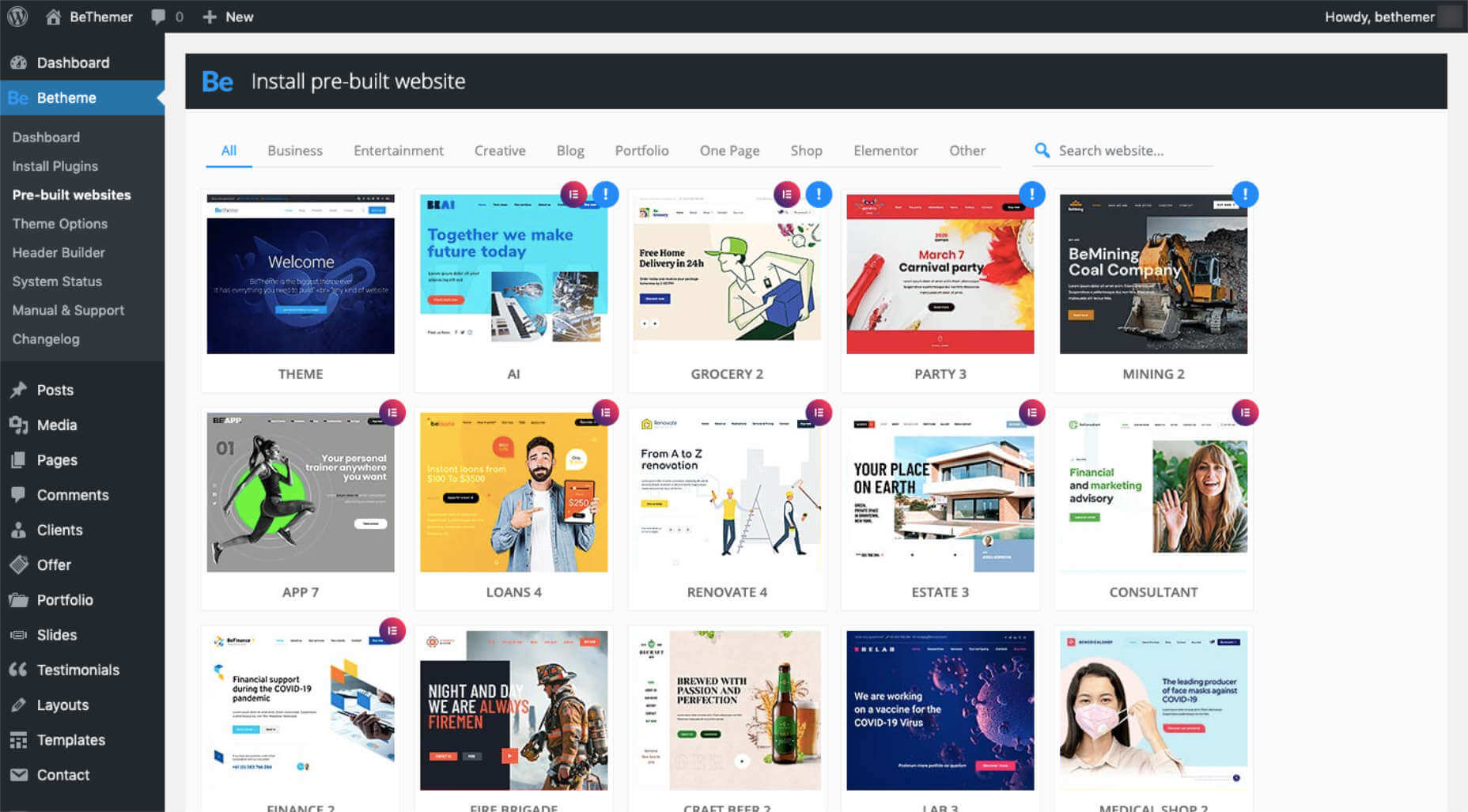
BeTheme has a variety of pre-built websites already set up with Elementor, taking even more of the work out of building a website.

8 BeTheme Pre-Built Websites You Can Edit With Elementor

Why should you care about Elementor’s integration with BeTheme?

It’s because it practically eliminates most of Be’s learning curve, which was already super friendly to use.

And if you spend less time trying to figure things out by using tools that you already know and love, you can get a website up and running much more quickly.

If you’re interested in being able to edit with Elementor, let’s take a better look at what you can do with 8 of our pre-built sites today.

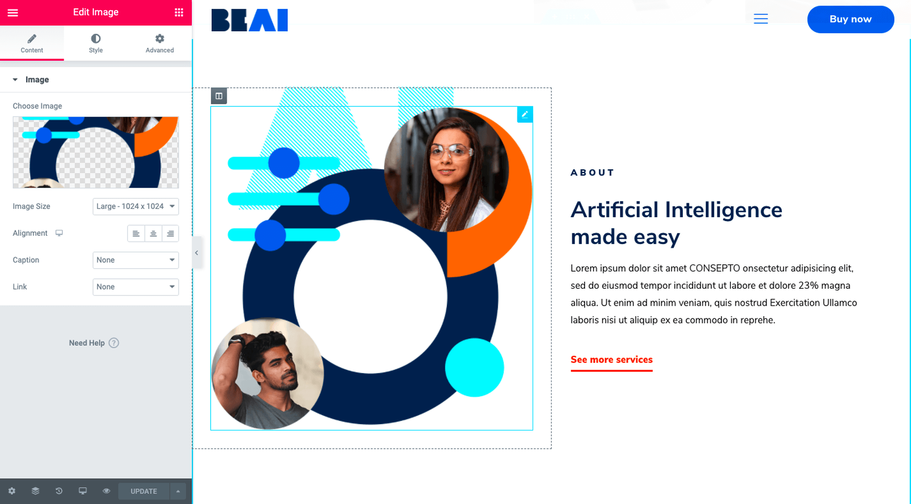
1. BeAI Makes a Complex Subject Easier to Relate to

This is the BeAI pre-built website:

As you can imagine with something like artificial intelligence, it’s not easy for consumers to instantly grasp such a complex concept, technology, or product. But if you design your website so that it looks sharp but still grounded, you can make it feel more inviting.

With the help of Elementor and this pre-built site, it’s very easy to create a sophisticated and relatable design that enables users to focus on the content without getting overwhelmed by the tech.

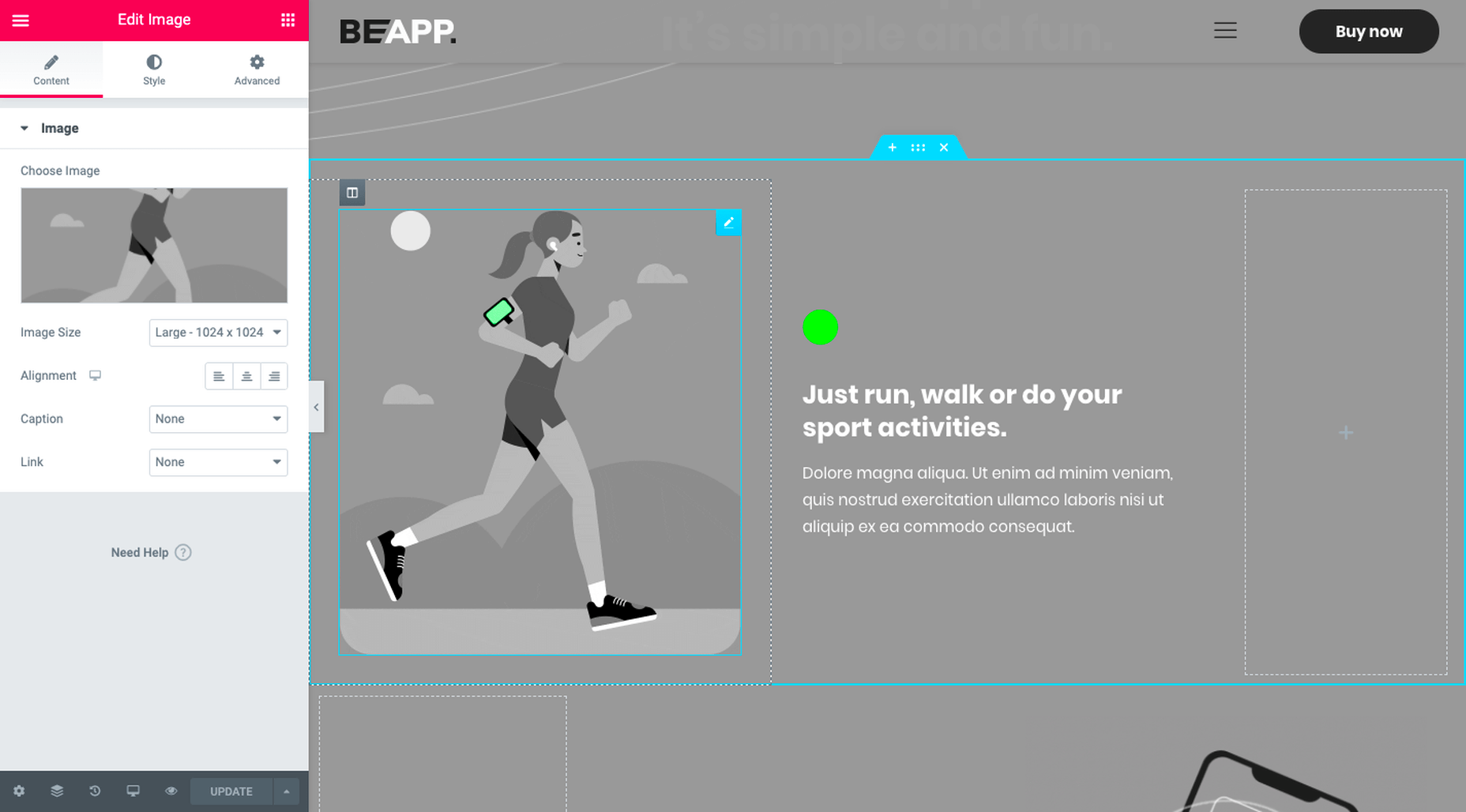
2. BeApp Brings Technology to Life

This is the BeApp pre-built website:

Similar to BeAI, the design takes the focus off the complexity of the technology and instead puts it on what users can accomplish with the app.

In both of the screenshots here, there are animated elements. In the first, you’ll find concentric circles pulsing outwards from the runner’s body. In the second, you’ll see that the device’s screen is glowing. It’s a neat design choice and one that brings something like the act of running (with an app) to life.

3. BeConsultant Adds Subtle Surprises to an Otherwise Predictable Website Visit

This is the BeConsultant pre-built website:

There’s nothing wrong with creating a website that’s minimally designed — especially if the goal is to get visitors to read your message and get in touch. However, sometimes your website needs just a tiny kick to get visitors to take notice at the right time.

In the case of this pre-built site, you can use Elementor’s animated blocks — like the Counter — to add a little movement to an otherwise static website and make sure prospects stay engaged.

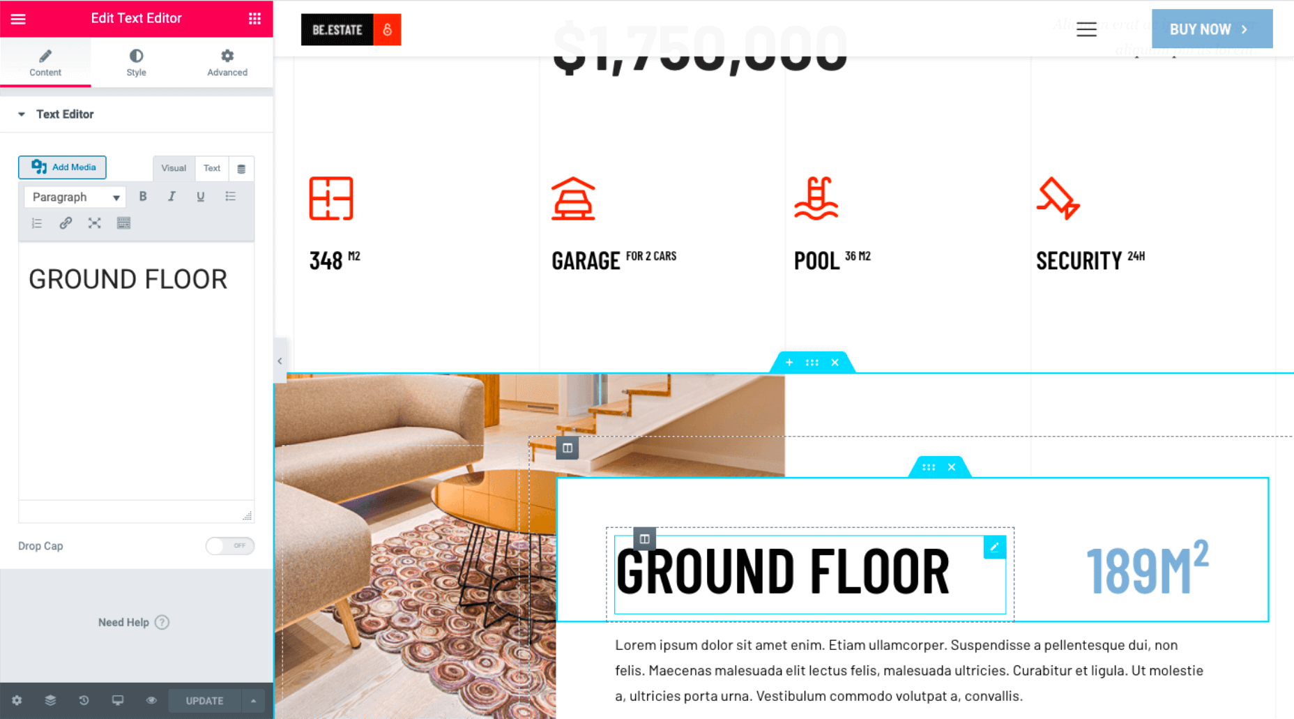
4. BeEstate Provides Visitors With a Tour-Like Experience

This is the BeEstate pre-built website:

When you’re trying to sell a luxury item — or, at the very least, get people to sign up for an in-person look at it — you need your website to have that same next-level feel.

Although an effect like this (which is a layered parallax scroll) might be difficult to reproduce on your own, the pre-built site has done the hard part for you. All you need to do is edit the background with Elementor and swap in the image you want to slowly reveal to visitors as they scroll.

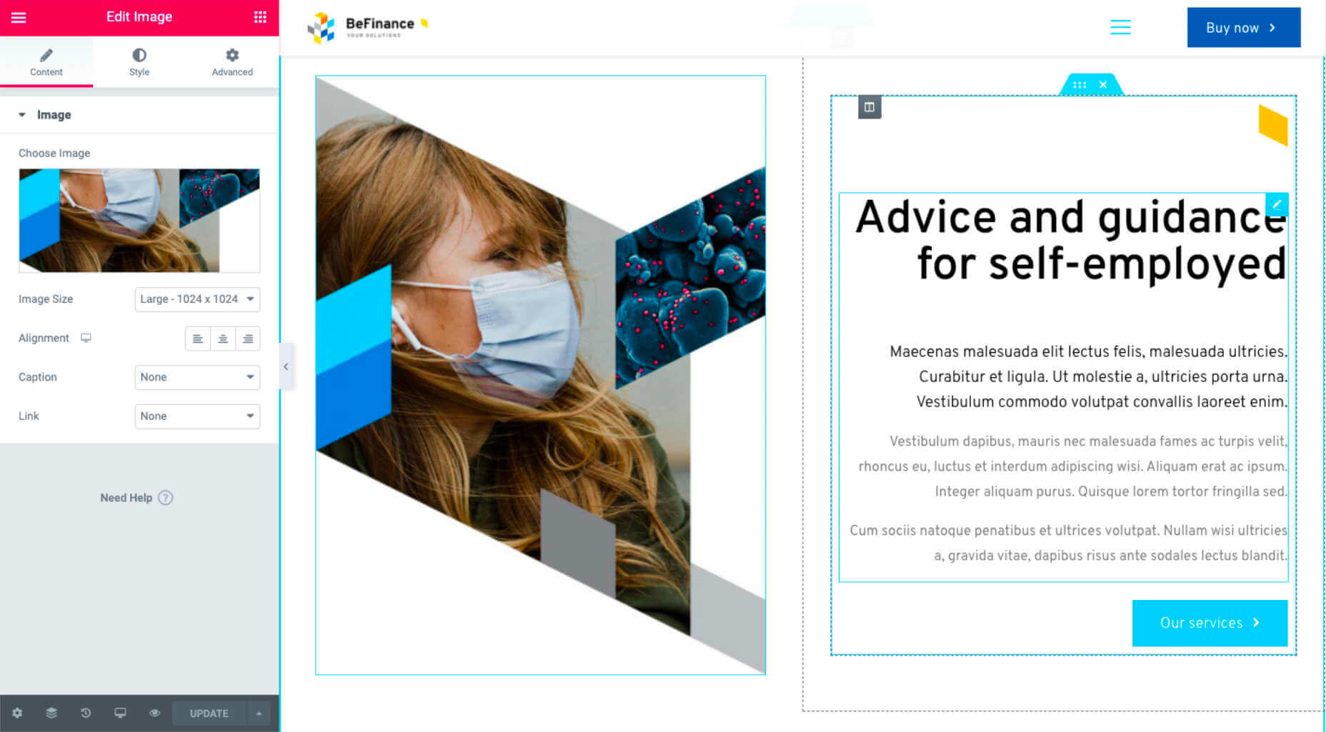
5. BeFinance Translates Stability into Geometry

This is the BeFinance pre-built website:

When building websites for industries where there’s an element of risk involved (like finance), you want to do everything you can to make visitors feel at ease.

Although it’s ultimately up to your client to provide a secure experience or product their customers can trust, there are things you can do with design to help move that along.

In the case of BeFinance, you can see that there are a lot of geometric shapes in play — beyond the typical CTA buttons we usually see. Geometric shapes often convey a sense of stability and security. It might not outright scream “You can trust us!”, but it’ll be there in the background to help reinforce that idea.

6. BeGrocery Gives its Products Room to Shine

This is the BeGrocery pre-built website:

Although this site is built for a grocery delivery service, a website like this would work equally well for any ecommerce or online ordering website.

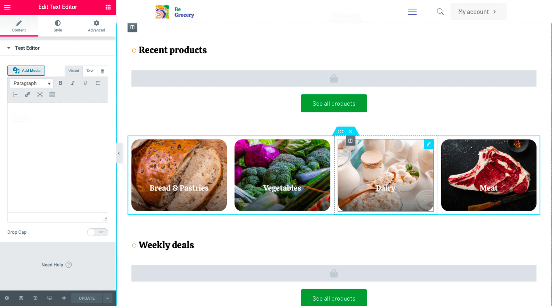
Notice how clean and clear the interface is, making it easy for products to shine through? While BeGrocery has done the work of laying out your products and categories, Elementor makes it easy to edit how your inventory is displayed.

7. BeLoans Calls Visitors’ Attention to Eye-Catching Elements

This is the BeLoans pre-built website:

With a business built around something as sensitive and stressful as requesting a loan, the last thing you want is for your website to create any doubt or fear in the minds of visitors. One of the reasons this particular design works is because of the friendly color palette.

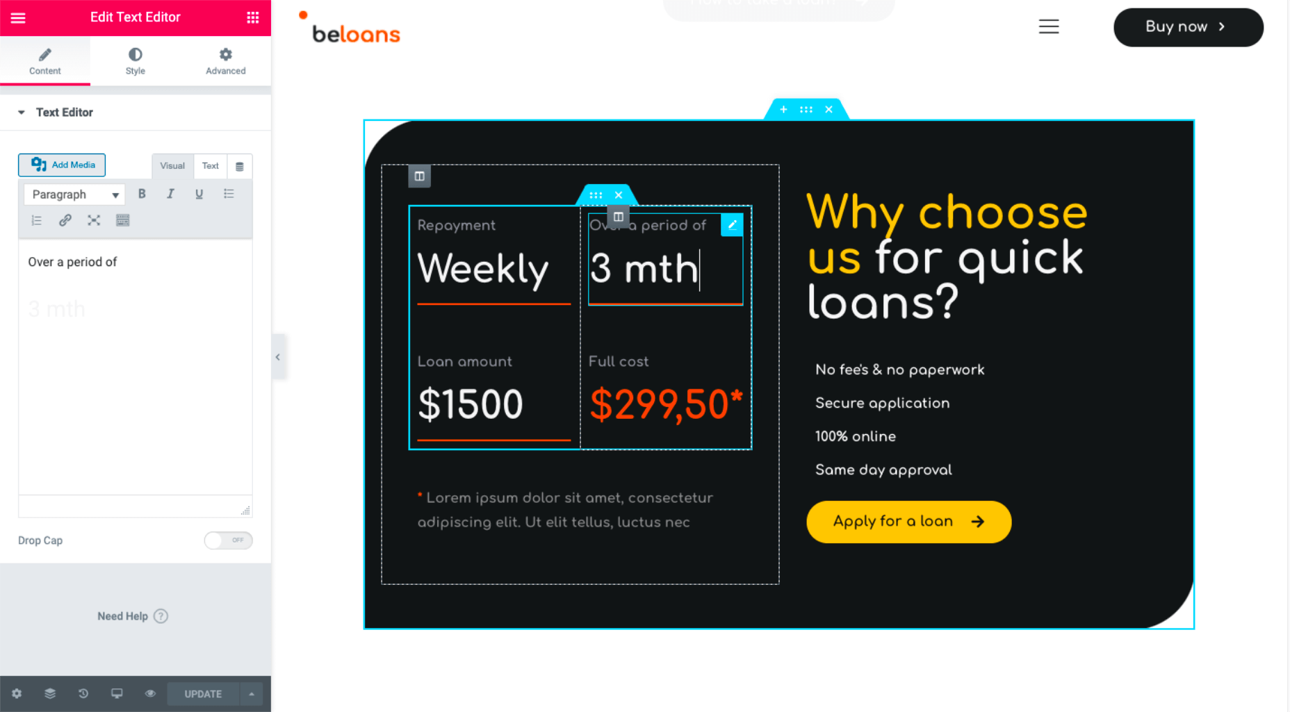
Another reason it works so well is because of how simple it makes the whole thing feel. And if you want to change the terms of the loans, making an edit with Elementor would be a breeze, as you can see in the example above.

8. BeRenovate Gives Visitors a Peek at What’s to Come

This is the BeRenovate pre-built website:

What’s interesting about this design is its fusion between illustrations and photos. Before you look below, take note of the house shapes floating around “From A to Z renovation”.

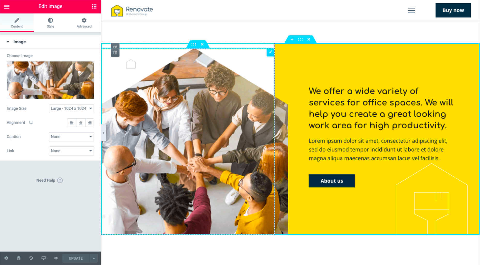
Now, look at this:

Whenever photos are introduced to the page — to give visitors a peek at what’s in store for them — they’re tucked inside those same house-shaped outlines. It’s a creative way to merge a unique illustrative design with real-world photographs that visitors can relate to.

Get your Elementor-compatible BeTheme pre-built website today

There’s a reason why millions of WordPress users (from first-time users to professional web designers) rely on Elementor:

It’s insanely easy to build a website that looks like it took weeks to create.

Thanks to Be’s developers, you won’t even have to worry about the building part. All you need to do is pick the pre-built site you like and then edit it with Elementor according to your client’s needs.

Once you’re signed up for BeTheme, you’ll find your Elementor-compatible BeTheme pre-built sites here:

Just look for the ones with the Elementor icon in the top-right corner.

Sounds too easy, right? It totally is.

[– This is a sponsored post on behalf of BeTheme –]

Source

Categories: Designing, Others Tags:

Better Reducers With Immer

June 16th, 2020 No comments
Smashing Editorial

Better Reducers With Immer

Better Reducers With Immer

Chidi Orji

2020-06-16T12:30:00+00:00
2020-06-18T13:34:20+00:00

As a React developer, you should be already familiar with the principle that state should not be mutated directly. You might be wondering what that means (most of us had that confusion when we started out).

This tutorial will do justice to that: you will understand what immutable state is and the need for it. You’ll also learn how to use Immer to work with immutable state and the benefits of using it.
You can find the code in this article in this Github repo.

Immutability In JavaScript And Why It Matters

Immer.js is a tiny JavaScript library was written by Michel Weststrate whose stated mission is to allow you “to work with immutable state in a more convenient way.”

But before diving into Immer, let’s quickly have a refresher about immutability in JavaScript and why it matters in a React application.

The latest ECMAScript (aka JavaScript) standard defines nine built-in data types. Of these nine types, there are six that are referred to as primitive values/types. These six primitives are undefined, number, string, boolean, bigint, and symbol. A simple check with JavaScript’s typeof operator will reveal the types of these data types.

console.log(typeof 5) // number
console.log(typeof 'name') // string
console.log(typeof (1 

A primitive is a value that is not an object and has no methods. Most important to our present discussion is the fact that a primitive’s value cannot be changed once it is created. Thus, primitives are said to be immutable.

The remaining three types are null, object, and function. We can also check their types using the typeof operator.

console.log(typeof null) // object
console.log(typeof [0, 1]) // object
console.log(typeof {name: 'name'}) // object
const f = () => ({})
console.log(typeof f) // function

These types are mutable. This means that their values can be changed at any time after they are created.

You might be wondering why I have the array [0, 1] up there. Well, in JavaScriptland, an array is simply a special type of object. In case you’re also wondering about null and how it is different from undefined. undefined simply means that we haven’t set a value for a variable while null is a special case for objects. If you know something should be an object but the object is not there, you simply return null.

To illustrate with a simple example, try running the code below in your browser console.

console.log('aeiou'.match(/[x]/gi)) // null
console.log('xyzabc'.match(/[x]/gi)) // [ 'x' ]

String.prototype.match should return an array, which is an object type. When it can’t find such an object, it returns null. Returning undefined wouldn’t make sense here either.

Enough with that. Let’s return to discussing immutability.

According to the MDN docs:

“All types except objects define immutable values (that is, values which can’t be changed).”

This statement includes functions because they are a special type of JavaScript object. See function definition here.

Let’s take a quick look at what mutable and immutable data types mean in practice. Try running the below code in your browser console.

let a = 5;
let b = a
console.log(`a: ${a}; b: ${b}`) // a: 5; b: 5
b = 7
console.log(`a: ${a}; b: ${b}`) // a: 5; b: 7

Our results show that even though b is “derived” from a, changing the value of b doesn’t affect the value of a. This arises from the fact that when the JavaScript engine executes the statement b = a, it creates a new, separate memory location, puts 5 in there, and points b at that location.

What about objects? Consider the below code.

let c = { name: 'some name'}
let d = c;
console.log(`c: ${JSON.stringify(c)}; d: ${JSON.stringify(d)}`) // {"name":"some name"}; d: {"name":"some name"}
d.name = 'new name'
console.log(`c: ${JSON.stringify(c)}; d: ${JSON.stringify(d)}`) // {"name":"new name"}; d: {"name":"new name"}

We can see that changing the name property via variable d also changes it in c. This arises from the fact that when the JavaScript engine executes the statement, c = { name: 'some name' }, the JavaScript engine creates a space in memory, puts the object inside, and points c at it. Then, when it executes the statement d = c, the JavaScript engine just points d to the same location. It doesn’t create a new memory location. Thus any changes to the items in d is implicitly an operation on the items in c. Without much effort, we can see why this is trouble in the making.

Imagine you were developing a React application and somewhere you want to show the user’s name as some name by reading from variable c. But somewhere else you had introduced a bug in your code by manipulating the object d. This would result in the user’s name appearing as new name. If c and d were primitives we wouldn’t have that problem. But primitives are too simple for the kinds of state a typical React application has to maintain.

This is about the major reasons why it is important to maintain an immutable state in your application. I encourage you to check out a few other considerations by reading this short section from the Immutable.js README: the case for immutability.

Having understood why we need immutability in a React application, let’s now take a look at how Immer tackles the problem with its produce function.

Immer’s produce Function

Immer’s core API is very small, and the main function you’ll be working with is the produce function. produce simply takes an initial state and a callback that defines how the state should be mutated. The callback itself receives a draft (identical, but still a copy) copy of the state to which it makes all the intended update. Finally, it produces a new, immutable state with all the changes applied.

The general pattern for this sort of state update is:

// produce signature
produce(state, callback) => nextState

Let’s see how this works in practice.

import produce from 'immer'

const initState = {
  pets: ['dog', 'cat'],
  packages: [
    { name: 'react', installed: true },
    { name: 'redux', installed: true },
  ],
}

// to add a new package
const newPackage = { name: 'immer', installed: false }

const nextState = produce(initState, draft => {
  draft.packages.push(newPackage)
})

In the above code, we simply pass the starting state and a callback that specifies how we want the mutations to happen. It’s as simple as that. We don’t need to touch any other part of the state. It leaves initState untouched and structurally shares those parts of the state that we didn’t touch between the starting and the new states. One such part in our state is the pets array. The produced nextState is an immutable state tree that has the changes we’ve made as well as the parts we didn’t modify.

Armed with this simple, but useful knowledge, let’s take a look at how produce can help us simplify our React reducers.

Writing Reducers With Immer

Suppose we have the state object defined below

const initState = {
  pets: ['dog', 'cat'],
  packages: [
    { name: 'react', installed: true },
    { name: 'redux', installed: true },
  ],
};

And we wanted to add a new object, and on a subsequent step, set its installed key to true

const newPackage = { name: 'immer', installed: false };

If we were to do this the usual way with JavaScripts object and array spread syntax, our state reducer might look like below.

const updateReducer = (state = initState, action) => {
  switch (action.type) {
    case 'ADD_PACKAGE':
      return {
        ...state,
        packages: [...state.packages, action.package],
      };
    case 'UPDATE_INSTALLED':
      return {
        ...state,
        packages: state.packages.map(pack =>
          pack.name === action.name
            ? { ...pack, installed: action.installed }
            : pack
        ),
      };
    default:
      return state;
  }
};

We can see that this is unnecessarily verbose and prone to mistakes for this relatively simple state object. We also have to touch every part of the state, which is unnecessary. Let’s see how we can simplify this with Immer.

const updateReducerWithProduce = (state = initState, action) =>
  produce(state, draft => {
    switch (action.type) {
    case 'ADD_PACKAGE':
      draft.packages.push(action.package);
      break;
    case 'UPDATE_INSTALLED': {
      const package = draft.packages.filter(p => p.name === action.name)[0];
      if (package) package.installed = action.installed;
      break;
    }
    default:
      break;
    }
  });

And with a few lines of code, we have greatly simplified our reducer. Also, if we fall into the default case, Immer just returns the draft state without us needing to do anything. Notice how there is less boilerplate code and the elimination of state spreading. With Immer, we only concern ourselves with the part of the state that we want to update. If we can’t find such an item, as in the `UPDATE_INSTALLED` action, we simply move on without touching anything else.

The `produce` function also lends itself to currying. Passing a callback as the first argument to `produce` is intended to be used for currying. The signature of the curried `produce` is

//curried produce signature
produce(callback) => (state) => nextState

Let’s see how we can update our earlier state with a curried produce. Our curried produce would look like this:

const curriedProduce = produce((draft, action) => {
  switch (action.type) {
  case 'ADD_PACKAGE':
    draft.packages.push(action.package);
    break;
  case 'SET_INSTALLED': {
    const package = draft.packages.filter(p => p.name === action.name)[0];
    if (package) package.installed = action.installed;
    break;
  }
  default:
    break;
  }
});

The curried produce function accepts a function as its first argument and returns a curried produce that only now requires a state from which to produce the next state. The first argument of the function is the draft state (which will be derived from the state to be passed when calling this curried produce). Then follows every number of arguments we wish to pass to the function.

All we need to do now to use this function is to pass in the state from which we want to produce the next state and the action object like so.

// add a new package to the starting state
const nextState = curriedProduce(initState, {
  type: 'ADD_PACKAGE',
  package: newPackage,
});

// update an item in the recently produced state
const nextState2 = curriedProduce(nextState, {
  type: 'SET_INSTALLED',
  name: 'immer',
  installed: true,
});

Note that in a React application when using the useReducer hook, we don’t need to pass the state explicitly as I’ve done above because it takes care of that.

You might be wondering, would Immer be getting a hook, like everything in React these days? Well, you’re in company with good news. Immer has two hooks for working with state: the useImmer and the useImmerReducer hooks. Let’s see how they work.

Using The useImmer And useImmerReducer Hooks

The best description of the useImmer hook comes from the use-immer README itself.

useImmer(initialState) is very similar to useState. The function returns a tuple, the first value of the tuple is the current state, the second is the updater function, which accepts an immer producer function, in which the draft can be mutated freely, until the producer ends and the changes will be made immutable and become the next state.

To make use of these hooks, you have to install them separately, in addition to the main Immer libarary.

yarn add immer use-immer

In code terms, the useImmer hook looks like below

import React from "react";
import { useImmer } from "use-immer";

const initState = {}
const [ data, updateData ] = useImmer(initState)

And it’s as simple as that. You could say it’s React’s useState but with a bit of steroid. To use the update function is very simple. It receives the draft state and you can modify it as much as you want like below.

// make changes to data
updateData(draft => {
  // modify the draft as much as you want.
})

The creator of Immer has provided a codesandbox example which you can play around with to see how it works.

useImmerReducer is similarly simple to use if you’ve used React’s useReducer hook. It has a similar signature. Let’s see what that looks like in code terms.

import React from "react";
import { useImmerReducer } from "use-immer";

const initState = {}
const reducer = (draft, action) => {
  switch(action.type) {      
    default:
      break;
  }
}

const [data, dataDispatch] = useImmerReducer(reducer, initState);

We can see that the reducer receives a draft state which we can modify as much as we want. There’s also a codesandbox example here for you to experiment with.

And that is how simple it is to use Immer hooks. But in case you’re still wondering why you should use Immer in your project, here’s a summary of some of the most important reasons I’ve found for using Immer.

Why You Should Use Immer

If you’ve written state management logic for any length of time you’ll quickly appreciate the simplicity Immer offers. But that is not the only benefit Immer offers.

When you use Immer, you end up writing less boilerplate code as we have seen with relatively simple reducers. This also makes deep updates relatively easy.

With libraries such as Immutable.js, you have to learn a new API to reap the benefits of immutability. But with Immer you achieve the same thing with normal JavaScript Objects, Arrays, Sets, and Maps. There’s nothing new to learn.

Immer also provides structural sharing by default. This simply means that when you make changes to a state object, Immer automatically shares the unchanged parts of the state between the new state and the previous state.

With Immer, you also get automatic object freezing which means that you cannot make changes to the produced state. For instance, when I started using Immer, I tried to apply the sort method on an array of objects returned by Immer’s produce function. It threw an error telling me I can’t make any changes to the array. I had to apply the array slice method before applying sort. Once again, the produced nextState is an immutable state tree.

Immer is also strongly typed and very small at just 3KB when gzipped.

Conclusion

When it comes to managing state updates, using Immer is a no-brainer for me. It’s a very lightweight library that lets you keep using all the things you’ve learned about JavaScript without trying to learn something entirely new. I encourage you to install it in your project and start using it right away. You can add use it in existing projects and incrementally update your reducers.

I’d also encourage you to read the Immer introductory blog post by Michael Weststrate. The part I find especially interesting is the “How does Immer work?” section which explains how Immer leverages language features such as proxies and concepts such as copy-on-write.

I’d also encourage you to take a look at this blog post: Immutability in JavaScript: A Contratian View where the author, Steven de Salas, presents his thoughts about the merits of pursuing immutability.

I hope that with the things you’ve learned in this post you can start using Immer right away.

Related Resources

  1. use-immer, GitHub
  2. Immer, GitHub
  3. function, MDN web docs, Mozilla
  4. proxy, MDN web docs, Mozilla
  5. Object (computer science), Wikipedia
  6. Immutability in JS,” Orji Chidi Matthew, GitHub
  7. ECMAScript Data Types and Values,” Ecma International
  8. Immutable collections for JavaScript, Immutable.js , GitHub
  9. The case for Immutability,” Immutable.js , GitHub

(ks, ra, il)

Categories: Others Tags:

Adobe CC Updates to Boost Workflow and Collaboration

June 16th, 2020 No comments

Whether Adobe’s focus on collaboration and remote-working was prescient long-term thinking, or if this direction of development is a reaction to the Covid-19 pandemic is unclear; what is clear is that the timing of this release is ideal for the new work environment we find ourselves in.

Adobe CC June Update Highlights

Adobe’s move from an 18-month release cycle, to multiple releases per year thins out the excitement surrounding these updates, but in this one there are some new tools and initiatives to get excited about — particularly if you’re a fan of Photoshop, XD, or Premiere Pro.

Creative Cloud Desktop Update

The Creative Cloud Desktop app ties the whole Creative Cloud suite together. Adobe is transforming it into a place to connect and to learn, as well as managing your documents.

Photoshop Updates

The big news for Photoshop users is a substantially enhanced Select Subject tool. Adobe was lagging behind in this area, with detailed cut-outs requiring hours of manual work to get right. The algorithms governing the tool have been updated, cutting hours off the time it takes to isolate complex shapes like hair, or smoke.

Photoshop also sees the introduction of Local Hue Adjustments. These allow you to localize changes to an image’s color. You could always do this, but now you can do it without multiple masked layers.

If those improvements aren’t enough for you, there’s also tighter Lightroom integration so you can hop back and forth between apps, leveraging the power of both.

XD Updates

XD is fast becoming Adobe’s most important app, if not in terms of sales volume, then for its singular ability to keep pace with rivals like Figma.

This release is XD’s 30th, and it includes a new way of working with layouts: Stacks are CSS Flexbox-style elements that work horizontally or vertically. Stacks are content-aware, with elements repositioning themselves when dragged.

XD version 30 also introduces Design Tokens. Design Tokens are a simple way of labelling a high-level design decision, like a color, so that when the design is exported the developer receives more insight into the designer’s intention.

Expect more XD innovation in the future because the Adobe Fund for Design will now be issuing grants for technical projects, including developing plugins for XD.

Premiere Pro Updates

The big news for Premiere Pro users is the introduction of stock audio to the Adobe Stock Library. This means that for the first time you can trial, and purchase music from within your Premiere Pro editing environment.

Yes, it is just another opportunity to open your wallet. However, the addition of music elevates video to another level, and this new type of content in the Adobe Stock Library is a huge leap forward.

Premier Rush Updates

Not to be outdone, Premiere Rush now has a Sensei-powered auto-reframe tool enabling the app to intelligently crop video.

If you are publishing video for multiple file formats – to post to different social media channels for example – Auto Reframe will intelligently crop the video to the right aspect ratio.

Illustrator Updates

Illustrator is very much the Oliver Twist of the Creative Cloud suite, but even it gets a welcome update.

Illustrator can now save directly to the cloud, and Adobe testing suggests that doing so is up to five times faster than saving to your local drive.

Source

Categories: Designing, Others Tags: