Archive

Archive for June, 2020

Smashing Podcast Episode 18 With Mina Markham: How Can I Learn React?

June 16th, 2020 No comments
Photo of Mina Markham

Smashing Podcast Episode 18 With Mina Markham: How Can I Learn React?

Smashing Podcast Episode 18 With Mina Markham: How Can I Learn React?

Drew McLellan

2020-06-16T05:00:00+00:00
2020-06-16T09:20:31+00:00

In this episode of the Smashing Podcast, we’re talking about learning React. What’s React like to work with, and how can experienced developers get started? I spoke to Mina Markham to find out.

Show Notes

Weekly Update

Transcript

Drew McLellan: She is a front-end architect, conference speaker and organizer, and lover of design systems. Her work on the Pantsuit patent library for Hillary Clinton’s Hillary for America presidential campaign marked a watershed for design systems within the industry and was featured on publications, such as Wired, Fast Company, and Communication Arts. Like many of us, she writes code for a living, currently as a senior engineer at Slack. So we know she’s a talented and forward thinking developer, but did you know she was once mistaken for Patrick Swayze? My smashing friends, please welcome Mina Markham. Hi Mina. How are you?

Mina Markham: I’m smashing.

Drew: Good to hear. Now, sometimes on the Smashing Podcast, we talk to people about the subject that they’re best known for. And sometimes it’s fun just to talk about something a bit tangential. Now, I could chat to you all day about pattern libraries, design systems, the amazing work you’ve done in that particular area, and I could talk to you about subjects that you’ve perhaps spoken about, events, such as the Event Apart, things like art direction. And we could obviously talk about CSS until the cows come home. But you tweeted a few days ago, and I realized that we’re actually both in the same boat in that we’re both experienced front-end engineers and we’re both recently started working with React. So before we get onto React itself, where were you coming to up to this point? Had you been working with other libraries and frameworks for JavaScript development?

Mina: No, actually I’ve been doing mostly vanilla JavaScript for a while. And before that, of course I got into JavaScript. Let me rephrase that. I started working with Java script using jQuery because it made the most sense to me. It was something that was very easily for me to parse to figure out what was happening. And then from there I backtracked to doing just vanilla, plain JavaScript, ESX, and I hadn’t really gotten too much into the framework wars. I had no, like I had no favorite. I had no dog in the fight. I was like, “For you, React, whatever. I don’t really care.” But times change.

Drew: And in this sort of way of working with vanilla JavaScript, because I’ve done a lot of that myself as well. I’ve worked with various frameworks. I’ve done a lot with jQuery back in the day. I worked with YUI, Yahoo User Interface Library. Had you felt many of the pain points that something like React’s architecture tries to address?

Mina: I don’t think I ever had. I spent most of my career making websites versus web apps and things like that. So everything I did was pretty static up to a certain extent. So I never really had to deal with state management, things like that. So the pain points that React attempts to solve I had never really applied to the kind of work that I did.

Drew: Generally speaking, what’s the sort of nature of the projects that you’ve with React so far?

Mina: It was actually only been the one project, which I’m currently working on and I can’t give away too many details because public company and all that good stuff.

Drew: Of course.

Mina: But essentially what I’m trying to do is I’m trying to use React to, it’s a very interactive sort of product where I need people to be able to enter in and save data at a certain state and then manipulate it and generate something else with said data. And that’s just something that it’s not simple DOM manipulation at that point. It really is a lot of more complex, front-end manage of data and managing the state of said data. So there really was no other alternative but to use some kind of library that attempts to solve that problem. I knew I wouldn’t be able to get past with just plain JavaScript. I contemplated maybe handling somethings on the server side, but again, due to the very interactive nature of what I’m working with, it need to be in the client. And so we already use React at Slack for various other things. And so I was like, “Okay, well we just should go ahead and adopt the same thing that the rest of the parent the companies are using and go from there.”

Drew: One of the things that I’m always seems to be a pain point with people picking up React is getting to grips with the tool chain that’s needed to get things working, Webpack being an obvious elephant in the room. Have you had to do much configuration of the tool chain or like me if you had the luxury of teammates doing it for you?

Mina: Oh, I love the infrastructure team at Slack the data. The front-end infrastructure team at Slack, they handled all of that. I didn’t have to think about it. It was great. Because I tried to learn React before in the past. Usually the way I learn best is by actually working and implementing on things. And we use React to build a lot of hillaryclinton.com back in 2016. So it’s not like I’ve never worked with people who use it. It’s just my work never directly needed me to get involved. But that code base was very complex and very sophisticated, and there was so much happening that there’s such a barrier to entry to try to learn anything in there if you didn’t already know how React and Redux and all of that works, which I didn’t. So I wasn’t really effective in learning in that environment.

Mina: Luckily, here I do have people to like take away a little bit more of the complex bits of it. I don’t have to worry about the Webpack config at all. That’s been set up. That’s been tried and tested and ready to go. I am in a similar boat where we also use Redux in addition to React, which I didn’t realize were two different things. I didn’t know which part handled which. Dropping into a code base like that, it was a little disorienting because I didn’t realize that they were all the same thing. I had people who were seasoned React developers telling me, “Oh, we also are using Redux, which makes it a little bit harder for you to really learn what React all can do if you’re starting from scratch.” And I never quite knew what they meant by that because I didn’t know what they were talking about.

Mina: To answer your original question, I am still having a little bit more of a little bit barrier to entry, because it’s not just learning React. I’m having to learn React and also how to use the Redux store. So those two things at the same time can be a little much.

Drew: Yeah, I’ve found exactly the same thing coming into an existing code base as my first React project that uses Redux. And I think as is the nature of any of these sort of technologies when they’re young, they iterate really quickly, and what’s best practice at one point, 6 months later has moved on and there’s a different way of doing things. And when you have a code base that spans many years, you can sometimes have different styles of implementing things in there. It doesn’t always keep sync. And of course, if you’re following a tutorial or whatever to learn, you’re reading books, you’re using resources, they will be in the most modern version of how to do things. And that doesn’t necessarily nit to what you see when you look at an existing, mature product. Is that something you’d experienced at all, or have you managed to keep your code base really up to date?

Mina: I think that is something that I definitely have been experiencing. When I tried to learn how to do React on my own, I looked at various tutorials and things like that. And I noticed, or at least people have told me who have worked who have been working with me that some of the things that we do or kind of anti-pattern or not quite how things work now, because this code base is slightly, well mature us relative, but it’s a few years old. And so there are some ways that I guess are easier to do things than the way we’re doing them currently because this was written years ago. So it’s a little bit of a treadmill trying to keep up with current times and make sure I want to do things the best way, but also I don’t want to break an established code base because I want to play around with stuff.

Drew: Obviously, one of the things with React that people like you and I are coming to it, it can feel a bit jarring as this whole thing with JSX. Are you using JSX in your project?

Mina: We are. I am using JSX.

Drew: Have you made peace with that?

Mina: I fell like a little small piece of me dies every time I open one of those files. It still feels sacrilege to put my HTML in the JavaScript file. I know that’s kind of revolutionary and the whole point, but it just feels off to me that I’m writing my markup in a JavaScript file. I’ve made peace with it, but every time I do it, I’m just like, “…” Separation concerns, it is a thing. I’d like it back, please.

Drew: It’s a valid point, isn’t it? My background when I was starting to work more seriously with JavaScript, and this was probably when I was back at Yahoo, things were very much on the model of server rendered HTML pages and then taking a progressive enhancement approach, layering JavaScript on top to enhance the interface. And if the state of something in the interface needed to change, your code had to know about all the parts of the interface that it needed to update, which obviously leads you to a tightly coupled approach with these big monolithic views where the code you write needs to know about all the other code around it. And I guess that doesn’t really lend itself to a componentized approach which you would take when working with a pattern library or a design system, which is more to your area of particular expertise. I guess, React lends itself more to that approach, does it?

Mina: I think it does, especially with the being able to couple the very specific CSS to one JSX or one React component. And so that way it makes it much easier to separate or only take what you need for the library and leave the rest, whereas a pattern library or design system that attempts to do something more monolithic with just one big style CSS file or something like that, it does make it a lot difficult. You kind of have to take it all or nothing. So I do appreciate that React allows us to do more individualized, more componentized way of development, even if I still wish there was a way for me to do truly separate my presentation layer and my content layer from my interactivity layer. But maybe that’s just me being a little bit old school in that sense.

Drew: I definitely feel the pain there. The idea is that, come and correct me if I’m wrong, my understanding is that rather than separating the technologies, the CSS, and the JavaScript, and the HTML, it’s separating the functionality. So everything that is one component all exist together-

Mina: Yeah.

Drew: … which I guess is useful if that component then is no longer needed. You can just delete it, and it’s gone, and it doesn’t leave a footprint around your app. That’s not always the case with CSS though. How are you working with CSS with React? Have You looked at things like styled-components or anything like that?

Mina: No, we haven’t. I’ve heard of styled-components, but I’ve never quite really investigated them very fully to be perfectly honest. So the way that we’re working with CSS with React is we write Less, and we just have a Less file attached to each individual component that gets imported into that component. And then it gets bonded up via Webpack and served to the client.

Drew: Are you using a system like BEM or something to turn namespace?

Mina: Yeah. We’re using BEM for namespacing, although the adherence to it is kind of varied depending on who’s writing what. But we try to use a BEM namespacing pattern to make it a little bit clearer what the purpose of each individual class and component is.

Drew: And does that seem to be working successfully for you?

Mina: I think so. Occasionally it kind of has the same old problem of I sometimes don’t know how to name something. After a while daily things has always and will always be a difficult thing for master. So that’s the only issue I have with is I occasionally I have no idea what I should call a particular component.

Drew: Definitely. That’s a constant battle, isn’t it, how to out the name things?

Mina: Yeah.

Drew: I always end up when working on a new feature or something like that, you give a component and all the classes and everything the name that the feature has got at the moment. And then by the time you come to launch, it’s been renamed something else. So you have references to the old name in the code and the interface has the new name. And …

Mina: I try to always name things based on the function or the purpose of it versus things that are a little bit more ephemeral, because it’s less likely that the actual purpose of this component will change. I forgot to mention, but in addition to using BEM, I guess we use BEMITs if you’re familiar with that. It’s basically the ITCSS plus BEM, both of which were created by Harry Roberts. So I use Hungarian notation to denote whether or not something is a component, versus a layout object, versus like a larger pattern comprised of multiple components. And then from there we use the BEM convention to signify like the block element and all that.

Drew: And have you had to do much refactoring and deleting of components and things in your code base and had to deal with the issue of CSS getting left behind?

Mina: Yeah. So the non-React part of my job, of maintaining slack.com is that’s all just a bunch of Less files that are being compiled for CSS. And I guarantee you, there’s a lot of zombie code in there, because we definitely iterate above things a lot in the time I’ve been there. And we don’t always have time to go back and do the cleanup versus when we redesign a page or something. So it’s overdue for an audit, I’ll say that.

Drew: This is something that we’ve just been looking at in our React project, looking at how we approach CSS. At the moment, we have a few big, global CSS files for the whole of the app, and we do get this situation where our bundle size is just growing, and growing, and growing and never gets any smaller, even though things do get removed. So we’ve been looking at things like styled-components, Tailwind as well is another option that we’re really seriously considering. Have you looked at tailwind much?

Mina: I haven’t looked at it a lot. I’ve been curious about it, but again, I’ve never really had time to dig in to actually see if it’s something that I want to try to bring into our code base.

Drew: I was actually quite surprised, because like you, I’m a bit old school with how to do these things. I like nice separation of concerns. And I like to write my CSS in CSS, and of course the approach with Tailwind is you have all these class names, which feel a bit like inline styles that you’re applying. And if it feels dirty.

Mina: Yeah.

Drew: And I volunteered within the team, we each which took a technology to investigate if they’d be a good fit for our problems, and I volunteered to look at Tailwind because I was absolutely certain I was going to hate it.

Mina: No, no.

Drew: But it turns out I actually think it solves a lot of problems. I was quite impressed.

Mina: Yeah. I’ve sort of come around to a similar way of thinking, because I in the past would much prefer to have one class comprise all of the styles I needed for a particular component and not do a class per property, as I believe Tailwind does or languages like it do. For the similar reasons, it felt very much like, “Well, I’m just running inline CSS at this point. Why would I do this?” But as I’ve been developing more and more, inside of our Slack design system, I created a bunch of what I call utility classes that do things like add a bit of margin with a pattern. I’ve noticed that more and more, I’m using those classes in addition to the component classes. So I’m like, “Okay, well maybe I should revisit this whole to doing a CSS as a one declaration at a time.” I don’t know if I’d go that far, but it’s definitely worth considering.

Drew: Computing seems to flip flop in terms of trends between thin clients and fat clients solutions. We started with mainframes with terminals, and then the PC era with windows and office and all these sort of big applications. And they were all getting really slow, and than the web came along, and that was just a browser, and all the work was being done on the server. And it was all fast and snappy again. And now we’ve gone back to putting all that work back in the browser with everything being done with JavaScript, things like React and the JAMstack approach where we’re back to a sort of fat client. I sometimes worry that we’re asking too much of the browser. Is this a mistake? Are we asking too much of the browser trying to do all this stuff in React?

Mina: I want to say yes with the caveat of, again, my experience is very much contained to mostly static websites. I don’t do a lot of product development. So maybe in that realm, this makes more sense. But from my perspective, I feel like we’re a lot of the times using a hatchet when we just need a butter knife. I don’t know why we need put all this in the browser, put so much work and so much pressure on the client. I feel like we could do this much simpler. One of the things that always made me a little hesitant to use React, or I say hesitant, but what I mean when it made me viscerally angry and I actively opposed, was when I would go to a website and literally nothing would render because there was one error or something, Like, “Really? The entire page is broken because one function broke down?”

Mina: It just kind of annoyed me that a lot of times it was an all or nothing approach. One of the talks that I gave at AEA in the past and other places in the past was talking about how to include progressive enhancement and not just your development, but also of art direction and design of sites. And I would point out specifically examples of websites that didn’t do progressive enhancement or any kind of graceful degradation. It was like either you have the JavaScript running in the browser or you get absolutely nothing. And it would be like just a simple site that represent information about the history of web design, which was one of the sites actually talked about, the history of web design from like 1990 until now. It was a beautiful website with lots of timelines, animation of things. But it also could have been rendered statically with just a list. There were steps in between showing nothing and showing that beautifully enhanced experience that I think got lost because of the way we’ve been approaching modern web development now.

Drew: So would you say there are absolutely some categories of projects that suit a solution like React and some where it really shouldn’t be used and you should be using more traditional methods?

Mina: I think that if your site particularly is mostly static, it was just serving up information, I guess I don’t understand why you need a project like React to render something that doesn’t have a lot of interaction beyond just DOM manipulation. I guess I don’t see what benefit you get from that. Again, I may not be working on the appropriate projects. I may not just have seen or found that use case, but I’m having a hard time seeing if it’s just mostly static site, presenting content, not a lot interaction, not a lot of interaction beyond manipulated DOM and doing animations. I don’t see how having a React library helps you accomplish that goal.

Drew: It’s interesting because I’m not bad talking it because I haven’t actually used it, but I see a lot of Gatsby projects and Gatsby being a static site generator that uses a React front-end in it. And I see all the examples of the themes and things they have available are all content based sites, or blogs, and a recipe site, and a portfolio, and these sort of things. And there’s something I think actually that this isn’t necessarily the right fit for something like React. Why isn’t this being statically rendered and then progressively enhance?

Mina: Yeah.

Drew: It’s not software.

Mina: Yeah. I haven’t actually used Gatsby either. I’ve heard plenty of great things about it, but that’s probably one of the examples I would think of where I’m like, “Okay, I guess I’m just not seeing why that tool is necessary to do that particular job.” Again, I don’t know. Maybe it’s just because more people are comfortable writing in React when they are writing new something else, and it’s just providing a tool that meets people where they are. I’ve heard great things about static site generators that use React for people who have used them and love them, but it’s not a use case that I would have immediately been like, “Oh, that makes sense.”

Drew: It seems like there’s always been this battle between what we would call a website and what you might call a web app. And the chasm between the two seems to be getting wider, and wider, and wider, whereas a progressive enhancement approach tries to bridge the gap by taking something static and adding JavaScript and adding interactivity. It seems that things like React are ideally suited for software that you’re running in the browser. Would you agree with that?

Mina: I would definitely agree with that because it feels like it’s was built for that type of environment; it was built for running software. It was built by Facebook for Facebook. So it was built for a product. It was built for running whatever you call a web app in the browser and not necessarily for the type of work that, as I mentioned, I’m used to doing. So I think in those scenarios, it definitely makes a lot of sense to use it if you’re building a more complex, more sophisticated piece of software that’s meant to run inside of a browser. But if you’re building a marketing site or whatever, I guess I would still struggle to see why it will be necessary there.

Drew: So are we giving people permission to still build decent, statically rendered websites?

Mina: I would love to see more of that happen. I feel like that’s kind of gotten lost and it’s sort of lost its, if it ever was cool or whatever. I feel like we’ve lost that part of web development. It’s so funny: you and I both said that we’re kind of old school, and I laugh at that because I’ve actually been doing web development for, what, six years now? How am I old school? It hasn’t been that long for me. And yet somehow I’m part of the old guard who doesn’t like new and shiny things. I don’t get it.

Drew: So in fact React has actually existed for the whole time that you’ve been a web developer.

Mina: Maybe I just have an old soul. I don’t know.

Drew: I think that’s probably the case. I’ve not looked personally at, there are service side rendered approaches you can take with React apps. Have you experienced any of those?

Mina: I haven’t experienced any them. I briefly looked into them for the project I’m currently working on, because I feel like there’s parts of the operation that would work better on a server versus in the clients. But I think because of my limited knowledge and the fact that the code base is a little more complicated than I can understand, I wasn’t quite able to figure out how to make that part work. I would love to figure it out eventually, but I spent a day digging into it. I was like, “You know what? I’m not grokking this away I need to be. So I’m just going to back up and take a different route.”

Drew: Yeah. I think we’ve all been there.

Mina: Yeah. I went down a path. I was like, “Oh, this is dark and scary. Let’s reverse. Let’s reverse.”

Drew: Step away from the code.

Mina: Yes.

Drew: So you’ve been very diplomatic and polite about React so far. I sense that there’s some tension bubbling under the surface a bit. Come on. Tell us what you really feel.

Mina: I have been polite and diplomatic, mostly because the Reacts fan base can be a little mean sometimes, and I would rather not have them come for me. So please, React is great. It’s wonderful. Use it for what you want to use it for. I kid, but even that tweet that you mentioned at the beginning of this podcast where I think what you said is that I don’t hate it. I don’t love it, but I don’t hate it. Even that statement, I got people, there was no vitriol, but it was more they where ready to leap to the defense and say, “Well, I love it because X, Y, Z.” I’m like, “I didn’t say it was bad. I just said that I’m meh about the whole thing.” But apparently being meh is not okay. I have to love it.

Mina: So that’s why I probably have been a bit more diplomatic than I would ordinarily be, just because I don’t want people to think that I’m bad mouthing it, because I’m not. It has a place in more web development. It serves a function. It does its job well. People love it. It’s just not a tool that I’ve ever had or wanted to use until now.

Drew: Yeah. Things can get very tribal, can’t they, with people feeling like they have to take one side or another, and you’re either absolutely for something or absolutely against something? And I’m not sure it serves a good purpose, and I don’t think it really moves us forward as an industry and as a community to do that.

Mina: Yeah. It’s really odd. It’s fascinating to watch from just a sociological standpoint, but it’s often just really like weird to observe. It’s like I’m not allowed to just be, like I said, neutral about certain things. I have to have a strong opinion, which is I don’t think healthy. What’s the term, “Strong opinions, loosely held?” That’s kind of the way I go about things. I feel strongly about certain things, but it’s not like you can’t change my mind. Where I feel like some people, their identity gets wrapped up into certain aspects of it ,that if you are not for whatever they’ve chosen to identify with, it’s a personal slight versus just, I don’t care about this particular topic, or tool, or whatever.

Drew: Yes. I don’t know if it’s made worse by the fact that we all are sort of tending to specialize a lot more in particular parts of the stack. And I know there are people who are React developers. They would call themselves a React developer because that’s what they work in. And they wouldn’t necessarily write any vanilla Java script or wouldn’t use Vue or whatever. React is their world. So I guess it almost feels like an attack on their entire career to say, “I don’t like React.” Well, they’re really invested in making you like React or whatever the technology may be.

Mina: I will admit to being one of those people in the past. Actually, probably it was mostly about SASS, I believe. I was very much on the team of doing SASS as a preprocessor and all other preprocessors are trash. I don’t want to talk about them. I don’t want to deal with them. And I realized that was a very narrow way to look at things. Use the appropriate tool for the job. Whatever makes you more productive, that’s the right tool. It doesn’t really matter what it is.

Drew: Are there any technologies that we work with that don’t have that sort of tribal feel? Is there anything that people are just happy to use or not use? I can’t think of anything.

Mina: Wow. No one has opinions about markup, actually.

Drew: No.

Mina: I feel like no one has opinions about like actual HTML and just markup, just like, “It’s there.” They use it. But people have strong opinions about CSS and how it’s either terrible or wonderful, and the preprocessor wars that don’t really happen all that much anymore, and then of course, all of the tribalism within the various JavaScript libraries.

Drew: So you would say your journey so far with React is still just, “It’s a tool. It does its job?”

Mina: It went from a curiosity to active and visceral dislike because of how prevalent it was and how I unnecessary I thought that that prevalence was to meh. I’m now with meh, which again does not mean I hate it. It just means …

Drew: I think that’s a good place to be. I think we’re probably all sort of stronger as technologists if we understand the value of a particular technology for its purpose. We can evaluate what is good for what circumstance and pick the right tool for the job.

Mina: Yeah. And that’s kind of where I’ve arrived at this point in my career where I don’t get really invested in any particular language, or technology, or whatever, because it’s like, “Just whatever tool is most appropriate for what you’re trying to do, then use that.” I’ve learned that there’s a place for everything; there’s a time and a place to do everything. And up until recently, there was no real time or place for me to use this React librarian, and now there is.

Drew: I think that’s a good place to be. So I’ve been learning all about React lately as you have in the day job. Is there anything else that you’ve been learning about lately?

Mina: I’ve actually learned ironically, which is I think another language that has originated at Facebook, I’ve been doing a lot of Hack development, mostly because that’s what I use at Slack, at my day job. Learning Hack paved the way for me to get more comfortable using React because they follow very similar patterns, except one is server side and one’s not. So that, along with just in general, I’ve been learning more about the back-end and how that works for various different reasons. And I’ve been stretching myself for the past couple years and getting more and more outside of my comfortable zone. Design systems, libraries, that’s very much my world, and I feel very good and comfortable in that world. But I’m stepping outside of it and doing a lot more server side logic, and API development, and data modeling, and all of that. I’ve been doing a lot on that for the past year as well.

Drew: I find that the more I understand about the whole stack about back-end stuff in front-end stuff, each one helps my knowledge of the other. I find I write better front-end code by having written back-end code and understanding-

Mina: Yeah. I think I feel the same way. Now that I have a better idea of, like we said, the whole stack of how we get from the data to the end client. I find that I’m thinking about the entire pipeline no matter what part I’m actually working in. I’m thinking about what’s the best way to structure this API so that when I get to the template, I don’t have to do so much manipulating of the data that I receive on that end of it. It’s definitely made me overall a better engineer, I feel like it

Drew: If you, dear listener, would like to hear more from Mina, you can follow her on Twitter where she’s @MinaMarkham and find her personal site at mina.codes. Thanks for joining us today, Mina. Do you have any parting words?

Mina: Have a smashing night?

Drew: Great.

(il)

Categories: Others Tags:

What is Developer Experience (DX)?

June 15th, 2020 No comments

Developer Experience¹ is a term² that has one somewhat obvious meaning — the experience of developers — but it eludes definition in the sense that people invoke it at different times for different reasons referring to different things. For instance, our own Sarah Drasner’s current job title is “VP of Developer Experience” at Netlify. But a job title just one way the term is used. Let’s dig in a bit and apply it to the different ways people think about and use the term.

People think of specific companies.

I hear DX and Stripe together a lot. That makes sense. Stripe is a company almost exclusively for developers. They are serious about providing a good experience for their customers (developers), hence “developer experience.” Just listen to Suz Hinton talk about “friction journals”, which is this idea of using a product (like Stripe) and noting down every single little WTF moment, confusion, and frustration so that improvements can be made:

Netlify is like Stripe in this way, as is Heroku, CodePen, and any number of companies where the entire customer base is developers. For companies like this, it’s almost like DX is what user experience (UX) is for any other company.

People think of specific technologies.

It’s common to hear developer experience invoked when comparing technologies. For instance, some people will say that Vue offers a better developer experience than React. (I’m not trying to start anything, I don’t even have much of an opinion on this.) They are talking about things like APIs. Perhaps the state is more intuitive to manage in one vs. the other. Or they are talking about features. I know Vue and Svelte have animation helpers built-in while React does not. But React has hooks and people generally like those. These are aspects of the DX of these technologies.

Or they might be speaking about the feeling around the tools surrounding the core technology. I know create-react-app is widely beloved, but so is the Vue CLI. React Router is hugely popular, but Vue has a router that is blessed (and maintained) by the core team which offers a certain feeling of trust.

> vue create hello-world
> npx create-react-app my-app

I’m not using JavaScript frameworks/libraries as just any random example. I hear people talk about developer experience as it relates to JavaScript more than anything else — which could just be due to the people who are in my circles, but it feels notable.

People think of the world around the technology.

Everybody thinks good docs are important. There is no such thing as a technology that is better than another but has much worse docs. The one with the better docs is better overall because it has better docs. That’s not the technology itself; that’s the world around it.

Have you ever seen a developer product with an API, and when you view the docs for the API while logged in, it uses API keys and data and settings from your own account to demonstrate? That’s extraordinary to me. That feels like DX to me.

Airtable docs showing me API usage with my own data.

“Make the right thing easy,” notes Jake Dohm.

That word, easy, feels highly related to DX. Technologies that make things easy are technologies with good DX. In usage as well as in understanding. How easily (and quickly) can I understand what your technology does and what I can do with it?

What the technology does is often only half of the story. The happy path might be great, but what happens when it breaks or errors? How is the error reporting and logging? I think of Apollo and GraphQL here in my own experience. It’s such a great technology, but the error reporting feels horrendous in that it’s very difficult to track down even stuff like typos triggering errors in development.

What is the debugging story like? Are there special tools for it? The same goes for testing. These things are fundamental DX issues.

People think of technology offerings.

For instance, a technology might be “good” already. Say it has an API that developers like. Then it starts offering a CLI. That’s (generally) a DX improvement, because it opens up doors for developers who prefer working in that world and who build processes around it.

I think of things like Netlify Dev here. They already have this great platform and then say, here, you can run it all on your own machine too. That’s taking DX seriously.

One aspect of Netlify Dev that is nice: The terminal command to start my local dev environment across all my sites on Netlify, regardless of what technology powers them, is the same: netlify dev

Having a dedicated CLI is almost always a good DX step, assuming it is well done and maintained. I remember WordPress before WP-CLI, and now lots of documentation just assumes you’re using it. I wasn’t even aware Cloudinary had a CLI until the other day when I needed it and was pleasantly surprised that it was there. I remember when npm scripts started taking over the world. (What would npm be without a CLI?) We used to have a variety of different task runners, but now it’s largely assumed a project has run commands built into the package.json that you use to do anything the project needs to do.

Melanie Sumner thinks of CLIs immediately as core DX.

People think of the literal experience of coding.

There is nothing more directly DX than the experience of typing code into code editing software and running it. That’s what “coding” is and that’s what developers do. It’s no wonder that developers take that experience seriously and are constantly trying to improve it for themselves and their teams. I think of things like VS Code in how it’s essentially the DX of it that has made it so dominant in the code editing space in such a short time. VS Code does all kinds of things that developers like, does them well, does them fast, and allows for a very wide degree of customization.

TypeScript keeps growing in popularity no doubt in part due to the experience it offers within VS Code. TypeScript literally helps you code better by showing you, for example, what functions need as parameters, and making it hard to do the wrong thing.

Then there is the experience outside the editor, which in the browser itself. Years ago, I wrote Style Injection is for Winners where my point was, as a CSS developer, the experience of saving CSS code and seeing the changes instantly in the browser is a DX you definitely want to have. That concept continues to live on, growing up to JavaScript as well, where “hot reloading” is goosebump-worthy.

The difference between a poor developer environment (no IDE help, slow saves, manual refreshes, slow pipelines) and a great developer environment (fancy editor assistance, hot reloading, fast everything) is startling. It essentially makes you a better and more productive programmer.

People compare it to user experience (UX).

There is a strong negative connotation to DX sometimes. It happens when people blame it for it existing at the cost of user experience.

I think of things like client-side developer-only libraries. Think of the classic library that everyone loves to dunk: Moment.js. Moment allows you to manipulate dates in JavaScript, and is often used client-side to do that. Users don’t care if you have a fancy API available to manipulate dates because that is entirely a developer convenience. So, you ship this library for yourself (good DX) at the cost of slowing down the website (bad UX). Most client-side JavaScript is in this category.

Equally as often, people connect developer experience and user experience. If developers are empowered and effective, that will “trickle down” to produce good software, the theory goes.

Worst case, we’re in a situation where UX and DX are on a teeter totter. Pile on some DX and UX suffers on the other side. Best case, we find ways to disentangle DX and UX entirely, finding value in both and taking both seriously. Although if one has to win, certainly it should be the users. Like the HTML spec says:

In case of conflict, consider users over authors over implementors over specifiers over theoretical purity.

People think about time.

How long does a technology take to adopt? Good DX considers this. Can I take advantage of it without rewriting everything? How quickly can I spin it up? How well does it play with other technologies I use? What is my time investment?

This kind of thing makes me think of some recent experience with Cloudflare Workers. It’s really cool technology that we don’t have time to get all into right here, but suffice to say it gives you control over a website at a high level that we often don’t think about. Like what if you could manipulate a network request before it even gets to your web server? You don’t have to use it, but because of the level it operates on, new doors open up without caring about or interfering with whatever technologies you are using.

Not only does the technology itself position itself well, the DX of using it, while there are some rough edges, is at least well-considered, providing a browser-based testing environment.

A powerful tool with a high investment cost, eh, that’s cool. But a powerful tool with low investment cost is good DX.

People don’t want to think about it.

They say the best typography goes unnoticed because all you see is the actual thing it’s telling you. That can be true of developer experience. The best DX is that you never notice the tools because they just work.

Good DX is just being able to do your job rather than fight with tools. The tools could be your developer environment, it could be build tooling, it could be hosting stuff, or it could even be whatever APIs you are interfacing with. Is the API intuitive and helpful, or obtuse and tricky?


Feel free to keep going on this in the comments. What is DX to you?

  1. Are we capitalizing Developer Experience? I’m just gonna go for it.
  2. Looks like Michael Mahemoff has a decent claim on coining the term.

The post What is Developer Experience (DX)? appeared first on CSS-Tricks.

Categories: Designing, Others Tags:

My Flywheel Landing Page

June 15th, 2020 No comments

Flywheel is my WordPress hosting partner here. I use Local every day for my WordPress local development environment and use their hosting for all my WordPress sites as part of my whole flow, so I’m glad they aren’t just a sponsor but a product I use and like.

Last November some of their crew came out and shot some photos and video with me, which was cool and fun and made me feel famous lolll.

They ultimately built a landing page from it, which is super well done!

Just look at me being all famous.

Check out some photos that Kimberly Bailey took while the gang was here.

And the video!

We sat down with @chriscoyier (CSS-Tricks, CodePen, and Shop Talk Pro) to chat about his decision to move his sites to Flywheel. ?? pic.twitter.com/zh5zPojTOm

— Flywheel (@HeyFlywheel) May 20, 2020

Anyway feel free to check out that landing page and if your company is headed to make a WordPress hosting decision soon, might as well use my referral link 😉

The post My Flywheel Landing Page appeared first on CSS-Tricks.

Categories: Designing, Others Tags:

Adding a Custom Welcome Guide to the WordPress Block Editor

June 15th, 2020 No comments
Screenshot showing a modal on top of the WordPress block editor welcoming users to the editor for the first time.

I am creating a WordPress plugin and there is a slight learning curve when it comes to using it. I’d like to give users a primer on how to use the plugin, but I want to avoid diverting users to documentation on the plugin’s website since that takes them out of the experience.

What would be great is for users to immediately start using the plugin once it’s installed but have access to helpful tips while they are actively using it. There’s no native feature for something like this in WordPress but we can make something because WordPress is super flexible like that.

So here’s the idea. We’re going to bake documentation directly into the plugin and make it easily accessible in the block editor. This way, users get to use the plugin right away while having answers to common questions directly where they’re working.

My plugin operates through several Custom Post Types (CPT). What we’re going to build is essentially a popup modal that users get when they go to these CPTs.

The WordPress block editor is built in React, which utilizes components that can be customized to and reused for different situations. That is the case with what we’re making — let’s call it the component — which behaves like a modal, but is composed of several pages that the user can paginate through.

WordPress itself has a component that displays a welcome guide when opening the block editor for the first time:

WordPress displays a modal with instructions for using the block editor when a user loads the editor for the first time.

The guide is a container filled with content that’s broken up into individual pages. In other words, it’s pretty much what we want. That means we don’t have to re-invent the wheel with this project; we can reuse this same concept for our own plugin.

Let’s do exactly that.

What we want to achieve

Before we get to the solution, let’s talk about the end goal.

The design satisfies the requirements of the plugin, which is a GraphQL server for WordPress. The plugin offers a variety of CPTs that are edited through custom blocks which, in turn, are defined through templates. There’s a grand total of two blocks: one called “GraphiQL client” to input the GraphQL query, and one called “Persisted query options” to customize the behavior of the execution.

Since creating a query for GraphQL is not a trivial task, I decided to add the guide component to the editor screen for that CPT. It’s available in the Document settings as a panel called “Welcome Guide.”

Screenshot showing the WordPress editor with the document settings panel open in the right column. a welcome guide tab is highlighted in the settings.

Crack that panel open and the user gets a link. That link is what will trigger the modal.

Close-up screenshot of the welcome guide tab opened, revealing a link that says "Open Guide: Creating Persisted Queries."

For the modal itself, I decided to display a tutorial video on using the CPT on the first page, and then describe in detail all the options available in the CPT on subsequent pages.

Screenshot showing the custom modal open in the block editor and containing an embedded video on how to use the plugin.

I believe this layout is an effective way to show documentation to the user. It is out of the way, but still conveniently close to the action. Sure, we can use a different design or even place the modal trigger somewhere else using a different component instead of repurposing , but this is perfectly good.

Planning the implementation

The implementation comprises the following steps:

  1. Scaffolding a new script to register the custom sidebar panel
  2. Displaying the custom sidebar panel on the editor for our Custom Post Type only
  3. Creating the guide
  4. Adding content to the guide

Let’s start!

Step 1: Scaffolding the script

Starting in WordPress 5.4, we can use a component called to add a panel on the editor’s Document settings like this:

const { registerPlugin } = wp.plugins;
const { PluginDocumentSettingPanel } = wp.editPost;
 
const PluginDocumentSettingPanelDemo = () => (
  <PluginDocumentSettingPanel
    name="custom-panel"
    title="Custom Panel"
    className="custom-panel"
  >
    Custom Panel Contents
  </PluginDocumentSettingPanel>
);
registerPlugin( 'plugin-document-setting-panel-demo', {
  render: PluginDocumentSettingPanelDemo,
  icon: 'palmtree',
} );

If you’re experienced with the block editor and already know how to execute this code, then you can skip ahead. I’ve been coding with the block editor for less than three months, and using React/npm/webpack is a new world for me — this plugin is my first project using them! I’ve found that the docs in the Gutenberg repo are not always adequate for beginners like me, and sometimes the documentation is missing altogether, so I’ve had to dig into the source code to find answers.

When the documentation for the component indicates to use that piece of code above, I don’t know what to do next, because is not a block and I am unable to scaffold a new block or add the code there. Plus, we’re working with JSX, which means we need to have a JavaScript build step to compile the code.

I did, however, find the equivalent ES5 code:

var el = wp.element.createElement;
var __ = wp.i18n.__;
var registerPlugin = wp.plugins.registerPlugin;
var PluginDocumentSettingPanel = wp.editPost.PluginDocumentSettingPanel;


function MyDocumentSettingPlugin() {
  return el(
    PluginDocumentSettingPanel,
    {
      className: 'my-document-setting-plugin',
      title: 'My Panel',
    },
    __( 'My Document Setting Panel' )
  );
}


registerPlugin( 'my-document-setting-plugin', {
  render: MyDocumentSettingPlugin
} );

ES5 code does not need be compiled, so we can load it like any other script in WordPress. But I don’t want to use that. I want the full, modern experience of ESNext and JSX.

So my thinking goes like this: I can’t use the block scaffolding tools since it’s not a block, and I don’t know how to compile the script (I’m certainly not going to set-up webpack all by myself). That means I’m stuck.

But wait! The only difference between a block and a regular script is just how they are registered in WordPress. A block is registered like this:

wp_register_script($blockScriptName, $blockScriptURL, $dependencies, $version);
register_block_type('my-namespace/my-block', [
  'editor_script' => $blockScriptName,
]);

And a regular script is registered like this:

wp_register_script($scriptName, $scriptURL, $dependencies, $version);
wp_enqueue_script($scriptName);

We can use any of the block scaffolding tools to modify things then register a regular script instead of a block, which gains us access to the webpack configuration to compile the ESNext code. Those available tools are:

I chose to use the @wordpress/create-block package because it is maintained by the team developing Gutenberg.

To scaffold the block, we execute this in the command line:

npm init @wordpress/block

After completing all the prompts for information — including the block’s name, title and description — the tool will generate a single-block plugin, with an entry PHP file containing code similar to this:

/**
 * Registers all block assets so that they can be enqueued through the block editor
 * in the corresponding context.
 *
 * @see https://developer.wordpress.org/block-editor/tutorials/block-tutorial/applying-styles-with-stylesheets/
 */
function my_namespace_my_block_block_init() {
  $dir = dirname( __FILE__ );


  $script_asset_path = "$dir/build/index.asset.php";
  if ( ! file_exists( $script_asset_path ) ) {
    throw new Error(
      'You need to run `npm start` or `npm run build` for the "my-namespace/my-block" block first.'
    );
  }
  $index_js     = 'build/index.js';
  $script_asset = require( $script_asset_path );
  wp_register_script(
    'my-namespace-my-block-block-editor',
    plugins_url( $index_js, __FILE__ ),
    $script_asset['dependencies'],
    $script_asset['version']
  );


  $editor_css = 'editor.css';
  wp_register_style(
    'my-namespace-my-block-block-editor',
    plugins_url( $editor_css, __FILE__ ),
    array(),
    filemtime( "$dir/$editor_css" )
  );


  $style_css = 'style.css';
  wp_register_style(
    'my-namespace-my-block-block',
    plugins_url( $style_css, __FILE__ ),
    array(),
    filemtime( "$dir/$style_css" )
  );


  register_block_type( 'my-namespace/my-block', array(
    'editor_script' => 'my-namespace-my-block-block-editor',
    'editor_style'  => 'my-namespace-my-block-block-editor',
    'style'         => 'my-namespace-my-block-block',
  ) );
}
add_action( 'init', 'my_namespace_my_block_block_init' );

We can copy this code into the plugin, and modify it appropriately, converting the block into a regular script. (Note that I’m also removing the CSS files along the way, but could keep them, if needed.)

function my_script_init() {
  $dir = dirname( __FILE__ );


  $script_asset_path = "$dir/build/index.asset.php";
  if ( ! file_exists( $script_asset_path ) ) {
    throw new Error(
      'You need to run `npm start` or `npm run build` for the "my-script" script first.'
    );
  }
  $index_js     = 'build/index.js';
  $script_asset = require( $script_asset_path );
  wp_register_script(
    'my-script',
    plugins_url( $index_js, __FILE__ ),
    $script_asset['dependencies'],
    $script_asset['version']
  );
  wp_enqueue_script(
    'my-script'
  );
}
add_action( 'init', 'my_script_init' );

Let’s copy the package.json file over:

{
  "name": "my-block",
  "version": "0.1.0",
  "description": "This is my block",
  "author": "The WordPress Contributors",
  "license": "GPL-2.0-or-later",
  "main": "build/index.js",
  "scripts": {
    "build": "wp-scripts build",
    "format:js": "wp-scripts format-js",
    "lint:css": "wp-scripts lint-style",
    "lint:js": "wp-scripts lint-js",
    "start": "wp-scripts start",
    "packages-update": "wp-scripts packages-update"
  },
  "devDependencies": {
    "@wordpress/scripts": "^9.1.0"
  }
}

Now, we can replace the contents of file src/index.js with the ESNext code from above to register the component. Upon running npm start (or npm run build for production) the code will be compiled into build/index.js.

There is a last problem to solve: the component is not statically imported, but instead obtained from wp.editPost, and since wp is a global variable loaded by WordPress on runtime, this dependency is not present in index.asset.php (which is auto-generated during build). We must manually add a dependency to the wp-edit-post script when registering the script to make sure it loads before ours:

$dependencies = array_merge(
  $script_asset['dependencies'],
  [
    'wp-edit-post',
  ]
);
wp_register_script(
  'my-script',
  plugins_url( $index_js, __FILE__ ),
  $dependencies,
  $script_asset['version']
);

Now the script setup is ready!

The plugin can be updated with Gutenberg’s relentless development cycles. Run npm run packages-update to update the npm dependencies (and, consequently, the webpack configuration, which is defined on package "@wordpress/scripts") to their latest supported versions.

At this point, you might be wondering how I knew to add a dependency to the "wp-edit-post" script before our script. Well, I had to dig into Gutenberg’s source code. The documentation for is somewhat incomplete, which is a perfect example of how Gutenberg’s documentation is lacking in certain places.

While digging in code and browsing documentation, I discovered a few enlightening things. For example, there are two ways to code our scripts: using either the ES5 or the ESNext syntax. ES5 doesn’t require a build process, and it references instances of code from the runtime environment, most likely through the global wp variable. For instance, the code to create an icon goes like this:

var moreIcon = wp.element.createElement( 'svg' );

ESNext relies on webpack to resolve all dependencies, which enables us to import static components. For instance, the code to create an icon would be:

import { more } from '@wordpress/icons';

This applies pretty much everywhere. However, that’s not the case for the component, which references the runtime environment for ESNext:

const { PluginDocumentSettingPanel } = wp.editPost;

That’s why we have to add a dependency to the “wp-edit-post” script. That’s where the wp.editPost variable is defined.

If could be directly imported, then the dependency to “wp-edit-post” would be automatically handled by the block editor through the Dependency Extraction Webpack Plugin. This plugin builds the bridge from static to runtime by creating a index.asset.php file containing all the dependencies for the runtime environment scripts, which are obtained by replacing "@wordpress/" from the package name with "wp-". Hence, the "@wordpress/edit-post" package becomes the "wp-edit-post" runtime script. That’s how I figured out which script to add the dependency.

Step 2: Blacklisting the custom sidebar panel on all other CPTs

The panel will display documentation for a specific CPT, so it must be registered only to that CPT. That means we need to blacklist it from appearing on any other post types.

Ryan Welcher (who created the component) describes this process when registering the panel:

const { registerPlugin } = wp.plugins;
const { PluginDocumentSettingPanel } = wp.editPost
const { withSelect } = wp.data;


const MyCustomSideBarPanel = ( { postType } ) => {


  if ( 'post-type-name' !== postType ) {
    return null;
  }


  return(
    <PluginDocumentSettingPanel
      name="my-custom-panel"
      title="My Custom Panel"
    >
      Hello, World!
    </PluginDocumentSettingPanel>
  );
}


const CustomSideBarPanelwithSelect = withSelect( select => {
  return {
    postType: select( 'core/editor' ).getCurrentPostType(),
  };
} )( MyCustomSideBarPanel);


registerPlugin( 'my-custom-panel', { render: CustomSideBarPanelwithSelect } );

He also suggests an alternative solution, using useSelect instead of withSelect.

That said, I’m not totally convinced by this solution, because the JavaScript file must still be loaded, even if it isn’t needed, forcing the website to take a performance hit. Doesn’t it make more sense to not register the JavaScript file than it does to run JavaScript just to disable JavaScript?

I have created a PHP solution. I’ll admit that it feels a bit hacky, but it works well. First, we find out which post type is related to the object being created or edited:

function get_editing_post_type(): ?string
{
  if (!is_admin()) {
    return null;
  }


  global $pagenow;
  $typenow = '';
  if ( 'post-new.php' === $pagenow ) {
    if ( isset( $_REQUEST['post_type'] ) && post_type_exists( $_REQUEST['post_type'] ) ) {
      $typenow = $_REQUEST['post_type'];
    };
  } elseif ( 'post.php' === $pagenow ) {
    if ( isset( $_GET['post'] ) && isset( $_POST['post_ID'] ) && (int) $_GET['post'] !== (int) $_POST['post_ID'] ) {
      // Do nothing
    } elseif ( isset( $_GET['post'] ) ) {
      $post_id = (int) $_GET['post'];
    } elseif ( isset( $_POST['post_ID'] ) ) {
      $post_id = (int) $_POST['post_ID'];
    }
    if ( $post_id ) {
      $post = get_post( $post_id );
      $typenow = $post->post_type;
    }
  }
  return $typenow;
}

Then, ,we register the script only if it matches our CPT:

add_action('init', 'maybe_register_script');
function maybe_register_script()
{
  // Check if this is the intended custom post type
  if (get_editing_post_type() != 'my-custom-post-type') {
    return;
  }


  // Only then register the block
  wp_register_script(...);
  wp_enqueue_script(...);
}

Check out this post for a deeper dive on how this works.

Step 3: Creating the custom guide

I designed the functionality for my plugin’s guide based on the WordPress component. I didn’t realize I’d be doing that at first, so here’s how I was able to figure that out.

  1. Search the source code to see how it was done there.
  2. Explore the catalogue of all available components in Gutenberg’s Storybook.

First, I copied content from the block editor modal and did a basic search. The results pointed me to this file. From there I discovered the component is called and could simply copy and paste its code to my plugin as a base for my own guide.

Then I looked for the component’s documentation. I browsed the @wordpress/components package (which, as you may have guessed, is where components are implemented) and found the component’s README file. That gave me all the information I needed to implement my own custom guide component.

I also explored the catalogue of all the available components in Gutenberg’s Storybook (which actually shows that these components can be used outside the context of WordPress). Clicking on all of them, I finally discovered . The storybook provides the source code for several examples (or stories). It’s a handy resource for understanding how to customize a component through props.

At this point, I knew would make a solid base for my component. There is one missing element, though: how to trigger the guide on click. I had to rack my brain for this one!

This is a button with a listener that opens the modal on click:

import { useState } from '@wordpress/element';
import { Button } from '@wordpress/components';
import { __ } from '@wordpress/i18n';
import MyGuide from './guide';


const MyGuideWithButton = ( props ) => {
  const [ isOpen, setOpen ] = useState( false );
  return (
    <>
      <Button onClick={ () => setOpen( true ) }>
        { __('Open Guide: “Creating Persisted Queries”') }
      </Button>
      { isOpen && (
        <MyGuide 
          { ...props }
          onFinish={ () => setOpen( false ) }
        />
      ) }
    </>
  );
};
export default MyGuideWithButton;

Even though the block editor tries to hide it, we are operating within React. Until now, we’ve been dealing with JSX and components. But now we need the useState hook, which is specific to React.

I’d say that having a good grasp of React is required if you want to master the WordPress block editor. There is no way around it.

Step 4: Adding content to the guide

We’re almost there! Let’s create the component, containing a component for each page of content.

The content can use HTML, include other components, and whatnot. In this particular case, I have added three instances for my CPT just using HTML. The first page includes a video tutorial and the next two pages contain detailed instructions.

import { Guide, GuidePage } from '@wordpress/components';
import { __ } from '@wordpress/i18n';


const MyGuide = ( props ) => {
  return (
    <Guide { ...props } >
      <GuidePage>
        <video width="640" height="400" controls>
          <source src="https://d1c2lqfn9an7pb.cloudfront.net/presentations/graphql-api/videos/graphql-api-creating-persisted-query.mov" type="video/mp4" />
          { __('Your browser does not support the video tag.') }
        </video>
        // etc.
      </GuidePage>
      <GuidePage>
        // ...
      </GuidePage>
      <GuidePage>
        // ...
      </GuidePage>
    </Guide>
  )
}
export default MyGuide;
imaged gif showing the mouse cursor clicking on the Open Guide link in the block editor's document settings, which opens the custom welcome guide containing a video with links to other pages in the modal.
Hey look, we have our own guide now!

Not bad! There are a few issues, though:

  • I couldn’t embed the video inside the because clicking the play button closes the guide. I assume that’s because the falls outside the boundaries of the guide. I wound up uploading the video file to S3 and serving with .
  • The page transition in the guide is not very smooth. The block editor’s modal looks alright because all pages have a similar height, but the transition in this one is pretty abrupt.
  • The hover effect on buttons could be improved. Hopefully, the Gutenberg team needs to fix this for their own purposes, because my CSS aren’t there. It’s not that my skills are bad; they are nonexistent.

But I can live with these issues. Functionality-wise, I’ve achieved what I need the guide to do.

Bonus: Opening docs independently

For our , we created the content of each component directly using HTML. However, if this HTML code is instead added through an autonomous component, then it can be reused for other user interactions.

For instance, the component displays a description concerning HTTP caching:

const CacheControlDescription = () => {
  return (
    <p>The Cache-Control header will contain the minimum max-age value from all fields/directives involved in the request, or "no-store" if the max-age is 0</p>
  )
}
export default CacheControlDescription;

This component can be added inside a as we did before, but also within a component:

import { useState } from '@wordpress/element';
import { Button } from '@wordpress/components';
import { __ } from '@wordpress/i18n';
import CacheControlDescription from './cache-control-desc';


const CacheControlModalWithButton = ( props ) => {
  const [ isOpen, setOpen ] = useState( false );
  return (
    <>
      <Button 
        icon="editor-help"
        onClick={ () => setOpen( true ) }
      />
      { isOpen && (
        <Modal 
          { ...props }
          onRequestClose={ () => setOpen( false ) }
        >
          <CacheControlDescription />
        </Modal>
      ) }
    </>
  );
};
export default CacheControlModalWithButton;

To provide a good user experience, we can offer to show the documentation only when the user is interacting with the block. For that, we show or hide the button depending on the value of isSelected:

import { __ } from '@wordpress/i18n';
import CacheControlModalWithButton from './modal-with-btn';


const CacheControlHeader = ( props ) => {
  const { isSelected } = props;
  return (
    <>
      { __('Cache-Control max-age') }
      { isSelected && (
        <CacheControlModalWithButton />
      ) }
    </>
  );
}
export default CacheControlHeader;

Finally, the component is added to the appropriate control.

Animated gif showing the option to view a guide displaying when a block is selected in the editor.

Tadaaaaaaaa ?

The WordPress block editor is quite a piece of software! I was able to accomplish things with it that I would have been unable to without it. Providing documentation to the user may not be the shiniest of examples or use cases, but it’s a very practical one and something that’s relevant for many other plugins. Want to use it for your own plugin? Go for it!

The post Adding a Custom Welcome Guide to the WordPress Block Editor appeared first on CSS-Tricks.

Categories: Designing, Others Tags:

Which Video Conferencing Tools Are Most Accessible?

June 15th, 2020 No comments
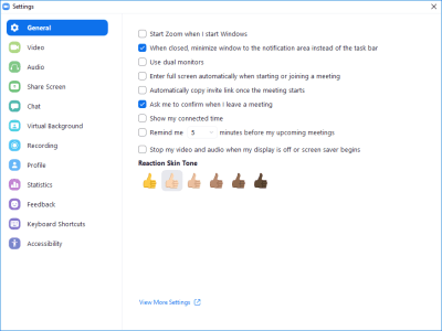
A screenshot of Zoom's desktop settings menu

Which Video Conferencing Tools Are Most Accessible?

Which Video Conferencing Tools Are Most Accessible?

Claudio Luis Vera

2020-06-15T12:30:00+00:00
2020-06-15T15:46:10+00:00

With us all suddenly working from home in the COVID era, most of us have had to make some quick choices from a huge variety of video conferencing and collaboration tools. But do all of these apps work well for everyone? If you have a co-worker or a student with a disability, would they be able to participate as well?

If you’ve had a disability yourself — or if you work in government or higher education — you’ve probably faced this question already. If not, pay attention, because the wrong choice could leave your organization vulnerable to a discrimination lawsuit.

With the right apps, working from home is a blessing for those with a disability. If you can’t drive, you no longer have to rely on poor transportation like paratransit or expensive ride-share services. Working from home allows you to attend to your medical needs in ways that might be disruptive in an office, like running a nebulizer or using an IV. Or you may avoid the hassle of navigating a building that’s not truly accessible.

With the wrong tools, a person with a severe disability may actually experience new barriers. They could be left out of meetings and other types of collaboration, and that can create significant liability for the employer.

“When people with disabilities are excluded because a product is inaccessible, it’s not only frustrating, but it [also] affects our colleagues and clients that work with us.”

— Lynette Frison, screen reader user

Most of us make a common mistake when we set up large meetings or online events: we assume that everyone who attends will be fully able to participate. Unless you know everyone’s ability level — like with your immediate co-workers — you should ask if someone needs accommodations or assume that someone attending may have difficulty seeing, hearing, or working a mouse.

Zoom: The Favorite For Accessibility

Ask anyone in the disability community about video conferencing tools, and they will almost certainly point you to Zoom. There’s no shortage of favorable opinions and anecdotal support for Zoom in the disability community, as the app has a reputation for providing a consistently high level of access. In fact, 92% listed Zoom as their tool of choice in a survey conducted by Fable, an accessibility testing firm that draws testers from a variety of different disabilities.

An app’s accessibility comes from ensuring that the app’s functionality works for everyone, including those using assistive technologies like screen readers, magnification, and captions. Most software developers don’t test their apps thoroughly for compatibility with assistive technologies or for usability with people with disabilities.

Even the simple task of joining a meeting can present a roadblock if the app hasn’t been developed with accessibility in mind. For example, unnecessary preference dialogs when entering a meeting can block a blind person that’s using a screen reader from attending. Zoom offers the convenience of clicking on an email link and allowing the participant to join a meeting immediately. “You follow the link and that’s it”, says Eric Barrette, director of technology for the Lighthouse of Broward, an organization for the blind and visually impaired.

The simplicity of Zoom’s one-click sign-on belies the depth of the application behind it. Zoom’s product philosophy favors universal design over separate applications for different user types. The result is an app that is easy to learn for first-time use, but has layers of additional features for those who invest the time in becoming power users.

Advanced Roles And Features

Almost all video conferencing apps have three different roles that a user can play: host, presenter, and participant. The names of these roles may vary with the app, but the functions are fairly standard: A host works as the master of ceremonies and manages the permissions; a presenter is a speaker or panelist and often uses screen sharing. Naturally, playing host has the greatest functionality and requires the greatest knowledge of an app. For that reason, it’s the most difficult role to support accessibly, and Zoom supports it quite well.

Jonathan Mosen, a blind podcaster from New Zealand, has created an in-depth audiobook titled Meet me Accessibly with tutorials that teach easy to advanced tasks to fellow blind Zoom users. These include hosting Zoom meetings, conducting screen sharing, as well as doing installations, and optimizing the settings.

Settings And Security

Zoom allows users to tailor the app to their needs through the app’s extensive settings menus. If anything, Zoom is the Swiss Army knife of video conferencing tools with a setting for every conceivable aspect of the application. At the Lighthouse of Broward, the IT team has taken advantage of this by creating one account with settings aimed at the blind, and another account with different settings for low-vision users.

In fact, there are 70 settings within the desktop client, and another 95 available through Zoom’s advanced settings web user interface. With 165 settings, it’s easy for any product to stumble, especially when it comes to getting the default settings right. Many of the security issues came from overly lax defaults, like meetings not requiring passwords, or re-using personal meeting room IDs for convenience.

A screenshot of Zoom's desktop settings menu

Zoom’s desktop settings menu (Large preview)

Zoom doesn’t allow settings to be saved offline or shared — yet. In an ideal world, power users in the disability community could create settings profiles that are tailored for specific disabilities and share them with others who are less experienced with Zoom.

Different Use Cases For Accessible Conferencing

Video With Work Chat

With stay-at-home orders in place, many teams are finding themselves making more use of threaded work chat throughout the day. Like an email client, this type of application is one that you’d leave on all the time, so your interactions aren’t limited to the duration of an online meeting.

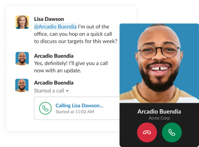
A screenshot of a chat window in Slack showing theprofile picture of the person calling along with their user name, company name, and two large bold buttons with the telephone icon on both: red button to decline call and green one to accept the call via Slack

Slack video conferencing (Image source) (Large preview)

Slack is a hugely popular app for threaded work chat that offers the ability to call another member in a video call. It’s great for spontaneous video conversations, and its large bold buttons and resizable text are helpful for users with moderately low vision. However, the Slack interface presents challenges to screen reader users and those with serious vision impairments, like keeping track of which Slack community that you’re in when the UI is magnified.

Still image from a video chat including four people divided into four boxes across the screen with a little window in the bottom right corner

Microsoft Teams website (Large preview)

If you work in an organization with an Office 365 Enterprise license, Microsoft Teams is an alternative to Slack, with its integration into other Office apps for calendaring and file sharing. The video calls on Teams can include hundreds of participants, and they’re the app of choice inside Microsoft. Teams is also favored over Slack by many blind and low-vision users.

One-To-One Video

People use video conferencing tools in a variety of different ways, depending on the situation and the physical abilities of the participants. If you’re conducting a job interview though, it’s crucial to know beforehand if the job candidate needs accommodations or if they can’t work with your platform of choice. Failure to provide a viable alternative could land you in a discrimination lawsuit.

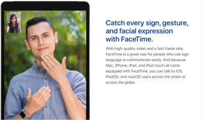
One-to-one video calls with apps like FaceTime are well-suited for therapists and other independent healthcare providers. They’re also an excellent vehicle for those who communicate using sign language, as illustrated on the Apple accessibility website.

A still image of a video call between two people using sign language

FaceTime is a great way for people who use sign language to communicate easily. (Image source: Apple Accessibility) (Large preview)

Using Captions

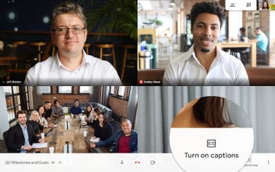
But what if one of the participants doesn’t know sign language? In that case, a hard-of-hearing user would benefit from the automatic captions that are available in Google Meet. Using captions as simple as clicking on the menu in the bottom right corner and clicking on the “Turn on captions” menu item. Captions appear — but only on the devices that have them turned on — so they don’t present a distraction to attendees that don’t want them.

A still image of a video call in Google Meet with the Turn On Captions setting zoomed in to see where it can be found in the interface

Captions can be turned both on or off during a Google Meet call. (Image source: 9to5google) (Large preview)

Captions are a lifeline for the deaf and the hard of hearing, and are helpful to those participants who need to keep their audio turned off or who are in a noisy situation. They’re also useful for those who aren’t native speakers of the language that’s being spoken. Auto-captions may be satisfactory for a native speaker of American or Australian English — and if you’re OK with homonyms like “meat” or “meet” being mixed up occasionally. But if the speaker has a strong accent or a speech impairment, then the accuracy of the captions drops significantly.

There’s much debate over how much accuracy is needed for captions to be viable. According to Kristina England, an accessibility expert at the University of Massachusetts, “[in] higher ed institutions we need 99% accurate captions for accommodation requests.”

When auto-generated captions get below 90% accuracy, they can be a serious annoyance, which has won them the nickname of “craptions” in the disability community. For that reason, it’s important to always choose a product that allows users to turn the captions off on their end.

Avoid this easy mistake: don’t use auto-captions in PowerPoint or Google Slides if you’re presenting remotely. Limit their use to live, in-person meetings instead. By having the captions on the presenter end, they become part of the meeting’s video stream and can’t be turned off by the other attendees. If you’re recording the presentation, then the inaccurate captions become an indelible part of your recording. Also, PowerPoint and Google Slides only transcribe the presenter’s audio, leaving anything spoken by the other participants out of the captions.

Before the COVID pandemic hit, Zoom was preparing to include Live Transcription, an automatic captioning feature, in its Enterprise plan. The feature is powered by Otter.ai, an artificial intelligence service that provides real-time automated captioning and identifies the speaker like Google Meet. With the 30-fold growth of new accounts, though, Zoom was compelled to delay the launch of Live Transcription so as not to overtax its infrastructure. In the meantime, you can still get the same functionality by running Otter.ai through Zoom’s API for third-party captioning services. but that requires an Otter for Teams account for a minimum of 3 users at $30/month each.

One important piece of advice, though: If you’re looking to host a conference or a large public event over the internet, you should not rely on auto-captions, but consider hiring a live human captioner instead. If you use Zoom, there’s another benefit, too: your meeting participants will be able to scroll back through the captions and read any parts they may have missed.

A Word About Webex

Webex has gained a lot of market share in the large enterprise market, particularly with its integration with Cisco’s on-site video conferencing equipment. Webex is also tightly bound with Microsoft Outlook through the Webex Productivity Tools package. When considering these combinations, Webex offers mixed levels of accessibility for users of different abilities.

For sighted and low-vision users who can use a mouse, Webex’s integrations are quite useful. However, when a participant enters a meeting, Webex often throws pop-up dialogs to confirm their audio and video choices, which can’t be operated without a pointing device. Outlook’s Calendar and Meeting interfaces also fail to provide keyboard access, further blocking someone who can’t work a mouse from accessing a meeting.

If your enterprise has deaf and hard-of-hearing members, Webex doesn’t offer automatic captions but it does offer a media viewer window where a human captioner can type what is spoken by a presenter during a meeting. Webex also provides transcription services for recorded meetings for customers who have Network Based Recordings enabled.

Webex’s bold visual design works well for people who have low vision but are not blind. “The text in Webex is easy to see visually and works well when utilizing screen magnification software. The settings in Webex are intuitive and easy to figure out,” says Elizabeth Novak, a tester with Fable.

For those users who are blind and rely on screen readers, though, Webex presents numerous barriers. Many of its interface elements have missing or confusing labels. Others can’t be reached with a keyboard.

Webex’s spotty support for screen readers has led to a lawsuit against one of its customers: in October 2019, a blind plaintiff in Massachusetts sued her employer for not providing accessible alternatives like Zoom for Webex meetings. Beacon Health Options, the employer, was using Webex for virtual conferences and mandatory employee training in which Amy Ruell, the plaintiff, was unable to participate. The case is still ongoing at the time of this writing.

One of the quirks of digital accessibility lawsuits is that they are rarely filed against software makers or implementers. Instead, they are almost always filed against the organization that purchases the software and makes it available to its customers, employees, and other constituents. The courts’ reasoning is that the organization should be conducting due diligence in vetting the products that it uses.

Judging Apps By Their Accessibility Pages

If you’re the one deciding which video conferencing platform to use in your organization, the lack of formal studies and the constant change will pose challenges. One good way to gauge a company’s commitment to accessibility is to look for an accessibility page on their website. Usually, it’s posted as a link in the footer of every page. A company that is at least aware of accessibility will have a posted accessibility policy.

There are a handful of companies that need to meet accessibility standards quite strictly and take their documentation much further. These companies will post Voluntary Product Accessibility Template (VPAT) statements to meet Section 508 requirements for selling to the government or higher education. VPAT statements can be a goldmine of accessibility compliance information, and should be reviewed by anyone in charge of making a purchasing decision.

Zoom and Webex both provide extensive VPAT statements on their websites with detailed information on accessibility. These disclosure statements classify the level of support for users with disabilities and assistive technologies into four categories:

Supports Supports With Exceptions Does Not Support Not Applicable

From these options, anything other than “Supports” should be looked at carefully or treated as a potential problem area.

A real red flag is when a company does not have a posted policy, and where a search for “accessibility” yields results that are unrelated to disabilities or assistive technologies. This is the case with Crowdcast, where the results for “access” are related to connectivity and security. With Jitsi, developers contribute their efforts to building and refining the application as an open-source project. However, accessibility at Jitsi is sparsely resourced:

Community post that says “Maybe after few months or more when things slow down, we will be able to take a look, but for now our hands are full and any help is welcome.”

(Large preview)

While this doesn’t help a person with a disability who may want to use Jitsi, it does present opportunities to developers looking to contribute where they can make a large social impact.

If an app has advanced features or functionality that’s not directly connected to video conferencing, then support can be spotty as well. This often the case with polling, Q&A and other ancillary features, even with Zoom. For those products that do post VPATs on their websites, you can see which features are problematic. A good rule of thumb would be to avoid these features when accessibility is a concern.

Building Accessible Products

How do the makers of video conferencing platforms create a product that’s truly accessible for all? At Zoom accessibility is treated as a core value, beginning with CEO Eric Yuan. According to Alex Mooc, Zoom’s accessibility lead, “that executive buy-in trickles down to every team leader, every platform. Every platform owner is accountable for these accessibility issues.” The product teams are organized so that accessibility experts are embedded into every development team, unlike most other companies where accessibility comes in as oversight from a separate entity.

Zoom has fast release cycles, where the product is tested for accessibility as it’s built. Zoom’s engineers aren’t necessarily well-versed in accessibility when they’re hired, but they’re expected to learn quickly from the company’s extensive internal knowledge.

Most companies design and build their product for their abled users, and might consider disabled users as an afterthought, if at all. The opposite is true at Zoom: accessibility is treated as part of the product’s usability for all users, abled and otherwise. “Someone who is disabled is like a canary in a coal mine,” says Mooc, because resolving issues that they encounter helps with usability for all other users. In other words, accessibility is a means to deliver the frictionless, easy-to-use experience that Zoom strives for.

Zoom also seeks out feedback from people in the disability community, leaning heavily on its relationships with educational institutions like the University of Washington. Some of Mooc’s research involves going to disabled users’ homes and observing how they work. With stay-at-home orders and social distancing, though, this type of research has been put on hold.

Of all the ways to gain insight into a product’s accessibility, the best is to have live user testing by people with disabilities. Fable Tech Labs uses Zoom almost exclusively to conduct functional testing remotely with participants who are blind, have low vision, or have mobility impairments and rely on assistive technologies like switch systems and voice navigation. But doing this type of testing remotely presents its own technical challenges and requires a lot of skill and knowledge of hardware to conduct successfully. This can lead to elaborate workarounds with multiple devices and video feeds. Ideally, there would be a mixing-board-style product to handle multiple feeds in a remote connection, but that’s not in Zoom’s roadmap.

Growth And Change

Over the past few months, both Zoom and Google Meet have grown from 10 million users to over 300 million daily participants each. The sudden explosion in popularity has attracted malicious users who found ways to hijack insecure meetings in Zoom in a practice called “zoom-bombing”. The few incidents generated news stories that became ubiquitous in the news media, raising concerns about Zoom’s security. Some organizations like Google and the New York City school system have gone as far as banning Zoom from their computers.

For many in the disability community, this turn of events has had an unfortunate impact on access. If organizations ban Zoom from their computers, then meetings need to be conducted and classes need to be taught online using less accessible products, which can mean trading a usable-but-insecure platform for one that simply can’t be used.

“Security is very important, but there’s no point trying to use an inaccessible tool no matter how secure it is.”

— Erik Burggraaf, screen reader user

Fortunately, Zoom has been quick to respond with a series of security fixes within a couple of weeks. The overly lax defaults in the app’s 165 settings were tightened up, and a variety of changes were made to the user experience. Now it’s mostly up to users to update their Zoom apps, settings, and desktop clients.

Since the beginning of the COVID pandemic, the rate of development in video conferencing has accelerated in a business that already had frequent releases. Major product announcements are happening weekly, and Zoom is releasing patches nearly daily, along with a major upgrade to Zoom 5.

The net: if you use any video conferencing software, you should be diligent about updating your software as frequently as you can — or enabling auto-updates on your device. You may even find that a serious accessibility issue may be resolved with a simple software update.

The future is looking promising though, according to accessibility tester Shane: “Accessibility is getting better each day within online communication tools. However, some still need work to be completely inclusive to all people.”

Further Reading

(ra, il)
Categories: Others Tags:

Exciting New Tools for Designers, June 2020

June 15th, 2020 No comments

The best new tools for designers are ones that make your life easier and your workflows faster. You’ll find some of those in this list this month for sure. From tools to help you capture and manage color palettes to AI-powered design analytics to simple animations, there’s something for almost every designer or developer.

Here’s what new for designers this month.

The Hero Generator

The Hero Generator is a fun tool that will help you create just the right hero header without having to write the code yourself. Upload your image, set some specs for spacing and color, add a button, and out comes the code for an example that you can build right on the screen. Make sure to play with the gradient overlay to get just the right color and orientation to ensure that your hero header looks great and includes highly readable type.

Sorted Colors

Sorted Colors groups named CSS colors in a way that shows related colors together. It’s a nice way to check colors side by side when you are trying to make a final decision about a hue or color palette. You could also use it to create a monotone palette.

Attention Insight

Attention Insight is an AI-powered design analytics tool that allows you to compare multiple designs and to measure which object attracts the most attention. It uses a combination of heatmaps, percentage of attention metrics to help measure the overall clarity of your design. New features, such as a contrast checker, are also in the works. It works as a web app, plugin for popular software, or a Chrome extension.

Color Copy Paste

Color Copy Paste is an app that you can use to capture a color from practically anything and then paste it to Figma, Sketch, or a web browser. It’s a quick way to snag little bits of inspiration when you see them.

Runme

Runme, which is still in beta, allows you to build, deploy, and launch an application from any public Git-repo with one click. Enter a URL and a few commands and you are ready to go. This is an open-source tool and contributions are welcome.

Rough Notation

Rough Notation is a small JavaScript library to create and animate annotations on a web page. It uses RoughJS to create a hand-drawn look and feel. Elements can be annotated in a number of different styles. Animation duration and delay can be configured or turned off. Choose from options to underline, box, circle, highlight, cross off, strikethrough, group items, and more.

Trails

This is a simple, but useful goodie. Trails is a simple geometrical trail on an x and z axis that you can attach to Three.js objects. The simple animation is mesmerizing.

Pose Animator

Pose Animator takes a 2D vector illustration and animates its containing curves in real-time based on a recognition result from PoseNet and FaceMesh. It borrows the idea of skeleton-based animation from computer graphics and applies it to vector characters. (It’s a fast way to cartoonize yourself.) You can build from a webcam video or single image in Chrome or Safari.
Neumorphism UI

Neumorphism UI is a user interface kit packed with components in the neumorphic style. It includes more than 200 components, 10 sections, and five example pages to build a website in this style.

3D Photography Using Context-Aware Layered Depth Inpainting

This project by a group of researchers proved that you can convert a single RGB-D image into a 3D photo, much like what you’d see from an iPhone. The included source code shows how to use a layered depth image as part of a learning-based model that creates a three-dimensional effect.

Meanderer

Meanderer is a micro-library for scaling CSS motion path strings. And it looks pretty nifty. All you need is an object with a path (typically an SVG) and you are ready to try it out.

Underline Animation

Sometimes it is the most simple of animations that can have the greatest impact on a design. This Underline Animation pen from Aaron Iker is an example of that with a nifty little underline that moves to an arrow.

Create a Hamburger Menu in SVG & CSS

Love it or hate it, you’ll probably need to create a hamburger menu element at some point. This great tutorial from UX Collective explains how to do it from start to finish using an SVG icon and CSS. (This lesson is designed so almost anyone with a little dev knowledge can follow along with success.)

Blush

Blush is a fun, semi-custom illustration generator. It uses drawings from artists around the world with parts and color options that you can mix and match to get just the right illustration for your design project. Choose your specifications and download a PDF. It’s that easy.

Supabase

Supabase in an open-source alternative to Firebase and adds real-time and restful APIs to Postgres without code. (It’s in Alpha and free to use during that time.)

Fluent Icons

Fluent Icons includes 965 icons in a Microsoft-esque style. These colorful and consistent icons are ideal for use across apps, presentations, websites, and infographics. (Free and paid options available.)

One Word Domains

Looking for a quick and easy to remember domain name? One Word Domains lets you search all the available one-word domains available for purchase.

Free Device Icons

This set of free device icons includes 67 elements that represent user interfaces and devices. They come in multiple file formats – SVG, EPS, PNG, and AI – as a line-style vector.

Windups

Windups is a tool to help you add a typewriter-style animation to text elements. It’s a fun way to help people through your design and build dynamic content. You can see how engaging it is by playing with the Windups site with building blocks of text and “continue” buttons.

Glorious Glyphs Game

Test your typography IQ with the Glorious Glyphs Game game from ILoveTypography.com. The game includes 30 questions about glyph characters, where you have to ID a font. It’s a lot tougher than you might think!

Cosmos

Cosmos is a beautiful and colorful gradient font family. It contains letterforms with hologram, multicolor, minimal, glitch, and blur options is a readable and trendy style. This premium font family is available by the style or altogether.

Ephemera

Ephemera is a groovy novelty-style typeface that has fun lines, plenty of common shapes and elements, and glyphs that pair for exceptional letter combinations. It could make a nice brand mark or an interesting display type element. It includes upper- and lowercase characters, numerals, and some extras.

Kavo Serif

Kavo Serif is clean, modern typeface with five weights, and even includes logo templates. It’s a versatile font that works great in large and small sizes.

Republiko

Republiko is a modern display typeface with regular and outline styles. While it is designed for display, the characters remain readable at smaller sizes as well.

TT Lakes Neue

TT Lakes Neue is a font superfamily with 91 styles. It’s got a nice geometric shape and the package even includes a variable font. This is a premium typeface that you can buy individual styles or the complete package.

Typo Ring

Typo Ring is a super round typeface with plenty of weights (although the free version has limited character sets). It’s highly readable and includes upper- and lowercase letters.

XXIX

XXIX is a bold, futuristic slab with fun shapes and slants. It’s an all uppercase option with a limited set of numerals and glyphs.

Source

Categories: Designing, Others Tags:

Popular Design News of the Week: June 8, 2020 – June 14, 2020

June 14th, 2020 No comments

Every week users submit a lot of interesting stuff on our sister site Webdesigner News, highlighting great content from around the web that can be of interest to web designers.

The best way to keep track of all the great stories and news being posted is simply to check out the Webdesigner News site, however, in case you missed some here’s a quick and useful compilation of the most popular designer news that we curated from the past week.

Is this Apple’s Most Ludicrous Move Yet?

Colors in UI Design: A Guide for Creating the Perfect UI

Larder.io – Bookmarking for Developers

10 Newest and Promising UI Design Trends

3 Simple Website Tweaks to Impress your Customers

Web Site Vs Web App: The Differences & Why They Matter

2020 Logo Trend Report

Grid for Layout, Flexbox for Components

NoDesign.dev – Tools and Resources for Non Artistic Developers

Patternico

The Need for Speed, 23 Years Later

How to Be a Badass Front-end Developer

Heavy Machine Website Design

Death of a Typeface

Collection of Free COVID 19 Resources for Designers

Cool Little CSS Grid Tricks for your Blog

8 Expressive Free Font Combos for your Next Design

A Freelancer’s Checklist for Building a Strong Personal Website

How to Font Pair Effectively: Tricks and Tools

3 Cases of Effective Fusing Modern and Traditional Web Design Ideas

20 Reasons Why You Should Use WordPress for your Website

6 Ways to Stay Creative While Working from Home

Anti-racist Reading List for Designers

Building a Career from Different Income Streams

Adobe is Offering $1 Million in Support of Creative Projects Over the Coming Year

Want more? No problem! Keep track of top design news from around the web with Webdesigner News.

Source

Categories: Designing, Others Tags:

Striking a Balance Between Native and Custom Select Elements

June 12th, 2020 No comments

Here’s the plan! We’re going to build a styled select element. Not just the outside, but the inside too. Total styling control. Plus we’re going to make it accessible. We’re not going to try to replicate everything that the browser does by default with a native element. We’re going to literally use a element when any assistive tech is used. But when a mouse is being used, we’ll show the styled version and make it function as a select element.

That’s what I mean by “hybrid” selects: they are both a native and a styled alternate select in one design pattern.

Custom selects (left) are often used in place of native selects (right) for aesthetics and design consistency.

Select, dropdown, navigation, menu… the name matters

While doing the research for this article, I thought about many names that get tossed around when talking about selects, the most common of which are “dropdown” and “menu.” There are two types of naming mistakes we could make: giving the same name to different things, or giving different names to the same thing. A select can suffer from both mistakes.

Before we move ahead, let me try to add clarity around using “dropdown” as a term. Here’s how I define the meaning of dropdown:

Dropdown: An interactive component that consists of a button that shows and hides a list of items, typically on mouse hover, click or tap. The list is not visible by default until the interaction starts. The list usually displays a block of content (i.e. options) on top of other content.

A lot of interfaces can look like a dropdown. But simply calling an element a “dropdown” is like using “fish” to describe an animal. What type of fish it is? A clownfish is not the same as a shark. The same goes for dropdowns.

Like there are different types of fish in the sea, there are different types of components that we might be talking about when we toss the word “dropdown” around:

  • Menu: A list of commands or actions that the user can perform within the page content.
  • Navigation: A list of links used for navigating through a website.
  • Select: A form control () that displays a list of options for the user to select within a form.

Deciding what type of dropdown we’re talking about can be a foggy task. Here are some examples from around the web that match how I would classify those three different types. This is based on my research and sometimes, when I can’t find a proper answer, intuition based on my experience.

Dropdown-land: Five scenarios where different dropdowns are used across the internet. Read the table below for a detailed description.
Diagram Label Scenario Dropdown Type
1 The dropdown expects a selected option to be submitted within a form context (e.g. Select Age) Select
2 The dropdown does not need an active option (e.g. A list of actions: copy, paste and cut) Menu
3 The selected option influences the content. (e.g. sorting list) Menu or Select (more about it later)
4 The dropdown contains links to other pages. (e.g. A “meganav” with websites links) Disclosure Navigation
5 The dropdown has content that is not a list. (e.g. a date picker) Something else that should not be called dropdown

Not everyone perceives and interacts with the internet in the same way. Naming user interfaces and defining design patterns is a fundamental process, though one with a lot of room for personal interpretation. All of that variation is what drives the population of dropdown-land.

There is a dropdown type that is clearly a menu. Its usage is a hot topic in conversations about accessibility. I won’t talk much about it here, but let me just reinforce that the

element is deprecated and no longer recommended. And here’s a detailed explanation about inclusive menus and menus buttons, including why ARIA menu role should not be used for site navigation.

We haven’t even touched on other elements that fall into a rather gray area that makes classifying dropdowns even murkier because of a lack of practical uses cases from the WCAG community.

Uff… that was a lot. Let’s forget about this dropdown-land mess and focus exclusively on the dropdown type that is clearly a element.

Let’s talk about

Styling form controls is an interesting journey. As MDN puts it, there’s the good, the bad, and the ugly. Good is stuff like which is just a block-level element to style. Bad is stuff like checkboxes, which can be done but is somewhat cumbersome. is definitely in ugly terrain.

A lot of articles have been written about it and, even in 2020, it’s still a challenge to create custom selects and some users still prefer the simple native ones.

Among developers, the is the most frustrating form control by far, mainly because of its lack of styling support. The UX struggle behind it is so big that we look for other alternatives. Well, I guess the first rule of is similar to ARIA: avoid using it if you can.

I could finish the article right here with “Don’t use , period.” But let’s face reality: a select is still our best solution in a number of circumstances. That might include scenarios where we’re working with a list that contains a lot of options, layouts that are tight on space, or simply a lack of time or budget to design and implement a great custom interactive component from scratch.

Custom requirements

When we make the decision to create a custom select — even if it’s just a “simple” one — these are the requirements we generally have to work with:

  • There is a button that contains the current selected option.
  • Clicking the box toggles the visibility of the options list (also called listbox).
  • Clicking an option in the listbox updates the selected value. The button text changes and the listbox is closed.
  • Clicking outside the component closes the listbox.
  • The trigger contains a small triangle icon pointing downward to indicate there are options.

Something like this:

CodePen Embed Fallback

Some of you may be thinking this works and is good to go. But wait… does it work for everyone? Not everyone uses a mouse (or touch screen). Plus, a native element comes with more features we get for free and aren’t included in those requirements, such as:

  • The checked option is perceivable for all users regardless of their visual abilities.
  • The component can interact with a keyboard in a predictable way across all browsers (e.g. using arrow keys to navigate, Enter to select, Esc to cancel, etc.).
  • Assistive technologies (e.g. screen readers) announce the element clearly to users, including its role, name and state.
  • The listbox position is adjusted. (i.e. does not get cut off of the screen).
  • The element respects the user’s operating system preferences (e.g high contrast, color scheme, motion, etc.).

This is where the majority of the custom selects fail in some way. Take a look at some of the major UI components libraries. I won’t mention any because the web is ephemeral, but go give it a try. You’ll likely notice that the select component in one framework behaves differently from another.

Here are additional characteristics to watch for:

  • Is a listbox option immediately activated on focus when navigating with a keyboard?
  • Can you use Enter and/or Space to select an option?
  • Does the Tab key jump go to the next option in the listbox, or jump to the next form control?
  • What happens when you reach the last option in the listbox using arrow keys? Does it simply stay at the last item, does it go back to the first option, or worst of all, does focus move to the next form control?
  • Is it possible to jump directly to the last item in the listbox using the Page Down key?
  • Is it possible to scroll through the listbox items if there are more than what is currently in view?

This is a small sample of the features included in a native element.

Once we decide to create our own custom select, we are forcing people to use it in a certain way that may not be what they expect.

But it gets worse. Even the native behaves differently across browsers and screen readers. Once we decide to create our own custom select, we are forcing people to use it in a certain way that may not be what they expect. That’s a dangerous decision and it’s in those details where the devil lives.

Building a “hybrid” select

When we build a simple custom select, we are making a trade-off without noticing it. Specifically, we sacrifice functionality to aesthetics. It should be the other way around.

What if we instead deliver a native select by default and replace it with a more aesthetically pleasing one if possible? That’s where the “hybrid” select idea comes into action. It’s “hybrid” because it consists of two selects, showing the appropriate one at the right moment:

  • A native select, visible and accessible by default
  • A custom select, hidden until it’s safe to be interacted with a mouse

Let’s start with markup. First, we’ll add a native with items before the custom selector for this to work. (I’ll explain why in just a bit.)

Any form control must have a descriptive label. We could use , but that would focus the native select when the label is clicked. To prevent that behavior, we’ll use a and connect it to the select using aria-labelledby.

Finally, we need to tell Assistive Technologies to ignore the custom select, using aria-hidden="true". That way, only the native select is announced by them, no matter what.

<span class="selectLabel" id="jobLabel">Main job role</span>
<div class="selectWrapper">
  <select class="selectNative js-selectNative" aria-labelledby="jobLabel">
    <!-- options -->
    <option></option>
  </select>
  <div class="selectCustom js-selectCustom" aria-hidden="true">
     <!-- The beautiful custom select -->
  </div>
</div>

This takes us to styling, where we not only make things look pretty, but where we handle the switch from one select to the other. We need just a few new declarations to make all the magic happen.

First, both native and custom selects must have the same width and height. This ensures people don’t see major differences in the layout when a switch happens.

.selectNative,
.selectCustom {
  position: relative;
  width: 22rem;
  height: 4rem;
}

There are two selects, but only one can dictate the space that holds them. The other needs to be absolutely positioned to take it out of the document flow. Let’s do that to the custom select because it’s the “replacement” that’s used only if it can be. We’ll hide it by default so it can’t be reached by anyone just yet.

.selectCustom {
  position: absolute;
  top: 0;
  left: 0;
  display: none;
}

Here comes the “funny” part. We need to detect if someone is using a device where hover is part of the primary input, like a computer with a mouse. While we typically think of media queries for responsive breakpoints or checking feature support, we can use it to detect hover support too using @media query (hover :hover), which is supported by all major browsers. So, let’s use it to show the custom select only on devices that have hover:

@media (hover: hover) {
  .selectCustom {
    display: block;
  }
}

Great, but what about people who use a keyboard to navigate even in devices that have hover? What we’ll do is hide the custom select when the native select is in focus. We can reach for an adjacent Sibling combinatioron (+). When the native select is in focus, hide the custom select next to it in the DOM order. (This is why the native select should be placed before the custom one.)

@media (hover: hover) {
  .selectNative:focus + .selectCustom {
    display: none;
  }
}

That’s it! The trick to switch between both selects is done! There are other CSS ways to do it, of course, but this works nicely.

Last, we need a sprinkle of JavaScript. Let’s add some event listeners:

  • One for click events that trigger the custom select to open and reveal the options
  • One to sync both selects values. When one select value is changed, the other select value updates as well
  • One for basic keyboard navigation controls, like navigation with Up and Down keys, selecting options with the Enter or Space keys, and closing the select with Esc
CodePen Embed Fallback

Usability testing

I conducted a very small usability test where I asked a few people with disabilities to try the hybrid select component. The following devices and tools were tested using the latest versions of Chrome (81), Firefox (76) and Safari (13):

  • Desktop device using mouse only
  • Desktop device using keyboard only
  • VoiceOver on MacOS using keyboard
  • NVDA on Windows using keyboard
  • VoiceOver on iPhone and iPad using Safari

All these tests worked as expected, but I believe this could have even more usability tests with more diverse people and tools. If you have access to other devices or tools — such as JAWS, Dragon, etc. — please tell me how the test goes.

An issue was found during testing. Specifically, the issue was with the VoiceOver setting “Mouse pointers: Moves Voice Over cursor.” If the user opens the select with a mouse, the custom select will be opened (instead of the native) and the user won’t experience the native select.

What I most like about this approach is how it uses the best of both worlds without compromising the core functionality:

  • Users on mobile and tablets get the native select, which generally offers a better user experience than a custom select, including performance benefits.
  • Keyboard users get to interact with the native select the way they would expect.
  • Assistive Technologies can interact with the native select like normal.
  • Mouse users get to interact with the enhanced custom select.

This approach provides essential native functionality for everyone without the extra huge code effort to implement all the native features.

Don’t get me wrong. This technique is not a one-size-fits-all solution. It may work for simple selects but probably won’t work for cases that involve complex interactions. In those cases, we’d need to use ARIA and JavaScript to complement the gaps and create a truly accessible custom select.

A note about selects that look like menus

Let’s take a look back at the third Dropdown-land scenario. If you recall, it’s a dropdown that always has a checked option (e.g. sorting some content). I classified it in the gray area, as either a menu or a select.

Here’s my line of thought: Years ago, this type of dropdown was implemented mostly using a native . Nowadays, it is common to see it implemented from scratch with custom styles (accessible or not). What we end up with is a select element that looks like a menu.

Three similar dropdowns that always have a selected option.

A is a type of menu. Both have similar semantics and behavior, especially in a scenario that involves a list of options where one is always checked. Now, let me mention the WCAG 3.2.2 On Input (Level A) criterion:

Changing the setting of any user interface component should not automatically cause a change of context unless the user has been advised of the behavior before using the component.

Let’s put this in practice. Imagine a sortable list of students. Visually, it may be obvious that sorting is immediate, but that’s not necessarily true for everyone. So, when using , we risk failing the WCAG guideline because the page content changed, and ignificantly re-arranging the content of a page is considered a change of context.

To ensure the criterion success, we must warn the user about the action before they interact with the element, or include a

Categories: Designing, Others Tags:

Learn Z-Index Using a Visualization Tool

June 12th, 2020 No comments

There are some neat interactive demos in here from Thiru Manikandan. There are a couple of very tricky things with z-index that never fail to confuse. In addition to things like requiring positioning and source order, the trickiest are the stacking contexts and parent/child relationships. z-index isn’t a flat playing field. Even if you put z-index: 2147483644¹ on an element, it’s possible nothing will happen because that element might be inside a parent element with its own stacking context and a lower z-index than a sibling or some higher-up level DOM element.

  1. Just three shy of the maximum 2147483647. LOLZ. Hat tip to Dan Danney who mentioned seeing that in the wild recently.

Direct Link to ArticlePermalink

The post Learn Z-Index Using a Visualization Tool appeared first on CSS-Tricks.

Categories: Designing, Others Tags:

How to Define Effective Milestones in Design Projects

June 12th, 2020 No comments

When it comes to creating and launching a website, it’s important to deliver realistic time expectations to the client, and establish the different stages you can bill them for.

After all, creating a site is about so much more than putting some code together. From the initial brief to the launch of the site there are numerous stages in between. It can be natural to quote a lump price and charge it all at the end, or 50% upfront and 50% on completion. However, if there are snags along the way, unexpected delays, or if the client cancels last minute after you’ve nearly finished creating the site, you may be left out of pocket.

By charging stage by stage, you are getting the main chunks of what you are owed at the time you do it. While the exact web development phases differ slightly between clients and projects — and you should schedule, and bill for your specific situation — the basic steps pretty much stay the same.

Brief and Planning – Pay me ~20%

Whether your client has an existing site they are looking to re-do, or are starting from scratch, the initial brief and planning stage shouldn’t be underestimated.

This stage includes researching, finding out their requirements, and putting together a plan. You need to identify the scope of the project, the areas of main importance and the site’s purpose.

It’s at this stage you clarify what web pages and features are needed to fulfil this. You also need to define the software and any resource requirements as well as the estimated deadlines for the project. When deciding the budget, you need to remember to keep in mind any other aspects like heading to meetings.

Creating the Visuals – Pay me ~15%

The visual stage involves three main elements: wireframes, mock-ups, and prototypes.

Wireframes are simple sketches of the future website before any development or design elements (such as fonts and branding) are applied. It’s a basic backbone to base the future of the project on which allows you to see where key elements will be located.

The next stage is mock-ups which are high-fidelity statics of the future website and portray how things will look. Within this stage aspects such as colors, fonts, logos and images should be applied. This stage needs to be much more detailed and a well-thought out static version of the future site. It provides an opportunity to hone in on details and represent the suppositional final look of the site. Remember the end result will still be likely to change, but this should include all the elements needed that you could base the project on.

The third visual stage of the design is prototyping which is a highly detailed, dynamic version of the website which is due to be created. This is likely to be as similar as possible to the final system and will offer a comprehensive overview of the functionality of the site. It’s a great final chance to check out the website before it is built and make any last big tweaks.

Initial Build – Pay me ~15%

The next stage is to actually get creating the website. By utilising the previous visuals, you can get building according to the clients specifications.

It involves creating the initial home page and a “shell” for interior pages where content can be added later on. This process includes designing interactive forms, implementing payment getaways and confirming the CMS you will use. Here you will add in any custom coding too. Expect this to take up a significant amount of time depending on the level of complexity involved with the site.

Content Creation and SEO – Pay me ~15%

Once you have the main structure in place, it’s time to sort the content. By now you should have established if you are creating the content or if the client is sending elements such as text and images over themselves.

Keep in mind (and ensure the client is aware) that copy is designed to both drive engagement, and for search engine optimisation (SEO.) The style of writing is important and is something to certainly bill the client for. Content needs to be short, snappy and to the point, encouraging readers to both interact with it, and progress to other pages.

If pages require large chunks of information, it’s best to split it into manageable sections and supplement it with interesting visuals to keep them engaged. Identify search terms the client wants to rank for and check the text adheres to this. There are many SEO plugins and tools (such as Yoast) which you can use to easily check it’s optimised.

Beta Testing – Pay me ~15%

Once the design and functionality are complete, it needs to go through a beta testing stage. This is the initial test before it’s set live and promoted to the world.

The beta phase is important to iron out any errors and get feedback from the intended audience. It’s also the stage where you need to ensure proper functioning across multiple devices.

There are a number of sites and tools you can use to check how the site looks in the different mobile, tablet and desktop resolutions. The site needs to look and function as per the client’s specifications and ensure it matches their brief. Here you can see if there are any final amendments which need to be made following from feedback both from the audience and client.

Launch – Pay me ~20%

Once the site has passed the beta testing and the client is happy, it’s time to launch the site. This is the final billing stage for the client and should be a quick and simple step.

Discuss with the client when they want to launch it and get set up for then. You will need to connect any domains, check the DNS records and CNAME’s and get the site up and running. If it’s a large and complex site it can take a little longer than a smaller site, so ensure you plan for this.

Always be prepared that there could be teething problems on launch and that the client might want feedback and amendments based on how the site is used and interacted with. There are always ways to analyse user testing, monitor analytics and refine the site, so it could be worth going on some sort of retainer contract for future updates for the client.

These are the basic stages you can bill a client for. Try and decide how long each step with take and come up with pricing based on this. You can charge a deposit upfront and then always let the client know if certain steps are going to end up costing more than initially quoted.

Featured image via Unsplash.

Source

Categories: Designing, Others Tags: