When do you use inline-block?
The inline-block value for display is a classic! It’s not new and browser support is certainly not something you need to worry about. I’m sure many of us reach for it intuitively. But let’s put a point on it. What is it actually useful for? When do you pick it over other, perhaps similar, options?
(I bet this makes for interesting replies.)
What is the last thing you used `display: inline-block` for?
— Chris Coyier (@chriscoyier) June 19, 2020
Buttons
The most common answer I heard was: I always use it on buttons.
Ultimately, I think that makes sense, but it contributes to a what I see as a slight misunderstanding. The idea is that you want elements that look like buttons (which might be crafted with , , or perhaps ) to lay inline — like they do naturally — but be able to have margin and padding. That’s the slight misunderstanding part: display: inline; elements can still have margin and padding, and it probably behaves like you expect it to.
The tricky part is that:
- The block-direction margin on inline elements is ignored entirely
- The padding on inline elements doesn’t affect the height of the line of text
So, while the buttons themselves are pretty much styled just fine, the parent element and surrounding text probably isn’t. Here’s a demo that:
Things get worse when wrapping starts to happen with inline buttons:

So yeah, inline-block makes pretty good sense on buttons I’d say. But…
Don’t forget inline-flex and inline-grid
With the display values inline-flex and inline-grid, you’ll get all the same good behavior that you will from inline-block, but the elements (often buttons) can benefit from a stronger inline layout system.
Take the example of buttons-with-icons, like this:
<a href="#" class="button>
  <svg> ... </svg>
  Text
</a>
To get the text and icon aligned perfectly in the center, it’s tempting to do like:
.button svg {
  vertical-align: middle;
}
Which never gets it quite right…

But this is an easy fix with inline-flex:
.button {
  display: inline-flex;
  align-items: center;
}
lh units nicely!)With inline-flex or inline-grid, you have all the power of a flexbox or grid layout system within a block that lays out in the inline direction.
Blocks that can still wrap
An inline-block elements will respect a width. That’s another difference between them and straight-up inline elements. People used to¹ build column layout systems with inline-block, because it basically can do what floats could do here, except without the need to worry about clearing the float², allowing people to take advantage of wrapping which happens a bit more elegantly than float.
The idea of inline-blocks behaving like columns that can wrap (even down to 1 column) lives on to this day because it’s a trick that can be used in HTML emails to allow for multi-column layouts that collapse to single-column on small screens without the need for media queries (which some email clients don’t support).
Yesterday in an HTML email, on divs that wrap tables, to allow for responsive columns without media queries
— Dan Denney (@dandenney) June 19, 2020
transform on an inline element
Inline elements can’t take a transform. So if you need that, it’ll need to be inline-block.
Column children that don’t break in the middle of themselves
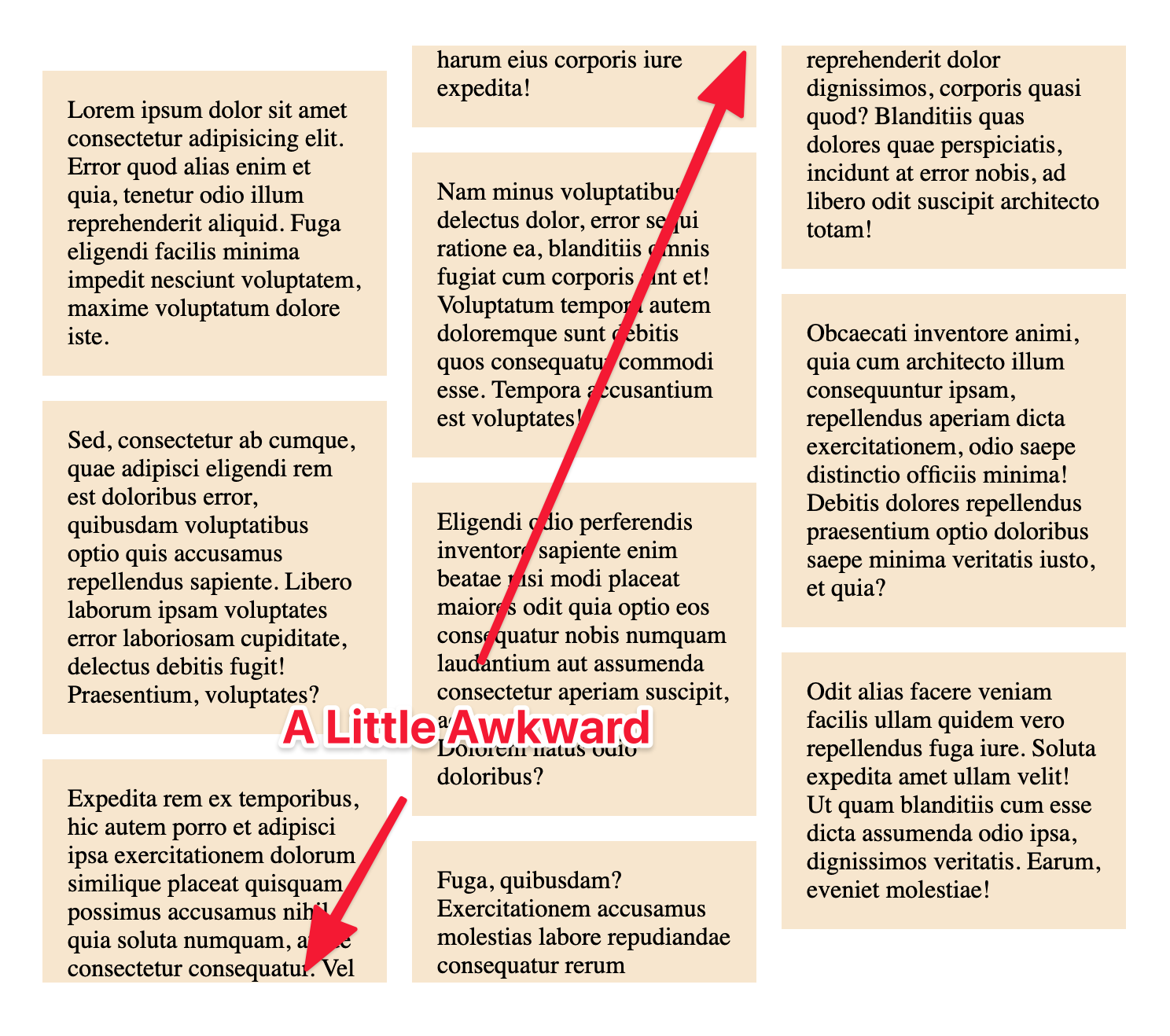
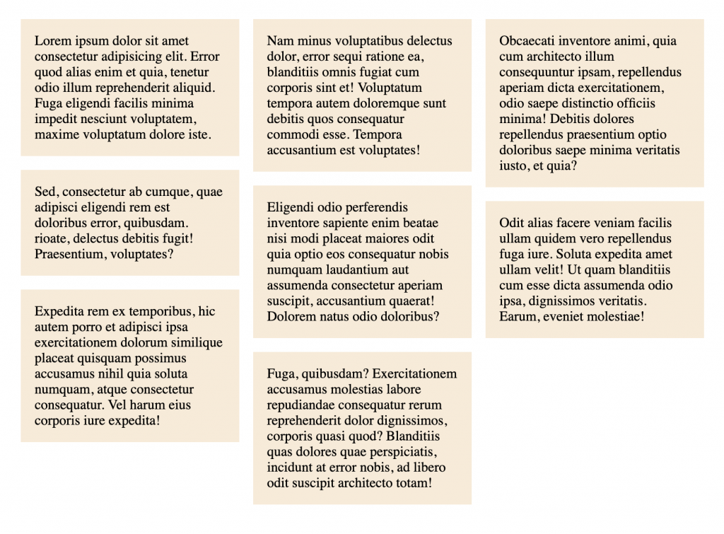
CSS columns can be used on paragraphs of text where you don’t really care if any given paragraph breaks across columns. But sometimes CSS columns are used for blocks where that would be awkward. Say the blocks have their own backgrounds and padding. The breaks are pretty weird visually.

This is a weird trick that I can’t say I 100% understand, but if you toss display: inline-block; on those boxes (and probably width: 100%; to make sure they stay column-width), then they won’t break and the padding is preserved.

Quick way to make a list go horizontal
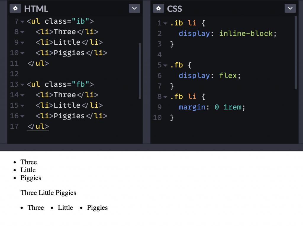
This was another mega-popular answer to my original tweet. List elements stack list items vertically, like block-level elements. They aren’t actually blocks. They are display: list-item;, which is actually somewhat important here, as we’ll see. The popular use case is “when I want to lay out a list horizontally”.
So you’ve got a list…
<ul>
  <li>Three</li>
  <li>Little</li>
  <li>Piggies</li>
</ul>
You wanna knock it over in a row instead, you can…
li {
  display: inline-block;
}
And you got it.
I took a quick listen in VoiceOver and the inline-block list still announces the element as a list, but doesn’t speak the bullet points, which makes sense as they aren’t there. That’s the thing with changing the display of the list items themselves away from list-item: they lose their, ahem, list-item-y-ness.
An alternative would be to make the parent a flexbox container…
ul {
  display: flex;
}
…which achieves the horizontal row thing (the flexbox default), but leaves the bullets as you aren’t changing the display of the list items themselves. It’s on you to manually remove that if you want.

Centered lists
Speaking of lists, Jeff Starr just blogged about the idea of lists within centered text, which can get awkward as well. The awkwardness is that the text inside the list items can be centered, but the list item itself is still full-width, creating this situation where the bullet stays aligned to the left.

Jeff’s solution was to inline-block the whole list. That keeps the list only as wide as the natural width of the content, allowing the bullets to leave the left edge and travel with the centered content. As long as there are block-level elements before and after, that is a good solution.
By way of an alternative, if the goal is to shrink the width of the list to the width of the content, that could also be achieved like this without stopping the list from being block-level:
ul {
  width: max-content;
  margin: 0 auto;
  text-align: left;
}- There is another tricky thing with
inline-block. Likeinlineelements, any whitespace between them essentially render as a space. So two 50% wide `inline-block` elements won’t fit on a line if there is any whitespace between them. Good thing there are tricks to fix that. - I say “used to” because, if you were going to make a column system today, you’d almost certainly use flexbox or grid — or not build a “system” at all because just using the syntax of these largely negates the need for a system in the first place.
¹ ² ³ ? ? ? ? ? ?
- Footnote
The post When do you use inline-block? appeared first on CSS-Tricks.
You can support CSS-Tricks by being an MVP Supporter.
