Archive

Archive for July, 2020

The ultimate guide to creating online quizzes and assignments

July 14th, 2020 No comments

If life is a journey, learning is the vehicle that propels your students forward and helps them decide where they want to go.

With schools now closed because of the COVID-19 pandemic, educators have been forced to reevaluate how they communicate with each other, hold classes from the safety of their homes, and keep students learning while they’re at home.

E-learning provides you with an opportunity to reach students anywhere and keep them engaged whether they’re on the other side of town or halfway around the world. Virtual classrooms — as well as the video conferencing apps that make them possible — transcend traditional barriers that required students and teachers to meet for classes in person.

Incorporating e-learning tools into your curriculum enables students to access an extensive range of written, audio, and visual learning material without having to deal with unwieldy paper assignments or open multiple links to access information.

Since quizzes and assignments are an essential part of the learning process, JotForm offers an all-in-one solution that allows you to

  • Prepare questions in a variety of formats
  • Assign them to your students
  • Collect their answers
  • Calculate their grades

The best part is that you don’t have to be a tech whiz to create a shareable online quiz.

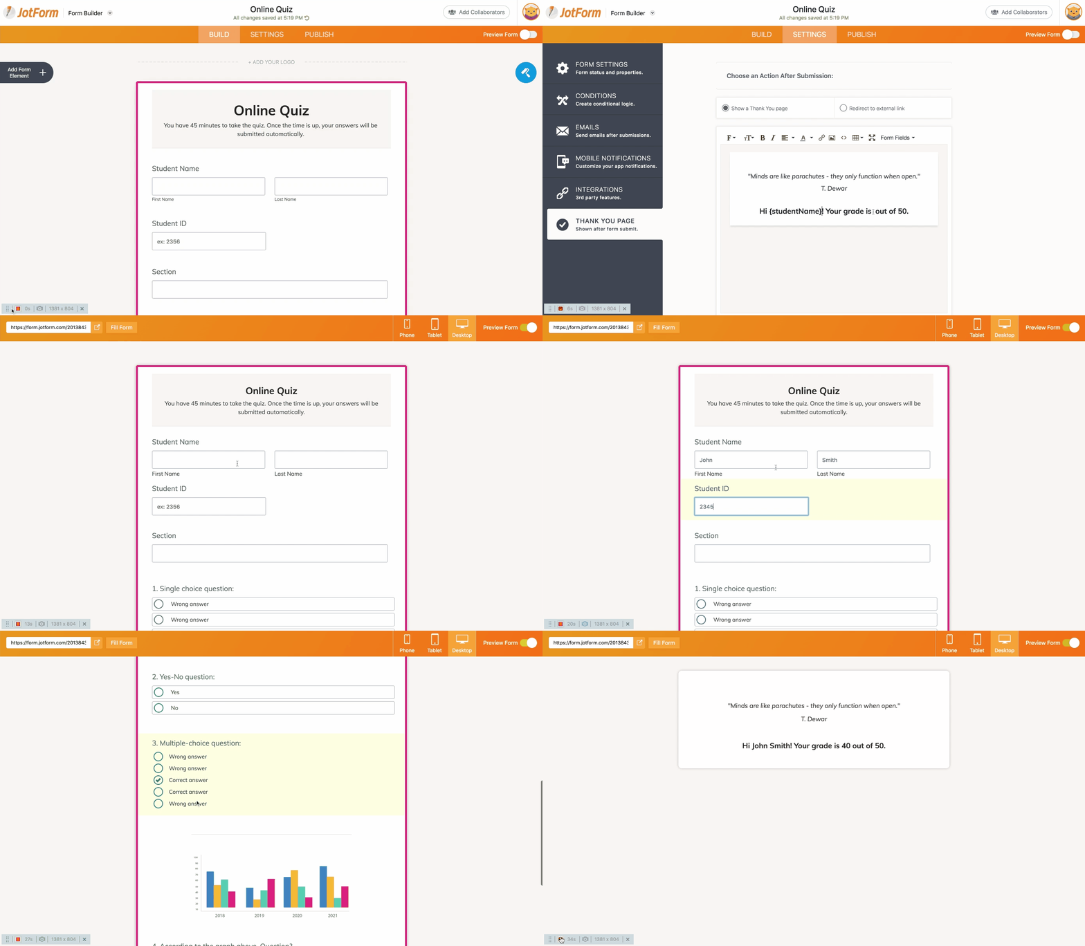
To get a better idea of what JotForm can do, check out this online quiz form template that highlights the different types of questions you can ask.

A customizable online quiz form template for educators

The sample quiz also includes a form calculation widget that automatically calculates grades based on correct and incorrect responses.

Creating a quiz

You can either build your own test or browse through our template gallery, which contains dozens of ready-made templates that can be tailored to match your needs. Regardless of which option you choose, it only takes a matter of minutes to create a wide range of tests, quizzes, and exams.

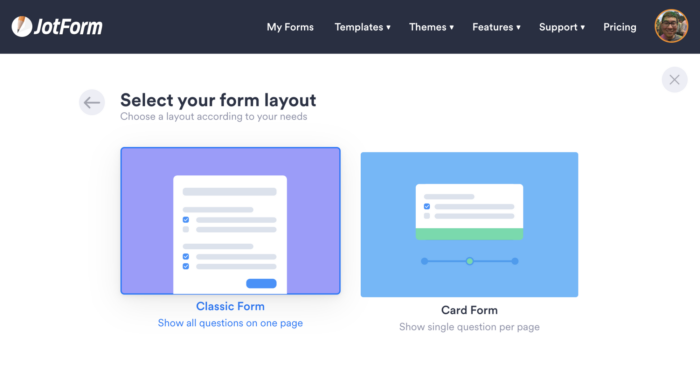
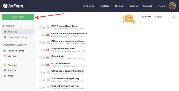
If you’d like to build your form from scratch, just open JotForm’s Form Builder and click on the Create Form button on the left side of the page.

From there, all you have to do is choose your preferred layout.

If you prefer to use one of the dozens of quiz templates in our template gallery, this Online Quiz Form template shows the different types of questions you can create in a matter of minutes.

Types of questions

Once you’ve selected a general layout for your quiz, click on the Add Form Element icon on the left side of the blank form.

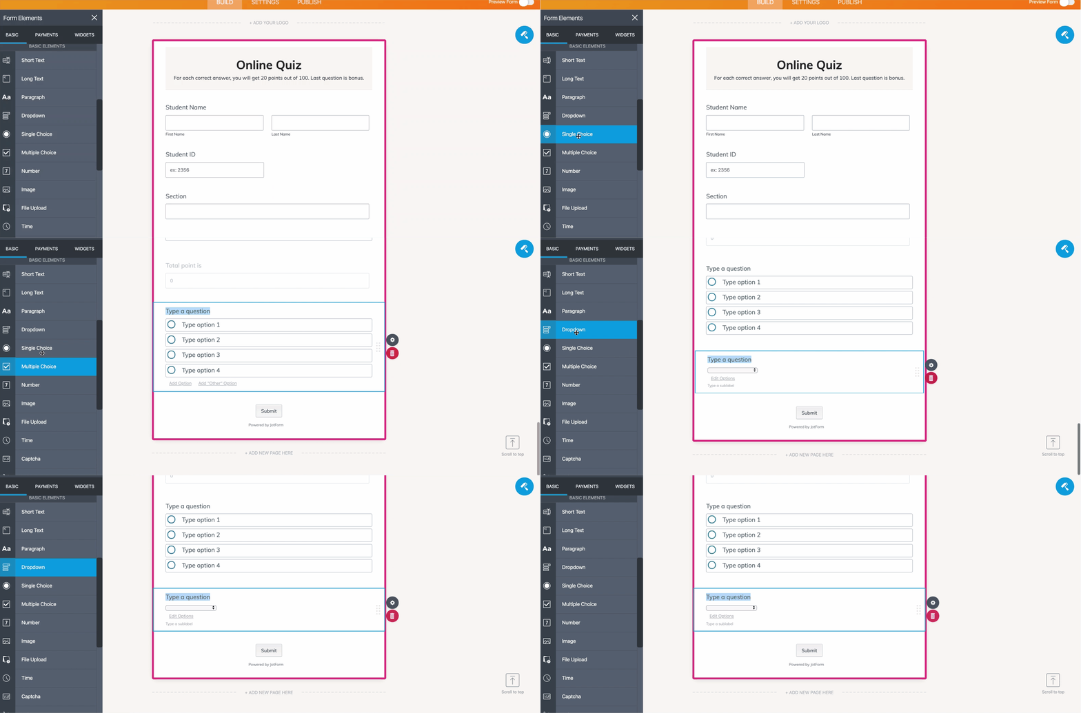
Scroll through the Form Elements menu that pops up, and you’ll find a wide variety of fields you can place on your form. If you’re not quite sure where to begin, we’ll demonstrate how these fields can create common types of quiz questions.

Single-choice

Single-choice questions allow students to pick a single answer from a short list of choices.

Either the Single Choice or Dropdown form element will come in handy if you want to test your students’ overall knowledge about a certain subject. After placing one of them on your form, all you need to do is type your question and list all of the possible answers, including the only correct one.

Yes/No and True/False

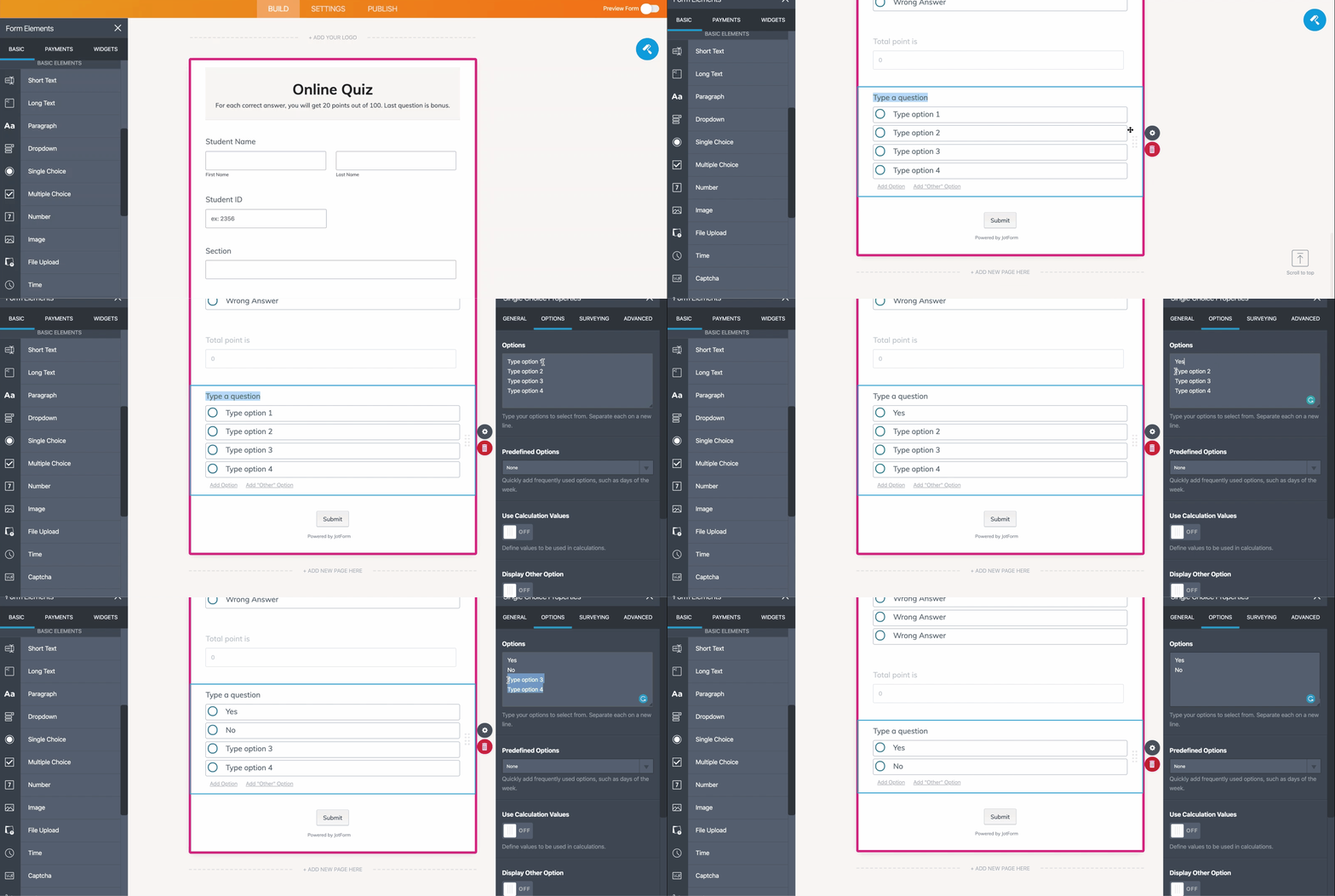
Yes-no and true-false questions are common on tests and can be advantageous for your students since there’s a 50-percent chance that they’ll select the correct answer. The Single Choice form element is the best choice for these types of questions. Simply add the field to your form, type the question you want to ask, and include two answer options: “yes” and “no,” or “true” and “false.”

Multiple-choice

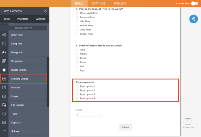
The Multiple Choice form element enables you to ask questions with more than one correct answer and lets students select the answers that they think are right.

Open-ended questions

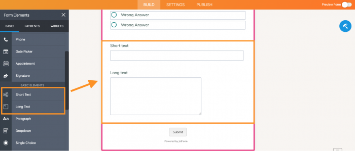
If it’s important for you to understand the thought process behind each student’s response, the Short Text or Long Text form elements will allow students to explain why and how they came up with their answer. Once you place either the Short Text or Long Text field on your form, type the question you want to ask or provide an essay prompt for students.

Fill-in-the-blanks

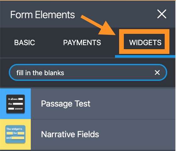
Fill-in-the-blank questions can be particularly useful when you want to gauge how well students understand a specific subject. You can use the Passage Test or Narrative Fields widget to create a sentence, paragraph, or short passage with blank fields that students must fill in.

Listings

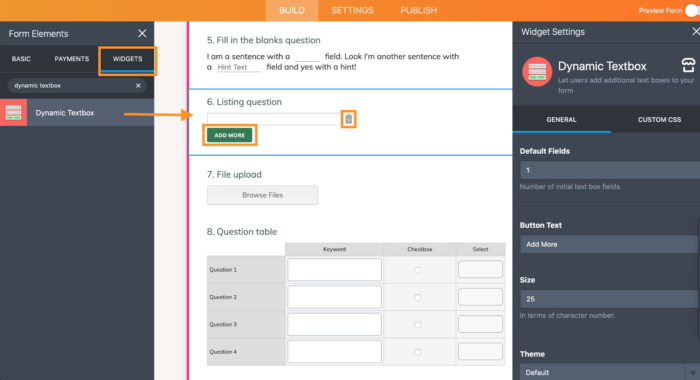
If you want to build some flexibility into a quiz or test, try the Dynamic Textbox widget. It allows your students to type out any number of answers to a certain question. Unlike traditional test questions that require students to select an answer from a variety of choices, the Dynamic Textbox widget enables your students to get creative, think critically, and provide answers that resonate with them.

Collect documents

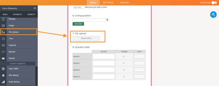
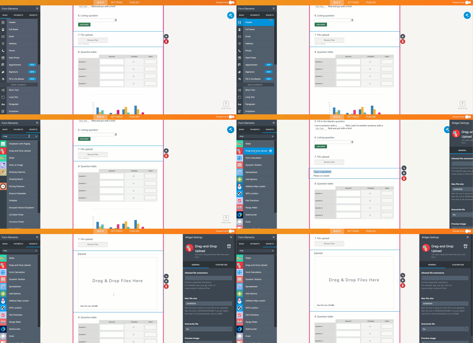
With the File Upload form element or Drag-and-Drop Upload widget, you can create a test that allows students to upload files, such as an essay, image, or video. These widgets not only allow your students to upload their work but also enable you to collect answers and multiple documents from a single quiz.

Question tables

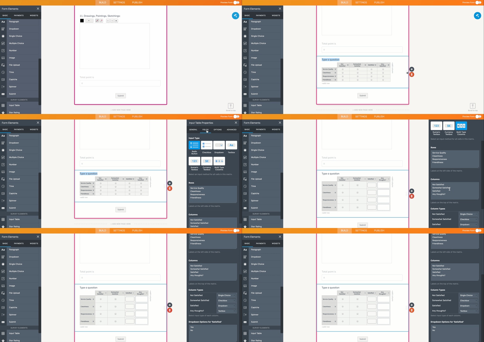
Question tables are handy when your class is covering a topic in detail. Our Input Table form element allows you to easily create question tables, as well as add rows and columns in a variety of formats.

For instance, students can type a keyword in one column, mark a checkbox in another one, and select an option from the dropdown menu in an adjacent column.

Once you add your question and type the options in the rows and columns, open the Input Table Properties menu, click on the Fields tab, and set the format for answers in your table using the Input Type section. You can change how responses are formatted and displayed within each column using the Column Types section under the Fields tab in the Input Table Properties menu.

Visual expression

There are times when it’s easier and more effective to ask a question using images, videos, and other graphic elements rather than just text.

JotForm allows you to build a question based on a graph, an image, or even a video by using the Image form element and one of the many video embedding widgets, such as Iframe Embed,Vimeo, or YouTube. After uploading an image or embedding a video, simply add a question beneath it using any format you’d like, such as a single-choice or fill-in-the-blank question.

Image options

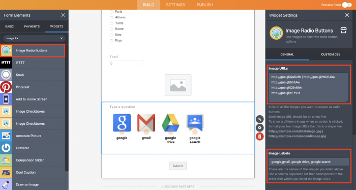
If you want to get fancy, JotForm’s Image Radio Button widget allows you to create questions and display responses that include images. All you have to do is type your question, list the image URLs, add labels for each one, and set the size for the images.

Drawings, paintings, and sketches

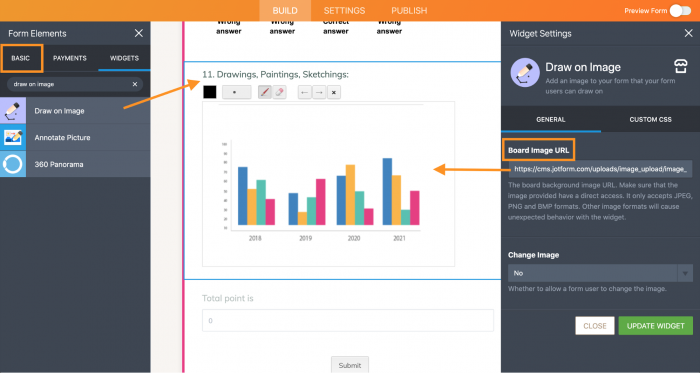
If you want to be really creative or give students some room to demonstrate their creativity, JotForm’s Draw on Image widget lets students draw, paint, sketch, and use their own handwriting on tests. You can either provide them a blank space or ask them to draw over a certain image, such as a graph.

Once you place the widget on your form, just type your question and add the image URL.

Connected/correlated questions

JotForm’s flexible features can show certain test questions only if students select specific responses to previous questions. For instance, if you ask a yes-no question, JotForm’s conditional logic capabilities will show specific follow-up questions, based on whether students selected yes or no.

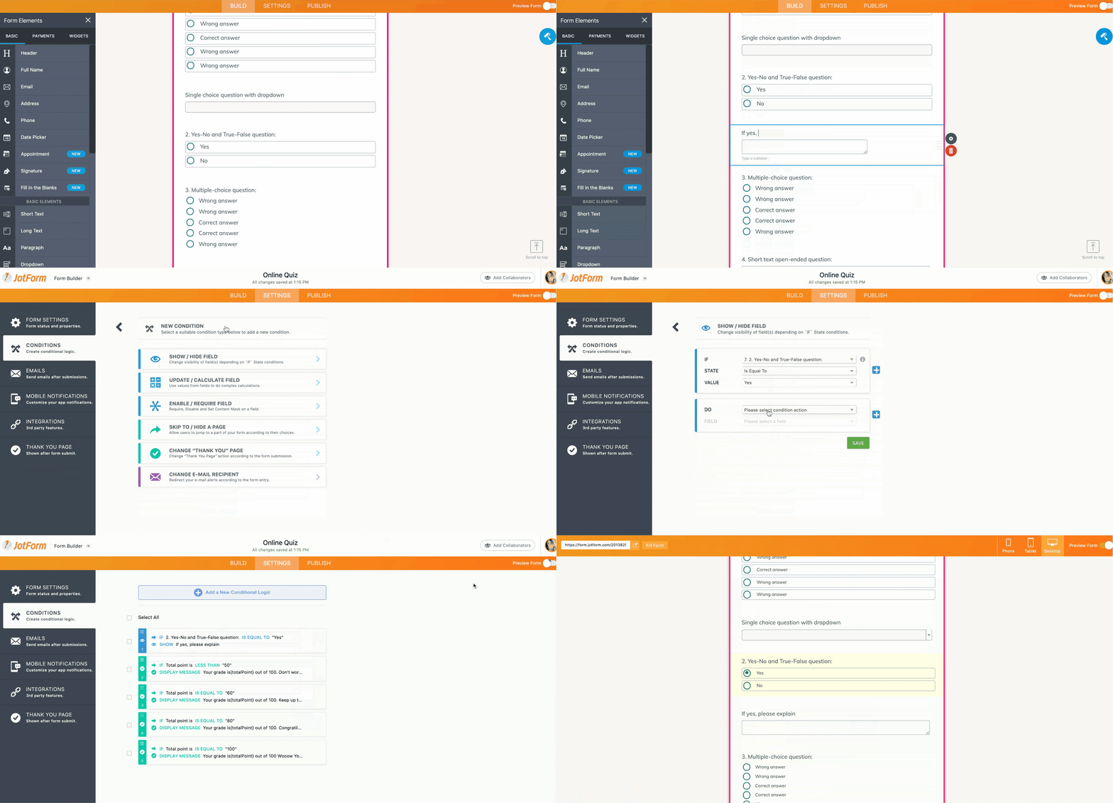
Setting up conditional logic in your form can get a little tricky, so we’ll walk you through the process:

  • Create a yes-no question and type the follow-up questions for both yes responses and no responses.
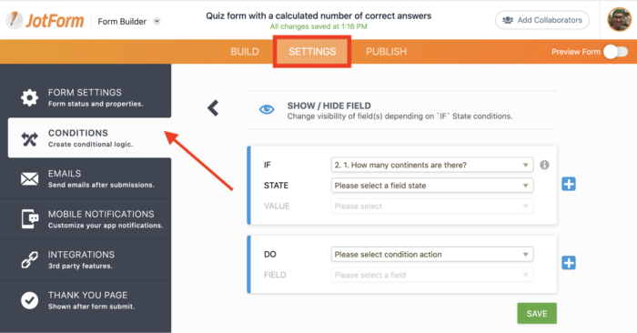
  • Click on the Settings tab toward the top of your form, select Conditions from the options menu, and create a new conditional statement.
  • Select the Show/Hide Field option and use the panel that appears to set a simple formula that will dictate when certain questions are shown and hidden. You must state what actions will trigger another set of actions to occur.
  • Select a question in the dropdown menu next to the IF field that will trigger another set of actions. (In this case, select the yes-no question form field.)
  • Select the answer a form respondent must give in the dropdown menu beside the STATE field to trigger an action. (In this case, select the Equal to option.)
  • Select the specific response to a question in the dropdown menu beside the VALUE field that’s impacted by a form respondent’s answer. (In this case, select yes.)
  • Select what action will be taken as a result of the form respondent’s answer by making a selection in the dropdown menu next to the DO field. (In this case, select Show from the available options.)
  • Select which form field will be impacted by an action in the dropdown menu next to the FIELD field. (In this case, choose the follow-up question for a yes response to the original question.)
  • Create a conditional statement for a no response to your question by repeating these steps.

Score quizzes and assignments

Creating a test and getting it to your students is only half the battle. Once they’ve completed your test and submitted it, you still have to review the responses from each student one by one, right?

False.

JotForm can not only help you create a wide range of quizzes, tests, and assignments but also calculate grades once students complete their work. This prevents you from spending hours on grading or inadvertently miscalculating a student’s grade.

As soon as an assignment, test, or quiz is submitted to you, JotForm can automatically calculate a grade based on how many questions were answered correctly and incorrectly.

Just so you know…

JotForm can’t calculate scores for certain questions, such as those where students must upload files or type in their own answers.

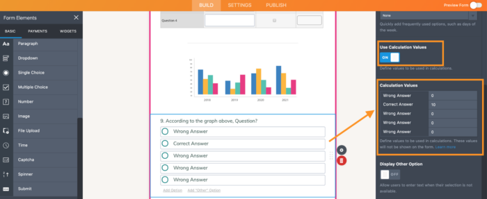
Before you set up the grade calculation process, it’s important to assign values — or points — for correct and incorrect answers to each question. To do this, select a question, click on the Properties icon, and switch on the Calculation Values option. Use the Calculation Values table to assign points for each answer — the number zero should be used to indicate incorrect answers, while values greater than one should be used for any correct answers.

For example, if a multiple-choice question is worth four points on a test, and there are two correct answers, each correct answer should be assigned a value of two points.

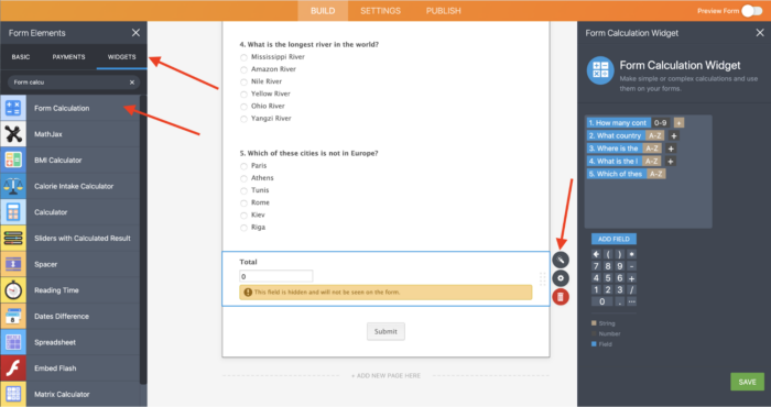
Once you’ve identified the correct and incorrect answers for each question, it’s time to set up the grading process. That may sound daunting, but there’s no need to fret when you have JotForm’s Form Calculation widget.

Once you locate the widget and click on it, go to the Widget Settings menu and use the Add Field button to select all the question fields that now have a designated score. Add a “+” in between each of the form fields and save your settings. When a student fills out and submits your form, this widget will sum up the assigned values for each selected answer.

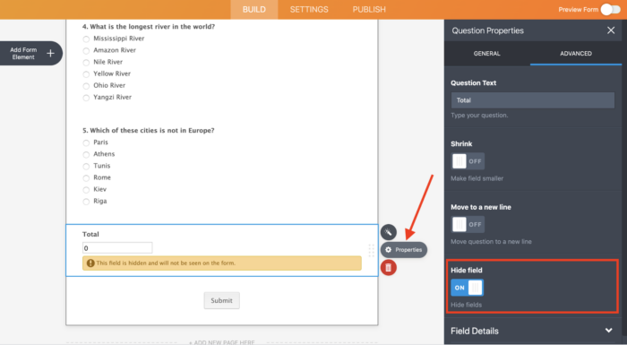
As a quick reminder, don’t forget to hide the widget from students by clicking on the question’s Properties icon and turning on the Hide field toggle switch under the Advanced tab. Doing this prevents students from viewing or changing their score until they submit their quizzes.

Assign quizzes to students and send reminder emails

Now that you’re a pro at making online quizzes, tests, and assignments, why not spring a pop quiz on your students?

If you’re thinking of sending the quiz to each student one by one, stop what you’re doing right now! JotForm’s new Assign Forms feature enables you to share your form with students and control their access to your quiz.

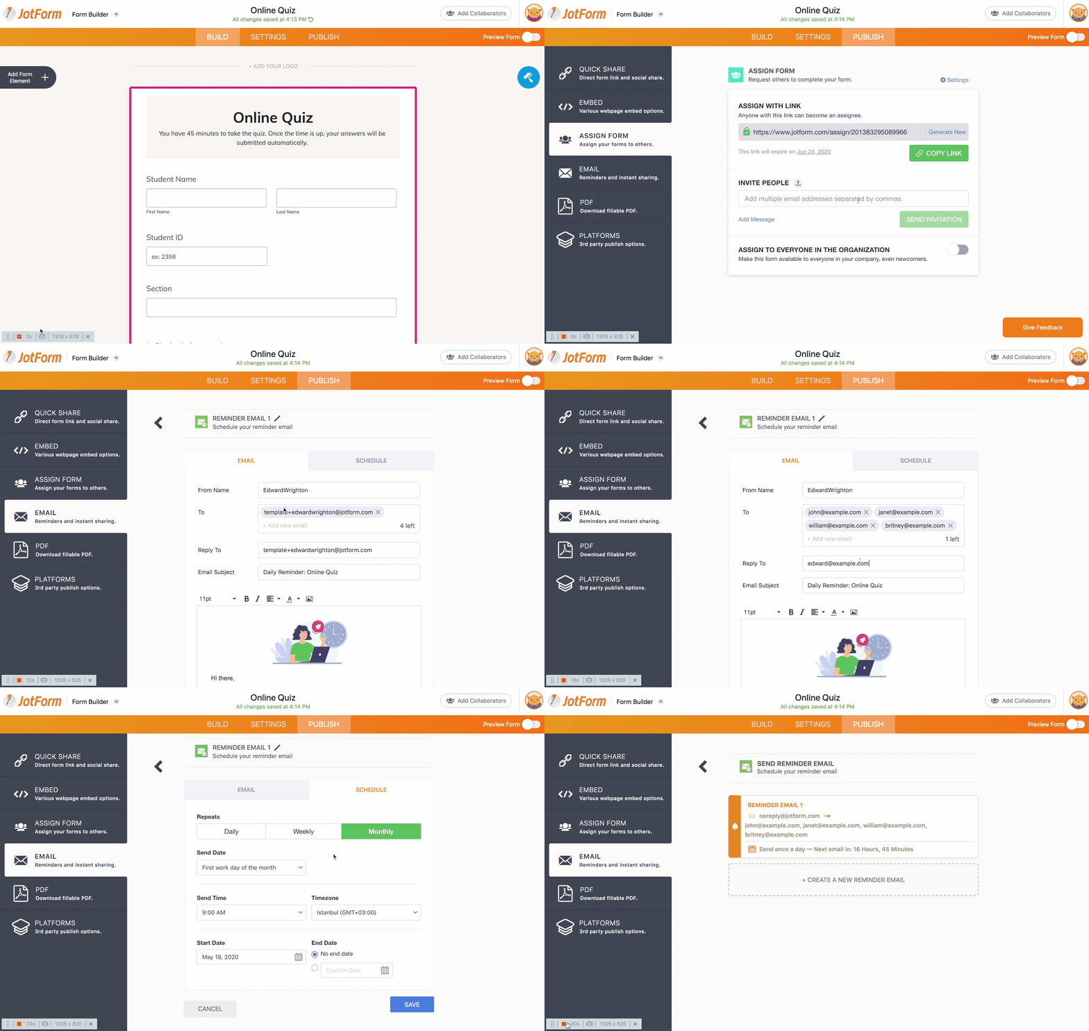
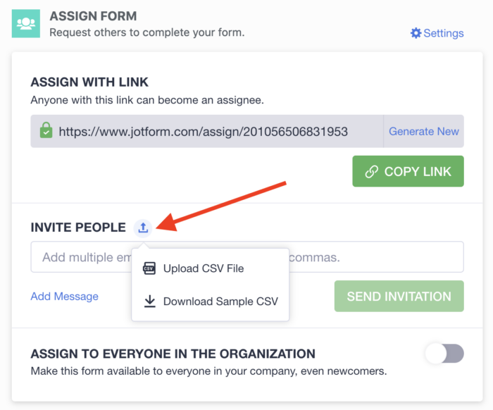
All you need to do is click on the Publish tab at the top of your online form and select Assign Form from the list of menu options. Paste your students’ email addresses into the Invite People field, and invite all of your students to take the quiz at once.

You can save time and eliminate manual data entry by uploading a CSV file that contains a list of email addresses for your students.

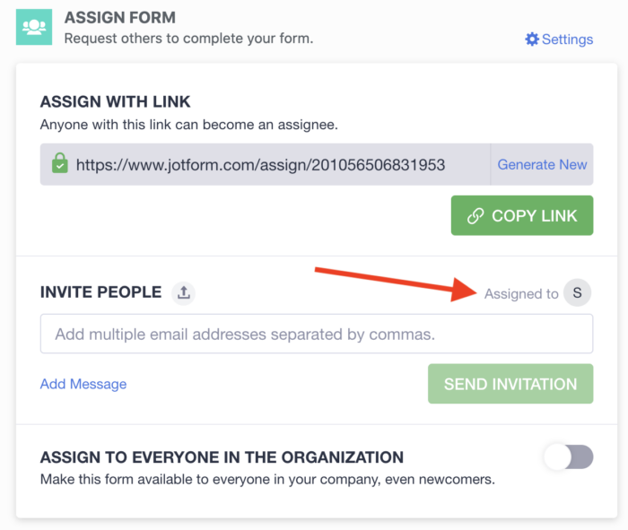
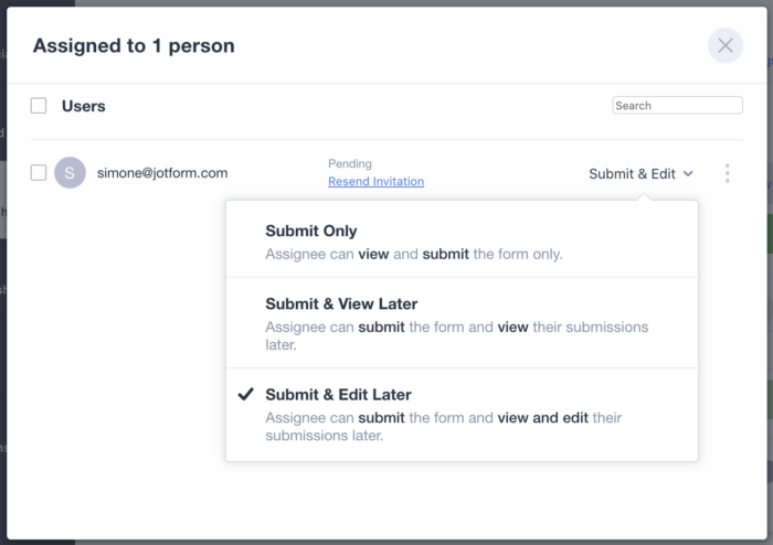
You can then edit their permissions by allowing them to view, edit, or fill in the form. Once you invite your students to take the quiz, you can change their level of access to your quiz by clicking on the Assigned to icon.

Edit their permission settings by using the dropdown menu that appears on the far right side of the row that includes their name.

To ensure that all of your students are notified about the quiz or assignment, schedule automated reminder emails to be sent on a daily, weekly, or monthly basis. Simply go to the Publish tab toward the top of your form, select Email from the list of menu options, and click on Schedule a Reminder Email. From there, you can customize the reminder email and schedule it to be sent out on certain days and at specific times.

View answers

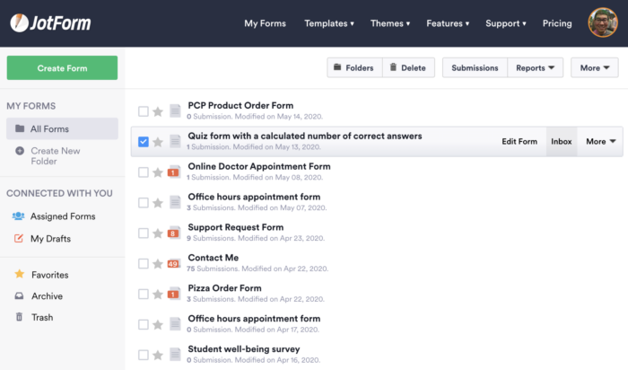
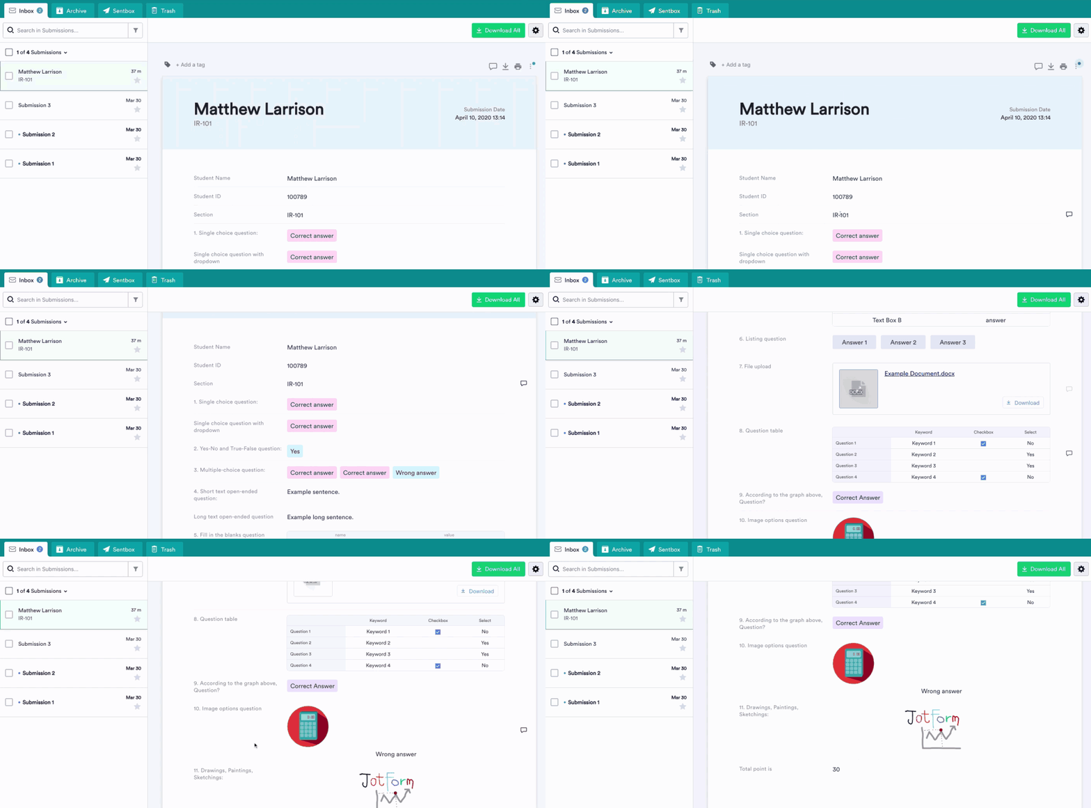
Once students submit their answers to your assignments or quizzes, their form responses will be sent to your JotForm inbox. You can access your inbox by clicking on the form in your My Forms page and selecting Inbox from the list of options.

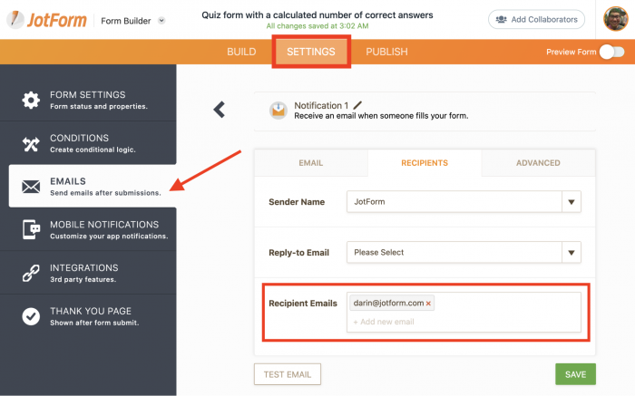
JotForm can send you an email notification once someone fills out and submits your form test. All you need to do is click on the Settings tab toward the top of the screen and select Emails from the list of menu options. Select Notification Email from the list of available email options, and add your email address to the Recipients Emails field.

Announce results and grades

It can be nerve-racking for students to wait for their grades. The good news is that tallying up scores and sending them out doesn’t need to take days or even hours. In fact, JotForm can show students their grades as soon as they complete a test, exam, or assignment and submit it to you. It’s important to note, though, that JotForm can’t calculate scores for certain questions, such as those where students must upload files or type in their own answers.

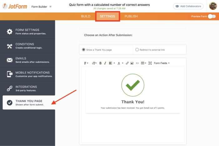
All you need to do is click on the Settings tab near the top of the Form Builder and select Thank You Page from the left sidebar. The Thank You Page appears immediately after a quiz is submitted. You can customize the page, add motivational phrases, and inform your students of their grades. Just select the Form Calculator from the Form Fields dropdown menu to let your students know how they did.

Conclusion

Although nothing beats in-person instruction, online, or distance, learning can not only help you reach students in more places but also develop a flexible curriculum that keeps students engaged when they can’t be in the classroom.

With JotForm, you can create interactive tests that will keep students on their toes and save time for everyone. Students no longer have to write out answers by hand and wait several days for their grades to arrive. More important, JotForm automatically calculates grades for most question types once students complete an online test and submit it, reducing the amount of manual work that teachers need to do.

Stop relying on old-school methods — and paper tests — to keep tech-savvy students engaged in a 21st-century classroom. Give JotForm a try today and surprise them by being the teacher with the coolest online tests on campus.

Categories: Others Tags:

Hosting and Security: Are You Leaving Your Doors Open Without Knowing it?

July 14th, 2020 No comments

Cybercrime is nothing new, but it is evolving. Being that each year the digital environment continues to grow and evolve new security threats keep revealing themselves.

It’s not so much that cybercriminals are getting overly powerful, it’s just that the digital sphere has grown so much that it’s hard to keep all the gaps closed.

When it comes to small businesses, first websites tend to be rushed affairs. In a lot of cases, SMB owners don’t have a lot of experience with setting up an online presence for their brand, which can lead to mistakes of various severity ranging from minuscule to very serious.

The biggest mystery for them is probably hosting and the server-side of things. In a lot of cases, they just pay for hosting without even knowing what type of hosting they’re getting let alone if it’s set up properly and has all the right protections.

Let’s see what you need to pay attention to when purchasing hosting.

Backup is essential

Things happen, nobody is perfect, no software is infallible, and downtime can be forgiven. What cannot be forgiven is not having a backup for the files you host.

If a malfunction occurs on the server, all the files that belong to the client can be lost. Being that most business websites are living things that constantly go through changes (product pages, blog posts, banners, etc.), a lot of time is wasted on recovering everything. In some cases, it’s impossible.

The only thing that can help is having backup files.

Understand the type of hosting you are getting

Not all hostings are the same. There are more than a few options to choose from, and what you’ll be getting will depend on what you intend to do with your website.

Here are the prominent hosting types:

  1. Shared hosting – Cheap, shared resources, low security.
  2. VPS (Virtual Private Server) – Somewhere between dedicated and shared hosting, good security.
  3. Cloud hosting – Instead of storing data on one server, it is fragmented on multiple machines, good security.
  4. Dedicated hosting – A dedicated server for your business with all resources at your disposal, good security.
  5. Managed hosting – The provider manages everything from hardware, software, updates, patches, and so on, good security.
  6. Colocation hosting – You share physical server rooms with other businesses, but you have your own hardware, you take care of everything and get higher bandwidth, security is what you make it.

As you can see, there are quite a few options to go for, and it all depends on your know-how. Choosing the wrong provider may lead to security gaps and inconsistency in service.

Network monitoring is essential for prevention

Your website is a particular symbiosis between hardware and software. This symbiotic system is quite complex, and its performance is not always the same.

If you get hosting with network monitoring, you’ll be getting updates on how well each part of the system is performing. It can be useful for optimization but also in times when you’re experiencing traffic spikes that may cause some parts of your website to malfunction.

Furthermore, network monitoring also records and reports access from unknown machines, IP-addresses, and other suspicious activity happening on your server.

Firewall, DDoS protection & SSL

Most of us have at least a basic understanding of what a Firewall is. It serves as a barrier between the server and the rest of the web. We’re talking about host-firewalls, which are responsible for traffic coming in and out of a server machine.

DDoS attacks are the most common malicious attacks a server can experience. Their full name is Distributed Denial of Service, and the concept behind them is fairly simple.

Multiple devices bombard one system with requests for data and/or queries in order to prevent anyone else from gaining access to the server’s resources. It can be done to incapacitate a particular service or an entire server. These are considered basic protection.

With these attacks, we face a denial of service through the virtual hijacking of server resources like RAM, bandwidth, and CPU. Having a mechanism to protect you from these is essential for serious businesses.

SSL encryption (or TLS as the current version of the certificate is called) is something you see every day but don’t know what it is. The “https” marking that you see in the link of a particular website is functioning under the security certification of TLS.

Here’s what SSL/TLS ensures your visitors have when they visit your website:

  • Confirmation of website authenticity.
  • The documentation signed within your webpages isn’t altered.
  • The communication between users and the server is encrypted.

Having this security certificate also helps with SEO as it shows search engines that the website is secure.

User access and permissions

Now, this is more of an internal thing. It is up to you to decide who has access to what within the server.

This goes for basic users, moderators, administrators, and so on. We’re not going to go into the details of how to do this, as it will depend on what server you’re using.

Be advised that failing to set these parameters properly can open your server to manipulation, tampering, and even theft of sensitive business and customer data.

Regular updates

Updates are not there to only remove bugs and improve performance. They’re there to close up any security holes that might have been identified. Missing one update can be bad for you if you are unlucky. Missing multiple updates increases this risk many times over.

Oftentimes we hear about exploits that developers didn’t realize they left open to hackers, and these updates help them close them up. The longer the list of updates you missed, the longer the list of potential security breaches you are leaving your server open to.

We understand that some updates may make a bunch of plug-ins go down. Change them!

Updates take precedent over non-essential functionalities.

We hope we managed to help you understand the connection between the hosting and security of your online business. Do additional research for things you can’t understand – nobody expects you to – and find an approach that keeps you safe.

Categories: Others Tags:

Is Redesigning Your Mobile App A Bad Idea?

July 14th, 2020 No comments
Scrabble GO home screen

Is Redesigning Your Mobile App A Bad Idea?

Is Redesigning Your Mobile App A Bad Idea?

Suzanne Scacca

2020-07-14T11:00:00+00:00
2020-07-15T16:33:48+00:00

I’m all for updating and upgrading mobile apps. I think if you’re not constantly looking at ways to improve the user experience, it’s just too easy to fall behind.

That said, a redesign should be done for the right reasons.

If it’s an existing app that’s already popular with users, any changes made to the design or content should be done in very small, incremental, strategic chunks through A/B testing.

If your app is experiencing serious issues with user acquisition or retention, then a redesign is probably necessary. Just be careful. You could end up making things even worse than they were before.

Let’s take a look at some recent redesign fails and review the lessons we can all learn from them.

Lesson #1: Never Mess With A Classic Interface (Scrabble GO)

Scrabble is one of the most profitable board games of all time, so it’s no surprise that EA decided to turn it into a mobile app. And it was well-received.

However, that all changed in early 2020 when the app was sold to Scopely and it was redesigned as an ugly, confusing and overwhelming mess of its former self.

Let me introduce you to Scrabble GO as it stands today.

The splash screen introducing gamers into the app looks nice. Considering how classically simply and beautiful the board game is, this is a good sign. Until this happens:

Scrabble GO home screen

The Scrabble GO home screen is distraction overload. (Source: Scrabble GO) (Large preview)

I don’t even know where to start with this, but I’m going to try:

  • The colors are way over-the-top and there are too many.
  • Since “Start New Game” is the primary action users want to take, it should be the only button in that color, but “Level 5” and “Level 6” distract from it.
  • The interface is so cluttered that it’s hard to focus on any particular part of it.
  • There’s no sense of control or priority within the design.
  • The navigation has gated pages! And I’m not sure what that icon on the left is supposed to be… gems and rewards? Why then is there a gem counter in the top banner?

Beyond the UI of the homescreen, the UI and UX within the game board have been altered, too.

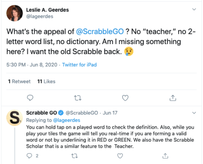
Take, for instance, this plea from @lageerdes on Twitter:

Twitter user @lageerdes tells Scrabble GO she wants the old app back

Twitter user @lageerdes asks Scrabble GO why the old functionality is gone. (Source: Twitter) (Large preview)

It took Scrabble GO over a week to tell @lageerdes something that could’ve easily been spelled out in a game FAQ or Settings page. These aren’t the only classic features that the new app has either complicated or done away with.

Now, Scopely took note of the negative comments from users and promised to revamp the app accordingly (which was promising). But rather than revert back to the old and much-loved design, it just added a new mode:

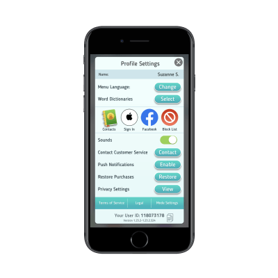
Scrabble GO settings with 'Mode Settings'

Scrabble GO added new ‘Mode Settings’ to appease users. (Source: Scrabble GO) (Large preview)

You’d think that the mode switcher would be more prominently displayed — like in the menu bar. Instead, it’s buried under the “Profile Settings” tab and there’s no indication anywhere in the app that the classic mode even exists.

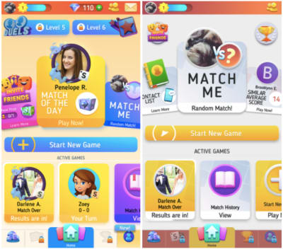
Sadly, classic mode isn’t much of an improvement (classic is on the right):

Scrabble GO home screen vs. the newly designed classic home screen

The new Scrabble GO home screen versus the newly designed classic mode home screen. (Source: Scrabble GO) (Large preview)

The colors are toned down, some of the elements in the top-half have been cut out or minimized, but it doesn’t address any of the users’ issues with the app or game play.

Worse, many users are reporting the app crashes on them, as this complaint from Twitter user @monicamhere demonstrates:

Twitter user @monicamhere complains that Scrabble GO app crashes

Twitter user @monicamhere complains to Scrabble GO about the app crashing. (Source: Twitter) (Large preview)

I suspect this is happening because the developers jammed a second overloaded mode into the app rather than simply refine the existing one based on user feedback.

So, what’s the lesson here?

  • For starters, don’t mess with a classic.
    The old mobile app closely resembled the physical board game and it was a huge part of its appeal. When you throw out an old design for something (seemingly) more trendy, you run the risk of alienating once-loyal users.
  • Also, if it ain’t broke, don’t fix it.
    Previously, the app was very easy to use and came with all the features and functionality users were familiar with from the board game. Now, they’re left with a non-intuitive and distracting mess.
  • If your users are telling you to ditch the redesign, listen to them.
    Who are you building this app for? Yourself or the users who are going to play with it and put money into your pocket?

Listen to what your users have to say. It’s valuable feedback that could make a world of difference in the user experience.

Lesson #2: Never Mislead Users At Checkout (Instacart)

This is an interesting case because the people who objected to this particular Instacart UI update weren’t its primary users.

Here’s why the change was an issue:

Users go onto the Instacart website or mobile app and do their grocery shopping from the local store of their choice. It’s a pretty neat concept:

Instacart mobile app - shopping with Wegmans

Instacart users can do virtual shopping with grocery stores like Wegmans. (Source: Instacart) (Large preview)

Users quickly search for items and add them to their virtual shopping cart. In many cases, they have the option to either do curbside pickup or have the groceries delivered to their front doorstep. Either way, a dedicated “shopper” picks out the items and bags them up.

When the user is done shopping, they get a chance to review their cart and make final changes before checking out.

On the checkout page, users get to pick when they want their order fulfilled. Beneath this section, they find a high-level summary of their charges:

Instacart checkout tab with summary of charges

Instacart checkout sums up the total costs of a user’s order. (Source: Instacart) (Large preview)

At first glance, this all appears pretty-straightforward.

  • The cost of their cart is $174.40, which they already knew.
  • There’s a service fee of $9.99.
  • Sales tax is $4.11.
  • And the total is $197.22.

But before all that is a section called “Delivery Tip”. This is where Instacart’s shoppers take issue.

They argued that this is a dark pattern. And it is. Let me explain:

The first thing that’s wrong is that the Delivery Tip isn’t included with the rest of the line items. If it’s part of the calculation, it should be present down there and not separated out in its own section.

The second thing that’s wrong is that the tip is automatically set at 5% or $2.00. This was the shoppers’ biggest grievance at the time. They believed that because the “(5.0%)” in the delivery tip line wasn’t there in 2018, users might’ve seen the amount and thought “That seems reasonable enough” and left it at that. Whereas if you spell out the percentage, users may be inclined to leave more money.

For users who take the time to read through their charges and realize that they can leave a larger tip, this is what the tip update page looks like for small orders:

Instacart delivery tip customization

Instacart enables users to change the way they tip the delivery person. (Source: Instacart) (Large preview)

It’s oddly organized as the pre-selected amount sits at the very bottom of the page. And then there’s a random $6 tip included as if the app creators didn’t want to calculate what 20% would be.

That’s not how the tip is presented to users with larger orders though:

Instacart users can customize delivery tip on big orders

Instacart enables users to customize the tip they leave the delivery person, from 5% to 20% or they can customize the amount. (Source: Instacart) (Large preview)

It’s a strange choice to present users with a different tip page layout. It’s also strange that this one includes an open field to input a custom tip (under “Other amount”) when it’s not available on smaller orders.

If Instacart wants to avoid angering its shoppers and users, there needs to be more transparency about what’s going on and they need to fix the checkout page.


Dark patterns have no place in app design and especially not at checkout.

If you’re building an app that provide users with delivery, pickup or personal shopper services (which is becoming increasingly more common), I’d recommend designing your checkout page like Grubhub‘s:

Grubhub checkout page with tips

The Grubhub checkout page recaps the user’s order and provides tip amounts in percentages. (Source: Grubhub) (Large preview)

Users not only get a chance to see their items at the time of checkout, but the tip line is not deceptively designed or hidden. It sticks right there to the bottom of the page.

What’s more, tips are displayed as percentage amounts instead of random dollars. For U.S. consumers that are used to tipping 20% for good service, this is a much better way to ensure they leave a worthwhile tip for service workers rather than assume the dollar amount is okay.

And if they want to leave more or less, they can use the “Custom” option to input their own value.

Lesson #3: Never Waver In Your Decision To Roll Back (YouTube)

When the majority of your users speak up and say, “I really don’t like this new feature/update/design”, commit to whatever choice you make.

If you agree that the new feature sucks, then roll it back. And keep it that way.

If you don’t agree, then tweak it or just give it time until users get back on your side.

Just don’t flip-flop.

Here’s what happened when YouTube switched things up on its users… and then switched them again:

In 2019, YouTube tested hiding its comments section beneath this icon:

The Verge and XDA Developers - YouTube comments test

The Verge and XDA Developers report on a new placement of YouTube comments in 2019. (Source: Verge) (Large preview)

Before this test, comments appeared at the very bottom of the app, beneath the “Up next” video recommendations. With this update, however, they were moved behind this new button. Users would only see comments if they clicked it.

The response to the redesign clearly wasn’t positive as YouTube rolled back the update.

In 2020, YouTube decided to play around with the comments section again. Unlike the 2019 update, though, YouTube’s committed to this one (so far).

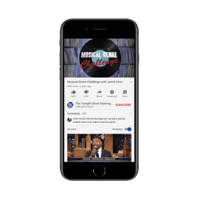
Here’s where the comments appear now:

YouTube comments section design in 2020

The YouTube comments redesign puts the comments above the ‘Up next’ section. (Source: YouTube) (Large preview)

They’re sandwiched between the “Subscribe” bar and the “Up next” section.

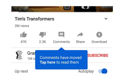
If YouTube users go looking for the comments section in the old spot, they’re going to find this message now:

YouTube notice: ‘Comments have moved'

A notice appears when YouTube users go looking for comments in the old location. (Source: YouTube) (Large preview)

This is a nice touch. Think about how many times you’ve had to redesign something in an app or on a website, but had no way of letting regular users know about it. Not only does this tell them there’s been a change, but “Go To Comments” takes them there.

With this tooltip, YouTube doesn’t assume that users will zero in on the new section right away. It shows them where it is:

YouTube new comments section tooltip

YouTube users see tooltip that shows them where the new comments section is. (Source: YouTube) (Large preview)

I actually think this is a good redesign. YouTube might be a place for some users to mindlessly watch video after video, but it’s a social media platform as well. By hiding the comments section under a button or tucking them into the bottom of the page, does that really encourage socialization? Of course not.

That said, users aren’t responding well to this change either, as Digital Information World reports. From what I can tell, the backlash is due to Google/YouTube disrupting the familiarity users have with the app’s layout. There’s really nothing here that suggests friction or disruption in their experience. It’s not even like the new section gets in the way or impedes users from binge-watching videos.

This is a tricky one because I don’t believe that YouTube should roll this update back.

There must be something in YouTube’s data that’s telling it that the bottom of the app is a bad place for comments, which is why it’s taking another stab at a redesign. It might be low engagement rates or people expressing annoyance at having to scroll so much to find them.

As such, I think this is a case for a mobile app developer not to listen to its users. And, in order to restore their trust and satisfaction, YouTube will need to hold firm to its decision this time.

Is A Mobile App Redesign The Best Idea For You?

Honestly, it’s impossible to please everyone. However, your goal should be to please, at the very least, most of your users.

So, if you’re planning to redesign your app, I’d suggest taking the safe approach and A/B testing it first to see what kind of feedback you get.

That way, you’ll only push out data-backed updates that improve the overall user experience. And you won’t have to deal with rolling back the app or the negative press you get from media outlets, social media comments, or app store reviews.

Further Reading on SmashingMag:

(ra, yk, il)

Categories: Others Tags:

Smashing Podcast Episode 20 With Marcy Sutton: What Is Gatsby?

July 14th, 2020 No comments
Photo of Marcy Sutton

Smashing Podcast Episode 20 With Marcy Sutton: What Is Gatsby?

Smashing Podcast Episode 20 With Marcy Sutton: What Is Gatsby?

Drew McLellan

2020-07-14T05:00:00+00:00
2020-07-15T16:33:48+00:00

Today, we’re talking about Gatsby. What is it and how does it fit into your web development stack? Drew McLellan talks to expert Marcy Sutton to find out.

Show Notes

Weekly Update

Transcript

Drew McLellan: She is the lead engineer on the Developer Relations team at Gatsby. Previously, she worked on the open source axe-core accessibility testing library, and has also worked as an accessibility engineer at Adobe. She’s passionate about improving the web for people with disabilities and often speaks about it at conferences. In 2016, O’Reilly gave her web platform award for a work in accessibility.

Drew: She also co-leads the accessibility Seattle and NW Tech Women Meetups in a local region. So, we know she’s a skilled engineer and an accessibility expert. But did you know she wants to send it Angel Falls in a barrel? My smashing friends please welcome Marcy Sutton.

Marcy Sutton: Hello.

Drew: Hello. Marcy. How are you?

Marcy: I’m smashing. How are you?

Drew: I’m very good. Thank you. I wanted to talk to you today about Gatsby. Because it came up in a conversation I was having on a previous episode about learning React with Mina Markham. I realized I was in danger of doing the typical man on the internet thing of giving an opinion on something that I had no direct experience of. So that’s not how we do things at Smashing.

Drew: And I want to make sure that we properly cover Gatsby. And what better way to do it than to talk somebody who knows it inside and out. So, presuming that perhaps I’ve heard the name Gatsby. But I’ve got no idea where it fits into the stack when building website. What exactly is Gatsby.

Marcy: Gatsby is a website generator, it currently uses React. But it will create a static website for you that then will rehydrate into a full React web application. So you really get the best of both worlds with fast builds that you’re compiling HTML files that will load fast for users. And then you get all of this enhancement with JavaScript to make really interactive dynamic web apps.

Marcy: So, it’s really exciting space to be in. And I’ve been working on the learning side with documentation and now on the Devrel team, I’m focused on making it as good as it can be, knowing accessibility challenges with JavaScript and just trying to fix it from the inside out.

Drew: Many of us will be familiar, I guess, with the concept of a static site generator. And Gatsby seems to broadly fit into that role. But to me, it seems like it goes a lot further than the most SSG’s do. And most site generators are front-end code agnostic. It seems that with Gatsby, you end up with Gatsby code running as part of your site. Is that a fair assessment? And if so, what sort of things is Gatsby actually doing in your front-end?

Marcy: Yes, I’d say the biggest piece of that is client side routing. So, Gatsby right now is using reach router under the hood. It does kind of its own implementation. But that is the piece that when you load your static site for the first time, there are HTML files there. So, if the user turns JavaScript off for some reason, your site should still be there, still have content.

Marcy: But if JavaScript is enabled, that’s when this hydration step happens where, when you use links in your Gatsby site, it will go pre-fetch resources from that page, so it will load faster. So, that is all enabled with this JavaScript layer that Gatsby gives you. And so beyond that, it really depends kind of what you’re using in your site will end up in that JavaScript bundle.

Marcy: But for things that use a lot of interactivity, like accessible interfaces, that’s a good place to be. For me, I really enjoy having JavaScript available to me at all times, and having my markup just be in a good spot. I know it’s a matter of preference, whether you want your HTML and your JavaScript and your CSS all kind of neatly coupled and there’s room for variations within building Gatsby

Marcy: You don’t always have to use something like CSS and JS. But it’s really about getting the power of that dynamic JavaScript layer, available to you while you’re writing your website. It’s not like this add on in a separate file.

Drew: When I think of how a static site generator usually works, I’m thinking of content in perhaps Markdown files. And the generator runs across that content and merges it with templates and creates 10s, hundreds, thousands of HTML files, which are the pages of your website. When I think of a React site or app, I’m thinking more about single page experience where the interfaces be created by React on the fly. So, you’re saying Gatsby does both of those? It’s creating all the pages and also enhancing it with JavaScript?

Marcy: It is, yes. Gatsby will use Node.js at build time, it will go over your React components and compile them into HTML files. Which honestly, the first time I looked at Gatsby I wouldn’t turn JavaScript off and was like, “All right, are there other pages here, what is this?” And I was so happy that Gatsby works that way by default. It will create built files from your react components, which is awesome.

Marcy: I have explored more progressive enhancement approaches since it’s in JavaScript. Like what if you want to output something progressively enhanced for users, where if they do have JavaScript turned off, you don’t want all this broken code that assumes JavaScript is there. So there are some quirks with it. But you can work around that kind of thing at least for your core user flows where you want someone to still be able to buy something, you might need to add some support and for those use cases.

Marcy: But I’ve been pleasantly surprised that the way that Gatsby rolls that out by default. And so, it is a choice that they made to build sites that way, and we’re always evaluating it. Is it still the best way? What do we need to do to give our users what they’re asking for? So, we’re doing some explorations internally, ongoing just to make sure Gatsby is doing the best job it can at building a website.

Marcy: So keeping bundle sizes small, and making sure that for making trade offs for what we say is performant code with pre-fetching. Like, do we have the data to back that up? That’s the kind of thing as a developer advocate that I’m super interested in, is making sure that what we’re packaging and bundling on websites is actually needed and will really make the best Gatsby site it can make.

Drew: You mentioned performance there, and there’s a big focus on performance. It certainly seems from the way that Gatsby presents itself. Is that a true feature of Gatsby or is it just the nature of JAMstack websites?

Marcy: I think it can be a nature of JAMstack websites. Ultimately, it’s going to come down to what you’re bundling on your website. So, no matter what framework or tool you’re using, we still have to be thoughtful in what we’re putting in those bundles for end users. But Gatsby really aims to give you good defaults. Not only for performance, but for accessibility as well.

Marcy: But that always takes evaluation, we always have to make sure that if we’ve added something, that it’s still performant. But yeah, getting that initial payload of static files, they load fast. Much faster than classic WordPress site that I used to have. But then enhancing it with JavaScript. There are some trade offs there for sure.

Marcy: But it works really well, lots of people, they really like their Gatsby sites. So, it’s been fun to get to work on it full time, and learn the ins and outs of a JavaScript framework like Gatsby.

Drew: What sort of performance features just Gatsby actually put into place to speed up your sites?

Marcy: Well, with the pre-fetching for links, this client said routing stuff, I’d say that’s probably the biggest one. Making it really easy to generate a progressive web app. So, having some offline capabilities, you can sort of pick and choose what you want in terms of offline and PWA type stuff. But they really make that part of the initial experience, like a lot of the starter example sites that you might start from have examples of using a manifest, and kind of making that modern version of your website.

Marcy: Really, it’s like not shipping code that you don’t need. That’s a big part of it. Caching, that’s really the pre-fetching for links. That’s what I would say is the biggest piece of it.

Drew: So this is where the site is actually anticipating where the user is going to go. Is it as intelligent as that or does it pre-fetch everything on the page or?

Marcy: No, it’s based on user interaction. So, if the user scrolls down the View port, there’s something pre-fetching that happens there. If you hover over links, it will kind of estimate that there’s a pretty good chance that you might go to that page. We’ve been talking internally, well, I guess, open source to about whether that pre-fetching should happen on keyboard focus too, so that intersection of accessibility and performance is very interesting.

Marcy: There’s some trade offs there like should a keyboard user who can’t use the mouse and is tabbing through every link to navigate, should that really be fetching content for every single one of those because a mouse user might be a bit more selective about where they put their mouse cursor. So, those conversations I find extremely fascinating.

Marcy: And trying to think of what data do we need to validate these assumptions too. So yeah, it’s been super interesting to look at those defaults and what improvements can we make and really checking like how much data is that fetching? Is that really a good thing? Just to speed it up a little bit? Or is it fast enough without that? Are there alternative solutions that we could use as part of the fun of working on a framework because being able to evaluate all those trade offs.

Drew: This is pre-fetching something that users just get for free in their site. So do they have to do any work to implement it?

Marcy: You do get it for free using Gatsby link. So it’s a component that comes with Gatsby and when you use that, it outputs anchor tags. So your HTML is real HTML and you’ve leveraged the web platform in that way. But in your React components, you are working directly with the Gatsby link component. And that has all of those mechanisms for… It looks at whatever your future HREF will be, for that link of where you want to go to and it will go and grab resources from that link and preload them.

Marcy: And it’s only internal to your site. So it’s not going off and trying to fetch things on other websites. But it seems to work pretty well. I know some users are actively looking for ways, like you actually have to opt out of some of these things. At least routing, not using the pre-fetching. You just use regular anchor tags. And then you don’t really get that functionality. It’s pretty easy to use something else. But some of the discussions we’re having are around client side routing, and how to make that the best it can be. And so, that’s a really interesting space too.

Drew: How closely do you have to work within the Gatsby ecosystem in terms of if I wanted to have my own link component? Would that be completely fine, I wouldn’t be fighting against Gatsby to do that sort of thing?

Marcy: No, you could slot in whatever components you want, as long as they work with the React runtime. That’s really the beauty of it. Anything you could put in a React app, you could put in a Gatsby app. There’s even a pre-React plugin. So, there are some alternatives to working with Gatsby. But I love how you can pull in whatever, off the shelf components that you want to use or write your own.

Marcy: And I think that flexibility is what people really enjoy. There is the caveat of it uses the React runtime. And so, you have to be okay with using react or using this pre-React plugin. But personally, I really like react and JSX for working with accessibility and templates, especially with React hooks. So, being able to use the hut in my Gatsby site is just so cool. I really like it.

Drew: And how’s the process of building a Gatsby site that’s presumably a node module that you can just install and you would do a build like you would with any other static site generator?

Marcy: Yes. There is a CLI that you install globally. And I guess it’s whether you want to install it globally. That’s what we recommend, because then you can run it from any directory on your computer, but it will pull down whatever you need to build a Gatsby site. And then you can add on, say you wanted to use WordPress as a headless CMS or some other content source.

Marcy: You can install packages, plugins to make that work, and then integrate it with your site. There’s also some starters and themes that you can use to get up and running quicker. I’ve used those if I want to test out something or start a site rapidly for a specific integration like Drupal or prismic or whichever CMS or eCommerce solution or something I want to use.

Marcy: There’s lots of examples. So you’re not always tinkering with trial and error trying to figure it out, but it’s sort of these building blocks that you can piece together and create… It’s what we call the content mesh. And so, you can use these best in breed integrations to create a site instead of, if I had a classic WordPress site, the authoring experience and working with teams is really great.

Marcy: But there were shortcomings in the front end, like how it would work on a mobile device. What else? If I wanted an eCommerce solution? I think there’re some things that are easier to do these days, but being able to pick whichever kind of best solutions you want for authentication, or whatever that modern thing is, you’re like, “I wish I could use that.” With Gatsby, you can pull a lot of these things together and make this content mesh way of building that’s pretty refreshing.

Marcy: Especially when you can still use those integrations like WordPress and still work with teams. So, we’re pretty excited about this new way of working where you can pick all the technologies that you’ve like, or that work for your team.

Drew: One of the big features that Gatsby has tout strongly is this ability to pull in data or content from a variety of different sources. You mentioned things like WordPress and Drupal, and what have you. Traditionally, if I was using something like Jekyll or Eleventy, or something like that, I would need to wire up that myself to interact with API’s, perhaps pull content down and write it into markdown files or JSON files, and then have the generator work with those files.

Drew: So it would be a sort of two step process, could use something like source bit, which we covered on a previous episode that does that sort of thing? Do I understand rightly that Gatsby has just this native ability to consume different sources in a way that other static site generators, just don’t?

Marcy: I think what makes Gatsby really strong in this area is its GraphQL data layer, and the plugin ecosystem. So, chances are someone has already written a plugin for whatever data source you’d be looking to build. And if not, there’s probably something close. But using GraphQL, is kind of the under workings of it. The layer that makes all of these integrations possible is using GraphQL.

Marcy: And so, there’s lots of possibilities for what you could pull in and we try to make it easy to write plugins too. So it’s been really neat learning about how to write a plugin, and the AST or Abstract Syntax Tree that it creates and kind of learning about how all that works has been really cool. But yeah, I’d say, there are a lot of things off the shelf that you could pick up without having to write it all yourself, which is pretty awesome.

Marcy: And it’s nice to have the flexibility to pull in markdown. Say your developers want to write their blog content markdown, but the marketing team is really not happy with that, you could combine content sources, and source them from multiple places. I’ve seen people sourcing things from other GitHub repos, and they use a get plugin to pull in markdown content that way. Lots of flexibility.

Drew: And I guess you’ve got the option then of writing your own plugins to pull from a custom data source. Say you’ve got some legacy system and you want to put a nice, shiny new website on the front of it. You could write a plugin that would get the data out in whatever format that is needed and translate it into something that gets bigger than work with?

Marcy: You could yes. And so, plugins enable that. And then there’s this abstraction on top of that, which we call Gatsby themes. And those are not only user interface code, but they could be GraphQL queries, configurations that set up a plugin, so it’s like a plugin with usage kind of bundled together. And you can distribute those themes on NPM.

Marcy: And then, their version and you can pull them in. And that whole API is really interesting too for teams who say you have multiple repos, and you want to pull data into those, it would be very repetitive to have the same queries in all of these repos in the same code. So, to dry things up a bit and not repeat yourself so much. You can use these abstractions called themes, to sort of distribute around that logic or code that would enable that source plugin. So, there’s these kind of layers of abstractions that you can build on top of it that we’ve heard that teams are really getting a lot out of right now.

Drew: So a theme in the Gatsby world isn’t a look and feel like it would be with CMS like WordPress.

Marcy: Yeah, I mean, it can but that’s not all that it is. So, naming things is very hard. But themes I’ve really enjoyed learning about just the flexibility and being able to, yes, you could include some user interface code. But there could be some query language code that goes in there as well. But the fact that it’s kind of bundled together, makes it easy to distribute. Yeah, it’s been a really neat abstraction that it’s been cool to see what people are building and what themes they’re shipping, and all that.

Drew: Yeah, I can imagine it would lead to some fairly innovative uses of Gatsby. Have you seen anything that’s been, in particular that caught your eye that customers are doing this particularly creative?

Marcy: Yeah. Well, in terms of themes, I mean, one of the first ones I read about there’s a case study on the Gatsby blog, I think from Apollo. And they wrote a documentation site using Gatsby themes and that used a get source plugin. And so, it really kind of decouples your sourcing, and your content, making it so that teams can pull in a theme to use across multiple repos.

Marcy: I’d say that’s the most interesting to me just because of what I can envision it enabling like, past teams I was on where we had to source content, we were just so like limited and where that code could live and how repeatable it could be. And so, seeing a solution now where teams are like, “Oh, this works great.” And that was even last summer, or like that was a case study a while ago.

Marcy: So since then, API’s have been improving, and there’s a whole team working on Gatsby themes. And I know they are rolling out some big improvements in the next few weeks. So, I don’t want to steal their thunder, but there’s some neat stuff coming with themes. They’ve been overhauling some of the blog themes like the core themes that we offer from Gatsby.

Marcy: I know they’re using it internally to build some of our own product announcement, or product improvements that will be announced here in the next couple of weeks. So, lots of cool stuff going on with Gatsby themes, and people selling their own themes and starters. I think that’s really interesting too.

Drew: There’s a bit of a marketplace springing up around Gatsby.

Marcy: There is, Yeah.

Drew: Is there any sort of online training and those sorts of things if somebody wants… If somebody decided that they were really going to get into Gatsby and they needed to learn it quick? Are there run places they can go with that sort of information is available?

Marcy: A ton of it? Yes. There’s definitely the Gatsby Doc’s site, which is gatsbyjs.org/doc’s. And we have tutorials, and I’ve been doing live streams almost every week for Gatsby stuff. There are a ton of educators who have Gatsby material on YouTube and various learning platforms. Egghead, I think some of my teammates from Gatsby have egghead videos as well.

Marcy: So, there is a ton of stuff out there. I would say check the dates on it if you find something. We’re always actively updating the Gatsby Doc’s, some of the older third party videos and things that may, check the dates on those because we can’t monitor every single learning resource for update. It’s hard to keep up with our own staff.

Marcy: Because there’s just so much with how many content sourcing options and use cases. It’s a very broad space. But there’s so much learning material out there, and a ton of ways to get started that you can sort of try and find things like depending on where you are on your learning spectrum. Are you at the beginning stages, are you coming from other technologies and you just need to learn about like what is this React thing.

Marcy: You can sort of pick and choose which materials will work for you based on where you’re at. I’ve been doing a course recently through live streams called Gatsby Web Creators, where we went all the way from beginner HTML, CSS and JavaScript through to creating our first Gatsby site. We just completed that on Friday. And so, it’s been really neat to go all the way back to the beginning.

Marcy: And because a lot of materials with Gatsby, it uses React. So, it’s a pretty big jump to get started with that. So, I really wanted to go back and take the steps to get all the way through to building things with React and Gatsby. So that was really neat. And I’m excited to continue on that route, so that there is more beginner material and more things to help people understand how to build a site with Gatsby because a lot of those skills are portable to other frameworks.

Drew: One of the big questions that is going to come up for anybody who’s thinking about building sort of client project sites using Gatsby, one of the big questions that’s going to come up is about managing content and putting stuff in front of a client. You mentioned already how Gatsby can connect to different content management systems. Is that the primary method that you would put in place to deal with that question? Or does Gatsby have anything in its ecosystem that would enable people to edit content in any way?

Marcy: Yeah, I would say having a CMS or something can make those team relationships work a lot better. I’ve been in those use cases where the dev teams like, “Just learn HTML.” And you see this glaze over from the client of like, “No, I can’t believe you just said that.” So having a system where people can do their best work in whatever ways suits them best, is super, super important.

Marcy: Like you just can’t handle marketer GitHub, and might work some of the time but not all the time. And so, having like a preview and build infrastructure makes that better, and that’s where the Gatsby cloud product space kind of enters into the fray. There are ways to do preview. Without the paid cloud side and Gatsby cloud does have a free tier for personal projects, so it’s not all paid.

Marcy: But we have this, like the open source and the product ecosystem kind of come together so that Gatsby can as a founding organization, make enough money to keep the open source framework, keep that healthy, and keep our community rolling along with that. So, that’s kind of where this open source commercial side comes together, and really enabling some of these workflows that teams need.

Marcy: Some things like getting fast previews, getting builds out the door fast and deployed. And so, there are solutions on the Gatsby cloud side specifically, and then wherever there is an open source way to make Gatsby work like with a preview server or something, we try to document that and make sure our community knows what’s what and how to serve those team needs.

Marcy: Yeah, I would say like, you need some way to preview your CMS changes because it’s like that instant gratification. You don’t want to be waiting an hour for a build to see some content.

Drew: So that’s interesting. The Gatsby cloud service gives you that ability to use a headless CMS service, where you’re just working with the content, but you’ve got no visualization of what it would look like in your site enables you to get a preview of how that would work. Is that right?

Marcy: It is, yeah. And so, it’s part of the trade off of decoupling, your headless CMS, which may have had, like WordPress, you could just look up the front end, but we’re giving it a new front end, and potentially pulling in other sources and other things that WordPress doesn’t know about. And so, decoupling it in that way makes sense. But you still, as a team member, you have to be able to do your work in the speed that you’re rapidly used to.

Marcy: And so, that is where Gatsby preview, Gatsby builds come in to give that front end back to teams so they can collaborate, they can make decisions, get something shipped. So that has sprung up in the last year, getting more features and improvements in all the time and that we’ve heard from some teams that are really starting to see speed increases.

Marcy: And as we figure out like, “Okay, if this build is going slow, why is that?” It’s usually because the site is really, really big. So we’ve been focused a lot on improvements for large sites, and really improving those team, collaborative workflows. It’s a big focus of the team right now.

Drew: So Gatsby cloud is, I guess at its heart is a hosting service. Is it a CDN for deploying your Gatsby sites with a load of Gatsby specific functionality and features around it?

Marcy: I would call it more of a continuous delivery product because it’s not an actual CDN. It integrates with CDNs like Fastly, Netlify. There’s a lot of different providers that you can hook up and some of them for free. You can do a lot for free, which is pretty awesome. I just did it the other day in our last Gatsby web creators session, we use Gatsby cloud and Netlify to build our site.

Marcy: And it enables you to make Gatsby sites faster specifically, because it does have those improvements. It only has to build one type of site. So, there’re some improvements that Gatsby cloud can make, that no other platform can make because they are trying to like support all of these different types of websites and they do them all very well.

Marcy: But for Gatsby, if that’s all you’re building, and there’s quite a few agencies, who are all in on Gatsby, and they want to make it as fast as they can. So, that’s where Gatsby cloud can make some performance improvements specifically for Gatsby, because it doesn’t have to worry about any other platforms.

Drew: So, Gatsby cloud would do your build, and it would then just deploy it to something like Netlify or presumably a whole range of different places.

Marcy: Yep. Yep, it will. And so, it’s the piece of Netlify that it would be using then as it’s uploading these built packages. Built files. It’s not using their builds, so the builds are happening on Gatsby clouds infrastructure, and that’s where some a lot of speed increases can happen. And then there’s still that upload step to get it out to a CDN, whichever one you’ve chosen.

Marcy: But yeah, it seems like teams are really loving this ability to see. I mean, it’s functionality that you would have missed. And so, that’s a necessary thing to add back in, is to be able to do these collaborative previews and get sign offs and all of that.

Drew: So, Gatsby cloud is provided as a service from Gatsby the company, and there’s Gatsby the open source project as well. Is this a similar sort of relationship to like WordPress and automatic have, where you’ve got a commercial entity developing an open source product?

Marcy: I would say so yeah, like Drupal. There’s precedent in tech to have these founding organizations where it’s kind of a virtuous cycle. And we’re working on publishing some governance documentation right now to make sure that, that’s super clear to our community, how we make decisions. But the entire goal is to keep Gatsby sustainable, so that it can continue to be an open source project that people can use it with ever even getting into Gatsby cloud.

Marcy: You could use other solutions with it if you want. And so, we need like enough business to sustain, like the people working on it. And so, I’m kind of in between, like I float in between the open source and commercial side and trying to make sure that we’re prioritizing things. I mean, as you could imagine, we’re juggling a lot of things with how broad the spaces like, we all have our niche use cases that we like, feel really strongly about, we need to do for our jobs.

Marcy: That adds up to be a lot of niche use cases. So, we try to juggle and prioritize and really listen to our community about what hurts right now, what’s painful, what’s going well. And so, that’s been an interesting journey to get for me personally to get back into devREL and really be listening to the community about, how can we make us be even better?

Drew: And is there a big community around Gatsby lots and lots of people using it?

Marcy: There are a lot of people using it, a lot of contributors. So for a lot of folks, it might be their first time contributing to open source like coming over to our docks and joining us for Hacktoberfest and things like that. And so, it has been really neat to see what a big community Gatsby does have, especially with things like accessibility and trying to make sure that frameworks do all they can out of the box for free.

Marcy: And so, there’s this, I don’t know, subset or intersection of accessibility and Gatsby and that’s my happy place. But the broader community, a lot of people learn React or learn web development through Gatsby. And so, that’s really neat to see a progression through our community, and hopefully we get people to come contribute, even if it’s an issue or something of like, “Hey, this link was broken or this part of the docks was confusing to me or it’s outdated.”

Marcy: Like even just telling a framework or a project that you use, that something could be better is a great way to contribute, because you can help us gain insight into the things that could use improvement. So that’s a great way to contribute.

Drew: You mentioned accessibility and of course, people will know you as being an accessibility expert. And they might be surprised to see you working with sort of fully featured front end framework like React, thinking that perhaps the two don’t really go together. Is that always the case at JavaScript heavy front ends are worth less accessible?

Marcy: Well, I wish it weren’t the case. But I think the data has shown that a lot of websites that do use front end frameworks are less accessible than those that don’t. A project that comes to mind is the Web a Million. And actually, I have a blog post, I’m refreshing the Gatsby site to see if my blog post has launched yet. But webbing through the web a million this project, they used their automated wave tool to crawl the top 1 million home pages and evaluate them for some accessibility violations.

Marcy: And it was really depressing results. Like they’ve run it twice now I think, and I think it got worse. So, it’s not great, but I don’t think you can really point to any one framework because there’s plenty of sites that don’t use frameworks that have lots of accessibility problems. So, it’s kind of a broader industry issue, a really society.

Marcy: And so, for me working on a full featured web framework, I saw as an opportunity to try and get more accessibility awareness in the mainstream. And so, that was an intentional move on my part to go and try to make an impact on a lot of sites like working on one site is cool. You can solve some really interesting problems. For me, I wanted to advocate accessibility much more broadly and try to make frameworks the best they can be from the inside.

Marcy: So even if something is rough right now, trying to play that long game of like, “Okay, what web standards things can we talk about? What framework improvements can we make so that if this is kind of rough, like not just give up on it.” So, even if I know it’s… I don’t know, JavaScript is some folks enemy I feel like I like it. You need some JavaScript to make accessible user interfaces, you just do.

Marcy: So, I am trying to like straddle those viewpoints and do the right thing while listening to my activist colleagues and friends kind of out there like pushing us forward as an industry. And then on the inside, I can be the messenger and the person that could try and reconcile some of those huge trade offs and ethical questions about What are we building?

Marcy: So, it’s challenging, but I really like it, because I have an impact to make on the web. And so, web framework. Lots of people are building Gatsby sites. So, seems like a good place to try and make an impact.

Drew: You mentioned briefly that Gatsby uses React at the moment. Is there a possible future where Gatsby might work with other frameworks, might receive a view version of Gatsby?

Marcy: I would love that. I’ve certainly talked about it. There is a pre React plug in, as I mentioned earlier. So you can swap that out. I think a big part of what we are talking about is sustainability of projects, trying to make the right call, these aren’t easy choices to make. It’s not just like rip it out and start over. There’s a lot of concerns that go along with that. It goes deep.

Marcy: So, it’s something we’re actively talking about. And I don’t really have anything specific to share right now. But we do have some internal meetings coming up soon to talk about that sort of thing. So, it’s being discussed, and I would love to have a view flavor, that’d be amazing. But as you can imagine there’s some interesting challenges that come along with that, and we want to make sure it’s the right move so that we’re not like, I don’t know, going down a path and having it not work for whatever reason, then we’re maintaining two frameworks, like how do we make that actually realistic in terms of what we can maintain and make succeed for an open source community?

Drew: So I’ve been learning all about Gatsby. What have you been learning about lately Marcy?

Marcy: Well, I wish it was better but work life balance. I’ve been learning about, for me, unfortunately, I’m in like a burnout cycle. And so, I feel like I’m continually learning the lesson of how to be productive, especially this year in 2020. There’s just like one thing after another. So, trying to get really clear focus on where I want to go in my career, what makes me happy?

Marcy: How can I sustain, and we’re talking about sustainability. Like how can I sustain my own life after a career of really pushing hard on accessibility in particular like, “Okay, how can I kind of take a little step back and make sure that what I am putting out there, what I am doing is meaningful, worth the energy.” See, a lot of my lessons have been kind of that intersection of work and life and trying to make the most of the time that’s been… I don’t know about you, but it’s been pretty stressful for a lot of people including me.

Drew: It’s been very, very stressful. We are at very difficult times, isn’t it?

Marcy: Yeah, yeah. I mean, we have so much to be thankful for in this industry, having opportunities and skills that you can apply. Seeing a lot of layoffs in our industry, really trying to make decisions that reflect where we’re at and not just going through the motions. So that was a big motivator for Gatsby web creators was, “Wow, there’s a lot of school age kids not in school this year, it would be really cool to see an outcome of turning some kids’ eyes onto web development.”

Marcy: Like when I was in seventh grade, and someone came to a class of mine to talk about photojournalism. I was like, “I want to be a photojournalist.” So that actually did work. I got some feedback from someone that said, “My seventh grader’s learning from you, and now they’re really excited about code.” So, that was a really good thing to spend some energy on, in a time where like, that wasn’t something I would have necessarily thought of before being in these circumstances in 2020.

Marcy: So, really trying to be like nimble and make choices that kind of reflect where I want to go and what’s happening.

Drew: If you the listener would like to hear more from Marcy, you can find her on Twitter where she’s @marcysutton and find all her latest goings on, on her personal website, marcysutton.com. And of course you can find out how to get started with Gatsby from Gatsbyjs.org. Thanks for joining us today Marcy, do you have any parting words?

Marcy: Make the most of it wherever that might be.
(il)

Categories: Others Tags:

Running spot instances effectively with Amazon EKS

July 13th, 2020 No comments

I know this is a little outside the normal scope of CSS-Tricks stuff, but I find the whole concept of spot instances fascinating. Here’s the gist from a very-non-expert (me). You can just buy and pay for web servers, for example, Amazon EC2. You can save a bunch of money if you buy them as “reserved instances” meaning you agree ahead of time you’ll need it for a long time (like a year) and prepay some or all of it.

There is a way to save way more money though, and that’s to use spot instances. Blake Stoddard:

Spot instances give us the ability to get the compute we need at an even deeper discount than a 1-year RI or savings plan rate would, without the same commitment. Combine the price with seamless integration with auto-scaling groups and it makes them a no-brainer for most of our workloads.

The big catch with spot instances? AWS can take them back from you with a two-minute notice.

With a spot instance, you ask for a web server and get one, but it can be ripped away from you at any time. No wonder it’s so cheap, eh?

In order to take advantage of this, you have to know what you’re doing (which rules me out, but thankfully I work with smart people). You can’t put everything on spot instances because some things need to be highly available, and that will depend on what you’re doing. But even more so than the cost savings, that’s what I like about the idea of spot instances: it teaches you to build in a resilient way. If you can build your site on a system where the servers themselves can get taken away from you at any moment and still offer a reliable service, that’s a seriously resilient foundation.

Direct Link to ArticlePermalink


The post Running spot instances effectively with Amazon EKS appeared first on CSS-Tricks.

You can support CSS-Tricks by being an MVP Supporter.

Categories: Designing, Others Tags:

My Long Journey to a Decoupled WordPress Gatsby Site

July 13th, 2020 No comments

As a professional research biologist, my playground used to be science laboratories filled with microscopes, petri dishes, and biology tools. Curiosity leads many scientists on their journey to discoveries. Mine led me to web design. I used to try learning HTML on my lab desktop while centrifuging extraction samples or waiting for my samples to thaw or freeze. These wait times are valuable for writing experiment notes and even learn a new skill. For me, this meant learning basic HTML through editors, like HomeSite and later Dreamweaver, as well as many other online resources.

After leaving my science lab desk about a decade ago, I found a new playground. I was introduced to WordPress by a local web developer friend. This changed the course of my life. Learning web design is no longer a downtime activity — it has become the main activity of my daily life.

My first step: Learning theme development

I call myself a WordPress enthusiast and an avid WordPress user. I entered into the world of WordPress by learning to hack themes, my virtual guru“Building Themes from Scratch Using Underscores” by Morten Rand-Hendriksen. While learning to develop themes, I must have watched this tutorial countless times and quickly it became my go-to reference. While doing my learning projects, I often referred to Morten’s GitHub repository to learn from his themes. For my personal sites, I used my own themes which are inspired by Morten’s, like Kuhn, Popper and others.

I also learned how to build plugins and widgets for my own site, but I mostly stayed within theming. I built themes for my personal sites. My personal sites are like my three-ring binders: one for every subject area. My sites discourage search engines and are designed for archiving my personal learning and posting notes. This habit of writing and documenting every aspect of my projects was inspired by “Just Write” by Sara Soueidan.

A call to Learn JavaScript deeply

It all started with Matt Mullenweg‘s call for WordPress developers to “learn JavaScript deeply” during the 2015 State of the Word address and the subsequent announcement of the Gutenberg block editor. Until then, I was a happy WordPress user and an aspiring WordPress developer. It was reported that JavaScript and API-driven Interfaces are the future of WordPress. Like other WordPress enthusiasts, I also acknowledged that JavaScript was a must-have skill for WordPress development.

Thus, began my own JavaScript learning journey and road map. I used Zell Liew‘s article “Learning JavaScript — where should you start and what to do when you’re stuck?”

Let me share my learning journey with you.

I started by looking at React and REST API-based themes

Since the official integration of the REST API in WordPress core, a few React-based themes have started popping up.

In my opinion, these themes appeared to be experimental. When the Foxhound theme was released, it was covered in CSS-Tricks as well as WordPress Tavern. I downloaded it to my test site, and it worked fine; however, I could not hack and learn from it given my limited familiarity with JavaScript and React.

I started digging into React

I used Robin Wieruch‘s article “JavaScript fundamentals before learning React” as my JavaScript/React learning road map. While struggling to learn and understand React routing, I discovered Gatsby which utilizes @reach/router as a built-in feature, making routing a breeze. In my brief exploratory research, I learned that Gatsby is indeed a “React-based framework that helps developers build blazing fast websites and apps.” This led me to learn Gatsby while continuing to make progress on React. After a while, I immersed myself in my Gatsby projects and only occasionally returned to learning basic JavaScript and React.

I picked up Gatsby

Given that I had already done several small learning projects in React, understanding Gatsby was natural. Gatsby is said to be aimed at developers and not users. I did not find it that hard to learn and run my own simple Gatsby test sites.

Gatsby’s documentation and tutorials are well-written, helpful, and easy to follow. I decided to learn Gatsby using its tutorials and completing all eight parts as a means of “learning by doing.” While working on my projects, I consulted other guides and tutorial posts. The following two guides helped me to understand build concepts, add functionality and put together a reasonable Gatsby demo site:

For styling React components, there are several options which are covered on CSS-Trick. Some options include local inline CSS-in-JS, styled components and modular CSS. Gatsby components can also be styled with Sass using gatsby-plugin-sass, which makes the code more readable. Because of its familiarity and code readability, I chose styling with Sass; however, I recognize the value of CSS modules as well.

Resources for integrating Gatsby and WordPress

My Gatsby learning didn’t stop there. In fact, Gatsby has been the most significant part of my learning curve more recently. Here’s everything I found throughout my learning journey that I hope will serve you as well on your own journey.

There are many sites already running on Gatsby. Those who have migrated to Gatsby seem to be happy, especially with the blazingly fast speed and the improved security it offers.

Commenting in Gatsby

WordPress has natively supported comments for a long, long time. Gatsby sites are serverless-static, so posting comments is an issue since they are dynamic and requires a client side service.

Some Gatsby and React developers seem to leave commenting and interactions on their own personal sites to Twitter. Others seem to reach for Disqus. If you are interested, this Northstack tutorial describes in detail how to bring WordPress comments over to Gatsby.

WordPress Gatsby themes

I first became aware of WordPress ported Tabor for Gatsby theme from WordPress Tavern. It was developed by Rich Tabor and is freely available on GitHub (demo). From there, two WordPress-inspired Gatsby themes became available through the Gatsby Theme Jam project. One was by Alexandra Spalato called Gatsby Theme WordPress Starter (demo) and the other by Andrey Shalashov called WordPress Source Theme (demo).

In 2019, a team of Gatsby and WPGraphQL developers led by Jason Bahl, Muhammad Muhsin, Alexandra Spalato, and Zac Gordon announced a project that ports WordPress themes to Gatsby. Zac, talking to WordPress Tavern, said the project would offer both free and paid premium themes. At the time of this writing, five themes were listed with no free download.

Decoupled Gatsby WordPress starters

The current Gatsby starer library lists ten WordPress-compatible starter themes, including a more recent one by Henrik Wirth that ports the WordPress Twenty Twenty theme — stylesheets and fonts — to Gatsby. Although the theme is still a work-in-progress with some limitations (e.g. no support for tags, monthly archives, and comments). Nevertheless, it is a great project and uses a new experimental Gatsby Source plugin for WordPress.

Another popular starter is gatsby-starter-wordpress by Gatsby Central.

Gatsby WordPress themes from GitHub

There are other popular Gatsby themes that are available at GitHub. The Twenty Nineteen WordPress Gatsby Theme is a port of the Twenty Nineteen WordPress Theme by Zac Gordon and Muhammad Muhsin.

Experimental plugins

There are also two new GraphQL plugins for WordPress that are under development and only available on GitHub at the moment. One is Gatsby Source WordPress Experimental by Tyler Barnes. This is a re-written version of current Gatsby Source WordPress plugin using WPGraphQL for data sourcing, as well as a custom WPGatsby plugin that transforms WPGraphQL schema in Gatsby-specific ways.

The other one is Gatsby WordPress Gutenberg which is still being developed by Peter Pristas. Its documentation is available over at the GatsbyWPGutenberg Docs site.

Step-by-step guides

Despite the ongoing progress in Gatsby WordPress theme development, I could not locate any detailed how-to guides written for beginners like me. Mohammad Mohsin wrote up a thorough guide over at Smashing magazine in 2018, explaining how he developed his Celestial React theme using the WordPress REST API. The other tutorial is another one he wrote about porting the Twenty Nineteen WordPress Theme to Gatsby, which uses WPGraphQL for WordPress data sourcing.

More recently, there have been two additional guides that I’ve benefited from:

Finally, my own partially ported Gatsby site

Everything covered so far is what has fueled me to create my own WordPress Gatsby site. While it was a large technical task, the guides I’ve referenced, in addition to the experimental plugins and existing documentation for Gatsby made it so much easier than if I had attempted to figure it out on my own.

Here is the result. While it’s still a work in progress, it’s awesome to see it working. I’ve written up a complete step-by-step walkthrough on how I made it, which will publish next week here on CSS-Tricks. So stay tuned!

What’s next on the horizon for Gatsby and WordPress?

I am still keeping my eyes on the two experimental WordPress plugins I mentioned earlier. I plan to revisit the project once those are officially released, hopefully in the WordPress Plugin Directory. This recent tweet thread highlights the current status of porting content from the WordPress block editor to a decoupled WordPress Gatsby theme.

Has anyone successfully used the block editor with a decoupled #WordPress setup? I haven’t tried but have heard some rumblings it doesn’t work, or doesn’t work well. Curious to hear from folks.

— Rachel Cherry (@bamadesigner) May 14, 2020

In a recent WordCamp Spain 2020 session, Matt Mullenweg said that the demand for decoupled WordPress sites is growing:

But for people who are building more advanced applications or have some sort of constraint on their website where they need the React frontend, I think the decoupled use case of WordPress is stronger than ever.

Dan Abramov agrees:

This hits the nail on the head. And is 100% matching our long term thinking. Client-side-only is not sustainable. We need to move more stuff to the server, but without sacrificing seamless composition of interactive pieces. https://t.co/O4LX8JacRo

— Dan Abramov (@dan_abramov) May 10, 2020

Taking with Sarah Gooding of WPTavern, Gatsby WP Themes project members Zac Gordon and Jason Bahl also confessed that the “most current Gatsby WordPress themes are directed for businesses and developers, they are not suitable for beginners.” Let’s hope the future fixes that!

My personal take

Based on my very limited experience, I think that currently available Gatsby WordPress themes are not ready for prime time use for users like me. Yeah, it is exciting to try something on the bleeding edge that’s clearly in the minds of many WordPress users and developers. At the same time, the constantly evolving work being done on the WordPress block editor, WPGraphQL and Gatsby source WordPress plugins makes it difficult to predict where things are going and when it will settle into a state where it is safe to use in other contexts. Until then, it’s a frustrating experience to work on something only to have the API or the interface change on you.

For my own personal uses, a normal Gatsby site is enough, I could get content with Markdown files without any hassles associated with decoupling WordPress. For larger agency sites… I can see why having a decoupled solution would make a lot of sense for them and their clients.

Remember, I’ll be sharing my tutorial next week — see you then!


The post My Long Journey to a Decoupled WordPress Gatsby Site appeared first on CSS-Tricks.

You can support CSS-Tricks by being an MVP Supporter.

Categories: Designing, Others Tags:

Introducing Headless WordPress with Gatsby Cloud (Live Preview, Incremental Builds, and more!)

July 13th, 2020 No comments

The Gatsby team shipped an update to its source plugin for WordPress, graduating it to a beta release. The new version brings a new set of features to Gatsby’s headless WordPress configuration, which brings together WPGraphQL and WPGatsby to power a Gatsby front-end that pulls in data from WordPress.

If you haven’t encountered these plugins before, that’s probably because they’re only available on GitHub rather than the WordPress Plugin Directory.

And if you’re wondering what the big deal is, then you’re in for a treat because this may very well be the most straightforward path to using React with WordPress. WPGraphQL turns WordPress into a GraphQL API server, providing an endpoint to access WordPress data. WPGatsby optimizes WordPress data to conform to Gatsby schema. Now, with the latest version of gatsby-source-wordpress@v4, not only is the GraphQL schema merged with Gatsby schema, but Gatsby Cloud is tossed into the mix.

That last bit is the magic. Since the plugin is able to cache data to Gatsby’s node cache, it introduces some pretty impressive features that make writing content and deploying changes so dang nice via Gatsby Cloud. I’ll just lift the feature list from the announcement:

  • Preview content as you write it with Gatsby Preview
  • Update or publish new content almost instantly with Incremental Builds, available only on Gatsby Cloud
  • Links and images within the HTML of content can be used with gatsby-image and gatsby-link. This fixes a common complaint about the original source plugin for WordPress.
  • Limit the number of nodes fetched during development, so you can rapidly make changes to your site while creating new pages and features
  • Only images that are referenced in published content are processed by Gatsby, so a large media library won’t slow down your build times
  • Any WPGraphQL extension automatically makes its data available to your Gatsby project. This means your site can leverage popular WordPress SEO, content modeling, translation, and ecommerce plugins through a single Gatsby source plugin.

Live previews are super nice. But hey, check out the introduction of incremental builds. That means no more complete site rebuilds when writing content. Instead the only things that get pushed are the updated files. And that means super fast builds with fewer bugs.

Oh, and hey, if you’re interested in putting a React site together with WordPress as the CMS, Ganesh Dahal just started a two-part series today here on CSS-Tricks that provides a step-by-step walkthrough.

Direct Link to ArticlePermalink


The post Introducing Headless WordPress with Gatsby Cloud (Live Preview, Incremental Builds, and more!) appeared first on CSS-Tricks.

You can support CSS-Tricks by being an MVP Supporter.

Categories: Designing, Others Tags:

Lazy Loaded Prefill Embeds

July 13th, 2020 No comments

Lemme sum this up:

  • CodePen has Embedded Pens. Build a Pen on CodePen, embed it on any other site.
  • We also offer Prefill Embeds, which remove that first step. With Prefill Embeds, the Pen doesn’t need to exist on CodePen at all. You pass in the code and settings you want to appear in the embed via code blocks sitting on the page (progressive enhancement!). Now that code can live in your Git repo or database, which might offer a more desirable level of control.
  • Stephen Shaw details how these Prefill Embeds can be created on-demand through user interaction (e.g. click a “Run this code” button) so they are only there when a user wants to see them. This is a super lightweight way to add optional interactivity to any blog post or documentation.

I’ll put an example right here in this blog post:

<h1>Hello from HTML</h1>
html {
  background: black;
  color: white;
  text-align: center;
}

h1::after {
  content: " / CSS!";
}
document.querySelector("h1").innerText += " / JavaScript";

All that code lives right here in this blog post, and the Embedded Pen iframe doesn’t load until you click to load it, which you might do if you’re interested in seeing that code run.

Direct Link to ArticlePermalink


The post Lazy Loaded Prefill Embeds appeared first on CSS-Tricks.

You can support CSS-Tricks by being an MVP Supporter.

Categories: Designing, Others Tags:

How to Implement In-App Purchases in Your iOS and Android App?

July 13th, 2020 No comments

Today we’ll be talking about the in-app purchases feature in mobile apps and how to integrate them with your business app. But before that, we need to take a slight detour to basics.

Smartphone apps have become an essential part of our lives. These apps didn’t exist 12 years back, and now we have a mobile app for everything, literally everything. For instance, there is an app that just has a button that does absolutely nothing.

So, from taxi apps to food delivery, from gaming apps to dating, and from social media apps to work assisting apps, there is a virtually infinite buffet of apps for you to choose from. But there is one more interesting thing about these apps. Have you ever observed that most of the top apps we access on our Android and iOS smartphones are free?

It may feel weird that the biggest apps from the richest firms in the world are actually free. Then how do they make money on such apps?

How Do Free Apps Make Money?

This is such a vast topic that we could write a whole new blog on how free apps make money, but I’ll explain it briefly.

There are several ways to earn from an app, even from a free app. The most popular means of revenue from free apps are:

  • In-App Purchases
  • In-App Advertisements
  • Freemium
  • Sponsorship
  • Email Marketing

What is In-App Purchases?

Out of all the options mentioned before, for this article, we will be focusing on In-App Purchases. Several years ago, the App Store allowed developers to charge customers directly within the mobile app.

Obviously, paying in an app that you downloaded for free didn’t seem a very good idea at first for the users. This approach took a while to catch on, but at present, it’s one of the top means of revenue for many app companies and individual developers.

People have different thoughts about the in-app purchases model. But one thing is for sure, you may love it, you may hate it, but you can’t ignore it.

There are a few strategies in the in-app purchase approach:

Free Trials

This approach mostly works for gaming apps and photo editing apps. The App Store doesn’t directly allow free trials of apps, but with in-app purchases option, you can offer users a demo and trial of their apps at no cost.

For instance, a game developer can offer a free download of the full version of their game, with 1/10th of the levels unlocked. This strategy worked amazingly for a long time. If the app users loved the game, they would purchase the rest of the game via the in-app purchase approach.

With this approach, there is a higher chance of people giving a shot to your app and downloading it. Since users can download the app for free, they are more inclined to try it out, and hopefully, upgrade later.

Freemium Model

This is the next level of strategy after the free trial one. The word freemium comes from two words “free” and “premium.” In the freemium approach, the app is free to everyone, but those who use the app regularly and like it can upgrade for more features.

Let’s see this with an example to understand better. Let’s say you have built your own photo-editing app like Picsart or Snapseed. Such apps are usually free, with most of the basic features. For the advanced features though, users have to pay. That additional filters and editing tools come into the in-app purchases.

Currency Model

Now comes the most common example and popular example of the in-app purchase model. This model is used primarily in social and gaming apps. The currency model of in-app purchases for the users who like to have more than the normal experiences on the app, a little extra boost, or more premium service.

If I explain with an example, it’s those advanced weapons, vehicles, or game pass that you purchase in games like PUBG or Asphalt. With social or dating apps like Tinder, people purchase extra likes and other premium features.

Implementing In-App Purchases in Android Apps

The in-app purchases in Android are managed by Google Play’s in-app billing service. For Android devices, the in-app purchases can be applied to only those apps that you publish through Google Play.

In simple terms, the Google Play app handles the connection between the Android app and the Google Play server. But, Google Play is not in charge of your content delivery. However, the financial transactions happening in the app is up to Google Play to handle.

You must also create a Google Wallet merchant account to integrate in-app purchase feature. You need that account to use the in-app billing service on Google Play.

This merchant account lets you manage in-app products and subscriptions very effectively and many useful features like improving synchronous purchase flow.

There’s always a case where mistaken in-app purchases would be made by app users, or maybe their young kids. Now usually in an Android device, if an app user has made a purchase of an in-app product or a subscription, there is no refund window.

So, if a user needs a refund for an unintentional in-app purchase, they’ll need to contact you directly through the standard payment processor, Google Wallet. I would recommend backing up the information of in-app purchases on your server for your own records.

Implementing In-App Purchases in iOS Apps

The iOS apps’ In-App Purchase service is much similar to Android’s. Store Kit framework is used to embed in-app purchases in an iOS app, but you also need to design an In-App Purchase store.

About the actual implementation of the in-app purchases service, you need to see Apple’s programming guide. See the guidelines of the In-App Purchase services to make sure your idea of the service matches Apple’s.

Now, the way in-app purchases work in iOS apps is like this. Once you’ve made the payment, the Store Kit communicates with the App Store for secure payment processing. Once the transaction is made, the app is notified, and the purchased items should be provided to users.

Apple also provides a sandbox environment to test your app, and in this case, our in-app purchase service before you launch it. So, before letting the in-app purchase service out in the market, you can make sure it is good to launch without any errors or bugs.

Integrating In-App Purchase service to an app is a lot more complicated than many think. The reason for this complexity is that there are money transactions involved and more than a few moving parts in the process. So, approaching an app development company for such a task is the best step you can take.

Categories: Others Tags:

Crowdfunding Web Platform Features With Open Prioritization

July 13th, 2020 No comments
Smashing Editorial

Crowdfunding Web Platform Features With Open Prioritization

Crowdfunding Web Platform Features With Open Prioritization

Rachel Andrew

2020-07-13T13:00:00+00:00
2020-07-13T17:34:04+00:00

In my last post, I described some interesting CSS features — some of which are only available in one browser. Most web developers have some feature they wish was more widely available, or that was available at all. I encourage developers to use, talk about, and raise implementation bugs with browsers to try to get features implemented, however, what if there was a more direct way to do so? What if web developers could get together and fund the development of these features?

This is the model that open-source consultancy Igalia is launching with their Open Prioritization experiment. The basic idea is a crowdfunding model for web platform features. If we want a feature implemented, we can put in a small amount of money to help fund that work. If the goal is reached, the feature can be implemented. This article is based on an interview with Brian Kardell, Developer Advocate at Igalia.

What Is Open Prioritization?

The idea of open prioritization is that the community gets to choose and help fund feature development. Igalia have selected a list of target features, all of which are implemented or currently being implemented in at least one engine. Therefore, funding a feature will help it become available cross-browser, and more usable for us as developers. The initial list is:

  • CSS lab( ) colors in Firefox
  • :focus-visible in WebKit/Safari
  • HTML inert in WebKit/Safari
  • Selector list arguments for :not( ) in Chrome
  • CSS Containment support in WebKit/Safari
  • CSS d (SVG path) support in Firefox

The website gives more explanation of each feature and all of the details of how the funding will work. Igalia are working with Open Collective to manage the pledges.

Who Are Igalia?

You may never have heard of Igalia, but you will have benefited from their work. Igalia works on browser engines, and have specialist knowledge of all of the engines. They had the second-highest number of commits to the Chrome and WebKit source in 2019. If you love CSS Grid Layout, then you have Igalia to thank for the implementation in Chrome and WebKit. The work to add the feature to those browsers was done by a team at Igalia, rather than engineers working internally at the browser company.

This is what makes this idea so compelling. It isn’t a case of raising some money and then trying to persuade someone to do the work. Igalia have a track record of doing the work. Developers need to be paid, so by crowdsourcing the money we are able to choose what is worked on next. Igalia also already have the relationships with the engines to make any suggested feature likely to be a success.

Will Browsers Accept These Features If We Fund Them?

The fact that Igalia already have relationships within browser engine teams, and have already discussed the selected features with them means that if funded, we should see the features in browsers. And, there are already precedents for major features being funded by third parties and developed by Igalia. The Grid Layout implementation in Chrome and WebKit was funded by Bloomberg Tech. They were frustrated by the lack of Grid Layout implementation, and it was Bloomberg Tech who provided the money to develop that feature over several years.

Chrome and WebKit were happy to accept the implementation; there was no controversy over adding the feature. Rather, it was a matter of prioritization. The browsers had other work that was deemed a higher priority, and financial commitment and developer time was therefore directed elsewhere. The features that have been selected for this initial crowdfunding attempt are also non -controversial in terms of their implementation. If the work can be done then the engines are likely to accept it. Interoperability — things working in the same way across browsers — is something all browser vendors care about. There is no benefit to an engine to lag behind. We essentially just get to bypass the internal prioritization process for the feature.

Why Don’t Browsers Just Do This Stuff?

I asked Brian why the browser companies don’t fund these things themselves. He explained,

“People might think, for example, ‘Apple has all of the money in the world’ but this ignores complex realities. Apple’s business is not their Web browser. In fact, the web browser itself isn’t a money-making endeavor for anyone. Browsers and standards are voluntary, they are a commons. Cost-wise, however, browsers are considerable. They are massively more complex than most of us realize. Only 3 organizations today have invested the many years and millions of dollars annually that it takes to evolve and maintain a rendering engine project. Any one of them is already making a massive and unparalleled investment in the commons.”

Brian went on to point out the considerable investment of Firefox into Servo, and Google into LayoutNG, projects which will improve the browser experience and also make it possible to implement new features of the platform. There is a lot that any browser could be implementing in their engine, but the way those features are internally prioritized may not always map to our needs as developers.

It occurred to me that by funding browser implementation, we are doing the same thing that we do for other products that we use. Many of us will have developed a plugin for a needed feature in a CMS or paid a third party to provide it. The CMS developers spend their time working on the core product, ensuring that it is robust, secure, and up to date. Without the core product, adding plugins would be impossible. Third parties however can contribute parts to that platform, and in a sense that is what we can do via open prioritization. Show that a feature is worthwhile enough for us to pledge some cash to get it over the line.

How Does This Fit With Projects Such As Web We Want?

SmashingConf has supported the Web We Want project, where developers pitched web platform ideas to be discussed and voted for onstage at conferences. I was involved in several of these events as a host and on the panel. I wondered how open prioritization fits with these existing efforts. Brian explained that these are quite different things saying,

“… if you asked me what could make my house better I could name a million things. Some of those aren’t even remotely practical, they would just be really neat. But if you said make a list of things you could do with a budget for what each one costs — my list will be considerably more practical and bound by realities I know exist.

At the end of the month if you say “there is your list, and here is $100, what will you do with it?” that’s a very direct question that helps me accomplish something practical. Maybe I will paint. Maybe I will buy some new lighting. Or, maybe I will save it for some months toward something more costly.”

The Web We Want project asks an open question, it asks what we want of the platform. Many of the wants aren’t things that already exist as a specification. To actually start to implement any of these things would mean starting right at the beginning, with an idea that needs taking right from the specification stage. There are few certainties, and they would be very hard to put a price on.

The features selected for this first open prioritization experiment are deliberately limited in scope. They already have some implementation; they have a specification, and Igalia have already spoken to browser maintainers to check that the features are ready to work on but don’t feature in immediate priorities.

Supporting this project means supporting a concrete chunk of development, that can happen within a reasonably short timeframe. Posting an idea to Web We Want, writing up an idea on your blog, or adding an issue describing a totally new feature on the CSSWG GitHub repo potentially gets a new idea out into the discussion. However, those ideas may have a long slow path to becoming reality. And, given the nature of standards discussions, probably won’t happen in exactly the way that you imagined. It is valuable to propose these things, but very hard to estimate time and costs to a final implementation.

The same problem is true for the much-wanted feature of container queries, Igalia have gone so far as to mention container queries in their FAQ. Container queries are something that many people involved in the standards process and at browser vendors are looking into, however, those discussions are at an early stage. It isn’t something it would be possible to put a monetary value on at this point.

Get Involved!

There is more information at the Open Prioritization site, along with a detailed FAQ answering other questions that you might have. I’m excited about this because I’m always keen to help find ways for designers and developers to get involved in the web platform. It is our platform. We can wait for things to be granted to use by browser vendors, or we can actively contribute via ideas, bug reports, and with Open Prioritization a bit of cash, to help to make it better.

(il)

Categories: Others Tags: