Archive

Archive for July, 2020

How to Make a Monthly Calendar With Real Data

July 21st, 2020 No comments

Have you ever seen a calendar on a webpage and thought, how the heck did they did that? For something like that, it might be natural to reach for a plugin, or even an embedded Google Calendar, but it’s actually a lot more straightforward to make one than you might think and only requires the trifecta of HTML, CSS and JavaScript. Let’s make one together!

I’ve set up a demo over at CodeSandbox so you can see what we’re aiming for.

Let’s first identify some requirements for what the calendar should do. It should:

  • Display a month grid for a given month
  • Display dates from the previous and next months to so the grid is always full
  • Indicate current date
  • Show the name of the currently selected month
  • Navigate to the previous and next month
  • Allow the user to navigate back to current month with a single click

Oh, and we’ll build this as a single page application that fetches calendar dates from Day.js, a super light utility library.

We’re going to shy away from choosing a specific framework to keep things easy. For this setup, I’m using Parcel for package management so I can write in Babel, bundle things up, and manage the one and only dependency for the project. Check out the package.json file over at CodeSandbox for specifics.

Step 1: Start with the basic markup and styles

Let’s start with creating a basic template for our calendar. This doesn’t need to be anything fancy. But it also should be done without resorting to tables.

We can outline our markup as three layers where we have:

  • A section for the calendar header. This will show the currently selected month and the elements responsible for paginating between months.
  • A section for the calendar grid header. Again, we’re not reaching form tables, but this would be sort of like a table header that holds a list containing the days of the week, starting with Monday.
  • The calendar grid. You know, each day in the current month, represented as a square in the grid.

Let’s write this up in a file called index.js. This can go inside a src folder in the project folder. We will indeed have an index.html file in the project root that imports our work, but the primary markup will live in the JavaScript file.

<!-- index.js -->
document.getElementById("app").innerHTML = `
<!-- Parent container for the calendar month -->
<div class="calendar-month">
  <!-- The calendar header -->
  <section class="calendar-month-header">
    <!-- Month name -->
    <div
      id="selected-month"
      class="calendar-month-header-selected-month"
    >
      July 2020
    </div>


    <!-- Pagination -->
    <div class="calendar-month-header-selectors">
      <span id="previous-month-selector"><</span>
      <span id="present-month-selector">Today</span>
      <span id="next-month-selector">></span>
    </div>
  </section>
  
  <!-- Calendar grid header -->
  <ol
    id="days-of-week"
    class="day-of-week"
  >
    <li>Mon</li>
    ...
    <li>Sun</li>
  </ol>


  <!-- Calendar grid -->
  <ol
    id="calendar-days"
    class="date-grid"
  >
    <li class="calendar-day">
      <span>
        1
      </span>
      ...
      <span>
        29
      </span>
    </li>
  </ol>
</div>
`;

Let’s go ahead and import this file into that index.html file that lives in the root directory of the project. Nothing special happening here. It’s merely HTML boilerplate with an element that’s targeted by our app and registers our index.js file.

<!DOCTYPE html>
<html>
  <head>
    <title>Parcel Sandbox</title>
    <meta charset="UTF-8" />
  </head>

  <body>
    <div id="app"></div>

    <script src="src/index.js"></script>
  </body>
</html>

Now that we have some markup to work with, let’s style it up a bit so we have a good visual to start with. Specifically, we’re going to:

  • Position the elements using flexbox
  • Create a calendar frame using CSS grid
  • Position the labels within the cells

First up, let’s create a new styles.css file in the same src folder where we have index.js and drop this in:

body {
  --grey-100: #e4e9f0;
  --grey-200: #cfd7e3;
  --grey-300: #b5c0cd;
  --grey-800: #3e4e63;
  --grid-gap: 1px;
  --day-label-size: 20px;
}

.calendar-month {
  position: relative;
  /* Color of the day cell borders */
  background-color: var(--grey-200);
  border: solid 1px var(--grey-200);
}


/* Month indicator and selectors positioning */
.calendar-month-header {
  display: flex;
  justify-content: space-between;
  background-color: #fff;
  padding: 10px;
}


/* Month indicator */
.calendar-month-header-selected-month {
  font-size: 24px;
  font-weight: 600;
}


/* Month selectors positioning */
.calendar-month-header-selectors {
  display: flex;
  align-items: center;
  justify-content: space-between;
  width: 80px;
}


.calendar-month-header-selectors > * {
  cursor: pointer;
}


/* | Mon | Tue | Wed | Thu | Fri | Sat | Sun | */
.day-of-week {
  color: var(--grey-800);
  font-size: 18px;
  background-color: #fff;
  padding-bottom: 5px;
  padding-top: 10px;
}


.day-of-week,
.days-grid {
  /* 7 equal columns for weekdays and days cells */
  display: grid;
  grid-template-columns: repeat(7, 1fr);
}


.day-of-week > * {
  /* Position the weekday label within the cell */
  text-align: right;
  padding-right: 5px;
}


.days-grid {
  height: 100%;
  position: relative;
  /* Show border between the days */
  grid-column-gap: var(--grid-gap);
  grid-row-gap: var(--grid-gap);
  border-top: solid 1px var(--grey-200);
}


.calendar-day {
  position: relative;
  min-height: 100px;
  font-size: 16px;
  background-color: #fff;
  color: var(--grey-800);
  padding: 5px;
}


/* Position the day label within the day cell */
.calendar-day > span {
  display: flex;
  justify-content: center;
  align-items: center;
  position: absolute;
  right: 2px;
  width: var(--day-label-size);
  height: var(--day-label-size);
}

The key part that sets up our grid is this:

.day-of-week,
.days-grid {
  /* 7 equal columns for weekdays and days cells */
  display: grid;
  grid-template-columns: repeat(7, 1fr);
}

Notice that both the calendar grid header and the calendar grid itself are using CSS grid to lay things out. We know there will always be seven days in a week, so that allows us to use the repeat() function to create seven columns that are proportional to one another. We’re also declaring a min-height of 100px on each date of the calendar to make sure the rows are consistent.

We need to hook these styles up with the markup, so let’s add this to the top of our index.js file:

import "./styles.css";

This is a good spot to stop and see what we have so far.

Step 2: Setting up current month calendar

As you probably noticed, the template only contains static data at the moment. The month is hardcoded as July and the day numbers are hardcoded as well. That’s where Day.js comes into play. It provides all the data we need to properly place dates on the correct days of the week for a given month using real calendar data. It allows us to get and set anything from the start date of a month to all the date formatting options we need to display the data.

We will:

  • Get the current month
  • Calculate where the days should be placed (weekdays)
  • Calculate the days for displaying dates from the previous and next months
  • Put all of the days together in a single array

First, we need to import Day.js and remove all static HTML (selected month, weekdays and days). We’ll do that by adding this to our index.js file right above where we imported the styles:

import dayjs from "dayjs";

We’re also going to lean on a couple of Day.js plugins for help. WeekDay helps us set the first day of the week. Some prefer Sunday as the first day of the week. Other prefer Monday. Heck, in some cases, it makes sense to start with Friday. We’re going to start with Monday.

The weekOfYear plugin returns the numeric value for the current week out of all weeks in the year. There are 52 weeks in a year, so we’d say that the week starting January 1 is the the first week of the year, and so on.

So here what we put into index.js right after our import statements:

const weekday = require("dayjs/plugin/weekday");
const weekOfYear = require("dayjs/plugin/weekOfYear");


dayjs.extend(weekday);
dayjs.extend(weekOfYear);

Once we strip out the hardocded calendar values, Here’s what we have in index.js so far:

import dayjs from "dayjs";
import "./styles.css";
const weekday = require("dayjs/plugin/weekday");
const weekOfYear = require("dayjs/plugin/weekOfYear");


dayjs.extend(weekday);
dayjs.extend(weekOfYear);


document.getElementById("app").innerHTML = `
<div class="calendar-month">
  <section class="calendar-month-header">
    <div
      id="selected-month"
      class="calendar-month-header-selected-month"
    >
    </div>
    <div class="calendar-month-header-selectors">
      <span id="previous-month-selector"><</span>
      <span id="present-month-selector">Today</span>
      <span id="next-month-selector">></span>
    </div>
  </section>
  
  <ul
    id="days-of-week"
    class="day-of-week"
  >
  </ul>
  <ul
    id="calendar-days"
    class="days-grid"
  >
  </ul>
</div>
`;

Now let’s set few constants. Specifically, we want to construct an array of days of the weeks (i.e. Monday, Tuesday, Wednesday, etc.):

const WEEKDAYS = ["Mon", "Tue", "Wed", "Thu", "Fri", "Sat", "Sun"];

Then, we want to fetch the current year and set in in YYYY format:

const INITIAL_YEAR = dayjs().format("YYYY");

And we want to set the current month as the starting point when initially loading the calendar, where M formats the month as a numeric value (e.g. January equals 1):

const INITIAL_MONTH = dayjs().format("M");

Let’s go and populate our calendar grid header with the days of the week. First we grab the proper element (#days-of-week), then we iterate through our WEEKDAYS array, creating a list item element for each item in the array while setting the name for each one:

// Select the calendar grid header element
const daysOfWeekElement = document.getElementById("days-of-week");


// Loop through the array of weekdays
WEEKDAYS.forEach(weekday => {
  // For each item in the array, make a list item element
  const weekDayElement = document.createElement("li");
  // Append a child element inside the list item...
  daysOfWeekElement.appendChild(weekDayElement);
  /// ...that contains the value in the array
  weekDayElement.innerText = weekday;
});

Step 3: Creating the calendar grid

That was pretty straightforward but now the real fun starts as we will now play with the calendar grid. Let’s stop for a second a think what we really need to do to get that right.

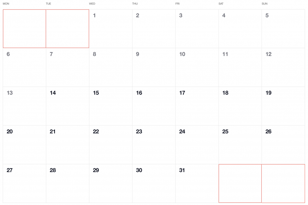
First, we want the date numbers to fall in the correct weekday columns. For example, July 1, 2020 is on a Wednesday. That’s where the date numbering should start.

If the first of the month falls on Wednesday, then that means we’ll have empty grid items for Monday and Tuesday in the first week. The last day of the month is July 31, which falls on a Friday. That means Saturday and Sunday will be empty in the last week of the grid. We went to fill those with the trailing and leading dates of the previous and next months, respectively, so that the calendar grid is always full.

Create days for the current month

To add the days for the current month to the grid, we need to know how many days exist in the current month. We can get that using the daysInMonth method provided by Day.js. Let’s create a helper method for that.

function getNumberOfDaysInMonth(year, month) {
  return dayjs(`${year}-${month}-01`).daysInMonth()
}

When we know that, we create an empty array with a length that’s equal to number of days in the current month. Then we map() that array and create a day object for each one. The object we create has an arbitrary structure, so you can add other properties if you need them.

In this example, though, we need a date property that will be used to check if a particular date is the current day. We’ll also return a dayOfMonth property that acts as the label (e.g. 1, 2, 3 and so on). isCurrentMonth checks whether the date is in the current month or outside of it. If it is outside the current month, we will style those so folks know they are outside the range of the current month.

function createDaysForCurrentMonth(year, month) {
  return [...Array(getNumberOfDaysInMonth(year, month))].map((day, index) => {
    return {
      date: dayjs(`${year}-${month}-${index + 1}`).format("YYYY-MM-DD"),
      dayOfMonth: index + 1,
      isCurrentMonth: true
    };
  });
}

Add dates from the previous month to the calendar grid

To get dates from the previous month to display in the current month, we need to check what is the weekday of the first day in selected month. That’s where we can use the WeekDay plugin for Day.js. Let’s create a helper method for that.

function getWeekday(date) {
  return dayjs(date).weekday()
}

Then, based on that, we need to check which day was the last Monday in the previous month. We need that value to know how many days from the previous month should be visible in the current month view. We can get that by subtracting the weekday value from the first day of the current month. For example, if first day of the month is Wednesday, we need to subtract 3 days to get last Monday of the previous month. Having that value allows us to create an array of day objects starting from the last Monday of the previous month through the end of that month.

function createDaysForPreviousMonth(year, month) {
  const firstDayOfTheMonthWeekday = getWeekday(currentMonthDays[0].date);


  const previousMonth = dayjs(`${year}-${month}-01`).subtract(1, "month");
  
  const previousMonthLastMondayDayOfMonth = dayjs(
    currentMonthDays[0].date
  ).subtract(firstDayOfTheMonthWeekday - 1, "day").date();


  // Account for first day of the month on  a Sunday (firstDayOfTheMonthWeekday === 0)
  const visibleNumberOfDaysFromPreviousMonth = firstDayOfTheMonthWeekday ? firstDayOfTheMonthWeekday - 1 : 6


  return [...Array(visibleNumberOfDaysFromPreviousMonth)].map((day, index) => {    
    return {
      date: dayjs(
        `${previousMonth.year()}-${previousMonth.month() + 1}-${previousMonthLastMondayDayOfMonth + index}`
      ).format("YYYY-MM-DD"),
      dayOfMonth: previousMonthLastMondayDayOfMonth + index,
      isCurrentMonth: false
    };
  });
}

Add dates from the next month to the calendar grid

Now, let’s do the reverse and calculate which days we need from the next month to fill in the grid for the current month. Fortunately, we can use the same helper we just created for the previous month calculation. The difference is that we will calculate how many days from the next month should be visible by subtracting that weekday numeric value from 7.

So, for example, if the last day of the month is Saturday, we need to subtract 1 day from 7 to construct an array of dates needed from next month (Sunday).

function createDaysForNextMonth(year, month) {
  const lastDayOfTheMonthWeekday = getWeekday(`${year}-${month}-${currentMonthDays.length}`)


  const visibleNumberOfDaysFromNextMonth = lastDayOfTheMonthWeekday ? 7 - lastDayOfTheMonthWeekday : lastDayOfTheMonthWeekday


  return [...Array(visibleNumberOfDaysFromNextMonth)].map((day, index) => {
    return {
      date: dayjs(`${year}-${Number(month) + 1}-${index + 1}`).format("YYYY-MM-DD"),
      dayOfMonth: index + 1,
      isCurrentMonth: false
    }
  })
}

OK, we know how to create all days we need, let’s use the methods we just created and then merge all days into a single array of all the days we want to show in the current month, including filler dates from the previous and next months.

let currentMonthDays = createDaysForCurrentMonth(INITIAL_YEAR, INITIAL_MONTH)
let previousMonthDays = createDaysForPreviousMonth(INITIAL_YEAR, INITIAL_MONTH, currentMonthDays[0])
let nextMonthDays = createDaysForNextMonth(INITIAL_YEAR, INITIAL_MONTH)


let days = [...this.previousMonthDays, ...this.currentMonthDays, ...this.nextMonthDays]

Here’s everything we just covered put together in index.js:

// Same as before ...


const WEEKDAYS = ["Mon", "Tue", "Wed", "Thu", "Fri", "Sat", "Sun"];
const INITIAL_YEAR = dayjs().format("YYYY");
const INITIAL_MONTH = dayjs().format("M");
const daysOfWeekElement = document.getElementById("days-of-week");


// Add weekdays to calendar header
WEEKDAYS.forEach(weekday => {
  const weekDayElement = document.createElement("li");
  daysOfWeekElement.appendChild(weekDayElement);
  weekDayElement.innerText = weekday;
});


let currentMonthDays = createDaysForCurrentMonth(INITIAL_YEAR, INITIAL_MONTH);
let previousMonthDays = createDaysForPreviousMonth(INITIAL_YEAR, INITIAL_MONTH);
let nextMonthDays = createDaysForNextMonth(INITIAL_YEAR, INITIAL_MONTH);
let days = [...previousMonthDays, ...currentMonthDays, ...nextMonthDays];


console.log(days);


function getNumberOfDaysInMonth(year, month) {
  return dayjs(`${year}-${month}-01`).daysInMonth();
}


function createDaysForCurrentMonth(year, month) {
  return [...Array(getNumberOfDaysInMonth(year, month))].map((day, index) => {
    return {
      date: dayjs(`${year}-${month}-${index + 1}`).format("YYYY-MM-DD"),
      dayOfMonth: index + 1,
      isCurrentMonth: true
    };
  });
}


function createDaysForPreviousMonth(year, month) {
  const firstDayOfTheMonthWeekday = getWeekday(currentMonthDays[0].date);
  const previousMonth = dayjs(`${year}-${month}-01`).subtract(1, "month");
  const previousMonthLastMondayDayOfMonth = dayjs(currentMonthDays[0].date)
    .subtract(firstDayOfTheMonthWeekday - 1, "day")
    .date();
  // Cover first day of the month being sunday (firstDayOfTheMonthWeekday === 0)
  const visibleNumberOfDaysFromPreviousMonth = firstDayOfTheMonthWeekday
    ? firstDayOfTheMonthWeekday - 1
    : 6;


  return [...Array(visibleNumberOfDaysFromPreviousMonth)].map((day, index) => {
    return {
      date: dayjs(
        `${previousMonth.year()}-${previousMonth.month() +
          1}-${previousMonthLastMondayDayOfMonth + index}`
      ).format("YYYY-MM-DD"),
      dayOfMonth: previousMonthLastMondayDayOfMonth + index,
      isCurrentMonth: false
    };
  });
}

function createDaysForNextMonth(year, month) {
  const lastDayOfTheMonthWeekday = getWeekday(
    `${year}-${month}-${currentMonthDays.length}`
  );
  const nextMonth = dayjs(`${year}-${month}-01`).add(1, "month");
  const visibleNumberOfDaysFromNextMonth = lastDayOfTheMonthWeekday
    ? 7 - lastDayOfTheMonthWeekday
    : lastDayOfTheMonthWeekday;
  return [...Array(visibleNumberOfDaysFromNextMonth)].map((day, index) => {
    return {
      date: dayjs(
        `${nextMonth.year()}-${nextMonth.month() + 1}-${index + 1}`
      ).format("YYYY-MM-DD"),
      dayOfMonth: index + 1,
      isCurrentMonth: false
    };
  });
}

function getWeekday(date) {
  return dayjs(date).weekday();
}

Step 4: Show calendar dates

OK, so we have the basic markup for our calendar, the data we need to display dates from the current month, plus dates from the previous and next month to fill in empty grid items. Now we need to append the dates to the calendar!

We already have a container for the calendar grid, #calendar-days. Let’s grab that element.

const calendarDaysElement = document.getElementById("calendar-days");

Now, let’s create a function that will append a day to our calendar view.

function appendDay(day, calendarDaysElement) {
  const dayElement = document.createElement("li");
  const dayElementClassList = dayElement.classList;


  // Generic calendar day class
  dayElementClassList.add("calendar-day");


  // Container for day of month number
  const dayOfMonthElement = document.createElement("span");


  // Content
  dayOfMonthElement.innerText = day.dayOfMonth;


  // Add an extra class to differentiate current month days from prev/next month days
  if (!day.isCurrentMonth) {
    dayElementClassList.add("calendar-day--not-current");
  }


  // Append the element to the container element
  dayElement.appendChild(dayOfMonthElement);
  calendarDaysElement.appendChild(dayElement);
}

Notice that we’re tossing in a check for the dates that are coming from the previous and next months so that we can add a class to style them differently from the dates in the current month:

.calendar-day--not-current {
  background-color: var(--grey-100);
  color: var(--grey-300);
}

That’s it! Our calendar should now look as we wanted.

Step 5: Select current month

What we have so far is pretty nice, but we want the user to be able to paginate from month-to-month forwards and backwards in time, starting from the current month. We have most of the logic in place, so all we really need to do is to add a click listener to the pagination buttons that re-runs the days calculation and re-draws the calendar with updated data.

Before we begin, let’s define variables for dates that are in the current month, previous month, and next month so we can reference them throughout the code.

let currentMonthDays;
let previousMonthDays;
let nextMonthDays;

Now, let’s create a method that will be responsible for re-calculating the calendar days and re-rendering the calendar when paginating to another month. We will call that function createCalendar. This method will accept two attributes — year and month — and based on that, the calendar will re-render with new data and without a new page load.

The method will replace the header content to always show the selected month label.

function createCalendar(year = INITIAL_YEAR, month = INITIAL_MONTH) {
  document.getElementById("selected-month").innerText = dayjs(
    new Date(year, month - 1)
  ).format("MMMM YYYY");


  // ...

Then it will grab the calendar days container and remove all existing days.

// ...


  const calendarDaysElement = document.getElementById("calendar-days");
  removeAllDayElements(calendarDaysElement);


  // ...

When the calendar is cleared, it will calculate new days that should be displayed using the methods we created before.

//...


currentMonthDays = createDaysForCurrentMonth(
  year,
  month,
  dayjs(`${year}-${month}-01`).daysInMonth()
);


previousMonthDays = createDaysForPreviousMonth(year, month);


nextMonthDays = createDaysForNextMonth(year, month);


const days = [...previousMonthDays, ...currentMonthDays, ...nextMonthDays];


// ...

And, finally, it will append a day element for each day.

// ...
days.forEach(day => {
  appendDay(day, calendarDaysElement);
});

There is one piece of logic still missing: a removeAllDayElements method that clears the existing calendar. This method takes the first calendar day element, removes it, and replaces it with another one. From there, it will run the logic in a loop until all of the elements are removed.

function removeAllDayElements(calendarDaysElement) {
  let first = calendarDaysElement.firstElementChild;


  while (first) {
    first.remove();
    first = calendarDaysElement.firstElementChild;
  }
}

Now we can reuse that logic when we want to change the month. Recall the first step when we created a static template for our component. We added these elements:

<div class="calendar-month-header-selectors">
  <span id="previous-month-selector"><</span>
  <span id="present-month-selector">Today</span>
  <span id="next-month-selector">></span>
</div>

These are the controls for paginating between months. To change it, we need to store the currently selected month. Let’s create a variable to keep track of what that is and set its initial value to the present month.

let selectedMonth = dayjs(new Date(INITIAL_YEAR, INITIAL_MONTH - 1, 1));

Now, to make the selectors work, we need a bit of JavaScript. To make it more readable, we will create another method called initMonthSelectors and we will keep the logic there. This method will add event listeners to the selector elements. It will listen for click events and update the value of selectedMonth to the name of the newly selected month before running the createCalendar method with proper year and month values.

function initMonthSelectors() {
  document
  .getElementById("previous-month-selector")
  .addEventListener("click", function() {
    selectedMonth = dayjs(selectedMonth).subtract(1, "month");
    createCalendar(selectedMonth.format("YYYY"), selectedMonth.format("M"));
  });


  document
  .getElementById("present-month-selector")
  .addEventListener("click", function() {
    selectedMonth = dayjs(new Date(INITIAL_YEAR, INITIAL_MONTH - 1, 1));
    createCalendar(selectedMonth.format("YYYY"), selectedMonth.format("M"));
  });


  document
  .getElementById("next-month-selector")
  .addEventListener("click", function() {
    selectedMonth = dayjs(selectedMonth).add(1, "month");
    createCalendar(selectedMonth.format("YYYY"), selectedMonth.format("M"));
  });
}

That’s it! Our calendar is ready. While that’s great and all, it would be even nicer if we could mark the current date so it stands out from the rest. That shouldn’t be very hard. We are already styling days that are not in the selected month, so let’s do similar thing to that.

We’ll create a variable that’s set for today:

const TODAY = dayjs().format("YYYY-MM-DD");

Then, in the appendDay method where we apply a class for dates outside the current month, we have to add another check to see if the element is today’s date. If it is, we’ll add a class to that element:

function appendDay(day, calendarDaysElement) {
  // ...
  if (day.date === TODAY) {
    dayElementClassList.add("calendar-day--today");
  }
}

Now we can style it!

.calendar-day--today {
  padding-top: 4px;
}


.calendar-day--today > div {
  color: #fff;
  border-radius: 9999px;
  background-color: var(--grey-800);
}

Voilà, there we have it! Check out the final demo to see everything put together.


The post How to Make a Monthly Calendar With Real Data appeared first on CSS-Tricks.

You can support CSS-Tricks by being an MVP Supporter.
Categories: Designing, Others Tags:

marketstack: A Market Data API

July 21st, 2020 No comments

(This is a sponsored post.)

I like the apilayer company tagline: “Automate What Should Be Automated.” They have this thick suite of products that are all APIs with clear documentation. They all have usable free tiers to develop against and prove out an idea, and then paid plans if you need to start using the APIs more aggressively. They have a brand new one: marketstack.

With this API, you have access to stock market data both current and historical. Got an idea for an app (or business!) that needs stock data? Wanna chart out how Apple is doing? Hit the REST API with your key and the AAPL stock symbol and you’ll get back just the JSON data you need. If you’ve always wanted to build a stock market app, this totally opens that door.

That’s what I love about stuff like this. I’ve seen so many people with startup ideas, but then end up being limited by the fact that they just don’t have the data they need to make it actually useful. So many business ideas are really founded on what kind of data you have access to. APIs like marketstack open those doors in affordable ways to everyone.

I think picking out technology stacks is fun, even just to think about. Like doesn’t it sound fun to build an Electron app with something like Electron Forge so you have a React+webpack setup, then hit the marketstack API for interesting market data and use nivo to build charts, chucking whatever data you need to save into Fauna?

Direct Link to ArticlePermalink


The post marketstack: A Market Data API appeared first on CSS-Tricks.

You can support CSS-Tricks by being an MVP Supporter.

Categories: Designing, Others Tags:

How to Improve Largest Contentful Paint (LCP) and SEO

July 21st, 2020 No comments

Contentful; Webster’s Dictionary defines “contentful” as… not found. Clearly someone made up this word, but that is not necessarily a bad thing.

The world of user experience metrics is moving quickly, so new terminology is needed. Largest Contentful Paint (LCP) is one of a number of metrics measuring the render time of content on a web page.

What is Largest Contentful Paint?

Google defines LCP as “the render time of the largest content element visible within the viewport.” For what we are talking about in this blog, we will consider “content” to be an image, typically a JPEG or PNG file. In most cases, “largest” points to a hero image that is “above the fold” and is one of the first images people will notice when loading the page. Applying optimization to this largest content is critical to improving LCP.

It is probably more instructive to view LCP relative to other metrics. For example, First Contentful Paint (FCP) and Visually Complete book end LCP.

Each metric has its pros and cons, but LCP is a happy medium. LCP marks when web page loading starts to have a substantial impact on user experience.

In Google’s opinion, to provide a good user experience, LCP should occur within 2.5 seconds of when the page first starts loading. Poor values are anything greater than 4 seconds.

How Does Largest Contentful Paint Impact Lighthouse Scores and SEO?

LCP is now part of several “Core Web Vitals” scores that Google will measure in its ranking algorithm. Each of the Core Web Vitals represents a distinct facet of the user experience, is measurable in the field, and reflects the real-world experience of a critical user-centric outcome.

In the case of the overall Google Lighthouse score, LCP represents 25% weighting on the performance score of Lighthouse version 6.0. This makes LCP the most important Core Web Vitals metric in determining the performance score.

While Google has indicated that content is still the most important factor in SEO ranking, a better user experience (as measured by Core Web Vitals) will generate higher rankings in a crowded field. If there are many websites competing for the top search engine spots, then Largest Contentful Paint will play a critical factor in rankings.

How to Improve Largest Contentful Paint

Now that you know that LCP is important, what can you do to improve it by making content load faster? Google provides a number of suggestions, but the most effective technique is to optimize content for the device requesting it.

For example, a website includes an 800kb JPEG image that is intended for high resolution desktops. On a smartphone, that would be optimized down to less than 100kb, with no perceptible impact on quality. LCP can improve by more than 60% — or several seconds — through this single optimization.

Find Savings in Largest Contentful Paint by using Image Speed Test

Image Speed Test is a great tool offered by ImageEngine.io that provides an analysis of LCP improvement opportunities. Just paste in the URL of the web page you are interested in optimizing, and the test will show you:

  • Image Payload Reduction
  • Speed Index
  • Largest Contentful Paint
  • Page Load Time (Visually Complete)

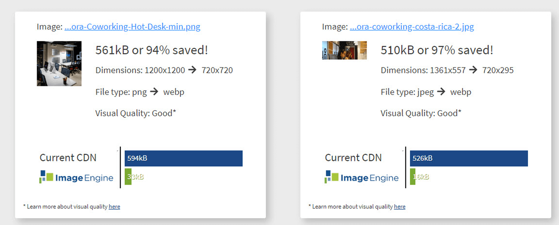
It also provides a video of the web page loading with and without optimizations. Finally, it analyses each image to provide an estimate of payload savings. In this case, the “largest content” on the page is this image. With optimizations, the image payload is reduced by 94%. That delivers a huge improvement in LCP.

How Does ImageEngine Improve LCP

ImageEngine is an image content delivery network (CDN) service that makes image optimization simple. Basically, for each image on the page, the image CDN will:

  1. Detect the device model requesting the web page;
  2. Optimize the image in terms of size, compression, image format;
  3. Deliver via a CDN edge server that is geographically closest to the user.

ImageEngine improves web performance for every image on the page, including the largest. You can learn more about ImageEngine here, and also sign up for a free trial.

Best Practices: Preconnect

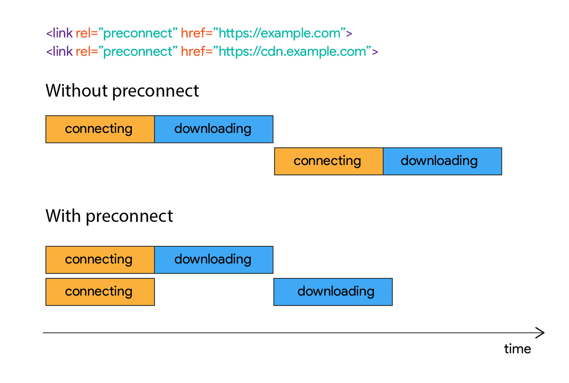
In addition to using an image CDN like ImageEngine, a few other best practices can improve LCP. Using the resource hints to provide a preconnect for your content can streamline the download process.

For example, putting the following link statement in the HTML will accelerate the download process. The link statement will make the browser connect to the third party as early as possible so that download can start sooner. ImageEngine’s optimizations make each image download smaller and faster, but preconnect save time in the connection phase.

Best Practices: Minimize Blocking JavaScript and CSS

When JavaScript or CSS is “blocking” it means that the browser needs to parse and execute CSS and JavaScript in order to paint the final state of the page in the viewport.

Any website today relies heavily on both JavaScript and CSS, which means that it is almost impossible to avoid some render blocking resources. On a general note: be careful with what kind of CSS and JavaScript is referenced inside the element. Make sure that only the strictly necessary resources are loaded in . The rest can be deferred or loaded asynchronously.

When looking to improve the LCP specifically, there are some practices worth looking into more deeply.

Inline Critical CSS

It is not an easy task, but if the browser can avoid making a request to get the CSS needed to render the critical part of the page – usually the “above the fold” part – the LCP is likely to occur earlier. Also you will avoid content shifting around and maybe even a Flash of Unstyled Content (FOUC).

The critical CSS — the CSS needed by the browser to set up the structure and important styles of the part of the page shown above the fold — should in-inlined. This inlined CSS may also refer to background images, which of course should also be served by an Image CDN.

Do Not Use JavaScript to (lazy) Load Images

Many modern browsers natively support lazy loading, without the use of JavaScript. Because images usually are heavily involved in the performance of LCP, it is best practice to leave image loading to the browser and avoid adding JavaScript in order to lazy load images.

Lazy loading driven by JavaScript will add additional latency if the browser first has to load and parse JavaScript, then wait for it to execute, and then render images. This practice will also break the pre-parser in the browser.

If an image CDN is used to optimize images, then the benefits of lazy loading become much smaller. Especially large hero images that are above the fold have a large impact on LCP and will not benefit from being lazy loaded with JavaScript. It is best not to make JavaScript a blocking issue for rendering images, but rather rely on the browser’s own ability to select which images should be lazy loaded.

[– This is a sponsored post on behalf of ImageEngine –]

Source

Categories: Designing, Others Tags:

Translating Design Wireframes Into Accessible HTML/CSS

July 21st, 2020 No comments
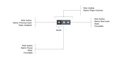
Audio player controls design with name and role annotations

Translating Design Wireframes Into Accessible HTML/CSS

Translating Design Wireframes Into Accessible HTML/CSS

Harris Schneiderman

2020-07-21T09:00:00+00:00
2020-07-21T18:33:53+00:00

All too often, accessibility doesn’t cross a designer’s mind when creating user interfaces. Overlooking accessibility considerations in the design phase can trickle down through to your website or application and have a large impact on your users. Whether it is usability testing, creating prototypes, adopting an accessible pattern library, or even just annotating wireframes, designers must incorporate accessibility into their workflow. Instead of overloading QA engineers to find accessibility defects, thinking of accessibility from the start, or “shifting left,” can have a tremendously positive impact on the content you create.

Shifting Left

There are many studies that show the changes in the cost of fixing defects at different stages of the development process. Based on the cost of fixing a defect at the design stage as having a factor of 1x, these studies show cost differences that increase to 6x during implementation, 15x during testing after code commit, and as high as 100x if caught after the defect makes it into production. Research by the NIST estimates the defects fixing costs being as 10x during integration testing and 15x during system testing but only 30x in production.[^2] Regardless of what your organization’s actual costs are, one thing is certain: catching defects in the design and development phase is orders-of-magnitude less expensive than later in the process.

Deque has assembled data from 20 years of accessibility testing. Based on our data, a trend that we have seen over the last five years, as Web applications have increased in complexity, is that the number of defects per page has been increasing steadily to between 30 and 50 defects per page. These defect numbers often dwarf any functional defect rates and amplify the value in shifting accessibility testing and fixing as far left in the process as possible.


Around 70% of accessibility defects can be avoided through the appropriate combination of automated and guided testing during the design and development process.

This article is aimed at giving you an overview of how this can be achieved.

The Design Phase

Annotations

Annotations are textual or graphical explanations added to a design to inform the implementer of intent. Similar to a designer annotating things like color and font-size, accessibility information must also be conveyed in designs. Let’s dive into a simple audio player widget and assess what kinds of annotations we will need.

Our audio player will consist of three controls:

  1. A control to go to the previous track (when applicable)
  2. A control to play and pause the currently playing audio track
  3. A control to go to the next track (when applicable)

Audio player controls design with name and role annotations

(Large preview)

Name, Role And State

The accessible name of a component will dictate what an assistive technology user will be informed of when interacting with it. It is very important to annotate each of our audio player controls because, visually, they are represented with iconography alone and no textual content. This means that we will annotate the 3 controls with accessible names of “Previous track,” “Pause,” and “Next track.”

Next, we want to think about the purpose of each of these 3 controls. Since they are clickable elements that perform audio player actions, the obvious choice of role here is “button”. This is not something that should be assumed through the design but, rather, this is something that designers must annotate to ensure the implementers add this semantic information to the controls. Having the roles mapped out from the start will save you from having to go back and add them to the controls after the implementation has already taken place.

Finally, just as designers map out how a control appears when hovered, they must be thinking about the various states of their widget in terms of accessibility. In the case of our audio player, we actually have quite a few states to annotate for the implementer. Starting with the “Previous track” button, we know that it should be disabled when there is no previous track to play. The play/pause button should toggle the audio player between the playing and paused states. This means we need to annotate that the accessible name needs to match that state. The button’s accessible name should be “Pause” when audio is playing and “Play” when audio is paused. For the “Next track” button, we should annotate the fact that it should be disabled when there is no next track. Lastly, the hover and focus states for each of the buttons should be annotated so keyboard users have some visual indication of the currently focused control in the audio player.

Pause button with focus state annotations

(Large preview)

Interaction for the entire component

When on first track: disable “previous track” button

When on last track: disable “next track” button

When playing, display the “pause” button and hide the “play” button

When not playing: display the “play” button and hide the “pause” button

After clicking “play”, place focus on the “pause” button

After clicking “pause” place focus on the “play” button

Usability Testing

Usability testing, a UX research methodology in which a researcher has a user perform a series of tasks and analyzes their behavior, is a very important stage in the design phase. Information gathered from usability testing is vital in shaping digital user experiences. Performing this testing with users with disabilities is extremely important because it allows your team to get an idea of how easily these users will be able to interact with the content they are creating. If you are doing usability testing on an existing system, you will be able to get a very realistic scenario set up for the participant which is great when it comes to users who rely on various assistive technologies.

If you are doing usability testing on a non-existing system, be prepared to deal with accessibility challenges surrounding the output of design software. The interactive prototypes outputted from these tools are often extremely different from what the end product will be in a browser or on an OS platform. In addition, these “functional prototypes” are usually extremely inaccessible. If possible, find a close alternative out in the wild that you can use in your prototype’s place, which can give you a good idea of how your participants will interact with your system. For example, if you are building a new mobile navigation component, find an existing one on the Internet, and do usability testing with it. Determine what worked in this alternative and learn what needs to be improved. Either way, always be prepared to make accommodations for your usability testing participants based on their disabilities. Ensuring that the tests go smoothly without any roadblocks will not only make your participants happy but will also allow you to get through more testing in less time.

Pattern Libraries

Pattern libraries are collections of user interface components and are extremely beneficial in both the design and the development phases. Having a sufficient set of UI components at your fingertips makes building fully functional applications much easier. For the designer, these components help keep a nice consistency across your application which improves the overall experience for your users. For the developer, having fully-tested, accessible, reusable components help produce high-quality content rapidly. These components should be treated with special care in terms of accessibility because they will presumably be used numerous times through your application(s).

Work With the Developers

Speaking with fellow developers and designers at conferences and meetups, I frequently hear of divided teams in which the designers and developers work in complete isolation from one another. Not only should developers be included in the design phase in things like design review meetings, but designers should also be included in the development phase.


Collaboration is key when it comes to creating awesome accessible content.

Oftentimes, developers are privy to implementation details that can help shape design comps or even pivot an approach to solving a design problem. Likewise, designers can help keep developers in check when it comes to implementing their designs accessibly because detail-oriented aspects such as spacing and specific color usage can have a huge impact on accessibility. While the developers implement a design, designers should pay close attention to things like focus indication, tab order, reading order, fonts, colors, and even accessible names and alt texts of images. Because, after all, what good are all of those amazing accessibility-specific annotations if the developer ignores them?

The Development Phase

Automate Accessibility Testing

Us developers love the idea that certain things in our workflows can be completely automated. Thankfully, there are many amazing accessibility automation libraries available, which your team should leverage to assist in creating sustainable accessible interfaces. Static analysis tools such as eslint-plugin-jsx-a11y can provide immediate feedback to developers warning them of potential accessibility issues while they are coding. Developers can even set their text editor up to display these warnings right as they type code, catching these defects live as they pop up.

Accessibility rules engines, such as axe-core, can be integrated into almost any framework or environment and can help catch many extremely common accessibility issues. A great way to ensure your entire team is creating accessible content is to integrate these types of tools into your CI (continuous integration) and CD (continuous delivery) pipelines. Writing accessibility-specific test cases (unit or end-to-end) is another great form of automation. On my team, we have all of the above configured so no pull requests can even be merged until all of our accessibility automation tests have passed. This means we can guarantee minimal accessibility defects even make it to our dev servers and definitely won’t make it into production.

Manage Accessibility Defects Systematically

Accessibility issues should be treated no differently than security or functionality defects. They should be triaged and prioritized regularly with the rest of the “normal” workload. Measuring progress and gathering metrics specific to accessibility defects can also be useful, especially if your team is just beginning to ramp up on accessibility. This can also help identify your system’s weak points or bottlenecks. If your team participates in sprint retrospectives (or something similar), accessibility should be a talking point. Reflecting on what works and what doesn’t is a healthy exercise and can lead to enhancements in your team’s overall approach towards sustainable accessibility.

This Cool axe Beta tool

We’ve talked about accessibility automation, which is a great starting point for testing. However, inevitably, a human must pick up where the robots leave off to get full accessibility testing coverage. Manual testing requires a deep understanding of accessibility as well as the W3C Web Content Accessibility Guidelines, or “WCAG.” The axe Beta application assists in getting you through this manual testing without having to be an expert in accessibility. It has a large suite of Intelligent Guided Tests, which ask extremely simple questions and does all of the heavy liftings for you!

Given that we always strive to automate everything, one might react skeptically to the assertion that accessibility testing cannot be fully automated and requires a human brain to cover all bases. However, let’s take images as an example and what information, if any, they provide in the context of a webpage. An accessibility automation library cannot derive informational intent by scanning or processing an image. Even if we feed a machine learning algorithm an image and it can spit out a perfect description of what is in that image, it doesn’t know what that image conveys in the context of the page. The information a given image conveys, or whether that image is used solely as decoration, is completely up to the author of the content.

Tying It All Together

Having accessibility in mind from the very beginning of development makes creating accessible content much easier than making these considerations late in the software development lifecycle. Baking accessibility into the ideation, design and implementation of your software creates a more sustainable product.

Set your team up for success by utilizing resources such as WCAG, ARIA, ARIA Authoring Practices, and Stack Overflow. Prevent accessibility defects from finding their way into your software by leveraging accessibility automation libraries and integrating them into your continuous integration servers. Our team has worked hard on filling in the gap between automated and manual testing, we’d love for you to give axe Beta a try! If accessibility defects are handled systematically, not only can you rid your applications of these issues, but you can prevent them from finding their way back in the future.


Do you want to join me in a free workshop on this exact topic? Register for our upcoming Translating Design Wireframes Virtual Workshop which will be split into two 3 hour sessions.

(ra, il)

Categories: Others Tags:

When do you use inline-block?

July 20th, 2020 No comments

The inline-block value for display is a classic! It’s not new and browser support is certainly not something you need to worry about. I’m sure many of us reach for it intuitively. But let’s put a point on it. What is it actually useful for? When do you pick it over other, perhaps similar, options?

(I bet this makes for interesting replies.)

What is the last thing you used `display: inline-block` for?

— Chris Coyier (@chriscoyier) June 19, 2020

Buttons

The most common answer I heard was: I always use it on buttons.

Ultimately, I think that makes sense, but it contributes to a what I see as a slight misunderstanding. The idea is that you want elements that look like buttons (which might be crafted with ,

Categories: Designing, Others Tags:

Levels of Fix

July 20th, 2020 No comments

On the web, we have the opportunity to do work that fixes things for people. It’s fascinating to me how different the scope of those fixes can be.

Consider the media query prefers-reduced-motion. Eric wrote:

I think it’s also worth pointing out the true value prefers-reduced-motion represents: Not attracting buzzword-hungry recruiters on LinkedIn, but improving the quality of life for the people who benefit from the effect it creates. Using this media query could spare someone from having to unnecessarily endure a tremendous amount of pain for simply having the curiosity to click on a link or scroll down a page.

The use of this media query is exclusively to make people’s experience on the web better. We can write code that reduces motion for users who have explicitly asked for reduced motion.

It’s worth noting that because people ask for reduced motion doesn’t mean they are asking for absolutely zero motion. But let’s set that aside for a moment. It’s probably better to err toward zero if you aren’t prepared to do the nuanced work of figuring out what level of reduction is best for your users.

So let’s say we’re going to nuke all motion for a site. We could do this:

@media (prefers-reduced-motion: reduce), (update: slow) {
  *, ::before, ::after {
    animation-delay: -1ms !important;
    animation-duration: 1ms !important;
    animation-iteration-count: 1 !important;
    background-attachment: initial !important;
    scroll-behavior: auto !important;
    transition-duration: 0s !important;
    transition-delay: 0s !important;
  }
}

By doing that, we fix the site for all users who prefer less motion for all of those users, for one site. That’s one scope we can hit.

Another thing we could do as a web worker is build a browser extension. Miraculously, the web has a standardized format for extensions, so you can largely write it once and ship the thing to any desktop browser. When you build an extension, you can’t really force anyone to use it, and chances are that a very low percentage of people visiting your site will have it installed, even less so of those who could benefit from it. But for those that do, you’ve fixed not just one site but all sites for that one person. That’s a very different but also very interesting and powerful scope.

It’s no wonder then that some people are drawn to working on the browsers themselves. Or for the standards organizations that guide that work. I’m not saying that browsers should or would implement something like forced reduced motion at the CSS level, but they could. And if you fix something at the browsers or standards level, you might just fix something for all sites for all users, which is the biggest scope there is.

It’s these different scopes that are so interesting to me:

  • Fixing one site for all users
  • Fixing all sites for one user
  • Fixing all sites for all users

You don’t have to just pick just one. Most of us probably do most of our work in that first bucket. But it’s worth thinking about if any of your work could go towards the others.


The post Levels of Fix appeared first on CSS-Tricks.

You can support CSS-Tricks by being an MVP Supporter.

Categories: Designing, Others Tags:

Creating a Gatsby Site with WordPress Data

July 20th, 2020 No comments

In my previous article last week, I mentioned creating a partially ported WordPress-Gatsby site. This article is a continuation with a step-by-step walkthrough under the hood.

Gatsby, a React-based framework for static sites, is attracting attention not only from JavaScript developers but also from the WordPress developers and users. Many WordPress users find its features appealing, like ultra fast image handling and improved security protection from hackers, but would like to use them while continuing to use the WordPress admin and editor to manage content.

Chris has covered the idea of combining Gatsby and WordPress before here on CSS-Tricks. As a WordPress enthusiast, I decided to give it a try. This article is based on what I learned and documented along the way.

Please note that WPGraphQL and gatsby-cli are in constant development with breaking changes in later versions. This project was done using WPGraphQL 0.8.3, gatsby-source-wpgraphql 2.5.1 and gatsby-cli 2.12.21. Unlike WordPress, newer WPGraphQL releases do not support backward compatibility. Please consult the official WPGraphQL & Gatsby doc for the latest changes and proceed with caution before using.

There are ready-to-use projects in the Gatsby starters library. Two great examples are Alexandra Spalato’s gatsby-wordpress-theme-blog and the twenty-nineteen-gatsby-theme by Zac Gordon and Muhammad Muhsin.

Prerequisites

If you want to follow along, here’s what you’ll need:

Assets and resources

Because I had already done a few Gatsby learning projects in the past, I had some assets like typography, layouts, and other reusable components that I could apply here. I had also gone through the following recent tutorial guides, which helped me to prepare for this project.

Henrick Wirth‘s guide is super comprehension and thorough. Jason’s step-by-step article is a great resource and even includes super helpful videos that help see the process take place. Muhammad’s article helps explain how static pages are created with Gatsby’s createPages API and breaks down various functions, template files and React components along the way.

I largely followed Henrik’s guide and divided this article into similar sections. Henrik’s guide includes image handling and adding PageBuilder with ACF Flexible Content features which we don’t get into here.

Section 1: Setting up WordPress and Gatsby

First, let’s set up a WordPress site for a data source. This could be an already existing site or a fresh one. Even a local WordPress installation is fine. I decided to start with a new test WordPress site for this project using the Twenty Twenty theme that ships with WordPress.

Install the WPGraphQL and WPGraphiQL plugins

Let’s start by installing a couple of plugins in WordPress. We’ll use WPGraphQL to enable GraphQL API in WordPress and open up WordPress as a data source. We’ll also use WPGraphiQL (note the “i” in the name). This one is actually optional, but it creates an interface for testing GraphQL queries directly in the WordPress dashboard, which is super handy. You may notice that I’m linking to the GitHub repos for the plugins instead of the WordPress Plugin Directory and that’s intentional — neither plugin is available in the directory at the time of this writing. As such, you’ll download the ZIP files and manually install them in WordPress via the /wp-content/plugins directory.

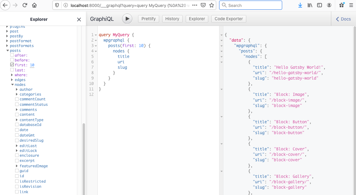
Once activated, the GraphiQL API is displayed in the WordPress dashboard.

The GraphiQL API provides a playground to test GraphQL queries from WordPress site.

Screenshot of the GraphQL playground interface in the WordPress dashboard.
The GraphiQL screen provides three panels: one to navigate between different objects (left), one to query data (center),and one to visualize the returned data (right).

Setting up a local Gatsby site

We will setup a local Gatsby site by installing Gatsby’s starter default in the wordpress-gatsby directory of the project with this in the command line:

#! create a new Gatsby site using the default starter
gatsby new wordpress-gatsby https://github.com/gatsbyjs/gatsby-starter-default

Restart the server with gatsby develop, then let’s navigate to localhost:8000 in a new browser tab. We should get a starter page in the browser.

A link to how to create a gatsby site locally is available from the Gatsby documentation.

Next, we’re going to install and configure the gatsby-source-graphql plugin. Just as we did when setting up WordPress, we have to install and configure WPGraphQL in the Gatsby site.

#! install wpgraphql plugin
#! add with yarn
yarn add gatsby-source-graphql
#! install with npm
npm install --save gatsby-source-graphql

OK, now it’s time to configure the gatsby-source-graphql plugin. Open up the gatsby-config.js file and let’s use these settings:

// plugin configuration
module.exports = {
  plugins: [
    {
      resolve: "gatsby-source-graphql",
      options: {
        typeName: "WPGraphQL",
        fieldName: "wpcontent",
        // GraphQL endpoint, relative to your WordPress home URL.
        url: "https://tinjurewp.com/wp-gatsby/graphql",
        // GraphQL endpoint using env variable
       // url: "${process.env.WORDPRESS_URL}/graphql",
      },
    },
  ],
}

How did I come up with this exact configuration? I strictly followed what’s described in the Gatsby docs. The plugin was added to the Gatsby instance by specifying the URL of the GraphQL endpoint (highlighted above) and two configuration options: typeName, a remote schema query type, and fieldName, which is available in the Gatsby query. Please note, the latest WPGraphQL doc suggest using fieldName: "wpcontent" instead of "wpgraphql"as described in the guide.

Alternative setup: Use the dotenv module

Optionally, we could have set things up using the dotenv npm module to define environment variables that are used to customize the development environment. Henrik uses this method in his guide as well.

If you’re using this method, a variable in the .env.production plugin configuration file, like WORDPRESS_URL, can be defined and used instead of exposing the WordPress URL.

# .env.production
# Don't put any sensible data here!!!
WORDPRESS_URL=https://tinjurewp.com/wp-gatsby/

My test environment equally exposes the WordPress instance and data to WPGraphQL.

Colby Fayock has a helpful step-by-step guide on using environmental variables with Gatsby and Netlify.

After re-starting the development server, the WPGraphQL API is available with Gatsby to query and retrieve the specific data that’s queried from the WordPress site and display it on a Gatsby site through the localhost GraphQL URL at https//localhost:8000/___graphql/.

Screenshot showing the GraphQL query interface with the explorer on the left, the query in the center, and the returned data on the right.
Note that, unlike in WordPress site itself, the data here is exposed to WPGraphQL. We can query against the WPGraphQL API to display any field from the WordPress site.

Section 2: Porting posts and pages from WordPress

In Gatsby, posts and pages can be created at build time by querying data with GraphQL and mapping the query results to posts or page templates. The process is described in a Gatsby tutorial on programmatically creating pages from data. Gatsby make use of two APIs, onCreateNode and createPages, and tutorial contains a detailed explanation on how they are implemented.

The code snippets here come from Henrik’s guide. Because of the way WordPress stores data in its database under different data types and categories, porting all the contents turns out to be less than straightforward. However, with prior knowledge of creating pages and posts with Gatsby createPages API and Node API, I was able to follow along. There’s also a lot of real-world starter sites that can be referenced as examples.

Step 1: Add posts and pages content in a WordPress site

Add some posts and pages in WordPress site if you don’t have any already. Before creating page for that content, we need to delete index.js and page-2.js from the pages folder of the Gatsby site. These two files seem to interfere with the ported WordPress data.

Step 2: Create page and post template

We’re going to create two template files for our content, one for posts (/src/templates/posts/index.js) and one for pages (/src/templates/pages/index.js).

Here’s our post template. Basically, we’re using the post title twice (one as the SEO page title and one as the post heading) and the post content as a Post component.

// src/templates/post/index.js
import React  from "react"
import Layout from "../../components/layout"
import SEO from "../../components/SEO"


const Post = ({ pageContext }) => {
  const post = pageContext.post


  return (
    <Layout>
      <SEO title={post.title} />


      <h1> {post.title} </h1>
      <div dangerouslySetInnerHTML={{__html: post.content}} />


    </Layout>
  )
}


export default Post

We’ll do nearly the same thing for the page template:

//src/templates/pages/index.js

import React  from "react"
import Layout from "../../components/layout"
import SEO from "../../components/seo"


const Page = ({ pageContext }) => {
  const page = pageContext.page


  return (
    <Layout>
      <SEO title={page.title} />


      <h1>{page.title}</h1>
      <div dangerouslySetInnerHTML={{__html: page.content}} />


    </Layout>
  )
}


export default Page

Step 3: Create static posts and pages with the createPages API

Note that the entire code we’re covering here can be written in the node.js file. However, for readability purposes, posts and pages are separated in a folder named create in the project’s root directory following Henrik’s Guide.

We’re going to get our hands dirty with the GraphQL createPages API! We’ll start by adding the following to gatsby-node.js.

// gatsby-node.js
const createPages = require("./create/createPages")
const createPosts = require("./create/createPosts")


 exports.createPagesStatefully = async ({ graphql, actions, reporter }, options) => {
  await createPages({ actions, graphql, reporter }, options)
  await createPosts({ actions, graphql, reporter }, options)
 }

Muhammad’s post makes a good point that’s worth calling out here:

The createPages API is part of the Node APIs that Gatsby exposes. It essentially instructs Gatsby to add pages. Within this we are calling some methods using async/await (a feature of ECMAScript 2017).

In other words: both functions create relevant static pages. With that in mind, let’s define what data we want to use and fetch that data in the create/createPages.js file. Sorry for the big code dump, but Henrik’s comments help explain what’s happening.

//create/createPages.js
const pageTemplate = require.resolve('../src/templates/page/index.js');


const GET_PAGES = `
  query GET_PAGES($first:Int $after:String) {
    wpgraphql {
      pages(
        first: $first
        after: $after
        # This will make sure to only get the parent nodes and no children
        where: {
          parent: null
         }
      ) {
        pageInfo {
          hasNextPage
          endCursor
        }
        nodes {
          id
          title
          pageId
          content
          uri
          isFrontPage
        }
      }
    }
  }
`


const allPages = []
let pageNumber = 0
const itemsPerPage = 10


/** This is the export which Gatbsy will use to process.
 * @param { actions, graphql }
 * @returns {Promise<void>} */
module.exports = async ({ actions, graphql, reporter }, options) => {


  /** This is the method from Gatsby that we're going
   * to use to create pages in our static site. */
  const { createPage } = actions
  /** Fetch pages method. This accepts variables to alter
   * the query. The variable `first` controls how many items to
   * request per fetch and the `after` controls where to start in
   * the dataset.
   * @param variables
   * @returns {Promise<*>} */
  const fetchPages = async (variables) =>
    /** Fetch pages using the GET_PAGES query and the variables passed in. */
    await graphql(GET_PAGES, variables).then(({ data }) => {
      /** Extract the data from the GraphQL query results */
      const {
        wpgraphql: {
          pages: {
            nodes,
            pageInfo: { hasNextPage, endCursor },
          },
        },
      } = data


      /** Map over the pages for later creation */
      nodes
      && nodes.map((pages) => {
        allPages.push(pages)
      })


      /** If there's another page, fetch more
       * so we can have all the data we need. */
      if (hasNextPage) {
        pageNumber++
        reporter.info(`fetch page ${pageNumber} of pages...`)
        return fetchPages({ first: itemsPerPage, after: endCursor })
      }


      /** Once we're done, return all the pages
       * so we can create the necessary pages with
       * all the data on hand. */
      return allPages
    })


  /** Kick off our `fetchPages` method which will get us all
   * the pages we need to create individual pages. */
  await fetchPages({ first: itemsPerPage, after: null }).then((wpPages) => {


    wpPages && wpPages.map((page) => {
      let pagePath = `${page.uri}`


      /** If the page is the front page, the page path should not be the uri,
       * but the root path '/'. */
      if(page.isFrontPage) {
        pagePath = '/'
      }


      createPage({
        path: pagePath,
        component: pageTemplate,
        context: {
          page: page,
        },
      })


      reporter.info(`page created: ${page.uri}`)
    })


    reporter.info(`# -----> PAGES TOTAL: ${wpPages.length}`)
  })
}

Again, Muhammad’s post is excellent help because it breaks down what the createPages.js and createPosts.js functions can do. Henrik’s guide also provides helpful comments for each step.

Step 4: Creating posts

The createPosts.js file is almost identical to createPages.js. The sole difference is prefixing the path with blog/ and replacing the “page” with “posts” throughout the code.

If we stop here and restart the development server with gatsby develop in the terminal, the develop log displays the page buildup.

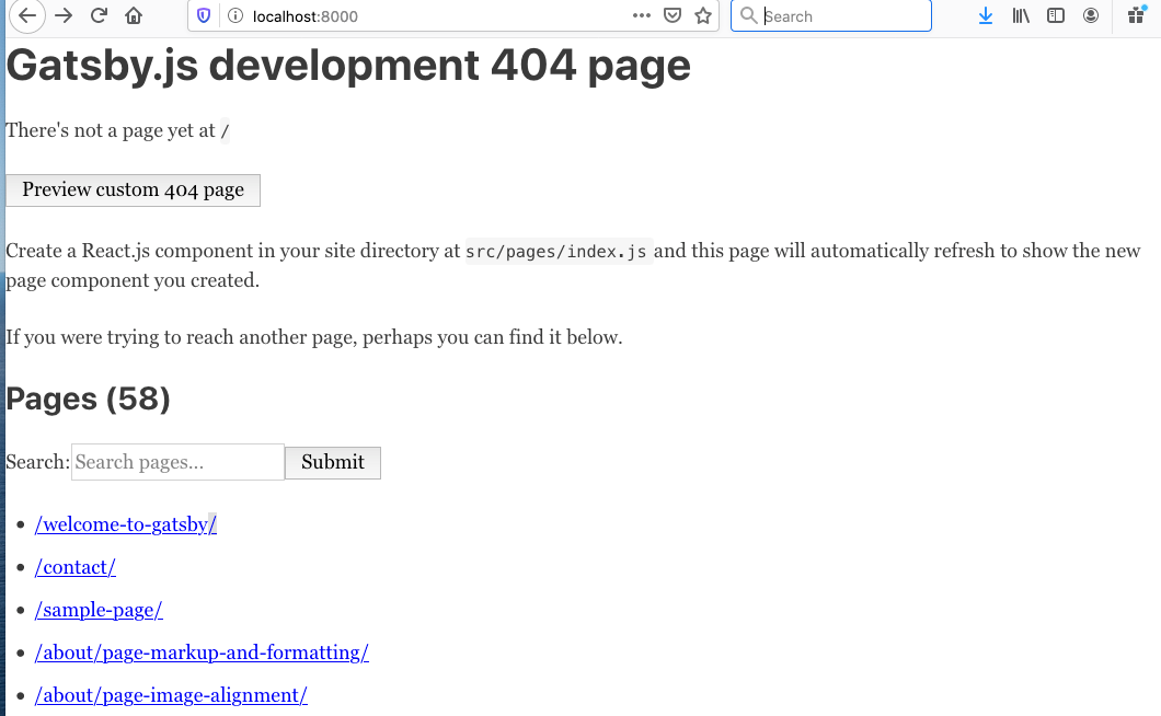
Now, if we open up localhost:8000 in a browser, we get a 404 error.

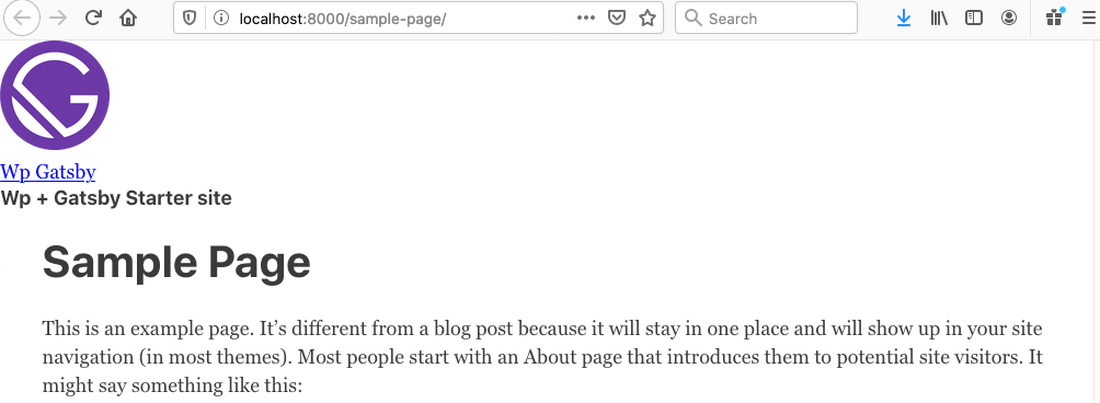
That might be off-putting, but it’s all good. Clicking any of the links on the 404 page displays the correct page or post from the WordPress data source. For example, if the sample-page link is clicked, it displays sample page content from WordPress in the browser.


Section 3: Working with navigation

Let’s move on to the navigation menu for our site. WordPress has a navigation management feature that allows us to construct menus using links to pages, posts, archives, taxonomies, and even custom links. We want to create navigation for a main menu in WordPress and send it to GraphQL where we can query it for our own site.

Navigation links — including page and post links — are created in Gatsby using the Gatsby Link API, which uses both the built-in component and navigate function. The component is used for linking to internal pages, but not to external links.

Porting navigation menu from the WordPress into Gatsby site turns out to be a tricky little task that requires creating

and components and refactoring the component accordingly. Here’s how that works.

Code snippets used in this section are taken directly from Henrik’s guide for completeness, however these code snippets appear to be pretty standard used in other Gatsby WordPress starters with little variation.

Step 1: Create a WordPress menu

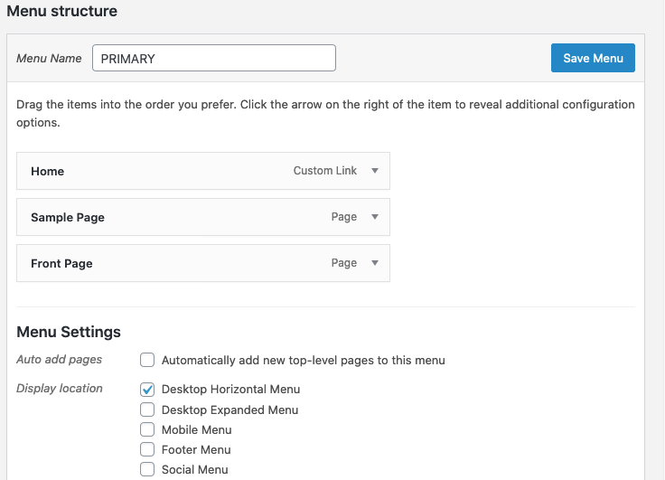
As described in the guide, it is important to set up a menu called “PRIMARY” which is defined in the Twenty Twenty theme. We’re going to toss three links in there:

  • Home: A link to our homepage, which will be a custom link pointing to our site’s index.
  • Sample Page: The default page that WordPress creates on a new WordPress installation.
  • Front Page: This is typically the name given for the homepage in WordPress. You’ll need to create this page in the editor.

Step 2: Query Menu Items with GraphiQL Explorer

Next up, we’ll write a query for the menu items from the GraphiQL interface. Notice that we can use the explorer to practically write it for us by checking a few boxes.

query MyQuery {
  menuItems(where: {location: PRIMARY}) {
    nodes {
      label
      url
      title
      target
    }
  }
}

Step 3: Create menu and link utility components in Gatsby

See how the URLs in the data are absolute, displaying the full address? We’ll need a utility function to translate those to relative URLs, again, because that’s what the component supports.

Henrik’s guide provides the following utility function for converting absolute WordPress URLs to relative URLs that are required for Gatsby:

// src/utils/index.js
/** Parses a menu item object and returns Gatsby-field URI.
 * @param {object} menuItem a single menu item
 * @param wordPressUrl
 * @param blogURI */
export const CreateLocalLink = (menuItem, wordPressUrl, blogURI='blog/') => {
  const { url, connectedObject } = menuItem;


  if (url === '#') {
    return null;
  }
  /** Always want to pull of our API URL */
  let newUri = url.replace(wordPressUrl, '');


  /** If it's a blog link, respect the users blogURI setting */
  if (connectedObject && connectedObject.__typename === 'WPGraphQL_Post') {
    newUri = blogURI + newUri;
  }


  return newUri;
};

Step 4: Create a menu item component

The next step is to create a component which utilizes the utility function created in the previous step. The result is a fully formed link that gets consumed by the Gatsby site menu.

// src/components/MenuItem.js
import React from "react"
import { CreateLocalLink } from "../utils"
import { Link } from "gatsby"


const MenuItem = ({ menuItem, wordPressUrl }) => {
  return (
    <Link style={{marginRight: '20px' }}
     to={CreateLocalLink(menuItem, wordPressUrl)}>
     {menuItem.label}
     </Link>
  )
}


export default MenuItem

Step 5: Creating a menu component

OK, we created URLs and a functional component. Let’s create a new

component where our components can go. The Gatsby StaticQuery API is used to query all primary menu items with GraphQL.

// src/components/Menu.js
import React from "react"
import { StaticQuery, graphql } from "gatsby"
import MenuItem from "./MenuItem"


/** Define MenuItem fragment and get all primary menu items */
const MENU_QUERY = graphql`
  fragment MenuItem on WPGraphQL_MenuItem {
    id
    label
    url
    title
    target
  }


  query GETMAINMENU {
    wpgraphql {
      menuItems(where: {location: PRIMARY}) {
        nodes {
          ...MenuItem
        }
      }
      generalSettings {
        url
      }
    }
  }
`


const Menu = () => {
  return (
    <StaticQuery
      query={MENU_QUERY}
      render={(data) => {
        if (data.wpgraphql.menuItems) {
          const menuItems = data.wpgraphql.menuItems.nodes
          const wordPressUrl = data.wpgraphql.generalSettings.url


       return (
         <div style={{ marginBottom: "20px" }}>
           {
             menuItems &&
             menuItems.map((menuItem) => (
               <MenuItem key={menuItem.id}
               menuItem={menuItem} wordPressUrl={wordPressUrl}/>
             )
           )}
         </div>
       )
      }
      return null
   }}
  />
  )
}


export default Menu

Step 6: Adding the menu to the layout component

At this point, we have everything we need to construct a Gatsby site menu using WordPress data. We just need to drop the

component into our component:

// src/components/layout.js
import React from "react"
import PropTypes from "prop-types"
import useSiteMetadata from '../components/siteMetadata';
import Header from "./Header"
import Footer from "./Footer"
import Menu from "./Menu"
import "./layout.css"


const Layout = ({ children }) => {
  const { title, description } = useSiteMetadata();


  return (
    <section>
      <Header siteTitle={title} description={description} />
      <div
      style={{ margin: `0 auto`, maxWidth: 960,
               padding: `0 1.0875rem 1.45rem`,}}>
        <Menu />
        <main>{children}</main>
        <Footer />
      </div>
    </section>
  )
}


Layout.propTypes = {
  children: PropTypes.node.isRequired,
}


export default Layout

Step 7: Adding Support for External Link path

Gatsby’s documentation on the component explains that data coming from an external CMS, like WordPress, should ideally be inspected by the component and renders either with Gatsby’s or with a regular tag accordingly. This ensures that any truly external links on the WordPress side remain absolute without conflicting the component.

This requires — you guessed it — another component that does exactly that. In Gatsby Docs it’s referred as which returns either a Gatsby-compatible component or a traditional element:

//src/components/UniversalLink.js
import React from "react"
import { Link as GatsbyLink } from "gatsby"


const UniversalLink = ({ children, to, activeClassName, partiallyActive, ...other }) => {
  const internal = /^/(?!/)/.test(to)
  // Use Gatsby Link for internal links, and <a> for others
  if (internal) {
    return (
      <GatsbyLink
        to={to}
        activeClassName={activeClassName}
        partiallyActive={partiallyActive}
        {...other}
      >
        {children}
      </GatsbyLink>
    )
  }
  return (
    <a href={to} {...other}>
      {children}
    </a>
  )
}
export default UniversalLink

Now, let’s go back to our component and update it to use the :

/ src/components/MenuItem.js
import React from "react"
import { CreateLocalLink } from "../utils"
import UniversalLink from "./UniversalLink"


const MenuItem = ({ menuItem, wordPressUrl }) => {
  return (
    <UniversalLink style={{marginRight: '20px' }}
      to={CreateLocalLink(menuItem, wordPressUrl)}>
      {menuItem.label}
    </UniversalLink>
  )
}


export default MenuItem

Are you ready to check things out? Restart the local server with gatsby develop and the browser should display a navigation menu with items that contain links to relative page paths.

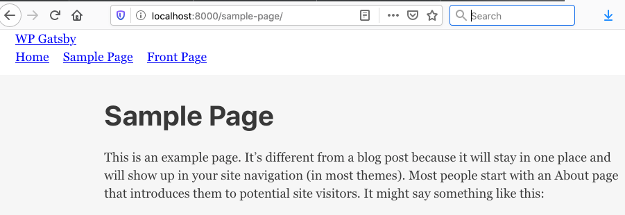
Screenshot showing the Same Page title and content under the site navigation, which includes the site title, and menu items.
Created in WordPress, displayed in Gatsby.

Section 4: Displaying blog posts in Gatsby

We’re in pretty good shape at this point, but there’s a big piece we’ve gotta tackle: displaying pages on the site. We’ll walk through the steps to make that happen in this section, specifically by creating blog post templates as well as a couple of new components for post images before tying everything together in createPages.js and createPosts.js.

Have you already created your pages and posts in WordPress? If not, this is a good time to jump in there and do it.

Step 1: Add a globals variable file at the root of the project directory

// global variable
const Globals = {
  blogURI: ''
}
module.exports = Globals

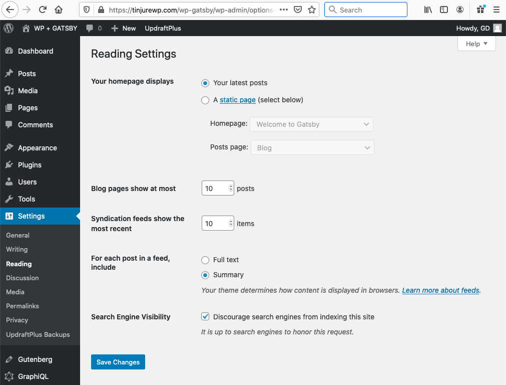
The blogURI = ' ' URL path is used when the homepage setting in the WordPress admin (Settings ? Reading) is set to the “Your latest posts” option.

If you’re planning to use the “static page” option instead, then blogURI= 'blog' should be used in the global variables file.

Step 2: Create a blog template inside the templates folder

This template will handle displaying all published posts. Take note that two components — PostEntry and Pagination, both of which don’t exist yet) —are used here. We’ll get to those in just a moment.

// src/templates/post/blog.js
import React from "react"
import Layout from "../../components/Layout"
import PostEntry from "../../components/PostEntry"
import Pagination from "../../components/Pagination"
import SEO from "../../components/SEO"


const Blog = ({ pageContext }) => {
  const { nodes, pageNumber, hasNextPage, itemsPerPage, allPosts }
  = pageContext


  return (
    <Layout>
      <SEO
        title="Blog"
        description="Blog posts"
        keywords={[`blog`]}
      />
      {nodes && nodes.map(post => <PostEntry key={post.postId}
        post={post}/>)}
      <Pagination
        pageNumber={pageNumber}
        hasNextPage={hasNextPage}
        allPosts={allPosts}
        itemsPerPage={itemsPerPage}
      />
    </Layout>
  )
}


export default Blog

Step 3. Create a post entry component

This component is used within archive.js and other components to iterate through posts, displaying the post entry title, featured image (if any), excerpt and URL (aka “slug” in WordPress parlance).

// src/components/PostEntry.js
import React from "react"
import { Link } from "gatsby"
import Image from "./Image"
import { blogURI } from "../../globals"


const PostEntry = ({ post }) => {
  const { uri, title, featuredImage, excerpt } = post

  return (
    <div style={{ marginBottom: "30px" }}>
      <header>
        <Link to={`${blogURI}/${uri}/`}>
          <h2 style={{ marginBottom: "5px" }}>{title}</h2>
          <Image image={featuredImage} style={{ margin: 0 }}/>
        </Link>
      </header>


      <div dangerouslySetInnerHTML={{ __html: excerpt }}/>
    </div>
  )
}

export default PostEntry

Step 4: Create an (optional) image component

The Gatsby default starter comes with an Image component and that works just fine in most case. In this example, we’re fetching the image file used as the post’s featured image in WordPress and assign it a fallback image in case there is no featured image as described in Henrik’s guide.

// src/components/Image.js
import React from "react"
import { useStaticQuery, graphql } from "gatsby"


const Image = ({ image, withFallback = false, ...props }) => {
  const data = useStaticQuery(graphql`
    query {
      fallBackImage: file(relativePath: { eq: "fallback.svg" }) {
        publicURL
      }
    }
  `)


  /* Fallback image */
  if (!image) {
    return withFallback ? <img src={data.fallBackImage.publicURL}
      alt={"Fallback"} {...props}/> : null
  }


  return <img src={image.sourceUrl} alt={image.altText} {...props}/>
}


export default Image

If withFallback is set to false (like it is in the default Gatsby component file), then it will simply not render a DOM element.

Step 5: Create a Pagination component

The Pagination component allows us to display specified number of posts per page in the post index. WordPress has two types of pagination one that returns Next and Previous links to navigate between pages one at a time, and one that provides linked page numbers. We’re working with the former in this component:

// src/components/Pagination.js
import React from "react"
import { Link } from "gatsby"
import { blogURI } from "../../globals"


const Pagination = ({ pageNumber, hasNextPage }) => {
  if (pageNumber === 1 && !hasNextPage) return null


  return (
    <div style={{ margin: "60px auto 20px", textAlign: "center" }}>
      <div className="nav-links">
        {
          pageNumber > 1 && (
            <Link
              className="prev page-numbers"
              style={{
                padding: "8px 8px 5px 4px",
              }}
           to={pageNumber > 2 ? `${blogURI}/page/${pageNumber - 1}`: `${blogURI}/`}
            >
              ← <span> Previous</span>
            </Link>
          )
        }
          <span className="meta-nav screen-reader-text"></span>
          {pageNumber}
        </span>


        {
          hasNextPage && (
            <Link
              style={{
                padding: "4px 8px 5px 8px",
              }}
              className="next page-numbers"
              to={`${blogURI}/page/${pageNumber + 1}`
              }
            >
              <span>Next </span> →
            </Link>
          )
        }
      </div>
    </div>
  )
}


export default Pagination

There is a conditional statement on Line 7 that returns null if pageNumber === 1 && !hasNextPage. In other words, if the current page’s hasPageNumber is greater than 1, the Previous button (Lines 13-24) will display. Similarly, when the current page’s hasNextPage is at least 1, then the Next button (Lines 30-42) will display.

Step 6: Refactoring createPages

We need to clean up the createPages.js file to reflect all the work we’ve done since creating the file. The file simply becomes too big with everything it’s tracking. To keep our code organized and structured, we can use GraphQL fragments, which allow us “to split up complex queries into smaller, easier to understand components,” according to the documentation.

GraphQL fragments are reusable units which allows to construct sets of fields, and then include them in queries wherever needed.

If we follow Henrik’s guide, the GraphQL query fields for the post template and post preview are stored in the data.js file:

// src/templates/posts/data.js
const PostTemplateFragment = `
  fragment PostTemplateFragment on WPGraphQL_Post {
    id
    postId
    title
    content
    link
    featuredImage {
      sourceUrl
    }
    categories {
      nodes {
        name
        slug
        id
      }
    }
    tags {
      nodes {
        slug
        name
        id
      }
    }
    author {
      name
      slug
    }
  }
`


const BlogPreviewFragment = `
  fragment BlogPreviewFragment on WPGraphQL_Post {
    id
    postId
    title
    uri
    date
    slug
    excerpt
    content
    featuredImage {
      sourceUrl
    }
    author {
      name
      slug
    }
  }
`


module.exports.PostTemplateFragment = PostTemplateFragment
module.exports.BlogPreviewFragment = BlogPreviewFragment

Next, refactoring the create/createPosts.js file as described in the guide requires adding the following code at the top section of createPosts.js (Lines 2-10), just above the const = GET_POSTS=` query statement on Line 4.

// create/createPosts.js
const {
  PostTemplateFragment,
  BlogPreviewFragment,
} = require("../src/templates/posts/data.js")


const { blogURI } = require("../globals")


const postTemplate = require.resolve("../src/templates/posts/index.js")
const blogTemplate = require.resolve("../src/templates/posts/blog.js")


const GET_POSTS = `
  # Here we make use of the imported fragments which are referenced above
  ${PostTemplateFragment}
  ${BlogPreviewFragment}
  query GET_POSTS($first:Int $after:String) {
    wpgraphql {
      posts(
       first: $first
       after: $after
       # This will make sure to only get the parent nodes and no children
       where: {
         parent: null
       }
      ) {
         pageInfo {
           hasNextPage
           endCursor
         }
         nodes {
           uri


           # This is the fragment used for the Post Template
           ...PostTemplateFragment


           #This is the fragment used for the blog preview on archive pages
          ...BlogPreviewFragment
        }
      }
    }
 }
`

Here, the fragment strings created in the previous steps (Lines 9-10) are imported and registered outside the GET_POSTS query (Line 12) and used as fragments (Lines 34 and 37 ) inside the GET_POSTS($first:Int $after:String) query.

At the bottom of the createPosts.js file, the blogPage path is defined with global blogURI variable (Lines 36-41) and we’ve added the code to create paginated blog pages (Lines 99-111).

// create/createPosts.js
// Previous code excluded


const allPosts = []
const blogPages = [];
let pageNumber = 0;
const itemsPerPage = 10;


/** This is the export which Gatbsy will use to process.
 * @param { actions, graphql }
 * @returns {Promise<void>} */
module.exports = async ({ actions, graphql, reporter }, options) => {


  /** This is the method from Gatsby that we're going
   * to use to create posts in our static site */
  const { createPage } = actions


  /** Fetch posts method. This accepts variables to alter
   * the query. The variable `first` controls how many items to
   * request per fetch and the `after` controls where to start in
   * the dataset.
   * @param variables
   * @returns {Promise<*>} */
  const fetchPosts = async (variables) =>
    /** Fetch posts using the GET_POSTS query and the variables passed in */
    await graphql(GET_POSTS, variables).then(({ data }) => {
      /** Extract the data from the GraphQL query results */
      const {
        wpgraphql: {
          posts: {
            nodes,
            pageInfo: { hasNextPage, endCursor },
          },
        },
      } = data


      /** Define the path for the paginated blog page.
       * This is the url the page will live at
       * @type {string} */
      const blogPagePath = !variables.after
        ? `${blogURI}/`
        : `${blogURI}/page/${pageNumber + 1}`


      /** Add config for the blogPage to the blogPage array for creating later
       * @type {{
       *   path: string,
       *   component: string,
       *   context: {nodes: *, pageNumber: number, hasNextPage: *} }} */
      blogPages[pageNumber] = {
        path: blogPagePath,
        component: blogTemplate,
        context: {
          nodes,
          pageNumber: pageNumber + 1,
          hasNextPage,
          itemsPerPage,
          allPosts,
        },
      }


      /** Map over the posts for later creation */
      nodes
      && nodes.map((posts) => {
        allPosts.push(posts)
      })


     /** If there's another post, fetch more so we can have all the data we need */
      if (hasNextPage) {
        pageNumber++
        reporter.info(`fetch post ${pageNumber} of posts...`)
        return fetchPosts({ first: itemsPerPage, after: endCursor })
      }


      /** Once we're done, return all the posts so we can
       * create the necessary posts with all the data on hand */
      return allPosts
    })


  /** Kick off our `fetchPosts` method which will get us all
   * the posts we need to create individual posts */
  await fetchPosts({ first: itemsPerPage, after: null }).then((wpPosts) => {


    wpPosts && wpPosts.map((post) => {
      /** Build post path based of theme blogURI setting */
      const path = `${blogURI}${post.uri}`


      createPage({
        path: path,
        component: postTemplate,
        context: {
          post: post,
        },
      })


      reporter.info(`post created:  ${path}`)
    })


    reporter.info(`# -----> POSTS TOTAL: ${wpPosts.length}`)


    /** Map over the `blogPages` array to create the
     * paginated blog pages */
    blogPages
    && blogPages.map((blogPage) => {
      if (blogPage.context.pageNumber === 1) {
        blogPage.context.publisher = true;
        blogPage.context.label = blogPage.path.replace('/', '');
      }
      createPage(blogPage);
      reporter.info(`created blog archive page ${blogPage.context.pageNumber}`);
    });
  })
}

The final updated create/createPosts.js and create/createPage.js files are available in this GitHub repository.

In his Twenty Nineteen porting tutorial post, Muhammad describes in great detail how static pages created with Gatsby’s createPage use nearly the same code and file structure used in this example. Nice to see some consistency forming between our references.

After re-starting local server with gatsby develop, we should display a screen in our browser now showing a loop of our published posts, containing the post title and excerpt.


Section 5: Styling and deployment

While styling, typography and deployment are all beyond the scope of what we’re covering here, we can touch on them a bit. The Gatsby’s documentation provides excellent resources on both styling and deployment/hosting options.

Basic site styling

Gatsby’s documentation is grouped by global CSS files, modular stylesheets and CSS-in-JS. There are other styling options available, including Typograpgy.js, Sass, JSS, Stylus and PostCSS.

While porting the Twenty Nineteen WordPress theme to Gatsby, Muhammad includes the theme’s styles so they can be used over on the Gatsby site. He cautions that some adjustments are needed since some units and values are incompatible with Gatsby. For example, he had to adjust vw units in CSS to use them with flexbox for some components. Similarly, porting Twenty Twenty theme to Gatsby, Henrik followed a similar process in his Gatsby starter -Twenty Twenty by porting over the Twenty Twenty stylesheet as well as fonts.

I decided to use Sass in my project. That requires installing gatsby-plugin-sass and its required node-sass dependency:

#! install node-sass & gatsby-sass
yarn add node-sass gatsby-plugin-sass
#! or with npm
npm install --save node-sass gatsby-plugin-sass

Then the plugin can be added to gatsby-config.js and configured as shown here.

// gatsby-config.js
module.exports = {
  siteMetadata: {
    plugins: [
      `gatsby-plugin-sass`
    ],
  }
}

Now we can write styles in .scss files and import them as we normally would in any other Sass project.

// using import in a component file
import("./src/styles/global.scss")


// using require in the gatsby-browser.js file
require('./src/styles/global.scss')

The .scss stylesheet can be imported by the global component or added in gatsby-browser.js with a require statement. For this demo project, I’m using Gatsby’s default styling for the main page and I simply left post content as is. I refactored the Header.js file a bit with some very basic styling.

//src/components/Header.js
import { Link } from "gatsby"
import PropTypes from "prop-types"
import React from "react"
import useSiteMetadata from '../components/siteMetadata';
import Menu from "./Menu"
import "../styles/header.css"


const Header = () =>{
  const { title } = useSiteMetadata();


  return (
    <header className="header">
      <div className="nav-container brand">
        <Link  to="/"> {title} </Link>
        {/* Menu here */}
        <Menu />
      </div>
    </header>
  )
}


Header.propTypes = {
  siteTitle: PropTypes.string,
  description: PropTypes.string,
}


Header.defaultProps = {
  siteTitle: ``,
  description: ``,
}


export default Header

This should give us the site header when we restart the server with gatsby develop.

Supporting WordPress block styles

I’m assuming you’re well familiar with the WordPress block editor if you’ve made it this far and know how blocks generally work. Since releasing the block editor, WordPress has maintained a separate set of styles specifically for block content.

That means we need an extra step to port those over to Gatsby with the theme styles. Jason Lengstorf demonstrates in his tutorial guide. First, the WordPress blocks package is installed:

# install wordpress/block-library
npm install @wordpress/block-library
# with yarn add
yarn add @wordpress/block-library

Then we can import those styles into a Gatsby component. Let’s go with the component:

// src/components/layout.js
import React from "react"
  import { Link } from "gatsby"


import "@wordpress/block-library/build-style/style.css"
  import "../styles/layout.css"


const Layout = ({ children }) => {
  return (
    <section>
      <header>
        <Link to="/" className="home">
          Gatsby + WP
        </Link>
      </header>
      <main>{children}</main>
    </section>
  )
}


export default Layout

The block editor is still very much in active development, which means things are prone to change, perhaps unexpectedly. So, definitely proceed with caution if you’re planning to use them.

Site deployment

We’ve talked a bit about deployment when I explained why I chose Netlify, I chose it because it hooks into the project’s GitHub repo and deploys automatically when pushing to a specific branch, thanks to Netlify Functions.

Netlify has a nice steop-by-step guide that covers how to connect a Gatsby site to Netlify. The Gatsby Doc also describes deploying to Netlify.

Finally, link to my own Netlify deployed demo site.

Again, this gives us continuous deployment where the site rebuilds automatically when changes are pushed to the repo. If we want a similar process whenever changes are made in WordPress — like publishing a post or editing a page — then the JAMstack Deployments plugin can be used as described in Jason’s guide.


This is still a work in progress!

While what I’ve learned in the process of porting a WordPress theme to Gatsby is great for constructing the basic building blocks of a blog, I’ve realized that there is still a lot of work to cover. I mean, WordPress stores so much data, including authors, categories, tags, post statuses, custom post types, and so much more, that all take extra consideration.

But there’s a growing list of decoupled Gatsby WordPress site examples, some of which I’ll list below for reference. Henrik’s an awesome list of WordPress-Gatsby resources is super helpful to learn more about the WordPress-Gatsby decoupling.

Credits

I know I mentioned it throughout this post, but a big shout out to Henrick Wirth, Jason Lengstorf and Muhammad Muhsin for all the work they’ve done to document and share what it takes to port WordPress to Gatsby. Everything I’ve covered here is merely the accumulation of their fine work and I appreciate each of them for creating such helpful guides suitable even for beginners like myself. I owe a special thank you to our own Geoff Graham from CSS-Tricks for editing this article.


The post Creating a Gatsby Site with WordPress Data appeared first on CSS-Tricks.

You can support CSS-Tricks by being an MVP Supporter.
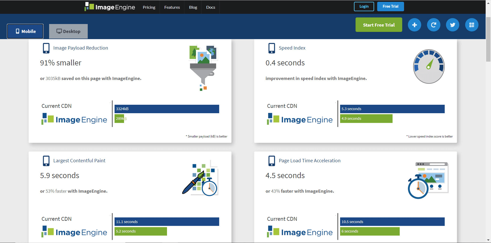
Categories: Designing, Others Tags:

How to Create a PPC Landing Page Copy That Converts

July 20th, 2020 No comments

Running PPC campaigns can be incredibly lucrative. In fact, many businesses have taken off solely with the power of a well-targeted paid advertising campaign.

However, at the same time, PPC can be very costly, especially when you’re getting clicks but no one’s taking the action that you want them to take.

When that happens, there’s usually one primary reason:

Poor landing page copy.

If there’s a disconnect between your ads and your landing page, people will not only fail to convert but will leave your site in a matter of seconds.

Therefore, ensuring that your copy is in line with your audience’s expectations and your campaign goals is absolutely vital. It might even be the single most crucial thing that you should focus on.

If you look at some of the best PPC landing page examples, you’ll quickly notice how focused and well-crafted the copy is, with every element and word carefully chosen to match the brand voice and audience expectations.

These companies have perfected the art of landing page copy, but even though the bar is set quite high, that doesn’t mean that you can’t create copy that works just as well, even if you don’t have a lot of experience.

To help you get started, let’s explore some of the most important aspects of PPC landing page copy that you should consider.

Understand Your Audience

Countless components go into successful landing page copy. But few are as important as your ability to get through to the very core of the problems that your audience is facing.

Most marketers think that they understand who they’re trying to reach, but few actually take the time to dive deep into who their audience is, their pain points, what solutions they are seeking, or even how they formulate their problems in a search query.

Having answers to these questions will dictate every decision in your PPC campaign and will provide you with all of the knowledge necessary to craft compelling copy that captures attention and fills the reader with a sense of urgency that forces them to take action.

If you know and understand the problem that your audience is facing, you will have a much easier time emphasizing that problem in your copy, relating with your audience, and showing how your solution can alleviate their pain in the easiest and most convenient way possible.

Use Stories to Break Through Barriers

Stories have been the driving force of human communication since the dawn of humanity. They are so ingrained into our minds that we can’t help but relate to stories that capture our imaginations and address problems that we are familiar with.

That’s why it’s not surprising that stories have become one of the most powerful ways to communicate sales messages as well, with savvy marketers using them to showcase how a product can help solve a pressing issue.

With the help of stories, you can bring your product to life, putting it in a real-life scenario where you or your customers use the solution that you’re selling to overcome obstacles and reach the goals that seemed unattainable.

Having some of your best customers tell your story for you is especially powerful, as it not only paints a compelling picture of how your product can help but also allows the reader to associate with the story’s protagonists and envision themselves going through the same journey.

Instead of listing your product’s features and benefits, which alone is sure to be met with skepticism, you can use stories to form a genuine connection with your audience and make them trust you in as little as a few minutes it takes to read through your landing page.

Create an Irresistible Headline

No matter how well-crafted the body of your copy might be, it won’t make much of a difference if the reader doesn’t get past the headline.

Once a prospect clicks through to your website, they are intuitively looking for a reason to click away, as they are in unfamiliar territory and aren’t sure if they can trust you or if what you have to offer is even relevant to them.

If you don’t want to lose the vast majority of your site’s visitors, you must make sure that your headline and subhead are irresistible and almost force the reader to go through the rest of your page in order to satisfy their curiosity.

Most good headlines masterfully combine an element of curiosity with a laser-focused identification of the most pressing problem that the reader is facing.

This way, the prospect is left with no choice than to read further because if they don’t, they will feel like they’re missing out on a solution that could potentially help solve their problem forever.
When working with PPC campaigns, it’s also essential to connect the headline of your ad with the headline and subhead on your landing page, as they must build on one another and naturally guide the sequence of information towards the resolution that the reader is seeking.
One rule of thumb to follow when designing great headlines is making them all about the reader instead of your company. Many brands tend to focus on who they are and what they’ve achieved, but those that manage to flip the conversation to focus on the customer’s needs and how the solution can help them usually see the best results.

Make Your Landing Page Look Professional

Image Source

With so many aspects of the landing page to consider, it’s not surprising that some elements are neglected, even if they play a vital role in how many visitors end up converting into customers.

And one of these aspects is the presentation of your brand and your company on the landing page, which might seem like an afterthought, but can actually determine whether a visitor trusts you enough to buy from you.

For one thing, you should make sure that your site looks secure, and has an SSL certificate, a user-friendly design, and social proof elements that showcase your success stories.

Another vital part of presenting yourself is using clear wording, including the correct grammar. Making grammar and style mistakes throughout your page can be an instant turnoff for readers. By using online grammar and punctuation checker tools it will be easier for you to just focus on creating amazing content.

When writing the copy, try to make the language easy to understand and avoid complex sentences or less-common words. After all, your primary goal when creating a landing page is not to impress the reader but to make sure that they understand your message and are persuaded to buy.

You should also make the page easy to skim through in order to ensure that your readers understand the core message. To achieve that, use plenty of bolding and colored elements to make important sentences pop out.

Use bullet lists for features and benefits, as well as clearly distinguishable testimonials that ideally have the person’s full name and a picture.

Final Words

Even though PPC campaigns can be incredibly effective, making them profitable does take time and effort. If you want the clicks to turn into customers, you must have a solid understanding of your audience, connect with your readers through stories, and come up with a headline that immediately captures attention.

Finally, your landing page must look professional and convenient to browse on any device because getting prospects to trust you is essential if you want them to buy from you.

Photo by Launchpresso on Unsplash

Categories: Others Tags:

How businesses are Incorporating Innovative Technologies to Market in Pandemic

July 20th, 2020 No comments

In the past few months, the use of innovative technologies is streamlined under the shadow of the Coronavirus pandemic.

Social distancing, remote working, and self-isolation have created hurdles on the way of marketers to reach out to their customers. It has forced marketers to make the use of digital channels that include innovative technologies such as AI and ML, AR and VR, Big-data, digital marketing, and more into their marketing strategy. The pandemic has created a lot of opportunities for businesses to expand their digital footprints as people spend most of their time online. Expert opinions and predictions indicate that these trends will be followed through the crisis and there are all possibilities that these trends will live after the crisis. In this blog, we are going to discuss some of the major innovative technologies being used increasingly in the Coronavirus pandemic.

1. Shifting to online ordering

Online delivery services are emerging as a new norm, people prefer to order food items, groceries, and other products online instead of visiting a physical store. As a result, Restaurants and other bricks and mortar stores are using the potential of web technology to cater to their customer needs by providing a digitally enabled delivery system. For the first time, the delivery orders are more than the supply, delivery based apps like Doordash, Instacart, and Uber Eats are being extensively used. UberEats have found a 30% increase in the customers signing up for services during COVID-19. In Instacart, people ordered around $680 million worth of goods in each week of April which is about a 430% increase from December. According to Statista, 27% of the US respondents stated that they have deliberately purchased hygiene products (e.g. hand sanitizer, toilet paper, etc.) online instead of offline because of coronavirus pandemic. Businesses are rapidly adopting digital delivery systems to make it convenient for customers to shop online.

2. Use of AR and VR to market products

Businesses are utilizing the potential of Augmented Reality (AR) and Virtual Reality (VR) more during the pandemic. Retail, real estate, trade shows/events and are the major areas using AR and VR technology to provide better virtual marketing experience for the customers and driving sales. For real estate, a VR startup Beike has developed a VR platform to enable potential customers to take a virtual 3D tour of the house properties in the market. The platform has 4 million house properties and apartments listed and it has 650 million users. VR-based trade shows are being widely used by hotels, airlines, and the fashion industry, the technology is enabling users to join large conferences virtually and have real-world tradeshow experiences without breaking the lockdown order. It eliminates the trade show costs and time such as traveling time, meal cost, and other expenses associated with traditional trade shows. Other marketing areas are using the AR and VR technology to streamline their marketing as it was before the crisis.

3. Digital marketing

With consumers staying safely in their homes and spending most of their time online, digital marketing platforms are the best tools for brands to reach out to their potential customers during the pandemic. Digital marketing channels such as E-mail automation, SEO, content marketing, and social media marketing were already well underway, but due to pandemic businesses are relying more on digital mode for marketing. With the increased activities on the biggest platforms like Google, Facebook, and more, the opportunities for businesses to reap the benefit is increased.

4. Big-Data, predictive analytics

Predictive analysis and forecasting are being used widely during the COVID-19 pandemic. Big-Data helps businesses to make decisions, there are many companies implementing data science solutions for efficient marketing. The retail industry is embracing data science and predictive analytics solutions to find out hidden revenue opportunities, consumer purchase behavior, competitive prices, and more. These factors are helping businesses to make proper marketing decisions and get better results. Predictive analytics is not only helping in marketing decision making but also in increasing model sustainability by processing a massive amount of data. Data science solutions and predictive analytics are helping businesses to stay ahead of the curve during the COVID-19 pandemic.

5. AI and ML-based Automations

The pandemic has accelerated AI and ML-based marketing automation processes that were already well underway. With the help of machine learning, it becomes possible to make market predictions by processing a big amount of data. Major companies such as Google and Facebook are utilizing the potential of machine learning to improve ad offerings to consumers. Machine learning algorithms are helping advertisers to improve their media buying efficiency while AI and automation help marketers in many different areas. AI helps in segmentation the customer base, selection of the right channel to drive engagement, fraud detection, and security, and more. Several companies are embracing the potential of AI and ML to bring automation in the system and to be able to deal with the current marketing challenges.

Conclusion

With an increase in the digital shopping habits of consumers, the use of innovative technologies by businesses of all kinds has increased during the pandemic, executing business processes digitally is shaping up to be new normal. A recent survey states most people of all age groups are likely to make online purchases even after the crisis. These trends are expected to live through the pandemic and beyond, thus, for businesses, it is important to develop an infrastructure to maximize digital or web-based interactions with their customers. Many expert opinions suggest that businesses are required to utilize innovative technologies to stay ahead of the curve.


Photo: Hello I’m Nik ? on Unsplash
Creator: Piyush Jain is the founder and CEO of Simpalm, an app development company in Chicago.

Categories: Others Tags:

The Designer’s Guide to Letter-Spacing

July 20th, 2020 No comments

Most of the information we consume happens through reading, so it makes a lot of sense to pay attention to the words when designing. There are many aspects to typography, but one of the things that helped improve the quality of my design was letter-spacing.

Letter-spacing is about adding and removing space between letters. Some people confuse it with kerning, but these two are different; letter-spacing affects the whole line of text, whereas kerning adjusts the space between two individual letters at the time. Kerning is best left to type designers, besides which, unlike letter-spacing there is currently no way to control kerning in CSS.

I believe that practice and a lot of observation will change the way you treat letter-spacing in your work as well.

The Purpose of Letter-Spacing

The main purpose of letter-spacing is to improve the legibility and readability of the text. Words act differently depending on their size, color, and the background they are on. By adjusting letter-spacing to the environment you are working with you will help readers consume your information faster, and more efficiently. The fun part is that they won’t even notice it — that’s the whole point of the job.

Bear in mind that typographers think about letter-spacing and kerning when designing a typeface. It means you don’t have to apply it to all your text, but in order to have an understanding when it’s necessary, you should know some basic principles, and use good typefaces.

How Letter-Spacing Affects Legibility and Readability

The legibility and readability of your text depend on things like line-height, paragraph length, font size, typeface choice, letter-spacing, and much more. Regarding letter-spacing, if you are just getting into typography, the best thing you can do is not overuse it. What I mean by that is simply don’t make the distance between letters too big or too small; even if you think it looks good, people will struggle reading it, and that will ruin their experience.

Letter-Spacing Capital Letters

Capital letters are designed with the intention that they will appear at the beginning of a sentence or proper noun, in combination with lowercase letters. When capital letters are next to each other, the space between them is too tight. So in order to achieve better readability, space needs to be increased. This applies to both large and small font sizes.

Letter-Spacing Headlines

If you are using well designed fonts, you can be sure that they are calibrated well, and you won’t need to make any major adjustments to them. However, the problem with headlines is that at larger scales the space between letters looks unbalanced. It can be fixed by increasing or decreasing the letter-spacing value.

There are no strict rules for letter-spacing — there are a lot of typefaces and all of them require an individual approach — but if you look at how big companies like Google and Apple treat their typefaces, you can find a lot of valuable information there.

Let’s take a look at the “Roboto” and “San Francisco” typefaces (the first one is used in Material Design and the second one in Apple’s ecosystem). Headlines from 20 to 48 pixels have either a positive letter-spacing value or none. If the font size is bigger, letter-spacing becomes negative. These exact numbers are not going to work that well for other typefaces, but after trying different approaches I can state that it’s a common pattern.

I’ve tested several guidelines for letter-spacing and the one that was published by Bazen Agency works for a lot of popular typefaces. It will be a good starting point for you, but you can always apply additional adjustments:

  • H1 — 96px — -1.5%
  • H2 — 60px — -0.5%
  • H3 — 48px — 0%
  • H4 — 34px — 0.25%
  • H5 — 24px — 0%
  • H6 — 20px — 0.15%
  • Subtitle — 16px — 0.15%

If you happen to design a lot of apps or you’re planning to do that, one thing that helps me is using the default Material Design and Apple guidelines for their typefaces. They are well balanced and it saves a lot of time.

Letter-Spacing Body Text

If you ever read anything about letter-spacing, you’ve probably have seen this popular wisdom from typographer Frederic Goudy: “Anyone who would letter-space lowercase would steal sheep”. (There’s an argument that he was only referring to blackletter fonts.) Some designers took it as a hard rule and now never adjust the letter-spacing of lowercase text.

Based on my practice and by looking at the work of designers I can’t agree with Goudy, because sometimes small changes can make a big difference in how your text performs. Let’s take, for example, condensed fonts. At a small size, the letters are too close to each other, which leads to poor legibility. By increasing letter-spacing by 1.5% you will see that the text is now easier to read.

If we look at my previous example, in the guidelines for “Roboto” and “San Francisco” typefaces, letter-spacing is applied to body text; even though San Francisco has a dedicated “SF Pro Display” for headlines and “SF Pro Text” for body text, letter-spacing is still used to refine them.

There are a lot of different typefaces and a single rule doesn’t apply to all of them. Experiment with letter-spacing and do what seems right to you. There are some simple guidelines that will lead you in the right direction, especially when working with body text:

Keep in Mind Line-Height

If you have a line-height greater than 120%, most likely negative letter-spacing will lead to an unbalanced look to the paragraph. To refine it you would need to either keep it at 0% or only slightly increase it.

Light Text on Dark Background

On a dark background, white text looks overexposed and therefore letters appear too tight. To make it more legible, I would suggest you increasing letter-spacing a small amount.

General Values for Body Text

You can use the following guidelines for body text, which I have tested with several typefaces:

  • Body 1 — 16px — 0.5%
  • Body 2 — 14px — 0.25%

Letter-Spacing Captions

Unlike headlines and body text, smaller font sizes don’t have many variations in letter-spacing. It’s a common practice when a font size is lower than 13px to increase the space between letters to make it legible. But there are always exceptions (“SF Pro Text” guidelines suggest using positive letter-spacing only when a font size is 11px or below). Make sure you experiment with settings.

You can use the following values as a starting point and then edit them to what seems right to the typeface of your choice:

  • Caption — 12px — 0.5%
  • Overline — 10px — 1.5%

Final Tip

One of the things that helped me improve my skills in typography was looking at other designers and especially type foundries. By decoding their work you might notice some nuances of how they treat typography and it will help you in future projects.

Source

Categories: Designing, Others Tags: