Archive

Archive for August, 2020

How to Make your Landing Pages Visually Attractive – [Infographic]

August 4th, 2020 No comments

Landing pages are like gateways to conversions, if done right. Rather than having a wall of text on your landing pages, it is always better to have impactful visuals that would engage the prospects and encourage them to take the next action. Too much text does not only clutter a landing page but also contributes to the high bounce rate.

According to a study, content with visuals is viewed 94% more than its counterparts and gets 180% stronger engagement. While it is important to use the right tone and persuasive language, visuals play an equally important role when it comes to landing pages.

This brings us to the very important question of HOW to add relevant visuals that can bring out the best from your landing pages.

1. Impressive images

80% of readers pay more attention to the content if there are images supporting it. You can use visual cues on your landing page to direct the subscriber to take the required action.

2. GIF animations

GIFs are the perfect amalgamation of a video and slideshow of static images. They have gotten immensely popular in recent times which is evident from the fact that 500 million active users spend 11 million hours viewing GIFs on GIPHY. These animations can help you present your product in different angles or let the reader know about the huge range of products available on your eCommerce website. Just make sure that the size of your GIF is not more than 1MB as it can cause the page to load slowly and lead to an increased bounce rate.

3. Explainer videos

Videos in landing pages can increase the conversion by 86%. However, this is possible only if you use relevant videos that reflect the brand personality and convey the message. Adhere to the inverted pyramid technique when you strategize the design of your landing page (as shown in the image below). It will help you drive better conversions.

90% of users prefer video content and that’s the reason why savvy marketers prefer to use it in their landing pages. You can even go a step ahead and add personalized videos to your landing pages with the help of tools like Vidyard and Hippo Video.

4. Demonstrative illustrations

The latest survey has revealed that 95% B2B buyers want shorter and highly visual content. In light of this trend, abstract art has gained momentum and ideas are getting represented in a graphic manner through modern designs. Just bear in mind that you do not use any images or illustrations directly from the stock as it will hamper your brand credibility.

5. Informative graphs

If you want to give the readers an overview of some facts and figures or complicated statistics, graphs can be a great option for you. To showcase trends over the years, you can use line charts or bar graphs while pyramids and pie charts work well to show the proportion of elements.

How will you choose the right colors?

Selecting the right color is of utmost importance as it can affect customer psychology and get him or her to take the decision.

For example, white stands for purity and minimalism. It is a great choice for non-profit organizations and medical facilities.

Red, being the color with the longest wavelength in the spectrum gets noticed even from a distance. It represents power, passion, intensity, love, and heat. Have you noticed how McDonald’s and Burger King both have these colors? Many FMCG brands choose to use it in a combination with white and yellow.

Blue conveys the emotions of calmness and peace. It is used for legal services.

To learn more about using the right visual elements and CTA designs in your landing page to drive maximum conversions, head to this insightful infographic put together by our friends at Email Uplers: A Deep Dive Into The Use Of Visuals In Landing Pages.

How to Use Visual Elements in Landing Page to Boost Conversions Source: How to Use Visual Elements in Landing Page to Boost Conversions

Categories: Others Tags:

What Is Salesforce?

August 4th, 2020 No comments

You’ve probably heard about Salesforce while researching customer relationship management (CRM) solutions for your business. Your employees may have even used it at a previous job, and as your company grows, they may be asking for it to help them manage their interactions with customers. But what is Salesforce, and what does it do?

Salesforce itself is a cloud computing software-as-a-service (SaaS) company that has been in business since 1999. It started as a cloud-based CRM software company years before SaaS became ubiquitous throughout enterprises. Over 150,000 companies run Salesforce in some form.

cloud based CRM software

The Salesforce CRM product is Customer 360, an integrated platform that includes modules for sales, service, marketing, commerce, engagement, analytics, communities, productivity, and more.

Customer 360 also lets you use third-party apps or build your own to extend its functionality. It includes the MuleSoft Anypoint Platform to connect any app, data, or device you use.

Customer 360 offers industry-specific solutions for financial services, healthcare, and philanthropy. Companies use Salesforce for everything from keeping track of customer information to analyzing customer data for marketing and upselling opportunities.

This guide will cover everything you need to know to get started with Salesforce, including

  • How to use Salesforce. You’ll read about use cases for Salesforce, why companies choose Salesforce for their CRM needs, and who Salesforce’s main competitors are.
  • What Salesforce CRM is and how it works. You’ll get an overview of the Salesforce CRM platform, along with the main features and capabilities.
  • Salesforce product clouds explained. Salesforce’s modules are known as clouds, like Service Cloud and Sales Cloud. You’ll learn more about these clouds, including the features, advantages, and opportunities of each.
  • What is the Salesforce AppExchange? You might want to extend Salesforce with third-party applications, or you might want to create an application for Salesforce that you can share. This section will discuss how to be an AppExchange partner and what kinds of API, data, and CTI integrations are available.

How to use Salesforce

Because it was originally built for salespeople (hence the name), some of the main functions of Salesforce include tracking prospects and companies, adding deals, and accessing sales collateral. However, because Salesforce offers so many additional products, many companies use the platform in a variety of additional ways. For example, Salesforce can be used to manage marketing campaigns, handle customer service inquiries, log calls, and create reports.

The software runs in the cloud, so all applications are hosted online. This lets users access Salesforce from anywhere and from any device, a boon for remote workers or salespeople who are on the road and need to enter details of sales calls easily. It also allows companies to get up and running quickly, without having to install hardware and applications on the premises.

To get started, companies can sign up for a 30-day trial of Salesforce. You’ll start by identifying and prioritizing your business objectives so that you can implement the services and applications that are most important to your company, and then roll out the “nice to haves.”

Woman analyzing datas through a CRM software

For example, if your biggest need is a place for your sales team to enter details about customer interactions, you may want to start with Sales Cloud. Over time, you could roll out the Marketing Cloud application so your marketing team can start implementing personalized email campaigns.

Once you sign up, you’ll create user types that open up data for specific roles, like a sales manager user type that can see all the data relating to the sales team’s interactions with customers. You’ll also define your sales processes, set up accounts and contacts, import your data, and customize Salesforce to meet your company’s needs.

Salesforce has a collection of applications and integrations, and uses APIs to connect with other applications like SAP or Oracle to access data or extend the capabilities in those systems. The APIs can read and write data to these systems to ensure you’re always accessing the most up-to-date information.

What Salesforce is used for

Because there are so many different modules, there are endless ways to use Salesforce. In the broadest terms, companies use Salesforce to understand and interact with their existing customers and to acquire new customers. Here are just a few ways Salesforce customers use the software.

The athleticwear brand Adidas uses Salesforce Commerce Cloud, Service Cloud, and other products. Commerce Cloud manages customer data across different channels, for instance, in stores and online. Adidas also uses shopper preferences from Commerce Cloud for product development and, in some cases, to create custom products. The company uses Service Cloud for its customer care agents, who are able to provide support by phone, email, web, or social media using one application.

Farmers Insurance has implemented multiple products from the Salesforce Customer 360 suite, including Service Cloud, Marketing Cloud, Community Cloud, Einstein Analytics, and the Salesforce Platform.

With the Platform, customers, employees, and insurance agents can log into Salesforce from 15 different entry points. Customers can view more information about their history and claims, and employees and customers can more easily access information necessary for customer service.

Farmers is in the process of implementing a single view of the customer that includes all the insurance products they’ve purchased from the company.

Land O’Lakes uses Salesforce to connect with the farmers who provide their dairy products. Community Cloud powers their customer community, and B2B Commerce is used for online ordering. Integration between Service Cloud and Sales Cloud allows customer service representatives to get a complete view of the customer.

These are just three of the many use cases for Salesforce. You can tailor each module depending on the business problem, industry, and size of the business.

Why Salesforce?

You may be wondering, why Salesforce? There are a lot of reasons to use CRM software. Forrester Research found that 74 percent of CRM users improved their customer relationships, 65 percent increased their sales quotas, and 50 percent boosted their productivity.

Salesforce currently holds the most market share, at 19.5 percent. That’s double what its largest rival, SAP, holds — and three times Oracle’s market share. Salesforce is widely used, which means your team members are likely already familiar with it. And the fact that so many companies use it is a testament to how well it works.

Being able to quickly get up and running is another benefit of Salesforce. Because it’s cloud based, you can quickly integrate your other applications using APIs and be up and running within days or weeks, though on-premises deployments can take months. The single, platform-based API is also appealing. Companies can get direct access to all Salesforce applications, data, and metadata without having to support multiple platforms and versions.

In addition, Salesforce has many modules you can use as needed. You don’t have to roll them all out at once. You can scale as your business grows, and the pricing model makes it affordable for even small businesses.

Salesforce also offers AppExchange, its online marketplace of third-party applications built specifically for Salesforce. Because Salesforce is so widely used, developers have contributed many different applications and add-ons. You can likely find an extension to fit your needs that someone else has coded, saving you even more time.

Salesforce alternatives

While Salesforce is the market leader for CRM, there are plenty of alternative platforms. Salesforce’s two primary competitors are SAP and Oracle. SAP offers SAP C/4HANA, a full suite of customer experience solutions that include customer data management, marketing, commerce, service, and sales. The company also acquired Qualtrics, which has strong analytics capabilities. Oracle’s CRM product is Oracle CX Solutions.

There are other lesser-known (but still viable) Salesforce alternatives that are all cloud based as well:

  • Adobe is probably best known for its creative suite, but it also offers a viable CRM product, Adobe Marketing Cloud, which is geared toward the enterprise market.
  • Microsoft Dynamics 365 provides CRM functions as well as field service, human resources, and artificial intelligence features.
  • HubSpot CRM is free and provides automation for a lot of tasks like sending follow-ups. It integrates with Gmail, social media, and call platforms, and has tools for live chat.
  • Freshsales provides email tracking and event tracking. Their pipeline is a drag-and-drop interface so you can see where prospects are in their customer journeys.
  • Zoho CRM automates sales operations and provides real-time data access. They also integrate with Google Apps.
  • Bpm’online CRM lets you use both business process management (BPM) and CRM tools in one program, and is relatively easy to customize.

If you’re hesitant about choosing a CRM system, consider Salesforce and its competitors.

Now that you know how Salesforce is used and why companies choose it, you’re ready to dig deeper into what it can do. In the next section, you’ll learn more about Salesforce CRM. We’ll take a deeper dive into the available features and the capabilities they offer.

What Salesforce CRM is and how it works

Salesforce is almost synonymous with customer relationship management. You’ll regularly hear people use “Salesforce” and “CRM” interchangeably. And it’s no wonder; Salesforce CRM is packed with features that help companies manage their relationships with customers, from first contact on. The idea behind Salesforce CRM is to give all departments in a company — including marketing, sales, service, and commerce — a complete view of every customer.

The Salesforce Customer 360 Platform is the current iteration of Salesforce CRM. It rolls up all of Salesforce’s offerings to integrate the sales, marketing, and service data that’s traditionally considered a part of other CRM offerings. Business-to-business (B2B) companies use Analytics, Sales Cloud, Service Cloud, and Marketing Cloud at the very minimum. Business-to-consumer (B2C) companies use Analytics, Commerce Cloud, Service Cloud, and Marketing Cloud.

What can you do with Salesforce CRM? Infographic Design

You can do a lot with Salesforce CRM besides collect data. Salesforce CRM includes

  • Contact management, where you can store prospect, customer, and partner information
  • Customer engagement tools that include the ability to push messages to customers on multiple channels, such as the web, chat, mobile devices, and more
  • Workflow creation, which automates standard processes and procedures — for example, you could create a workflow to follow up with existing customers before their contracts expire
  • Task management to help you keep track of everything you need to do; in the workflow example, you might program your workflow to add a task to your list, which would show up under task management
  • Opportunity tracking, which shows you where prospects are in the sales pipeline and allows you to follow up as needed across the organization
  • Collaboration tools that allow you to share information and even open up chat windows with your team to consult with them
  • Analytics that help you track your goals and that run predictive models to forecast busy periods or future sales
  • Mobile-ready dashboards that allow your team members to view their contacts, tasks, and dashboards from anywhere, as well as input customer and prospect information from sales calls and meetings

Since marketing has become an integral part of customer relationship management, Salesforce CRM also features a host of marketing capabilities:

  • Marketing leads monitoring allows you to track, route, and analyze marketing leads.
  • Social media integration enables you to analyze customer sentiment (e.g., posts that praise or complain about your brand), engage with your followers, and post social content on platforms like Instagram and Facebook.
  • Email integration lets you send personalized email campaigns to your customer or prospect list.

There are also sales-specific features within Salesforce CRM:

  • Sales lead monitoring allows you to zero in on where leads are in the pipeline and quickly see what the next steps are in the sales process.
  • Communities for sales give you the ability to set up communities for different parts of your organization, for employees to communicate with partners, and for customers to communicate with you.
  • Sales forecasting uses the analytics capabilities in Salesforce CRM to predict how much you’ll sell in a given period. You’ll know quickly whether you’re on target to meet revenue goals.

As mentioned previously, Salesforce Customer 360 is portioned off into different clouds for different functions. Now that you know about Salesforce CRM features, the next section will discuss Salesforce product clouds. You’ll get more information on how they work, including the solutions each cloud provides.

Salesforce product clouds explained

As we mentioned before, Salesforce Customer 360 is split up into different Salesforce products, or Salesforce clouds, that provide specific functionality. The Salesforce modules that comprise Salesforce Customer 360 to provide a full CRM platform are

  • Sales Cloud
  • Service Cloud
  • Marketing Cloud
  • Commerce Cloud
  • Analytics Cloud
  • Community Cloud

Each of these Salesforce clouds offers features that are specific to different teams and functions. For example, Service Cloud provides what customer service teams need to provide support, while the Community Cloud is used for building customer communities. This section takes a more in-depth look at each Salesforce module.

Datas in a cloud storage

Sales Cloud

The Salesforce Sales Cloud is the module for sales teams. It provides contact management, collaboration features, and marketing tools so employees can find new customers, keep track of leads, and ultimately close deals faster. As with all Salesforce products, the Salesforce Sales Cloud includes dashboards and reporting features so you can dig into how well your team is doing.

Account and contact management provide a complete view of customers. You can view activity history, key contacts for an account, customer communications, and any discussions you’ve had internally about the account. You can also pull in data from social media sites.

Salesforce Sales Cloud includes Opportunity Management. This feature provides information on what stage the opportunity is in, the products the lead is interested in, who your competition is, and any quotes you’ve sent. You can also track your leads from the time they contact you through the closure of deals, and get sales data for territory planning.

You can access Salesforce Sales Cloud through mobile devices. It uses workflows to automate business processes and create approval processes for expenses and discounts.

Service Cloud

Customer service teams use the Salesforce Service Cloud to provide customer support. However, you can also use the Salesforce Service Cloud to build customer self-service portals as well as provide support for field service agents.

The Service Cloud includes an agent workspace, which gives customer service agents macros, keyboard shortcuts, and templates, as well as access to customer data. It provides access to the full details, context, and history of every case and customer interaction. This helps agents better understand the customer. In addition, the module recommends articles, lets you automate service and approval processes, and matches cases automatically with the best agent for each customer.

Marketing Cloud

Building on Salesforce’s roots as a CRM company, Salesforce Marketing Cloud helps companies deliver personalized marketing and customer experiences. This module includes tools to better understand the customer, send tailored communications and marketing messages, and analyze the effects of marketing efforts.

The Salesforce Marketing Cloud has nearly a dozen integrated tools for companies to use. Some of these tools are

  • Journey Builder: creates one-to-one customer journeys across all channels and departments
  • Email Studio: builds personalized email marketing campaigns
  • Audience Studio: captures and stores data in a data management platform
  • Mobile Studio: personalizes mobile communications, including SMS messaging, push notifications, and chats
  • Social Studio: engages across social media and listens for social media sentiment
  • Advertising Studio: serves up personalized advertising using CRM data
  • Datorama: a single platform to view marketing data, investments, key performance indicators (KPIs), and decisions
  • Interaction Studio: tracks, visualizes, and manages customer experiences in real time, allowing you to engage with customers at the exact moment they prefer to hear from you
  • Data Studio: collects and manages data to help you discover who your audience is

Commerce Cloud

Salesforce includes both business-to-consumer (B2C) and business-to-business (B2B) products in the Salesforce Commerce Cloud. The module is actually split into four different e-commerce solutions. Each uses artificial intelligence to tailor the shopping experience to customers based on their behavior.

  • B2C Commerce

  • As the name implies, Salesforce B2C Commerce is the Commerce Cloud solution for B2C companies. It includes features to reduce abandoned carts, add digital commerce to social media channels, and allow in-store associates to access digital inventory so they can ship items directly to customers.

  • B2B Commerce

  • This Salesforce Commerce Cloud solution creates B2B experiences to make it easier for B2B buyers to find and purchase what they need. It also includes B2B-specific features like fast reorders, account hierarchies, contract pricing, and custom catalogs. It extends your store to channel partners so they can build branded portals for shopping.

  • Lighting Order Management

  • While this hasn’t been released at present, Lightning Order Management promises to transform order management on Salesforce Commerce Cloud.

  • Commerce Cloud Endless Aisle

  • If you have a brick-and-mortar store, Commerce Cloud Endless Aisle extends your digital presence into the store and prevents customers from leaving because you don’t have the product they want in stock. It lets store associates access your inventory regardless of where the inventory is located and gives customers access to out-of-stock or online-only products.

Analytics Cloud

The Salesforce Analytics Cloud is the module that lets you make sense of all your data. It includes capabilities to automate how you use your data and answer questions like “Why did X happen?” or “What will happen in the future?” Artificial intelligence is a big part of Salesforce Analytics Cloud.

With this module, you can tailor analytics to your business and your business goals and view what’s important to you. Using artificial intelligence, the Salesforce Analytics Cloud can make recommendations about what you should do next.

You can also view all of your analytics on a single screen. The module allows you to create complete visualizations, predictions, and insights on a single platform, and you can consolidate it and view it how you want, rather than switching between programs. Salesforce Analytics Cloud also includes collaboration tools so you can share dashboards and discuss decisions with your team while you’re viewing the same records.

Community Cloud

There are a lot of things you can do with Salesforce Community Cloud: Create customer self-service portals, let customers access and update their accounts, allow partners to collaborate with you, and build your own types of communities, like forums.

The Community Cloud lets you pull in data from any source: Salesforce, third parties, or legacy data systems. You can then use templates to build personalized experiences and portals for customers and partners. These communities are mobile optimized, so you can access and use them from a smartphone.

To help you manage your communities, the module includes measurement, analytics, and optimization tools that you can customize on your dashboard. You can also organize information, including discussions, files, groups, and experts.

Salesforce Clouds provide a lot of functionality for sales, service, marketing, commerce, analytics, and community-building. However, you may have something in mind that Salesforce doesn’t include. In the next section, you’ll learn about Salesforce AppExchange, the company’s marketplace for third-party integrations and extensions that let you customize Salesforce to better fit your business.

What is the Salesforce AppExchange?

While Salesforce Customer 360 is packed with features, you may find that you need a third-party solution to import data, add functionality for specific industries like financial services or education, or simply extend Salesforce Cloud products to meet your company’s needs.

Salesforce recognized that its customers would want to customize its flagship CRM products, and in 2006, released the Salesforce AppExchange. This is just one way for Salesforce customers to integrate data from other sources and extend their systems.

Salesforce third-party applications

The AppExchange is like the Google Play store for Salesforce users. It’s an online marketplace where you can look for solutions ranging from third-party applications to prebuilt process automation extensions. Salesforce’s partners offer over 5,000 products in the Salesforce AppExchange marketplace. You also have access to more than 1,000 consultants to help you with your integrations.

Here you can find ready-to-install third-party applications as well as building blocks, known as components, to create pages without code. The Salesforce AppExchange also offers

  • Bolt Solutions, prebuilt templates for industry solutions and communities
  • Lightning Data for pre-integrated, approved, scalable data solutions with real-time access
  • Flow Solutions to automate processes and connect with third-party systems

Salesforce also offers free solutions in the Salesforce Labs section.

Salesforce AppExchange is widely used: 95 percent of Fortune 100 companies have installed something from it, and 88 percent of Salesforce customers use it. There are over 6.5 million installations from the Salesforce AppExchange. What makes it appealing is that customers who want to extend their Salesforce systems don’t need to build a solution themselves; they can purchase a premade application or building blocks, which saves them countless hours in development time.

How companies become Salesforce AppExchange partners

Salesforce has a partner program for developers, startups, or independent software vendors (ISVs) that want to become Salesforce AppExchange partners. As part of the program, partners get help planning their apps, learning more about Salesforce, creating go-to-market strategies, and generating customer demand for their apps. The AppExchange works on a revenue-sharing model, so developers don’t have to pay up front for their app listings.

To become a Salesforce AppExchange partner, developers need to have a Salesforce login. All of the apps must go through a security review before they become available to the public and each time the apps are updated. The apps can be free or paid, and they can be utilities, packs, or full applications. Ideally they include documentation.

Salesforce recommends developers start the contract process, the product build, and security review at the same time, and, while they’re waiting for their app to pass the security check, have their launch marketing ready to go.

Salesforce integration on the AppExchange

If you’re looking for Salesforce integration solutions, the AppExchange likely has what you need. Integrations include apps, Bolt Solutions, Components, Flow Solutions, and Lightning Data. You can integrate apps that you use every day, like G Suite, Slack, and Quickbooks, using native integrations, prebuilt connectors that are already part of Salesforce or third-party integrations.

The Salesforce AppExchange hosts almost 200 Salesforce integration apps. They offer a variety of connectors, linking to large enterprise systems like SAP and data loaders like Jitterbit. You can find integrations for the Financial Services Cloud, Health Cloud, Lightning Experience, Marketing Cloud, and more.

Salesforce API integration

For those who want to create their own Salesforce extensions, Salesforce uses application programming interfaces (APIs) to integrate with other applications. There are several types of APIs that can be used: REST, SOAP (WSDL), and Bayeux:

  • REST APIs use HTTP requests to get, post, put, and delete data, and typically handle JSON, CSV, XML, or custom data. You would use a REST API for your user interface or analytics.
  • SOAP APIs are based on HTTP and XML. They’re used for metadata or tooling, for example.
  • A Bayeux API, a streaming API that provides data to users in real time, is used for both client-side and server-side configuration.

The prebuilt integrations in Salesforce AppExchange already have the appropriate API. For example, if you’re integrating a push notification app with Salesforce, it will use the Bayeux protocol.

Salesforce data integration examples

One of the big reasons to explore Salesforce integrations and the AppExchange is to integrate your data. There are a lot of options to move data between different systems as well as collect data from outside sources. Here are a few examples of Salesforce data integration.

JotForm offers a built-in connector to Salesforce so you can map JotForm fields to Salesforce fields. You can build lead capture forms, then route the form data into Salesforce and send it to the appropriate sales team members, without doing any manual data entry.

Dataloader.io is another Salesforce data integration tool. It lets you import and export data to and from Salesforce using MuleSoft APIs. Tools like this let you migrate your data to Salesforce or export it for manual reporting purposes.

For companies that want to create automatic workflows and move data between Salesforce and other apps, Zapier offers prebuilt data integrations. You could create an integration between Salesforce and Asana with Zapier to automatically create tasks for teams, or integrate Salesforce with Freshbooks to send invoices.

For e-commerce companies, the eShopSync for WooCommerce integration transfers data between WooCommerce and Salesforce and allows for real-time data synchronization.

Salesforce CTI integration

Computer Telephony Integration, or CTI integration, links your phone to your computer systems. A Salesforce CTI integration lets you route incoming calls to the right person, log and record calls, and give customer service agents information about the caller and their account. You can also embed dialing into Salesforce so that calls can be made directly from the application and monitor the average handling time and dropped call percentages.

Salesforce CTI integration also lets companies offer self-service customer support. For example, a customer can use an interactive voice response (IVR) interface to get routed to the correct agent.

These integrations are typically available from Salesforce AppExchange partners and third-party vendors. They use Salesforce Open CTI in JavaScript to embed APIs that connect Salesforce and data sources. You can also use Open CTI to create customizable call control tools that function as fully integrated parts of Salesforce.

With the wide array of integration options in Salesforce, there’s a lot you can do beyond the Customer 360 package and the Salesforce clouds. Third-party APIs and extensions add functionality specific to your industry or for customizing how you import, export, and manage data. Most of what you need can be found on the Salesforce AppExchange, which eliminates the need to program your own software.

Conclusion

Salesforce has become synonymous with CRM. Organizations can use Salesforce for contact management, customer engagement, workflow creation, task management, and opportunity tracking. You can also collaborate with colleagues, run analytics, and access Salesforce from a mobile dashboard. Since marketing has become a large part of CRM, Salesforce includes features for things like social media and email campaigns.

In the Salesforce AppExchange, you can get third-party add-ons to extend and customize Salesforce to your company’s needs. These add-ons use API integrations to move data back and forth and CTI integrations to work with your telephone system.

With the knowledge you’ve gained from this guide, you can now start exploring Salesforce as a viable option for CRM. As you continue your Salesforce journey, regularly review the extensions you’ve added to make sure they meet your needs and to ensure you get the most out of your Salesforce clouds.

Categories: Others Tags:

Friction Logs

August 3rd, 2020 No comments

I first heard the term “Friction Log” from Suz Hinton back in April on ShopTalk. The idea makes an extreme amount of sense: Use a thing, and write down moments where you felt friction.

Did some installation step bug out? Did you see something that the docs didn’t mention? Did you have to stop and wonder if some particular API existed or how it worked? Were you confused about why a certain thing was called what it was? Friction! Log it. Then use that log to smooth out that friction because whatever is being built will be better for it.

I mention this because my friend Rick Blalock just started frictionlog.com based on that idea. I’d say that it’s a little weird to watch content of someone else getting stuck, but I know better. People have told me time and time again that they enjoy watching me get stuck and unstuck in screencasts. This is like that, except these moments of getting stuck are moments of friction worth of calling out.

I’d love to see a moment in the industry where you pay people to do friction logs on your product. Like a form of extra-educated customer research.

Direct Link to ArticlePermalink


The post Friction Logs appeared first on CSS-Tricks.

You can support CSS-Tricks by being an MVP Supporter.

Categories: Designing, Others Tags:

The Making of: Netlify’s Million Devs SVG Animation Site

August 3rd, 2020 No comments

The following article captures the process of building the Million Developers microsite for Netlify. This project was built by a few folks and we’ve captured some parts of the process of building it here- focusing mainly on the animation aspects, in case any are helpful to others building similar experiences.

Building a Vue App out of an SVG

The beauty of SVG is you can think of it, and the coordinate system, as a big game of battleship. You’re really thinking in terms of x, y, width, and height.

<div id="app">
   <app-login-result-sticky v-if="user.number" />
   <app-github-corner />

   <app-header />

   <!-- this is one big SVG -->
   <svg id="timeline" xmlns="http://www.w3.org/2000/svg" :viewBox="timelineAttributes.viewBox">
     <!-- this is the desktop path -->
     <path
       class="cls-1 timeline-path"
       transform="translate(16.1 -440.3)"
       d="M951.5,7107..."
     />
     <!-- this is the path for mobile -->
     <app-mobilepath v-if="viewportSize === 'small'" />

     <!-- all of the stations, broken down by year -->
     <app2016 />
     <app2017 />
     <app2018 />
     <app2019 />
     <app2020 />

     <!-- the 'you are here' marker, only shown on desktop and if you're logged in -->
     <app-youarehere v-if="user.number && viewportSize === 'large'" />
   </svg>
 </div>

Within the larger app component, we have the large header, but as you can see, the rest is one giant SVG. From there, we broke down the rest of the giant SVG into several components:

  • Candyland-type paths for both desktop and mobile, shown conditionally by a state in the Vuex store
  • There are 27 stations, not including their text counterparts, and many decorative components like bushes, trees, and streetlamps, which is a lot to keep track of in one component, so they’re broken down by year
  • The ‘you are here’ marker, only shown on desktop and if you’re logged in

SVG is wonderfully flexible because not only can we draw absolute and relative shapes and paths within that coordinate system, we can also draw SVGs within SVGs. We just need to defined the x, y, width and height of those SVGs and we can mount them inside the larger SVG, which is exactly what we’re going to do with all these components so that we can adjust their placement whenever needed. The within the components stands for group, you can think of them a little like divs in HTML.

So here’s what this looks like within the year components:

<template>
 <g>
   <!-- decorative components -->
   <app-tree x="650" y="5500" />
   <app-tree x="700" y="5550" />
   <app-bush x="750" y="5600" />

   <!-- station component -->
   <app-virtual x="1200" y="6000" xSmall="50" ySmall="15100" />
   <!-- text component, with slots -->
   <app-text
     x="1400"
     y="6500"
     xSmall="50"
     ySmall="15600"
     num="20"
     url-slug="jamstack-conf-virtual"
   >
     <template v-slot:date>May 27, 2020</template>
     <template v-slot:event>Jamstack Conf Virtual</template>
   </app-text>

   ...
 </template>

<script>
...

export default {
 components: {
   // loading the decorative components in syncronously
   AppText,
   AppTree,
   AppBush,
   AppStreetlamp2,
   // loading the heavy station components in asyncronously
   AppBuildPlugins: () => import("@/components/AppBuildPlugins.vue"),
   AppMillion: () => import("@/components/AppMillion.vue"),
   AppVirtual: () => import("@/components/AppVirtual.vue"),
 },
};
...
</script>

Within these components, you can see a number of patterns:

  • We have bushes and trees for decoration that we can sprinkle around viax and y values via props
  • We can have individual station components, which also have two different positioning values, one for large and small devices
  • We have a text component, which has three available slots, one for the date, and two for two different text lines
  • We’re also loading in the decorative components synchronously, and loading those heavier SVG stations async
SVG Animation

Header animation for Million Devs

The SVG animation is done with GreenSock (GSAP), with their new ScrollTrigger plugin. I wrote up a guide on how to work with GSAP for their latest 3.0 release earlier this year. If you’re unfamiliar with this library, that might be a good place to start.

Working with the plugin is thankfully straightforward, here is the base of the functionality we’ll need:

import { gsap } from "gsap";
import { ScrollTrigger } from "gsap/ScrollTrigger.js";
import { mapState } from "vuex";

gsap.registerPlugin(ScrollTrigger);

export default {
 computed: {
   ...mapState([
     "toggleConfig",
     "startConfig",
     "isAnimationDisabled",
     "viewportSize",
   ]),
 },
 ...
 methods: {
   millionAnim() {
     let vm = this;
     let tl;
     const isScrollElConfig = {
       scrollTrigger: {
         trigger: `.million${vm.num}`,
         toggleActions: this.toggleConfig,
         start: this.startConfig,
       },
       defaults: {
         duration: 1.5,
         ease: "sine",
       },
     };
   }
 },
 mounted() {
   this.millionAnim();
 },
};

First, we’re importing gsap and the package we need, as well as state from the Vuex store. I put the toggleActions and start config settings in the store and passed them into each component because while I was working, I needed to experiment with which point in the UI I wanted to trigger the animations, this kept me from having to configure each component separately.

Those configurations in the store look like this:

export default new Vuex.Store({
  state: {
    toggleConfig: `play pause none pause`,
    startConfig: `center 90%`,
  }
}

This configuration breaks down to
  • toggleConfig: play the animation when it passes down the page (another option is to say restart and it will retrigger if you see it again), it pauses when it is out of the viewport (this can slightly help with perf), and that it doesn’t retrigger in reverse when going back up the page.
  • startConfig is stating that when the center of the element is 90% down from the height of the viewport, to trigger the animation to begin.

These are the settings we decided on for this project, there are many others! You can understand all of the options with this video.

For this particular animation, we needed to treat it a little differently if it was a banner animation which didn’t need to be triggered on scroll or if it was later in the timeline. We passed in a prop and used that to pass in that config depending on the number in props:

if (vm.num === 1) {
  tl = gsap.timeline({
    defaults: {
      duration: 1.5,
      ease: "sine",
    },
  });
} else {
  tl = gsap.timeline(isScrollElConfig);
}

Then, for the animation itself, I’m using what’s called a label on the timeline, you can think of it like identifying a point in time on the playhead that you may want to hang animations or functionality off of. We have to make sure we use the number prop for the label too, so we keep the timelines for the header and footer component separated.

tl.add(`million${vm.num}`)
...
.from(
  "#front-leg-r",
  {
    duration: 0.5,
    rotation: 10,
    transformOrigin: "50% 0%",
    repeat: 6,
    yoyo: true,
    ease: "sine.inOut",
  },
  `million${vm.num}`
)
.from(
  "#front-leg-l",
  {
    duration: 0.5,
    rotation: 10,
    transformOrigin: "50% 0%",
    repeat: 6,
    yoyo: true,
    ease: "sine.inOut",
  },
  `million${vm.num}+=0.25`
);

There’s a lot going on in the million devs animation so I’ll just isolate one piece of movement to break down: above we have the girls swinging legs. We have both legs swinging separately, both are repeating several times, and that yoyo: true lets GSAP know that I’d like the animation to reverse every other alteration. We’re rotating the legs, but what makes it realistic is the transformOrigin starts at the center top of the leg, so that when it’s rotating, it’s rotating around the knee axis, like knees do 🙂

Adding an Animation Toggle

animation toggle

We wanted to give users the ability to explore the site without animation, should they have a vestibular disorder, so we created a toggle for the animation play state. The toggle is nothing special- it updates state in the Vuex store through a mutation, as you might expect:

export default new Vuex.Store({
  state: {
    ...
    isAnimationDisabled: false,
  },
  mutations: {
    updateAnimationState(state) {
      state.isAnimationDisabled = !state.isAnimationDisabled
    },
  ...
})

The real updates happen in the topmost App component where we collect all of the animations and triggers, and then adjust them based on the state in the store. We watch the isAnimationDisabled property for changes, and when one occurs, we grab all instances of scrolltrigger animations in the app. We don’t .kill() the animations, which one option, because if we did, we wouldn’t be able to restart them.

Instead, we either set their progress to the final frame if animations are disabled, or if we’re restarting them, we set their progress to 0 so they can restart when they are set to fire on the page. If we had used .restart() here, all of the animations would have played and we wouldn’t see them trigger as we kept going down the page. Best of both worlds!

watch: {
   isAnimationDisabled(newVal, oldVal) {
     ScrollTrigger.getAll().forEach((trigger) => {
       let animation = trigger.animation;
       if (newVal === true) {
         animation && animation.progress(1);
       } else {
         animation && animation.progress(0);
       }
     });
   },
 },

SVG Accessibility

I am by no means an accessibility expert, so please let me know if I’ve misstepped here- but I did a fair amount of research and testing on this site, and was pretty excited that when I tested on my Macbook via voiceover, the site’s pertinent information was traversable, so I’m sharing what we did to get there.

For the initial SVG that cased everything, we didn’t apply a role so that the screenreader would traverse within it. For the trees and bushes, we applied role="img" so the screenreader would skip it and any of the more detailed stations we applied a unique id and title, which was the first element within the SVG. We also applied role="presentation".

<svg
   ...
   role="presentation"
   aria-labelledby="analyticsuklaunch"
 >
   <title id="analyticsuklaunch">Launch of analytics</title>

I learned a lot of this from this article by Heather Migliorisi, and this great article by Leonie Watson.

The text within the SVG does announce itself as you tab through the page, and the link is found, all of the text is read. This is what that text component looks like, with those slots mentioned above.

<template>
 <a
   :href="`https://www.netlify.com/blog/2020/08/03/netlify-milestones-on-the-road-to-1-million-devs/#${urlSlug}`"
 >
   <svg
     xmlns="http://www.w3.org/2000/svg"
     width="450"
     height="250"
     :x="svgCoords.x"
     :y="svgCoords.y"
     viewBox="0 0 280 115.4"
   >
     <g :class="`textnode text${num}`">
       <text class="d" transform="translate(7.6 14)">
         <slot name="date">Jul 13, 2016</slot>
       </text>
       <text class="e" transform="translate(16.5 48.7)">
         <slot name="event">Something here</slot>
       </text>
       <text class="e" transform="translate(16.5 70)">
         <slot name="event2" />
       </text>
       <text class="h" transform="translate(164.5 104.3)">View Milestone</text>
     </g>
   </svg>
 </a>
</template>

Here’s a video of what this sounds like if I tab through the SVG on my Mac:

If you have further suggestions for improvement please let us know!

The repo is also open source if you want to check out the code or file a PR.

Thanks a million (pun intended) to my coworkers Zach Leatherman and Hugues Tennier who worked on this with me, their input and work was invaluable to the project, it only exists from teamwork to get it over the line! And so much respect to Alejandro Alvarez who did the design, and did a spectacular job. High fives all around. ?


The post The Making of: Netlify’s Million Devs SVG Animation Site appeared first on CSS-Tricks.

You can support CSS-Tricks by being an MVP Supporter.

Categories: Designing, Others Tags:

3 Essential Design Trends, August 2020

August 3rd, 2020 No comments

Do the lazy days have you longing for a new design technique to try? You are in luck.

This month’s collection of essential design trends is packed with functional ideas to spruce up design projects. And all of them are fairly easy to accomplish and will give your project a modern – or intentionally old-school – look.

Here’s what’s trending in design this month:

Angles

There are so many ways to add and use funky angles in design projects.

An angle with a color-block can be a great way to help add a place for a text element on top of an image or video to help ensure readability. Use a color for the angled element that contrasts with the background and text overlay for a striking visual or use a color that matches the background for a more subtle feel.

Another bonus for using angles in the design is that they can help create a distinct eye-tacking pattern from one part of the screen to another to help create visual focus. On a smaller, more vertical screen (such as a mobile device), large angles can even serve a pseudo-split screen purpose and create a way for text and other elements to stack in more vertical orientations.

Angles can come in all different degrees and sizes. There aren’t a lot of rules with how to use them. The common factor is that they make the design easier to understand.

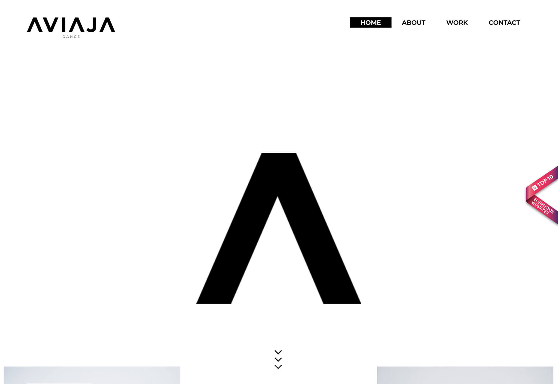
Alternatively, angles can be an independent design element that really has nothing to do with function or adding a text layer. That’s exactly what Aviaja Dance does with their design. The main use of angles comes from the fun “A” in the logo. It’s the main visual on the homepage above the scroll and is rotated in other locations throughout the design.

The next two examples use color-blocked angles.

Dantia uses a small blue angle in the top corner to anchor the logo against video that uses a lot of different colors. This way the logo is always visible. Small triangles are used as bullets throughout the design to further emphasize this shape.

Adige Design uses a large angle in a color that almost fades into the background to almost split the screen in half – part text, part visuals. This is a popular and effective use of an angle to enhance readability and add visual finesse.

Overprint Effects

While overprinting is a print design technique, the visual it creates is popping up in plenty of digital projects. It’s a cool look that creates additional colorways and almost always has a funky vibe.

When a design uses overprint, one color “prints” over another forming a mixed shade from the two hues. It has a certain elegance because as a print technique, it is often reserved for special projects.

That same feel comes through in digital design as well.

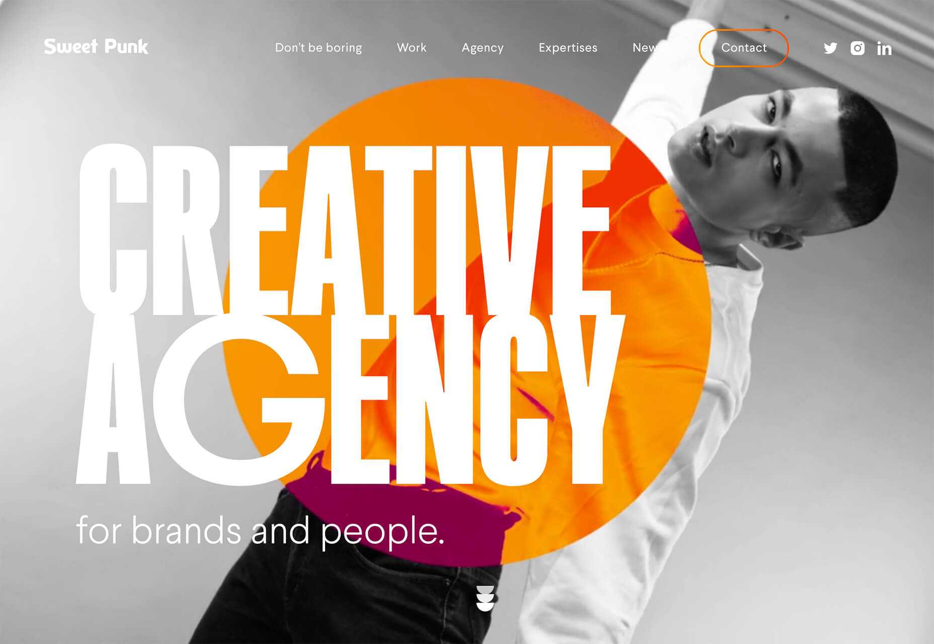
Sweet Punk uses a fun overprint with a bright orange circle and black and white image to create a lot of contrast in an interesting color effect. What makes it stand out even more is that the overprint slide is just part of a bigger set of moving images. It stands out because of the color choices and technique.

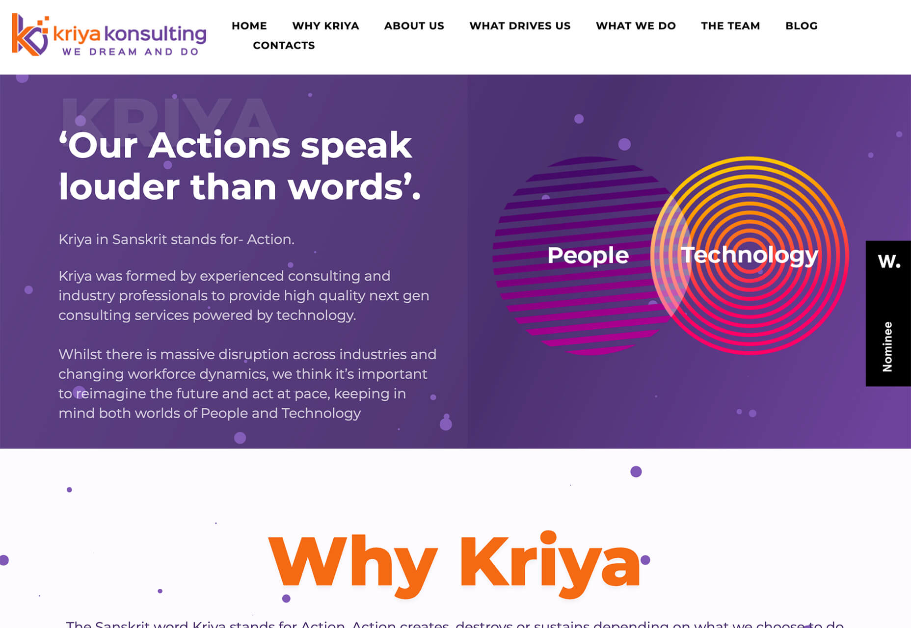
Kriya Konsulting uses a small overprint feature in a graphic to create a focal point away from text. The effect is subtle and with color and lines inside shapes, it gives you a lot to look at. The overprint graphic is just one of many circles on the screen that come together for a full effect. The interest of the overprint area serves as a starting point for the eye, which moves to other circular elements and text on the screen.

Dystopian Creatives uses an overprint effect in a quick animation as the site loads and then in several locations on the scroll. It’s so subtle that you might miss it if you aren’t looking thanks to a pretty bold overall aesthetic.

Turn of the Last Century Typography

Tall, skinny, modern-style typefaces are in. Bonus points for using this trend in a way that evokes feelings of the roaring 20s (1920s that is).

These font styles seem to mimic media posters from the era. While most of these typefaces fall into the category of modern serif, there are some sans options that create a similar feel.

The primary commonality is the use of extremely tall x-heights, and strokes with distinctly variable thick and thin options. Most of these typefaces are rather condensed as well.

Note how each of these examples takes a different approach.

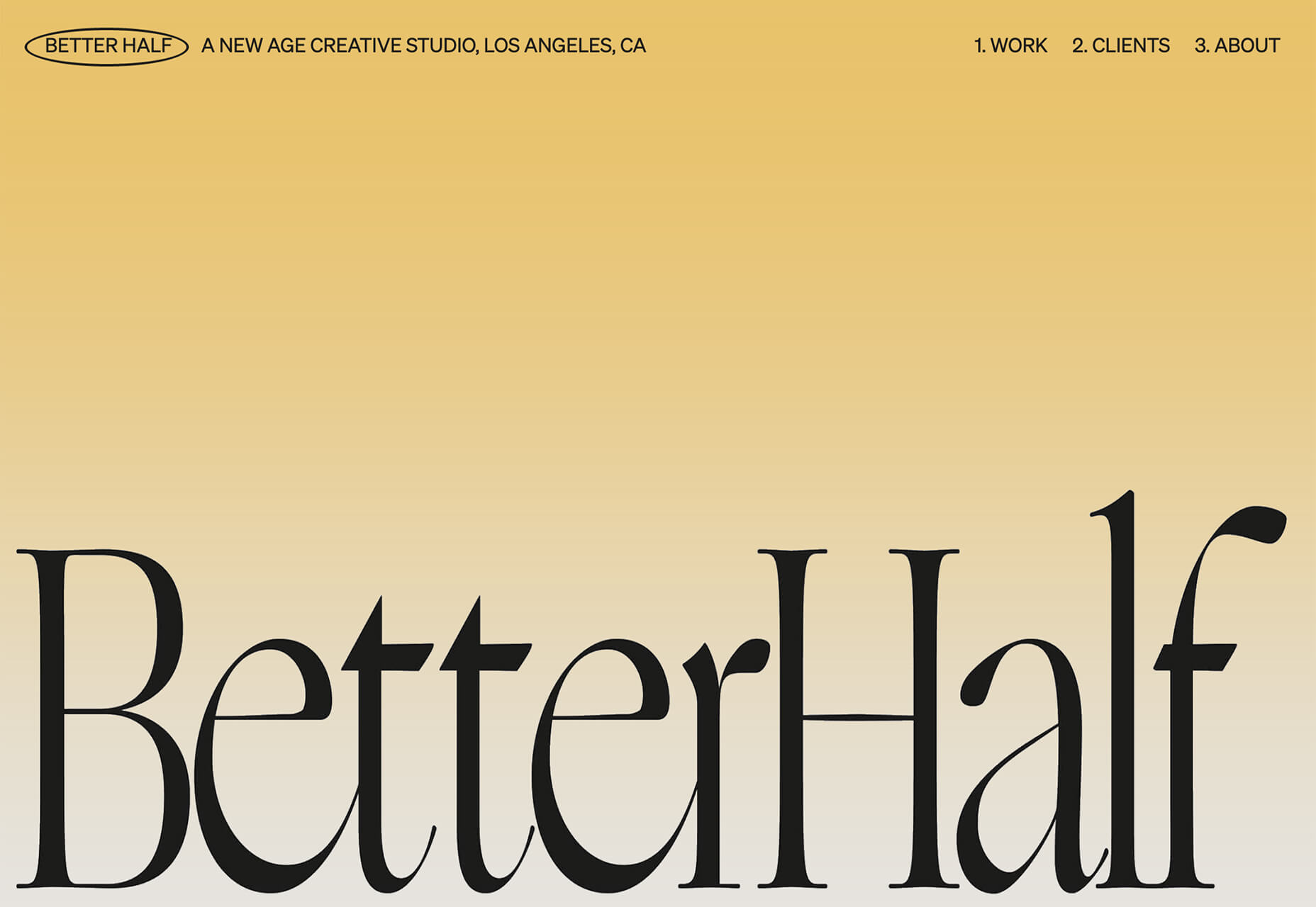
Better Half uses a modern serif with a dramatic x-height. Note the use of upper and lower-case letters for the headline. It brings attention to the high-drama of the typeface.

Chiara Luzzana takes the opposite approach with an all uppercase character set and mixes outline and filled lettering. The text is somewhat reminiscent of the title credits from “Stranger Things” with dual throwback vibes to the 1920s and 1980s. (Proof that everything that was popular once comes back around again.)

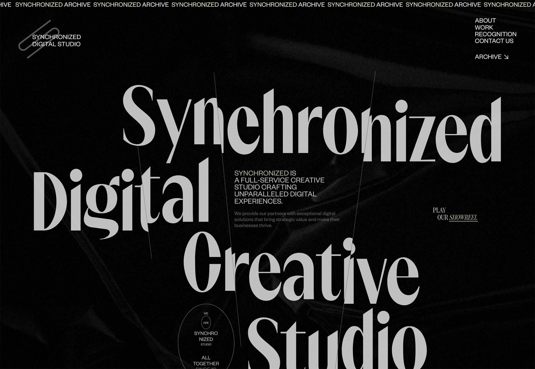
Synchronized Digital Studio goes another way entirely. While the text and design has a similar feel, they do it here with a modern sans serif. Note that the x-height is still quite tall and there are vast differences between thick and thin strokes.

Each of these compact, yet bold typefaces are used to create a dominant visual. That’s the beauty of this style – the typeface is the art thanks to so much visual interest. There’s also the added bonus that these condensed styles allow for higher character counts without getting visually overwhelming. (So, if you need to use a long word at a large size in the main headline, this could be a viable option.)

Conclusion

Design trends that are fun (and functional) are some of the best. Using angles can make it easier to incorporate text elements that are easy to read, overprint effects add flair and a bit of an old-school feel, and turn of the last century typography feels modern and fresh with a hint of 1920s flair.

Any of these design elements can be applied to websites without a complete overhaul and make a great refresh for the dog days of summer and beyond.

Source

Categories: Designing, Others Tags:

Popular Design News of the Week: July 27, 2020 – August 2, 2020

August 2nd, 2020 No comments

Every week users submit a lot of interesting stuff on our sister site Webdesigner News, highlighting great content from around the web that can be of interest to web designers.

The best way to keep track of all the great stories and news being posted is simply to check out the Webdesigner News site, however, in case you missed some here’s a quick and useful compilation of the most popular designer news that we curated from the past week.

Stroke Text CSS: The Definitive Guide

Code Snippets for Easier Coding

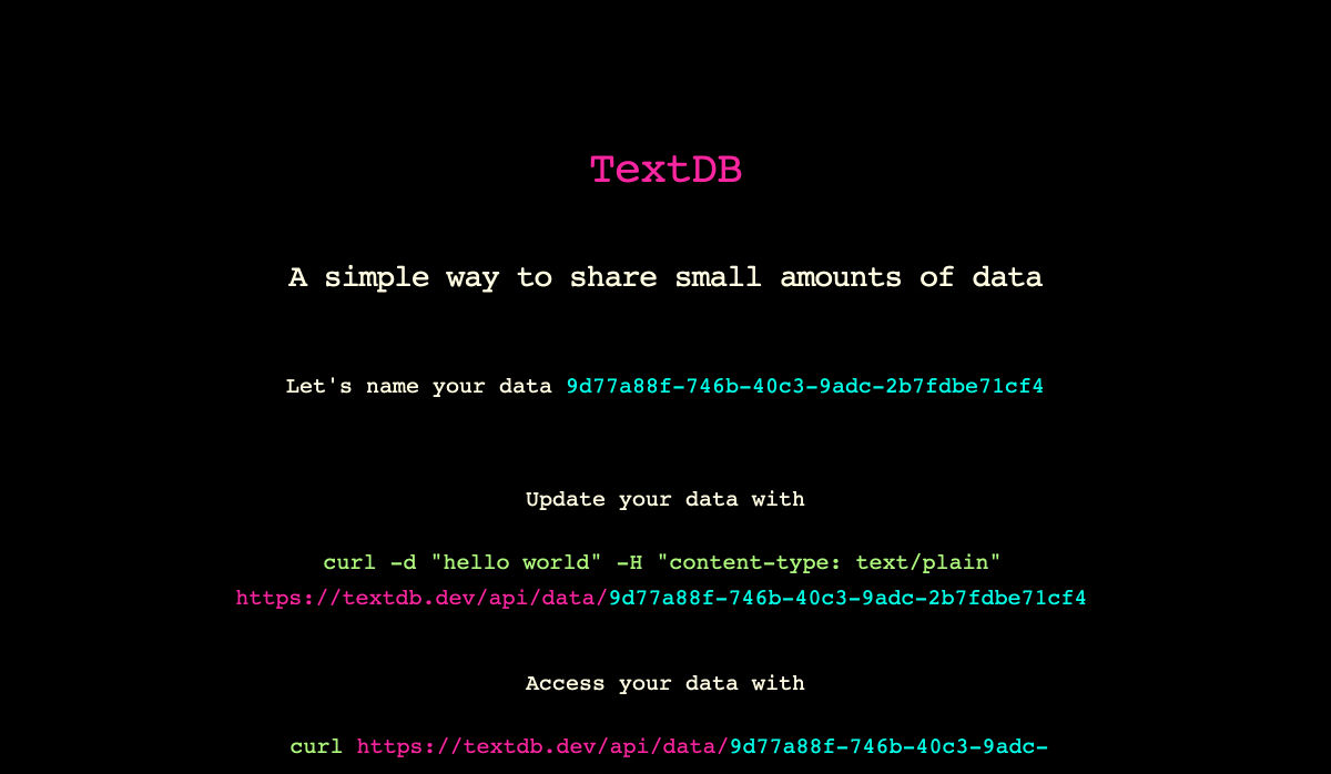
Textdb – A Simple Way to Share Small Amounts of Data

10+ Favicon Generators to Make your Brand Stand Out

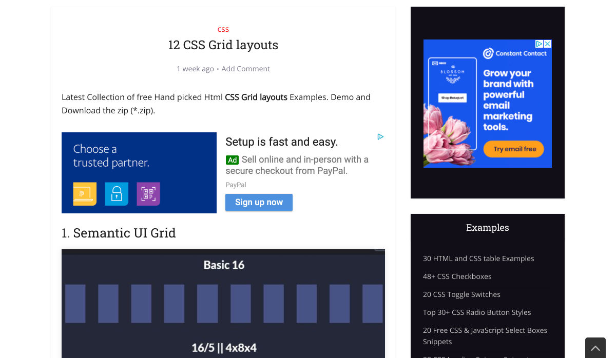
12 CSS Grid Layouts

Applying Disney’s Basic Principles of Animation to UI Design

Curiosity Creates

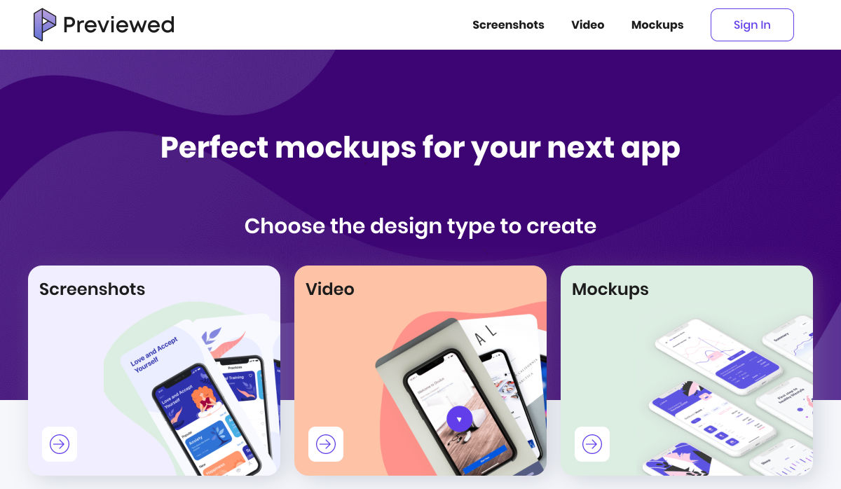
Previewed – Beautiful Mockups & Graphics for your Next App

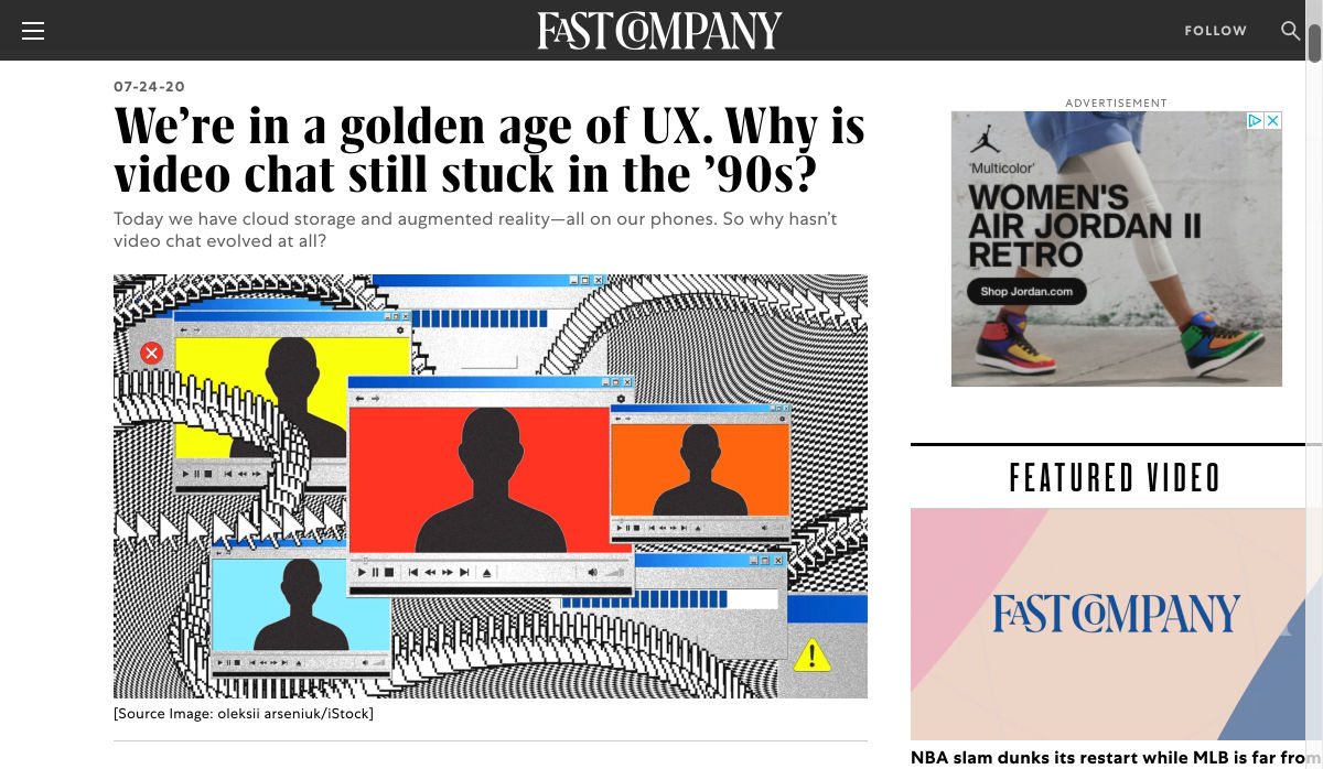
We’re in a Golden Age of UX. Why is Video Chat Still Stuck in the ’90s?

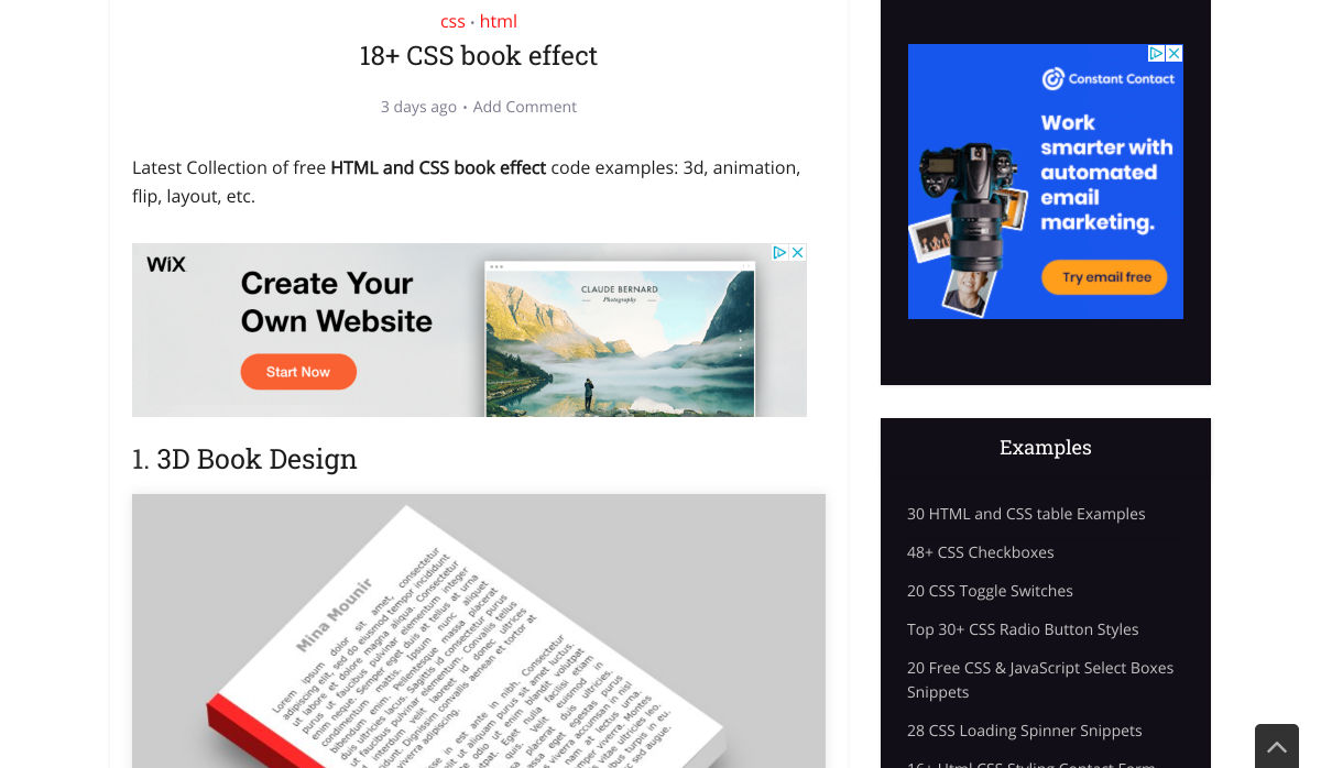
18+ CSS Book Effect

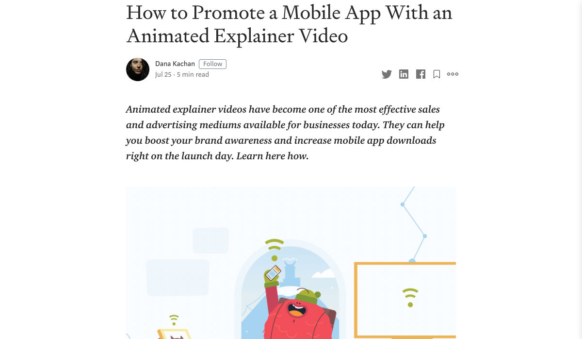
How to Promote a Mobile App with an Animated Explainer Video

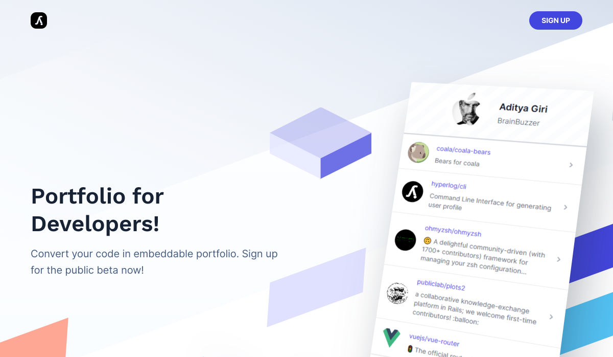
Hyperlog – Portfolios for Developers

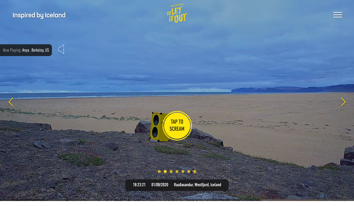
Site Design: Looks like You Need to Let it Out

Doing Stupid Stuff with GitHub Actions

Is it Good Design? Well, Yeah.

15 Free Adobe XD UI Kits for Web and Mobile App Designers

The Office as You Know it is Gone

How Interactive Content will Increase your Visitor’s Time on Page

What do Web Design Clients Need from Designers?

Truthmark is a Photography Database Aiming to Stop Misuse in Fake News

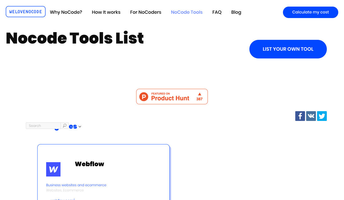
200+ NoCode Tool List by WeLoveNoCode

Designing for ‘Why?’

10 Tips Before You Buy a Domain Name

Making Memories to Last (August 2020 Wallpapers Edition)

Design Constraints are not Restraints – They Stoke Creativity

Want more? No problem! Keep track of top design news from around the web with Webdesigner News.

Source

Categories: Designing, Others Tags:

7 Graphic Design Tools I Can’t Live Without in 2020

August 1st, 2020 No comments
graphic designer tools i can't live without

Have you ever been talking to a friend who is an aspiring graphic designer, and they asked you what your go-to graphic design tools are and which tools you could never live without?

Because I have.

And it happened to me this week.

One of my friends and I were chatting over a coffee when she asked me what tools she absolutely needs to start out as a graphic designer.

And that’s when it actually hit me that I love and use so many tools on a daily basis, that it’s hard to keep count.

So I went home that night and wrote up a list of graphic design tools that I really consider crucial, and the list was at around 25 tools.

7 Design Tools I Can’t Live Without

But I’ve compacted only my very favorites into this list of 7 tools that I’m going to share with you today that I simply can’t do without.

So without further ado, let’s jump right into them.

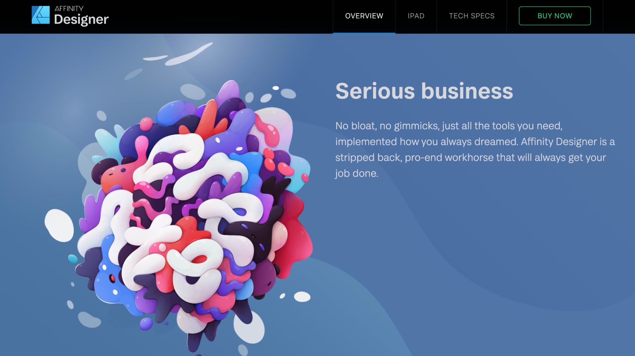
1. Affinity Designer

Affinity Designer Products Homepage

If you’re not a Creative Cloud user, then Affinity Designer could be the thing for you.

I used to be a die-hard Adobe user until I started getting incredibly bothered by just how sluggish Illustrator had become.

I remembered reading about Affinity products and decided to give them a go, and never turned back.

The design revolution.

“Affinity Designer has truly changed the world of graphic design. Five years of intensive refinement since launch have been dedicated to our unwavering vision of a powerful, super-smooth app that improves your workflow and allows your creativity to shine.”

Of course, there are lots of other great tools out there like Figma and Sketch, but after trying out Affinity Designer for a while, I was hooked.

And yes, there are things that still need some improving, like their color tools, but other than that, I can actually say that I’m obsessed.

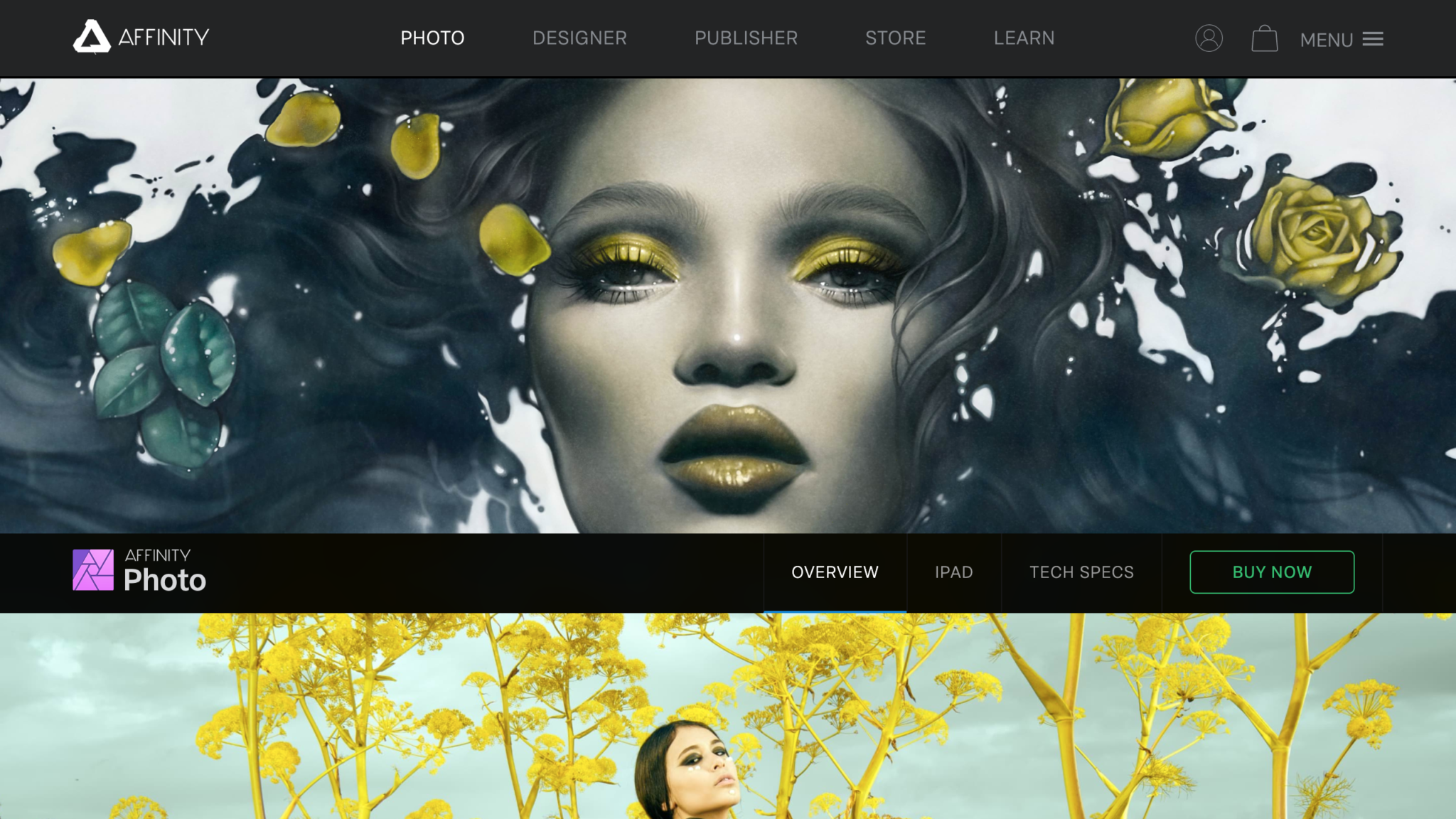
2. Affinity Photo

Affinity Photo Homepage

Another tool that I simply can’t do without is Affinity Photo.

If you happen to manipulate a lot of photos, you might find that Affinity Photo is much stronger than Photoshop in some areas, and mainly in bitmap scaling.

Due to Lanczos 3 sampling, Affinity Photo’s bitmap scaling is incredibly better and more useful than Photoshop’s.

If you’ve ever gotten frustrated with the hours that you’ve lost just manually calculating the horizontal whitespace so that it’s proportionate to the vertical, you’re not alone.

Affinity Photo has solved many of the small annoyances we’ve all had to deal with Photoshop, so if you’re over Creative Cloud, it’s time to give Affinity products a go.

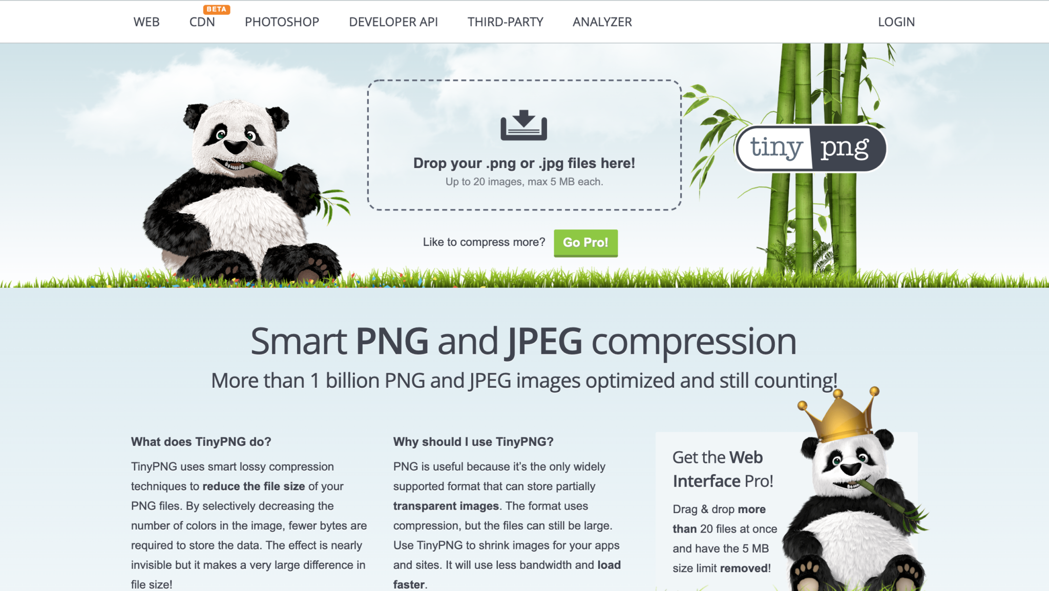
3. TinyPng

TinyPng Design Tool Homepage

There’s nothing worse than slow loading times.

If a webpage doesn’t load in half a second, I’m gone.

And I’m not alone in this. 47 percent of consumers expect a web page to load in two seconds or less. 40 percent of consumers will wait no more than three seconds for a web page to render before abandoning the site.

So, when I need to optimize my designs for the web, I need to use some sort of tool that is going to help me with that.

TinyPng has been my go-to tool for the longest time. It’s free and it works quickly and efficiently.

So if you to optimize some of your images and designs for web format, ues TinyPng!

Not to mention that their mascot is the cutest little panda I’ve ever seen.

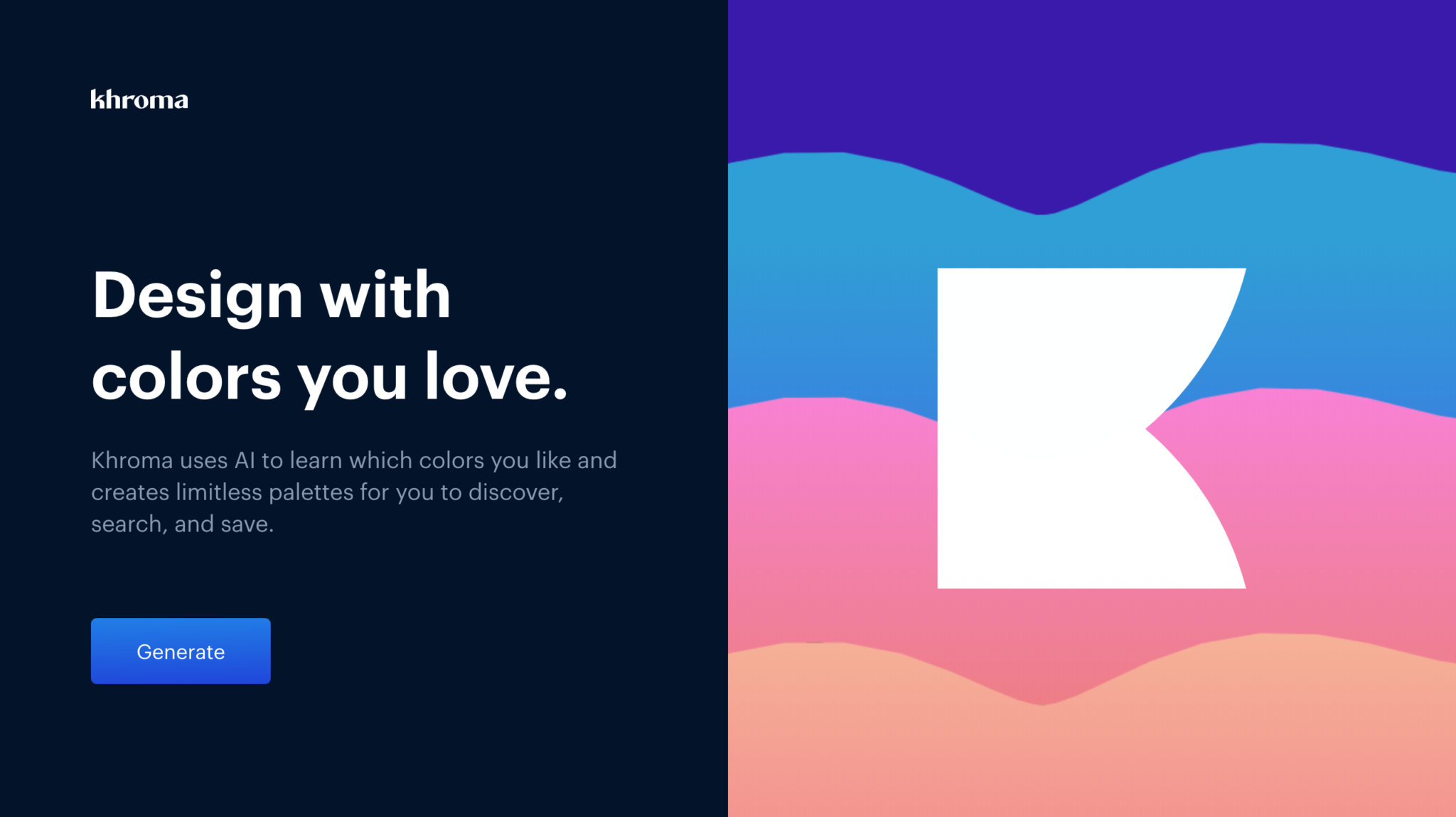
4. Khroma

Khroma color matching graphic design tool

If you’re amazing at finding, matching, and combining colors, then you could probably skip over this tool.

But this is a tool that I definitely wouldn’t want to design without.

Khroma uses AI to learn which colors you like and creates limitless palettes for you to discover, search, and save.

The way it works is quite intricate.

Khroma’s search allows you to search and filter the generator by hue, tint, value, color, as well as hex and rgb values.

Give it a go and see how you like it!

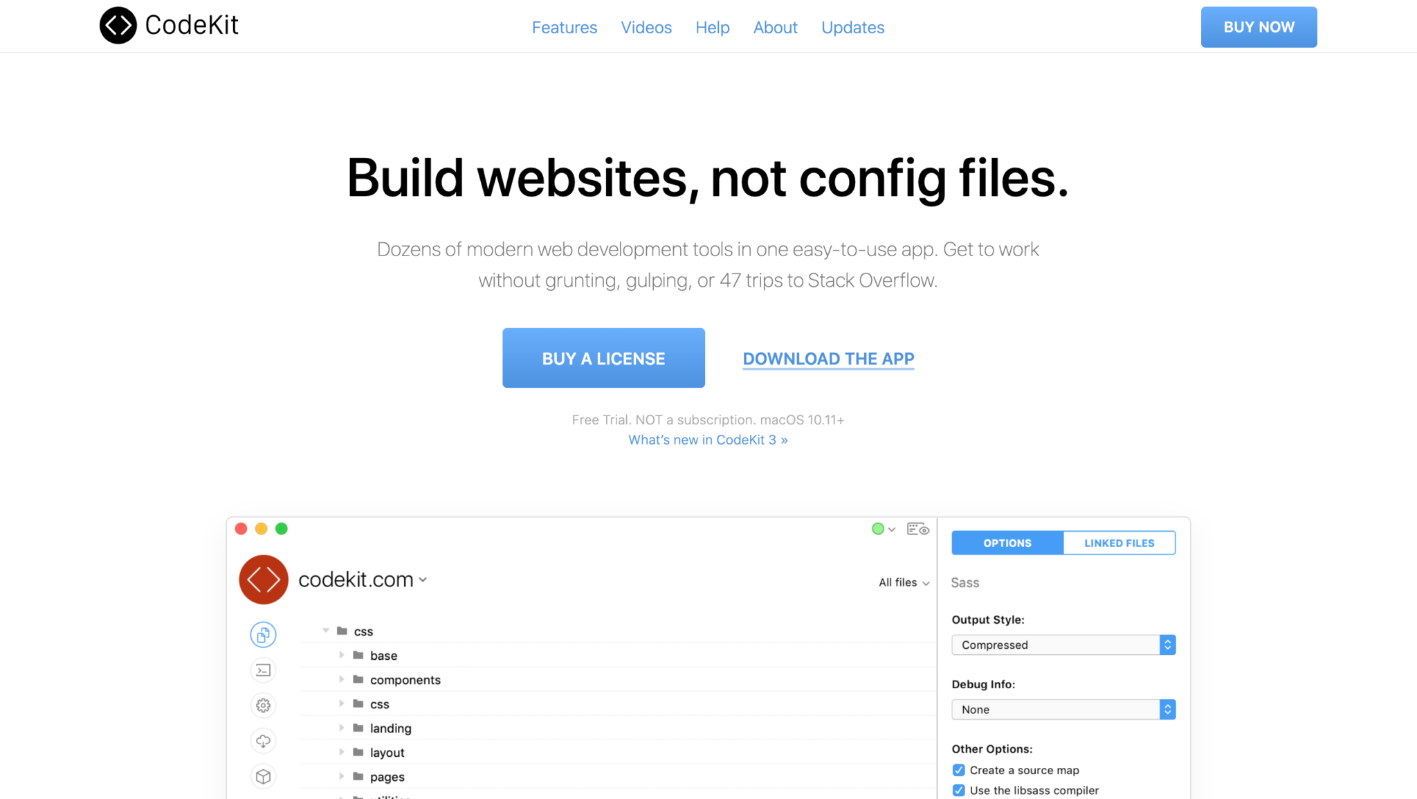
5. Codekit

Codekit homepage

Like most of us, I didn’t invest in getting into compilers as soon as I should have.

I used all the apps, like Minify, to minify CSS and JavaScript, but then one day, I found Codekit.

And I never went back.

What I found amazing about Codekit is that while I’m coding, I can also change the settings because it is a GUI, and don’t have to think another coding language.

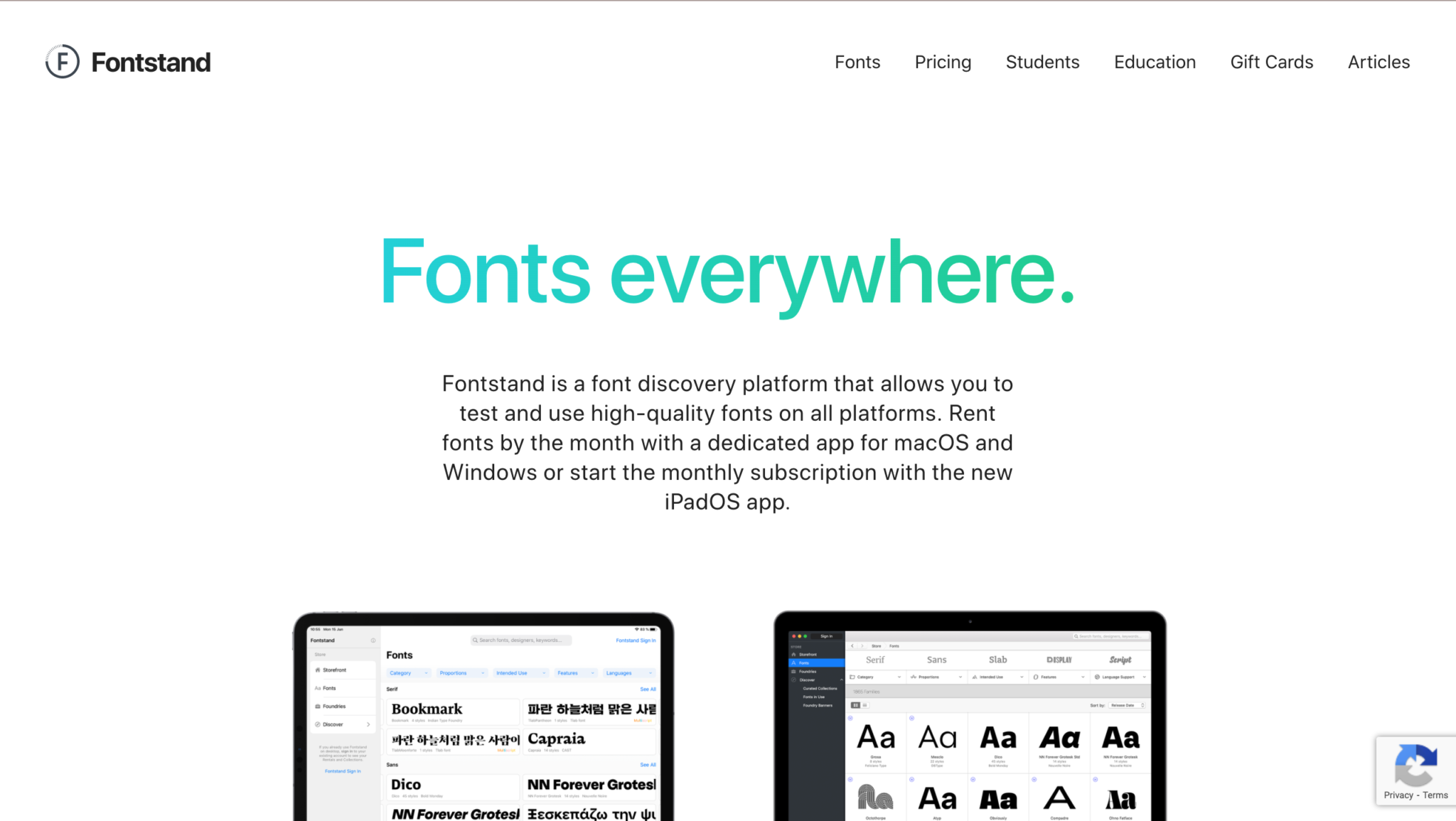
6. Fontstand

If you’re not using Creative Cloud, then you need somewhere new to get your fonts from.

Fontstand is a font discovery platform that allows you to test and use high-quality fonts on all platforms.

You can rent fonts by the month with a dedicated app for macOS and Windows or start the monthly subscription with the new iPadOS app.

So basically, if you find a font you like, you get a 1-hour free trial with it to see if it fits your vibe, and if it does, then you can choose to rent the font for a small fee.

I think it’s an amazing platform that’s definitely worth looking into!

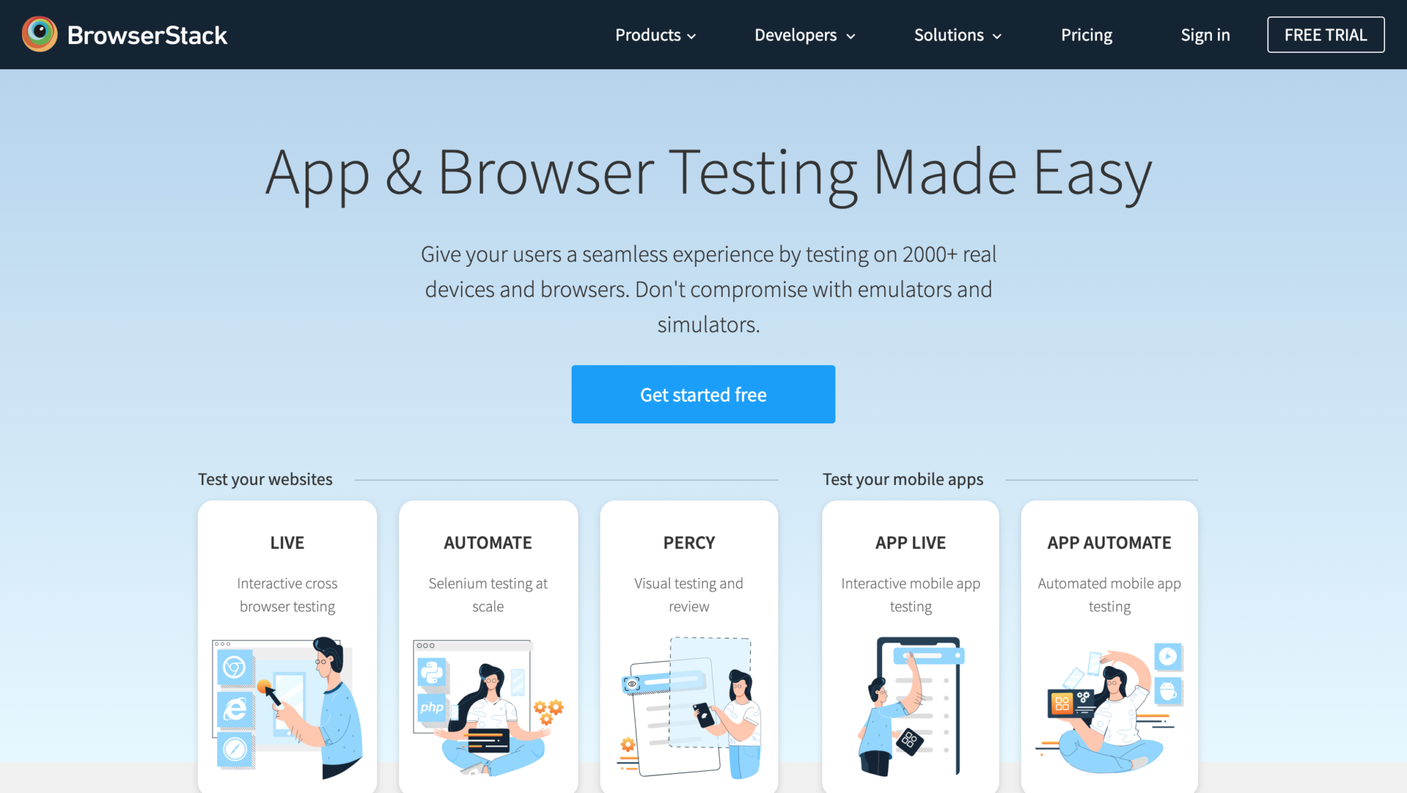
7. BrowserStack

And finally, we come to our last “can’t-live-without” product which is BrowserStack.

No matter what it is you’re building, it needs to be tested.

If you could, it would be best to test on real devices. But in the case that you can’t afford it, or don’t want to spend your money on that, you’ll need a live testing solution.

You can use BrowserStack for that. With their product, you can give your users a seamless experience by testing on 2000+ real devices and browsers.

No need to compromise with emulators and simulators!

Final Thoughts

So that concludes my list of must-use tools for 2020.

Or at least, a part of that list.

Let me know in the comments which tools you started using this year that you think you’ll be using for the long-haul!

Until next time,

Stay creative, folks!

Read More at 7 Graphic Design Tools I Can’t Live Without in 2020

Categories: Designing, Others Tags: