Archive

Archive for August, 2020

Designing a JavaScript Plugin System

August 25th, 2020 No comments

WordPress has plugins. jQuery has plugins. Gatsby, Eleventy, and Vue do, too.

Plugins are a common feature of libraries and frameworks, and for a good reason: they allow developers to add functionality, in a safe, scalable way. This makes the core project more valuable, and it builds a community — all without creating an additional maintenance burden. What a great deal!

So how do you go about building a plugin system? Let’s answer that question by building one of our own, in JavaScript.

I’m using the word “plugin” but these things are sometimes called other names, like “extensions,” “add-ons,” or “modules.” Whatever you call them, the concept (and benefit) is the same.

Let’s build a plugin system

Let’s start with an example project called BetaCalc. The goal for BetaCalc is to be a minimalist JavaScript calculator that other developers can add “buttons” to. Here’s some basic code to get us started:

// The Calculator
const betaCalc = {
  currentValue: 0,
  
  setValue(newValue) {
    this.currentValue = newValue;
    console.log(this.currentValue);
  },
  
  plus(addend) {
    this.setValue(this.currentValue + addend);
  },
  
  minus(subtrahend) {
    this.setValue(this.currentValue - subtrahend);
  }
};


// Using the calculator
betaCalc.setValue(3); // => 3
betaCalc.plus(3);     // => 6
betaCalc.minus(2);    // => 4

We’re defining our calculator as an object-literal to keep things simple. The calculator works by printing its result via console.log.

Functionality is really limited right now. We have a setValue method, which takes a number and displays it on the “screen.” We also have plus and minus methods, which will perform an operation on the currently displayed value.

It’s time to add more functionality. Let’s start by creating a plugin system.

The world’s smallest plugin system

We’ll start by creating a register method that other developers can use to register a plugin with BetaCalc. The job of this method is simple: take the external plugin, grab its exec function, and attach it to our calculator as a new method:

// The Calculator
const betaCalc = {
  // ...other calculator code up here


  register(plugin) {
    const { name, exec } = plugin;
    this[name] = exec;
  }
};

And here’s an example plugin, which gives our calculator a “squared” button:

// Define the plugin
const squaredPlugin = {
  name: 'squared',
  exec: function() {
    this.setValue(this.currentValue * this.currentValue)
  }
};


// Register the plugin
betaCalc.register(squaredPlugin);

In many plugin systems, it’s common for plugins to have two parts:

  1. Code to be executed
  2. Metadata (like a name, description, version number, dependencies, etc.)

In our plugin, the exec function contains our code, and the name is our metadata. When the plugin is registered, the exec function is attached directly to our betaCalc object as a method, giving it access to BetaCalc’s this.

So now, BetaCalc has a new “squared” button, which can be called directly:

betaCalc.setValue(3); // => 3
betaCalc.plus(2);     // => 5
betaCalc.squared();   // => 25
betaCalc.squared();   // => 625

There’s a lot to like about this system. The plugin is a simple object-literal that can be passed into our function. This means that plugins can be downloaded via npm and imported as ES6 modules. Easy distribution is super important!

But our system has a few flaws.

By giving plugins access to BetaCalc’s this, they get read/write access to all of BetaCalc’s code. While this is useful for getting and setting the currentValue, it’s also dangerous. If a plugin was to redefine an internal function (like setValue), it could produce unexpected results for BetaCalc and other plugins. This violates the open-closed principle, which states that a software entity should be open for extension but closed for modification.

Also, the “squared” function works by producing side effects. That’s not uncommon in JavaScript, but it doesn’t feel great — especially when other plugins could be in there messing with the same internal state. A more functional approach would go a long way toward making our system safer and more predictable.

A better plugin architecture

Let’s take another pass at a better plugin architecture. This next example changes both the calculator and its plugin API:

// The Calculator
const betaCalc = {
  currentValue: 0,
  
  setValue(value) {
    this.currentValue = value;
    console.log(this.currentValue);
  },
 
  core: {
    'plus': (currentVal, addend) => currentVal + addend,
    'minus': (currentVal, subtrahend) => currentVal - subtrahend
  },


  plugins: {},    


  press(buttonName, newVal) {
    const func = this.core[buttonName] || this.plugins[buttonName];
    this.setValue(func(this.currentValue, newVal));
  },


  register(plugin) {
    const { name, exec } = plugin;
    this.plugins[name] = exec;
  }
};
  
// Our Plugin
const squaredPlugin = { 
  name: 'squared',
  exec: function(currentValue) {
    return currentValue * currentValue;
  }
};


betaCalc.register(squaredPlugin);


// Using the calculator
betaCalc.setValue(3);      // => 3
betaCalc.press('plus', 2); // => 5
betaCalc.press('squared'); // => 25
betaCalc.press('squared'); // => 625

We’ve got a few notable changes here.

First, we’ve separated the plugins from “core” calculator methods (like plus and minus), by putting them in their own plugins object. Storing our plugins in a plugin object makes our system safer. Now plugins accessing this can’t see the BetaCalc properties — they can only see properties of betaCalc.plugins.

Second, we’ve implemented a press method, which looks up the button’s function by name and then calls it. Now when we call a plugin’s exec function, we pass it the current calculator value (currentValue), and we expect it to return the new calculator value.

Essentially, this new press method converts all of our calculator buttons into pure functions. They take a value, perform an operation, and return the result. This has a lot of benefits:

  • It simplifies the API.
  • It makes testing easier (for both BetaCalc and the plugins themselves).
  • It reduces the dependencies of our system, making it more loosely coupled.

This new architecture is more limited than the first example, but in a good way. We’ve essentially put up guardrails for plugin authors, restricting them to only the kind of changes that we want them to make.

In fact, it might be too restrictive! Now our calculator plugins can only do operations on the currentValue. If a plugin author wanted to add advanced functionality like a “memory” button or a way to track history, they wouldn’t be able to.

Maybe that’s ok. The amount of power you give plugin authors is a delicate balance. Giving them too much power could impact the stability of your project. But giving them too little power makes it hard for them to solve their problems — in that case you might as well not have plugins.

What more could we do?

There’s a lot more we could do to improve our system.

We could add error handling to notify plugin authors if they forget to define a name or return a value. It’s good to think like a QA dev and imagine how our system could break so we can proactively handle those cases.

We could expand the scope of what a plugin can do. Currently, a BetaCalc plugin can add a button. But what if it could also register callbacks for certain lifecycle events — like when the calculator is about to display a value? Or what if there was a dedicated place for it to store a piece of state across multiple interactions? Would that open up some new use cases?

We could also expand plugin registration. What if a plugin could be registered with some initial settings? Could that make the plugins more flexible? What if a plugin author wanted to register a whole suite of buttons instead of a single one — like a “BetaCalc Statistics Pack”? What changes would be needed to support that?

Your plugin system

Both BetaCalc and its plugin system are deliberately simple. If your project is larger, then you’ll want to explore some other plugin architectures.

One good place to start is to look at existing projects for examples of successful plugin systems. For JavaScript, that could mean jQuery, Gatsby, D3, CKEditor, or others.

You may also want to be familiar with various JavaScript design patterns. (Addy Osmani has a book on the subject.) Each pattern provides a different interface and degree of coupling, which gives you a lot of good plugin architecture options to choose from. Being aware of these options helps you better balance the needs of everyone who uses your project.

Besides the patterns themselves, there’s a lot of good software development principles you can draw on to make these kinds of decisions. I’ve mentioned a few along the way (like the open-closed principle and loose coupling), but some other relevant ones include the Law of Demeter and dependency injection.

I know it sounds like a lot, but you’ve gotta do your research. Nothing is more painful than making everyone rewrite their plugins because you needed to change the plugin architecture. It’s a quick way to lose trust and discourage people from contributing in the future.

Conclusion

Writing a good plugin architecture from scratch is difficult! You have to balance a lot of considerations to build a system that meets everyone’s needs. Is it simple enough? Powerful enough? Will it work long term?

It’s worth the effort though. Having a good plugin system helps everyone. Developers get the freedom to solve their problems. End users get a large number of opt-in features to choose from. And you get to grow an ecosystem and community around your project. It’s a win-win-win situation.


The post Designing a JavaScript Plugin System appeared first on CSS-Tricks.

You can support CSS-Tricks by being an MVP Supporter.

Categories: Designing, Others Tags:

Designing Clarity 01 – Alrick Dorett – Captaining Yourself and Your Ship

August 25th, 2020 No comments
EP01-podcast title screen

Bam! Here comes the real first episode.

The famous military strategist Sun Tzu said:

If you know the enemy and know yourself, you need not fear the result of a hundred battles. If you know yourself but not the enemy, for every victory gained you will also suffer a defeat. If you know neither the enemy nor yourself, you will succumb in every battle. – Extracted from The Art of War.

I always love this quote. And through my life experiences, I have learned to look inwards to understand myself first before equating any failure to eternal circumstances. If COVID-19 is the enemy, then perhaps the first step towards beating it (and of course clarity) is to know thyself.

I thought it would be a great start to the designing clarity podcast to invite a good friend of mine Alrick Dorett to talk about “Captaining yourself and your ship”. While he is the chief pricing officer at TBWA, we are not going to talk about his work. Rather, his writings on coaching and self-management in the time of COVID. Check out the podcast below:

?

If you are interested in his writings we referenced during the podcast, do check them out at Port and Starboard and Listening.

Listen to this podcast via Apple Podcasts and Spotify. Don’t forget to subscribe to get the latest episodes, it’s free! This podcast series is hosted on Anchor.

The Designing Clarity Podcast is hosted by Brian Ling. Brian is the founder and design director of Design Sojourn, a Design Led Innovation Consultancy passionate in using design thinking to make lives better.

This podcast is for business leaders and entrepreneurs looking to innovate and design their new normal.

The post Designing Clarity 01 – Alrick Dorett – Captaining Yourself and Your Ship appeared first on Design Sojourn. Please click above if you cannot see this post.

Categories: Designing, Others Tags:

How To Create Customer-Centric Landing Pages

August 25th, 2020 No comments
displaying discount amount on landing pages

How To Create Customer-Centric Landing Pages

How To Create Customer-Centric Landing Pages

Travis Jamison

2020-08-25T10:00:00+00:00
2020-08-27T08:20:13+00:00

Establishing whether there’s a market for a specific product takes a lot of time and effort. Through years of exposure to the nuances of a particular industry, experienced entrepreneurs develop a keen sense for noticing “gaps in the market,” be it for entirely new services or ways to improve on existing products.

Vision typically precedes plenty of legwork. Before securing financing — or pouring their own savings into developing a new product — smart businesses apply serious diligence into establishing product-market fit. They build a value proposition that resonates with their prospective customers. They find out how their competitors managed to build a customer base. They may even go so far as building prototypes and conducting focus groups to get some real data on product feasibility.

Essentially, companies understand the importance of knowing whether their new product has a good chance of being successful before going on the market. The relationship between customer needs and product offering is simply too obvious to ignore.

This begs the question:

“Why are customer needs overlooked in so many other aspects of running a successful business?”

Sure, some of an organization’s moving parts don’t relate directly to the product itself. Nor the customer, for that matter. One could argue that a company’s website doesn’t exist to directly serve the customer. It’s there to provide and obtain information that would contribute to an increase in awareness and revenue.

Why should we consider a customer’s needs when designing a website or landing pages? Does a customer even have needs in this context?

You bet they do!

And as the world of web design matures, the focus has started shifting to understanding what these needs are when it comes to designing the content that drives a sale.

Gone are self-indulgent product stories. Gone are irrelevant, questionable claims. Gone are interfaces that take more than three seconds to load. The era of customer-centric landing pages has dawned. And if your job involves being concerned with metrics like conversion, engagement, and bounce-rates, this is a post that you may want to sit straight up for.

Maintaining Consistency With Ad Copy And Landing Page Content

The needs that landing pages serve aren’t the same as the needs our products serve.

When thinking about creating any kind of customer-centric marketing material, we need to think about their needs outside of the context of the pain points our services will offer.

What we’re talking about here are meta-needs. Those that make their interaction with our landing pages engaging and convenient to the extent that it puts them in a mental and emotional state that’s more receptive to being sold something.

How do we do this? How do we subtly illustrate consideration for our landing page visitors’ needs?

A great way to start is to create consistency between the core message of the advert and the landing page content. If your ad guys are doing their jobs properly, an advert linked to a specific keyword search will hook a potential customer with content that is relevant to their search.

If this results in a click-through, your potential customer has already given you some pretty vital information: your ad copy speaks to their pain point. They believe the promise that your ad copy is making. They’re willing to start a journey with you.

This concept is called “Ad Scent,” and if you are not leveraging this information on your landing page, you’re shooting yourself in the foot.

MarketingSherpa reports that just under 50% of digital marketers understand the importance of a thread between ad copy and landing page, and create a landing page unique to each ad campaign.

Sure, the overhead sounds like a headache, but it’s not rocket science. If you promise something in your ad copy, expand on that promise on your landing page. And not by simply repeating the ad copy using different terms. You’ve already conveyed a core message that speaks to a visitor’s needs. They get it. You sell something they want.

Now is the time to provide them with information and prompts that link their needs to the action you want them to take.

A great example of this is online retailer BangGood. After Googling “Cheap retro reading glasses,” you’re shown a sponsored ad reading: “Buy Cheap reading glasses retro round” and “$100 All Categories Coupon For New Users, Coupon Deals & Unbeatable Deals Every Day.”

Clicking through to this page takes you directly to a product catalog that’s been filtered by our search term. There’s no need to click through multiple categories and subcategories to find the style you want. Plus, highly visible “discount” labels clearly show you how much you’d be saving on each of the products if you make a purchase right away.

displaying discount amount on landing pages

Image source: banggod.com. (Large preview)

This brings us to another interesting concept behind creating engaging landing pages that optimize conversion: urgency.

Leveraging Urgency

Unlike shoppers going through the effort of strolling through a busy street looking for a deal, online shoppers have the option to view other retailers’ discounted wares within seconds of each other.

Few things grab the attention of a semi-motivated customer better than a highly visible countdown timer showing how much time a visitor has to take advantage of a particular “hot deal.” There’s real psychology behind this notion.

Zoma does this exceptionally well on their sales page. A clearly visible, but critically, non-intrusive visual element makes visitors aware of the fact that they have (gasp!) a short period of time left to capitalize on a massive discount.

using countdown timer on landing pages to create sense of urgency

Image source: zomasleep.com. (Large preview)

Sure, shoppers may choose to click around for another hour to find a better deal, but there’s no way this offer is NOT sticking in the backs of their heads.

This is customer-centric design at its best. What’s one thing that will hurry along any customer in their decision making? The feeling that they are one of the few people lucky enough to take advantage of a terrific deal.

Providing Social Proof

Another great thing Zoma does on this landing page is giving visitors something they don’t always know they want: proof that other shoppers were extremely satisfied with the given product.

By now, the importance of social proof is ingrained in the thought processes of every marketer worth their salt, but what many fail to realize is the importance of its visibility and credibility on the landing page.

In Zoma’s example, if you go to their sports mattress page a 4.7 star-rating is clearly visible along with a very attractive sample size. Seeing almost 300 reviews is certainly reassuring for a potential customer.

Zoma goes the extra mile by making the review element clickable — an action that, critically, doesn’t take the user away from the landing page, but rather to an anchor on the page.

What are they shown in this space? Simple copy that asks and answers the exact question they were having:

“See why active people love Zoma.”

And directly below this is a beautifully laid-out, uncluttered list of credible reviews by happy customers, all displayed above a floating CTA that prompts the visitor to add the product to their cart.

putting reviews on landing pages for social proof

Image source: zomasleep.com. (Large preview)

How many customer needs are being addressed in the space of one click? Let’s see:

  • The need to have their consideration validated by their peers;
  • Reassurance that the reviews are legit;
  • The convenience of instantly taking action without needing to scroll back to a “purchase” area.

None of these needs speak directly of the product itself, but rather leverage customer needs that are intrinsic to their online shopping experience.

Addressing Pain Points

Another aspect of customer-centric design in landing pages involves giving visitors the product information they need rather than the information the company feels is relevant.

This concept speaks to the customer’s desire to instantly understand the value that a product will bring to their lives rather than a convoluted wall of text describing the company’s history, corporate values, and integrity of its staff.

Customers who have followed a link to a landing page want to know what’s in it for them. And they want to know this within seconds of reading the copy.

Marketers need to anticipate the pain points a customer wants addressed. This information should always be readily available, if they’ve done their customer profiling correctly and have a great understanding of their value proposition.

But the kicker is that conveying this value — illustrating clearly how the product will fulfill the customer’s needs — needs to be done in an engaging and easily understandable way.

Engaging Potential Customers

In this context, what does “engaging” mean? While there aren’t any paint-by-numbers answers to this question, there are some general guidelines.

Keep the visual clutter to a minimum. Show only imagery and text that relate directly to the reasons a person may be interested in the product. At first glance, do they care about the years you spent developing the service with the help of industry experts? Do they care about your company’s strategic roadmap?

Nope. They care about one thing:

“How is spending their money on your product going to solve a problem they have?”

A terrific example of this super-simplified, though highly engaging approach to communicating true customer value can be seen on the landing page for Elemental Labs.

communicating customer value propositions on landing pages

Image source: drinklmnt.com. (Large preview)

Aside from navigation and other peripheral content elements, just over twenty words are visible to the visitor. And in those two sentences, what is communicated to the visitor? How many of their pain points are addressed? How many reasons are they given to be drawn to the CTA?

What the product is and the value it represents to the potential customer is spelled out within seconds of the user landing on this page. Customer-centricity is at the forefront of every aspect of this page’s design.

Using simple, high-quality product visuals aligned with graphic design principles that promote maximum engagement is another way to capitalize on customers-centricity.

This is something that LMNT also does exceptionally well, showing simple, tasteful visuals that show the product in its packaging as well as in use.

This tells an extremely simple visual story that can’t help but connect the customer to a mental impression of actually using the product. There’s no need for a complex sequence of images showing how the sachet is opened, poured, mixed, and then drank.

Wrapping It All Up

Customer-centricity is something that can and should be applied to almost every decision that a business makes. The temptation is always there to only think about customer needs as they interact with the product or service itself, but smart marketers and entrepreneurs understand that customer needs extend beyond their use of the product.

Customers require their time to be respected. They need businesses to understand that their attention span is limited.

They need marketers to grasp that product value isn’t something abstract. It’s something that must be communicated intelligently, without the informational and visual clutter that so often drags attention away from what’s really important:

“In what ways can the product or service make customer lives easier?”

If this question is one of the first that every marketing professional asks themselves ahead of a campaign, they’re starting out on the right path.

Smashing Newsletter

Every week, we send out useful front-end & UX techniques. Subscribe and get the Smart Interface Design Checklists PDF delivered to your inbox.


Front-end, design and UX. Sent 2× a month.
You can always unsubscribe with just one click.

Smashing Editorial
(ah, ra, yk, il)
Categories: Others Tags:

Smashing Podcast Episode 23 With Guillermo Rauch: What Is Next.js?

August 25th, 2020 No comments
Photo of Guillermo Rauch

Smashing Podcast Episode 23 With Guillermo Rauch: What Is Next.js?

Smashing Podcast Episode 23 With Guillermo Rauch: What Is Next.js?

Drew McLellan

2020-08-25T05:00:00+00:00
2020-08-27T08:20:13+00:00

Today, We’re talking about Next.js. What is it, and where might it fit into our web development workflow? I spoke to co-creator Guillermo Rauch to find out.

Show Notes

Weekly Update

Transcript

Drew McLellan: He’s the founder and CEO of Vercel, a cloud platform for static sites that fits around a Jamstack workflow. He’s also the co-creator of Next.js. He previously founded LearnBoost and CloudUp, and is well-known as the creator of several popular node open source libraries like Socket.io, Mongoose, and SlackIn. Prior to that, he was a core developer on MooTools, so we know he knows his way around JavaScript like the back of his hand. Did you know he once received a royal commission from the King of Spain to create an ice sculpture out of iceberg lettuce? My smashing friends, please welcome Guillermo Rauch. Hi Guillermo, how are you?

Guillermo Rauch: I’m smashing freaking good, thanks for having me.

Drew: I wanted to talk to you today about the whole world of Next.js, as it’s something that obviously you’re personally very knowledgeable about, having been involved as a co-creator right from the start. Next.js is one of those project names that has been on my radar while working in the Jamstack space, but it isn’t something that I’ve actually personally looked at or worked with too closely before. For people who are like me, who perhaps aren’t aware of what Next.js is, perhaps you could give us a bit of background into what it is and what problems it tries to solve.

Guillermo: Next.js is a very interesting member of the Jamstack universe, because Next.js actually started being a fully SSR-focused framework. It started getting a lot of adoption outside the Jamstack space where people were building very large things specifically when they wanted to have user generated content or dynamic content or social networks or e-commerce, and they knew that they wanted SSR because their data set was very large or very dynamic. It fell under the radar I think for a lot of people in the Jamstack world, but later on Next.js gained the capabilities for static optimization.

Guillermo: On one hand, for example, if you wouldn’t do data fetching at the top level of your page with Next.js, your React page would be … Also by the way, for those who are not fully in the know, Next.js is simply React framework for production, but has this capability of doing some rendering. Then when you get in static optimization capabilities, if you wouldn’t define data fetching at the top level of your page, it automatically exported as HTML instead of trying to do anything with server rendering.

Guillermo: Then later on, it also gained the capability for static site generation, meaning that you can define a special data hook, but that data hook gets data at build time. Next.js became a hybrid, very powerful dynamic and static framework, and now it’s been growing a lot in the Jamstack space as well.

Drew: People might say that React is already a framework, you certainly hear it described that way. What does it actually mean to be a framework for React?

Guillermo: That’s a great observation, because I always point out to people that React at Facebook and React outside of Facebook are completely different beasts. React at Facebook actually is used together with server rendering, but even their server rendering, for example, doesn’t use Node.js, it uses a highly specialized virtual machine called Hermes which communicates to their sort of production hack and PHP stack and answers all this advanced and exotic Facebook needs.

Guillermo: When they open source React, it’s almost like open sourcing a component. I always call it like open sourcing the engine, but not giving you the car. What happened is people really wanted to go and drive with it, they wanted to get to places with React. In the community, people started creating cars, and they would embed React as the engine, which was what the driver, the developer was after in the first place, make React the fundamental part of the car. Things like Next.js and Gatsby and React Static and many other frameworks started appearing that were solving the need for like, “I actually want to create fully loaded pages and applications.”

Guillermo: Whereas React was kind of more like the component and the engine for specific widgets within the page, this was certainly the case for Facebook. They will broadly and publicly admit that they invented it for things like the notification batch, the chat widget, the newsfeed component, and those components were React routes that were embedded into the contents of the production existing app with lots and lots of lines of code and even other JS libraries and frameworks.

Guillermo: What it means to create a framework for React, it means you make React the fundamental part of the story, hopefully and this is something we’ll try to do with Next.js, the learning curve is primarily about React with some added surface for Next.js, particularly around data fetching and routing. We also do a lot of production optimizations, so when you get React, when you get Create React app, which is sort of like, I like to call it a bootstrapped car that Facebook gives you, maybe the needs for production are not really met. Or if you try to do it yourself by configuring Webpack and configuring Babel and configuring server rendering and static generation, it’s also hard to put together a car from scratch. Next.js will give you this zero config and also production optimized set of defaults around building entire big things with React.

Drew: So it’s like it almost puts a sort of ecosystem around your React app with a collection of pre-configured tools to enable you to-

Guillermo: Correct.

Drew: Hit the ground running and do static site generation or server rendering or routing.

Guillermo: Correct, and you used a word there that is very, very key to all this, which is pre-configured. We’re fortunate enough to draw the attention of Google Chrome as a contributor to Next.js. One of the leaders of this project, her thing is that when they were working on frameworks internally at Google, they faced a lot of the same problems that the community and open source are facing today. There were many different competing initiatives at Google on how to scale and make really performant web apps out of the box.

Guillermo: You would join as a Googler and you would be given a framework with which you would create really big production ready, very high performance applications. Shubie was part of a lot of those initiatives, and what she found is that there’s two key ingredients to making a framework succeed at scale. One is pre-configuration, meaning that you come to work, you’re going to start a brand new app, you should be given something that is already ready to go and meets a lot of the production demands that are known at that given point in time.

Guillermo: On the other hand, the other really important step that we’re working towards is conformance. You can be given the most highly optimized production ready pre-configured framework, but if you go ahead and, for example, start introducing lots of heavy dependencies or third party scripts or use very inefficient layouts that take a long time to paint and so on and so forth, then you’re going to make that pre-configuration sort of go to waste. By mixing pre-configuration with conformance over time, the developer is not only having a great starting point, but it’s also guided to success over time.

Drew: It seems that a characteristic of Next.js, that it’s quite opinionated, the UI layer is React, it uses type script, uses Webpack, and those are all choices that the project has made and that’s what you get. Correct me if I’m wrong, but you couldn’t swap out React for Vue, for example, within Next.js.

Guillermo: That’s a good point, where technical decision making meets sort of an art. On one hand, I’d really like to claim that Next is very unopinionated, and the reason for this is that if you specifically go to github.com/vercel/nextjs and the examples directory, you’ll see that there’s almost like a combinatoric explosion of technologies that you can use together with Next.js. You’ll see fire-based, you’ll see Graphic UL, you’ll see Apollo, you’ll see Redux, you’ll see MobX, in the CSS space there’s even more options.

Guillermo: We have a default CSS port that’s embedded, but then you can use two flavors of it, one with import, one with style tags which we call Style JSX, which resembles very much like the web platform approach to Shadow CSS. The reason I mean unopinionated is we want Next.js to stay very close to the “bare metal” of the web, and not introduce lots of primitives that if the web from 10 years from today would be incompatible with. Then if you look at the examples, you’ll see that there’s all these other technologies that you can plug in.

Guillermo: The base level of opinionation is that there is React and you’re not going to be able to replace it, at least anytime soon. Then there is the concept of you should be able to create pages, and this was kind of like a new thing when we first launched it, which was everyone is trying to create single-page applications. What we realized is like the internet is made up of websites with lots of pages that create distinct entry points via search engines, via Twitter, via Facebook, via social networks, via email companions, like you always guide the person toward an entry point, and that person that comes through that entry point shouldn’t have to download the burden of the entirety of the application.

Guillermo: Then that path led us to implementing server rendering, then static generation for multiple pages, et cetera, et cetera. That other base level of opinionation is Next should be a framework that works for the web, not against the web. Then on top of that, React was missing data fetching and routing primitives, and we added those. There’s a level of opinionation that has to deal with like everybody needs a router, so might as well have a router built in by default.

Drew: The big advantage of having those defaults is it takes away a lot of the complexity of choice, that it’s just there, it’s configured, and you can just start using it without needing to think too much, because I think we’ve all-

Guillermo: Exactly.

Drew: Been in situations where there are far too many choices of what components to use, and it can be overwhelming and get in the way of being productive.

Guillermo: Exactly.

Drew: What sort of projects do you see people using Next.js for? Is it for basically any situation where you might build a production React app, or is it more suited to particular types of content heavy sites? Does it matter in that sense?

Guillermo: Yeah, so this has been an age old debate of the web, is the web for apps, is the web for sites, is it a hybrid? What is the role of JavaScript, et cetera, et cetera? It’s kind of hard to give a straight up answer, but my take on this is the web was evolved always to be a hybrid of content that is evolving to be more and more dynamic and personal to the user. Even when you say like a content website, the high end content websites of the world have code bases that are very much comparable to apps.

Guillermo: A great example here is like New York Times, they’ll give you embedded widgets with data analysis tools and interactive animation, and they’ll recommend what story to read next, and they have a subscription model built in which sometimes gives you part of the content and sometimes counts how many articles you’ve read. Like if I told you this when the web was invented, like Tim Berners-Lee would be like, “No, that’s crazy, that’s not possible on the web,” but that’s the web we have today.

Guillermo: Next.js is answering a lot of these complex modern needs, which means you’ll see lots of e-commerce usage, you’ll see lots of content with that. E-commerce meaning, by the way, not just like buy items, but experiences like the largest real estate websites on the web, realtor.com, zillow.com, trulio.com, that entire category is all Next.js, then content sites. We just onboarded washingtonpost.com as a customer of Vercel and Next.js, we have then a third category that is more emergent but very interesting, which is full apps and user-generated content, like tiktok.com, and kind of like you would think the original single-page application use case as well being quite represented there.

Guillermo: Next.js sort of shines when you need to have lots of content that has to be served very, very quickly, has to be SEO optimized, and at the end of the day, it’s a mix of dynamic and static.

Drew: I’ve previously spoken to Marcy Sutton about Gatsby, which seems to be in a similar sort of space. It’s always great to see more than one solution to a problem and having choice for one project to the next. Would you say that Next.js and Gatsby are operating in the same sort of problem space, and how similar or dissimilar are they?

Guillermo: I think there’s an overlap for some use cases. For example, my personal blog rauchg.com runs on Next.js, it could’ve just been a great Gatsby blog as well. There is that overlap in the smaller static website sort of space, and by small I don’t mean not relevant. A lot of dotcoms that are super, super important run on basically static web, so that’s the beauty of Jamstack in my opinion. Because Next.js can statically optimize your pages and then you can get great Lighthouse scores through that, you can use it for overlapping use cases.

Guillermo: I think the line gets drawn when you start going into more dynamic needs and you have lots of pages, you have the need to update them at one time. Although Gatsby is creating solutions for those, Next.js already has production ready live solutions that work with any sort of database, any sort of data backend for basically “generating” or “printing” lots and lots of pages. That’s where today customers are going to Next.js instead of Gatsby.

Drew: One of the problems that everyone seems to run into as their JavaScript-based solution gets bigger is performance and how things can start getting pretty slow, you have big bundle sizes. Traditionally, things like code splitting can be fairly complex to get configured correctly. I see that’s one of the features that jumped out at me of Next.js, that it claims that the code splitting is automatic. What does Next.js do in terms of code splitting to make that work?

Guillermo: Your observation is 100% right. One of the biggest things with the web and one of the biggest weights on the web is JavaScript, and just like different materials have different densities and weights irrespective of the actual physical volume, JavaScript tends to be a very dense, heavy element. Even small amounts of JavaScript compared to, like for example, images that can be processed asynchronously and off the main thread, JavaScript tends to be particularly bothersome.

Guillermo: Next.js has invested a tremendous amount of effort into automatically optimizing your bundles. The first one that was my first intuition when I first came up with the idea for Next.js was you’re going to define, for example, 10 routes. In the Next.js world you create a pages directory and you drop your files in there Index.js, About.js, Settings.js, Dashboard.js, Termsofservice.js, Signup.js, Login.js. Those become entry points to your application that you can share through all kinds of media.

Guillermo: When you enter those, we want to give you JS that is relevant for that page first and foremost, and then perhaps a common bundle so that subsequent navigations within the system are very snappy. Next.js also, which is very, very nice, automatically pre-fetches the rest of the pages that are connected to that entry point, such that it feels like a single-page application. A lot of people say like, “Why not just use Create React app if I know that I have maybe a couple routes?” I always tell them, “Look, you can find those as pages, and because Next.js will automatically pre-fetch ones that are connected, you end up getting your single-page application, but it’s better optimized with regards to that initial paint, that initial entry point.”

Guillermo: That was the initial code splitting approach, but then it became a lot more sophisticated over time. Google contributed a very nice optimization called Module and No Module, which will give differential JS to modern browsers, and legacy JS that’s heavy with polyfields to other browsers, and this optimization 100% automated and produces massive savings. We gave it to one of our customers that we host on Vercel called Parnaby’s, I believe if I’m not mistaken, it was something very, very significant. It was maybe like 30% savings in code sizes, and that was just because they upgraded Next.js to a version that optimized JS bundles better.

Guillermo: That was kind of the point that we were going over earlier, which is you choose Next.js and it only gets better and more optimal over time, it’ll continue to optimize things on your behalf. Those are, again, pre-configurations that you would never have to deal with or be bothered with, and the research of which you don’t ever even want to do, to be honest. Like I wasn’t obviously very involved with this, but I look at some of the internal discussions and they were discussing all these polyfields that only mattered to Internet Explorer X and Soho, I was like, “I don’t even want to know, let’s just upgrade Next.js and get all these benefits.”

Drew: There is sometimes great benefits on there with sticking with the defaults and sticking with the most common configuration of things, which seems to be really the Next.js approach. I remember when I started writing PHP back in the early 2000s, and everybody was using PHP and MySQL, and at the time I’d just come from Windows so I wanted to use PHP and Microsoft Sequel Server. You can do it, but you’re swimming against the tide the whole way. Then as soon as I just switched over to MySQL, the whole ecosystem just started working for me and I didn’t need to think about it.

Guillermo: Yeah, everything just clicks, that is such a great observation. We see that all the time, like the Babel ecosystem is so powerful now that you could become, for example, a little bit faster by swapping Babel for something else, but then you trade off that incredible ecosystem compatibility. This is something you touched on performance earlier, and like for a lot of people, build performance and static generation performance is a big bottleneck, and this is something that we are very diligent in improving the performance of our tools incrementally.

Guillermo: For example, one of the things that Next.js is doing now is that it’s upgrading its default from Webpack 4 to Webpack 5, which has some breaking things, and that’s why we’re first offering it to people as an opt-in flag, but later on it’ll become the default. Webpack 5 makes incredible performance improvements, but we’re not sacrificing the Webpack ecosystem, we incrementally improved. Sure, there were some very small things that needed to be sacrificed, but that’s an incredible benefit of the JS ecosystem today that a lot of people are glossing over, I think, because maybe they see, “Oh, we could’ve done X in Soho, maybe it was a little faster, or maybe MPM in Soho would take less time.” They pick up some details and they miss the bigger picture, which is the ecosystem value is enormous.

Drew: The value of having all the configuration and the maintenance and that side of it done by a project like Next.js rather than taking that on yourself by swapping to using something else is incredible, because as soon as you move away from those defaults, you’re taking on the burden of keeping all the compatibilities going and doing it yourself. One of the things that I’ve been really interested in with Next.js is there are options available for either doing static site generation or server-side rendering, or maybe a hybrid of the two perhaps. I think there’s been some recent changes to this in a recent update, can you tell us a little bit about that and when you might choose one or the other?

Guillermo: Yeah, for sure. One of the key components of this hybrid approach combined with the page system that I described earlier is that you can have pages that are fully static or pages that server rendered. A page that’s fully static has the incredible benefit of what I call static hoisting, which is you can take that asset and automatically put it at the edge. By putting it at the edge, I mean you can cache it, you can preemptively cache it, you can replicate it, you can make it so that when a request comes in, it never touches the server because we know ahead of time, “Hey, Slash Index is a static.”

Guillermo: That’s a very, very interesting benefit when it comes down to serving global audiences. You basically get an automatic CDN out of the box, especially when you deploy the modern edge networks like Vercel or AWS Amplify or Netlify and so on. Next.js has this premise of if it can be made static, it should be static. When you’re first starting a project and you’re working on your first page or you’re kicking the tires of the framework, might as well make everything static.

Guillermo: Even for high end needs, so for example, vercel.com, our own usage of Next.js is fully static. It’s a combination of fully static and static site generation, so all our marketing pages are static, our blog is statically generated from a dynamic data source, and then our dashboard which has lots of dynamic data, but we can deliver it as shells or skeletons, all the pages associated with viewing your deployments, viewing your projects, viewing your logs, et cetera, et cetera, are all basically static pages with client-side JavaScript.

Guillermo: That serves us incredibly well because everything where we need a very fast first-pane performance is already pre-rendered, everything that needs SEO, already pre-rendered, and everything that’s extremely dynamic, we only have to worry about security, for example, from the perspective of the client side which uses the same API calls that, for example, our CLI used or our integrations use, et cetera, et cetera. A fully static website, very cheap to operate, incredibly scalable and so on and so forth.

Guillermo: Now, one particular thing that we needed with our blog was we wanted to update the data very quickly. We wanted to fix a typo very quickly and not wait for an entire build to happen, and this is a very significant benefit of Next.js, that as you straddle from a static to a dynamic, it gives you these in between solutions as well. For our blog we used incremental static generation, so essentially we can rebuild one page at a time when the underlying content changes.

Guillermo: Imagine that we had not just a couple hundred blog posts and we had lots of blog posts being generated all the time and being updated all the time, like I mentioned one of our customers, Washington Post, in that case you need to go more toward full SSR, especially as you start customizing the content for each user. That journey of complexity that I just described started from I have one marketing page, to I have a blog that has a couple thousand pages, to I have tens of thousands or millions of pages. That’s the Next.js journey that you can traverse with your own business.

Guillermo: Then you start as a developer to choose between perhaps less responsibility to more responsibility, because when you opt in to using SSR, you’re now executing code on the server, you’re executing code on the cloud, there’s more responsibility with more power. The fact that you can decide where you use each kind of tool is I think a very, very interesting benefit of Next.

Drew: Just in practicalities of combining the static site generation and the server-side rendering, how does that work in terms of the server element? Are you needing a dedicated platform like Vercel to be able to achieve that, or is that something that can be done more straightforwardly and more simply?

Guillermo: Next.js gives you a dev server, so you download Next and you run your Next Dev, and that’s the dev server. The dev server is obviously incredibly optimized for development, like it has the latest fast refresh technology that Facebook released, where … Actually, Facebook didn’t release it, Facebook uses it internally to get the best and most performant and most reliable hot module replacement, such that you’re basically typing and it changes are reflecting on the screen, so that’s the dev server.

Guillermo: Then Next gives you a production server called Next Start, and Next Start has all the capabilities of the framework for self-hosting. The interesting thing about Vercel is that when you deploy Next to it, it gets automatically optimized and it’s 100% serverless, meaning there’s no responsibility whatsoever of administration, scaling, cashing and cashing validation, purging, replication, global fail over and so on and so forth that you would have to take on when you run Next Start yourself.

Guillermo: That’s also the great benefit of Next.js, so for example, apple.com has several different properties, subdomains and pages on dotcom on Next.js they self-host, due to very, very advanced and stringent security and privacy needs. On the other hand, washingtonpost.com uses Vercel, so we have this sort of wide range of users, and we’re extremely happy to support all of them. The nice thing about where serverless is headed in my opinion is it can give you best of both worlds in terms of the most optimal performance that only gets better over time, with the best developer experience of like, “Hey, I don’t have to worry about any sort of infrastructure.”

Drew: The Next.js is an open source project that’s being developed by the team at Vercel. Are there other contributors outside of Vercel?

Guillermo: Yeah, so Google Chrome being the main one that actively submit server PRs, help us with optimizations and testing it with partners, like very large Next.js users that are already part of the Google ecosystem, for example, due to using lots and lots of apps, so they need to be involved closely as partners. Facebook, we maintain a great relationship with the Facebook team. For example, fast refresh, we were the first React framework to land that, and they helped guide us through all the things that they learned of using React and fast refresh at Facebook.

Guillermo: We work with lots of partners that have very large deployments of Next.js apps in the wild from all kinds of different sort of use cases, like imagine e-commerce and content. Then there’s just lots and lots of independent contributors, people that use Next.js personally, but also educators and members of front infrastructure teams at large companies. It’s a very, very wide community effort.

Drew: It sounds like the concern that somebody might have, that this is being developed in a significant part by Vercel, that they might have the concern that they’re going to get sort of locked into deploying on that particular platform, but it sounds very much like that’s not the case at all, and they could develop a site and deploy it on Firebase or Netlify or…

Guillermo: Yeah, absolutely. I like to compare it a lot for like the Kubernetes of the Front End age in a way, because at the end of the day I am a firm believer that … Kubernetes is something that pretty much almost everyone needs when they need to run Linux processes, like you were talking about opinionation and you’re saying it’s a good technology, it’s very much not opinionated, but there is some opinionation that we kind of forget about. It’s like at the end of the day, it grew out of running a specific demons of Linux programs packaged as containers.

Guillermo: Next is in a similar position, because what we take for being the universal primitive of the world as a React component, obviously it’s opinionated, but we do think that for lots of enterprises, just like they all gravitate towards Linux, we are seeing the same thing towards React and Vue, but Vue luckily has Nuxt too, which is a very awesome solution, it’s equivalent in ideation and principles as Next. We’re gravitating towards these platforms like Next.js, like Nuxt, like Sapper for the Svelte ecosystem.

Guillermo: I think these should be open platforms, because again, if everybody’s going to need this, might as well not reinvent the wheel across the entire industry, right? We very much welcome that position, we welcome people to deploy it and reconfigure it and rebuild it and redistribute it and so on.

Drew: Just recently a new version of Next.js was released, I think version 9.5. What significant changes were there in that release?

Guillermo: The most awesome one is, as I was saying earlier, a lot of things start static and then become more dynamic as things grow. This was the venture for WordPress, by the way. WordPress in the beginning was based on a static file database approach, and then grew into needing a database, kind of like what you described with how PHP evolved to be more and more MySQL. What’s nice about Next.js 9.5 is that it makes incremental static generation a production ready feature, so we took it out of the unstable flag.

Guillermo: This feature allows you to make that journey from static to dynamic without giving up on all the static benefits, and without having to go full for server-rendered dynamic, so it stretches the useful lifetime of your sort of static. The way we use it at Vercel, for example, as I mentioned, it’s like our blog gets fully pre-rendered at build time, but then for example, we’re actually in a couple minutes about to make a major announcement, and when we blog about it we want to be able to tweak it, fix it, preview it, et cetera without having to issue a five to 10-minute build every time we change one letter of one blog post.

Guillermo: With incremental static generation, you can rebuild one page at a time. What could take minutes or even seconds, depending on how big your site is, now takes milliseconds. Again, you didn’t have to give up on any of the benefits of static. That’s perhaps the thing I’m most excited about that went stable on Next.js 9.5, and specifically because the JS community and the React community and the framework community and static site generated community have been talking about this unicorn of making a static incremental for a long time, so the fact that Next.js did it, it’s being used in production and it’s there for everybody to use, I think it’s a major, major, major milestone.

Guillermo: There’s lots of little DX benefits. One that’s really nice in my opinion is Next.js, as I said, has a page system. You would argue, “Okay, so let’s say that I’m uber.com and I’ve decided to migrate on Next.js, do I need to migrate every URL inside over to Next.js in order to go live?” This has become a pretty important concern for us, because lots of people choose Next.js, but they already are running big things, so how do you reconcile the two?

Guillermo: One of the things that Next.js allows you to do in 9.5 is you can say, “I want to handle all new pages that I created with Next.js with Next.js, and the rest I want to hand off to a legacy system.” That allows you incremental, incremental is the keyword here today, incremental adoption of Next.js. You can sort of begin to strangle your legacy application with your Next.js optimized application one page at a time, when you deploy and you introduce in your Next.js page, it gets handled by Next. If it doesn’t match the Next.js routing system, it goes to the legacy system.

Drew: That sounds incredibly powerful, and the incremental rendering piece of that, I can think of several projects immediately that would really benefit that have maybe 30-minute build times for fixing a typo, as you say. That sort of technology is a big change.

Guillermo: We talked to one of the largest, I believe, use cases in Jamstack in the wild, and it was basically a documentation website and their build times were 40 minutes. We’re doing a lot in this space, by the way, like we’re making pre-rendering a lot faster as well. One of my intuitions for years to come is that as platforms get better, as the primitives get better, as the build pipelines get better we’re going to continue to extend the useful lifetime of statics. Like what ended up taking 40 minutes is going to take four.

Guillermo: A great example is we’re rolling out an incremental build cache, as well, system. I sort of pre-announced it on Twitter the other day, we’re already seeing 5.5 times faster incremental builds. One of the things that I like about Jamstack is that the core tenet is pre-render as much as possible. I do think that’s extremely valuable, because when you’re pre-rendering you’re not rendering just in time at runtime. Like what otherwise the visitor would incur in in terms of rendering costs on the server gets transferred to build time.

Guillermo: One of the most exciting things that’s coming to Next is that without you doing anything as well, the build process is also getting faster. On the Vercel side, we’re also taking advantage of some new cloud technology to make pre-rendering a lot faster as well. I think we’re always going to live in this hybrid world, but as technology gets better, build times will get better, pre-rendering will get better and faster, and then you’ll have more and more opportunities to do kind of a mix of the two.

Drew: Sounds like there’s some really exciting things coming in the future for Next.js. Is there anything else we should know before we sort of go away and get started working with Next.js?

Guillermo: Yeah. I think for a lot of people for whom this is new, you can go to nextjs.org/learn, it’ll walk you through building your first small static site with Next.js, and then it’ll walk you through the journey of adding more and more complexity over time, so it’s a really fun tutorial. I recommend also staying tuned for our announcement that I was just starting to share on twitter.com/vercel, where we share a lot of Next.js news. Specifically we highlight a lot of the work that’s being done on our open source projects and our community projects and so on. For myself as well, twitter.com/rauchg if you want to stay on top of our thoughts on the ecosystem.

Drew: I’ve been learning all about Next.js today, what have you been learning about lately, Guillermo?

Guillermo: As a random tangent that I’ve been learning about, I decided to study more economics, so I’ve been really concerned with like what is the next big thing that’s coming in terms of enabling people at scale to live better lives. I think we’re going through a transition period, especially in the US, of noticing that a lot of the institutions that people were “banking on”, like the education system, like the healthcare system, a lot of those, like where you live and whether you’re going to own a house or rent and things like that, a lot of these things are changing, they have changed rapidly, and people have lost their compass.

Guillermo: Things like, “Oh, should I go to college? Should I get a student loan?” and things like that, and there is a case to be made for capitalism 3.0, and there is a case to be made for next level of evolution in social and economic systems. I’ve been just trying to expand my horizons in learning a lot more about what could be next, no pun intended. I’ve found there’s lots of great materials and lots of great books. A lot of people have been thinking about this problem, and there is lots of interesting solutions in the making.

Drew: That’s fascinating. If you, dear listener, would like to hear more from Guillermo, you can find him on Twitter at @RauchG, and you can find more about Next.js and keep up to date with everything that goes on in that space at nextjs.org. Thanks for joining us today, Guillermo. Do you have any parting words?

Guillermo: No, thank you for having me.

(il)

Categories: Others Tags:

Where Does Logic Go on Jamstack Sites?

August 24th, 2020 No comments

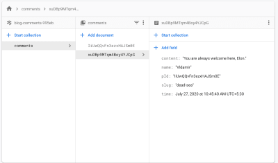
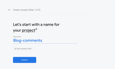
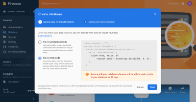
Here’s something I had to get my head wrapped around when I started building Jamstack sites. There are these different stages your site goes through where you can put logic.

Let’s look at a special example so you can see what I mean. Say you’re making a website for a music venue. The most important part of the site is a list of events, some in the past and some upcoming. You want to make sure to label them as such or design that to be very clear. That is date-based logic. How do you do that? Where does that logic live?

There are at least four places to consider when it comes to Jamstack.

Option 1: Write it into the HTML ourselves

Literally sit down and write an HTML file that represents all of the events. We’d look at the date of the event, decide in whether it’s in the past or the future, and write different content for either case. Commit and deploy that file.

<h1>Upcoming Event: Bill's Banjo Night</h1>
<h1>Past Event: 70s Classics with Jill</h1>

This would totally work! But the downside is that weu’d have to update that HTML file all the time — once Bill’s Banjo Night is over, we have to open your code editor, change “Upcoming” to “Past” and re-upload the file.

Option 2: Write structured data and do logic at build time

Instead of writing all the HTML by hand, we create a Markdown file to represent each event. Important information like the date and title is in there as structured data. That’s just one option. The point is we have access to this data directly. It could be a headless CMS or something like that as well.

Then we set up a static site generator, like Eleventy, that reads all the Markdown files (or pulls the information down from your CMS) and builds them into HTML files. The neat thing is thatwe can run any logic we want during the build process. Do fancy math, hit APIs, run a spell-check… the sky is the limit.

For our music venue site, we might represent events as Markdown files like this:

---
title: Bill's Banjo Night
date: 2020-09-02
---

The event description goes here!

Then, we run a little bit of logic during the build process by writing a template like this:

{% if event.date > now %}
  <h1>Upcoming Event: {{event.title}}</h1>
{% else %}
  <h1>Past Event: {{event.title}}</h1>
{% endif %}

Now, each time the build process runs, it looks at the date of the event, decides if it’s in the past or the future and produces different HTML based on that information. No more changing HTML by hand!

The problem with this approach is that the date comparison only happens one time, during the build process. The now variable in the example above is going to refer to the date and time the build happens to run. And once we’ve uploaded the HTML files that build produced, those won’t change until we run the build again. This means that once an event at our music venue is over, we’d have to re-run the build to make sure the website reflects that.

Now, we could automate the rebuild so it happens once a day, or heck, even once an hour. That’s literally what the CSS-Tricks conferences site does via Zapier.

The conferences site is deployed daily using a Zapier automation that triggers a Netlify deploy,, ensuring information is current.

But this could rack up build minutes if you’re using a service like Netlify, and there might still be edge cases where someone gets an outdated version of the site.

Option 3: Do logic at the edge

Edge workers are a way of running code at the CDN level whenever a request comes in. They’re not widely available at the time of this writing but, once they are, we could write our date comparison like this:

// THIS DOES NOT WORK
import eventsList from "./eventsList.json"
function onRequest(request) {
  const now = new Date();
  eventList.forEach(event => {
    if (event.date > now) {
      event.upcoming = true;
    }
  })
  const props = {
    events: events,
  }
  request.respondWith(200, render(props), {})
}

The render() function would take our processed list of events and turn it into HTML, perhaps by injecting it into a pre-rendered template. The big promise of edge workers is that they’re extremely fast, so we could run this logic server-side while still enjoying the performance benefits of a CDN.

And because the edge worker runs every time someone requests the website, we can be sure that they’re going to get an up-to-date version of it.

Option 4: Do logic at run time

Finally, we could pass our structured data to the front end directly, for example, in the form of data attributes. Then we write JavaScript that’s going to do whatever logic we need on the user’s device and manipulates the DOM on the fly.

For our music venue site, we might write a template like this:

<h1 data-date="{{event.date}}">{{event.title}}</h1>

Then, we do our date comparison in JavaScript after the page is loaded:

function processEvents(){
  const now = new Date()
  events.forEach(event => {
    const eventDate = new Date(event.getAttribute('data-date'))
    if (eventDate > now){
        event.classList.add('upcoming')
    } else {
        event.classList.add('past')
    }
  })
}

The now variable reflects the time on the user’s device, so we can be pretty sure the list of events will be up-to-date. Because we’re running this code on the user’s device, we could even get fancy and do things like adjust the way the date is displayed based on the user’s language or timezone.

And unlike the previous points in the lifecycle, run time lasts as long as the user has our website open. So, if we wanted to, we could run processEvents() every few seconds and our list would stay perfectly up-to-date without having to refresh the page. This would probably be unnecessary for our music venue’s website, but if we wanted to display the events on a billboard outside the building, it might just come in handy.

Where will you put the logic?

Although one of the core concepts of Jamstack is that we do as much work as we can at build time and serve static HTML, we still get to decide where to put logic.

Where will you put it?

It really depends on what you’re trying to do. Parts of your site that hardly ever change are totally fine to complete at edit time. When you find yourself changing a piece of information again and again, it’s probably a good time to move that into a CMS and pull it in at build time. Features that are time-sensitive (like the event examples we used here), or that rely on information about the user, probably need to happen further down the lifecycle at the edge or even at runtime.


The post Where Does Logic Go on Jamstack Sites? appeared first on CSS-Tricks.

You can support CSS-Tricks by being an MVP Supporter.

Categories: Designing, Others Tags:

This vs. That

August 24th, 2020 No comments

Here’s a nice site from Phuoc Nguyen, who I’ve noted before has quite a knack for clever sites. This vs. That pits different related concepts against each other as a theme for an article. For example, CSS has display: none;, opacity: 0;, and visibility: hidden; and they all, on the surface “hide” something, but they are all markedly different in ways that are important to understand. That’s one of the articles. The content is open source as well, if you feel like adding anything.

This reminds me of this Pen from Adam Thompson:

CodePen Embed Fallback

All that Pen is doing is setting the colors of some pill boxes, but it does it in literally seven different ways — in this case, none of them are “better” than another:

  1. Swap a class
  2. Swap a class, colors defined in Sass @mixin
  3. Swap a class, class swaps value of a custom property
  4. Swap the value of a custom property
  5. Swaps the value of a custom property, colors stored in JavaScript only
  6. Set inline styles
  7. Manipulate the CSSOM
  8. Set a non-standard color attribute

They all ultimately do the same thing. And there could be many more: change class on a higher-up parent. Use data-* attributes. Use some kind of hue-shifting filter. Use color math in JavaScript to manipulate hues. Use the checkbox hack to change styling. Surely there are even dozens more.

Direct Link to ArticlePermalink


The post This vs. That appeared first on CSS-Tricks.

You can support CSS-Tricks by being an MVP Supporter.

Categories: Designing, Others Tags:

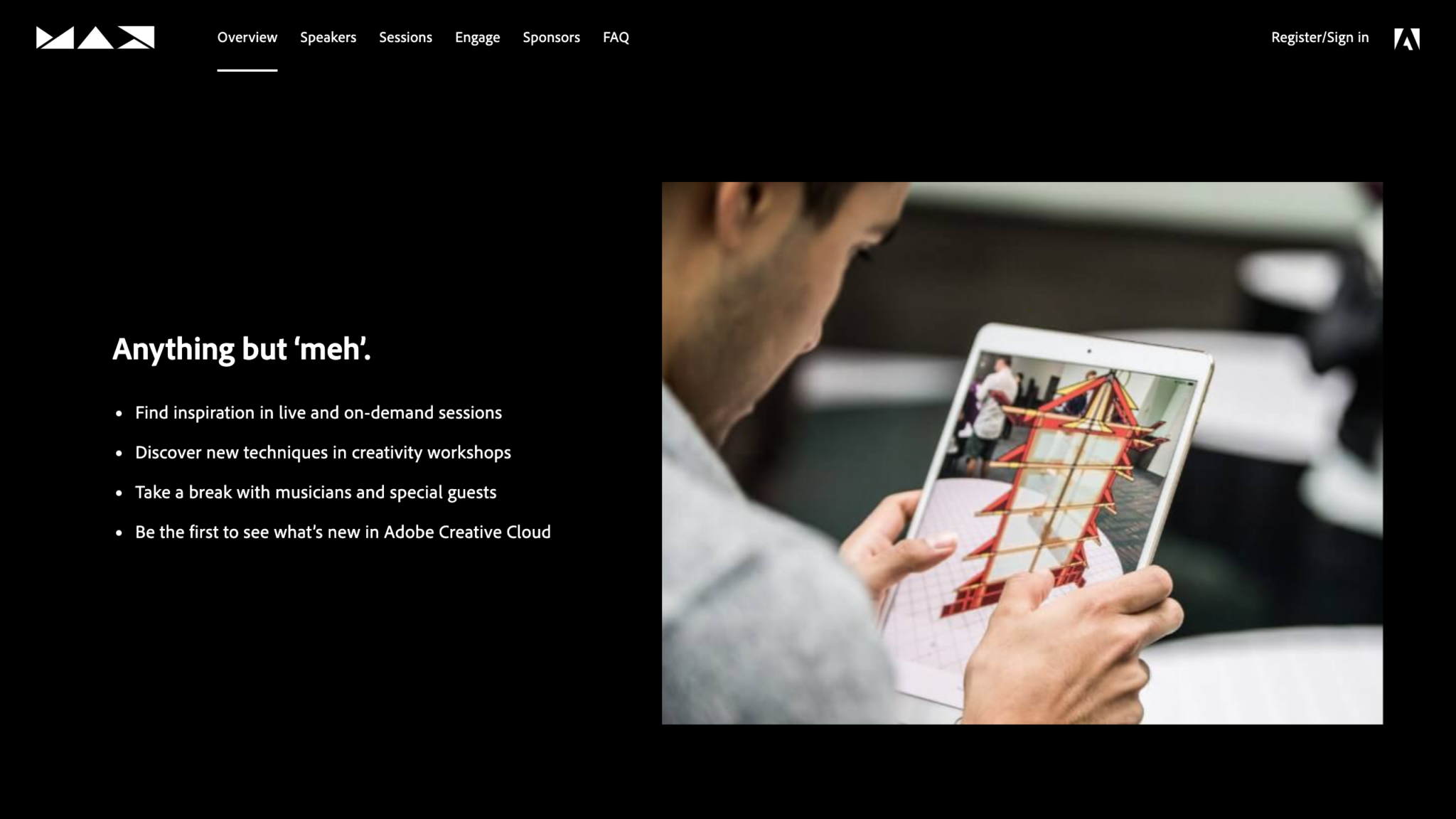
Adobe MAX 2020 Will Be Free For Everyone to Attend, So Sign Up Now!

August 24th, 2020 No comments

Like many other incredible events this year, due to Corona, this year’s Adobe MAX event will be held online.

This may seem like bad news, but there is a good side to it.

This year’s Adobe MAX event will be free for everyone to attend!

If you’re unaware of what an Adobe MAX event is, let me explain.

What is Adobe MAX?

Adobe MAX is a creativity conference where they tease their state-of-the-art experimental technologies for the creative world.

It includes three full days of luminary speakers, celebrity appearances, musical performances, a global collaborative art project, and 350+ sessions — and all at no cost.

That’s 56 hours worth of non-stop inspiration and learning.

Typically, Adobe hosts their events at a single venue, which means that there are limited spots and also, many of us can’t travel to the event.

So, what I’m about to tell you is actually great news.

This year the event will be held virtually for the first time in their event’s history, and most importantly, it’ll be free. But that doesn’t mean that it’ll be lacking in any way, shape, or form.

Who will be speaking at the Adobe MAX 2020 Conference?

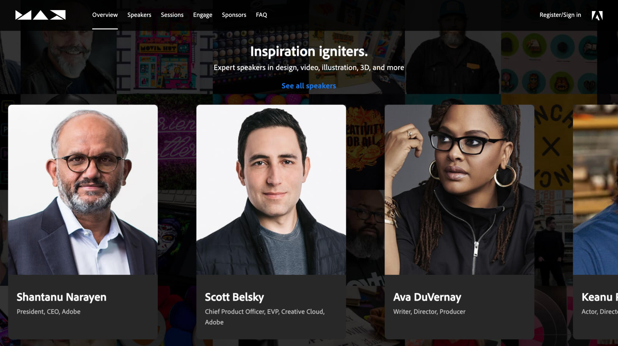
If you attend this year’s virtual conference, you will have the amazing opportunity to hear from incredible people like Ava DuVernay, an Academy Award-winning filmmaker, the creative Annie Leibovitz, the amazing Keanu Reeves, The Futur’s founder, Chris Do, recording artist Tyler the Creator, and so many other creative luminaries and celebrity speakers.

When will the Adobe MAX conference take place this year?

Adobe MAX 2020 will be held online on October 20-22, so you better get your tickets now!

How do I sign up for the Adobe MAX 2020 Conference?

The answer to that question is simple.

All you have to do is sign-up is go on this website and register to participate.

That’s literally it. Go ahead and sign-up now before it’s too late!

Are you guys pumped to attend this year’s Adobe Max event?

Have you ever been to one in the past?

Let us know your experiences in the comments below and see you there!

Read More at Adobe MAX 2020 Will Be Free For Everyone to Attend, So Sign Up Now!

Categories: Designing, Others Tags:

8 Best Ecommerce Marketing Strategies to Boost Your Sales and Revenue

August 24th, 2020 No comments

Operating an eCommerce site is not easy, and marketing it is a different game altogether. It requires you to put a lot of smart work and hard work in place to make any sizable income.

But if you are aware of some robust marketing strategies that almost always deliver the results, your job can become a bit easier, and you can gain many customers easily. We know this, so we are going to share our knowledge and experience with you. In this article, we will introduce you with eight best eCommerce marketing strategies you can implement to boost your sales. Let us get started!

1. Utilize the power of Google Shopping Ads

In today’s time, there can be no better place to get your visitors than Google. The traffic coming from it converts more than any other traffic source, and it is also quite cheaper than the traffic from other marketing channels. However, the ranking will take time in Google’s search results. If you do not have that much patience, you can harness the power of Google Shopping Ads that appear on the top of the search pages whenever someone searches for a product. They look something like this:

As you can see, these ads not only allow you to occupy the top of a search results page but also will enable you to hook your visitors by showing a price, an image, and other relevant information right there on the search page itself. So, whoever visits your site by clicking these ads is more likely to convert into a customer, and you pay only when they click – which means a very high return on investment.

2. Use SML (schema mark-up)

SML stands for Structured Mark-up Language. This language, also known popularly as Schema, helps search engines in better crawling and understanding of your site. By adding SML to your product pages, you can ensure that they are crawled and indexed correctly by Google and other search engines. While it doesn’t directly impact your search rankings, it does so indirectly by making your pages appear with information-rich snippets that entice people to click on your link instead of other links. And when that happens, it increases your Click-Through-Rate (CTR), which is an important ranking signal used by Google in its algorithms. As a result, you start moving up in search results from a steady pace.

3. Upsell your products

In case you are not aware of it, upselling refers to selling a more premium or better version of your product than the customer is willing to buy. By doing this, you can increase your revenue without necessarily acquiring new customers, and that is precisely what makes this strategy cool. The strategy works because many times; the customer is not fully aware of what options – better or worse – are available in the market other than the product that (s)he is going to buy. If you can offer a better deal on your product pages by upselling relevant products, it can become a win-win situation for both you and your customers.

4. Protect your site with an SSL certificate

Since we are about security, it is also important to discuss another security-related element that can turn visitors away from your site if it appears. If your website lacks an SSL certificate and therefore loading over default HTTP protocol instead of the more secure HTTPS, web browsers show a “Not Secure” label before your URL in the address bar. Something like this:

You can imagine what such a label appearing before your URL can do damage to your brand. The visitors to your site will feel that something is seriously wrong with the security of your website (which would also be true, given the importance of SSL) and immediately hit that dreaded Close Tab button. If you want to ensure that it does not happen, install an SSL certificate on your site. In case you are clueless about which certificate to buy, there are many SSL certificates out there in the market like Comodo certificate, DigiCert certificate, GeoTrust SSL certificates are among the best ones in the industry.

5. Pay attention to site speed

The speed of your site matters a lot when you are selling something. Nobody likes waiting nowadays – especially if they are looking to purchase something. If your site is slow to load, they will close it and want to buy from somewhere else. Do not let that happen – increase your site speed by following the steps outlined below:

Enable caching on your site.

  • Eliminate unnecessary elements from your product pages (i.e., excess javascript/CSS, images/media loading from external sources, multiple widgets, etc.)
  • Choose a reliable web hosting company
  • Check your site with the Google Page Speed Insights tool and implement the steps suggested to boost your Page Speed score.
  • These steps can help you enough in ensuring that your site loads faster.

6. Leverage email marketing

Email marketing may sound like an old technique in an all-social media-driven world. However, it still works wonders for many businesses. Especially if you are running an eCommerce business, you can leverage its power in many ways. You can start a blog that sends customers to your product pages after they’re educated enough to purchase your product, you can also use email addresses of your users to inform them about a product that was out of stock as soon as it’s back in stock. Last, but certainly not least, you can also tell your customers about various sales offers you are running through emails.

7. Use Trust Seals on your checkout page

Often when people do not buy from your site, it is not something wrong with your marketing, but with the security, elements included, or not included in your website. Security threats for an online business are among the top concerns in your mind and in the minds of your potential customers, which is why they do not purchase from sites that do not make them feel safe. If you want to make your visitors feel safe on your website, include some Trust Seals from reputed brands on your site (especially your checkout page), as shown above. You will need to purchase some security-related products from these brands to display these seals, but that is worth it because it will also boost your sales revenue.

8. Use videos in your product pages and marketing strategy

Finally, use the power of video to improve your product pages and boost your marketing. On product pages, videos can be used to provide your customers with a better understanding of the product they are buying. Off the product page, they can be used as a marketing tool to send visitors to your site through video sharing platforms like YouTube and other social media channels. It would help if you crafted a solid marketing strategy around it, and you can drive tons of traffic and sales to your eCommerce site through this one marketing medium alone.

Conclusion

So, these were eight best eCommerce marketing strategies you must implement to boost your sales. It is easy to implement them and necessary because, without these strategies, you cannot get the best ROI out of your marketing campaigns. Please share your thoughts and feedback about them in the comments below and let us know how they perform for your site.


Photo by S O C I A L . C U T on Unsplash

Categories: Others Tags:

20 Freshest Web Designs, August 2020

August 24th, 2020 No comments

In this month’s collection of the freshest web designs from the last four weeks the dominant trend is attention to detail.

You’ll find plenty of animation, in fact, almost every one of these sites uses animation to a greater or lesser degree. Let’s dive in:

Globekit

Globekit is a tool that allows developers to quickly create animated and interactive globes and embed them on web pages. Its site features some exceptional 3D animation.

Yolélé

Yolélé is food company built around fonio, a West African super grain. Its site features a great page transition, and the landing page carousel is one of the few examples of horizontal scrolling we’ve seen work well.

Begonia

Begonia is a Taiwanese design agency with an impressive client list. Its site features animated typography, a super bold splash screen, and some surreal artwork. There’s so much here, it’s almost overwhelming.

Next Big Thing

Next Big Thing is an agency supporting the full lifecycle of start-ups. Its site is clearly targeting tech-based clients, and there are some lovely transitions. The masked hero transition on scroll is delightful.

Proper

We all have every reason for the odd sleepless night right now, but regular sleep is essential for our health. Proper offers sleep solutions from coaching to supplements on its subtly shaded site.

The Oyster & Fish House

The site for The Oyster & Fish House is packed with some delightful details. We love the subtle wave textures, the photography has a nostalgic feel, and the typography is perfectly sophisticated.

Drink Sustainably

Fat Tire produces America’s first certified carbon neutral beer, and Drink Sustainably has been produced to explain the concept. We love the vintage advertising style of the artwork.

Treaty

It seems like every week there’s a new CBD brand launching. What we like about Treaty’s site is the slick fullscreen video, the inclusion of botanical illustrations, and the really brave use of whitespace.

Studio Louise

You’re greeted on Studio Louise’s site by a shot of trees with two random shapes; as you scroll the shapes morph and relocate to the top right corner, and you suddenly realize they’re an “S” and an “L”, cue: smiles.

Wünder

Another site for a CBD product, this time a vibrantly branded sparkling beverage. Wünder’s site features enticing photography, an on-trend color palette, and credible typography.

Seal + Co

Some professions lend themselves to exciting, aspirational sites, and some companies are accountancy firms. However Seal + Co’s site creates the impression of a modern, capable, and imaginative firm.

DocSpo

There is some lovely, 3D animation on the DocSpo site. The company is a Swedish startup enabling digital business proposals, and its site is bold, Appleesque, and packed with nice details.

Motley

We never get tired of particle effects, like the one employed by Finland-based agency Motley. There’s some superb work in the portfolio, and it’s great to see a blog using Old Master paintings for thumbnails.

The Ornamental

The Ornamental sources leather goods for wealthy individuals, and luxury lifestyle firms. Its site is minimal, with some drool-worthy handbags. We particularly liked the image zoom hover effect in the store.

G.F Smith

G.F Smith is one of the world’s leading paper suppliers. Its redesigned site is much simpler than its last, with some lovely touches, like the varied paper photography when you hover over product thumbnails.

Raters

Raters is a new app that lets you discover new movies via reviews from people you trust. This simple site does an exceptional job of previewing the app, across multiple device sizes.

Fleava

There’s a whole heap of nice interactive details on Fleava’s site, from the cursor-following circles when hovering over links, to the way the thumbnails are squeezed when dragging through projects.

The Story of Babushka

A babushka doll is a traditional Russian toy, made up of dolls, nested inside dolls. The Story of Babushka uses the toy as a metaphor for growth in this children’s book, and the accompanying animated website.

Grand Matter

After the uniformity of the 2010s, there are a wealth of illustration styles being explored across the web. Grand Matter is an artist agency that represents some amazing talent, and we love the illustration they chose themselves.

Nathan Young

Nathan Young’s site does exactly what it needs to do: Providing case studies for his design work. The fade-out on scroll is a simple device that elevates the whole site experience.

Source

Categories: Designing, Others Tags:

How To Build Your Own Comment System Using Firebase

August 24th, 2020 No comments
Basic blog

How To Build Your Own Comment System Using Firebase

How To Build Your Own Comment System Using Firebase

Aman Thakur

2020-08-24T10:30:00+00:00
2020-08-27T08:20:13+00:00

A comments section is a great way to build a community for your blog. Recently when I started blogging, I thought of adding a comments section. However, it wasn’t easy. Hosted comments systems, such as Disqus and Commento, come with their own set of problems:

  • They own your data.
  • They are not free.
  • You cannot customize them much.

So, I decided to build my own comments system. Firebase seemed like a perfect hosting alternative to running a back-end server.

First of all, you get all of the benefits of having your own database: You control the data, and you can structure it however you want. Secondly, you don’t need to set up a back-end server. You can easily control it from the front end. It’s like having the best of both worlds: a hosted system without the hassle of a back end.

In this post, that’s what we’ll do. We will learn how to set up Firebase with Gatsby, a static site generator. But the principles can be applied to any static site generator.

Let’s dive in!

What Is Firebase?

Firebase is a back end as a service that offers tools for app developers such as database, hosting, cloud functions, authentication, analytics, and storage.

Cloud Firestore (Firebase’s database) is the functionality we will be using for this project. It is a NoSQL database. This means it’s not structured like a SQL database with rows, columns, and tables. You can think of it as a large JSON tree.

Introduction to the Project

Let’s initialize the project by cloning or downloading the repository from GitHub.

I’ve created two branches for every step (one at the beginning and one at the end) to make it easier for you to track the changes as we go.

Let’s run the project using the following command:

gatsby develop

If you open the project in your browser, you will see the bare bones of a basic blog.

Basic blog

(Large preview)

The comments section is not working. It is simply loading a sample comment, and, upon the comment’s submission, it logs the details to the console.

Our main task is to get the comments section working.

How the Comments Section Works

Before doing anything, let’s understand how the code for the comments section works.

Four components are handling the comments sections:

  • blog-post.js
  • Comments.js
  • CommentForm.js
  • Comment.js

First, we need to identify the comments for a post. This can be done by making a unique ID for each blog post, or we can use the slug, which is always unique.

The blog-post.js file is the layout component for all blog posts. It is the perfect entry point for getting the slug of a blog post. This is done using a GraphQL query.

export const query = graphql`
    query($slug: String!) {
        markdownRemark(fields: { slug: { eq: $slug } }) {
            html
            frontmatter {
                title
            }
            fields {
                slug
            }
        }
    }
`

Before sending it over to the Comments.js component, let’s use the substring() method to get rid of the trailing slash (/) that Gatsby adds to the slug.

const slug = post.fields.slug.substring(1, post.fields.slug.length - 1)

return (
    <Layout>
        <div className="container">
            <h1>{post.frontmatter.title}</h1>
            <div dangerouslySetInnerHTML={{ __html: post.html }} />
            <Comments comments={comments} slug={slug} />
        </div>
    </Layout>
    )
 }

The Comments.js component maps each comment and passes its data over to Comment.js, along with any replies. For this project, I have decided to go one level deep with the commenting system.

The component also loads CommentForm.js to capture any top-level comments.

const Comments = ({ comments, slug }) => {
    return (
        <div>
            <h2>Join the discussion</h2>
            <CommentForm slug={slug} />
            <CommentList>
                {comments.length > 0 &&
                    comments
                        .filter(comment => !comment.pId)
                        .map(comment => {
                            let child
                            if (comment.id) {
                                child = comments.find(c => comment.id === c.pId)
                            }
                            return (
                                <Comment
                                    key={comment.id}
                                    child={child}
                                    comment={comment}
                                    slug={slug}
                                />
                            )
                        })}
                    </CommentList>
                </div>
            )
        }

Let’s move over to CommentForm.js. This file is simple, rendering a comment form and handling its submission. The submission method simply logs the details to the console.

const handleCommentSubmission = async e => {
    e. preventDefault()
        let comment = {
            name: name,
            content: content,
            pId: parentId ∣∣ null,
            time: new Date(),
        }
        setName("")
        setContent("")
        console.log(comment)
    }

The Comment.js file has a lot going on. Let’s break it down into smaller pieces.

First, there is a SingleComment component, which renders a comment.

I am using the Adorable API to get a cool avatar. The Moment.js library is used to render time in a human-readable format.

const SingleComment = ({ comment }) => (
    <div>
        <div className="flex-container">
            <div className="flex">
                <img
                    src="https://api.adorable.io/avazars/65/abott@adorable.png"
                    alt="Avatar"
                />
            </div>
            <div className="flex">
                <p className="comment-author">
                    {comment.name} <span>says</span>
                </p>
                {comment.time} &&(<time>(moment(comment.time.toDate()).calendar()}</time>)}
            </div>
        </div>
        </p>{comment.content}</p>
    </div>
)

Next in the file is the Comment component. This component shows a child comment if any child comment was passed to it. Otherwise, it renders a reply box, which can be toggled on and off by clicking the “Reply” button or “Cancel Reply” button.

const Comment = ({ comment, child, slug }) => {
    const [showReplyBox, setShowReplyBox] = useState(false)
    return (
        <CommentBox>
            <SingleComment comment={comment} />
            {child && (
                <CommentBox child className=comment-reply">
                    <SingleComment comment={child} />
                </CommentBox>
            )}
            {!child && (
                <div>
                    {showReplyBox ? (
                        <div>
                            <button
                                className="btn bare"
                                onClick={() => setShowReplyBoy(false)}
                            >
                                Cancel Reply
                            </button>
                            <CommentForm parentId={comment.id} slug={slug} />
                        </div>
                    ) : (
                        <button className="btn bare" onClick={() => setShowReplyBox(true)}>
                            Reply
                        </button>
                    )}
                </div>
            )}
        </div>
    )}
</CommentBox>

Now that we have an overview, let’s go through the steps of making our comments section.

1. Add Firebase

First, let’s set up Firebase for our project.

Start by signing up. Go to Firebase, and sign up for a Google account. If you don’t have one, then click “Get Started”.

Click on “Add Project” to add a new project. Add a name for your project, and click “Create a project”.

Initialize Firebase

(Large preview)

Once we have created a project, we’ll need to set up Cloud Firestore.

In the left-side menu, click “Database”. Once a page opens saying “Cloud Firestore”, click “Create database” to create a new Cloud Firestore database.

Cloud Firestore

(Large preview)

When the popup appears, choose “Start in test mode”. Next, pick the Cloud Firestore location closest to you.

Firestore test mode

(Large preview)

Once you see a page like this, it means you’ve successfully created your Cloud Firestore database.

Firestore dashboard

(Large preview)

Let’s finish by setting up the logic for the application. Go back to the application and install Firebase:

yarn add firebase

Add a new file, firebase.js, in the root directory. Paste this content in it:

import firebase from "firebase/app"
import "firebase/firestore"

var firebaseConfig = 'yourFirebaseConfig'

firebase.initializeApp(firebaseConfig)

export const firestore = firebase.firestore()

export default firebase

You’ll need to replace yourFirebaseConfig with the one for your project. To find it, click on the gear icon next to “Project Overview” in the Firebase app.

Project settings

(Large preview)

This opens up the settings page. Under your app’s subheading, click the web icon, which looks like this:

Project installation

(Large preview)

This opens a popup. In the “App nickname” field, enter any name, and click “Register app”. This will give your firebaseConfig object.

<!-- The core Firebase JS SDK is always required and must be listed first -->
<script src="https://www.gstatic.com/firebasejs/7.15.5/firebase-app.js"></script>

<!-- TODO: Add SDKs for Firebase products that you want to use
    https://firebase.google.com/docs/web/setup#available-libraries -->

<script>
    // Your web app's Firebase configuration
    var firebaseConfig = {

    ...

    };
    // Initialize Firebase
    firbase.initializeApp(firebaseConfig);
</script>

Copy just the contents of the firebaseConfig object, and paste it in the firebase.js file.

Is It OK to Expose Your Firebase API Key?

Yes. As stated by a Google engineer, exposing your API key is OK.

The only purpose of the API key is to identify your project with the database at Google. If you have set strong security rules for Cloud Firestore, then you don’t need to worry if someone gets ahold of your API key.

We’ll talk about security rules in the last section.

For now, we are running Firestore in test mode, so you should not reveal the API key to the public.

How to Use Firestore?

You can store data in one of two types:

  • collection
    A collection contains documents. It is like an array of documents.
  • document
    A document contains data in a field-value pair.

Remember that a collection may contain only documents and not other collections. But a document may contain other collections.

This means that if we want to store a collection within a collection, then we would store the collection in a document and store that document in a collection, like so:

{collection-1}/{document}/{collection-2}

How to Structure the Data?

Cloud Firestore is hierarchical in nature, so people tend to store data like this:

blog/{blog-post-1}/content/comments/{comment-1}

But storing data in this way often introduces problems.

Say you want to get a comment. You’ll have to look for the comment stored deep inside the blog collection. This will make your code more error-prone. Chris Esplin recommends never using sub-collections.

I would recommend storing data as a flattened object:

blog-posts/{blog-post-1}
comments/{comment-1}

This way, you can get and send data easily.

How to Get Data From Firestore?

To get data, Firebase gives you two methods:

  • get()
    This is for getting the content once.
  • onSnapshot()
    This method sends you data and then continues to send updates unless you unsubscribe.

How to Send Data to Firestore?

Just like with getting data, Firebase has two methods for saving data:

  • set()
    This is used to specify the ID of a document.
  • add()
    This is used to create documents with automatic IDs.

I know, this has been a lot to grasp. But don’t worry, we’ll revisit these concepts again when we reach the project.

2. Create Sample Date

The next step is to create some sample data for us to query. Let’s do this by going to Firebase.

Go to Cloud Firestore. Click “Start a collection”. Enter comments for the “Collection ID”, then click “Next”.

Add collection

(Large preview)

For the “Document ID”, click “Auto-ID. Enter the following data and click “Save”.

Add document

(Large preview)

While you’re entering data, make sure the “Fields” and “Types” match the screenshot above. Then, click “Save”.

That’s how you add a comment manually in Firestore. The process looks cumbersome, but don’t worry: From now on, our app will take care of adding comments.

At this point, our database looks like this: comments/{comment}.

3. Get the Comments Data

Our sample data is ready to query. Let’s get started by getting the data for our blog.

Go to blog-post.js, and import the Firestore from the Firebase file that we just created.

import {firestore} from "../../firebase.js"

To query, we will use the useEffect hook from React. If you haven’t already, let’s import it as well.

useEffect(() => {
    firestore
      .collection(`comments`)
      .onSnapshot(snapshot => {
        const posts = snapshot.docs
        .filter(doc => doc.data().slug === slug)
        .map(doc => {
          return { id: doc.id, ...doc.data() }
        })
        setComments(posts)
      })
}, [slug])

The method used to get data is onSnapshot. This is because we also want to listen to state changes. So, the comments will get updated without the user having to refresh the browser.

We used the filter and map methods to find the comments whose slug matches the current slug.

One last thing we need to think about is cleanup. Because onSnapshot continues to send updates, this could introduce a memory leak in our application. Fortunately, Firebase provides a neat fix.

useEffect(() => {
    const cleanUp = firestore
      .doc(`comments/${slug}`)
      .collection("comments")
      .onSnapshot(snapshot => {
        const posts = snapshot.docs.map(doc => {
          return { id: doc.id, ...doc.data() }
        })
        setComments(posts)
      })
    return () => cleanUp()
  }, [slug])

Once you’re done, run gatsby develop to see the changes. We can now see our comments section getting data from Firebase.

Getting Firestore data

(Large preview)

Let’s work on storing the comments.

4. Store Comments

To store comments, navigate to the CommentForm.js file. Let’s import Firestore into this file as well.

import { firestore } from "../../firebase.js"

To save a comment to Firebase, we’ll use the add() method, because we want Firestore to create documents with an auto-ID.

Let’s do that in the handleCommentSubmission method.

firestore
.collection(`comments`)
.add(comment)
.catch(err => {
   console.error('error adding comment: ', err)
 })

First, we get the reference to the comments collection, and then add the comment. We’re also using the catch method to catch any errors while adding comments.

At this point, if you open a browser, you can see the comments section working. We can add new comments, as well as post replies. What’s more amazing is that everything works without our having to refresh the page.

Storing comment

(Large preview)

You can also check Firestore to see that it is storing the data.

Stored data in Firestore

(Large preview)

Finally, let’s talk about one crucial thing in Firebase: security rules.

5. Tighten Security Rules

Until now, we’ve been running Cloud Firestore in test mode. This means that anybody with access to the URL can add to and read our database. That is scary.

To tackle that, Firebase provides us with security rules. We can create a database pattern and restrict certain activities in Cloud Firestore.

In addition to the two basic operations (read and write), Firebase offers more granular operations: get, list, create, update, and delete.

A read operation can be broken down as:

  • get
    Get a single document.
  • list
    Get a list of documents or a collection.

A write operation can be broken down as:

  • create
    Create a new document.
  • update
    Update an existing document.
  • delete
    Delete a document.

To secure the application, head back to Cloud Firestore. Under “Rules”, enter this:

service cloud.firestore {
    match /databases/{database}/documents {
    match /comments/{id=**} {
        allow read, create;
    }
    }
}

On the first line, we define the service, which, in our case, is Firestore. The next lines tell Firebase that anything inside the comments collection may be read and created.

If we had used this:

allow read, write;

… that would mean that users could update and delete existing comments, which we don’t want.

Firebase’s security rules are extremely powerful, allowing us to restrict certain data, activities, and even users.

On To Building Your Own Comments Section

Congrats! You have just seen the power of Firebase. It is such an excellent tool to build secure and fast applications.

We’ve built a super-simple comments section. But there’s no stopping you from exploring further possibilities:

  • Add profile pictures, and store them in Cloud Storage for Firebase;
  • Use Firebase to allow users to create an account, and authenticate them using Firebase authentication;
  • Use Firebase to create inline Medium-like comments.

A great way to start would be to head over to Firestore’s documentation.

Finally, let’s head over to the comments section below and discuss your experience with building a comments section using Firebase.

Smashing Newsletter

Every week, we send out useful front-end & UX techniques. Subscribe and get the Smart Interface Design Checklists PDF delivered to your inbox.


Front-end, design and UX. Sent 2× a month.
You can always unsubscribe with just one click.

Smashing Editorial
(ra, yk, al, il)
Categories: Others Tags: