Archive

Archive for August, 2020

How to Convert PDF Files to Other Formats?

August 18th, 2020 No comments

Working with a PDF document can be significantly easier and more convenient that working with an original document created in a program such as Microsoft Word.

If you’re working in the legal profession, and you need to exchange documents with clients or other lawyers, a PDF provides several advantages. For example, for a digital document to be admissible in court, that document needs to be in a format that cannot be altered without leaving a digital record of what changes were made.

The human resources department of any company provides prospective and current employees with a variety of documents, forms, and other paperwork. Additionally, a business can create brochures, training manuals or even invoices and forward a PDF file. While the original source document may have been created in Microsoft Word, it’s far more efficient to send copies as a PDF file. This eliminates compatibility issues that may arise due to different versions of Word, missing fonts or different operating systems, such as Mac or Windows, or iOS and Android.

Here’s five reasons why you should distribute PDF documents rather than an original.

  1. Retain formatting. You may be using special fonts and formatting.
  2. Platform agnostic. PDF can be read on any device and operating system, including mobile and tablets.
  3. Security. You may want people to only read your document, and not change the content of your PDF. Plus, you can easily password-protect a PDF document.
  4. Multiple versions of software. People receiving your document may not have the latest version of Microsoft Word, which means it’s possible the document can’t be accessed. This isn’t an issue when using PDF.
  5. Free PDF readers. There’s a wide-variety of free PDF readers available for every operating system and platform.

How to Create a PDF on Mac

  1. Open the document
  2. Select File > Print
  3. Choose the PDF popup menu and select “Save as PDF”
  4. Choose a name and location for the PDF file. Enter the information you want in the Title, Author, Subject, and Keywords fields.
  5. Select Save

Apple makes it very easy to create a PDF from any type of software program by mimicking the same steps you would take to print a document. The process is baked into the operating system.

To create a PDF, just follow the steps provided above.

How to Convert PDF to Word – Word to PDF

How to Convert PDF to Word

  1. Open the file you want to convert in Acrobat.
  2. Click on the Export PDF tool in the right pane.
  3. Choose Microsoft Word as your export format.
  4. Click Convert. If your PDF contains scanned text, Acrobat will run text recognition automatically.
  5. Name the Word file and save it in a desired location.
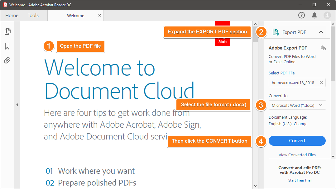
Let’s say you urgently need to convert a PDF file to Word document format. There are a few ways you can do this. Adobe offers a product Acrobat Pro DC as part of their Creative Cloud Suite of products. It’s $12.99 a month and allows you to convert PDFs into Word doc, Excel spreadsheets and edit scanned PDFs.

If you have access to Adobe, it’s best to use the steps above to convert your PDF back into a Word document.

But if you’re strapped for cash, here’s a free way to convert a PDF to a word doc.

  1. Upload your file.
  2. Visit www.convertpdftoword.net
  3. Download the Word Doc version.

This free tool is littered with confusing ads, so try to ignore those. Also, the formatting is all wonky in the .doc version. But if you insist on changing the format, you should spring for the paid version with more features.

Here are our top picks for PDF to Word tools:

  • PDF2Doc.com: simple, straightforward drag-and-drop PDF converter.
  • iLovePDF.com: this site is very easy to use and has a lot of other PDF tools, like converting PDFs to Excel or Powerpoint. This is a handy site to bookmark for all your PDF editing needs.
  • WordtoPDF.com: This site is nice because you can go from one file format to another, converting the documents and then emailing them to anyone. There is a size limit.

There are many other online options which you can choose to convert your PDF files. Visit JotForm’s guide about online PDF to Word converters.

How to Convert Word to PDF

  1. Click File tab and select Export.
  2. Click Create PDF/XPS Document.
  3. Then click Create PDF/XPS.
  4. Change the file name and choose a folder on your computer before saving the document.
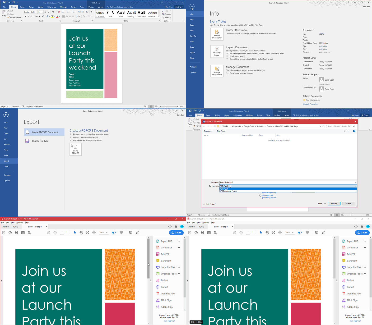
Now you have a shiny new PDF!

Since you now know how to convert a Word document to a PDF, you’ll be able to easily share PDFs without disturbing the formatting as well as being able to view your document easily on a mobile device. For more online options that you can consider, visit JotForm’s guide of Word to PDF online tools.

Basically, there are programs for editing, converting, reading, creating and designing PDFs, if you want a full suite of functionality you’re probably going to have to pay for it. If you’re willing to piece together solutions through various web-based tools, you’ll get what you need.

How to Convert PDF to Excel – Excel to PDF

How to Convert PDF to Excel

Concerning PDF to XLSX conversions, there are a couple of methods you can refer. Along with online conversion tools, you can also use Microsoft Office or Adobe Acrobat. We have covered both converting PDF to Excel in MS Office and Adobe Acrobat in separate articles.

How to Convert Excel to PDF

Spreadsheets sometimes contain important financial information that should not be changed, or is confidential and is to be viewed by specific people, only. An advantage of using PDF instead of Excel is anyone can open it, even if they aren’t using Microsoft Office. Another advantage is it’s easier to print and distribute a spreadsheet.

Here’s how you can create a PDF from Excel:

  1. Open the file
  2. Select “Export”
  3. Select “Create PDF/XPS”
  4. Click Options and adjust your PDF settings
  5. Select which items to include in the PDF document
  6. Give your PDF document a name and select “Publish”

If you would like to convert an Excel file to PDF using Adobe Acrobat PDF Maker, you can follow the instructions given at JotForm’s Excel to PDF Guide Using Adobe. But if you wish using Microsoft Office, JotForm’s Excel to PDF Convert Guide Using MS Office is the right option.

How to Convert PDF to Powerpoint

How to Convert PDF to Powerpoint (PPTX)

One way to transfer the content in a PDF to a PowerPoint presentation is to copy the content directly from the PDF and paste it into PowerPoint slides. Unfortunately, that’s labor intensive and might mess up the formatting.

To retain the formatting, convert the PDF to a PowerPoint (PPTX) file. Adobe Acrobat Pro lets you convert all the pages of a PDF into PowerPoint quickly. Alternatively, you can export just the information you need.

Note that the Acrobat XI Standard has Microsoft Office conversion tools for Word and Excel, but you need the Pro version for PowerPoint. Also, this feature is not available in older versions of Adobe Acrobat.

Here are the steps:

  1. Open Adobe Acrobat, go to Tools, and then select Export PDF.
  2. Choose Microsoft PowerPoint as your export format, select the PDF file that you want to export to PowerPoint, and then click the Export button.
  3. In the Save As window, name the PowerPoint file and save it to your desired location.
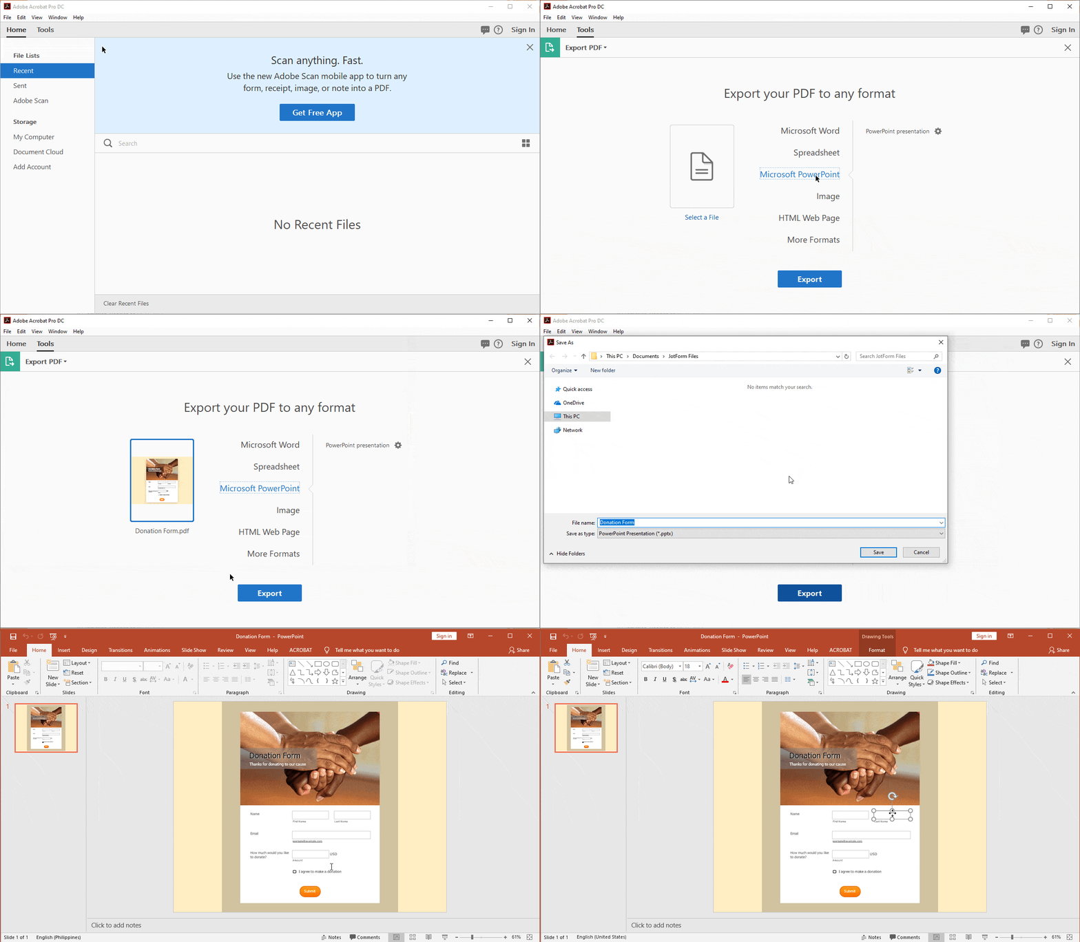
How to Convert Powerpoint (PPTX) to PDF

Converting your PowerPoint slides into a PDF file is a quick way to produce a presentation that can be printed or shared. Share it with your clients so they can view the PowerPoint slides even if they don’t have Microsoft PowerPoint installed on their computer.

With Microsoft PowerPoint, you can directly export the PowerPoint slides to PDF without losing the formatting.

To do that, follow these steps:

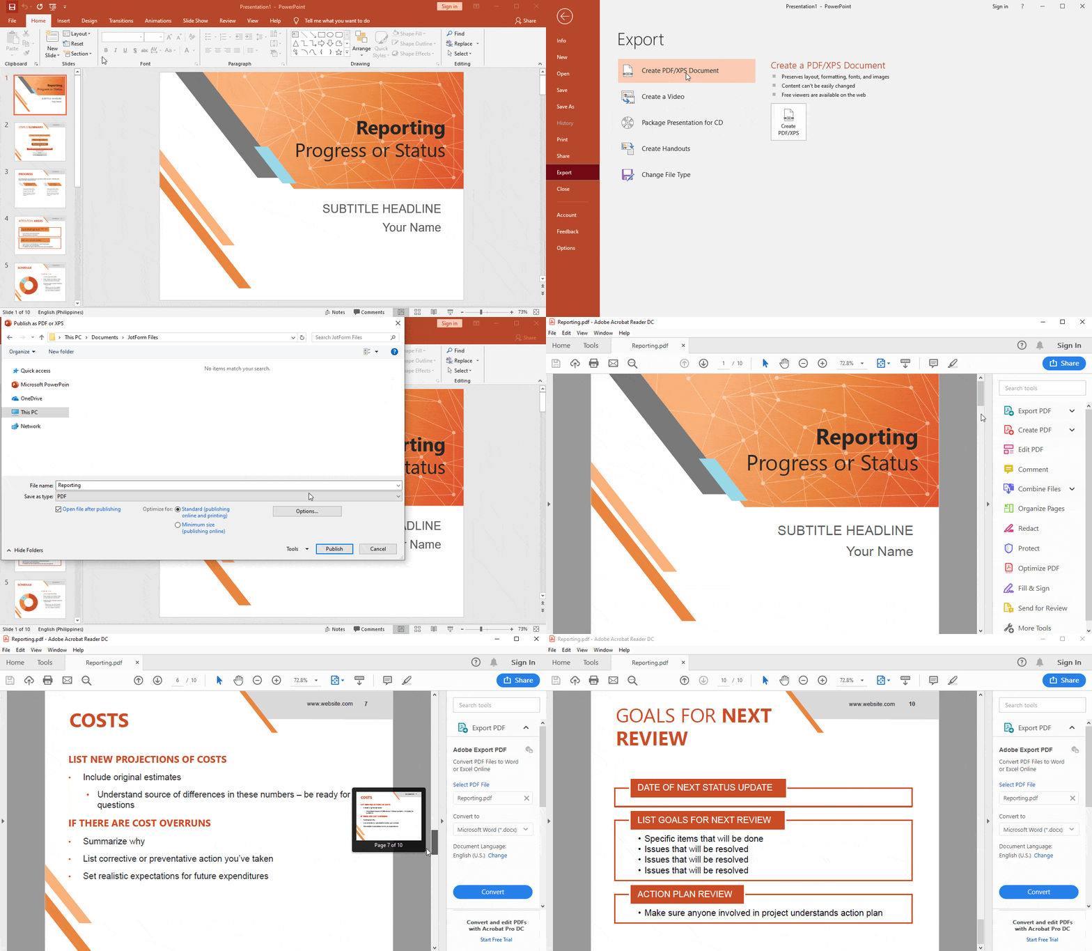
  1. Open Microsoft PowerPoint, and then select File Export
  2. Click Create PDF/XPS Document, and then click Create PDF/XPS.

  3. In the Publish as PDF dialog box, choose a location to save the file.

That’s it! The converted PDF should open automatically. If not, you can manually open the PDF and check to make sure all the pages are there and the formatting is intact.
How to Convert PDF to Image – Image to PDF

How to Convert PDF to JPG

Let’s say you have a PDF and you really need it to be a jpg, in the PDF editing tool of your choice go to file and “save as” and choose jpg-jpeg.

Maybe you just want part of the PDF to be an image. You’ve found the perfect graph for your report on the airspeed velocity of an unladen sparrow, unfortunately it’s in a PDF and you can’t seem to right click and save the image in order to plop it in your report.

No worries, there are actually a few easy ways to life images out of PDFs.

Screen grab the image

Most PC’s come with the Snipping Tool and you can download a screen grabber tool like Snip for Macs. These tools all works basically the same, you select the tool and you can either take a full screenshot or choose to select the area you want to capture. Cross hairs will take over your cursor and you can click and drag to select your screenshot.

Or you can use these keyboard shortcuts for taking screenshots on a Mac

  1. COMMAND+SHIFT+3 saves an image of the full-screen to the desktop
  2. COMMAND+SHIFT+4 allows for taking a snip of a specific area of the screen to the Desktop. When the cursor changes to a cross hairs, click and drag a box around the section you want to capture and release the mouse to save to the desktop.

Web Applications For Extracting Images from PDFs

Taking a screen grab is only one way to pull images from a PDF. There are a collection of web-based tools that will also do the job.

  • ExtractPDF: a clean, easy-to-use interface, makes for quick and easy photo extraction from a PDF. Doesn’t give you the option to choose what file format you get, but the results look pretty good.
  • PDFaid: This page has so many ads you can’t tell what’s the app and what’s an ad. But it does the trick with just a couple clicks and you can choose what find of file you want.

Still need some help? We’ll walk you through the image extraction process using five of the best (and predominantly free) software tools available.

How to Convert JPG to PDF

Need to turn an image into a PDF file? No need to worry. We’ll show you a few of the best, not to mention free, software tools out there to convert JPG images to PDF files.

How to Convert PDF to PNG

Why would you want to convert a PDF to PNG format? The answer lies in how you want the PDFs to be viewed and how you’re going to use them. Here are some of the reasons why it might be useful to convert a PDF to PNG:

  • It’s easier to import/paste a PNG image to Microsoft Office applications like Word or PowerPoint.
  • A PNG is a very common image format on the web. Instead of embedding the PDF on your website, you can use the converted PNG image. This will eliminate design and browser compatibility issues. Users won’t need an external plugin or extension.
  • Opening a PDF requires an external application, while opening a PNG image doesn’t.

Follow these steps to convert a PDF to PNG:

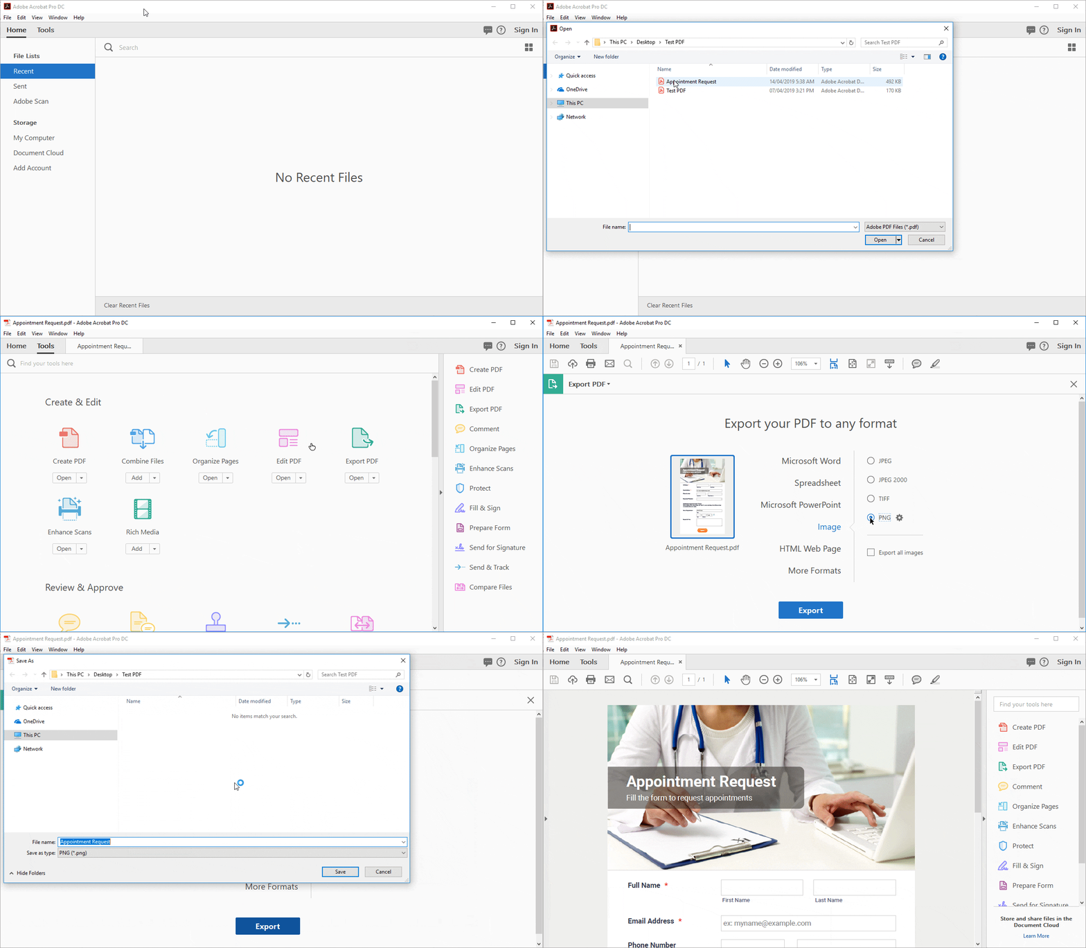
  1. Open the PDF file in Adobe Acrobat, and then click the Tools tab.
  2. In the Tools tab, select Export PDF > Image and then PNG file format.

You can further configure the conversion settings by clicking the gear icon beside the file format you choose.

Click the Export PDF button. This will open a new dialog box where you can select the folder destination. After selecting the folder, the Save As window will open. Enter the file name, and then click the Save button to save the file.
How to Convert PNG to PDF

There are several different applications you can use to create a PDF, but it’s best to use Adobe Acrobat. This app will allow you to create a PDF from images, text, or spreadsheets.

There are several advantages of using Adobe Acrobat; the most common are conformity and reliability. When you create a PDF, Acrobat saves every bit of detail and formatting, including spacing, fonts, pictures, and forms.

Follow these steps to create a PDF using Adobe Acrobat:

  1. In the app menu, click File > Create > PDF, or go to the Tools tab, and then click Create PDF.
  2. In the Create PDF menu, select Single File, and then click the Create button to launch the Open dialog box. Select the file you want to convert.
  3. After you select the file, the PDF will be created.

How to Convert PDF to TIFF

Tagged Image File Format (TIFF) is a format that is used largely in the publishing and printing industry. It’s best for any bitmap images that you intend to edit, and it preserves the image quality.

To convert PDF to TIFF, use Adobe Acrobat for the best results:

  1. Open Adobe Acrobat, and then click Tools > Export PDF.
  2. Select Image, then TIFF to launch the Open box dialog.
  3. Browse the PDF file that you want to convert to TIFF, and then choose the folder where you want to save the TIFF file.
  4. That’s it! Now you can preview the converted TIFF file.

How to Convert TIFF to PDF

Converting TIFF to PDF is pretty easy using Adobe Acrobat. You can do the conversion directly from the TIFF, or you can embed a TIFF image into a Word document and then convert the document. In this tutorial, we’ll be converting a TIFF to PDF directly.

Follow these steps:

  1. Open Adobe Acrobat, and go to the Tools tab > Create PDF.
  2. Select Single File, and then click the Create button to find the TIFF file.
  3. After you select the TIFF file, it will be converted into a PDF.

How to Convert PDF to DWG

PDF to DWG

If you’re not already familiar with DWG file format, here’s a short description from Wikipedia: “DWG is a proprietary binary file format used for storing two- and three-dimensional design data and metadata. It is the native format for several CAD packages including DraftSight, AutoCAD, BricsCAD, IntelliCAD (and its variants), Caddie and Open Design Alliance compliant applications.”

Converting PDF to DWG is beyond Adobe Acrobat’s functionality. But there are several ways to convert PDF to DWG using online apps like the following:

If you want to convert a PDF into a DWG file while retaining the formatting so that it can be used in AutoCAD, this is the best method.

Note: You must have AutoCAD 2017 or newer.

If you have AutoCAD 2017 or a newer version installed on your computer, you can easily convert PDF to DWG using the PDF Import command. Here’s how:

  1. Open AutoCAD. Click on the Insert tab and then on PDF Import.
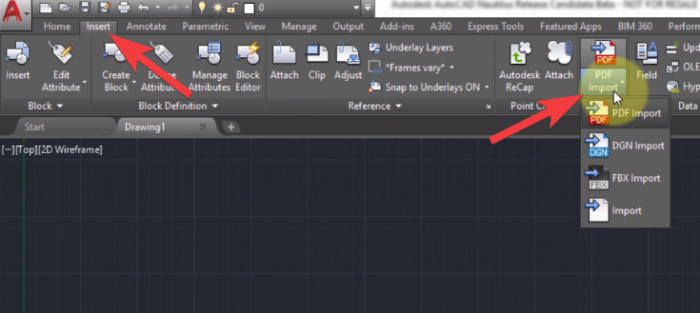
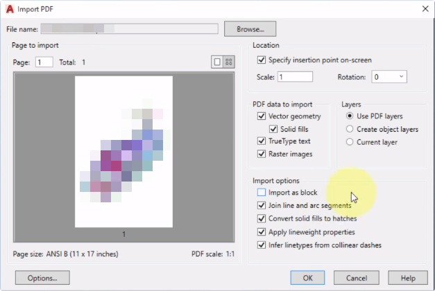
2. In the Open dialog box, select the PDF file you want to import into AutoCAD, and then choose any of the import options. Click OK to import the PDF.
3. After importing the PDF, you can continue to edit it in AutoCAD and then save it as a drawing file (DWG) whenever you want. To do that, click the AutoCAD application button (in the upper left corner) > Save As > Drawing.
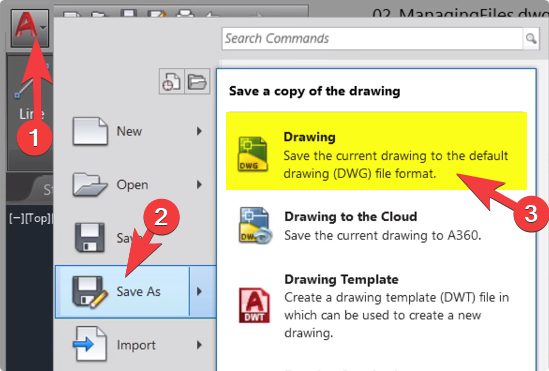
That’s all you need to do to convert PDF to DWG.

How to Convert DWG to PDF

Converting DWG to PDF is a great way to share your drawings in a format that’s easily accessible for people who don’t have AutoCAD software.

To convert a DWG file to PDF without altering the format, you need AutoCAD 2017 or a newer version.

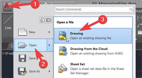
  1. Open AutoCAD and click the AutoCAD application button (in the upper left corner), then click Open, browse for the Drawing (DWG) file you want to convert to PDF, and click Open.
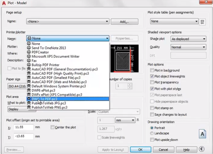
  1. Print the PDF by clicking on the AutoCAD application button, and then Print (or press Ctrl+P), and configure your printing options:

A. First, select DWG to PDF under Printer/plotter > Name.
B. Change the Paper size to ISO A4.
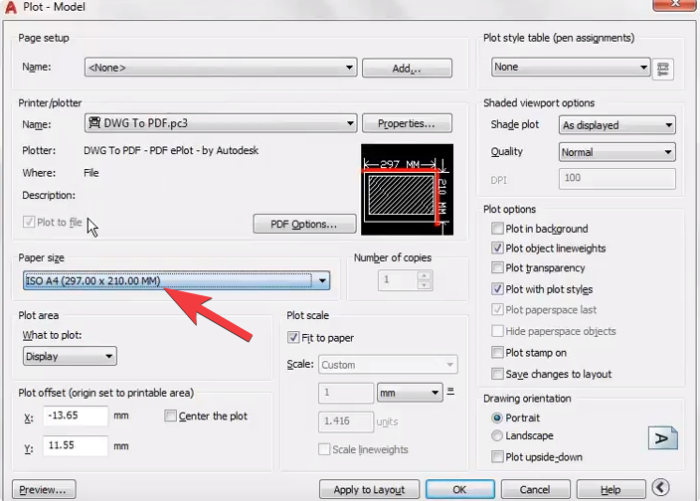
C. In the Plot Area, select what you want to convert: Display, Window, Layout, or Extents.

3. Click on OK, and choose the location where you want to save the PDF file.

That’s it! You can now share the PDF with your clients or customers.

How to Convert PDF to Ebook

How to Convert PDF to Kindle

Kindle File Format is a proprietary e-book file format with the file extension .azw or .azw3. Created by Amazon, this file format is built to be readable on Kindle devices or devices like smartphones, tablets, or e-readers that have Amazon’s Kindle app.

Kindle devices can read PDF documents without any conversion, but PDF documents are handled differently than text in the usual Kindle format. This is inconvenient when reading. For example, some PDF documents don’t look good on Kindle devices; the fonts are too small and don’t automatically resize, so you have to unpinch to zoom in.

Don’t worry; this guide will show you how to convert PDF to Kindle format so you can read a file on your Kindle device without any issues.

A. Convert PDF to Kindle Online

If you don’t like downloading and installing software on your PC, converting PDF to Kindle online is the best choice for you. It’s quick and easy. You just have to upload your PDF, and you can download the converted file right away.

To do that, visit https://www.epubor.com/convert-pdf-to-kindle.html to convert your PDFs to Kindle (.azw3).

B. Convert by sending an email to your Kindle email address

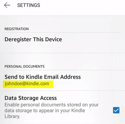
Every Kindle device comes with its own email address, so you can send PDFs to your Kindle. You can find the Email Address under Settings > My Account > Send to Kindle Email Address.
How to convert and send a document to your Kindle

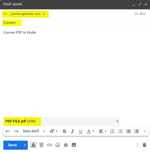
Simply send the PDF documents as file attachments to your registered Kindle email address (e.g., johndoe@kindle.com) with the subject line “Convert.” Amazon will automatically convert the attached PDF files to Kindle format and send them to your Kindle using Amazon’s Whispersync technology.

Here’s an example:
C. Convert PDF to Kindle using Calibre

If you want to convert multiple PDF documents for reading on your Kindle, download Calibre. Calibre is open source and can convert multiple PDFs quickly and easily.

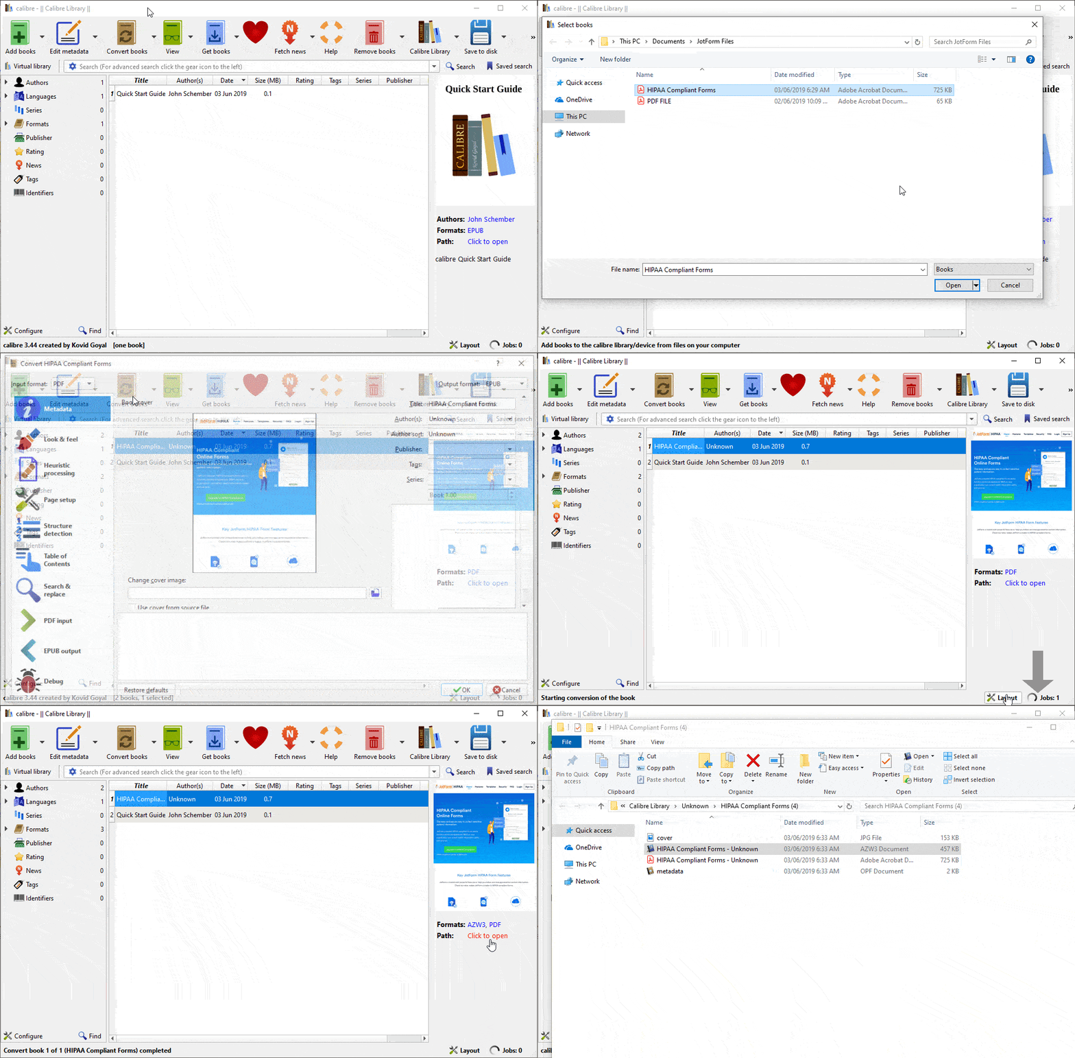
  1. Download and install Calibre at https://calibre-ebook.com/download.
  2. After installation, open Calibre, and then click Add Books and browse to your PDF files.
  3. Click Convert Books (Individual or Bulk). This will open a new window.
  4. Change the output format to AZW3, and then click OK at the bottom right corner to start the conversion.
  5. After conversion (when Jobs at the bottom right corner of the app becomes 0), you will see the Click to open link in the right pane. Click on it to open the output destination folder to view the converted files.
How to Convert PDF to EPUB

EPUB (Electronic Publication) is an e-book file format that uses the .epub file extension. EPUB is supported by many e-readers like Kindle devices, smartphones, and tablets with compatible software installed.

If you want to convert PDF to EPUB format for your Kindle device or for other e-reader software, follow these steps.

A. Convert PDF to EPUB Online

If you’re in a hurry and want to save time with conversion, you can convert your PDF files to EPUB online.

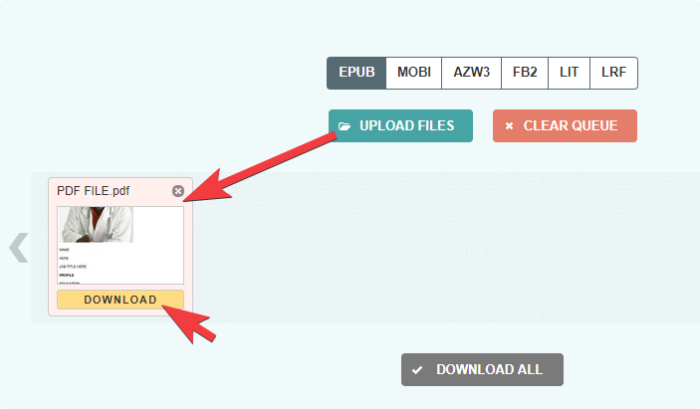
The steps are pretty straightforward. Just go to https://toepub.com/, upload your PDF files, and the conversion will start right away. Click the Download button to download the EPUB file.
B. Convert PDF to EPUB using Calibre

  1. Download and install Calibre.
  2. After installation, open Calibre, and then click Add Books and browse to your PDF files.
  3. Click Convert Books (Individual or Bulk). This will open a new window.
  4. Change the output format to EPUB, and then click OK at the bottom right corner to start the conversion.
  5. After conversion (when Jobs at the bottom right corner of the app becomes 0), you will see the Click to open link in the right pane. Click on it to open the output destination folder to view the converted files.

How to Convert PDF to Text Formats

How to Convert PDF to TXT

PDF to Text (TXT) conversion is easy. There’s absolutely no need to type text manually. Adobe Acrobat can convert PDF into plain text instantly and take care of the optical character recognition for you. You can edit the text, make further changes, or copy and paste text to any external apps.

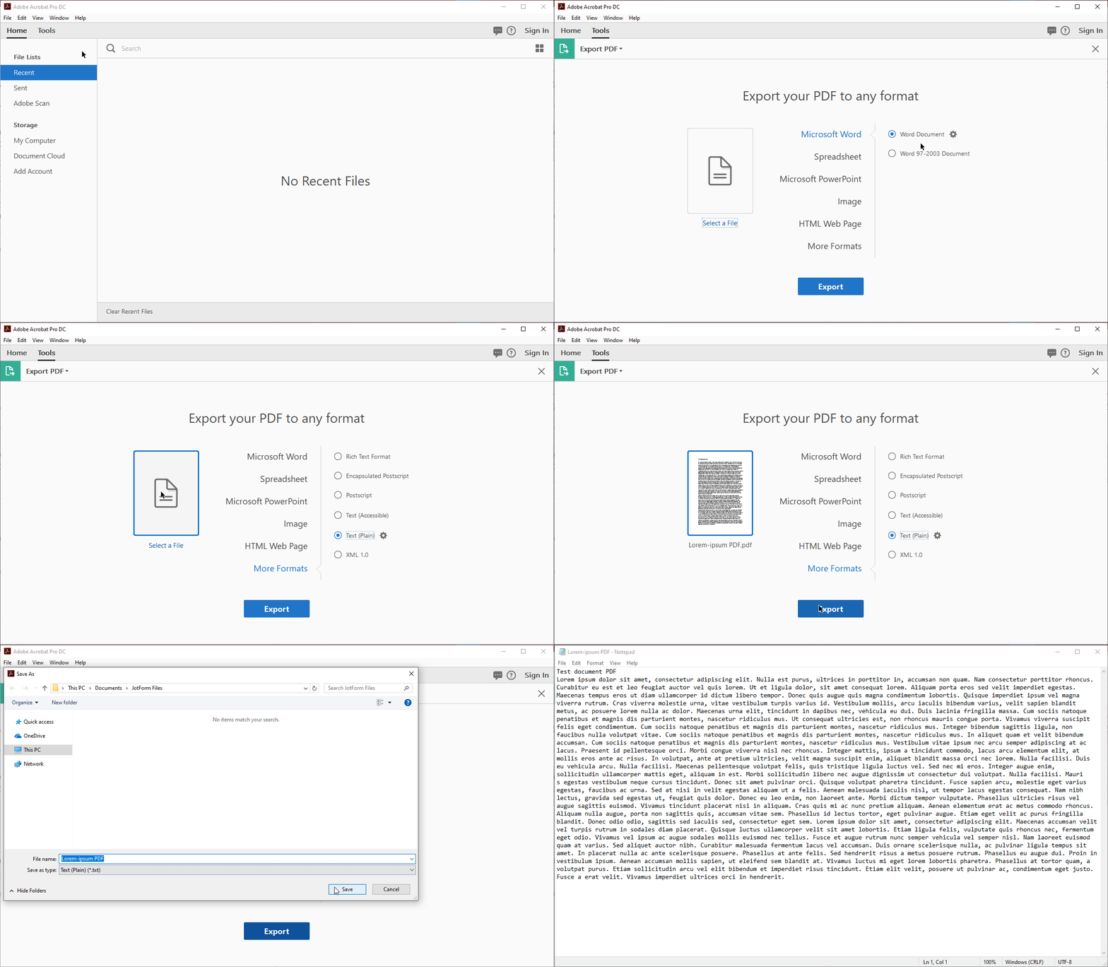
Follow these steps:

1. Open Adobe Acrobat, go to Tools, and then Export PDF.

2. Select More Formats and then Text (Plain).

3. Select the PDF file that you want to convert, and then click the Export button.

4. Select the folder where you want to save the file.

5. After conversion, the text should open in Notepad or your default text viewing application.
How to Convert TXT to PDF

A text document has no formatting, such as italics, links, and bullets. If you need the text for complex purposes, you may want to convert it to a standard format like PDF.

The easiest way to convert a text file to PDF is to create a PDF file using Adobe Acrobat.

Follow these steps:

  1. Open Adobe Acrobat.
  2. Click File > Create > PDF From File.
  3. Select the Text (TXT) file that you want to convert to a PDF.
  4. Save the PDF, and that’s it!

How to Convert RTF to PDF

  1. Open your word processor software
  2. Open the file
  3. Click “Choose File” and “Print”
  4. Choose Adobe PDF as the printer in the Print dialog box
  5. Click Print

Rich Text Format (RTF) is a proprietary document file format that was created in the late 1980s by Microsoft. The purpose was to create a file standard so users could exchange Microsoft documents between Mac and Windows. Most word processing software can read and write some versions of RTF, however it’s not a perfect process.

Instead of wrestling with RTF documents, it may be easier to send it as a PDF.

How to convert PDF to ODT

OpenDocument Text Document (.odt) are the files created by the free OpenOffice Writer word processor program. ODT files are very similar to the popular DOCX file format used with Microsoft Word.

If you want the PDF to be opened on OpenOffice Writer, you need to convert the PDF to ODT or to any document format that’s supported by OpenOffice Writer. In this guide, we will tackle PDF to ODT conversion.

There’s no direct conversion of PDF to ODT using Adobe Acrobat. The best method is to convert a PDF to a Word document, and then save the Word document to OpenDocument format.

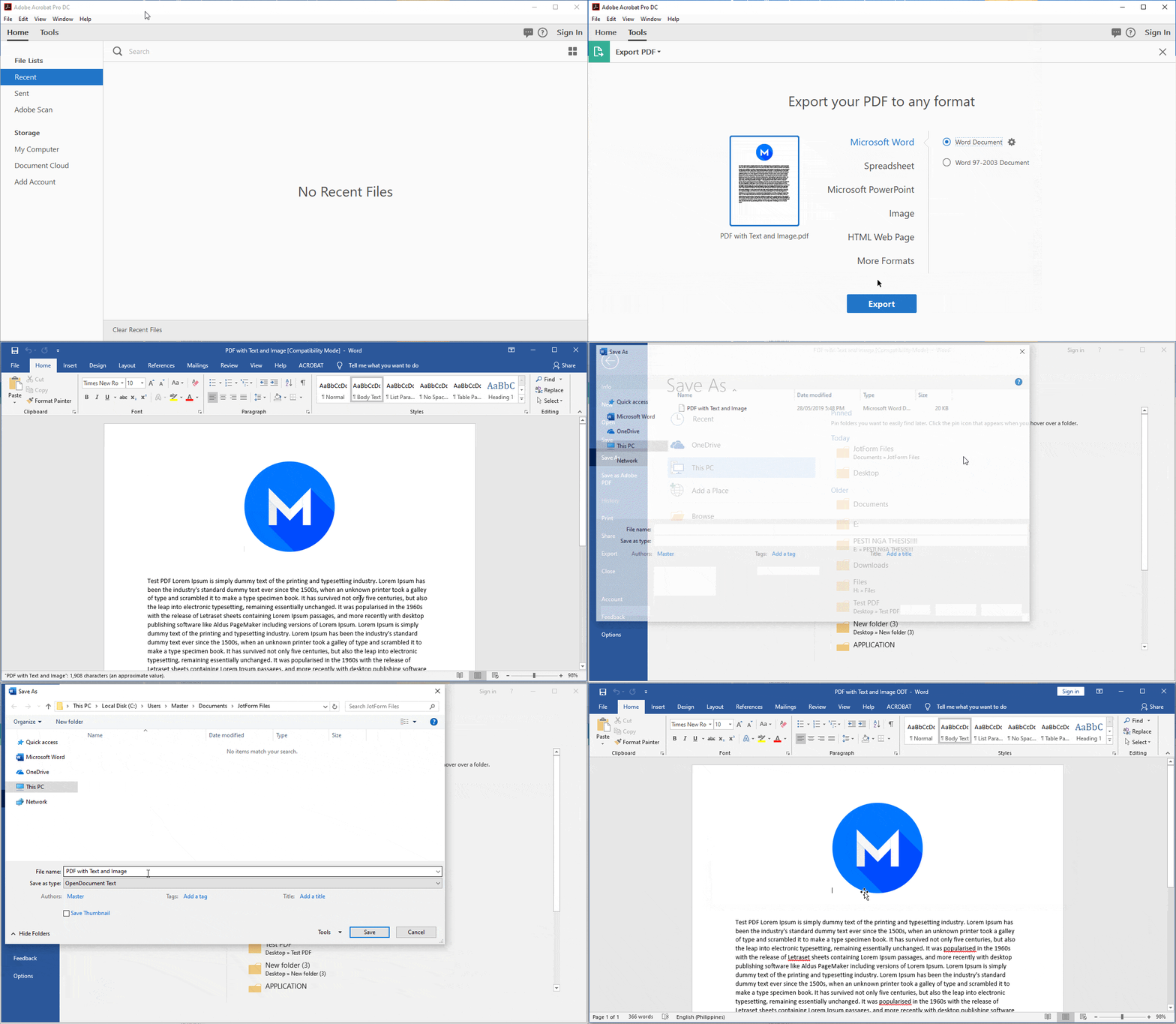
Follow these steps:

  1. Open Adobe Acrobat, and then go to Tools > Export PDF.
  2. Select Microsoft Word format, and then select the PDF file.
  3. Click the Export button, and then select the destination folder.
  4. After conversion, the file should automatically open in Microsoft Word. If not, open the converted file in Microsoft Word, and save it as OpenDocument (ODT).
How to convert ODT to PDF

OpenDocument Text (ODT) is the default format for OpenOffice.org and LibreOffice. If you want to share your file, ensure that it’s easily accessible on any device, and ensure the security of the content, consider converting it to PDF.

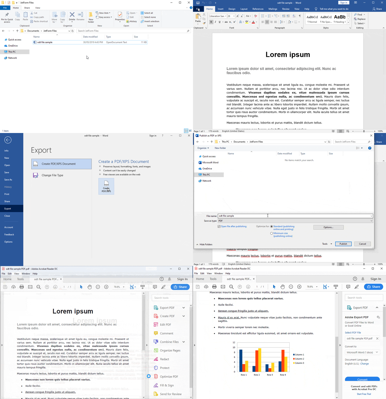
You can convert ODT to PDF in seconds using Microsoft Word. Follow these three simple steps:

  1. Open the OpenDocument Text (.odt) file in Microsoft Word.
  2. Go to File > Export > Create PDF/XPS Document > Create PDF/XPS.
  3. Select the destination folder, and then click the Publish button.

The file will automatically open in your default PDF viewer. Here’s a visual guide:
How to convert PDF to HTML

How do you display the content of a PDF in all browsers without running into any compatibility issues? You can simply embed the PDF on your website, or you can convert the PDF to HTML. While the latter may not produce the cleanest result, you can customize the HTML.

For instance, if you want to convert a brochure that’s in PDF format into a website, but you don’t have strong design or development skills, converting your PDF to HTML might be the quickest solution.

We recommend using the Adobe Acrobat application for PDF to HTML conversion. In addition to flexibility and functionality, you will get the best results when you work with the app that created the PDF.

Follow these steps to convert a PDF to HTML using Adobe Acrobat:

  1. Load your PDF into Adobe Acrobat, and then go to Tools.
  2. Select Export PDF, then HTML Web Page.
  3. Click the Export button, and then choose your file destination.
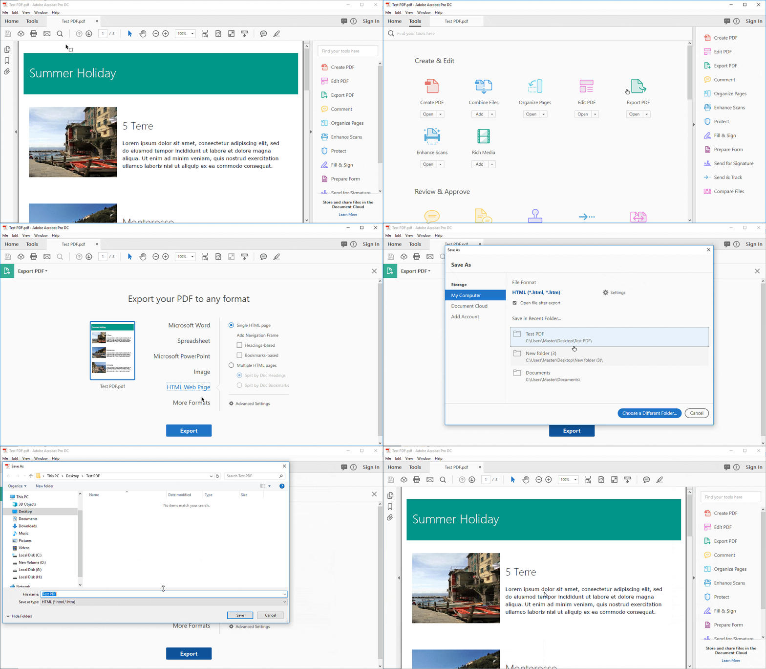
4. Preview the converted HTML.
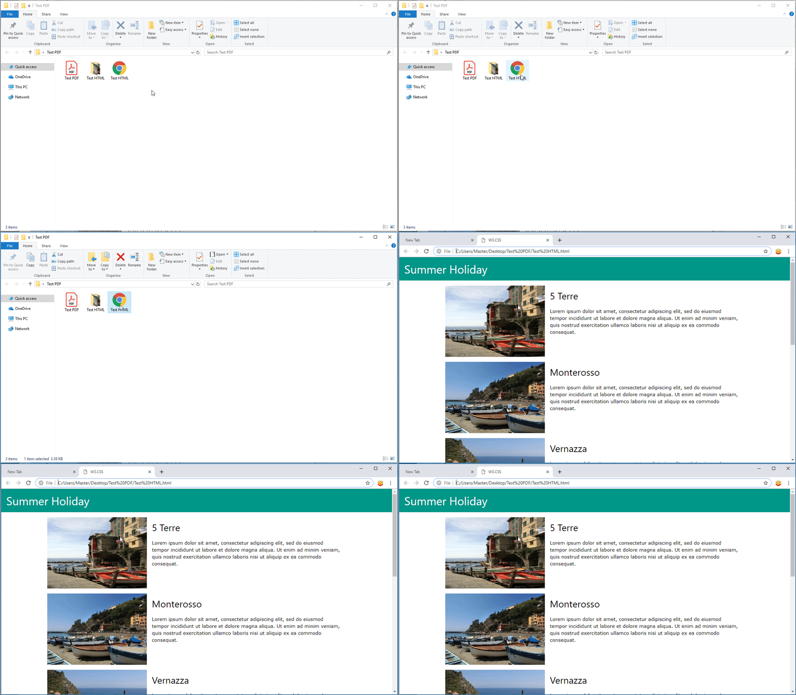
How to Convert HTML To PDF

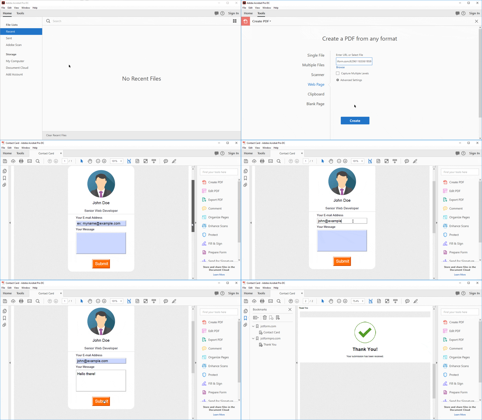
Converting the HTML from a web page into a PDF file is easy with Adobe Acrobat. The result behaves much like the original web page. The layout, formatting, images, and links — including CSS styles, HTML5 tags, and even JavaScript forms — are preserved. If the HTML contains a form, the form in the converted PDF will be submittable and will work the same way it does on the web page.

Follow these steps:

  1. Open Adobe Acrobat, and then go to the Tools tab.
  2. Select Create PDF, Web Page, and then enter the website URL that you want to convert to PDF.
  3. Click the Create button.

How to Convert PDF to XPS

XPS (XML Paper Specification) is an alternative file format for PDF (Portable Document Format) that was developed by Microsoft. Like PDF, the XPS file format is also frequently used for final documents that need to be shared. Examples are contracts, financial reports, tax returns, resumes, flyers, and other legal documents.

If you want a less expensive file format that’s compatible with Microsoft Office, consider using XPS instead of PDF. If you have Microsoft Office 2010 or newer, you can already open a PDF file directly in Microsoft Word and export it to XPS format. Follow these steps:

  1. Open Microsoft Word, and then go to File > Open. Browse to the PDF file that you want to convert to XPS.
  2. After the PDF loads in Microsoft Word, go to File > Export > Create PDF/XPS Document > Create PDF/XPS.
  3. Select the folder where you want to save the file, and then change the format to XPS Document. You can rename the file if you want. Click the Publish button to save the XPS file.
How to Convert XPS to PDF

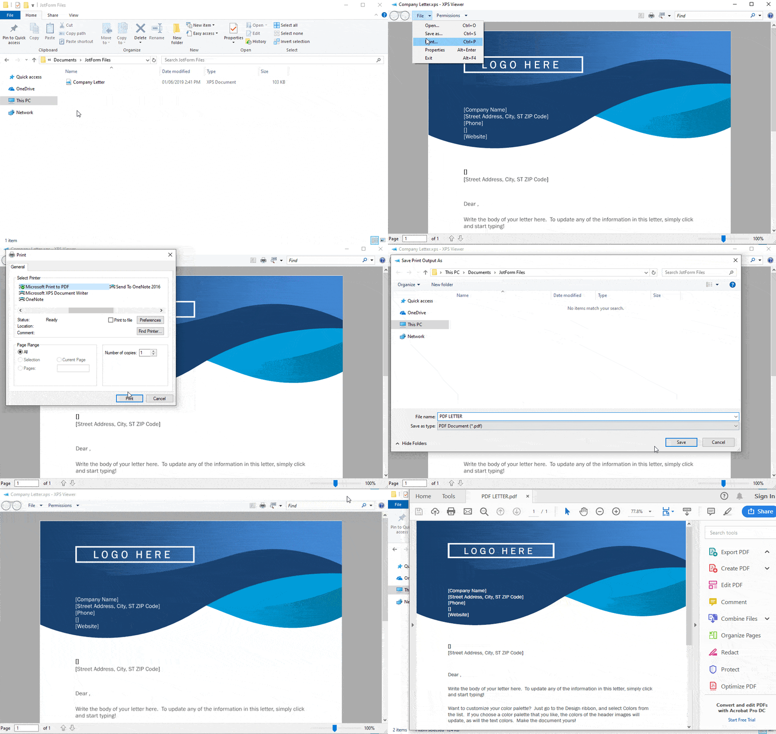
If you prefer PDF over XPS, follow the steps below to convert XPS to PDF:

  1. Open Microsoft Word, and then go to File > Open. Browse to the XPS file that you want to convert to PDF.
  2. After that, go to File > Print > Microsoft Print to PDF.
  3. Enter a name for your PDF, and then click the Print button to save the PDF file.

How to Convert PDF to DjVu

DjVu file format has advanced compression technology intended for scanned images, similar to a PDF. A DjVu file can contain compressed yet very high-resolution images of scanned documents, digital documents, and photographs.

Unfortunately, DjVu format is not as widely supported as PDF. Adobe Acrobat does not export directly to this file format. The easiest and most convenient way to convert PDF to DjVu is through an online converter that’s designed to convert PDF to DjVu and vice versa.

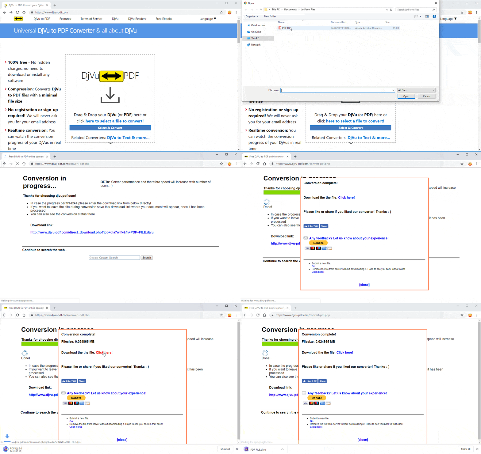
The guide is pretty straightforward. Here are the steps:

  1. Go to https://www.djvu-pdf.com/.
  2. Select the PDF to convert to DjVu. The conversion will automatically start and will redirect you to a download page afterward.
  3. Click the download link to download the DjVu file.
How to Convert DjVu to PDF

If you come across DjVu files and want to make them more useful, you can convert them to PDF. PDF is more widely known and supported than DjVu, and it’s easier to create and edit PDFs.

To convert PDF to Djvu quickly, you can try one of the same online converter tools listed in the PDF to DjVu guide. However, the following process works better and retains the file’s formatting and quality.

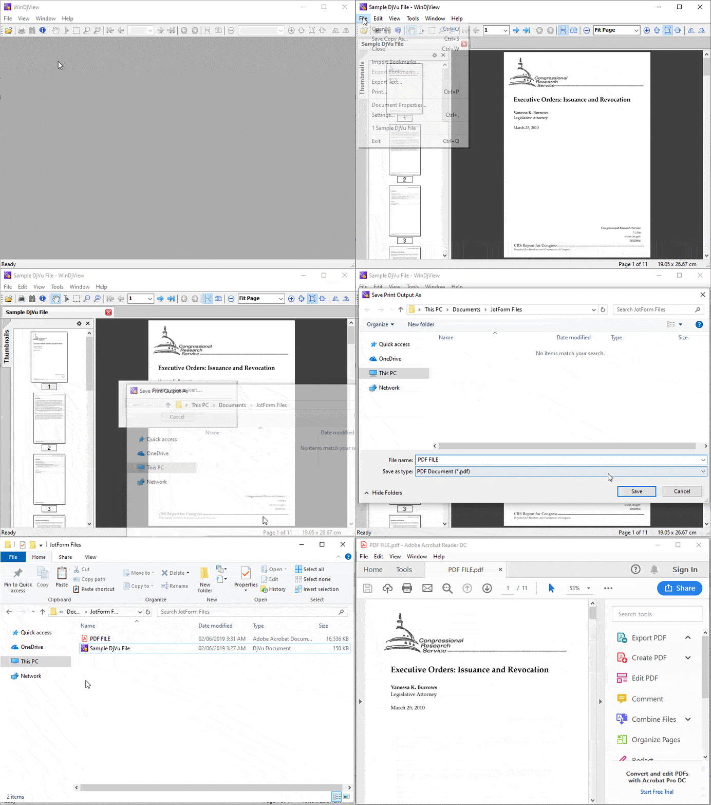
  1. Download and install the light and open-source Djvu Viewer app, WinDjView.
  2. After installation, open WinDjView, and then go to File > Open. Browse to the DjVu file that you want to convert to PDF.
  3. Next, go to File > Print, and then select any PDF printer in the Printer list, e.g., Microsoft Print to PDF. (If you don’t have a printer installed, you can install this free Foxit PDF Reader, which adds a printer to the list.) Click the Print button to save the DjVu file as a PDF.
Categories: Others Tags:

The New CSS-Tricks Video Intro by dina Amin

August 17th, 2020 No comments

You know we do video screencasts, right? It’s not, like, super regular, but I have done them for a long time, still like doing them, and plan to keep doing them. I publish them here, but you can subscribe over on YouTube as well.
I’ve had a couple of different custom video intro animations over the years, always done by someone far more handy with that kind of thing than I am. When I asked around in May this year, I got some good leads, but none better than Matthias paging Marc, and then Marc helping me out with an introduction to dina Amin.

One look at dina’s work and it’s an obvious: yes! She does stop-motion and a lot of breakin’ stuff:

Just one small example, check out the show reel too!

We chatted back and forth, scoping out the project. She says:

I worked together with Assem Kamal on a new intro for CSS-Tricks YouTube channel. We wanted to make something very short yet interesting so that audiences on YouTube don’t skip the intro or get bored if they watch a couple of CSS-Tricks videos back to back.

She researched and asked a bunch of questions. I like how she was very aware of the role an intro like this plays in a video, especially tutorials. Can’t be too long. Can’t be annoying in any way. It has to have enough detail that it’s almost fun to see multiple times.

The old video started with a keyboard:

This is the old one. Love it the spirit but could use a freshening up. pic.twitter.com/ZfkDHaFZYI

— Chris Coyier (@chriscoyier) May 26, 2020

We started with an Apple keyboard, because we wanted to keep something from the original intro that Chris’ audience would relate to, and most importantly because I wanted to take the keyboard apart!

“Did we cut up that keyboard?!” Yes, we did. It was too easy to find multiple broken Apple keyboards, it’s a very well-engineered product and it all comes together beautifully with minimum parts, but only Apple can fix this product. You can’t just get your screw kit out and open this up and fix one flawed button connection. So a lot of these keyboards are thrown away because it’s too expensive to fix in countries like Egypt. We got our hands on three keyboards and we cut up one as we animated and used different keyboard buttons from the other two to make the buttons stretch.

It was fun seeing some behind-the-scenes stuff in her Instagram Stories:

And another connection from the original is the idea of websites as components and building out layouts. That was just referenced in the original with some background sketches and now comes to life with paper prototypes in this version.

We thought of showing the ‘how to make a website’ process in very abstract steps where each step quickly transitions and transforms into the other. Starting with keyboard clicks that turn into code, then design blocks that make up a website, which scrolls to reveal the CSS-Tricks logo.

It’s all done quite literally with stop motion! Hand moving bits around, taking photos, and making those into video.

Once we got the concept approved and our props ready, we spent hours and hours moving little pieces to make all this magic.

Check out a time lapse of the creation!

Ultimately, I got a number of versions in different aspect ratios and sizes, which is wonderful as I can switch it up and use different ones that might be more appropriate in different scenarios. Here’s the main one!

I’ve already been putting these on the start and end of videos like this one.

Thanks, dina and Assam!


The post The New CSS-Tricks Video Intro by dina Amin appeared first on CSS-Tricks.

You can support CSS-Tricks by being an MVP Supporter.

Categories: Designing, Others Tags:

Japanese Minimalism in UI Design for Digital Products

August 17th, 2020 No comments

In this article, I’m considering the concept of Japanese minimalism, its implications in the user interface design of digital products, and its key principles.

Are you ready to immerse in Japanese art trends leveraged in the context of the modern digital world?

“Be content with what you have; rejoice in the way things are. When you realize there is nothing lacking, the whole world belongs to you.” — Lao Tzu

Konnichiwa, and welcome to the overview of the digital product design trend emphasizing the beauty of Japanese minimalism in the modern digital world. Here old art traditions combine with digital technologies, and the ancient stays side by side with innovation. This incredible cohesion of styles and technologies has given birth to a new trend in product user interface design — Japanese neo-minimalism. Let’s dive deeper into the history of the concept and see incredible samples of this style implemented in UI design for mobile apps and websites.

Minimalism Deep-Rooted in Japanese Art

Illustration by Ani Chitishvili

When thinking of minimalism, Japanese interior and graphic design are likely the first things coming to mind. Japanese minimalism takes roots in traditional Zen Buddhism aesthetics, the minimalist movement that carries the mission of keeping life simple and uncluttered by focusing on the bare essentials.

At the heart of it is MA (lit., “gap”, “space”, “pause”), a Japanese cultural concept meaning the love to not things but space between them. It is all about the negative space, emptiness, and clearness. MA is usually considered as space where the absence of things means more than the presence of them. It is filled with nothing but energy and feeling. Ma means silence as opposed to sound and lack as opposed to excess.

This concept moves us away from modern consumerism and helps re-connect with simplicity, naturalness, and functionality. It’s relished in interior design, architecture, art, music, and other Japanese life aspects. It has also become one of the most significant sources of inspiration for digital product creators worldwide. Today, you can see many examples of digital illustrations in web design featuring Japanese minimalist aesthetics.

Principles of Japanese Minimalist Aesthetics in UI Design

Let’s think of Google. The world’s top brand has implemented all principles of Japanese minimalism in its memorable yet straightforward design. It is full of emptiness and meaning at the same time. It is clear and simple. It celebrates the beauty of contrast and bold typography. And it keeps a focus on the most important.

The Use of Negative Space

In this case, negative is positive. The negative space (or white space) is the emptiness between elements in the user interface design. Modern brands leverage the power of negative space in web design and mobile app design to emphasize the importance of existing things. Using negative spaces helps avoid cognitive user overload and keep design intuitive.

The white space is a friend of user-friendliness in UI design for digital products. It allows emphasizing the most important and focusing attention on the essential content. By removing all the necessary things, we remain the most important and help the user easily find it in an interface. The most successful products are mostly easy-to-use, minimalist, and have a lot of negative space in the UI.

UI App Animation by Movica
The concept for Sushi Delivery by Yevhenia Tsmokalenko

Simplicity & Clearness

“Simple can be harder than complex: You have to work hard to get your thinking clean to make it simple. But it’s worth it in the end because once you get there, you can move mountains.” — Steve Jobs

Simplicity is not only about how it looks but also how it functions. Let’s consider simplicity from the UX perspective. A simple user interface design empowers users to navigate between the web pages or app screens easily. It makes them enjoy interacting with the UI and gives them confidence that they can quickly accomplish tasks and goals they’re using your digital product for.

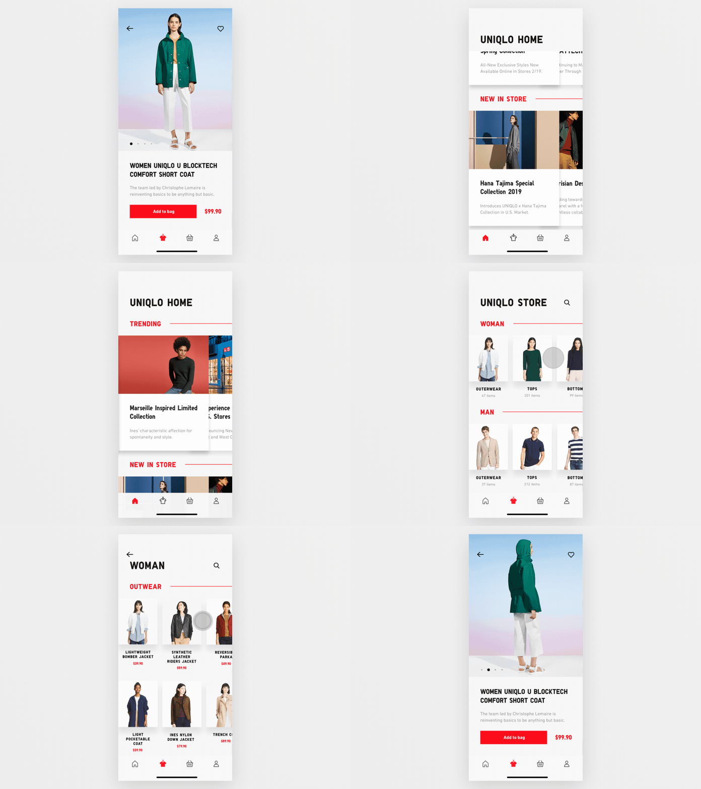
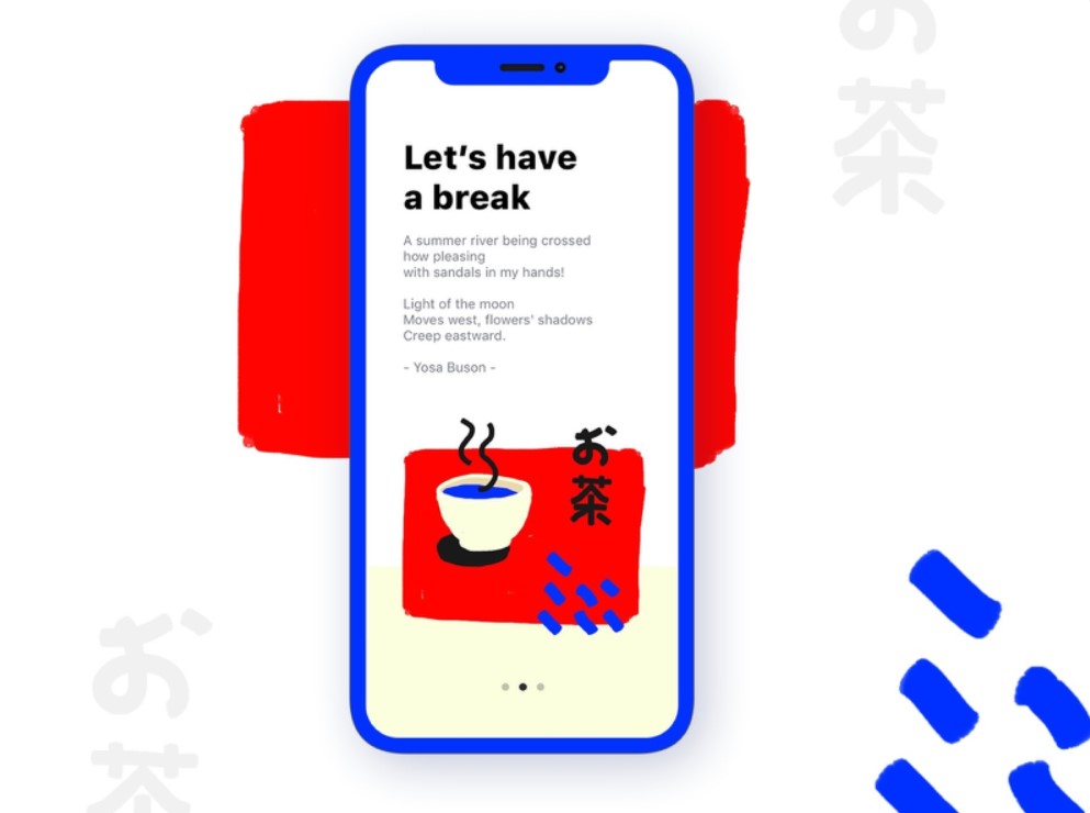
Japanese minimalism implies the absence of the cluttering details and decorations but keeping everything simple, elegant, strict, and clear. An excellent example of this is a mobile app design below.

Uniqlo E-Commerce App Animation by Michal Skvarenina

Contrast

Japanese minimalism is in love with the art of contrasts. Traditionally, it uses red & white and white & black combinations the most often. The frequent color combination is also red-blue-white. The monochromatic and high-contrast palette reveals the elegance of a digital product and gives it a fresh and modern look.

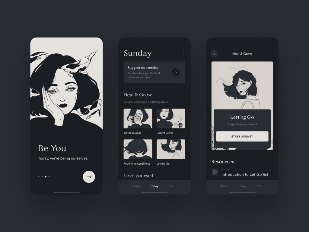
Furthermore, high-contrast design increases the content readability and enables users to consume information more easily. The UI clarity, understandability, and ease of use are key goals of intelligent UX design, and a contrast color palette may help achieve them faster. The two examples below show how you can apply it to mobile app design.

Self-Motivation App by Fireart Studio
Design by Mathilde Glib

Dramatic Typography

We often associate the Japanese culture with Kanji, the adopted logographic Chinese characters used in the Japanese writing system. Inspired by Kanji’s distinguishable beauty, digital designers often create typography of a similar mood and look.

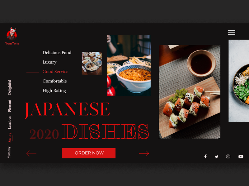
Japanese minimalism tends to use bold typography, and we can see the same tendency in the UI design of many new digital products. Large Japanese typography implemented in high-contrast palette creates a feeling of drama and intrigue. It helps shape an unforgettable online brand image and lasting impression from a website or mobile application. Are you looking to build a memorable brand for your digital product? Just try adding a bit of dramatism to its design by leveraging high-contrast color and bold typography, like Japanese art senseis have done it for their masterpieces.

Logo by Insigniada
UI Web Design by Drew Rios
Web Design for the Japanese Restaurant by Sofia Pham

The Focus on Essentials

Japanese people are thought to be masters of concentration since all the local religious and philosophical movements say about the importance of this human ability. Are they? Probably, we’ll never know until visit Japan in reality. However, local art brightly demonstrates it.

Japanese design is usually ultra-minimalist and focuses the viewer’s attention on one or several elements located in the center. There are no distracting details and unnecessary decorations in the user interface. This design is most often concentrated on the functionality first, and the visual part after. Mobile app designs presented below are great examples of this peculirity.

Signup Screen by Oleg Frolov
Sakana App by Yury Kirsanov

Less is More Today

Less is more. “More” may feel too cluttering and obtrusive for the user’s overloaded mind in the noisy modern world. Minimalism remains the optimal option for digital products. Rooting in Japanese culture and widely spread around the globe, the art of minimalism has conquered the hearts of millions of people today. It has become a continuous trend bringing a fresh look and ease of use to digital products. I hope that this article will help you reinforce your inner creative engine and inspire you to produce even more amazing minimalist designs for your next projects.

Categories: Others Tags:

What Happens When Border Radii Overlap?

August 17th, 2020 No comments

I’d wager that most times we’re rounding box corners in CSS, we’re applying a uniform border-radius value across the border. It’s a nice touch of polish in many designs. But there are times when we might want different radii for different corners. Easy, right? That way the property takes four values. Well, as it turns out, it’s actually possible to paint ourselves into a corner because rounded borders are capable of overlapping one other.

Many of us know the common “999em hack” for getting a “pill-shaped” rectangle:

CodePen Embed Fallback

We set the border-radius to an absurdly large number, like 999em or 999vmax, and instead of becoming some kind of impossible, Escher-esque möbius strip, the corners are nicely rounded off to form a semicircle. This is convenient because it means we don’t have to know the dimensions of the rectangle to achieve this effect — it “just works.”

CodePen Embed Fallback

The origins of this trick are murky to me, but I found an early example in a comment on Lea Verou’s blog by David Baron.

But, like many “hacks”, we can encounter some odd behavior in certain edge cases. For instance, why does that work when this doesn’t:

CodePen Embed Fallback

We want the right side of the rectangle to be “pill-shaped,” and the left side to have corners rounded to 40px. But our 40px corners are gone! Where did they go?

Hey, those left corners should be slightly rounded!

The answer is that they didn’t go anywhere; the browser has just reduced their values so close to zero that they merely look like they’re gone.

The browser is diverging somehow from the values we requested, but when and how does it decide to step in? Let’s check the spec:

Let f = min(Li/Si), where i ? {top, right, bottom, left}, Si is the sum of the two corresponding radii of the corners on side i, and Ltop = Lbottom = the width of the box, and Lleft = Lright = the height of the box. If f < 1, then all corner radii are reduced by multiplying them by f.

Ah, that explains it! Have a great rest of your week! :wipes hands conclusively:

…I’m joking, of course. That requires a little decoding, so let’s look at it two ways, mathematically and geometrically. Always keep in mind that the purpose of this formula is to prevent radius overlap. In fact, that’s why the “999em hack” works in the first place!

Here’s what I mean.

In plain English, the browser is essentially thinking: “Shrink all radii proportionally until there is no overlap between them.” (Note that it’s the radii that mustn’t overlap; the circles they form may indeed overlap.)

But a computer doesn’t understand English, so what the formula does is this.

First, it calculates the ratio of the length of each side of the rectangle to the sum of the radii that touch it. So, in our standard “pill hack” that works out to:

[Width of Side] / [Adjacent Border Radius 1 + Adjacent Border Radius 2]
Top: 200px / (400px + 400px) = 0.25
Right: 100px / (400px + 400px) = 0.125
Bottom: 200px / (400px + 400px) = 0.25
Left: 100px / (400px + 400px) = 0.125

Then it multiplies all of the radii by the smallest of these ratios. The smallest ratio is 0.125, so we’ll multiply that by our initial 400px radii:

400px * 0.125 = 50px

That leaves all our radii at 50px. For a rectangle whose shortest sides are 100px, this gives us a perfect pill shape. Cool! Take a look at the following animation:

CodePen Embed Fallback

(To make things easier to see, we’re using 400px here for our “absurdly large” radii rather than 999em; they’ll overlap as long as they are at least half the length of the shortest side of the rectangle.)

The circles representing the radii we specified start out at their requested size, then shrink by the ratio dictated by the formula above. What’s important to note is that they all shrink by the same ratio. It’s perhaps more intuitive here, since they all start out at the same size anyway.

Now let’s go back to our “broken” example that got everything started.

CodePen Embed Fallback

What’s going on here? Let’s try a less extreme example to show border radii that are affected by this shrinking, but not to the extent that they virtually disappear:

CodePen Embed Fallback

We can see there that we’re not getting the 40px radii we’re asking for in the top-left and bottom-left corners, but we are getting something. Let’s work through that formula again, first finding the ratios between all the sides and their adjacent radii:

Top: 200px / (40px + 400px) = 0.455
Right: 100px / (400px + 400px) = 0.125
Bottom: 200px / (40px + 400px) = 0.455
Left: 100px / (40px + 40px) = 1.25

Again, our lowest ratio there is 0.125, so we multiply all the specified radii by that amount, giving us 50px radii for the right corners and 5px radii for the left corners.

What the formula is ensuring here is that the two large radii on the right side of the rectangle don’t overlap, but in doing so, has shrunk the small radii on the left side of the rectangle more than they “need to be” shrunk to prevent radius overlap on the top, bottom, and left sides.

Here’s a richer example that shows what happens in different circumstances. Play around with some of the values to see what happens. Again, the large sizes are the radii we specified in code, and the small sizes are how the browser reconciles them to prevent overlap.

CodePen Embed Fallback

Why would the Oz-like spec makers decide on doing things this way? Why not shrink the larger border radii first, rather than shrinking all radii from the start?

I can’t read their minds, of course, but the benefit of this approach is that the radii maintain their proportions to one another. If we were to instruct the browser to decrease the largest radii until there was no overlap or until it was equal to the second largest radii (whichever came first) and repeat, then our “hybrid pill hack” would have worked; but there are cases where you could end up with four equal radii when the user had asked for very different sizes. In other words, the implementation has to be “unfaithful” to the numbers one way or the other, and this is the way they chose (wisely, I think).

Thanks to my colleague Catherine for first noticing this “disappearing radii” issue!


The post What Happens When Border Radii Overlap? appeared first on CSS-Tricks.

You can support CSS-Tricks by being an MVP Supporter.

Categories: Designing, Others Tags:

Exciting New Tools for Designers, August 2020

August 17th, 2020 No comments

The common theme in this month’s collection of new tools and resources is “things that help you show off your work.” Many of these tools are made to help you better web products or apps or showcase designs with others.

Here’s what new for designers this month.

Naturaltts

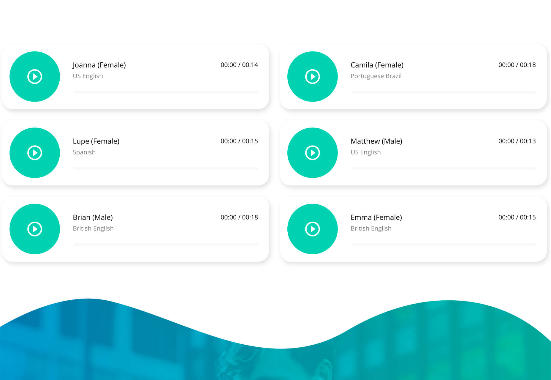
Naturaltts is an online text to speech converter, that allows you to download an mp3 recording. The tool has more than 60 voices to choose from in six languages. There’s a free plan for personal use (based on characters converted) and affordable paid plans for higher volumes and commercial users. One application of this tool is voiceover for videos or tutorials.

Handz

Handz is a library of hands with different gestures in three-dimensional shapes. The collection includes 12 gestures with nine skin colors, and three different sleeve types. Put all that together and you have 320 potential combinations that you can use for projects. The library is completely free and works in a variety of formats with different tools.

Isoflow

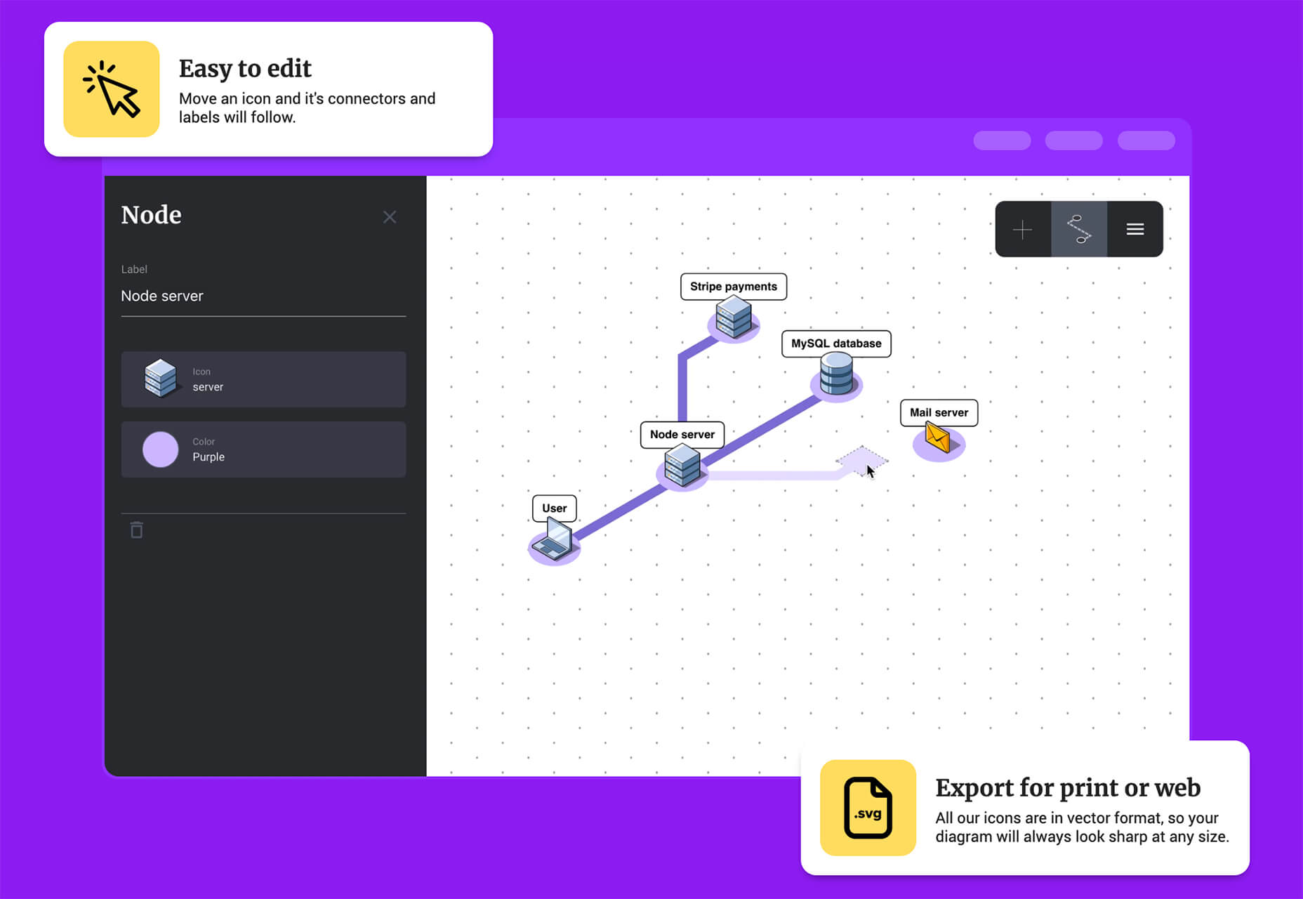
Isoflow allows you to create isometric diagrams for presentations and illustrations with ease. You can edit and then export diagrams for print or website use, thanks to vector rendering.

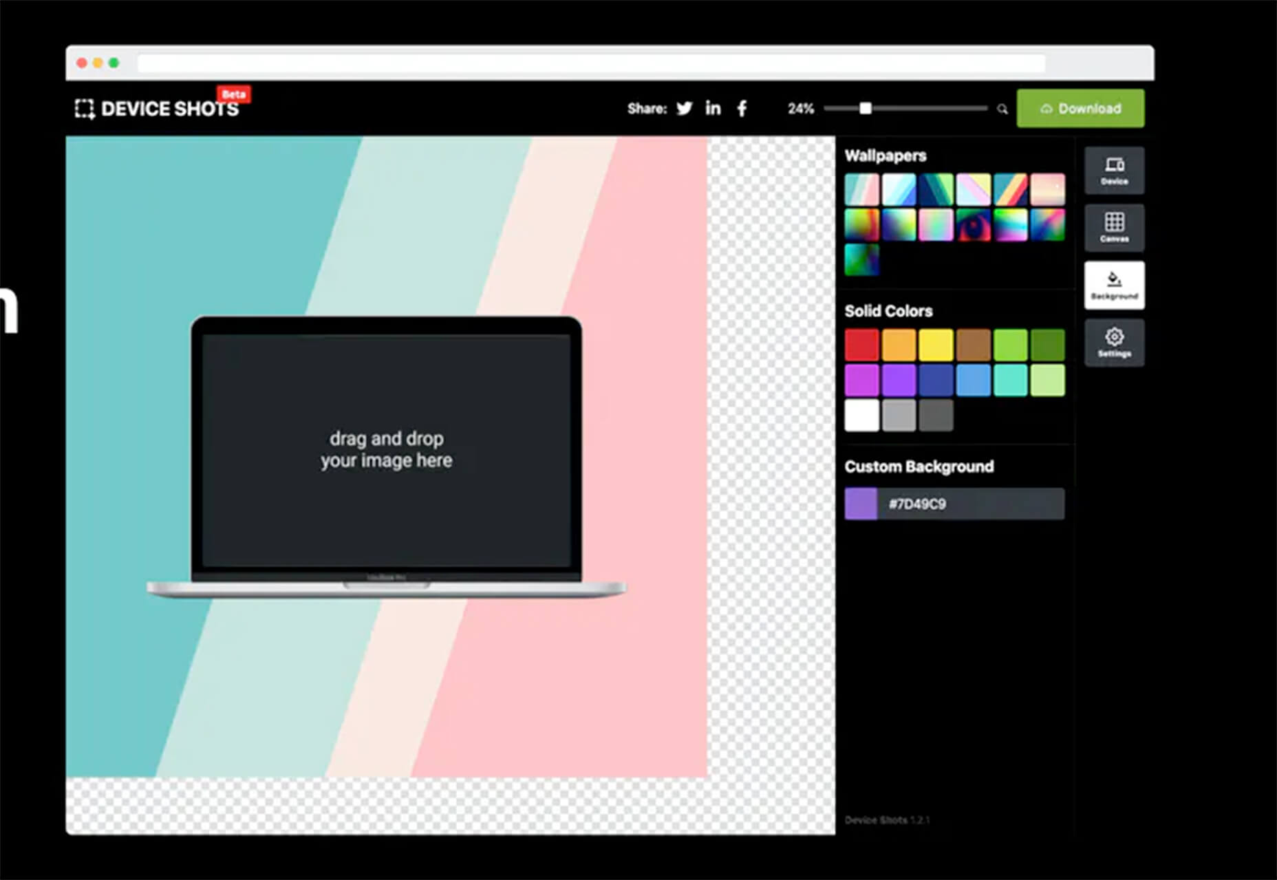
Device Shots

Device Shots is a small web app that helps you generate a high-resolution device mockup using a screenshot of your website or mobile application. It supports almost every device type you can think of and resizes for social media platforms.

Barchartrace

Barchartrace is a simple MIT open source bar chart generator. Use it to create some of the animated charts you see on social media. Just insert your information (upload via CSV file), choose animation settings, and go.

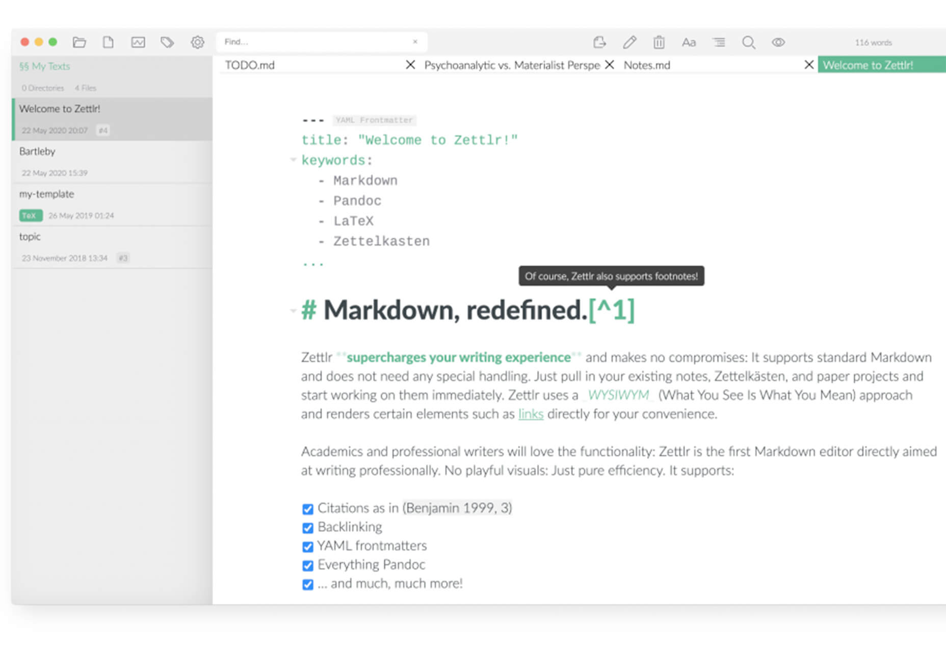
Zettlr Markdown Editor

Zettlr is a free and open source markdown editor for Mac OS. Zettlr supports simple notations, references, includes a dark mode, and tagging. It’s made for note takers who need a tool to amp up their projects, and is used primarily in higher education.

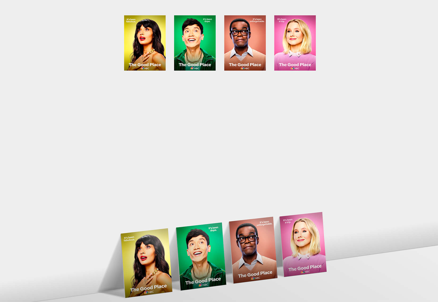
CSS Leaning Card Effect

The CSS Leaning Card Effect replicates the bookshelf feel you get when rectangles lean with a shadow against planes. Lynn Fisher does it in the pen with code that you can see and work on with your own images.

Lemon.io

Lemon.io is a tool that matches you with freelance developers to get projects moving more quickly. You are guaranteed a match in 24 hours and there is no risk if the match doesn’t work out. Just tell Lemon.io what you need and the algorithm will match you with a dev from the database. Prices for development through the platform start at $35 per hour.

Papercups

Papercups is a customer messaging tool that lets you chat in real-time. The customizable widget works with your favorite tools, such as Slack and Gmail, and is free to use. Chat apps are one of the most in-demand website features right now.

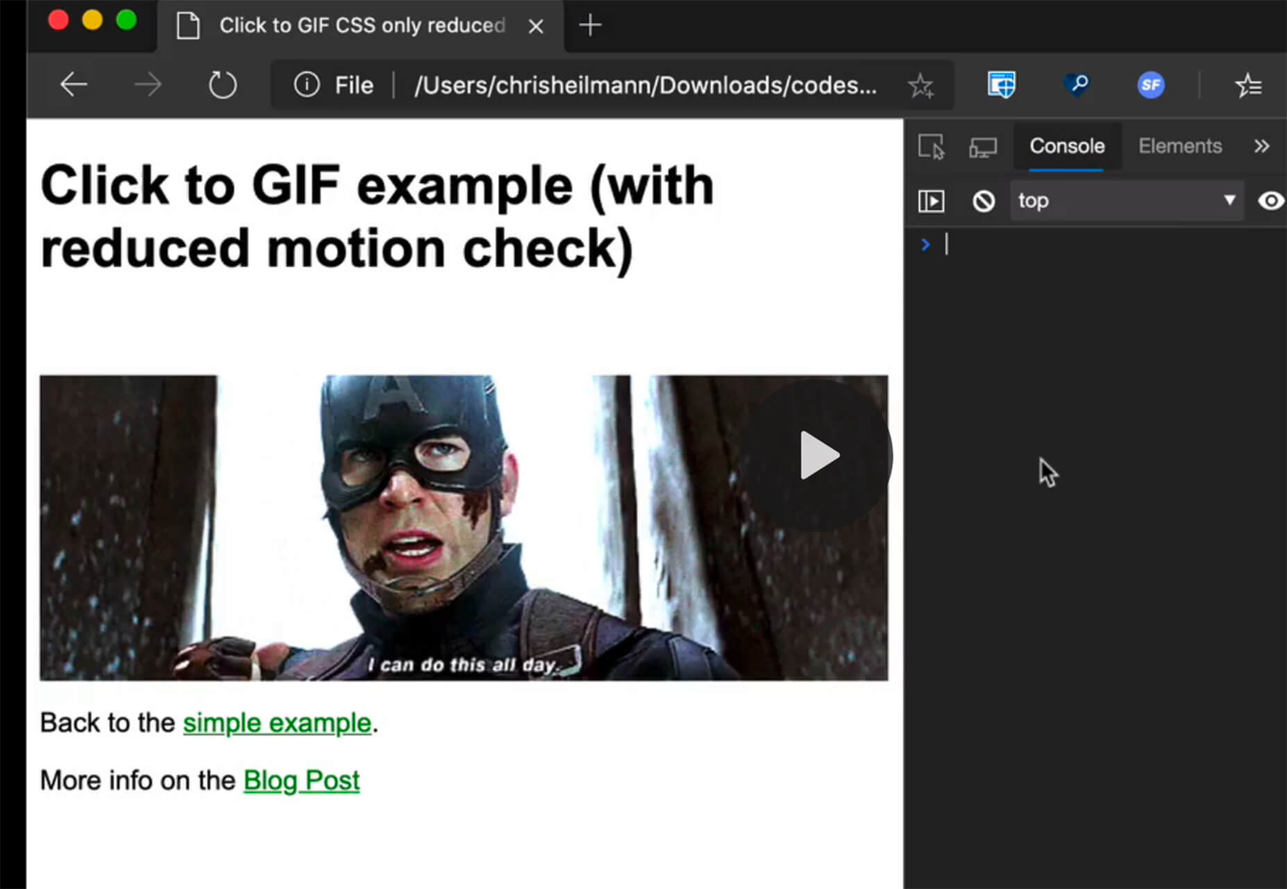
CSS Click to Animate Gif

Christian Heilmann has created a great guide/experiment in pure CSS that adds a play button on top of animated GIFs so that users can control the motion. He developed the concept because GIFs can get overwhelming and annoying. Learn how he did it and see it in action.

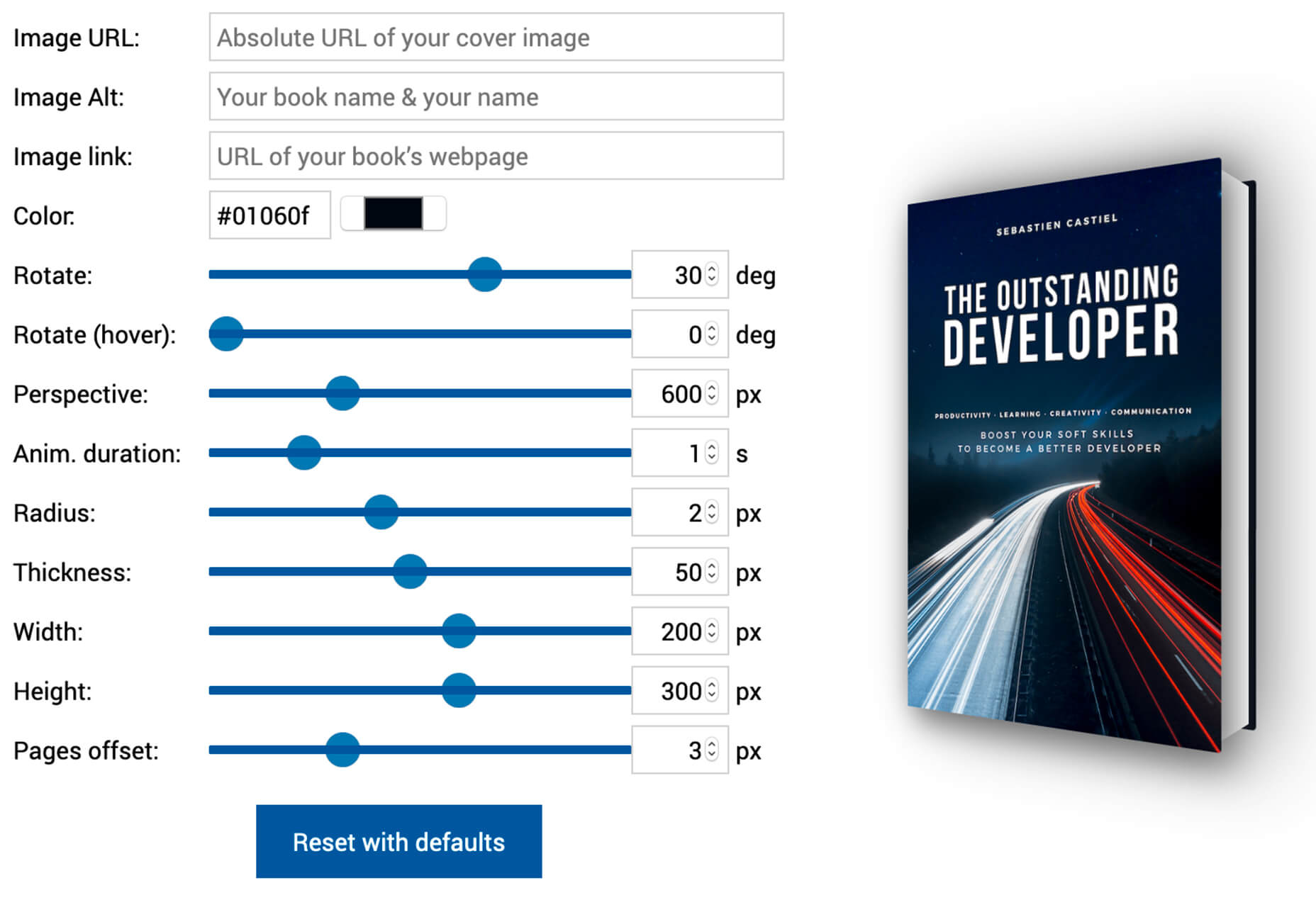
3D Book Image Generator

Here’s another little bit of CSS magic with a 3D Book Image Generator. Just input your image and set some specifications and get a 3D book cover image that you can use in projects. (There’s also an accompanying tutorial if you want to learn how to generate the CSS on your own.)

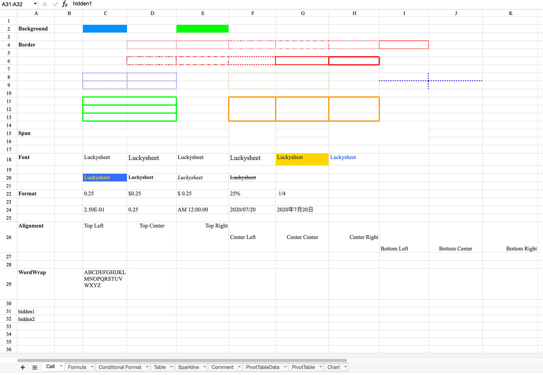
Luckysheet

Luckysheet is an online spreadsheet – it’s a lot like Microsoft Excel – with powerful data functions and tools. It’s user-friendly and open source. It even has quite a few built-in mathematical formulas and supports various table types.

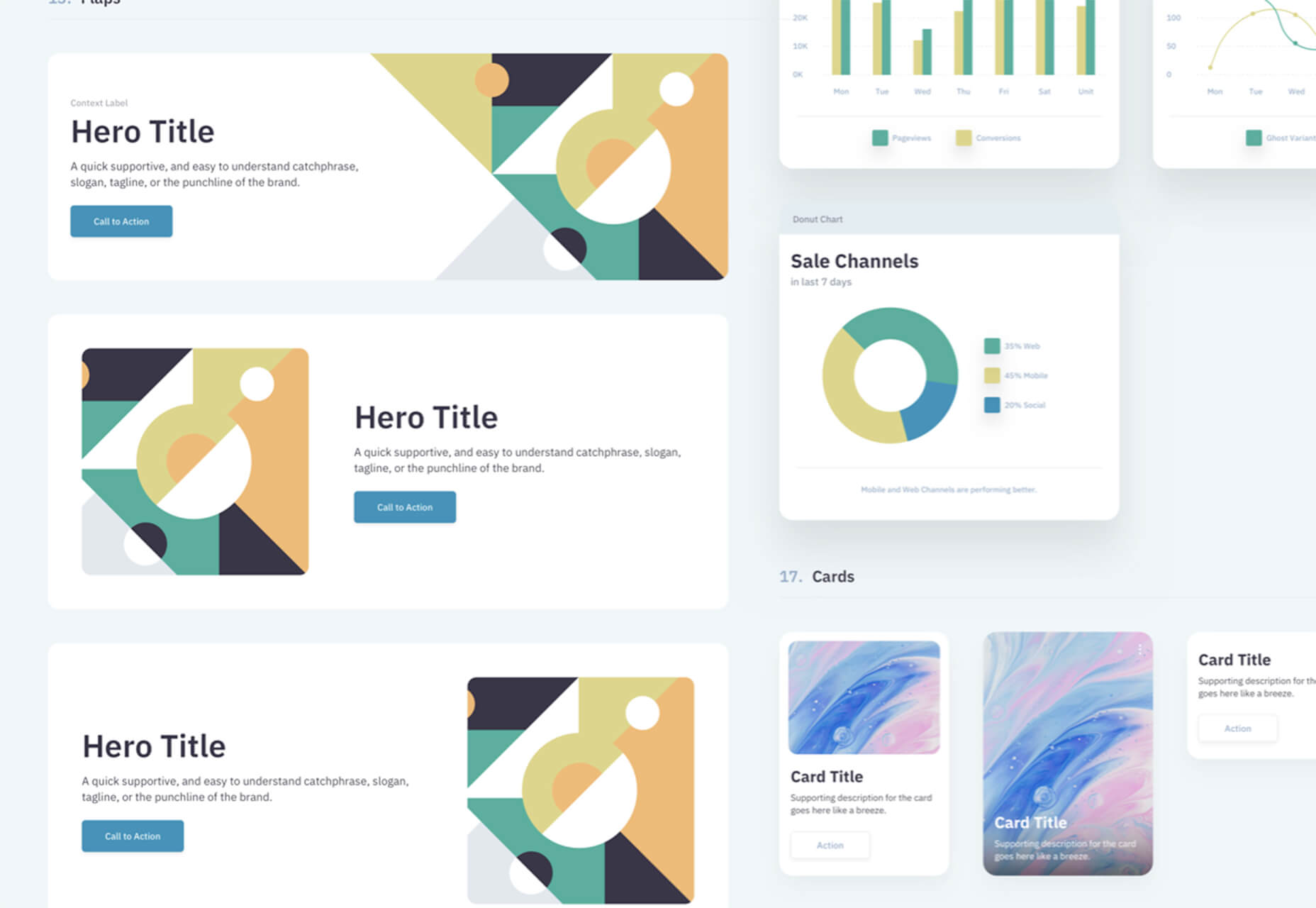
RevKit

RevKit is a design system UI kit that works with Sketch, Figma, and Adobe XD. It includes plenty of organized components that you can pop right into designs to help get them started faster. It also includes a style guide, elements, and form controls. The download is free.

Card

Card allows you to store social media profiles, websites, and files in a customized profile. Share it in one click. Replace awkward contact exchange and multiple usernames with a simple QR code or link.

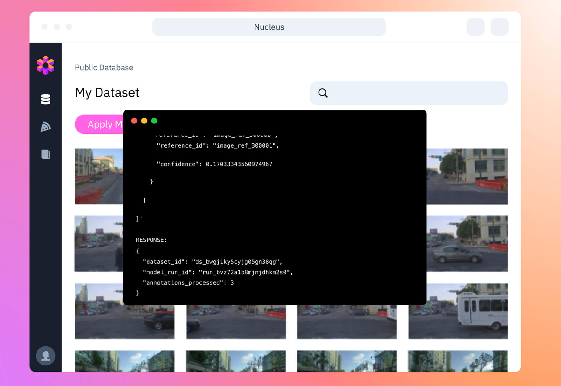
Scale Nucleus

Scale Nucleus helps visualize data, curate interesting slices within your dataset, review and manage annotations, and measure and debug model performance. This tool claims to be “the right way” to develop ML models.

Previewed

Previewed is a mockup generator to create beautiful promotional graphics for your app. Browse a variety of templates, pick one, customize, and download your design to show off.

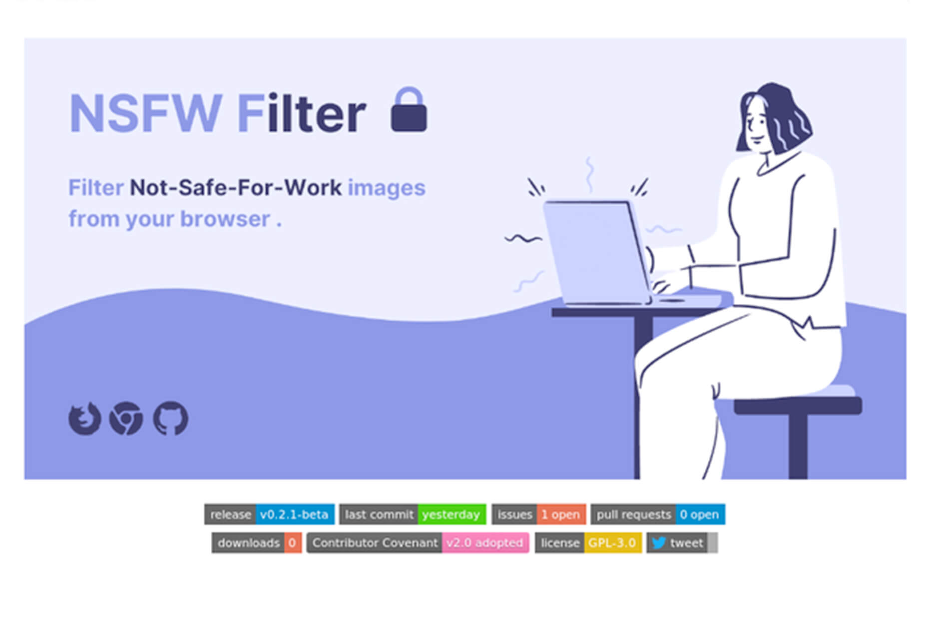
NSFW Filter

NSFW Filter is a browser extension that blocks images that aren’t safe for work. The best part is that it runs locally in-browser and doesn’t access any of your data. Plus, it saves you from on-the-job embarrassment.

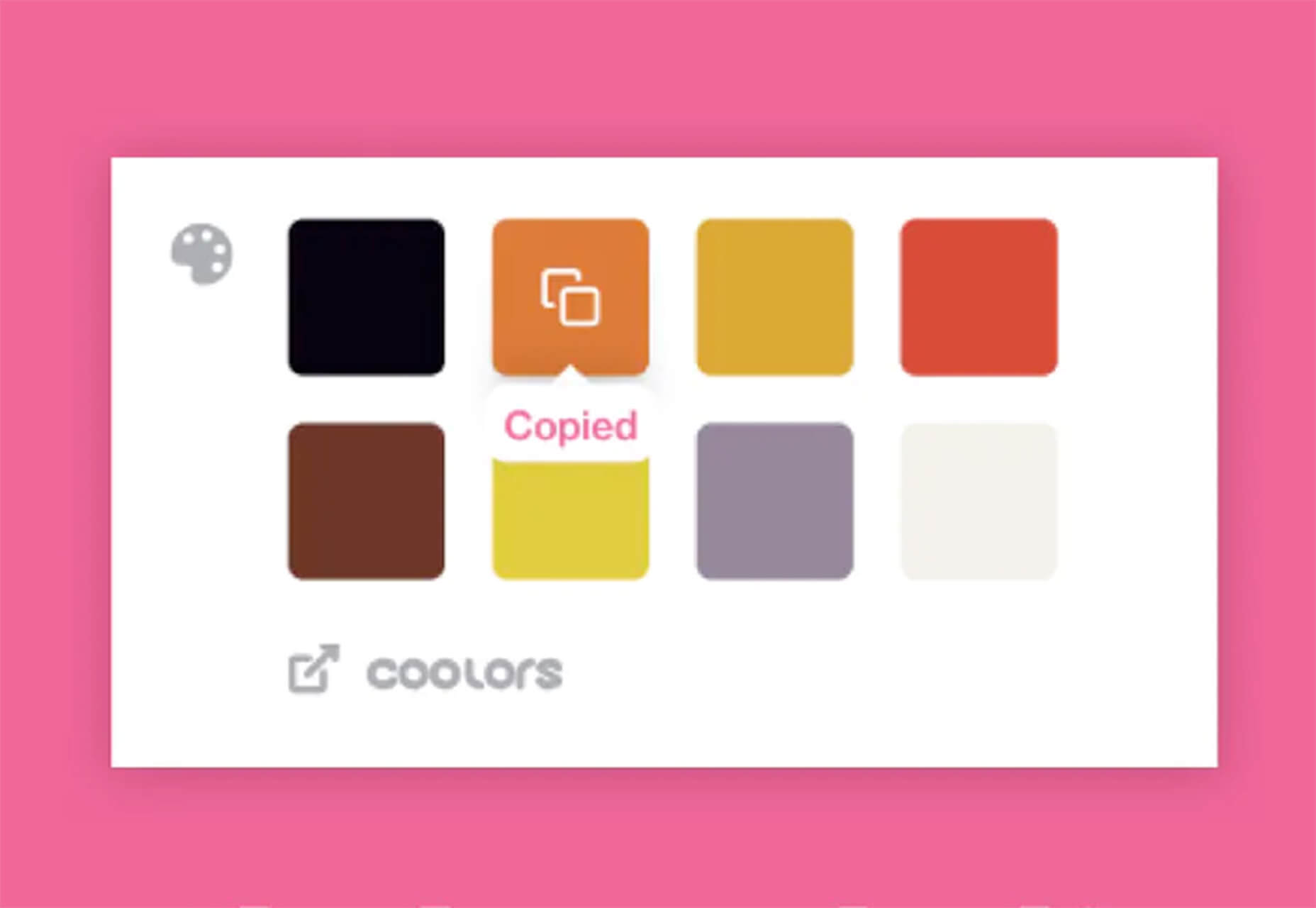
ColorFlick for Dribbble

ColorFlick for Dribbble is another browser extension that makes it easy to copy hex codes from the tool to your clipboard with ease. You can also create palettes you can share from your favorite shots using Coolors.

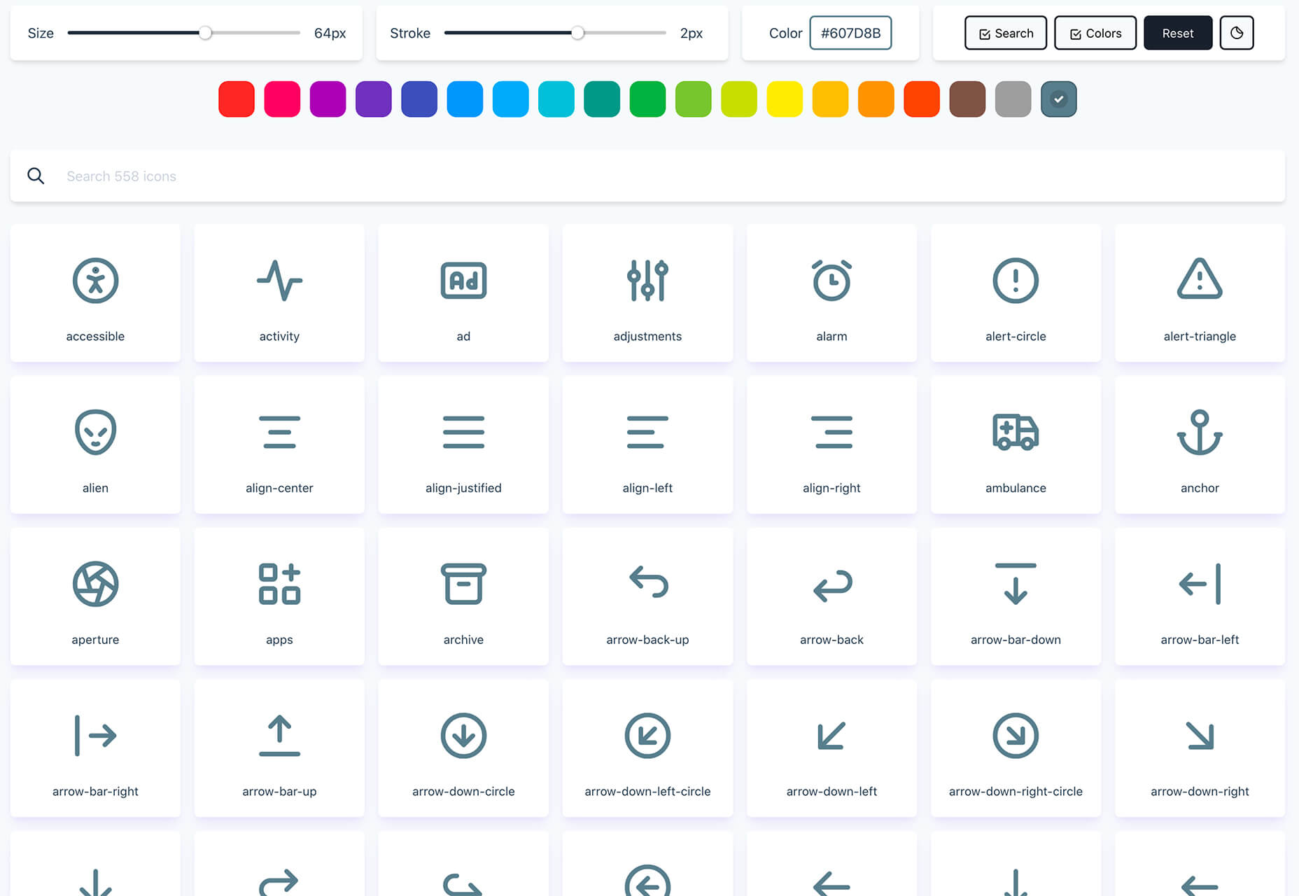
Tabler Icons

Tabler Icons is a collection of more than 550 SVG icons that you can customize. Change the color, size, or stroke width with on-screen controls and then click to copy the icons you want to use. It’s that simple!

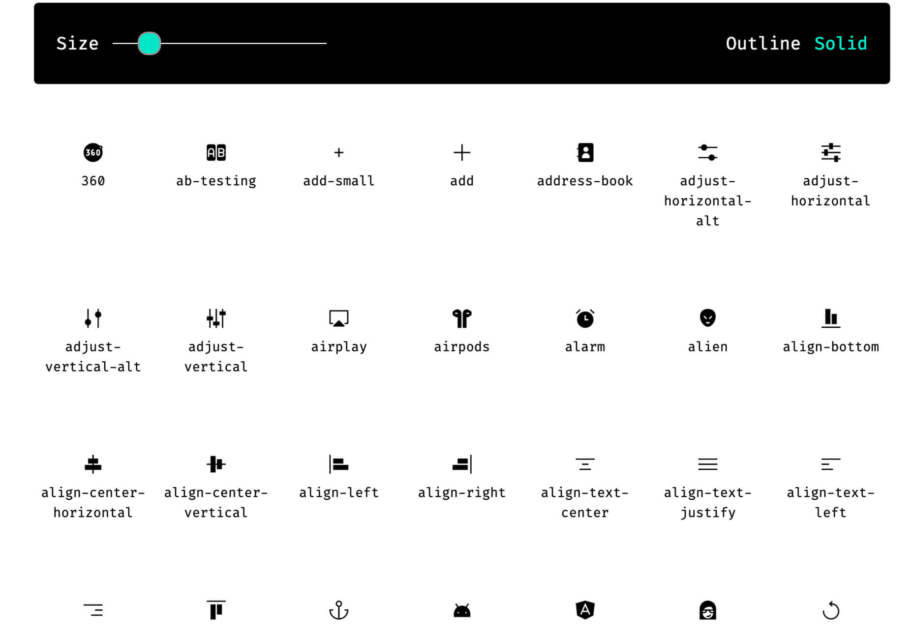
Teenyicons

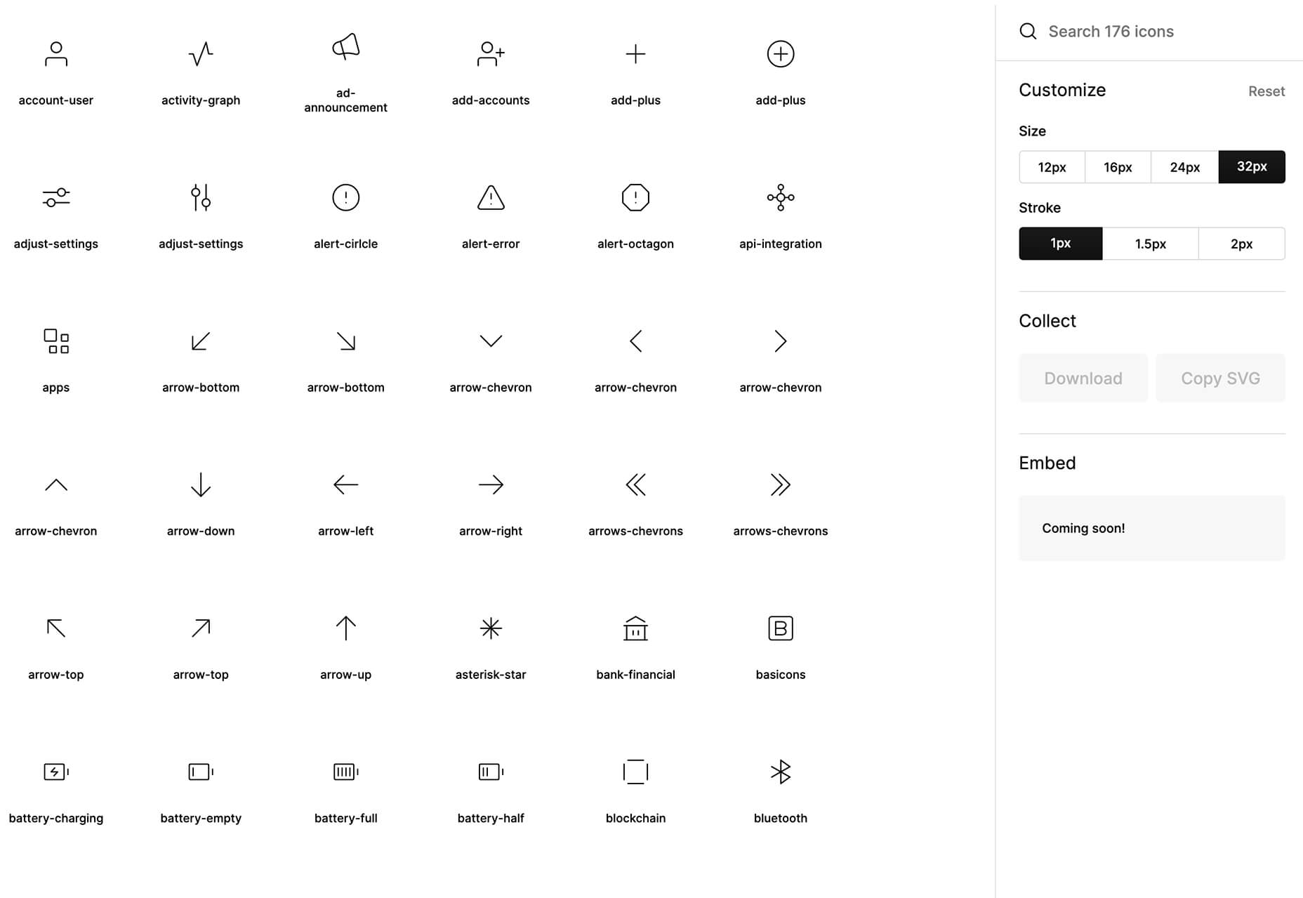
Teenyicons might be some of the cutest icons out there. This collection includes minimal 1px icons in outline or solid fills. And there are plenty of icons to choose from. Adjust the size and grab the ones that you need for projects.

Basicons

Basicons is a set of simple icons for product design and development. Plus, they are updated weekly.

Chozy Mermaid

Chozy Mermaid is a super funky novelty typeface to close out summer. The characters feature beach themes within slab characters. It might be hard to find an application for this one, but it is too fun not to share.

Dotuku

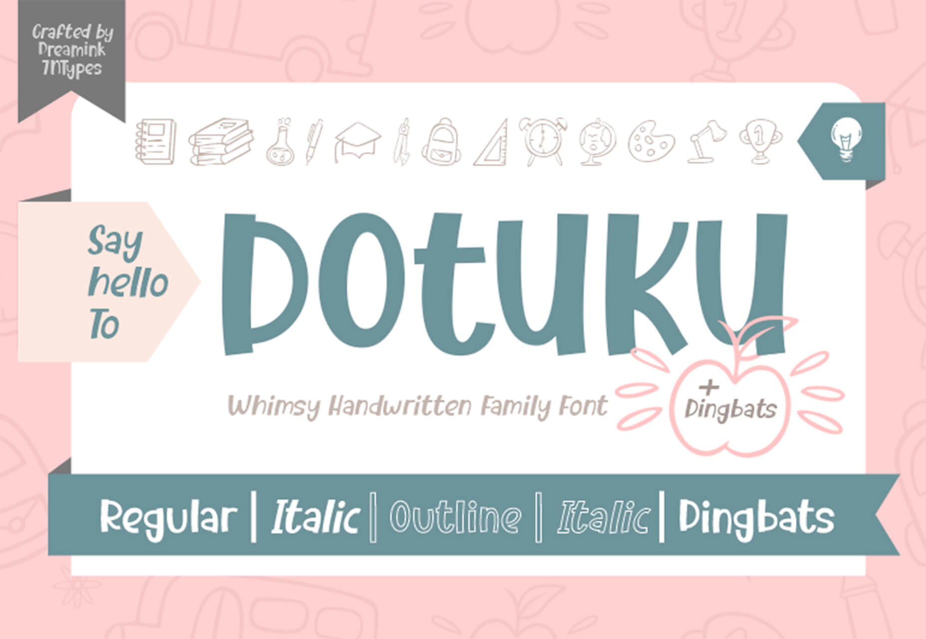
Dotuku is a dingbats font with a back to school theme. The limited character set features filled and outline styles that are perfect for classrooms.

Margin

Margin is a fun retro style typeface with a 1970s vibe. It’s a “chubby serif” with 60 characters and 58 glyphs.

Rollanda

Rollanda is a signature-style script with a thicker weight and rough stroke. The character set is pretty robust.

Source

Categories: Designing, Others Tags:

Mastering Props And PropTypes In React

August 17th, 2020 No comments
Smashing Editorial

Mastering Props And PropTypes In React

Mastering Props And PropTypes In React

Adeneye David Abiodun

2020-08-17T10:30:00+00:00
2020-08-17T10:34:54+00:00

Do props and PropTypes confuse you? You’re not alone. I’m going to guide you through everything about props and PropTypes. They can make your life significantly easier when developing React apps. This tutorial will introduce you to the details about props, passing and accessing props, and passing information to any component using props.

Building React applications involves breaking down the UI into several components, which implies that we will need to pass data from one component to another. Props are an important mechanism for passing information between React components, and we’re going to look into them in great detail. This article would be incomplete without looking into PropTypes, because they ensure that components use the correct data type and pass the right data.

It’s always a good practice to validate the data we get as props by using PropTypes. You will also learn about integrating PropTypes in React, typechecking with PropTypes, and using defaultProps. At the end of this tutorial, you will understand how to use props and PropTypes effectively. It is important that you already have basic knowledge of how React works.

Understanding Props

React allows us to pass information to components using things called props (short for properties). Because React comprises several components, props make it possible to share the same data across the components that need them. It makes use of one-directional data flow (parent-to-child components). However, with a callback function, it’s possible to pass props back from a child to a parent component.

These data can come in different forms: numbers, strings, arrays, functions, objects, etc. We can pass props to any component, just as we can declare attributes in any HTML tag. Take a look at the code below:

<PostList posts={postsList} />

In this snippet, we are passing a prop named posts to a component named PostList. This prop has a value of {postsList}. Let’s break down how to access and pass data.

Passing and Accessing Props

To make this tutorial interesting, let’s create an application that shows a list of users’ names and posts. The app demo is shown below:

See the Pen [Passing and Accessing Props](https://codepen.io/smashingmag/pen/MWyKQpd) by David Adeneye.

See the Pen Passing and Accessing Props by David Adeneye.

The app comprises collections of components: an App component, a PostList component, and a Post component.

The list of posts will require data such as the content and the name of the user. We can construct the data like so:

const postsList = [
  {
    id: 1,
    content: "The world will be out of the pandemic soon",
    user: "Lola Lilly",
  },
  {
    id: 2,
    content: "I'm really exited I'm getting married soon",
    user: "Rebecca Smith",
  },
  {
    id: 3,
    content: "What is your take on this pandemic",
    user: "John Doe",
  },
  {
    id: 4,
    content: "Is the world really coming to an end",
    user: "David Mark",
  },
];

After this, we need the App component to pull the data, Here is the basic structure of that component:

const App = () => {
  return (
    <div>
      <PostList posts={postsList} />
    </div>
  );
};

Here, we are passing an array of posts as a prop to the PostList (which we’ll create in a bit). The parent component, PostList, will access the data in postsList, which will be passed as posts props to the child component (Post). If you’ll remember, our app comprises three components, which we’ll create as we proceed.

Let’s create the PostList:

class PostList extends React.Component {
  render() {
    return (
      <React.Fragment>
        <h1>Latest Users Posts</h1>
        <ul>
          {this.props.posts.map((post) => {
            return (
              <li key={post.id}>
                <Post {...post} />
              </li>
            );
          })}
        </ul>
      </React.Fragment>
    );
  }
}

The PostList component will receive posts as its prop. It will then loop through the posts prop, this.props.posts, to return each posted item as a Post component (which we will model later). Also, note the use of the key in the snippet above. For those new to React, a key is a unique identifier assigned to each item in our list, enabling us to distinguish between items. In this case, the key is the id of each post. There’s no chance of two items having the same id, so it’s a good piece of data to use for this purpose.

Meanwhile, the remaining properties are passed as props to the Post component ( ).

So, let’s create the Post component and make use of the props in it:

const Post = (props) => {
  return (
    <div>
      <h2>{props.content}</h2>
      <h4>username: {props.user}</h4>
    </div>
  );
};

We are constructing the Post component as a functional component, rather than defining it as a class component like we did for the PostList component. I did this to show you how to access props in a functional component, compared to how we access them in a class component with this.props. Because this a functional component, we can access the values using props.

We’ve learned now how to pass and access props, and also how to pass information from one component to the other. Let’s consider now how props work with functions.

Passing Functions Via Props

In the preceding section, we passed an array of data as props from one component to another. But what if we are working with functions instead? React allows us to pass functions between components. This comes in handy when we want to trigger a state change in a parent component from its child component. Props are supposed to be immutable; you should not attempt to change the value of a prop. You have to do that in the component that passes it down, which is the parent component.

Let’s create a simple demo app that listens to a click event and changes the state of the app. To change the state of the app in a different component, we have to pass down our function to the component whose state needs to change. In this way, we will have a function in our child component that is able to change state.

Sounds a bit complex? I have created a simple React application that changes state with the click of a button and renders a piece of welcome information:

See the Pen [Passing Function via Props in React](https://codepen.io/smashingmag/pen/WNwrMEY) by David Adeneye.

See the Pen Passing Function via Props in React by David Adeneye.

In the demo above, we have two components. One is the App component, which is the parent component that contains the app’s state and the function to set the state. The ChildComponent will be the child in this scenario, and its task is to render the welcome information when the state changes.

Let’s break this down into code:

class App extends React.Component {
  constructor(props) {
    super(props);
    this.state = {
      isShow: true,
    };
  }
  toggleShow = () => {
    this.setState((state) => ({ isShow: !state.isShow }));
  };
  render() {
    return (
      <div>
        <ChildComponent isShow={this.state.isShow} clickMe={this.toggleShow} />
      </div>
    );
  }
}

Notice that we’ve set our state to true, and the method to change the state is created in the App component. In the render() function, we pass the state of the app, as the prop isShow, to the ChildComponent component. We also pass the toggleShow() function as a prop named clickMe.

We will use this in the ChildComponent which looks like this:

class ChildComponent extends React.Component {
  clickMe = () => {
    this.props.clickMe();
  };
  render() {
    const greeting = "Welcome to React Props";
    return (
      <div style={{ textAlign: "center", marginTop: "8rem" }}>
        {this.props.isShow ? (
          <h1 style={{ color: "green", fontSize: "4rem" }}>{greeting}</h1>
        ) : null}
        <button onClick={this.clickMe}>
          <h3>click Me</h3>
        </button>
      </div>
    );
  }
}

The most important thing above is that the App component passes down a function as a prop to the ChildComponent. The function clickMe() is used for the click handler in the ChildComponent, whereas the ChildComponent doesn’t know the logic of the function — it only triggers the function when the button gets clicked. The state is changed when the function is called, and once the state has changed, the state is passed down as a prop again. All affected components, like the child in our case, will render again.

We have to pass the state of the app, isShow, as a prop to the ChildComponent, because without it, we cannot write the logic above to display greeting when the state is updated.

Now that we’ve looked at functions, let’s turn to validation. It’s always a good practice to validate the data we get through props by using PropTypes. Let’s dive into that now.

What Are PropTypes In React?

PropTypes are a mechanism to ensure that components use the correct data type and pass the right data, and that components use the right type of props, and that receiving components receive the right type of props.

We can think of it like a puppy being delivered to a pet store. The pet store doesn’t want pigs, lions, frogs, or geckos — it wants puppies. PropTypes ensure that the correct data type (puppy) is delivered to the pet store, and not some other kind of animal.

In the section above, we saw how to pass information to any component using props. We passed props directly as an attribute to the component, and we also passed props from outside of the component and used them in that component. But we didn’t check what type of values we are getting in our component through props or that everything still works.

It’s totally upon us whether to validate the data we get in a component through props. But in a complex application, it is always a good practice to validate that data.

Using PropTypes

To make use of PropTypes, we have to add the package as a dependency to our application through npm or Yarn, by running the following code in the command line. For npm:

npm install --save prop-types

And for Yarn:

yarn add prop-types

To use PropTypes, we first need to import PropTypes from the prop-types package:

import PropTypes from 'prop-types';

Let’s use ProTypes in our app that lists users’ posts. Here is how we will use it for the Post component:

Post.proptypes = {
  id: PropTypes.number,
  content: PropTypes.string,
  user: PropTypes.string
}

Here, PropTypes.string and PropTypes.number are prop validators that can be used to make sure that the props received are of the right type. In the code above, we’re declaring id to be a number, while content and user are to be strings.

Also, PropTypes are useful in catching bugs. And we can enforce passing props by using isRequired:

Post.proptypes = {
  id: PropTypes.number.isRequired,
  content: PropTypes.string.isRequired,
  user: PropTypes.string.isRequired
}

PropTypes have a lot of validators. Here are some of the most common ones:

Component.proptypes = {
  stringProp: PropTypes.string,         // The prop should be a string 
  numberProp: PropTypes.number,         // The prop should be a number
  anyProp: PropTypes.any,               // The prop can be of any data type 
  booleanProp: PropTypes.bool,          // The prop should be a function
  functionProp: PropTypes.func          // The prop should be a function
  arrayProp: PropTypes.array            // The prop should be an array
}

More types are available, which you can check in React’s documentation].

Default Props

If we want to pass some default information to our components using props, React allows us to do so with something called defaultProps. In cases where PropTypes are optional (that is, they are not using isRequired), we can set defaultProps. Default props ensure that props have a value, in case nothing gets passed. Here is an example:

Class Profile extends React.Component{

  // Specifies the default values for props 
  static defaultProps = {
    name: 'Stranger'
  };

  // Renders "Welcome, Stranger":
  render() {
    return <h2> Welcome, {this.props.name}<h2>
  }
}  

Here, defaultProps will be used to ensure that this.props.name has a value, in case it is not specified by the parent component. If no name is passed to the class Profile, then it will have the default property Stranger to fall back on. This prevents any error when no prop is passed. I advise you always to use defaultProps for every optional PropType.

Conclusion

I hope you’ve enjoyed working through this tutorial. Hopefully, it has shown you how important props and propTypes are to building React applications, because without them, we wouldn’t be able to pass data between components when interactions happen. They are a core part of the component-driven and state-management architecture that React is designed around.

PropTypes are a bonus for ensuring that components use the correct data type and pass the right data, and that components use the right type of props, and that receiving components receive the right type of props.

If you have any questions, you can leave them in the comments section below, and I’ll be happy to answer every one and work through any issues with you.

References

(ks, ra, al, il)

Categories: Others Tags:

Popular Design News of the Week: August 10, 2020 – August 16, 2020

August 16th, 2020 No comments

Every week users submit a lot of interesting stuff on our sister site Webdesigner News, highlighting great content from around the web that can be of interest to web designers.

The best way to keep track of all the great stories and news being posted is simply to check out the Webdesigner News site, however, in case you missed some here’s a quick and useful compilation of the most popular designer news that we curated from the past week.

Web Design: 16 Basic Types of Web Pages

What’s New in WordPress 5.5 – Deep Dive into an Epic Release

Content-Visibility: The New CSS Property that Boosts your Rendering Performance

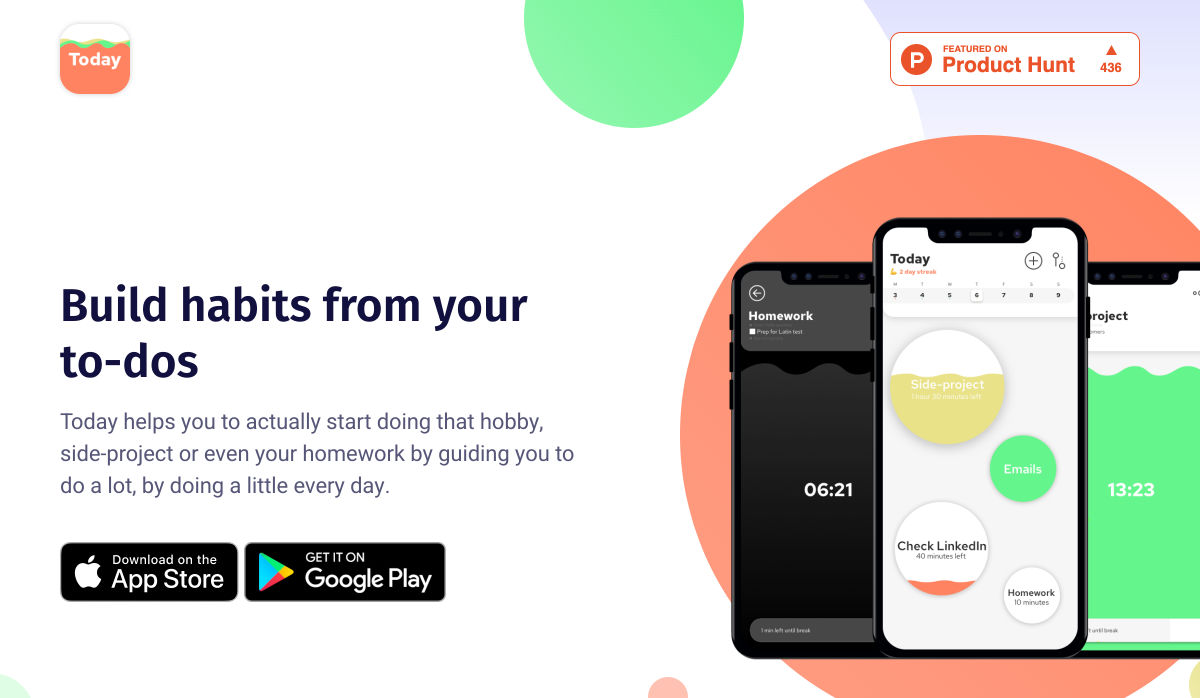
Today – Make your Side Project a Daily Habit

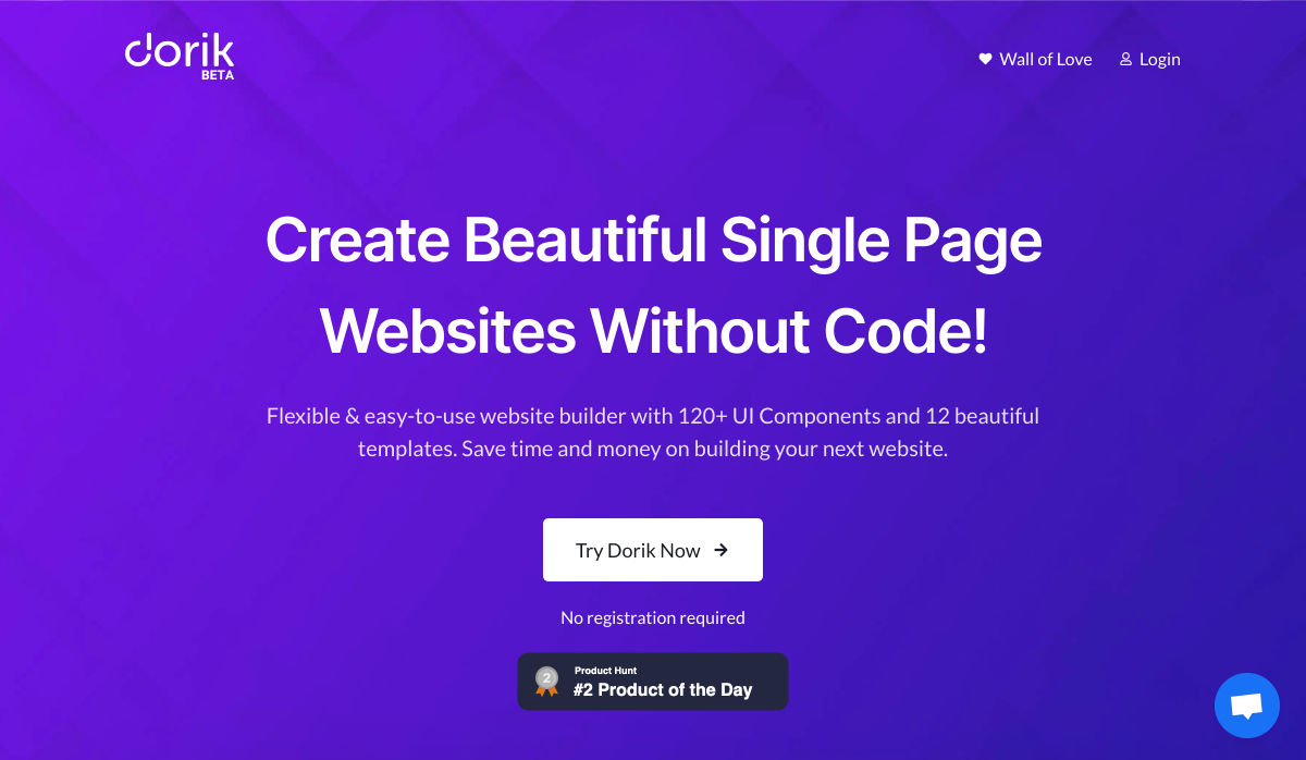
Dorik – Build Beautiful Single Page Website in Minutes, Without Code

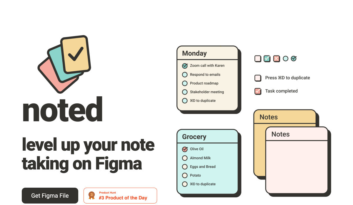
Noted – Level up your Note Taking on Figma

18 Grid Layouts for Building Stunning Websites

Generative Logo Design

18 Beautiful Examples of Floral Illustrations in Web Design

What is Gamification in UX and How it Makes Us Better

When Does Using Headless WordPress Make Sense?

20 Skills Design Software won’t Ever Replace

Styled Components: A Quick Start Guide

How to Simplify Your design

5 Free Resources Every Data Scientist Should Start Using Today

100 Heartening Design Quotes to Spark your Creative Energy

PDF: Still Unfit for Human Consumption, 20 Years Later

Enterprise UI that Works: 7 Not-So-Obvious Lessons from World Leading Companies

These Tech Trends Defined 2020 so Far, According to 5 Founders

Google Launches ‘people Cards’ in Search

Nailing the Perfect Contrast Between Light Text and a Background Image

How to Target your Design Portfolio to Get the Client You Want

Pablo Stanley on Life as a Remote Designer

Incredible 3D Illustrations of your Favorite Fictional Places

What Web Design Learns from Architecture’s Design Thinking

Want more? No problem! Keep track of top design news from around the web with Webdesigner News.

Source

Categories: Designing, Others Tags:

CSS-Tricks Chronicle XXXVIII

August 14th, 2020 No comments

Hey gang! I’ve been fortunate enough to be a guest in a variety of different here, so I thought it was time for another Chronicle post. You know, those special posts where I round up the random goings-on of things I do off of this site.


I joined Ed & Tom over on A Question of Code.

We cover a lot of ground in this show. Why does having a personal site gives you a massive advantage? (Having your own website puts you ahead of a surprising number of people; it should be table-stakes, but it’s not!) And what does job hunting (and running a job board) look like in the time of COVID? What will working remotely mean for junior devs in the near future?

That reminds me: I gotta update my personal site with these interviews.


Drew and I chatted about Serverless over on the Smashing Podcast.

We’re talking about Serverless architectures. What does that mean, and how does it differ from how we might build sites currently?

Ya know, we have that site all about serverless, and we’ve had a good stream of pull requests on it so it stays decently up to date. This stuff only gets more interesting over time. The technology gets better and cheaper and it really can’t be ignored anymore.


Bob and Mendel had me on Do the Woo.

WooCommerce also drifted in and out of Chris’s web life, and recently he took it a bit deeper on his site CSS-Tricks. Although he isn’t deep into the WooCommerce community, he is a huge fan and we can gain useful insights and perspectives from his web experience.

Indeed, we do use WooCommerce around here — especially lately, what with the memberships and posters.


Gerry and I talked about the not-so-great direction that the web and technology is headed in many respects over on the Human-Centered Design podcast.

Gerry is a fascinating guy who does a ton of interesting work that always centers around the biggest and more important ideas out there. One of his recent projects is World Wide Waste and we get into that with him over on ShopTalk as well.


Here’s me as a guest at the Front-end Development South Africa online meetup:


Chris had me on the Self-Made Web Designer podcast (hey, I guess that’s what I am).

The front-end development field is constantly changing and advancing in your career is becoming more and more difficult.

For one, the sheer amount of people in the industry has gone up drastically. Not to mention, what it actually means to be a front-end developer worthy of a tech job is getting more and more complicated.

So the question becomes, “How do you establish yourself as a fron-tend web developer? Then, “How do you grow in your career?”


The post CSS-Tricks Chronicle XXXVIII appeared first on CSS-Tricks.

You can support CSS-Tricks by being an MVP Supporter.

Categories: Designing, Others Tags:

That’s Just How I Scroll

August 14th, 2020 No comments

How do you know a page (or any element on that page) scrolls? Well, if it has a scrollbar, that’s a pretty good indication. You might still have to scrapple with your client about “the fold” or whatever, but I don’t think anyone is confused at what a scrollbar is or what it indicates.

But let’s say there is no scrollbar. That’s super common. macOS hides scrollbars by default and only shows them during scroll. Most mobile browsers don’t have scrollbars, even if you attempt to force them with something like overflow: scroll;.

Why does this matter? If you don’t know an area is scrollable, you might miss out on important content or functionality.

I regularly think about the Perfectly Cropped story from Tyler Hall. There is a screen on iOS that has important functionality you need to scroll down to, but there is no indicator whatsoever that you can scroll there.

The result of that was Tyler’s mom literally not being able to find functionality she was used to. Not great.

There is an elaborate way to detect visible scrollbars and force them to be visible, but something about that rubs me the wrong way. It doesn’t honor a user’s preference (assuming it is the user’s preference), requires DOM manipulation tests, and uses vendor-prefixed CSS (which will probably live a long time, but has been standardized now, so maybe not forever).

I enjoy these approaches and by Chris Smith and his thinking:

CodePen Embed Fallback

My favorite are the shadow-based techniques. To me an inset shadow is a really clear indicator, as it makes it appear that content is flowing underneath and the shadow follows an edge that as a hint that you can scroll in that direction. Plus, you’ve got CSS control there so I’d think it could match whatever UI situation you’re in fairly easily.

It should be known though that it can be done entirely in CSS though, no JavaScript, and is one of the great CSS tricks.


The post That’s Just How I Scroll appeared first on CSS-Tricks.

You can support CSS-Tricks by being an MVP Supporter.

Categories: Designing, Others Tags:

How to Market Yourself as a Freelance Software Developer

August 14th, 2020 No comments

Software Developer is one of the fastest-growing professions. According to the Bureau of Labor Statistics (BLS), this occupation is expected to grow by 21 percent between 2018 and 2028, which is much higher than the average job.

The reason for this is simple – every industry is in need of software solutions and people who can help implement them.

At the same time, the number of people who are turning to freelance is also growing. In 2019, 35% of Americans were working as freelancers, up by 7 percent since 2013. 28% of Americans were doing this full-time, which is up by 17% from 2014.

All this to say, if you’re interested in becoming a freelance software developer, you’ve chosen an interesting time to do it. Demand is high for software developers, but you’ll also have plenty of competition in the freelancing space. To succeed, you’ll need to market yourself effectively and stand out from the crowd.

Identify Your Audience

The first thing you’ll want to do is narrow down your audience. As a software developer, you could work for practically any industry. However, if you try to market yourself to all of them, you’ll have a harder time making a name for yourself. Instead, you should focus on a specific niche and build your marketing strategy around them.

There are a few things you can do to narrow down your audience. First, look at your past clients if you have any. In what niches have you produced your best work? Having some strong examples of your past work in a niche will give your marketing efforts an immediate boost.

You can also think about where your own interests lie. What are your own passions? For example, if you’re someone who likes to spend your free time at the gym, the audience you target could be businesses in the health and wellness industry. By targeting an audience you’re familiar with, you’ll be able to speak their language and you’ll have more passion for the projects.

Change Your Mindset

The next thing to work on is changing your mindset. Too many freelancers find themselves in an employee mindset. The result is that they end up taking any work they can get at any price. When you’re a freelancer though, you’re not an employee – you are your own business.

When you think about your relationship with your clients, do you find yourself thinking that you work “for” them or “with” them? If it’s the former, you’ll want to shift your mindset to the latter. Start thinking of yourself as a business that is offering its services to another business. You should focus on changing your mindset from the start, as it will end up impacting how you market yourself to the world in the subtlest of ways.

Establish Your Credentials

Credentials are a big reason why anyone will hire you. Most businesses won’t take a chance on freelancers who cannot demonstrate their expertise, especially when it comes to large and important projects like software development. Working as a freelancer is all about establishing trust with prospective clients, and to do this you need to have some credentials.

Start with your professional credentials. If you have a degree in software development, you’re off to a great start. Another thing you can get is certifications related to software development – here are some good ones to consider. Other things you can use as professional credentials are previous customer testimonials and examples of your work. The more evidence you can provide of your software development proficiency, the better.

After that, focus on your personal credentials. Landing clients is about more than having a good resume. You also need to be someone that your clients enjoy working with. In every interaction with your audience – including emails, your website, and social media – you need to display your positive, authoritative, and trustworthy personality. When you’re responding to an email from, or on the phone with, a potential client it may not feel like you’re still marketing yourself, but you are.

Create an Online Presence

With all of this groundwork laid, now it’s time to create your online presence. It will do a lot of marketing for you, so you should give it plenty of attention.

A Website

The most obvious place to start is with a website. A website is where prospective clients can come to learn about you and where you can display your best, most professional self.

Unless you’re an excellent web designer, hire someone to create a website for you. If money is tight, look for some cheap domain names to help offset the cost. A great website goes a long way though, so put as much into it as you can.

Social Media

Besides a website, you’ll also want a strong social media presence. You should have accounts on the largest social media sites, including Facebook, Twitter, and LinkedIn. Once you’re set up, make sure you use these accounts regularly. Always act professional, but allow your personality to shine through as well. Talk about things related to your niche and showcase your latest work. When someone finds your social media profile, this will be their first impression of you, so make it a good one.

Freelancing Websites

Lastly, you can establish yourself on freelancing websites. You can use sites like Upwork or Freelancer to create a professional profile and find clients who might need your services. You can also use sites that are specifically for finding software developers, such as Codementor. By creating an account on Codementor you can begin to attract some clients when you’re first starting out and build out your profile. For more information on this site, you can read this Codementor review.

Make Connections

Finally, you should focus on making connections with others, and here are a few easy ways to do this:

  • Look for networking events in your area where your audience might be attending
  • Find some online groups you can join to discuss software development or the niche you’re targeting
  • Whenever you meet someone new, be sure to mention what it is you do for a living
  • Ask past or current clients to refer you to anyone looking for a software developer

You’d be surprised at how much work can come your way just by making a simple connection with someone. Word of mouth and previous clients combine for 79 percent of how most freelancers find new work, so start connecting with as many new people as you can.

Once you make these connections, you’ll need to nurture them. Everyone you meet won’t be ready to become a client 10 minutes later. The best thing you can do is simply let everyone know what value you provide, then let them come to you. If you are too pushy with your sales tactics, it will likely turn people away. This guide provides some additional tips on how you can nurture your leads.

Get Started with Your Freelance Software Developer Career

A lot of freelancers hate the marketing aspect of their business. This often happens because they are not doing it right. When done correctly, marketing yourself should be an enjoyable experience, as it allows you to make meaningful connections and help others using your skills and experience.

Both the need for software developers and the popularity of working as a freelancer will continue to rise in the coming years. If this is something you’ve been considering, there’s no better time than the present. Start laying a solid foundation by picking your target audience and changing your mindset.

After that, it’s just a matter of making connections and showcasing your unique strengths. It may take some time for your marketing strategy to pick up steam, but once in place, you’ll have more clients than you know what to do with.


Photo by Per Lööv on Unsplash

Categories: Others Tags: