The Top 10 Important Principles of Logo Design
The concept behind having a logo is to communicate with customers and presenting something memorable. There aren’t any set of fixed rules that you should follow when it comes to designing logos. If anything, the only thing you need to keep in mind is sticking to what your customer wants. A good logo only makes sense when it’s natural, attractive, and easy to grasp.
A logo should tell a story and represent the business. Here are the ten principles you need to keep in mind when you design a logo.
Top Ten Principles of Logo Design
1. Keep it Simple
Try to keep your logo simple and easy to understand. If you add too much cluster, color, and elements, your customers might get confused. Simplicity has always been in the design game, and it’s still on the top. People would be attracted to something bold and straightforward more than a logo that has too much going on. Make wise choices with elements, font, and colors to create a visible logo that can be observed at a single glance.
2. Create an ‘Easy to Remember’ Logo
The second principle for you to remember is – your logo should be memorable. However, in today’s era, it’s hard to make a logo that stands out in the crowd and leaves a long-lasting impression. So, here are several things to remember (and ignore) to make an easy to recognize logo:
- Stay away from generic elements like globes, ‘V’ shaped people, etc.
- Draw something that tells a story about the brand’s origins.
- Don’t use elements and colors that can be a turnoff for customers.
3. Design it for Your Target Audience
Invest in a logo design that is a reflection of your target audience to attract them to you. For example, the ‘Toys R Us’ logo is colorful and attractive that can quickly grasp the attention of children and even adults. However, before you start the logo design, define the features of your audience to the designer. The features will include demographics, age group, gender, and interests. A well-described audience will make it easy to design a logo.
4. Create an Evergreen Logo
Make a logo that is timeless and can last forever. Businesses often face a challenge when trying to create a logo that is timeless yet modern because logo design trends evolve too quickly to catch up. So, make it your aim to create a logo that stays fresh and forever. Tips for a great logo design:
- Avoid incorporating too many latest trends.
- Focus on designing a logo with unique typography instead of elements.
- When you start designing your logo, make sure you don’t change too much. Try to stay close to the original logo.
5. Opt for A Flexible Design
Always design a logo that is adaptable and flexible because you’ll be using for online and offline marketing. You need a logo that can fit on your website, business cards, packaging material, fliers, billboards, etc. Is your logo adaptable enough to fit on everything? It should support every format, whether it’s horizontal or vertical. Try to avoid very bright colors, because those colors come out horrible when they’re printed.
6. Relevant to the Brand
Stick to brand heritage and origin when you’re designing a logo for a brand that’s been around for decades. Make sure you highlight the most popular features of the logo because that’s how the customer recognizes it. For example, Pepsi is known by the colors red and blue, and being a designer, if you change the colors to green and red, the customers might get confused. That would also be a lousy logo design trick. However, to make a successful logo, you’ll stick to the original color and play around with the elements. In Pepsi’s case, they’ve changed the round-shaped part quite a few times over the years.
7. Choose the Correct Font
There are some fonts that you just need to stay away from to make an attractive logo. Most brands tend to choose between classic serif, crisp sans serif, or flowing script because they’re the right blend of modern yet traditional.
Some brands, however, go all out and create their fonts. So, between the two, you can pick an option, but remember to stay focused on clean fonts that are easily readable. Adidas and Nike are great examples of brands that use beautiful fonts.
8. Stay Away from Using Too Many Colors
Ever heard the idiom too many cooks spoil the broth? Well, the same goes for logos; too many colors spoil the design. You might think that adding too many colors will make your logo attractive and colorful, but that’s a big mistake! Too many colors can confuse the customers, and they can get lost in the logo. Complicated logos are hard to understand and remember. So, either go three colors at max or monochrome!
9. Make Your Logo Unique
The number of businesses are increasing, which is making the competition even tougher. However, an amazing and unique logo can help you stand out from the crowd. Your first thought process should be to create a design that is different from your competitors and attracts attention. The key is to design a logo that’s unforgettable and easy for the customer to remember. Customers react well to fresh designs quicker than other logos. Some examples are Google, Apple, UPS, etc. People will look at the logos of these brands and quickly recognize them because of their originality. So, start with a unique concept and take it from there.
10. A Balanced Logo is A Good Option
Humans are naturally attracted to balanced logo and Unlimited graphic design. Once your logo design is complete, take a breather and analyze how well-proportioned the logo is. A balanced-out logo design can have elements, the right colors, and typography; however, it’s all about placement. Use the tips below to make sure your logo is balanced:
- Make sure your logo is symmetrical.
- Use the right proportions so that your logo makes sense.
- Create a composition of the sizes of every element.
- Don’t use too many colors.
The Best Examples of Great Logo Designs
A well-balanced and professionally created logo stays in the customer’s mind for a long time. A great logo can make a positive impression on the customers, whether it’s a new or existing brand. However, some brands take the cake for great logos that have been around for decades. Here are examples of the best and evergreen logos that have been around for a while.
Amazon
Amazon is an online shopping mall that offers a wide range of products across the world to more than 20 countries. The logo is simply the text ‘amazon’ with an orange arrow that stretches from ‘A’ to ‘Z’ that indicates the retailer offers every product from A to Z. The brand has managed to create a logo with texts and elements and only used two colors. It’s a great masterpiece.
KFC
What is the one thing that aids customers in recognizing the KFC logo anywhere? The character that has been around since 1930. KFC has made a lasting impression on their customers by sticking to their roots. Every time the fast-food chain rebrands, they make sure that the logo has the character, the same color palette, and typography. All they do is move around elements to make it look different.

Starbucks
The Starbucks logo is another example of an evergreen logo. The coffee shop was founded in 1971, and the logo designing was done with proper research. In 1971, the logo was a topless ‘Siren’ sign that was brown and white. Truth be told, the logo looked a little clustered; however, the brand redesigned the logo in 1987 to a mermaid with a crown and flowing hair in green and white. Since then, the logo has evolved and become simpler.

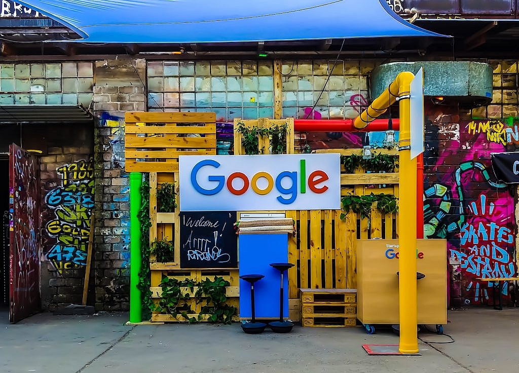
Google – The #1 Search Engine! The Google logo is probably the most seen logo on the planet because people open browsers at least once a day. The website receives more than 100 billion visits per month. What makes the Google logo so recognizable? The four colors and the simple font. Anyone who looks at that color palette will recognize it’s Google in a heartbeat.

Coca Cola
The logo for Coca Cola is older than a century! A bookkeeper created the logo in 1886, where he wrote it down in formal handwriting in monochrome. Later down the line in 1947, the logo was added in white on a red disc. The Coca Cola logo is one of the widely recognized logos in the world because it has stayed close to its origin.
Time to Redesign A Logo!
Rebranding is a very common practice for businesses that have been present for decades. So, remember these ten principles of logo designing before you start. Your logo is the representative element of your business, and what you create says a lot about your brand. You can use the logo design principles to redesign or create a new logo that people can easily remember. Good Luck!
Photo by Aleks Dorohovich on Unsplash
