Archive

Archive for September, 2020

Apple Will Release 217 New Emojis and We Have A Sneak Peek of What They Might Look Like

September 25th, 2020 No comments

I don’t know about you, but when I text, I use a lot of emojis to express myself.

Maybe too many.

And there were so many times where there just wasn’t an emoji I needed to express myself, or something to describe what I was doing.

That’s why I’m so incredibly excited to announce that Apple will be adding an additional 217 emojis to the pack.

This year, they already added over 100 new emojis, including one of my personal favorites, the otter. ?

And now, we wait for 217 more in 2021.

new emojis 2021 apple

If you’re a big dreamer, you’ll finally have an emoji to describe your head being in the clouds.

There’s also a mending heart, which I love, an exhaling face, and a few others!

new emojis 2021 apple

One important thing that you should know is that 200 of 210 of these emojis are skin tone variants, which is incredibly exciting!

It’ll be amazing now that we can all find the perfect relationship emoji to describe our lives.

new emojis 2021 apple

The update is expected to take place in January and will gradually roll out new emojis until October of next year.

And although we haven’t gotten an exact image of the new emojis from Apple, the talented designer Joshua Jones from emojipedia has made some mock-ups of what we can expect to see soon!

new emojis 2021 apple

What are you most excited for in the upcoming emoji release?

What other emojis would you like for Apple to release?

Let us know in the comments below.

new emojis 2021 apple

Maybe we can come together and make some emoji mock-ups and send a request to Apple to implement them.

Who knows what we could accomplish if we all come together.

Anyways,

Read More at Apple Will Release 217 New Emojis and We Have A Sneak Peek of What They Might Look Like

Categories: Designing, Others Tags:

Web Technologies and Syntax

September 24th, 2020 No comments

JavaScript has a (newish) feature called optional chaining. Say I have code like:

const name = Data.person.name;

If person happens to not exist on Data, I’m going to get a hard, show-stopping error. With optional chaining, I can write:

const name = Data.person?.name;

Now if person doesn’t exist, name becomes undefined instead of throwing an error. That’s quite useful if you ask me. In a way, it makes for more resilient code, since there is less possibility of a script that entirely bombs out. But there are arguments that it actually makes for less resilient code, because instead of fixing the problem at the root level (bad data), you’re putting a band-aid on the problem.

Jim Nielsen makes the connection to optional chaining and !important in CSS. Errors of “undefined properties” are perhaps the most common of all JavaScript errors and optional chaining is a quick workaround. Styles that don’t cascade the way you want is (maybe?) the most common of all CSS issues and !important is a quick workaround.

Anyone familiar with CSS knows that using !important doesn’t always fix your problems. In fact, it might just cause you more problems. Ditto for optional chaining in JavaScript, it might cause you more problems than it fixes (we just don’t know it yet since it hasn’t been around long enough).

I like that take.

Sweeping negative hot takes about new features are just clickbait silliness, but sometimes there are good things buried in there to think about. I’ll bet optional chaining settles into some nice patterns in JavaScript, just like !important has in CSS to some degree. Most chatter I hear about !important in CSS lately is about how you should use it when you really mean it (not for getting out of a jam).

Direct Link to ArticlePermalink


The post Web Technologies and Syntax appeared first on CSS-Tricks.

You can support CSS-Tricks by being an MVP Supporter.

Categories: Designing, Others Tags:

Productivity Hacks For Remote Teams

September 24th, 2020 No comments

Web workers and site owners are no strangers to remote work. Thanks to high-speed internet connections and ultra-portable devices, anyone can choose their ideal workspace.

Home offices, coworking spaces, the local park, or even a tropical beach can all become a great location to tackle their list of daily tasks.

However, as a large percentage of global workers shifted to a remote working model in 2020, the research data studying the productivity of these people started to become more and more conflicting.

On the one hand, some findings suggested drops in productivity that were anywhere between 1% and 14%. On the other hand, empirical data showed that, across some industries, workers actually managed to increase their productivity by 4%.

Keeping in mind that there are two sides to each coin, remote workers, as well as managers, need to understand that productivity doesn’t just depend on location. It’s equally conditioned by work habits, tools, and personal wellbeing. Thus, it becomes clear that, to some extent, efficiency can be intentionally boosted. The following are the top productivity hacks for remote teams.

Setting Boundaries

Distractions make for productivity’s greatest foe. Whether you’re dealing with the usual hustle and bustle of an office or a busy home, it’s important to remember that eliminating distractions (or at least keeping them down to a minimum) is possible. All it takes is setting some boundaries.

First and foremost, to increase the efficiency with which you tackle your daily tasks, try to choose a place to work from. It can be any place that’s available to you – your dining room table or the spare room above the garage. What’s important is that you train your mind to associate your chosen setting with productive work.

Of course, once you’ve decided on the space, you can implement a few advanced hacks as well:

  • Set the room temperature to a comfortable 70 degrees. The hotter your office, the lower your productivity will be. So try not to lull yourself to sleep by keeping the heating on a high setting (and save on your monthly bills as well).
  • Turn on the lights. Opt for brighter, cooler shades of white as these stimulate the wake cycle of your circadian rhythm.
  • Choose the right background noise. If there are other people around you while you get work done, you might want to invest in a pair of noise-canceling headphones. Otherwise, you can choose a playlist on your favorite music app that’ll get you in the zone.
  • Make use of Do Not Disturb mode. Remote teams usually use several communication apps, which are great for keeping in touch. However, constantly dealing with notifications can be distracting. If you’re working on something that requires your full attention, make sure your phone and computer notifications are off. This way, you can focus on the task at hand.
  • Add greenery to your space. Plants don’t just improve the air quality in your office, but they can also boost creativity by as much as 45%!

Another way to define and enforce boundaries regarding your work habits is to have a clearly determined routine. Sticking to a schedule can be difficult (especially if you’re in charge of your own time). But do your best to instill some sense of predictability into your workday.

  • Start work at the same time every day. It doesn’t matter if it’s 6 AM or 2 PM. What matters is that you choose a time when you feel most energized and ready to tackle your tasks.
  • Forget about your snooze button. If you’re one of those people who set 5 alarms in the morning, it might be time to reconsider this habit. According to research, allowing yourself to drift back to sleep after having woken up may cause sleep inertia, which has been linked to poor performance, reduced vigilance, and a feeling of drowsiness that lasts for hours.
  • Stop working on time. It may seem counterintuitive to not work as much as you can, but in the long-run, pacing yourself is going to help you avoid burnout. Set a hard-stop time for your workday, and you’ll reap the benefits.
  • Respect your coworkers’ schedules. Many remote teams are scattered across the globe, which means different time zones. In these cases, try to make sure you’re mindful of other people’s time. Do your best to stick to an agreed schedule when asking for information and delivering assignments.

Be Clear About Your Priorities

Here’s the deal: putting together a to-do list isn’t about fitting as much as you can into your day. Instead, it’s all about prioritizing.

The thing is, we all have a long list of tasks that we need to do. However, if you take the time to think about the outcomes you get from these actions, you quickly realize that some contribute to your output in a big way, while others have almost negligible results. This idea is better known as the Pareto principle.

So, it turns out that boosting productivity doesn’t necessarily mean doing more. Instead, it means working more smartly, focusing on high-priority tasks, and minimizing time spent on less impactful to-dos and time-wasters.

If you’re new to prioritizing your to-do list, you can start by doing your most demanding tasks first thing in the morning. Getting over that big obstacle at the beginning of the workday (also called Eating the Frog) helps you achieve two things.

  • Firstly, you get a sense of accomplishment that’s crucial to motivating you to work further.
  • Secondly, you get the most challenging task off your list, and you can concentrate on the rest of your assignments that you either enjoy or that take up less effort.

Another technique you could try is categorizing your work assignments. According to Dwight Eisenhower, urgent and important tasks rarely coincide. So, you can hack your schedule by classifying your tasks based on how immediately they require your attention. This technique is a great way to identify anything that you should be dropping from your schedule, as well as to point out the tasks you should dedicate the most time to.

Task prioritization is a particularly important skill for remote team managers. They need to have insight into how each of their team members is doing at any time. Some project management software solutions allow you to assign tasks to different members of your team, giving you visual feedback regarding each employee’s current workload.

These tools can be a great way to keep track of all ongoing processes. Furthermore, they can help you make sure that not a single employee has to deal with more than they can objectively handle.

Impose Deadlines

Although most people feel like deadlines cause needless stress (and consequently impair productivity), research shows that this isn’t necessarily true.

When set correctly, deadlines can help you focus, as well as become a source of motivation. The only prerequisite is that the goals you’ve set out are achievable. And you can easily get a productivity boost by creating micro-deadlines throughout your day.

You can experiment with some form of the Pomodoro technique. It combines short periods of work and rest, helping you keep your focus at its highest level throughout the day. Most people choose the 20 minutes on, 5 minutes off variation. But, you can experiment with longer intervals as well to see what works best for you personally.

Alternatively, you can use a journal or calendar app to time block your tasks. This practice involves selecting times during your day when you will address specific assignments, so it can help you limit the number of hours you spend on time-wasters such as email.

It’s also not a bad idea to track and analyze your work hours. By using calendar analytics and insights, you can get invaluable information on the tasks that are taking up most of your resources.

Additionally, tracking software allows remote team managers to see how their coworkers are utilizing their work hours, allowing them to assign tasks in smarter, more realistic ways.

Take Care of Physical Wellbeing

Finally, don’t forget that physical health impacts productivity just as much as tech or productivity hacks do. Nutrition, exercise, sleep, and mental wellbeing can all contribute to getting things done more quickly and efficiently.

So, make sure that you and your team members practice healthy habits in your work routines. Make time in the day for some movement, such as an after-lunch walk. Or, engage in some healthy competition to see who can do the most push-ups, sit-ups, or track the most steps during the week.

And, of course, if you are a business owner whose team is working remotely, make sure that there are protocols in place so that everyone gets the right benefits. Investing in your remote team’s health may seem like an unnecessary cost, but know that keeping them healthy and satisfied with their job automatically boosts performance.

Find What Works for You

Every team is different, and within that team, every person has their own personal preferences. Naturally, boosting efficiency will require personalized solutions.

There are numerous productivity hacks out there. So, if your goal is to enhance your performance or help your remote team do the same, make sure to do your research. Experiment until you find the ideal solution.

Remember, as a digital nomad, you’re already at a huge advantage – you can choose when and where you work. So, consider how you can upgrade your habits with proven-to-work hacks, and enjoy the benefits of a routine that lets you do more in less time.


Photo by Charles Deluvio on Unsplash

Categories: Others Tags:

A Gentle Introduction to Using a Docker Container as a Dev Environment

September 24th, 2020 No comments

Sarcasm disclaimer: This article is mostly sarcasm. I do not think that I actually speak for Dylan Thomas and I would never encourage you to foist a light theme on people who don’t want it. No matter how wrong they may be.

When Dylan Thomas penned the words, “Do not go gentle into that good night,” he was talking about death. But if he were alive today, he might be talking about Linux containers. There is no way to know for sure because he passed away in 1953, but this is the internet, so I feel extremely confident speaking authoritatively on his behalf.

My confidence comes from a complete overestimation of my skills and intelligence coupled with the fact that I recently tried to configure a Docker container as my development environment. And I found myself raging against the dying of the light as Docker rejected every single attempt I made like I was me and it was King James screaming, “NOT IN MY HOUSE!”

Pain is an excellent teacher. And because I care about you and have no other ulterior motives, I want to use that experience to give you a “gentle” introduction to using a Docker container as a development environment. But first, let’s talk about whyyyyyyyyyyy you would ever want to do that.

kbutwhytho?

Close your eyes and picture this: a grown man dressed up like a fox.

Wait. No. Wrong scenario.

Instead, picture a project that contains not just your source code, but your entire development environment and all the dependencies and runtimes your app needs. You could then give that project to anyone anywhere (like the fox guy) and they could run your project without having to make a lick of configuration changes to their own environment.

This is exactly what Docker containers do. A Dockerfile defines an entire runtime environment with a single file. All you would need is a way to develop inside of that container.

Wait for it…

VS Code and Remote – Containers

VS Code has an extension called Remote – Containers that lets you load a project inside a Docker container and connect to it with VS Code. That’s some Inception-level stuff right there. (Did he make it out?! THE TALISMAN NEVER ACTUALLY STOPS SPINNING.) It’s easier to understand if we (and by “we” I mean you) look at it in action.

Adding a container to a project

Let’s say for a moment that you are on a high-end gaming PC that you built for your kids and then decided to keep if for yourself. I mean, why exactly do they deserve a new computer again? Oh, that’s right. They don’t. They can’t even take out the trash on Sundays even though you TELL THEM EVERY WEEK.

This is a fresh Windows machine with WSL2 and Docker installed, but that’s all. Were you to try and run a Node.js project on this machine, Powershell would tell you that it has absolutely no idea what you are reffering to and maybe you mispelled something. Which, in all fairness, you do suck at spelling. Remember that time in 4?? grade when you got knocked out of the first round of the spelling bee because you couldn’t spell “fried.” FRYED? There’s no “Y” in there!

Now this is not a huge problem — you could always skip off and install Node.js. But let’s say for a second that you can’t be bothered to do that and you’re pretty sure that skipping is not something adults do.

Instead, we can configure this project to run in a container that already has Node.js installed. Now, as I’ve already discussed, I have no idea how to use Docker. I can barely use the microwave. Fortunately, VS Code will configure your project for you — to an extent.

From the Command Palette, there is an “Add Development Container Configuration Files…” command. This command looks at your project and tries to add the proper container definition.

In this case, VS Code knows I’ve got a Node project here, so I’ll just pick Node.js 14. Yes, I am aware that 12 is LTS right now, but it’s gonna be 14 in [checks watch] one month and I’m an early adopter, as is evidenced by my interest in container technology just now in 2020.

This will add a .devcontainer folder with some assets inside. One is a Dockerfile that contains the Node.js image that we’re going to use, and the other is a devcontainer.json that has some project level configuration going on.

Now, before we touch anything and break it all (we’ll get to that, trust me), we can select “Rebuild and Reopen in Container” from the Command Palette. This will restart VS Code and set about building the container. Once it completes (which can take a while the first time if you’re not on a high-end gaming PC that your kids will never know the joys of), the project will open inside of the container. VS Code is connected to the container, and you know that because it says so in the lower left-hand corner.

Now if we open the terminal in VS Code, Powershell is conspicously absent because we are not on Windows anymore, Dorthy. We are now in a Linux container. And we can both npm install and npm start in this magical land.

This is an Express App, so it should be running on port 3000. But if you try and visit that port, it won’t load. This is because we need to map a port in the container to 3000 on our localhost. As one does.

Fortunately, there is a UI for this.

The Remote Containers extension puts a “Remote Explorer” icon in the Action Bar. Which is on the left-hand side for you, but the right-hand side for me. Because I moved it and you should too.

There are three sections here, but look at the bottom one which says “Port Forwarding,” I’m not the sandwich with the most lettuce, but I’m pretty sure that’s what we want here. You can click on the “Forward a Port” and type “3000,” Now if we try and hit the app from the browser…

Mostly things, “just worked.” But the configuration is also quite simple. Let’s look at how we can start to customize this setup by automating some of the aspects of the project itself. Project specific configuration is done in the devcontainer.json file.

Automating project configuration

First off, we can automate the port forwarding by adding a forwardPorts variable and specifying 3000 as the value. We can also automate the npm install command by specifying the postCreateCommand property. And let’s face it, we could all stand to run AT LEAST one less npm install.

{
  // ...
  // Use 'forwardPorts' to make a list of ports inside the container available locally.
  "forwardPorts": [3000],
  // Use 'postCreateCommand' to run commands after the container is created.
  "postCreateCommand": "npm install",
  // ...
}

Additionally, we can include VS Code extensions. The VS Code that runs in the Docker container does not automatically get every extension you have installed. You have to install them in the container, or just include them like we’re doing here.

Extensions like Prettier and ESLint are perfect for this kind of scenario. We can also take this opportunity to foist a light theme on everyone because it turns out that dark themes are worse for reading and comprehension. I feel like a prophet.

// For format details, see https://aka.ms/vscode-remote/devcontainer.json or this file's README at:
// https://github.com/microsoft/vscode-dev-containers/tree/v0.128.0/containers/javascript-node-14
{
  // ...
  // Add the IDs of extensions you want installed when the container is created.
  "extensions": [
    "dbaeumer.vscode-eslint",
    "esbenp.prettier-vscode",
    "GitHub.github-vscode-theme"
  ]
  // ...
}

If you’re wondering where to find those extension ID’s, they come up in intellisense (Ctrl/Cmd + Shift) if you have them installed. If not, search the extension marketplace, right-click the extension and say “Copy extension ID.” Or even better, just select “Add to devcontainer.json.”

By default, the Node.js container that VS Code gives you has things like git and cURL already installed. What it doesn’t have, is “cowsay,” And we can’t have a Linux environment without cowsay. That’s in the Linux bi-laws (it’s not). I don’t make the rules. We need to customize this container to add that.

Automating environment configuration

This is where things went off the rails for me. In order to add software to a development container, you have to edit the Dockerfile. And Linux has no tolerance for your shenanigans or mistakes.

The base Docker container that you get with the container configurations in VS Code is Debian Linux. Debian Linux uses the apt-get dependency manager.

apt-get install cowsay

We can add this to the end of the Dockerfile. Whenever you install something from apt-get, run an apt-get update first. This command updates the list of packages and package repos so that you have the most current list cached. If you don’t do this, the container build will fail and tell you that it can’t find “cowsay.”

# To fully customize the contents of this image, use the following Dockerfile instead:
# https://github.com/microsoft/vscode-dev-containers/tree/v0.128.0/containers/javascript-node-14/.devcontainer/Dockerfile
FROM mcr.microsoft.com/vscode/devcontainers/javascript-node:0-14
# ** Install additional packages **
RUN apt-get update 
  && apt-get -y install cowsay

A few things to note here…

  1. That RUN command is a Docker thing and it creates a new “layer.” Layers are how the container knows what has changed and what in the container needs to be updated when you rebuild it. They’re kind of like cake layers except that you don’t want a lot of them because enormous cakes are awesome. Enormous containers are not. You should try and keep related logic together in the same RUN command so that you don’t create unnecessary layers.
  2. That denotes a line break at the end of a line. You need it for multi-line commands. Leave it off and you will know the pain of many failed Docker builds.
  3. The && is how you add an additional command to the RUN line. For the love of god, don’t forget that on the previous line.
  4. The -y flag is important because by default, apt-get is going to prompt you to ensure you really want to install what you just tried to install. This will cause the container build to fail because there is nobody there to say Y or N. The -y flag is shorthand for “don’t bother me with your silly confirmation prompts”. Apparently everyone is supposed to know this already. I didn’t know it until about four hours ago.

Use the command prompt to select “Rebuild Container”…

And, just like that…

It doesn’t work.

This the first lesson in what I like to call, “Linux Vertigo.” There are so many distributions of Linux and they don’t all handle things the same way. It can be difficult to figure out why things work in one place (Mac, WSL2) and don’t work in others. The reason why “cowsay” isn’t available, is that Debian puts “cowsay” in /usr/games, which is not included in the PATH environment variable.

One solution would be to add it to the PATH in the Dockerfile. Like this…

FROM mcr.microsoft.com/vscode/devcontainers/javascript-node:0-14
RUN apt-get update 
  && apt-get -y install cowsay
ENV PATH="/usr/games:${PATH}"

EXCELLENT. We’re solving real problems here, folks. People like cow one-liners. I bullieve I herd that somewhere.

To summarize, project configuration (forwarding ports, installing project depedencies, ect) is done in the “devcontainer.json” and enviornment configuration (installing software) is done in the “Dockerfile.” Now let’s get brave and try something a little more edgy.

Advanced configuration

Let’s say for a moment that you have a gorgeous, glammed out terminal setup that you really want to put in the container as well. I mean, just because you are developing in a container doesn’t mean that your terminal has to be boring. But you also wouldn’t want to reconfigure your pretentious zsh setup for every project that you open. Can we automate that too? Let’s find out.

Fortunately, zsh is already installed in the image that you get. The only trouble is that it’s not the default shell when the container opens. There are a lot of ways that you can make zsh the default shell in a normal Docker scenario, but none of them will work here. This is because you have no control over the way the container is built.

Instead, look again to the trusty devcontainer.json file. In it, there is a "settings" block. In fact, there is a line already there showing you that the default terminal is set to "/bin/bash". Change that to "/bin/zsh".

// Set *default* container specific settings.json values on container create.
"settings": {
  "terminal.integrated.shell.linux": "/bin/zsh"
}

By the way, you can set ANY VS Code setting there. Like, you know, moving the sidebar to the right-hand side. There – I fixed it for you.

// Set default container specific settings.json values on container create.
"settings": {
  "terminal.integrated.shell.linux": "/bin/zsh",
  "workbench.sideBar.location": "right"
},

And how about those pretentious plugins that make you better than everyone else? For those you are going to need your .zshrc file. The container already has oh-my-zsh in it, and it’s in the “root” folder. You just need to make sure you set the path to ZSH at the top of the .zshrc so that it points to root. Like this…

# Path to your oh-my-zsh installation.
export ZSH="/root/.oh-my-zsh"


# Set name of the theme to load --- if set to "random", it will
# load a random theme each time oh-my-zsh is loaded, in which case,
# to know which specific one was loaded, run: echo $RANDOM_THEME
# See https://github.com/ohmyzsh/ohmyzsh/wiki/Themes
ZSH_THEME="cloud"


# Which plugins would you like to load?
plugins=(zsh-autosuggestions nvm git)


source $ZSH/oh-my-zsh.sh

Then you can copy in that sexy .zshrc file to the root folder in the Dockerfile. I put that .zshrc file in the .devcontainer folder in my project.

COPY .zshrc /root/.zshrc

And if you need to download a plugin before you install it, do that in the Dockerfile with a RUN command. Just remember to group all of these into one command since each RUN is a new layer. You are nearly a container expert now. Next step is to write a blog post about it and instruct people on the ways of Docker like you invented the thing.

RUN git clone https://github.com/zsh-users/zsh-autosuggestions ${ZSH_CUSTOM:-~/.oh-my-zsh/custom}/plugins/zsh-autosuggestions

Look at the beautiful terminal! Behold the colors! The git plugin which tells you the branch and adds a lightning emoji! Nothing says, “I know what I’m doing” like a customized terminal. I like to take mine to Starbucks and just let people see it in action and wonder if I’m a celebrity.

Go gently

Hopefully you made it to this point and thought, “Geez, this guy is seriously overreacting. This is not that hard.” If so, I have successfully saved you. You are welcome. No need to thank me. Yes, I do have an Amazon wish list.

For more information on Remote Containers, including how to do things like add a database or use Docker Compose, check out the official Remote Container docs, which provide much more clarity with 100% less neurotic commentary.


The post A Gentle Introduction to Using a Docker Container as a Dev Environment appeared first on CSS-Tricks.

You can support CSS-Tricks by being an MVP Supporter.

Categories: Designing, Others Tags:

The Empty Box

September 23rd, 2020 No comments

When I was in high school, we learned about “The Black Box” which is concept in theater. If memory serves me right, the approach was a simple and elegant one: that you can take any space, any black box, and make it come to life with a story. I liked the idea that it’s possible to convey anything, tell any story, and create any reality — all in the confines of what equates to a black box, a simple room that requires a curtain and very little else.

It’s an exciting concept. You see something extremely polished like a studio-produced movie. One might think, “No way I could do that.” All the scripts, the actors, the production, animation, set, props, everything. Where do you even begin?

But looking at things through The Black Box model, we distill the movie down to its essence, the story. We can see it as some folks telling a story in a stark, empty room. Take Thor: Ragnarok, a movie I really enjoy. It has incredible special effects, bits of humor, tension, relationships and stories that are well told. Sibling rivalry? Most of us know of or have seen something like that. Someone confronting you and you’d like to escape? We have all likely dealt with a challenge like that.

Those are the stories. The special effects and polished production? Those merely dress up the stories but aren’t necessary to convey the story. But still, how do you get from a black box to a large scale production?

Or, put in a different context: how do we get from an idea to a full-fledged website or app? You see all of these incredible sites around you and could easily fall into a trap of thinking anything you put out needs to meet the same scale and production. But let’s pull the curtain back on that and play with the idea that…

Apps are the box

Programmers are literal creatures, so instead of a “black box,” which has different connotations in tech, I’ll switch it up and call it an “empty box” — even though that also has roots in other metaphors, such as a the “tabula rasa” (clean slate) in art, which is a very similar concept.

If you look at an apps like Notion, Airbnb, or Etsy as newcomers to the industry, the yes, it might seem impossible how you might get from learning basic CRUD operations to working on an application at the same scale, state and complexity as those apps. But what happens if we flip the script? Instead of thinking about building the entire universe from scratch, maybe we start with an empty box, one that only holds the core use case or problem that’s being solved. We can decide what we’re going to create with this small bit of space we have in the world.

It’s a nice way to dial back the scope. Of course, people might use our sites in myriad ways, but when you peel back every usage, every feature, and compare what else is out there, what is the purpose? Sometimes we work at big companies with lots of competing priorities — so many that if you ask different folks, you’ll likely get a wide range of answers. And certainly any app with any level of complexity has to cater to many user needs.

However, I wonder if it might serve us to be able to answer that question with clarity. Particularly when we’re just starting out.

You have an empty box. What can you build in that space? You can engage people all around the world instantly in any way. You can create any interaction. What is that interaction and what is it trying to convey? What is going to make it relatable? What’s going to get the message across?

Forget about all the production and complexity you could build. What’s the purpose you want to convey at the core? What are you most excited about? What the solution to the problem right in front of you?


The post The Empty Box appeared first on CSS-Tricks.

You can support CSS-Tricks by being an MVP Supporter.

Categories: Designing, Others Tags:

Using Markdown and Localization in the WordPress Block Editor

September 23rd, 2020 No comments

If we need to show documentation to the user directly in the WordPress editor, what is the best way to do it?

Since the block editor is based on React, we may be tempted to use React components and HTML code for the documentation. That is the approach I followed in my previous article, which demonstrated a way to show documentation in a modal window.

But this solution is not flawless, because adding documentation through React components and HTML code could become very verbose, not to mention difficult to maintain. For instance, the modal from the image above contains the documentation in a React component like this:

const CacheControlDescription = () => {
  return (
    <p>The Cache-Control header will contain the minimum max-age value from all fields/directives involved in the request, or <code>no-store</code> if the max-age is 0</p>
  )
}

Using Markdown instead of HTML can make the job easier. For instance, the documentation above could be moved out of the React component, and into a Markdown file like /docs/cache-control.md:

The Cache-Control header will contain the minimum max-age value from all fields/directives involved in the request, or `no-store` if the max-age is 0

What are the benefits and drawbacks of using Markdown compared to pure HTML?

Advantages Disadvantages
? Writing Markdown is easier and faster than HTML ? The documentation cannot contain React components
? The documentation can be kept separate from the block’s source code (even on a separate repo) ? We cannot use the __ function (which helps localize the content through .po files) to output text
? Copy editors can modify the documentation with no fear of breaking the code
? The documentation code isn’t added to the block’s JavaScript asset, which can then load faster

Concerning the drawbacks, not being able to use React components may not be a problem, at least for simple documentation. The lack of localization, however, is a major issue. Text in the React component added through the JavaScript __ function can be extracted and replaced using translations from POT files. Content in Markdown cannot access this functionality.

Supporting localization for documentation is mandatory, so we will need to make up for it. In this article we will pursue two goals:

  • Using Markdown to write documentation (displayed by a block of the WordPress editor)
  • Translating the documentation to the user’s language

Let’s start!

Loading Markdown content

Having created a Markdown file /docs/cache-control.md, we can import its content (already rendered as HTML) and inject it into the React component like this:

import CacheControlDocumentation from '../docs/cache-control.md';


const CacheControlDescription = () => {
  return (
    <div
      dangerouslySetInnerHTML={ { __html: CacheControlDocumentation } }
    />
  );
}

This solution relies on webpack, the module bundler sitting at the core of the WordPress editor.

Please notice that the WordPress editor currently uses webpack 4.42, However, the documentation shown upfront on webpack’s site corresponds to version 5 (which is still in beta). The documentation for version 4 is located at a subsite.

The content is transformed from Markdown to HTML via webpack’s loaders, for which the block needs to customize its webpack configuration, adding the rules to use markdown-loader and html-loader.

To do this, add a file, webpack.config.js, at the root of the block with this code:

// This is the default webpack configuration from Gutenberg
const defaultConfig = require( '@wordpress/scripts/config/webpack.config' );


// Customize adding the required rules for the block
module.exports = {
  ...defaultConfig,
  module: {
    ...defaultConfig.module,
    rules: [
      ...defaultConfig.module.rules,
      {
        test: /.md$/,
        use: [
          {
            loader: "html-loader"
          },
          {
            loader: "markdown-loader"
          }
        ]
      }
    ],
  },
};

And install the corresponding packages:

npm install --save-dev markdown-loader html-loader

Let’s apply one tiny enhancement while we’re at it. The docs folder could contain the documentation for components located anywhere in the project. To skip having to calculate the relative path from each component to that folder, we can add an alias, @docs, in webpack.config.js to resolve to folder /docs:

const path = require( 'path' );
config.resolve.alias[ '@docs' ] = path.resolve( process.cwd(), 'docs/' )

Now, the imports are simplified:

import CacheControlDocumentation from '@docs/cache-control.md';

That’s it! We can now inject documentation from external Markdown files into the React component.

Translating the documentation to the user’s language

We can’t translate strings through .po files for Markdown content, but there is an alternative: produce different Markdown files for different languages. Then, instead of having a single file (/docs/cache-control.md), we can have one file per language, each stored under the corresponding language code:

  • /docs/en/cache-control.md
  • /docs/fr/cache-control.md
  • /docs/zh/cache-control.md
  • etc.

We could also support translations for both language and region, so that American and British English can have different versions, and default to the language-only version when a translation for a region is not provided (e.g. "en_CA" is handled by "en"):

  • /docs/en_US/cache-control.md
  • /docs/en_GB/cache-control.md
  • /docs/en/cache-control.md

To simplify matters, I’ll only explain how to support different languages, without regions. But the code is pretty much the same.

The code demonstrated in this article can also be seen in the source code of a WordPress plugin I made.

Feeding the user’s language to the block

The user’s language in WordPress can be retrieved from get_locale(). Since the locale includes the language code and the region (such as "en_US"), we parse it to extract the language code by itself:

function get_locale_language(): string 
{
  $localeParts = explode( '_', get_locale() );
  return $localeParts[0];
}

Through wp_localize_script(), we provide the language code to the block, as the userLang property under a global variable (which, in this case, is graphqlApiCacheControl):

// The block was registered as $blockScriptRegistrationName
wp_localize_script(
  $blockScriptRegistrationName,
  'graphqlApiCacheControl',
  [
    'userLang' => get_locale_language(),
  ]
);

Now the user’s language code is available on the block:

const lang = window.graphqlApiCacheControl.userLang; 

Dynamic imports

We can only know the user’s language at runtime. However, the import statement is static, not dynamic. Hence, we cannot do this:

// `lang` contains the user's language
import CacheControlDocumentation from '@docs/${ lang }/cache-control.md';

That said, webpack allows us to dynamically load modules through the import function which, by default, splits out the requested module into a separate chunk (i.e. it is not included within the main compiled build/index.js file) to be loaded lazily.

This behavior is suitable for showing documentation on a modal window, which is triggered by a user action and not loaded up front. import must receive some information on where the module is located, so this code works:

import( `@docs/${ lang }/cache-control.md` ).then( module => {
  // ...
});

But this seemingly similar code does not:

const dynamicModule = `@docs/${ lang }/cache-control.md`
import( dynamicModule ).then( module => {
  // ...
});

The content from the file is accessible under key default of the imported object:

const cacheControlContent = import( `@docs/${ lang }/cache-control.md` ).then( obj => obj.default )

We can generalize this logic into a function called getMarkdownContent, passing the name of the Markdown file alongside the language:

const getMarkdownContent = ( fileName, lang ) => {
  return import( `@docs/${ lang }/${ fileName }.md` )
    .then( obj => obj.default )
} 

Managing the chunks

To keep the block assets organized, let’s keep the documentation chunks grouped in the /docs subfolder (to be created inside the build/ folder), and give them descriptive file names.

Then, having two docs (cache-control.md and cache-purging.md) in three languages (English, French and Mandarin Chinese), the following chunks will be produced:

  • build/docs/en-cache-control-md.js
  • build/docs/fr-cache-control-md.js
  • build/docs/zh-cache-control-md.js
  • build/docs/en-cache-purging-md.js
  • build/docs/fr-cache-purging-md.js
  • build/docs/zh-cache-purging-md.js

This is accomplished by using the magic comment /* webpackChunkName: "docs/[request]" */ just before the import argument:

const getMarkdownContent = ( fileName, lang ) => {
  return import( /* webpackChunkName: "docs/[request]" */ `@docs/${ lang }/${ fileName }.md` )
    .then(obj => obj.default)
} 

Setting the public path for the chunks

webpack knows where to fetch the chunks, thanks to the publicPath configuration option. If it’s not provided, the current URL from the WordPress editor, /wp-admin/, is used, producing a 404 since the chunks are located somewhere else. For my block, they are under /wp-content/plugins/graphql-api/blocks/cache-control/build/.

If the block is for our own use, we can hardcode publicPath in webpack.config.js, or provide it through an ASSET_PATH environment variable. Otherwise, we need to pass the public path to the block at runtime. To do so, we calculate the URL for the block’s build/ folder:

$blockPublicPath = plugin_dir_url( __FILE__ ) . '/blocks/cache-control/build/';

Then we inject it to the JavaScript side by localizing the block:

// The block was registered as $blockScriptRegistrationName
wp_localize_script(
    $blockScriptRegistrationName,
    'graphqlApiCacheControl',
    [
      //...
      'publicPath' => $blockPublicPath,
    ]
);

And then we provide the public path to the __webpack_public_path__ JavaScript variable:

__webpack_public_path__ = window.graphqlApiCacheControl.publicPath;

Falling back to a default language

What would happen if there is no translation for the user’s language? In that case, calling getMarkdownContent will throw an error.

For instance, when the language is set to German, the browser console will display this:

Uncaught (in promise) Error: Cannot find module './de/cache-control.md'

The solution is to catch the error and then return the content in a default language, which is always satisfied by the block:

const getMarkdownContentOrUseDefault = ( fileName, defaultLang, lang ) => {
  return getMarkdownContent( fileName, lang )
    .catch( err => getMarkdownContent( fileName, defaultLang ) )
}

Please notice the different behavior from coding documentation as HTML inside the React component, and as an external Markdown file, when the translation is incomplete. In the first case, if a string has been translated but another one has not (in the .po file), then the React component will end up displaying mixed languages. It’s all or nothing in the second case: either the documentation is fully translated, or it is not.

Setting the documentation into the modal

By now, we can retrieve the documentation from the Markdown file. Let’s see how to display it in the modal.

We first wrap Gutenberg’s Modal component, to inject the content as HTML:

import { Modal } from '@wordpress/components';


const ContentModal = ( props ) => {
  const { content } = props;
  return (
    <Modal 
      { ...props }
    >
      <div
        dangerouslySetInnerHTML={ { __html: content } }
      />
    </Modal>
  );
};

Then we retrieve the content from the Markdown file, and pass it to the modal as a prop using a state hook called page. Dynamically loading content is an async operation, so we must also use an effect hook to perform a side effect in the component. We need to read the content from the Markdown file only once, so we pass an empty array as a second argument to useEffect (or the hook would keep getting triggered):

import { useState, useEffect } from '@wordpress/element';

const CacheControlContentModal = ( props ) => {
  const fileName = 'cache-control'
  const lang = window.graphqlApiCacheControl.userLang
  const defaultLang = 'en'


  const [ page, setPage ] = useState( [] );


  useEffect(() => {
    getMarkdownContentOrUseDefault( fileName, defaultLang, lang ).then( value => {
      setPage( value )
    });
  }, [] );


  return (
    <ContentModal
      { ...props }
      content={ page }
    />
  );
};

Let’s see it working. Please notice how the chunk containing the documentation is loaded lazily (i.e. it’s triggered when the block is edited):

Tadaaaaaaaa ?

Writing documentation may not be your favorite thing in the world, but making it easy to write and maintain can help take the pain out of it.

Using Markdown instead of pure HTML is certainly one way to do that. I hope the approach we just covered not only improves your workflow, but also gives you a nice enhancement for your WordPress users.


The post Using Markdown and Localization in the WordPress Block Editor appeared first on CSS-Tricks.

You can support CSS-Tricks by being an MVP Supporter.

Categories: Designing, Others Tags:

Graphic Design Books Every Designer Should Read in 2020

September 23rd, 2020 No comments
Graphic Design Books

Graphic design is an incredibly important field in our world. According to the US Labor of Statistics data, there are 281.500 graphic design jobs just in the USA.

It’s a field in which just having talents is not enough. You have to constantly improve your skills, whether they are directly about graphic design or the business side of it. You need to keep up with the competition.

The Internet is a great resource for improving your skillset, and showcasing your work. But, there are some things that you can’t just find in blog articles and forums. That’s where the graphic design books come into play. There are so many great books written by experienced designers, and we’ll try to go through a few of them in this article.

Without further ado, here are the graphic design books you should read if you are looking for a career in graphic design.

Graphic Design Books

How to be a Graphic Designer, Without Losing Your Soul by Adrian Shaughnessy

If you are looking to have a career in this field, you definitely should read this amazing work that was published in 2005, but re-issued in 2012 by Adrian Shaughnessy.

The book is not particularly focused on the technical or artistic aspect of graphic design, it’s more about the business side of it. Adrian Shaughnessy is a freelance graphic designer himself, and he shows the not so glamorous side of the field and shares his tips.

If you are doing any kind of freelance creative work, this is a must-read. There are great insights from running your business to the creative process.

Thoughts on Design by Paul Rand

Thoughts on Design by Paul Rand
Image Source

Thoughts on Design is the grandfather of the design books. Originally an essay that was published in 1947, it became the book we know today in 1970.

If you want to learn more about the cultural and historical context of the graphic design industry, this one is a great and light read.

Make sure you check other books by Paul Rand as well, such as A Designer’s Art and Design, Form and Chaos.

Logo Modernism by Jens Müller

Published by TASCHEN, Logo Modernism by Jens Müller is an amazing resource for graphic designers. The book focuses on the most stylish and important logos created between 1940-1980.

There are around 6,000 trademarks in the book, and the modernist attitude toward creating a corporate identity is closely examined.

The book is divided into 3 chapters which are Geometric, Effect, and Typographic. And each chapter has subsections that go deeper into the form and style such as the alphabet, overlay, dots, and squares.

Interaction of Color by Josef Albers

Josef Albert’s Interaction of Color is thoroughly used in art education. Albers explains the complex color theory principles, and it’s regarded to be the ‘last word’ on color theory.

Since it’s conceived as a handbook and teaching aid for artists, instructors, and students this highly influential book is easy to read and understand with great examples.

If you want to learn more about color and improve how you interact with it, this is a must-read.

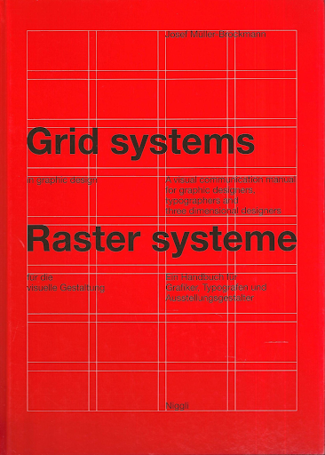
Grid Systems in Graphic Design by Josef Müller-Brockmann

Grid systems are essential for graphic designers as a tool for organizing layout and content. It’s the definitive word on using grid systems in graphic design.

It’s a visual communication manual for graphic designers, 3D designers and typographers. The book is full of great conceptual examples, and also shows you why a certain grid choice would work better in a given situation.

If you are looking to improve yourself in this field, grid systems are something you can’t just pass.

Thinking With Type by Ellen Lupton

Thinking With Type is a great book for anyone who works with type. It’s especially useful for designers, covering all the angles from print to screen.

The book starts off by explaining the theory in 3 categories, letter, text, and grid. After the theoretical introduction, the practical exercises you can put to use immediately follow up. There is also a section in which what you shouldn’t be doing is explained as well.

Designing Brand Identity by Alina Wheeler

This best selling book by Alina Wheeler is everything you are looking for about designing in today’s day and age. Originally published in 2009, the book has been updated for the fifth time in 2017 to cover all of the new emerging technologies and practices.

The book covers expanded coverage of social media cross channel synergy, crowdsourcing, SEO, experience branding, mobile devices, wayfinding, and placemaking. The book consists of three sections on brand fundamentals, process basics, and case studies. These case studies include top brands from various industries around the world.

If you want to learn more about identity design and the process of branding, you definitely need to read this.

As a graphic designer, you constantly need to improve yourself. There are so many things you can learn from the iconic and famous illustrators to CG artists. And working towards mastering your craft is not enough, don’t forget to learn more about the business side of it.

Categories: Others Tags:

Simplify Your Stack With A Custom-Made Static Site Generator

September 23rd, 2020 No comments

With the advent of the Jamstack movement, statically-served sites have become all the rage again. Most developers serving static HTML aren’t authoring native HTML. To have a solid developer experience, we often turn to tools called Static Site Generators (SSG).

These tools come with many features that make authoring large-scale static sites pleasant. Whether they provide simple hooks into third-party APIs like Gatsby’s data sources or provide in-depth configuration like 11ty’s huge collection of template engines, there’s something for everyone in static site generation.

Because these tools are built for diverse use cases, they have to have a lot of features. Those features make them powerful. They also make them quite complex and opaque for new developers. In this article, we’ll take the SSG down to its basic components and create our very own.

What Is A Static Site Generator?

At its core, a static site generator is a program that performs a series of transformations on a group of files to convert them into static assets, such as HTML. What sort of files it can accept, how it transforms them, and what types of files come out differentiate SSGs.

Jekyll, an early and still popular SSG, uses Ruby to process Liquid templates and Markdown content files into HTML.

Gatsby uses React and JSX to transform components and content into HTML. It then goes a step further and creates a single-page application that can be served statically.

11ty renders HTML from templating engines such as Liquid, Handlebars, Nunjucks, or JavaScript template literals.

Each of these platforms has additional features to make our lives easier. They provide theming, build pipelines, plugin architecture, and more. With each additional feature comes more complexity, more magic, and more dependencies. They’re important features, to be sure, but not every project needs them.

Between these three different SSGs, we can see another common theme: data + templates = final site. This seems to be the core functionality of generator static sites. This is the functionality we’ll base our SSG around.

At its core, a static site generator is a program that performs a series of transformations on a group of files to convert them into static assets, such as HTML.

Our New Static Site Generator’s Technology Stack: Handlebars, Sanity.io And Netlify

To build our SSG, we’ll need a template engine, a data source, and a host that can run our SSG and build our site. Many generators use Markdown as a data source, but what if we took it a step further and natively connected our SSG to a CMS?

  • Data Source: Sanity.io
  • Data fetching and templating: Node and Handlebars
  • Host and Deployment: Netlify.

Prerequisites

  • NodeJS installed
  • Sanity.io account
  • Knowledge of Git
  • Basic knowledge of command line
  • Basic knowledge of deployment to services like Netlify.

Note: To follow along, you can find the code in this repository on GitHub.

Setting Up Our Document Structure In HTML

To start our document structure, we’re going to write plain HTML. No need to complicate matters yet.

In our project structure, we need to create a place for our source files to live. In this case, we’ll create a src directory and put our index.html inside.

In index.html, we’ll outline the content we want. This will be a relatively simple about page.

<!DOCTYPE html><html lang="en">
<head>
    <meta charset="UTF-8">
    <meta name="viewport" content="width=device-width, initial-scale=1.0">
    <title>Title of the page!</title>
</head>
<body>
    <h1>The personal homepage of Bryan Robinson</h1>

    <p>Some pagraph and rich text content next</p>

    <h2>Bryan is on the internet</h2>
    <ul>
        <li><a href="linkURL">List of links</a></li>
    </ul>
</body>
</html>

Let’s keep this simple. We’ll start with an h1 for our page. We’ll follow that with a few paragraphs of biographical information, and we’ll anchor the page with a list of links to see more.

Convert Our HTML Into A Template That Accepts Data

After we have our basic structure, we need to set up a process to combine this with some amount of data. To do this, we’ll use the Handlebars template engine.

At its core, Handlebars takes an HTML-like string, inserts data via rules defined in the document, and then outputs a compiled HTML string.

To use Handlebars, we’ll need to initialize a package.json and install the package.

Run npm init -y to create the structure of a package.json file with some default content. Once we have this, we can install Handlebars.

npm install handlebars

Our build script will be a Node script. This is the script we’ll use locally to build, but also what our deployment vendor and host will use to build our HTML for the live site.

To start our script, we’ll create an index.js file and require two packages at the top. The first is Handlebars and the second is a default module in Node for accessing the current file system.

const fs = require('fs');
const Handlebars = require('handlebars');

We’ll use the fs module to access our source file, as well as to write to a distribution file. To start our build, we’ll create a main function for our file to run when called and a buildHTML function to combine our data and markup.

function buildHTML(filename, data) {
  const source = fs.readFileSync(filename,'utf8').toString();
  const template = Handlebars.compile(source);
  const output = template(data);

  return output
}

async function main(src, dist) {
  const html = buildHTML(src, { "variableData": "This is variable data"});

  fs.writeFile(destination, html, function (err) {
    if (err) return console.log(err);
      console.log('index.html created');
  });
}

main('./src/index.html', './dist/index.html');

The main() function accepts two arguments: the path to our HTML template and the path we want our built file to live. In our main function, we run buildHTML on the template source path with some amount of data.

The build function converts the source document into a string and passes that string to Handlebars. Handlebars compiles a template using that string. We then pass our data into the compiled template, and Handlebars renders a new HTML string replacing any variables or template logic with the data output.

We return that string into our main function and use the writeFile method provided by Node’s file-system module to write the new file in our specified location if the directory exists.

To prevent an error, add a dist directory into your project with a .gitkeep file in it. We don’t want to commit our built files (our build process will do this), but we’ll want to make sure to have this directory for our script.

Before we create a CMS to manage this page, let’s confirm it’s working. To test, we’ll modify our HTML document to use the data we just passed into it. We’ll use the Handlebars variable syntax to include the variableData content.

<h1>{{ variableData }}</h1>

Now that our HTML has a variable, we’re ready to run our node script.

node index.js

Once the script finishes, we should have a file at /dist/index.html. If we read open this in a browser, we’ll see our markup rendered, but also our “This is variable data” string, as well.

Connecting To A CMS

We have a way of putting data together with a template, now we need a source for our data. This method will work with any data source that has an API. For this demo, we’ll use Sanity.io.

Sanity is an API-first data source that treats content as structured data. They have an open-source content management system to make managing and adding data more convenient for both editors and developers. The CMS is what’s often referred to as a “Headless” CMS. Instead of a traditional management system where your data is tightly coupled to your presentation, a headless CMS creates a data layer that can be consumed by any frontend or service (and possibly many at the same time).

Sanity is a paid service, but they have a “Standard” plan that is free and has all the features we need for a site like this.

Setting Up Sanity

The quickest way to get up and running with a new Sanity project is to use the Sanity CLI. We’ll start by installing that globally.

npm install -g @sanity/cli

The CLI gives us access to a group of helpers for managing, deploying, and creating. To get things started, we’ll run sanity init. This will run us through a questionnaire to help bootstrap our Studio (what Sanity calls their open-source CMS).

Select a Project to Use:
   Create new project
   HTML CMS

Use the default dataset configuration?   
   Y // this creates a "Production" dataset

Project output path:
   studio // or whatever directory you'd like this to live in

Select project template
   Clean project with no predefined schemas

This step will create a new project and dataset in your Sanity account, create a local version of Studio, and tie the data and CMS together for you. By default, the studio directory will be created in the root of our project. In larger-scale projects, you may want to set this up as a separate repository. For this project, it’s fine to keep this tied together.

To run our Studio locally, we’ll change the directory into the studio directory and run sanity start. This will run Studio at localhost:3333. When you log in, you’ll be presented with a screen to let you know you have “Empty schema.” With that, it’s time to add our schema, which is how our data will be structured and edited.

Creating Sanity Schema

The way you create documents and fields within Sanity Studio is to create schemas within the schemas/schema.js file.

For our site, we’ll create a schema type called “About Details.” Our schema will flow from our HTML. In general, we could make most of our webpage a single rich-text field, but it’s a best practice to structure our content in a de-coupled way. This provides greater flexibility in how we might want to use this data in the future.

For our webpage, we want a set of data that includes the following:

  • Title
  • Full Name
  • Biography (with rich text editing)
  • A list of websites with a name and URL.

To define this in our schema, we create an object for our document and define out its fields. An annotated list of our content with its field type:

  • Title — string
  • Full Name — string
  • Biography — array of “blocks”
  • Website list — array of objects with name and URL string fields.
types: schemaTypes.concat([
    / Your types here! /

    {
        title: "About Details",
        name: "about",
        type: "document",
        fields: [
            {
                name: 'title',
                type: 'string'
            },
            {
                name: 'fullName',
                title: 'Full Name',
                type: 'string'
            },
            {
                name: 'bio',
                title: 'Biography',
                name: 'content',
                type: 'array',
                of: [
                    {
                        type: 'block'
                    }
                ]
            },
            {
                name: 'externalLinks',
                title: 'Social media and external links',
                type: 'array',
                of: [
                    {
                        type: 'object',
                        fields: [
                            { name: 'text', title: 'Link text', type: 'string' },
                            { name: 'href', title: 'Link url', type: 'string' }
                        ]
                    }
                ]
            }
        ]
    }
])

Add this to your schema types, save and your Studio will recompile and present you with your first documents. From here, we’ll add our content into the CMS by creating a new document and filling out the information.

Structuring Your Content In A Reusable Way

At this point, you may be wondering why we have a “full name” and a “title.” This is because we want our content to have the potential to be multipurpose. By including a name field instead of including the name just in the title, we give that data more use. We can then use information in this CMS to also power a resumé page or PDF. The biography field could be programmatically used in other systems or websites. This allows us to have a single source of truth for much of this content instead of being dictated by the direct use case of this particular site.

Pulling Our Data Into Our Project

Now that we’ve made our data available via an API, let’s pull it into our project.

Install and configure the Sanity JavaScript client

First thing, we need access to the data in Node. We can use the Sanity JavaScript client to forge that connection.

npm install @sanity/client

This will fetch and install the JavaScript SDK. From here, we need to configure it to fetch data from the project we set up earlier. To do that, we’ll set up a utility script in /utils/SanityClient.js. We provide the SDK with our project ID and dataset name, and we’re ready to use it in our main script.

const sanityClient = require('@sanity/client');
const client = sanityClient({
    projectId: '4fs6x5jg',
    dataset: 'production',
    useCdn: true 
  })

module.exports = client;

Fetching Our Data With GROQ

Back in our index.js file, we’ll create a new function to fetch our data. To do this, we’ll use Sanity’s native query language, the open-source GROQ.

We’ll build the query in a variable and then use the client that we configured to fetch the data based on the query. In this case, we build an object with a property called about. In this object, we want to return the data for our specific document. To do that, we query based on the document _id which is generated automatically when we create our document.

To find the document’s _id, we navigate to the document in Studio and either copy it from the URL or move into “Inspect” mode to view all the data on the document. To enter Inspect, either click the “kabob” menu at the top-right or use the shortcut Ctrl + Alt + I. This view will list out all the data on this document, including our _id. Sanity will return an array of document objects, so for simplicity’s sake, we’ll return the 0th entry.

We then pass the query to the fetch method of our Sanity client and it will return a JSON object of all the data in our document. In this demo, returning all the data isn’t a big deal. For bigger implementations, GROQ allows for an optional “projection” to only return the explicit fields you want.

const client = require('./utils/SanityClient') // at the top of the file

// ...

async function getSanityData() {
    const query = {
        "about": *[_id == 'YOUR-ID-HERE'][0]
    }
    let data = await client.fetch(query);
}

Converting The Rich Text Field To HTML

Before we can return the data, we need to do a transformation on our rich text field. While many CMSs use rich text editors that return HTML directly, Sanity uses an open-source specification called Portable Text. Portable Text returns an array of objects (think of rich text as a list of paragraphs and other media blocks) with all the data about the rich text styling and properties like links, footnotes, and other annotations. This allows for your text to be moved and used in systems that don’t support HTML, like voice assistants and native apps.

For our use case, it means we need to transform the object into HTML. There are NPM modules that can be used to convert portable text into various uses. In our case we’ll use a package called block-content-to-html.

npm install @sanity/block-content-to-html

This package will render all the default markup from the rich text editor. Each type of style can be overridden to conform to whatever markup you need for your use case. In this case, we’ll let the package do the work for us.

const blocksToHtml = require('@sanity/block-content-to-html'); // Added to the top

async function getSanityData() {
    const query = {
        "about": *[_type == 'about'][0]
    }
    let data = await client.fetch(query);
    data.about.content = blocksToHtml({
        blocks: data.about.content
    })
    return await data
}

Using The Content From Sanity.io In Handlebars

Now that the data is in a shape we can use it, we’ll pass this to our buildHTML function as the data argument.

async function main(src, dist) {
    const data = await getSanityData();
    const html = buildHTML(src, data)

    fs.writeFile(dist, html, function (err) {
        if (err) return console.log(err);
        console.log('index.html created');
    });
}

Now, we can change our HTML to use the new data. We’ll use more variable calls in our template to pull most of our data.

To render our rich text content variable, we’ll need to add an extra layer of braces to our variable. This will tell Handlebars to render the HTML instead of displaying the HTML as a string.

For our externalLinks array, we’ll need to use Handlebars’ built-in looping functionality to display all the links we added to our Studio.

<!DOCTYPE html>
<html lang="en">
<head>
    <meta charset="UTF-8">
    <meta name="viewport" content="width=device-width, initial-scale=1.0">
    <title>{{ about.title }}</title>
</head>
<body>
    <h1>The personal homepage of {{ about.fullName }}</h1>

    {{{ about.content }}}

    <h2>Bryan is on the internet</h2>
    <ul>
        {{#each about.externalLinks }}
            <li><a href="{{ this.href }}">{{ this.text }}</a></li>
        {{/each}}
    </ul>
</body>
</html>

Setting Up Deployment

Let’s get this live. We need two components to make this work. First, we want a static host that will build our files for us. Next, we need to trigger a new build of our site when content is changed in our CMS.

Deploying To Netlify

For hosting, we’ll use Netlify. Netlify is a static site host. It serves static assets, but has additional features that will make our site work smoothly. They have a built-in deployment infrastructure that can run our node script, webhooks to trigger builds, and a globally distributed CDN to make sure our HTML page is served quickly.

Netlify can watch our repository on GitHub and create a build based on a command that we can add in their dashboard.

First, we’ll need to push this code to GitHub. Then, in Netlify’s Dashboard, we need to connect the new repository to a new site in Netlify.

Once that’s hooked up, we need to tell Netlify how to build our project. In the dashboard, we’ll head to Settings > Build & Deploy > Build Settings. In this area, we need to change our “Build command” to “node index.js” and our “Publish directory” to “./dist”.

When Netlify builds our site, it will run our command and then check the folder we list for content and publish the content inside.

Setting Up A Webhook

We also need to tell Netlify to publish a new version when someone updates content. To do that, we’ll set up a Webhook to notify Netlify that we need the site to rebuild. A Webhook is a URL that can be programmatically accessed by a different service (such as Sanity) to create an action in the origin service (in this case Netlify).

We can set up a specific “Build hook” in our Netlify dashboard at Settings > Build & Deploy > Build hooks. Add a hook, give it a name and save. This will provide a URL that can be used to remotely trigger a build in Netlify.

Next, we need to tell Sanity to make a request to this URL when you publish changes.

We can use the Sanity CLI to accomplish this. Inside of our /studio directory, we can run sanity hook create to connect. The command will ask for a name, a dataset, and a URL. The name can be whatever you’d like, the dataset should be production for our product, and the URL should be the URL that Netlify provided.

Now, whenever we publish content in Studio, our website will automatically be updated. No framework necessary.

Next Steps

This is a very small example of what you can do when you create your own tooling. While more full-featured SSGs may be what you need for most projects, creating your own mini-SSG can help you understand more about what’s happening in your generator of choice.

  • This site publishes only one page, but with a little extra in our build script, we could have it publish more pages. It could even publish a blog post.
  • The “Developer experience” is a little lacking in the repository. We could run our Node script on any file saves by implementing a package like Nodemon or add “hot reloading” with something like BrowserSync.
  • The data that lives in Sanity can power multiple sites and services. You could create a resumé site that uses this and publishes a PDF instead of a webpage.
  • You could add CSS and make this look like a real site.
Categories: Others Tags:

The Basics of Coffee Branding & Design – Coffee Design Ideas Brewed to Perfection

September 23rd, 2020 No comments

Be honest, have you ever, ever created an amazing design or came up with a great idea and coffee was not involved?

Because, I’ve got to admit… I’ve never had a good idea on a day I didn’t have coffee.

And I might have a little bit of a problem. Recently, I’ve been drinking about 4 cups of coffee a day, and that’s not helping my sleeping habits for sure.

But that’s what gave me this idea.

Today I want to talk to you about coffee branding basics and how to design for your next coffee shop clients or company.

[source]

We’re also going to go over the best examples of coffee branding and graphic design.

So grab your coffee and let’s get into it.

The Basics of Coffee Branding

Coffee is pretty much an essential part of life at this point.

[source]

Almost every single person I know starts their morning off with coffee, then has an afternoon pick-me-up coffee.

And it’s not just my friends who drink that much coffee. It turns out that 75% of all Americans intake their caffeine by drinking coffee.

Besides the fact that it’s just a wonderful beverage with a million and one benefits, from clearer thinking and better ideas, and also helping you stay awake on the days you stayed up absolutely too late, it’s also a drink that brings people together.

[source]

People love to bond and spend time together in coffee shops, people go there to relax, work, have meetings, etc.

On average, a typical American adult will spend about 2 grand a year on buying coffee, and 173 million bags of coffee are consumed worldwide each year.

So this means that now, more than ever, your coffee branding needs to stand out.

When people walk into the grocery store to pick out a bag of coffee beans, their eyes need to be drawn to your design.

But how?

Ask the Right Questions: Assess The Brand’s Values, Strategy, and Style

Before you can hop on any graphic design software and start designing away, you have to stop and think about what your brand’s values are or what your client is expecting from you.

[source]

Here are some questions to ask yourself before designing.

  1. What’s the style or vibe you’re going for?
  2. Is it a more earthy vibe? Will the colors be neutral or do they want them to be crazy eccentric?
  3. What are the values of this coffee company? Are they ethical? How can I express that through my design?
  4. Who is my target audience and what would they look for in a coffee brand?

Once you answer some of these basic questions, you can start designing accordingly.

4 Easy Steps to Creating the Perfect Coffee Brand and Logo

1. Come Up With The Right Branding Strategy

As I said, it all comes down asking the right questions, and when you get your answers, you can start coming up with a strategy.

Pinpointing your audience is key in the first steps of designing. Who are you designing for? An elegant brand that requires minimal color and a fancy typeface, or for a younger, more fun generation, where you have the freedom to do whatever you want? No matter the audience, make sure you design with them in mind and what would make the choose your brand.

The brand name is going to decide a lot for you. The creativity wheels will start spinning when you look at the name. Do a play on words, coincide your design to make sense with the name. You can also get a sense of tone-of-voice from the name of the brand and design accordingly.

Your logo should be something that everyone can recognize and something that sparks joy for your clients and customers. But we’ll talk more about this a little later.

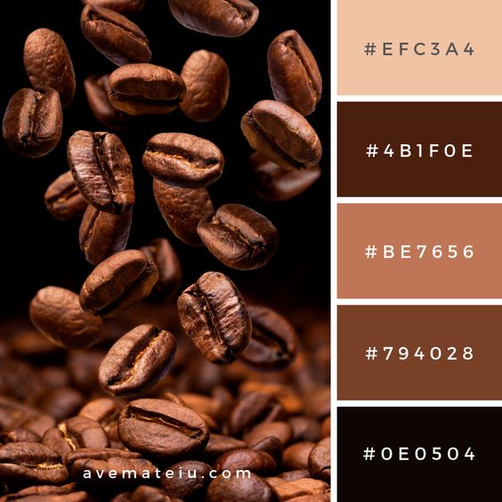
2. Use An Irresistible Color Palette

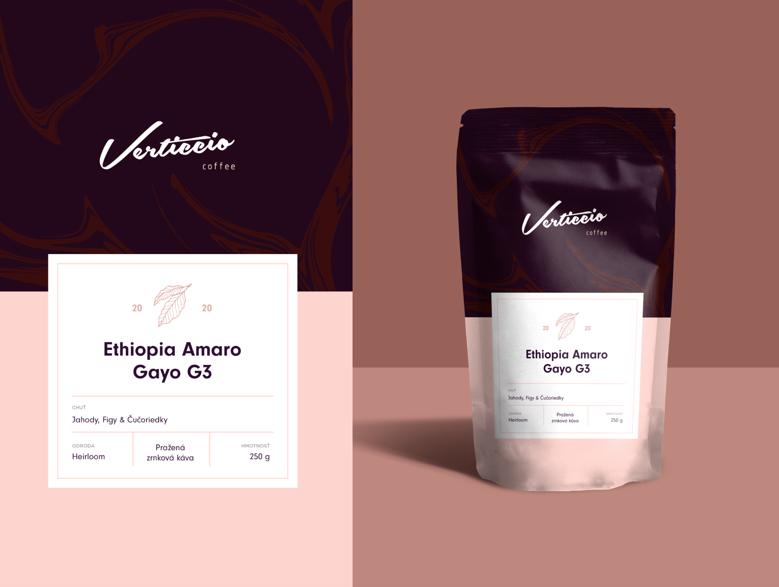
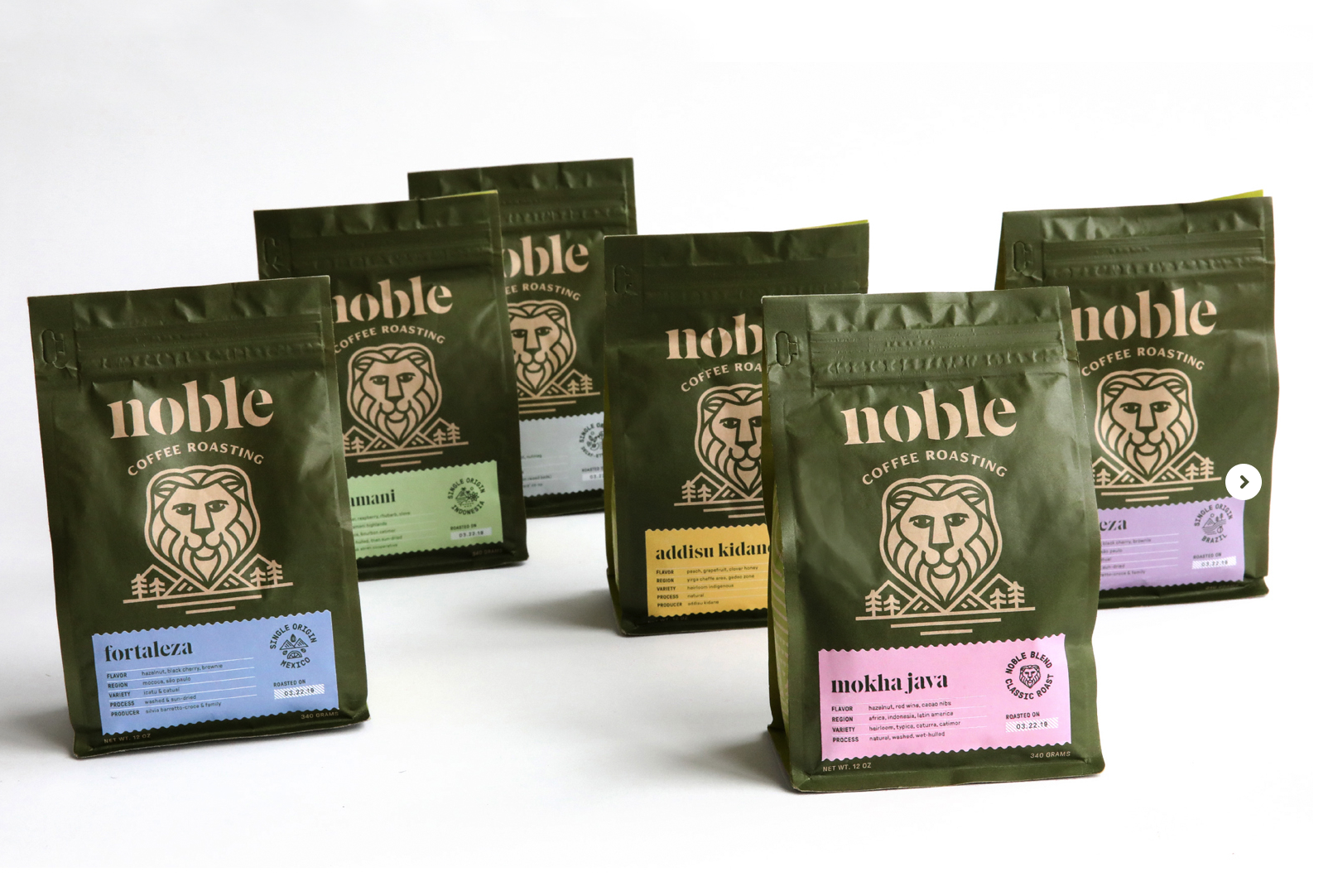
After doing some research and drawing some conclusions from my own experience in designing for coffee brands, most people love earthy tones when it comes to coffee branding.

So whether you go from a toned-down green, or an earthy brown pallette, make sure everything works together perfectly.

Just because most people choose earthy tones, that doesn’t mean that you have to! You can still go for brighter, more vibrant color palettes, but my recommendation is that you use the more muted versions of the colors you choose. So if you want to use orange and green, for example, just use a more muted version of the colors.

Here are a few of my favorite color combinations when it comes to coffee branding.

3. Check Out Your Competitors

One sure fire way to know if you’re doing well is by checking out your competitors.

Check out the ones who are doing better than you, but also the ones in the same boat.

You want to look at their work and not just be a copy-cat of what their doing, but be inspired by them and ask yourself what you have to offer that is different from them and how you can do better.

4. Keep it Simple

When it comes to your logo, the best thing to do is to keep it simple.

Especially nowadays, when the trend is flat-design and minimalist.

You want people to look at your design, and say, “oh yeah! That’s my favorite coffee brand.”

It shouldn’t be so complex that your customers don’t understand what the heck is going on, but it can also have a bit of a back story that needs to be explained.

A perfect combination of the two is the goal here, but keep it simple!

Our Favorite Coffee Branding Examples

I want to close out this article by inspiring you and showing you some examples of my favorite coffee brand designs.

My favorite places to get inspiration from are Pinterest, Dribbble, Behance, and the places around me.

So if you’re lacking inspiration, I hope this helps!

I hope this article helped you out in one way or another and inspired you to get to designing.

So go ahead, grab your coffee and go make something amazing.

And until next time,

Stay creative, folks!

Read More at The Basics of Coffee Branding & Design – Coffee Design Ideas Brewed to Perfection

Categories: Designing, Others Tags:

When Does Emotional Design Cross a Line?

September 23rd, 2020 No comments

Designing for emotion in and of itself is not a problem. Websites are bound to elicit an emotional reaction from visitors, even if it’s as simple as them feeling at ease because of the soft, pastel color palette you’ve designed the site with.

I don’t want to outright villainize emotional design. Unless there is some form of unethical manipulation at play, designing for your visitors’ emotions can actually provide them with a more positive experience.

So, here’s what I’d like to look at today:

  1. What is emotional design?
  2. When does emotional design cross a line?
  3. What’s the right way to design for emotions?

1. What Is Emotional Design?

When we look at emotional design in the context of a website, we’re focused on three types of emotional reactions:

a. Visceral Reactions

Visceral reactions are instinctive ones. Usually, visitors experience these as their first impressions of a website or web page. For instance, a cluttered or otherwise poorly designed homepage might leave visitors feeling overwhelmed, hesitant, or wanting to flea.

A minimally designed homepage interface, on the other hand, might have visitors not feeling much of a reaction at all. In this case, no feeling is a good feeling.

Like Irene Au said:

Design is like a refrigerator. When it works, no one notices. When it doesn’t, it stinks!

— Irene Au (@ireneau) February 14, 2015

b. Behavioral Reactions

Behavioral reactions stem from the usability of a website. There’s a lot that can stir up negative emotions here, like:

  • Extra-long contact forms
  • Confusing menus
  • Error-ridden content
  • Slow-loading pages
  • And more

Again, if a website is easy to get through and attractively designed, visitors aren’t likely going to “ooh” and “aah” with every step they take on the site. And that’s a good thing. If they’re focusing more on how the design looks, they’re not paying attention to the brand’s actual offer.
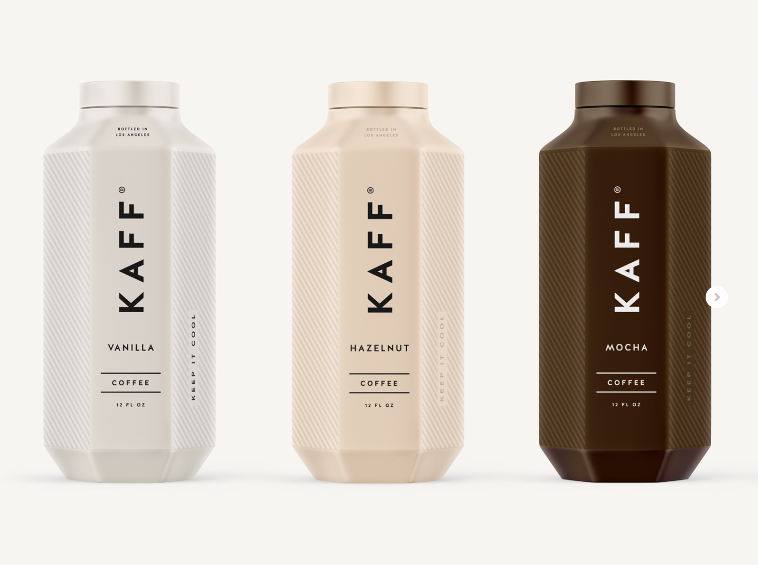
c. Reflective Reactions

Reflective reactions are the third type of emotions we design for.

This is complicated because there’s a lot wrapped up in how visitors feel about a website after the fact. Sometimes the most well-designed interfaces and experiences can’t save them from a bad experience, whether they realized too late that the products were overpriced or they were treated poorly by a live chat representative.

As a web designer, all you can really do is to make sure you’re working with reputable companies and then aligning the designs of their sites with their values.

When Does Emotional Design Cross a Line?

There’s already enough social pressure online; your website doesn’t need to be one of those places, too

Emotional design shouldn’t be about manipulating consumers’ emotions. In most cases, emotional design is about controlling the environment of the website so that emotions don’t go spinning wildly out of control — in either direction.

It’s when we take what we know about influencing someone’s emotional state to monetarily benefit from it that emotional design becomes problematic.

Here are some ways in which you might negatively impact the emotions of your visitors through design:

FOMO

The fear-of-missing-out isn’t always a bad marketing strategy. However, when FOMO is used for the purposes of rushing consumers to take action now and without time to really think it through, it definitely can be.

Chances are good they’ll feel badly no matter what. Either because they regret the rushed (and probably unnecessary, or expensive) decision or they blame themselves for missing out on an opportunity to be like everyone else.

There’s already enough social pressure online; your website doesn’t need to be one of those places, too. So, be careful with how you present customers with limits (on time, on products, etc.) or how you frame the call-to-action (“If you don’t buy this now, expect to fail/be miserable/suffer even more”).

Analysis Paralysis

It doesn’t matter why people specifically seek out your website. They have a problem or a hole in their life, and they’re looking for something to fix it.

Now, you can’t help it if the website has too much to offer in the way of options or solutions. Companies have to provide every possible solution/option so their users don’t feel like they have to go somewhere else to get what they need. However, the way you design these options can lead to a negative emotional state if you’re not careful.

For instance, your visitors might experience analysis paralysis, where there are so many options that it becomes impossible to take action. Similar to FOMO, this can lead to regret either with the decision they made or the one they were incapable of making.

By simplifying how many choices are presented at once, or designing a clear and supportive pathway to the right option of many, your website will leave visitors feeling much more positively about the whole experience.

Trendy Nostalgia

Nostalgia can be a great way to play upon the positive associations and emotions consumers feel towards an era gone by or a place they once knew. But, again, it depends on how you design with it.

For example, if you design a vintage website for an agency launched in 2019 and run by a group of 20-somethings, it might come off feeling disingenuous once customers start to catch on.

For a restaurant known as the oldest bar in the state, that would be a different story. That nostalgically designed website would be a real part of its story; not just done as a sales gimmick. As a result, customers would likely embrace those warm feelings for the “good ol’ days” they get from the website.

Also, think about how quickly nostalgia fades if it’s done to align with a trend. Unless you’re committed to redesigning a website the second that nostalgic feeling falls out of favor, you could be condemning your client to an outdated website mere months after launch.

What’s the Right Way to Design for Emotions?

Like I said before, there’s nothing wrong with designing for emotions. You just have to make sure your website visitors don’t feel manipulated and that they welcome the pleasant feelings the site gives them.

make sure your website visitors don’t feel manipulated

It might seem harmless at the time. After all, what are they doing on the site if they weren’t interested in the first place? And it’s not like they were bullied into spending their money, right?

But if they sense in any way that their response was driven by an emotion they wouldn’t have otherwise felt, they’re not going to be happy. While it might not be enough for them to cancel their subscription or services, or to return products they bought, it will definitely leave a bad taste in their mouth. And, ultimately, it can cost your website loyal visitors and customers.

So, if you’re going to use emotional design on a website, do it to improve their experience, not to put more money into your clients’ pockets. That means your emotional design choices need to be honest, transparent, and focused on eliciting naturally positive emotions like:

  • Satisfaction
  • Feeling impressed
  • Trust
  • Calm
  • Feeling valued

Go back to the three emotional reactions I brought up earlier. If you can design a website to give off a positive first impression, and to be pain-free and usable, you can spend the rest of your time injecting small bits of happiness and positivity into the website with color choices, friendly micro-interactions, personalized content, and more.

Featured image via Unsplash.

Source

Categories: Designing, Others Tags: