Archive

Archive for September, 2020

Thinking About Power Usage and Websites

September 21st, 2020 No comments

Gerry McGovern asked if I had any insight into energy consumption and websites. He has a book, after all, about the digital costs on the planet. He was wondering about the specifics of web tech, like…

If you do this in HTML it will consume 3× energy but if you do it in JavaScript it will consume 10×.

I would think if you really looked, and knew exactly how to measure it, you could find examples like that. Say I wanted to move an element across the screen. If I wrote a setInterval loop in JavaScript that incremented the left position on the relative-positioned element by one millisecond, I’m 99% sure that takes more literal electricity to do than if you were to do a CSS @keyframes animation over the same time where you changed the transform: translateX() value. In that example, usually, we’re thinking about performance moreso than energy consumption, but that’s interesting right away: does good performance map to lower energy usage? Probably.

Researches have looked into this.

We discover a statistically significant negative correlation between performance scores and the energy consumption of mobile web apps (with medium to large effect sizes), implying that an increase of the performance score tend to lead to a decrease of energy consumption.

They were testing mobile web apps on Android using Lighthouse scores. I can guess that maps pretty well to other platforms and other performance metrics.

I’m glad the research so far maps to what I would logically expect to be true. Things that lead to poor performance are things that take energy. Imagine images. You’ll be dinged on performance scores for serving too large or unoptimized images. Imagine the performance implications of that. There are two images sitting on a server, a large one and a small one. Which one takes more electricity to travel to some user’s computer? The large one. Which one takes more processing power to parse and display? The large one. Which one occupies more memory (which uses electricity) for the duration of it’s life on screen? The large one.

The less across the network, the less electricity.

The less your browser has to do, the less electricity.

Some ad that auto-refreshes itself every few seconds? Not only is it annoying, but it’s bandwidth-wasteful and thus wasteful with electricity. Whenever you have to resort to polling (i.e. making a network request over and over) rather than something event-based like web sockets? That’s using electricity that you may not have needed to use.

We know that CDNs are good for performance too. Rather than a file (like an image) needing to travel across the world, it comes from a server much geographically closer on a server designed for that job. This is where things get a little more murky to me.

With performance as our goal: objective achieved. With low-energy consumption as our goal, are we there?

It has been studied, but unfortunately, I can’t tell what the conclusion is from the abstract alone. In my mind, things are complicated by the fact that servers around the world are storing copies of these assets, and when the assets change, it’s not just one server where they update, but again, servers around the world. There has got to be a balance between the propagation and duplicative storage as far as the savings that would be realized by the efficiency of saving requests.

Speaking of storage efficiency, I’m certain that storage just sitting on disk takes a lot less electricity than files being sent over networks — but it still has a cost. Say you saved a copy of every file every time you changed it. Say you saved a complete copy of your website every time you deployed it. Useful? Sure. Does that cost electricity? It must. There must be some balance to strike there.

Gerry was asking me about particular technologies though. I can think of another big deal thing in CSS land: dark mode! Yet again, it’s been studied. Dark mode saves power.

Dark Mode can indeed reduce the display power draw by up to 58.5% at full brightness for the set of popular Android apps that we tested! In terms of whole phone battery drain reduction, that translates into 5.6% to 44.7% savings at full brightness and 1.8% to 23.5% savings at 38% brightness.

And what about comparing technologies? I suspect it’s far more about what that technology (or language) is doing than the language itself. For example, I can build a little area that opens and closes in HTML with a

element. Is that more energy-efficient than creating that area by attaching a click handler on a button that toggles the class of an element that visually opens and closes it? I kinda doubt it. I’d bet the electricity being used in the re-paint/re-render steps that the browser is doing and the languages behind it are less relevant. And yet! If I made the browser download a 50 KB JavaScript library just to implement my little open/close element, then yes, it does matter, and the JavaScript version is less efficient.

In that way, just as good performance generally maps to less energy consumption, I’d bet that adhering to the rule of least power generally maps to less energy consumption as well.

Sick of me guessing at stuff? Fair enough.

Jack Lenox’s article “How Improving Website Performance Can Help Save The Planet” on Smashing is a better deep dive. He points to websites that will test your site. Website Carbon Calculator is one example and it states:

Calculating the carbon emissions of website is somewhat of a challenge, but using five key pieces of data we can make a pretty good estimate:

1. Data transfer over the wire
2. Energy intensity of web data
3. Energy source used by the data centre
4. Carbon intensity of electricity
5. Website traffic

The testing code is open source.


The post Thinking About Power Usage and Websites appeared first on CSS-Tricks.

You can support CSS-Tricks by being an MVP Supporter.

Categories: Designing, Others Tags:

Nova

September 21st, 2020 No comments

Nova is a new (vehemently macOS-only) code editor from Panic, the folks behind Coda. It’s like “Coda 3” except this was such a major re-write that they gave it a whole new name.

I played with some of the betas as they were building it. I got a little discount as it went live, so I bought it and am using it here and there. Here’s my thought dump!

Like a lot of other people, I’m on the VS Code train. VS Code is very good and free. I work on a team where everyone else also uses VS Code. It’s going to be hard to dislodge my VS Code muscle memory. I’ve written about switching code editors before. The short story:

  1. Nothing can be obnoxious up front. As in, I can re-learn things after the transition.
  2. There has to be some killer feature that makes it appealing.

I really, really like Prettier and Emmet. If I couldn’t have those, I’d be out for sure. Fortunately, they are some of the top extensions.

I picked out a few I know I’ll want.

The default expansion for Emmet is Ctrl-E though, and it doesn’t work with Tab expansion (as far as I can tell), which isn’t my favorite. It does have all the extra fancy things Emmet can do though, which you can map to whatever keys you want.


The key binding setup is great. I was able to map all the things I’m used to, like setting Command-T to “Open Quickly” which is like the “Go to file…” setup in VS Code.


I have nearly 30 VS Code extensions activated. They all add some little nicety to VS Code for me specifically. I haven’t missed any of them yet. It would be a bonus to me if the default behavior of Nova was so good off the shelf that it didn’t need as many third-party tweaks (aside from the two biggies I already mentioned). For example, I don’t need a plugin to make my indendations all rainbow-ified because they already are!

But notice the JSX isn’t particularly well highlighted even though it’s on the right syntax.

“Find-in-project” is something I do at least a dozen times a day, so that’s something that needs to work tremendously well for me. My only issue so far is that it seems get stuck on “Indexing Files…” for me quite a bit (or feels stuck because it gets the ol’ fan spinning). That said, it seems to return good search results.

The Mac-ness of Nova is ver, very strong. Scoping the “find-in-project” search results (say to only return *.js files) requires creating a new search scope. I can save that scope with a custom name which is a neat idea, but it has the very verbose UI-heavy search scoping from the MacOS Finder rather than a quick input field where I can quickly type *.js to scope results. In other words, it just feels like an example of emphasizing Mac-y-ness over usefulness.


Another mega Mac-y-ness thing is right-clicking a folder to open the file browser: it’s exactly like right-clicking a folder in the Finder. It’s comforting in a way, because that menu has a lot of powerful things in it.

But it also lacks things that might be contextually useful. For example, I miss an option to “Open this folder in a terminal window.”


The UI details are very nice. Selecting of coding font preferences is wonderful. The minimap looks great with little colored rectangles representing your code. The window and editor themes are very well done. Everything about the UI is just super classy.


It’s still a successor to Coda, so if you need to SFTP into remote servers and do direct editing, that’s there. I just had to do it the other day to edit a file I intentionally keep out of git, so that feature is still handy at times.

That’s a remote file system.

I otherwise would have used Coda for that, and didn’t even have to set it up for Nova because Panic Sync brought over all that auth info.


I do kind of dig that there is a built-in browser (Safari, of course). I’m wondering if I can get the muscle memory to be able to work within just this one application only without having to do much window-juggling. That means file browser, code editor, terminal, browser, and DevTools.

It’s a lot to see at once, but… kinda cool? I wish it had the option to use Chromium built-in as I happen to be more familiar with those DevTools There are some rough edges too, like my little tmux session in the terminal doesn’t respond to click events.


It’s interesting that Swift isn’t a built-in language. I would have guessed Panic even wrote at least parts of Nova in Swift given its Mac-y-ness.


If nothing else, you should check out the Nova landing page for all the CSS trickery! The animated clip-path on the image illustrating Nova’s themes is super cool. It’s just some images stacked on top of each other all sharing the same animation, staggered out:

@keyframes wipe
{
    0% { clip-path: polygon(-50% 0%, 0% 0%, -50% 101%, -100% 101%) }
    100% { clip-path: polygon(150% 0%, 200% 0%, 150% 101%, 100% 101%) }
}

/* ... */

img#interface1 { animation-delay: -17000ms; }
img#interface2 { animation-delay: -15000ms; }
img#interface3 { animation-delay: -13000ms; }
img#interface4 { animation-delay: -11000ms; }

The


though… that’s just gorgeous:

CodePen Embed Fallback

Oh, and check out the use of the display-p3 color format!

DevTools window showing CSS custom properties on the Nova landing page that reference display-p3 color values.

The post Nova appeared first on CSS-Tricks.

You can support CSS-Tricks by being an MVP Supporter.

Categories: Designing, Others Tags:

Pre-Caching Image with React Suspense

September 21st, 2020 No comments

Suspense is an exciting, upcoming feature of React that will enable developers to easily allow their components to delay rendering until they’re “ready,” leading to a much smoother user experience. “Ready,” in this context, can mean a number of things. For example, your data loading utility can tie into Suspense, allowing for consistent loading states to be displayed when any data are in flight, without needing to manually track loading state per query. Then, when your data are available, and your component is “ready,” it’ll render. This is the subject that’s most commonly discussed with Suspense, and I’ve written about it previously; however, data loading is only one use case among many where Suspense can improve user experience. Another one I want to talk about today is image preloading.

Have you ever made, or used a web app where, after landing on a screen, your place on it staggers and jumps as images download and render? We call that content reflow and it can both be jarring and unpleasant. Suspense can help with this. You know how I said that Suspense is all about holding a component back from rendering until it’s ready? Fortunately, “ready” in this context is pretty open-ended — and for our purposes can included “images we need that have preloaded.” Let’s see how!

Quick crash course on Suspense

Before we dive into specifics, let’s take a quick look at how Suspense works. It has two main parts. The first is the concept of a component suspending. This means React attempts to render our component, but it’s not “ready.” When this happens, the nearest “fallback” in the component tree will render. We’ll look at making fallbacks shortly (it’s fairly straightforward), but the way in which a component tells React it’s not ready is by throwing a promise. React will catch that promise, realize the component isn’t ready, and render the fallback. When the promise resolves, React will again attempt to r.ender. Rinse, wash and repeat. Yes, I’m over-simplifying things a tad, but this is the gist of how Suspense works and we’ll expand on some of these concepts as we go.

The second part of Suspense is the introduction of “transition” state updates. This means we set state, but tell React that the state change may cause a component to suspend, and if this happens, to not render a fallback. Instead, we want to continue viewing the current screen, until the state update is ready, at which point it’ll render. And, of course, React provides us with a “pending” boolean indicator that lets the developer know this is in progress so we can provide inline loading feedback.

Let’s preload some images!

First off, I want to note that there’s a full demo of what we’re making at the end of this article. Feel free to open the demo now if you just want to jump into the code. It’ll show how to preload images with Suspense, combined with transition state updates. The rest of this post will build that code up step-by-step, explaining the how’s the why’s along the way.

OK, let’s go!

We want our component to suspend until all of its images have preloaded. To make things as simple as possible, let’s make a component that receives a src attribute, preloads the image, handles the exception throwing, and then renders an when everything’s ready. Such a component would allow us to seamlessly drop our component wherever we want an image displayed, and Suspense would handle the grunt work of holding onto it until everything is ready.

We can start by making a preliminary sketch of the code:

const SuspenseImg = ({ src, ...rest }) => {
  // todo: preload and throw somehow
  return <img alt="" src={src} {...rest} />;
}; 

So we have two things to sort out: (1) how to preload an image, and (2) tying in exception throwing. The first part is pretty straightforward. We’re all used to using images in HTML via but we can also create images imperatively using the Image() object in JavaScript; moreover, images we create like this have an onload callback that fires when the image has … loaded. It looks like this:

const img = new Image();
img.onload = () => {
  // image is loaded
}; 

But how do we tie that into exception throwing? If you’re like me, your first inclination might be something like this:

const SuspenseImg = ({ src, ...rest }) => {
  throw new Promise((resolve) => {
    const img = new Image();
    img.onload = () => {
      resolve();
    };
  });
  return <img alt="" src={src} {...rest} />;
}; 

The problem, of course, is that this will always throw a promise. Every single time React attempts to render a instance, a new promise will be created, and promptly thrown. Instead, we only want to throw a promise until the image has loaded. There’s an old saying that every problem in computer science can be solved by adding a layer of indirection (except for the problem of too many layers of indirection) so let’s do just that and build an image cache. When we read a src, the cache will check if it’s loaded that image, and if not, it’ll begin the preload, and throw the exception. And, if the image is preloaded, it’ll just return true and let React get on with rendering our image.

Here’s what our component looks like:

export const SuspenseImg = ({ src, ...rest }) => {
  imgCache.read(src);
  return <img src={src} {...rest} />;
};

And here’s what a minimal version of our cache looks like:

const imgCache = {
  __cache: {},
  read(src) {
    if (!this.__cache[src]) {
      this.__cache[src] = new Promise((resolve) => {
        const img = new Image();
        img.onload = () => {
          this.__cache[src] = true;
          resolve(this.__cache[src]);
        };
        img.src = src;
      }).then((img) => {
        this.__cache[src] = true;
      });
    }
    if (this.__cache[src] instanceof Promise) {
      throw this.__cache[src];
    }
    return this.__cache[src];
  }
};

It’s not perfect, but it’s good enough for now. Let’s go ahead and put it to use.

The implementation

Remember, there’s a link to the fully working demo below, so if I move too fast at any particular step, don’t despair. We’ll explain things as well go.

Let’s start by defining our fallback. We define a fallback by placing a Suspense tag in our component tree, and pass our fallback via the fallback prop. Any component which suspends will search upward for the nearest Suspense tag, and render its fallback (but if no Suspense tag is found, an error will be thrown). A real app would likely have many Suspense tags throughout, defining specific fallbacks for its various modules, but for this demo, we only need a single one wrapping our root app.

function App() {
  return (
    <Suspense fallback={<Loading />}>
      <ShowImages />
    </Suspense>
  );
}

The component is a basic spinner, but in a real app, you’d likely want to render some sort of empty shell of the actual component you’re trying to render, to provide a more seamless experience.

With that in place, our component eventually renders our images with this:

<FlowItems>
  {images.map(img => (
    <div key={img}>
      <SuspenseImg alt="" src={img} />
    </div>
  ))}
</FlowItems>

On initial load, our loading spinner will show, until our initial images are ready, at which point they all show at once, without any staggered reflow jankiness.

Transition state update

Once the images are in place, when we load the next batch of them, we’d like to have them show up after they’ve loaded, of course, but keep the existing images on the screen while they load. We do this with the useTransition hook. This returns a startTransition function, and an isPending boolean, which indicates that our state update is in progress, but has suspended (or even if it hasn’t suspended, may still be true if the state update is simply taking too long). Lastly, when calling useTransition, you need to pass a timeoutMs value, which is the maximum amount of time the isPending flag can be true, before React just gives up and renders the fallback (note, the timeoutMs argument will likely be removed in the near future, with the transition state updates simply waiting as long as necessary when updating existing content).

Here’s what mine looks like:

const [startTransition, isPending] = useTransition({ timeoutMs: 10000 });

We’ll allow for 10 seconds to pass before our fallback shows, which is likely too long in real life, but is suitable for the purposes of this demo, especially when you might be purposefully slowing your network speed down in DevTools to experiment.

Here’s how we use it. When you click the button to load more images, the code looks like this:

startTransition(() => {
  setPage(p => p + 1);
});

That state update will trigger a new data load using my GraphQL client micro-graphql-react, which, being Suspense-compatible, will throw a promise for us while the query is in flight. Once the data come back, our component will attempt to render, and suspend again while our images are preloading. While all of this is happening, our isPending value will be true, which will allow us to display a loading spinner on top of our existing content.

Avoiding network waterfalls

You might be wondering how React blocks rendering while image preloading is taking place. With the code above, when we do this:

{images.map(img => (

…along with our rendered therein, will React attempt to render the first image, Suspend, then re-attempt the list, get past the first image, which is now in our cache, only to suspend on the second image, then the third, fourth, etc. If you’ve read about Suspense before, you might be wondering if we need to manually preload all the images in our list before all this rendering occurs.

It turns out there’s no need to worry, and no need for awkward preloading because React is fairly smart about how it renders things in a Suspense world. As React is making its way through our component tree, it doesn’t just stop when it hits a suspension. Instead, it continues rendering all other paths through our component tree. So, yeah, when it attempts to render image zero, a suspension will occur, but React will continue attempting to render images 1 through N, and only then suspend.

You can see this in action by looking at the Network tab in the full demo, when you click the “Next images” button. You should see the entire bucket of images immediately show up in the network list, resolve one by one, and when all finished, the results should show up on screen. To really amplify this effect, you might want to slow your network speed down to “Fast 3G.”

For fun, we can force Suspense to waterfall over our images by manually reading each image from our cache before React attempts to render our component, diving through every path in the component tree.

images.forEach((img) => imgCache.read(img));

I created a demo that illustrates this. If you similarly look at the Network tab when a new set of images comes in, you’ll see them added sequentially in the network list (but don’t run this with your network speed slowed down).

Suspend late

There’s a corollary to keep in mind when using Suspense: suspend as late in the rendering and as low in the component tree as possible. If you have some sort of which renders a bunch of suspending images, make sure each and every image suspends in its own component so React can reach it separately, and so none will block the others, resulting in a waterfall.

The data loading version of this rule is that data should be loaded as late as possible by the components that actually need it. That means we should avoid doing something like this in a single component:

const { data1 } = useSuspenseQuery(QUERY1, vars1);
const { data2 } = useSuspenseQuery(QUERY2, vars2);

The reason we want to avoid that is because query one will suspend, followed by query two, causing a waterfall. If this is simply unavoidable, we’ll need to manually preload both queries before the suspensions.

The demo

Here’s the demo I promised. It’s the same one I linked up above.

If you run it with your dev tools open, make sure you uncheck the box that says “Disable Cache” in the DevTools Network tab, or you’ll defeat the entire demo.

The code is almost identical to what I showed earlier. One improvement in the demo is that our cache read method has this line:

setTimeout(() => resolve({}), 7000);

It’s nice to have all our images preloaded nicely, but in real life we probably don’t want to hold up rendering indefinitely just because one or two straggling images are coming in slowly. So after some amount of time, we just give the green light, even though the image isn’t ready yet. The user will see an image or two flicker in, but it’s better than enduring the frustration of frozen software. I’ll also note that seven seconds is probably excessive, but for this demo, I’m assuming users might be slowing network speeds in DevTools to see Suspense features more clearly, and wanted to support that.

The demo also has a precache images checkbox. It’s checked by default, but you can uncheck it to replace the component with a regular ol’ tag, if you want to compare the Suspense version to “normal React” (just don’t check it while results are coming in, or the whole UI may suspend, and render the fallback).

Lastly, as always with CodeSandbox, some state may occasionally get out of sync, so hit the refresh button if things start to look weird or broken.

Odds and ends

There was one massive bug I accidentally made when putting this demo together. I didn’t want multiple runs of the demo to lose their effect as the browser caches images it’s already downloaded. So I manually modify all of the URLs with a cache buster:

const [cacheBuster, setCacheBuster] = useState(INITIAL_TIME);


const { data } = useSuspenseQuery(GET_IMAGES_QUERY, { page });
const images = data.allBooks.Books.map(
  (b) => b.smallImage + `?cachebust=${cacheBuster}`
);

INITIAL_TIME is defined at the modules level (i.e. globally) with this line:

const INITIAL_TIME = +new Date();

And if you’re wondering why I didn’t do this instead:

const [cacheBuster, setCacheBuster] = useState(+new Date());

…it’s because this does horrible, horrible things. On first render, the images attempt to render. The cache causes a suspension, and React cancels the render, and shows our fallback. When all of the promises have resolved, React will attempt this initial render anew, and our initial useState call will re-run, which means that this:

const [cacheBuster, setCacheBuster] = useState(+new Date());

…will re-run, with a new initial value, causing an entirely new set of image URLs, which will suspend all over again, ad infinitum. The component will never run, and the CodeSandbox demo grinds to a halt (making this frustrating to debug).

This might seem like a weird one-off problem caused by a unique requirement for this particular demo, but there’s a larger lesson: rendering should be pure, without side effects. React should be able to re-attempt rendering your component any number of times, and (given the same initial props) the same exact state should come out the other end.


The post Pre-Caching Image with React Suspense appeared first on CSS-Tricks.

You can support CSS-Tricks by being an MVP Supporter.

Categories: Designing, Others Tags:

58 Top UX Designer Portfolios in 2020

September 21st, 2020 No comments

We’ve previously prepared a list of the best Web Designer Portfolios. While web designers are extremely important for any digital product, UX Designers are also equally important if not even more important. As a result, we wanted to prepare this article+showcase of the top UX Designer Portfolios on the web to be an example for any striving or experienced UX Designers who want to improve their portfolios.

What Does a UX Designer Do?

Usually, UX Design is used interchangeably with UI and Usability. It’s true that a UX Designer works on Usability and UI Design, but those are subsets of UX Design in general. A UX Designer is responsible for almost all aspects of the product. As a result, UX Designers have to be extremely versatile and systematic.

What Makes Up a Good UX Designer Portfolio?

A portfolio website is essentially a publicly accessible business card. The greatest thing about it is that you can tell a lot more about your story and your work on your portfolio. A good UX Designer portfolio includes information about yourself, your work, and how to reach you. Let’s go over each point in detail.

An About Me Page

Having a short bio on the landing page of your portfolio website is good but make sure to include an about me page. On your about me page, include as much information about yourself as possible. But don’t forget to make it simple and easy-to-understand. You should cover anything from your own short biography, your work experience and you can even include a bit more about yourself such as your hobbies, etc.

Work Experiences

Your portfolio should reflect the quality of your work and as a result, you should clearly showcase your best pieces of work on your portfolio. A good practice is to showcase the work you’re most proud of on your main page but have a link to the rest of your portfolio. A popular practice is to add it as “My Work” on your primary navigation menu. For freelancers, it’s always good to strike a balance between “serious” projects and more quirky ones.

Social Proof

Social proof is good, social proof is necessary, social proof can lead to success. In other words, you need social proof to back up your work. Some might think that their work speaks for itself, but the reality is that people need to see your work praised by others. So, if possible, adding a few instances of social proof will go a long way. Things that pass as social proof include quotes from satisfied clients, employers, and previous work experiences (especially true if you’ve worked for a well-known company).

Contact Information & Availability

This one is simple. Your portfolio website should include your contact information or ways to contact you. The easier to contact you, the better. On top of that, some freelancers include information about their availability regarding new projects/jobs on their portfolio websites.
58 Best UX Designer Portfolios

We’ve searched far and wide to prepare our list of the best UX Designer portfolios we could find. So, let’s get right into it.

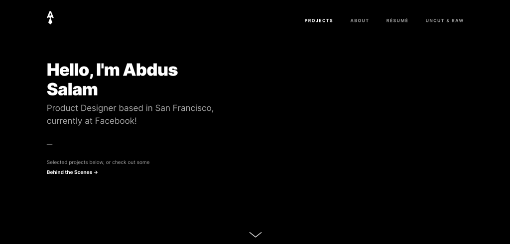
#1 Abdus Salam

Product Design – UX Design

Abdus Salam UX Designer Portfolio

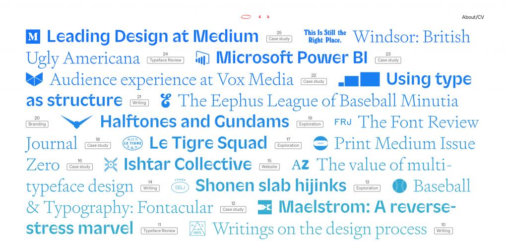
#2 Bethany Heck

Design – UX Design

Bethany Heck UX Designer Portfolio

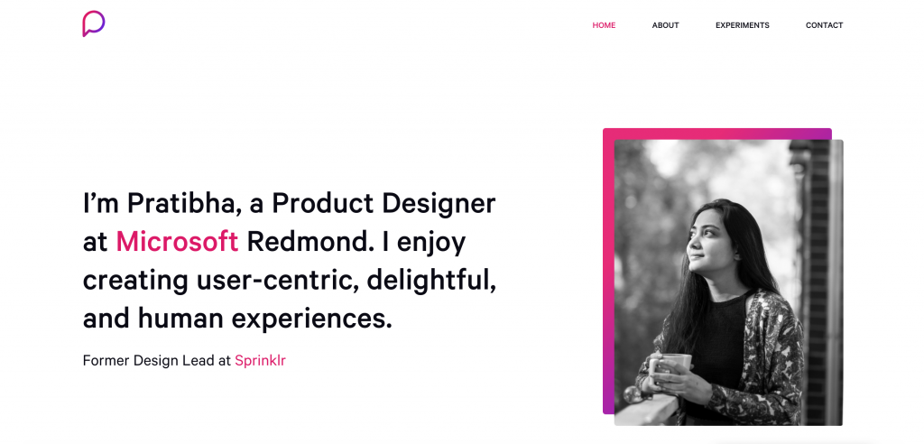
#3 Pratibha Joshi

Product Design – UX Design

Pratibha Joshi UX Designer Portfolio

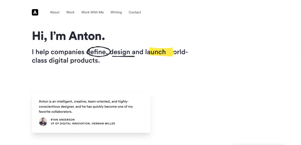
#4 Anton Sten

Product Design – UX Design

Anton Sten UX Designer Portfolio

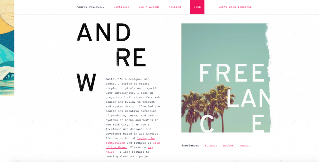
#5 Andrew Couldwell

Product Design – Web Design – Experience

Andrew Couldwell UX Designer portfolio

#6 Kosas Karolis

Product Design – UX Design

Kosas Karolis UX Designer Portfolio

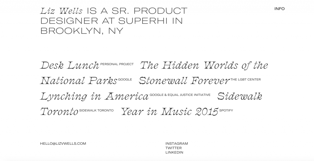
#7 Liz Wells

Product Design – UX Design

Liz Wells UX Designer Portfolio

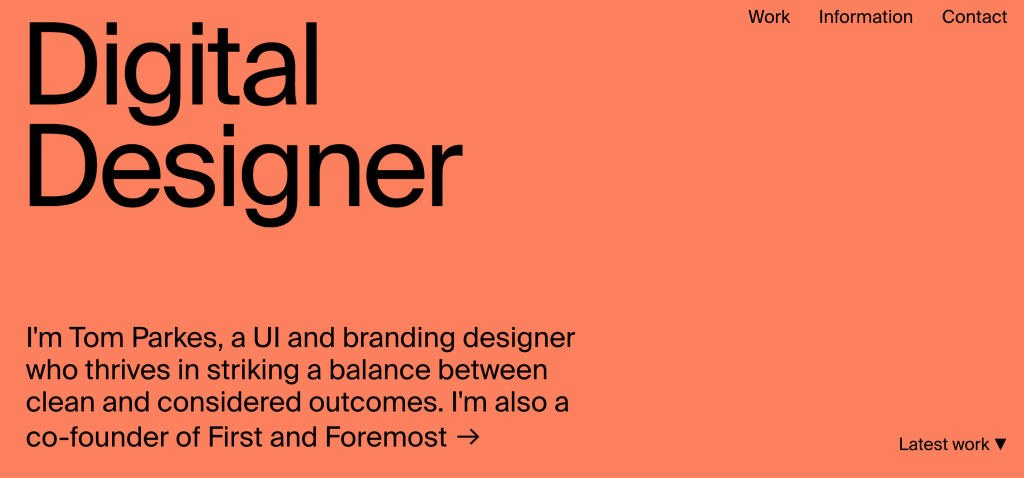
#8 Tom Parkes

UI Design – Brand Design

Tom Parkes UX Designer Portfolio

#9 Ivo Mynttinen

UI Design – Product Design – UX Design

Ivo Mynttinen UX Designer Portfolio

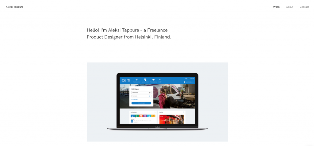
#10 Aleksi Tappura

UX Design – UI Design

Aleksi Tappura UX Designer Portfolio

#11 Ed Chao

UI Design

Ed Chao UX Designer Portfolio

#12 Luke James Taylor

UX Design – UI Design

Luke James Taylor UX Designer Portfolio

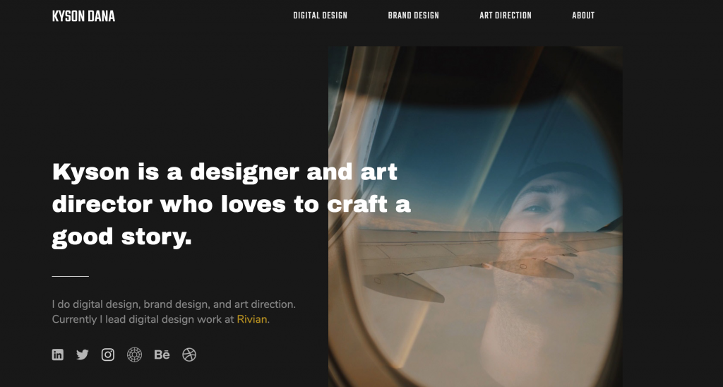
#13 Kyson Dana

UI Design – Brand Design

Kyson Dana UX Designer Portfolio

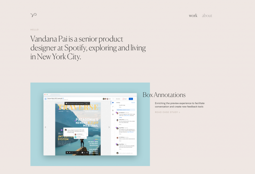
#14 Vandana Pai

Product Design – UX Design

Vandana Pai UX Designer Portfolio

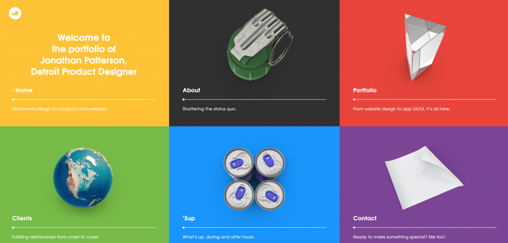
#15 Jonathan Patterson

Product Design

Jonathan Patterson UX Designer Portfolio

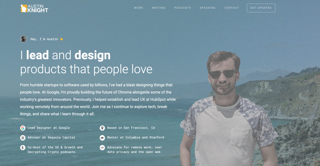
#16 Austin Knight

Product Design – UX Design

Austin Knight UX Designer Portfolio

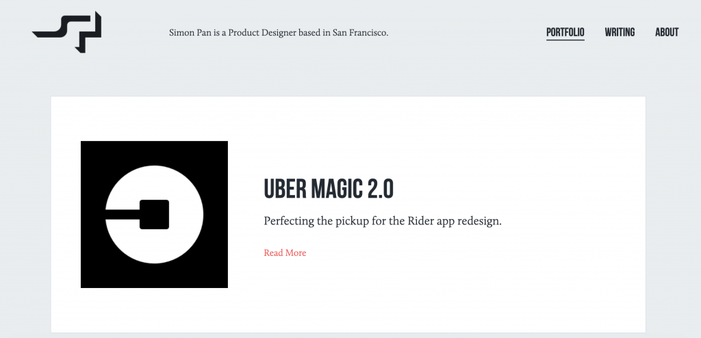
#17 Simon Pan

Product Design – UX Design

Simon Pan UX Designer Portfolio

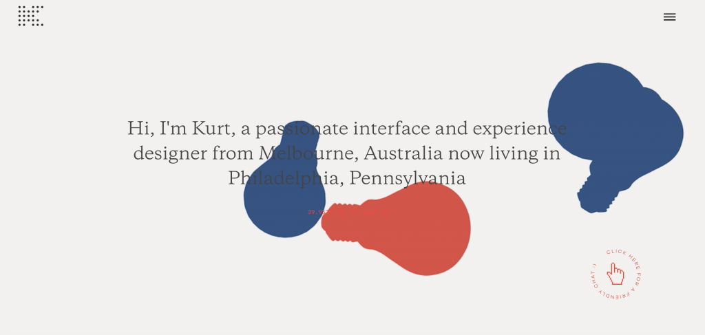
#18 Kurt Winter

UX Design – UI Design

Kurt Winter UX Designer Portfolio

#19 Isa Pinheiro

Brand Design – UX Design

Isa Pinheiro UX Designer Portfolio

#20 Husam Elfaki

UX Design

Husam Elfaki UX Designer Portfolio

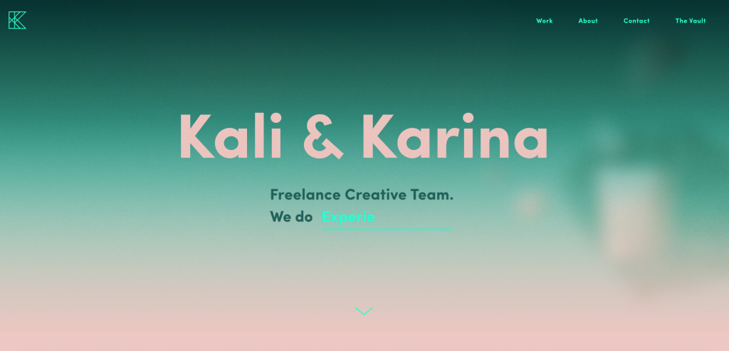
#21 Kali & Karina

UX Designer

Kali & Karina UX Designer Portfolio

#22 Elliot Owen

UX Design

Elliot Owen UX Designer Portfolio

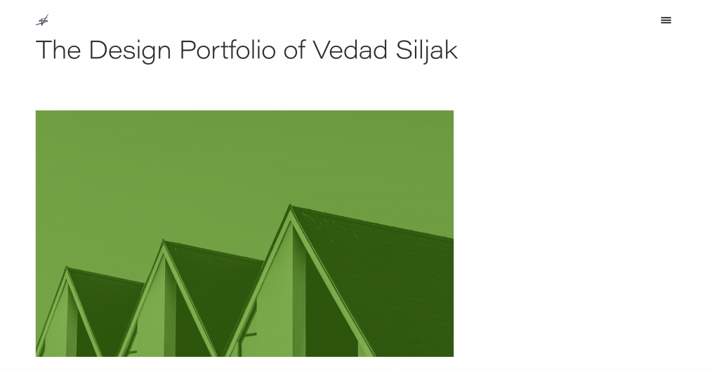
#23 Vedad Siljak

UX Design – UI Design

Vedad Siljak UX Designer Portfolio

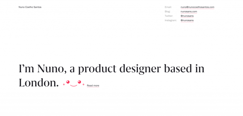
#24 Nuno Coelho Santos

UX Design – Product Design

Nuno Coelho Santos UX Designer Portfolio

#25 Johnny Czar

UX Design – Product Design

Johnny Czar UX Designer Portfolio

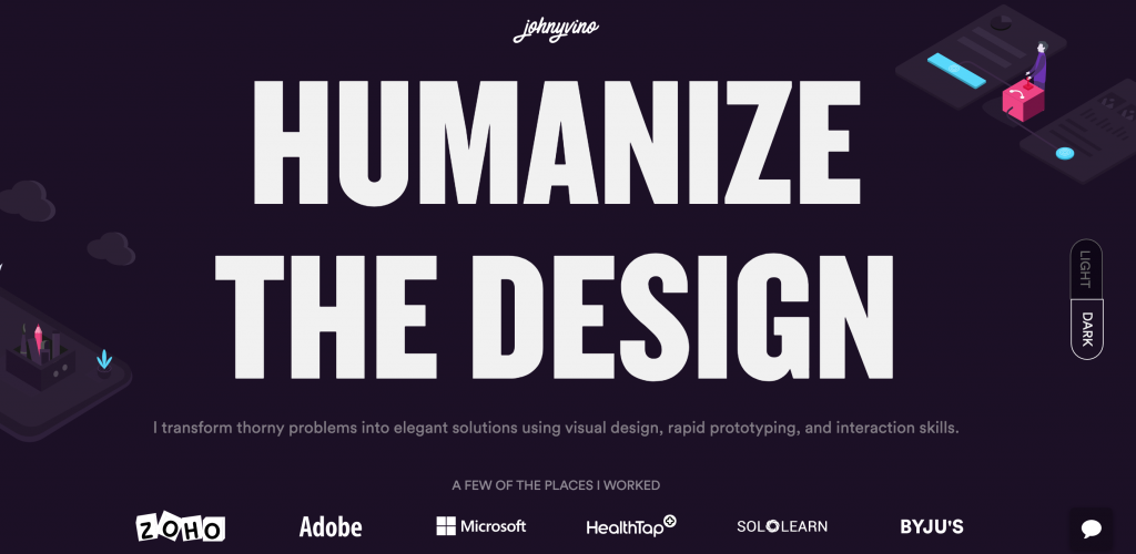
#26 Johny Vino

UX Designer – Product Designer

Johny Vito UX Designer Portfolio

#27 Hera Saqib

UX Design – Product Design

Hera Saqib UX Designer Portfolio

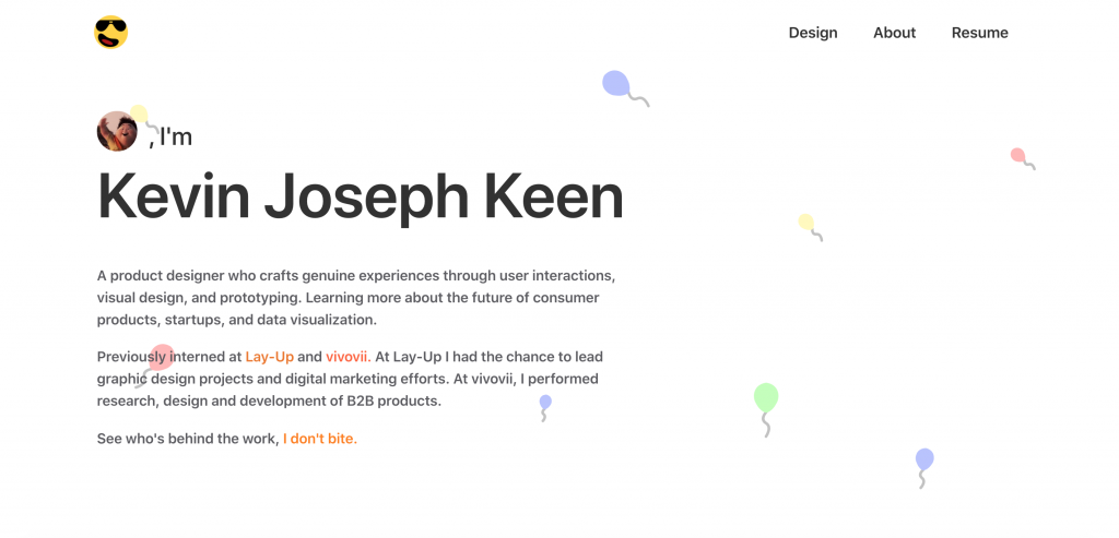
#28 Kevin Joseph Keen

UX Design – Product Design

Kevin Joseph Keen UX Designer Portfolio

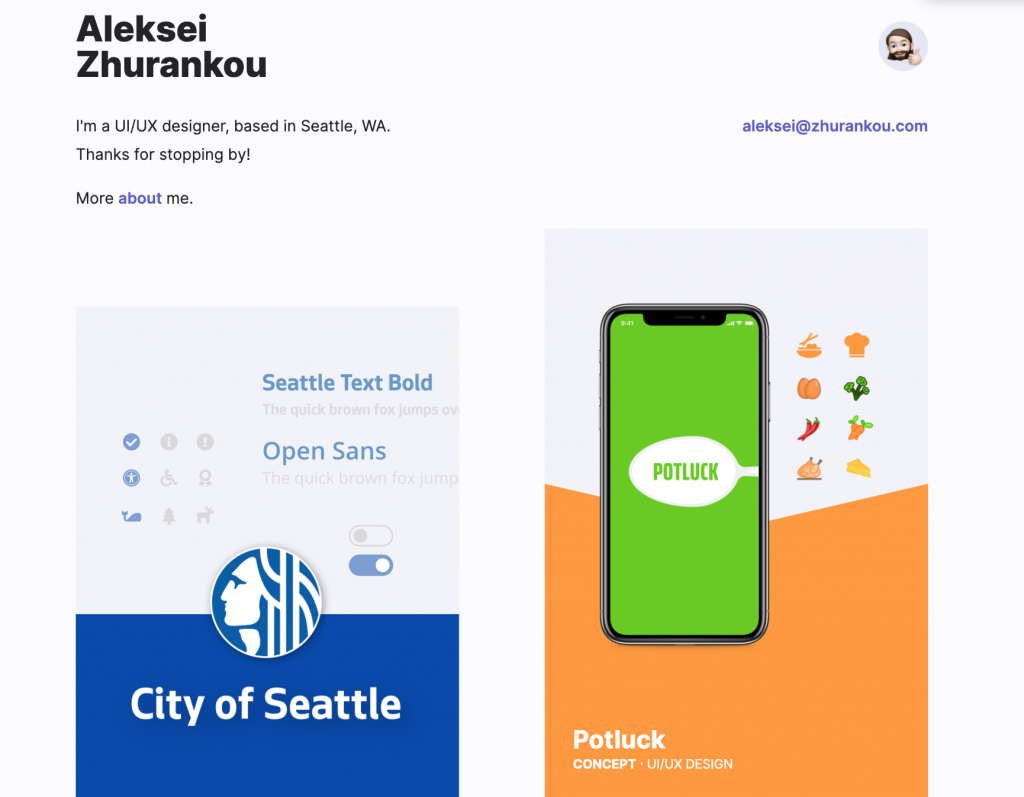
#29 Aleksei Zhurankou

UI Design – UX Design

Aleksei Zhurankou UX Design Portfolio

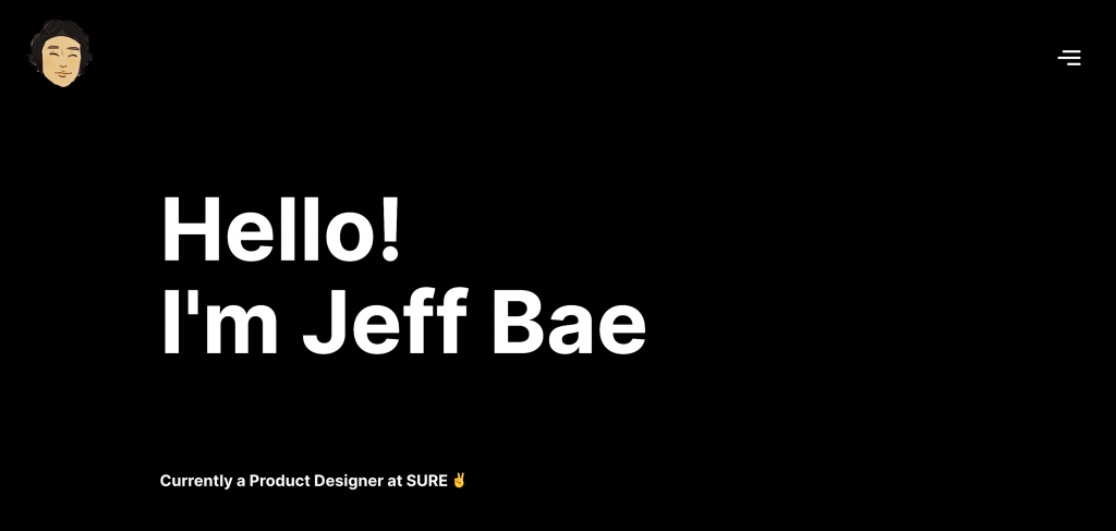
#30 Jeff Bae

Product Design

Jeff Bae UX Designer Portfolio

#31 Sarah Jutras

UX Design

Sarah Jutras UX Designer Portfolio

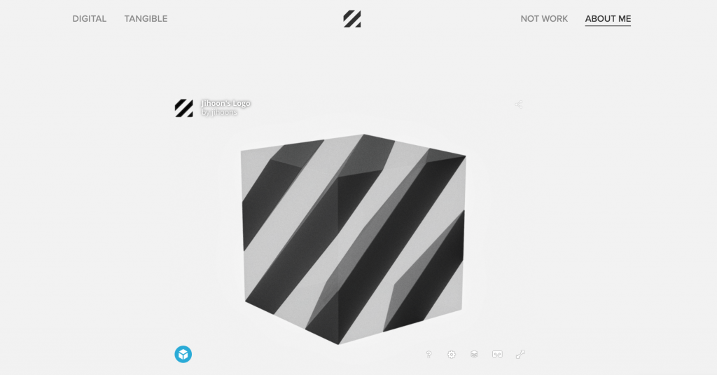
#32 Jihoon Suh

Product Design – UX Design

Jihoon Suh UX Designer Portfolio

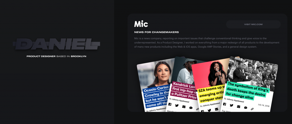
#33 Daniel Rakh

Product Design – UX Design

Daniel Rakh UX Designer Portfolio

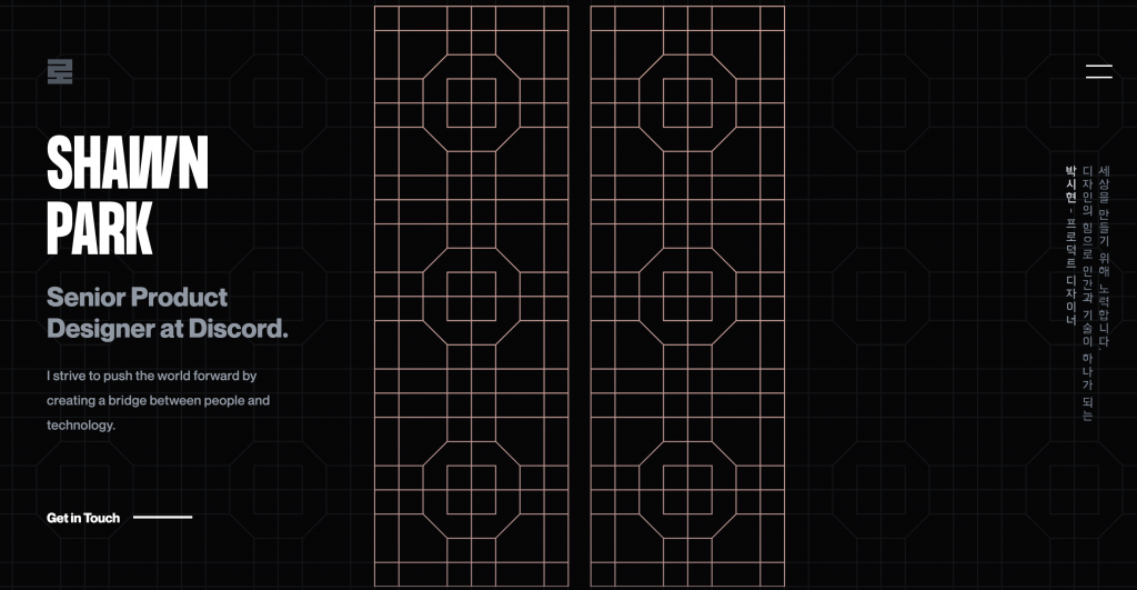
#34 Shawn Park

Product Design – UX Design

Shawn Park UX Designer Portfolio

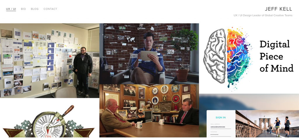
#35 Jeff Kell

UX Design – UI Design

Jeff Kell UX Designer Portfolio

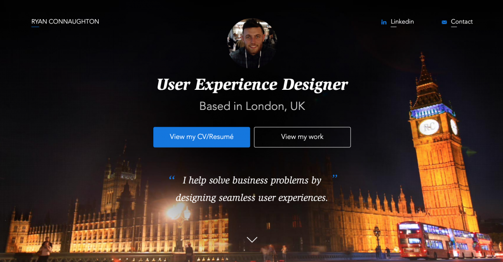
#36 Ryan Connaughton

UX Design

Ryan Connaughton UX Designer Portfolio

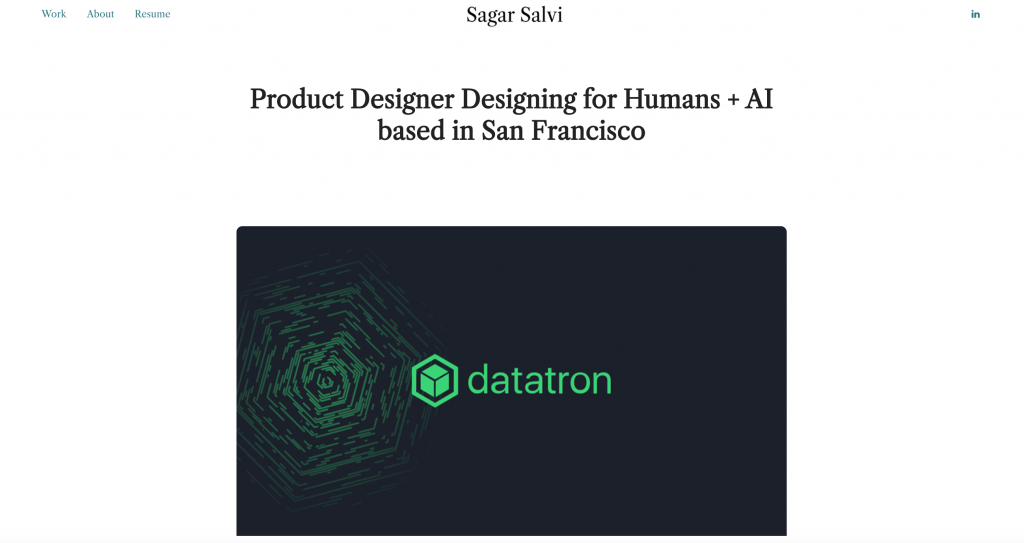
#37 Sagar Salvi

Product Design – UX Design

Sagar Salvi UX Designer Portfolio

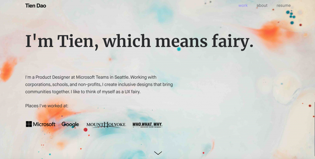
#38 Tien Dao

Product Design – UX Design

Tien Dao UX Designer Portfolio

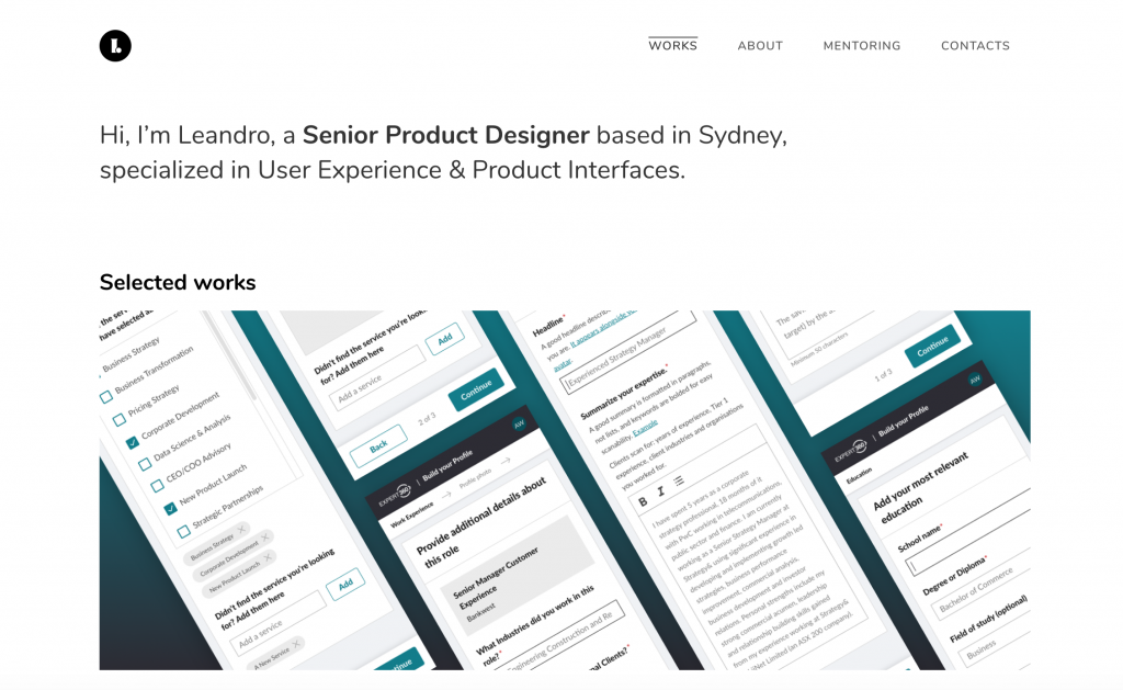
#39 Leandro Varanda

Product Design – UX Design – UI Design

Leandro Varanda UX Designer Portfolio

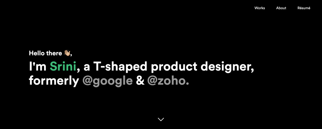
#40 Srinivasan Chakkarapani

Product Desing

Srinivasan Chakkarapani UX Designer Portfolio

#41 Omar Alamrani

UX Desing – UI Design

Omar Alamrani UX Designer Portfolio

#42 Fiona Yeung

UX Design

Fiona Yeung UX Designer Portfolio

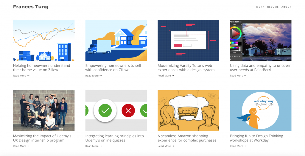
#43 Frances Tung

UX Design

Frances Tung UX Designer Portfolio

#44 Charity Zhan Shi

UX Design – Product Design

Charity Zhan Shi UX Designer Portfolio

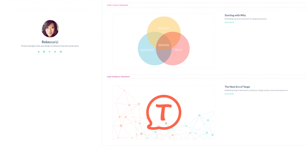
#45 Rebecca Li

Product Design – UX Design

Rebecca Li UX Designer Portfolio

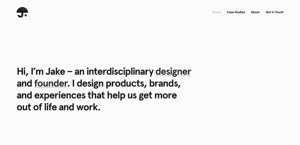
#46 Jake Doering

Product Design – UX Design

Jake Doering UX Designer Portfolio

#47 Stephen Barros

UX Design – UI Design

Stephen Barros UX Designer Portfolio

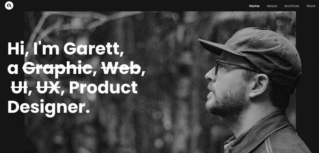
#48 Garret MacGilivray

UX Design – UI Design

Garret MacGilivray

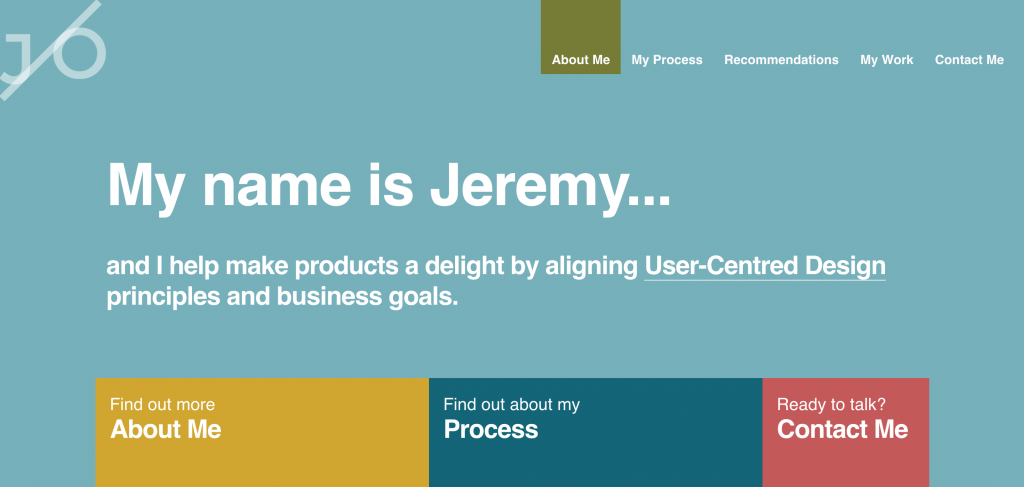
#49 Jeremy Omeara

UX Design – UX Development

Jeremy Omeara UX Designer Portfolio

#50 Julio Castellano

UX Design – Product Design

Julio Castellano UX Designer Portfolio

#51 Ryan Nicholas Clark

UX Design – UI Design

Ryan Nicholas Clark UX Designer Portfolio

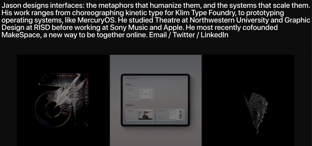
#52 Jason Yuan

UI Design

Jason Yuan UX Designer Portfolio

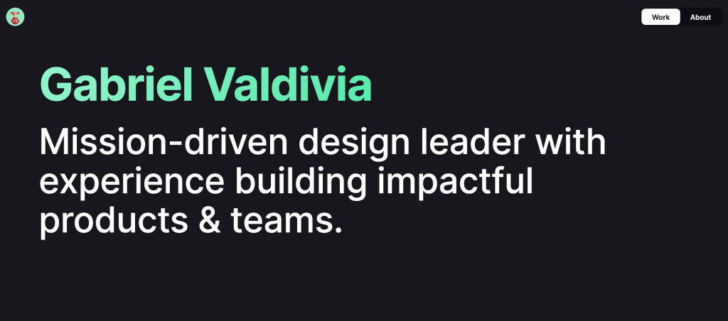
#53 Gabriel Valdivia

Product Design – UX Design

Gabriel Valdivia UX Designer Portfolio

#54 Omar Jalalzada

Product Design

Omar Jalalzada UX Designer Portfolio

#55 Michael Evensen

UX Design

Michael Evensen UX Designer Portfolio

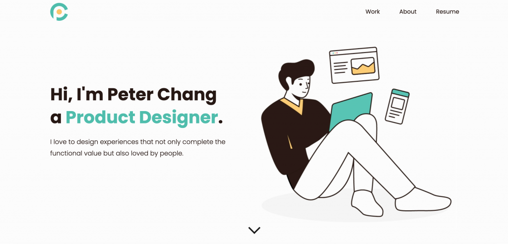
#56 Peter Chang

Product Design

Peter Chang UX Designer Portfolio

#57 Jacob Ottesen

UX Design

Jacob Ottesen UX Designer Portfolio

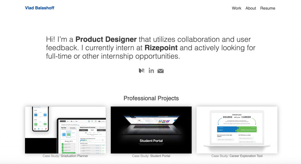
#58 Vlad Balashoff

Product Design

Vlad Balashoff UX Designer Portfolio

To Wrap Up…

If you’re reading this paragraph that means that you’ve read through all of the UX Designer Portfolios we’ve gathered for you. First of all, thanks! Secondly, if you think that we’ve missed any or if you’re a UX Designer yourself and want your UX Designer portfolio featured in this article, drop us a line and we’ll make sure to add it!

Categories: Others Tags:

A/B Testing for Beginners: A Practical Guide

September 21st, 2020 No comments

As a website owner, it’s vital to find effective ways to improve the conversion rates of your website and landing pages.

Although there are tons of articles online written to help you optimize your conversions, the fact is, when it comes to digital marketing, it’s only through direct testing that you will be able to find the unique combination of page elements that produce the highest conversion rates.

And that’s where A/B testing comes in.

In this article, we take a look at a few basic considerations for A/B testing your webpages, although a lot of the principles we will discuss apply to test various other areas of your digital marketing, including emails, ads, and apps.

So read on to discover a simple yet effective way to get the best returns from your marketing efforts.

What is A/B Testing?

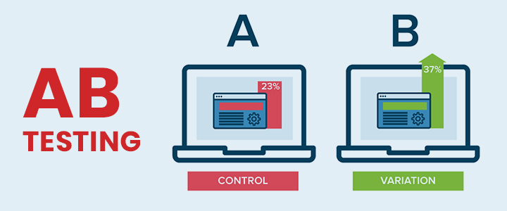
AB testing is a method of comparing two different versions of a webpage in order to determine the one that performs better.

Also called bucket testing or split testing, this type of conversion optimization takes the guesswork out of optimizing your website and allows you to make data-informed decisions to help you achieve your ultimate objectives.

Source

In addition to using it on your website or landing pages, you can also use AB testing to optimize emails, online ads, and apps.

How A/B Testing Works

A/B testing works in a very simple way. First, you take a web page and modify either a single element on it, or completely redesign the page to create a different version of the original page.

Next, you divide your traffic in half and send 50% to the original page version (also known as the control), and the other 50% to the variation.

You then measure the engagement of each segment of visitors to determine what type of effect the change you made had on visitor behavior.
If the effect is positive, you can proceed with the new version as the original and test a different element to optimize even further.

Benefits of A/B Testing

One of the main benefits of A/B testing is that it lets you make changes to user experiences while collecting valuable data on the results.

It allows you to construct a hypothesis, as well as to discover why certain elements of your website experience impact visitor behavior.

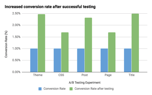
With this type of test, you can continually improve on all the different experiences that you provide on your website, which helps you to boost your conversion rates over time.

Source

Other benefits of A/B testing include:

  • Improved user engagement
  • Reduced bounce rates
  • Longer dwell times
  • Increased conversion rates
  • Quick results and ease of analysis
  • Higher conversion values

By testing to find out which versions of your pages perform better, it gives you the ability to provide your visitors with the best and most relevant content that they will find useful and engaging. This, in turn, will boost all your important engagement metrics.

How to Conduct Effective A/B Tests

To run a successful A/B test, you must be deliberate and focused with regard to each step of the testing process.

Here, we take a look at 7 steps to help you create an A/B testing framework so you can start running tests on your pages.

1. Collect Data

Your first step is to collect data, so you know where your beginning point is. Turn to your analytics to get insight into where you might begin your optimization efforts.

Ask yourself:

  • What fears, uncertainties, and doubts do visitors feel on this page?
  • What is it that stands in the way of your conversion?
  • How can you improve your customer experience?
  • Are there any elements, including images, copy, design layout, etc. that might raise questions or concerns in your customers’ minds, thereby preventing or delaying a conversion?

It’s a good idea to start with your site’s high-traffic areas, as this will allow you to gather data a lot faster.
Find pages that have high drop-off rates or low conversion rates that need to be improved.

Some of the most commonly tested page elements include:

  • Headline
  • Subject Line
  • Call to Action (CTA)
  • Layout
  • Copy/content
  • Images
  • Promotions

2. Identify Your Goals

Next, identify what your goals are for your A/B tests. These are the metrics that you will use to determine whether or not the page variation is more successful than the original.

These can be anything from product purchases, email sign-ups, clicking a link or call to action button, and so on.

3. Start With a Hypothesis

Your third step is to generate a hypothesis. Using the data you collected in step one, make a list of the different A/B testing ideas for why you believe the variation will perform better than the original version.

Prioritize the list according to the expected impact, and by the difficulty of implementation.

Keep in mind that testing a website has a lot more variables than testing a landing page.

But, if you’re just getting started with A/B testing, you can begin by testing your conversion pages or those with the highest bounce rates.

4. Create the Page Variation

Now that you have everything set up, it’s time to run the actual experiment.

Using your chosen A/B testing software, make the predetermined changes to one of the elements of your page.

For instance, you might try changing the following:

  • The color of the CTA button
  • Reordering the page elements
  • Changing the page heading
  • Hiding navigation elements
  • … and so on.

You can change any of these elements or create something entirely custom.

In such a case, although you may change multiple elements in a single page, it’s still a simple A/B test because you will be comparing the performance of the entire page (version A) against the other (version B).

The good news is that many of the top A/B testing tools offer a visual editor to make it easy even for beginners to make these changes.

One such tool is VWO.

5. Run the Experiment

Now comes the fun part – letting the experiment run.

Once the experiment is live, visitors to your site will be randomly assigned to either the original page or the variation.

Their interaction with each page will be measured, counted, and compared in order to determine the performance of the two pages.

6. Analyze Results

After the experiment is complete, you must analyze the results.

Your testing software will present you with the data from the experiment showing you the difference between the performance of your two pages.

You will be able to easily see whether or not changing a particular element had a statistically significant impact.

7. Implement Solutions

The final part is simple. If your variation turns out to be the winner, then that’s the page you proceed with.

It becomes your new original, and you can then generate a different hypothesis to test for further optimization.

Conclusion

Even after the success of your first test, you have to carry on testing and optimizing.

This is not a once-and-done process, but one that you have to continue doing so you can make more and more improvements and maximize conversions on your website.

Which pages on your website will you test first? Let us know in the comments section below!


Photo by Jonathan Francisca on Unsplash

Categories: Others Tags:

9 UX Tips Every Blog Manager Needs

September 21st, 2020 No comments

A blog is a great way to connect with customers and build loyalty. But the truth is, most company blogs could use some help with their user experience.

Maintaining a blog is more than just uploading a bunch of content and calling it a day. There are certain features every blog needs in order to be navigable and deliver information efficiently. The better your user experience, the better and more effective your blog will be.

Want to upgrade your blog’s UX? All it takes are a few steps. Here are nine ways you can get started:

1. Get Your Look Right

As great as your blog content might be, it’s the design that dictates whether visitors click away. People tend to judge a book by its cover, or in this case a blog by its homepage.

Appearance is everything with blogs, but there’s no need to reinvent the wheel. Website builders like WordPress offer templates you can use to create a beautiful blog.

Templates are great starting points, but they shouldn’t be the end of your design. Look for ways to make your blog stand out. Everything from photos of team images to short GIFs of your users can personalize and beautify your blog.

When in doubt, look at what other companies do in your space. If you’re a tech startup, what do you see on Microsoft or Apple’s blog? Don’t be a copycat, but don’t be afraid to take inspiration from the leaders in your space.

2. Organize Your Posts

The homepage of your company’s blog will likely show the most recent posts first. This helps recurring visitors stay up-to-date with your company and ensures new ones meet the latest “you.”

However, not all visitors will be looking for the newest content. Use tags to help readers dive into specific topics without a lot of scrolling. For example, a calendar startup might use categories like “scheduling tips,” “efficiency hacks,” and “time management.”

3. Make it a Team Effort

Readers don’t want to see the same person drone on and on. While corporate wikis are internal-only content databases, they prove the point that blogs must be multi-author affairs.

No one member of your team knows everything. Make sure that the author byline reflects the content beneath it.

A software developer shouldn’t be bylined on a post about user interface suggestions. A designer doesn’t make sense as the author on a post about common JavaScript errors.

4. Connect Content to Elsewhere on Your Site

One of the key goals of your company blog is to boost traffic to your site, particularly its conversion-oriented pages. Use your blog to point readers to shopping areas and product pages they might find valuable.

Use a navigation bar on top of your blog that follows visitors about the page. When these pages are just a click away, readers are more likely to visit them. Making users re-enter URLs or backtrack out of the blog will turn many customers away.

5. Enable Searches

When a visitor hits your site’s blog, they’re looking for something specific. Whether it’s a tutorial on how to use your product or general tips about the industry you work in, the content they seek should be easy to locate. If it’s not, visitors may become frustrated and leave the site to look someplace else.

Adding a search bar to your blog makes it easy for readers to find exactly what they’re looking for. It quickly takes them to the articles most relevant to their interests based on the keywords they use.

6. Use External Links Judiciously

It’s true: External links cause readers to leave your site. With that said, they also benefit your blog by giving it a sense of authority.

When external content really is the best resource on a topic, point your readers to it. Use keywords that closely describe the content you’re pointing to.

How do you bring those readers back to your blog? By ensuring the rest of the post is so solid that users want to finish the post.

External links are also important for SEO. Google’s algorithms look for an organic profile of high-authority backlinks when deciding how to rank blogs. Avoid linking out to spammy sites, or too frequently to any one site.

7. Strategize Ad Placements

Ads on your blog are a win-win: You can collect some extra revenue, while your customers get product suggestions relevant to their interests. The keyword, of course, is relevance.

Even too many relevant ads, however, can drive users away. Avoid more than two ads per page, and make sure they’re placed in ways that are obvious but don’t obscure the content. Feel free to charge more for ads immediately on top of or beside your content, where they’re likely to get the most clicks.

8. Include Rich Media

Most people associate blogs with text articles. While most blogs do include text content, they shouldn’t be only text. Adding images and videos to your blog content makes it more engaging while helping readers visualize the concepts you’re talking about.

The more types of media you can include, the better. You can embed audio clips from podcasts, screenshots from your website, or videos made by your content team. Experiment to find out what resonates with your audience.

9. Sweat the Details

Certain content features add a lot to your UX without much effort on your end. Many platforms, like WordPress, allow you to include these simply by installing a plugin.

A good example is an estimated reading time. Someone looking for a more in-depth read might prefer a higher reading time. Those who want a quick answer to their question will prefer blog articles that take only a few minutes to read.

Another detail you can add is when the blog post was last updated. Readers want to know if the information is up to date. Noting each post’s last update can also benefit your content team by identifying posts that could use a fresh perspective.

The better your blog’s user experience, the more value it’ll provide your reader and, by extension, your company. Engaged readers tend to be engaged customers. When in doubt, build it out.


Photo by UX Indonesia on Unsplash

Categories: Others Tags:

Instagram Creates Voting Registration Stickers and Now I’m Officially Ready To Vote

September 21st, 2020 No comments

Instagram is getting ready for National Voter Registration Day and so are we.

Tomorrow is September 22nd, which means that it’ll be National Voter Registration Day and Instagram has been coming out with some amazing stickers in celebration of that.

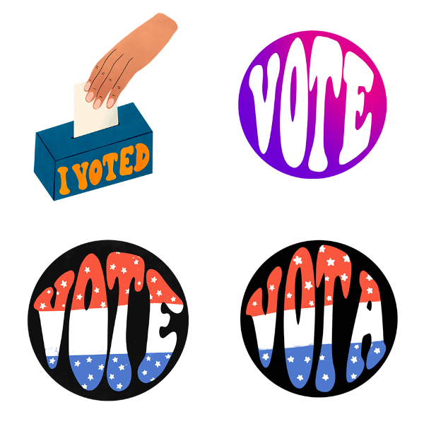
instagram voting stickers

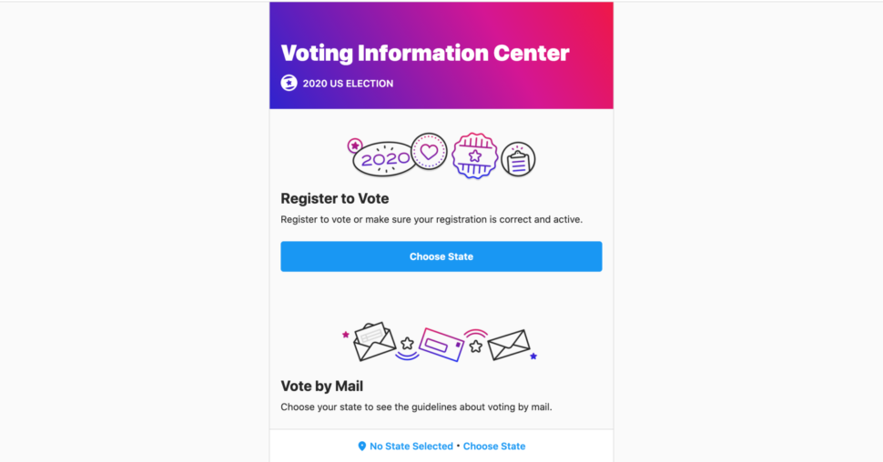
One thing that I love about Instagram is that they’ve been encouraging people to get out there to vote, and they even have an election info and voting resource center.
instagram voting center

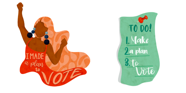
During this time, they’ve teamed up with six different amazing designers and artists who have been creating amazing voting registration stickers that users can add to their stories.
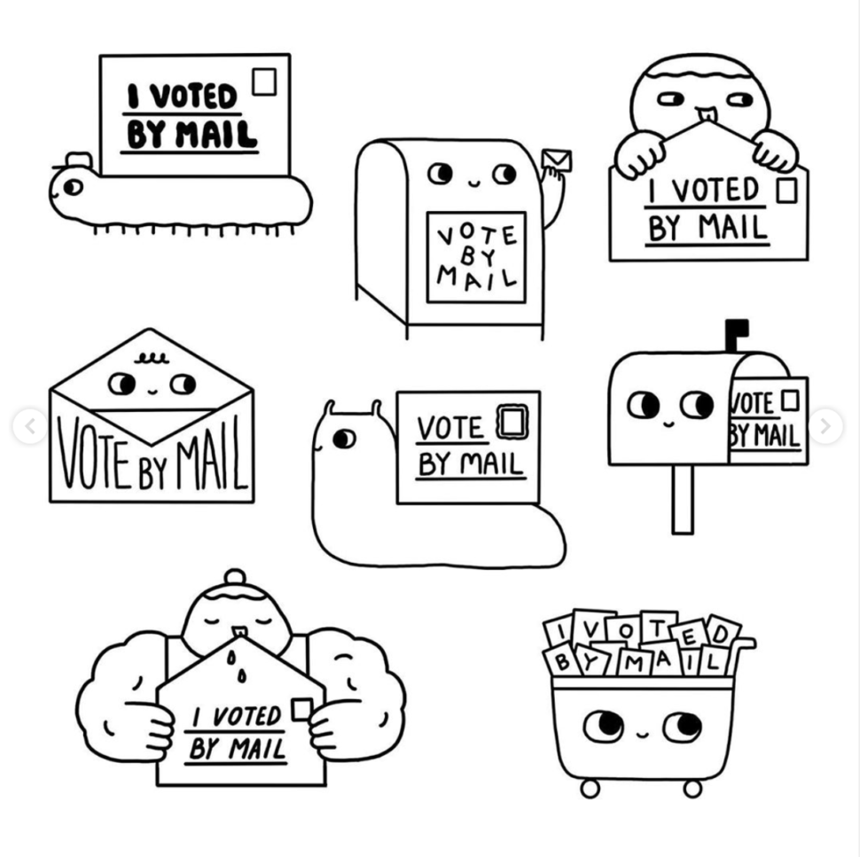
instagram voting stickers

D’Ara Nazaryan, Reyna Noriega, Hank Washington, Jing Wei, Barry Lee, and Iliana Galvez all brought something a little different to the table and creating some amazing stickers. Some in English, some in Spanish, and all unique and vibrant in their own way.

instagram voting stickers

Of course, everyone is encouraged to use these stickers on their stories, no matter the size of their platform, to remind everyone to get out their and vote this year!

instagram voting stickers

If you go on your Instagram story, slide up on your screen and click on the sticker icons, you’ll see all these different voting registration stickers and you can choose the one that best fits your style.

instagram voting stickers

Voting is super important, and if you have time to scroll on Instagram, then you definitely have the time to register to vote!

instagram voting stickers

Make it a priority, go register to vote, and then share on your story some of these cool stickers to encourage your friends and family to get out there and do the same!

Let us know what you guys think about the stickers in the comments below and which one you’ll be using in your upcoming stories.

And of course, until next time,

Stay creative, folks!

Read More at Instagram Creates Voting Registration Stickers and Now I’m Officially Ready To Vote

Categories: Designing, Others Tags:

Exciting New Tools for Designers, September 2020

September 21st, 2020 No comments

It’s fun to see new website design tools that reflect current times and the state of the world. That’s very true this month with new databases devoted to diversity and women in technology, as well and resources to make your design life easier.

Here’s what’s new for designers and developers this month:

Ztext.js

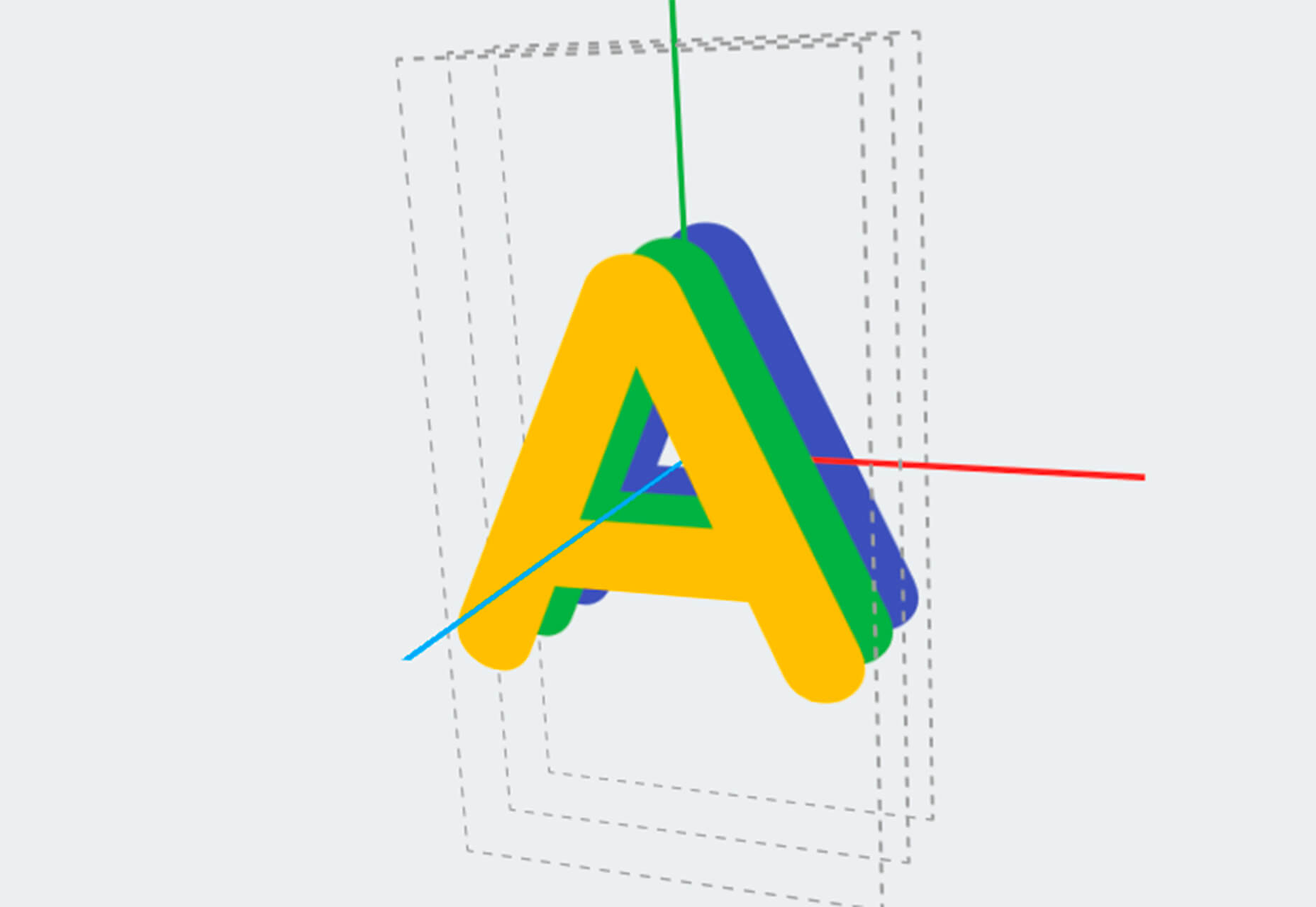
Ztext.js is an easy to implement, three-dimensional typography tool for the web that works with any font you want to use. With the popularity of 3D effects and animation, this tool has a lot of practical applications. Everything you need, including documentation, is available from developer Bennett Feely on his website and GitHub. (It’s free but you can show appreciation with a donation if you like it.)

Gradient Magic

Gradient Magic is a free gallery of fun and interesting CSS gradients. You can sort through a random selection or by category of color to find just the right gradient for your project. Some of them would make really neat backgrounds or image overlays.

Impossible Checkbox

Impossible Checkbox is a fun little divot that you’ll want to play with and emulate. Click or tap the slider to activate and a nifty little friend pops up. Now here’s the fun part: You can’t leave it checked, and take note of the changing expression of the checkbox character.

Diversify Tech

Diversify Tech isn’t your average job board; it is a collection of resources – and opportunities – for underrepresented people in technology. It includes a weekly roundup and everything from scholarships, to events, to jobs, to speaking opportunities.

Women in Tech

Women in Tech is a list of apps made by women. The apps are ranked and chosen based on upvotes and is a good resource if you want to help support women-owned projects. Search or submit an app for inclusion.

Devello Studio

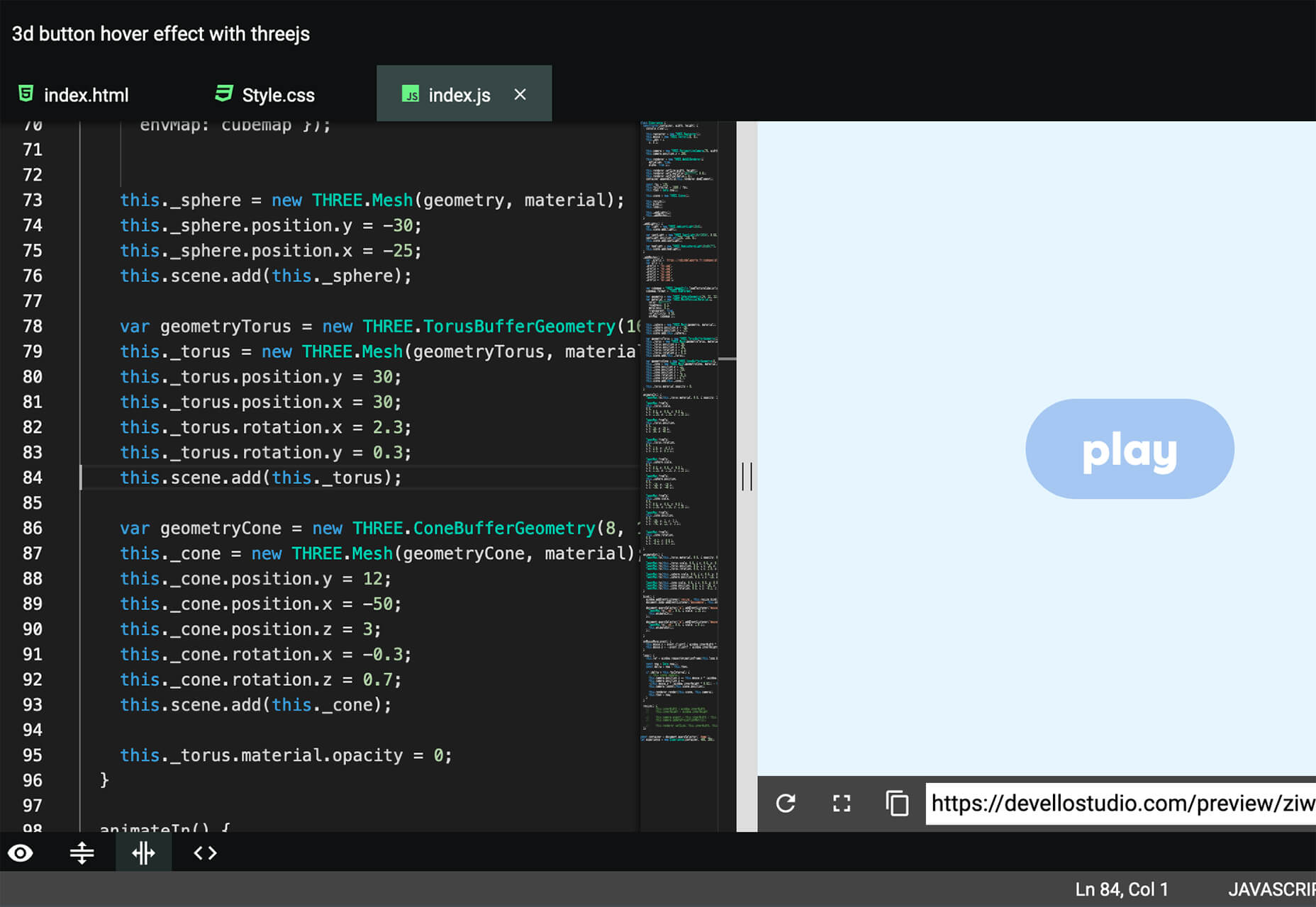
Devello Studio is a tool that allows you to write code in the cloud. You don’t have to install anything and no matter where you are, just can open a project in-browser, and continue development where you had left off last time. Plus, it works with GitHub support built right in.

Hustl

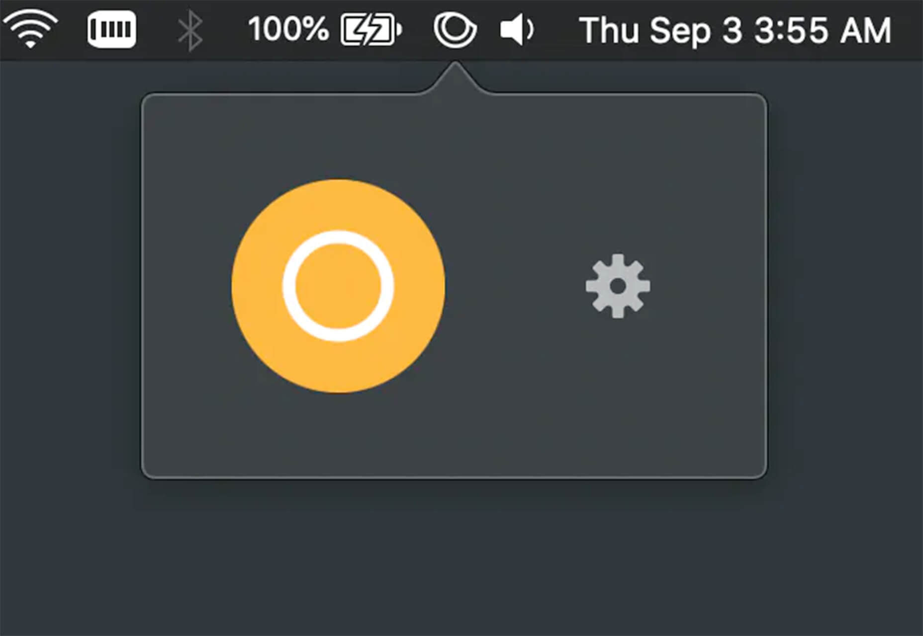
Hustl is a premium Mac app that allows you to create time-lapse videos of your screen. Use it to show off work or projects or create a cool video for your portfolio. Plus you can use it to capture just one active app so you don’t have to do a lot of editing later.

FeedBaxley

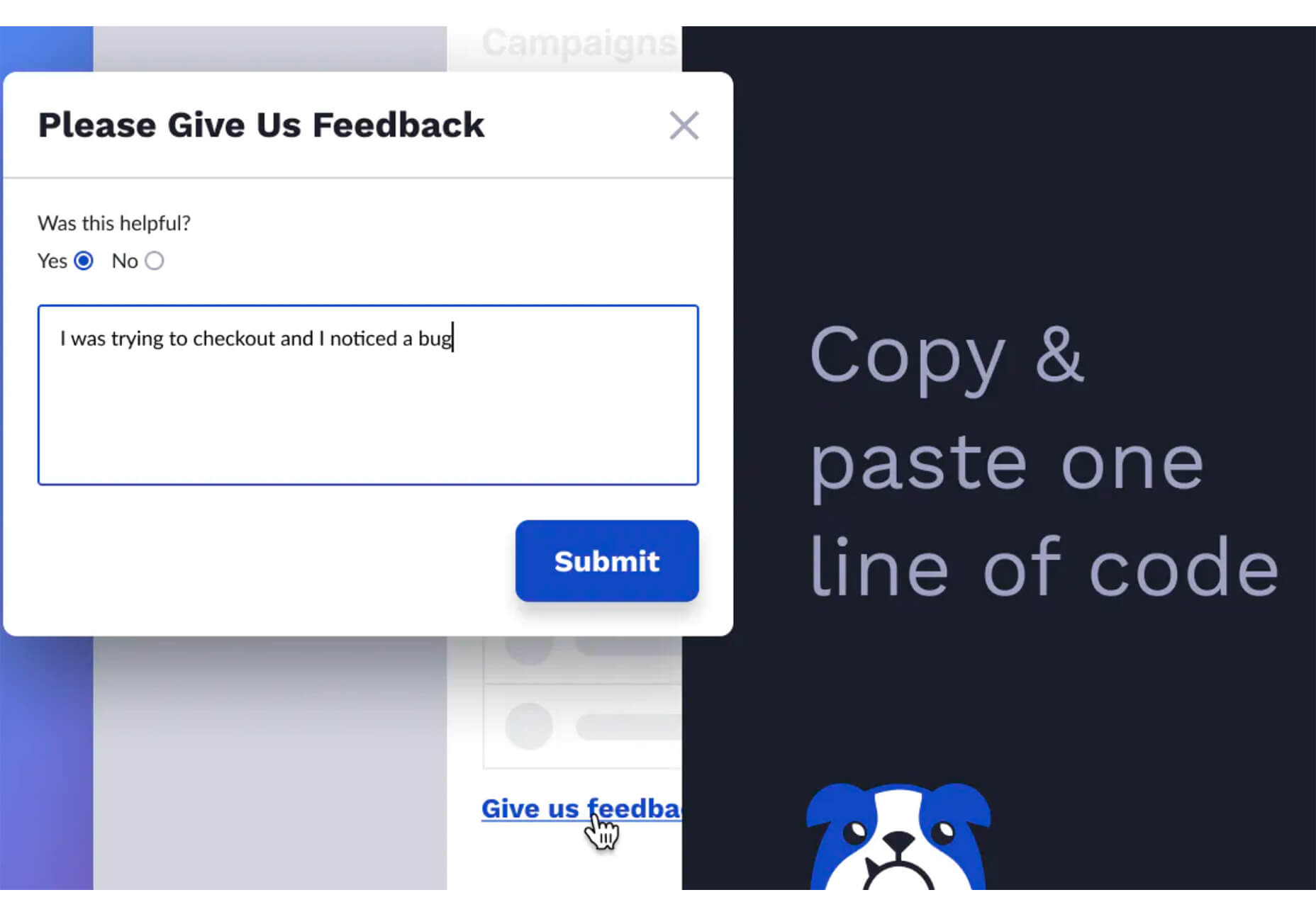
FeedBaxley is a user feedback tool that helps you (and users) figure out what’s frustrating before it becomes a real issue. You can customize everything to match your brand and set it up with copy and paste tools. Feedback integrates with Slack, making it easy for you to analyze information with a team.

BestTime

BestTime launched a major update with a new tool that makes it possible to analyze visitor peaks of public business (cafe, gym, etc) for whole areas. Using the heatmap API you can find businesses at popular times, locations, or by business type.

Pixeltrue

Pixeltrue is a new collection of free SVG illustrations and Lottie animations in a trendy style. They are available for commercial and personal use and add a bit of whimsical delight to website projects. (The error illustrations are particularly fun.)

Previewed

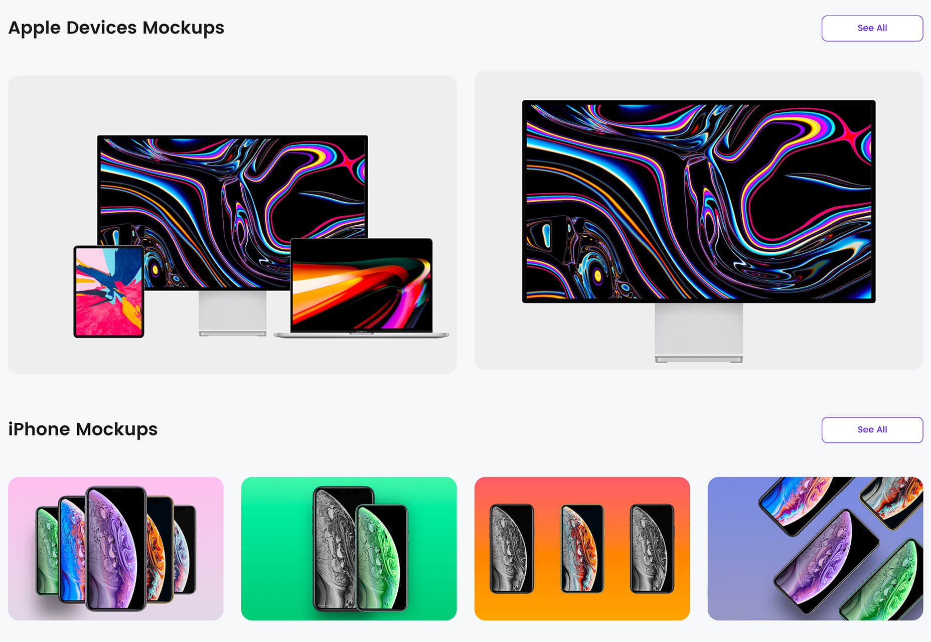
Previewed has tons of cool and realistic mockups that you can use to create the perfect setting for digital projects. You can find mockups for a variety of devices and cool panoramas that work perfectly for elements such as app store previews.

Alt Text Overlay Bookmarklet

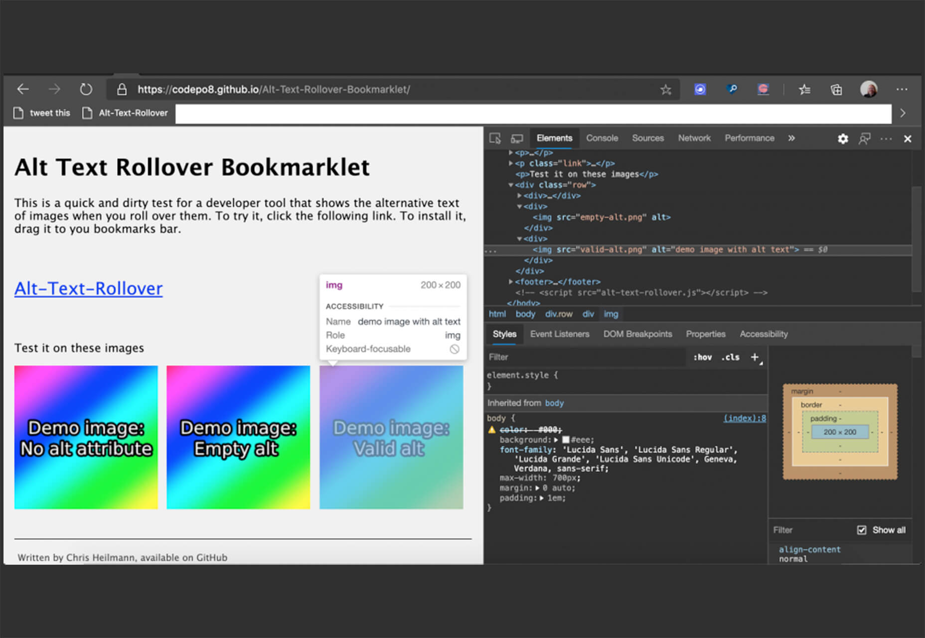
The Alt Text Overlay Bookmarklet solves a common problem: It shows what images use alt text and what that text is. The tool was created by Christian Heilmann and he’s put it on GitHub for you to play with and test.

MergeURL

MergeURL allows you to merge and shorten up to five links. Enter the links and mergeurl.com/o/xxxxx, for example, will open all the URLs associated with that link. The tool is free to use and you don’t have to register to use the service.

Infinity Search

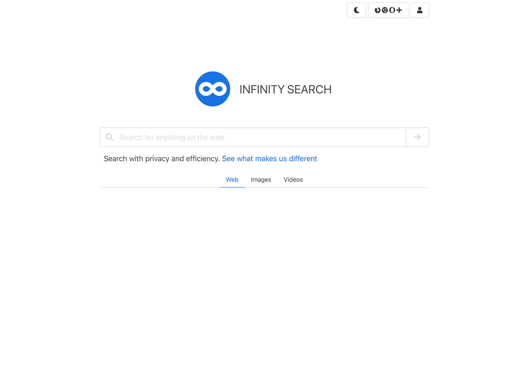
Infinity Search is a new search engine that lets you look for things privately and efficiently. Search the web, images, or videos. Here’s a little about how it works: “While we retrieve results from other search engines like Bing and Wikipedia, we also have our own indexes of links that are displayed in our search results. We are actively working on improving these indexes and they will only get better.”

Blade UI Kit

Blade UI Kit is a set of renderless components to use in Laravel Blade Views. It’s built for the tall stack and is completely open source. It includes 26 components and you can contribute as well.

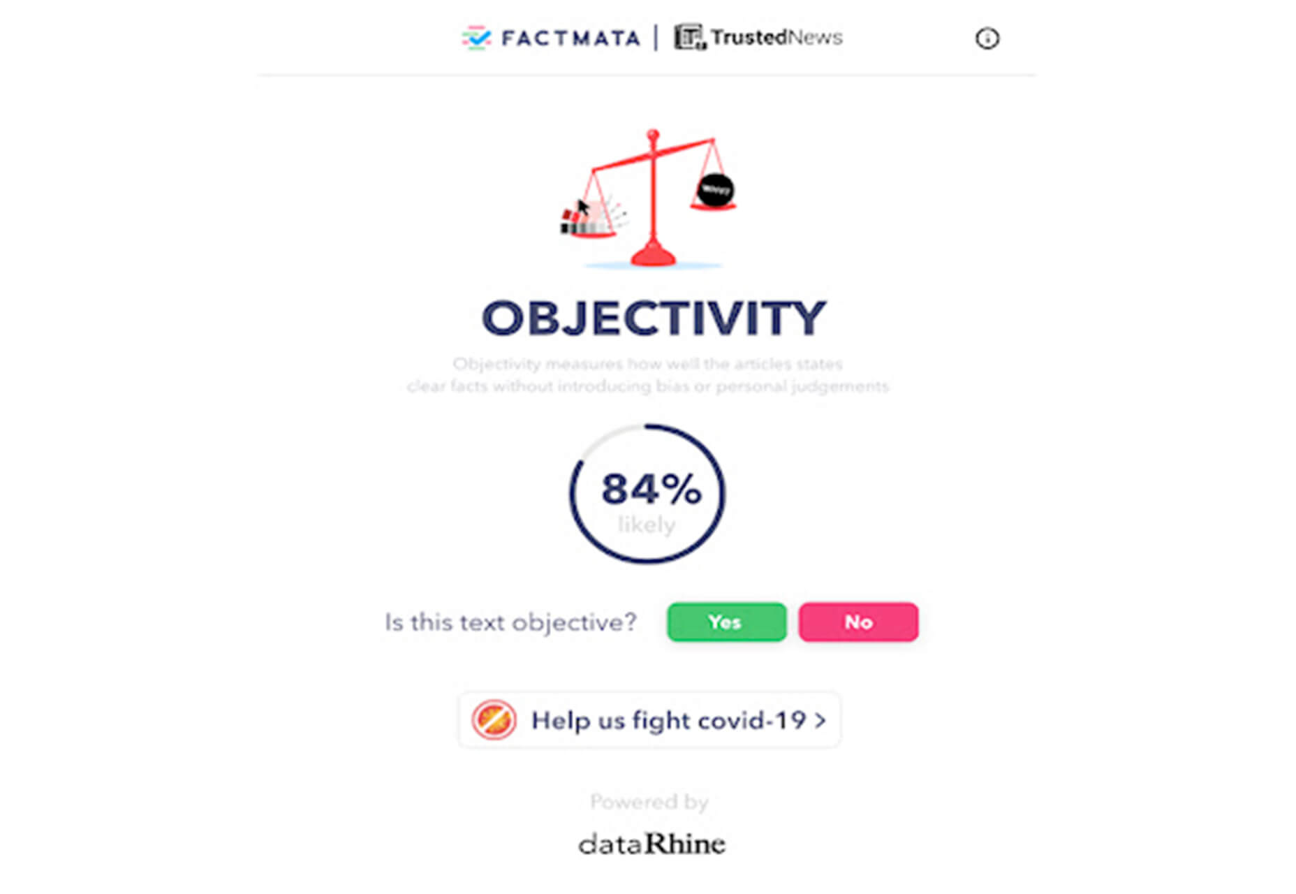
Trusted News

Trusted News is a Google Chrome extension that uses AI to assist in evaluating the quality of the online content. In its first release, it scores the objectivity for a selected article, testing whether it is written from a neutral perspective as opposed to a subjective one.

BaseDash

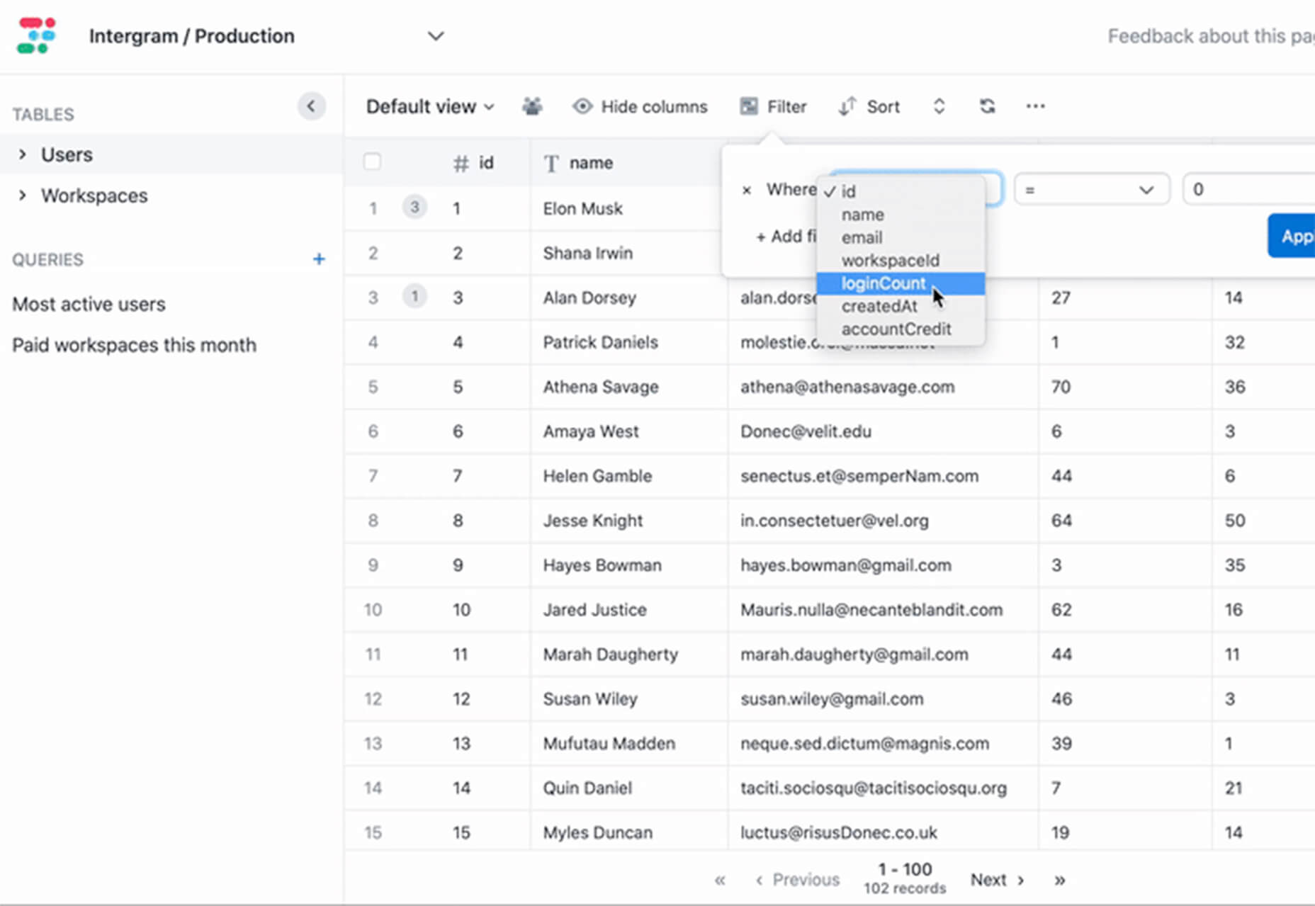
BaseDash allows you to edit production data without coding. You can make changes to the database with the ease of a spreadsheet. This tool makes it easy to find and edit information in a hurry. It works with all major databases including MySQL, PostgreSQL, Amazon Redshirt, Microsoft SQL Server, and more.

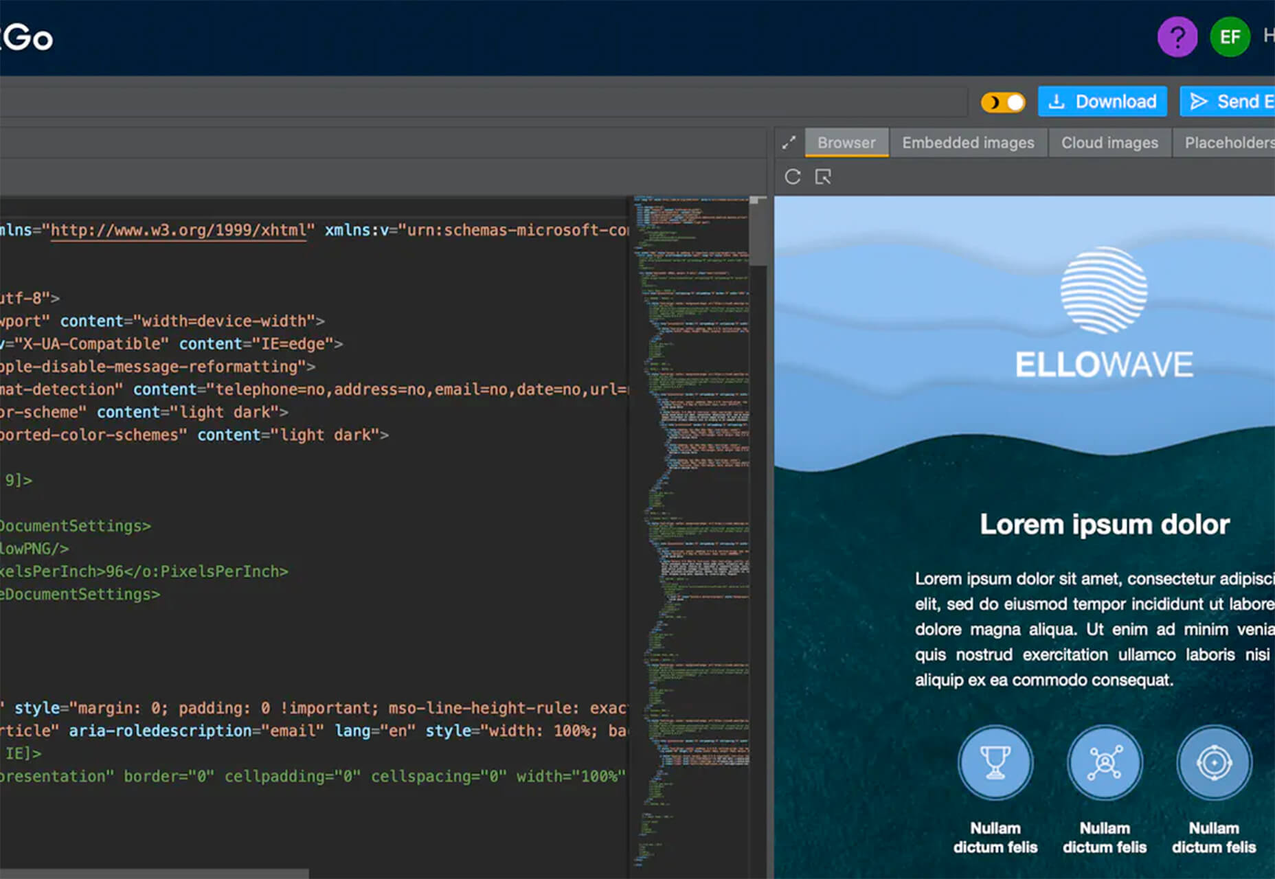
Email2Go

Email2Go is a service that helps you create email templates and test them on dozens of physical devices and applications. It’s free right now while it is in early release.

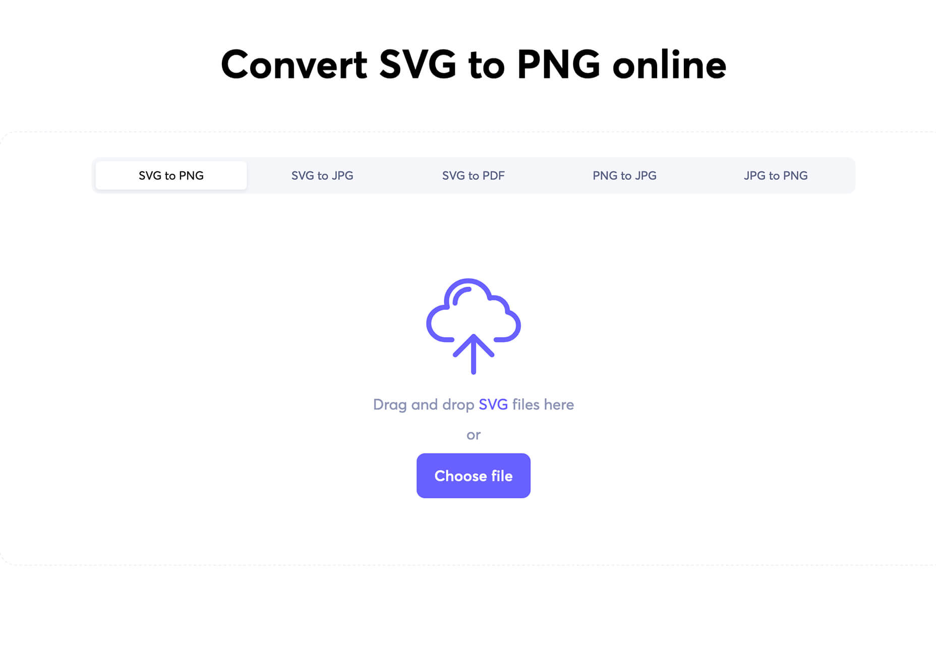
Iconscout Converter

The Iconscout Converter allows you to convert icons and images from one file format to another for free. Convert SVG, PNG, JPG, and PDF with a single click.

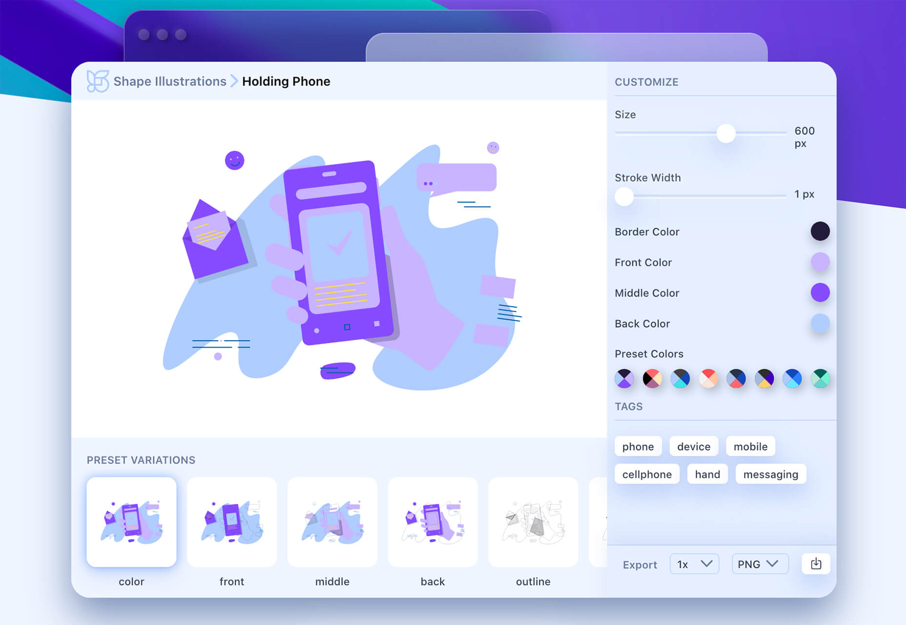
Shape 2

Shape 2 is a massive collection of 5,000+ unique icons and illustrations with a full-blown web editor. Customize colors, stroke width, size and full variations that can export to SVG, PDF, PNG, GIF, and React. This is a premium tool and includes a discounted release price for now.

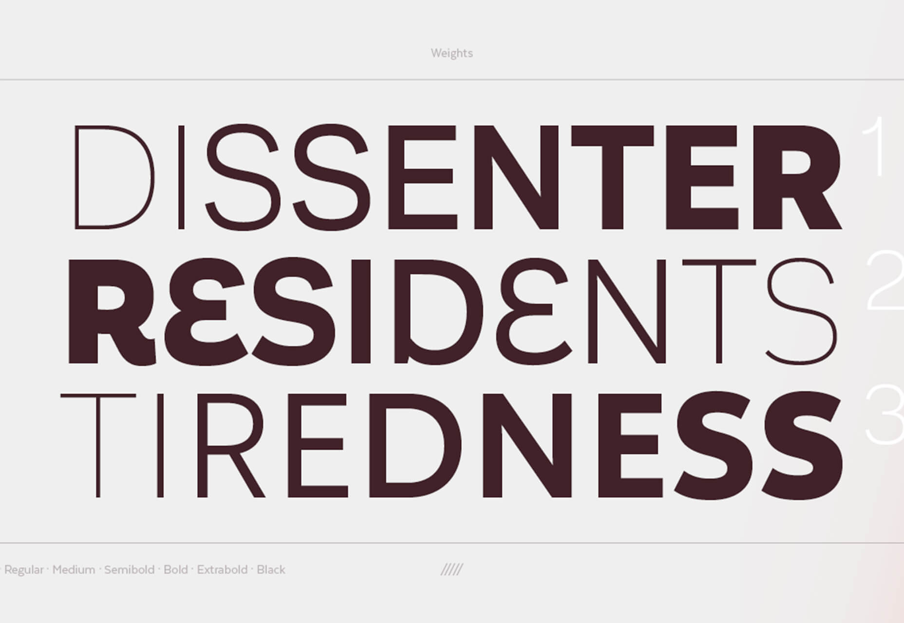
Aestetico

Aestetico is a beautiful sans serif that includes a massive family with 54 styles. This premium typeface is highly readable and has modern lines and curves that make it a great option for a variety of uses.

Arcades

Arcades is a modern display font with a retro, 1980s-style vibe. It includes regular and italic styles.

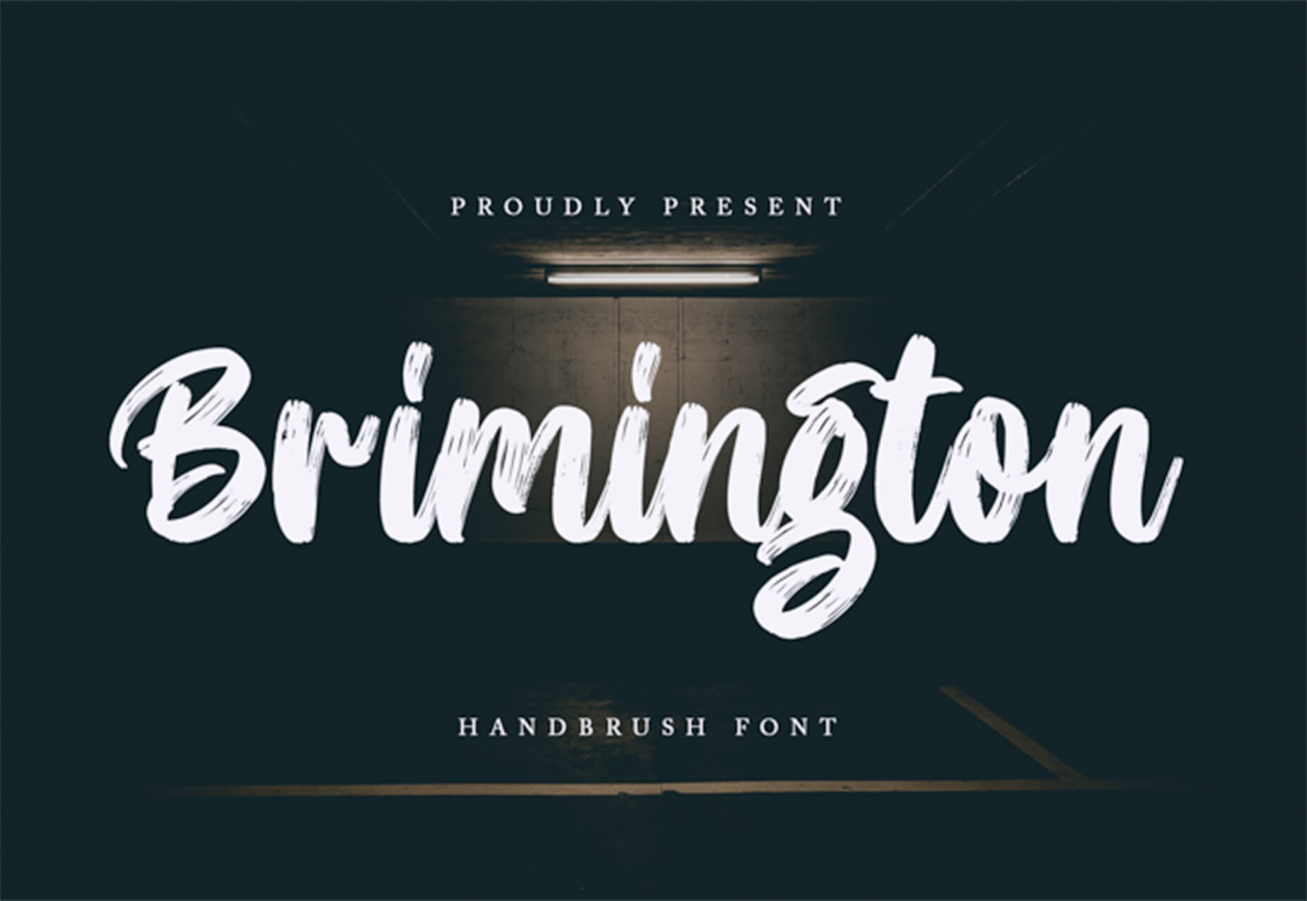
Brimington

Brimington is a handwriting style typeface with rough strokes and smooth curves. It includes a set of 227 characters and 219 glyphs in a readable design.

California Signature

California Signature is a typeface duo with a slab serif and handwriting style that are perfectly paired. The thick and thin options provide a yin and yang effect.

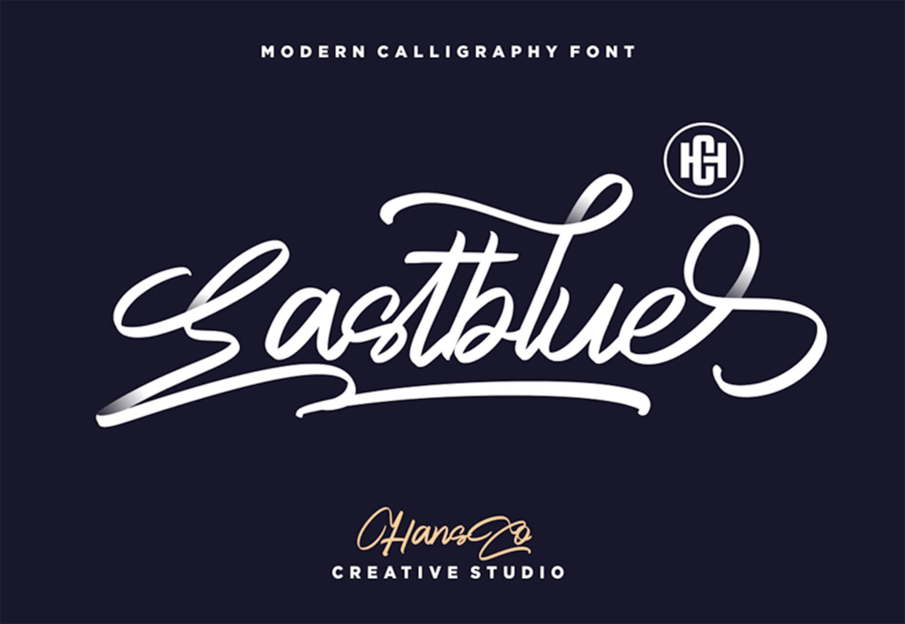
Eastblue

Eastblue is a script typeface with long swashes and interesting curves. It includes a solid character set and is free for personal use only.

Source

Categories: Designing, Others Tags:

How To Build Rapport With Your Web Design Clients

September 21st, 2020 No comments

Working as a freelancer in the creative space is rife with obstacles. Some we can see coming, others we can’t.

One of the challenges that many freelance web designers face in their first few years is managing client relationships. We’ve all heard about — and experienced — the horrors of clients running amok on our work, turning a piece of thoughtfully-considered design into a playground of questionable ideas that often run against best practice.

When these situations are not managed delicately, the client-designer relationship can break down, invoices may go unpaid, and as a result, websites go unlaunched. This is a scenario that no designer — or indeed no client — wants to be a part of.

In this article, I’m going to teach some strategies for managing client communication and processes that have helped me to run less stressful projects and achieve better results, as well as draw upon some best practices to help you manage the business side of your work.

My False Start

When I started freelancing in 2009, I had very little experience in dealing with clients. I’d only graduated from university two years prior and had been in a steady job ever since. And that job was in-house at an office supplies company, which means that the closest I came to having a client was my boss, which is nothing like the client-designer relationship at all.

Thus, once I started my own practice, I was not equipped with strategies for managing clients and expectations. As you might imagine, things didn’t go very well.

As a result, working with a diverse range of clients, from small to large and with varying technical requirements was a challenge. My business acumen left a lot to be desired, and I knew it. I was not confident in my sales skills and this mindset shook the very foundation of my service. It led to me producing lesser-quality, lower-paid work for clients who had little understanding of the design process.

At the time, I blamed the clients. But, in hindsight, I see that the problem was being caused by the way that I was doing business. I would wonder how other designers — those well-known faces in the industry — managed to produce much better, more profitable work and seem happy about it. This was truly an enigma to me at the time, and as I said: it was easier to blame others than to look inward and resolve the problem at its core.

What Was The Problem?

The main issue was one of mindset. When I dug down, I realized that I didn’t consider myself worthy of their business. This manifested in a lack of confidence in my work and some eye-wateringly low prices.

“We need a homepage design with unlimited revisions — how much?”

“£20.”

Ouch.

Frankly, it doesn’t matter if you’re reading this as a new freelancer, an experienced business owner or an in-house designer; if your mindset is not geared toward building confidence and rapport in your professional relationships, you’ll constantly face challenges in dealing with other people.

I realized over time that the way I was looking at my business was upside down. I focused too much on the output (the website design, the money) and not the input (building a relationship with the client).

So I switched it around.

Developing Relationships (Not Just Websites)

In business, at least a part of your motivation must be to develop relationships with clients. It’s important to recognize that clients work with you to solve their business problems. They’re not buying a website: they’re buying a tool to reach some business goal. It took me years to fully appreciate that clients care very little about your tech skills or design flair. They care much more deeply about your ability to help them reach their goals and, less-apparently, how you make them feel during that process.

To earn respect from your clients and to establish yourself as an authority in your area of work, you need to look beyond your core skill-set. You need to put processes in place, backed by a growth mindset that will see you handle tough situations. Here are some top tips for doing that:

1. Get Your Formal Processes In Place, And Follow Them

When starting out as a freelancer it is tempting to work without a contract and without taking a deposit payment. This is a problem because according to a private survey conducted by creative freelancer platform YunoJuno, 55% of its UK members have not been paid for work at some point in their career.

Putting procedures in place isn’t a silver bullet, but it can mitigate the risk. If you’re operating without contracts and deposit payments, you face two very real problems:

  • You have less security.
  • You’ll be taken less seriously.

Your client could cancel the project or make unreasonable requests of you. It is vital to establish the goalposts in a written contract, and take at least some of the payment upfront. This gives you security and leverage if things start to go wrong.

“I’ve been stiffed by clients, experienced scope creep like you couldn’t imagine, spent months on a ‘rush job’, and on occasion, completely lost track of half-completed projects.”

— Jenny Knizner, VP of marketing at job portal Moon-lighting

When you take the time to put processes in place, those formalities that you once considered inconvenient can really become a saving grace.

But perhaps most importantly of all, following these basic rules helps to establish you as a professional. It sends out a message that you take your work and your time seriously. And if a prospective client is reluctant to make any contractual commitments, that’s a pretty good sign for what working with them might be like.

The foundation for leveling-up your web design business starts by tackling the basics.

2. Don’t Hide Behind Your Email

To establish rapport with your client, you’re going to have to talk to them. Face-to-face meetings in person are great, but so are video calls. And there is really no excuse to not do at least do the latter, especially since we’re all familiar with video conferencing now.

As industry veteran Paul Boag explains in his book Digital Adaptation:

“Digital does not work well in a world of departmental divisions. People need to sit together, work together, and solve problems together.”

This means you need to spend real time with your clients, doing real work, and not skirt around big topics over email or any lesser medium.

Distance creates disconnect, and email sure creates some distance. It has its uses, but when it comes to discussing big ideas, it can be very limiting. If you want to be seen as a project leader, somebody who knows their stuff and can be trusted, it means showing your face once in a while. It means giving your client (and the project) the time and space it deserves to grow and evolve.

Web design is a service-led industry, and good service is built on clear communication.

3. Get To Know Your Clients

Clients are people. People have motivations, dreams, fears and problems just like you. It’s so easy, especially if you hold them at arm’s length, to see clients simply as projects. You’ll have a significantly easier time if you earn their trust by getting to know them. They will be more likely to pay you on time and respect your design decisions. Trust is not earned through emails where you only talk about work. Trust is built by taking the time to speak, face to face, about things other than work. Don’t be afraid to make small talk about weekend plans or current affairs, and observe how your relationship matures to a point of mutual respect.

“It’s in small talk, in conversations unrelated to work, where we explore other aspects of the person with whom we’re conversing… Big relationships are built on small talk.”

— David Burkus, author of “Friend of a Friend”

When was the last time you spoke with a client about something other than your work? Take the time to do this to strengthen your relationship, but be mindful of the line between friendship and a professional partnership. Be friendly with your clients, but know that they’re not your friends. This blurring of boundaries can lead to a relaxing of your professional processes, and before you know it you’re chatting at 9 PM and doing everything for “mates rates”.

4. Build Long-Term Relationships

If you want to truly build a business, and not become some transient freelancer who ultimately gives up and goes back into full-time employment, you need to think of your client relationships in the longer term.

This means digging into their goals and their business well-beyond what your project will deliver in the first instance. Consider how you can help them in other ways: read an article relevant to them? Send them it. Stumbled across a new piece of software that could make them more efficient? Recommend it to them. Find ways of delivering value to them, and it will come back to you in more work and referrals.

Repeat business is important because the average repeat customer spends 67% more in months 31-36 of their relationship with a business than they do in months 0-6. This particular study pertains to e-commerce sales but I have seen similar patterns in the B2B space also. It’s really all about trust. Once you’ve earned it, they’ll come back for more.

Taking the time to foster a relationship with your client helps to shift your thinking away from seeing them as a means to pay the rent this month, to looking at them more as a long term partner.

5. Practice Your Self-Development

If you’re anything like me, achieving the previous four points would have felt like a steep hill to climb when I started over 10 years ago. Being able to really grasp a piece of work and manage the project and people effectively takes experience, confidence, and skill.

For the main part, much of this depends on peeking outside your comfort zone. Running video calls with multiple stakeholders, managing conversations with clients, and insisting on good practices (such as contract signing) all require a level of assertiveness that doesn’t come naturally to many people.

If you struggle with self-confidence and feel ready to build your resilience, read up on things like positive affirmations and assertiveness skills. These “self-help” ideas are easy to sneer at but they will provide you with practical tools to seriously boost your confidence and grow as a professional.

In Summary, The Product Comes Second To The Service You Deliver

Website development is a service. Clients pay for the end product, but the experience they have in working with you will be remembered. How you make people feel matters.

To quote Simon Sinek’s book Start with Why as mentioned above:

“People don’t buy what you do, they buy why you do it.”

If you want to do better work for more money and be respected along the way, taking the time to grow as a professional and go the extra mile in how you manage clients can do a lot for you.

Whether you’re embarking on a freelance career, or you’ve been around for a while, I urge you to invest some time in reflecting on your work process and communication skills. Reflect on how you’ve done business to date, and consider what the next 3 years might look like for you. The service element of the web design industry is only getting more competitive, sophisticated, and demanding. But with demand comes amazing opportunities. Are you prepared for it?

Recommended Reading

Categories: Others Tags:

Designing Clarity 02 – Maish Nichani – The Digitisation Tipping Point

September 21st, 2020 No comments
Ep02-podcast title screen

Finally, episode 2 of the Designing Clarity Podcast is here! Sorry, it took a while as there was a lot of editing required due to signal dropouts and tech failures. We hope to improve our workflow, and get it more streamlined for the next one.

COVID-19 is the greatest disrupter there is. Those of us who have gone digital or online are now breathing a sigh of relief. But what about the rest of us? Those of us who were not so quick or lack the ability to go digital?
Going digital is not an easy process, you might be wondering: is going digital the best for me? When is it the best time to do so? How much is it going to cost? What do I have to do? What processes need to change? Is it as simple as setting up a website? And most importantly, will my employees fear for their jobs?
These questions are probably on everyone’s mind when they are deciding if they should go digital or not. However, as we approach this digitisation tipping point, many of us need to evolve (ie go digital) or die.
Today I have my friend and collaborator Maish Nichani to share some of his thoughts on how we can think about digitisations, digitalisation, and digital transformation. Check out the podcast below.

??

Connect up with Maish on Linkedin here.

Listen to this podcast via Apple Podcasts and Spotify. Don’t forget to subscribe to get the latest episodes, it’s free! This podcast series is hosted on Anchor.

The Designing Clarity Podcast is hosted by Brian Ling. Brian is the founder and design director of Design Sojourn, a Design Led Innovation Consultancy passionate in using design thinking to make lives better.

This podcast is for business leaders and entrepreneurs looking to innovate and design their new normal.

The post Designing Clarity 02 – Maish Nichani – The Digitisation Tipping Point appeared first on Design Sojourn. Please click above if you cannot see this post.

Categories: Designing, Others Tags: