Archive

Archive for September, 2020

5 Tips for Designing One-Page Websites That Work

September 15th, 2020 No comments
Pixel Lab

Smart design choices can help reduce the fatigue and frustration people would otherwise feel when using the web.

There are a lot of ways web designers can minimize distractions, information overload, and analysis paralysis. For instance, designing with abundant white space, shorter snippets of text, and calming color palettes all work.

One-page websites might be another design choice worth exploring.

When done right, a single-page website could be very useful in creating a simpler and more welcoming environment for today’s overwhelmed consumers.

With its diminutive structure, it would leave a unique and memorable impression on visitors. What’s more, a well-crafted one-page website would provide visitors with a clean, narrow, and logical pathway to conversion.

For those of you who use BeTheme’s pre-built sites (or are thinking about adopting them for your next site), there’s good news. In addition to the great selection of traditionally structured sites available, Be also has single-page websites for you to work with.

So, the technical aspects you’d need to master to get the one-page formula right are already taken care of.

Let’s have a look at some of the features that make single-page websites shine and how you can design them:

1. Give Visitors a Succinct Journey Through the Website and Brand’s Story

The typical business websites you design include pages like Home, About, and Contact, as well as pages that explain the company’s services or sell their products. Unless you’re building really long sales landing pages, there’s usually about 400 to 600 words on each page.

That’s still a lot of content for your visitors to get through and it can make perusing a single website an overwhelming experience. Imagine how they feel about reading through all that content when they have to do it multiple times when comparing other websites and options.

In some cases, this multi-page website structure is overkill. The information you’d otherwise fill a full page with can easily be edited down to fit a single pane or block on a one-page website and still be as useful.

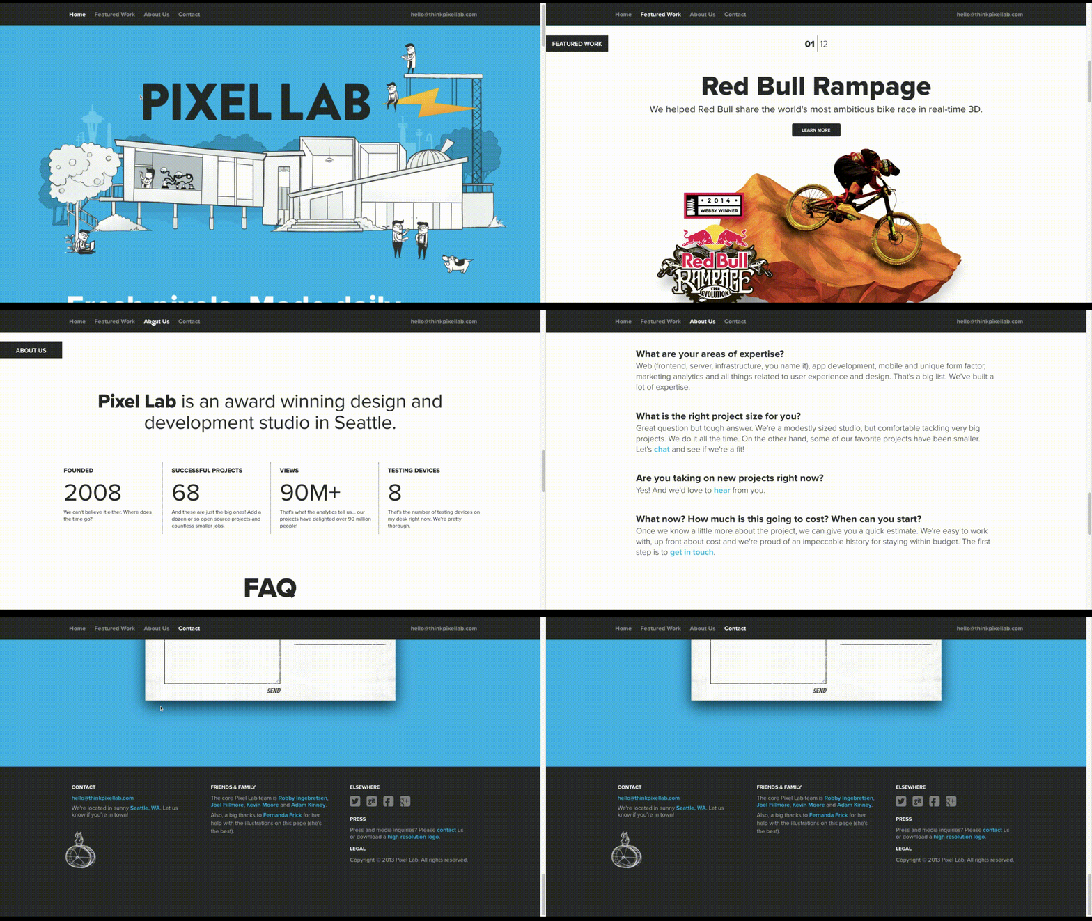
Like how design and development studio Pixel Lab does it:

Notice how all the key points are hit in a concise and visually attractive manner:

  • The Featured Work portfolio
  • The About Us introduction
  • The FAQs
  • The contact form

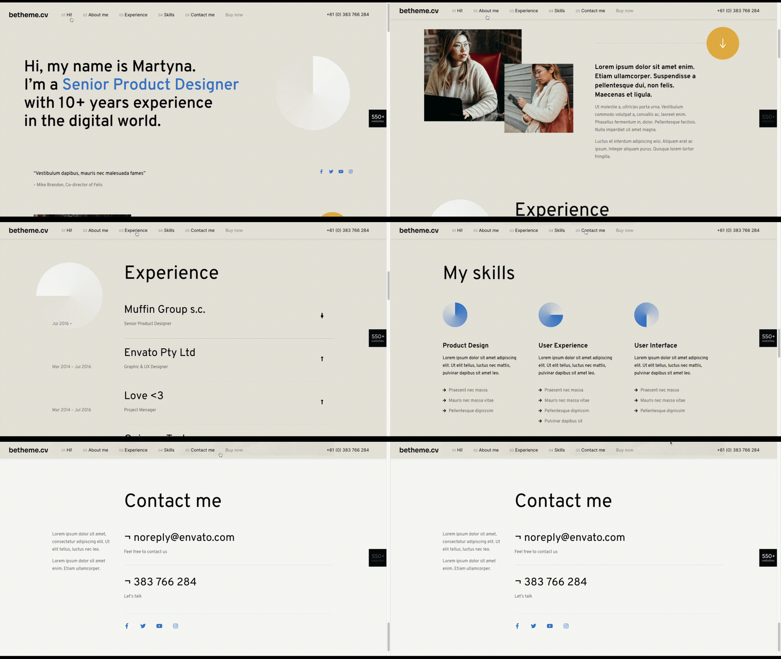
The BeCV pre-built site is built in a similar manner (and for a similar purpose, too):

BeCV

Just remember to keep a sticky navigation bar present at all times so visitors know exactly how much content there is on the page.

2. Opt For a Non-Traditional Navigation for a Uniquely Memorable Experience

Typically, the rule is that website navigation should follow one of two patterns:

  • Logo on the left, navigation links on the right.
  • Logo on the left, hamburger menu storing the navigation on the right (for mobile or desktop).

There are a number of reasons why this layout is beneficial. Ultimately, it comes down to the predictability and comfort of having a navigation be right where visitors expect it, no matter where they end up on your website.

However, with a single-page website, this is one of those rules you can bend, so long as you have a way to keep the navigation ever-present and easy to use.

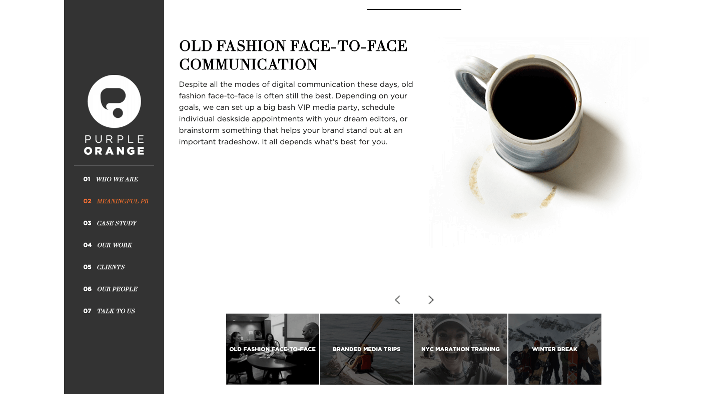
There are some great examples of one-page sites that have done this, usually opting for a stylized left-aligned sidebar that contains links to the various parts of the page. Purple Orange is just one of them:

Purple Orange

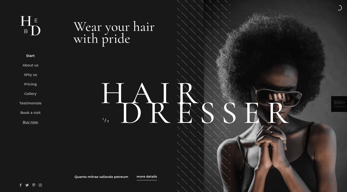
And you can use a Be pre-built site like BeHairdresser to create a similar navigation for your website:

BeHairdresser

If you’re trying to make a bold brand stand out, this is a neat layout option to experiment with.

3. Tell a More Visually Striking Story

One of the problems with building a website with WordPress is that you always have to worry about how your design decisions affect speed. Even once the code is optimized, images are usually the low-hanging fruit that have to be dealt with.

But when your website only contains one page, this means images aren’t as much of a problem (so long as you compress and resize them). It’s only when you continue to add pages, products, and galleries that you have to scale back your visual content.

So, if your brand has a strong visual identity and you want the website to show that off through images, a one-page website is a great place to do it.

Just remember to keep a good balance between text and images as Vodka A does:

Vodka A

There’s no reason for a liquor distribution company to mince words when the elegant product photos effectively communicate to consumers what it’s all about.

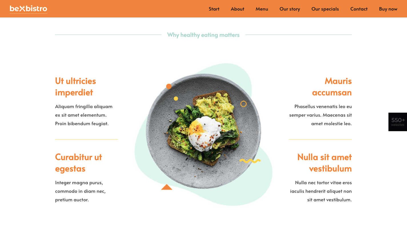
In fact, this image-heavy, single-page style would work well for any vendor selling a small inventory of products: food, beverages, subscription boxes, health and beauty products, etc. And you can use the pre-built BeBistro to carefully craft it:

BeBistro

4. Turn a Complex Business Idea or Offering into Something Simple to Understand

When a company sells a technical or complex solution to consumers, it can be a real struggle to explain what it does and why they should buy it.

But here’s the thing: Consumers don’t really care about all that technical stuff. Even if you were to explain how an app worked or how you use a software like Sketch or WordPress to design a website, their eyes would glaze over.

What matters most to them is that you have an effective and affordable solution that they can trust. So, why bog them down with page after page of technical specs and sales jargon?

A one-page website enables you to simplify even the most complex of solutions.

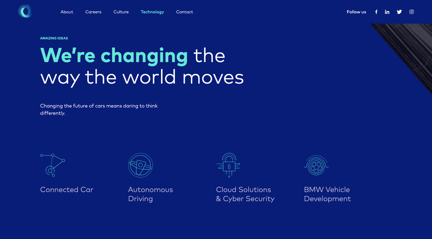
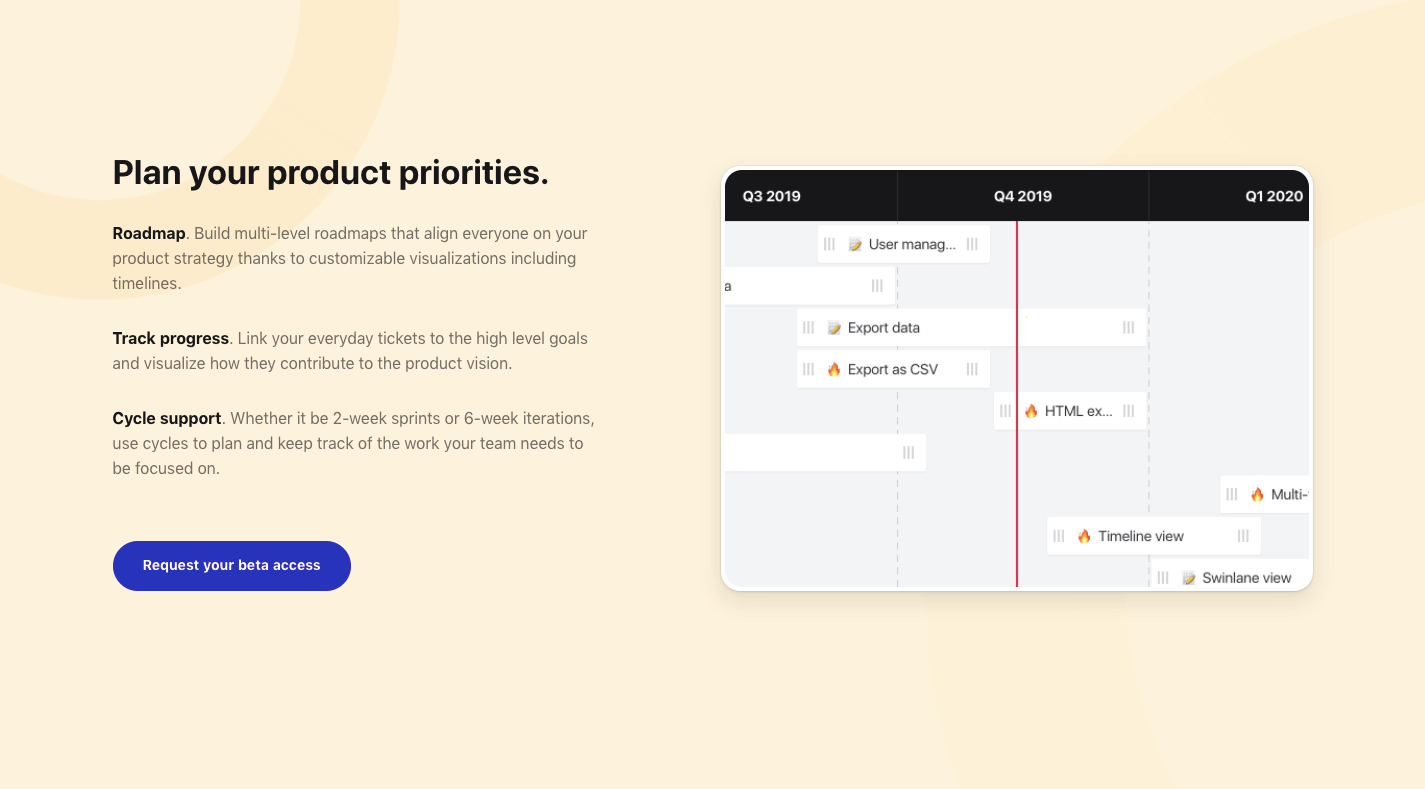
Take Critical TechWorks, for instance. It offers an advanced technological solution for the automobile industry…and, yet, this is all it needs to explain the technology at work:

Critical Techworks

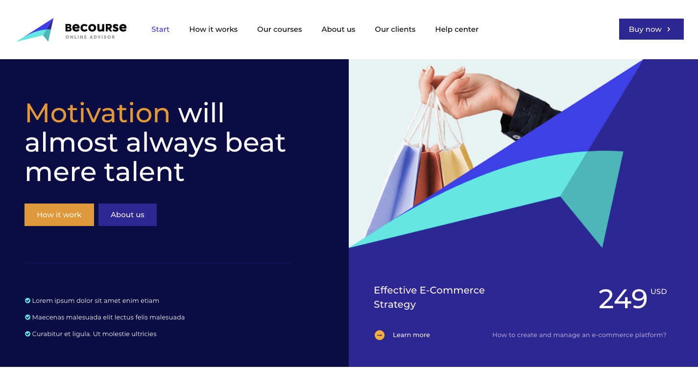
If your website’s visitors are more concerned with the outcomes rather than the “how”, you’d do well to make the website and content as easy to digest as possible. And you can use a pre-built site like BeCourse to do that:

BeCourse

Notice how both of these sites take visitors through a small handful of sections (pages) before delivering them to the main attraction: the contact or sign-up form.

5. Capture Leads and Sales at Different Stages of the Sales Funnel

Some of your visitors will be brand new to the site and need more information before they pull the trigger. Others will already have a good idea of what they’re getting into and just need one small push to get them to take action.

With a single-page website, you can design each section to cater to the different kinds of leads and prospects that arrive there.

The top sections should be introductory in nature, providing new visitors with information they need to decide if this is an option worth pursuing. The sections further below should drill down into the remaining questions or concerns that interested prospects have.

Regardless of which section they’re looking at, your one-page site will have CTA buttons built in along the way that drive them to conversion the second they’re ready.

This will enable your site to always be prepared to convert leads, whether visitors read the first two sections or make their way through all of them until they reach the conversion point (e.g. a contact form, a checkout page, etc.).

You’ll find a nice example of this on the Cycle website, with CTAs strategically placed along the single-page’s design:

Cycle

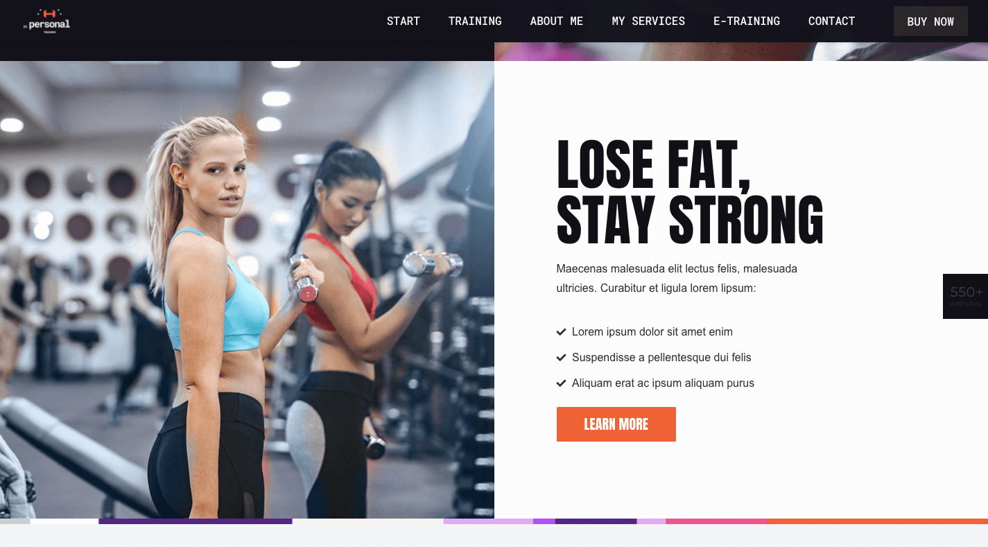
BePersonalTrainer is a good pre-built site option if you want to ensure that you include a CTA button at the perfect stopping points throughout your page:

BePersonalTrainer

You won’t find them at the bottom of every section, but that’s okay. You just need them whenever your visitors are seriously thinking about taking action.

What Should You Build: A Multi-Page or One-Page Website?

Although a single-page website won’t work for larger websites (especially in ecommerce), it could work well for business websites that are on the smaller side to begin with.

By centralizing all of that information into a single page, you’ll create a fresh experience that wows visitors with how succinct yet powerful both the message and offering are.

Just be careful. Many single-page websites are poorly done (which is probably why they fell out of fashion for a while).

Remember: This is not your chance to throw web design rules out the window. In fact, this will be an opportunity to clear out the fluff and the clutter that’s accumulated over the years and to return to a more scaled-back and classic approach to design.

And with the help of Be’s pre-built one-page websites, it won’t require much work on your part to make that happen.

[– This is a sponsored post on behalf of BeTheme –]

Source

Categories: Designing, Others Tags:

School Reopening: How Educational Institutions Can Reopen Safely

September 15th, 2020 No comments

A century from now, historians will study how the “Great Lockdown” of 2020 changed the lives of billions across the globe — and there’s one aspect in particular that will stand out: education.

In the big picture of human history, mass public schooling is a recent phenomenon. It arrived with the era of industrialization. Hundreds, even thousands, of students packed into classrooms, lecture halls, and school cafeterias.

Then COVID-19 hit, and schools worldwide were shut down. Administrators and educators scrambled to find solutions when physical interaction was all but impossible.

Putting the “distance” in distance learning

In the Australian outback, the Alice Springs School of the Air has been operating since 1951. Today, it provides remote education to 125 students within a 521,000-square-mile radius. Classes were once held over two-way radio; now they use a satellite link for video. When the nearest school is thousands of miles away, distance learning is the only option.

As the COVID-19 pandemic hit, educational institutions worldwide had to face some of the same challenges that the Alice Springs School of the Air has dealt with for nearly 70 years. They had to suspend physical operations and move to distance learning. Suddenly, millions of students around the world became “distance learners.”

In the first months of the pandemic, U.S. schools patched together temporary solutions, trying live video classes, emailed assignments, and virtual study groups. Worried parents gathered to create their own solutions, like learning pods.

As the months passed, it became clear that distance learning was here to stay — at least for the upcoming school year in the U.S. Short-term patch jobs weren’t enough. Schools had to find a way to deliver education with limited or no physical contact. This resulted in many challenges:

  • How to stick to the curriculum with students and teachers at home
  • How to successfully blend live and virtual learning environments
  • Questions about which tools are necessary to meet strict COVID regulations, such as obtaining health declarations from students attending in-person classes
  • How to complete standard processes, such as school registration, when parents can’t even visit the school secretary’s office

This guide tackles all of the tricky questions associated with school reopening, including planning and managing hybrid classes, as well as how parents can help and what tools can assist with the process.

Using these tips and recommendations, educators will be able to identify the best ways to reopen successfully and continue their educational mission with fewer disruptions.

Planning the Reopening Process: Proceed with Care

Hair salons, restaurants, medical clinics. They are all different businesses with different needs. As these and other businesses slowly reopen, the various challenges they face will require new and innovative solutions. Different states and countries have devised their own schedules for reopening businesses, depending on their unique, local situations. Many businesses have already reopened, while others have partially reopened or are in the process of reopening now.

Schools, however, are another story. Educational institutions have to reopen. Millions of students need to start learning again. What’s more, 27 million Americans must have childcare so that they can go to work. Until schools reopen, many parents can’t work, which only makes their economic situation worse.

There’s no room for delay, and that’s why schools are turning to the next best solution: hybrid learning.

What is hybrid learning?

Just as a hybrid car runs on a mix of fuel and electricity, hybrid learning runs on a combination of in-person and virtual interactions.

Right now, it’s not feasible for schools to throw open their doors and let in all of their students. Instead, many schools are dividing the student body into groups and staggering attendance, so the number of students physically in the school at the same time doesn’t exceed the allowed limits.

When groups aren’t attending school, they’re taking online classes and completing assignments from home. This is a complex undertaking that requires several online tools and solutions to support remote interactions.

Digital is here, ready or not

Even schools that aren’t yet embracing hybrid learning will need to think more seriously about implementing online solutions as soon as possible. Why? Here are two reasons:

1. Some processes will inevitably move online

A whole lot more goes on at school besides teaching. Things like collecting student data, registering new students, gathering student feedback, disciplining students, and managing permission and parental consent are examples of administrative processes that can easily go digital, thereby becoming more efficient, streamlined, and contactless. Even before the pandemic, many schools were already digitizing their back to school tasks with JotForm. In a socially distanced world, digitization is now a must.

2. You may not have a choice

The pandemic is proving to be unpredictable, and authorities are changing their directives as circumstances on the ground shift. Schools must be prepared for government-mandated closures, and when those happen, there will be no choice but to provide remote education.

Besides, there will always be vulnerable students and teachers who can’t attend school in person. For instance, people who are medically high risk will have to engage in distance learning until the pandemic is fully behind us — and that could take years.

Hybrid class: What it looks like

A hybrid class is a blend of offline and online learning, but there is no hard and fast rule about the structure. Some teachers prefer to give a traditional lecture-style lesson followed by an online assignment completed individually. Others use more interactive methods to engage remote students.

A hybrid class uses several tools and technologies, including virtual meeting rooms through tools like Zoom or Webex, course management software, video content, digital quizzes and surveys, group chats via WhatsApp and other chat apps, and more.

Here are a few broad suggestions about how to design a hybrid class:

  • Break down the syllabus into parts. Not every module or course will be suitable for online learning. Separate the syllabus into small portions so you can see what must be covered in the live classroom versus what can be adapted to online sessions.
  • Mix it up. Don’t spend all of your in-person teaching time giving lectures. When students are physically together, this is the time to encourage interaction and connection, which is sorely lacking in remote learning situations. At the same time, don’t make the online component boring with hour-long, one-sided lectures. Keep it exciting and engaging by mixing up the styles and experiences, both online and offline.
  • Make virtual classes interactive. Keeping students engaged online can be more difficult than in a face-to-face setting. Incorporate games, collaborative projects, quizzes, and other interactive content in virtual classes to maintain students’ interest and attention.
  • Use online tools to share and connect. A hybrid class is much more than a few Zoom meetings. It requires a central portal where students and staff can access all course content, assignments, and interactions in real time. Learning management tools such as Google Classroom, Edmodo LMS, and Schoology offer course authoring, content management, and social networking features to make hybrid learning smooth and efficient.

Don’t forget everything else

There are many aspects of an educational institution in addition to classes and teaching. Finances; food and catering; delivery of protective equipment, such as masks, hand sanitizer, sneeze guards, and even disposable cups instead of mugs for the teachers’ lounge need to be coordinated through digital, contactless processes.

Here are some tips on how to plan ahead to make your school safe and efficient:

  • Create an online self-screening form for parents or guardians to fill out every morning, verifying that their child is symptom free and hasn’t been knowingly exposed to the virus. This saves the hassle and expense of collecting and filing papers from every student every day.
  • Engage students with age-appropriate activities to reinforce the importance of adhering to health and safety guidelines. Make it fun! Students can design face masks in art class, or you can involve senior students in crafting posters and messages to pin up around the school.
  • Develop a cleaning schedule to ensure classrooms and shared spaces are disinfected according to health and safety guidelines. An online planner shared among the janitorial supervisors can be a great way to streamline a complex, time-consuming process.
  • Check out the CDC’s recommendations for operating a school during COVID-19.

EdTech: The key to school reopening

Is there any part of daily life that isn’t impacted by technology?

Washing machines are now smart washers, which allow you to tackle the laundry even if you’re not at home. Watches have become smartwatches, which keep track of your emails, heart rate, and time.

In education, there’s education technology, known as “EdTech” for short. It’s changing the way schools operate and students learn, especially in the shadow of COVID-19.

What EdTech is and why it matters

EdTech covers the various digital tools and online platforms that facilitate learning. Used by schools and colleges worldwide, EdTech isn’t exclusive to educational settings. It’s popular in business for staff training, among other applications.

One example of EdTech is virtual learning software. For instance, Zoom is a popular way to host virtual lessons, so it falls in the category of EdTech.

Other examples of EdTech include

  • Virtual class enrichment tools, such as Starfall and Education.com
  • Learning management software, such as Google Classroom and Schoology
  • Specialized tools for different subjects, such as Yousician for music lessons

EdTech is becoming so widespread, it’s forecast to grow by 17 percent a year, reaching an estimated $252 billion in value by 2020. And that was before COVID-19 turned school classrooms into virtual hotspots.

The reopening challenge: From real to virtual

Although EdTech is advancing rapidly, it took a global pandemic to make many educators understand its importance.

As people across the world deal with the realities of the pandemic in their daily lives, schools must make the transition from in-person learning to virtual instruction. Many schools and school districts are aiming for the hybrid classroom as the new educational model, and EdTech is the bridge to that model.

To be successful, the move from an in-person to a digital classroom requires careful planning. You must adapt curricula for remote learning in order to properly engage students. And teachers must be equipped with and trained to use EdTech tools.

There are also many administrative challenges involved in remote education. Tasks such as student registration, student and parent feedback, monitoring of assignments, grading, and attendance all still need to be completed. Fortunately, technology can make these tasks easier and more efficient.

EdTech involves much more than installing tools and software — it’s a complete shift in mindset, and all teachers and students must be on board to succeed.

Learning goes mobile, and so should you

Mobile learning, also known as M-learning, is an offshoot of the EdTech industry, and by all measures, it’s going to be big.

Mobile use is rising worldwide — in 2019, people in the U.S. spent an average of three hours and 10 minutes on their mobile phones every day. And that’s before social distancing rules came into play.

People are comfortable with and accustomed to using their mobile phones for daily tasks, such as sending emails, watching videos, and chatting with friends. As more students move to remote education, they will naturally spend time learning and completing school tasks on their phones.

For many families, this is a necessity. Mobile phones and tablets are cheaper than laptops. That means more students can participate in virtual classrooms if the platforms can be accessed from a phone.

Another aspect to consider is flexibility. Students can complete their studies from any location via their mobile phones. They can move around the house to get away from family noise, or sit outdoors to get fresh air while they listen to a lesson.

Adapting remote learning for mobile with the help of EdTech is a vital consideration for school reopening.

Accessibility is not optional

A big advantage of virtual learning is accessibility. The only thing a student needs is an internet connection, right?

Not so fast: Students who are physically impaired can’t participate in virtual learning unless it’s accessible. What’s more, online courses are required by law to be accessible, so schools must take steps to make their remote learning programs accessible.

EdTech tools are every educator’s friend when it comes to online accessibility. For example, EdTech enables the easy creation of both audio and text-based classes, giving students a choice that should meet their needs. Accessible design elements, such as large fonts and contrasting colors, are essential for people with visual impairments, while keyboard shortcuts are necessary for students who are unable to use a mouse due to a physical impairment.

There is no compromising on accessibility, even when learning moves completely online. Rather, educators must focus on making their virtual courses fully accessible.

The digital frontier in education is fast approaching, and schools need EdTech to get there. Educational institutions that have already implemented EdTech are discovering these distinct advantages as they adapt to a new reality.

Next steps for teachers and administrators

A global pandemic is likely the toughest situation in which to reopen an educational institution.

Minimizing human contact is paramount — but schools are high-intensity, densely crowded environments. With complex safety regulations that change frequently, plus serious health concerns and high educational standards to maintain, it’s no wonder school administrators are feeling intense pressure.

The safety of staff and students is the number-one priority of every school. That’s why you should thoroughly investigate the potential risks of reopening in advance. The most effective way to do that is with a school reopening risk assessment.

School reopening: Know the risk and manage it

In ordinary circumstances, running a school comes with massive responsibilities. Hundreds, if not thousands, of students, teachers, and parents entrust the school’s staff with maintaining order and safety.

Then along comes a global pandemic, and the stakes get higher. Much higher.

With schools reopening, students and teachers in many regions are returning to campus at least part time. It’s vital that all necessary safety measures are in place in advance to reduce risk in this new hybrid learning model. But to know what risks a school faces, first you must conduct a risk assessment.

A school reopening risk assessment considers every type of risk that could arise in the daily operations of the school amid COVID-19. It looks at different aspects of the school day and pinpoints all possible health, safety, legal, and educational complications. Start at the beginning of the day, and run through a timetable to cover the various scenarios. Map out the risks that arise in each separate case.

For example, how many school buses arrive in the morning? How many students are on each bus? How do students enter the school campus? Is there one entrance or several?

How many students attend each class? How big are the classrooms? What common areas do the various classes share?

There will be hundreds of questions of this nature, and you must answer them all in order to quantify exactly what kinds of risks are involved with every activity at the school. Many of these questions will seem obvious and even superfluous; however it’s vital to note them all to create an accurate picture of the school in action. Only then can the true risk be defined.

Mitigating risk: More than common sense

As the COVID-19 pandemic progresses, the situation on the ground changes often, sometimes suddenly. Governments worldwide are continually updating their health and safety recommendations for homes and workplaces. In the U.S., the Centers for Disease Control and Protection (CDC) has published comprehensive guidelines to help steer leaders in the right direction. School administrators should become well versed in CDC recommendations and make sure to stay up to date as circumstances shift.

Many of the CDC guidelines are common sense — for example, disinfecting common areas and bathrooms regularly throughout the school day, providing hand disinfecting stations in strategic places on campus, requesting masks be worn when possible, and ensuring that students under quarantine don’t attend school in person. These are all sensible precautions for school reopening.

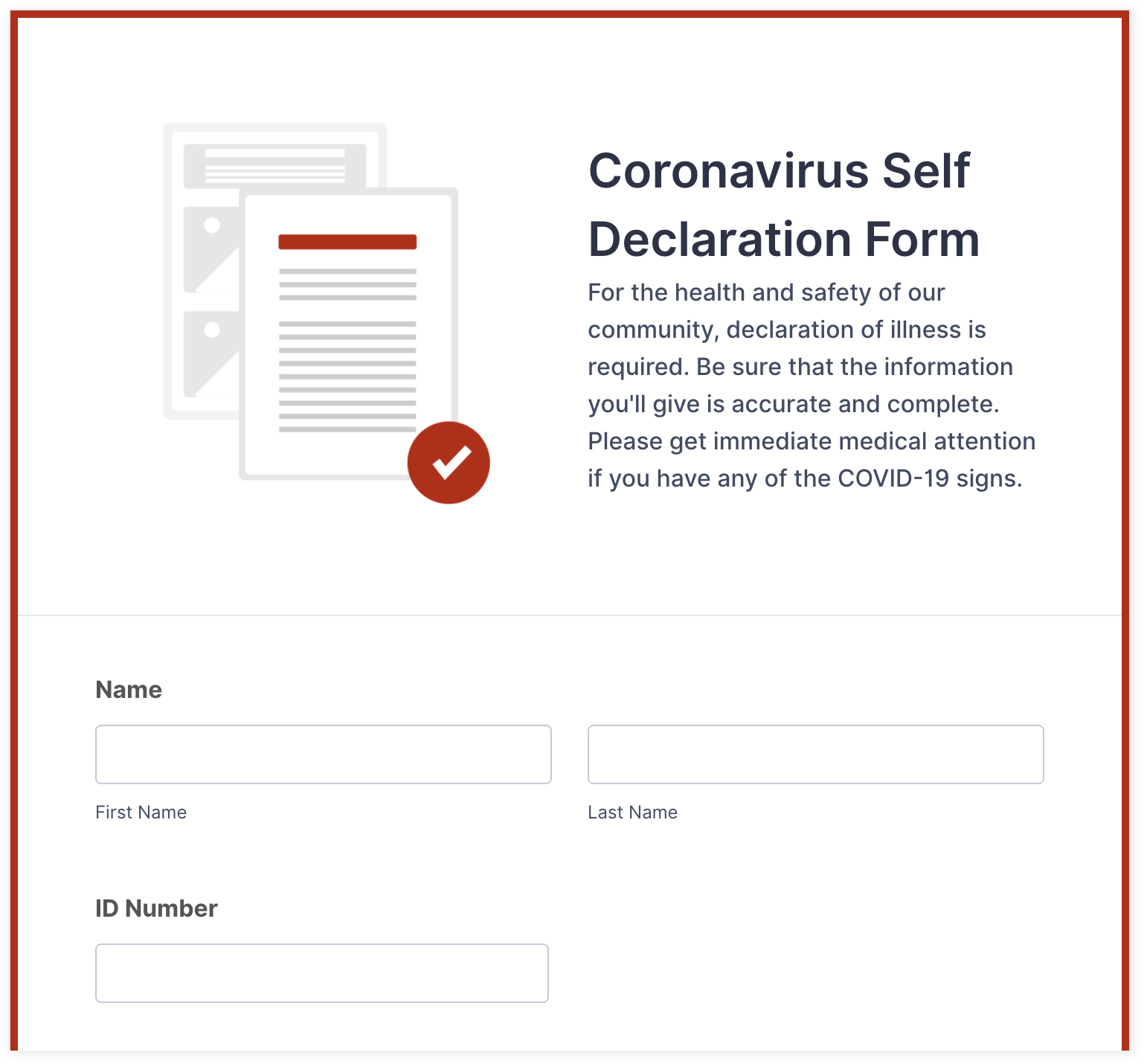
Another important part of school reopening is collecting official authorization that students and teachers who attend in-person classes aren’t at risk of spreading coronavirus. The best way to do that is through online forms.

How to use online forms for school reopening

Regular coronavirus testing of students and teachers is ideal. However, in most cases, it’s not realistic. Many schools opt for self screening forms instead.

Self screening forms

Anyone attending school is required to self screen for the virus via an online questionnaire. The self screening form covers details that would indicate a higher risk of contracting the virus, such as recent travel, signs and symptoms of the virus, or those who have been in contact with a known carrier.

Self declaration forms

Imagine a school with 1,000 students and teachers. Every day, every person who attends school in person must complete a form declaring that they haven’t been exposed to the coronavirus. The school administration must collect all these consent forms and keep them on file for regulatory and safety purposes.

Now, imagine going through this process with printed forms. It’s impossible. That’s why digital forms are the answer.

Suppose a teacher or student doesn’t have any indications of being at risk. In that case, they can sign a self declaration form to assert that they consent to coronavirus regulations and can attend school.

With digital consent forms, schools can adapt the template to a sensible and user-friendly format for various groups. For elementary students, a parent or guardian will be handling the daily consent form, so it should be tailored for that purpose. High school students will likely need a more thorough risk assessment of their social interactions. Make sure to adjust the clauses and requirements of consent forms so they are sensible and appropriate for anyone physically attending school, whether students, teachers, or other staff members.

Contact tracing forms

Unfortunately, keeping a school 100-percent coronavirus free is nearly impossible. Eventually, there will be some community exposure, and there may even be students or teachers who test positive.

After positive cases are noted in the school, it’s time for contact tracing. Contact tracing tracks the movement of the individual who has the virus and identifies people with whom they came in contact. Those people can then be notified that they must enter self quarantine to prevent further spreading the infection.

Digital contact tracing forms are a highly effective way to manage the complicated process of contact tracing, especially when time is of the essence. Not only do they provide a fast and centralized way to collect data; they also make it much easier to consolidate and analyze the data and quickly inform the affected individuals.

School reopening survey forms

Reopening a school during a pandemic is a complex business. Having parents and students on board is crucial to making it a success. That’s why getting feedback from the student body about what they need and expect for the return to school will make the process much more efficient and accurate.

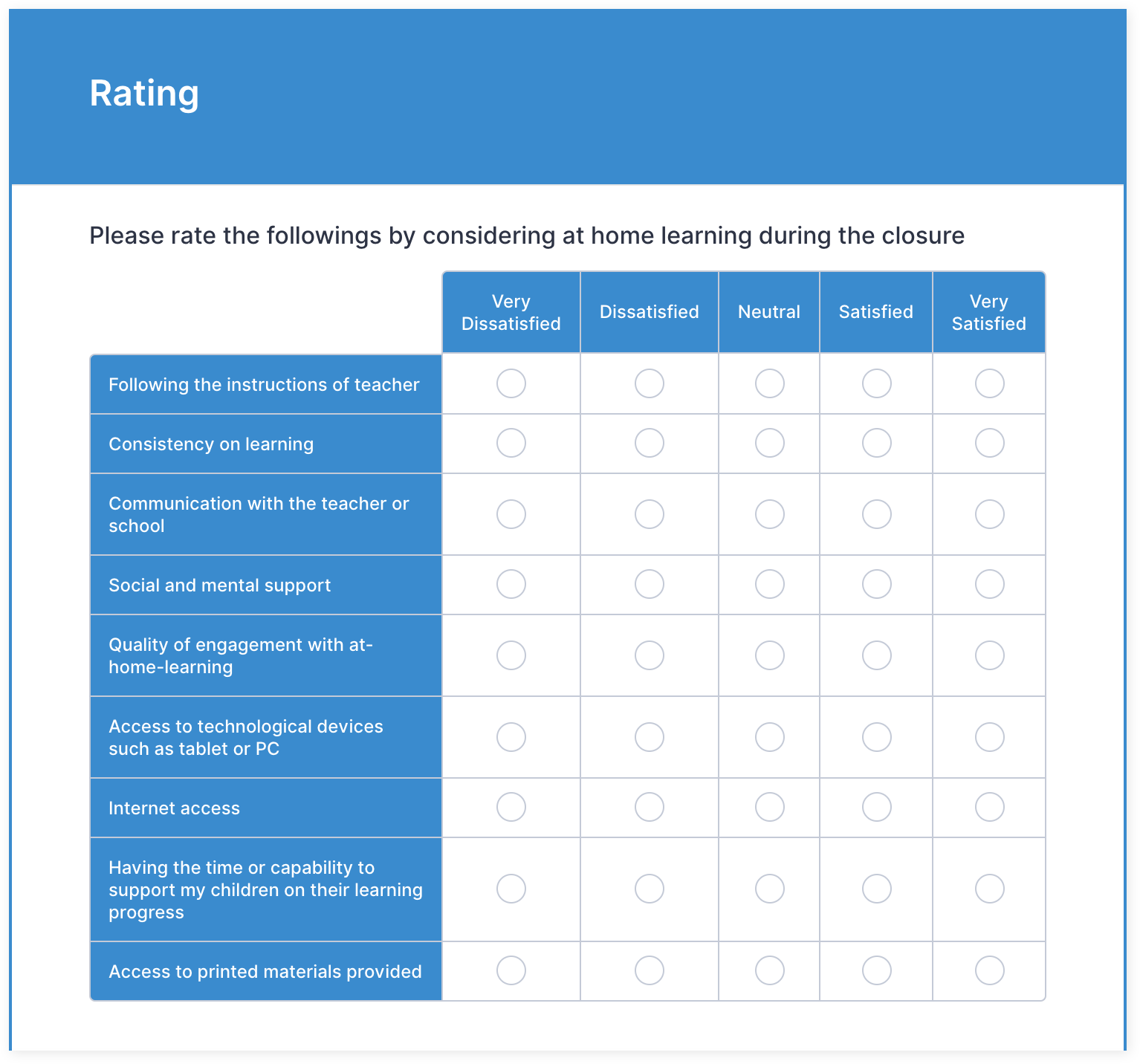
The most effective way to gather feedback is to conduct a school reopening survey for students and their families. The survey should be as detailed as possible, so that administrators can collect the information they need to focus on the issues that matter most. Plus, when parents and students feel involved and heard, they’re much more likely to follow the new regulations and make the best of the situation.

Here are some ideas for school reopening survey questions that cover all bases:

  • Health situation: Ask about the student’s health risk and that of their immediate family. Are they medically high-risk, or do any high-risk individuals live in their home?
  • Technology and home setup: It’s important to understand whether the student is equipped for virtual learning. Do they have access to a reliable internet connection and a computer or tablet?
  • Preferences: Does the student or their parent/guardian have a preference for in-person, hybrid, or remote education? Is there a responsible adult at home during the day to assist the child with virtual learning?
  • Logistics: Does the student have a means of transport to attend school or do they need to take the school bus? Are there concerns about eating meals from the school cafeteria?
  • Free text: Provide a section for the student or parent to express their opinions, ask questions, or voice any other concerns they may have. This encourages openness and candor that will help you create the most effective school reopening strategy for your student body.

Parents: The strongest link in school reopening success

Unlike students and teachers, there’s one group of people who don’t come to school every day — yet they are critical to successful education: parents and guardians.

During the pandemic, parents and guardians have been asked to participate in their children’s schooling in a more hands-on way than ever before. Especially now, parents are the key to making school reopening as smooth as possible.

For starters, parents must monitor their child’s health and contact with others, ensuring they aren’t at risk of spreading infection at school. It’s the parent’s responsibility to sign a consent form for their child and make sure the school receives it — every single day.

In addition, many schools have transitioned to a hybrid model, meaning parents must stay on top of the days their child is on campus or at home in virtual classes. For home-based learning, parents must support their kids by setting up their computers, signing into classes, downloading materials, and helping with schoolwork and assignments.

All of this is happening out of sight of school administrators and teachers. These professionals have to trust parents and hope they’re doing what’s necessary to make school reopening a success.

But it’s time for a reality check: No administrator can be 100-percent sure that parents are following all the rules all the time. That’s why staff must encourage parents to facilitate their child’s learning and keep them safe. And that means supporting parents with procedures and techniques to help them cope.

How schools can support parents

In the beginning stages of school reopening, when students and their parents are adjusting to a different way of learning, here are six ways schools can help parents create a positive learning experience.

Make collecting consent easy

In the case of minor children, parents must declare that their children haven’t been exposed to the virus and can attend in-person classes without putting others at the school at risk. Administrators can make this process much easier for parents by providing a digital self declaration form to complete every morning, quickly and easily. Via a simple web link, the parent can access the form on their computer or mobile device, provide their consent, and send it to the school in just a few seconds.

Promote hygiene awareness

One of the keys to preventing infection is maintaining good hygiene — at school and home. This is a two-way street. While schools provide hand sanitizer and disinfect common areas every few hours, it’s up to students to frequently wash their hands, avoid touching their faces, and reduce physical contact with friends. For energetic kids, this is a tough but essential ask.

Parents play a huge role in helping their kids understand the importance of personal hygiene, and schools can help parents by providing educational materials on the subject. For example, schools can create posters showing how to properly wash hands for parents to hang up in their bathroom at home.

A productive home learning environment

Remote learning is challenging for everyone — teachers, students, and parents. Parents need to find ways to support their kids with a productive learning environment at home. This might mean rearranging a room of the house and turning it into a classroom, moving TVs out of the area where the child will be attending virtual classes to eliminate distractions, or creating a timetable with set breaks for recess and lunch.

As educational experts, school staff are the perfect resources to provide parents with tips about creating positive learning habits. The school can even host virtual support groups for parents, where participants can share their experiences and solve issues together.

Parent-teacher communication

For many parents, the hybrid school model has added another job to their already-overflowing resume: tutor.

Particularly for younger children, learning at home comes with certain difficulties. Students need to keep up with virtual timetables, log into classes at the right time, and work on assignments and exercises without a teacher guiding them. Suddenly, parents have to act as a support tutor for their kids to help them get through the school day. This can be quite a shock for parents accustomed to waving as their children take off on the school bus every morning.

Teachers should maintain ongoing communication to keep parents in the loop about changes to schedules, special projects or tasks their child may need help with, and upcoming tests and deadlines.

Social distancing outside of school

School reopening depends not just on what happens at school, but also on how students behave in their free time. Parents must encourage their children to socially distance outside of school hours to minimize their risk of exposure to coronavirus and prevent infection rates skyrocketing on school campuses.

As the saying goes, education begins at home, so schools should remind parents about the importance of social distancing at all times. Advise parents on managing their kids’ schedules with social restrictions, such as encouraging virtual playdates or creating “pods” of friends who get together only with each other. You should also educate parents about their own social habits during this time. After all, kids naturally follow their parents’ example, so parents should limit contact with outsiders as much as possible.

Parental support website

Schools can support parents during school reopening in many ways, but the problem is how to connect with them efficiently in real time. A great way to do this is by creating a purpose-built website, especially for parents, that consolidates all the relevant information in one place.

Parents can access consent forms, class timetables, updates to rules and regulations, online information, and downloadable material about healthy hygiene, social distancing, and more. The site can even host webinars, chat groups, and private communication between parents, teachers, and admin staff.

Creating a parental support website is easier with the help of a website builder. As the pandemic continues and virtual learning looks like it’s here to stay, a parents-only school website is essential to supporting these behind-the-scenes heroes of hybrid education.

Online tools for school reopening: The fast track to efficiency

The COVID-19 pandemic has been a rough ride, but it has also brought glimmers of hope. One of those is an increased sense of community. People have rallied together to help one another in unprecedented ways. For instance, in the UK, when the government asked for 250,000 volunteers to support the National Health Service, it was flooded with 750,000 offers of help.

This sense of goodwill spread to the business world too. Hundreds of tech companies provided their tools and services to businesses and individuals for free, or at discounted rates, across all industries, from marketing to communications and health. Many offered a hand to educational institutions, to help them cope with campus closures and social distancing protocols that made teaching incredibly difficult.

For example, ClassTag is a free tool that facilitates communication between school districts and families via SMS, email, apps, and the internet. It also has a videoconferencing feature for virtual classes and content sharing capabilities. Companies like Scribd, Rosetta Stone, and Scholastic offered free access to their learning products during the lockdowns as well. Other EdTech providers, such as LinkedIn, Amazon, and Coursera, opened up their paid educational courses at no cost.

How JotForm responded to the crisis

Here at JotForm, supporting the community is our priority. Our Coronavirus Responder Program provides free access to a range of digital form templates designed to meet the needs of healthcare providers and others during the crisis. As circumstances change on the ground and health regulations shift, we add new form templates, covering all kinds of scenarios and requirements for healthcare workers on the front lines.

The effects of the pandemic echo beyond the walls of health providers, and that’s why we created 150+ free coronavirus response templates that can be used for all kinds of business operations related to COVID. From virus screening to volunteer signups, client consent for salons, patient liability waivers, teletherapy consent, and coronavirus case reporting, there’s a free digital form for just about every possible pandemic-related situation.

You can easily adapt and use these forms for school reopenings too, giving teachers and administrators a fast track to efficiency.

Digital form templates for school reopening: Endless possibilities

Digital forms are flexible and easy to use for a wide range of purposes and goals. You just need to do some quick customization, like adding the school logo and adjusting the field titles, and you’re set for an efficient, streamlined school reopening.

Here are a few digital form templates that can be tailored for schools and educational institutions:

  • Screening checklist. Monitor the temperatures and symptoms of school staff and visitors with this comprehensive health screening checklist.
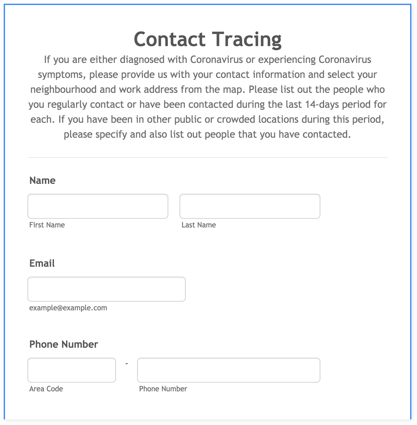
  • Contact tracing form. Collect location information for students or staff who may have been exposed to the virus; a Google Maps integration helps to pinpoint their recent movements.
  • Self-quarantine time-off request form. Keep track of staff who are required to self-quarantine with digitally recorded requests for time off work.
  • Cleaning and disinfection log template. Monitor and track the cleaning schedule of school campuses to ensure compliance with COVID-19 health and safety measures.
  • Remote learning device request form. Find out which students need tools and equipment for virtual learning and gather the relevant data in one centralized place.
  • Virtual office hours form. Make it easy for parents to schedule virtual teacher meetings with this digital appointment scheduling form.

School reopening won’t wait

Teachers, students, parents, and entire communities rely on schools to maintain their daily routines. What’s more, the vital need for quality education will never go away, even in the face of a global pandemic.

For the coming school year, it seems that COVID-19 is here to stay. School administrators can’t control the virus or its effects on daily operations. You also can’t control when schools reopen, whether there will be a delay in reopening schedules, and what structure the school will employ when the reopening phase finally arrives. This is in the hands of your local authorities.

Yet, at the same time, it’s up to you to find a solution to provide high-quality education — even in confusing and uncertain times — and to be ready with the best tools in place when the school opens once again.

Conclusion

Education has come a long way since local schoolhouses and chalkboards.

The unique circumstances of COVID-19 have made virtual classrooms common. Schools are reopening to a new reality, creating unprecedented challenges for administrators, teachers, students, and parents. What will help each group cope with remote learning? EdTech.

For administrators, EdTech streamlines every aspect of school operations, including managing the demands of health and safety regulations. For teachers, EdTech provides learning platforms to keep them on track with curricula and educational goals.

Students can use EdTech tools at home or in class, via laptops or mobile phones, to manage their schoolwork and achieve academic success. And for parents, EdTech is the key to communicating with staff and teachers, guiding their kids to make the best of the hybrid classroom environment.

Today, EdTech is driving learning possibilities like never before. With digital tools and solutions, educational institutions can find ways to reopen and flourish, even in a global pandemic that has altered the daily routines of millions.
Categories: Others Tags:

What are the Robust Security Plans to Stop Unwanted Form Entries?

September 15th, 2020 No comments

After somebody spends long hours building a form for the respective people to fill, they feel a sigh of relief since the critical job is now done.

But, this relief is often short-lived because they soon witness some unknown and irrelevant entries coming in. Are these the people they sent the form to? No! Do they need these entries? No! This is generally termed as web form spam. Such annoying entries are often received by people who probe for vulnerability or wish to get links to their spam websites through the publisher’s web page.

For somebody who’s recently published a new website, this can be a bit off-putting, and a lot annoying. Even though it’s quite like the regular spam, this can be a lot more annoying when done repeatedly with every form. This might seem like something that never really happens, but actually is one of the most significant issues with form publishers. Even if it’s just a simple college form that requires students to fill out some information, it’s prone to such susceptible entries unless some steps are taken in order to prevent them. To help anybody who would want to prevent himself from this web form spam, here are a few security plans to be put in action:

Activate Powerful Field Validation

If one must carefully go through the forms on the web out there, he/she will be surprised to see how most of them have zero to little field validation. Click submit, and the form submission will be successful. This is like presenting the form to the bots for all the spamming.

Instead, one must use a quality marketing automation software and decide the specific validations for every field carefully. As soon as the human makes a mistake in the field entry, a notification will be sent. Bots, on the other hand, will find it annoying since they can’t figure out what data must be filled in order to submit the form. But, this might not be enough since bots can sometimes be brilliant.

Limit the form entry to only one per IP address

A spammer’s usual tactic to drive the form builder crazy would be to repeatedly fill the form from a single IP address since they might not have a lot of devices to do so. There’s a simple technique to restrain them from doing so. Block them by restricting the number of submittable entries from an IP address to one.

Though, one might want to take their form’s purpose into consideration before they take this action since maybe the people they wish to fill this form might use the same devices to do it. For example, in a school or university, teachers will probably use the same computers to fill out a specific form.

The strongest of all- CAPTCHA

CAPTCHA is that powerful tool that can even annoy humans at times. Imagine what it would do to those evil ‘bots’ who are planning to spam the form entries. Though CAPTCHA is an easy step for a human, a ‘bot can’t clear it. Those odd-looking combinations of numbers and letters might be a second’s task for humans to figure out, but bots will take years to figure out something like that. Basically, an automated web crawler can’t get through CAPTCHA no matter what. Nowadays, it’s even easier for humans to pass the CAPTCHA test since all they need to do is click a checkbox that verifies them to be human.

Yes, CAPTCHA is an extra job for the person who’s filling out that form, but it saves the form publisher hours from figuring out spammed entries. A second wasted there will count to hours saved here. Moreover, CAPTCHA will also add up to a person’s website’s professionalism.

Password-protection- the oldest trick in the book

Remember how kids used to put a password on their favorite games so that their siblings can’t mess up their scores and progress? The same needs to be done with these forms here. If this form is supposed to be filled by a specific group of people you know, circulate the password along with it that would be the key to open it in the first place.

Bots can fight anything but the password. This is the ultimate solution to everybody’s spamming headache. Especially when a form is posted on social media, spammers can really mess up the entries as well as one’s inbox. With a password, it’ll be easier to prevent such unpredictable behavior from respondents who hurt the integrity of one’s data. Moreover, it’s completely controllable when the password protection works or doesn’t work on the form since sometimes the entries can be lower in number than expected, and one might need more of them.

A data confirmation screen in the end!

Most of the websites or form publishers generally opt for a data confirmation screen where they ask the user to click confirm in case they’ve entered all the data right. Doing this, they ensure that none of the bot’s spammed entries reaches their inbox.

Imagine a bot having been through all the above steps and failing at this final step! Amusing for the form publisher, but brain-scrambling for that bot who tried to harm the integrity of the form’s purpose and data. If nothing else works, this step will surely knock all those bots away from one’s form.

Conclusion

Done! Form publishers, here is the ultimate guide to all your problems with form spamming. Use the right tools, use the proper techniques, but considering the purpose of form since preventing entries sometimes can work in the negative direction as well. A way too tricky form to fill will bore everybody out, and one might not receive the essential entries as well. So, it’s imperative to take such actions only when they’re genuinely required. For somebody who needs the maximum number of entries, some of the techniques above won’t work too well. But, these will always work when a form needs to be saved from the evil bots.


Photo by Markus Winkler on Unsplash
Creator, Andy Butcher is a digital marketing manager at SoftwareWorld; a leading software technology review and rating platform.

Categories: Others Tags:

The Top 10 Important Principles of Logo Design

September 15th, 2020 No comments

The concept behind having a logo is to communicate with customers and presenting something memorable. There aren’t any set of fixed rules that you should follow when it comes to designing logos. If anything, the only thing you need to keep in mind is sticking to what your customer wants. A good logo only makes sense when it’s natural, attractive, and easy to grasp.

A logo should tell a story and represent the business. Here are the ten principles you need to keep in mind when you design a logo.

Top Ten Principles of Logo Design

1. Keep it Simple

Try to keep your logo simple and easy to understand. If you add too much cluster, color, and elements, your customers might get confused. Simplicity has always been in the design game, and it’s still on the top. People would be attracted to something bold and straightforward more than a logo that has too much going on. Make wise choices with elements, font, and colors to create a visible logo that can be observed at a single glance.

2. Create an ‘Easy to Remember’ Logo

The second principle for you to remember is – your logo should be memorable. However, in today’s era, it’s hard to make a logo that stands out in the crowd and leaves a long-lasting impression. So, here are several things to remember (and ignore) to make an easy to recognize logo:

  • Stay away from generic elements like globes, ‘V’ shaped people, etc.
  • Draw something that tells a story about the brand’s origins.
  • Don’t use elements and colors that can be a turnoff for customers.

3. Design it for Your Target Audience

Invest in a logo design that is a reflection of your target audience to attract them to you. For example, the ‘Toys R Us’ logo is colorful and attractive that can quickly grasp the attention of children and even adults. However, before you start the logo design, define the features of your audience to the designer. The features will include demographics, age group, gender, and interests. A well-described audience will make it easy to design a logo.

4. Create an Evergreen Logo

Make a logo that is timeless and can last forever. Businesses often face a challenge when trying to create a logo that is timeless yet modern because logo design trends evolve too quickly to catch up. So, make it your aim to create a logo that stays fresh and forever. Tips for a great logo design:

  • Avoid incorporating too many latest trends.
  • Focus on designing a logo with unique typography instead of elements.
  • When you start designing your logo, make sure you don’t change too much. Try to stay close to the original logo.

5. Opt for A Flexible Design

Always design a logo that is adaptable and flexible because you’ll be using for online and offline marketing. You need a logo that can fit on your website, business cards, packaging material, fliers, billboards, etc. Is your logo adaptable enough to fit on everything? It should support every format, whether it’s horizontal or vertical. Try to avoid very bright colors, because those colors come out horrible when they’re printed.

6. Relevant to the Brand

Stick to brand heritage and origin when you’re designing a logo for a brand that’s been around for decades. Make sure you highlight the most popular features of the logo because that’s how the customer recognizes it. For example, Pepsi is known by the colors red and blue, and being a designer, if you change the colors to green and red, the customers might get confused. That would also be a lousy logo design trick. However, to make a successful logo, you’ll stick to the original color and play around with the elements. In Pepsi’s case, they’ve changed the round-shaped part quite a few times over the years.

7. Choose the Correct Font

There are some fonts that you just need to stay away from to make an attractive logo. Most brands tend to choose between classic serif, crisp sans serif, or flowing script because they’re the right blend of modern yet traditional.

Some brands, however, go all out and create their fonts. So, between the two, you can pick an option, but remember to stay focused on clean fonts that are easily readable. Adidas and Nike are great examples of brands that use beautiful fonts.

8. Stay Away from Using Too Many Colors

Ever heard the idiom too many cooks spoil the broth? Well, the same goes for logos; too many colors spoil the design. You might think that adding too many colors will make your logo attractive and colorful, but that’s a big mistake! Too many colors can confuse the customers, and they can get lost in the logo. Complicated logos are hard to understand and remember. So, either go three colors at max or monochrome!

9. Make Your Logo Unique

The number of businesses are increasing, which is making the competition even tougher. However, an amazing and unique logo can help you stand out from the crowd. Your first thought process should be to create a design that is different from your competitors and attracts attention. The key is to design a logo that’s unforgettable and easy for the customer to remember. Customers react well to fresh designs quicker than other logos. Some examples are Google, Apple, UPS, etc. People will look at the logos of these brands and quickly recognize them because of their originality. So, start with a unique concept and take it from there.

10. A Balanced Logo is A Good Option

Humans are naturally attracted to balanced logo and Unlimited graphic design. Once your logo design is complete, take a breather and analyze how well-proportioned the logo is. A balanced-out logo design can have elements, the right colors, and typography; however, it’s all about placement. Use the tips below to make sure your logo is balanced:

  • Make sure your logo is symmetrical.
  • Use the right proportions so that your logo makes sense.
  • Create a composition of the sizes of every element.
  • Don’t use too many colors.

The Best Examples of Great Logo Designs

A well-balanced and professionally created logo stays in the customer’s mind for a long time. A great logo can make a positive impression on the customers, whether it’s a new or existing brand. However, some brands take the cake for great logos that have been around for decades. Here are examples of the best and evergreen logos that have been around for a while.

Amazon

Amazon is an online shopping mall that offers a wide range of products across the world to more than 20 countries. The logo is simply the text ‘amazon’ with an orange arrow that stretches from ‘A’ to ‘Z’ that indicates the retailer offers every product from A to Z. The brand has managed to create a logo with texts and elements and only used two colors. It’s a great masterpiece.

KFC

What is the one thing that aids customers in recognizing the KFC logo anywhere? The character that has been around since 1930. KFC has made a lasting impression on their customers by sticking to their roots. Every time the fast-food chain rebrands, they make sure that the logo has the character, the same color palette, and typography. All they do is move around elements to make it look different.

Starbucks

The Starbucks logo is another example of an evergreen logo. The coffee shop was founded in 1971, and the logo designing was done with proper research. In 1971, the logo was a topless ‘Siren’ sign that was brown and white. Truth be told, the logo looked a little clustered; however, the brand redesigned the logo in 1987 to a mermaid with a crown and flowing hair in green and white. Since then, the logo has evolved and become simpler.

Google

Google – The #1 Search Engine! The Google logo is probably the most seen logo on the planet because people open browsers at least once a day. The website receives more than 100 billion visits per month. What makes the Google logo so recognizable? The four colors and the simple font. Anyone who looks at that color palette will recognize it’s Google in a heartbeat.

Coca Cola

The logo for Coca Cola is older than a century! A bookkeeper created the logo in 1886, where he wrote it down in formal handwriting in monochrome. Later down the line in 1947, the logo was added in white on a red disc. The Coca Cola logo is one of the widely recognized logos in the world because it has stayed close to its origin.

Time to Redesign A Logo!

Rebranding is a very common practice for businesses that have been present for decades. So, remember these ten principles of logo designing before you start. Your logo is the representative element of your business, and what you create says a lot about your brand. You can use the logo design principles to redesign or create a new logo that people can easily remember. Good Luck!


Photo by Aleks Dorohovich on Unsplash

Categories: Others Tags:

6 Tools You Can Use For Marketing Outside Social Media

September 15th, 2020 No comments

Social platforms help you engage with your customers directly, increase awareness about your brand, and boost sales.

With more than 3.6 billion people using social media, it has become a key platform to promote businesses. Many companies gain customers using platforms like Facebook, Instagram, and Twitter.

However, social media is not the only way to generate leads for your business. There are several other channels of digital marketing that can drive traffic and leads to your site.

In this article, I will discuss the top six tools that can help you improve your marketing strategy using SEO, PR, email marketing, PPC, and native advertising. Let’s get started!

1- Ubersuggest

Search engines drive 53% of the web traffic. This means, if you want to attract high-quality leads to your site, you cannot ignore SEO.

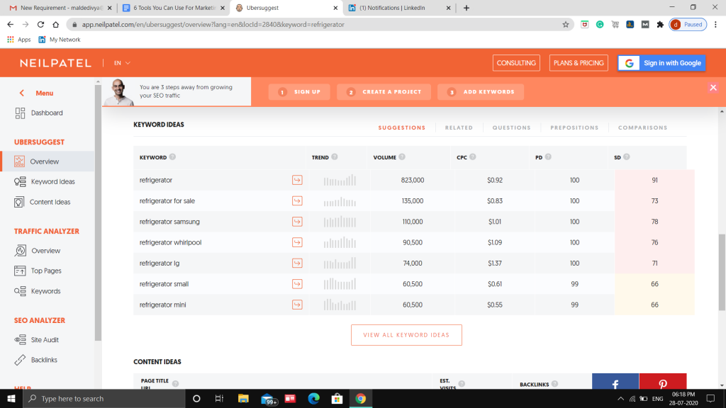
Ubersuggest is a great tool that can help you get started with SEO. It enables you to find relevant and high-traffic keywords that you should be using on your website. It also shows the types of content you should be producing for acquiring higher organic rankings.

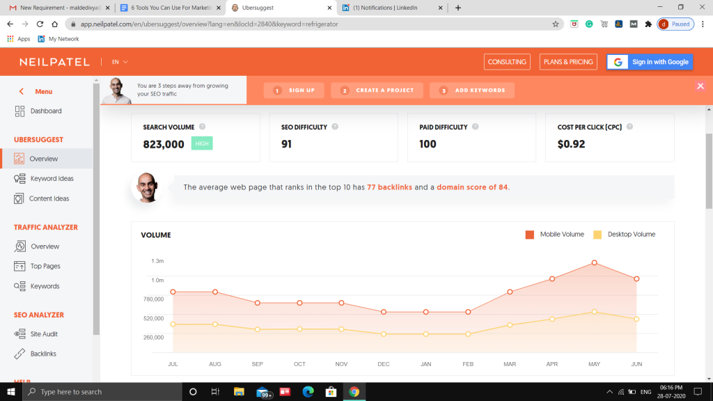
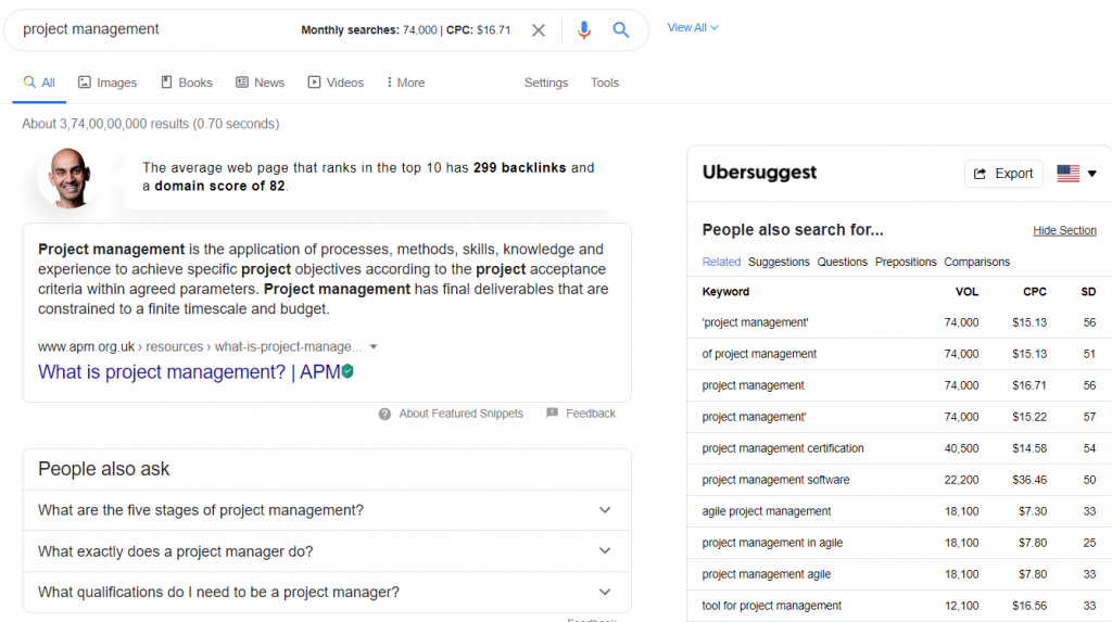
For every keyword, Ubersuggest displays the monthly search volume, SEO difficulty, paid difficulty, and CPC. With the help of SEO difficulty score, you can easily find keywords that are easy to rank for. You should look for keywords having SEO difficulty in the range of 30-40.

It also shows the number of backlinks needed to rank for that keyword and the average domain score of pages that are ranking on Google for that keyword.

Apart from this, Ubersuggest displays related keywords. This is essential as it helps to determine what other search terms your target audience is using to find the products you sell.

You can also add the free Ubersuggest Chrome extension. The biggest benefit of using the extension is that it provides keyword data as you search on Google.

For instance, every time you enter a keyword or keyphrase on Google, Ubersuggest provides you with its monthly search volume, CPC, and related terms. This is great because you don’t even have to visit the tool to get the essential data.

2- HARO

HARO is an abbreviated form of “help a reporter out.” This tool is used to get in touch with reporters for regulating and maintaining public relations. With over 75000+ journalists and bloggers, HARO is a great tool for businesses to find the right reporters to run their PR campaigns.

The biggest benefit of using HARO is that you will be able to spread your message to a wider pool of audience and boost your brand’s reputation.

Using HARO is pretty simple. Register for their services. Add details about your business, like your name, email address, phone number, company name, and annual revenue.

You will receive emails thrice a day (5:35 a.m., 12:35 p.m. and 5:35 p.m. ET), Monday through Friday. Check the reporters’ relevant requests, pitch your requirements, and answer the journalist’s questions.

Interested journalists will then reach out to you, and you might just get published in one of the major editorials. Isn’t that great!

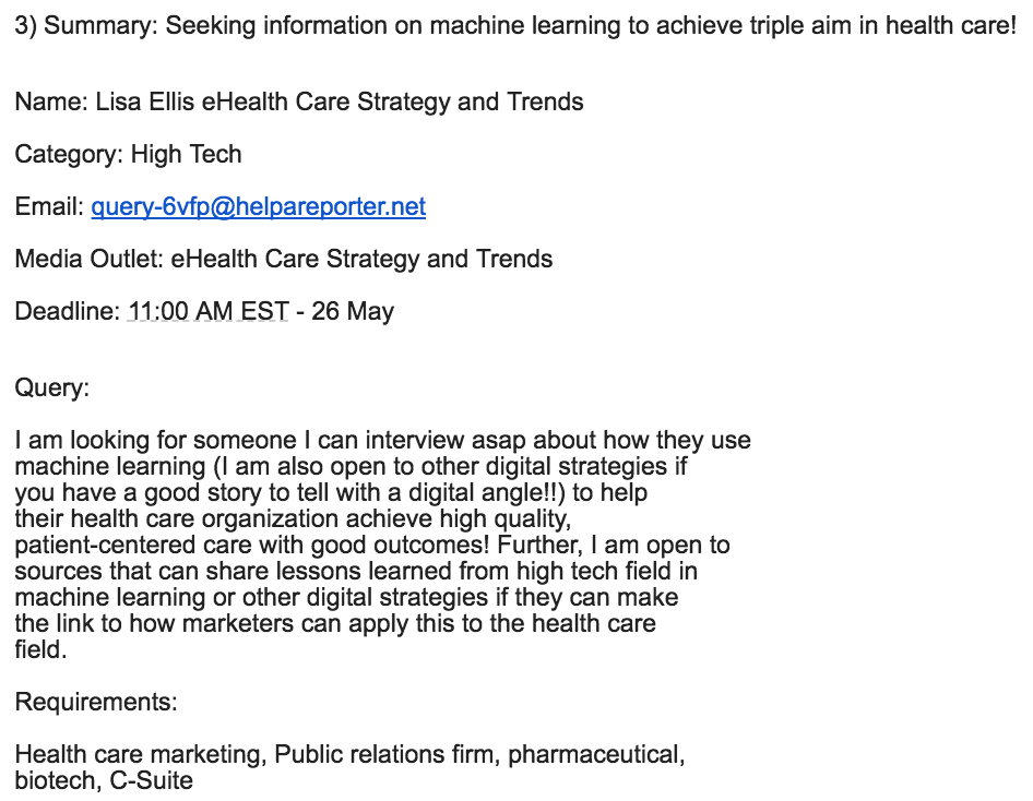
Here’s an example of the emails you will receive from journalists on HARO. It consists of the topic, journalist name, category, media outlet, query, requirements, and deadline. If you feel it is the right one for you, reply to the email explaining why you are the right choice for their conditions.

Source

3- MediaScale

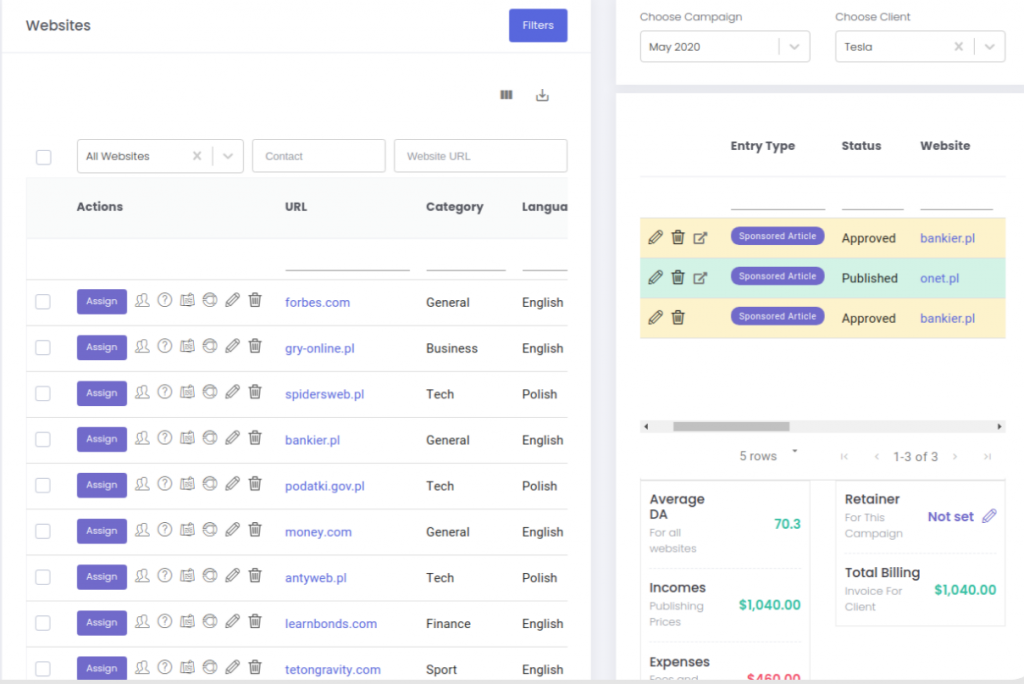
After you start optimizing your website for search engines, you will need a tool to manage your earned media and organic marketing campaigns. That’s where MediaScale can help. It is a great tool for PR and SEO campaign management and overview.

MediaScale integrates with all the major SEO tools, including SEMrush, Similar Web, Ahrefs, and Moz to give you a complete picture of how your website or clients (if you’re an agency) are doing organically. This enables you to generate outreach lists, comprehensive reports, dynamic website filtering directly from the tools you use for SEO.

Mediascale is best suitable for marketers and agencies because it brings all the SEO and PR campaigns you run to one place, showing you campaign progress, updated website metrics, links generated and tracking of URLs after they go live.

4- EmailAnalytics

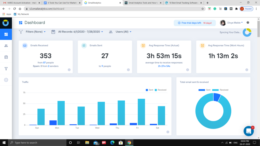
EmailAnalytics provides real-time insights about your email campaigns.

The platform shows:

  • Average email response rate.
  • Top senders & receivers.
  • Email activity by the hour of the day.
  • Email activity by day of the week.

All these data points are vital as it allows you to understand if your email campaigns are as effective as you want them to be.

Email activity helps you determine the right time to send emails to your customers to generate the best possible results.

As shown in the image below, you can check the number of emails sent, received, and the average response time. This is essential as it helps keep an eye on your email campaign activity.

5- Optmyzr

Paid ads are yet another excellent way to drive traffic, attract high-quality leads, and increase sales instantly. You are likely to get the results from day one. However, it is essential to manage the paid ad campaigns effectively. If not, you will lose more than you gain. That’s where Optmyzr can help.

Here are the key features of Optmyzr:

  • Manage bid and bid adjustments
  • Forecast and automate budgets
  • Find positive and negative keywords to include in your ad
  • Receive alerts and suggestions based on your ad goals
  • Identify root cause change analysis
  • Run A/B tests to find the best ad copy

The biggest benefit of using Optmyzr for ad management is that it allows you to automate tedious tasks. The list includes smart budget optimization, account audits, inventory-driven shopping, ad refresh, and white label reports.

All you have to do is set bid management rules for the target position, target ROAS, and target CPA.

6- Brax

Native advertising is rising in popularity. The primary reason for this is that native ads look more convincing as it matches the feel and looks of the media format it appears in.

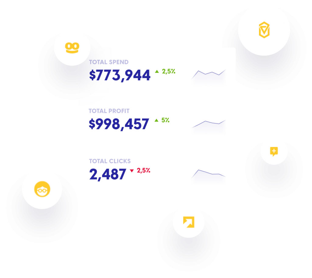
Brax allows you to manage all your native ad campaigns from a single dashboard. You can check the total spending and profit right on the platform. This helps to ensure that you are going in the right direction with native advertising.

You can set rules, and Brax will optimize your ad performance accordingly. For example, you can set commands to pause ads with low engagement or exclude bad placements. This is essential as it improves your ROI based on the real-time performance of your native ads automatically.

Conclusion

While social selling is effective, to convert maximum possible leads, you need to engage with them on different channels. The six tools mentioned above can help you attract and engage high-quality leads to various marketing platforms. Have you used any of them? Did you see positive results? Let me know in the comments!


Photo by NordWood Themes on Unsplash

Categories: Others Tags:

5 Pro Tips on Making Whiteboard Animation Videos That Further Your Branding

September 15th, 2020 No comments

Keeping an audience interested nowadays is no easy task. Especially when it comes to explaining how complex or highly technical products (or services) work.

Luckily, marketers and business owners have a fantastic resource – whiteboard animation videos – to make that job a bit easier!

Now, this style provides an effective canvas that lets you unfold your ideas and synthesize important information in effective and engaging ways. But developing a compelling, well-executed whiteboard video can be tricky. Doubly so if it’s your first time doing it and you aren’t familiar with the ins-and-outs of the format.

So, to help with that, we’ve compiled some critical production tips that can be the difference between an O.K. piece, and an amazing conversion tool that will enhance your video marketing strategy!

5 Pro Tips to Make Great Whiteboard Animation Videos

Producing educational content is one of the best ways brands have to make their product more appealing and expand their online reach.

Of the many different options available, whiteboard animation videos stand as one of the most powerful tools to share knowledge. In a nutshell, the style recreates someone writing on a whiteboard, using seemingly drawn lines that come alive with dynamic animations.

Read below our tips to learn how to make great whiteboard pieces that’ll engage your audience and further your branding efforts.

1. Setting up your whiteboard’s script

The script is the backbone of any video. It gives you the structure you need to get your message across effectively.

It’s important to highlight, though, that whiteboard videos aren’t designed just to make a sales pitch or talk up your product’s most essential features. Those are just organic outcomes of a good piece. Instead, they focus on connecting with your audience on a personal level – Something they achieve through great storytelling.

So, to produce a solid whiteboard video, you’ll have to write a script with a compelling narrative. The question is: How do you achieve that?

To begin with, you’ll have to present a character – or characters – and their story. It’s paramount that these characters represent the buyer persona you are trying to connect with. (More on this in a minute.) Once you have that, the story should evolve up to the point where you introduce a problem that’s relevant to your audience, so you can then propose an ideal solution – yours!

To bring more clarity, here’s a simple step-by-step on how this structure of basic storytelling works:

  1. Present your main characters and the problem they’re dealing with.
  2. Introduce a solution – AKA, your product, or service.
  3. Explain how your solution works, highlighting your value proposition.
  4. Add a clear CTA to prompt your audience to take action.

Pro Tip: When it comes to video content, it’s very important to write your script in a conversational tone. Using simple terms and jargon that resonate with your target audience.

2. The basics of a great storyboard

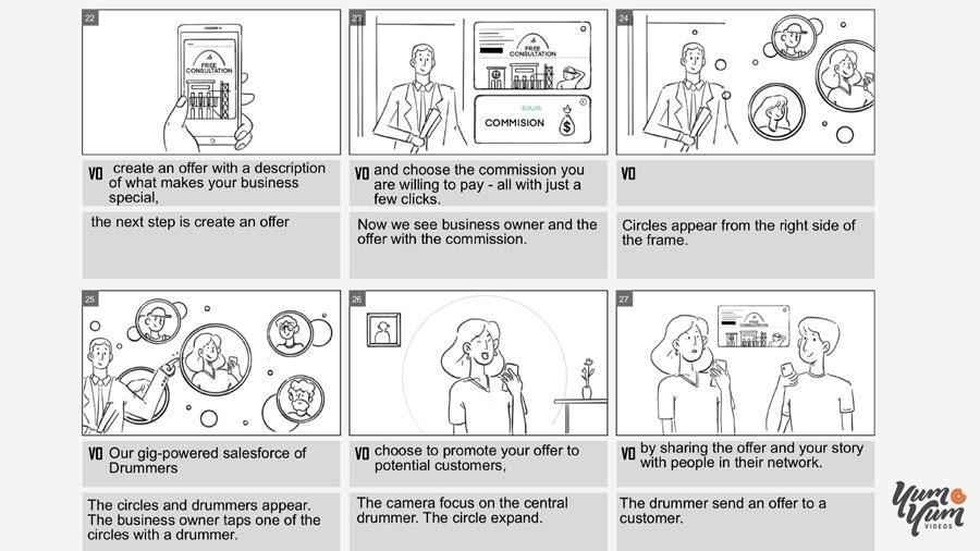
The storyboard is the visual representation of your video’s main actions and visual cues, from start to finish. It looks like a comic strip, and it’s the tool that’s going to guide you and your teams during production.

Through sketches and basic drawings, each frame shows who or what is in the scene with its corresponding part of the script or voice-over. It also includes a brief description that explains the scene and additional notes, such as camera angle, sound effects, graphic elements, etc.

In this case, what sets the whiteboard style apart is it creates the illusion of a continuous and interconnected drawing. So, instead of swapping them out as it happens in other types of videos, the visual cues in your storyboard should occur in seamless succession.

All in all, whether you make it yourself or a whiteboard animation company you work with, a well-crafted storyboard will also help you visualize your script and identify mistakes or inconsistencies in the narrative. Giving you time to adjust what’s needed to make sure your production is going in the right direction. So, the sooner you start working on it, the better.

3. Effective branding techniques in whiteboard animation

To stand out, every marketing video you develop for your business should make a distinctive visual statement. One with a well-balanced color scheme and a unique design that reflects your brand’s identity.

The fact that whiteboard videos have a black-lined drawing on a white background makes it the perfect setting for implementing effective branding techniques.

To start, whenever color makes an appearance, it’s going to impact the audience. So, you should seize this great opportunity and use your brand’s colors to emphasize certain moments of your video. For example, when you want to introduce your solution. That way, you’ll imply an unconscious connection between solving a problem and your brand.

The same goes for jingles, music, and sound effects – These can help you drive the viewer’s attention when you need it the most. So, try to use them to accentuate parts of the message you want to deliver.

Last but not least, it’s very important to use your brand’s name and logo in critical parts of your piece – especially at the end alongside your CTA. Doing so is going to give your content permanence in your audience’s mind. Ensuring your brand’s message stays with them after they finished watching your video.

4. Setting up characters that mirror your target audience

To make your story – AKA, your video – engaging and relatable, it’s paramount to create a character that reflects the target audience you are trying to connect with. Done right, they’ll be instantly attracted to your content and, more importantly, stay to see what you have to say to them.

To achieve that, you’ll have to develop your video’s characters using your buyer persona as a model. To define who that is, you’ll need to establish the common traits and main characteristics of your “ideal audience member”. Giving these personas a name, age, job, educational level, hobbies, interests, and needs.

Let’s say you find out that the average person that you want to visit your website is “James”, a young man in his twenties that goes to college. He also loves to play soccer and reading Japanese graphic novels in his free time.

So, to engage James – and people like him -, you’ll have to custom-make your video using this information, and, most importantly, you’ll have to create your characters after him. This is going to make your audience feel represented and connect more easily with your brand’s message.

5. The importance of video lengths in marketing

There’s a common saying in video marketing that goes like this: The shorter the video, the better. And it makes sense because people online aren’t that patience anymore – They expect gratification and value in the quickest way possible.

Thing is, “short” is kind of a vague term. So, how long should your whiteboard video be?

Well, it’s going to depend on the complexity of the subject you want to cover and your target audience. The golden rule, though, is to keep them around the 2-minute mark as much as you can. However, if your topic requires more time, you have up to 6 minutes to get solid engagement. After that, it drops significantly.

The bottom line is that before you start developing your piece, you should always assume your viewers have short attention spans and a lot of distractions. Include only what’s really necessary to get your message across and remove anything that won’t add value. Be specific and concise – every second counts!

Summing Things Up

If you want to boost your brand awareness and increase engagement, few things are more effective than whiteboard videos. By combining educational content with a super entertaining approach, they manage to deliver a lot of information while keeping the audience interested.

As we’ve just learned, there are many elements that you should mind, assess, and plan to make it work. Something that can overwhelm even to the most experienced marketer!

However, remember that everything starts with a well-written script, a character that can accurately represent your audience, and applying the right branding techniques to reflect your business’ identity.

We hope this guide on how to make great whiteboard videos helped you understand the basics and inspired you to start working on yours. So, now it’s your turn!


Photo by Mark Rabe on Unsplash

Categories: Others Tags:

How to pick the right type of content to turn visitors into customers

September 15th, 2020 No comments

The number of people visiting your website keeps rising but the number of sales made stays the same? We can compare this situation to a store: a lot of people go in and out of a store, without buying a thing, which means that the products, prices or the marketing is just not engaging enough for the customers.

A lot of visits on your website do not necessarily mean a lot of customers and income. The reason for that is that the content you are offering on your website is not engaging enough or the sign u forms are too demanding.

In today’s article, we will be talking about the things you are doing wrong, how to fix them, and what to add to bring in more customers.

Here are a few tips to do so:

1. Free offers

Now, this might seem weird, we are talking about increasing our income and yet the first tip to do so is by offering free stuff to your customers. But let us be honest, even you are tempted to buy something if it is on sale, buy one get one free, or even getting samples, promo codes, or participating in giveaways. So offering stuff like these to your customers will for sure make them want to spend money on your website and maybe even come back again.

2. Proof of the quality of your product

You see a lot of celebrities and people marketing certain products on their social media platforms, and it is a well-known fact that people tend to buy what they see other people buying. Posting images and honest reviews of your products is always a big plus. People will gain a type of trust in you and your product when seeing it is useful to other people.

3. Introducing your product

Now, when we compared an online store to a real-life one it is not that easy. When a customer goes to a store in real life, he can see the product, feel it, even try it. But, when it comes to an online store it is really difficult to present your product closest to an in a real-life one. A lot of people do tricks like demo videos, images of the product, or even videos of other customers using your product. It is said that a good quality video rise the possibility of selling a product with 85%!

4. Mobile version

We have replaced our PCs and laptops almost completely with our phones, and it is only logical to have an option to shop straight from our phones. Almost 90% of websites’ buyers shop using their phones, not their PCs. So it makes sense, to gain more customers, that investing in a mobile interface will for sure make itself worth it.

5. Design

People are visual beings, and as such, their decision making is heavily influenced by the visual appearance of your website. Combining colors, arranging the buttons, controlling the crownless, navigation…all of those pieces merged, complete the design puzzle that makes the difference between top or flop in your sites’ success. Play around with the possibilities, note the important factors, or even hire a specialist to guide you in your designing tasks, since it’s a factor that will help you boost your conversions drastically.

6. Exit-intent pop-up

This is a really cool trick used by many websites out there. Its main purpose is to engage people into not leaving the site. For example, most of them are programmed in a way that as you swipe your cursor to close the tab or window, a big popup appears offering you some kind of a great deal that you would not like to miss out on. This makes a lot of the page visitors stay, but also a lot of them to buy a product that you are offering.

7. A live chat

This is another great trick for making people stay and keeping them entertained. Its basically telling them: ‘’Hey, we are here you can talk to us now”. It is said it can increase the possibility of sales made by even 45%. You can even personalize the type of message you want to send to a certain customer based on many factors, so setting up a live chat can be extremely beneficial.

8. Don’t be rude

Some pages are really rude when it comes to free trials. Once the customers decide to try out the free trial, they make it almost impossible to cancel, which is something that you definitely want to avoid. Every customer has to have an option to cancel their free trial whenever they want. Another thing to stop doing is asking card details for a free trial. Giving out card details is a personal thing. So when signing up for a free trial why is it necessary to give out card details? Giving a ‘’no card required” in the free trial option will give your possible future customers some type of trust and show them the confidence you have in your product.

9. Feedback

Whether it is a paying customer or just a person that has used their free trial, giving them the option of leaving feedback is a plus. This will showcase all of your good reviews, but also show people that you are interested in improving and that you listen to all of your customers.

10. Make buying easiest possible

Nobody wants to go through a big fuss when wanting to buy something. It should be as minimal possible making it easy to shop, for not only teens and adults who know how to use the internet, but also for the elders who do not have as much knowledge in the tech world. Try making buying possible without a complicated and often long sign up process, offer free shipping, and have as much description what to do in the next step so the people do not get lost.

11. Focus on profit

The main purpose of the webpage is its profit, and you want every action of the website to be profit-related. Keeping your page as simple as possible, without any distractions, will make your customers focus on the product more than on the page itself. This for sure rises the chances of sales made.

Conclusion

Web-marketing is much more than just building a website and hoping for the best. There is a lot of competition out there and you want to make constant improvements to your website. We hope you find these tips and tricks helpful and that you will see an improvement when it comes to your number of sales.


Photo by Kaleidico on Unsplash

Categories: Others Tags:

Winamp Skin Museum

September 14th, 2020 No comments

65,000 skins, they say. That’s extraordinary, especially considering how creative and well done many of them are. MySpace was an even bigger creative explosion of customization.

What’s the next product that will inspire this kind of user ownership through theming? Allowing it isn’t terribly difficult. You allow people to write (or link up) their own CSS and, ideally, give them sensible selectors to hook onto.

Be careful you don’t open up any XSS holes. The much harder trick is building something that people want to skin. Once you’re over that hump, it’s about having enough people theming it that it starts to inspire other people to do the same.

Direct Link to ArticlePermalink


The post Winamp Skin Museum appeared first on CSS-Tricks.

You can support CSS-Tricks by being an MVP Supporter.

Categories: Designing, Others Tags:

content-visibility: the new CSS property that boosts your rendering performance

September 14th, 2020 No comments

Una Kravets and Vladimir Levin:

[…] you can use another CSS property called content-visibility to apply the needed containment automatically. content-visibility ensures that you get the largest performance gains the browser can provide with minimal effort from you as a developer.

The content-visibility property accepts several values, but auto is the one that provides immediate performance improvements.

The perf benefits seems pretty big:

In our example, we see a boost from a 232ms rendering time to a 30ms rendering time. That’s a 7x performance boost.

It’s manual work though. You have to “section” large vertical chunks of the page yourself, apply content-visibility: auto; to them, then take a stab at about how tall they are, something like contain-intrinsic-size: 1000px;. That part seems super weird to me. Just guess at a height? What if I’m wrong? Can I hurt performance? Can (or should) I change that value at different viewports if the height difference between small and large screens is drastic?

Seems like you’d have to be a pretty skilled perf nerd to get this right, and know how to look at and compare rendering profiles in DevTools. All the more proof that web perf is its own vocation.

Direct Link to ArticlePermalink


The post content-visibility: the new CSS property that boosts your rendering performance appeared first on CSS-Tricks.

You can support CSS-Tricks by being an MVP Supporter.

Categories: Designing, Others Tags:

Interaction Media Features and Their Potential (for Incorrect Assumptions)

September 14th, 2020 No comments
Microsoft Surface with a keyboard, trackpad, external bluetooth mouse, touchscreen.

This is an updated and greatly expanded version of the article originally published on dev.opera back in 2015. That article referenced the Editor’s Draft, 24 March 2015 of the specification Media Queries Level 4, and contained a fairly big misunderstanding about how any-hover:none would end up being evaluated by browsers in practice.

The spec has since been updated (including clarifications and examples that I submitted following the publication of the original article), so this updated version removes the incorrect information of the original and brings the explanations in line with the most recent working draft. It also covers additional aspects relating to JavaScript touch/input detection.

The Media Queries Level 4 Interaction Media Featurespointer, hover, any-pointer and any-hover — are meant to allow sites to implement different styles and functionality (either CSS-specific interactivity like :hover, or JavaScript behaviors, when queried using window.matchMedia), depending on the particular characteristics of a user’s input devices.

Although the specification is still in working draft, interaction media features are generally well supported, though, to date, there are still some issues and inconsistencies in the various browser implementations — see the recent pointer/hover/any-pointer/any-hover test results, with references to relevant browser bugs.

Common use cases cited for interaction media features are often “make controls bigger/smaller depending on whether the users has a touchscreen device or is using a mouse/stylus” and “only use a CSS dropdown menu if the user has an input that allows hover-based interactions.”

@media (pointer: fine) {
  /* using a mouse or stylus - ok to use small buttons/controls */
}
@media (pointer: coarse) {
  /* using touch - make buttons and other "touch targets" bigger */
}
@media (hover: hover) {
  /* ok to use :hover-based menus */
}
@media (hover: none) {
  /* don't use :hover-based menus */
}

There are also examples of developers using these new interaction media features as a way of achieving standards-based “touch detection,” often just for listening to touch events when the device is identified as having a coarse pointer.

if (window.matchMedia && window.matchMedia("(pointer:coarse)").matches) {
  /* if the pointer is coarse, listen to touch events */
  target.addEventListener("touchstart", ...);
  // ...
} else {
  /* otherwise, listen to mouse and keyboard events */
  // ...
}

However, these approaches are slightly naive, and stem from a misunderstanding of what these interaction media queries are designed to tell us.

What’s the primary input?

One of the limitations of pointer and hover is that, by design, they only expose the characteristics of what a browser deems to be the primary pointer input. What the browser thinks, and what a user is actually using as their primary input, may differ — particularly now that the lines between devices, and the types of inputs they support, is becoming more and more blurry.

Which one’s the “primary” input? the answer may depend on the activity.

Right out of the gate, it’s worth noting that interaction media features only cover pointer inputs (mouse, stylus, touchscreen). They don’t provide any way of detecting if a user’s primary input is a keyboard or keyboard-like interface, such as a switch control. In theory, for a keyboard user, a browser could report pointer: none, signaling that the user’s primary input is not a pointer at all. However, in practice, no browser offers a way for users to specify that they are in fact keyboard users. So keep in mind that, regardless of what the interaction media feature queries may return, it’s worth making sure that your site or app also works for keyboard users.

Traditionally, we could say that a phone or tablet’s primary input is the touchscreen. However, even on these devices, a user may have an additional input, like a paired bluetooth mouse (a feature that has been available for years on Android, is now supported in iPadOS, and is sure land in iOS), that they are using as their primary input.

An Android phone with a paired bluetooth keyboard and mouse, with the screen showing an actual mouse pointer and right-click context menu in Chrome
An iPad with a paired bluetooth keyboard, mouse, and Apple Pencil, with the screen showing the mouse “dot” and right-click context menu in Safari

In this case, while the device nominally has pointer: coarse and hover: none, users may actually be using a fine pointer device that is capable of hovers. Similarly, if a user has a stylus (like the Apple Pencil), their primary input may still be reported as the touchscreen, but rather than pointer: coarse, they now have an input that can provide fine pointer accuracy.

In these particular scenarios, if all the site is doing is making buttons and controls bigger and avoiding hover-based interactions, that would not be a major problem for the user: despite using a fine and hover-capable mouse, or a fine but still not hover-capable stylus, they will get styling and functionality aimed at the coarse, non-hover-capable touchscreen.

If the site is using the cues from pointer: coarse for more drastic changes, such as then only listening to touch events, then that will be problematic for users — see the section about incorrect assumptions that can completely break the experience.

However, consider the opposite: a “regular” desktop or laptop with a touchscreen, like Microsoft’s Surface. In most cases, the primary input will be the trackpad/mouse — with pointer:fine and hover:hover — but the user may well be using the touchscreen, which has coarse pointer accuracy and does not have hover capability. If styling and functionality are then tailored specifically to rely on the characteristics of the trackpad/mouse, the user may find it problematic or impossible to use the coarse, non-hover-capable touchscreen.

Feature Touchscreen Touchscreen + Mouse Desktop/Laptop Desktop/Laptop + Touchscreen
pointer:coarse true true false false
pointer:fine false false true true
hover:none true true false false
hover:hover false false true true

For a similar take on this problem, see ”The Good & Bad of Level 4 Media Queries” by Stu Cox. While it refers to an even earlier iteration of the spec that only contained pointer and hover and a requirement for these features to report the least capable, rather than the primary, input device.

The problem with the original pointer and hover on their own is that they don’t account for multi-input scenarios, and they rely on the browser to be able to correctly pick a single primary input. That’s where any-pointer and any-hover come into play.

Testing the capabilities of all inputs

Instead of focusing purely on the primary pointer input, any-pointer and any-hover report the combined capabilities of all available pointer inputs.

In order to support multi-input scenarios, where different (pointer-based) inputs may have different characteristics, more than one of the values for any-pointer (and, theoretically, any-hover, but this aspect is useless as we’ll see later) can match, if different input devices have different characteristicsprimary pointer input). In current implementations, these media features generally evaluate as follows:

Feature Touchscreen Touchscreen + Mouse Desktop/Laptop Desktop/Laptop + Touchscreen
any-pointer:coarse true true false true
any-pointer:fine false true true true
any-hover:none false false false false
any-hover:hover false true true true
Comparison of Firefox on Android’s media query results with just the touchscreen, and when adding a bluetooth mouse. Note how pointer and hover remain the same, but any-pointer and any-hover change to cover the new hover-capable fine input.

Going back to the original use cases for the interaction media features, instead of basing our decision to provide larger or smaller inputs or to enable hover-based functionality only on the characteristics of the primary pointer input, we can make that decision based on the characteristics of any available pointer inputs. Roughly translated, instead of saying “make all controls bigger if the primary input has pointer: coarse” or “only offer a CSS menu if the primary input has hover: hover,” we can build media queries that equate to saying, “if any of the pointer inputs is coarse, make the controls bigger” and “only offer a hover-based menu if at least one of the pointer inputs available to the user is hover-capable.”

@media (any-pointer: coarse) {
  /* at least one of the pointer inputs
    is coarse, best to make buttons and 
    other "touch targets" bigger (using 
    the query "defensively" to target 
    the least capable input) */
}
@media (any-hover: hover) {
  /* at least one of the inputs is 
     hover-capable, so it's at least 
     possible for users to trigger
     hover-based menus */
}

Due to the way that any-pointer and any-hover are currently defined (as “the union of capabilities of all pointing devices available to the user”), any-pointer: none will only ever evaluate to true if there are no pointer inputs available, and, more crucially, any-hover: none will only ever be true if none of the pointer inputs present are hover-capable. Particularly for the latter, it’s therefore not possible to use the any-hover: none query to determine if only one or more of the pointer inputs present is not hover-capable — we can only use this media feature query to determine whether or not all inputs are not hover-capable, which is something that can just as well be achieved by checking if any-hover: hover evaluates to false. This makes the any-hover: none query essentially redundant.

We could work around this by inferring that if any-pointer: coarse is true, it’s likely a touchscreen, and generally those inputs are not hover-capable, but conceptually, we’re making assumptions here, and the moment there’s a coarse pointer that is also hover-capable, that logic falls apart. (And for those doubting that we may ever see a touchscreen with hover, remember that some devices, like the Samsung Galaxy Note and Microsoft’s Surface, have a hover-capable stylus that is detected even when it’s not touching the digitizer/screen, so some form of “hovering touch” detection may not be out of the question in the future.)

Combining queries for more educated guesses

The information provided by any-pointer and any-hover can of course be combined with pointer and hover, as well as the browser’s determination of what the primary input is capable of, for some slightly more nuanced assessments.

@media (pointer: coarse) and (any-pointer: fine) {
  /* the primary input is a touchscreen, but
     there is also a fine input (a mouse or 
     perhaps stylus) present. Make the design
     touch-first, mouse/stylus users can
     still use this just fine (though it may 
     feel a big clunky for them?) */
}
@media (pointer: fine) and (any-pointer: coarse) {
  /* the primary input is a mouse/stylus,
     but there is also a touchscreen 
     present. May be safest to make 
     controls big, just in case users do 
     actually use the touchscreen? */
}
@media (hover: none) and (any-hover: hover) {
  /* the primary input can't hover, but
     the user has at least one other
     input available that would let them
     hover. Do you trust that the primary
     input is in fact what the user is 
     more likely to use, and omit hover-
     based interactions? Or treat hover 
     as as something optional — can be 
     used (e.g. to provide shortcuts) to 
     users that do use the mouse, but 
     don't rely on it? */
}

Dynamic changes

Per the specification, browsers should re-evaluate media queries in response to changes in the user environment. This means that pointer, hover, any-pointer, and any-hover interaction media features can change dynamically at any point. For instance, adding/removing a bluetooth mouse on a mobile/tablet device will trigger a change in any-pointer / any-hover. A more drastic example would be a Surface tablet, where adding/removing the device’s “type cover” (which includes a keyboard and trackpad) will result in changes to the primary input itself (going from pointer: fine / hover: hover when the cover is present, to pointer: coarse / hover: none when the Surface is in “tablet mode”).

Screenshots of Firefox on a Surface tablet. With the cover attached, pointer:fine, hover:hover, any-pointer:coarse, any-pointer:fine, and any-hover:hover are true; once the cover is removed (and Windows asks if the user wants to switch to “tablet mode”), touch becomes the primary input with pointer:coarse and hover:none, and only any-pointer:coarse and any-hover:none are true.

If you’re modifying your site’s layout/functionality based on these media features, be aware that the site may suddenly change “under the user’s feet” whenever the inputs change — not just when the page/site is first loaded.

Media queries may not be enough — roll on scripting

The fundamental shortcoming of the interaction media features is that they won’t necessarily tell us anything about the input devices that are in use right now. For that, we may need to dig deeper into solutions, like What Input?, that keep track of the specific JavaScript events fired. But of course, those solutions can only give us information about the user’s input after they have already started interacting with the site — at which point it may be too late to make drastic changes to your layout or functionality.

Keep in mind that even these JavaScript-based approaches can just as easily lead to incorrect results. That’s especially true on mobile/tablet platforms, or in situations where assistive technologies are involved, where it is common to see “faked” events being generated. For instance, if we look over the series of events fired when activating a control on desktop using a keyboard and screen reader, we can see that fake mouse events are triggered. Assistive technologies do this because, historically, a lot of web content has been coded to work for mouse users, but not necessarily for keyboard users, making a simulation of those interactions necessary for some functionalities.

Similarly, when activating “Full Keyboard Support” in iOS’s Settings ? Accessibility ? Keyboard, it’s possible for users to navigate web content using an external bluetooth keyboard, just as they would on desktop. But if we look at the event sequence for mobile/tablet devices and paired keyboard/mouse, that situation produces pointer events, touch events, and fallback mouse events — the same sequence we’d get for a touchscreen interaction.

Showing iOS settings with Full Keyboard Access enabled on the left and an iPhone browser window open to the right with the What Input tool.
When enabled, iOS’s “Full Keyboard Access” setting results in pointer, touch, and mouse events. What Input? identifies this as a touch input

In all these situations, scripts like What Input? will — understandably, through no fault of its own — misidentify the current input type.

Incorrect assumptions that can completely break the experience

Having outlined the complexity of multi-input devices, it should be clear by now that approaches that only listen to specific types of events, like the form of “touch detection” we see commonly in use, quickly fall apart.

if (window.matchMedia && window.matchMedia("(pointer: coarse)").matches) {
  /* if the pointer is coarse, listen to touch events */
  target.addEventListener("touchstart", ...);
  // ...
} else {
  /* otherwise, listen to mouse and keyboard events */
  target.addEventListener("click", ...);
  // ...
}

In the case of a “touch” device with additional inputs — such as a mobile or tablet with an external mouse — this code will essentially prevent the user from being able to use anything other than their touchscreen. And on devices that are primarily mouse-driven but do have a secondary touchscreen interface — like a Microsoft Surface — the user will be unable to use their touchscreen.

Instead of thinking about this as “touch or mouse/keyboard,” realize that it’s often a case of “touch and mouse/keyboard.” If we only want to register touch events when there’s an actual touchscreen device for performance reasons, we can try detecting any-pointer: coarse. But we should also keep other regular event listeners for mouse and keyboard.

/* always, as a matter of course, listen to mouse and keyboard events */
target.addEventListener("click", ...);
 // ...

if (window.matchMedia && window.matchMedia("(any-pointer: coarse)").matches) {
  /* if there's a coarse pointer, *also* listen to touch events */
  target.addEventListener("touchstart", ...);
  // ...
}

Alternatively, we could avoid this entire conundrum about different types of events by using pointer events, which cover all types of pointer inputs in a single, unified event model, and are fairly well supported.

Give users an explicit choice

One potential solution for neatly circumventing our inability to make absolute determinations about which type of input the users are using may be to use the information provided by media queries and tools like What Input?, not to immediately switch between different layouts/functionalities — or worse, to only listen to particular types of events, and potentially locking out any additional input types — but to use them only as signals for when to provide users with an explicit way to switch modes.

For instance, see the way Microsoft Office lets you change between “Touch” and “Mouse” mode. On touch devices, this option is shown by default in the application’s toolbar, while on non-touch devices, it’s initially hidden (though it can be enabled, regardless of whether or not a touchscreen is present).

Screenshot of Microsoft Office's 'Touch/Mouse mode' dropdown, and a comparison of (part of) the toolbar as it's presented in each mode

A site or web application could take the same approach, and even set the default based on what the primary input is — but still allow users to explicitly change modes. And, using an approach similar to What Input?, the site could detect the first appearance of a touch-based input, and alert/prompt the user if they want to switch to a touch-friendly mode.

Potential for incorrect assumptions — query responsibly

Using Media Queries Level 4 Interaction Media Features and adapting our sites based on the characteristics of the available primary or additional pointer input is a great idea — but beware false assumptions about what these media features actually say. As with similar feature detection methods, developers need to be aware of what exactly they’re trying to detect, the limitations of that particular detection, and most importantly, consider why they are doing it — in a similar way to the problem I outlined in my article on detecting touch.

pointer and hover tell us about the capabilities of whatever the browser determines to be the primary device input. any-pointer and any-hover tell you about the capabilities of all connected inputs, and combined with information about the primary pointer input, they allow us to make educated guesses about a user’s particular device/scenario. We can use these features to inform our layout, or the type of interaction/functionality we want to offer; but don’t discount the possibility that those assumptions may be incorrect. The media queries themselves are not necessarily flawed (though the fact that most browsers seem to still have quirks and bugs adds to the potential problems). It just depends on how they’re used.

With that, I want to conclude by offering suggestions to “defend” yourself from the pitfalls of input detections.

? Don’t

Assume a single input type. It’s not “touch or mouse/keyboard” these days, but “touch and mouse/keyboard” — and the available input types may change at any moment, even after the initial page load.

Just go by pointer and hover. the “primary” pointer input is not necessarily the one that your users are using.

Rely on hover in general. Regardless of what hover or any-hover suggest, your users may have a pointer input that they’re currently using that is not hover-capable, and you can’t currently detect this unless it’s the primary input (since hover: none is true if that particular input lacks hover, but any-hover: none will only ever be true if none of the inputs are hover-capable). And remember that hover-based interfaces generally don’t work for keyboard users.

? Do

Make your interfaces “touch-friendly.” If you detect that there’s an any-pointer:coarse input (most likely a touchscreen), consider providing large touch targets and sufficient spacing between them. Even if the user is using another input, like a mouse, at that moment, no harm done.

Give users a choice. If all else fails, consider giving the user an option/toggle to switch between touch or mouse layouts. Feel free to use any information you can glean from the media queries (such as any-pointer: coarse being true) to make an educated guess about the toggle’s initial setting.

Remember about keyboard users. Regardless of any pointer inputs that the user may or may not be using, don’t forget about keyboard accessibility — it can’t be conclusively detected, so just make sure your stuff works for keyboard users as a matter of course.


The post Interaction Media Features and Their Potential (for Incorrect Assumptions) appeared first on CSS-Tricks.

You can support CSS-Tricks by being an MVP Supporter.

Categories: Designing, Others Tags: