Daniel C. Wilson explains how with CSS @keyframe animations, when multiple of them are applied to an element, they do both work. But if any properties are repeated, only the last one works. They override each other. I’ve seen this limitation overcome by applying keyframes to nested elements so you don’t have to do deal with that fighting.
But the Web Animation API (WAAPI) in JavaScript has a way to do additive animations. It’s a matter of adding composite: "add" to the options. For example:
The same goes for moving an item 20px + 30px with margin left (not the most performant way to move an object, but it demonstrates length usage)… if the animations both run at the same time, with the same duration and in the same direction, the end result will be a movement of 50px.
Cool. That’s nice for JavaScript animations, but what about CSS? Are we ever going to get it? Maybe. Even now, you can apply additive animations to your existing CSS animations in just a line of JavaScript:
Kind of reminds me of indeterminate checkboxes. They exist, but there is no way to express them in HTML or CSS — you have to put them in that state via JavaScript.
Whimsical is an app that lets you create flowcharts, wireframes, and mind maps but it was only earlier today that I spotted just how great the website is — especially the product pages. Check out this page where they describe how to use the Mind Maps feature where you can use the product right there on the marketing site.
Neat, huh? This is all done through the power of the element. You could make something like this with SVG for sure but there’s always a blurry line between picking SVG and canvas.
However, in terms of design, I love this idea of the advertisement being the product. And I also love cutting out all the usual sign-up nonsense to show folks the value of the app. Most products make you sign up and go through onboarding before you can see the value of the product. But that’s just not the case here; the ad is the product!
Also, I just love the design of this thing. Each product feature has its own theme, which makes the product demos pop a bit more as you look around. It’s a small detail but makes me want to explore the rest of the site to see what other fancy UI trinkets are lying around.
I also like also being able to jump straight into a working example of a wireframe. There’s no marketing spiel about how revolutionary the app is or how it’ll change the art of mind maps forever. Everything gets out of the way to show you the product, first and foremost.
But! Going back to the navigation for a sec: choosing not to label those icons is an interesting decision. It’s lovely, but what does each icon mean? This is covered in a post Chris wrote a while back when he asked: Are icons content? That said, the argument about whether or not to label icons has been going on for decades in software design. Jef Raskin, one of the designers of the original Macintosh back in the 1980s, wrote a great book called The Humane Interface where he argues that we should never leave icons unlabelled. Perhaps that’s a bit much, but in this case, I don’t think it would hurt to label these icons since they’re product-specific and mind map icons aren’t something we see every day.
Whimsical’s typography is interesting, too! they’re using DIN Next which feels a little at odds with the visual design, at least to me. DIN Next is the kind of typeface that gets lost in the background, designed to stand back and display fonts take center stage:
But I think the font’s success is carried by the buck wild visual design — the squiggly lines, the floating circles and moon shapes that are found everywhere in the UI. Then again, perhaps you don’t want the typeface to stick out when your UI is so visually loud, and I mean that in a good way.
The trick to designing an interface like this is making sure color accessibility is taken into consideration though. Stacie Arellano wrote about why color contrast is so important a while back:
You can mathematically know if two colors have enough contrast between them.
The W3C has a document called Web Content Accessibility Guidelines (WCAG) 2.1 that covers successful contrast guidelines. Before we get to the math, we need to know what contrast ratio scores we are aiming to meet or exceed. To get a passing grade (AA), the contrast ratio is 4.5:1 for most body text and 3:1 for larger text.
I’m not going to double check the numbers here for Whimsical, but it’s worth keeping an eye on… especially when a UI has a lot of white text on bright and colorful backgrounds. I’ve managed to mess this up more than a few times and it’s an easy thing to trip up on. But if folks can’t read the text in your UI, that’s a big problem.
Anyway, this site for the Whimsical product is a breath of fresh air. It’s visually striking and shows that communicating a product’s value and features can be done with show-and-tell instead of tell-and-tell.
Which leads me to ask you a question: Is there a website you’ve recently visited that caught your eye?
The element has a trick it can do where it shows different image formats in different situations. If all you are interested in is formats for the sake of performance, maybe you’d do:
<picture>
  <source srcset="img/waterfall.avif" type="image/avif">
  <source srcset="img/waterfall.webp" type="image/webp">
  <img src="img/waterfall.jpg" alt="A bottom-up shot of a huge waterfall in Iceland with green moss on either side.">
</picture>
But notice those elements there… they can take a media attribute as well! In other words, they can be used for responsive images in the sense that you can swap out the image for a different one, perhaps even one with a different aspect ratio (e.g. a wide-crop rectangle shape on a large screen vs. close-crop square shape on a small screen).
That is using a prefers-reduced-motion media query to swap a GIF for a static image when less movement is preferred (a system-level choice). Clever! I saw Manuel’s tweet about it get some love the other day:
Start with a static image and replace it with an animation only if users have no preference for reduced motion. Progressive enhancement ??
element) and allow them to be “played” on demand. We could alter that a smidge again and have it respect this media query by using a smidge of JavaScript:
You’re up for the biggest interview of your life. You’re determined to make a killer first impression.
Would you wear sweatpants? Of course, you wouldn’t.
Why? Because presentation is everything.
Just like you wouldn’t wrap a diamond in toilet paper, don’t wrap high-quality blog content in bad graphic design. You’re only asking people to abandon your blog before they’ve even given it a shot.
Instead, your graphic design should complement your blog, helping to explain complex concepts to the reader, while encouraging conversions.
Unsure what’s going so terribly wrong with your graphic design? This article will break down the five main reasons bad graphic design is seriously hurting your blog’s performance.
The Challenge of Bad Graphic Design
While blogging may be your forte, the visual design of your blog posts helps to ease readability and guide the reader through your points.
Good graphic design will ooze professionalism, aiding navigation, and bolstering your overall brand image.
Using high-quality product images, sleek custom images, and consistent branding, successful bloggers and online business owners use top quality visual design to appeal to their specific target audience while encouraging conversions.
The problem is that nearly half of all content marketers complain that it’s a real challenge to produce consistently high quality graphic design.
Whether it’s due to lack of budget and skills or shoddy graphic designers, 84% of marketers agree that if you don’t have a focus on design, you’ll be outperformed by your competitors.
Not convinced that graphic design makes much difference to your blog’s performance? Read on to see just how badly poor graphic design harms your blog, especially if you hope to make money blogging.
How is Bad Graphic Design Hurting Your Blog Performance?
While the content of your blog may be the star of the show, if your graphic design doesn’t dazzle on the first impression, readers won’t even get to the writing.
Poor graphic design is a real turn-off — it makes your blog look cheap. Not only that, it’s seriously hampering your blog’s performance. Here’s how.
1. Poor graphic design causes high bounce rates
Simply put, if your graphic design is unappealing and uncoordinated, visitors will click off your site.
There are a few reasons that visitors may choose to leave your site due to poor design, but it’s usually something to do with user experience or credibility.
Bad graphic design can interrupt that cadence, making it difficult to read or confusing to look at.
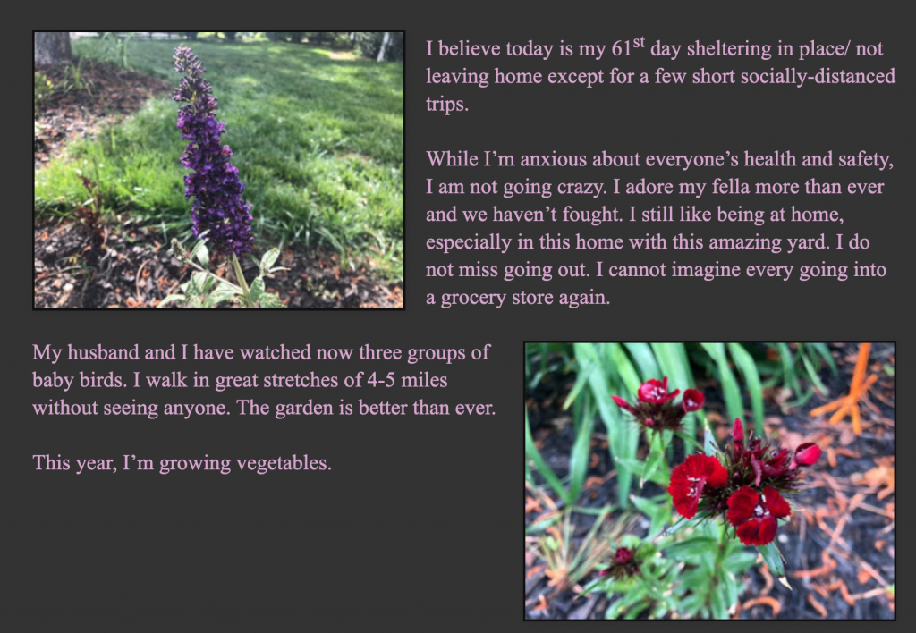
While the photos are original pictures taken by the writer, they bear no relevance to what the content actually says.
On top of this, the alignment makes it difficult to read the paragraphs without having to jump from one side of the page to the other. And the pale pink writing against the gray background is difficult to read.
Rather than struggling through, visitors may simply leave the page due to poor user experience caused by bad graphic design.
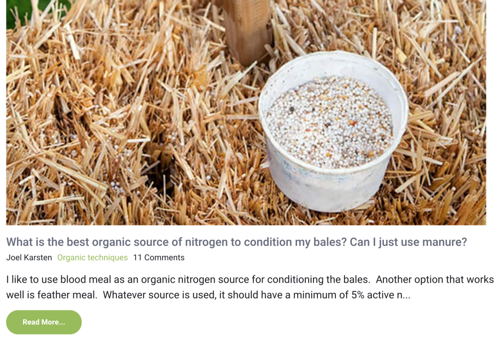
Reading through the blog, the writer is clearly an expert on straw bale garden and home design.
However, the blurred hero images of unknown substances hurt the credibility of the blogger’s expertise.
Readers have no idea what they’re being shown and the writer doesn’t utilize the images to make it clear.
If the readers can’t make head or tail of the hero image, they’re highly unlikely to click the blog and even more unlikely to believe its content.
Instead, choose visually stimulating images that support your message and aid the flow of the website. This can reduce your bounce rate by 45%.
Keep in mind that you don’t have to have a photoshoot for each post you create, and your graphics can be as simple as vector illustrations.
2. Unsophisticated graphic design fails to present a consistent brand image
A consistent brand image gives a professional feel to your blog and builds brand awareness to bolster loyalty.
Especially important for affiliate bloggers, consistency is key to conversions. Consistent branding can increase your conversions by up to 33%. That’s a third of sales you’re missing out on due to inconsistent branding in your graphic design.
Equally, your branding should help to differentiate you from other blogs on the same topic so that your followers can identify your content immediately.
73% of organizations are focusing on design to differentiate their brand this year as it’s one of the best ways to build a tangible brand image. Blogs that don’t focus on using design as a differentiator are missing a key opportunity to separate themselves from the competition.
While some of the blog’s writers go to the effort of making custom images, not all of the contributors conform. Instead, some writers simply use stock images to head up blog posts.
Of the custom images that do exist, none have a consistent aesthetic. Each image has a different color palette, font, and illustrative style.
If these images were shared on social media, nobody would know they were advertising Ranking by SEO.
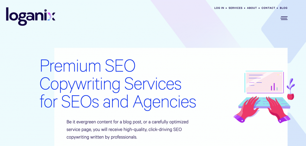
In contrast, check out the consistent custom images used in Loganix’s graphic design:
Equally, when you head to the content writing firm’s blog, you’ll see that all custom hero images match the same color palette and illustrative graphic style.
If these images were posted on social media, you’d immediately know they were associated with Loganix.
The problem is that many people believe they don’t have the assets to nurture a consistent image.
If you feel that way, try using free graphic design programs like Canva and PicMonkey to create professional-looking custom images that fit consistently with your blog’s brand image.
3. Pointless graphic design won’t help clarify complex concepts
Write a blog, shove in a few vaguely relevant stock images, and away you go, right? No.
You need to be thoughtful about the graphic design elements within your blogs, otherwise, you miss opportunities to clarify complex ideas.
Worse still, you may overcomplicate your points with poorly-coordinated images and design features.
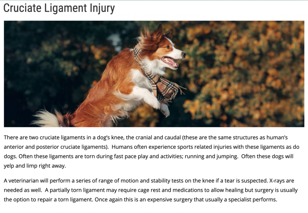
For those who don’t know, a cruciate ligament injury is extremely painful, both in animals and humans. The main signs your dog may have a cruciate ligament injury include stiffness, lameness, and awkwardness when sitting. Basically, the opposite of what the dog is doing in this picture.
The graphic design choice for this blog directly contradicts the paragraph it’s supposed to support. This makes it confusing for readers — should you be watching out for your dog springing around on his back legs?
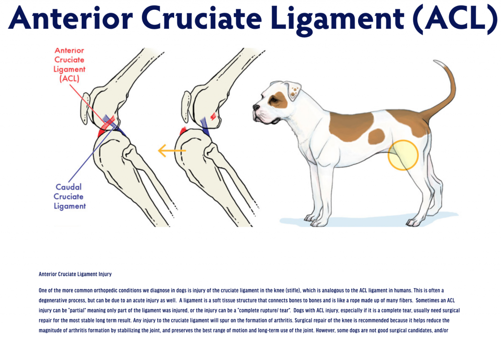
In this case, the custom graphic is used to illustrate the points explained in the blog. Annotated diagrams help to show what the injury looks like and where it may occur on the reader’s animal.
This example of stellar graphic design takes a complex concept and breaks it down using a simplistic diagram. The reader leaves the blog far more informed thanks to a visual explanation of the issue.
4. Unprofessional graphic design lowers quality of your products
If your blog exists to showcase products and push sales, your graphic design should work to enhance the products you’re trying to sell. You should include high quality product images, along with graphics that show that product or service in action.
Bad product images only serve to make your products look low quality.
Take a look at Khan Home Improvement, for example:
Not only are all the images too small to truly see the quality of the kitchen renovations, the photograph on the left is wonky. What’s more, it’s an image of a bathroom on a blog for kitchen renovations.
The dimly-lit photographs combined with the misuse of images makes the renovations service look inferior and slapdash. The text is difficult to read, both due to its condensed layout and the background image underneath.
As uSERP’s search ranking specialist, Jeremy Moser puts it“Readers don’t want to read long blocks of text. They need something to capture their interest and eye-catching graphics are an excellent way to do so.”
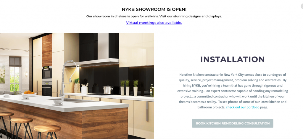
Now check out this sleeker version of product graphic design by NYKB:
The high resolution image shows a far more professional finish and is large enough to see clearly.
Rather than lots of block text on a dark background, a short explanation complements the image. The use of whitespace makes the text far easier to read.
Overall, thanks to a more professional graphic design, this kitchen renovation contractor gives the impression of a higher quality job. It’s obvious who you’d hire to renovate your kitchen.
You may not be looking to convert your readers into buyers, but you’re probably still looking to convert your readers into blog subscribers.
The structure and flow of your blog should work to make it easy for your readers to know what to do next. It’s your job to show them their next course of action with clear visual signals.
When considering graphic design elements, think about what visual elements help customers to convert — how are you signposting your subscription or purchase links?
Not only are there no images throughout the entire post, there are also no obvious calls-to-action (CTAs). While there are a few affiliate links scattered throughout the text, the webcam company fails to lead readers toward their own product.
Since the educational market is an important target sector for ManyCam, the company is missing a huge opportunity to convert readers of this blog post.
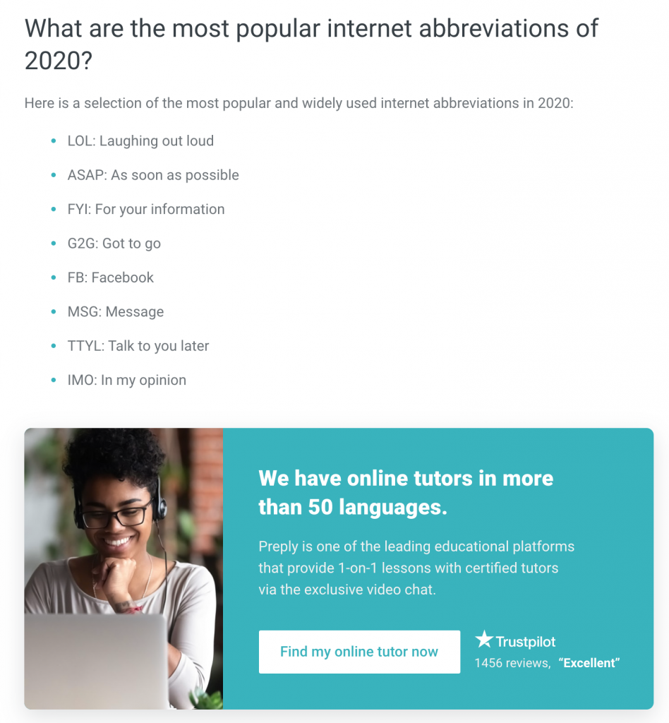
Preply inserts professionally-designed custom CTA images at appropriate breaks throughout this blog post about English colloquialisms.
Readers of this post are likely not native English speakers and are coming to the blog to learn about the English language. This gives Preply a prime opportunity to add a polished, on-brand CTA to find an online tutor.
Notice how the CTA is shaped like a button. CTAs designed like buttons convert 2.3 times more than those that aren’t.
Instead, follow these graphic design tips to ensure your blogs have a consistent, professional feel that voices your brand image and encourages engagement.
1. Consistent branding
There’s a reason that 37% of marketers are highly focused on consistency in branding. It’s because it sends a clear message to the reader about who you are and what you’re about.
If you continuously chop and change your blog’s image, readers may get confused about the tone of your message.
Equally, consistent branding helps readers to recognize your brand across all your social media platforms and marketing channels.
2. Use creative graphics to elaborate your points
There are various creative ways to use graphics to explain complex ideas, get your point across, and make your content more shareable.
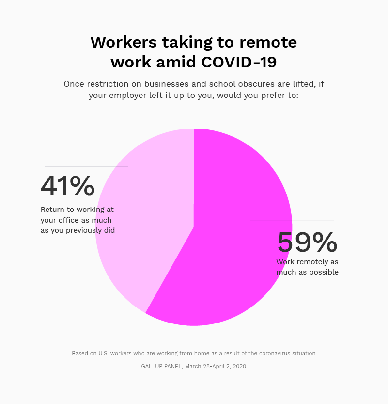
67% of B2B marketers use infographics — the fourth most used content type. This is because infographics are a great way to break down intense data into easily-visualizable chunks.
Check out this eye catching example from Marketer Hire and how they share statistics on remote work amidst COVID-19:
Wouldn’t you rather see statistics and facts in quirky illustrated cartoon form over a dreary black-and-white table?
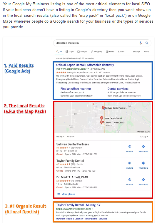
Another effective way to illustrate your message is to include screenshots. If you’re talking about a particular product, brand, or program, screenshots are perfect for showing how something works immediately.
That’s how local SEO Agency, Ardent Growth, helps to explain local search marketing in its blog:
Each paragraph of the blog post gives the reader guidance on how to conduct local search marketing. Screenshots of each step are added to demonstrate these points in action.
3. Avoid stock images
60% of marketers have given up using stock images because they’re simply not engaging. Stock images do little for your blog post beyond adding a bit of color.
Nowadays marketing specialists agree that custom graphics are the best way to reach marketing goals.
While you may not see blogging as a marketing endeavor, you’re still trying to cinch followers and up your readership. Custom images are far more effective at doing this than stock images as they add a personal touch to your blog.
Conclusion
Since it’s obvious that poor graphic design is hampering your blog’s performance, it’s about time you invested in sleeker images and a more professional aesthetic.
While you can always hire a graphic designer, why not try using online graphic design tools like Canva, PicMonkey, Crello, or Venngage? With custom images, infographics, and screenshots, you’ll be able to create a more consistent brand image to differentiate your blog from competing websites.
Every day, billions of people use the internet and smartphones. Because of this, digital marketing has become one of the most important aspects of an organization’s overall marketing strategy.
What is digital marketing?
Digital marketing can mean slightly different things to different people. For example, the tactics used by an e-commerce platform will be different from bricks and mortar businesses.
The most common types of activity encompassed within digital marketing include:
Content marketing
The shift towards content marketing has been significant over the last decade. Creating and distributing valuable content to your target audience to build awareness, trust, and inbound leads.
Content marketing can take the form of blogs, whitepapers, video content, case studies, infographics, and podcasts.
Social media marketing
There are a number of social media platforms used by brands in order to drive traffic and engagement. While much of the activity on social media can be classed as content marketing, the chance to listen and engage with an audience makes it a viable marketing channel in its own rite.
Social media continues to evolve as new platforms emerge. The most popular being Facebook, Twitter, Instagram, YouTube, Snapchat, WeBo, and TikTok.
Search engine optimization (SEO)
Gaining quality organic traffic through major search engines such as Google and Bing. Strategies can include optimizing websites, building backlinks, and SEO friendly content.
Search engine marketing (SEM)
The other side of the search engine coin to SEO. Search engine marketing refers to the paid activities used to increase search engine visibility and drive traffic through Google Adwords or Bing Ads.
Affiliate marketing
This particular form of marketing is becoming extremely popular. Affiliate marketing is when a person or company is paid a set commission for every sale or traffic they generate for another company. This particular form of marketing is popular with bloggers and solopreneurs, who can pivot content quickly in order to showcase affiliate links.
Every year Amazon pays out hundreds of millions of dollars in affiliate fees and is one of the most popular programs of its kind in the world.
Pay per click (PPC)
Similar to paid search, you pay a pre-set amount whenever someone clicks on your ad.
Email marketing
The granddaddy of digital marketing. Every year we hear that email marketing is dead, but it is still a staple of a solid digital marketing strategy. When it’s done properly, regular or automated email marketing is still a powerful tool, especially combined with personalized marketing techniques.
Instant messaging and bots
WhatsApp, Facebook Messenger, and WeChat have, between them, billions of users all around the world. That is an unmissable opportunity for brands looking to get their messages out there.
The use of bots, in particular on Facebook, is a great way of interacting with your audience in a scalable, on-brand way.
What does it mean to outsource digital marketing?
Outsourcing your digital marketing means that you are using a person, company, or companies to take care of those aspects of your overall marketing strategy. This could be for a number of reasons including a budget, lack of internal resources, or being too big or too small to be able to have the necessary resources in the house.
What does in-house digital marketing mean?
An in-house team will plan, execute, and report on all digital marketing activities using a team employed by the organization.
What are the benefits of outsourcing digital marketing
There are many reasons that you might want to outsource your digital marketing, including:
Budget – smaller businesses know that they need to implement some form of digital marketing to grow, but cannot afford to hire a team full time to do this. Instead, they will use third-party/parties to plan and implement digital marketing on their behalf. Types of outsourcing could include web design, social media, SEO, and so on.
Knowledge – because digital marketing companies make their money from just that, they need to keep their knowledge, skills, and technologies on the leading edge at all times. You can benefit from this continuing development without having to put yourself off your team through the recommended training or costs.
What are the cons of outsourcing digital marketing?
There are some potential downsides to turning over your digital marketing to a third party.
Less personal – by handing over your marketing strategy to someone else, you might find that your brand begins to develop in different ways in order to attract new audiences and customers. If you’ve been responsible for your brand and marketing to date, it can be difficult to let go.
Finding the right team can be difficult – while working with the right team can fundamentally change your business success for the better, choosing the wrong team can be damaging.
It takes time to find the right people. You need to work with those that you connect with and work hard for you. There are plenty of horror stories out there that put people off hiring an outside agency.
You need to commit to a strategy – in order to create a comprehensive digital marketing campaign, you need to commit to a budget, and strategy at the outset, as well as have. It is unfair for you to move the goalposts frequently. You’ll also need to sign something along the lines of a digital marketing proposal and it’d make sense to get acquainted with one prior to signing it.
You are one of a number of clients – your business may not be as important to them as you’d like it to be. That’s not to say that you won’t be treated professionally, but you cannot always expect to be a top priority.
What are the benefits of in-house digital marketing?
Dedicated to one client, you – there are no other clients vying for your marketing team’s attention, so you know that your company always takes top priority.
Quicker response times – if your marketing team works with others within your organization on various tasks, having a team on-site, dedicated to you can cut out a lot of red tapes. For example, if a certain department has an idea for a campaign or would like something promoted at short notice, you don’t have to try and negotiate with an outsourced team to try and bump your request to the top of the list.
Better brand knowledge – because the team is part of your organization, they live and breath your brand every day. This can then be translated seamlessly into your campaigns.
What are the cons of in-house digital marketing?
Costs – as covered earlier in the article, digital marketing encompasses a lot of different specialisms. Recruiting and training people in all of these areas can be very expensive. In addition to salaries, you also have to consider recruitment costs, benefits and ongoing training needs.
Skill levels – each area of digital marketing could be done by one person full time. But it is usually down to a few people who are expected to do everything. They often end up gravitating towards the areas they prefer, or never developing in-depth knowledge in a number of areas.
Potential to be overworked – if you hire a single person to do all of your digital marketing, as well as your traditional marketing tasks, you run the real risk of burning them out quickly.
Fewer contacts and special deals – digital marketing agencies can often have great contacts and deals in place with other sites or providers. In house teams often don’t have the time of the financial clout to do this.
Less strength in depth – if you are using an agency and someone is out sick, then there are usually other people who can take over the project at short notice. This usually isn’t the case with small in house teams. If someone in your team leaves, you are without any skill in certain areas until they are replaced.
Does it make sense to combine the two?
Many businesses find a good balance between in-house teams and outsourcing. It usually works best when there is an experienced marketing point person who can lead on the strategy development and then recruit and oversee the people or companies who will then actually implement the digital marketing campaigns.
This works well for a number of reasons. Having a single point of contact who has overall responsibility for digital marketing helps to streamline planning and decisions. Small in-house teams can also take care of some of the days to day digital marketing tasks that need doing and respond to in house requests quickly.
From a digital marketing agency perspective, it is always easier to deal with someone who knows what they are doing when it comes to leading a marketing function within a company and has realistic expectations.
For those companies who are deciding whether or not to recruit an in-house team, or outsource, this article provides some of the pros and cons of each course of action. Remember, what works for one company will not always work for another. It might make sense to outsource your digital marketing requirements at the beginning, then move towards a blended team as you scale up. Alternatively, if you are large enough to recruit a full digital marketing team, then you will have an entire department dedicated only to your organization.
Formally known as churn, payment failure primarily stems from the attempting purchaser having insufficient funds, outdated credit card information, or exceeding their credit card limit. However, matters regarding churn can also stem from business technicalities, such as server errors: another instance in which payments may fail.
Regardless of the reason, failed payments can be catastrophic on both businesses and their consumers. Not only do businesses lose income from non-receival of payment, but customers may also lose access to services they love.
For example, customers may only learn their payment has failed once their service has been interrupted. With service interruption being a gateway to raising customer frustration, using strategic approaches (including customer retention tactics) when working to reduce churn rates may show healthy payoffs.
How Much Do Failed Payments Cost Businesses?
On average, American businesses lose $136 billion per year on customer churn costs. Furthermore, modern businesses who rely on auto-renewals earn 62% of their revenue from subscriptions. However, auto-renewals increase the likelihood of failed payments.
Not only do more than 2 in 3 businesses lose 17% or more of subscription profits to churn, but 47% of businesses also lose auto-renewals due to changes in payment data. For example, changed expiration dates, zip codes, and card numbers.
All in all, failed payments raise operational costs. How? 48% of businesses say chargeback rates cut into forecasted revenue. Similarly, 43% say increased customer service contacts from failed payments make keeping customers more costly. However, it costs 5x more to attract new customers than to keep existing ones.
The solution? Personability as means for retaining customer loyalty.
How Businesses Can Reduce Involuntary Churn:
First and foremost, improving customer retention is your easiest approach to saving money on marketing costs, increasing profits, and improving your brand’s quality of service. Take it from the experts – 65% of a company’s business comes from existing customers.
The commonality of customers not knowing their payment has failed until their service stops was previously mentioned. A great way to prevent the customer, and fiscal, frustration this can cause is to boost the amount of personability put into your customer loyalty tactics.
The old adage, “The customer’s always right” may still, to some extent, prove true. Statistically, 32% of people will stop doing business with a company after just one bad experience. Knowing this, you can improve your brand’s profits by improving your range of customer service.
Just as unfavorable service can turn customers away, respectable efforts can attract. After a great experience, customers are willing to pay 17% more for services. On top of that, repeat customers spend 67% more in months 31-36 of working with a business than in months 0-6.
Since satisfied customers are less likely to cancel a subscription and are more likely to add services or upgrade their existing packages, it will prove beneficial to know who your best customers are. Additionally, get to the bottom of why customers leave your business. This can be achieved by learning from customer complaints and offering multichannel customer service to broaden the available avenues consumers have to submit feedback.
Outside of improving your brand’s customer relations, turn to technology for a more hands-on approach to tackling your business’ amount of failed payments. For example, you can reduce card declines by using payment processors, digital wallets, and using direct debit transactions. Automatic card updaters are also a great tool for reducing involuntary churn as they check card networks to update payment information behind the scenes. This way, customers don’t have to manually update their card data for auto-renewing services.
E-commerce businesses can keep track of their churn rates by keeping tidy financial statements. For example, finding the exact amounts of revenue from each sales channel. On top of that, e-commerce businesses can opt for software rather than card reader-esque hardware. Specialty software can organize neat income statements, allowing business leaders access to their specific sources of revenue.
Research has pointed involuntary churn out to be the #1 cause of payment failure. In fact, 34% of failed payments are due to involuntary churn and failed payments. Zig Ziglar, an expert in personal development training, believes Lack of direction, not lack of time, is the problem.” Survivability is essential, and in the world of business, survivability does not come without consumers. Does your business model include tactics for improving customer retention or failed payment reduction?
I made this neat little gray burst thing. It’s nothing particularly special, especially compared to the amazing creativity on CodePen, but I figured I could document some of the things happening in it for learning reasons.
CodePen Embed Fallback
It’s SVG
SVG has , so I figured it would be easy to use for this burst look. The x1 y1 is always the middle, and the x2 y2 are randomly generated. The mental math for placing lines is pretty easy since it’s using viewBox="0 0 100 100". You might even prefer -50 -50 100 100 so that the coordinate 0 0 is in the middle.
Random numbers
const getRandomInt = (min, max) => {
  min = Math.ceil(min);
  max = Math.floor(max);
  return Math.floor(Math.random() * (max - min + 1)) + min;
};
It’s nice to have a function like that available for generate art. I use it not just for the line positioning but also the stroke width and opacity on the grays.
I’ve used that function so many times it makes me think native JavaScript should have a helper math function that is that clear.
Generating HTML with template literals is so easy
This is very readable to me:
let newLines;
for (let i = 0; i < NUM_LINES; i++) {
  newLines += `
  <line
    x1="50"
    y1="50"
    x2="${getRandomInt(10, 90)}"
    y2="${getRandomInt(10, 90)}"
    stroke="rgba(0, 0, 0, 0.${getRandomInt(0, 25)})"
    stroke-linecap="round"
    stroke-width="${getRandomInt(1, 2)}"
  />`;
}

svg.insertAdjacentHTML("afterbegin", newLines);
Interactivity in the form of click-to-regenerate
If there is a single function to kick off drawing the artwork, click-to-regenerate is as easy as:
doArt();

window.addEventListener("click", doArt);
Rounding
I find it far more pleasing with stroke-linecap="round". It’s nice we can do that with stroke endings in SVG.
The coordinates of the lines don’t move — it’s just a CSS transform
It might look like the lines are only getting longers/shorter, but really it’s the whole line that is shrinking with scale(). You just barely notice the thinning of the lines since they are so much longer than wide.
Notice the negative animation delays. That’s to stagger out the animations so they feel a bit random, but still have them all start at the same time.
What else could be done?
Colorization could be cool. Even pleasing, perhaps?
I like the idea of grouping aesthetics. As in, if you make all the strokes randomized between 1-10, it feels almost too random, but if it randomized between groups of 1-2, 2-4, or 8-10, the aesthetics feel more considered. Likewise with colorization — entirely random colors are too random. It would be more interesting to see randomization within stricter parameters.
More movement. Rotation? Movement around the page? More bursts?
Most of all, being able to play with more parameters right on the demo itself is always fun. dat.GUI is always cool for that.
Having a semantically versioned software will help you easily maintain and communicate changes in your software. Doing this is not easy. Even after manually merging the PR, tagging the commit, and pushing the release, you still have to write release notes. There are a lot of different steps, and many are repetitive and take time.
Let’s look at how we can make a more efficient flow and completely automating our release process by plugin semantic versioning into a continuous deployment process.
Semantic versioning
A semantic version is a number that consists of three numbers separated by a period. For example, 1.4.10 is a semantic version. Each of the numbers has a specific meaning.
CodePen Embed Fallback
Major change
The first number is a Major change, meaning it has a breaking change.
Minor change
The second number is a Minor change, meaning it adds functionality.
Patch change
The third number is a Patch change, meaning it includes a bug fix.
It is easier to look at semantic versioning as Breaking . Feature . Fix. It is a more precise way of describing a version number that doesn’t leave any room for interpretation.
Commit format
To make sure that we are releasing the correct version — by correctly incrementing the semantic version number — we need to standardize our commit messages. By having a standardized format for commit messages, we can know when to increment which number and easily generate a release note. We are going to be using the Angular commit message convention, although we can change this later if you prefer something else.
It goes like this:
<header>
<optional body>
<optional footer>
Each commit message consists of a header, a body, and a footer.
The commit header
The header is mandatory. It has a special format that includes a type, an optional scope, and a subject.
The header’s type is a mandatory field that tells what impact the commit contents have on the next version. It has to be one of the following types:
feat: New feature
fix: Bug fix
docs: Change to the documentation
style: Changes that do not affect the meaning of the code (e.g. white-space, formatting, missing semi-colons, etc.)
refactor: Changes that neither fix a bug nor add a feature
perf: Change that improves performance
test: Add missing tests or corrections to existing ones
chore: Changes to the build process or auxiliary tools and libraries, such as generating documentation
The scope is a grouping property that specifies what subsystem the commit is related to, like an API, or the dashboard of an app, or user accounts, etc. If the commit modifies more than one subsystem, then we can use an asterisk (*) instead.
The header subject should hold a short description of what has been done. There are a few rules when writing one:
Use the imperative, present tense (e.g. “change” instead of “changed” or “changes”).
Lowercase the first letter on the first word.
Leave out a period (.) at the end.
Avoid writing subjects longer than 80 charactersThe commit body.
Just like the header subject, use the imperative, present tense for the body. It should include the motivation for the change and contrast this with previous behavior.
The commit footer
The footer should contain any information about breaking changes and is also the place to reference issues that this commit closes.
Breaking change information should start with BREAKING CHANGE: followed by a space or two new lines. The rest of the commit message goes here.
Enforcing a commit format
Working on a team is always a challenge when you have to standardize anything that everyone has to conform to. To make sure that everybody uses the same commit standard, we are going to use Commitizen.
Commitizen is a command-line tool that makes it easier to use a consistent commit format. Making a repo Commitizen-friendly means that anyone on the team can run git cz and get a detailed prompt for filling out a commit message.
Generating a release
Now that we know our commits follow a consistent standard, we can work on generating a release and release notes. For this, we will use a package called semantic-release. It is a well-maintained package with great support for multiple continuous integration (CI) platforms.
semantic-release is the key to our journey, as it will perform all the necessary steps to a release, including:
Figuring out the last version you published
Determining the type of release based on commits added since the last release
Generating release notes for commits added since the last release
Updating a package.json file and creating a Git tag that corresponds to the new release version
Pushing the new release
Any CI will do. For this article we are using GitHub Action, because I love using a platform’s existing features before reaching for a third-party solution.
There are multiple ways to install semantic-release but we’ll use semantic-release-cli as it provides takes things step-by-step. Let’s run npx semantic-release-cli setup in the terminal, then fill out the interactive wizard.
Th script will do a couple of things:
It runs npm adduser with the NPM information provided to generate a .npmrc.
It creates a GitHub personal token.
It updates package.json.
After the CLI finishes, it wil add semantic-release to the package.json but it won’t actually install it. Run npm install to install it as well as other project dependencies.
The only thing left for us is to configure the CI via GitHub Actions. We need to manually add a workflow that will run semantic-release. Let’s create a release workflow in .github/workflows/release.yml.
name: Release
on:
  push:
    branches:
      - main
jobs:
  release:
    name: Release
    runs-on: ubuntu-18.04
    steps:
      - name: Checkout
        uses: actions/checkout@v2
      - name: Setup Node.js
        uses: actions/setup-node@v1
        with:
          node-version: 12
      - name: Install dependencies
        run: npm ci
      - name: Release
        env:
          GITHUB_TOKEN: ${{ secrets.GITHUB_TOKEN }}
        # If you need an NPM release, you can add the NPM_TOKEN
        #   NPM_TOKEN: ${{ secrets.NPM_TOKEN }}
        run: npm run release
Steffen Brewersdorff already does an excellent job covering CI with GitHub Actions, but let’s just briefly go over what’s happening here.
This will wait for the push on the main branch to happen, only then run the pipeline. Feel free to change this to work on one, two, or all branches.
on:
  push:
    branches:
      - main
Then, it pulls the repo with checkout and installs Node so that npm is available to install the project dependencies. A test step could go, if that’s something you prefer.
- name: Checkout
uses: actions/checkout@v2
- name: Setup Node.js
uses: actions/setup-node@v1
with:
    node-version: 12
- name: Install dependencies
run: npm ci
# You can add a test step here
# - name: Run Tests
# run: npm test
Finally, let semantic-release do all the magic:
- name: Release
run: npm run release
Push the changes and look at the actions:
Now each time a commit is made (or merged) to a specified branch, the action will run and make a release, complete with release notes.
Release party!
We have successfully created a CI/CD semantic release workflow! Not that painful, right? The setup is relatively simple and there are no downsides to having a semantic release workflow. It only makes tracking changes a lot easier.
semantic-release has a lot of plugins that can make an even more advanced automations. For example, there’s even a Slack release bot that can post to a project channel once the project has been successfully deployed. No need to head over to GitHub to find updates!
As we turn the corner into the final part of the year, many of the new websites and redesigns that we see during much of the rest of the year tend to slow down. Many businesses are focusing on fourth quarter and holiday sales.
With that being said, there are plenty of holiday flourishes already showing up on many websites. But there are still a few trends that don’t have a holiday theme.
Here’s what’s trending in design this month.
1. Beautiful Connectivity
Web elements that merge and flow into one another can be difficult to design but the payoff is totally worthwhile. This website design trend exemplifies connected elements in a way that’s beautiful and mesmerizing.
You can accomplish it with static elements or interactivity; the common theme is that design parts enter the space of one another and merge in ways that are seamless and visually interesting.
The thing that makes it exceptionally tricky is responsiveness. To ensure that pieces work well at all sizes when they overlap or encroach on the space of one another takes a lot of planning and testing.
Here are a few examples of projects that do it well – and each one does it in a different way.
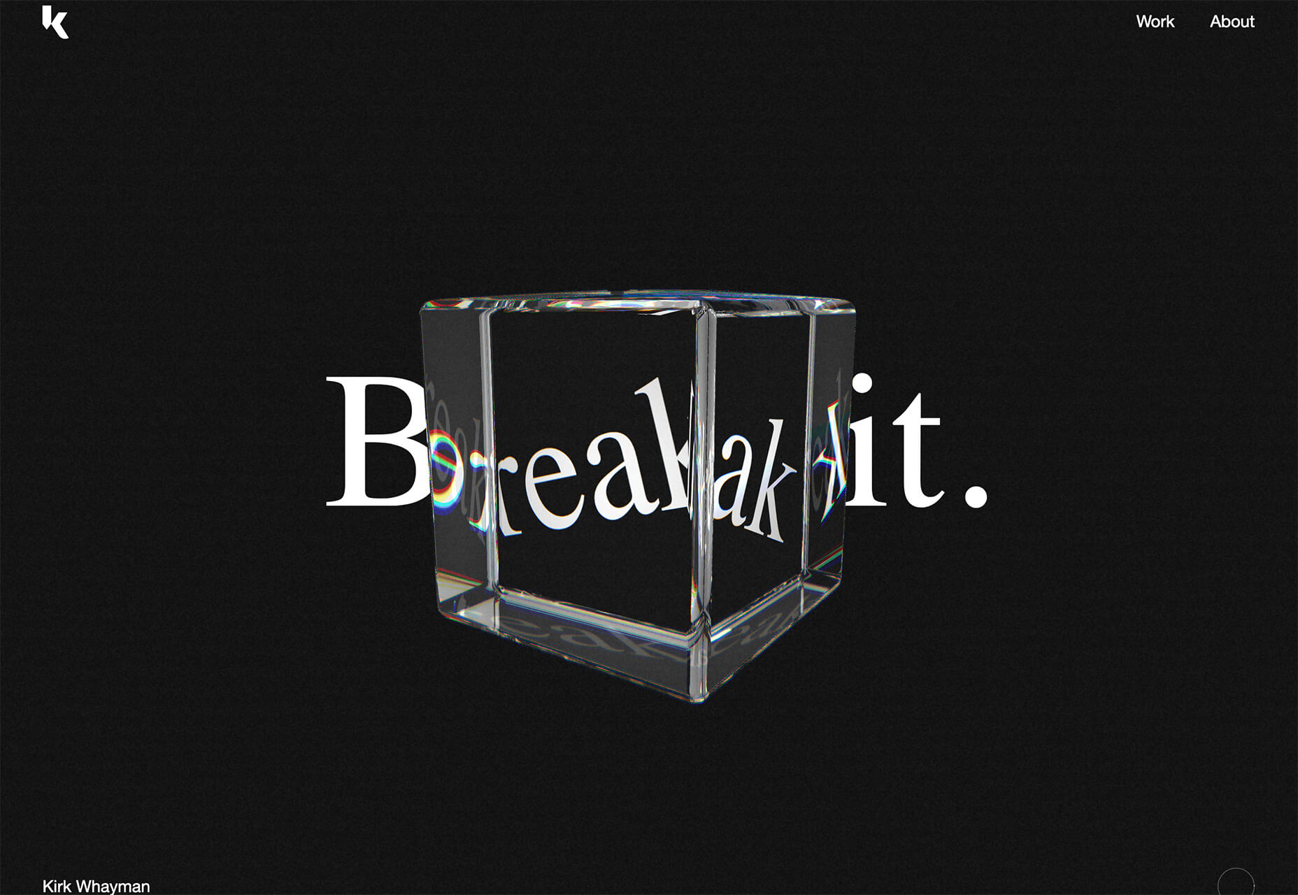
Kirk Whayman‘s website uses a floating ice cube over simple lettering. The interactivity is spot on here with hover actions that allow you to move the block with the letters refracting in an expected manner. (It would be easy to play with it all day.) But the coolest interaction happens when you “break it” (click on the cube). The elements continue to merge and interact in a new and different way.
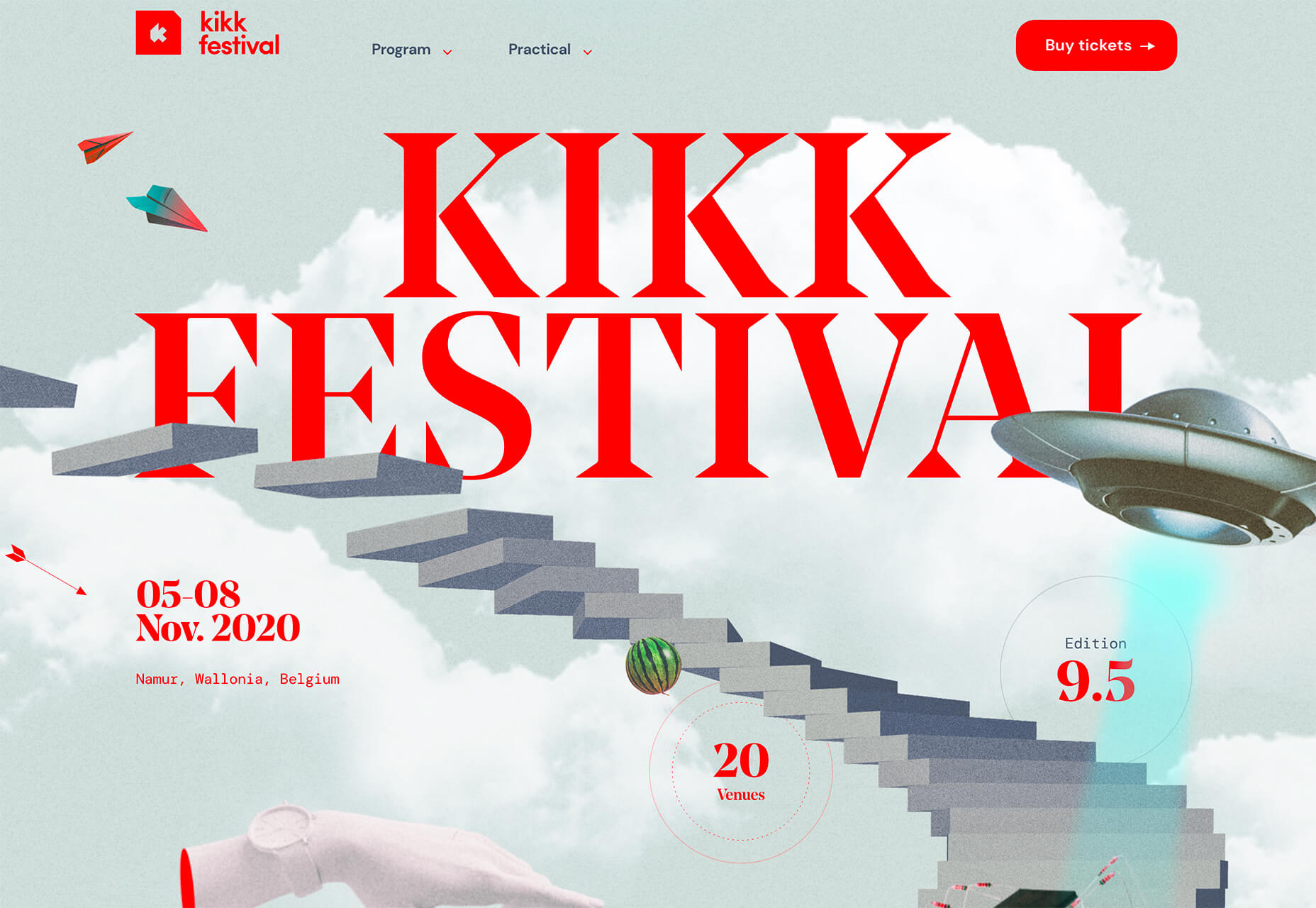
Kikk Festival uses animations and giant scrollable illustrations and plenty of elements that overlap within the space. What’s neat is that everything on this canvas seems to touch everything else. The staircase design encourages scrolling and lettering and smaller animated elements all connect to the steps in the sky motif.
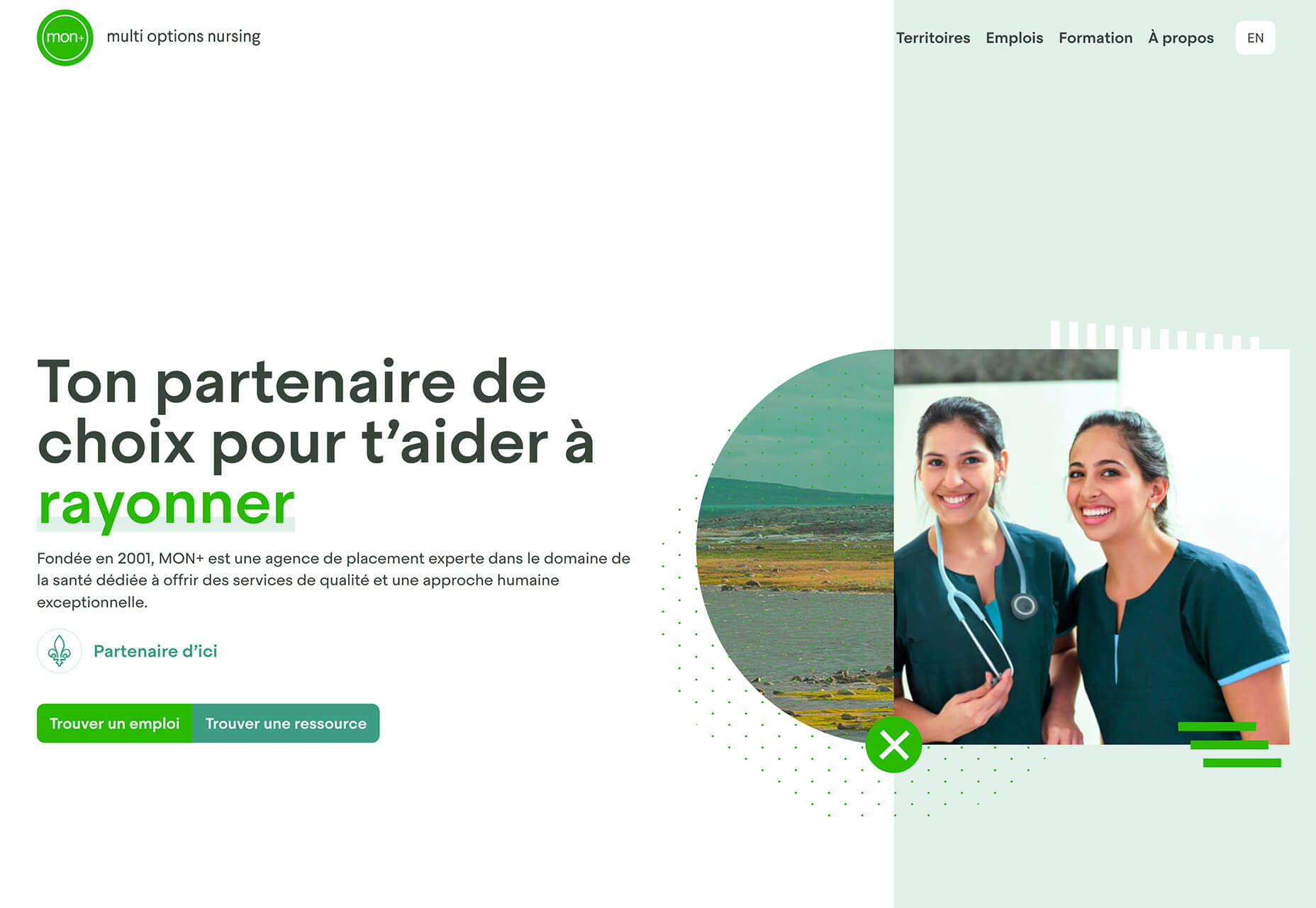
Multi Options Nursing takes a totally different approach. It uses a static split screen with a photo on the right side that merges into a round graphic element. It takes two not-s-interesting images and makes something out of them. The design carries this theme below the scroll as well and this style of image presentation carries a nice visual weight without feeling heavy.
2. Almost Brutalism
Brutalism just seems to keep coming back around. For those that love this trend, it keeps evolving as well.
The latest styles of brutalism are a little less mono but still pretty sharp with harsh lines, questionable type readability, and a lot going on in a compressed space. These projects also seem to be embracing color and alternative font choices more readily.
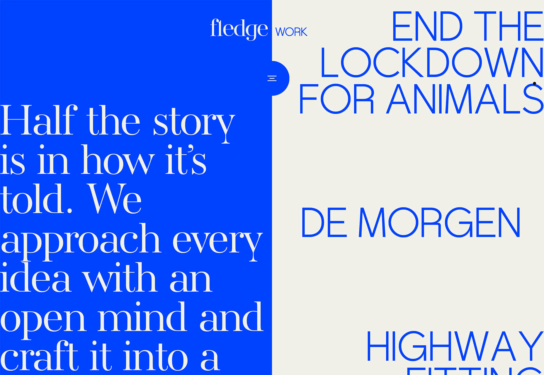
Fledge uses a split screen – still a dominant trend two years running – with a blue that’s almost too bright with an almost white offset color. The text is big and smooshed into the space tightly. Depending on the breakpoint, you might not even get the whole phrase on the left side. The design challenge is what are you supposed to do here? There are some hover animation cues, but they aren’t very direct.
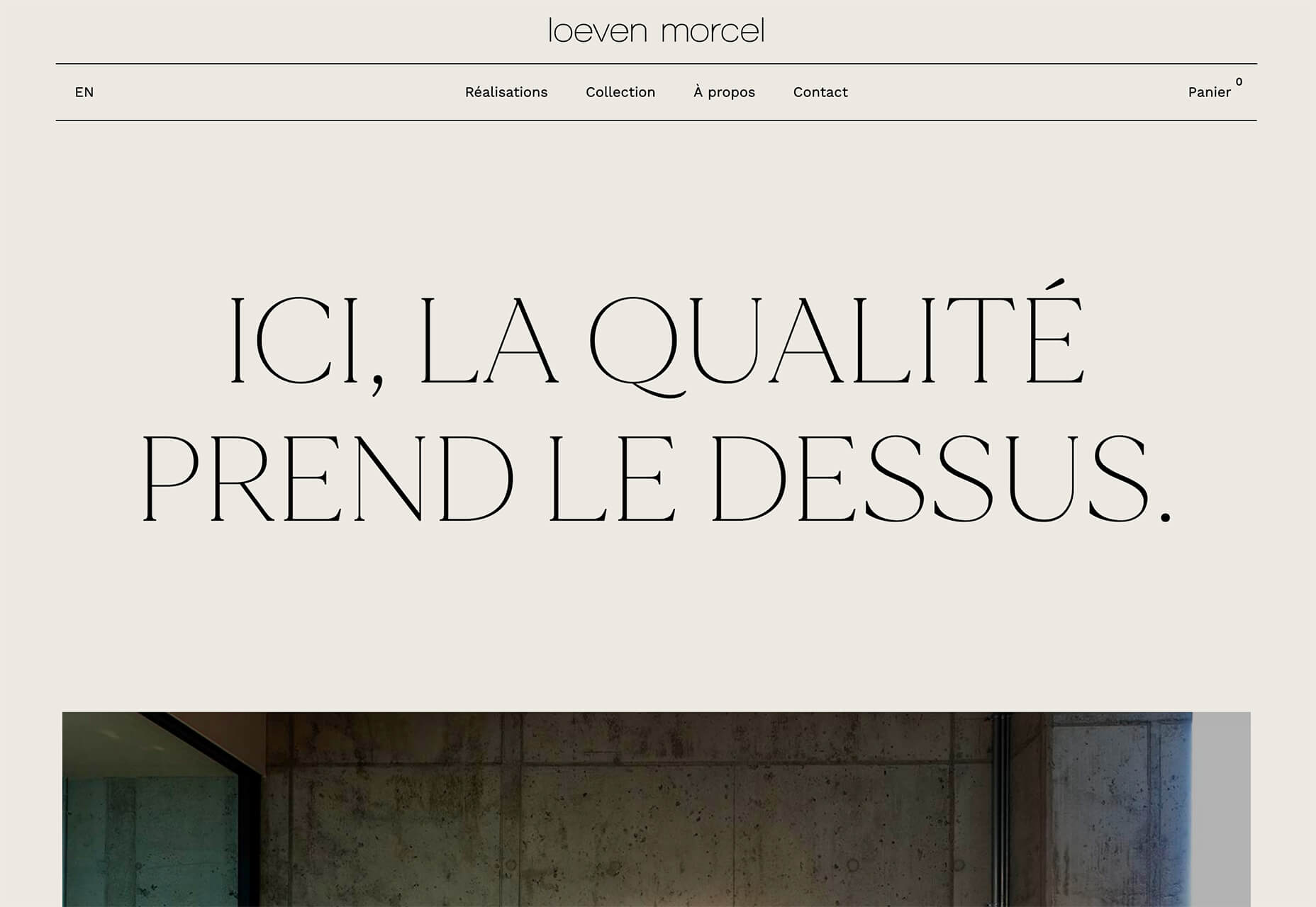
Loeven Morcel’s design has hints of brutalism and elements of elegance. What makes this design skew toward the brutal side is use of space and typography. Like the previous example, it falls into the territory of “what should I do here” with some concerns about readability. Most of these issues are resolved on the scroll if you move beyond the homepage.
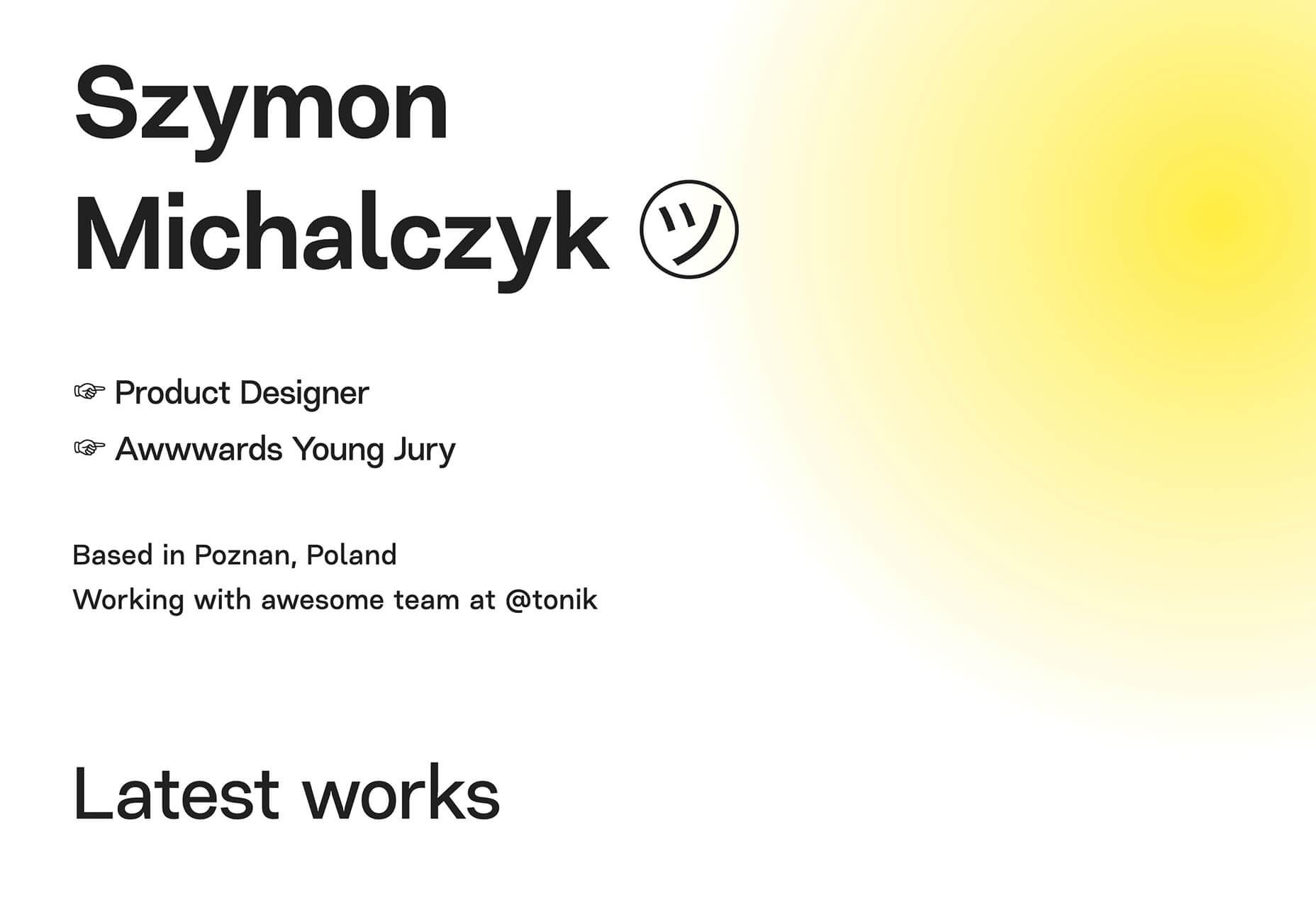
Szymon Michalczyl’s site is another that is close to brutal in style but has an element of sleekness that doesn’t quite carry it over the edge. The simple framework has that brutalist feel but the use of simple, clean fonts with plenty of space pulls it back into a more mainstream design scheme.
3. Beige Everything
Is a shade of beige the color of the year for 2020? Or is it just how we all feel?
Beige backgrounds are everywhere, making this one of those design trends that you can’t miss. The good news is that designers are playing with different shades of beige as well as warm and cool variations. Beige on its own can take on some of the color from accent hues and imagery, so that’s important to keep in mind when using this in the background.
The other variable is how saturated to make beige coloring. Most designs are using some of the more muted options while mostly playing with the levels of green and red. But darker beiges are also an option.
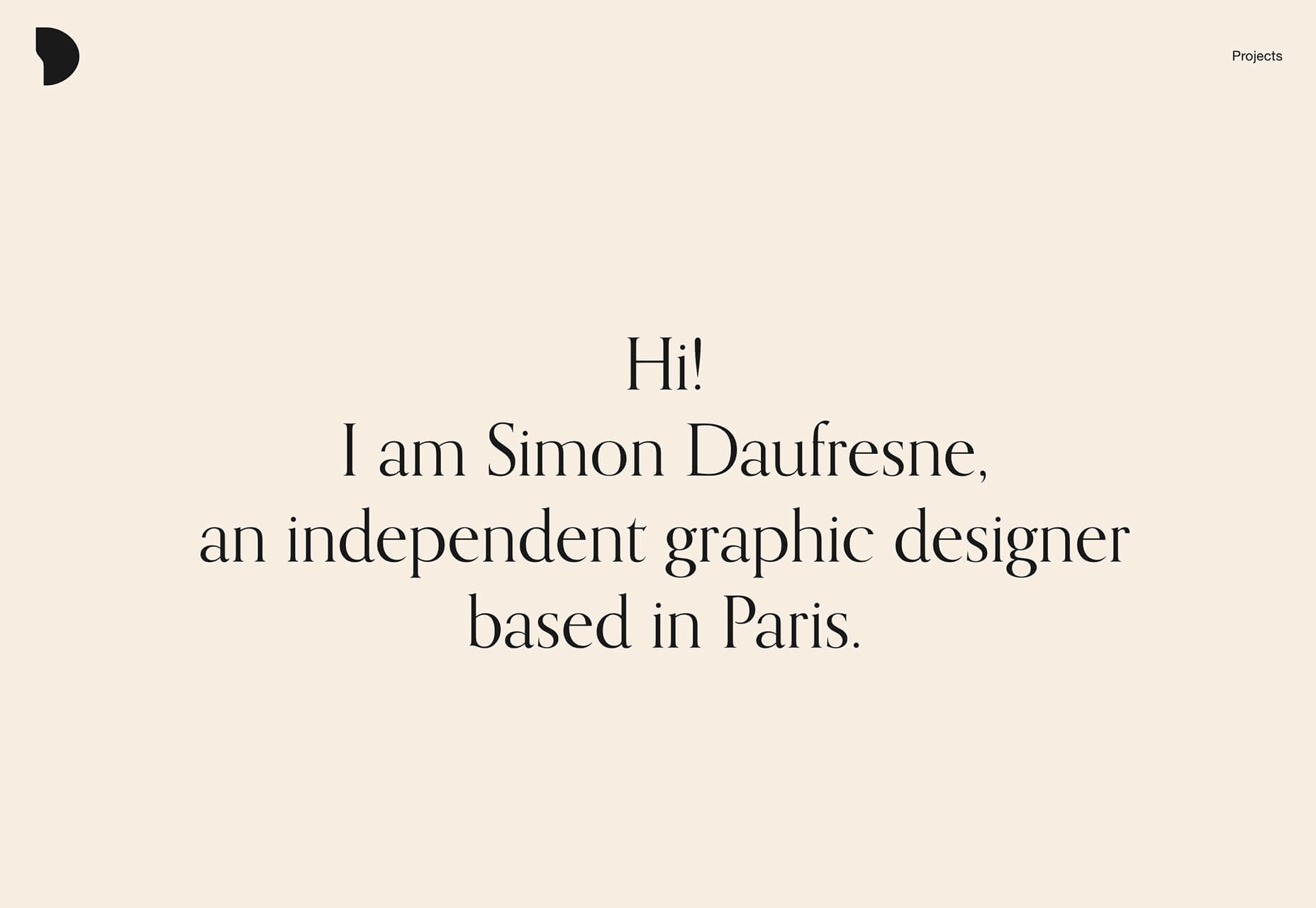
Simon Daufresne uses a beige that is the color that comes to mind when you think beige. It’s simple, a hint reddish, and is used with black only to maintain true color.
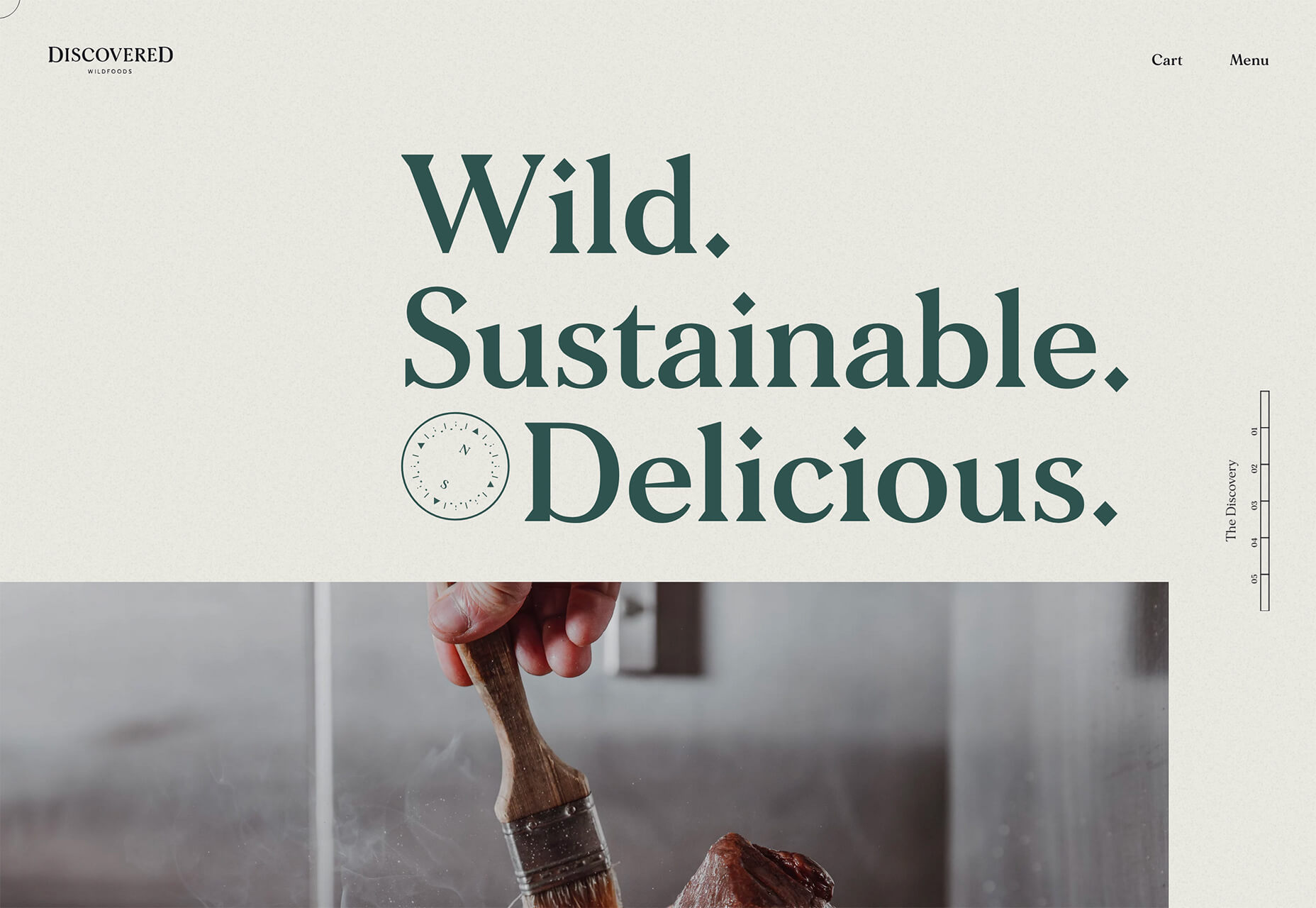
Discovered Wildfoods uses a more neutral feeling beige with a more green undertone (or is that color feel coming from other design elements). The neutral and natural color fits the brand and association this website is trying to create.
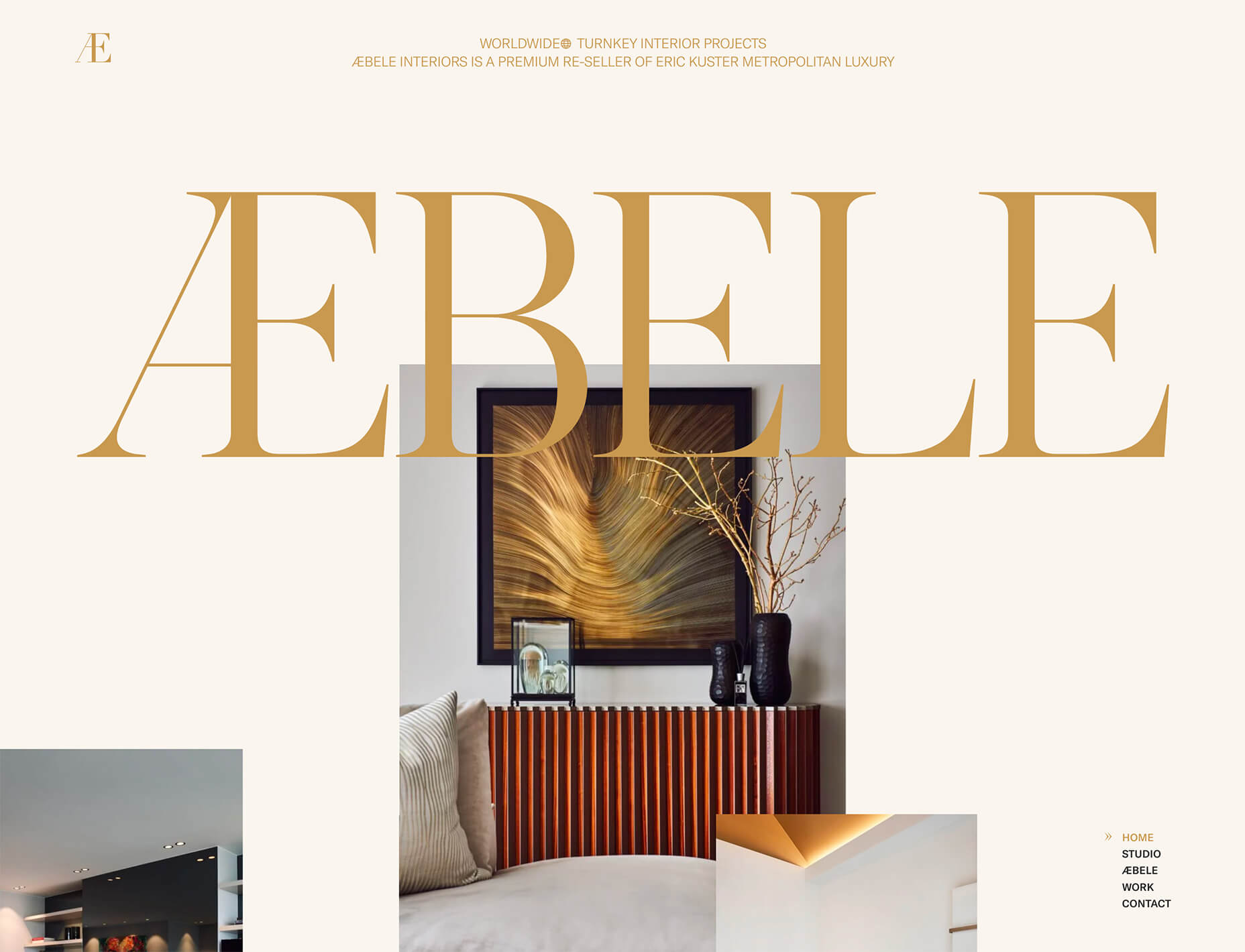
Aebele Interiors also uses a more traditional beige but with a bold mustard accent that makes the color feel exceptionally warm. What’s nice about this color combination is that in small sizes the mustard colored-type almost falls into the beige background, but at larger sizes seems to almost jump off the screen. It’s an interesting color juxtaposition.
Conclusion
Personally, this month’s trends are a mixed bag. I love the lines and interactivity of the beautifully connected examples. It shows that elements can cross and work together well.
On the flip side, brutalism and beige just aren’t my style. But apparently, they appeal to a lot of people based on the number of projects using these styles. What do you think? I’d love to know how you feel about these trends. Let me know on Twitter.