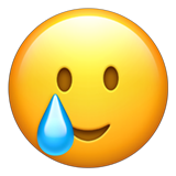
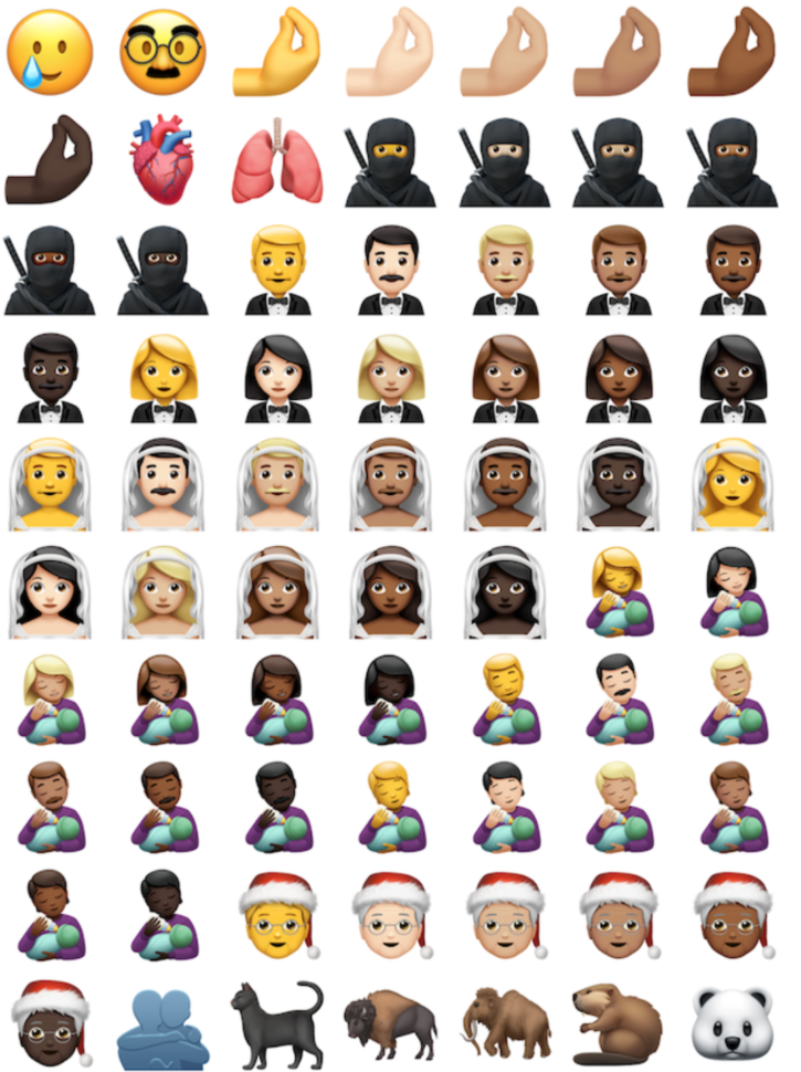
This year has been a lot, and if there’s one emoji that could accurately explain it all, it’s probably this:
I’m currently updating my phone as we speak, because I absolutely can. not. wait. to start using these new emojis.
With 117 new emojis being released, and counting, I can’t help but think that there is officially an emoji to describe everything you could ever think/feel.
…Or at least they’re getting close.
“The new 117 icons, which were released in iOS 14.2, iPadOS 14.2 and macOS 11 Big Sur on Thursday, and it includes my personal favorite, the absolutely most relatable emoji ever, which is the ‘Smiling Face with Tear’ emoji.”
While Emojipediadefines it as mainly an expression of feeling “touched, relieved, or grateful,” I know i’ll be using it when I feel like this:
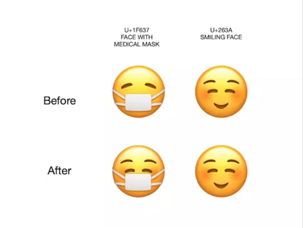
There are lots of other emojis that we’re looking forward to like the happy person wearing a mask.
Prior to this update, the emoji wearing the mask used to be sad, but taking into consideration all the changes that have been going on this year, wearing a mask isn’t that bad after all and you can still smile and be happy while wearing your mask, just as this emoji suggests.
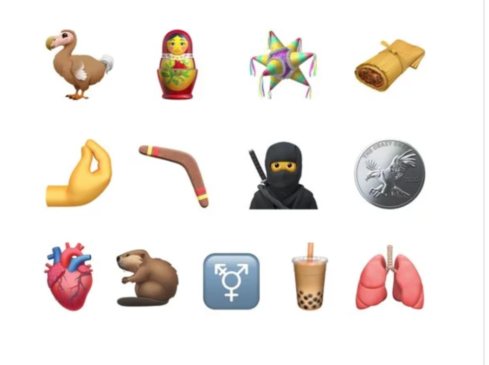
Some other new emojis that we’re looking forward to seeing are the otter, the italian hand, boomerang, ninja, bubble tea and so many more!
What emoji are you looking forward to using in the near future?
A business logo is so much more than just a random design. It can show your customers what your brand means, what it is all about, and is also the answer to how you want to portray yourself.
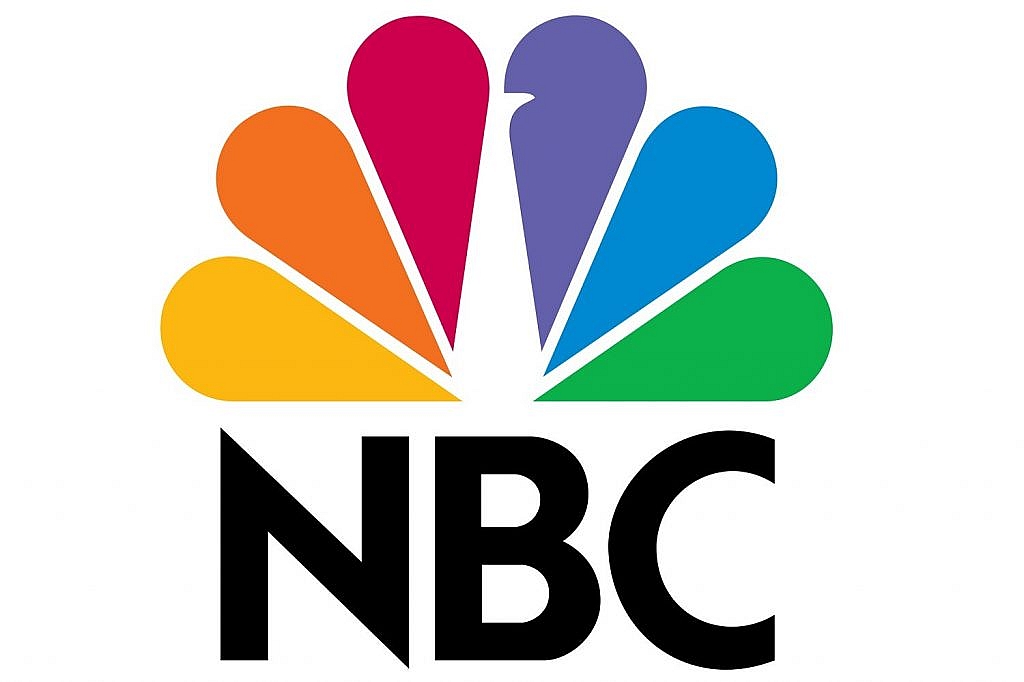
Let us take NBC’s logo for example. The image is obviously a peacock but the reason they picked a peacock is because at that time there were very few colored channels on the television. This means that a lot of people were still using black and white TV sets.
The amount of color that was in their logo along with their signature line ‘Proud as a Peacock’, was narrowed down upon in the hope of changing people’s minds about colored TV and getting them to switch.
The six feathers also resemble the six divisions at NBC.
You would not think the company’s logo has that much meaning to it but it does. It serves as a sense of purpose for the brand as well as a sense of belonging. The power of a great logo really cannot be underestimated.
It can help your company bring in more customers, change the reputation and feel of your company, and even potentially help you make more money down the road.
In reference to that importance, let us go through a few of the most famous logo ideas that can hopefully serve as inspiration for you and your company-
Brand Name Initials
Initials of the brand name are pretty self-explanatory. You would only use the first letter of each word in the brand’s name. It is a logo that becomes very distinct to that brand pretty quickly because of the design and format. A few good examples include-
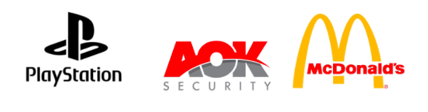
PlayStation- The PlayStation logo is the signature standing P letter and the sleeping S letter. It is instantly recognizable and those two letters are enough to know which company you are buying.
AOK Security– With security brands especially, you do not want something too informal or playful. This simple logo from AOK Security with the brand name initials is recognizable without being immature.
McDonald’s– The big M from Mcdonaldsis a signature part of their marketing strategy. You would find the logo sky high in the air a few miles before you actually got to the store and kids yelled with joy when it came within vision. It is and will always remain iconic.
Pictorial marks
These are the logos that are 100% pictorial (only images) but you still recognize them because their logo has become a valuable part of their brand.
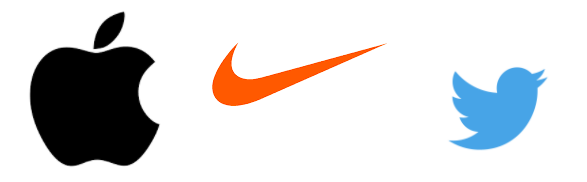
Apple- The simple bitten apple has become synonymous with Apple products over the years and you see the logo featured on every device. The logo is said to resemble the apple that fell near Issac Newton and led him to discover the concept of gravity.
Nike– Nike‘s well-known tick is extremely simple and minimalistic but it is associated with speed and power through the brand’s amazing marketing tactics. The logo has been derived from the Greek goddess Nike who is the Winged Goddess of Victory.
Twitter- The bird logo for Twitter signifies a bird tweeting away. This is also why every post on the platform is called a ‘tweet’.
Full Brand Name
Using your full brand name within your logo was one of the very first types of logos ever used and is still in effect to this day. It is extremely common but works like a charm every time.
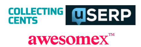
Collecting Cents– The logo behind Collecting Cents is the very definition of a ‘full brand name’ logo. It has no frills, is completely legible, and uses only one stand-alone color
uSERP– uSERP, a link building company, uses their entire brand name within their logo in a very legible font which keeps things minimalistic and understandable.
awesomex– Much like the collecting cents logo, awesomex is also a straightforward, legible, and simple logo that uses the full brand name type.
Animated Characters
Animated characters add an element of fun and childishness to the logo in most cases but there are also some logos that incorporate animated characters while maintaining the more formal look.
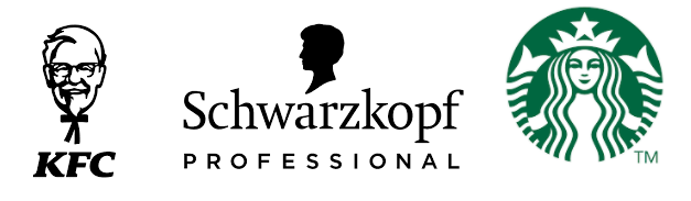
KFC- KFC‘s classic logo with the founder of the brand Colonel Sandersfeaturing is well received by their customers because it conveys emotion and over the years has become instantly recognizable. It tells the history of the brand while also being fun and light.
Schwarzkopf- This is an example of a brand that has maintained the formal look and feel even after incorporating an animated character into the brand. Schwarzkopf prides itself as being a line of luxury hair products. The simple shadow character of a person is simple yet elegant.
Starbucks- The classic Starbucks logo that is the favorite of Instagram posts is an example of a logo that has managed to become even bigger than the product itself. The logo is recognizable, loved, and screams premium coffee.
Emblem Logo
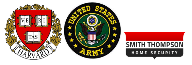
The emblem logo is most commonly used by Universities or formal educational institutes. It conveys a deep message in most cases and is often used by military agencies as well.
Harvard University- Harvard University‘s logo includes three books, a shield, and the word Veritas. The logo is also used as a seal for legal purposes. The Latin word can be translated into English to mean ‘Truth’.
United States Army- The United States Army‘s logo is a symbol of strength and defense. It conveys a lot of emotion for not just the people serving but for Americans in general.
Smith Thompson Home Security– The Smith Thompson logo is easy to read while still having an emblem logo aspect to it. It is not as straightforward as the other full name logos because of its use of the emblem and colors along with the brand name but it works perfectly for a security company that wants a more formal logo.
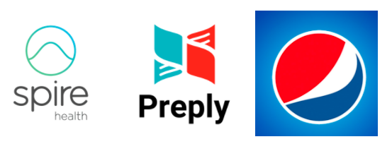
Abstract Logos
An abstract logo is a pictorial logo that is not recognizable as a known character or object. So, for example, with Apple, everyone knows what an Apple is but with abstract logos, the logo is often a geometric form of some kind or just a design.
Spire Health- Spire‘s simple logo can be drawn without taking your hand off the paper. It is minimalist and subtle which works well for healthcare companies.
Preply- Preply is a language learning company that uses a simple red and blue logo whether it is on its website or in the app store.
Pepsi- The classic red, white, and blue Pepsi logo is completely abstract but still manages to have a lot of meaning. The colors represent the American flag while also having other, more subtle meanings. For example, the colors also resemble the golden ratio.
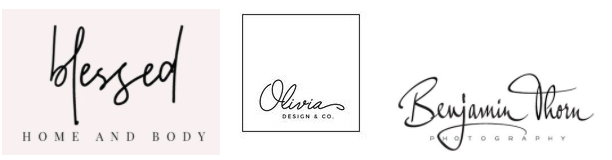
Hand-Written Logo
Hand-written logos use the font that resembles someone’s handwriting. They are very popular in the online community and new handwriting fonts come up almost every day.
Blessed Home and Body- The Blessed logo is a predominantly online home and body store. The logo is extremely simple to create and you can easily create something similar using a graphic design software like Canva.
Olivia Design and Co.- This design company’s logo is another simple handwriting logo and is also predominantly online.
Benjamin Thorn Photography- The Benjamin Thorn Photography logo is actually a mix between the handwriting logo and a normal font. This type of logo works nicely for websites or for someone who wants to start an online business.
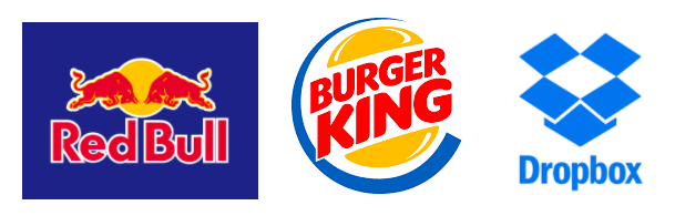
Combination Mark Logos
The combination mark logo is a logo that includes both lettermark or wordmark alongside a pictorial mark. Here are a few examples-
The combination mark is the best of both worlds since it includes not only the mascot or abstract logo but also the wordmark or lettermark associated with the brand.
Whether it is Redbull, Burger King, or Dropbox; all three of these brands have done that in their own separate way.
Redbull uses the class bull logo alongside a very easily legible font- nothing fancy on that front. Burger King and Dropbox, on the other hand, have more abstract logos coupled with a wordmark.
Numerical Logos
Numerical logos use numbers within the design of their logo and the number is often also repeated in the brand name.
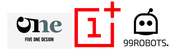
Multiple design companies tend to use numerical logos as part of their design since it screams innovation. The Five One Design’s logo is a prime example of this.
That is not to say other companies shy away from this logo type. 99 Robots and One Plus Mobiles have also done an awesome job of incorporating numbers into their logo.
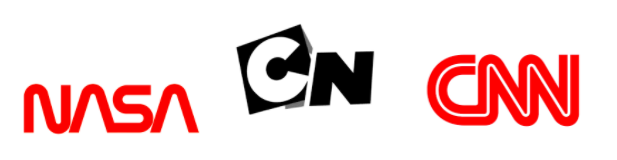
Lettermark Logos
Lettermark logos are simply another name for brand name initial logos. They work especially well for brands with long names. Here are some more examples-
Think about it, NASA’s entire non-abbreviated form is National Aeronautics and Space Administration which is an absolute mouthful. Abbreviating your logos can really help them become easier to read and understand for your customer.
Wrapping it up
Finding the right logo for your brand is as important as creating a great website or having a good mission statement. It is one of the steps you take that will shape your brand and decide its future.
Hopefully, these logo ideas gave you some much-needed inspiration to help you get started or atleast give you a few ideas to work around.
Photo by Devin Avery on Unsplash Creator; Burkhard Berger, You can follow him on his path from 0 to 100,000 monthly visitors on www.awesomex.com.
Every week users submit a lot of interesting stuff on our sister site Webdesigner News, highlighting great content from around the web that can be of interest to web designers.
The best way to keep track of all the great stories and news being posted is simply to check out the Webdesigner News site, however, in case you missed some here’s a quick and useful compilation of the most popular designer news that we curated from the past week.
Minimal CSS Frameworks
Responsive Grid Design: Ultimate Guide
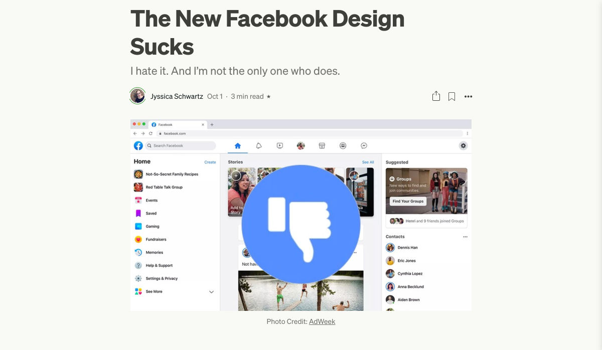
The New Facebook Design Sucks
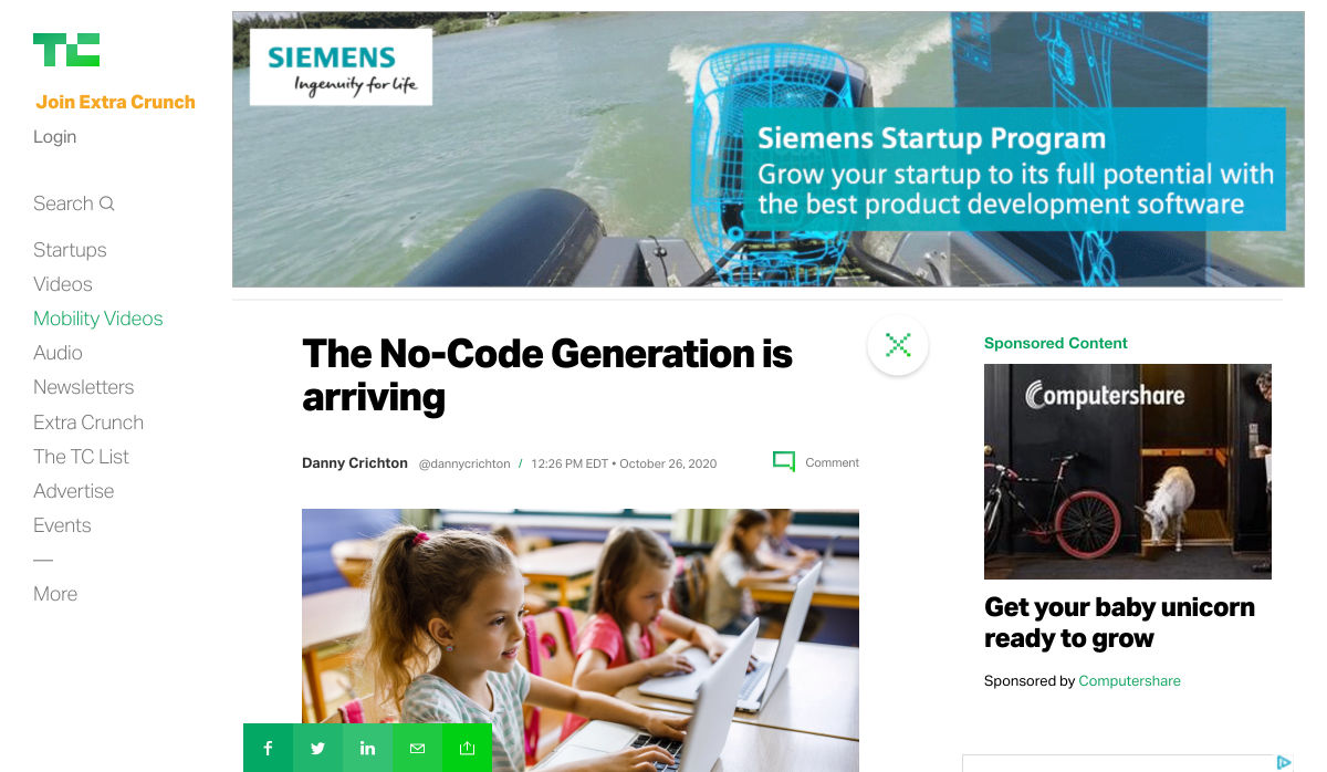
The No-Code Generation is Arriving
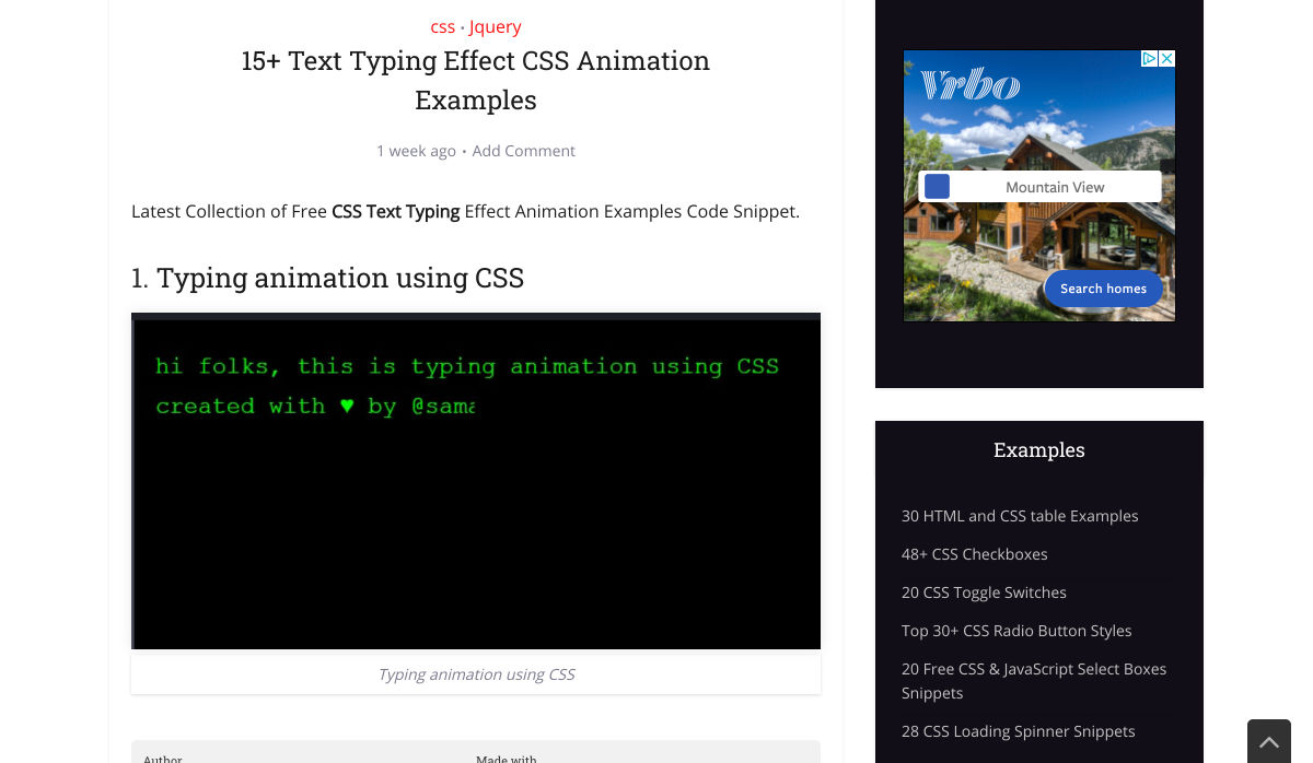
15+ Text Typing Effect CSS Animation Examples
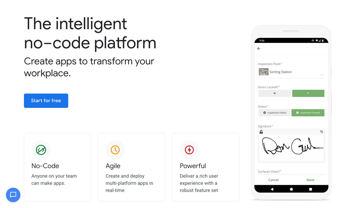
AppSheet by Google Workspace – No-code App Building Platform
Ecommerce Development Trends: The 2021 Edition
How Videos Can Boost your Website Ranking Results
5 Small Business Website Essentials You Need for your Site
The Psychology of User Decisions
Overflow for Windows – User Flow Diagramming Tool for Designers
How to Create an AI that Chats like You on WhatsApp
‘50 Shades of Blue’
Here’s Why Developers are in Love with Functional Programming
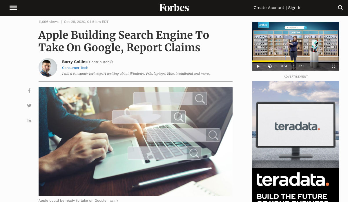
Apple Building Search Engine to Take on Google, Report Claims
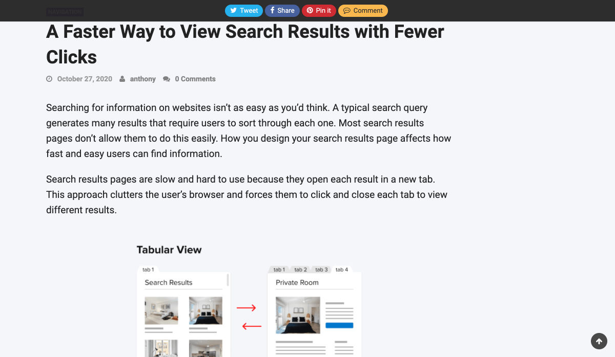
A Faster Way to View Search Results with Less Clicking
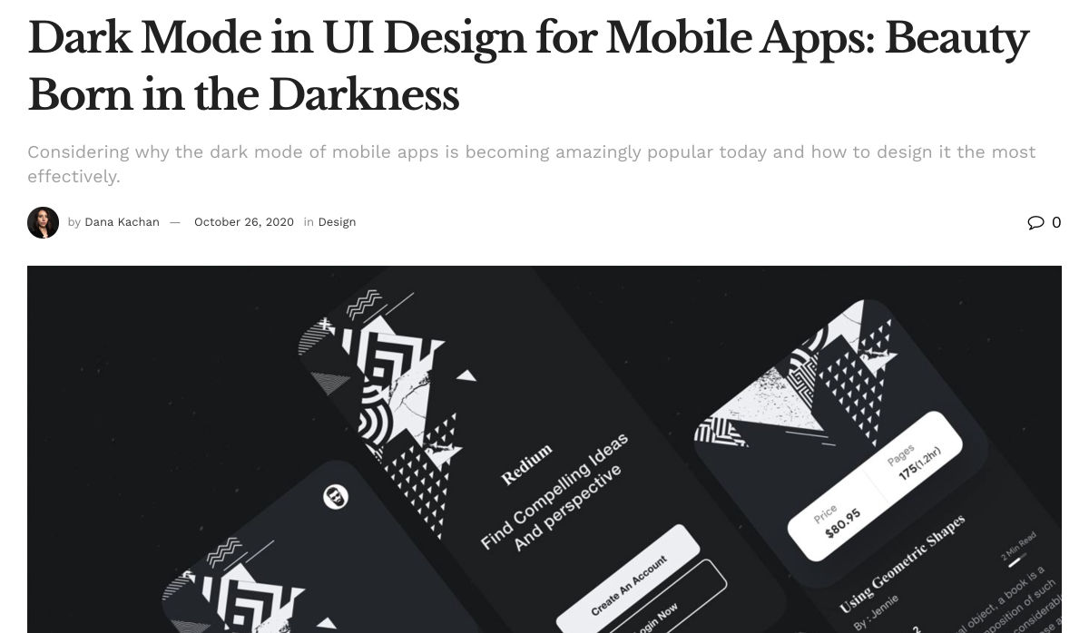
Dark Mode in UI Design for Mobile Apps: Beauty Born in the Darkness
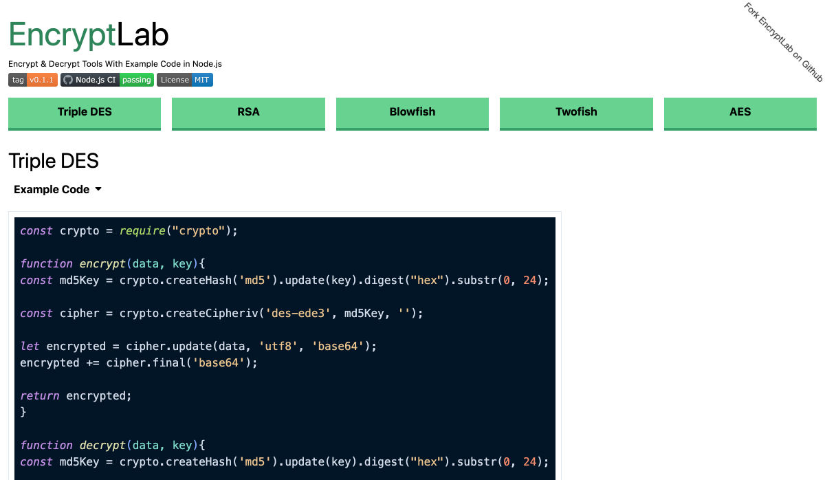
EncryptLab – A Collection of Free and Comprehensive Encryption Tools
Part of your World: Why We’re Proud to Build a Truly Native Mac App
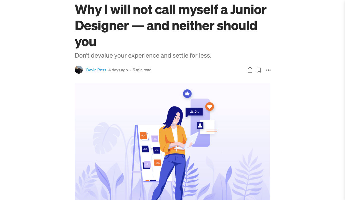
Why I will not Call Myself a Junior Designer?-?and Neither Should You
10 Usability Mistakes Most Designers Make on Checkboxes
People Problems
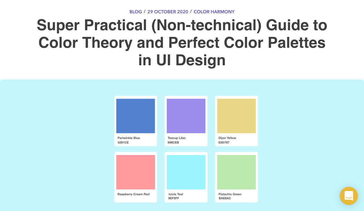
Practical Guide to Color Theory for UI Designers
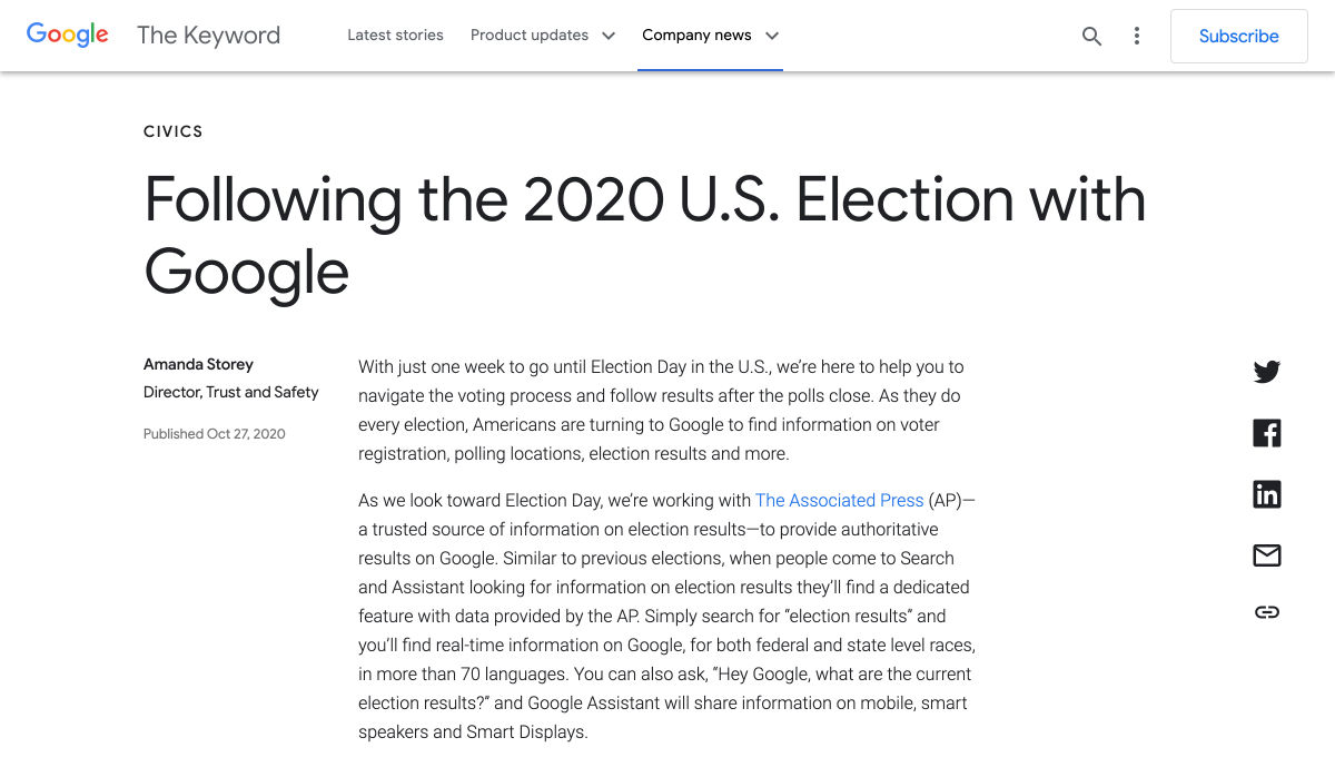
Following the 2020 U.S. Election with Google
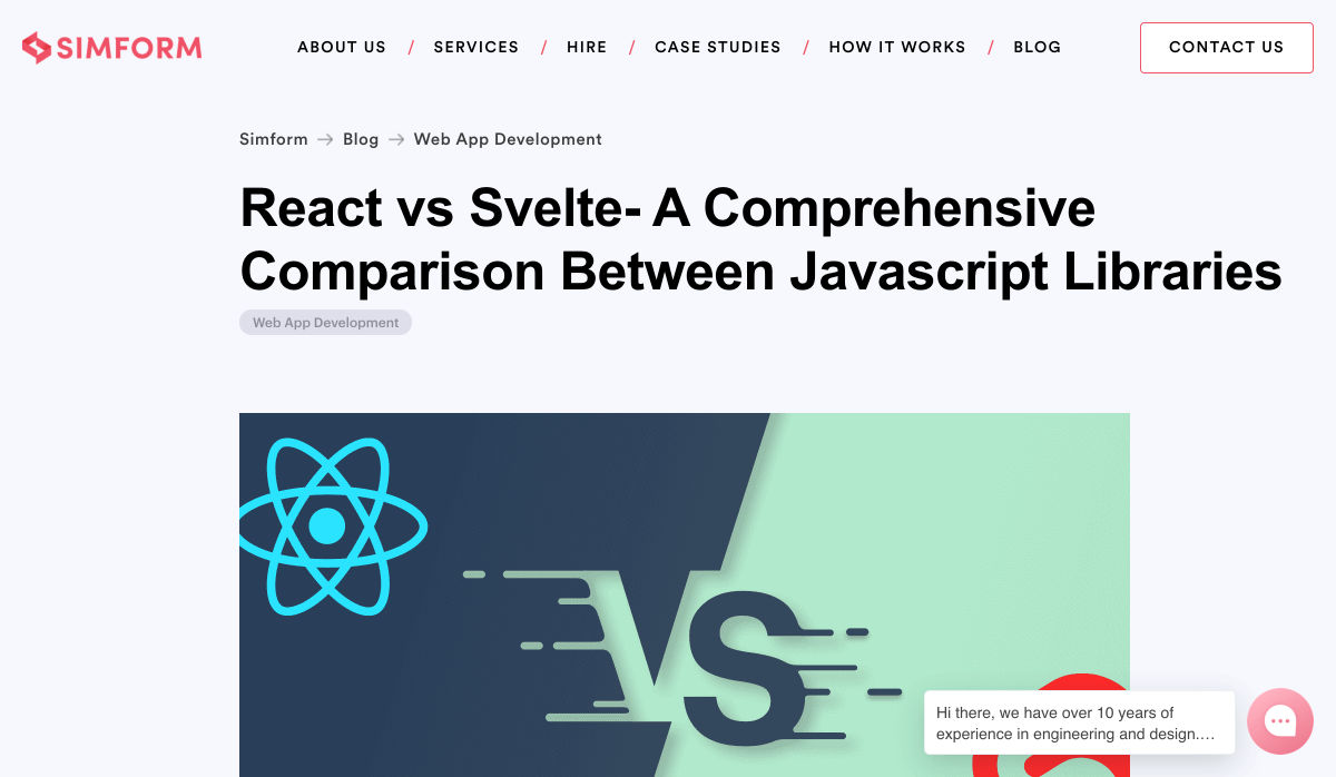
React Vs Svelte – A Comprehensive Comparison Between Javascript Libraries
Want more? No problem! Keep track of top design news from around the web with Webdesigner News.
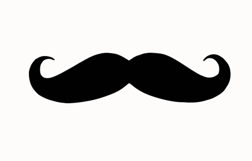
And with this new month comes some wonderful seasonal traditions.
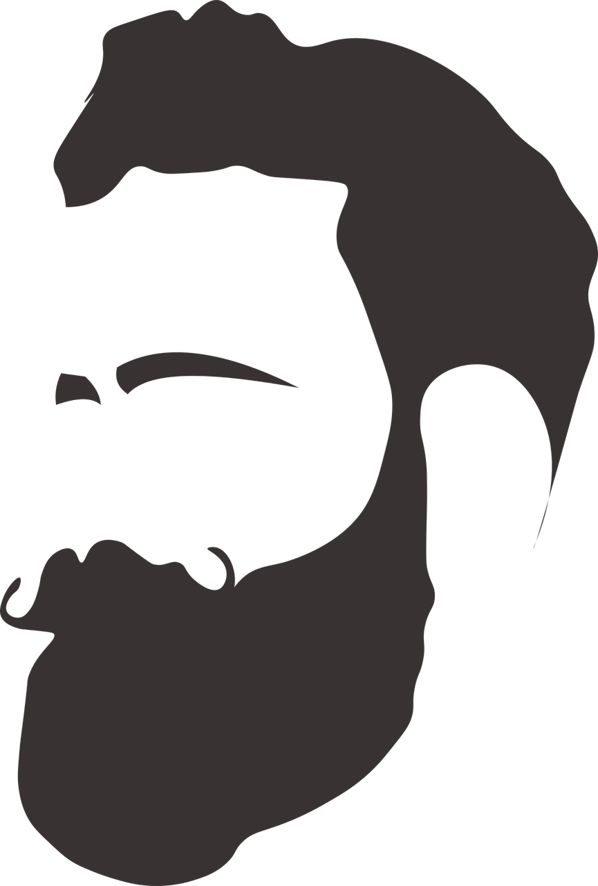
While many people are looking forward to Thanksgiving, Christmas, Hanukkah, or just relaxing around the house with friends and family, millions of people all around the world are celebrating Movember (or no-shave November).
As the name implies, this tradition encourages people to shave once at the start of November and then put their razors away till the end of the month.
This fairly new tradition came about to help raise awareness of men’s mental, physical, and sociological issues.
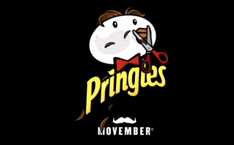
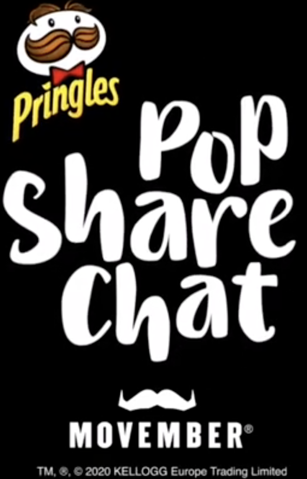
Many brands have taken up the cause and decided to shave their mascots’/logos’ facial hair.
In our opinion, Pringle’s new cleanly shaven face has stolen the spotlight.
This will be the first time Mr. Pringles has shaven off his mustache.
The brand began in the mid-20th century, meaning he has not shaved in over 50 years.
The real question we have on our minds is, “how long will it take to grow it back?”
Will the stache slowly grow back over the course of November? Will it be thicker and more gnarly by the end of November? Only time will tell.
Pop, Share. Chat
Pringles also decided to change its motto to “Pop, Share. Chat.”
This new slogan is designed to encourage men to talk openly with those close to them about the struggles they are facing as men.
According to one study in 2018, men were 3.65x more likely to end their own lives than their female counterparts.
While many experts disagree on what is the underlying cause of this discrepancy, our hope is that all men around the world this month will take up the true meaning of this cause.
Gather around with your friends and try to enjoy this season with others who care for you.
Happy holidays and let that facial hair grow wild!