Archive

Archive for November, 2020

11 Actionable Tips to Increase Customer Loyalty for Ecommerce

November 13th, 2020 No comments

Regardless of whether the business is small or big, customer loyalty is extremely important. Do you know, it costs you ten times more to grab and attract new customers than to retain the existing ones. As stated by smallbizgenius, 65% of the company’s revenue comes from existing customers.

If you are searching for appealable tips to create and retain customers, consider implementing a few of the strategies mentioned below.

What is Customer Loyalty?

Customer Loyalty is the willingness and readiness of customers to do repetitive business with the company or brand. It is the outcome of satisfaction, good customer experience, and overall quality of the goods and services that the customer receives from a business.

Why do you need to Increase Customer Loyalty?

If the business is small or large, customer loyalty is extremely important. It is difficult to win the hearts of first-time customers because they do not know about your products and services. The company needs a marketing move to make the purchase from your store. Moreover, the customers who have purchased from you before are more likely to buy from you as they trust the brand.

Here are some benefits of why customer loyalty is important:

  • Repeat customers spend more compared to first-time customers.
  • Helps to promote profit.
  • Loyal customers shop frequently.
  • Keeping old customers is cheaper than new ones.
  • Loyal customers produce high conversion rates.
  • Loyal customers will bring referral traffic and prove to be good word of mouth.
  • Customers who are loyal will understand when problems occur and trust the business to fix them.

11 Actionable Tips to Increase Customer Loyalty for Ecommerce

A business needs to make its customers happy because happy and satisfied customers will agree to spend frequently on your products and services. Here are a couple of tactics and strategies to build customer loyalty.

1. Maintain standards and don’t breach your promises

Authencity and trust impact more to build loyal customers. Be consistent in your services and brand. Provide standard quality products to the customers. Build familiar relations with your customers. Look after your brand, logo, value as if your reputation is at risk.

2. Be in touch with your clients and customers

Frequent communication with your customers will help you keep fresh in their minds. Take time to set up a database with the contact information of customers. Send timely reminders, personalized wishes, or monthly newsletters. Social media is another option to be in touch with your customers.

3. Offer different payment plans

Providing flexible payment methods for customers will help to build their trust and better the user experience of your store. For instance, if you are a wedding planner, you can offer an installment payment method to the customers. This will be manageable for the customer as it becomes difficult for the customers to pay the amount altogether. Besides this, let customers decide their own price of a product for your Magento store with Custom Price for Magento 2.

4. Reward loyal customers

Offering rewards to the most loyal customers is an amazing technique way to keep them returning to you. Loyalty points are the best way to reward customers. Whenever a customer makes a purchase, loyalty points will be added and they can redeem it anytime.

5. Make customer service a priority

Statistics by Nextiva states, across the globe, 96% of consumers say customer service is an important factor in their choice of loyalty to a brand. This shows customer service must be taken into primary focus. Customers remember the good and bad experience with your store. Accordingly, they will suggest their friends and family. So either you gain business or lose.

6. Encourage customers by adding VIP levels

Social mark holds great importance so you can take its advantage to increase customer loyalty. By adding VIP levels a business can increase the loyalty of the customers and customers will be attracted to be engaged with the business more. Start with small rewards for first-time customers, then increase the rewards for next time customers.

7. Take customer’s feedbacks and take action

Make it easy and simple for customers to provide feedback. Ask them why they opted for your store for buying and any improvement required in the services. Thank customers for their feedback. Take action on the feedback provided by them. Also, develop simple customer support so that the customers can contact you easily for assistance.

8. Stay sharp and active

To build customer loyalty, be on your toes on everything you do. Do not get careless with your marketing by sending bulk emails without personalized communication. These emails will only go to the spam folder. Instead, give a personalized touch to your emails that will encourage customers to read it. Wherever possible predict your customers’ needs before they even ask for.

9. Be as kind as your customers

From the outside looking in, loyalty programs seem to be a plan for customers to spend more money. Hence, a generous loyalty program will stand out from the rest. If your loyalty programs require customers to spend a lot of money in order to get small discounts, you are doing it wrong. Rather provide them rewards that they can enjoy even by spending less.

10. Provide a head start

Providing a head start on a loyalty program to your customers. Initial offers must be such that the customers can easily take their advantage. This will make them stick to the finish point.

11. Don’t’ just rely on technology

Even with the advancement in technology and the era of text messages and emails, nothing is like talking with a person. Automated phone services can save money but highly-trained customer representative can build loyalty.

Customer Loyalty Programs Examples

Look at the below offer by Dunkin’ Donuts.
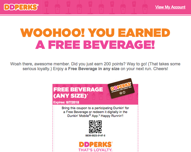
Source: Clickz

Love your pet? Enjoy great deals from the PetSmart loyalty program.
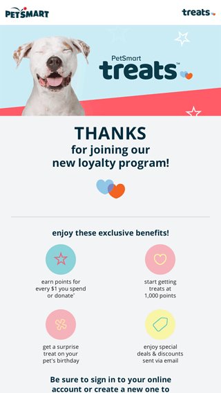
Source: Email Tuna

Look at the levels of perks created by Reebok. What type of customers can enjoy which service.

Source: Reebok

Over to you:

Loyalty and customer rewards programs can prove to be an effective way for customer retention, boost customer lifetime value, and inspire loyalty. Hopefully, the above tips and examples will help you build customer loyalty for your E-commerce business store. It will help to gain loyal customers who will frequent your business in the coming years.

Happy Reading!

Categories: Others Tags:

11 Actionable Tips to Increase Customer Loyalty for Ecommerce

November 13th, 2020 No comments

Regardless of whether the business is small or big, customer loyalty is extremely important. Do you know, it costs you ten times more to grab and attract new customers than to retain the existing ones. As stated by smallbizgenius, 65% of the company’s revenue comes from existing customers.

If you are searching for appealable tips to create and retain customers, consider implementing a few of the strategies mentioned below.

What is Customer Loyalty?

Customer Loyalty is the willingness and readiness of customers to do repetitive business with the company or brand. It is the outcome of satisfaction, good customer experience, and overall quality of the goods and services that the customer receives from a business.

Why do you need to Increase Customer Loyalty?

If the business is small or large, customer loyalty is extremely important. It is difficult to win the hearts of first-time customers because they do not know about your products and services. The company needs a marketing move to make the purchase from your store. Moreover, the customers who have purchased from you before are more likely to buy from you as they trust the brand.

Here are some benefits of why customer loyalty is important:

  • Repeat customers spend more compared to first-time customers.
  • Helps to promote profit.
  • Loyal customers shop frequently.
  • Keeping old customers is cheaper than new ones.
  • Loyal customers produce high conversion rates.
  • Loyal customers will bring referral traffic and prove to be good word of mouth.
  • Customers who are loyal will understand when problems occur and trust the business to fix them.

11 Actionable Tips to Increase Customer Loyalty for Ecommerce

A business needs to make its customers happy because happy and satisfied customers will agree to spend frequently on your products and services. Here are a couple of tactics and strategies to build customer loyalty.

1. Maintain standards and don’t breach your promises

Authencity and trust impact more to build loyal customers. Be consistent in your services and brand. Provide standard quality products to the customers. Build familiar relations with your customers. Look after your brand, logo, value as if your reputation is at risk.

2. Be in touch with your clients and customers

Frequent communication with your customers will help you keep fresh in their minds. Take time to set up a database with the contact information of customers. Send timely reminders, personalized wishes, or monthly newsletters. Social media is another option to be in touch with your customers.

3. Offer different payment plans

Providing flexible payment methods for customers will help to build their trust and better the user experience of your store. For instance, if you are a wedding planner, you can offer an installment payment method to the customers. This will be manageable for the customer as it becomes difficult for the customers to pay the amount altogether. Besides this, let customers decide their own price of a product for your Magento store with Custom Price for Magento 2.

4. Reward loyal customers

Offering rewards to the most loyal customers is an amazing technique way to keep them returning to you. Loyalty points are the best way to reward customers. Whenever a customer makes a purchase, loyalty points will be added and they can redeem it anytime.

5. Make customer service a priority

Statistics by Nextiva states, across the globe, 96% of consumers say customer service is an important factor in their choice of loyalty to a brand. This shows customer service must be taken into primary focus. Customers remember the good and bad experience with your store. Accordingly, they will suggest their friends and family. So either you gain business or lose.

6. Encourage customers by adding VIP levels

Social mark holds great importance so you can take its advantage to increase customer loyalty. By adding VIP levels a business can increase the loyalty of the customers and customers will be attracted to be engaged with the business more. Start with small rewards for first-time customers, then increase the rewards for next time customers.

7. Take customer’s feedbacks and take action

Make it easy and simple for customers to provide feedback. Ask them why they opted for your store for buying and any improvement required in the services. Thank customers for their feedback. Take action on the feedback provided by them. Also, develop simple customer support so that the customers can contact you easily for assistance.

8. Stay sharp and active

To build customer loyalty, be on your toes on everything you do. Do not get careless with your marketing by sending bulk emails without personalized communication. These emails will only go to the spam folder. Instead, give a personalized touch to your emails that will encourage customers to read it. Wherever possible predict your customers’ needs before they even ask for.

9. Be as kind as your customers

From the outside looking in, loyalty programs seem to be a plan for customers to spend more money. Hence, a generous loyalty program will stand out from the rest. If your loyalty programs require customers to spend a lot of money in order to get small discounts, you are doing it wrong. Rather provide them rewards that they can enjoy even by spending less.

10. Provide a head start

Providing a head start on a loyalty program to your customers. Initial offers must be such that the customers can easily take their advantage. This will make them stick to the finish point.

11. Don’t’ just rely on technology

Even with the advancement in technology and the era of text messages and emails, nothing is like talking with a person. Automated phone services can save money but highly-trained customer representative can build loyalty.

Customer Loyalty Programs Examples

Look at the below offer by Dunkin’ Donuts.

Source: Clickz

Love your pet? Enjoy great deals from the PetSmart loyalty program.

Source: Email Tuna

Look at the levels of perks created by Reebok. What type of customers can enjoy which service.

Source: Reebok

Over to you:

Loyalty and customer rewards programs can prove to be an effective way for customer retention, boost customer lifetime value, and inspire loyalty. Hopefully, the above tips and examples will help you build customer loyalty for your E-commerce business store. It will help to gain loyal customers who will frequent your business in the coming years.

Happy Reading!

Categories: Others Tags:

10 Reasons Your WordPress Site Will Get Hacked (and How to Stop It)

November 13th, 2020 No comments

A hacked WordPress site is as damaging as having your home burgled. It can completely shatter your peace of mind and adversely impact your online business.

Why do hackers target WordPress sites? The answer is relatively simple: WordPress is the single biggest platform for website creation these days, so there’s a larger base to attack; this attracts the attention of online criminals.

So, how can a hack impact your website?

Depending on the type of attack, your website could suffer any of the following:

  • It could be defaced completely;
  • It could load or operate very slowly on any device;
  • It could completely crash and malfunction;
  • It could display the dreadful “White Screen of Death”;
  • Its incoming visitors could be redirected to other suspicious websites;
  • It could lose all your valuable customer data.

This list is not exhaustive but you get the idea.

Now that we know how a successful hack can impact your website and online business, let us look at the top 10 reasons behind WP hacks and prevent them.

1. An Insecure Web Host

Like any website, WordPress is hosted on a web host or server. Unfortunately, most site owners do not pay much attention to the web host they select and choose the cheapest they can find. For example, it is more affordable to host a website on a shared hosting plan — one that shares its server resources with many other websites like yours.

This can make your site vulnerable to hackers as a successful hack into any website on the shared server. A single hacked site can consume the overall server bandwidth and impact all the other sites’ performance.

The only way to fix this problem is to opt for a reliable host and a virtual or dedicated server.

Pro tip: If you’re already using a shared hosting plan, check with your hosts if they offer VPS hosting and make the switch.

2. Use of Weak Passwords

Weak passwords are the main reason behind successful brute force attacks that target your account. Even to this day, users continue to use weak and common passwords like “password” or “123456”; if you’re one of them, your website could land in trouble!

Guessing weak passwords allows hackers to enter the admin accounts where they can inflict the maximum damage.

How do you fix this problem? Simple, ensure all your account users (including admin users) configure strong passwords for their login credentials. With at least 8 characters, passwords must be a mix of upper- and lower-case alphabets, numbers, and symbols.

For added safety, install a password management tool that can automatically generate and store strong passwords.

Pro tip: You can use a plugin to reset passwords for all your users.

3. An Outdated WP Version

Outdated software is among the most common reasons why websites get hacked. Despite being free to download, most site users defer updating their site to the latest version, for fears of updates causing their site to crash.

Hackers take advantage of any vulnerability or bug in an older version and cause issues like SQL Injections, WP-VCD Malware, SEO Spam & other major issues like website redirecting to another site.

How do you solve this problem? When you see a notification about an update on your dashboard, update your site as soon as possible.

Pro tip: If you are worried about updates crashing your live website, you can first test the updates on a staging site.

4. Outdated WP Plugins and Themes

Similar to the previous point, hackers also take advantage of outdated, unused, or abandoned plugins and themes installed on websites. With over 55,000 plugins and themes that are available, it is easy to install a plugin or theme, even from unsafe or untrusted websites.

Plus, many users do not update their installed plugins/themes to the latest version or do not find the updated version. This makes it easier for hackers to do their job & infect sites.

How do you avoid this problem? As with the core WP version, update each of your installed plugins/themes on your site regularly. Take stock of all the unused ones and remove them or replace them with better alternatives.

You can update your plugins/themes from your hosting account.

Pro tip: We suggest setting aside time every week to run updates. Test them on a staging site and then update your site.

5. Common Admin Usernames

In addition to weak passwords, users also create common usernames that are easy to guess.

This includes common usernames for admin users like – “admin”, “admin1”, or “admin123”. Common admin usernames make it easier for hackers to get into admin accounts and control backend files in your WP installation.

How do you avoid this problem? If you are using any such usernames that are easy to guess, change them immediately to a unique username. The easiest way of doing it is through your hosting account’s user management tool, by deleting the previous admin user and creating a new admin user with a unique username.

As the first step, change the default username of your admin user and limit users who have administrator privileges.

Pro tip: WordPress has 6 different user roles with limited permissions. Only grant admin access to users who really need it.

6. Use of Nulled Plugins/Themes

Coming back to the importance of plugins/themes, users have access to many websites that sell nulled or pirated copies of popular and paid plugins and themes. While these are free to use, they are often riddled with malware. They can compromise your website’s overall security and make it easier for hackers to exploit.

Being a pirated copy, nulled plugins/themes do not have any available updates from its development team, hence will not have any security fixes.

How do you fix this problem? Simple, for a start, only download original plugins and themes from trusted websites and marketplaces.

Pro tip: If you don’t wish to pay for paid or premium plugins and themes, opt for a free version of the same tools that will have limited features but are still safer to use than the nulled version.

7. Unprotected Access to wp-admin Folder

To take control of your site, hackers often try to break into and control your wp-admin folder in your installation. As the website owner, you must take measures to protect your wp-admin directory.

How can you protect your wp-admin folder? First, restrict the number of users having access to this critical folder. Additionally, apply for password protection as an added layer of security for access to the wp-admin folder. You can do this using the “Password Protection Directories” feature of the cPanel in your web host account.

Pro tip: Besides these fixes, you can also implement Two Factor Authentication (or 2FA) protection for all your admin accounts.

8. Non-SSL Website

You can easily migrate your HTTP website to HTTPS by installing an SSL certificate on your site. SSL (or Secure Socket Layer) is a secure mode of encrypting any data transmission between your web server and the client browser.

Without this encryption, hackers can intercept the data and steal it. Plus, a non-secure website can have many negative implications for your business – lower SEO ranking, loss of customer trust, or a drop in incoming traffic.

How do you fix this problem? You can quickly obtain an SSL certificate from your hosting company or SSL providers. It encrypts all data that is sent from and received by your website.

Pro tip: You can get a free SSL certificate from places like Let’s Encrypt, but these provide limit protection that will only be sufficient for a starter site or small site.

9. No Firewall Protection

Lack of firewall protection is another common reason why hackers can bypass website security measures and infiltrate the backend resources. Firewalls are the last line of defence against hackers and work like the security alarm installed on your house. Firewalls monitor web requests coming from various IP addresses, including the suspicious (or bad) ones.

They can identify and block requests that are known to be malicious in the past, thus preventing easy access for hackers to your website domain. Web application firewalls can thwart various attacks, including brute force attacks, XSS, and SQL injections.

Pro tip: A firewall provides much-needed security and is your first line of defence. But it’s important to also have a malware scanner installed.

10. Lack of WordPress Hardening Measures

Typically, hackers target the most vulnerable areas or weaknesses within a WP installation, to illegally access or damage the website. The WordPress team has identified these vulnerable areas and has devised a list of 12 hardening measures recommended for every website.

A few of these include:

  • Disabling the File Editor;
  • Preventing PHP execution in untrusted folders;
  • Changing the security keys;
  • Disallowing plugin installations;
  • Automatic logout of inactive users;

How do you implement these hardening measures? While some steps are easy to understand, others require the technical expertise of how WordPress works.

Pro tip: You can implement hardening measures on your own. However, some measures require technical expertise so in these cases, it’s much easier and safer to use a plugin.

Featured image via Pexels.

Source

Categories: Designing, Others Tags:

SVGBOX

November 13th, 2020 No comments

I’ve been saying for years that a pretty good icon system is just dropping in icons with inline where you need them. This is simple to do, offers full design control, has (generally) good performance, and means you aren’t smurfing around with caching and browser support stuff.

Along those lines… using isn’t the worst idea for icons either. It doesn’t offer as much fine-grained design control (although you can still filter them) and arguably isn’t quite as fast (since the images need to be fetched separately from the document), but it still has many of the same upsides as inline SVG icons.

Shubham Jain has a project called SVGBOX that offers icons-as- and removes one of the design-control limitations by offering a URL parameter to change colors.

Want an Instagram icon, but in red? Pass in red:

CodePen Embed Fallback

If you’re going to use a bunch of icons, the provided copy-and-paste code offers an “SVG sprite” version where the URL is like this:

<img src="//s.svgbox.net/social.svg?fill=805ad5#instagram">

That is going to increase the download weight of the icon (because it’s downloading all the icons from this set), but possibly be more efficient as it’s a single download not many. Hard to say if that’s more efficient or not these days, with HTTP/2 around.

What’s interesting is the #instagram part at the end of the URL. Just a hash-link, right? No! Fancier! In SVG land, that can be a fragment identifier, meaning it will only show the bit of the SVG that matches the proper element. Don’t see that every day.

Direct Link to ArticlePermalink


The post SVGBOX appeared first on CSS-Tricks.

You can support CSS-Tricks by being an MVP Supporter.

Categories: Designing, Others Tags:

How to Work With WordPress Block Patterns

November 12th, 2020 No comments

Just a little post I wrote up over at The Events Calendar blog. The idea is that a set of blocks can be grouped together in WordPress, then registered in a register_block_pattern() function that makes the group available to use as a “block pattern” in any page or post.

Block patterns are becoming upper-class citizens in the WordPress block editor. They were announced without much fanfare in WordPress 5.5 back in August, but have been given prominent real estate in the block inserter with its own tab next to blocks, including 10 or so default ones right out of the box.

Block patterns are sandwiched between Blocks and Reusable Blocks in the block inserter, which is a perfect metaphor for where it fits in the bigger picture of WordPress editing.

If the 5.6 Beta 3 release notes are any indication, then it looks like more patterns are on the way for default WordPress themes. And, of course, the block registration function has an unregister_block_pattern() companion should you need to opt out of any patterns.

What I find interesting is how the blocks ecosystem is evolving. We started with a set of default blocks that can be inserted into a post. We got reusable blocks that provide a way to assemble a group of blocks with consistent content across all pages of posts. Now we have a way to do the same, but in a much more flexible and editable way. The differences are subtle, but the use cases couldn’t be more different. We’ve actually been using reusable blocks here at CSS-Tricks for post explanations, like this:

We drop some text in here when we think there’s something worth calling out or that warrants a little extra explanation.

Any reusable block can be converted to a “regular” block. The styles are maintained but the content is not. That’s been our hack-y approach for speeding up our process around here, but now that block patterns are a thing, previous reusable blocks we’ve been using now make more sense as patterns.

Direct Link to ArticlePermalink


The post How to Work With WordPress Block Patterns appeared first on CSS-Tricks.

You can support CSS-Tricks by being an MVP Supporter.

Categories: Designing, Others Tags:

How Film School Helped Me Make Better User Experiences

November 12th, 2020 No comments

Recently, I finished a sixty-day sprint where I posted hand-coded zombie themed CSS animation every day. I learned a lot, but it also took me back to film school and reminded me of so many things I learned about storytelling, cinematography, and art.

Turns out that much of what I learned back then is relevant to websites, particularly web animations. Sarah Drasner made the connection between theater and development and I thought I’d extend some of those ideas as they relate to film.

A story makes everything more engaging

Humans love stories. I don’t need to quote you statistics on the billions of dollars spent on shows and books and games each year. If you can inject story into a website — especially when it comes to animation — it’ll be that much more interesting and appealing to your audience.

There are many ways to define what a “story” is, but as far as things go for the web where animations can be quick or subtle, I think a story only requires two things: a character and an inciting incident (which is simply a plot point that brings the protagonist — or main character — into the story).

Take the “Magical Oops” demo I made over at CodePen:

CodePen Embed Fallback

There’s not much going on, but there is a story. We have a character, the scientist, who invokes an inciting incident when he fires the shrink ray at the zombie. Instead of shrinking the zombie, the ray shrinks the zombie’s hat to reveal (and ultimately be worn by) a rabbit. Will you necessarily relate to those characters? Probably not, at least personally. But the fact that something happens to them is enough of an engaging hook to draw you in.

Sure, I lean toward funny and silly storylines, but a story’s tone can be serious or any other number of things.

I’m confident you can find a story that fits your site.

A story makes everything more personable

Humans anthropomorphize anything and everything. You know exactly what that feels like if you’ve ever identified with characters in a Pixar movie, like “Toy Story” or “Inside Out.” The character you add doesn’t have to be a literal living thing or representative of a living thing. Heck, my stories are about the undead.

How does that relate to the web? Let’s say your app congratulates users when completing a task, like Slack does when all unread threads have been cleared out.

The point is to add some personality and intentionality to whatever movement you’re creating. It’s also about bringing the story — which is the user task of reviewing unread messages — to a natural (and, in this case, a happy) conclusion. That sort of feedback is not only informative, but something that makes the user part of the story in a personable way.

If a viewer can understand the subject of the story, they’ll get why something moves or changes. They’ll see it as a character — even if the subject is the user. That’s what makes something personable. (You got it! Here’s a pony. ?)

Watch for the human’s smirk in my “Undead Seat Driver” pen:

CodePen Embed Fallback

The smirk introduces an emotional element that further adds to the story by making the main character more relatable.

Direct attention with visual depth

One of the greatest zombie movies of all time, Citizen Kane, reached popularity for a variety of reasons. It’s a wonderful story with great acting, for one, but there’s something else you might not catch when viewing the movie today that was revolutionary at the time: deep focus photography. Deep focus allowed things in the foreground and the background and the middle ground to be in focus all at the same time. Before this, it was only possible to use one focal point at a time. Deep focus made the film almost feel like it was in 3D.

We’re not constrained by camera lenses on the web (well, aside from embedded media I suppose), but one thing that makes the deep focus photography of Citizen Kane work so well is that director Orson Welles was able to point a viewer’s attention at different planes at different times. He sometimes even had multiple things happening in multiple planes, but this was always a choice.

Working with deep focus on the web has actually been happening for some time, even if it isn’t called that. Think of parallax scrolling and how it adds depth between backgrounds. There’s also the popular modal pattern where an element dominates the foreground while the background is either dimmed or blurred out.

That was the idea behind my “Hey, Hey, Hey!” pen that starts with a character in focus on a faraway plane who gives way to a zombie that appears in the foreground:

CodePen Embed Fallback

The opposite sort of thing occurs here in my “Nobody Here But Us Humans… 2” pen:

CodePen Embed Fallback

Try to think of a website as a 3D space and you’ll open up possibilities you may have never considered before. And while there are 3D transforms that work right now in your browser, that isn’t the only thing I’m talking about. There are tons of ways to “fake” a 3D effect using shading, shadows, relative size, blurs or other types of distortion.

For example, I used a stacking order to mimic a multi-dimensional space in my “Finally, alone with my sandwich…” pen. Notice how the human’s head rotation lends a little more credibility to the effect:

CodePen Embed Fallback

Take animation to the next level with scenes

Some of the work I’m proudest of are those where I went beyond silly characters doing silly things (although I am proud of that as well). There are two animations in particular that come to mind.

The first is what I call “Zombie Noon 2”:

CodePen Embed Fallback

The reason this one stands out to me is how the camera suddenly (and possibly as an unexpected plot twist) turns the viewer into a character in the story. Once the Zombie’s shots are fired, the camera rolls over, essentially revealing that it’s you who has been shot.

The second piece that comes to mind is called “Lunch (at) Noon” :

CodePen Embed Fallback

(I apparently got some middle school glee out of shooting hats off zombies’s heads. *shrugs* Being easily amused is cheap entertainment.)

Again, the camera puts things in a sort of first-person perspective where we’re facing a zombie chef who gets his hat shot off. The twist comes when a Ratatouille-like character is revealed under the hat, triggering a new scene by zooming in on him. Watch his eyes narrow when the focus turns to him.

Using the “camera” is an awesome way to bring an animation to the next level; it forces viewer participation. That doesn’t mean the camera should swoop and fly and zoom at every turn and with every animation, but switching from a 2D to a 3D perspective — when done well and done to deepen the experience — can enhance a user’s experience with it.


So, as it turns out, my film school education really has paid off! There’s so much of it that directly applies to the web, and hopefully you see the same correlations that I’ve discovered.

I’d be remiss if I didn’t call out something important in this article. While I think borrowing concepts from stories and storytelling is really awesome and can be the difference between good and great experiences, they aren’t the right call in every situation. Like, what’s the point of putting a user through a story-like experience on a terms and conditions page? Legal content is typically already a somewhat tense read, so adding more tension may not be the best bet. But, hey, if you’re able to introduce a story that relieves the tension of that context, then by all means! and, let’s not forget about users who prefer reduced motion.

Bottom line: These ideas aren’t silver bullets for all cases. They’re tools to help you think about how you can take your site and your animations the extra mile and enhance a user’s experience in a pleasant way.


The post How Film School Helped Me Make Better User Experiences appeared first on CSS-Tricks.

You can support CSS-Tricks by being an MVP Supporter.

Categories: Designing, Others Tags:

A Spreadsheet Importer You’ll Enjoy Using

November 12th, 2020 No comments

A great developer tool takes a painful task that would normally be a developer’s entire job, and makes it a pleasure to do. As a personal example, I’ve needed to build an image uploading experience many times in the past. I’ve hand-coded them and experienced far too much pain doing that. Then I used Filestack and it made everything not only much easier, but better.

You know what’s way harder than image uploads? Spreadsheet imports. Why? Because when users are uploading a spreadsheet, they aren’t just hosting the file — they are importing the data inside the spreadsheet, and that is a much trickier project. Fields need to get mapped to the right place. Bad data needs to be fixed in the back end. And everything needs to be fast and intuitive. Enter Flatfile. With their core product, Portal, you’ll never have to build your own spreadsheet importer again, thank god.

Allow me to walk you though this.

Your user has some data.

Let’s say you’re building a web software product that does some super useful thing. Who knows, say, it helps with automated marketing emails or something. Your customers want to import some of their customer data into your app so they can get started using it. They might have this data in a spreadsheet (e.g. a .csv or .xls file) because spreadsheets are a universal data transfer format (e.g. maybe the customer exported their data from another product).

You need to build an import experience.

Your web app won’t be nearly as useful and valuable to your customers if they can’t move their data into it quickly and easily. So you set out to build an intuitive import experience. You’re a developer, so you can do this. You build a file upload component. You build a file parser. You write docs about how it all works and your importer’s data expectations. Well, that’s how it could go, but you’re looking at weeks if not longer of development time, and the end result will be (I promise) lackluster. It probably won’t have robust error handling. It won’t have a polished UI. It won’t have countless hours of UX refinements from testing the complete experience.

Time to outsource it.

What if, instead of all that work, we could just write…

<FileImporter config={config} />

That’s basically what Flatfile does! Here’s a demo right here, that’s got enough complexity for you to really see what it’s capable of:

CodePen Embed Fallback

Before you ask… is it secure? Yes. GDPR compliant? Yes. SOC 2 Type 1? Yes. HIPAA? Yes. Can you run it on your own boxes? Yes.

Here’s an elegant import experience.

The user clicks a button and they get a full-page import experience where they can import their spreadsheet or manually enter data.

Your app will have requirements for what kind of data it is expecting, which you’ll configure. This importer will then look at the format of the customer’s data, and allow them to map over the fields you need, correctly, the first time.

Uh oh! There is some missing data. Flatfile does a wonderful job of highlighting exactly what that is. The customer has the option to fix it during an import. No need to re-import their CSV file. Users really have an intuitive opportunity to clean up the data and understand exactly what is going on. This would be extremely non-trivial to build yourself.

They can fix the problems, or just discard the bad data and proceed with importing.

And you’ll get nice clean JSON data out of that interaction for your app to use.

Build vs. buy?

You always gotta weigh these things when you’re building software products. In my experience, you better be really damn sure when you pick build instead of buy. I heavily weigh toward buy, particularly when what I’m buying is secondary to what I’m building. I feel that way because I made the mistake of building far too many times.

Most of us aren’t building uploader apps — we’re building some app that just needs customers to import data. I’d much rather let someone else get that part right while I get my part right. Me? I’d use Flatfile for spreadsheet importing in a heartbeat.


The post A Spreadsheet Importer You’ll Enjoy Using appeared first on CSS-Tricks.

You can support CSS-Tricks by being an MVP Supporter.

Categories: Designing, Others Tags:

How to improve your CX with a remote customer service team

November 12th, 2020 No comments

The entire world is currently experiencing extraordinary challenges in almost every aspect of its business model, with marketing platforms flooding businesses with ways to adapt to the new global way of working.

The severe effects that Covid-19 has had on corporate giants, business professionals, and rising talent has created a sense of necessary urgency amongst all business sectors to adapt and innovate. While the motivation for innovation is always welcomed and encouraged, it can become an extremely intimidating obstacle creating pressure and seemingly unmeetable expectations. This is especially true amongst businesses that prefer to be late adopters to innovations.

The intense disruption of basically everything we are used to as consumers and businesses has certainly led to accelerating growth and development amongst almost all sectors. We now have the privilege of seeing evolutions that we probably would not have seen for several years. This holds enormous benefits on a global scale that should be seen as opportunities to bypass certain processes in the growth cycle and elevate to an entirely new level of doing business. Of course, for the early adopters, this is a thrilling time to compete and perform, but for a great number of businesses, this is a time of great uncertainty. The overflow of information, articles, and advice on how to adapt to the new way of doing business can also be very overwhelming for a company that is still trying to determine what elements of their business needs to be adapted first.

One of the first elements that should be adapted is the structure of your customer service team. There is no longer the need for an entire team of employees to come to a fixed office space on a daily basis. The functions that they perform behind an office desk are the same functions that they can perform behind their own desk at home when given the right resources. There are many advantages as a result of not having a large office building to maintain. The first obvious one is the financial savings on overheads. The second one is the psychological effect it has on your employees. The list is endless.

The following factors highlight the relationship between improved customer service and a remote customer service team:

1. A Management tool will help the team to stay interconnected

When employees are working from a central management system and have the same access to certain platforms, it is easy for them to manage their tasks. It is also easy for the company to manage its employees. When the operational structure of a company and its employees is altered, it creates the risk of reduced control of various elements including customer service. As every person has a different way of working and managing themselves, the end-result of a geographically scattered workforce can be detrimental to the functionality of the company. It is therefore absolutely critical to establish and implement a management tool that will centralize systems and communications between employees to ensure they stay interconnected. It will also ensure that the company can effectively oversee the productivity of its employees. This will in turn ensure that the core function of customer service is achieved and excelled.

2. Customer experience will be enhanced through a skilled employee

Delivering satisfactory customer service is already a challenge in itself in a traditional customer-facing business. Being able to deliver the same level of service with a remote customer service team is even more challenging as the customer is exposed to additional elements that could negatively impact their experience. These elements include remote technical assistance, speed of response, and quality of communication. Consequently, it is essential to ensure that employee servicing customers are confidently skilled to meet and exceed the customers’ service delivery expectations. Over and above the standard skills the employee is required to have for this specific function, they need to have an x-factor. This factor is the ability to first understand what the customer wants, and secondly knowing what needs to be done to deliver on that need. Lastly, the employee must be skilled enough to satisfy this need proactively.

3. A happy employee is a productive employee is a satisfied customer

The ROI of a happy employee is often underrated by companies. The topic of employee wellness leading to increased productivity has always been a controversial one. Nevertheless, it remains an extremely important factor to take into consideration when analyzing the interpersonal health of a company. There is no doubt that the well-being of an employee can directly be seen in the work they deliver. One of the biggest advantages this global pandemic has had on the way companies conduct business is the fact that it has more opportunity than ever before to enhance the overall well-being of its employees. This not only benefits the employees but the company as well as they will reap the fruits through improved customer experiences leading to improved overall customer satisfaction. There are several elements employees are no longer exposed to by having the opportunity to work from home or a location of their choice. They have the freedom to choose how much time they are willing to spend on commuting. Having the opportunity for reduced commuting will reduce premature daily exhaustion. By merely giving employees the freedom to balance their work-life relationship will reduce stress and agitation.

4. Do not only respond to a customer but also engage with them

The quality of a service being delivered to a customer is the most important element in any business sector. Careful consideration should be given to this element in terms of execution and sustainability. A meaningless service provided hastily does more damage than no service at all. It is critical to ensure that employees actively engage with a customer through learning the customer’s request in detail. Thereafter the employee should strategically derive an action plan on how to successfully resolve or deliver the customer’s request. Only after the employee is confident that he can conclude the service adequately should he do so. The company should be mindful of reinforcing this concept into the minds of its employees and provide them with the right tools to execute this function. Regular online meetings and training sessions can be held to help employees stay on top of their game when it comes to customer service delivery.

Traditionally centralized customer service teams have many advantages to ensure satisfactory service delivery. It has been perfected over the years and has reached maturity in its lifecycle. While remote teams are a relatively new concept for the majority of companies around the world, it carries its own set of challenges. However, it can certainly be used as a functional tool to improve customer service experience. In many cases, it offers even greater prospects than traditionally centralized teams and should be seen as an opportunity for companies to increase their service delivery ability and customer satisfaction. Initiating this process can be challenging and it might seem like a risky decision. To ensure that your company is adequately equipped to take this step, do enough research so that you are fully aware of all the consequential factors. At the same time do not wait too long before starting this process as it is essential to be part of the business evolution in order to stay relevant and competitive.


Photo by Annie Spratt on Unsplash

Categories: Others Tags:

My WordPress Comments Wishlist

November 12th, 2020 No comments

A built-in commenting system is one of the reasons people reach for WordPress (and often stay there long-term). While I do think having a comment system is compelling (and as big of a fan of building on WordPress as I am), I find the comments system on WordPress quite crusty. It needs some love! There is so much more potential there! Here’s my list.

I don’t have any inside WordPress knowledge to inform me about how difficult any of these ideas would be, what other things they may affect, and what conversations have already been had around them. While I personally like these ideas, I’m fully aware that software decisions, particularly at this scale, are not lightly made. So all that said, this wishlist is almost like a design exercise and could be considered user feedback.

Comments should be user-owned and editable.

I find it highly weird that a logged-in user can leave a comment, but the comment isn’t “owned” by them. There doesn’t seem to be a direct connection between their account and the comment they just left. Seems like if you actually have an account, that would be an obvious thing to attach. People leave typos in comments all the time and it would be much less frustrating for them if they could just edit them. Maybe there could be a way to offer that edibility even without an account, like some editing timeout window.

As an admin user, I can edit comments in the admin area. This is what I’d expect a logged in user could do on their own comment.

Is this something BuddyPress does? I don’t know. I know with bbPress that users own (and thus can edit) their topics and replies (possibly time-limited), but that functionality doesn’t seem to extend to post comment threads.

There should be social auth for comments.

Having to manually type out your name and email address and all that to leave a comment feels like too much effort these days. I’d bet that alone detracts many would-be commenters. Commenting systems like Disqus make this quick and easy, and with social media I’m so used to being able to type a reply and respond immediately. On a WordPress comment form, I should be able to click a button to have the legwork of knowing my name and email and such taken care of for me. That might even be my ticket for editing it later.

Jetpack offers social media auth for comments, but if you turn that on, the UI for commenting is d, so you have no design control or anything.

Also, the UI where it first shows up as a little narrow textarea block that you click into to expand into a comment area is also unchangeable and just doesn’t work that well with my style. I wouldn’t mind if this was Jetpack-powered functionality, I just want more control.

The login form you get from Jetpack, which is like WordPress.com

There should be a HTML tag whitelist.

I find when people type a

, they don’t expect to have to escape it lest it be stripped. They expect it to just show

. Even web developers.

I see people “screw up” (not entirely their fault) the HTML in comments like this a ton. Jetpack offers Markdown in comments, which is a massive improvement because it becomes so easy to use backticks. I think native WordPress should support that. But even then, not everyone knows Markdown, let alone how it deals with HTML (e.g. when does it escape HTML and when does it not).

I’ve been thinking about this for a decade and I’m still not sure the best solution, but a whitelist seems like it could help a lot. For example, you can use a and it will make text italic, but a tag like

is not on the whitelist and is automatically escaped.

Comments should be previewable.

A preview gives people a chance to make sure their comment looks right, and probably just as importantly, one more chance to think before hitting the submit button.

Replies should generate email notifications.

Jetpack offers a feature that allows users to subscribe either to your blog itself (email notifications of newly published posts) or to comments on the particular post the user is commenting on.

In the case of new blog post emails, those come from WordPress.com, and you don’t have any control over them (e.g. design control or control over what kind of posts trigger them). It’s still kind of a cool feature, but if you’re serious about delivering new content to users, you might be better off with a more custom workflow.

Notifying users of new comments seems like a great feature for any commenting system. When I leave a comment, I feel invested, and there is a good chance I want to follow the continued conversation. Although, even more likely, I’d just want to hear about replies to my specific comment. WordPress already generates so many emails for things, this doesn’t feel out of scope.

Replies should show parent comment(s).

When looking at the site itself, replies are fairly obvious. They are nested under the parent comment they reply to. Context is always there. But there are other places where you can see a reply comment and be totally missing that context:

  1. Email notifications of reply comments don’t include the parent thread
  2. The comments area in the admin (or WordPress app)

The later includes a “In Reply To [Name]” link, but all it does is link to the front end of the site where that parent comment lives, it doesn’t do anything extra helpful like expand inline or show a popup preview.

Comment emails should be better looking.

I have a plugin on CSS-Tricks called Clean Notifications that hasn’t been updated in 13 years and it still works just fine. All it does is clean up the emails so there aren’t long gnarly URL’s in them, and instead, just have regular HTML links.

Default new comment emails: full of long gnarly URLs
With Clean Notifications on, things are cleaned up a little.

I’d vote that the default WordPress-generated emails could have a whole round of design love. Basic HTML email usage would allow link usage and basic typography that would make them all much nicer.

Look how nice and simple Lee Monroe’s HTML email template is.

Comment emails should have actionable links

There are links to Delete and Spam a comment, but they don’t actually do those things, they take you to a page where then you have to click another link to perform the action. If I’m auth’d, it should just do the action.

Ajax

Comment actions (particularly leaving a new comment) should be doable without requiring a full page refresh. Full page refreshes feel old in the same way that lacking quick social auth feels old.

Comment replies already have a special script that gets enqueued on WordPress themes. That script handles the job of manipulating the DOM and moving the comment form up next to comments when a “Reply” link is clicked (if you enable that feature). So there is a precedent for comment-specific JavaScript on arbitrary themes.

I would think it’s possible to write more JavaScript that would allow for Ajax submission of new comments and DOM manipulation to do whatever happens next (show the comment, show approval messaging, show errors, etc). There is precedent for this, as well as third-party plugins and blog posts about hand-rolled implementations. Personally, I just don’t want that technical debt, I just want it to work.

More comment actions

I’ve long run a plugin to help me “feature” or “bury” comments in a thread. It’s not particularly complex, as it just updates some metadata on individual comments, then lets me apply those states with a class and style them in CSS. I don’t know that all sites need this kind of thing, but… Jetpack offers the ability to add a button to “Like” a post like you can on WordPress.com. Why not comments too? If people could vote on comments, it could do useful things like allow the default sort of comments to be based on up-votes or likes rather than chronological order alone. I think people care far more about interesting comments than they do about seeing them in date-time order.

So perhaps additional comment actions could be…

  • Upvote
  • Downvote
  • Report as spam
  • Report as harmful (or a Code of Conduct violation)
  • Save / Pin

Speaking of voting, if comments were owned by users, and comments had data about quality, perhaps users with lots of good comments could be rewarded in various ways. Right now, you essentially have to choose to either moderate all comments or not, but it could be that you only moderate comments from people with low/bad/no quality scores. Not to mention calling out comments in threads from known-good commenters.

Sorting

Assuming we get some sort of voting system for comments, it makes sense for comments to be ordered by votes by default. Or at least an option for sorting in addition to the chronological order.

Front-end powers

I think it would be neat if you could do all the things you can do on the back end with a comment on the front end. For example, edit the comment, delete it, spam it, update metadata, etc.

Permissions role for comment moderator

On sites with thriving comment threads (like all sites would be if they had these awesome changes amiright?) it would be nice to be able to invite trusted community members to moderate comment threads. Not admins of the whole site. Not authors or editors. Just people who have permission to deal with comments and comments alone.

Not a real thing.

This was partially inspired by Jeremy Felt’s recent post and partially a continuation of my own thoughts. Jeremy mentions ideas like private comments (interesting, but not mega compelling to me) and Webmentions support (yes please!). Maybe this will go somewhere.


The post My WordPress Comments Wishlist appeared first on CSS-Tricks.

You can support CSS-Tricks by being an MVP Supporter.

Categories: Designing, Others Tags:

Libraries for SVG Drawing Animations

November 11th, 2020 No comments

In 2013, Jake Archibald introduced this cool trick of animating an SVG path to look like it’s drawing itself. It’s 2020 now, and the trick is still popular. I’ve seen it on a lot of websites I’ve visited recently. I, too, feature an animated SVG loader on my website using one of the libraries I’ll introduce below.

In a previous article, Chris Coyier wrote about how SVG path animations work under the hood, using the CSS stroke-dasharray and stroke-dashoffset properties. In this article, I want to introduce you to four JavaScript libraries that can be used to create SVG path drawing animations with fewer lines of code, like this cool example. Why a library? Because they’re ideal for complex animations involving two or more SVGs with multiple paths.

To get started, l’ll first secure an SVG to demo. Let’s use this castle from svgrepo. The castle SVG downloads as an SVG image. But, since we’re dealing with path animation, what we need is the code format of the SVG. To get this, I’ll import the file into Figma and use the “Copy as SVG” feature (Right Click ? Copy/Paste ? Copy as SVG) to grab the SVG code.

To successfully animate an SVG path, the SVG shape should have a fill of none and each individual SVG path must have a stroke (we’ll set it to #B2441D) and a stroke-width (set to 2px).

The animation effect we want to create is to first draw the outline (or stroke) of the SVG and then fill in the different colors. In total, there are six different fill colors used throughout the SVG, so we’ll remove the fill color from each path and give paths of the same color the same class name.

  • #695A69: color-1
  • #B2441D: color-2
  • #DFDOC6: color-3
  • #C8B2A8: color-4
  • #DE582A: color-5
  • #AO8A8A: color-6

After all the modifications, here’s what the SVG code looks like:


<svg id="svg-castle" width="480" height="480" viewBox="0 0 480 480" fill="none" xmlns="http://www.w3.org/2000/svg">
  <path d="M231.111 183.761V150.371C231.111 149.553 231.774 148.889 232.592 148.889H24  7.407C248.225 148.889 248.889 149.552 248.889 150.371V183.761L258.342 206.667H271.111  V135.556H240H208.889V206.667H221.658L231.111 183.761Z" stroke="#B2441D" stroke-width="2px" class="color-6" />
  <path d="M311.111 420H288.889V455.556V468.889H311.111V455.556V420Z" stroke="#B2441D"   stroke-width="2px" class="color-1" />
  <path d="M191.111 420H168.889V455.556V468.889H191.111V455.556V420Z" stroke="#B2441D" stroke-width="2px" class="color-1" />
  <path d="M168.889 220V228.889V237.778H222.222V228.889H212.487L221.658 206.667H208.88   9H169.524L177.778 220H168.889Z" stroke="#B2441D" stroke-width="2px" class="color-2"/ >
  <!-- etc. -->
</svg>

That’s all the SVG preparation we need. Let’s look at how to achieve the desired animation with the different libraries.

Library 1: Vivus

Vivus is a lightweight JavaScript class (with no dependencies) that allows you to animate SVGs like they’re being drawn. The library is available using any of these options. To keep things simple, we’ll use a CDN link:

<script src="https://cdnjs.cloudflare.com/ajax/libs/vivus/0.4.5/vivus.min.js" integrity="sha512-NBLGIjYyAoYAr23l+dmAcUv7TvFj0XrqZoFa4i1o+F2VvF9SrERyMD8BHNnJn1SEGjl1AouBDcCv/q52L3ozBQ==" crossorigin="anonymous"></script>

Next, let’s create a new Vivus instance. It takes three arguments:

  1. The ID of the target element (the SVG)
  2. An options object with a dozen possible values
  3. A callback function that runs at the end of the animation

Looking back at our SVG code, the SVG ID is svg-castle.

new Vivus('svg-castle', { 
  duration: 200, type:'oneByOne'
});

Now, let’s write a callback function that fills the paths with the different colors we’ve defined:

function fillPath(classname, color) {
  const paths = document.querySelectorAll(`#svg-castle .${classname}`);
  for (path of paths){
    path.style.fill = `${color}`;
  }
}

The fillPath function selects all paths in the svg-castle element with the supplied classname, loops through and fills each path with the specified color. Remember in a previous step, we removed the fill from each path and gave each path a same fill class (color-1, color-2, etc.).

Next up, we call the fillPath function for the six different classnames and their corresponding colors:

function after() {
  fillPath('color-1', '#695a69');
  fillPath('color-2', '#b2441d');
  fillPath('color-3', '#dfd0c6');
  fillPath('color-4', '#c8b2a8');
  fillPath('color-5', '#de582a');
  fillPath('color-6', '#a08a8a')
}

That’s the callback function passed to the Vivus instance. See Pen for full implementation.

CodePen Embed Fallback

Library 2: Walkway.js

Walkway is a light-weight SVG animation library for path, line and polygon elements. To start using it, we can either add the library using npm, yarn, or with a CDN link like we did with Vivus. We’ll go with the CDN link once again:

<script src="https://cdn.jsdelivr.net/npm/walkway.js/src/walkway.min.js"></script>

With Walkway, we create a new Walkway instance, passing an options object as an argument. Then, we call the draw method on the new instance and pass in an optional callback function which will be run at the end of the draw animation. Again, very much like Vivus.

We’ve already written the after callback function in the previous example, so the rest should be a piece of cake:

const svg = new Walkway({
  selector: '#svg-castle',
  duration: 3000,
});

svg.draw(after);
CodePen Embed Fallback

Library 3: Lazy Line Painter

Lazy Line Painter is a modern JavaScript library for SVG path animation. It requires minimal code to setup. However, if a GUI is more of your thing, you can use the Lazy Line Composer which is a free online editor for SVG path animation from the same makers. The SVG will be exported as an animated SVG file that can be used directly anywhere.

The basic setup for Lazy Line Painter is similar to what we’ve already done in the other examples. First, get the library using either npm or a CDN link. Just like the previous examples, we’ll use a CDN link:

<script src="https://cdn.jsdelivr.net/npm/lazy-line-painter@1.9.4/lib/lazy-line-painter-1.9.4.min.js"></script>

Then, we initialize a new LazyLinePainter instance, which accepts two parameters — a selector (the ID of the target SVG element) and a config object. Let’s call the paint method on the new instance:

// select the svg by id
let svg = document.querySelector('#svg-castle')

// define config options
let options = {
  strokeDash: '2, 2',
}
// initialize new LazyLinePainter instance
let myAnimation = new LazyLinePainter(svg, options)

// call the paint method
myAnimation.paint()

A full list of config options are available in the library docs. Unlike the previous libraries, we don’t pass a callback function to the paint method. Instead, we’ll listen for the complete:all event handler on the animation and then pass in the callback function.

myAnimation.on('complete:all', (event) => {after()});

We can also control when the paint method runs using event listeners like we’ve have done in the following codepen demo. Click on the castle to re-run the animation.

CodePen Embed Fallback

Library 4: Framer Motion

Framer Motion is a bit different from other libraries we’ve covered. It’s a production-ready open-source animation library for React components with tons of possible animation types. And, yes, this is from the same team behind the popular Framer prototyping tool.

First up, we’ll install the library with npm in the terminal:

npm install framer-motion

For SVG path drawing animations, Framer Motion provides a motion.path component that takes four props:

<motion.path
  d={pathDefinition}
  initial={{ pathLength: 1, pathOffset: 0 }}
  animate={{ pathLength: 0, pathOffset: 1 }}
  transition={{ duration: 2 }}
/>

To use it, we’ll simply convert our SVG paths to motion.path, like this:

import React from 'react';
import { motion } from "framer-motion";
const AnimatedCastle = () => {
  return (
    <svg id="svg-castle" width="480" height="480" viewBox="0 0 480 480" fill="non            e" xmlns="http://www.w3.org/2000/svg">
      <motion.path d="M311.111 420H288.889V455.556V468.889H311.111V455.556V420Z"              stroke="#B2441D" stroke-width="2" className="color-1"
       initial={{ pathLength: 1,fill:"none", opacity:0, }}
       animate={{ pathLength: 0,fill:"695A69", opacity:1 }}
       transition={{ duration: 2 }}
      />
      <motion.path d="M191.111 420H168.889V455.556V468.889H191.111V455.556V420Z"                stroke="#B2441D" stroke-width="2" className="color-2"
        initial={{ pathLength: 1, fill:"none", opacity:0, }}
        animate={{ pathLength: 0, fill:"#b2441d", opacity:1}}
        transition={{ duration: 3 }}
      />
         
      <!-- etc. -->
    </svg>
  )
}

This has to be done for each SVG path. See this demo for full implementation:

CodePen Embed Fallback

There’s a caveat though: the castle SVG has over 60 paths, which is a lot. Going through them was quite daunting for me, and I found the process to be repetitive and prone to errors. For that reason, I don’t recommend Framer Motion but I would say that it is well suited for SVGs within React components with no more than five paths. For anything more than that, go with any of the previous libraries we covered.

Conclusion

That’s a look at four JavaScript libraries we can use to get hand-drawn SVG effects.

Why didn’t we cover a CSS-only solution? While it’s possible to do, it involves a lot of code repetition. For example, it means finding the total length of each path using JavaScript or with this cool trick that sets each path length to 1, and then sets the stroke-dasharrray and stroke-dashoffset of each path to its path length.

After that, we still need to define keyframes to animate the stroke-dashoffset to zero. Then, those keyframe animations will be added to each path and with an animation-delay to offset things a bit. We also have to write six different keyframe rules to fill the paths with their respective colors. Considering that the castle has over 60 individual paths, that’s over 100 lines of CSS! Not exactly the most efficient or straightforward approach.


The post Libraries for SVG Drawing Animations appeared first on CSS-Tricks.

You can support CSS-Tricks by being an MVP Supporter.

Categories: Designing, Others Tags: