Archive

Archive for December, 2020

Thank You (2020 Edition)

December 31st, 2020 No comments

Heck of a year, eh? Like we do ever year, I’d like to give you a huge thanks for reading CSS-Tricks, and recap the year. More downs than ups, all told. Here at CSS-Tricks, it was more of a wash. Allow me to me share some numbers, milestones, and thoughts with you about our journey of 2020.

Let’s do the basic numbers

The site saw 94m pageviews this year. Last year we lost a smidge of pageviews (from 91m to 90m), so it’s nice to see that number go back up again, setting a new high record. Now I don’t have to tell myself stories like “jeez usage of browser extensions that block Google Analytics must be up.” Hitting 100m pageviews will be a nice milestone some future year. This number, long term, climbs very slowly. It’s a good reminder to me how much time, money, and energy are required to just maintain the traffic to a content site, let alone attempt to drive growth.

I have Cloudflare in front of the site this year. I think that’s a good idea generally, but especially now that they have specific technology to make it extra good. I’m a fan of pushing as much to the edge as we can, and now it’s not only static assets that are CDN-served but the content as well.

I mention that because now I have access to Cloudflare analytics, so I can compare across tools. I can’t see a whole year of data on Cloudflare, but comparing last month’s unique visitors between the two services, I see 6,847,979 unique visitors on Cloudflare compared to 6,125,272 sessions (or 7,449,921 unique page views — I’m not sure which is directly comparable) on Google Analytics. They seem pretty close. Closer than I thought they would be, since Google Analytics requires client-side JavaScript and Cloudflare analytics are, presumably, gathered at the DNS level, and thus not blockable like client-side JavaScript. I’ve turned off the WordPress-powered analytics for now, as having three places for analytics seemed a bit much, although I might flip them back on because, without them, I can’t see top on-site search results, which I definitely like to have.

Traffic that comes from organic¹ search was 77.7% this year, versus 80.6% last year. A 3% swing feels pretty large, yet almost entirely accounted for by a 3% swing from 9% to 12% in “direct” traffic. I have no idea what to make of that, but I suppose I don’t mind a better diversification in sources.

I find these end-of-year looks at the numbers sorta fun, but I’m generally not a big analytics guy. Last year I wrote:

There is a bunch of numbers I just don’t feel like looking at this year. We’ve traditionally done stuff like what countries people are from, what browsers they use (Chrome-dominant), mobile usage (weirdly low), and things like that. This year, I just don’t care. This is a website. It’s for everyone in the world that cares to read it, in whatever country they are in and whatever browser they want to.

I feel even more apathetic toward generalized analytics numbers this year. I think analytics are awesome when you have a question in mind you want an answer to, where the numbers help find that answer. Or for numbers that are obviously important and impactful to your site that you determined for yourself. Just poking around at numbers can fool you into thinking you’re gathering important insights and making considered decisions when you’re kinda just picking your nose.

One question that does interest me is what the most popular content is by traffic (we’ll get to that in a bit). Looking at the most popular content (by actual traffic) gives me a sense of what brings people here. Bringing traffic to the site is a goal. While we don’t generally sell sponsorship/advertising based on page views directly, those numbers matter to sponsors and fairly correlate directly to what we can charge.

Another bit of data I care about is what people search for that bring them to the site. Here’s how that breaks down:

  • Top 10: Various combinations of terms that have to do with flexbox and grid layout
  • Mixed into the top 20: Various alterations of the site’s name

From there, 10-100 are “random specific CSS things.” Beyond 100 is where SVG, JavaScript, design stuff, and CSS are sprinkled into the mix. The 251st ranked search term is the first time React shows up. The insight here is that: (1) our layout guides continue to do very well, (2) a lot of people like to get to the site first, then find what they need, and (3) searches for library-specific content isn’t a particularly common way to land here.

Top posts of the year

Thanks to Jacob, we can look at analytics data based on the year the content was written (and a few other bits of metadata).

Here’s an interesting thing. In 2019, articles written in 2019 generated about 6.3m page views. Those same articles, in 2020, generated 7.3m page views. Neat, huh? The articles drove more traffic as they aged.

Articles written in 2020 generated 12m pageviews. Here’s the top 10:

  1. CSS-Only Carousel
  2. Fluid Width Video (cheat, as this was written a few years ago as a stand-alone page, and I only moved it to the blog in 2020)
  3. How to Create an Animated Countdown Timer With HTML, CSS and JavaScript
  4. A Complete Guide to Links and Buttons
  5. The Hooks of React Router
  6. A Complete Guide to Dark Mode on the Web
  7. Neumorphism and CSS
  8. A Complete Guide to Data Attributes
  9. Why JavaScript is Eating HTML
  10. Front-End Challenges

Interesting backstory on that list. I dug into Google Analytics and created that Top 10 list based on the data it was showing me in a custom report, which Jacob taught me to do. Serendipitously, Jacob emailed me right after that to show me the Top 10 that he calculated, and it was slightly different than mine. Then I went back and re-ran my custom report, and it was slightly different than both the others. Weird! Jacob knew why. When you’re looking at a huge dataset like this in Google Analytics, they will only sample the data used for the report. It will show you a “yellow badge” and tell you what percentage of the data the report is based on. 500,000 sessions is the max, which is only 0.7% of what we needed to look at. That’s low enough that it accounted for the different lists. Jacob had already done some exporting and jiggering of the data to account for that, so the above list is what’s accurate to 100% of all sessions.

The top articles on the entire site from any year:

  1. The Complete Guide to Flexbox
  2. The Complete Guide to Grid
  3. Using SVG
  4. Perfect Full Page Background Images
  5. The Shapes of CSS
  6. Media Queries for Standard Devices
  7. Change Color of SVG on Hover
  8. CSS Triangle
  9. How to Scale SVG
  10. Using @font-face

Nothing from the Almanac made the top 10, but interestingly, right after that, the next 20 are so are heavily sprinkled with random articles from there. All told, the Almanac is about 14.8% of all traffic.

Two other things that I think are very cool that we did with content is:

  1. Published Jay Hoffman’s series on Web History, which include audio adaptations from Jeremy Keith that are served as a podcast.
  2. Published our end-of-year series like we did last year.

One of the many reasons I love being on WordPress is how easy it is to spin up series like these. All we did was toss up a category-specific template file and slapped on a little custom CSS. That gives the posts a cool landing page all to themselves, but are still part of the rest of the “flow” of the site (RSS, search, tags, etc.).

COVID

Perhaps the slight increase in traffic was COVID-related? With more people turning to coding as a good option for working from home, maybe there are more people searching for coding help. Who knows.

What we definitely found was that nearly every sponsor we work with, understandably, tightened their belt. Add in advertising plans with us that were reduced or canceled and, as a rough estimate, I’d say we’re down 25% in sponsorship revenue. That would be pretty devastating except for the fact that we try not to keep too many eggs in one basket.

Feels like a good time to mention that if your company is doing well and could benefit from reaching people who build websites, let’s talk sponsorship.

I’m trying to diversify revenue somewhat, even on this site alone. For example…

eCommerce

We’ve been using WooCommerce here to sell a couple of things.

Posters, mainly. A literal physical bit of printed paper sent through the post to you. The posters are unique designs made from the incredible illustrations that Lynn Fisher created for the flexbox and grid guides. We essentially “drop ship” them, meaning they are printed and shipped on-demand by another company. So, you buy them from this site, but another company takes it from there and does all the rest of it. That’s appealing because the amount of work is so low, but there are two major downsides: (1) Customer support for the orders becomes our problem and I’d say ~20% of orders need some kind of support, and (2) the profit margin is fairly slim compared to what it would be if we took on more of the work ourselves.

We also sell MVP Supporter memberships, which are great in that they don’t require much ongoing work. The trick there is just making sure it is valuable enough for people to buy, which we’ll have to work more on over time. For now, you basically get a book, video downloads, and no ads.

MVP Supporter

For being an MVP supporter of CSS-Tricks, you get: No ads, extra content, easier commenting, and extreme satisfaction for being cool.

$20.00 / year

Loose math, eCommerce made up 5% of the lost revenue. Long way to go there, but it’s probably worth the journey as my guess is that this kind of revenue is less volatile.

I’m also still optimistic about Web Monetization in the long-term (here’s the last post I wrote on it). But right now, it is not a solution that makes for a significant new revenue stream. Optimistically, it’s something like 0.05% of revenue.

Social media

As far a website traffic driver goes, social media isn’t particularly huge at 2.2% of all traffic (down from 2.3% last year). That’s about where it always is, whether or not we put much effort into it over the course of a year, which is exactly why I try not to spend energy there. What little effort we do expend, 95% of it is toward Twitter. We lean on Jetpack’s social automation features, mostly. It is still cool to have @css as a handle, and we are closing in on half a million followers. You’d think that would be worth something. We’ll have to figure that out someday.

When we hand-write Tweets (rare), those are still the ones with the most potential. I only do that when it feels like something fun to do, because even though they can get the most engagement, the time/value thing still just doesn’t make it worthwhile.

Example hand-written tweet

::marker is fantastic and now available in all the modern browsers. https://t.co/EAIb3HHUX3@simevidas notes a favorite use-case (list markers matching size of headers):https://t.co/KVKMCSq4pg pic.twitter.com/b4fei5Uw3V

— CSS-Tricks (@css) December 13, 2020

Most of our tweets are just auto-generated when a new post is published. And we’ve been doing that for so long, I think that’s what the Twitter followers largely expect anyway, and that’s fine. We do have the ability to customize the Tweet before it goes out, which we try to, but usually don’t.

Example Auto-Generated Tweet

A Complete Guide to CSS Functions https://t.co/ty82onsTvA pic.twitter.com/uaZ2YJKQop

— CSS-Tricks (@css) May 4, 2020

The other 5% of effort is Instagram just because it’s kinda fun. I don’t even wanna think about trying to extract direct value from Instagram. Maybe if we had a lot more products for direct sale it would make sense. But for now, just random tips and stuff to hold an audience.

Example Instagram Post

Screencasts

I did 22 screencasts this year. That’s a lot compared to the last many years! I’m not sure if I’ll be as ambitious in 2021, but I suspect I might be, because my setup at my desk is getting pretty good for doing them and my editing skills are slowly improving. I enjoy doing them, and it’s an occasional income stream (my favorite being pairing up with someone from a company and digging into their technology together). Plus, we got that cool new intro for our videos done by dina Amin.

The screencasts are published on the site and to iTunes as a videocast, but the primary place people watch is YouTube. I guess we could consider YouTube “social media” but I find that screencasts are more like “real content” in a way that I don’t with other social media. They are certainly much more time-consuming to produce and I hope more evergreen than a one-off tweet or something.

Newsletter

We hit 81,765 subscribers to the newsletter. On one hand, that’s a respectable number. On the other, it’s far too low considering how gosh darn good it is! I was hoping we’d hit 100k this year, but I didn’t actually do all that much to encourage signups, so that’s on me. I don’t think we missed a single week, so that’s a win, and considering we were at 65,000 last year, that’s still pretty good growth.

Comments

Y’all left 4,322 comments on the site this year. That’s down a touch from 4,710, but still decent averaging almost 12 a day.

I rollercoaster emotionally about comments. One day thinking they are too much trouble, requiring too much moderation and time to filter the junk. The vitriol can be so intense (on a site about code, wow) that some days I just wanna turn them off. Other times, I’m glad for the extra insight and corrections. Not to mention, hey, that’s content and content is good. We’ve never not had comments, so, hey, let’s keep ’em for now.

I absolutely always encourage your helpful, insightful, and kind comments, and promise to never publish rude or wrong comments (my call).

The forums completely shut down this year (into “read only” mode), so commenting activity from that didn’t exactly make its way over to the blog area. Closing the forums still feels… weird. I liked having a place to send (especially beginners) to ask questions. But, we just do not have the resources (or business model) to support safe and active forums. So closed they will remain, for now.

Goal review

  • ? 100k on email list. Fail on that one. That was kind of a moonshot anyway, and we never executed any sort of plan to help get there. For example, we could encourage it on social media more. We could attempt to buy ads elsewhere with a call to action to sign up. We could offer incentives to new subscribers somehow. We might do those things, or we might not. I don’t feel strongly enough right now to make it a goal for next year.
  • ? Two guides. We crushed this one. We published 9 guides. I consider this stuff our most valuable content. While I don’t want to only do this kind of content (because I think it’s fun to think of CSS-Tricks as a daily newspaper-style site as well), I want to put most of our effort here.
  • ? Have an obvious focus on how-to referential technical content. I think we did pretty good here. Having this in mind all the time both for ourselves and for guest posts meant making sure we were showcasing how to use tech and less focus on things like guest editorials which are, unfortunately, our least useful content. I’d like to be even stricter on this going forward. We’re so far along in our journey on this site. The expectation people have is that this site has answers for their technical front-end questions, so there is no reason not to lean entirely into that.
  • ? Get on Gutenberg. We also crushed it here. I think in the first month of the year I had us using Gutenberg on new content, and within a few months after that, we had Gutenberg enabled for all posts. It was work! And we still have a long way to go, as most posts on the site haven’t been “converted” into blocks, which is still not a brainless task. But, I consider it a fantastic success. I think Gutenberg is largely a damn pleasure to work with, making content authoring far more pleasurable, productive, and interesting.

New goals

  • Three guides. I know we did nine this year, but the goal was only two. I actually have ideas for three more, so I’ll make three the goal. Related side goal: I’d like to try to make mini-books out of some of these guides and either sell them individually or make it part of the MVP Supporter subscription.
  • Stay focused on how-to technical content around our strengths. Stuff like useful tips. Technical news with context. Advice on best-practices. I want to reign us in a bit more toward our strengths. HTML, CSS, and JavaScript stuff is high on that list of strengths, but not every framework, serverless technology, or build tool is. I’d like us to be more careful about not publishing things unless we can strongly vouch for it.
  • Complete all missing Almanac entries. There are a good 15-20 Almanac articles that could exist that don’t yet. Like we have place-items in there, but not place-content or place-self. Then there is esoteric stuff, like :current, :past, and :future time-dimensional pseudo-classes which, frankly, I don’t even really understand but are a thing. If you wanna help, please reach out.

Wrapping up

Thank you, again, for being a reader of this site. I hope these little peeks at our business somehow help yours. And I really hope 2021 is better than 2020, for all of us.

?

  1. I actually prefer my search grass-fed in addition to organic, but ok. ??

The post Thank You (2020 Edition) appeared first on CSS-Tricks.

You can support CSS-Tricks by being an MVP Supporter.

Categories: Designing, Others Tags:

Give your Eleventy Site Superpowers with Environment Variables

December 31st, 2020 No comments
Example of a dot env file showing variables for a node environment, port, API key and API URL.

Eleventy is increasing in popularity because it allows us to create nice, simple websites, but also — because it’s so developer-friendly. We can build large-scale, complex projects with it, too. In this tutorial we’re going to demonstrate that expansive capability by putting a together a powerful and human-friendly environment variable solution.

What are environment variables?

Environment variables are handy variables/configuration values that are defined within the environment that your code finds itself in.

For example, say you have a WordPress site: you’re probably going to want to connect to one database on your live site and a different one for your staging and local sites. We can hard-code these values in wp-config.php but a good way of keeping the connection details a secret and making it easier to keep your code in source control, such as Git, is defining these away from your code.

Here’s a standard-edition WordPress wp-config.php snippet with hardcoded values:

<?php 

define( 'DB_NAME', 'my_cool_db' );
define( 'DB_USER', 'root' );
define( 'DB_PASSWORD', 'root' );
define( 'DB_HOST', 'localhost' );

Using the same example of a wp-config.php file, we can introduce a tool like phpdotenv and change it to something like this instead, and define the values away from the code:

<?php 

$dotenv = DotenvDotenv::createImmutable(__DIR__);
$dotenv->load();

define( 'DB_NAME', $_ENV['DB_NAME'] );
define( 'DB_USER', $_ENV['DB_USER'] );
define( 'DB_PASSWORD', $_ENV['DB_PASSWORD'] );
define( 'DB_HOST', $_ENV['DB_HOST'] );

A way to define these environment variable values is by using a .env file, which is a text file that is commonly ignored by source control.

We then scoop up those values — which might be unavailable to your code by default, using a tool such as dotenv or phpdotenv. Tools like dotenv are super useful because you could define these variables in an .env file, a Docker script or deploy script and it’ll just work — which is my favorite type of tool!

The reason we tend to ignore these in source control (via .gitignore) is because they often contain secret keys or database connection information. Ideally, you want to keep that away from any remote repository, such as GitHub, to keep details as safe as possible.

Getting started

For this tutorial, I’ve made some starter files to save us all a bit of time. It’s a base, bare-bones Eleventy site with all of the boring bits done for us.

Step one of this tutorial is to download the starter files and unzip them wherever you want to work with them. Once the files are unzipped, open up the folder in your terminal and run npm install. Once you’ve done that, run npm start. When you open your browser at http://localhost:8080, it should look like this:

A default experience of standard HTML content running in localhost with basic styling

Also, while we’re setting up: create a new, empty file called .env and add it to the root of your base files folder.

Creating a friendly interface

Environment variables are often really shouty, because we use all caps, which can get irritating. What I prefer to do is create a JavaScript interface that consumes these values and exports them as something human-friendly and namespaced, so you know just by looking at the code that you’re using environment variables.

Let’s take a value like HELLO=hi there, which might be defined in our .env file. To access this, we use process.env.HELLO, which after a few calls, gets a bit tiresome. What if that value is not defined, either? It’s handy to provide a fallback for these scenarios. Using a JavaScript setup, we can do this sort of thing:

require('dotenv').config();

module.exports = {
  hello: process.env.HELLO || 'Hello not set, but hi, anyway 👋'
};

What we are doing here is looking for that environment variable and setting a default value, if needed, using the OR operator (||) to return a value if it’s not defined. Then, in our templates, we can do {{ env.hello }}.

Now that we know how this technique works, let’s make it happen. In our starter files folder, there is a directory called src/_data with an empty env.js file in it. Open it up and add the following code to it:

require('dotenv').config();

module.exports = {
  otherSiteUrl:
    process.env.OTHER_SITE_URL || 'https://eleventy-env-vars-private.netlify.app',
  hello: process.env.HELLO || 'Hello not set, but hi, anyway 👋'  
};

Because our data file is called env.js, we can access it in our templates with the env prefix. If we wanted our environment variables to be prefixed with environment, we would change the name of our data file to environment.js . You can read more on the Eleventy documentation.

We’ve got our hello value here and also an otherSiteUrl value which we use to allow people to see the different versions of our site, based on their environment variable configs. This setup uses Eleventy JavaScript Data Files which allow us to run JavaScript and return the output as static data. They even support asynchronous code! These JavaScript Data Files are probably my favorite Eleventy feature.

Now that we have this JavaScript interface set up, let’s head over to our content and implement some variables. Open up src/index.md and at the bottom of the file, add the following:

Here's an example: The environment variable, HELLO is currently: “{{ env.hello }}”. This is called with {% raw %}{{ env.hello }}{% endraw %}.

Pretty cool, right? We can use these variables right in our content with Eleventy! Now, when you define or change the value of HELLO in your .env file and restart the npm start task, you’ll see the content update.

Your site should look like this now:

The same page as before with the addition of content which is using environment variables

You might be wondering what the heck {% raw %} is. It’s a Nunjucks tag that allows you to define areas that it should ignore. Without it, Nunjucks would try to evaluate the example {{ env.hello }} part.

Modifying image base paths

That first example we did was cool, but let’s really start exploring how this approach can be useful. Often, you will want your production images to be fronted-up with some sort of CDN, but you’ll probably also want your images running locally when you are developing your site. What this means is that to help with performance and varied image format support, we often use a CDN to serve up our images for us and these CDNs will often serve images directly from your site, such as from your /images folder. This is exactly what I do on Piccalilli with ImgIX, but these CDNs don’t have access to the local version of the site. So, being able to switch between CDN and local images is handy.

The solution to this problem is almost trivial with environment variables — especially with Eleventy and dotenv, because if the environment variables are not defined at the point of usage, no errors are thrown.

Open up src/_data/env.js and add the following properties to the object:

imageBase: process.env.IMAGE_BASE || '/images/',
imageProps: process.env.IMAGE_PROPS,

We’re using a default value for imageBase of /images/ so that if IMAGE_BASE is not defined, our local images can be found. We don’t do the same for imageProps because they can be empty unless we need them.

Open up _includes/base.njk and, after the

{{ title }}

bit, add the following:

<img src="https://assets.codepen.io/174183/mountains.jpg?width=1275&height=805&format=auto&quality=70" alt="Some lush mountains at sunset" />

By default, this will load /images/mountains.jpg. Cool! Now, open up the .env file and add the following to it:

IMAGE_BASE=https://assets.codepen.io/174183/
IMAGE_PROPS=?width=1275&height=805&format=auto&quality=70

If you stop Eleventy (Ctrl+C in terminal) and then run npm start again, then view source in your browser, the rendered image should look like this:

<img src="https://assets.codepen.io/174183/mountains.jpg?width=1275&height=805&format=auto&quality=70" alt="Some lush mountains at sunset" />

This means we can leverage the CodePen asset optimizations only when we need them.

Powering private and premium content with Eleventy

We can also use environment variables to conditionally render content, based on a mode, such as private mode. This is an important capability for me, personally, because I have an Eleventy Course, and CSS book, both powered by Eleventy that only show premium content to those who have paid for it. There’s all-sorts of tech magic happening behind the scenes with Service Workers and APIs, but core to it all is that content can be conditionally rendered based on env.mode in our JavaScript interface.

Let’s add that to our example now. Open up src/_data/env.js and add the following to the object:

mode: process.env.MODE || 'public'

This setup means that by default, the mode is public. Now, open up src/index.md and add the following to the bottom of the file:

{% if env.mode === 'private' %}

## This is secret content that only shows if we're in private mode.

This is called with {% raw %}`{{ env.mode }}`{% endraw %}. This is great for doing special private builds of the site for people that pay for content, for example.

{% endif %}

If you refresh your local version, you won’t be able to see that content that we just added. This is working perfectly for us — especially because we want to protect it. So now, let’s show it, using environment variables. Open up .env and add the following to it:

MODE=private

Now, restart Eleventy and reload the site. You should now see something like this:

The same page, with the mountain image and now some added private content

You can run this conditional rendering within the template too. For example, you could make all of the page content private and render a paywall instead. An example of that is if you go to my course without a license, you will be presented with a call to action to buy it:

A paywall that encourages the person to buy the content while blocking it

Fun mode

This has hopefully been really useful content for you so far, so let’s expand on what we’ve learned and have some fun with it!

I want to finish by making a “fun mode” which completely alters the design to something more… fun. Open up src/_includes/base.njk, and just before the closing tag, add the following:

{% if env.funMode %}
  <link rel="stylesheet" href="https://fonts.googleapis.com/css2?family=Lobster&display=swap" />
  <style>
    body {
      font-family: 'Comic Sans MS', cursive;
      background: #fc427b;
      color: #391129;
    }
    h1,
    .fun {
      font-family: 'Lobster';
    }
    .fun {
      font-size: 2rem;
      max-width: 40rem;
      margin: 0 auto 3rem auto;
      background: #feb7cd;
      border: 2px dotted #fea47f;
      padding: 2rem;
      text-align: center;
    }
  </style>
{% endif %}

This snippet is looking to see if our funMode environment variable is true and if it is, it’s adding some “fun” CSS.

Still in base.njk, just before the opening

tag, add the following code:

{% if env.funMode %}
  <div class="fun">
    <p>🎉 <strong>Fun mode enabled!</strong> 🎉</p>
  </div>
{% endif %}

This code is using the same logic and rendering a fun banner if funMode is true. Let’s create our environment variable interface for that now. Open up src/_data/env.js and add the following to the exported object:

funMode: process.env.FUN_MODE

If funMode is not defined, it will act as false, because undefined is a falsy value.

Next, open up your .env file and add the following to it:

FUN_MODE=true

Now, restart the Eleventy task and reload your browser. It should look like this:

The main site we're working on but now, it's bright pink with Lobster and Comic Sans fonts

Pretty loud, huh?! Even though this design looks pretty awful (read: rad), I hope it demonstrates how much you can change with this environment setup.

Wrapping up

We’ve created three versions of the same site, running the same code to see all the differences:

  1. Standard site
  2. Private content visible
  3. Fun mode

All of these sites are powered by identical code with the only difference between each site being some environment variables which, for this example, I have defined in my Netlify dashboard.

I hope that this technique will open up all sorts of possibilities for you, using the best static site generator, Eleventy!


The post Give your Eleventy Site Superpowers with Environment Variables appeared first on CSS-Tricks.

You can support CSS-Tricks by being an MVP Supporter.

Categories: Designing, Others Tags:

A font-display setting for slow connections

December 31st, 2020 No comments

Me, I really dislike FOUT. I like that it’s an option, because not displaying text quickly on the web is no good. I know font-display: swap; is popular because it’s good for performance, but that FOUT stuff pains me. Matt Hobbs:

If there’s one thing I’d like readers to take away from this post it’s that font-display: swap is a very good option for users with a fast internet connection. But its infinite swap period could be frustrating for users on very slow and unstable connections. If you have users viewing your site under these conditions (I’m pretty certain you will at some point in time), then it may be worth considering font-display: fallback or even font-display: optional.

Seeeee, I told ya. I like how font-display: optional; totally stops FOUT. The font is either applied super fast, or isn’t used at all (but still downloaded async). Chances are, on the next page load, the font is loaded and cached and will be used.

Note this is about slow connections, not necessarily connections where the user would prefer as little data usage as possible. If that’s the case, check out some of the recent posts we linked up in Responsible, Conditional Loading.


And boy howdy, the Web Performance Calendar this year was just loaded in great articles.

Direct Link to ArticlePermalink


The post A font-display setting for slow connections appeared first on CSS-Tricks.

You can support CSS-Tricks by being an MVP Supporter.

Categories: Designing, Others Tags:

3 Steps to Enable Client Hints on Your Image CDN

December 31st, 2020 No comments

The goal of Client Hints is to provide a framework for a browser when informing the server about the context in which a web experience is provided.

HTTP Client Hints are a proposed set of HTTP Header Fields for proactive content negotiation in the Hypertext Transfer Protocol. The client can advertise information about itself through these fields so the server can determine which resources should be included in its response.

Wikipedia

With that information (or hints), the server can provide optimizations that help to improve the web experience, also known as Content Negotiation. For images, a better web experience means faster loading, less data payload, and a streamlined codebase.

Client Hints have inherent value, but can be used together with responsive images syntax to make responsive images less verbose and easier to maintain. With Client Hints, the server side, in this case an image CDN, can resize and optimize the image in real time.

Client Hints have been around for a while – since Chrome 35 in 2015, actually. However, support in most Chrome browsers got partly pulled due to privacy concerns in version 67. As a result, access to Client Hints was limited to certain Chrome versions on Android and first-party origins in other Chrome versions.

Now, finally, Google has enabled Client Hints by default for all devices in Chrome version 84!

Let’s see what’s required to make use of Client Hints.

1) Choose an Image CDN that Supports Client Hints

Not many image CDNs support client hints. Max Firtman did an extensive evaluation of Image CDNs that identified ones that supported client hints. ImageEngine stands out as the best image CDN with full Client Hints support in addition to more advanced features.

ImageEngine works like most CDNs by mapping the origin of the images, typically a web location or an S3 bucket, to a domain name pointing to the CDN address. Sign up for a free trial here. After signing up, trialers will get a dedicated ImageEngine delivery address that looks something like this: xxxzzz.cdn.imgeng.in. The ImageEngine delivery address can also be customized to one’s own domain by creating a CNAME DNS record.

In the following examples, we will assume that ImageEngine is mapped to images.example.com in the DNS.

2) Make the Browser Send Client Hints

Now that the trialer has an ImageEngine account with full client hints support, we need to tell the browser to start sending the client hints to ImageEngine. This basically means that the webserver has to reply to a request with two specific HTTP headers. This can be done manually on one’s website, or for example use a plugin if the site is running WordPress.

How the headers are added manually depends on one’s website:

  • A hosting provider or CDN probably offers a setting to alter http headers,
  • One can add the headers in the code of their site. How this is done depends on the programming language or framework one is using. Try googling “add http headers ”
  • The hosting provider may run apache and allow users to edit the .htaccess configuration file. One can also add the headers in there.
  • Trialers can also add the headers to the markup inside the element using the http-equiv meta element: .

Add Accept-CH header

The first header is the Accept-CH header. It tells the browser to start sending client hints:

Accept-CH: viewport-width, width, dpr

Add the Feature-Policy header

At the time of writing, the mechanism for delegating Client Hints to 3rd parties is named Feature Policies. However, it’s about to be renamed to Permission Policies.

Then, to make sure the Client Hints are sent along with the image requests to the ImageEngine delivery address obtained in step 1, this feature policy header must be added to server responses as well.

A Feature / Permission policy is a HTTP header specifying which origins (domains) have access to which browser features.

Feature-Policy: ch-viewport-width https://images.example.com;ch-width https://images.example.com;ch-dpr https://images.example.com;ch-device-memory https://images.example.com;ch-rtt https://images.example.com;ch-ect https://images.example.com;ch-downlink https://images.example.com

example.com must be replaced with the actual address refering to ImageEngine whether it’s the generic xxxzzz.cdn.imgeng.in-type or your customized delivery address.

Pitfall 1: Note the ch- prefix. The notation is ch– + client-hint name

Pitfall 2: Use lowercase! Even if docs and examples say, for example, Accept-CH: DPR, make sure to use ch-dpr in the policy header!

Once the accept-ch and feature-policy header are set, the response from the server will look something like the screen capture above.

3) Set Sizes Attribute

Last, but not least, the elements in the markup must be updated.

Most important, the src of the element must point to the ImageEngine delivery address. Make sure this is the same address used in step 1 and mentioned in the feature-policy header in step 2.

Next, add the sizes attribute to the elements. sizes is a part of the responsive images syntax which enable the browser to calculate the specific pixel size an image is displayed at. This size is sent to the image CDN in the width client hint.

<img src="https://images.example.com/test.jpg" sizes="200px" width="200px" alt="image">

If the width set in CSS or width attribute is known, one can “retrofit” responsive images by copying that value into sizes.

When these small changes have been made to the element, the request to ImageEngine for images will contain the client hints like illustrated in the screen capture above. The “width” header tells ImageEngine the exact size the image needs to be to fit perfectly on the web page.

Enjoy Pixel-Perfect Images

Now, if tested in a supporting browser, like Chrome version 84 and below, the client hints should be flowing through to images.example.com.

The element is short and concise, and is rigged to provide even better adapted responsive images than a classic client-side implementation without client hints would. Less code, no need to produce multiple sizes of the images on your web server and the resource selection is still made by the browser but served by the image CDN. Best from both worlds!

Trialers can see the plumbing in action in this reference implementation on glitch.com. Make sure to test this in Chrome version 84 or newer!

By using an image CDN like ImageEngine that supports client hints, sites will never serve bigger images than necessary when the steps above are followed. Additionally, as a bonus, ImageEngine will also optimize and convert images between formats like WebP, JPEG2000 and MP4 in addition to the more common image formats.

Additionally, the examples above contain a few network- or connectivity-related Client Hints. ImageEngine may also optimize images according to this information.

What about browsers not supporting Client Hints? ImageEngine will still optimize and resize images thanks to advanced device detection at the CDN edge. This way, all devices and browsers will always get appropriately sized images.

ImageEngine offers a free trial, and anyone can sign up here to start implementing client hints on their website.


The post 3 Steps to Enable Client Hints on Your Image CDN appeared first on CSS-Tricks.

You can support CSS-Tricks by being an MVP Supporter.

Categories: Designing, Others Tags:

Influencer Marketing Trends: Predictions for 2021

December 31st, 2020 No comments

They are loved and trusted. Influencers. These top influencer marketing trends will empower your brand and help earn the customers’ trust in 2021.

What if the influence is something different than we used to think before? In 2021, digital marketing practitioners expect a drastic change in the understanding of influencer marketing. While social media still is the hottest area of influence, 2021 brings many new trends based on the growing needs and expectations of the follower community.

Here we shed light on the most prominent influencer marketing know-how to help brands build affinity and trust-based relationships with their audience on social media. Meet the biggest and the brightest influencer marketing trends awaiting us in 2021.

Anti-Advertising. Advocating Something, They Really Tried and Loved

Today, we use the prefix “ANTI” more frequently than before. Modern society is already exhausted by many restrictions and “aging” laws. We say “ANTI” to everything that doesn’t match our desired reality anymore and takes us away from something genuine and original. Unfortunately, advertising has become one of the things pushing us to say “ANTI” to it. Thus, anti-advertising is the first trend that will embrace social media.

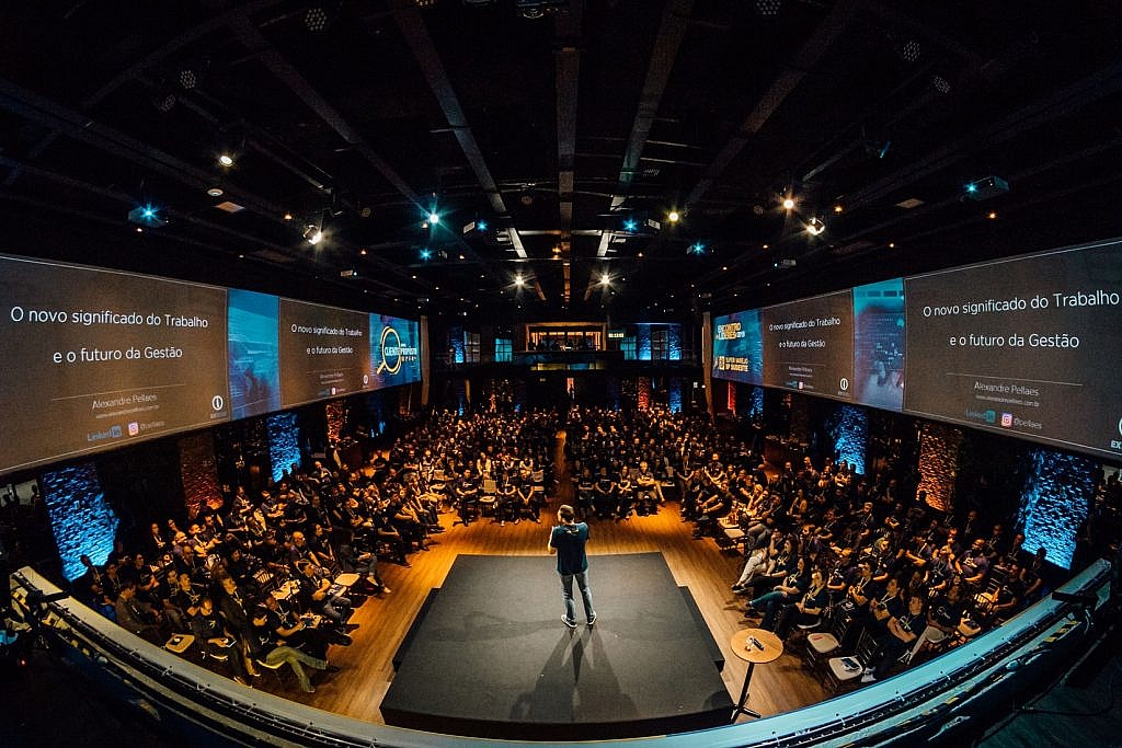
Photo by Alexandre Pellaes via Unsplash

What does “true” mean? Likely, it’s something that traditional advertisers have forgotten about many years ago. On the contrary, innovative advertisers switch to an entirely different approach based on the collaboration with influencers – organic advocates and trusted thought leaders that offer only something valuable and tested out by themselves to their followers.

Like bees follow the smell of honeydew, we’re attracted by the “expensive” smell of value. It’s seeping out from the great influencer’s content directly to the minds and hearts of followers. Influencers try to deliver value to people, not just to promote anything. They know that direct brand promotion won’t smell like “honeydew.” The value or, in other words, the trustworthiness of the influencer’s insights will matter more than the size of the audience.

The Growing Demand for Influencer Marketing Software

Time. Another big value in the modern fast-pacing world. The smart are those who realize the importance of time and don’t hesitate to use digital tools that allow them to automate processes and save time for more creativity. Along with the growing power of influencer marketing, we also see the rising demand for intelligent influencer marketing automation software.

It’s the magic wand marketing leaders have been dreaming of for many years. With the advent of artificial intelligence in digital marketing, we can finally access it. AI-powered influencer marketing software facilitates the search of niche influencers. Thanks to their advanced system of filters, you can set the desired influencer marketing KPIs (like 60-Days Average Views, Last Active Time, Price Range) and the target audience’s metrics (for example, Age, Gender, and Location). It allows avoiding cooperation with so-called “fake” influencers and finding the right influencers that really perform.

Tight Match of The Influencer’s Values with Brand’s Ethos

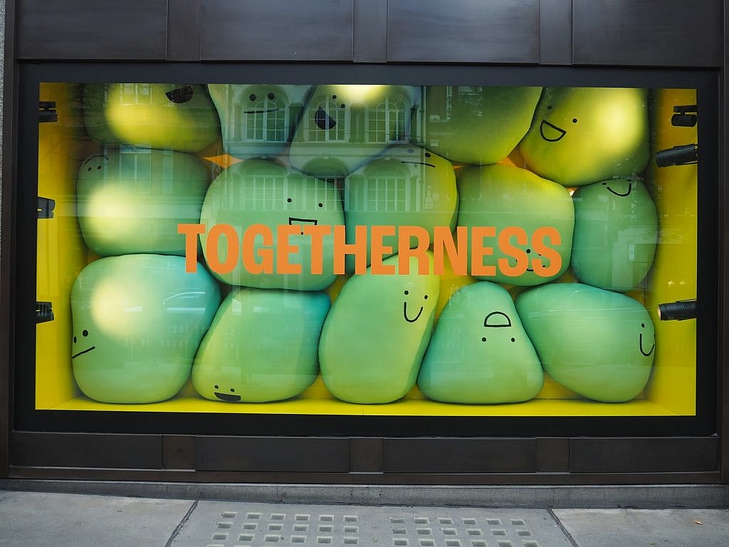
Photo by Anthony DELANOIX via Unsplash

2021 will be featured by the tighter match of the influencer’s values with the brand’s culture and ethos. Collaborating with someone famous and influential isn’t enough to earn the audience’s loyalty. Your brand’s values must align with those of the influencer. Otherwise, influencer marketing magic won’t work.

Your company must breathe the same air, speak the same language, and share the same audience with the influencer. Only in this case, the influencer will transfer your brand message organically and introduce your company as a friend to the target audience. What’s most important, the tighter the match of values, the less promotional will the influencer’s advocacy look.

Deepening Influencer Relationships

Influencers are now savvier toward the brands they partner with. In 2021, they will select companies for collaboration even more carefully. They will look for brands that correspond to their style, culture, and values to build long-term relationships with them. At the same time, brands will search for nearly the same, striving to set the partnership with the influencers that will last for years.

Photo by Walid Hamadeh via Unsplash

Long-term relationships with influencers are more beneficial for brands, as they also mean a better understanding and tighter match of values between them. Moreover, by regularly appearing in the influencer’s content, the brand’s advocacy can become its “organic” complementation. Social media followers will perceive the brand rather as a friend than a guest of their community. It will help enter the target audience’s trust circle and establish closer relationships with potential customers.

Involving Influencers in Branded Virtual Events

The next crucial influencer marketing trend is involving influencers in virtual events organized by brands. In 2021, influencers are expected to appear at online webinars, Q&A sessions with the brand, workshops, and discussions of the topics related to the company’s field more often.

Encouraging influencers to participate in such events, companies show that the opinion of thought leaders, aka trusted industry experts, matters to them and serves as one of the guide points for their team. They demonstrate that the brand is bothered by the same questions as to its target audience, and the same leaders inspire and motivate them to create products and services for their valued customers.

Brand Executives as The Influencers

We tend to trust people who have achieved more. We trust those who know the path to success and all the pitfalls on the way. In other words, we rely on leaders, as they have already overcome all those challenges and can guide us on how to cope with them. CEOs, founders, and top experts are the people who perfectly align to this category. Already leading the entire company, they are a trustworthy source of insights and inspiration. So, we call them influencers too.

We expect to witness another amazing influencer marketing trend related to positioning brand executives as niche influencers in the upcoming year. While partnering with other industry experts, companies can also communicate with their target audience through their “own” influencers.

Influence? In 2021, It Will Be Different

We used to think that an influencer is somebody whose opinion impacts the masses and matters to many people. In 2021, we will see a significant change in what we understand under the term “influencer.”

The collaboration with influencers is not about promotion anymore but partnership or even friendship with them. It’s about the tight match of the influencer’s and brand’s values and completing the same mission together. The brand and the influencer – they aren’t the client and the advertiser anymore. They are partners creating something valuable for their target audience together.

I hope these predictions about how companies will interact with influencers in 2021 will inspire you. Everyone has the potential to become an influencer. The motivation, diligence, and inner drive are all that matters. It’s the influencer’s world, and brands are just living in it.


Photo by Sander Dalhuisen via Pexels

Categories: Others Tags:

The Potential of AR in Web Design

December 31st, 2020 No comments

Over the years, experts have repeatedly discussed the possible impact of mixed realities on web design. Concepts like AR and VR are expected to have the potential to change the way that we interact with websites on a fundamental level.

Now that we’re in the year 2021, however, discussions about AR aren’t just observational anymore. The age of mixed-reality interfaces is here, in everything from Pokémon Go, to Snapchat filters.

The question is, how do web designers create incredible user experiences in a world where there are now multiple digital realities to consider?

The Benefits of Experimenting with AR

Before we look at some of the steps that web designers can take to enhance their projects with AR, it’s worth examining the benefits of interacting with augmented reality in the first place.

While virtual reality replaces the typical world around us completely with digital components, AR augments it. This means that developers and designers need to learn how to thrive in an environment where the real world and the digital one work together.

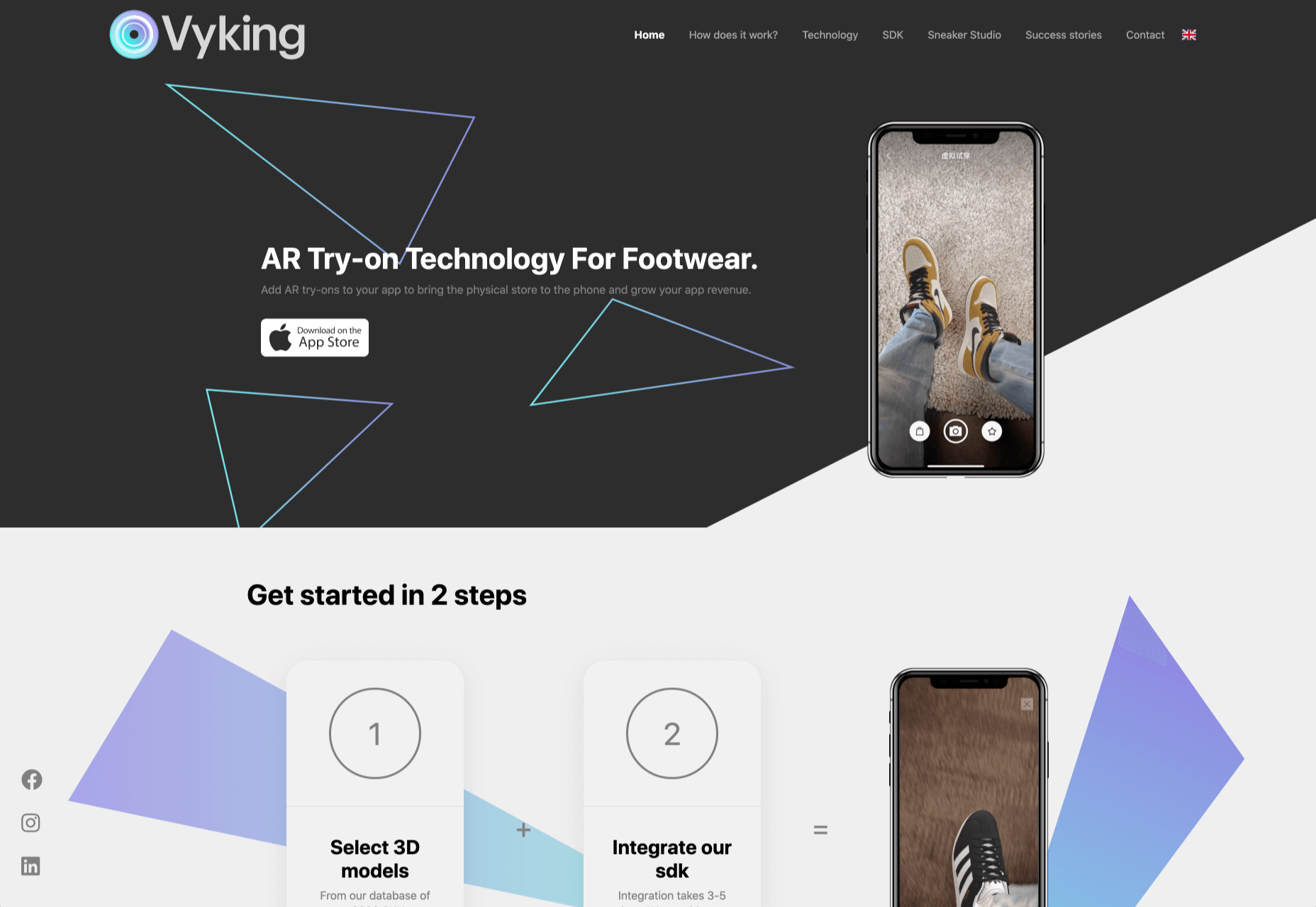
The most common AR application for website owners is to provide a solution for real-time and remote product visualization. Imagine being able to try on a pair of shoes before you buy them online. That’s a service that the Vyking brand can deliver by creating technology that “reinvents” the digital shopping experience.

This test functionality plays a massive role in purchasing decisions. In a world where people can’t see a shade of make-up in person when they’re shopping online, or check how an item of furniture looks in their home, AR has a crucial role to play.

In simple terms, AR helps shoppers to make more informed purchases.

Here’s how you can use augmented reality to deliver incredible UX.

1. Focus on Real-Time Feedback

Augmented reality is all about connecting the real world to the virtual world.

Doing this provides users a unique experience – one that’s filled with real-time feedback that can deliver crucial and insightful information. For instance, an augmented reality system in a GPS app can calculate the average time before reaching a destination based on previous trips.

Another option is for an augmented reality to use solutions like face-mapping to help customers determine how a certain makeup product will look before they buy it. For instance, that’s the case for the Mary Kay Mirror Me app, which simplifies the process of shopping for make-up.

When designing for AR, experts need to consider how they can provide customers with real-time information that they can use to make better purchasing decisions.

2. Define input and output

Although you’ve probably performed similar exercises when designing for traditional websites and applications in the past, defining inputs and outputs of UX in AR environments can be tough.

Defining inputs and outputs allows you to determine which elements of an interface your user can actually interact with, in your interface. This gives you a better idea of what to “augment.” For instance, you might decide that physical gestures like a swipe of the hand will be essential for AR inputs. However, you’ll also need to consider how each mobile device offers different input possibilities.

Outputs are a little simpler. For instance, you could offer a three-dimensional model of a product that your customers are interested in. Once you have that output, you can think about how the customer will interact with it by changing colors or position.

3. Embrace Customer-Friendly Performance

Another feature at the heart of AR applications is interactivity.

Good designs in the augmented reality world need to be simple to access and use, otherwise customers will end up avoiding them. For instance, 60% of customers say they want to use AR when they’re shopping for furniture. However, they’re only going to use your app if it actually works.

The Décor Matters website and app mix gamification with home decorating features that help customers get a better view of the home goods they’re planning on buying. The website even has inspiration pages available to help users find and try new design options with their AR technology.

When designing for AR, think about how you can make your applications or technology as simple to use as possible, so customers actually want to interact with it.

4. Address the Environment

In augmented and virtual reality applications, it’s important to remember that interfaces aren’t bound by physical screens. The viewport will move with the user, shifting perspectives in response. Most AR designers will use four different signifiers to describe AR environments:

  • Public environment: The entire body of the user is involved as a controller, like with the Xbox Kinect or Nintendo Wii;
  • Intimate environment: Where a user can be seated – often in a desktop environment;
  • Personal environment: AR on smartphones, mobile devices, and tablets, like Pokémon Go;
  • Private environments: Completely private spaces, such as with wearable technology like the Google Glass solution.

The environment that you’re designing for will be crucial for your project outcomes. Remember, spatial considerations need to be carefully considered when accounting for how users will interact with objects in a frame.

5. Remember User Fatigue

Another thing to keep in mind when designing for AR technology is that user fatigue is likely to be a much more significant consideration. After all, people interact with websites and applications in a much more intimate and in-depth way when AR is involved.

AR applications can often use the entire body of a customer as a controller. Because of this, designers need to be careful about exhausting interactions. High-effort and repetitive interactions could tire the user out mentally and physically, causing them to give up on the interaction.

When designing, you’ll need to consider how you might over-stimulate the user with too many interaction-focused elements at once. Keep it simple.

6. Remember the Essential Principles of UX Design

Remember, just because you’re tapping into a relatively new technology doesn’t mean that you should abandon all the basic tenets of user experience design that you’ve come to understand over the years. Although UX is constantly evolving and changing, it’s always going to keep a few fundamental principles in mind.

For instance, you’ll always strive to give users the best digital experience in exchange for the lowest amount of effort on their part. Additionally, you’ll need to think about how you can make end-users as comfortable as possible when they’re interacting with new types of technology on websites and apps.

For instance, since AR is most commonly associated with gaming in the current environment, it might be a good idea to implement gamification concepts into your AR design. What can you do to make sure your customers are having fun?

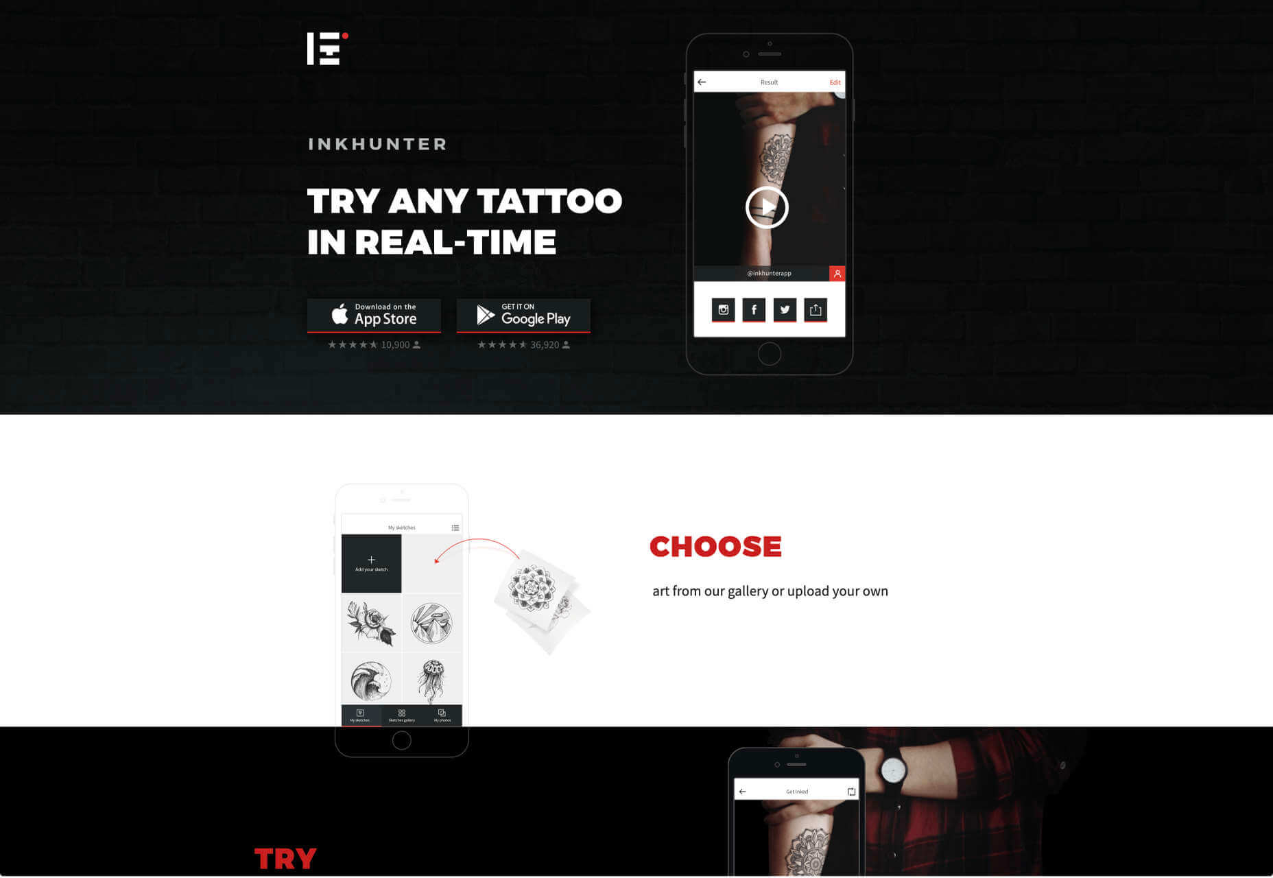
For instance, Inkhunter is an app that allows users to try on tattoos just like using a filter on Snapchat. The experience feels familiar, comfortable, and exciting.

Unlocking the Potential of AR Web Design

Augmented Reality technology has come a long way over the years. Today, developers and designers can access simple plug-in tools like WordPress VR, allowing designers to upload 360-degree videos into WordPress sites and other unique web extensions.

Augmented reality is becoming much more readily available on sites and apps of all shapes and sizes. Additionally, customers are accessing more ways to unlock AR’s power through everything from headsets to mobile interfaces.

However, just like any new technology in the web design world, designers need to think carefully about how they will overcome the challenges in user experience that AR can present. For instance, though AR can offer more information for a customer and help them make purchasing decisions faster, there are also risks. For instance, add too many interactive features to a single website or application, and you could scare users off with too much information.

In the short-term, web designers need to explore the new tools that are available to them and think about the customers they’re designing for. Only this way will we be able to make any considerable advances in the possibilities of AR.

Are You Ready to Embrace AR?

Designing for augmented reality applications and websites can be an intimidating concept – even for seasoned designers. However, this is just another technology that creatives can use to drive better experiences for end-users.

Learn how the latest technology works and get an insight into your customers’ needs, and you’ll be amazed at what you can accomplish in the AR world.

Source

Categories: Designing, Others Tags:

CSS Individual Transform Properties in Safari Technology Preview

December 30th, 2020 No comments

The WebKit blog details how to use individual CSS Transform properties in the latest version of Safari Technology Preview. This brings the browser in line with the CSS Transforms Module Level 2 spec, which breaks out the translate(), rotate() and scale() functions from the transform property into their own individual properties: translate, scale, and rotate.

So, instead of chaining those three functions on the transform property:

.some-element {
  transform: translate(50px 50px) rotate(15deg) scale(1.2);
}

…we can write those out individually as their own properties:

.some-element {
  translate(50px 50px);
  rotate(15deg);
  scale(1.2);
}

If you’re like me, your mind immediately jumps to “why the heck would we want to write MORE lines of code?” I mean, we’re used to seeing individual properties become sub-properties of a shorthand, not the other way around, like we’ve seen with background, border, font, margin, padding, place-items, and so on.

But the WebKit team outlines some solid reasons why we’d want to do this:

  • It’s simpler to write a single property when only one function is needed, like scale: 2; instead of transform: scale(2);.
  • There’s a lot less worry about accidentally overriding other transform properties when they’re chained together.
  • It’s a heckuva lot simpler to change a keyframe animation on an individual property rather than having to “pre-compute” and “recompute” intermediate values when chaining them with transform.
  • We get more refined control over the timing and keyframes of individual properties.

The post points out some helpful tips as well. Like, the new individual transform properties are applied first — translate, rotate, and scale, in that order — before the functions in the transform property.

Oh, and we can’t overlook browser support! It’s extremely limited at the time of writing… basically to just Safari Technology Preview 117 and Firefox 72 and above for a whopping 3.9% global support:

The post suggests using @supports if you want to start using the properties:

@supports (translate: 0) {
  /* Individual transform properties are supported */
  div {
    translate: 100px 100px;
  }
}

@supports not (translate: 0) {
  /* Individual transform properties are NOT supported */
  div {
    transform: translate(100px, 100px);
  }
}

That’s the code example pulled straight from the post. Modifying this can help us avoid using the not operator. I’m not sure that’s an improvement to the code or not, but it feels more like progressive enhancement to do something like this:

div {
  transform: translate(100px, 100px);
}

@supports (translate: 0) {
  /* Individual transform properties are supported */
  div {
    transform: none;
    translate: 100px 100px;
  }
}

That way, we clear the shorthand functions and make way for the individual properties, but only if they’re supported.


The post CSS Individual Transform Properties in Safari Technology Preview appeared first on CSS-Tricks.

You can support CSS-Tricks by being an MVP Supporter.

Categories: Designing, Others Tags:

Cloudinary Tricks for Video

December 30th, 2020 No comments

Creating video is time consuming. A well-made 5-minute video can take hours to plan, record, and edit — and that’s before we start talking about making that video consistent with all the other videos on your site.

When we took on the Jamstack Explorers project (a video-driven educational resource for web developers), we wanted to find the right balance of quality and shipping: what could we automate in our video production process to reduce the time and number of steps required to create video content without sacrificing quality?

With the help of Cloudinary, we were able to deliver a consistent branding approach in all our video content without adding a bunch of extra editing tasks for folks creating videos. And, as a bonus, if we update our branding in the future, we can update all the video branding across the whole site at once — no video editing required!

What does “video branding” mean?

To make every video on the Explorers site feel like it all fits together, we include a few common pieces in each video:

  1. A title scene
  2. A short intro bumper (video clip) that shows the Jamstack Explorers branding
  3. A short outro bumper that either counts down to the next video or shows a “mission accomplished” if this is the last video in the mission

Skip to the end: here’s how a branded video looks

To show the impact of adding the branding, here’s one of the videos from Jamstack Explorers without any branding:

This video (and this Vue mission from Ben Hong) is legitimately outstanding! However, it starts and ends a little abruptly, and we don’t have a sense of where this video lives.

We worked with Adam Hald to create branded video assets that help give each video a sense of place. Check out the same video with all the Explorers branding applied:

We get the same great content, but now we’ve added a little extra va-va-voom that makes this feel like it’s part of a larger story.

In this article, we’ll walk through how we automatically customize every video using Cloudinary.

How does Cloudinary make this possible?

Cloudinary is a cloud-based asset delivery network that gives us a powerful, URL-based API to manipulate and transform media. It supports all sorts of asset types, but where it really shines is with images and video.

To use Cloudinary, you create a free account, then upload your asset. This asset then becomes available at a Cloudinary URL:

https://res.cloudinary.com/netlify/image/upload/v1605632851/explorers/avatar.jpg
                           ^^^^^^^             ^^^^^^^^^^ ^^^^^^^^^^^^^^^^^^^
                              |                      |                |
                              V                      V                V
                      cloud (account) name    version (optional)  file name

This URL points to the original image and can be used in tags and other markup.

The original image size is 97.6kB.

Dynamically adjust file format and quality to reduce file sizes

If we’re using this image on a website and want to improve our site performance, we may decide to reduce the size of this image by using next-generation formats like WebP, AVIF, and so on. These new formats are much smaller, but aren’t supported by all browsers, which would usually mean using a tool to generate multiple versions of this image in different formats, then using a element or other specialized markup to provide modern options with the JPG fallback for older browsers.

With Cloudinary, all we have to do is add a transformation to the URL:

https://res.cloudinary.com/netlify/image/upload/q_auto,f_auto/v1605632851/explorers/avatar.jpg
                                                ^^^^^^^^^^^^
                                                      |
                                                      V
                                    automatic quality & format transformations

What we see in the browser is visually identical:

The transformed image is 15.4kB.

By setting the file format and quality settings to automatic (f_auto,q_auto), Cloudinary is able to detect which formats are supported by the client and serves the most efficient format at a reasonable quality level. In Chrome, for example, this image transforms from a 97.6kB JPG to a 15.4kB WebP, and all we had to do was add a couple of things to the URL!

We can transform our images in lots of different ways!

We can go further with other transformations, including resizing (w_150 for “resize to 150px wide”) and color effects (e_grayscale for “apply the grayscale effect”):

https://res.cloudinary.com/netlify/image/upload/q_auto,f_auto,w_150,e_grayscale/v1605632851/explorers/avatar.jpg
The same image after adding grayscale effects and resizing.

This is only a tiny taste of what’s possible — make sure to check out the Cloudinary docs for more examples!

There’s a Node SDK to make this a little more human-readable

For more advanced transformations like what we’re going to get into, writing the URLs by hand can get a little hard to read. We ended up using the Cloudinary Node SDK to give us the ability to add comments and explain what each transformation was doing, and that’s been extremely helpful as we maintain and evolve the platform.

To install it, get your Cloudinary API key and secret from your console, then install the SDK using npm:

# create a new directory
mkdir cloudinary-video

# move into the new directory
cd cloudinary-video/

# initialize a new Node project
npm init -y

# install the Cloudinary Node SDK
npm install cloudinary

Next, create a new file called index.js and initialize the SDK with your cloud_name and API credentials:

const cloudinary = require('cloudinary').v2;

// TODO replace these values with your own Cloudinary credentials
cloudinary.config({
  cloud_name: 'your_cloud_name',
  api_key: 'your_api_key',
  api_secret: 'your_api_secret',
});

Don’t commit your API credentials to GitHub or share them anywhere. Use environment variables to keep them safe! If you’re unfamiliar with environment variables, Colby Fayock has written a great introduction to using environment variables.

Next, we can create the same transformation as before using slightly more human-readable configuration settings:

cloudinary.uploader
  // the first argument should be the public ID (including folders!) of the
  // image we want to transform
  .explicit('explorers/avatar', {
    // these two properties match the beginning of the URL:
    // https://res.cloudinary.com/netlify/image/upload/...
    //                                    ^^^^^^^^^^^^
    resource_type: 'image',
    type: 'upload',

    // "eager" means we want to run these transformations ahead of time to avoid
    // a slow first load time
    eager: [
      {
        fetch_format: 'auto',
        quality: 'auto',
        width: 150,
        effect: 'grayscale',
      },
    ],

    // allow this transformed image to be cached to avoid re-running the same
    // transformations over and over again
    overwrite: false,
  })
  .then((result) => {
    console.log(result);
  });

Let’s run this code by typing node index.js in our terminal. The output will look something like this:

{
  asset_id: 'fca4abba96ffdf70ef89498aa340ae4e',
  public_id: 'explorers/avatar',
  version: 1605632851,
  version_id: 'b8a923931af20404e89d03852ff1bff1',
  signature: 'e7201c9ab36cb5b6a0545cee4f5f8ee27fb7f99f',
  width: 300,
  height: 300,
  format: 'jpg',
  resource_type: 'image',
  created_at: '2020-11-17T17:07:31Z',
  bytes: 97633,
  type: 'upload',
  url: 'http://res.cloudinary.com/netlify/image/upload/v1605632851/explorers/avatar.jpg',
  secure_url: 'https://res.cloudinary.com/netlify/image/upload/v1605632851/explorers/avatar.jpg',
  access_mode: 'public',
  eager: [
    {
      transformation: 'e_grayscale,f_auto,q_auto,w_150',
      width: 150,
      height: 150,
      bytes: 6192,
      format: 'jpg',
      url: 'http://res.cloudinary.com/netlify/image/upload/e_grayscale,f_auto,q_auto,w_150/v1605632851/explorers/avatar.jpg',
      secure_url: 'https://res.cloudinary.com/netlify/image/upload/e_grayscale,f_auto,q_auto,w_150/v1605632851/explorers/avatar.jpg'
    }
  ]
}

Under the eager property, our transformations are shown along with the full URL to view the transformed image.

While the Node SDK is probably overkill for a straightforward transformation like this one, it becomes really handy when we start looking at the complex transformations required to add video branding.

Transforming videos with Cloudinary

To transform our videos in Jamstack Explorers, we follow the same approach: each video is uploaded to Cloudinary, and then we modify the URLs to resize, adjust quality, and insert the title card and bumpers.

There are a few major categories of transformation that we’ll be tackling to add the branding:

  1. Overlays
  2. Transitions
  3. Text overlays
  4. Splicing

Let’s look at each of these categories and see if we can’t reimplement the Jamstack Explorers branding on Ben’s video! Let’s get set up by setting up index.js to transform our base video:

cloudinary.uploader
  .explicit('explorers/bumper', {
    // these two properties match the beginning of the URL:
    // https://res.cloudinary.com/netlify/image/upload/...
    //                                    ^^^^^^^^^^^^
    resource_type: 'video',
   type: 'upload',

    // "eager" means we want to run these transformations ahead of time to avoid
    // a slow first load time
    eager: [
      {
        fetch_format: 'auto',
        quality: 'auto',
        height: 360,
        width: 640,
        crop: 'fill', // avoid letterboxing if videos are different sizes
      },
    ],

    // allow this transformed image to be cached to avoid re-running the same
    // transformations over and over again
    overwrite: false,
  })
  .then((result) => {
    console.log(result);
  });

You may have noticed that we’re using a video called “bumper” instead of Ben’s original video. This is due to the way Cloudinary orders videos as we add them together. We’ll add Ben’s video in the next section!

Combine two videos with a custom transition using Cloudinary

To add our bumpers, we need to add a second transformation “layer” to the eager array that adds a second video as an overlay.

To do this, we use the overlay transformation and set it to video:publicID, where publicID is the Cloudinary public ID of the asset with any slashes (/) transformed to colons (:).

We also need to tell Cloudinary how to transition between the two videos, which we do using a special kind of video called a luma matte that lets us mask one video with the black area of the video, and a second video with the white area. This results in a stylized cross-fade.

Here’s what the luma matte looks like on its own:

The video and the transition both have their own transformations, which means that we need to treat them as different “layers” in the Cloudinary transform. This means splitting them into separate objects, then adding additional objects to “apply” each layer, which allows us to call that section done and continue adding more transformations to the main video.

To tell Cloudinary this this is a luma matte and not another video, we set the effect type to transition.

Make the following changes in index.js to put all of this in place:

const videoBaseTransformations = {
  fetch_format: 'auto',
  quality: 'auto',
  height: 360,
  width: 600,
  crop: 'fill',
}

cloudinary.uploader
  .explicit('explorers/bumper', {
    // these two properties match the beginning of the URL:
    // <https://res.cloudinary.com/netlify/image/upload/>...
    //
    resource_type: 'video',
    type: 'upload',

    // "eager" means we want to run these transformations ahead of time to avoid
    // a slow first load time
    eager: [
      videoBaseTransformations,
      {
        overlay: 'video:explorers:LCA-07-lifecycle-hooks',
        ...videoBaseTransformations,
      },
      {
        overlay: 'video:explorers:transition',
        effect: 'transition',
      },
      { flags: 'layer_apply' }, // <= apply the transformation
      { flags: 'layer_apply' }, // <= apply the actual video
    ],

    // allow this transformed image to be cached to avoid re-running the same
    // transformations over and over again
    overwrite: false,
  })
  .then((result) => {
    console.log(result);
  });

We need the same format, quality, and sizing transformations on all videos, so we pulled those out into a variable called videoBaseTransformations, then added a second object to contain the overlay.

If we run this with node index.js, the video we get back looks like this:

Not bad! This already looks like it’s part of the Jamstack Explorers site, and that transition adds a nice flow from the common bumper into the custom video.

Adding the outro bumper works exactly the same: we need to add another overlay for the ending bumper and a transition. We won’t show this code in the tutorial, but you can see it in the source code if you’re interested.

Add a title card to a video using text overlays

To add a title card, there are two distinct steps:

  1. Extract a short video clip to serve as the title card background
  2. Add a text overlay with the video’s title

The next two sections walk through each step individually so we can see the distinction between the two.

Extract a short video clip to use as the title card background

When Adam Hald created the Explorers video assets, he included a beautiful intro video that opens on a starry sky that’s perfect for a title card. Using Cloudinary, we can grab a few seconds of that starry sky and splice it into every video as a title card!

In index.js, add the following transformation blocks:

cloudinary.uploader
  .explicit('explorers/bumper', {
    // these two properties match the beginning of the URL:
    // https://res.cloudinary.com/netlify/image/upload/...
    //
    resource_type: 'video',
    type: 'upload',

    // "eager" means we want to run these transformations ahead of time to avoid
    // a slow first load time
    eager: [
      videoBaseTransformations,
      {
        overlay: 'video:explorers:LCA-07-lifecycle-hooks',
        ...videoBaseTransformations,
      },
      {
        overlay: 'video:explorers:transition',
        effect: 'transition',
      },
      { flags: 'layer_apply' }, // <= apply the transformation
      { flags: 'layer_apply' }, // <= apply the actual video

      // add the outro bumper and a transition
      {
        overlay: 'video:explorers:countdown',
        ...videoBaseTransformations,
      },
      {
        overlay: 'video:explorers:transition',
        effect: 'transition',
      },
      { flags: 'layer_apply' },
      { flags: 'layer_apply' },

      // splice a title card at the beginning of the video
      {
        overlay: 'video:explorers:intro',
        flags: 'splice', // splice this into the video
        ...videoBaseTransformations,
      },
      {
        audio_codec: 'none', // remove the audio
        end_offset: 3, // shorten to 3 seconds
        effect: 'accelerate:-25', // slow down 25% (to ~4 seconds)
      },
      {
        flags: 'layer_apply',
        start_offset: 0, // put this at the beginning of the video
      },
    ],

    // allow this transformed image to be cached to avoid re-running the same
    // transformations over and over again
    overwrite: false,
  })
  .then((result) => {
    console.log(result);
  });

Using the splice flag, we tell Cloudinary to add this video directly without a transition.

In the next set of transformations, we add three transformations we haven’t seen before:

  1. We set audio_codec to none to remove sound from this segment of video.
  2. We set end_offset to 3, which means we’ll get only the first 3 seconds of the video.
  3. We add the accelerate effect with a value of -25, which slows the video down by 25%.

Running node index.js will now give us a video that starts with just under 4 seconds of silent, starry skies:

Add text overlays to videos using Cloudinary

Our last step is to add a text overlay to show the video title!

Text overlays use the same overlay property as other overlays, but we pass an object with settings for the font. Cloudinary supports a wide variety of fonts — I haven’t been able to find a definitive list, but it seems to be a large number of Google Fonts — and if you’ve purchased a license to use a custom font, you can upload a custom font to Cloudinary for use in text overlays as well.

cloudinary.uploader
  .explicit('explorers/bumper', {
    // these two properties match the beginning of the URL:
    // <https://res.cloudinary.com/netlify/image/upload/>...
    //
    resource_type: 'video',
    type: 'upload',

    // "eager" means we want to run these transformations ahead of time to avoid
    // a slow first load time
    eager: [
      videoBaseTransformations,
      {
        overlay: 'video:explorers:LCA-07-lifecycle-hooks',
        ...videoBaseTransformations,
      },
      {
        overlay: 'video:explorers:transition',
        effect: 'transition',
      },
      { flags: 'layer_apply' }, // <= apply the transformation
      { flags: 'layer_apply' }, // <= apply the actual video

      // add the outro bumper and a transition
      {
        overlay: 'video:explorers:countdown',
        ...videoBaseTransformations,
      },
      {
        overlay: 'video:explorers:transition',
          effect: 'transition',
        },
        { flags: 'layer_apply' },
        { flags: 'layer_apply' },

        // splice a title card at the beginning of the video
        {
          overlay: 'video:explorers:intro',
          flags: 'splice', // splice this into the video
          ...videoBaseTransformations,
        },
        {
          audio_codec: 'none', // remove the audio
          end_offset: 3, // shorten to 3 seconds
          effect: 'accelerate:-25', // slow down 25% (to ~4 seconds)
        },
        {
        overlay: {
          font_family: 'roboto', // lots of Google Fonts are supported
          font_size: 40,
          text_align: 'center',
          text: 'Lifecycle Hooks', // this can be any text you want
        },
        width: 500,
        crop: 'fit',
        color: 'white',
      },
      { flags: 'layer_apply' },
      {
        flags: 'layer_apply',
        start_offset: 0, // put this at the beginning of the video
      },
    ],

    // allow this transformed image to be cached to avoid re-running the same
    // transformations over and over again
    overwrite: false,
  })
  .then((result) => {
    console.log(result);
  });

In addition to setting the font size and alignment, we also apply a width of 500px (which will be centered by default) to keep our title text from smashing into the side of the title card, and set the crop value to fit, which will wrap longer titles. Setting the color to white makes our text visible against the dark, starry background.

Run node index.js to generate the URL and we’ll see our fully branded video, including a title card and bumpers!

Build your video branding once; use it everywhere

Creating bumpers, transitions, and title cards is a lot of work. Creating high-quality video content is also a lot of work. If we had to manually edit every Jamstack Explorers video to insert these title cards and bumpers, it’s extremely unlikely that we would have actually done it.

We knew that the only realistic way for us to keep the videos consistently branded was to reduce the friction of adding the branding, and Cloudinary let us automate it entirely. This means that we can stay consistent without any manual steps!

As an added bonus, it also means that if we update our title cards or bumpers in the future, we can update all the branding for all the videos by changing the code in one place. This is a huge relief for us, because we know that Explorers is going to continue to grow and evolve over time.

What to do next

Now that you know how to use Cloudinary to add custom branding, here are some additional resources to help you keep learning.

What else can you automate using Cloudinary? How much time could you save by automating the repetitive parts of your video editing workflow? I am exactly the kind of nerd who loves to talk about this stuff, so send me your ideas on Twitter!


The post Cloudinary Tricks for Video appeared first on CSS-Tricks.

You can support CSS-Tricks by being an MVP Supporter.

Categories: Designing, Others Tags:

The Rules of Margin Collapse

December 30th, 2020 No comments

Josh Comeau covers the concept of margin collapsing:

This idea might sound simple, but if you’ve been writing CSS for a while, you’ve almost certainly been surprised when margins either don’t collapse, or they collapse in weird and unexpected ways. In real-world projects, all kinds of circumstances can complicate matters.

The basic stuff to know:

  • Margin collapsing only happens in the block-direction. This is true even if you change the writing-mode or use logical properties.
  • The largest margin “wins”
  • Any element in between will nix the collapsing (if we’re talking within-parent collapsing, even a bit of padding or border will be the in-between thing and prevent the collapsing, as Geoff noted when he covered it).

But it gets way weirder:

  • Margins can collapse even when they aren’t from sibling elements.
  • Margins in the same direction from different elements can also collapse.
  • Margins from any number of elements can collapse.
  • Negative margins also collapse, but it’s the larger-negative number that wins.
  • If it’s a bunch of elements all with different margins, you have to basically learn an algorithm to understand what happens and why.

It’s unfortunate that those things happen at all. It can be frustrating for any skill level. These are quirks of CSS that that have to be taught explicitly, rather than feeling like a natural part of a system. Even the CSS working group considers it a mistake:

The top and bottom margins of a single box should never have been allowed to collapse together automatically as this is the root of all margin-collapsing evil.

?

I don’t know that margin collapsing causes epic troubles in day-to-day CSSin’, but you gotta admit this is messy at best.


I also think about how it was a thing this year to suggest centering content via CSS grid and plopping all elements into the middle of a three-column grid ala .grid-wrapper > * { grid-column: 2; }. The point being that you still have the full grid to work with, so it’s easier to make one-off elements go full-bleed, edge-to-edge (or otherwise use the space). But when you do that, the elements become grid items and are out of the normal flow, so you won’t get margin collapsing. That used to feel like a strike against this technique, at least to me, since it would be unexpected. But thinking now about how janky margin collapsing is, maybe the avoiding of margin collapsing is yet another advantage of this sort of technique.

Direct Link to ArticlePermalink


The post The Rules of Margin Collapse appeared first on CSS-Tricks.

You can support CSS-Tricks by being an MVP Supporter.

Categories: Designing, Others Tags:

Design v18

December 29th, 2020 No comments

I redesigned the site! I can never think about the word redesign without also thinking about realigning, from Cameron Moll’s seminal article. I did not start from nothing. This design wasn’t a blank design canvas and empty code editor thing. I doubt any future redesign will be either. I started with what we already had and pushed some things around. But I pushed so much around, touching almost every single file, that it’s worthy of drawing a line and saying this is v18.

I keep a very incomplete design history here.

Getting Started

I always tend to start by poking around in a design tool. After 3 or 4 passes in Figma (then coming back after I started building to flesh out the footer design), this is where I left off.

Once I’m relatively happy with what is happening visually, I jump ship and start coding, making all the final decisions there. The final product isn’t 1000 miles different than this, but it has quite a few differences (and required 10× more decisions).

Simplicity

It may not look like it at first glance, but to me as I worked on it, the core theme was simplification. Not drastic, just like, 20%.

The header in v17 had a special mobile version and dealt with open/closed state. The v18 header is just a handful of links that fall down to the next line on small screens. I tossed in a “back to top” link in the footer that shows up once you’ve scrolled away from the top to help get you back to the nav. That scroll detection (IntersectionObserver based) is what I use to “spin the star” on the way back up also.

I can already tell that the site header will be one of the things that evolves significantly in v18 as there is more polish to be found there.

Emulated version of CSS-Tricks header on iPhone X

The search form in v17 also had open/closed states, and special templates for the results page. I’m all-in on Jetpack Search now, so I do nothing but open that when you click the search icon.

This search is JavaScript-powered, so to make it more resiliant, it’s also a valid hyperlink to Google search results:

<a 
  href="https://www.google.com/search?q=site:css-tricks.com%20layout"
  class="jetpack-search-filter__link"
>
  <span class="screen-reader-text">Search</span>
  <svg> ... </svg>
</a>

There were a variety of different layouts in v17 (e.g. sidebar on the left or right) and header styles (e.g. video in the header) before. Now there is largely just one of both.

The footer in v17 became quite sprawling, with whole sections for the newsletter form, social media, related sites, and more. I’ve compacted it all into a more traditional footer, if there is such a thing.

There is one look for “cards” now, whether that is an article, video, guide, etc. There are slight variations depending on if the author is relevant, if it has tags, a call-to-action, etc, but it’s all the same base (and template). The main variation is a “mini” card, which is now used mostly-consistently across popular articles, the monthly mixup, and in-article related-article cards.

The newsletter area is simplified quite a bit. In v17, the /newsletters/ URL was kind of a “landing page” for the newsletter, and you could view the latest in a sidebar.

Now that URL just redirects you to the latest newsletter so you can read it like any other content easily, as well as navigate to past issues.

Featured Images

WordPress has the concept of one featured image per article. You don’t have to use it, but we do. I like how it’s integrated naturally into other things. Like it becomes the image for social media integration automatically. We used it in v17 as a subtle background-image thing.

Maybe in a perfect world, a perfect site would have a perfect content strategy such that every single article has a perfect featured image. A matching color scheme, exact dimensions, very predictable. But this is no perfect world. I prefer systems that allow for sloppiness. The design around our featured images accepts just about anything.

  • A site-branded gradient is laid over top and mix-blend-mode‘d onto it, making them all feel related.
  • The exception is that they will be sized/cropped as needed.

With that known, our featured images are used in lots of contexts:

Large, featured article on the homepage
Card Layout
If vertical space is limited (height @media query), the featured image height is reduced.
Article headers use a very faded/enlarged version as part of a layered background
Social Media cards

CSS Stats

Looking only at the CSS between the two versions (Project Wallace helps here):

Project Wallace dashboard showing 23.78% drop in CSS file size and other similar metrics.

Minified and Gzipped the main stylesheet is 16.4 kB. Perhaps not as small as an all-utility stylesheet could be, but that’s not a size I’ll every worry about, especially since without really trying to the size heavily trended downward.

Not Exactly a Speed Demon

There are quite a few resources in use on CSS-Tricks. If speed was my #1 priority, the first thing I’d do is start chopping away at the resources in use. In my opinion, it would make the site far less fun, but probably wouldn’t harm the content all that much. I just don’t want to. I’d rather find ways to keep the site relatively fast while still keeping it visually rich. Maybe down the road I can explore some of this stuff to allow for a much lighter-weight version of the site that is opt-in in a standards-based way.

About those resources…

  • Images are the biggest weight. Almost every page has quite a few of them (10+). I try to serve them from a CDN in an optimized format sized with the responsive images syntax. There is more I can do, but I’ve got a good start already.
  • There is still ~180 kB of JavaScript. The Jetpack Search feature is powered by it, which is the weightiest module. A polyfill gets loaded (probably by that), which I should look into seeing if could be removed. I’m still using jQuery, which I’ll definitely look into removing in the next round. Nothing against jQuery, I’m just not using it all that much. Most of what I’m doing is written vanilla JavaScript anyway. Google Analytics is in there, and then rest is little baby scripts (ironically) for performance things or advertising.
  • The fonts weigh in at ~163 kB and they aren’t loaded in any particularly fancy way.

All three of those things are targets for speed improvements.

And yet, hey, the Desktop Lighthouse report ain’t bad:

Lighthouse scores:

98 = Performance
95 = Accessibility
93 = Best Practices
92 = SEO

Those results are from the homepage, which because of the big grids of content, is one of the heavier pages. There’s still plenty of attempts at performance best practices here:

  • Everything is served from global http/2 CDN’s and cached
  • Assets optimized/minified/combined where possible
  • Assets/ads lazy-loaded where possible
  • Premium hosting
  • HTML over the wire + instant.page

My hope is that as you click around the site and come back in subsequent visits, it feels pretty snappy.

Type

It’s Hoefler&Co. across the board again.

I left the bulk of the article typography alone, as that was one of the last design sprints I did in v17 and I kinda like where it left off. Now that clamp() is here though, I’m using that to do fluid typography for much of the site. For example, headers:

font-size: clamp(2rem, calc(2rem + 1.2vw), 3rem);

aXe

I used the axe DevTools plugin to test pages before launch, and did find a handful of things to get fixed up. Not exactly a deep dive into accessibility, but also, this wasn’t a full re-write, so I don’t expect terribly much has changed in terms of accessibility. I’m particularly interested in fixing any problems here, so don’t hold back on me!

Bugs

I’m sure there are some. I’d rather not use this comment thread for bugs. If you’ve run across one, please hit us at team@css-tricks.com. ?


The post Design v18 appeared first on CSS-Tricks.

You can support CSS-Tricks by being an MVP Supporter.

Categories: Designing, Others Tags: