Archive

Archive for December, 2020

Overlaying Video With Transparency While Wrangling Cross-Browser Support

December 8th, 2020 No comments
failed here, I started looking into videos. I found an article about alpha transparency in Chrome video published in 2013, which announces Google Chrome support for WebM with an alpha channel. It even shows an example and shares tips on how to use it. I went through the article and it immediately felt like the way to go. I was even more convinced after converting my image sequence to WebM because, while GIF was weighing in at 5.8 MB, WebM with transparency,using the same frame rate and full colors was only 540 KB! That’s more than 10 times smaller while offering better performance and quality. Awesome!

The joy did not last long though. As soon as I opened the website on my iOS Phone I realized that I should’ve started with checking the browser compatibility. Unfortunately, Safari (iOS and macOS) doesn’t support transparency in WebM. While my video was working perfectly on Chrome, Firefox and Edge, Safari greeted me with an ugly black background.

The search continues…

A good Solution

Thankfully, I found a video from WWDC 2019 announcing HEVC video with Alpha support for Safari starting in iOS 13 and macOS Catalina. It seemed to provide the same functionality as WebM but with support on Apple devices. So I decided to use the hybrid solution: HEVC for Safari and WebM for other browsers.

It seems like the perfect solution. But now we have two tasks:

  1. Create an HEVC with alpha-transparency
  2. Detect for Safari (and the version) to serve the correct format

Creating a transparent video

We will start with the easy part: creating a WebM file. If you want to create, convert, or even edit video files, FFmpeg is your friend. It is an extremely powerful open source multimedia framework, and if you have anything to do with multimedia files, I’d recommend starting there because it’s capable of so many things. I can say that FFmpeg has helped me reduce video file sizes over 10 times without any visible image quality degradation. But let’s get back to transparency.

In my experience, if you need to include animated elements into website layout, you get them as a set of video frames in PNG. Even while working on my example project, a tool that removes background from videos generated a set of images for me. So I will continue here assuming we’re building the video from a set of images (remember, you can download our set), but even if you’ve got a video file instead, the process will look similar (adjust FFmpeg options to your needs).

We are now ready to create a video. Using the command line, we’ll navigate to the folder that contains the PNG files and run the following command:

ffmpeg -framerate 25 -i unscreen-%3d.png -c:v libvpx-vp9 -pix_fmt yuva420p output.webm

You can adjust the arguments to fit your needs:

  • framerate: how much images will be used for 1s of the output video
  • -i unscreen-%3d.png: input file name and format. My files have numbers from 001 to 150 so i used %3d as a mask to select all files with three digits in the name.
  • -c:v: specifies the codec to use. I want the video to be encoded with VP9, which is supported by most web browsers.
  • -pix_fmt: specifies pixel format to be used. In our cas, it should support an alpha channel. You can see all supported formats if you run ffmpeg --pix_fmts.
  • output.webm: provides the desired output file name as a last argument

There are a lot more options available, but I won’t dive into details as it would take probably more than one article to go through them. Those provided in the example command work fine for our use case.

After the process is finished, we should see a new output.webm file, and if you open it in a supported browser, you’ll see a video. Easy, right?

Creating HEVC Alpha

Since we have a WebP file ready, it’s time to move to the second format we will be using: HEVC with alpha transparency. Unfortunately, at the time of writing, FFmpeg doesn’t support HEVC, so we have to use another tool. As far as I know, the only way to create HEVC with alpha is to use the Finder or Compressor on Mac. If you have a PC, you’ll probably have to ask someone with Mac to do it for you. The Compressor app is only provided with Final Cut Pro, so I won’t be using it, although it may be worth considering if you need custom settings.

Since macOS Catalina, the Finder has a built in Encode Media tool to convert videos. It is simple (and free), so it feeds our needs.

The Finder expects a video file as an input, so first, we have to convert the image sequence to ProRes 4444. This is an important step, as the Encode Media tool won’t accept just any video — it will fail unless you provide the format it accepts. It gave me a headache or two until I found out the correct encoding for the input file.

We can create input video using FFmpeg. As we did when creating WebM, we just have to run FFmpeg with the proper arguments:

ffmpeg -framerate 25 -i unscreen-%3d.png -c:v prores_ks -pix_fmt yuva444p10le -alpha_bits 16 -profile:v 4444 -f mov -vframes 150 output.mov

From this point on, a Mac is needed. But the process is simple and does not involve typing anything in terminal, so even if you ask a non-techy friend with a Mac to do it for you, I’m sure they can manage.

Having ProRes4444 video ready, you can navigate to the containing folder in Finder, right-click on it, and in the context menu, select Encode Selected Video Files.

As websites are becoming more and more dynamic when it comes to design, there is sometimes a need to incorporate complex, animated elements. There are many ways to do that from CSS transitions to 3D rendering on canvas, and animated SVG. But it is often easier to use a since they can be rather efficient and, with them, just about anything visual is possible.

But what if you a need transparent background on that video, so that it could overlay and appear to interact with other content on the page? It’s possible, but can be tricky, especially cross-browser. Let’s explore that.

Here’s an example

To see how transparent video overlays work, I’ve prepared an example that I hope feels both fun and relatable. The idea is to integrate video with interactive content underneath so that the content behind the video changes as the slider is advancing. It is a slider advertising dog food with a real video of a dog on the overlay and I’m sure that realistic, cute dog would improve the conversion rate!

CodePen Embed Fallback

You can follow along with this article to recreate this demo by yourself. Part of what you’ll need to create a video like this is an “image sequence” (a bunch of alpha-transparent images we’ll stitch together into a video). I’m providing the images I used for the example.

Exploring possibilities

To achieve this effect, I started with a search for any kind of solution that would allow me to insert animated content with transparent background on the page.

GIF

The first thing that came up was a GIF. Even though the GIF format was introduced over 30 years ago, it is still widely used. Unfortunately, it has its limitations. While it works perfectly for simple and small animated graphics, it is not that great for colorful, long video footage, it has limited color space, and will grow a lot in size for complex videos.

APNG

The next option I’ve looked at was APNG, which for some reason, is not as popular as GIF but is much better. (I didn’t even know it existed, did you?) APNG works similarly to animated GIF files while supporting 24-bit images and 8-bit transparency. It is also backward-compatible with regular PNG. If APNG is not supported, the first frame is displayed. It is supported by popular browsers, but no support in Internet Explorer 11 (yup, some people still have to support that). While it seemed like the way to go for a moment, I was not satisfied with its file size and performance.

Fun fact: Apple adopted the APNG format as their preferred format for animated stickers in iOS 10 iMessage apps.

Loop through PNGs

Next, a crude, but working, idea came to mind: use a bunch of PNGs and loop through them with JavaScript to imitate the video. But it requires using a lot of data transfer (each video frame would be a separate image) and resources to animate (you could drain a user’s battery quickly or make their computer fan go crazy).

I quickly abandoned that idea, but it turned out to be useful later. I’ll get back to that at the end of the article.

WebM with alpha transparency

As all the formats for failed here, I started looking into videos. I found an article about alpha transparency in Chrome video published in 2013, which announces Google Chrome support for WebM with an alpha channel. It even shows an example and shares tips on how to use it. I went through the article and it immediately felt like the way to go. I was even more convinced after converting my image sequence to WebM because, while GIF was weighing in at 5.8 MB, WebM with transparency,using the same frame rate and full colors was only 540 KB! That’s more than 10 times smaller while offering better performance and quality. Awesome!

The joy did not last long though. As soon as I opened the website on my iOS Phone I realized that I should’ve started with checking the browser compatibility. Unfortunately, Safari (iOS and macOS) doesn’t support transparency in WebM. While my video was working perfectly on Chrome, Firefox and Edge, Safari greeted me with an ugly black background.

The search continues…

A good Solution

Thankfully, I found a video from WWDC 2019 announcing HEVC video with Alpha support for Safari starting in iOS 13 and macOS Catalina. It seemed to provide the same functionality as WebM but with support on Apple devices. So I decided to use the hybrid solution: HEVC for Safari and WebM for other browsers.

It seems like the perfect solution. But now we have two tasks:

  1. Create an HEVC with alpha-transparency
  2. Detect for Safari (and the version) to serve the correct format

Creating a transparent video

We will start with the easy part: creating a WebM file. If you want to create, convert, or even edit video files, FFmpeg is your friend. It is an extremely powerful open source multimedia framework, and if you have anything to do with multimedia files, I’d recommend starting there because it’s capable of so many things. I can say that FFmpeg has helped me reduce video file sizes over 10 times without any visible image quality degradation. But let’s get back to transparency.

In my experience, if you need to include animated elements into website layout, you get them as a set of video frames in PNG. Even while working on my example project, a tool that removes background from videos generated a set of images for me. So I will continue here assuming we’re building the video from a set of images (remember, you can download our set), but even if you’ve got a video file instead, the process will look similar (adjust FFmpeg options to your needs).

We are now ready to create a video. Using the command line, we’ll navigate to the folder that contains the PNG files and run the following command:

ffmpeg -framerate 25 -i unscreen-%3d.png -c:v libvpx-vp9 -pix_fmt yuva420p output.webm

You can adjust the arguments to fit your needs:

  • framerate: how much images will be used for 1s of the output video
  • -i unscreen-%3d.png: input file name and format. My files have numbers from 001 to 150 so i used %3d as a mask to select all files with three digits in the name.
  • -c:v: specifies the codec to use. I want the video to be encoded with VP9, which is supported by most web browsers.
  • -pix_fmt: specifies pixel format to be used. In our cas, it should support an alpha channel. You can see all supported formats if you run ffmpeg --pix_fmts.
  • output.webm: provides the desired output file name as a last argument

There are a lot more options available, but I won’t dive into details as it would take probably more than one article to go through them. Those provided in the example command work fine for our use case.

After the process is finished, we should see a new output.webm file, and if you open it in a supported browser, you’ll see a video. Easy, right?

Creating HEVC Alpha

Since we have a WebP file ready, it’s time to move to the second format we will be using: HEVC with alpha transparency. Unfortunately, at the time of writing, FFmpeg doesn’t support HEVC, so we have to use another tool. As far as I know, the only way to create HEVC with alpha is to use the Finder or Compressor on Mac. If you have a PC, you’ll probably have to ask someone with Mac to do it for you. The Compressor app is only provided with Final Cut Pro, so I won’t be using it, although it may be worth considering if you need custom settings.

Since macOS Catalina, the Finder has a built in Encode Media tool to convert videos. It is simple (and free), so it feeds our needs.

The Finder expects a video file as an input, so first, we have to convert the image sequence to ProRes 4444. This is an important step, as the Encode Media tool won’t accept just any video — it will fail unless you provide the format it accepts. It gave me a headache or two until I found out the correct encoding for the input file.

We can create input video using FFmpeg. As we did when creating WebM, we just have to run FFmpeg with the proper arguments:

ffmpeg -framerate 25 -i unscreen-%3d.png -c:v prores_ks -pix_fmt yuva444p10le -alpha_bits 16 -profile:v 4444 -f mov -vframes 150 output.mov

From this point on, a Mac is needed. But the process is simple and does not involve typing anything in terminal, so even if you ask a non-techy friend with a Mac to do it for you, I’m sure they can manage.

Having ProRes4444 video ready, you can navigate to the containing folder in Finder, right-click on it, and in the context menu, select Encode Selected Video Files.

A window will appear. Select the desired HEVC quality (there are two to choose from), and check the option to Preserve Transparency. Then click the “Continue” button.

After a moment you should see a new file, which is encoded in HEVC with alpha. It’s done! Opening this file in Safari confirm that the transparency works.

Last but not least, it’s time to use videos on the website!

Serving transparent videos for all browsers

We can use element to serve videos. If the browser supports the given format in the src attribute, it will just work. But as I’ve mentioned, we need to serve HEVC for Safari and WebM for other browsers.

There is one more thing to take care of: some browsers support WebM or HEVC itself but without transparency. Those browsers will play the video but with a black background instead of an alpha channel. For example, Safari 12 will play HEVC without transparency. That’s unacceptable for us.

Normally, I’d use the element to provide the video along with multiple formats as fallbacks, and the browser would pick the one it supports. However, since we want to show HEVC only on specific Safari versions, we will have to set the video src attribute instead using JavaScript.

HEVC with transparency is supported in iOS 13 and Mac Safari 13, so let’s start by detecting those. The recommended way to adjust website features based on support is by detecting the existence of an API rather than looking at the User Agent, but I didn’t find any simple way to detect if the browser supports transparency in video format. Instead, I came up with my own solution. It’s not pretty, but it does the job.

function supportsHEVCAlpha() {
  const navigator = window.navigator;
  const ua = navigator.userAgent.toLowerCase()
  const hasMediaCapabilities = !!(navigator.mediaCapabilities && navigator.mediaCapabilities.decodingInfo)
  const isSafari = ((ua.indexOf('safari') != -1) && (!(ua.indexOf('chrome')!= -1) && (ua.indexOf('version/')!= -1)))
  return isSafari && hasMediaCapabilities
}

This targets Safari 13 and above by looking at navigator.mediaCapabilities, which is not supported in older versions, as well as looking that the browser is Safari at all. If the function returns true, then I’m good to go with HEVC alpha. For any other case, I’ll load WebM video.

Here’s an example of how this comes together in HTML:

<video id="player" loop muted autoplay playsinline></video>

<script>
const player = document.getElementById('player');
player.src = supportsHEVCAlpha() ? 'output.mov' : 'output.webm';
</script>

If you’re curious about those loop muted autoplay playsinline arguments on video element, those are about replicating a GIF-like experience:

  • Without muted, the video will not play without user interaction.
  • With playsinline, on iOS, the video plays right where it is in the layout instead of opening up in fullscreen.
  • With loop, the video repeats over and over.
  • With autoplay, it will start playing the video automatically on page load (as long as we also have muted in place).

That’s it! We have a lightweight, performant and high-quality solution for transparent videos, that works on most modern browsers (at least the last two recent versions of Chrome, Firefox, Safari and Edge). We can add some basic HTML and CSS to integrate static content with it and make it a little bit more real-life, or just use the same idea that’s in my demo. That wasn’t too bad, was it?

Hey, but what about IE 11? My whole company is using it!

In general, I’d recommend limiting a feature like this to modern browsers and hiding the video in IE. The video is probably not a critical element of the website. Although, I used to work on a commercial project where IE 11 support was a must and I was forced to figure something out to show the transparent video there. In the end, I ended up cycling through PNG images with JavaScript. I reduced the amount of frames and switched between them using a timer. Sure, the performance was awful, but it worked. The video was quite important to the whole design so we intentionally decided to sacrifice performance on IE 11 to provide the full experience.

Summary

I hope that I’ve saved you some time researching the idea of alpha-transparent video and that now you’re be able to incorporate animated elements like this on your website. I bet you’ll need it someday!

Do you have a different idea of how to use transparent video? Or maybe some experience with that already? Let me know in the comments.


The post Overlaying Video With Transparency While Wrangling Cross-Browser Support appeared first on CSS-Tricks.

You can support CSS-Tricks by being an MVP Supporter.

Categories: Designing, Others Tags:

Creating websites with prefers-reduced-data

December 8th, 2020 No comments

Spoiler alert: There is no support for it yet. But it is defined in the Media Queries Level 5 spec that includes other recent, but more familiar user preference features, like prefers-color-scheme and prefers-reduced-motion.

The Polypane blog goes into incredible depth on prefers-reduced-data, especially for something that we have yet to see in the wild. That’s actually what makes the Polypane team an ideal voice on the subject. It’s product is a browser that is able to emulate the feature behind a Chromium flag.

At the same time, it’s worth noting that the spec calls out two significant potential issues with this feature in its current state:

  • It may be an undesired source of fingerprinting, with a bias towards low income with limited data.
  • This feature is an early draft, and the CSS-WG does not consider it ready for shipping in production.

But that’s not to say we can’t start getting acquainted with it. Here’s how it works:

@media (prefers-reduced-data: reduced) {
  /* Stuff for reduced data preferences */
}

@media (prefers-reduced-data: no-preference) {
  /* Stuff for no data preferences */
}

What I appreciate from this post is the wealth of possible use cases it lists. Allow me to summarize:

  • Conditionally load fonts. As in, make a @font-face declaration then call the font on the body, once for users with no-preference to get the custom font, and again for users with reduced to get a lighter stack.
  • Background images. Have you ever used a giant splash image as the background for some full-width hero component? Maybe that can be served just to folks who have no-preference while those with reduced get either a smaller variation or no image at all.
  • Smaller images in HTML. This is clever because remember that we have the media attribute on the element. So, we can instruct browsers to use certain images when working with , a la: .
  • Conditionally preload and autoplay videos. Just as we can work with this feature in HTML, we can use it in JavaScript, too, by using window.matchMedia('(prefers-reduced-data: no-preference)').matches to set autoplay and preload attributes on a video based on data preferences.
  • Ditch infinite scrolling. I’d generally ditch this pattern in the first place, but we can certainly disable it so users who prefer reduced data aren’t force-fed more content (and thus, more data) just by reaching the end of a page.

That’s not a definitive list of ideas, of course! We talk all the time about serving the right assets to the right people at the right time and this media feature is a great tool to help us do that in certain contexts. Think also of:

  • Providing low-res versions of downloaded assets (e.g. PDFs)
  • Linking to certain sites or pages that have heavy experiences
  • Conditionally loading entire scripts, stylesheets, or libraries based on preference
  • Probably a gazillion other and more clever things…

And this advice is golden:

Like prefers-reduced-motion, it’s good to think of the prefers-reduced-data: reduce option as the default option: people get the lean, fast experience, and only when they indicate no-preference, we send them more data. That way, older browser that don’t support the media query get the lean experience by default.

Yep. The same sort of idea as “mobile-first” responsive design: start by designing for reduced data and then enhance as we scale up.

Direct Link to ArticlePermalink


The post Creating websites with prefers-reduced-data appeared first on CSS-Tricks.

You can support CSS-Tricks by being an MVP Supporter.

Categories: Designing, Others Tags:

The Power of Web Development Outside Tech

December 7th, 2020 No comments

In 2020, I learned about the power of web development for organizations and nonprofits outside of tech. I learned that you can leverage your skills to affect change and build long-lasting partnerships.

This year, I joined the Board of Directors of the League of Women Voters San Francisco (LWVSF), which, despite its name, welcomes people of all genders. This century-old organization has over 800 branches that span cities and states across the United States and the world.

Before joining the Board, I helped lead the LWVSF Observer Corps (and still do), whose focus is increasing government transparency and protecting the public’s participation in government with an emphasis on policing practices. Eventually, my volunteer efforts hit a point where I needed to start editing our website myself.

The first thing I noticed was that every individual League has its own website, user interface, and content. Some use MyLo (a platform developed for Leagues by LWV California), some use SquareSpace, and we at LWVSF use GoDaddy’s “Website Builder”. I quickly learned that base-level HTML, CSS, and inline JavaScript skills with a sprinkling of PHP (for WordPress-based sites) will take one quite far in this realm.

In some ways, the bar outside of the tech industry is lower — for these blogs, and what are otherwise static websites, one doesn’t need much to get started. Coming in as a seasoned software developer, I often found myself frustrated by small things: a limit on the number of displayed events in the editor, the inability to customize PayPal integrations, and unpreserved tabbing and syntax highlighting. Big things too, like unintuitive user interface and information architecture. Imagine attempting to make sense of a website builder without a foundation built on years of tech literacy.

The risks are also super high. If we introduce a website bug, it could mean the loss of essential donations and grants, the failure to recruit potential key members, or the inability to share last-minute information about a government meeting where legislative changes affect marginalized populations.

For me, this points to the importance of partnership between those in tech and those outside of it. Our skills are valuable to the essential work of political organizing. Tools for those working for social good and the betterment of society should be the best. We can help!

Take Rideshare Drivers United (RDU). In 2017, a software developer, Ivan Pardo, and a driver who was also a former union organizer put their heads together and created an app to recruit drivers to RDU. Pardo and I met through the Tech Workers Coalition and RDU’s text banking drive, and we discussed the amazing work he put into the app.

This year, Pardo updated the app with phone and text banking capabilities to help spread the “No on Prop 22” message. This led to the texting of over one million voters, with some individual drivers texting over 50,000 people! The platform is simple, straightforward, and impactful, but most importantly, the platform fits the needs of RDU and supports their activism rather than overshadowing it.

What makes Pardo’s app so good, so effective? He says:

I’m there to serve the group in any capacity necessary. But I’m not a driver. Just because you know software doesn’t mean you understand organizing. I spent just as many hours learning about the industry and that allows me to build software [for RDU] more effectively.

And his advice for getting involved?

Attach yourself to an organization that is pro-people and pro-democracy. Then build software to serve that organization.

As demonstrated by Pardo and RDU, there are clear benefits and a massive impact that stems from the cooperation between tech workers and non-tech organizations. Using our technical know-how to amplify the work of others has stood out to me as a light in the dark, especially in a year like 2020.

Even simple websites and apps go on to make a huge difference politically and socially. We, as website builders, have the benefit that even in a global pandemic, we’re able to organize and operate online.

In the last year, as friends, acquaintances, and myself were laid off in the middle of a global pandemic, I learned about and was inspired by the initiative of so many. Despite being unable to organize in person, I saw my friend Amy working on VoteAmerica, Chris churning out Election Map SF, countless individuals promoting the team behind Native Land, and The Algorithmic Justice League cobbling together AI advocacy resources, just to name a few.

This year, I learned about the power of web development for organizations and nonprofits outside of tech. I learned that you can leverage your skills to affect change and build long-lasting partnerships.


The post The Power of Web Development Outside Tech appeared first on CSS-Tricks.

You can support CSS-Tricks by being an MVP Supporter.

Categories: Designing, Others Tags:

Late to Logical

December 7th, 2020 No comments

2020 brought another wave of logical property features to major browsers and I’ve thoroughly enjoyed my investment into logical, rather than physical, web styling. I feel like I’ve learned a new way to speak about the box model that results in less written code with more global coverage.

p {
  /* 🚫 */ text-align: left;
  /* 👍 */ text-align: start;

  /* 🚫 */ margin-top: 1rem;
  /* 👍 */ margin-block-start: 1rem;
}

Like I described in the web.dev article I linked to above, a logical property is one that references a side, corner, or axis of the box model in context of the applicable language direction. It’s akin to referencing someone’s strong arm, rather than assuming it’s their right arm. “Right” is a physical arm reference, “strong” is a logical arm reference, contextual to the individual.

Latin, Hebrew and Japanese are shown rendering placeholder text within a device frame. Arrows and colors follow the text to help associate the 2 directions of block and inline.

Once I got the hang of the updated syntax, I realized other places in the world had already solved their problems similarly! The web was just late to logical jargon. Here are a couple of other places that have already gone logical.

Nautical Orientation

Port and starboard are logical sides of the ship that are contextual to the vessel. I love how Wikipedia says confidently:

… nautical terms of orientation deal unambiguously with the structure of vessels, referring respectively to the left and right sides of the vessel, seen by an observer aboard the vessel looking forward.”

Vessel centric logical properties. While working with ships, use a ship language.

Skiers & Stages

Skier’s left is logical direction that’s based on a skier facing down the mountain. Without the logical language, skiers were confusing left and right, since it depended on where they stood when they declared the direction. If you’re on a chair lift facing up the mountain, left is right and right is left once you’ve gotten off the lift and started skiing back down the mountain. So that community came up with a logical way to talk about the direction. Their terminology, “Skier’s Right” and “Skier’s Left”, are essentially contextual logical properties. While working with skiers, use skier language.

Similarly, film studios use terms like “Stage One” and “Camera Two”. It helps logically orient everyone based on a common understand, not a relative direction.

Logical Conclusion

As an industry or community, we have had issues with physical focused styles. Adding padding to the left and right of a button is only fitting in some languages. It’s like you wrote the padding while facing the wrong way on the ship. Logical properties, via inline-start and inline-end, will fit all languages. It won’t matter which way you’re facing in the ship, it’s not about you anymore.

Give logical properties a play in the Pen below. Notice the browser is doing tons of work to keep your content readable across the globe. So rad.

CodePen Embed Fallback
button {
  padding-block: 1ch;
  padding-inline: 2ch;
  border-inline: 5px solid var(--brand-1);
}

To emulate the confidence that Wikipedia had in nautical logical directions: We, the web, can now unambiguously deal with the structure of our boxes by referring respectively to their sides, contextual to language direction. Describe the side once, in a way that is still relevant to you, but now relevant to everyone else too. Think less, deliver more.

p {
  max-inline-size: 50ch;
  margin-block: 1rem;
}

It’s critical to me that logical properties are centered around people. Its user-centric because its language direction respective. By using logical properties we invite the individual to bring their diversity, complexity and unpredictability to the table; we can embrace it and rely on the browser engines to properly lay it out.

hr {
  max-inline-size: 30ch;
  margin-inline: auto;
  border-block-start: 1px solid hsl(2rad 20% 20% / 20%);
}

Drop “top” and “left”-style thinking, and starting thinking logically with “block” and “start”-style properties. While working with web boxes, use a web box language.

The web’s “magic paper” is now even more magical as it can stay as natural to the user as possible. I love it.


P.S. You’ve been getting logical property trained since flexbox.


The post Late to Logical appeared first on CSS-Tricks.

You can support CSS-Tricks by being an MVP Supporter.

Categories: Designing, Others Tags:

How to Use Chatbots to Cultivate Meaningful Conversations in Time of Crisis

December 7th, 2020 No comments
chatbot tablet

In light of recent events, only one thing springs to mind when the word crisis is mentioned – the Coronavirus pandemic. It has swept the world by storm, leaving us to cope with the “new normal” as best we can.

There’s constant unease that lingers in the air as we go about our daily routine while keeping physical distance, avoiding crowds, significantly increasing standards of hygiene, and basically, just trying to stay afloat both in business and personal lives. However, regardless of the sacrifices we make for the sake of our own health and the health of others, there’s one thing that brings support and comfort in these delicate times, and that is remote communication.

In our time of need, we have turned to various communication tools to have a safe conversation without the fear of being infected. Online communication in all its forms has surpassed traditional telephone calls and provided us with the opportunity to stay in touch with our loved ones, as well as conduct business at a satisfactory level. Companies that have harvested the internet’s potential have found it much easier to maintain efficiency, and most importantly, stay in touch with their existing and potential customers. But aren’t all those calls and video conferences overwhelming? How can the staff find the time that each customer deserves? Easy. With the use of chatbots.

Teach your chatbots to communicate effectively

Meaningful conversations are no longer restricted to humans. As people, chatbots also gather experience which will enable them to provide necessary information and be accurate and responsive to most customer inquiries. And as people, these intelligent machines learn how to communicate that information professionally and authentically. All you need to do is teach them.

Primarily, it is essential to decide on the content and the manner in which it will be communicated to your customers. This means that you need to give your bot clear instructions. Gather your experience with your target group, all the frequently asked questions, anticipate what may follow them, and most importantly, add that irreplaceable touch of humanity. AI bot can personalize conversations in ways that will make your visitors feel comfortable and engaged. For instance, by acquiring information from social media platforms, a bot can address the customer by name or even recognize a returning one.

Bots as ambassadors of goodwill

Profit is not the only thing your bot can obtain. Since the whole world is still in turmoil due to the ongoing pandemic, we have found ourselves in dire need of non-profit organizations and their valuable work. However, non-profits and NGOs are struggling themselves and fundraising has met a significant obstacle. Also, due to social distancing measures, it has become impossible to gather crowds to support a cause and doing it via telephone just can’t yield satisfactory results.

Fortunately, artificial intelligence steps in once again. A chatbot is an effective and accessible way to engage donors on your website, page, or social media profiles. There’s no coding experience required, so they’re easy to build and implement. With the GivingTuesday coming up, it is vital that we do everything in our power to spread the word. This big day of giving is actually a global, 24-hour campaign that advocates non-profits and NGOs’ purposes and encourages people to make donations. Thanks to machine learning, bots can now communicate your message in a timely and emphatic manner, answer questions, send notifications, and guide visitors to donation pages.

Meaningful AI conversations can be loads of fun

One of the most prominent traits of the art of conversation is humor. The good news is that chatbots can be taught to weave in charming, funny comments into the conversation, which is very much welcomed in these delicate times. Implementing a quiz is a great way to guide potential customers towards a buying decision. Bots can even spice things up by telling a joke or even sending a meme. While engaged in a relaxed and engaging conversation, the buyers are given detailed instructions, directions, and clickable links.

Mind you, this kind of online fun has to come paired with convenience. Let’s take Dominos Pizza, for example. They have a friendly yet informative bot integrated into their Messenger, so they can manage smooth and informative communication with customers without them having to download apps, make phone calls, or go through any hassle just to order a pizza. Which is exactly what they want. Your brand image is reflected in the level of your customers’ satisfaction, so every positive experience goes towards building a reputation and brand voice that will resonate with your audience.

A crisis demands timely, regular, and accurate information – bots can provide

One needs to stay on top of the situation at all times and in all walks of life to manage the challenges of the pandemic. Both entrepreneurs and their customers need to know precisely how to go about their decisions in accordance with the situation. An excellent example of this is Mona – the chatbot of the Austrian Federal Ministry for Digital and Economic Affairs. Mona caters to business people, answering the essential pandemic-related FAQs. Current infection numbers, opening time restrictions, and mandated social distancing rules, among others, are all available to everyone at all times.

The customers, on the other hand, have turned to online services since most shops remained closed. Needless to say, business establishments have found themselves overloaded with demands and inquiries about home deliveries or product information. Had there not been for chatbots, the sales would have experienced a major drop, directly affecting the brand’s reputation and setting an unfavorable tone for future business. This silver lining extends to the period after the pandemic dies down since the services have now been improved as AI will continue to provide for a significantly larger number of customers without putting a strain on the staff.

Building a meaningful relationship with your target audience is based on recognizing their individuality as well as their needs. Chatbots are able to do just that by keeping the lines of communication open 24/7, adding the feeling of comfort while providing the necessary information. Customer loyalty is what places you above the competition. Your courteous yet informative bot can add all that to its indisputable efficiency.

Categories: Others Tags:

Styling Comment Threads

December 7th, 2020 No comments

Comment threads are one of those things that look really simple when executed right. When designing them yourself, you may find that they are rather deceptively simple. There is a lot that goes into designing nice and usable comment threads, and in this article, I will try my best to walk you through the steps to building a comment thread, that is great to look at, and a joy to use.

What makes a good comment thread?

Before diving into designing and writing code, let’s break down what actually makes a good comment thread. A good comment thread will have the following characteristics:

  1. Comments are readable, and all the important data-points are visible to the user at a glance. This includes the author, number of votes, timestamp, and the content.
  2. Different parts of comments are visually distinct, so that the user is immediately able to understand what is what. This is especially important for the action buttons (e.g. reply, report), and links.
  3. There must be visual cues for hierarchies between the comments. This is a requirement for having nested comments, i.e. one comment being a reply to another one.
  4. There should be an easy way to quickly scroll to a comment, especially to the parent comment from its children (i.e. replies).
  5. Comments should also have a toggle feature which allows the users to hide and show the comment and its replies.

As you can see, that’s quite a lot to consider! There are also some nice-to-haves that we won’t cover in this article, but are certainly good enhancements:

  1. Users should be able to flag a comment so a moderator is aware of inappropriate content.
  2. A comment can be up- or down-voted as a way of signaling helpful and unhelpful comments.
  3. Only the first few comments are displayed and the user is able to load more comments.

The above features would require at least a bit of JavaScript to pull off. Moreover, depending on the tech stack, these features could just as likely be implemented server side, especially keeping track of the number of votes and flag status of comments. That is why we will focus only on styling the comment threads in this article. With that out of the way, let’s knock out the first set of points and design our comment thread.

A basic comment thread

A comment by itself has a pretty simple structure. Here’s a skeleton of a single comment:

A single comment structure

So far, so good. Notice how the replies have an extra margin to the left. This is meant to satisfy the visual hierarchy (point #3 above). The markup for the above structure could look something like this:

<div class="comment">

  <!-- Comment heading start -->
  <div class="comment-heading">

    <!-- Comment voting start -->
    <div class="comment-voting">
      <button type="button">Vote up</button>
      <button type="button">Vote down</button>
    </div>
    <!-- Comment voting end -->

    <!-- Comment info (author, # of votes, time added) start -->
    <div class="comment-info">
      <a href="#" class="comment-author">{{ author }}</a>
      <p>
        {{ # of votes }} • {{ time_added }}
      </p>
    </div>
    <!-- Comment info (author, # of votes, time added) end -->
  </div>
  <!-- Comment heading end -->

  <!-- Comment body start -->
  <div class="comment-body">
    <p>
      {{ comment_content }}
    </p>
    <button type="button">Reply</button>
    <button type="button">Flag</button>
  </div>
  <!-- Comment body end -->

  <!-- Replies start -->
  <div class="replies">
    <!-- ... -->
  </div>
  <!-- Replies end -->

</div>

There is nothing to explain here — just a bunch of containers with some basic elements. So instead, let’s look at a real-life example, with a comment that also has a reply.

CodePen Embed Fallback

Looks pretty nice, right? The above example satisfies the first three points, so we are already on our way. A few things to understand about the code above:

  • The replies are given an extra margin to the left side to provide a visual cue of the hierarchy.
  • The vote up and vote down buttons are using HTML character codes for the icons.
  • The class .sr-only hides elements on all devices except on screen readers. This makes the voting buttons accessible. If you are using a framework, like Bootstrap or Halfmoon, this class comes automatically packed in.

Adding links that jump to comments

Now that we have a basic comment thread going, let’s add a feature to help users quickly scroll to a comment. As mentioned above, this is especially useful when someone wants to jump to the parent comment of a reply.

In order to build it, we need to decide what these links look like. While this is entirely subjective, one particular design I really like is a clickable “border” on the left hand side of the comment, something like this:

Link (marked in red) that allows users to jump to a comment

In order to accommodate the link, we are pushing the comment body to the right and aligning it with the replies. This design also has the added benefit of reinforcing the hierarchy between the comments, because you can simply look at the number of border links to the left and determine the level of nesting of the comment you are currently reading. And of course, you can also immediately jump to any upper level by clicking on the border links.

To actually create these border links, we need to add anchor elements () inside each of our comments, and style these anchor elements to look like the borders that can be clicked. Let’s add them to our first code example above.

CodePen Embed Fallback

Here are a few things to understand about the changes made:

With all that, we have knocked out the first four of the points mentioned above. Let’s add more comments to the code example to see how it would look.

CodePen Embed Fallback

Allowing users to hide/show comments with a click

At this point, we have a pretty darn satisfactory comment thread. This design by itself can work for quite a lot of real life use cases. However, let’s go one step farther and add our toggle feature, i.e. hiding and showing comments with a click.

The quickest and easiest way to allow users to hide and show comments with a click is to make use of the

and

elements. To put it simply, the visibility of the entire

can be toggled by clicking on the

. There is no JavaScript involved, and these tags are supported by ~96% of browsers at this moment. Once again, if you are unfamiliar with these concepts, you can learn more in yet another article from Chris.

Anyway, to actually implement this, we need to make the following changes to our code:

  • Change comments from
    to

    , i.e. all the elements with the class .comment will now be a

    element.
  • Wrap the comment heading (.comment-heading) inside of a
    tag.
  • Provide a visual cue to the user to tell them whether a comment is hidden or not.

Seems easy enough. Anyway, here’s our new implementation:

CodePen Embed Fallback

Here are the final things to understand about the changes made:

  • The comments are now
    , and they are all given the open attribute, so they are visible (i.e. open) by default.
  • The comment headings are now wrapped inside of
    tags. The default arrow is also removed.
  • The cue for the visibility status of the comments is mainly created using small text at the right of the comment. The content of this text changes depending on whether the parent
    element has the open attribute or not. The text itself is a simple pseudo-element created using the ::after selector. Moreover, closed comments also have a border on the bottom to show the users that there is more to see.
  • At the very end of the CSS code, you will find some styles inside the @media screen and (-ms-high-contrast: active), (-ms-high-contrast: none) {...} selector. This is a hack that only targets Internet Explorer. You see, IE does not support
    , so they are always open by default there. By removing the text and resetting the cursor, IE users will see a regular comment thread, only without the ability to actually toggle the comment visibility. So, no harm, no foul.

Honorable mentions

Before we end this article, let’s talk about a few more things that is worth considering when designing comment threads in real-life applications.

What if the comment thread has no comments to show?

This may be a very simple problem to solve, but it is often easy to overlook these simple things. If a comment thread does not have any comments (empty state), we need to communicate that clearly to the user. A simple paragraph containing the line “There are no comments yet.” along with a form containing a text box and submit button can go a very long way, and should be the bare minimum when dealing with empty states. If you want to go the extra mile, you can also have a nice image (that communicates the message) accompanying the form.

How to handle the form for replying to a comment?

When it comes to the form for replying to a comment, different websites have different implementations. Some use the old fashioned way of redirecting users to a new page which contains the form — a simple text box with a submit button. Others open up a form right within the comment thread itself, usually with a simple toggle. The latter paradigm obviously requires JavaScript, but it is more more popular these days. For instance, in our example above, we could have a simple form which can be toggled by clicking on the Reply button, like so:

CodePen Embed Fallback

In the above example, we added simple forms inside the comment bodies, and gave them the class .d-none by default, which sets display: none; and hides them from view. Thanks to the simple event listener, any button with the attributes data-toggle="reply-form" and data-target="{{ comment_reply_form_id }} can be clicked to toggle the visibility of the forms. This is a very simple example of handling the reply forms with ease.

Where to place a new reply after a user is done posting it?

Let’s say a user replies to a comment using a form similar to the one shown above. Do you show it above the existing replies or below it? The answer is that it should always be shown above the other replies right after the user posts it for the first time. When a person fills out a form and submits it, they want immediate feedback to tell them that it worked. Therefore, by placing the new reply above the others, we are providing this feedback to the user without them needing to scroll down. On subsequent loads, you can of course arrange your comment replies according to whatever algorithm you see fit for your website.

Handling Markdown and code blocks

Many websites, particularly developer blogs, need to support markdown and code blocks in their comments. This is a much bigger discussion, perhaps warranting a dedicated article on this topic. However, for the sake of this article, let’s just say that there are plenty of Markdown editors out there that you can attach to a text box quite easily. Most of them work with JavaScript, so they should be fairly easy to integrate in our examples. One such plugin is markdown-it, which has a permissive MIT license. You can also look into WYSIWYG editors, which also serve a very similar purpose when it comes to comments on the web.

Spam prevention and user authentication

If you give users a form to provide their inputs, you can guarantee that you will find spam coming your way, so this is obviously an issue to address when building comment threads. A great way to reduce spam is to use services like reCAPTCHA from Google. For instance, in our example above, a reCAPTCHA box could be placed right below the Submit button in the reply forms. This would protect our website from abuse.

Another way to prevent spam is to only allow authenticated users to post comments, i.e. a user must have an account and be logged in to post a comment. Every comment would obviously be linked to an account, so this has the benefit of allowing moderators to handle users who continuously post spam or low effort content. In terms of handling it in the UI, a great way of doing it is by redirecting users to a login page when they click on the Reply or Post comment button if they are not logged in. Once they complete the authentication process, we can simply redirect them back to the comment thread and open up the form.


And we are done! We have fulfilled all five of our points, and have designed a nice-looking comment thread that is highly usable and accessible, with some cool features like jumping to comments, and togging the visibility of each comment. We also talked about forms inside comment threads, and discussed other things to consider in real-life applications. The bulk of our comment thread works using only CSS (no JavaScript), which goes to show you how far CSS has actually come.


The post Styling Comment Threads appeared first on CSS-Tricks.

You can support CSS-Tricks by being an MVP Supporter.

Categories: Designing, Others Tags:

Web Performance Calendar

December 7th, 2020 No comments

The Web Performance Calendar just started up again this year. The first two posts so far are about, well, performance! First up, Rick Viscomi writes about the mythical “fast” web page:

How you approach measuring a web page’s performance can tell you whether it’s built for speed or whether it feels fast. We call them lab and field tools. Lab tools are the microscopes that inspect a page for all possible points of friction. Field tools are the binoculars that give you an overview of how users are experiencing the page.

This to me suggests that field tools are the future of performance monitoring. But Rick’s post goes into a lot more depth beyond that.

Secondly, Matt Hobbs wrote about the font-display CSS property and how it affects the performance of our sites:

If you’re purely talking about perceived performance and connection speed isn’t an issue then I’d say font-display: swap is best. When used, this setting renders the fallback font almost instantly. Allowing a user to start reading page content while the webfont continues to load in the background. Once loaded the font is swapped in accordingly. On a fast, stable connection this usually happens very quickly.

My recommendation here would be to care deeply about the layout shift if you use this property. Once the font loads and is swapped out you could create a big shift of text moving all about over the place. I once shipped a change to a site with this property without minding the layout shift and users complained a lot.

It was a good lesson learned: folks sure care about performance even if they don’t say that out loud. They care deeply about “cumulative layout shift” too.

Direct Link to ArticlePermalink


The post Web Performance Calendar appeared first on CSS-Tricks.

You can support CSS-Tricks by being an MVP Supporter.

Categories: Designing, Others Tags:

3 Essential Design Trends, December 2020

December 7th, 2020 No comments

The end of the year tends to be busy for a variety of reasons and it can limit some of the freshness we see in designs during much of the year. Regardless, there are a few trending design elements.

What we are seeing right now is rooted in deep simplicity with a focus on the message.

Here’s what’s trending in design this month…

Activism and Engagement

Websites with a focus on societal issues have moved to the forefront. While the look and design techniques used for these websites can vary greatly, there’s a common theme of activism, community engagement, and support.

What’s great about this movement – and what it reflects – is that people can take to the digital space to help amplify their message or find support with people who are going through the same things they are.

While some of these efforts are backed by people and brands you may know, that’s not always the case.

The designs also work best when they reflect the personality of the spokesperson or mood of the issue at hand. Note the vast differences in the three examples.

The I Weigh Community uses bright color with a black and white image of promoter and celebrity Jameela Jamil to bring attention to mental health issues.

Wear the Waste by retailer H&M uses simple typography in a natural environment to set the stage for more eco-friendly clothing options.

Wavering Stripes uses an illustrative approach to bring attention to the stories of immigrants in detention.

Each design is vastly different but all are striking and draw attention to the causes therein. The common thread is that each design is simple enough to draw you in and help you better understand the message and not get lost in tricks or design effects.

In Your Face Products

‘Tis the season for product promotion.

Designers are opting for larger-than-life product images that allow shoppers to see every detail before making a purchase. (Seems like a good plan in a socially-distanced pandemic world.)

It can work in a number of ways:

  • With an oversized image and ability to use on-screen controls to take a closer look;
  • With video and animation effects to see the product in action;
  • With super high-resolution and zoomed in photography.

Pair these visuals with strong descriptive language and you’ve got a winning combination.

The variance in the examples is a good showcase of how to do this well, while not over-doing effects.

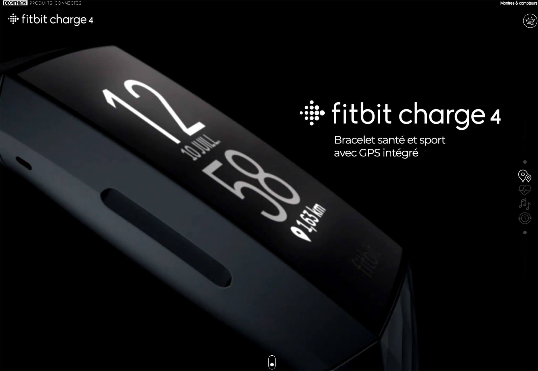
The Fitbit Charge 4 website uses an opening image of the device that’s way larger in scale than reality (especially if you are on a large desktop screen). Users control using click and scroll to get more views and details of the device. Zoom and animation aren’t overwhelming, providing a solid look at the product.

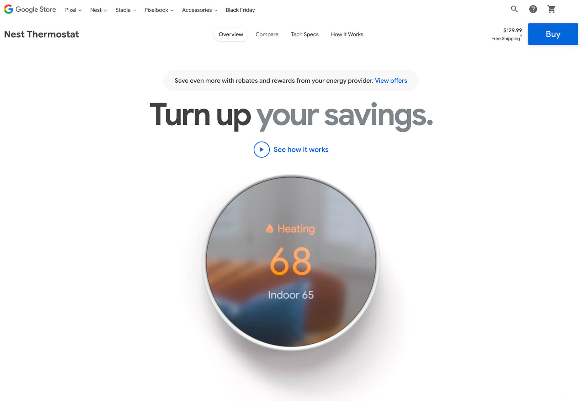
The Nest Thermostat opens with a video animation of the device moving into the forefront of the screen. (It’s rather quick.) From there, if you want more detail, there’s a video to watch that provides deeper product information in a digestible manner.

The final example isn’t really a product at all, but rather an art installation. What’s interesting is that it uses these same oversized options to show the art in detail. This is a great way to handle seeing something that you may not be able to experience in person. What makes it work so well is that the angles of the photography mimic how you would view it, looking up toward the piece hanging from the ceiling.

Simple Motion for Impact

Carrying on the theme of big, bold, and oversized designs, this trend focuses on simple animation for maximum impact.

While all-out cinematic animation can be fun to watch, it can be a little overwhelming at times. This more subtle approach is easier to digest and helps put the focus on the content at hand rather than the effect on the display.

There are plenty of ways to use simple animated effects, including scrolling animations, hover actions, and constantly moving elements. (You can see each of these if you click through the examples.)

The Patrick Mahomes store, 2PM, uses a single line of moving text that tells you what the website is about. It differentiates the retail store website from information about the athlete or his other efforts. White text on a black background is classic and easy to read. The most important thing of note may be the speed of the animation; it’s timed in a way that’s scannable but not dizzying. Sometimes the hardest part of nailing an animation is getting the speed right.

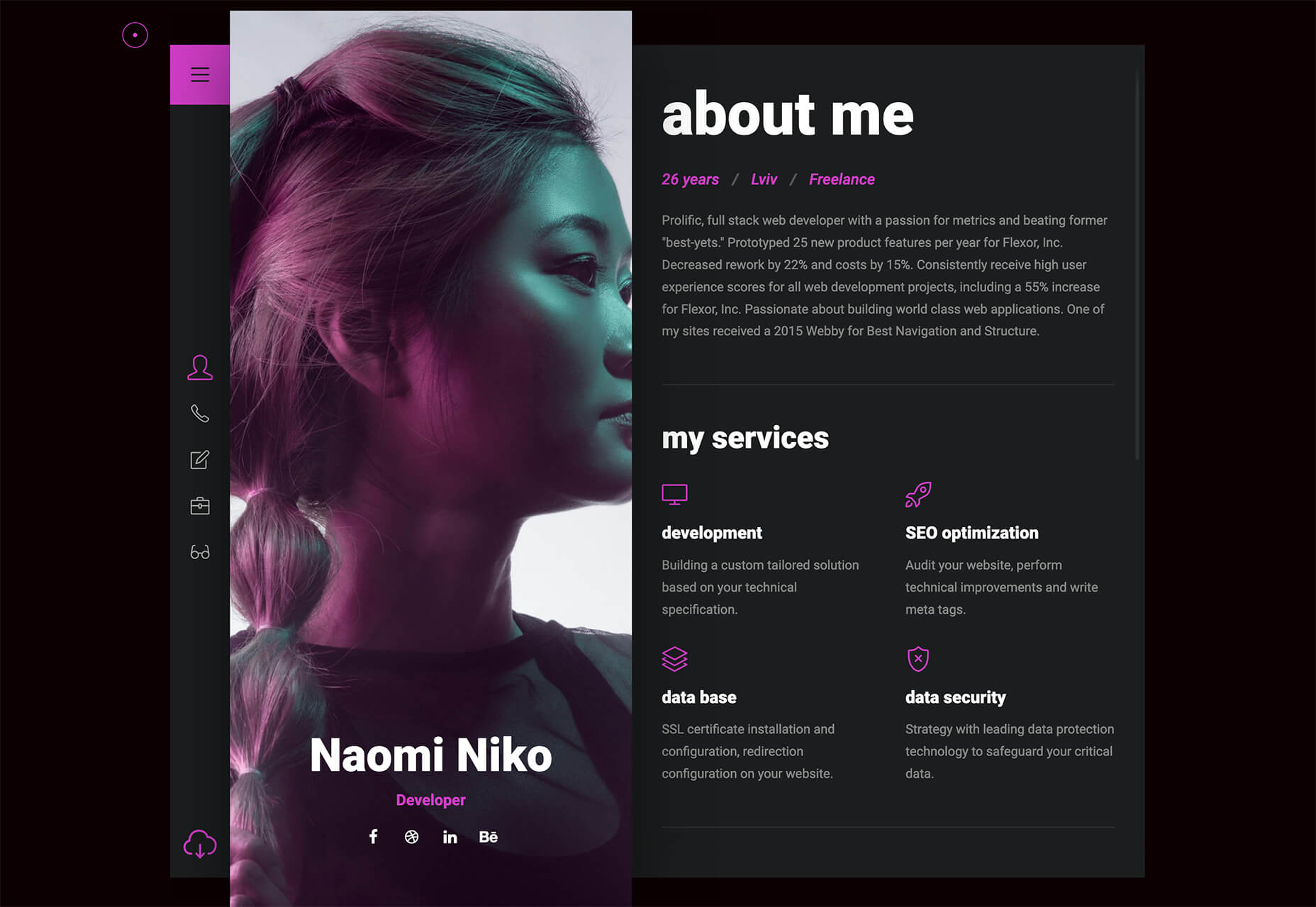
The resume-style website for Naomi Niko is striking and simple, but neat hover effects and a simple scroll animation for her resume only – and not the photo or details on the left side of the screen – make the design intriguing. The almost awkward crop and directional pull of her image also creates interest and makes you want to get further into the design.

Guilbo uses layered hover animation to make it look like he’s blowing a glittery-dust off the screen and at the user. The rugged detail of his face with the sparkle of the animation is a fun contrast. The design uses layering with dots in the foreground and background for an additional depth effect. It’s also especially nice that the objects are made to stay off his face for a realistic effect.

Conclusion

While 2020 has been an interesting year, designers have continued to find new ways to evolve the craft and create visual experiences that are inspiring. These trends are no exception.

It shows that even in unusual circumstances or with odd constraints, that amazing work and creativity can thrive. Stay creative everyone, and keep those new designs – and potential trends – coming!

Source

Categories: Designing, Others Tags:

Popular Design News of the Week: November 30, 2020 – December 6, 2020

December 6th, 2020 No comments

Every week users submit a lot of interesting stuff on our sister site Webdesigner News, highlighting great content from around the web that can be of interest to web designers.

The best way to keep track of all the great stories and news being posted is simply to check out the Webdesigner News site, however, in case you missed some here’s a quick and useful compilation of the most popular designer news that we curated from the past week.

Sidekick Browser – The Fastest Browser Built for Work

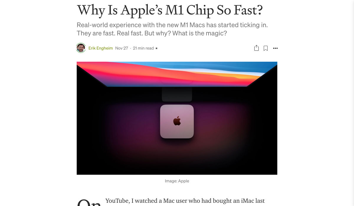
Why is Apple’s M1 Chip so Fast?

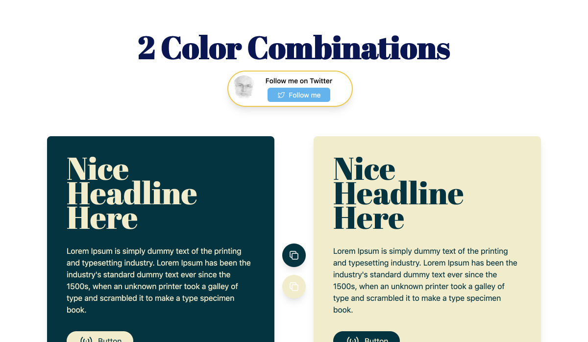
Two Color Combinations – A Curated Collection of 164 Two-color Palette Combinations

5 Tips to Build a Stunning Website that Stands Out from the Crowd

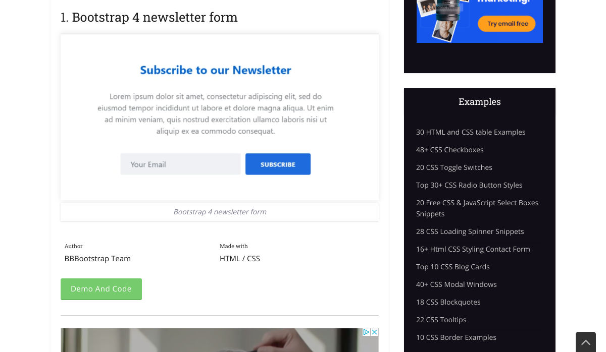
10+ Bootstrap Newsletters

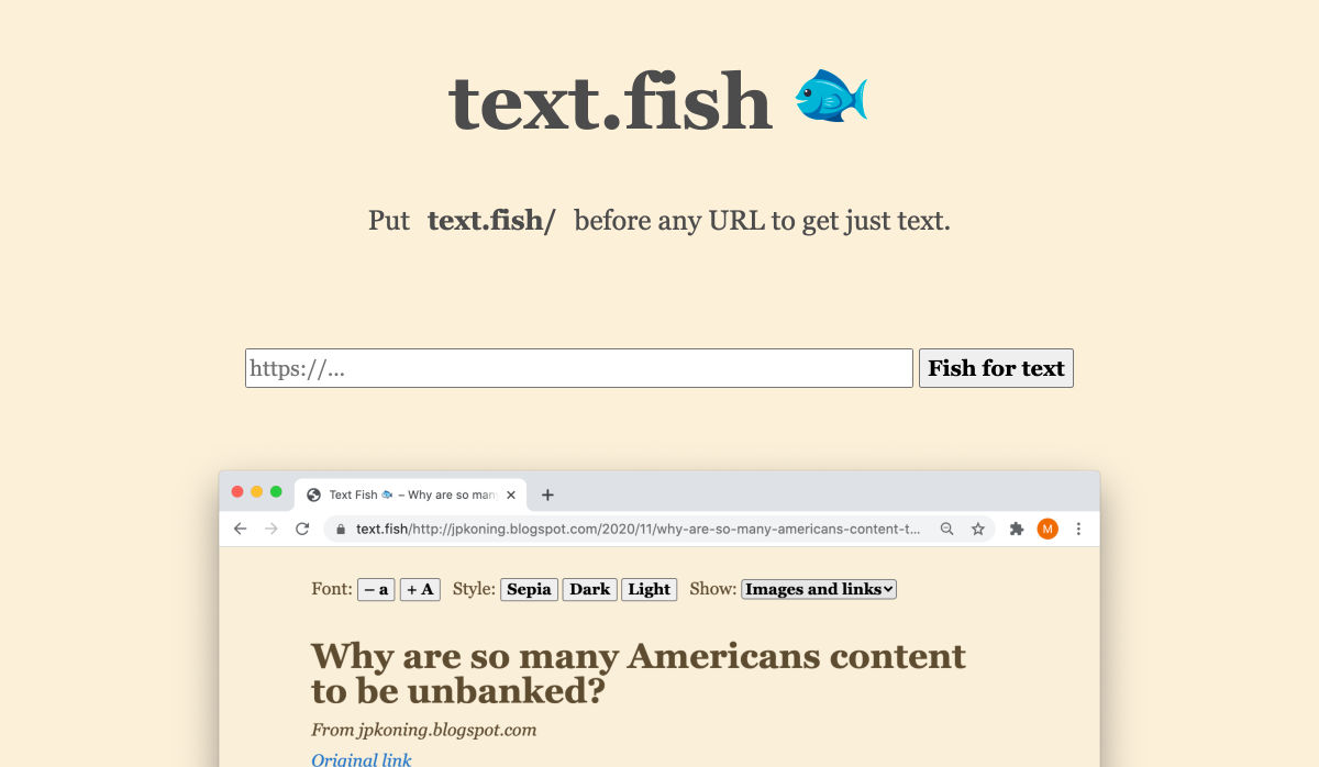
Text Fish – Get Just Text

Ecommerce Website Designs: 27 Best Online Shops and Why They Work

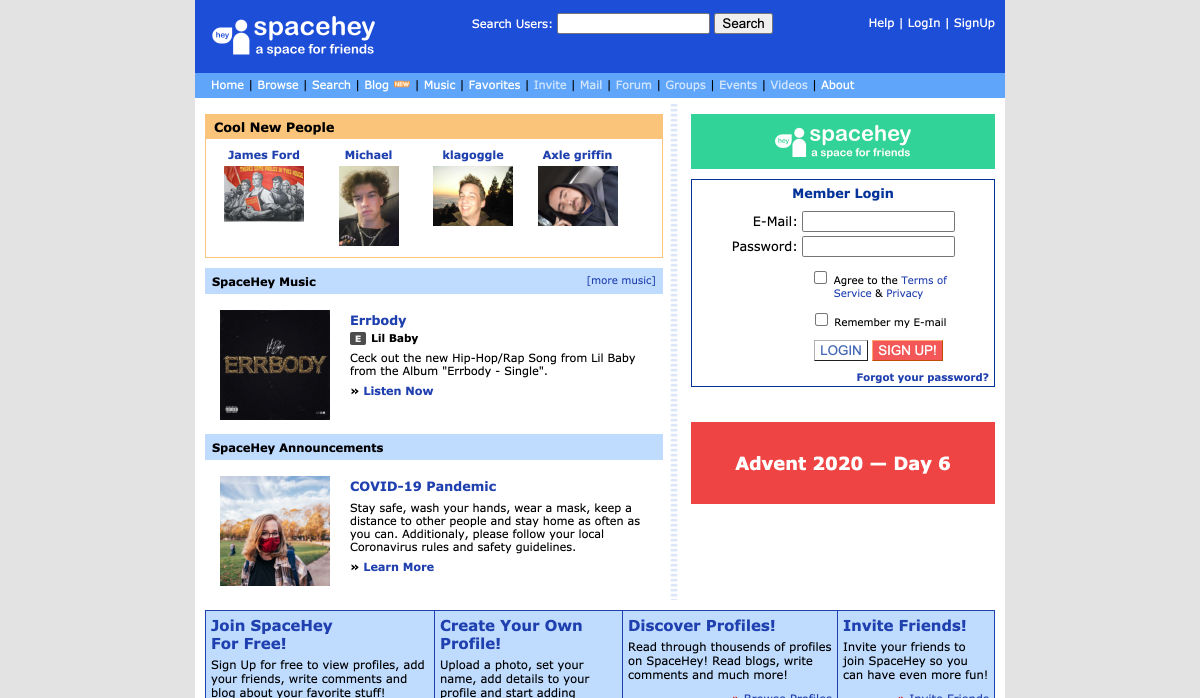
SpaceHey – MySpace Reborn

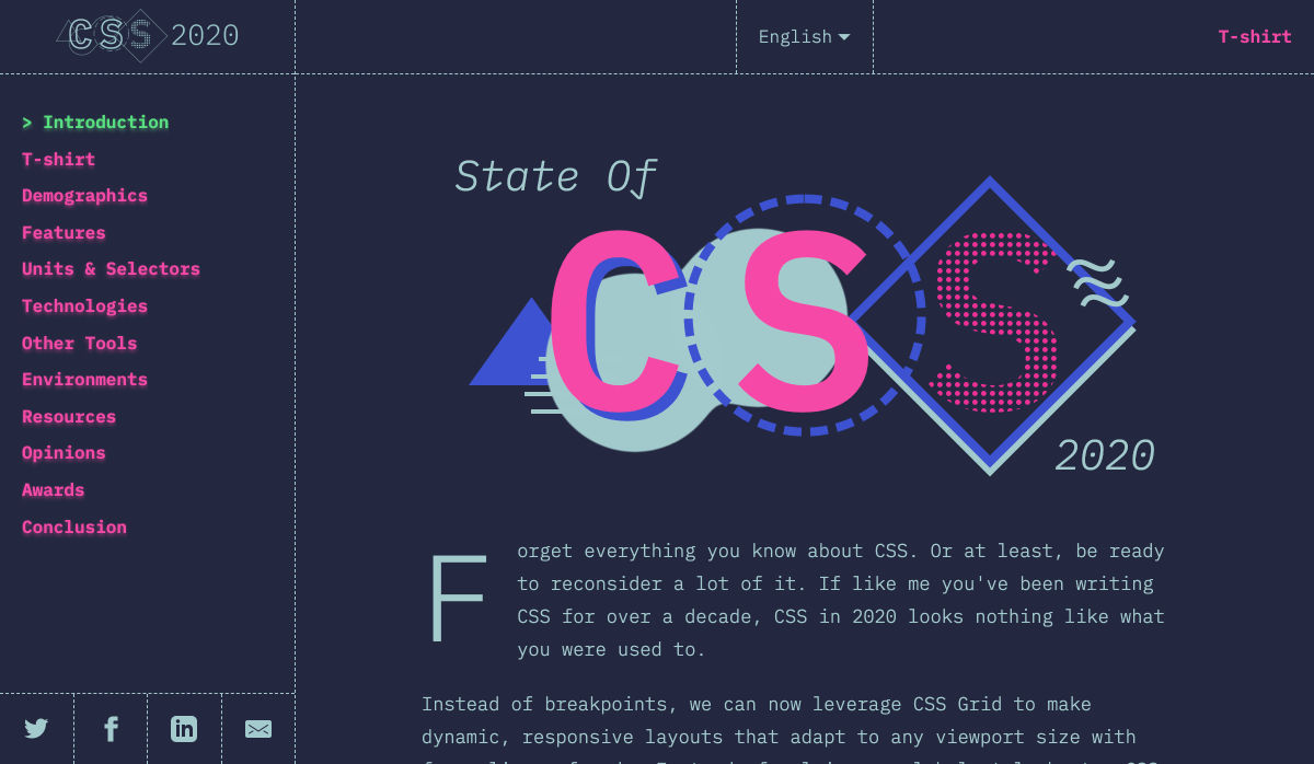
State of CSS – 2020

5 Overlooked Mobile Experience Design Best Practices

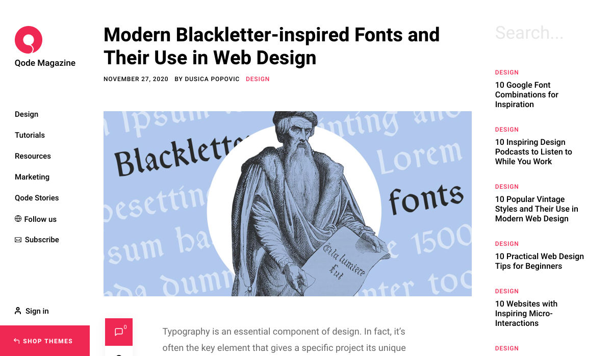
Modern Blackletter Inspired Fonts and their Use in Web Design

Internxt Drive – Secure & Private Cloud Storage Service

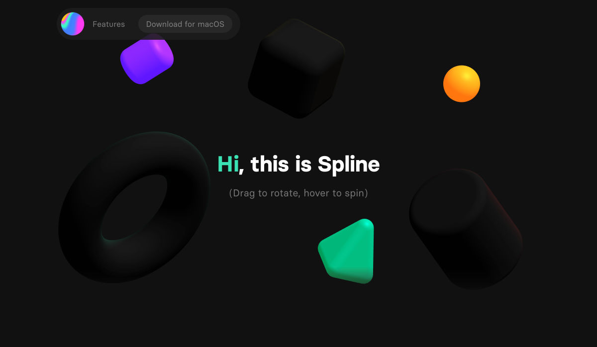
Spline – 3D for the Web (Preview Release)

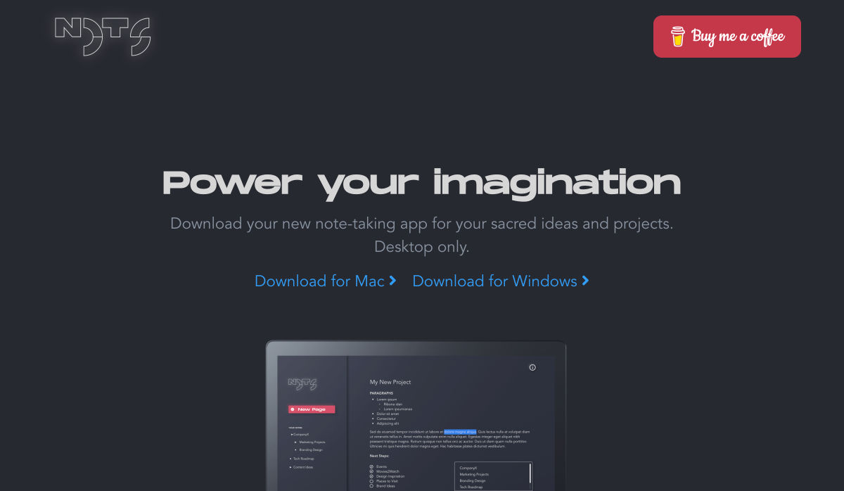
Nots – A Free Beautifully Designed Note-taking App for your Desktop

Google Play’s Best of 2020

Beacon – Run SQL Commands in Slack

Designing for the New Reality: Getting Rid of Pre-COVID Assumptions

Undoing the Toxic Dogmatism of Digital Design

Color Theory: A Beginner’s Guide for Designers

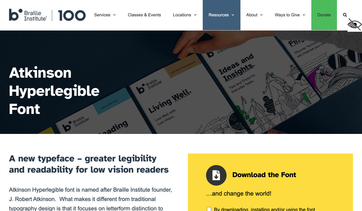
Atkinson Hyperlegible Font

11 Tips for Creating a Usable Website Contact Page

The 7 Secrets to a Great Conversation

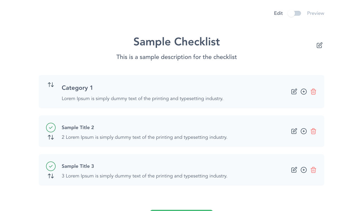
Checklist Generator – Create Checklists for Free and Host Them Wherever You Want

Empathetic Design: The First Stage of Design Thinking

Handy Guide to Networking for UX Designers

Want more? No problem! Keep track of top design news from around the web with Webdesigner News.

Source

Categories: Designing, Others Tags:

Cloudinary Fetch with Eleventy (Respecting Local Development)

December 4th, 2020 No comments

This is about a wildly specific combination of technologies — Eleventy, the static site generator, with pages with images on them that you ultimately want hosted by Cloudinary — but I just wanna document it as it sounds like a decent amount of people run into this situation.

The deal:

  • Cloudinary has a fetch URL feature, meaning you don’t actually have to learn anything (nice!) to use their service. You have to have an account, but after that you just prefix your images with a Cloudinary URL and then it is Cloudinary that optimizes, resizes, formats, and CDN serves your image. Sweet. It’s not the only service that does this, but it’s a good one.
  • But… the image needs to be on the live public internet. In development, your image URLs probably are not. They’re likely stored locally. So ideally we could keep using local URLs for images in development, and do the Cloudinary fetching on production.

Multiple people have solved this in different ways. I’m going to document how I did it (because I understand it best), but also link up how several other people have done it (which might be smarter, you be the judge).

The goal:

  • In development, images be like /images/image.png
  • In production, images be like https://res.cloudinary.com/css-tricks/image/fetch/w_1200,q_auto,f_auto/https://production-website.com/images/image.png

So if we were to template that (let’s assume Nunjucks here as it’s a nice templating language that Eleventy supports), we get something like this psuedo-code:

<img src="
  {{CLOUDINARY_PREFIX}}{{FULLY_QUALIFIED_PRODUCTION_URL}}{{RELATIVE_IMAGE_URL}}
  "
  alt="Don't screw this up, fam."
/>
Development Production
{{CLOUDINARY_PREFIX}} “” “https://res.cloudinary.com/css-tricks/image/fetch/w_1200,q_auto,f_auto/”
{{FULLY_QUALIFIED_PRODUCTION_URL}} “” “https://production-website.com”
{{RELATIVE_IMAGE_URL}} “/images/image.jpg” “/images/image.jpg”

The trick then is getting those… I guess we’ll call them global variables?… set up. It’s probably just those first two. The relative image path you’d likely just write by hand as needed.

Eleventy has some magic available for this. Any *.js file we put in a _data folder will turn into variables we can use in templates. So if we made like /src/_data/sandwiches.js and it was:

module.exports = {
  ham: true
}

In our template, we could use {{sandwiches.ham}} and that would be defined {{true}}.

Because this is JavaScript (Node), that means we have the ability to do some logic based on other variables. In our case, some other global variables will be useful, particularly the process.env variables that Node makes available. A lot of hosts (Netlify, Vercel, etc.) make “environment variables” a thing you can set up in their system, so that process.env has them available when build processes run on their system. We could do that, but that’s rather specific and tied to those hosts. Another way to set a Node global variable is to literally set it on the command line before you run a command, so if you were to do:

SANDWICH="ham" eleventy

Then process.env.SANDWICH would be ham anywhere in your Node JavaScript. Combining all that… let’s say that our production build process sets a variable indicating production, like:

PROD="true" eleventy

But on local development, we’ll run without that global variable. So let’s make use of that information while setting up some global variables to use to construct our image sources. In /src/_data/images.js (full real-world example) we’ll do:

module.exports = {

  imageLocation:
    process.env.PROD === 'true' 
      ? 'https://coding-fonts.css-tricks.com' 
      : '',

  urlPrefix:
    process.env.PROD === 'true'
      ? 'https://res.cloudinary.com/css-tricks/image/fetch/w_1600,q_auto,f_auto/'
      : ''

};

You could also check process.env.CONTEXT === 'deploy-preview' to test for Netlify deploy preview URLs, in case you want to change the logic there one way or the other.

Now in any of our templates, we can use {{images.imageLocation}} and {{images.urlPrefix}} to build out the sources.

<img 
  src="
    {{images.urlPrefixLarge}}{{images.imageLocation}}/image.png
  "
  alt="Useful alternative text."
/>

And there we go. That will be a local/relative source on development, and then on production, it becomes this prefixed and full qualified URL from which Cloudinary’s fetch will work.

Now that it’s on Cloudinary, we can take it a step further. The prefix URL can be adjusted to resize images, meaning that even with just one source image, we can pull off a rather appropriate setup for responsive images. Here’s that setup, which makes multiple prefixes available, so they can be used for the full syntax.

The end result means locally relative image in development:

The multiple versions are a lie in development, but oh well, srcset is kind of a production concern.

…and Cloudinary fetch URLs in production:

Other People’s Ideas

Phil was showing off using Netlify redirects to do this the other day:

A nice trick to optimize your site’s images without a build process or any library or framework cruft.

1. Upload & serve from @cloudinary in one step thanks to their Fetched URL API
2. Make it portable and simple with a @netlify CDN proxy

URLs FTW!

? https://t.co/YLLUvdEllQ pic.twitter.com/WRcMVFM6ZQ

— Phil Hawksworth (@philhawksworth) November 16, 2020

Then the trick to local development is catching the 404’s and redirecting them locally with more redirects.

If hand-crafting your own responsive images syntax is too big of a pain (it is), I highly recommend abstracting it. In Eleventy-land, Nicolas Hoizey has a project: eleventy-plugin-images-responsiver. Eric Portis has one as well, eleventy-respimg, which specifically uses Cloudinary as I have here.

Proving this stuff has really been on people’s minds, Tim Kadlec just blogged “Proxying Cloudinary Requests with Netlify.” He expands on Phil’s tweet, adding some extra performance context and gotchas.


The post Cloudinary Fetch with Eleventy (Respecting Local Development) appeared first on CSS-Tricks.

You can support CSS-Tricks by being an MVP Supporter.

Categories: Designing, Others Tags: