Archive

Archive for December, 2020

clipPath vs. mask

December 27th, 2020 No comments

These things are so similar, I find it hard to keep them straight. This is a nice little explanation from viewBox (what a cool name and URL, I hope they keep it up).

The big thing is that clipPath (the element in SVG, as well as clip-path in CSS) is vector and when it is applied, whatever you are clipping is either in or out. With a mask, you can also do partial transparency, meaning you can use a gradient to, for example, fade out the thing you are masking. So it occurs to me that masks are more powerful, as they can do everything a clip path can do and more.

Sarah has a whole post going into this as well.

What always bends my brain with masks is the idea that they can be luminance-style, meaning white is transparent, black is opaque, and everything in between is partially transparent. Or they can be alpha-style, where the alpha channel of the pixel is the alpha-ness of the mask. Writing that feels relatively clear, but when you then apply it to an element it feels all reverso and confusing.

Direct Link to ArticlePermalink


The post clipPath vs. mask appeared first on CSS-Tricks.

You can support CSS-Tricks by being an MVP Supporter.

Categories: Designing, Others Tags:

Popular Design News of the Week: December 21, 2020 – December 27, 2020

December 27th, 2020 No comments

Every week users submit a lot of interesting stuff on our sister site Webdesigner News, highlighting great content from around the web that can be of interest to web designers.

The best way to keep track of all the great stories and news being posted is simply to check out the Webdesigner News site, however, in case you missed some here’s a quick and useful compilation of the most popular designer news that we curated from the past week.

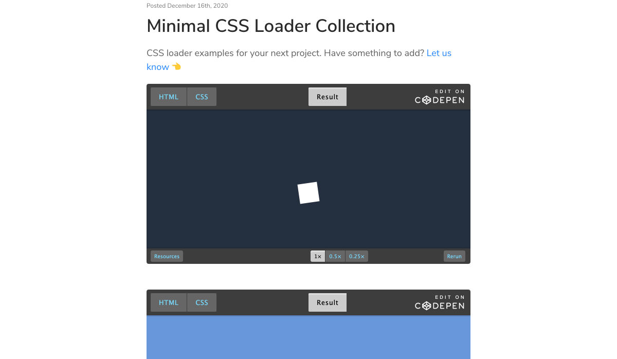
Minimal CSS Loader Collection

Webdesign Toolbox: Find the Perfect Web Development Tools

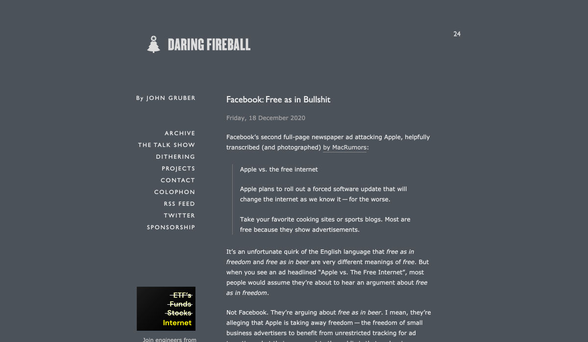
Facebook: Free as in Bullsh*t

New Year Edition: Top UX/UI Design Trends Rushing to Us In 2021

Our 50 Favorite CSS Libraries, Frameworks and Tools from 2020

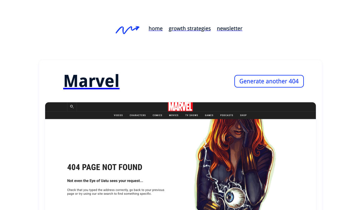
404 Page Inspiration – The Best 404 Pages from Around the Web

7 Best Instagram Tools for Designers in 2021

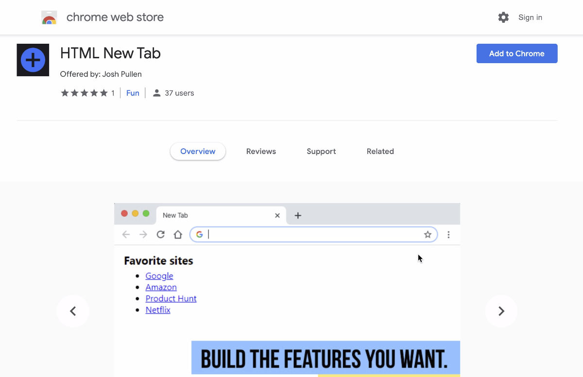
HTML New Tab for Chrome – Design your own New Tab Page

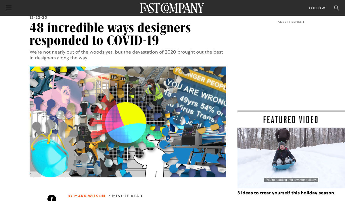
48 Incredible Ways Designers Responded to COVID-19

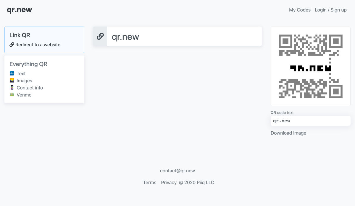
QR.New – Make a New QR Code with Text

Hotwire – HTML Over the Wire

Entry.dev – Entry-level Developer Jobs

The Dribbble Shots that Defined 2020

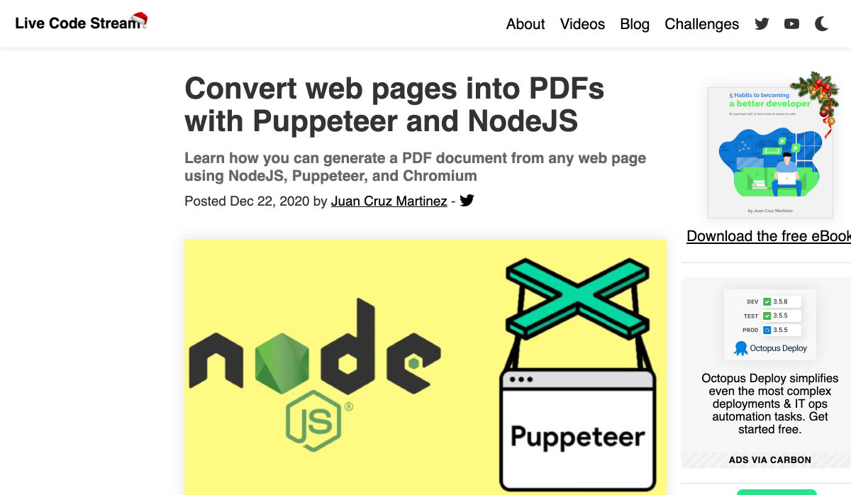
Convert Web Pages into PDFs with Puppeteer and NodeJS

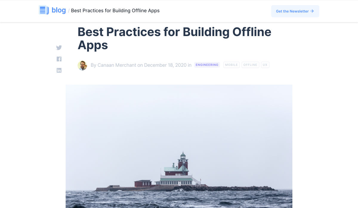
Best Practices for Building Offline Apps

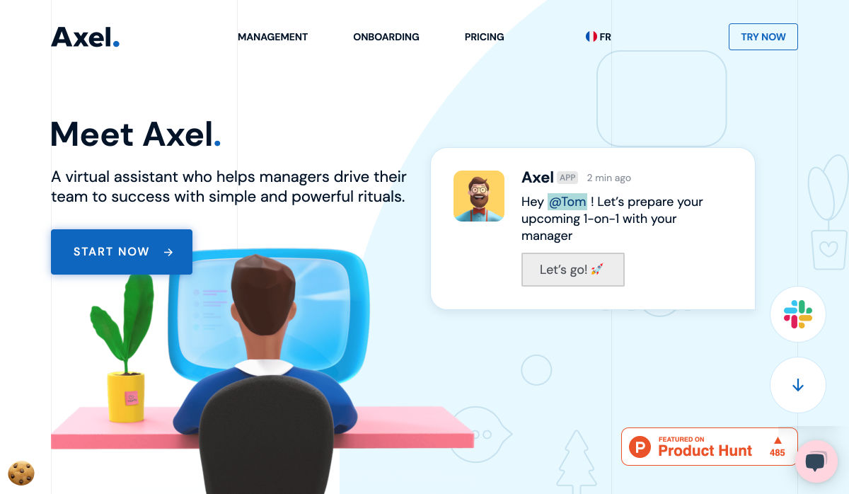
Axel – Powerful Rituals to Drive your Team to Success

Sorry, but We are not all Designers

Zecoda – The Easiest Way to Build Websites Without Code

Nebula – A Fully Featured Particle System Designer for the Web

Write Code. Not Too Much. Mostly Functions

How to Favicon in 2021: Six Files that Fit Most Needs

5 Years of Design – Time Travel Through Handpicked, Beautiful Designs

How the Web is Really Built

How to Be a 10x Developer

Why this Forgotten Punctuation Mark Should Be Revived for 2021

Want more? No problem! Keep track of top design news from around the web with Webdesigner News.

Source

Categories: Designing, Others Tags:

A Utility Class for Covering Elements

December 26th, 2020 No comments

Big ol’ same to Michelle Barker here:

Here’s something I find myself needing to do again and again in CSS: completely covering one element with another. It’s the same CSS every time: the first element (the one that needs to be covered) has position: relative applied to it. The second has position: absolute and is positioned so that all four sides align to the edges of the first element.

.original-element {
  position: relative;
}

.covering-element {
  position: absolute;
  top: 0;
  right: 0;
  bottom: 0;
  left: 0;
}

I have it stuck in my head somehow that it’s “not as reliable” to use bottom and right and that it’s safer to set the top and left then do width: 100% and height: 100%. But I can’t remember why anymore—maybe it was an older browser thing?

But speaking of modernizing things, my favorite bit from Michelle’s article is this:

.overlay {
  position: absolute;
  inset: 0;
}

The inset property is a Logical Property and clearly very handy here! Read the article for another trick involving CSS grid.

Direct Link to ArticlePermalink


The post A Utility Class for Covering Elements appeared first on CSS-Tricks.

You can support CSS-Tricks by being an MVP Supporter.

Categories: Designing, Others Tags:

Responsible, Conditional Loading

December 25th, 2020 No comments

Over on the Polyplane blog (there’s no byline but presumably it’s Kilian Valkhof), there is a great article, Creating websites with prefers-reduced-data, about the prefers-reduced-data media query. No browser support yet, but eventually you can use it in CSS to make choices that reduce data usage. From the article, perhaps you only load web fonts if the user hasn’t indicated a prefernce for low data usage:

@media (prefers-reduced-data: no-preference) {
  @font-face {
    font-family: 'Inter';
    font-weight: 100 900;
    font-display: swap;
    font-style: normal;
    font-named-instance: 'Regular';
    src: url('Inter-roman.var.woff2') format('woff2');
  }
}

body {
  font-family: Inter, system-ui, -apple-system, BlinkMacSystemFont,
               Segoe UI, Ubuntu, Roboto, Cantarell, Noto Sans, sans-serif,
               'Apple Color Emoji', 'Segoe UI Emoji', 'Segoe UI Symbol', 'Noto Color Emoji';
}

That’s a nice pattern. It’s the same spirit with accessibility and the prefers-reduced-motion media query. You could use both from JavaScript as well.

Also the same energy: Umar Hansa’s recent blog post JavaScript: Conditional JavaScript, only download when it is appropriate to do so. There are lots of examples in here, but the gist is that the navigator object has information in it about the device, internet connection, and user preferences, so you can combine that with ES Modules to conditionally load resources without too much code:

if (navigator.connection.saveData === false) {
    await import('./costly-module.js');
}

If you’re into the idea of all this, you might dig into Jeremy Wagner’s series starting here about Responsible JavaScript.


The post Responsible, Conditional Loading appeared first on CSS-Tricks.

You can support CSS-Tricks by being an MVP Supporter.

Categories: Designing, Others Tags:

9 Easy Ways to Deal With Difficult Clients

December 25th, 2020 No comments

Naturally, there are bad clients out there, but 90% of the time, it’s not really the client who is at fault. Poor communication, a lack of setting expectations, and a failure to qualify clients beforehand is usually the problem.

If you’re dealing with a problematic client, there’s usually not a lot you can do to ‘fix’ things — you should focus on finishing the project as well as you can. However, what you can do is ensure this situation never arises again.

We’ve been taught that the customer is always right. But to be honest, that’s not always the case. It’s your job as a designer and brand consultant to help your client grow their business. Because of that, you may think you have to make every idea a client has — but if these ideas do not serve their business and their brand, you have to speak up! Remember that you were hired for a reason, and that reason is that you can help them build their brand, not because you can design anything they think of.

So, to avoid the ‘difficult’ client scenario, here are a few things you can do.

1. Be Selective With Your Clients

Figure out who your ideal client is and determine that you will only work with them. Ideal clients are usually people who understand you and respect you and your expertise. A client who hires you because they know what you have to offer (i.e., working towards their business goals) will be more receptive to what you present to them — they will also be more receptive when you push back ideas.

you have to be willing to decline projects

Your ideal client is not someone who wants to dictate the whole process to you (clients who already have an idea in their head and want you to make it into reality for them).

This means you have to be willing to decline projects. This can be super difficult — saying no to a paying client always is — but the mental toll of working for a non-ideal client is never worth the money!

Be selective with your clients and ensure you are on the same page before accepting any projects. To work only with your ideal client, you can have a method of qualifying them ahead of time. Some people use questionnaires; others sit down and have a chat with potential clients. If they meet your requirements, that’s great. If not, then let them know it might not be the best fit for both of you. You can also refer them to another freelance designer, who you know would be glad to have their work.

2. Remember: You are NOT an Employee

People usually become freelancers because they have a set of skills that doesn’t tie them down to one employer — you may have even developed this skill set deliberately to avoid being stuck in one office, working for one company!

So don’t forget that you are not an employee. Your clients don’t get to send you to non-productive meetings, have you in the office at certain times, or dictate any other part of your working life to you. As a freelancer, you work for yourself — don’t get caught up in the idea you are ‘employed’ by your clients.

If your client starts acting like an employer, you need to gently remind them that you are a freelancer. They chose to work with you because of your skills and talents, and as long as you deliver it on time and budget, they can’t complain about how you do it!

3. Have a Specific Scope of Work

One of the most frustrating parts of freelancing is over-demanding clients: it happens to us all, but it happens because we let it happen!

When you start a project, define exactly what you will and won’t do as part of a contract. Then, if the client wants more than you said you would give, you can refer them to the scope document and offer the additional work at an extra fee.

Documentation saves you a lot of hassle!

Having a fixed scope for all your work will free you from the ‘demanding client’ problem. Before you start working for them, sit down with them and ask them exactly what they want from your design. That way, you know exactly what you should do and what you should not do. You can then document the services you will provide and get a written confirmation from them. Clients will sometimes forget what they told you before — which is why having written documents to show them is useful.

If they ask for additional services, you can update the document stating these changes and send them a copy. Documentation saves you a lot of hassle! It’s your responsibility to be organized and professional at the end of the day, even with over-demanding clients. Always treat them kindly — never be rude, as this will cause them to give you a bad review and hurt you in the end. Act like a professional from the start, and your clients will treat you as such.

4. Document Agreements

You may find yourself with a client who is forever changing their mind or forgetting the details — so make sure all your agreements with them are documented, and both of you have copies. Just like the scope of work documents, you can refer to these agreements in the future, and it will resolve any issues you have.

5. Set Clear Expectations

You need to set clear expectations both before and after someone becomes your client — tell them what they can expect in the project and what is included and what’s not included. Remember that your time is valuable: you cannot work indefinitely, so it is okay to set limitations in a project. One way to do this is to offer two rounds of revisions on a project. This is more than enough to come out with a design a client is happy with. Most clients will understand these limitations as long as you communicate them from the get-go.

6. Set Benchmarks

Rather than taking your design brief from the client and going off on your own to design everything, set some project milestones or benchmarks. Don’t be that designer who goes radio-silent until the final design is presented (we know, creatives like the idea of the ‘big reveal,’ but remember this is business, and communication is key!).

Benchmarks are important for a few reasons. Firstly, presenting the final design may sometimes work out, but other times, the client doesn’t like it or the direction they had in mind. Secondly, it saves you time – you don’t need to design a whole project only to have to go back and revise it all!

creatives like the idea of the ‘big reveal,’ but remember this is business, and communication is key!

Plan regular check-ins with your client, include them in the process, and ensure you are on the right track.

Take a branding project, for example. You can present to your client two or three logo concepts, providing them with options. This decreases the number of times a client is unhappy with the project’s direction because they can choose which one they want. Remember to make each design unique, rather than just a small variation of the other. Think of them as three different directions to explore with your client, and take it from there.

Ensure each concept you provide is top of your game, too — that way, whatever your client chooses, it will be a great design. Imagine you make two okay concepts and one great concept, and your client chooses the weakest design!

7. Don’t Take Offence

Imagine the scene: you go to a meeting with your client to talk about the final design. You arrive, and as well as your normal contact, the CFO is present at the meeting. They take one look at your design and decide it doesn’t work.

Don’t get mad! For a start, you don’t know if the CFO has the final say on the design, and even if they do, you have an agreed scope of work, and this is now an opportunity to move the goalposts (for a fee) and renegotiate the scope of work. Look at this as an opportunity, not as a setback!

Also, remember that you can’t please everyone all the time. Not everyone will love your designs, and it’s not a personal attack.

8. Match Your Client’s Energy

Think before you open your mouth — communication is crucial in the freelancing world, and you need to be on par with your clients’ energy and vocabulary. Imagine you have just agreed on a project with a new client, and after the meeting, they say, “I cannot wait for you to knock this logo out of the park!” And you reply hesitantly, “I’ll do what I can.”

This has already made your client doubt you, and that’s a red flag. Now your client may leave the meeting wondering if they chose the right designer for the job. What you and your body language need to say is, “Hell, yes! We’re going to knock this logo out of the park!”

This is why matching a client’s energy is so important. If they are aggressive in articulating themselves, you should be, too; obviously within limits — always be professional, but don’t be afraid to sound excited and confident!

9. Be Honest With Yourself

Sometimes, you don’t get on with someone. It happens. We can’t be best friends with all of our clients! If there’s a personality conflict that’s causing problems, it can be impossible to resolve. You may want to have someone else handle the client relationship or transfer the project to another freelancer.

being afraid will never get you anywhere as a freelancer

What makes being a freelancer great is that you actually have all the power — you can fire a client if it’s really not working for you. An employee cannot fire his or her boss. If the relationship between you and your client has turned sour, you hate the work, and it’s causing you too many headaches, you can get rid of them. No one can make you work for someone!

Even if your client represents a huge chunk of your income, don’t be afraid to fire them. There are always more clients — being afraid will never get you anywhere as a freelancer. You also need to remember that your quality of life is just as important as your income! One cannot exist without the other — there’s no point in having a huge paycheck if your sanity is suffering due to it.

Conclusion

‘Difficult’ clients in freelancing do exist, but a lot of the time, you’ll discover they could have been avoided if you, the designer, took a few key steps.

You should always be selective with your clients and ensure they fit your ‘ideal client’ model; if they don’t, you can gently refuse their project and send them on to another designer who is a better fit.

When you do start working with a client, remember they are just that, a client. They are not your boss or employer, and you are a freelancer. They don’t get to dictate your working hours or appearance in meetings. They agreed to work with you, for your skills and talents, as long as you deliver quality work on time, they don’t get to tell you what to do.

Always have a scope of work in a written contract and set expectations before you begin. This saves you hassle later when a client becomes overly demanding. Along the design process, document all agreements in paper and have benchmarks wherein you check-in with your clients.

Finally, take care with how you handle your clients in person – don’t take offense if they don’t like a design, match their energy, so they have no room to doubt you, and if it really just isn’t working due to a personality conflict, remember you are free to leave!

Featured image via Pexels.

Source
Categories: Designing, Others Tags:

How to Protect WordPress Files & Uploads Folder

December 25th, 2020 No comments

Content and files are the main assets of any WordPress site. While the website content can be protected by a password or membership plugins, there is no easy way to protect media files on your site.

As a matter of fact, membership or download plugins can secure and restrict your page and post URLs to logged-in users or paid members. However, media files embedded into content are still accessible to the public. In fact, anyone with direct links to those files can access and download them. They can even be hotlinked from other websites as well.

This poses a threat to your WordPress site as your valuable files and gray matter can be stolen at any time.

In this article, we’ll provide you with multiple solutions on how to keep prying eyes out of your media files.

By the end of this article, you’ll know:

  • How to restrict wp-content/uploads access to logged in users
  • How to prevent hotlinking of media files
  • How to Protect WordPress files with Prevent Direct Access Gold plugin
  • How to protect WordPress uploads and media files

Let’s get started!

How to Restrict wp-content/uploads Access to Logged In Users

WordPress stores all of your images and media uploads in the wp-content/uploads directory.

Imagine that you’re a singer and you make a living by selling music videos to registered members on your WordPress site. What happens if your albums in your wp-content/uploads folder are accessed by non-logged in users and leaked out? You’ll suffer a huge loss in revenue. To avoid that scenario, you need to play some tricks with the .htaccess file.

Note: There’s a good chance that you’ll modify some codes in the .htaccess file. In that case, remember to create a backup of your .htaccess file beforehand.

Open your .htaccess file in the root folder of your WordPress site and insert the following code snippet into it.

<IfModule mod_rewrite.c>
    RewriteEngine On
    RewriteCond %{HTTP_COOKIE} !.*wordpress_logged_in.*$ [NC]
    RewriteCond %{REQUEST_URI} ^(.*?/?)wp-content/uploads/.* [NC]
    RewriteRule . http://%{HTTP_HOST}%1/wp-login.php?redirect_to=%{REQUEST_URI} [L,QSA]
</IfModule>

The codes above are used for full direct access restriction to all of the files residing in the wp-content/uploads folder.

If you’d like to prevent direct access to only some specific files, copy and paste the codes below to your .htaccess file:

# Protect only some files within the uploads folder

<IfModule mod_rewrite.c>
    RewriteEngine On
    RewriteCond %{HTTP_COOKIE} !.*wordpress_logged_in.*$ [NC]
    RewriteCond %{REQUEST_URI} ^(.*?/?)wp-content/uploads/.*.(?:gif|png|jpe?g|pdf|txt|rtf|html|htm|xlsx?|docx?|mp3|mp4|mov)$ [NC]
    RewriteRule . http://%{HTTP_HOST}%1/wp-login.php?redirect_to=%{REQUEST_URI} [L,QSA]
</IfModule>

How do the two code snippets above work?

In the fourth line, the mod_rewrite module checks to see if there’s a cookie whose name contains “wordpress_logged_in.” If not, it means that the user is not logged in.

The next rule checks if the user is trying to access any files in the wp-content/uploads folder.

The final line redirects the user to a login page. If they successfully log in, they will be taken to the files they’re trying to access.

We’ve shown you how to restrict the direct access to files in the wp-content/uploads folder against non-logged in users. Let’s move to the next part of how to prevent your media files from hotlinking.

How to Prevent Hotlinking of Media Files

Hotlinking happens when other people use images and other media files, such as videos, and audios from your website and embed them directly on their site. Unless you allow them to hotlink your media files by providing the embed code, that’s considered stealing and violating copyright infringement. It also takes up your server bandwidth and resources.

To prevent hotlinking of your images and other media files, you first need to upload all of your important media files to another directory, then add the following code snippet to your .htaccess file:

# BEGIN Hotlinking Protection

RewriteEngine on 
RewriteCond %{HTTP_REFERER} !^$ 
RewriteCond %{HTTP_REFERER} !^http://(www.)?domain.com/wp-content/uploads/important/.*$ [NC]
RewriteRule .(gif|jpg|jpeg|bmp|zip|rar|mp3|mp4|flv|swf|xml|php|png|css|pdf) $ - [NC,F,L]

Make sure that you replace “domain.com” with your site.

If you want to show a “No Hotlinking” custom page instead of a usual error message to those who hotlink your media files, just modify the “RewriteRule” in the codes below a bit:

RewriteEngine on 
RewriteCond %{HTTP_REFERER} !^$ 
RewriteCond %{HTTP_REFERER} !^http://(www.)?domain.com/wp-content/uploads/important/.*$ [NC]
RewriteRule.(gif|jpg|jpeg|bmp|zip|rar|mp3|mp4|flv|swf|xml|php|png|css|pdf)$ http://www.domain.com/no-hot-linking.jpg - [NC,F,L]

In the codes above, “http://domain.com/no-hot-linking.jpg” is the direct link to the image you’re using as a customized error message.

You can also add a few tweaks to that code snippet for redirection purposes. By changing the final line to a specific URL of your homepage or a landing page, you can request users to become a member to access your media files.

In case you’d like to deny hotlinking but still allow certain search engines and social media platforms to access your files, you can add the following code snippet to your .htaccess file:

RewriteEngine on
RewriteCond %{HTTP_REFERER} !^$
RewriteCond %{HTTP_REFERER} !^http://(www.)?domain.com/wp-content/uploads/important/.*$ [NC]
RewriteCond %{HTTP_REFERER} !^http(s)?://(www.)?google.com [NC]
RewriteCond %{HTTP_REFERER} !^http(s)?://(www.)?bing.com [NC]
RewriteCond %{HTTP_REFERER} !^http(s)?://(www.)?yahoo.com [NC]
RewriteRule .(gif|jpg|jpeg|bmp|zip|rar|mp3|mp4|flv|swf|xml|php|png|css|pdf)$ http://www.domain.com/no-hot-linking.jpg - [NC,F,L]

Don’t forget to replace “domain.com” with the actual website name.

The .htaccess method seems straightforward and practical indeed. However, if you’re a complete WordPress novice and not so confident when it comes to codes, you should consider using a plugin to block direct access to your files.

It’s when the Prevent Direct Access (PDA) Gold plugin comes to play!

Limit WordPress Media Library Access with PDA Gold

Prevent Direct Access (PDA) Gold offers a friendly and effective solution to prevent your WordPress files from being indexed by search engines and stolen by unwanted users. The plugin protects unlimited media files and all file types such as images (PNG, JPEG), documents (PDF, DOCX, PPTX), audios, and videos (MP4, MP3) that you upload to your website under Media Library or via Media, Pages or Posts.

What’s more, PDA Gold enables you to set user permissions with a few simple clicks.

Let’s explore PDA Gold key features.

Restrict WordPress Media Visibility to Authorized Users

Once protected by PDA Gold, your private files will no longer be accessible to anyone except those you’ve granted permission.

Customizing the “No Access” page: The plugin allows you to show your custom page instead of the 404 error message. You can request unauthorized users to login, become a member to access the protected files by redirecting them to a registration or login page.

Restricting access by IP addresses: Prevent Direct Access enables you to take total control over your private download links by blocking unwanted IP addresses accessing your files. Plus, with the Gold version, you’ll be able to also set auto expiration on numbers of clicks or days.

Block Google Indexing of Private Files

The plugin informs Google and other search engines not to index any of your protected files. Your protected files and download links won’t be shown up on the search results.

PDA Gold also comes with basic security features.

Block access to WordPress uploads directory: Under the plugin protection, the wp-content/uploads folder where you store all media uploads will be safe from outsiders. No one will be able to sneak and browse your media files any more.

Preventing image and file hotlinking: Thanks to this feature, no one can steal and use your images and files without permission. It restricts usage of your media files, which stops others from sneakily embedding these URLs into their websites.

How to Protect WordPress Uploads and File Downloads

So how to secure WordPress files using Prevent Direct Access?

First, you need to install the Prevent Direct Access Lite and Gold plugin on your WordPress dashboard, under “Plugins.”

Now, start to protect your media files.

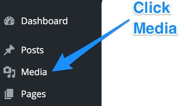
  • Click on “Media.”
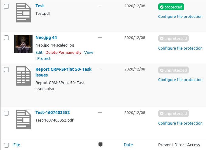
  • Choose “List View” mode.
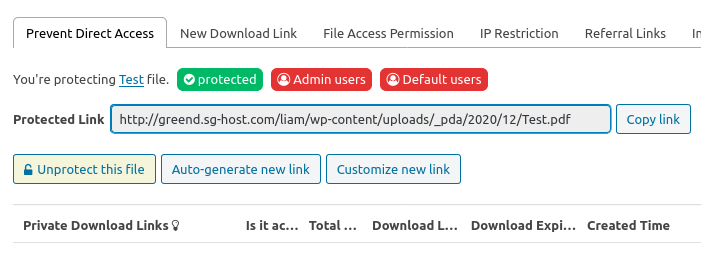
  • There’s an extra column named “Prevent Direct Access” generated by the plugin. Click on “Protect this file” option if you want to prevent others from accessing that file.
  • The file is now protected.

Make sure that you clear all caches, including your hosting cache, cache plugins, and browser cache. Your important files and their private links may not be protected correctly if they’re cached.

Grant Private Files Access to certain Domains/Referrer URLs

Apart from preventing direct access and hotlinking to your file URL, another key feature that you want to achieve is to allow access from your own or certain desired domains.

In other words, you can restrict file access to certain users depending on where they come from, i.e. referer links.

For example, you can specify only those who come from youraffiliatewebsite.com can download your private PDF files. Those with direct file URL won’t be able to do so.

Folder Protection: Protect WordPress Directories

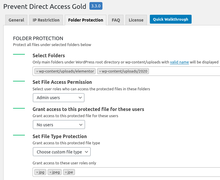
Instead of protecting files individually, you can block direct access to all files under a particular folder with Access Restriction on top of PDA Gold.

To use the folder protection feature, simply select a folder at the root or WordPress uploads directory to get started with. Then choose which user roles or username who can access those folders directly.

You can also select which file types to protect on those directories, e.g. only PNG and PPT.

Secure WordPress Files & Uploads Directory Now

We’ve provided you with 2 efficient solutions to prevent direct access to your wp-content/uploads folder as well as securing your WordPress media files against hotlinking and unauthorized users.

You can either add some code snippets in your .htaccess file or take the soft option of using the Prevent Direct Access Gold plugin. Always bear in mind to back up your .htaccess file and your site beforehand, since a small error made in that file can break your site severely.

What are you still waiting for? Protect your valuable files and media now.

Let us know what solution you’re using to block direct access to your media files by leaving a comment below.


Photo by Jon Moore on Unsplash

Categories: Others Tags:

Integrating TypeScript with Svelte

December 24th, 2020 No comments
Showing the terminal with an error output.

Svelte is one of the newer JavaScript frameworks and it’s rapidly rising in popularity. It’s a template-based framework, but one which allows for arbitrary JavaScript inside the template bindings; it has a superb reactivity story that’s simple, flexible and effective; and as an ahead-of-time (AOT) compiled framework, it has incredibly impressive perf, and bundle sizes. This post will focus on configuring TypeScript inside of Svelte templates. If you’re new to Svelte, I’d urge you to check out the introductory tutorial and docs.

If you’d like to follow along with the code (or you want to debug what you might be missing in your own project) you can clone the repo. I have branches set up to demonstrate the various pieces I’ll be going over.

Basic TypeScript and Svelte setup

Let’s look at a baseline setup. If you go to the initial-setup branch in the repo, there’s a bare Svelte project set up, with TypeScript. To be clear, TypeScript is only working in stand-alone .ts files. It’s not in any way integrated into Svelte. Accomplishing the TypeScript integration is the purpose of this post.

I’ll go over a few pieces that make Svelte and TypeScript work, mainly since I’ll be changing them in a bit, to add TypeScript support to Svelte templates.

First, I have a tsconfig.json file:

{
  "compilerOptions": {
    "module": "esNext",
    "target": "esnext",
    "moduleResolution": "node"
  },
  "exclude": ["./node_modules"]
}

This file tells TypeScript that I want to use modern JavaScript, use Node resolution, and exclude a node_modules from compilation.

Then, in typings/index.d.ts I have this:

declare module "*.svelte" {
  const value: any;
  export default value;
}

This allows TypeScript to co-exist with Svelte. Without this, TypeScript would issue errors any time a Svelte file is loaded with an import statement. Lastly, we need to tell webpack to process our Svelte files, which we do with this rule in webpack.config.js:

{
  test: /.(html|svelte)$/,
  use: [
    { loader: "babel-loader" },
    {
      loader: "svelte-loader",
      options: {
        emitCss: true,
      },
    },
  ],
}

All of that is the basic setup for a project using Svelte components and TypeScript files. To confirm everything builds, open up a couple of terminals and run npm start in one, which will start a webpack watch, and npm run tscw in the other, to start a TypeScript watch task. Hopefully both will run without error. To really verify the TypeScript checking is running, you can change:

let x: number = 12;

…in index.ts to:

let x: number = "12";

…and see the error come up in the TypeScript watch. If you want to actually run this, you can run node server in a third terminal (I recommend iTerm2, which allows you to run these terminals inside tabs in the same window) and then hit localhost:3001.

Adding TypeScript to Svelte

Let’s add TypeScript directly to our Svelte component, then see what configuration changes we need to make it work. First go to Helper.svelte, and add lang="ts" to the script tag. That tells Svelte there’s TypeScript inside the script. Now let’s actually add some TypeScript. Let’s change the val prop to be checked as a number, via export let val: number;. The whole component now looks like this:

<script lang="ts">
  export let val: number;
</script>

<h1>Value is: {val}</h1>

Our webpack window should now have an error, but that’s expected.

We need to tell the Svelte loader how to handle TypeScript. Let’s install the following:

npm i svelte-preprocess svelte-check --save

Now, let’s go to our webpack config file and grab svelte-preprocess:

const sveltePreprocess = require("svelte-preprocess");

…and add it to our svelte-loader:

{
  test: /.(html|svelte)$/,
  use: [
    { loader: "babel-loader" },
    {
      loader: "svelte-loader",
      options: {
        emitCss: true,
        preprocess: sveltePreprocess({})
      },
    },
  ],
}

OK, let’s restart the webpack process, and it should build.

Add checking

So far, what we have builds, but it doesn’t check. If we have invalid code in a Svelte component, we want that to generate an error. So, let’s go to App.svelte, add the same lang="ts" to the script tag, and then pass an invalid value for the val prop, like this:

<Helper val={"3"} />

If we look in our TypeScript window, there are no errors, but there should be. It turns out we don’t type check our Svelte template with the normal tsc compiler, but with the svelte-check utility we installed earlier. Let’s stop our TypeScript watch and, in that terminal, run npm run svelte-check. That’ll start the svelte-check process in watch mode, and we should see the error we were expecting.

Showing the terminal with a caught error.

Now, remove the quotes around the 3, and the error should go away:

Showing the same terminal window, but no errors.

Neat!

In practice, we’d want both svelte-check and tsc running at the same time so we catch both errors in both our TypeScript files and Svelte templates. There’s a bunch of utilities on npm that allow can do this, or we can use iTerm2, is able to split multiple terminals in the same window. I’m using it here to run the server, webpack build, tsc build, and svelte-check build.

Showing iTerm2 window with four open terminals in a two-by-two grid.

This setup is in the basic-checking branch of the repo.

Catching missing props

There’s still one problem we need to solve. If we omit a required prop, like the val prop we just looked at, we still won’t get an error, but we should, since we didn’t assign it a default value in Helper.svelte, and is therefore required.

<Helper /> // missing `val` prop

To tell TypeScript to report this as an error, let’s go back to our tsconfig, and add two new values

"strict": true,
"noImplicitAny": false 

The first enables a bunch of TypeScript checks that are disabled by default. The second, noImplicitAny, turns off one of those strict checks. Without that second line, any variable lacking a type—which is implicitly typed as any—is now reported as an error (no implicit any, get it?)

Opinions differ widely on whether noImplicitAny should be set to true. I happen to think it’s too strict, but plenty of people disagree. Experiment and come to your own conclusion.

Anyway, with that new configuration in place, we should be able to restart our svelte-check task and see the error we were expecting.

Showing terminal with a caught error.

This setup is in the better-checking branch of the repo.

Odds and ends

One thing to be aware of is that TypeScript’s mechanism for catching incorrect properties is immediately, and irreversibly switched off for a component if that component ever references $$props or $$restProps. For example, if you were to pass an undeclared prop of, say, junk into the Helper component, you’d get an error, as expected, since that component has no junk property. But this error would immediately go away if the Helper component referenced $$props or $$restProps. The former allows you to dynamically access any prop without having an explicit declaration for it, while $$restProps is for dynamically accessing undeclared props.

This makes sense when you think about it. The purpose of these constructs is to dynamically access a property on the fly, usually for some sort of meta-programming, or to arbitrarily pass attributes on to an html element, which is common in UI libraries. The existence of either of them implies arbitrary access to a component that may not have been declared.

There’s one other common use of $$props, and that’s to access props declared as a reserved word. class is a common example of this. For example:

const className = $$props.class;

…since:

export let class = "";

…is not valid. class is a reserved word in JavaScript but there’s a workaround in this specific case. The following is also a valid way to declare that same prop—thanks to Rich Harris for helping with this.

let className;
export { className as class };

If your only use of $$props is to access a prop whose name is reserved, you can use this alternative, and maintain better type checking for your component.

Parting thoughts

Svelte is one of the most promising, productive, and frankly fun JavaScript frameworks I’ve worked with. The relative ease with which TypeScript can be added is like a cherry on top. Having TypeScript catch errors early for you can be a real productivity boost. Hopefully this post was of some help achieving that.


The post Integrating TypeScript with Svelte appeared first on CSS-Tricks.

You can support CSS-Tricks by being an MVP Supporter.

Categories: Designing, Others Tags:

A Calendar in Three Lines of CSS

December 24th, 2020 No comments

This article has no byline and is on a website that is even more weirdly specific than this one is, but I appreciate the trick here. A seven-column grid makes for a calendar layout pretty quick. You can let the days (grid items) fall onto it naturally, except kick the first day over to the correct first column with grid-column-start.

Thoughts:

  • I’d go with an
      rather than a

        just because it seems like days are definitely ordered.
      • The days as-a-list don’t really bother me since maybe that makes semantic sense to the content of the calendar (assuming it has some)
      • But… seeing the titles of the days-of-the-week as the first items in the same list feels weird. Almost like that should be a separate list or something.
      • Or maybe it should all just be a
        since it’s sort of tabular data (it stands to reason you might want to cross-reference and look at all Thursdays or whatever).

        Anyway, the placement trickery is fun.

        CodePen Embed Fallback

        Here’s another (similar) approach from our collection of CSS Grid starter templates.

        CodePen Embed Fallback

        Direct Link to ArticlePermalink


        The post A Calendar in Three Lines of CSS appeared first on CSS-Tricks.

        You can support CSS-Tricks by being an MVP Supporter.

        Categories: Designing, Others Tags:

        8 Conversion-Driving UX Tactics For Ecommerce Websites

        December 24th, 2020 No comments

        Positive user experience (UX) is a prerequisite for retaining buyers, boosting eCommerce SEO results, and increasing website conversion rates.

        In this post, we’ll discuss actionable UX design tactics that’ll help you create a fascinating customer journey on your site which will skyrocket sales and bring in even more brand advocates.

        1. Ease the navigation with ready-made categories

        The less steps it takes to make a purchase for a user, the better. Sephora has learned this rule and simplified navigation with curated categories of products.

        The beauty retailer keeps focusing on personalization and products that’ll tap into the customer’s interests. For example, on the main page, they feature the following categories:

        • “Selling fast” to stir the FOMO (Fear of missing out) feeling and urge customers to buy.
        • “Recommended for you” with products based on search history and past purchases.
        • Extra curated category, like “Haircare value sets” personalized for a specific customer.

        In addition, Sephora includes a “More beauty for you” category with extra promotions and versatile categories that don’t match a specific customer group.

        Another beauty products retailer, Too Faced, added highlighted categories like “Christmas” and “The Fall Shop” to their header. Thus, users can start holiday shopping straight ahead, with a curated collection of products in mind.

        2. Leverage interactive marketing tactics

        Interactive marketing is all about engaging with a target audience through such interactive methods as quizzes, polls, giveaways, virtual reality (VR) and augmented reality (AR) elements, and more.

        One of the best interactive marketing examples for eCommerce is 360 videos that present a product from different angles. Apple, Logitech, and Nike have been using such videos to enable their customers to check out products’ ins and outs.

        Moreover, 360 videos improve customer satisfaction and decrease product return rates, as users get a chance to study the product before purchase.

        3. Drive signups with interactive elements

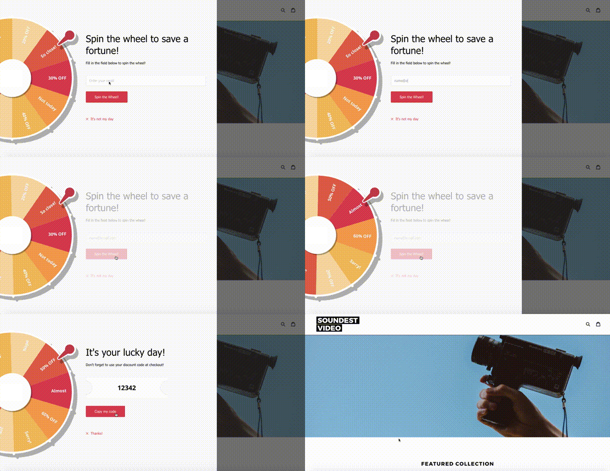
        To make users leave their emails and sign up on a website, email marketers and UX designers come up with creative, unobtrusive tactics. Tarte, an American cosmetics brand, regularly experiments with engaging UX tactics. Recently, they decided to gamify the signup process.

        Once a new user visited Tarte’s website, there was a spinning wheel with promotions like free shipping and discounts. Users could spin a wheel and enter their emails to get a promo code with an offer.

        That’s an excellent example of an interactive element and gamification that make users perform the desired action without any hassle.

        4. Highlight the promotions

        Promotions and extra offers help attract more customers and increase the average spend. That’s why placing promotions in users’ eyesight is essential.

        Nielsen Norman Group conducted research and figured out that users tend to read the content on a website, following the F-pattern. First, they concentrate on the header and first paragraph, moving below in horizontal order, and scanning the left side vertically.

        Michael Kors, an apparel and accessory retailer, places promotions on their website twice. First, they place a header with a black background and text area. Then, they use a hero space with a bold image and highlighted promotion. Users won’t miss a promotion as it’s vivid and catches the eye.

        5. Organize a wishlist

        Wishlists with items that can be saved for later are a popular solution for eCommerce websites. They help you increase signups and boost conversion rates as users can get notifications about a discount on the items they saved.

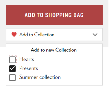
        An American retailer of discounted apparel and accessories called 6 pm went further with a wishlist UX. They offer organizing hearts (wish lists) into separate folders.

        For example, users can create separate personalized wishlists, for example, for presents or personal purchases. The wishlist isn’t visible to anyone unless shared via a direct link.

        That’s how 6 pm simplifies the creation of personal gift guides and improves customer experience (CX).

        6. Display the cart’s status

        Cart abandonment rate is one of the most complex problems marketers and UX designers have to solve. For example, the average cart abandonment rate in US eCommerce stores reached a whopping 70%.

        Together with an IT management department, you can consider the option of displaying the shopping cart’s status. If there are any items, display the amount of the items in a cart. The number against a shopping cart nudges customers to come back to the cart and finish their purchase.

        For example, you can display a number of items in a cart and a wishlist, so a customer may check out products in both categories. This is a rather effective upsell strategy to make a user add extra items to a cart when they’re in checkout, ready to buy.

        Some eCommerce websites combine this trick with other marketing tactics like popups or extra discounts to incentivize users to make a purchase.

        7. Simplify product returns

        Product returns aren’t what retailers expect from their customers. However, the easy process of a product return positively impacts the customer experience, motivates users to leave positive reviews, and boosts referrals.

        Victoria’s Secret is transparent when it comes to product returns. On their website, a link to terms of product returns is placed right below an “Add to bag” button. Thus, they don’t hide the information from users and make their terms clear before a customer even makes a purchase.

        8. Make it easy to reach out to support

        Sometimes, things don’t go as expected. That’s when customer support comes into action. In order not to make your customer wander the website looking for help, provide the links to customer support.

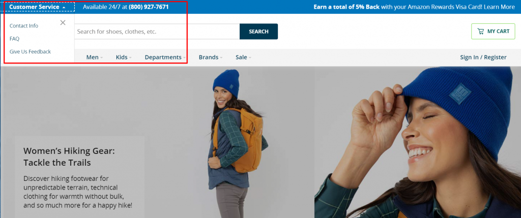
        Zappos placed a customer support block in a header, making it accessible to anyone. Their customer support options are truly impressive. You can reach out to the Loyalty Team via live chat, telephone, email, SMS, or find frequently asked questions in a dedicated block.

        Zappos’ call center works 24/7: that’s pretty impressive in the world of messengers and live chats. To streamline the distribution of calls and connect a customer to a consultant faster, they use an Interactive Voice Response (IVR) to guide a customer through a conversation.

        Wrapping up

        It takes the effort of multidisciplinary specialists like UX designers, marketers, and content writers to build a trustworthy, conversion-driving eCommerce website. In 2020, marketers have been focusing on creating a truly remarkable customer experience to engage with target audiences. Websites, as one of the major touchpoints in a customer journey, help marketers reach their goals.

        We hope our tips help you create an outstanding user experience and boost sales. Don’t forget to share our article and have fun devising creative UX campaigns!


        Photo by Sigmund on Unsplash

        Categories: Others Tags:

        7 Tips to Meet your Business Goals with an Offshore Development Team

        December 24th, 2020 No comments

        Are you looking for an efficient offshore development partner? According to Statista, Information technology outsourcing contributed $66.5 billion to the outsourcing industry’s overall revenue, and this number is only going to grow with time.

        It is common knowledge that an offshore team can lead to a significant reduction in cost. But if your team isn’t just right, the end-product might turn out unsatisfactory. It is easy to be duped by an offshore development company that initially offers the world and then cannot live up to your expectations and produces an utterly underwhelming product.

        To steer clear from pitfalls such as the above, I have come up with 7 sure-fire tips to meet and exceed your business goals with offshore development successfully. So without further ado, let’s get started.

        1. Collaborate with your offshore developers

        It is essential to be thorough and transparent in your communications with the offshore teams you are deciding on hiring. Collaboration is vital to get a fair sense of what the contending teams can bring to the table. Some offshore development teams provide pitches on how exactly they are going to go about your development project. These pitches need to be thoroughly evaluated and compared with your enterprise’s development goals.

        Enterprises must understand that even after they have chosen a development team, collaboration and transparent two-way communication is necessary to keep the project aligned with your business objectives. No one understands your project better than you, and clear communication and complete transparency every step of the way are essential for the project to meet your requirements. If you feel that the offshore development team you are looking at cannot earn your trust, you should take your search elsewhere.

        2. Demand complete control over development

        The offshore development team you choose should offer you complete control over the development and all subsequent deployment and maintenance tasks. The ideal offshore development team will not feel like a merchant or a vendor and will instead function and feel like an organic extension of your in-house teams.

        Ensure that the offshore team you plan on hiring is open to constructive feedback and is comfortable with checks regular on project status.

        It is advisable to split the project into small timeframe controlled mini-projects to ensure that it meets its final deadline without compromises on quality. As an enterprise, you should keep track of the resources utilized, whether financial, infrastructural, or temporal.

        The other side of the coin demands that even while remaining completely informed and an integral part of the development process, as an enterprise, you should not micromanage and offer your offshore development team breathing room to work on your project while you provide them flexibility in their schedules and instructions.

        3. Price Is King

        While hiring an offshore development team, it is necessary to ensure that the offshore project should not cost more than what it would cost to deploy your in-house team on the project.

        Thorough market research is advised to have a clear picture of the average development cost of your project in the offshore location you are outsourcing your project to.

        The easiest way to calculate whether the contending offshore development company has offered you a sweet deal is by getting to know the cost of an in-house team in that location, assessing the time sink and development expertise offered. Luckily, offshoring has picked up in a big way, and most offshore development organizations happen to be quite capable. A large contingent of companies has saved over 60% in development costs by offshoring. With a little attention to detail and scrutiny, your enterprise could be looking at a similar saving percentage.

        4. Fluid Communication

        I have mentioned communication earlier, but I would like to on the subject once more given its importance. The offshore development team you hire should be readily accessible and that too through multiple communication channels to cater to preference and the off chance of one or more communication channels facing downtime.

        Channels like communication apps, video chats, text chats, phone calls, and email should always be open. The offshore team should be consistently available during work hours to facilitate checks and give updates on the project’s progress. Avoid offshore teams that are not open to constant, fluid communication

        5. Conduct Background Checks

        You should thoroughly check The team you propose to hire for legitimacy. Without wanting to create doubt, for the sake of information, I would like to tell you that there are instances of fraudulent offshore providers who take up projects, receive initial payments, and then shut shop and disappear.

        Along with background checks, as an enterprise, you should pay close heed to testimonials and client stories published on impartial forums, rather than just the offshore company’s website. Along with gathering information about past projects and clients, you should also double-check your potential offshore development partner’s claims.

        Most companies should have no issue in furnishing you with actual references unless they are strictly working on private enterprise apps. An advised technique to gauge client satisfaction levels is to ask their previous clients if they would hire the same offshore company for further projects.

        6. Assess Market Opportunities

        Deploying offshore teams can often help you get a foot in the door to new market opportunities. You can build a brand presence in other countries and even work with your offshore partner to introduce new products and services pertinent to their geo-location.

        Offshore teams make perfect business sense when you do not have a team of competent developers in your target market. Not only do offshore teams help you save a ton in establishment costs, but they also allow you to understand and cater to foreign markets.

        7. Offshore developers: Where to look?

        The global market sports many countries that are bustling with offshore developers and offshore development service providers. Issues such as time zone and culture used to be roadblocks previously, but these issues have mostly been mitigated over the past two decades. Now it is a question of getting the best deal with optimum quality to price ratio. Here are some geographies with an abundance of offshore development resources.

        Asia

        Asia boasts of 4 million software developers. India, the Philippines and China have the largest number of developers. India leads the pack with 2.75 million developers, while China has 590k developers and the Philippines has 190k developers.

        Eastern Europe

        Eastern Europe is now a reputed and reliable IT outsourcing destination thanks to its cost-effectiveness, rapidly evolving tech industry, and of course, an ever-growing pool of development resources with a little over 1 million software developers. In terms of software development companies, Ukraine has 1600 while Poland, Bulgaria, and Belarus have 500 each.

        Latin America

        In Latin America, Brazil, Mexico, and Argentina are the best countries to hire offshore development professionals.

        Conclusion

        I trust that this article will help you to map out a strategy for your offshore development project and effectively analyze and decide among potential development partners. I would like to summarize by mentioning how hiring an offshore development partner is a significant risk if not approached methodically. It is also one of the best and most cost-efficient ways of entering new markets.

        With collaboration, proper control, effective price points, smooth communication, vetted resources, and knowledge about where to look for the best developers, you can rest assured that your project will go smoothly.


        Photo by Sigmund on Unsplash

        Categories: Others Tags: