Archive

Archive for December, 2020

Slow Movement

December 16th, 2020 No comments

There was a time when I felt overwhelmed by how fast the web developed. It seemed like not a single day passed without a new plugin, framework, technique, or language feature being released. I believed that in order to survive as a freelancer and to compete with others I had to learn everything everyone else was so good at: webpack, React, Angular, SVGs, Houdini, CSS Grid Layout, ES6, you name it. Being active on Twitter and going to conferences didn’t help with that because I was constantly exposed to all the new things.

Surrender

At some point, I surrendered. I decided for myself that I can’t keep up. Professionally it changed nothing for me because, in reality, no one expected me to know everything and this impression I had was only happening in my bubble anyway. Slowing down was a brilliant decision because it wasn’t just a mental relief, it also helped me focus on the things I actually wanted to learn. I still read newsletters, blogs and Twitter, and I still take some time to try something new every now and then, but I do it without pressure. I try to keep up-to-date but I don’t feel the urge to know everything.

This is how I have been dealing with developments on the web over the past few years, but recently, especially this year, I learned something new. It wasn’t a framework or language — it was the insight that in our aspiration for innovation and progress, we’re neglecting to draw on the many features HTML, CSS, and JavaScript offer today. In other words: there’s so much we can learn if we look back instead of ahead.

Don’t go chasing waterfalls

I’m speaking of neglect because I believe that there’s a significant divide between the things we believe we know about front-end languages and what we actually should know.

HTML

It’s part of my job and a hobby to inspect websites and evaluate the quality of their front-end. I’ve looked under the hood on many websites, and I can only confirm what web accessibility experts preach every day: most HTML documents are in terrible shape. If you don’t believe me, just look at the data:

There’s a massive difference between knowing HTML syntax and knowing how to use it properly. When it comes to writing well-structured, semantic HTML documents, we all can use a little refresher. In 2020, I’ve spent a good deal of my time learning HTML and I hope that users of the websites I build can benefit from my insights.

Two of my favorite things I’ve learned about HTML in 2020:

You can change the filename of a downloadable file by defining a value in the download attribute.
<a href="files/yxcvc27.pdf" download="report.pdf">Download (2MB)</a>
You can use the value attribute to change the numbering in an ordered list.
<ol>
  <li value="3">C</li>
  <li value="2">B</li>
  <li value="1">A</li>
</ol>

CSS

Almost every time I look up a CSS property on MDN or CSS-Tricks, I discover something new. Try it yourself. Search for margin, list-style-type or color. I’m sure you’ll learn something.

The list of things I’ve learned about CSS in 2020 is pretty long, here are two of my favorites.

You can use the url() function as (part of) the value of the content property.
div::before {
  content: url('marker-icon.png');
}
CodePen Embed Fallback
You can implement native smooth scrolling in CSS.
// Animate scrolling only if users don't prefer reduced motion
@media (prefers-reduced-motion: no-preference) {
  html {
    scroll-behavior: smooth;
  }
  
  // Add some spacing between the target and the top of the viewport
  :target {
    scroll-margin-top: 0.8em;
  }
}
CodePen Embed Fallback

JavaScript

I write JavaScript regularly, but it’s not one of my core strengths, so I learn new things about it all the time. Here are two of my favorites this year:

You can use the nomodule attribute to run JavaScript code only in browsers that don’t support JavaScript modules.
<script nomodule>
  console.log('This browser doesn't support JS Modules.');
</script>
<script type="module">
  console.log('This browser supports JS Modules.');
</script>

Conclusion

HTML is the backbone of every website; knowing how to write semantic documents should be every web developer’s top priority. CSS is, to its own extent, so complex that in order to learn new concepts we must understand which problems they solve compared to older techniques. JavaScript frameworks and libraries come and go, but what they all have in common is that they’re written in vanilla JavaScript.

In 2020, I relearned things I had already forgotten and discovered new things about established elements and properties. There’s so much hidden knowledge to find if you only look for it. I’ll expand on that in 2021 because there’s so much awesome stuff to discover.


The post Slow Movement appeared first on CSS-Tricks.

You can support CSS-Tricks by being an MVP Supporter.
Categories: Designing, Others Tags:

How to Use the Locomotive Scroll for all Kinds of Scrolling Effects

December 16th, 2020 No comments

I was recently looking for a way to perform scrolling effects on a project and I stumbled on the Locomotive Scroll library. It lets you perform a variety of scrolling effects, like parallax and triggering/controlling animations at scroll points.

You might also call it a “smooth scrolling” library, but it doesn’t leverage native smooth scrolling — it does just the opposite by virtualizing scrolling and ensuring it’s always smooth. You could probably consider this “scrolljacking” so if you hate that generally, you might hate this, but UX research seems rather mixed on whether it’s actually bad or not. The homepage will give you a good sense of how it works and feels.

Let’s look at the basics of using Locomotive-Scroll JavaScript and how to leverage it to for delightful user experiences.

What is Locomotive Scroll?

Here’s what they say:

Locomotive scroll is a simple scroll library, built as a layer on top of ayamflow’s virtual-scroll, it provides smooth scrolling with support for parallax effects, toggling classes, and triggering event listeners when elements are in the viewport.

In other words, it detects when elements are in the viewport and then alters CSS transform property values on those elements to create scrolling effects.

Oftentimes scrolling effects are called parallax meaning some elements are made to look like they are deep in the background, making them appear to move slower than other elements that are closer to the foreground while scrolling is taking place. Imagine looking out the window from a moving car. The trees far away seems to slowly drift by where the fence right along the road zips quickly by. Sort of like the effect here in this pen from Sarah Drasner:

CodePen Embed Fallback

Here’s how it works

Locomotive Scroll works primarily through specific attributes in the HTML. Elements with these attributes trigger event listeners in JavaScript when they are in the viewport, then apply CSS transform values as inline styles.

There are two key attributes to always call upon Locomotive:

  • data-scroll: detects whether or not an element is in the viewport
  • data-scroll-container: wraps all the HTML content you want to watch for scrolling

Here’s what we’re talking about when we say that the transform property values are updated in the HTML as inline styles.

Notice how, as soon as an element with Locomotive’s data- attributes comes into the viewport, the CSS transform values are are updated.

Let’s set this up

We can use the library right as a tag if we’d like. It’s on CDNs, so like:

<link rel="stylesheet" href="https://cdn.jsdelivr.net/npm/locomotive-scroll@3.5.4/dist/locomotive-scroll.css"> 
<script src="https://cdn.jsdelivr.net/npm/locomotive-scroll@3.5.4/dist/locomotive-scroll.min.js">

Now we look for the container and kick off the library:

const scroller = new LocomotiveScroll({
  el: document.querySelector('[data-scroll-container]'),
  smooth: true
});

The library is on npm as well, so we can use it that way in our build instead with the typical npm install locomotive-scroll, then:

import LocomotiveScroll from 'locomotive-scroll';

const scroll = new LocomotiveScroll();

That means we could use them off Skypack too, like:

CodePen Embed Fallback

That’s really all there is to the setup! It’s pretty plug-and-play like that.

Here are some examples

You can probably think of some pretty nice use cases for something like this, but let’s go over a few examples where you might use Locomotive Scroll.

Let’s start with this one:

CodePen Embed Fallback

That HTML has all kinds of data- attributes going on in there. We’ve already looked at data-scroll and data-scroll-container. Here’s what the rest are and what they do:

  • data-scroll-section : Defines a scrollable section. For better performance, it’s a good idea to split pages into sections.
  • data-scroll-direction: Defines the vertical or horizontal direction that an element moves.
  • data-scroll-speed: Specifies the speed an element moves. A negative value reverses the direction, but only vertically, unless data-scroll-direction is applied on the same element.
  • data-scroll-sticky: Specifies an element that sticks to the viewport as long as the target element is still in view.
  • data-scroll-target: Targets a particular element. It takes in an ID selector, which is unique compared to the other attributes.

So, let’s say we are using the data-scroll-sticky attribute. We always have to set a data-scroll-target attribute as well, because the target element is usually the container holding the other elements.

<div class="container" id="stick" data-scroll-section >
  <p data-scroll data-scroll-sticky data-scroll-target="#stick">
    Look at me, I'm going to stick when you scroll pass me.
  </p>
</div>

Now that we’ve picked one apart, here are a couple of others:

CodePen Embed Fallback

You can also use LocoMotive-Scroll in other frameworks, too. Here’s an example in React:

Scroll aboard!

I can not emphasize the power of Locomotive Scroll enough. I needed to add scroll effects to a side project I was working on, and this was super quick and easy to use. I hope you’re able to use it on a project and experience how great it is for scrolling effects.


The post How to Use the Locomotive Scroll for all Kinds of Scrolling Effects appeared first on CSS-Tricks.

You can support CSS-Tricks by being an MVP Supporter.

Categories: Designing, Others Tags:

The Power of Lampshading

December 16th, 2020 No comments

I enjoyed this blog post from Shawn. Lampshading is apparently the idea of a TV show calling attention to some weakness (like an implausible plot point) so that the show can move on. By calling it out, it avoids criticism by demonstrating the self-awareness. For developers, Shawn notes, it’s like admitting to your teammates/boss that you don’t know some particular technology so the team can move on.

Not only is this useful, it’s powerful. Higher-ups need to call out anything they don’t understand because their job is literally asking the right questions and making sure clarity is present for both customers and reports. Juniors need to use it in order to grow.

I feel like this is easier to pull off the further you are on the polarity of junior and senior. If you’re super new, people are like, yeah it makes sense that they don’t know that thing. If you’re highly (and deservedly) senior, people are like, wow this obviously and incredibly knowledgeable human has a gap in their skillset — how relatable and humble of them to say it. I would hope lampshading is useful for everyone, but I could see how people square in the middle might have trouble pulling it off.

Direct Link to ArticlePermalink


The post The Power of Lampshading appeared first on CSS-Tricks.

You can support CSS-Tricks by being an MVP Supporter.

Categories: Designing, Others Tags:

Display the Latest News on Your Site With Mediastack

December 16th, 2020 No comments

What an extraordinary year 2020 has been for the news! From the ongoing coronavirus crisis, to a turbulent US election, to the unrelenting march of Bitcoin, this year like no other we’ve been glued to our phones micro-analyzing every tidbit of news.

Which makes this the perfect time for mediastack, an awesome REST API that allows you to embed a customizable news feed, sourced from the world’s top news agencies, and updated by the minute, right on your site.

Integrating Global News with Your Site

News is the beating pulse of so many global industries. From political decisions that affect stock prices, to natural disasters that interrupt goods and services, to the whims of celebrities who overnight transform brands from unknown to must-have.

Whether you’re building a site for a non-profit in Louisiana that cares deeply about both Washington politics, and hurricanes in the Caribbean; or you’re building an app for a golf course in Halkidiki that’s focused on both local news, and golf around the world; delivering real-time news content to those users elevates UX.

Tightly integrating the news with your site makes it a hub for users hungry for that very news. The only limit is your creativity.

Display Up-to-Date News on Your Site

When news breaks around the world the top networks scramble to catch up; they simply can’t maintain correspondents in every town and city in the world, and so they rely on affiliates. mediastack pulls in news from over 7,500 different sources in over 50 countries worldwide, giving you access to exactly the same affiliates frequently used by big news organizations like CNN, MSNBC, BBC, or ABC.

When it’s one of the big players in news that breaks a story first, mediastack still has you covered because as will as covering smaller, lesser-known sources mediastack delivers real-time news from CBS, Sky News, The Guardian, Al Jazeera, USA Today, and a host of trusted names across the industry.

If your site targets users that are only interested in certain types of story — like sports, or Hollywood celebrities — then you can even pull in stories from ESPN, TMZ, or Fox News.

Get Started Quickly with mediastack

Getting started with mediastack couldn’t be simpler, and there’s a free plan that’s more than enough to prototype your project.

Full documentation is provided with code examples for PHP, Python, jQuery, Go, and Ruby. To start integrating all you need to do is register for a free access key.

Once you have your free access key, you connect to the API, then customize the results you receive with simple parameters. You can specify the types of news, the precise sources (including omitting sources), languages, countries, and most importantly your keywords.

For example here’s how you’d request science news from CNN, but not TMZ:

https://api.mediastack.com/v1/news
?access_key=[ INSERT YOUR ACCESS KEY HERE ]
&categories=science
&sources=cnn,-tmz

Let’s say you want to display Spanish language crypto news on your site, it couldn’t be easier:

https://api.mediastack.com/v1/news
?access_key=[ INSERT YOUR ACCESS KEY HERE ]
&categories=business,technology
&languages=es
&search=crypto,bitcoin,btc,xrp,ripple,etherium,altcoin

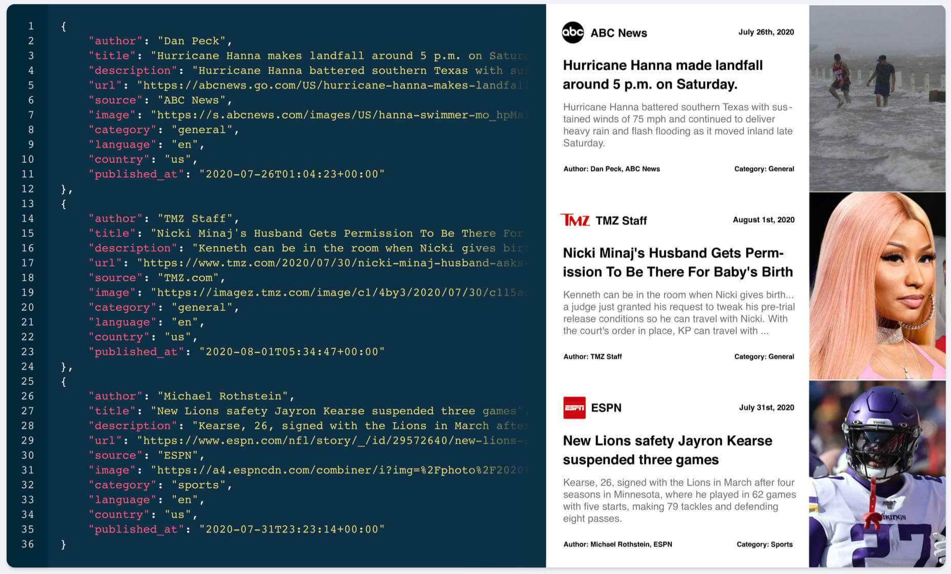
The API sends back simple JSON data that’s easy to run through. Each news item includes the author, title, description, url, source, image, category, language, country, and a published_at timestamp that records when the story was posted.

Once the feed is setup, sit back and relax. It’s all automated from now on.

The Best Source of News for Your Website

mediastack is delivered by apilayer, quite rightly one of the most trusted names in APIs, and is capable of handling millions of requests simultaneously.

Fast, updated by the minute, highly customizable, reliable, and sourced from the biggest names in the news industry, mediastack is an amazing API.

There’s a free-forever plan that allows you to use the API without charge, for up to 500 API calls per month, that’s perfect for trying it out.

For commercial use, plans start at just $19.99/month, and can handle up to 250,000 calls per month. Commercial plans also include HTTPS encryption, live news delivery, access to historical data, and — should you ever need it — technical support.

Head over to mediastack today, to prepare your site for whatever events 2021 throws at us.

[– This is a sponsored post on behalf of mediastack –]

Source

Categories: Designing, Others Tags:

We are Hiring Experience Designers and Design Thinkers (Closed!)

December 16th, 2020 No comments
we_are_hiring

(Edit: Applications are now closed!)

Design Sojourn is a proven Design Led Innovation Consultancy passionate in radically transforming lives.  We are growing our team in 2021!

We are currently looking for smart, dynamic, self-motivated Experience Designers with a strong background in ethnographic design research, experience in designing multiple touch-points, and bringing ideas to market.  A Design Thinker with strong verbal/written communications skills and loves getting things done is an advantage.

Design Sojourn is well known in the industry for its nurturing and pro-training culture, therefore a candidate with the right mindset and values could be considered and trained for the role.  

Experience Designer or Senior Experience Designer

  • Education qualifications in design from any discipline preferred but not required.  We have a team of multidisciplinary designers from diverse backgrounds, including those without qualifications in design.  Degree or diploma accepted. 
  • At least 2+ years of relevant experience with a strong portfolio of commercial Design Thinking projects.
  • Exhibits a good command of design or design thinking skillsets which could include, business model innovation, ethnographic research, presentation skills, workshop facilitation, customer journey mapping, insights generation, UX/UI, innovation project and change management, service blueprints, etc. in any combination.
  • Please introduce yourself by email to hr [little mouse] designsojourn.com.  Links to an online CV and/or online portfolio are highly recommended. Only shortlisted candidates will be notified by email.

Unfortunately due to local employment laws, we can only accept applications from Singaporeans and PRs. This role is based in Singapore.

We look forward to hearing from you!

The post We are Hiring Experience Designers and Design Thinkers (Closed!) appeared first on Design Sojourn. Please click above if you cannot see this post.

Categories: Designing, Others Tags:

We are Hiring Experience Designers and Design Thinkers (2021)

December 16th, 2020 No comments
we_are_hiring

Design Sojourn is a proven Design Led Innovation Consultancy passionate in radically transforming lives. We are growing our team in 2021!

We are currently looking for smart, dynamic, self-motivated Experience Designers with a strong background in ethnographic design research, and bringing ideas to market. A Design Thinker with strong verbal/written communications skills and loves getting things done is an advantage.

Design Sojourn is well known in the industry for its nurturing and pro-training culture, therefore a candidate with the right mindset and values could be considered and trained for the role.

Experience Designer or Senior Experience Designer

– Education qualifications in design from any discipline preferred but not required. We have a team of multidisciplinary designers from diverse backgrounds, including those without qualifications in design. Degree or diploma accepted.

– At least 2+ years of relevant experience with a strong portfolio of commercial Design Thinking projects.

– Exhibits a good command of design or design thinking skillsets which could include, business model innovation, ethnographic research, presentation skills, workshop facilitation, customer journey mapping, insights generation, UX/UI, innovation project and change management, service blueprints, etc. in any combination.

– Please introduce yourself by email to hr [little mouse] designsojourn.com. Links to an online CV and/or online portfolio are highly recommended. Only shortlisted candidates will be notified by email.

– Unfortunately due to local employment laws, we can only accept applications from Singaporeans and PRs. This role is based in Singapore.

We look forward to hearing from you!

The post We are Hiring Experience Designers and Design Thinkers (2021) appeared first on Design Sojourn. Please click above if you cannot see this post.

Categories: Designing, Others Tags:

We are Hiring (2021)

December 16th, 2020 No comments
we_are_hiring

Design Sojourn is an exciting strategic design consultancy passionate in radically transforming lives.

We are currently looking for dynamic self-starting Experience Designers with a strong background in Ethnographic Design Research, ability to facilitate Design Thinking workshops and a strong portfolio with commercial work.

Experience Designer or Senior Experience Designer

– Background in design from any discipline. Degree or diploma accepted.

– At least 2+ years of relevant experience.

– Possesses a strong portfolio of commercial projects underpinned by ethnographic research.

– A competent Design Thinker with experience in facilitating workshops.

– Exhibits a good command of technical design skills such as sketching, illustration, 3D CAD (optional), etc. in any combination.

– Please send an introduction of yourself via our contact page. Links to an online CV and/or online portfolio are highly recommended. Only shortlisted candidates will be notified by email.

– Unfortunately due to local employment laws, we can only accept applications from Singaporeans and PRs. This role is based in Singapore.

We look forward to hearing from you!

The post We are Hiring (2021) appeared first on Design Sojourn. Please click above if you cannot see this post.

Categories: Designing, Others Tags:

It’s Always Year Zero

December 16th, 2020 No comments

In the short term, opinions about technology often follow a compressed form of Laver’s Law:

  • Everything just before me was completely broken.
  • Everything that comes after me is completely unnecessary.
  • Everything I use right now is perfectly fine; stop changing things.

We tend to judge things based on where we started, our personal “Year Zeros.” But what’s “Year Zero” for us isn’t “Year Zero” for others. And in the fullness of time, the good ideas win out and hindsight judges them retrospectively obvious.

In 2020, I learned that it’s always Year Zero when it comes to building websites.

In “The Third Age of JavaScript” I speculated about a new wave of web developer tools enabled by the confluence of multiple trends:

In this framing, 2020 was Year Zero of the Third Age. But what happens in 2021? 2022? What makes me so sure that 2020 was some clear dividing line?

Nothing. There’s always room for innovation. New libraries, new frameworks, new build tools, even new languages. Yes, most of these will go nowhere, and yes, we swing back and forth a lot. But it’s the people who believe that web development isn’t done yet that make the future happen. Not those who play armchair quarterback, nor those who see everything in an odious light. I’d rather side with the people who believe it can be Year Zero than the people who believe Year Zero has passed.

“Year Zero” to me also means keeping a beginner’s mindset and constantly re-examining what I think I know. When I first learned web development, I was told that React was the best framework to build sites, Presentational and Container Components was the right way to do React, and that BEM was the right way to structure CSS. As a newcomer at Year Zero, I assumed that any discomfort I felt with the orthodoxy was my fault. Flash forward to this year and and my most popular articles are about Svelte and Tailwind questioning that conventional wisdom. No one gave me permission to do that. It took years to learn that I could dare to disagree with my mentors and give that permission to myself.

I feel this most of all for the newcomers to our industry. Every year there are about ~350k freeCodeCamp, ~100k university and ~35k bootcamp grads. It’s Year Zero for them. Or how about our end users — the millions of non-developers who every year have more of their world consumed by the buggy, slow software we make? It’s Year Zero for them.

It’s also Year Zero for web development in the broader arc of human history. The web is only 30 years old. We’ve had over 300 years refining modern physics, and yet there are still things we know we don’t know. It is such early days for the web.

Let’s stop pretending what we know is absolute truth and that what we have is the end state of things. It’s Always Year Zero.


The post It’s Always Year Zero appeared first on CSS-Tricks.

You can support CSS-Tricks by being an MVP Supporter.

Categories: Designing, Others Tags:

Old is Solid; New Gets Talked About

December 15th, 2020 No comments

When Chris asked me to write about “one thing I learned about building websites this year” I admit my brain immediately went through a list of techniques and CSS properties I started using this year. But then I paused. Other people can write about that much better than I can. What’s something that I specifically have learned?

Then I realized that I’ve been “learning” the same lesson for the last five years, yet I keep falling into the same trap time and time again. I always think that far more people are using the latest, coolest technology out there than there really are.

I think most of you feel the same. If you follow Twitter or any web development blog, it’s almost like everyone is using the latest and the greatest. And the latest and the greatest also seems to change weekly, if not daily. “What’s your favorite React state library? Well it’s Redux, no wait MobX, no wait Unstated, no wait Recoil, no wait, Jotai, no wait, Valtio, no wait…” The constant change can be exhausting, like you’re always falling behind compared to your peers.

But that’s not remotely the case. The vast majority of web developers use “boring” or “old” technology. That makes sense intuitively: most of the stuff on the web today was built …before today. When that needs to be maintained, it’s in the technologies that were in use when it was built. And herein lies the crux: We all maintain old things more than we build new things.

“The best bet for 2030” by CommitStrip

So you feel like everyone else gets to play with cool stuff like “auto-reloading serverless static deploys” while you’re still updating your Grunt configuration. Trust me, there are way more people updating their Grunt configuration right now than doing a serverless static deploy (whatever that may be).

That web dev you admire that’s all-in on Tailwind 2.0? They’re still maintaining a Bootstrap 2.3 website. That JavaScript guru that switches state libraries every week? They’re still maintaining a huge application using Flow. New just gets talked about more often.

I could mention the percentage of websites that run WordPress versus the percentage of sites that run React, but that’s not really the point. If you spend time in the web dev community, it feels like one is old-hat and the other isn’t.

Old can be solid, it can be dependable and it can be predictable. There are times where it’s fun to try new stuff and tell people about it, and there’s times to reach` for the technology you know so you can get stuff done.

My guess is that I’ll keep thinking, “Well no one really uses $foo anymore,” well into 2021 and beyond—it’s such an automatic thought. But I have to keep reminding myself that it’s wrong. For whatever value of $foo, there are tons of people still using it, and it’s still valuable.


The post Old is Solid; New Gets Talked About appeared first on CSS-Tricks.

You can support CSS-Tricks by being an MVP Supporter.

Categories: Designing, Others Tags:

What’s New in WCAG 2.1: Label in Name

December 15th, 2020 No comments

WCAG 2.1 Recommendations rolled out in 2018. It’s been a couple years now and there are some new Success Criterion. In this article, I will discuss Label in Name, which is how we visually label components. We’ll take a look at what some failure states look like, how to fix them, and examples of how to do them correctly.

You lost me at Success Criterion…

Success Criterion are testable statements that aren’t technology-specific. They’re the baseline from which we determine whether our work is “accessible.” In this case, “Label in Name” is the thing being evaluated, which is among a whole slew of other criterion. WCAG 2.1 is the current version of the spec and “Label in Name” is item 2.5.3, indicating it is in the second category (“Operable”) of criterion, under the fifth section (“Input Modalities”) of that category, marked as the third item in the section.

WCAG 2.1 is backwards-compatible with WCAG 2.0, meaning it’s an extension of WCAG 2.0. Further, the releases of WCAG 2.1 and 2.2 are in conjunction with each other and they all work together.

Label in Name

So, getting back to things, 2.5.3 Label in Name (Level A) is new and defined in the WCAG 2.1 Success Criterion. Here’s how it’s described:

For user interface components with labels that include text or images of text, the name contains the text that is presented visually.

The intent of this Success Criterion (SC) is to ensure the words which a label has visually on the component are also included in the words that are associated with the component programatically. This helps ensure that anyone — whether it’s someone using voice recognition software or someone who is visually abled — can rely on labels to describe the intent of a component, or how to interact with it. The visual text label and the programmatic name do not have to be exact, mind you, but they should contain a common work that associates them (e.g., “Submit” with “Submit Now”).

The point is that there isn’t confusion, because of a discrepancy, between what is read and what is seen.

Assistive technology in action

Let’s use the example of an HTML contact form. A user may use voice recognition software to fill out a form and come to the end where the form is submitted and the form is sent.

Say the label of the button and the visual text in the button are inconsistent:

<form>
  <label>
    Message:
    <textarea name="message"></textarea>
  </label>

  <button aria-label="Submit">Send</button>
</form>

In the above example, the button doesn’t function properly for assistive technology. The button contains the text “Send” but its aria-label is “Submit.” This is where the failure lies. The visual label (“Send”) is inconsistent with the programmatic name (“Submit”), providing no association between the two.

When these match or have a common term, users of speech recognition software can navigate by speaking the visible text labels of components such as links, buttons, and menus. In this case, we could fix it by matching the label and the text. But since the aria-label adds no value, removing it altogether is a better fix:

<form>
  <label>
    Message:
    <textarea name="message"></textarea>
  </label>

  <button>Send</button>
</form>

Sighted users that use screen readers will also have a better experience if the text they hear is the text that’s similar to the text they see on the screen.

When the label and visual text don’t match, speech-input users attempting to use the visible text label as a means of navigation (e.g. “move to First Name”) or selection will get stuck because the visible label spoken by the user does not match or is not part of the accessible name that is enabled as part of the speech-input command.

Also, when the accessible name is different from the visible label, it may function as a hidden command that can be activated accidentally by speech-input users. SC does not apply where a visible text label does not exist for a component.

Code in action

Here are three different failure states.

  • A problematic
  • A label mismatch where the spoken text reads more content than the visual label does because of an “accessibly hidden” span.
  • An input with a spoken label via aria-labelledby, which fails to establish a correlation between the spoken and visual label.

Again, these are all examples of poor practices, according to the 2.5.3 Label in Name SC.

In 2020 the WebAIM Million project evaluated 4.2 million form inputs and found that 55% were improperly unlabeled, either via , aria-label, or aria-labelledby.

When working with forms, most of us are pretty used to pairing a with an or some other form control. That’s awesome and a great way to indicate what the control does, but there’s also the control’s programmatic name, which is also known as the “accessible name” using an aria-label.

We get a better user experience when the name of the can be associated with the programmatic (or accessible) name in the aria-label. For example, if we’re using “First Name” for an input’s , then we probably want our aria-label to be “First Name” or something to that effect as well. A failure to draw a connection between programmatic names and visible labels can be more of a challenge for users with cognitive challenges. It requires additional cognitive load for speech-input users who must remember to say a speech command that is different from the visible label they see on a control. Extra cognitive load is also created when a text-to-speech user needs to absorb and understand speech output that can’t be connected to the visible label. These forms will submit, but it comes at a cost to accessibility and disabled users.

Here are those three examples from above fixed up!

CodePen Embed Fallback

Text in Label specifics

Per the WCAG SC, text should not be considered a visible label if it is used in a symbolic manner instead of expressing it directly in human language. A rich text editor is a good example of this because an editor might use images as text (which is included in 1.4.5 Images of Text).

To match the label text and accessible name with one another, it is important to determine which text should be considered the label for any component for any given control. There are often multiple text strings in a user interface that may be relevant to a control. There are reasons why the label in close proximity should be considered the text label. It’s about establishing a pattern of predictability for users interacting with a component. Those reason suggest that visible labels should be positioned:

  • immediately to the left of text inputs, dropdown boxes, and other widgets or components.
  • immediately to the right of checkboxes and radio buttons.
  • inside buttons or tabs or immediately below icons serving as buttons.
Labels to the left of inputs and dropdown select menus

Labels to the right of checkbox and radio buttons
Labels inside or below a button, depending on the symbol

Punctuation and capitalization may also be considered optional if used in a symbolic manner. For example, “First Name” is just fine instead of “First Name:” and “Next” is okay instead of “Next…” and so on.

Another thing to consider: components without a visual label are not considered by the WCAG SC.

Proper labeling has its perks

The core benefit of matching a component’s labels with its corresponding accessible name is that it gives speech-input users the ability to activate controls on a page without having to change focus or make guesses between two different terms.

In the end, using clear, consistent terminology between what is seen and what is spoken provides a more enjoyable user experience — for everyone — because the labels that get read by assistive technologies match the visible labels that can also be seen and read. This is what we talk about with inclusive design — everyone wins and no one is left out.

Summary

We just broke down some of the finer points of the WCAG 2.5.3 Success Criterion for labels in names. It sounds like a simple thing to follow. But as we’ve seen, there are situations where it’s not so clear-cut.

The goal of adhering to this criterion is, of course, to make our work accessible and inclusive for all people. The WCAG helps us know if we’re successful not only by providing guidelines, but by settings grades of compliance (A, AA, AAA, where AAA is the highest). Text in Label falls into the A grade, meaning it’s a base level of compliance. To earn the grade, the WCAG is looking for:

[…] user interface components with labels that include text or images of text, the name contains the text that is presented visually.

We can test and make certain that our code is complete and correct by looking at the source code of the site, using a browser’s DevTools, such as Chrome or Firefox, or running an accessibility audit using such tools as the WAVE browser extension (Chrome and Firefox) and Axe from Deque Systems (Chrome).

In short, there are real people on the other side of the glass and there are things we can do in our code and designs to help them enjoy interacting with the components we make. Text in Label is just one of many criterion outlined in the WCAG and, while it may seem like a small detail, adhering to it can make a big impact on our users.


The post What’s New in WCAG 2.1: Label in Name appeared first on CSS-Tricks.

You can support CSS-Tricks by being an MVP Supporter.

Categories: Designing, Others Tags: