Archive

Archive for December, 2020

Exciting New Tools for Designers, December 2020

December 14th, 2020 No comments

Jumpstart your next design project or speed up a workflow with some of these new tools and resources. With so many new tools being developed all the time, you are almost certain to find something that can help you with projects.

Here’s what new for designers this month.

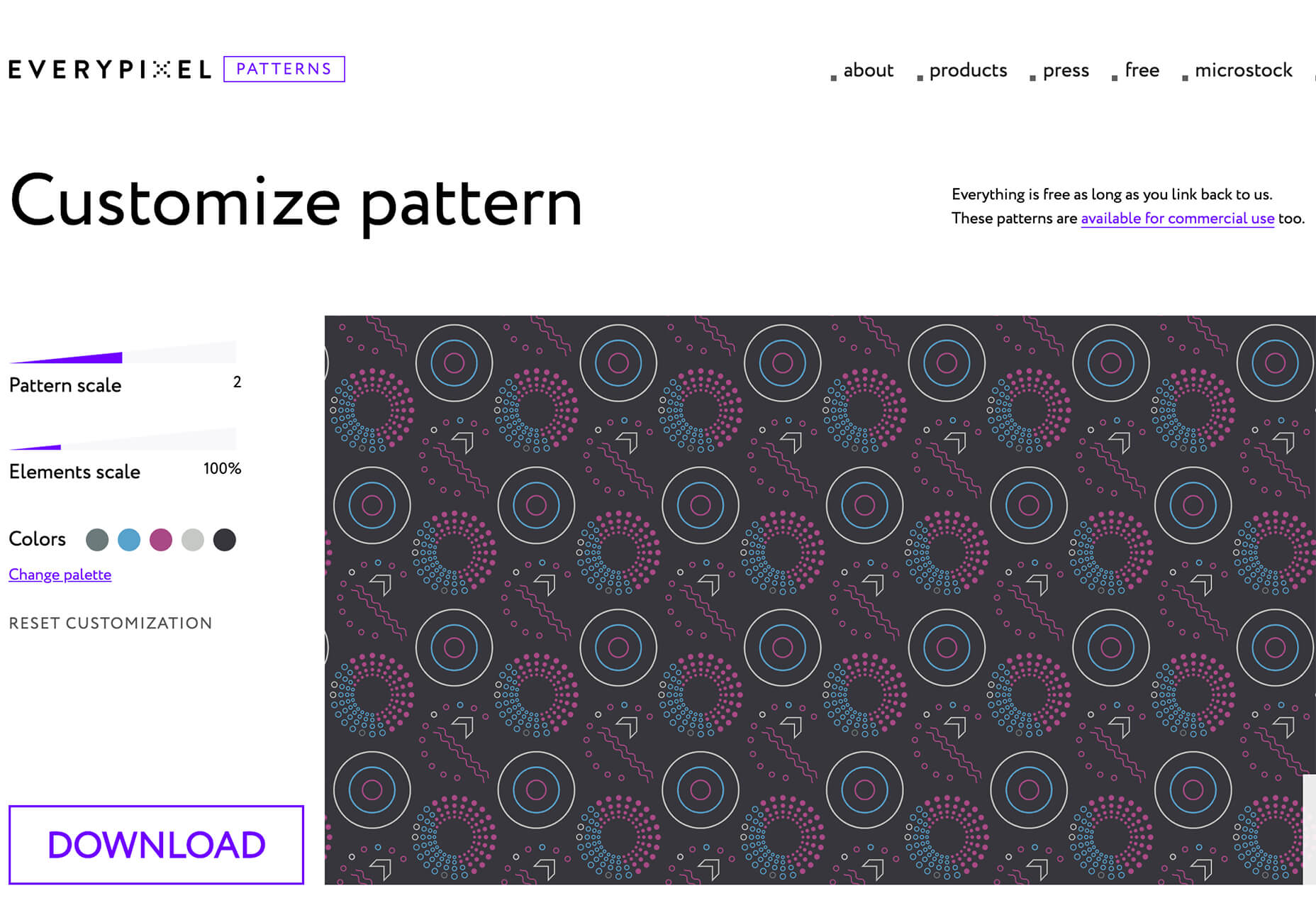
Everypixel Patterns

Everypixel Patterns solves a common design problem: Creating seamless patterns with graphic editors is such a long and exhausting process. That’s why some people choose to get patterns from stock websites but that can be a challenge too (and difficult to search). This tool makes getting patterns less time-consuming. It includes a gallery of well-designed content, which you can customize and edit as needed.

Multiavatar

Multiavatar is a free and open-source multicultural avatar maker. Type something in the input field and generate one of 12 billion avatars. (Everything is randomly generated and free to use.)

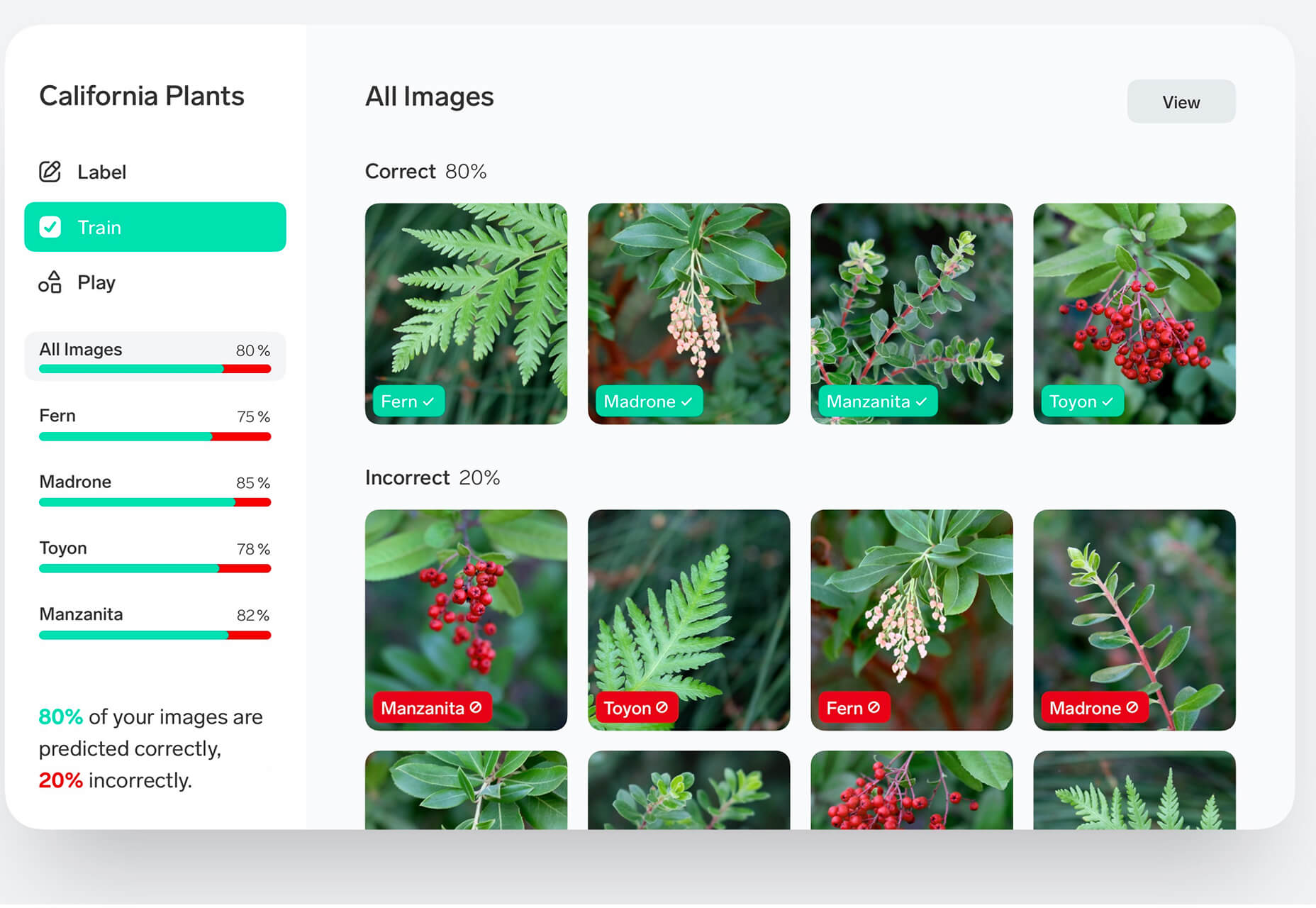
Lobe

Lobe is a machine learning app from Microsoft that helps you create and train models. Start by showing the app examples of what you want it to learn and it will train a model for you. The tool is pretty easy to understand and you don’t need or experience or code knowledge to use it and you can train an app for free on your computer.

Laser Cat

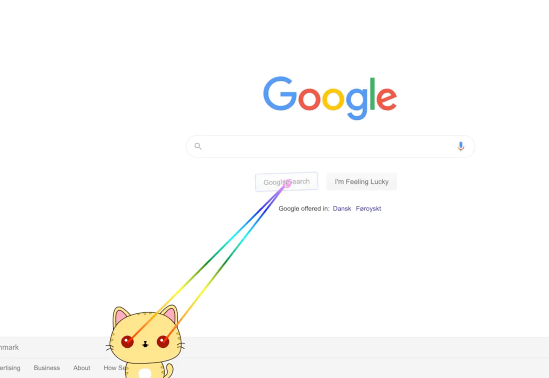
Laser Cat is a silly and fun Google Chrome extension that adds a cartoon cat to your browser that allows you to zap away anything you want to remove in the browser window. It’s light and fun. Go play!

Pattern Collect

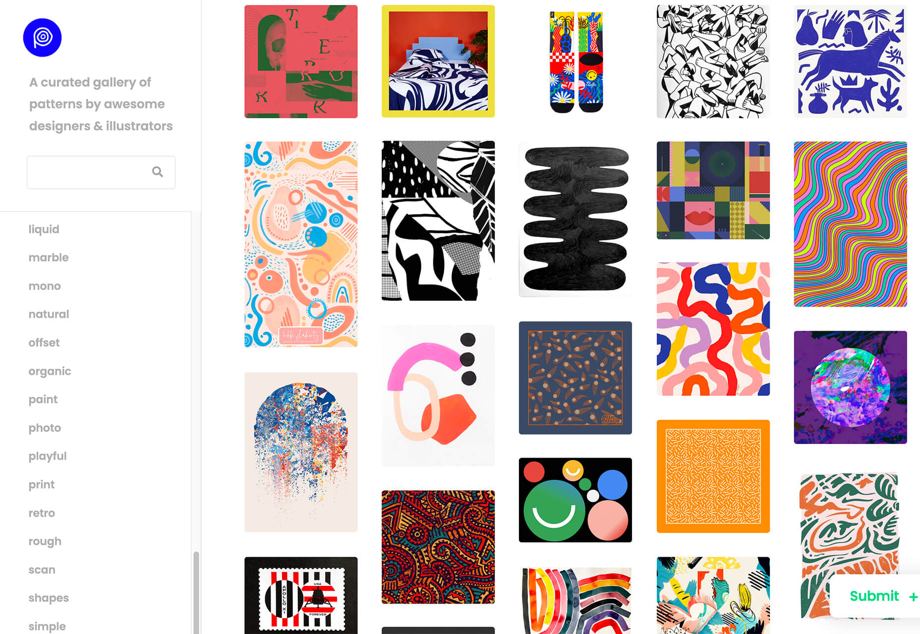
Pattern Collect is a curated gallery of patterns by various designs and illustrators. You can download patterns for use in projects or submit your own to share with the design community. The library is searchable and you can get new patterns via email if you subscribe.

FarbVelo

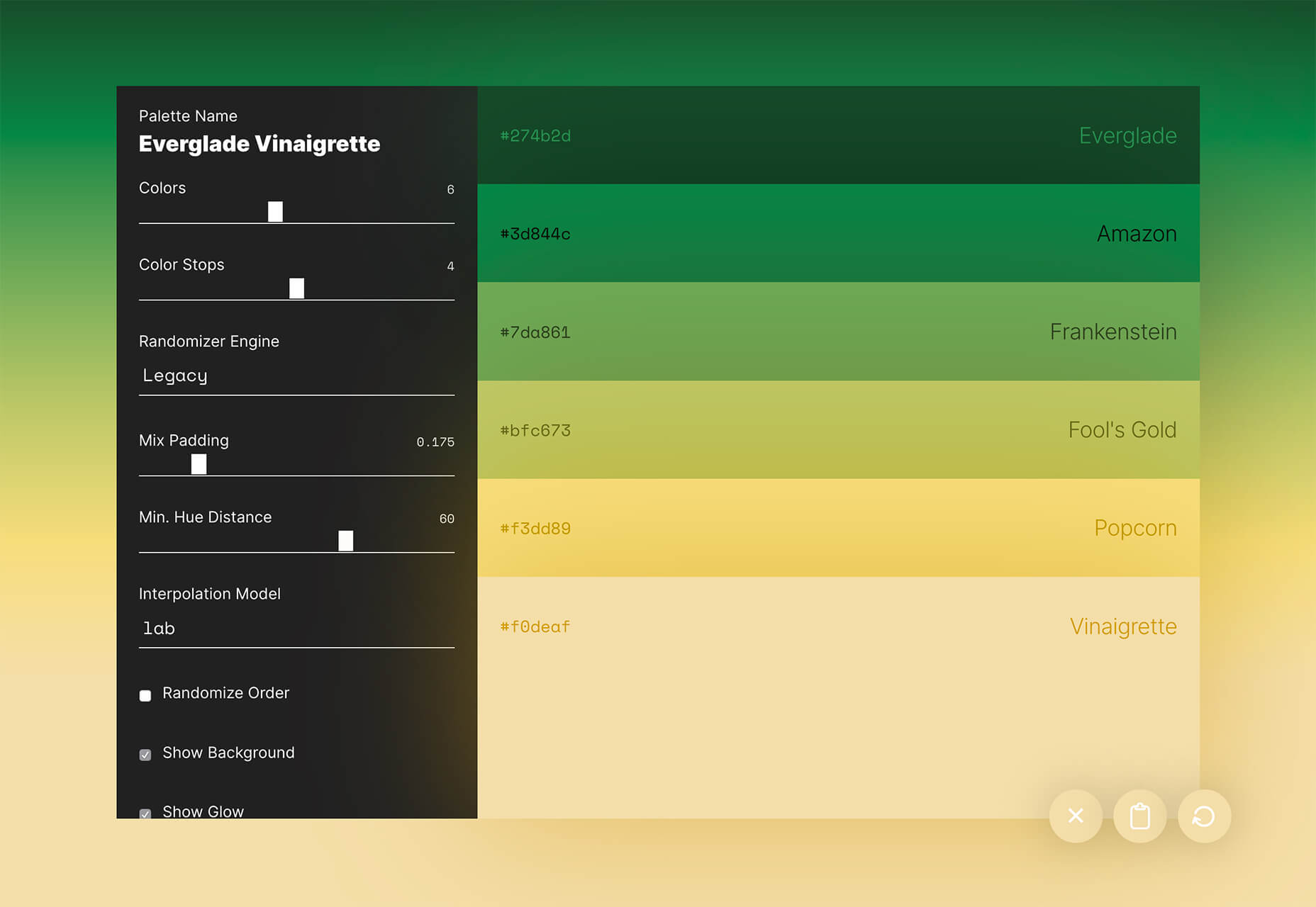
FarbVelo is a color palette generator that shows a new and random scheme with every refresh. The color choices are fresh and could work for a variety of projects, too.

CSS Clip Path Editor

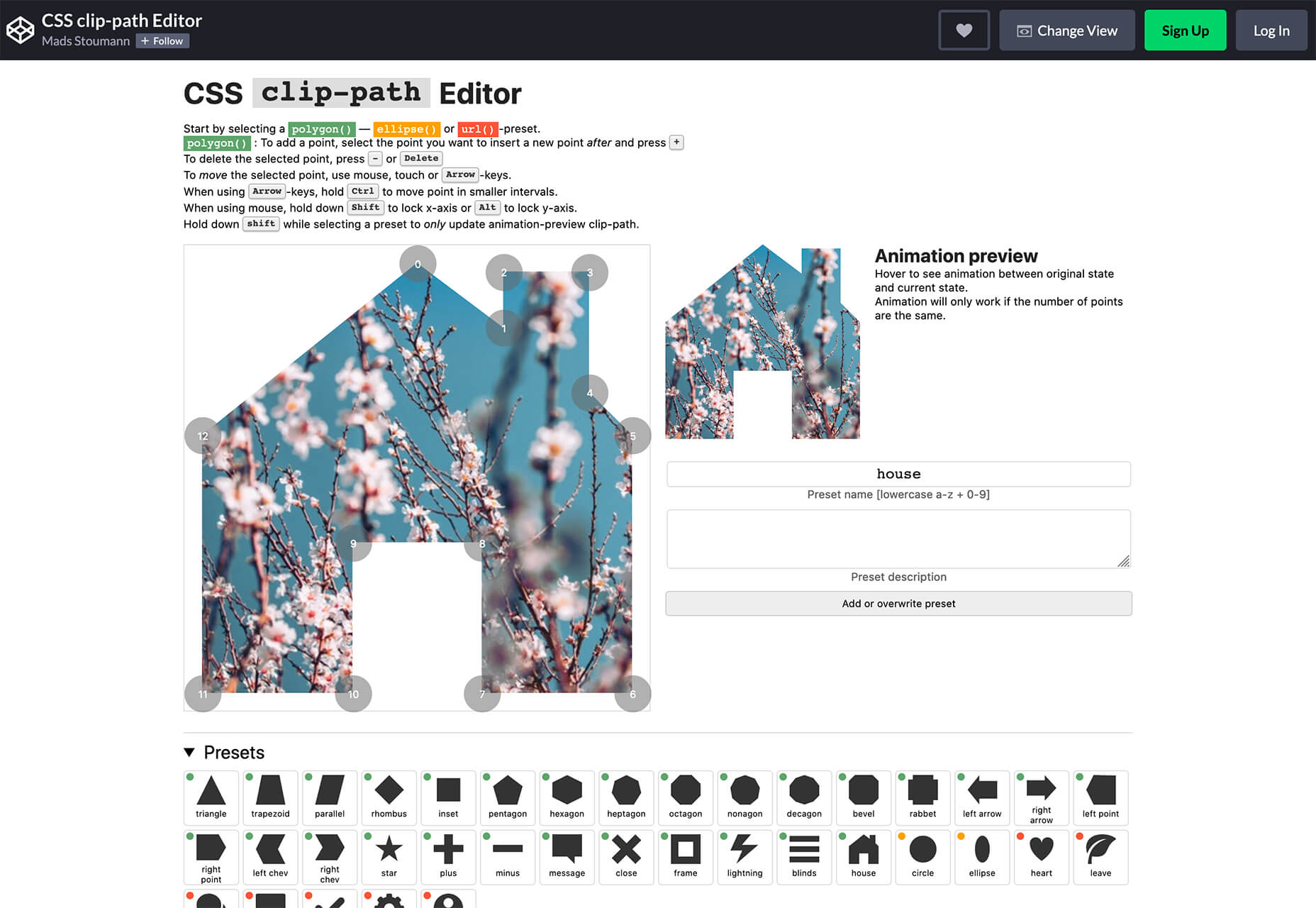
CSS Clip Path Editor is a cool little pen by Mads Stoumann that puts an image inside of almost any clip path you can imagine. There are presets to choose from or you can adjust the settings and paths to create your own image shape.

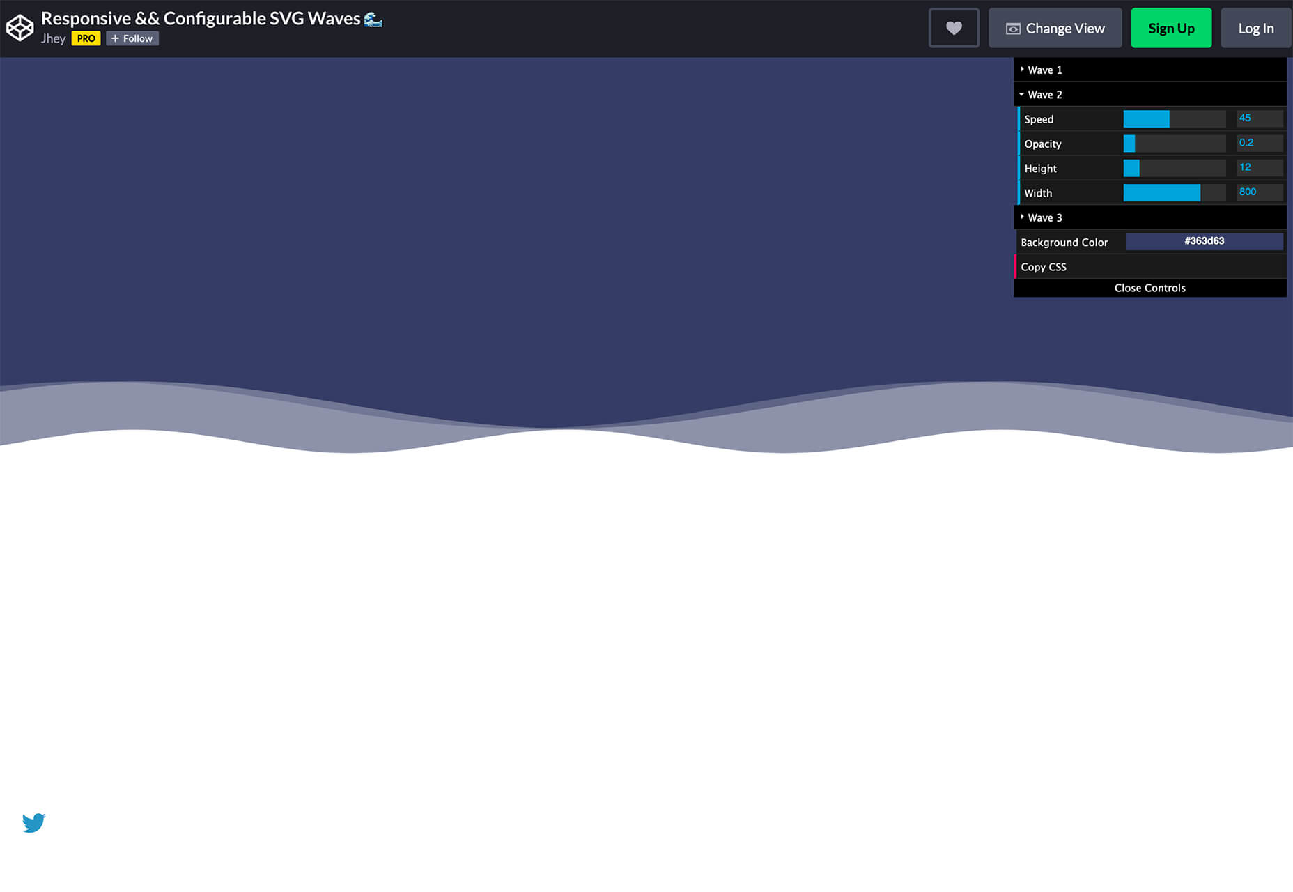
Responsive & Configurable SVG Waves

Responsive & Configurable SVG Waves is a soothing pen by Jhey. Change the background and wave elements for a simple and cool animation in SVG.

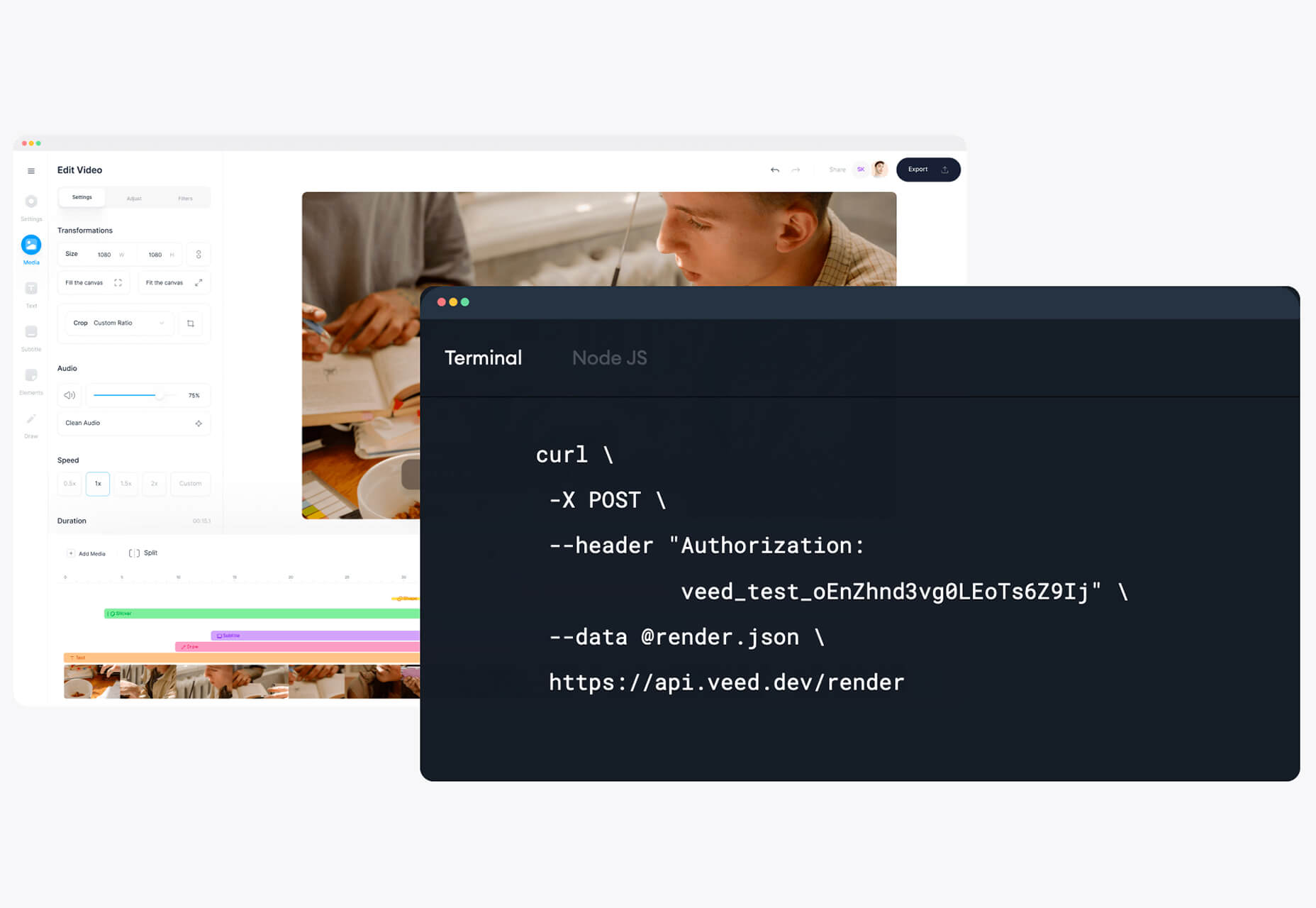
Veed

Veed lets you host, edit, and deliver videos in the cloud using a REST API. It works on any browser, device, and bandwidth, and keeps your website light, even when delivering heavy video content.

Overlay

Overlay is a plugin for Figma or Sketch that transforms components and symbols into clean and reusable React, Vue, or HTML code. The benefit? Use it to create more consistent websites and design systems more quickly and in a pixel-perfect manner.

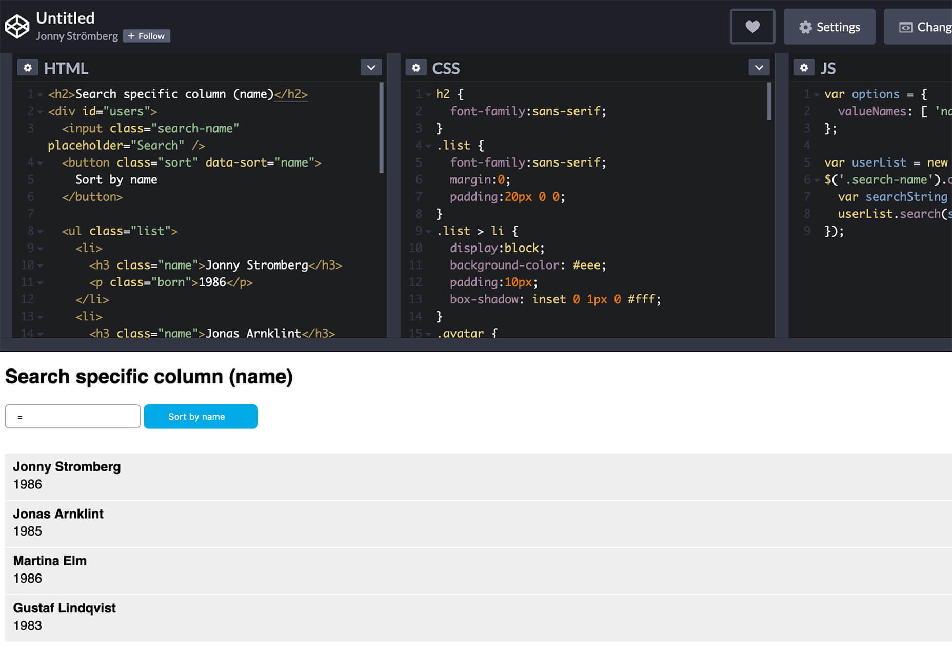
List.js

List.js is a library for adding search, sort, filters, and flexibility to tables, lists, and other HTML elements. It is built so that it will work on existing HTML and be invisible. Plus, it is simple to install and use.

What Are Design Tokens?

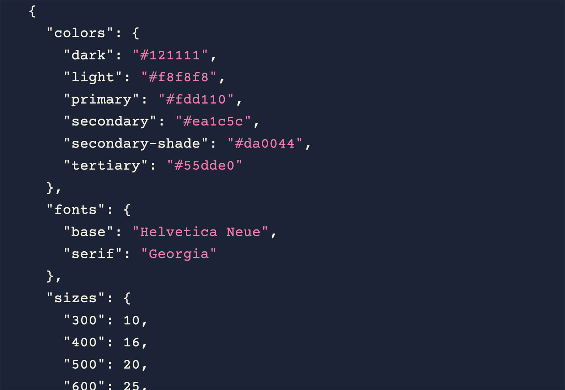
Design tokens are a “hot term” says Andy Bell. So, he wrote an explainer that breaks down what they are and how they might look in a standard data format like JSON. Read the explainer and you’ll be able to identify design tokens and understand them.

SVG Path Editor

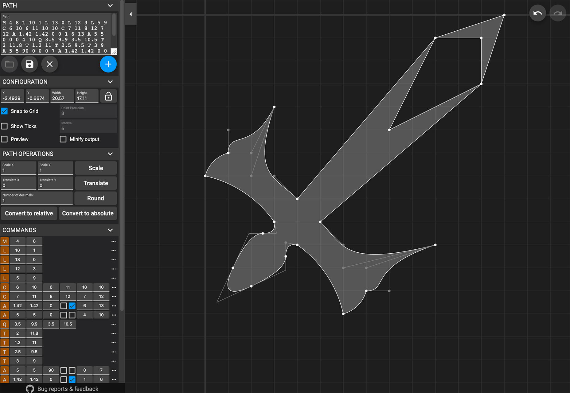
SVG Path Editor makes it easy to manipulate paths for any SVG element. The grid – if you choose to use it – helps edits stay symmetrical and easy to manage.

Operator Lookup

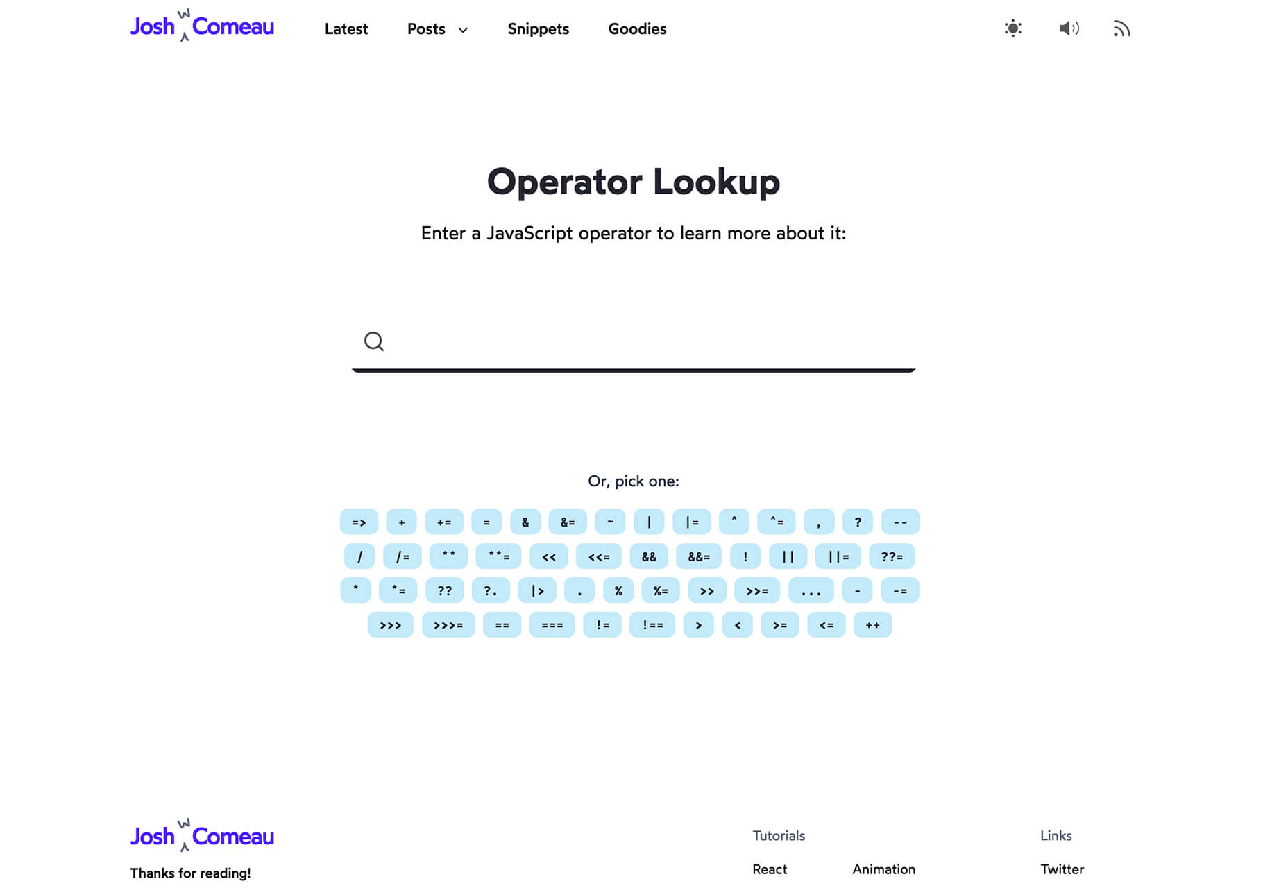
Operator Lookup is a practical and fun tool. Enter a JavaScript operator in the search box to learn more about what it does. (You can also choose from a “keyboard” of options.) Thanks for the tutorial, Josh W. Comeau.

Beacon

Beacon is a tool designed to help you write, run, and share SQL in Slack. It makes collaboration easy so you can work on and run queries, debug, and resolve issues all in a single platform.

Plaiceholder

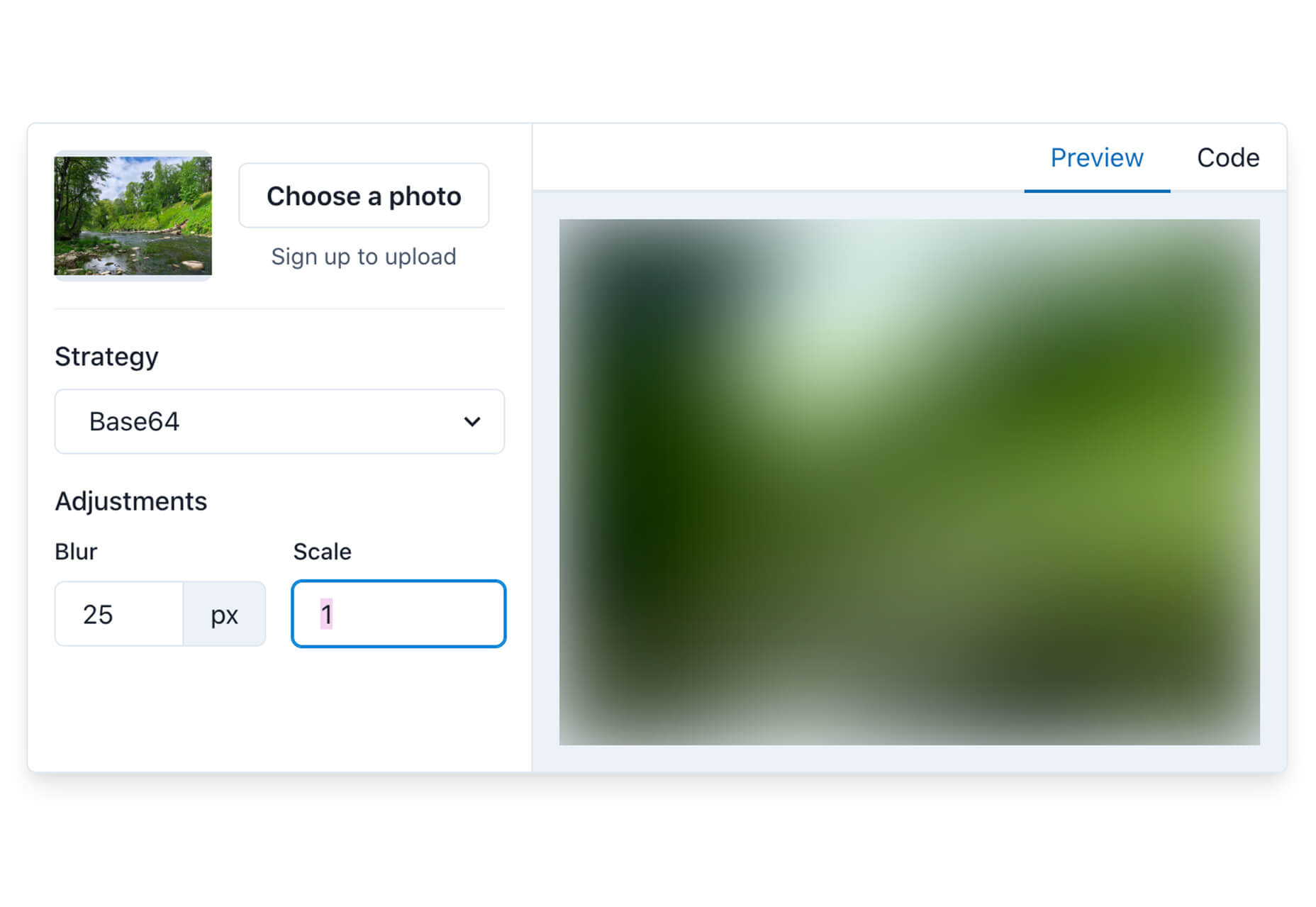
Plaiceholder transforms your images into lightweight placeholders using pure CSS or SVG.

Machine Translation

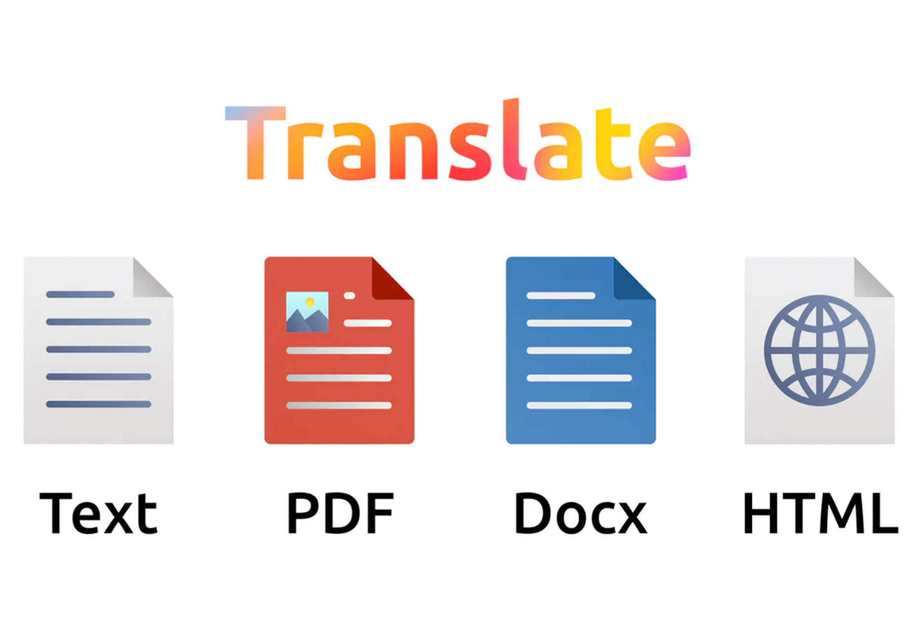
Machine Translation is available as Cloud API, on-premise translation server, and SDK that can be easily integrated into lots of business cases. Both solutions work with 110 languages.

Draggable Blend Generator

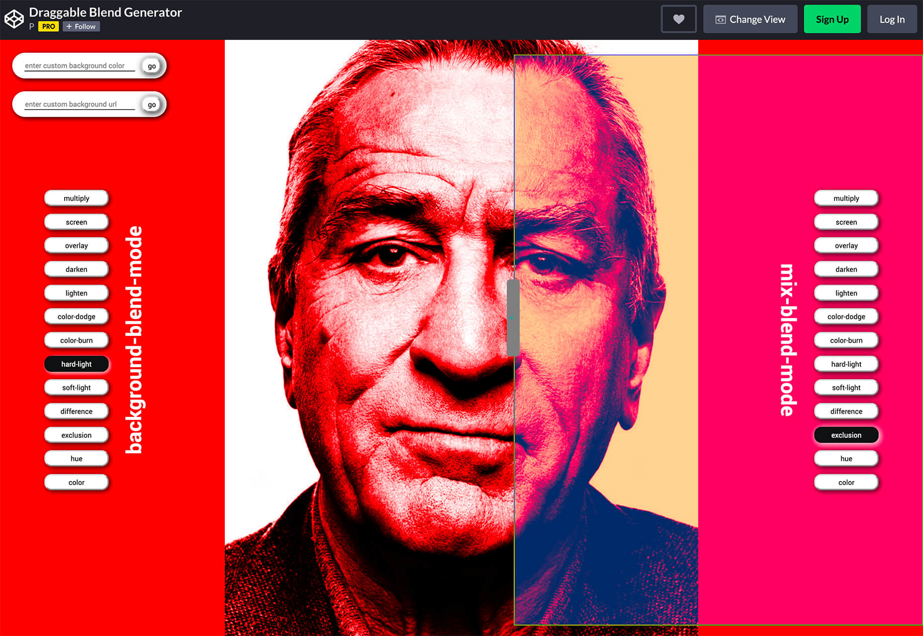
Draggable Blend Generator does just what the name implies. Change the blend mode of a background and foreground using a draggable tool so that you can see the changes in real time. Just enter the URL of a background image or pattern and color swatch and you are ready to go.

Jam Wand

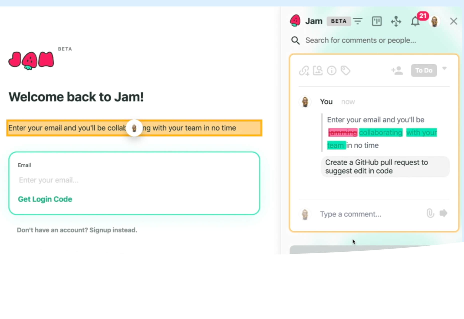
Jam Wand is a “magic wand” for making changes on your website, starting with copy. Click on any text, edit it, and submit the change to GitHub to be merged into the code. Copy changes as easy as click, type, and click again. (This tool is still in beta.)

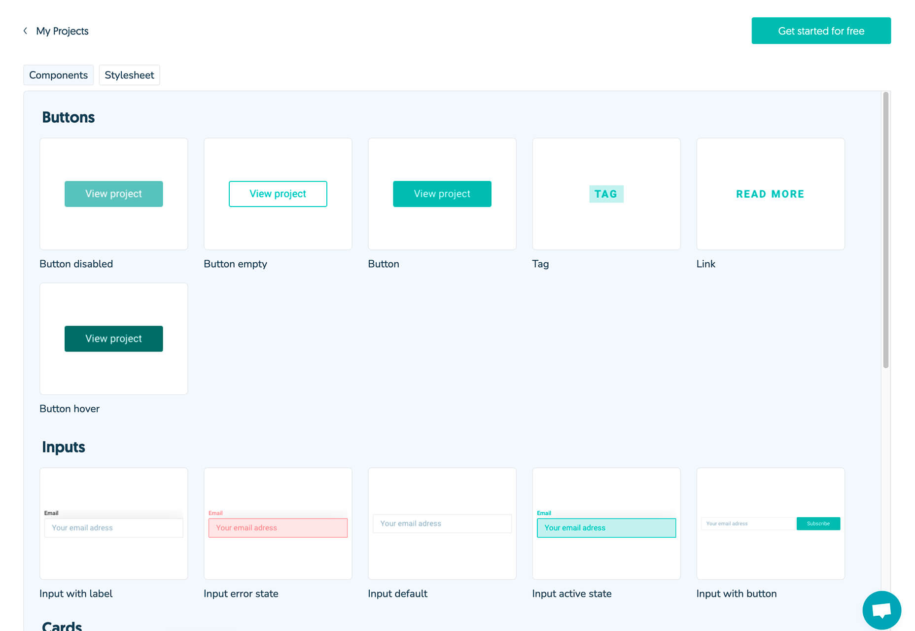
Boost UI Kit

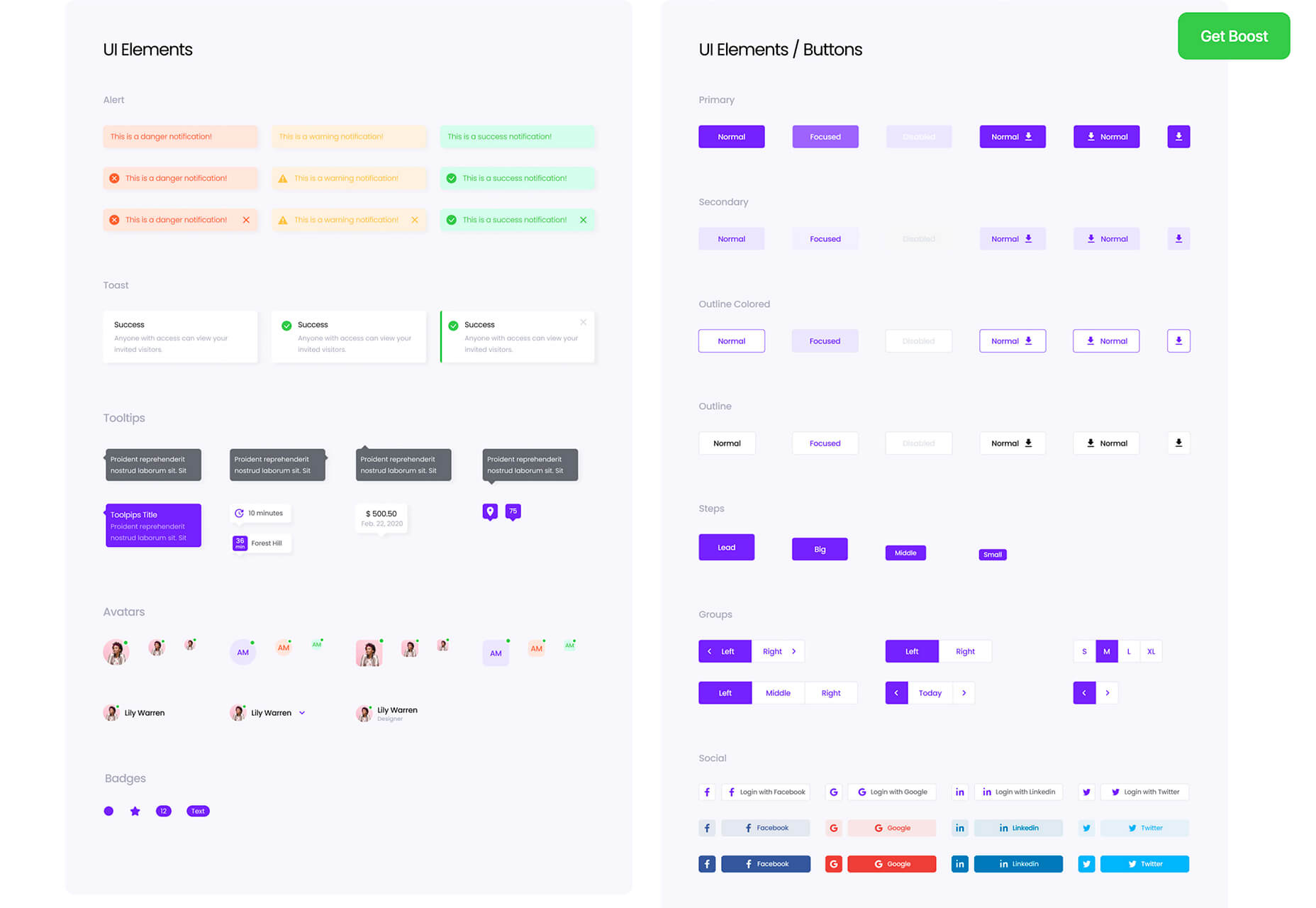
Boost UI Kit is a collection of elements and components that will help you finish website design projects using a bright and airy style. It works with Figma for easy integration.

Romanizer

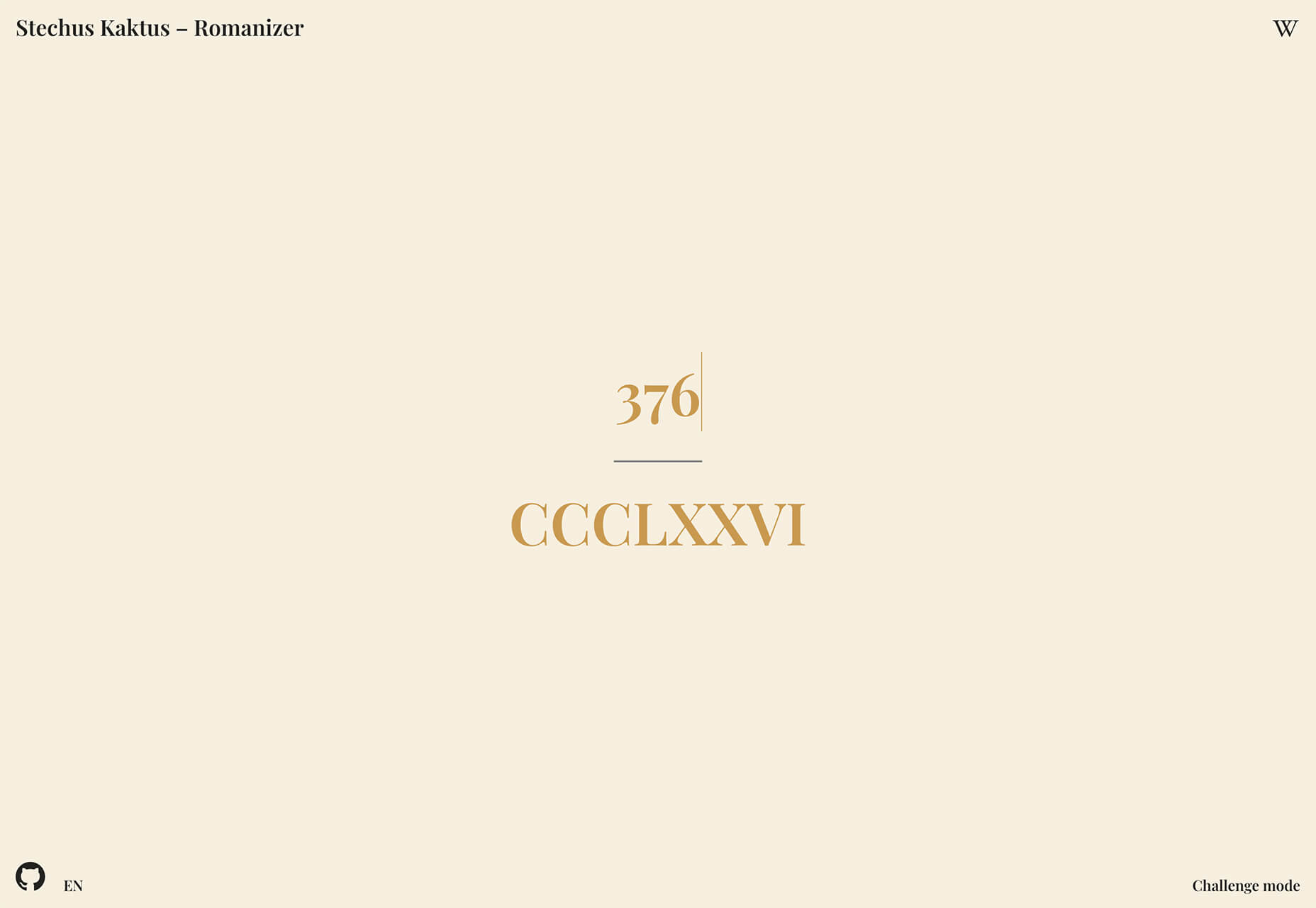
Romanizer is a fun game that tests your knowledge of Roman numerals. With two modes – a randomizer and a challenge you can participate in – you’ll learn to convert numbers visually in minutes.

Itmeo Market

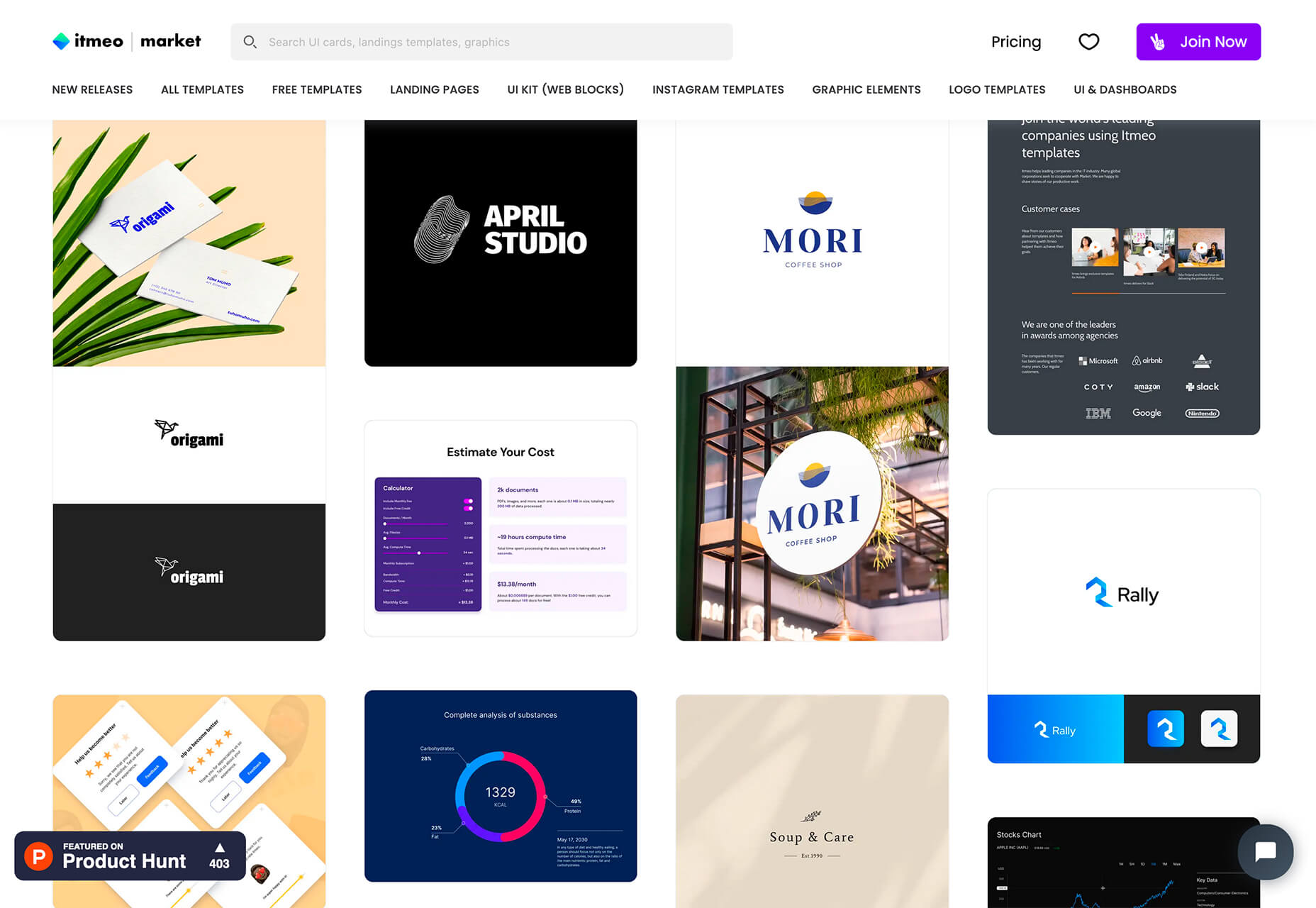
Itmeo Market is a new online graphics marketplace with exclusive and ready-to-use templates for a variety of projects. Templates include elements for logos, UI kits, graphic elements, Instagram templates, landing pages, and more. (This is a paid/subscription-based resource.)

Bellmoco Handcola

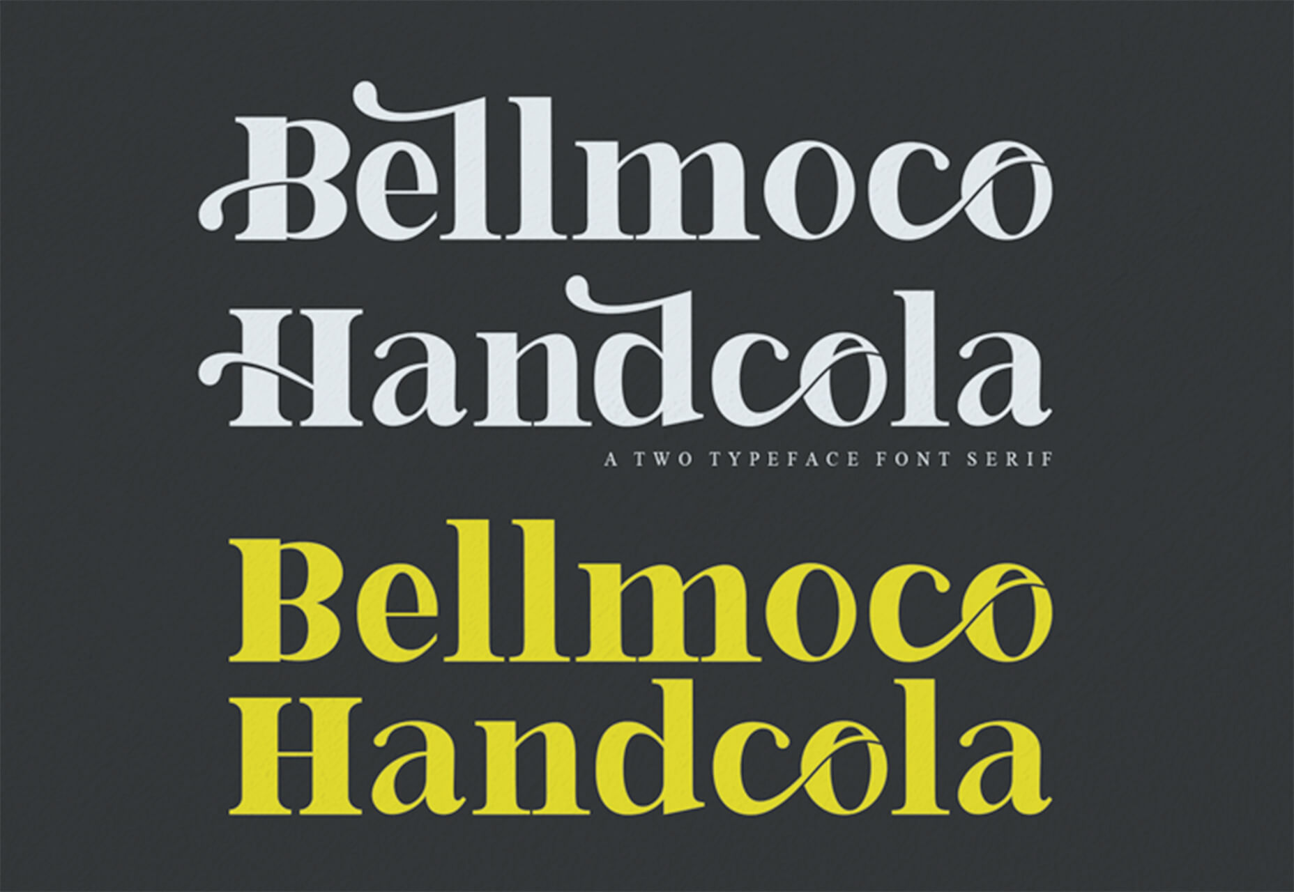
Bellmoco Handcola is a beautiful decorative typeface with fun swashes and serifs. The free version is for personal use only.

Bondie

Bondie is a handmade brush typeface with fills in many of the letterforms. It contains 106 characters and is free for personal use.

Bovino

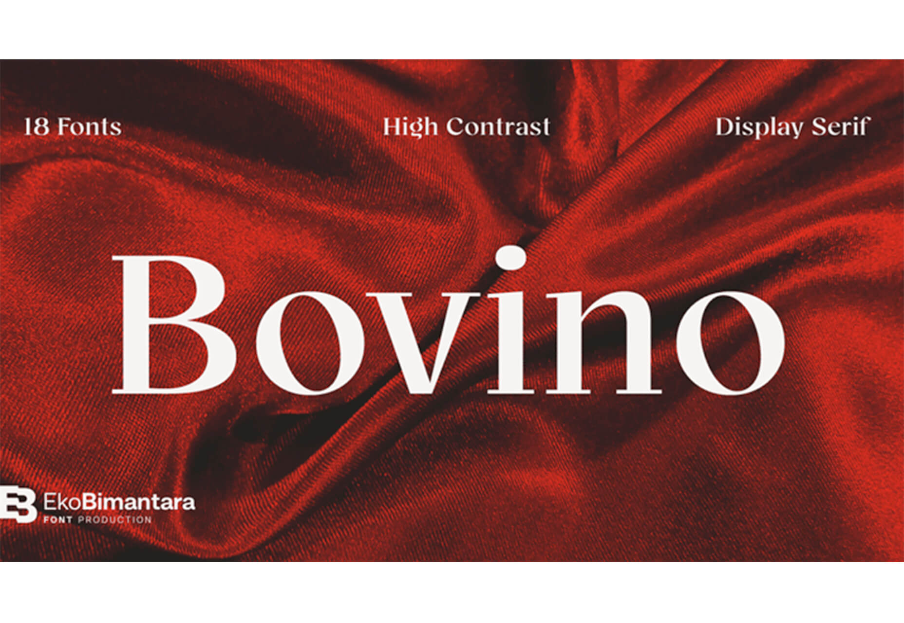
Bovino has multiple weights that can work for display or body text. The modern serif is free for personal use.

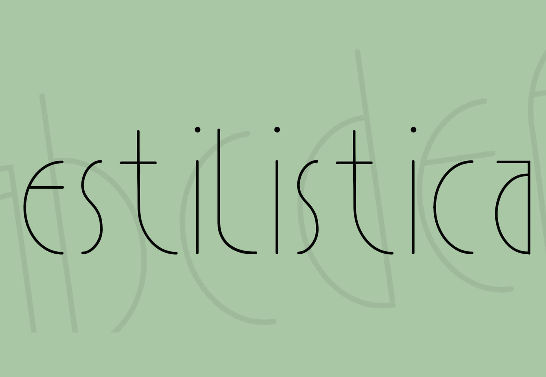
Estilistica

Estilistica is a thin modern style sans serif with smooth lines and a vertical profile. It is best suited for display use and is free for personal use.
Source

Categories: Designing, Others Tags:

Popular Design News of the Week: December 7, 2020 – December 13, 2020

December 13th, 2020 No comments

Every week users submit a lot of interesting stuff on our sister site Webdesigner News, highlighting great content from around the web that can be of interest to web designers.

The best way to keep track of all the great stories and news being posted is simply to check out the Webdesigner News site, however, in case you missed some here’s a quick and useful compilation of the most popular designer news that we curated from the past week.

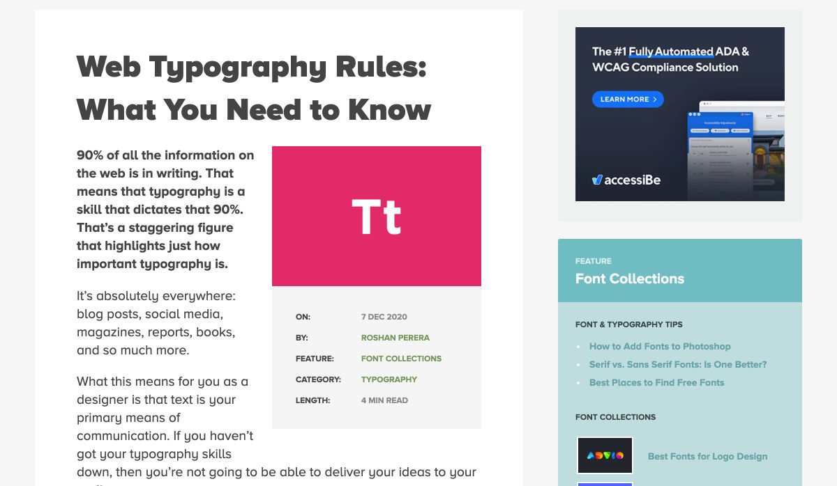
Web Typography Rules: What You Need to Know

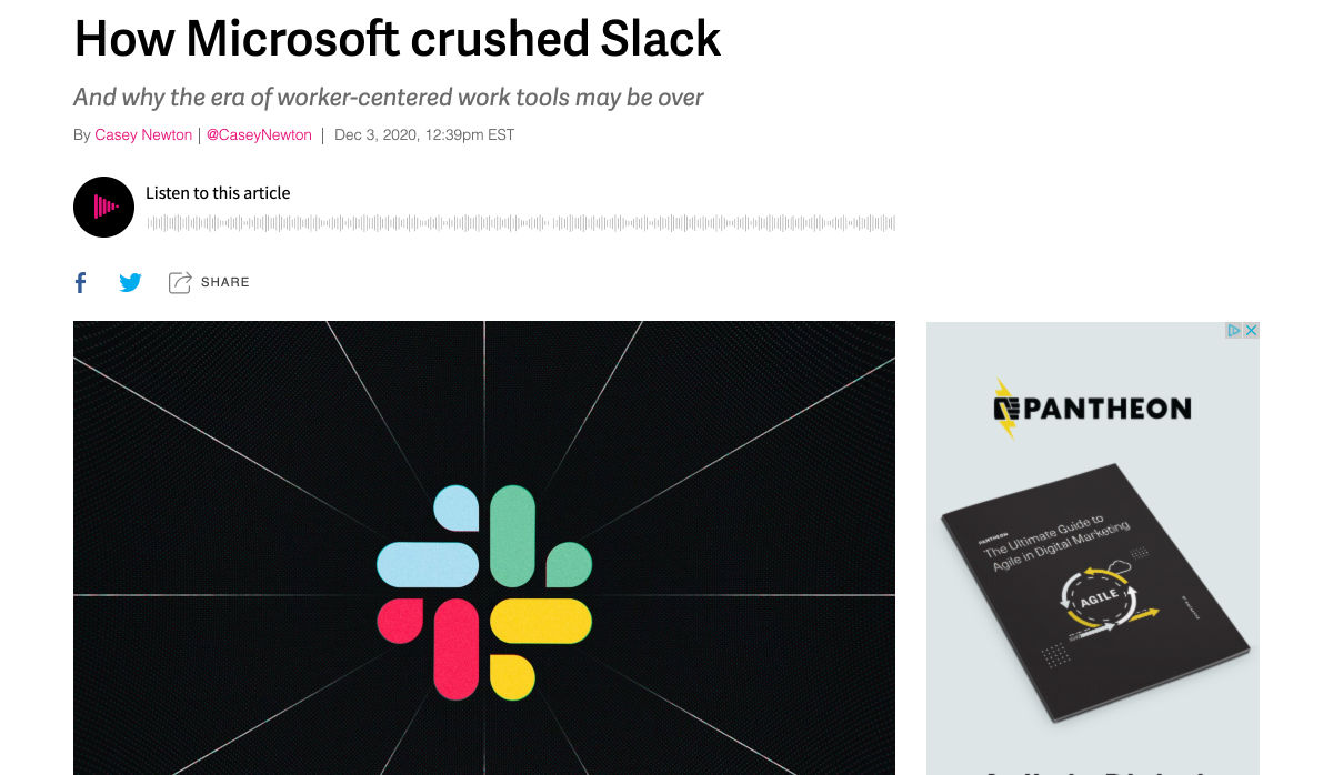
How Microsoft Crushed Slack

Graphic Design Trends for Social Media in 2021

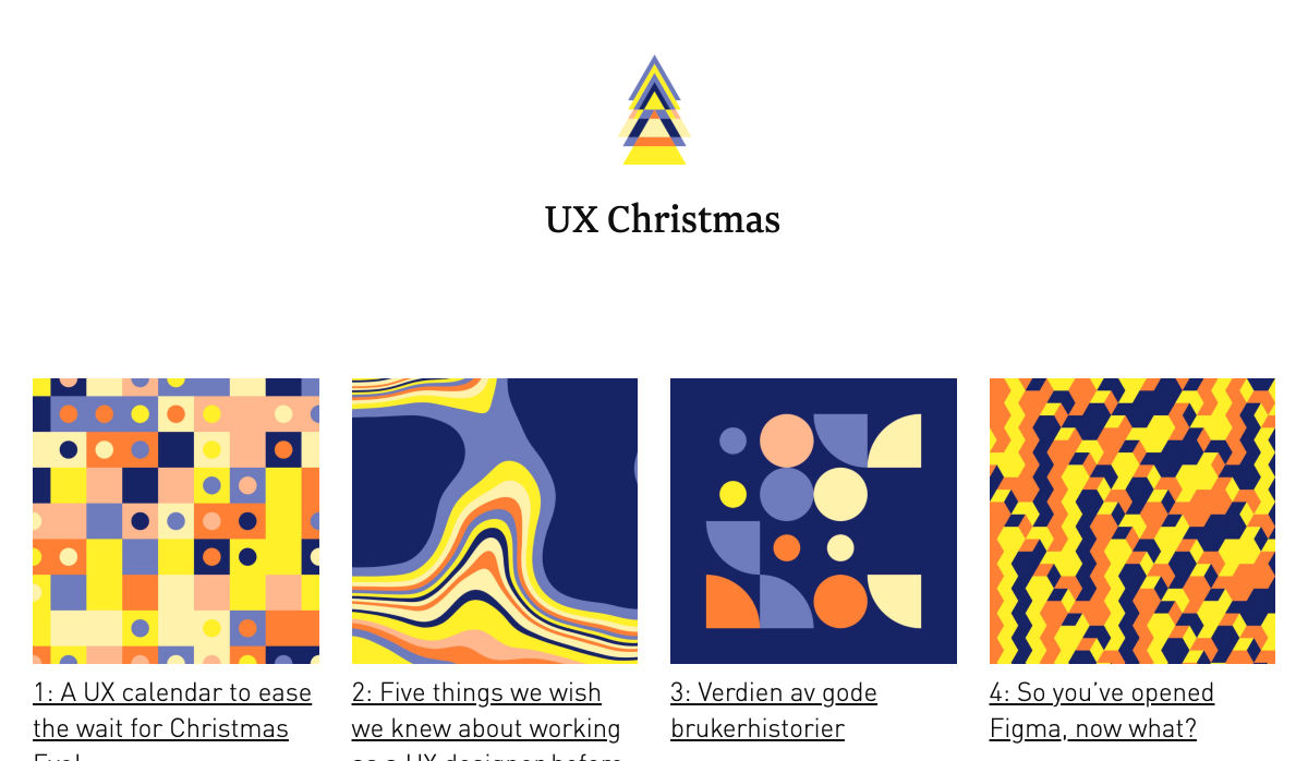
UX Christmas

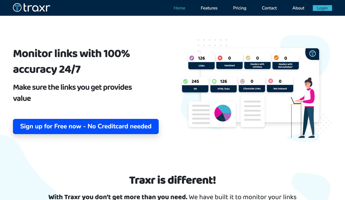
Traxr – Monitor Links with 100% Accuracy

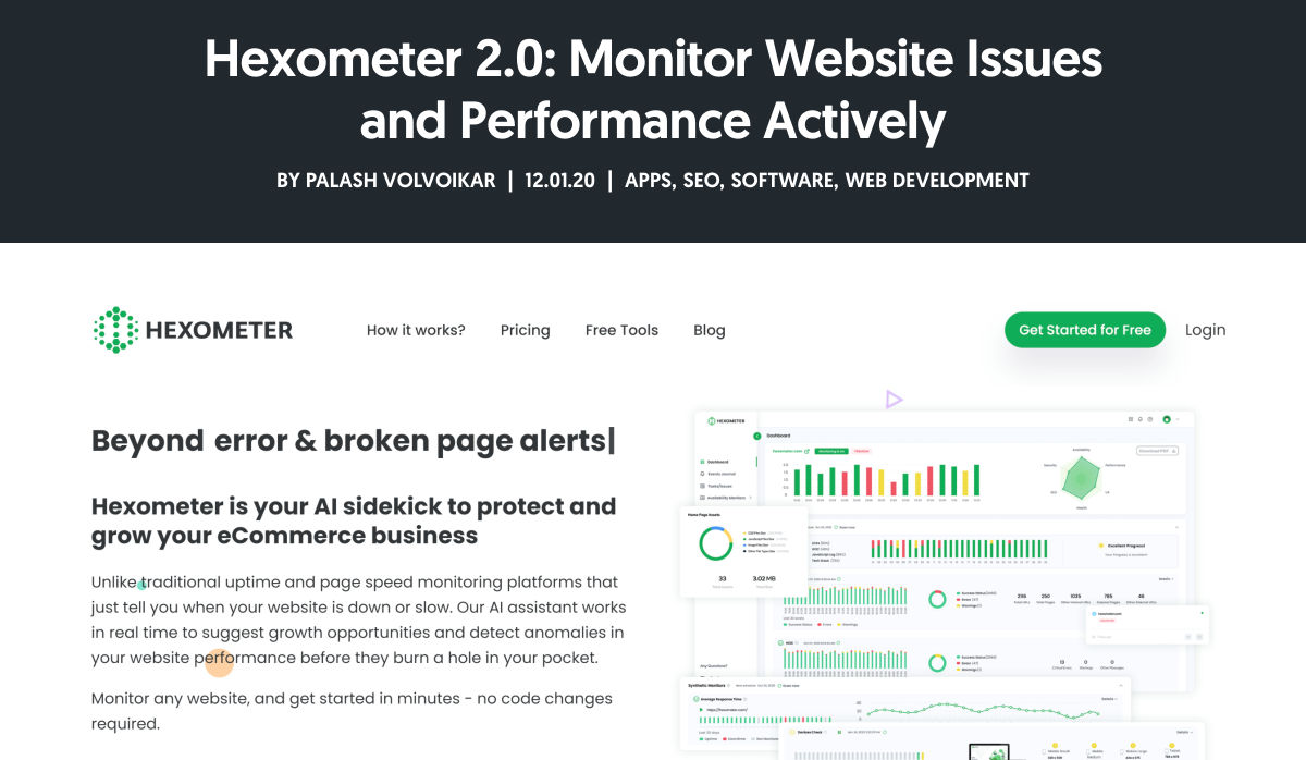
Hexometer 2.0: Monitor Website Issues and Performance Actively

Designing Data Science Tools at Spotify

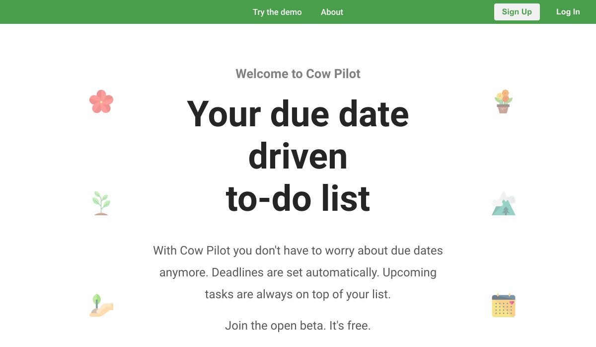
Cow Pilot – The Deadline Driven To-Do List

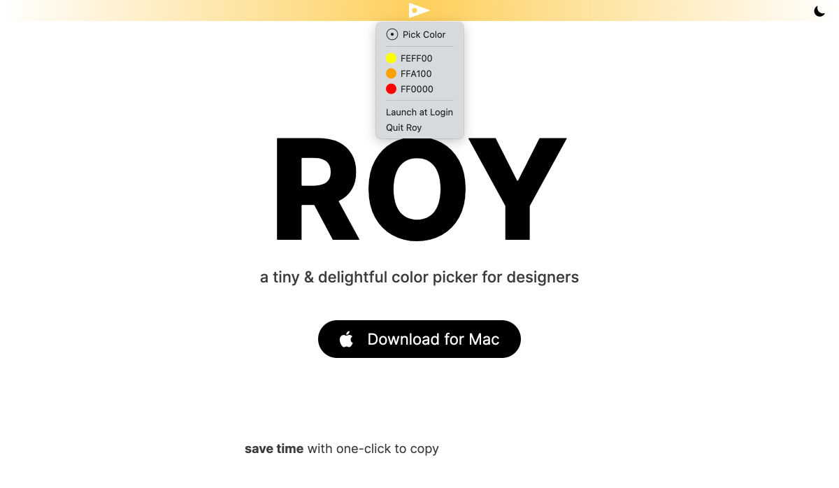
Roy – A Simple & Delightful Color Picker for Designers

5 New SEO Tools for Marketers

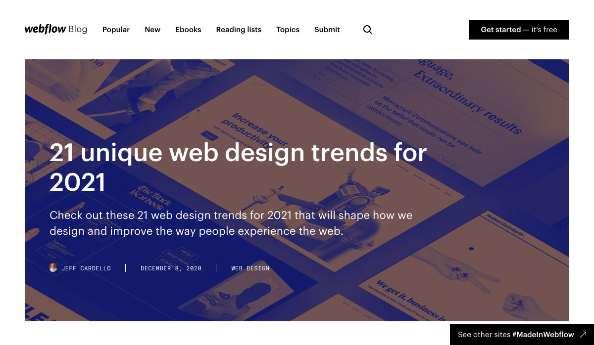
21 Unique Web Design Trends for 2021

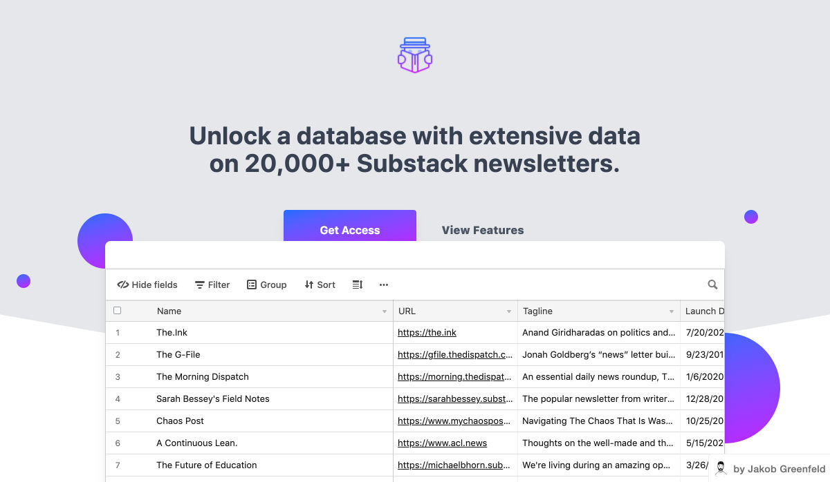
Newsletter Spy – A Database of 20,000+ Substack Newsletters

Visme 2.0 – All-in-one Design Platform

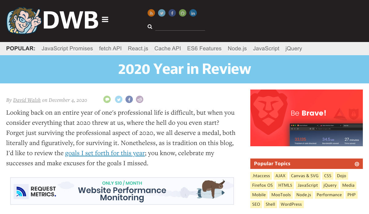
2020 Year in Review

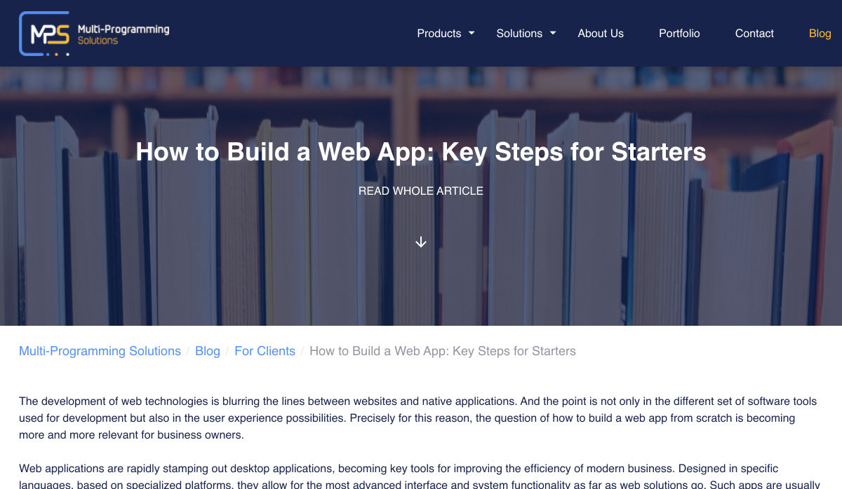
How to Build a Web App: Key Steps for Starters

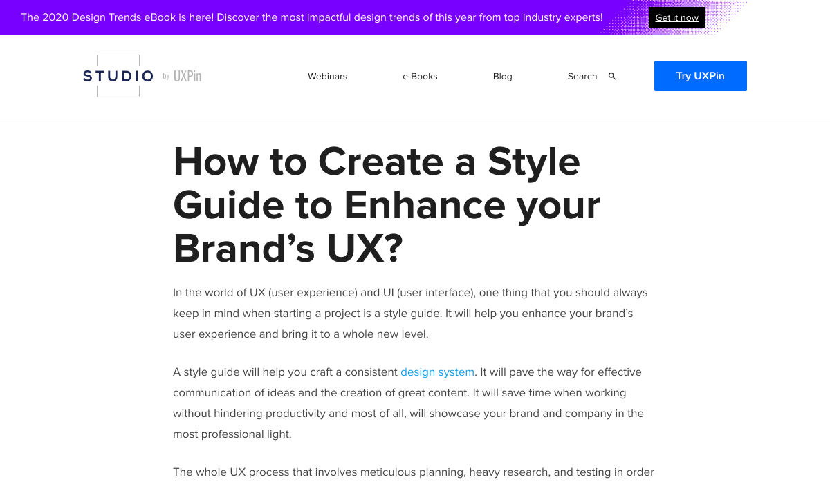
How to Create a Style Guide to Enhance your Brand’s UX

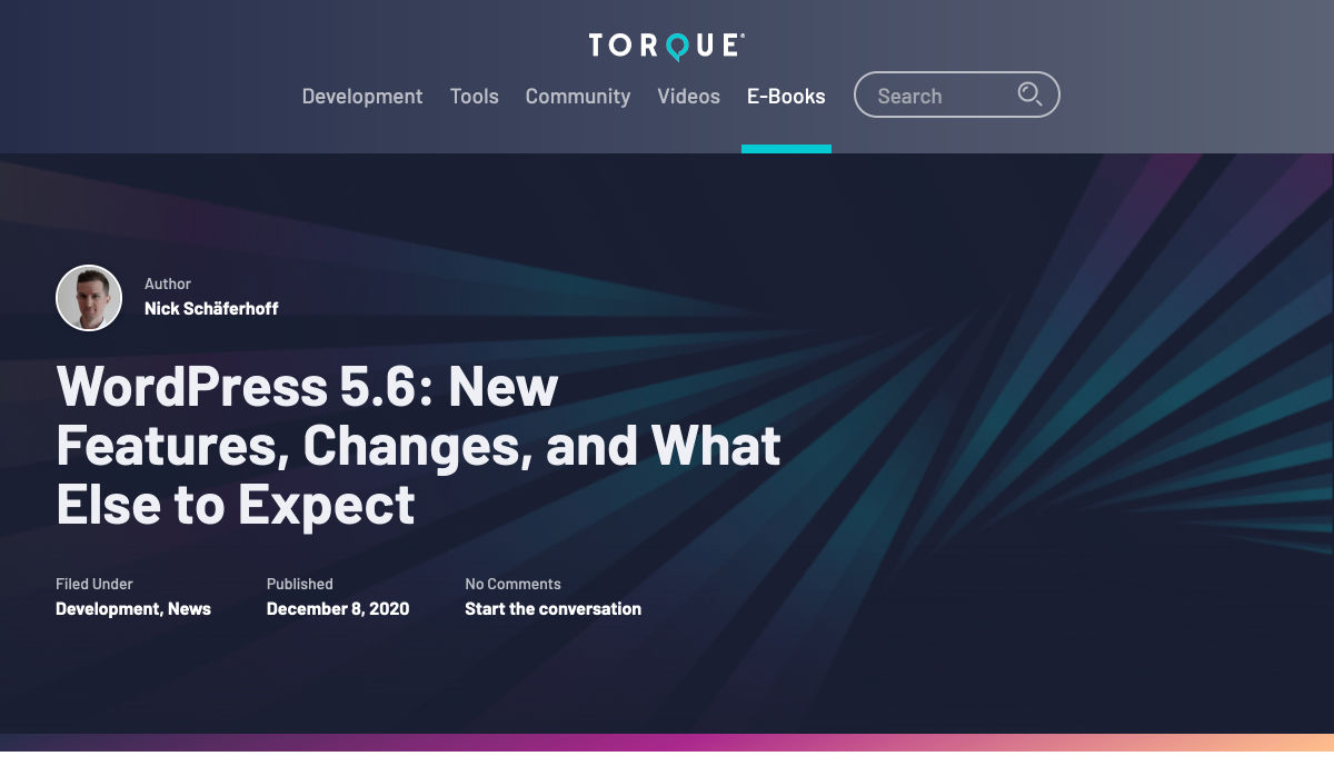
WordPress 5.6: New Features, Changes, and What Else to Expect

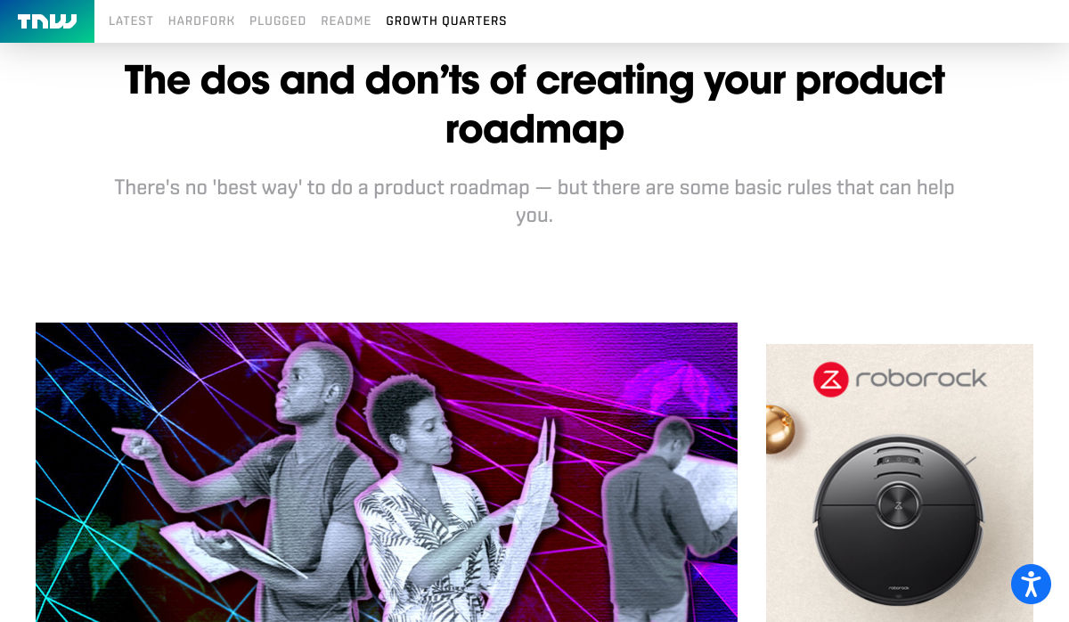
The Dos and Don’ts of Creating your Product Roadmap

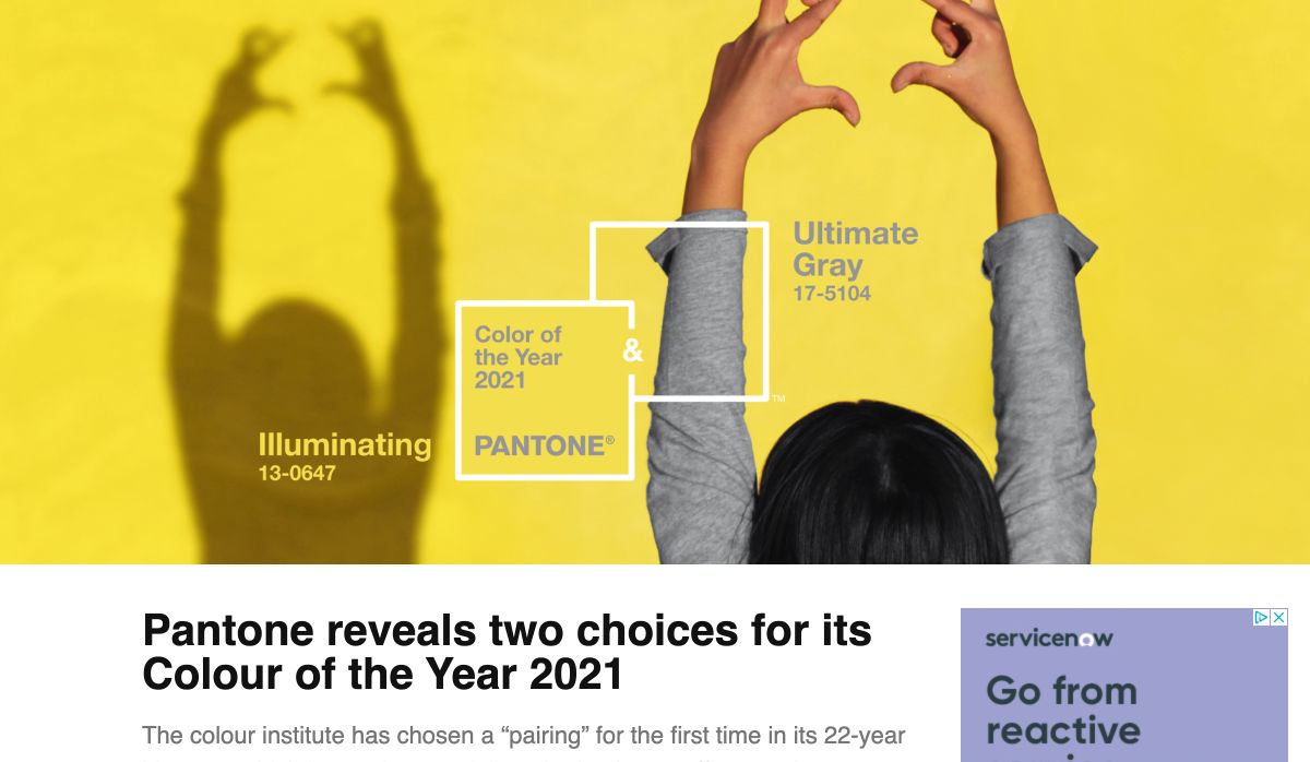
Pantone Reveals Two Choices for its Colour of the Year 2021

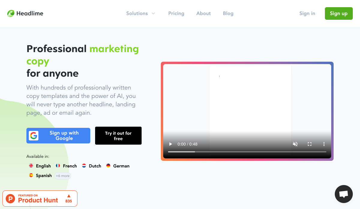
Headlime 2.0 – Professional Marketing Copy for Anyone

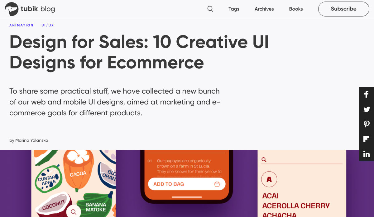
Design for Sales: 10 Creative UI Designs for Ecommerce

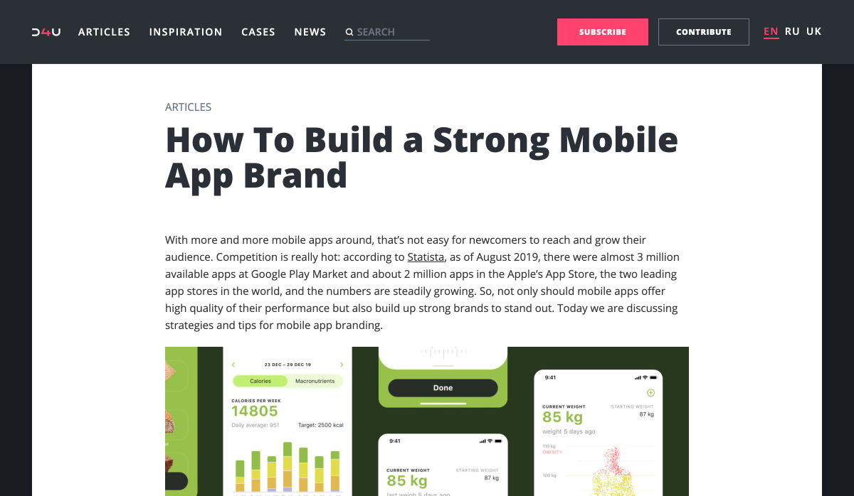
How to Build a Strong Mobile App Brand

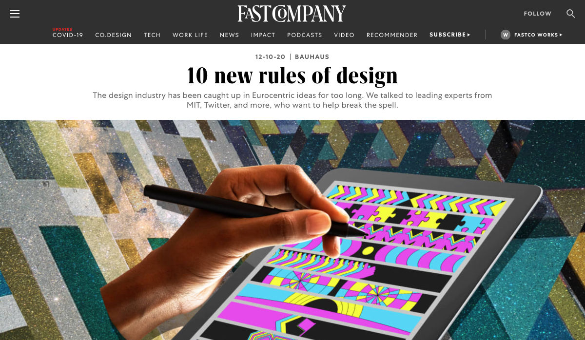
10 New Rules of Design

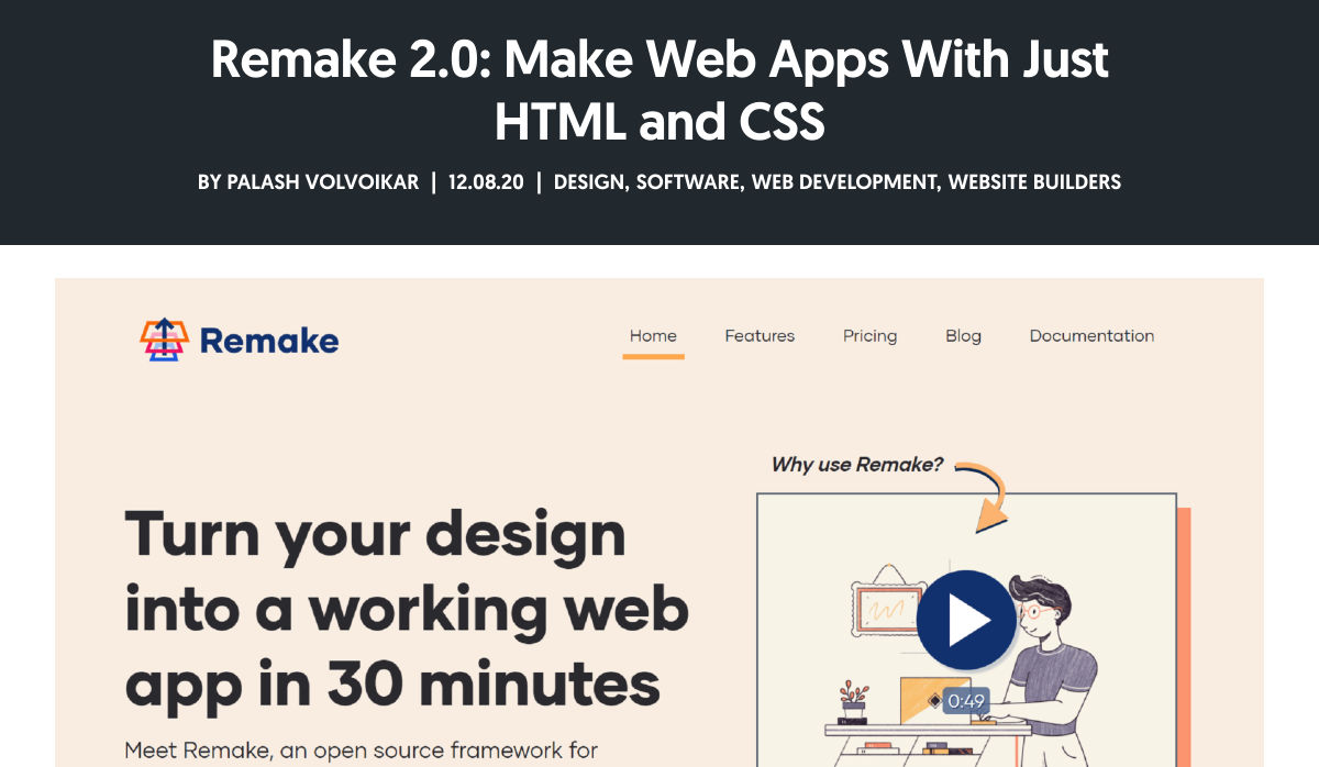
Remake 2.0: Make Web Apps with Just HTML and CSS

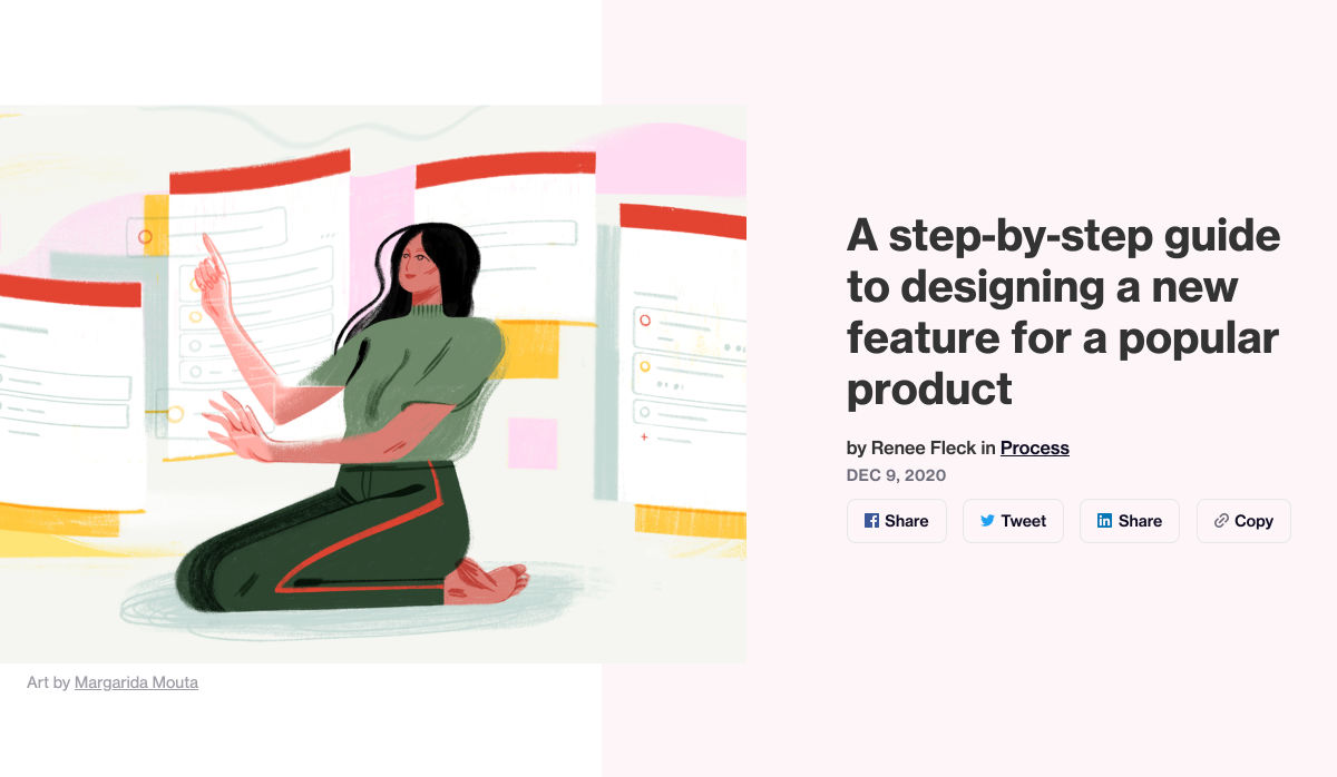
A Step-by-step Guide to Designing a New Feature for a Popular Product

Want more? No problem! Keep track of top design news from around the web with Webdesigner News.

Source

Categories: Designing, Others Tags:

Make it Personal

December 11th, 2020 No comments

One thing I noticed about building websites in 2020: despite all the social networks and publishing platforms craving our content, our stories, and our attention, people are somehow still building personal websites. Over the course of the year, many of you have launched or relaunched your website. It indeed feels like the personal website is experiencing a little revival.

To me, this comes as no surprise. The benefits of having your own personal site are enormous and appealing. As a creator, publishing on your own website might even be the single best thing you can do, both professionally and personally.

Your voice

On your personal website, you own your work. You decide what and when to publish. You decide when to delete things. You are in control. Your work, your rules, your freedom.

Your personal website is also a wonderful playground to tinker, prototype, experiment, explore, and learn about web standards and new technologies by experience. Want to improve your accessibility skills? Want to learn CSS Grid or try out variable fonts? Want to implement your first Service Worker or fine-tune the performance of your site? Your personal website is the perfect place for that!

But the prime reason to have a personal website is in the name: it is your personal home on the web. Since its early days, the web has been about sharing information and freedom of expression. Personal websites still deliver on that promise. Nowhere else do you have that much freedom to create and share your work and to tell your personal story. It is your chance to show what you stand for, to be different, and to be specific. Your site lets you be uniquely you and it can be whatever you imagine it to be.

So if you have a personal site, make sure to put in the work and attention to make it truly yours. Make it personal. Fine-tune the typography, add a theme switcher, or incorporate other quirky little details that add personality. As Sarah Drasner writes, you can feel it if a site is done with care and excitement. Those are the sites that are a joy to visit and will be remembered.

?

????

Your turn

Two things are crucial if you want to get started with your own personal site.

  1. You have to start. You can totally start with something small and basic. But start. Start a blog with WordPress, use a static site generator like Eleventy, a lovely flat-file CMS like Kirby, or code everything from scratch. That’s up to you. The tech stack doesn’t matter that much as long as you start.
  2. Be aware that your site is not “done” once you launch it. After the launch is when the journey begins. Many creators forget that and struggle with the fact that you have to maintain a site and publish work there. That’s why it is important to be really clear from the beginning in deciding what you want to publish and then build your site around that. Do you want to write? Great! Then focus on the reading experience and create a blog section. You want to post photos or illustrations? Amazing! Then make sure that the layout and structure of your site are built for this and it is easy to publish new images. If you know what you want to publish, it becomes much easier to make creating the work a habit and publishing it on your website part of your practice.

Remember, you don’t have to consider yourself a writer to write on your site. You don’t have to be a programmer to write code on your site. You don’t have to be a renowned expert to have an opinion. Document your process and share the things you learn. Try out different formats, different styles, and different topics. Write about one concept or one idea at a time. Or, if you love tricks, publish your best tricks. The journey is the destination and there might always be someone who benefits from even one of your smallest posts.

Publishing your work can be scary, especially in the beginning. It might feel like you are being judged. Everyone can inspect your source code, see your tiny mistakes, and notice when you get things awfully wrong. But that’s part of the process, too. And it’s this process that makes building, maintaining, and growing your personal site so worthwhile. Allow yourself to be vulnerable, push beyond your fear, and hit Publish. When you publish regularly on your personal site, it will inevitably grow. And so will you.

Your tribe

There is a community of creators out there, eagerly waiting for you to contribute your point of view. We are implementing Webmentions on our sites, adding blogrolls to our sites again, and we might even bring webrings back. We subscribe to each other’s feeds and we are sharing and quoting each other’s work and articles. In 2021, and in the years to come, we need you and many more to keep the Web open, independent, and diverse. Hidde de Vries recently shared this quote on his personal site which he had read on Jeremy Keith’s personal site:

If you have something wonderful, if you do not defend it, you will lose it.

Zeynep Tefepkçi (via adactio.com)

???????

Personal websites are such a thing. If you don’t have a website yet, come join us on the other side where the web is (still) personal. It’s worth it.


The post Make it Personal appeared first on CSS-Tricks.

You can support CSS-Tricks by being an MVP Supporter.

Categories: Designing, Others Tags:

There is No Normal

December 11th, 2020 No comments

This year I learned, or relearned maybe, that “normal” is subjective at best, and pretty misleading otherwise. If this forsaken year has taught us anything, it’s that there is no such thing as normal. Things change. People adapt. Everything is relative to everything else.

Besides being quite metaphysical, this somewhat connects to front-end development, our industry, and the sort of expectations we have for people down there. Too often, it feels like we tend to apply our own insecurities onto others.

I learned this way and so should you.

I know about this and you should too.

I don’t care about this therefore it’s not necessary.

This behavior needs to stop. We have to acknowledge that this industry is, for the most part, self-made and therefore does not have a clear learning path, let alone a defined success trajectory. As they say, Your Mileage May Vary™.

Let this message be for everyone who’s just starting in this field, everyone fresh out of bootcamp or university, and everyone with insecurities or impostor syndrome. This is for everyone who feels like they are not enough and don’t belong here.

You belong here.

Your experience, no matter how different than someone else’s, is valid.

There is no definitive list of skills to have. There is no mandatory technologies to look for. You don’t have to keep chasing the hype. At the end of the day, knowing HTML, CSS and some JavaScript should be enough to make do. You will learn the rest in due time. You have your entire career to learn new things. There is no rush to learn everything right now.

Breathe. Enjoy what you already know. You are doing well. Welcome to the craft.


The post There is No Normal appeared first on CSS-Tricks.

You can support CSS-Tricks by being an MVP Supporter.

Categories: Designing, Others Tags:

Let’s Create a Lightweight Native Event Bus in JavaScript

December 11th, 2020 No comments

An event bus is a design pattern (and while we’ll be talking about JavaScript here, it’s a design pattern in any language) that can be used to simplify communications between different components. It can also be thought of as publish/subscribe or pubsub.

The idea is that components can listen to the event bus to know when to do the things they do. For example, a “tab panel” component might listen for events telling it to change the active tab. Sure, that might happen from a click on one of the tabs, and thus handled entirely within that component. But with an event bus, some other elements could tell the tab to change. Imagine a form submission which causes an error that the user needs to be alerted to within a specific tab, so the form sends a message to the event bus telling the tabs component to change the active tab to the one with the error. That’s what it looks like aboard an event bus.

Pseudo-code for that situation would be like…

// Tab Component
Tabs.changeTab = id => {
  // DOM work to change the active tab.
}
MyEventBus.subscribe("change-tab", Tabs.changeTab(id));

// Some other component...
// something happens, then:
MyEventBus.publish("change-tab", 2);  

Do you need a JavaScript library to this? (Trick question: you never need a JavaScript library). Well, there are lots of options out there:

Also, check out Mitt which is a library that’s only 200 bytes gzipped. There is something about this simple pattern that inspires people to tackle it themselves in the most succincet way possible.

Let’s do that ourselves! We’ll use no third-party library at all and leverage an event listening system that is already built into JavaScript with the addEventListener we all know and love.

First, a little context

The addEventListener API in JavaScript is a member function of the EventTarget class. The reason we can bind a click event to a button is because the prototype interface of

Categories: Designing, Others Tags:

Why I love Tailwind

December 11th, 2020 No comments

Max Stoiber wrote some interesting notes about why he loves Tailwind. (Max created styled-components, so he has some skin in the styling methodology game.) There’s a lot of great history in this post about how Tailwind emerged and became a valuable tool for designers and engineers alike, but he also talks about what beats at the very heart of the Tailwind system and what makes it just so handy:

The key to Tailwind’s popularity is the painstakingly constructed system of design tokens at the core of the framework. The system’s carefully selected constraints give developers just the right guardrails. They make it obvious whether a choice is good or bad by offering only discrete steps.

He links to twin.macro — something I’d never heard of before — then gives an example that looks something like this:

import "twin.macro"

<div tw="text-center md:text-left" />

// ↓↓↓↓↓ turns into ↓↓↓↓↓

import "styled-components/macro"

<div 
  css={{
    textAlign: "center",
    "@media (min-width: 768px)": {
      "textAlign":"left"
    }
  }}
/>

What’s happening here is that you can use predefined classes just like you would with Tailwind — add spacing, make a div round, and a certain size, etc. What twin.macro does is let you use these classes, but with the additional benefits of CSS-in-JS. Max writes:

You get fully automatic critical CSS extraction and code splitting. Users will only load exactly the styles they need for the page they requested — nothing more and nothing less!

I sort of love this, using Tailwind as a shorthand, treating it more like a syntactic sugar on top of CSS rather than as a framework. Super interesting stuff.

Direct Link to ArticlePermalink


The post Why I love Tailwind appeared first on CSS-Tricks.

You can support CSS-Tricks by being an MVP Supporter.

Categories: Designing, Others Tags:

How to Build a Freelance Web Design Business on the Side of your Day Job

December 11th, 2020 No comments

Starting your own web design freelance business can be an exciting and challenging endeavor.

And whether you just need a little extra cash on the side of your day job or you’re hoping to build a business that will let you leave your 9-to-5, building a web design freelance business can be very lucrative.

That’s because, as the Internet continues to grow and evolve, companies are constantly needing new websites, updates to their current websites, or complete site overhauls.

As users and search engines focus on mobile-first design, companies pay good money to keep up with ever-changing guidelines and best-practices.

All of this is great news for web designers who want to make extra money on the side.

With some focused work, you can make a good side-income with just a few small projects or clients each month.

In today’s article, I’ll share how you can build a freelance web design business on the side of your day job. Let’s dive in:

1. Find your first clients.

The very first step in building a freelance web design business is to find your first clients.

If you’ve read other articles or watched videos about building a web design business, you might be wondering: don’t I have to “define my audience” or “design my logo” first?

All of that is important and you’ll want to devote some effort to that later, but your #1 priority needs to be getting freelance jobs.

The lowest hanging fruit to find freelance jobs is by searching and signing up for freelance job sites.

While these aren’t always the best long-term strategy, they can be an easy way to get a few clients: bringing in revenue, getting you experience, and giving your material to include in your portfolio.

You can also find your first clients by notifying your network that you’re available for work, joining relevant facebook groups, or experimenting with cold outreach in your area.

2. Build a basic portfolio

After you’ve secured a few easy-to-land freelance jobs, you can leverage those web design projects into building a basic, minimum-viable portfolio..

Now, as a web designer, you may be tempted to build the most amazing, inspiring portfolio of all time.

But since you’re building this business on the side (which means you have limited hours) it’s important to make a portfolio that’s “good enough.”

I call this a minimum viable portfolio and its goal is not to be the fanciest, but quick to assemble (put together your portfolio in less than 24 hours) and focused on conversions.

In short:

That’s all you need for a basic portfolio.

3. Do some basic marketing

Now that you’ve got your minimum viable portfolio up, it’s time to start using it to get more business. Here are 5 simple marketing activities you can do to drive awareness about your portfolio and your services:

Print a professional freelance business card and share it whenever the opportunity arises.

Do some basic networking (in-person or online) by paying attention to your first impressions and “digital handshake.”

Search social sites like Twitter for phrases like “need a web designer” and respond in a friendly and professional manner to start conversations with potential clients.

Frequently review freelance job boards watching for good opportunities that pay well. There are also services that will sort through job listings for you, like this one.

Find creative ways to collaborate with other freelancers in order to share resources, clients, and revenue.

4. Get referrals and repeat work

The final step is a sort of “rinse and repeat” strategy. Once you’ve got a few projects and clients moving along, the goal is to leverage those projects to get even more work.

First, focus on harnessing the power of word-of-mouth marketing for your business.

To rake in lots of referral business, you should go above and beyond for your clients—even if it means getting paid a little less in the beginning. This will pay off in spades later on as your satisfied clients send many more clients your way.

Second, focus on turning one-time projects into repeat business.

You can do that by creating monthly packages that your clients can choose from for ongoing website updates, maintenance, or upgrades. Adding recurring revenue is a really great way to scale your service business by helping you overcome the feast-famine cycle.

Once you’re stable

Now that you’ve got a few projects and, hopefully, a little bit of revenue each month, you can start to explore more revenue-generating ideas such as growing your passive income as a designer, developing products you can sell, or offering consulting packages.

The options are endless and depend entirely on how much time and effort you’re willing to put in.


Photo by Campaign Creators on Unsplash

Categories: Others Tags:

2 Smartest Ways to Structure Sass

December 11th, 2020 No comments

Sass – the extended arm of CSS; the power factor that brings elegance to your code.

With Sass, it is all about variables, nesting, mixins, functions, partials, imports, inheritance, and control directives. Sass makes your code more maintainable and reusable.

And now, I will show you how to make your code more structured and organized.

The organization of files and folders is crucial when projects expand. Modularizing the directory is necessary as the file structure increases significantly. This means structuring is in order. Here is a way to do it.

  • Divide the stylesheets into separate files by using Partials
  • Import the partials into the master stylesheet – which is typically the main.sass file.
  • Create a layout folder for the layout specific files

Types of Sass Structures

There are a few different structures you can use. I prefer using two structures — a simple one and a more complex one. Let’s have a look.
Simple Structure

The simple structure is convenient for a small project like a single web page. For that purpose, you need to create a very minimal structure. Here is an example:

  • _base.sass — contains all the resets, variables, mixins, and utility classes
  • _layout.sass — all the Sass code handling the layout, which is the container and grid systems
  • _components.sass — everything that is reusable – buttons, navbars, cards, and so on
  • _main.sass — the main partial should contain only the imports of the already mentioned files

Another example of the same simple structure is the following:

  • _core.sass — contains variables, resets, mixins, and other similar styles
  • _layout.sass — there are the styles for the header, footer, the grid system, etc
  • _components.sass — styles for every component necessary for that project, including buttons, modals, etc.
  • _app.sass — imports

This is the one I usually use for smaller projects. And when it comes to making a decision of what kind of structure to be used, the size of the project is often the deciding factor.

Why Use This Structure?

There are several advantages why you should use this organisational structure. First of all, the CSS files cache and in doing so, the need to download a new file for every new page visit is decreased. In this way, the HTTP requests decrease as well.

Secondly, this structure is much easier to maintain since there is only one file.

Thirdly, the CSS files can be compressed and thus decrease their size. For a better outcome, it is recommended to use Sass/Less and then do concatenation and minification of the files.

In case files become disorganized, you would need to expand the structure. In such a case, you can add a folder for the components and break it further into individual files. If the project broadens and there is a need for restructuring the whole Sass structure, consider the next, more complex pattern.

The 7-1 Patterned Structure

The name of this structure comes from 7 folders, 1 file. This structure is used by many, as it is considered to be a good basis for projects of larger sizes. All you need to do is organize the partials in 7 different folders, and one single file (app.sass) should sit at the root level handling the imports. Here is an example:

sass/
|
|- abstracts/
|  |- _mixins             // Sass Mixins Folder
|  |- _variables.scss     // Sass Variables
|
|- core/
|  |- _reset.scss         // Reset
|  |- _typography.scss    // Typography Rules
|
|- components/
|  |- _buttons.scss       // Buttons
|  |- _carousel.scss      // Carousel
|  |- _slider.scss        // Slider
|
|- layout/
|  |- _navigation.scss    // Navigation
|  |- _header.scss        // Header
|  |- _footer.scss        // Footer
|  |- _sidebar.scss       // Sidebar
|  |- _grid.scss          // Grid
|
|- pages/
|  |- _home.scss          // Home styles
|  |- _about.scss         // About styles
|
|- sections/ (or blocks/)
|  |- _hero.scss          // Hero section
|  |- _cta.scss           // CTA section
|
|- vendors/ (if needed)
|  |- _bootstrap.scss     // Bootstrap
|
- app.scss                // Main Sass file

In the Abstract partial, there is a file with all the variables, mixins, and similar components.

The Core partial contains files like typography, resets, and boilerplate code, used across the whole website. Once you write this code, there is no further overwriting.

The Components partial contains styles for all components that are to be created for one website, including buttons, carousels, tabs, modals, and the like.

The Layout partial has all styles necessary for the layout of the site, i.e., header, footer.

The Pages partial contains the styles for every individual page. Almost every page needs to have specific styles that are to be used only for that particular page.

For every section to be reusable and the sass code to be easily accessible, there is the Section/Blocks partial. Also, it is important to have this partial so that you don’t need to search whether particular code is in the home.sass or about.sass files in the Pages partial.

It is a good idea to put each section in a separate .sass file. Thus, if you have two different hero sections, put the code in the same file to know that there you can find the code for the two sections. And if you follow this pattern, you will have the majority of files in this folder.

The Vendors partial is intended for bootstrap frameworks so, if you use one in your project, create this partial.

I recommend you use app.sass as the main folder. Here is how it should look:

// Abstract files
@import "abscracts/all";

// Vendor Files
@import "vendor/bootstrap.scss";

// Core files
@import "core/all";

// Components
@import "components/all";

// Layout
@import "layout/all";

// Sections
@import "sections/all";

// Pages
@import "pages/all";

Instead of having a lot of imports in the file, create an all.sass file in every folder. Each all.sass file should contain all the imports for that folder — and to make it more visible and understandable, create a main file.

Organisation

The biggest benefit of this structure is organisation.You always know where to check if you need to change something specific. For example, if you want to change the spacing on a Section/Block you go directly to the Sections/Blocks folder. That way, you don’t need to search in the folder to find the class in a file.

Facilitation

When the code is structured, the processes are promptly facilitated. They are streamlined and every segment of the code has their own place.

Final Words

Organizing code is essential for developers and together with all other skills, it is the most effective way to improve the functioning of the site. And even though there are multiple ways of organisation and different strategies, opting for simplicity helps you avoid the dangerous pitfalls. And finally, there is no right or wrong choice since everything depends on the developer’s work strategies.

Featured image via Reshot.

Source

Categories: Designing, Others Tags:

Unconventional Stock Image Sources

December 10th, 2020 No comments

This year, I learned that there is a wide world of free stock imagery available beyond Unsplash and Pexels. You see, I’ve been working on designing WordPress themes this year, and all images need to be compatible with the GPL. Unsplash and Pexels both have free and open licenses, but unfortunately, aren’t compatible. Many other free stock photos sites don’t have the highest quality photos, so I’ve had to get creative about where I get the imagery I use in my mockups.

I discovered the solution to my stock imagery problem, ironically, on Unsplash. I started noticing photos from sources like the British Library, Birmingham Museums Trust, and Library of Congress. Who often has archives of public domain imagery? Libraries, museums, and governments. The sites are never a site like Unsplash, but they work well if you have the time and patience to dive through their archives. Plus? You can find some pretty cool photography, art, and illustrations that have a very different vibe than most stock photo resources.

Libraries

There are tons of libraries with license-compatible digital archives, such as the New York Public Library, Library of Congress, The State Library of New South Wales, National Library of Ireland, and many more. Try seeing if a major city with your state has a digital archive. Libraries are great for old photos, advertisements, and illustrations that I’ll use in portfolio site designs.

Museums

Many museums have started digitizing their collections in the past few years, such as the Smithsonian’s National Museum of Asian Art, the Met, and the Art Institute of Chicago. As the museums are often digitizing the work themselves, they have the luxury of releasing the images into the public domain. Museums are a fantastic resource for art, and for photos of objects like ceramics and jewelry that work well in e-commerce mockups.

Governments

US Government agencies like NASA tend to release a ton of their own media for public use, and I’ve discovered that space images look great in blog post mockups. Need some COVID photos? The CDC’s got you covered. Need some black & white nature photos? Check out the National Park Service’s “Open Parks Network.


Finding high-quality, totally free stock imagery can be a huge hassle. But I’ve found, with some creativity and some patience, there are far more options than I knew!


The post Unconventional Stock Image Sources appeared first on CSS-Tricks.

You can support CSS-Tricks by being an MVP Supporter.

Categories: Designing, Others Tags:

It’s all relative.

December 10th, 2020 No comments

I remember sitting in the back seat of our family’s Subaru station wagon. I was six and this was long before child carseats were a thing. My dad was at the wheel and my mom played 20 Questions with me while we drove to some vacation spot I can’t even remember.

It was my mom’s turn as she and I played 20 Questions. She had an object in mind and I was asking the questions.

“Is it big?” I asked.

“Relative to what?” my mom replied.

This was the pattern throughout the entire game. I asked a question and my mom answered with a question about relativity.

“You can ask questions when it’s my turn to think of an object,” I’d say.

“If you’re asking if the thing is as big as a mountain, the answer is no. But next to ant, yes, it is big.”

This year has been a long stretch of re-learning what it means to think relatively. How long of a stretch? It’s relative, I suppose. But as 2020 comes to a close, I can almost hear my mom asking me the same question, whether it’s at work or in my personal life.
“Relative to what?” she asks.

My mind jumps to relative units in CSS when I hear the word “relative.” I’m sure many of you are the same. I reach for things like em, rem and % all the time in my work. I only started using them to be cool when I first learned about them (whenever that was). I didn’t even know there was a real difference between em and rem. I thought they had something to do with retina screens.

Of course, that was a long time ago. (How long? It’s relative.) I now know that relative units are relative to the thing they reference. 2rem is going to evaluate one way on a site with a root font size of 16px and another for a site at 24px. Same deal with percentages. 50% inside a 400px container means something different than 50% inside a 1200px container.

So, now, when I find myself assigning size values to elements, I first having a little dialogue with my mom.

“This element is 5.25em.”

“Relative to what?” she asks.


I’ve also learned that thinking relatively requires a little perspective. And, no, this has nothing to do with CSS perspective (although I could probably try to make that connection). Thinking in relative terms means momentarily stepping out of your own shoes and seeing things from something else’s vantage point.

I say “something” because I think about this most when writing code. Whenever I’m working on the pieces of a component, I have to be mindful of the context—or perspective—of where they sit. Why? Because the pieces mean different things in different contexts and those contexts are relative to the component that contains them.

When is an

just an

? Hardly ever. It might be the post name. Or perhaps the heading for a widget. Maybe it’s the heading for a card component. As front-enders, we name those things according to the perspective of the component. From the perspective of a post, an

means (and probably looks) something different from the perspective of, say, a card.

.post {}
.post__title {}

.widget {}
.widget__title {}

.card {}
.card__title {}

Naming things is hard. I often find myself thinking, “Ack! What the heck should I call this thing?”

“Relative to what?” my mom interjects.


I could go on and on. The truth is that thinking in terms of relativity is just as important to the code we write as it is to a game of 20 Questions, or even our personal lives. And in a year where we’ve been upended by so many competing forces, thinking along these lines can offer solace and wisdom in the midst of what has been stressful and frustrating for many of us—relatively, of course.

  • “This is stressing me out.” Relative to what?
  • “I have so much to do.” Relative to when?
  • “I suck as JavaScript.” Relative to whom?
  • “I hate the place I work.” Relative to where?

It’s easy to get caught up in absolutes. Relativity forces us to see things differently.


The post It’s all relative. appeared first on CSS-Tricks.

You can support CSS-Tricks by being an MVP Supporter.

Categories: Designing, Others Tags: