Archive

Archive for January, 2021

7 Benefits of Dynamics CRM Calendar for your Business

January 27th, 2021 No comments

Time is precious. You must not waste it.

Especially in business, where every second can make a massive difference in the cost. With multiple tasks, it might get overwhelming to manage all the operations in a timely manner.

You might have tools like the calendar to help you stay on track. However, they are inadequate. You can’t integrate them with CRM, and thus for every task in the CRM, you have to update the task in the calendar manually. It gets so tiring. Besides, if you update them while on the go, the chances of discrepancies, or losing data might be higher.

For example, it takes you 15 minutes to update one task’s status in the CRM, and you have to update 15 of those. Overall, it would consume over 3 hours of your daily work time.

This kind of management further hampers your productivity and may result in inaccurate data.

Hence, Dynamics 365 Calendar.

It is an exclusive plugin in the Dynamics bundle. It helps bring data and calendars together.

As it integrates with CRM, it becomes easy to manage the operations; no back and forth between the modules or separate management.

A Microsoft Dynamics CRM calendar has many more benefits for your business. Such as:

1. Hassle-Free Activity Scheduling

With Dynamics 365 Calendar, you can get rid of repetitive data entries. You can create and manage your activities directly from the calendar screen. The calendar can remind you and your team about upcoming events. Besides, your team can know about the meetings and plan their schedules accordingly.

It reduces your effort. Suppose you sent out an important invite earlier but forgot to add a team member. At the last moment, it creates a mess because you are unsure of their schedule. Then Dynamics calendar can be your savior.

While creating and managing activities from one place, it helps you take into account everyone’s schedules. It means you don’t need to handle activities at multiple places.

2. Real-time Reminders

What’s the use of a CRM that only stores data? It is like working on Excel and using different tools to manage meetings and reminders. With the Microsoft Dynamics CRM calendar, you can stay updated about your appointments. You can get activity reminders on your screen or email based on your preferences.

With Calendar, you will never miss out on your schedule and meeting. It will send you reminders directly in the CRM.

3. No Repetitive Tasks

How often do you need to reschedule a meeting? Or, you need to undergo the scheduling process from the start? It happens a lot, right?

Re-adding team members, updating time, and then sending out invites – it takes too much of your time. The Dynamics calendar, on the contrary, saves it with quick rescheduling. It provides a hassle-free drag and drop feature to create, assign, or re-assign activities and meetings.

With simple pick and place actions, you can change the meeting slab to another day or time. It saves you from repetitive tasks.

4. Easy Data Sharing

Data sharing becomes comfortable with Dynamics 365 calendar. It allows direct sharing of calendars within the team so that everyone is on the same page. You can view what your other members are doing. You can monitor their activities and add suggestions to enhance team productivity and efficiency.

With Dynamics, you can also create an individual custom calendar as per their tasks. And later, share it with the individual for them to prioritize their work.

It eliminates unnecessary communication and helps do more in less time. Besides, it prevents you from disturbing your team in between tasks.

5. Effective Operations

Often, after completing the task on your simple calendar, you have to log in to your CRM and update it manually. Sometimes, if an urgent meeting or task shows up, you might forget to do that, resulting in discrepancies.

But Dynamics 365 calendar simplifies it. It facilitates editing rights directly in the CRM. It means that when you update your task as completed on the calendar, it would automatically update the status in the CRM.

You don’t have to go back and forth between calendar and CRM. For example, you can convert a contact into a lead from your calendar. It will directly sync in your CRM.

6. Filtration

Here’s the other benefit of a Microsoft Dynamics CRM calendar – ‘filters’. It provides various activity filters for calendar management.

With this calendar, you can easily filter the activities based on status and priorities. For instance, Open, Scheduled, Canceled, etc. You can also apply different filters to contacts, accounts, and other modules related to them.

It also allows you to fetch necessary information by quickly selecting the date, time, name, or further details.

7. Multiple Activities

With configurable features of Dynamics, you can customize the view it provides. You can configure your dashboard. You can have a quick overview of your team’s daily schedules, meetings, tasks, and everything else on one screen.

By choosing the required entities, modules, schedules, you can create your personalized dashboard. You can bifurcate the data using different colors, delete the unnecessary ones to manage schedules, etc. With this streamlined process, you can make timely decisions.

Dynamics also enables you to download the calendar settings as templates. You can even send and save it for future use.

Further, it provides resource management, allows managing custom activities, and multiple language support.

A Unified Approach

Dynamics 365 calendar is an umbrella of features that helps manage the entire business operations. It simplifies the way we remember our tasks and stays up to date.

Also, it takes over the human excuses of not being in the meeting like no invite or no reminders.

Microsoft Dynamics CRM calendar allows you to perform every activity on the calendar. It saves you and your team from putting in unnecessary efforts, utilizing time effortlessly.

With it, you can be sure of boosted productivity.

Summary

Dynamics 365 Calendar makes appointment and task management easy. Learn what are the other benefits of it and how it can boost your business productivity and efficiency.


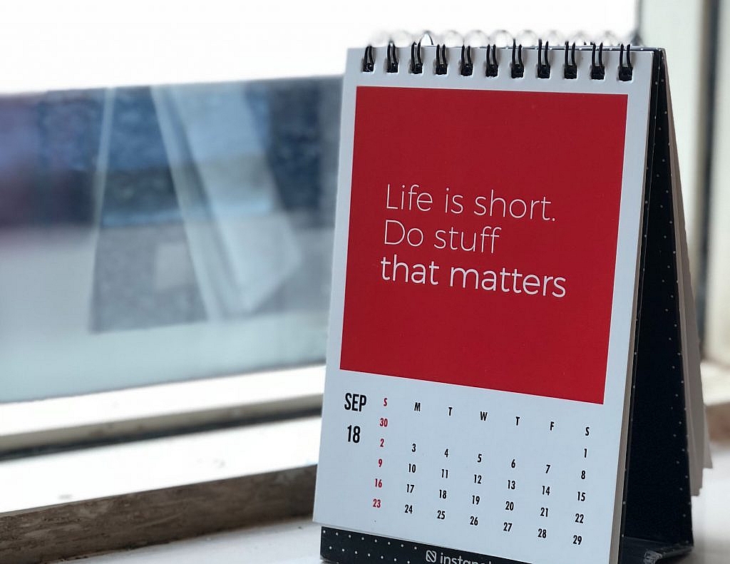
Photo by Manasvita S on Unsplash
Categories: Others Tags:

Should You Become a Web Designer in 2021?

January 27th, 2021 No comments

If you’re here, then you’re thinking about becoming a web designer and wondering if it’s a smart move.

Honestly, it’s not uncommon to be plagued by doubts and what-ifs when making a big career change, and that’s especially so right now, what with all the uncertainty we’ve faced over the last year.

Here’s some good news: It’s never a bad time to become a web designer, which makes 2021 the perfect time to turn your passion into a career! Here are 8 reasons why:

1. People Are Spending More Time Online Than Ever Before

DoubleVerify surveyed consumers’ digital consumption habits in 2020, and guess what it found? The amount of time people spend online has doubled since the pandemic began. Before 2020, consumers worldwide were spending an average of 3 hours and 17 minutes online every day. Now? The average is 6 hours and 59 minutes.

Needless to say, web designers are in high demand as businesses rush to get in front of these consumers.

2. There’s a Big Freelance Boom Right Now

An Upwork study at the end of 2020 reveals that freelancing grew by 22% (about 2 million workers) since 2019. This now-popular career move is a great option for everyone — from university graduates entering the workforce for the first time to anyone who’s been recently laid off. Heck, if you’re just plain unhappy with the course of your career and want to shake things up, freelancing could be the breath of fresh you need.

3. It’s a Future-Proof Field

In these uncertain times, you’re right to be cautious about jumping into something new. But web design is a career that’ll be around for a long, long time. It’s not just the fact that we’ll always need people to build websites that makes this field future-proof. You could build… Websites. Mobile apps. Web apps. Progressive web apps. You could specialize in… Graphic design. UX design. Web development. You could work for yourself. Build your own agency. Go work for someone else.

There’s a ton of flexibility in how you make a living as a designer. So if your interests change or your industry is impacted, that’s fine. Just pivot!

4. You Can Do It From Anywhere, Anytime

When people are nervous about traveling or living in densely packed cities, that’s not something that should worry you as a web designer. One of the benefits of being a web designer is that you can do it from anywhere you want and on your own schedule.

This is especially nice for anyone who has a family and needs a more effective way of managing it all at once, even when the kids aren’t in school or jobs out in the physical world are diminishing.

5. You’re in the Driver’s Seat

Let’s face it, it can be really stressful working for a company where you have little to no say about what goes on, how it gets done, and how much money you make for all your efforts. This is one of the reasons why freelancing is such an attractive option for many. You get to decide which content management system you build websites with. You get to decide who you work with. You get to set your hours of availability. You make the rules. And you know what? You can change them at any time. It’s all on you.

6. It Can Be a Lot of Fun

There’s some fascinating stuff coming down the line in digital design. For instance, augmented and virtual realities are really starting to pick up speed as ecommerce companies need a better way to allow customers to window-shop and try stuff on digitally.

AI is also bringing a lot of changes to the space. Not only can machine learning and language processing improve the way companies do business online, but they can also improve the way web designers work, too.

7. It Can Also Be Really Rewarding

Because you control your career as a web designer, you get to decide who you build websites for. So, what kinds of causes are you passionate about? Is there an industry you have close ties to and want to give back? This isn’t about working for free. This is about offering your professional design services to people you’re invested in and causes that get you excited.

Not only will it be easier to work for clients like these, but you’ll enjoy it more, too.

8. You Don’t Need to Go to School to Become a Designer

This is a common question for people wanting to leap into web design. While you should have some basic knowledge and skills when you start, you don’t need a degree in design or development to start making money.

One of the beautiful things about becoming a web designer is that you can learn as you go. Here are 5 free courses that’ll help you get to the next level. For instance, you can start as a freelancer, building websites from pre-made templates or themes. As you get more experience and pick up advanced design and coding skills, you can then branch out into specialized fields or areas of expertise.

Ready to Become a Web Designer?

There are many, many reasons to leap into web design in 2021. But are you ready? Before you get started, make sure you have a trusted set of resources to help you with the business side of becoming a web designer. Webdesigner Depot is a good place to start. You’ll learn things like:

And much, much more. When you’re ready, check out this 3-part business branding series where you’ll learn how to kick off your new web design business the right way.

Featured image via Unsplash.

Source

The post Should You Become a Web Designer in 2021? first appeared on Webdesigner Depot.

Categories: Designing, Others Tags:

Monorepo

January 26th, 2021 No comments

I’m not exactly a large-scale DevOps guy, but I can tell ya we’ve been moving back toward a monorepo at CodePen and it’s rife with advantages over a system with lots of smaller repos. For us, I mean. It’s very likely that you have entirely different challenges and have come to entirely different conclusions at your place. ?

I was thinking about this after reading Ben Nadel’s “Why I’ve Been Merging Microservices Back Into The Monolith At InVision.” Even though our conclusions are similar, I can tell he faces an entirely different set of problems.

Microservices Solve Both Technical and People Problems

A technical problem is one in which an aspect of the application is putting an undue burden on the infrastructure; which, in turn, is likely causing a poor user experience (UX). For example, image processing requires a lot of CPU. If this CPU load becomes too great, it could start starving the rest of the application of processing resources. This could affect system latency. And, if it gets bad enough, it could start affecting system availability.

A people problem, on the other hand, has little to do with the application at all and everything to do with how your team is organized. The more people you have working in any given part of the application, the slower and more error-prone development and deployment becomes. For example, if you have 30 engineers all competing to “Continuously Deploy” (CD) the same service, you’re going to get a lot of queuing; which means, a lot of engineers that could otherwise be shipping product are actually sitting around waiting for their turn to deploy.

Advantages of the Monorepo (for us)

  • One ring to rule them all. You git pull one repo and you are 100% up to date with everyone else and have everything you need for a complete dev environment.
  • No stray puppies. There is no confusion on where the action happens on GitHub. You do pull requests against the monorepo. You open issues on the monorepo. This avoids scattered activity that gets lost.
  • Kumbaya. You can share code. It can be particularly helpful to share utilities or components anywhere in the codebase. We poked at ideas like publishing shared bits to npm for other repos to use, but that workflow was janky compared to having the code together in on place.
  • Growing old together. There are no old and neglected repos, because it’s just one. For our small team, having dozens of repos meant some of them had old outdated dependencies, ancient versions of Node, linting and formatting rules that were out of sync with other repos, etc.

Disadvantages of the Monorepo (for us)

  • Deployment trickiness. I think the main reason we split off repos originally is that the code in those repos needed to go to unique places. They might have represented an individual Lambda or individual service on some other server. An individual repo means it’s easier to hook up stuff that is unique to that server/service, like CI/CD.

Yes, I get that this is controversial.

I actually don’t care that much. I’m not gonna get all intense about this like air fryer people and CrossFit zealots. Here’s a full-throated argument against monorepos from Matt Klein.

I’m just saying: it’s been clearly useful for us. I can see how things play out differently for other companies. I can see how a company that works with contractors might want to limit their access to something less than an entire monorepo. I can see how a git repo might become unwieldy and large. Those aren’t problems for us at CodePEn right now, so the advantages of a monorepo win.


The post Monorepo appeared first on CSS-Tricks.

You can support CSS-Tricks by being an MVP Supporter.

Categories: Designing, Others Tags:

Re-Creating the Porky Pig Animation from Looney Tunes in CSS

January 26th, 2021 No comments
The first rectangle contains an inner element that overflows both the top and bottom edges with the text "Possible" below it. The second rectangle clips the inner element on both sides, with "Also possible" below it. The third rectangle clips the inner element on the bottom, but shows it overflowing at the top, with the text "...Not possible" below it.

You know, Porky Pig coming out of those red rings announcing the end of a Looney Tunes cartoon. We’ll get there, but first we need to cover some CSS concepts.

Everything in CSS is a box, or rectangle. Rectangles stack, and can be displayed on top of, or below, other rectangles. Rectangles can contain other rectangles and you can style them such that the inner rectangle is visible outside the outer rectangle (so they overflow) or that they’re clipped by the outer rectangle (using overflow: hidden). So far, so good.

What if you want a rectangle to be visible outside its surrounding rectangle, but only on one side. That’s not possible, right?

Perhaps, when you look at the image above, the wheels start turning: What if I copy the inner rectangle and clip half of it and then position it exactly?. But when it comes down to it, you can’t choose to have an element overflow at the top but clip at the bottom.

Or can you?

3D transforms

Using 3D transforms you can rotate, transform, and translate elements in 3D space. Here’s a group of practical examples I gathered showcasing some possibilities.

For 3D transforms to do their thing, you need two CSS properties:

  • perspective, using a value in pixels, to determine how pronounced the 3D effect is
  • transform-style: preserve-3d, to tell the browser to keep elements positioned in 3D space.

Even with the good support that 3D transforms have, you don’t see 3D transforms ‘in the wild’ all that much, sadly. Websites are still a “2D” thing, a flat page that scrolls. But as I started playing around with 3D transforms and scouting examples, I found one that was by far the most interesting as far as 3D transforms go:

Three planes floating above each other in 3D space

The image clearly shows three planes but this effect is achieved using a single

. The two other planes are the ::before and ::after pseudo-elements that are moved up and down respectively, using translate(), to stack on top of each other in 3D space. What is noticeable here is how the ::after element, that normally would be positioned on top of an element, is behind that element. The creator was able to achieve this by adding transform: translateZ(-1px);.

Even though this was one of many 3D transforms I had seen at this point, it was the first one that made me realize that I was actually positioning elements in 3D space. And if I can do that, I can also make elements intersect:

Two planes intersecting each other in 3D space

I couldn’t think of how this sort of thing would be useful, but then I saw the Porky Pig cartoon animation. He emerges from behind the bottom frame, but his face overlaps and stacks on top of the top edge of the same frame — the exact same sort of clipping situation we saw earlier. That’s when my wheels started turning. Could I replicate that effect using just CSS? And for extra credit, could I replicate it using a single

?

I started playing around and relatively quickly had this to show for it:

An orange rectangle that intersects through a blue frame. At the top of the image it's above the frame and at the bottom of the image it's below the blue frame.

Here we have a single

with its ::before and an ::after pseudo-elements. The div itself is transparent, the ::before has a blue border and the ::after has been rotated along the x-axis. Because the div has perspective, everything is positioned in 3D and, because of that, the ::after pseudo-element is above the border at the top edge of the frame and behind the border at the bottom edge of the frame.

Here’s that in code:

div {
  transform: perspective(3000px);
  transform-style: preserve-3d;
  position: relative;
  width: 200px;
  height: 200px;
}

div::before {
  content: "";
  width: 100%;
  height: 100%;
  border:10px solid darkblue;
}

div::after {
  content: "";
  position: absolute;
  background: orangered;
  width: 80%;
  height: 150%;
  display: block;
  left: 10%;
  bottom: -25%;
  transform: rotateX(-10deg);
}
CodePen Embed Fallback

With perspective, we can determine how far a viewer is from “z=0” which we can consider to be the “horizon” of our CSS 3D space. The larger the perspective, the less pronounced the 3D effect, and vice versa. For most 3D scenes, a perspective value between 500 and 1,000 pixels works best, though you can play around with it to get the exact effect you want. You can compare this with perspective drawing: If you draw two horizon points close together, you get a very strong perspective; but if they’re far apart, then things appear flatter.

From rectangles to cartoons

Rectangles are fun, but what I really wanted to build was something like this:

I couldn‘t find or create a nicely cut-out version of Porky Pig from that image, but the Wikipedia page contains a nice alternative, so we’ll use that.

First, we need to split the image up into three parts:

  • : the blue background behind Porky
  • ::after: all the red circles that form a sort of tunnel
  • ::before: Porky Pig himself in all his glory, set as a background image

We’ll start with the

. That will be the background as well as the base for the rest of the elements. It’ll also contain the perspective and transform-style properties I called out earlier, along with some sizes and the background color:

div {
  transform: perspective(3000px);
  transform-style:preserve-3d;
  position: relative;
  width: 200px;
  height: 200px;
  background: #4992AD;
}

Alright, next up, we‘ll move to the red circles. The element itself has to be transparent because that’s the opening where Porky emerges. So how shall we go about it? We can use a border just like the example earlier in this article, but we only have one border and that can have a solid color. We need a bunch of circles that can accept gradients. We can use box-shadow instead, chaining multiple shadows in the property values. This gets us all of the circles we need, and by using a blur radius value of 0 with a large spread radius, we can create the appearance of multiple “borders.”

box-shadow: <x-offset> <y-offset> <blur-radius> <spread-radius> <color>;

We‘ll use a border-radius that‘s as large as the

itself, making the ::before a circle. Then we’ll add the shadows. When we add a few red circles with a large spread and add blurry white, we get an effect that looks very similar to the Porky’s tunnel.

box-shadow: 0 0 20px   0px #fff, 0 0 0  30px #CF331F,
            0 0 20px  30px #fff, 0 0 0  60px #CF331F,
            0 0 20px  60px #fff, 0 0 0  90px #CF331F,
            0 0 20px  90px #fff, 0 0 0 120px #CF331F,
            0 0 20px 120px #fff, 0 0 0 150px #CF331F;

Here, we’re adding five circles, where each is 30px wide. Each circle has a solid red background. And, by using white shadows with a blur radius of 20px on top of that, we create the gradient effect.

The background and circles in pure CSS without Porky

With the background and the circles sorted, we’re now going to add Porky. Let’s start with adding him at the spot we want him to end up, for now above the circles.

div::before {
  position: absolute;
  content: "";
  width: 80%;
  height: 150%;
  display: block;
  left: 10%;
  bottom: -12%;
  background: url("Porky_Pig.svg") no-repeat center/contain;
}

You might have noticed that slash in “center/contain” for the background. That’s the syntax to set both the position (center) and size (contain) in the background shorthand CSS property. The slash syntax is also used in the font shorthand CSS property where it’s used to set the font-size and line-height like so: /.
The slash syntax will be used more in future versions of CSS. For example, the updated rgb() and hsl() color syntax can take a slash followed by a number to indicate the opacity, like so: rgb(0 0 0 / 0.5). That way, there’s not need to switch between rgb() and rgba(). This already works in all browsers, except Internet Explorer 11.
Porky Pig positioned above the circles

Both the size and positioning here is a little arbitrary, so play around with that as you see fit. We’re a lot closer to what we want, but now need to get it so the bottom portion of Porky is behind the red circles and his top half remains visible.

The trick

We need to transpose both the circles as well as Porky in 3D space. If we want to rotate Porky, there are a few requirements we need to meet:

  • He should not clip through the background.
  • We should not rotate him so far that the image distorts.
  • His lower body should be below the red circles and his upper body should be above them.

To make sure Porky doesn‘t clip through the background, we first move the circles in the Z direction to make them appear closer to the viewer. Because preserve-3d is applied it means they also zoom in a bit, but if we only move them a smidge, the zoom effect isn’t noticeable and we end up with enough space between the background and the circles:

transform: translateZ(20px);

Now Porky. We’re going to rotate him around the X-axis, causing his upper body to move closer to us, and the lower part to move away. We can do this with:

transform: rotateX(-10deg);

This looks pretty bad at first. Porky is partially hidden behind the blue background, and he’s also clipping through the circles in a weird way.

Porky Pig partially clipped by the background and the circles

We can solve this by moving Porky “closer” to us (like we did with the circles) using translateZ(), but a better solution is to change the position of our rotation point. Right now it happens from the center of the image, causing the lower half of the image to rotate away from us.

If we move the starting point of the rotation toward the bottom of the image, or even a little bit below that, then the entirety of the image rotates toward us. And because we already moved the circles closer to us, everything ends up looking as it should:

transform: rotateX(-10deg);
transform-origin: center 120%;
Porky Pig emerges from the circle, with his legs behind the circles but his head above them.

To get an idea of how everything works in 3D, click “show debug” in the following Pen:

CodePen Embed Fallback

Animation

If we keep things as they are — a static image — then we wouldn’t have needed to go through all this trouble. But when we animate things, we can reveal the layering and enhance the effect.

Here‘s the animation I’m going for: Porky starts out small at the bottom behind the circles, then zooms in, emerging from the blue background over the red circles. He stays there for a bit, then moves back out again.

We’ll use transform for the animation to get the best performance. And because we’re doing that, we need to make sure we keep the rotateX in there as well.

@keyframes zoom {
  0% {
    transform: rotateX(-10deg) scale(0.66);
  }
  40% {
    transform: rotateX(-10deg) scale(1);
  }
  60% {
    transform: rotateX(-10deg) scale(1);
  }
  100% {
    transform: rotateX(-10deg) scale(0.66);
  }
}

Soon, we’ll be able to directly set different transforms, as browsers have started implementing them as individual CSS properties. That means that repeating that rotateX(-10deg) will eventually be unnecessary; but for now, we have a little bit of duplication.

We zoom in and out using the scale() function and, because we’ve already set a transform-origin, scaling happens from the center-bottom of the image, which is precisely the effect we want! We’re animating the scale up to 60% of Porky’s actual size, we have the little break at the largest point, where he fully pops out of the circle frame.

The animation goes on the ::before pseudo-element. To make the animation look a little more natural, we’re using an ease-in-out timing function, which slows down the animation at the start and end.

div::before {
  animation-name: zoom;
  animation-duration: 4s;
  animation-iteration-count: infinite;
  animation-fill-mode:forwards;
  animation-timing-function: ease-in-out;
}
CodePen Embed Fallback

What about reduced motion?

Glad you asked! For people who are sensitive to animations and prefer reduced or no motion, we can reach for the prefers-reduced-motion media query. Instead of removing the full animation, we’ll target those who prefer reduced motion and use a more subtle fade effect rather than the full-blown animation.

@media (prefers-reduced-motion: reduce) {
   @keyframes zoom {
    0% {
      opacity:0;
    }
    100% {
      opacity: 1;
    }
  }

  div::before {
    animation-iteration-count: 1;
  }
}

By overwriting the @keyframes inside a media query, the browser will automatically pick it up. This way, we still accentuate the effect of Porky emerging from the circles. And by setting animation-iteration-count to 1, we still let people see the effect, but then stop to prevent continued motion.

Finishing touches

Two more things we can do to make this a bit more fun:

  • We can create more depth in the image by adding a shadow behind Porky that grows as he emerges and appears to zoom in closer to the view.
  • We can turn Porky as he moves, to embellish the pop-out effect even further.

That second part we can implement using rotateZ() in the same animation. Easy breezy.

But the first part requires an additional trick. Because we use an image for Porky, we can’t use box-shadow because that creates a shadow around the box of the ::before pseudo-element instead of around the shape of Porky Pig.

That’s where filter: drop-shadow() comes to the rescue. It looks at the opaque parts of the element and adds a shadow to that instead of around the box.

@keyframes zoom {
  0% {
    transform: rotateX(-10deg) scale(0.66);
    filter: drop-shadow(-5px 5px 5px rgba(0,0,0,0));
  }
  40% {
    transform: rotateZ(-10deg) rotateX(-10deg) scale(1);
    filter: drop-shadow(-10px 10px 10px rgba(0,0,0,0.5));
  }

  60% {
    transform: rotateZ(-10deg) rotateX(-10deg) scale(1);
    filter: drop-shadow(-10px 10px 10px rgba(0,0,0,0.5));
  }

  100% {
    transform: rotateX(-10deg) scale(0.66);
    filter: drop-shadow(-5px 5px 5px rgba(0,0,0,0));
  }
}
CodePen Embed Fallback

And that‘s how I re-created the Looney Tunes animation of Porky Pig. All I can say now is, “That’s all Folks!”


The post Re-Creating the Porky Pig Animation from Looney Tunes in CSS appeared first on CSS-Tricks.

You can support CSS-Tricks by being an MVP Supporter.

Categories: Designing, Others Tags:

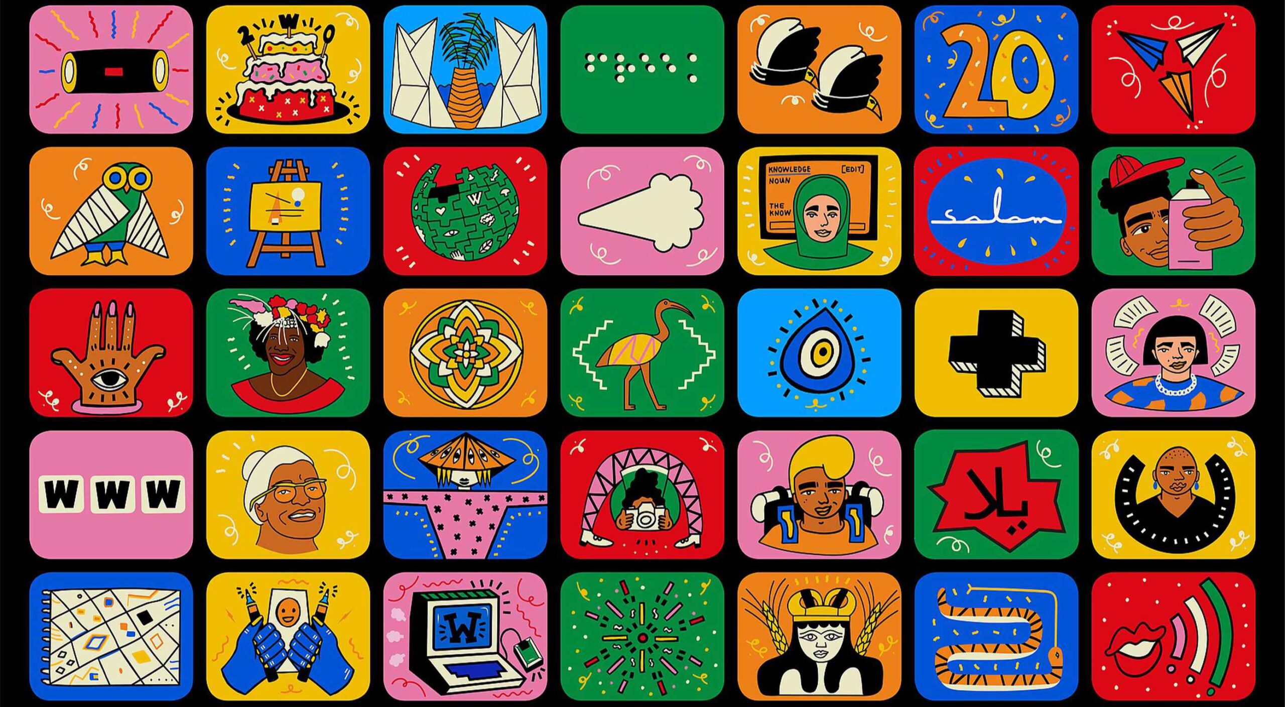
Celebrating 20 Years of Wikipedia

January 26th, 2021 No comments

20 years ago, Wikipedia was started with the ambitious aim of creating a free encyclopedia for the whole world.

Looking back 20 years, the world was a very different place: the Dot Com Bust had just passed; the average US house price was just $136k; Jack Bauer was only 24 hours into saving the world; President Obama was several years away from the US Senate; Destiny’s Child were topping the charts; the appalling events of 9/11, and everything that followed, were still months away.

Some startups from the same era have gone on to raise billions of dollars, a few have even turned a profit, while most have slipped into the realm of permanent 404s, Wikipedia has determinedly stuck to its original altruistic intent.

To celebrate its 20th anniversary, Wikipedia is highlighting some of the 280,000 volunteers who edit entries every month, keeping the site on point.

With 21,000,000,000 searches per month (give or take) Wikipedia has become an unparalleled authority for the web. With most-viewed articles from the past ranging from Darth Vader to Avengers: Endgame, to COVID-19, humans across the planet have a source of news that is transparent, independent, and democratic.

So happy birthday to Wikipedia, may we be celebrating again in 20 years.

Source

The post Celebrating 20 Years of Wikipedia first appeared on Webdesigner Depot.

Categories: Designing, Others Tags:

Tech Stacks and Website Longevity

January 25th, 2021 No comments

Steren Giannini in “My stack will outlive yours”:

My stack requires no maintenance, has perfect Lighthouse scores, will never have any security vulnerability, is based on open standards, is portable, has an instant dev loop, has no build step and… will outlive any other stack.

Jeremy Keith in “npm ruin dev”:

Instead of reaching for all-singing all-dancing toolchain by default, I’m going to start with a boring baseline. If and when that becomes too painful or unwieldy, then I’ll throw in a task manager. But every time I add a dependency, I’ll be limiting the lifespan of the project.

I like both of those sentiments.

Steren’s “stack” is HTML and CSS only. Will HTML and CSS “last” in the sense of that website being online and working for a long time. I’d say certainly yes. HTML and CSS were around before I got here, are actively developed, and no other technologies are really even trying to unseat them. The closest threats are native platforms, but those are so fractured, closed, while lacking the worldwide utility of the URL and open standards, that it doesn’t look like that any native platform will unseat the web. It’s more likely (and we see this happening, even if it’s slow and fraught) that native platforms embrace the web.

Will an HTML and CSS website be perfectly functional in, say, 2041? I’d say certainly. I’ll bet ya a dollar.

Steren doesn’t mean that HTML and CSS is just the output, but there is still other tooling to get there. No build process either. No templating. Need to update the navigation?

So… if I don’t use any templating system, how do I update my header, footer or nav? Well, simply by using the “Replace in files” feature of any good text editor. They don’t need frequent updates anyway. The benefits of using a templating system is not worth the cost of introducing the tooling it requires.

I admit this is drawing the line further back than I would. This feels just like trading one kind of technical debt for another. Now you’ll need to write scripts or an elaborate find-and-replace RegEx to do what you want to do, rather than reach for some form of HTML include, which there are a ton of ways to handle lightly.

But I get it. Especially since once you do add that one templating language (or whatever), the temptation is strong to keep adding to the system, introducing more and more liabilities with less consideration on how they may be “limiting the lifespan” of the project.

I don’t actually think the stack matters that much.

You know what technology stack will build the longest-lasting websites?

It isn’t one.

The trick is caring about and being invested in what you’re building.

— Chris Coyier (@chriscoyier) January 13, 2021

In thinking about sites I work on (and have worked on), the longevity of the site doesn’t feel particularly related to the stack. Like, at all. The sites with the longest lifespans (like this one) have long lifespans because I care about them, and they have all sorts of moving parts in the stack.

I pick technology to help with what I want to do. If my needs change, I change the technology. I don’t just say, ooops, my stack is off, I guess I’ll shut down the website forever.

If we’re talking about website longevity, I think the breakdown of how much things matter is more like this:

  • 80% How much I care about the website
  • 10% The website isn’t a financial burden
  • 5% The website isn’t a mental burden (“the stack” being some small part of this)
  • 5% I have access to the registrant and didn’t forget to renew the domain name before a squatter nabs it

The post Tech Stacks and Website Longevity appeared first on CSS-Tricks.

You can support CSS-Tricks by being an MVP Supporter.

Categories: Designing, Others Tags:

Checkerboard Reveal

January 25th, 2021 No comments

Back when I was 10, I remember my cousin visiting our house. He was (and still is) a cool kid, the kind who’d bring his own self-programmed chess game on a floppy disk. And his version of chess was just as cool as him because a piece of the board would disappear after each move.

Even cooler? Each disappearing piece of the game board revealed a pretty slick picture.

It was a really hard game.

I thought that same sort of idea would make for some pretty slick UI. Except, maybe instead of requiring user interaction to reveal the background, it could simply play as an animation. Here’s where I landed:

CodePen Embed Fallback

The idea’s pretty simple and there are lots of other ways to do it, but here’s the rabbit trail I followed…

First, I created some markup

The image can be handled as a background in CSS on the , or some

that’s designed to be a specific size. So, no need to deal with that just yet.

But the checkerboard is interesting. That’s a pattern that has CSS Grid written all over it, so I went with an element to act as a grid container with a bunch of other

elements right inside it. I don’t know how many tiles/squares/whatever a legit chess board has, so I just chose the number seven out of thin air and squared it to get 49 total squares.

<div class="grid">
  <div></div>
  <!-- etc. -->
  <div></div>
</div>

Yeah, writing out all those divs is a pain and where JavaScript could certainly help. But if I’m just experimenting and only need the developer convenience, then that’s where using Haml can help instead:

.grid
  - 49.times do
    %div

It all comes out the same in the end. Either way, that gave me all the markup I needed to start styling!

Setting the background image

Again, this can happen as a background-image on the or some other element, depending on how this is being used — just as long as it covers the entire space. Since I needed a grid container anyway, I decided to use that.

.checkerboard {
  background-image: url('walrus.jpg');
  background-size: cover;
  /* Might need other properties to position the image just right */
}

The gradient is part of the raster image file, but I could’ve gotten clever with some sort of overlay on the using a pseudo-element, like :after. Heck, that’s a widely used technique right here on the current design of CSS-Tricks.

Styling the grid

And yes, I went with CSS Grid. Making a 7×7 grid is pretty darn easy that way.

.checkerboard {
  background-image: url('walrus.jpg');
  background-size: cover;
  display: grid;
  grid-template-columns: repeat(7, 1fr);
  grid-template-rows: repeat(7, 1fr);
}

I imagine this will be a lot better once we see aspect-ratio widely supported, at least if I correctly understand it. The problem I have right now is that the grid doesn’t stay in any sort of proportion. That means the checkerboard’s tiles get all squishy and such at different viewport sizes. Boo. There are hacky little things we can do in the meantime, if that’s super important, but I decided to leave it as is.

Styling the tiles

They alternate between white and a dark shade of grey, so:

.checkerboard > div {
  background-color: #fff;
}
.checkerboard > div:nth-child(even) {
  background-color: #2f2f2f;
}

Believe it or not, our markup and styling is done! All that’s left is…

Animating the tiles

All the animation needs to do is transition each tile from opacity: 1; to opacity: 0; and CSS Animations are perfect for that.

@keyframes poof {
  to {
    opacity: 0;
  }
}

Great! I didn’t even need to set a starting keyframe! All I had to do was call the animation on the tiles.

.checkerboard > div {
  animation-name: poof;
  animation-duration: 0.25s;
  animation-fill-mode: forwards;
  background: #fff;
}

Yes, I could have used the animation shorthand property here, but I often find it easier to break its constituent properties out individually because… well, there’s so gosh darn many of them and things get hard to read and identify on a single line.

If you’re wondering why animation-fill-mode is needed here, it’s because it prevents the animation from looping back to the start of the animation when set to forwards. In other words, each tile will stay at opacity: 0; when the animation finishes rather than coming back into view.

I really, really wanted to do something smart and clever to stagger the animation-delay of the tiles, but I hit a bunch of walls and ultimately decided to ditch my effort to go 100% vanilla CSS for some light SCSS. That way, I could loop through all of the tiles and offset the animation for each one with a pretty standard function. So, sorry for the abrupt switch! That was just part of the journey.

$columns: 7;
$rows: 7;
$cells: $columns * $rows;

@for $i from 1 through $cells {
  .checkerboard > div:nth-child(#{$i}) {
    animation-delay: (random($cells) / $columns) + s;
  }
}

Let’s break that down:

  • There are variables for the number of grid columns ($columns), grid rows ($rows), and total number of cells ($cells). That last one is the product of multiplying the first two. If we know we are always working in with a grid that’s a perfect square, then we could refactor that a bit to calculate the number cells with exponents.
  • Then for every instance of cells between 1 and the total number of $cells (which is 49 in this case), each individual tile gets an animation-delay based on its :nth-child() value. So, the first tile is div:nth-child(1), then div:nth-child(2), and so on. View the compiled CSS in the demo and you’ll see how it all breaks out.
.checkerboard > div:nth-child(1) {}
.checkerboard > div:nth-child(2) {}
/* etc. */
  • Finally, the animation-delay is a calculation that takes a random number between 1 and the total number of $cells, divided by the number of $columns with seconds appended to the value. Is this the best way to do it? I dunno. It comes down to playing around with things a bit and landing on something that feels “right” to you. This felt “right” to me.

I really, really wanted to get creative and use CSS Custom Properties instead of resorting to SCSS. I like that custom properties and values can be updated client-side, as opposed to SCSS where the calculated values are compiled on build and stay that way. Again, this is exactly where I would be super tempted to reach for JavaScript instead. But, I made my bed and have to lie in it.

If you peeked at the compiled CSS earlier, then you would have seen the calculated values:

/* Yes, Autoprefixer is in there... */
.checkerboard > div:nth-child(1) {
  -webkit-animation-delay: 4.5714285714s;
          animation-delay: 4.5714285714s;
}

.checkerboard > div:nth-child(2) {
  -webkit-animation-delay: 5.2857142857s;
          animation-delay: 5.2857142857s;
}

.checkerboard > div:nth-child(3) {
  -webkit-animation-delay: 2.7142857143s;
          animation-delay: 2.7142857143s;
}

.checkerboard > div:nth-child(4) {
  -webkit-animation-delay: 1.5714285714s;
          animation-delay: 1.5714285714s;
}

Hmm, perhaps that animation should be optional…

Some folks are sensitive to motion and movement, so it’s probably a good idea to switch things up so the tiles are only styled and animation if — and only if — a user prefers it. We have a media query for that!

@media screen and (prefers-reduced-motion: no-preference) {
  .checkerboard > div {
    animation-name: poof;
    animation-duration: 0.25s;
    animation-fill-mode: forwards;
    background: #fff;
  }
  .checkerboard > div:nth-child(even) {
    background: #2f2f2f;
  }
}

There you have it!

Here’s that demo one more time:

CodePen Embed Fallback

The post Checkerboard Reveal appeared first on CSS-Tricks.

You can support CSS-Tricks by being an MVP Supporter.

Categories: Designing, Others Tags:

20 Best New Websites, January 2021

January 25th, 2021 No comments

Here we are into a brand new year, and although we’re far from out of the woods yet, there is a feeling of renewed hope on many fronts.

In this first collection of the year, we have a mix of retrospectives, brand new ventures, and business as usual. There is an eclectic mix of styles on offer, from glossy and slick to minimalist and brutalist, but all confident and looking to a better world in the year ahead.

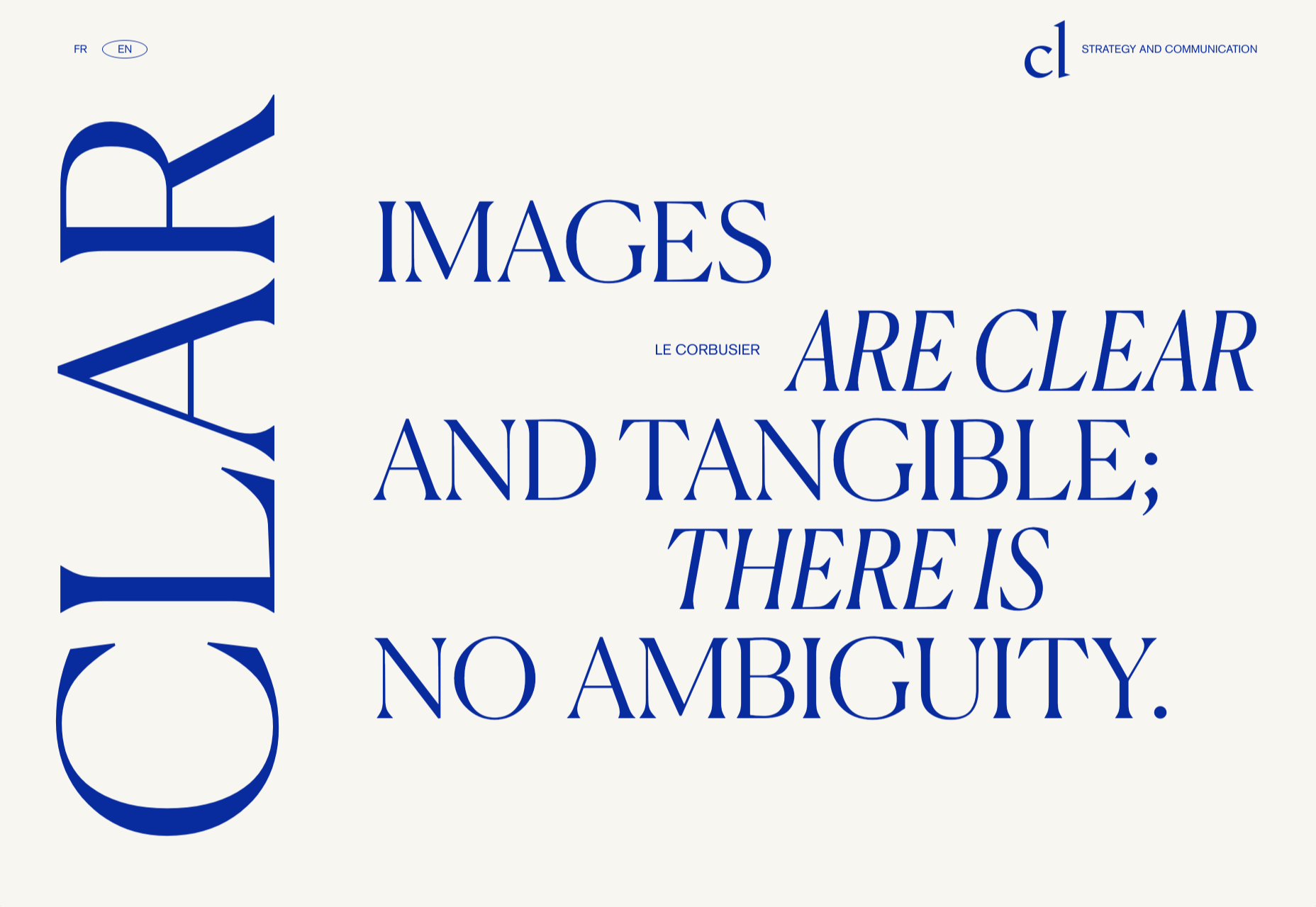
Clar

Brand strategists Clar have a simple but strong site. Aside from a few personnel profile shots and the odd bit of line animation, it is all text. The typography is good, and the use of color holds interest.

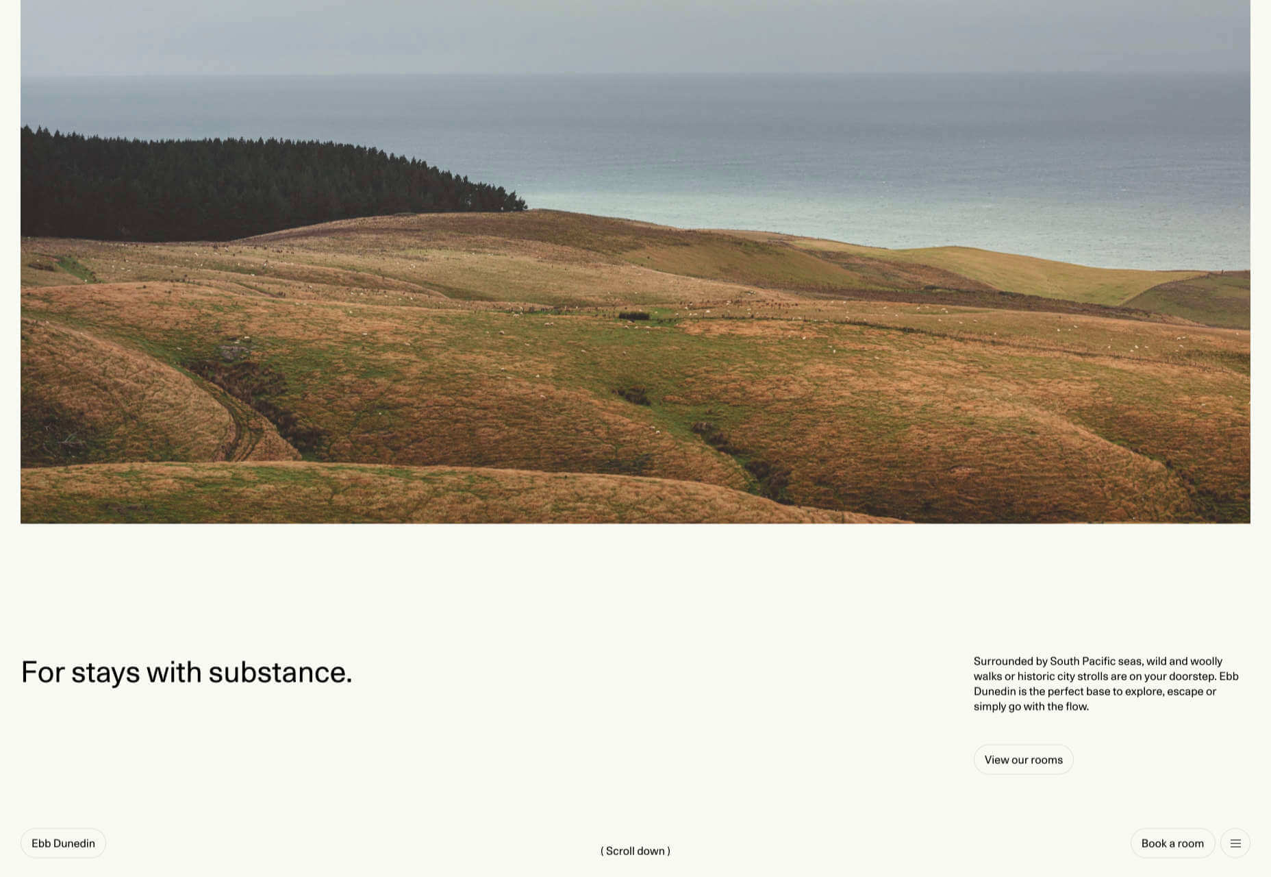
Ebb Dunedin

This boutique hotel, opening in March 2021 (COVID permitting), has bucked the usual luxury hotel trend and bravely gone for a more minimal design style to complement its interiors.

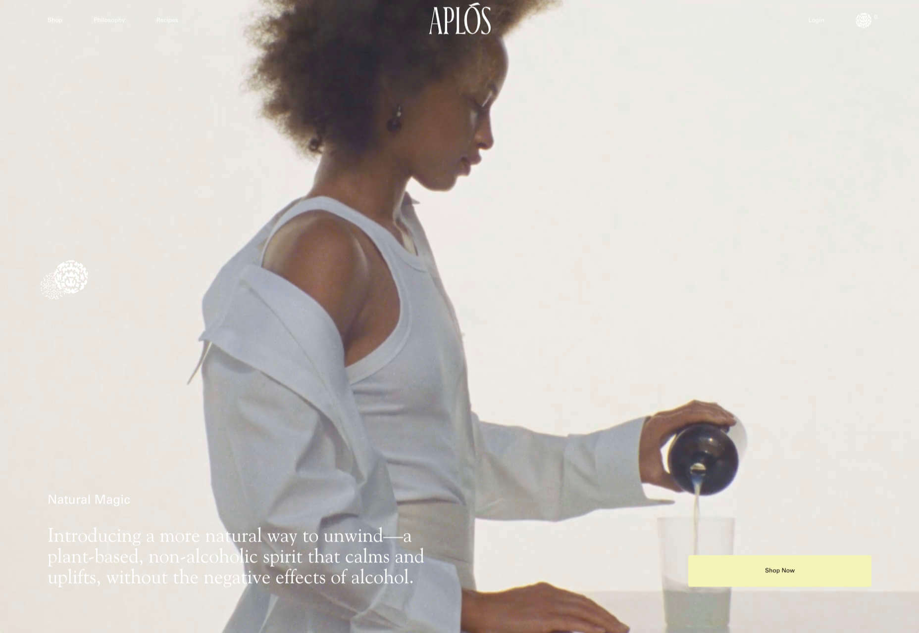
Aplós

Perfect for Dry January, Aplós is a new, non-alcoholic spirit that can be drunk on its own, with a mixer or in a cocktail. The site design and branding aesthetic is sophisticated calm.

Malala Fund COVID Initiative

Subtle color and simple line decorations keep this site for the Malala Fund’s COVID Initiative clean but warm and appealing.

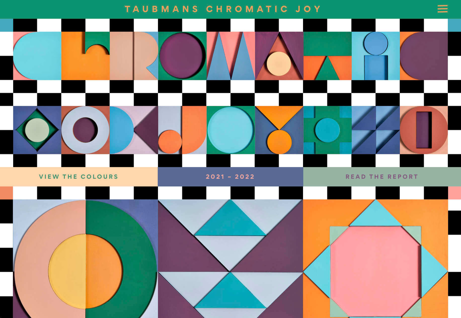
Taubmans Chromatic Joy

This micro-site promoting Taubmans’ new paint color collection is bursting with color and makes a big nod to the Memphis style of the 1980s.

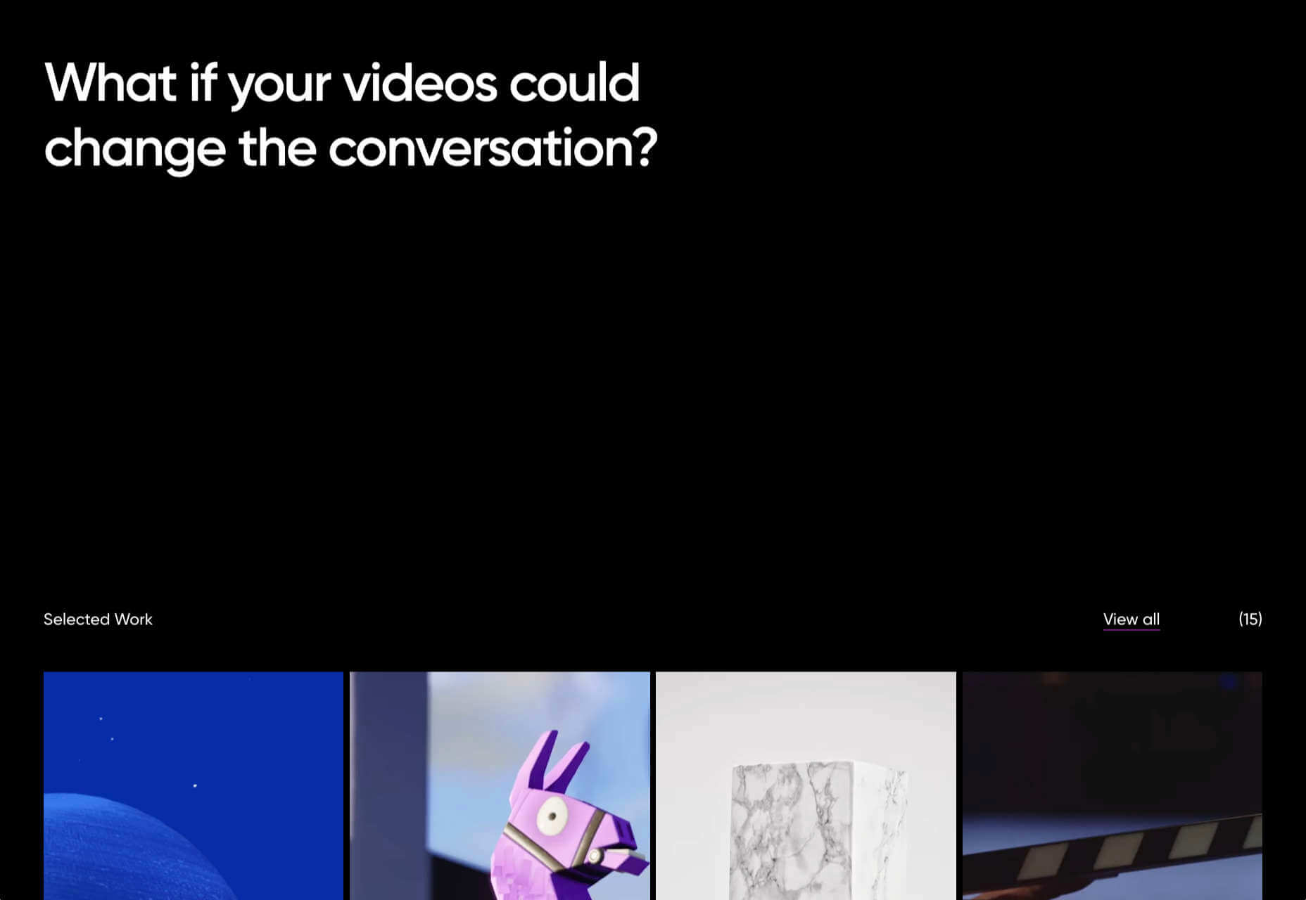
Myriad

Myriad video production agency’s site uses small amounts of bright colors really well. And they quote Eleanor Shellstrop.

The Ocean Cleanup

Cleaning all the plastic crap out of the oceanic garbage patches is a grim job, but it’s getting done, and The Ocean Cleanup site explains how and why in a not grim way.

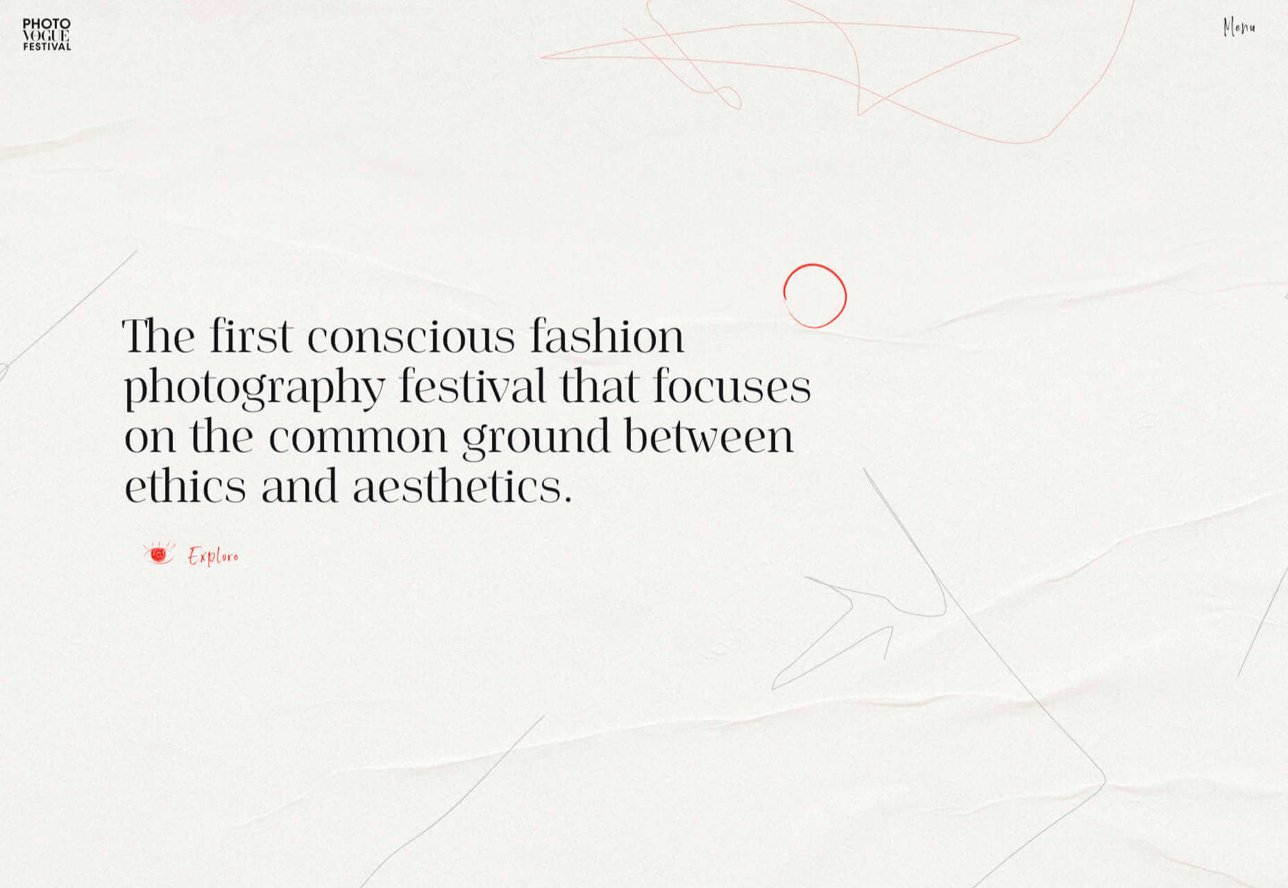
Photo Vogue Festival

This site displaying the work and talks from Vogue Italia’s 2020 Photo Festival mixes a hand-drawn style with clean type and a strong grid.

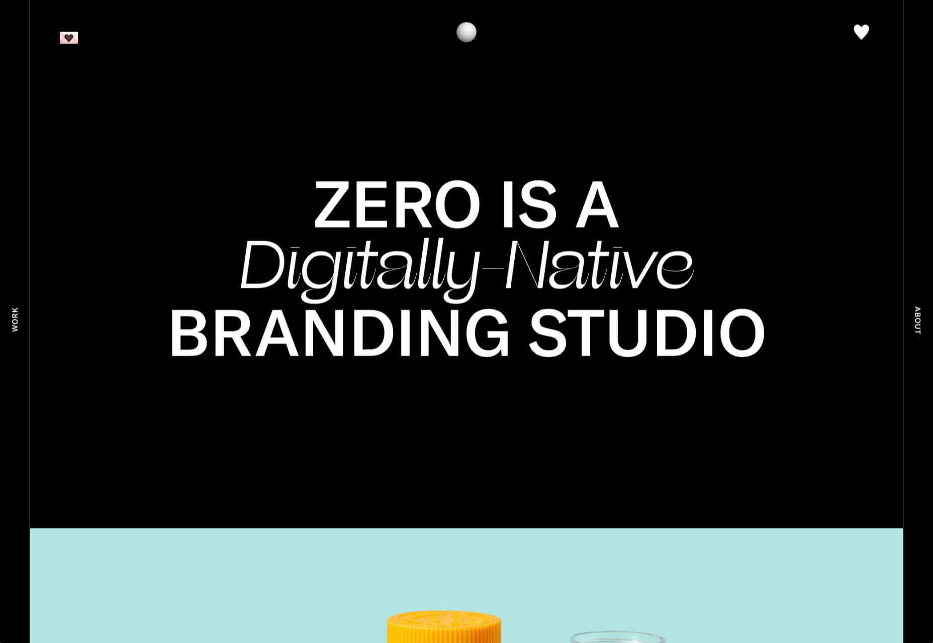
Zero

Zero is a digital branding agency. Their site is glossy with lots of high-quality images, smooth transitions, and a clear structure. The background options are a fun touch.

Fluff

This site for cosmetics brand Fluff takes an old school approach to designing for different viewports — sticking a fullscreen background behind your mobile view for desktop sounds like a terrible idea, but here it works.

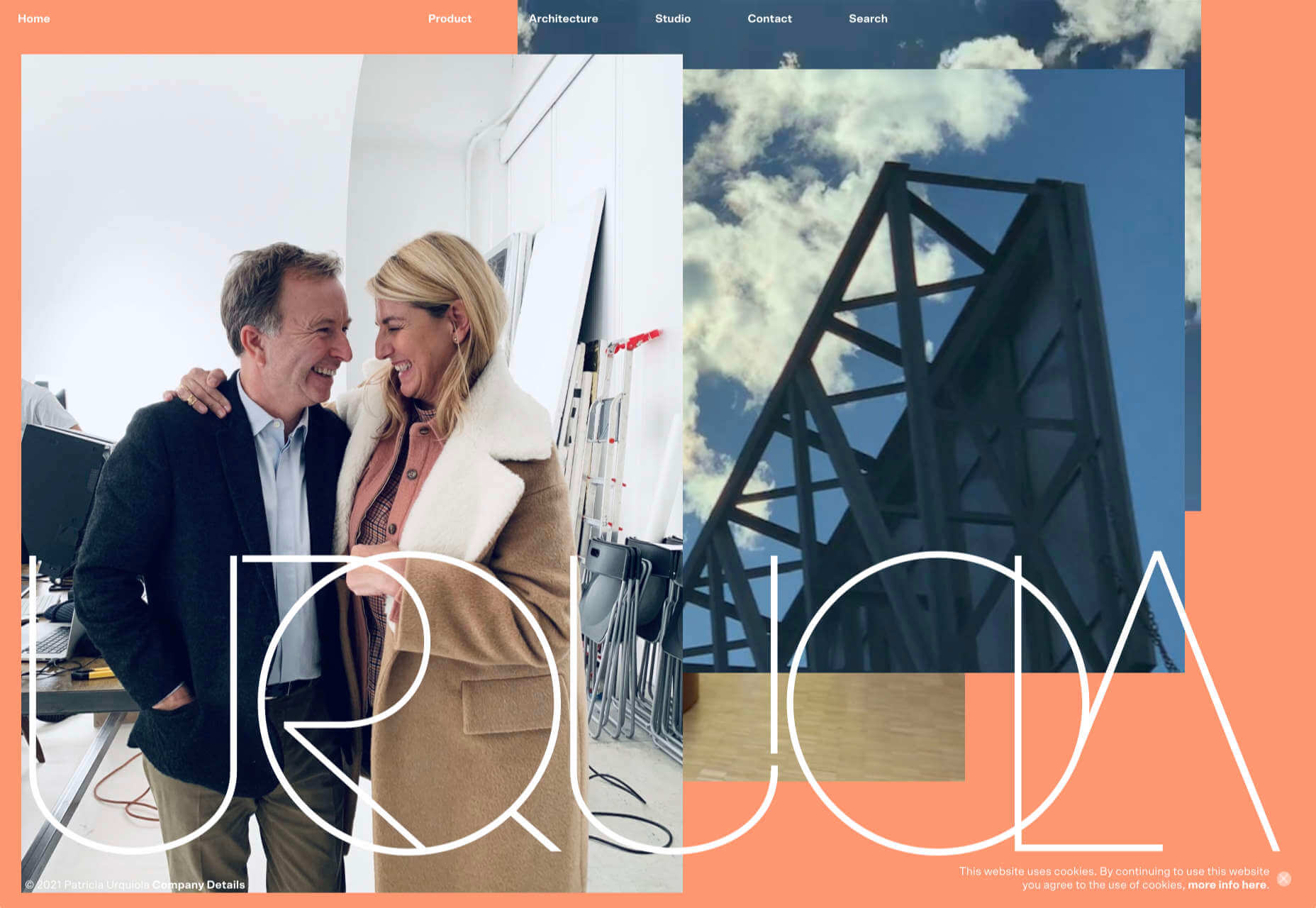
Patricia Urquiola

The new site for Patricia Urquiola design studio is bright, bold, and assured, inspiring confidence.

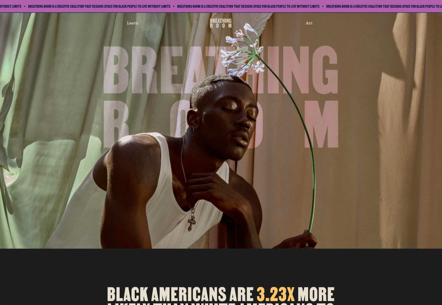
Breathing Room

Breathing Room describes itself as a volunteer creative coalition that designs spaces for black people to live without limits through art, design, and activism. The design radiates confidence and optimism.

A Year in Review

A microsite from Milkshake Studio, highlighting their work over the past year. Some good scrolling animation.

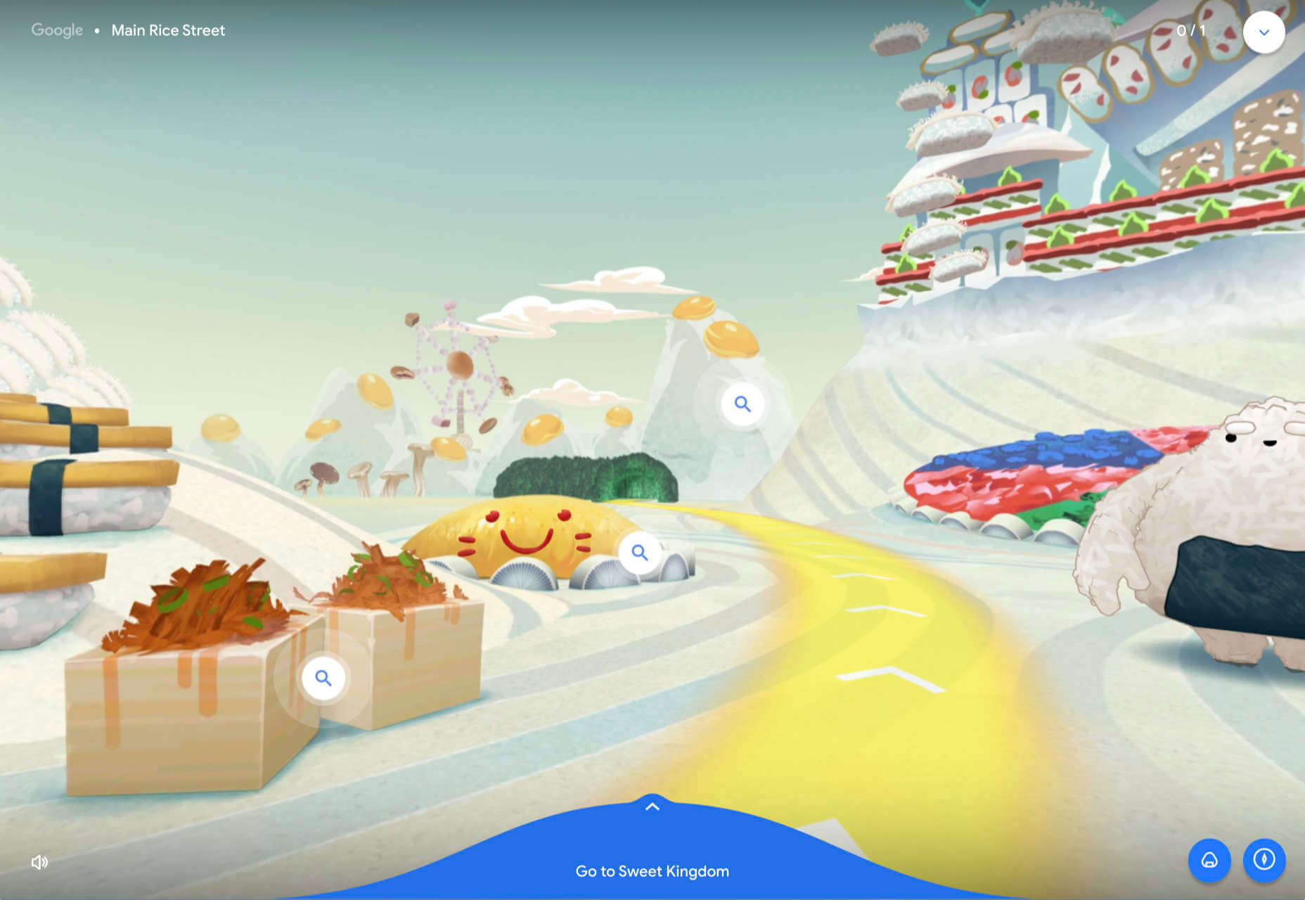
Umamiland

Umamiland is an animated interactive introduction to Japanese food, with links to Google search results for individual items or where to get them.

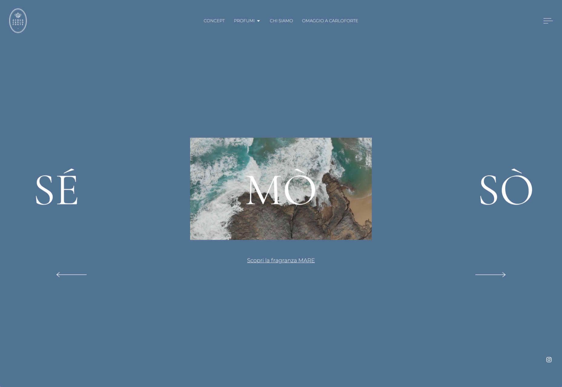
Acqua Carloforte

Carloforte is the town on the island of San Pietro, near Sardinia, and the scents of the island inspire the perfumes of Acqua Carloforte. Cue beautiful photography.

Eugene Ling

Eugen Ling’s portfolio site is simple and straightforward with little or no marketing-speak and a lovely, understated slider transition.

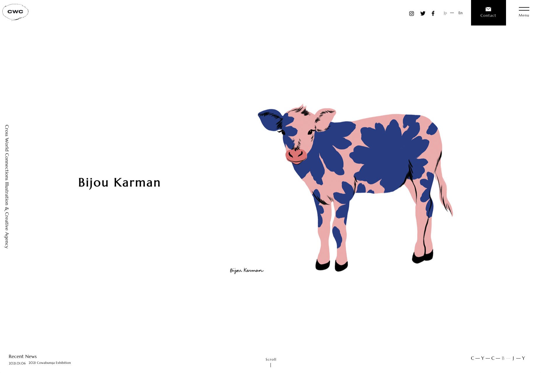
CWC Tokyo

Cross World Connections is an Illustration and Creative Agency based in Japan and represents illustrators from all over the world.

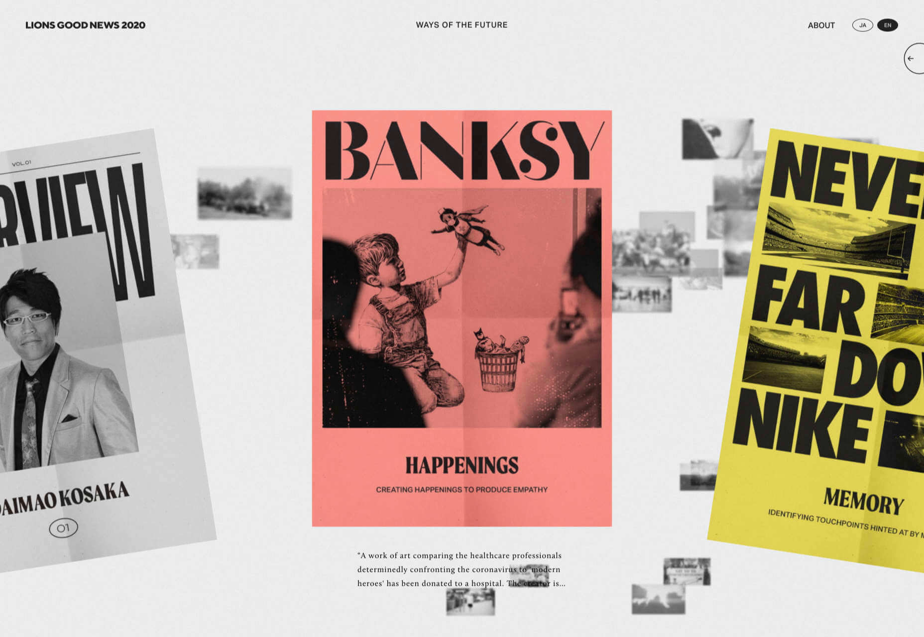
Lions Good News

Following the cancellation of the Cannes Lions Festival of Creativity in 2020, this site was set up to highlight good news in creativity during the pandemic. A carousel of paper flyers forms the main navigation and creates a lo-fi, DIY feel.

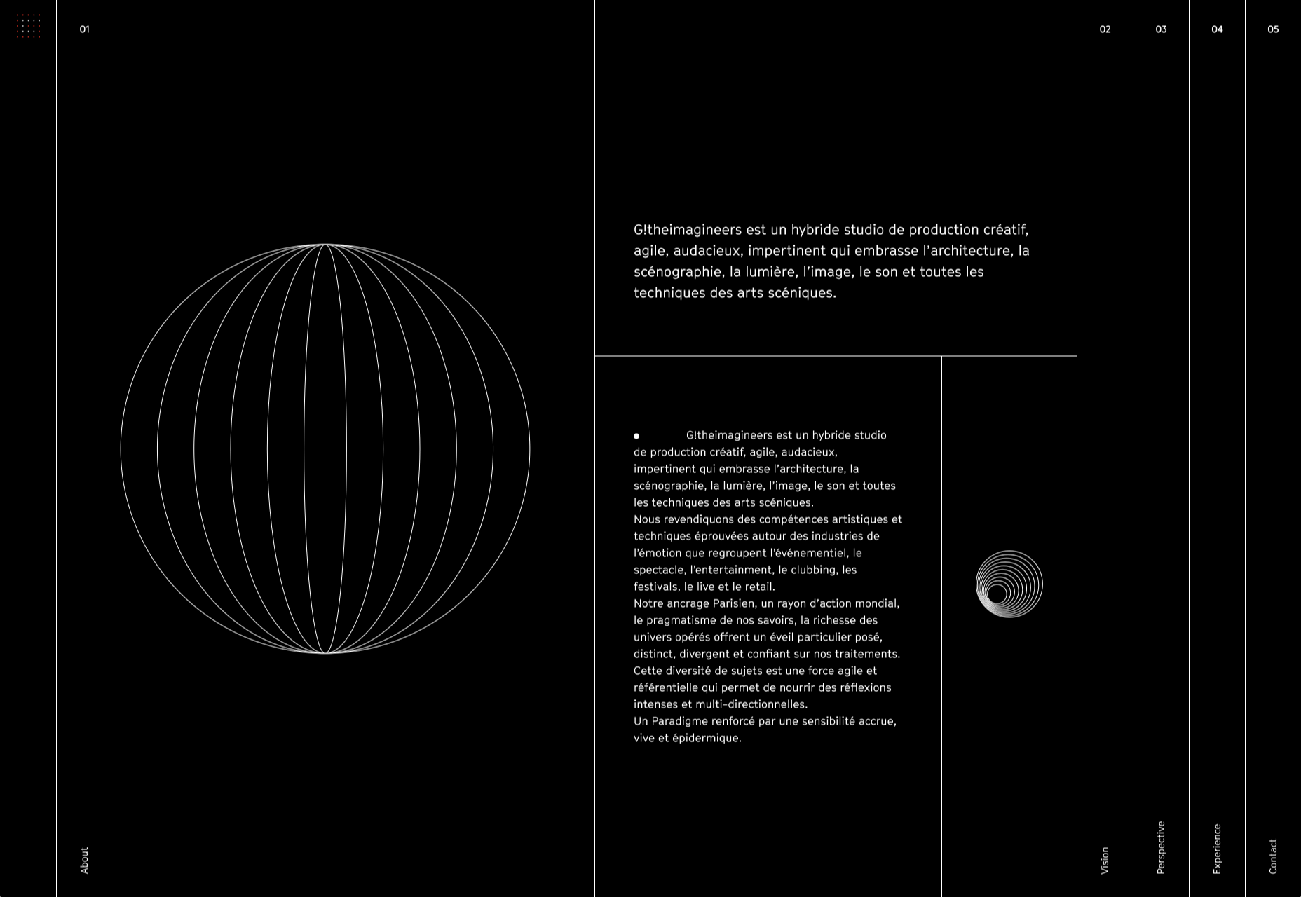
G!theimagineers

G!theimagineers is a production studio for events and entertainment. White lines on black, horizontal concertina navigation, and lots of circles.

Sgrappa

Sgrappa is handmade grappa with attitude, and this site has an uncompromising, in your face vibe.

Source

The post 20 Best New Websites, January 2021 first appeared on Webdesigner Depot.

Categories: Designing, Others Tags:

Popular Design News of the Week: January 18, 2021 – January 24, 2021

January 24th, 2021 No comments

Every week users submit a lot of interesting stuff on our sister site Webdesigner News, highlighting great content from around the web that can be of interest to web designers.

The best way to keep track of all the great stories and news being posted is simply to check out the Webdesigner News site, however, in case you missed some here’s a quick and useful compilation of the most popular designer news that we curated from the past week.

UI Design Trends for 2021

10 White Label Tools for Web Designers

12 Content Marketing Trends to Keep an Eye in 2021

We Can do Better than Signal

I Wasted $40k on a Fantastic Startup Idea

Mnm – An Open Source Project to Replace Email and SMTP

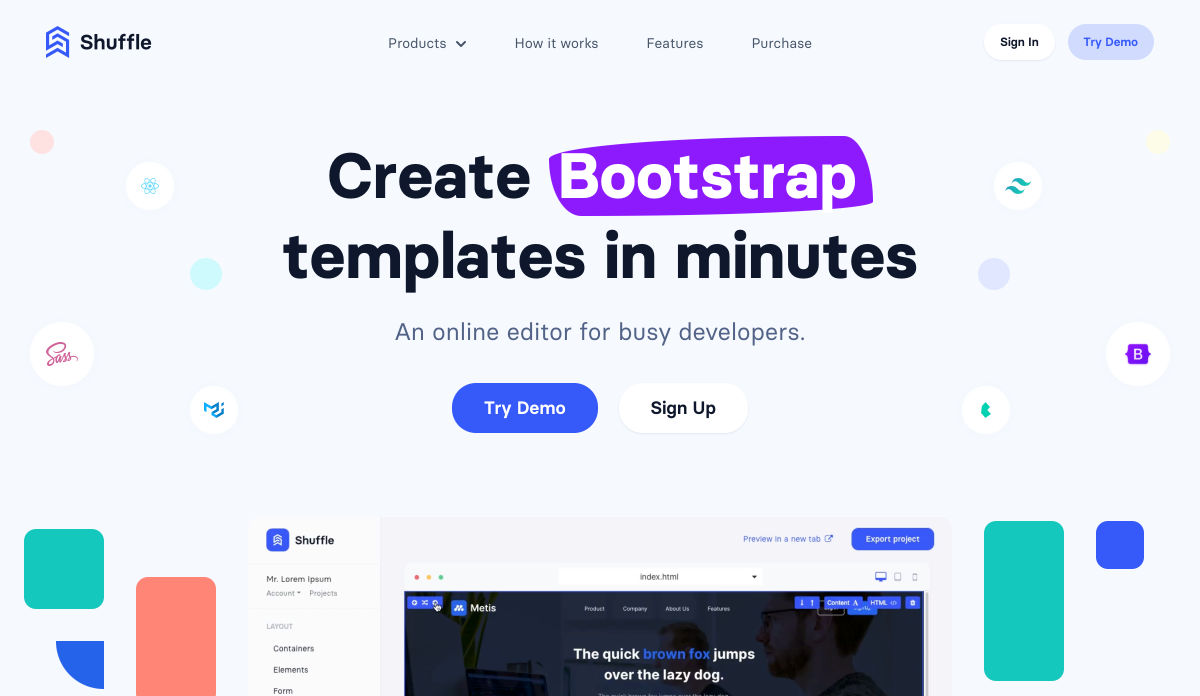
Shuffle – An Online Editor for Busy Developers

New in Chrome 88: Aspect-ratio

Everything About React Server Components

8 Examples of Icon-Based Navigation, Enhanced with CSS and JavaScript

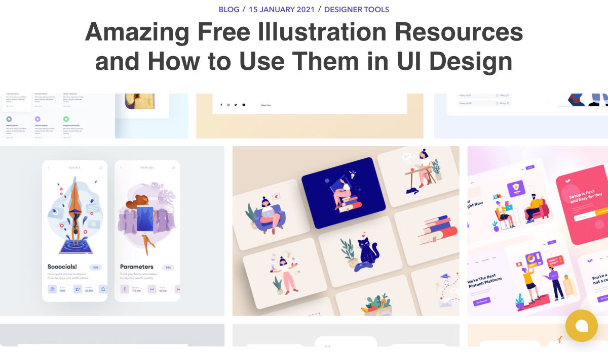
Amazing Free UI Illustrations and How to Use Them

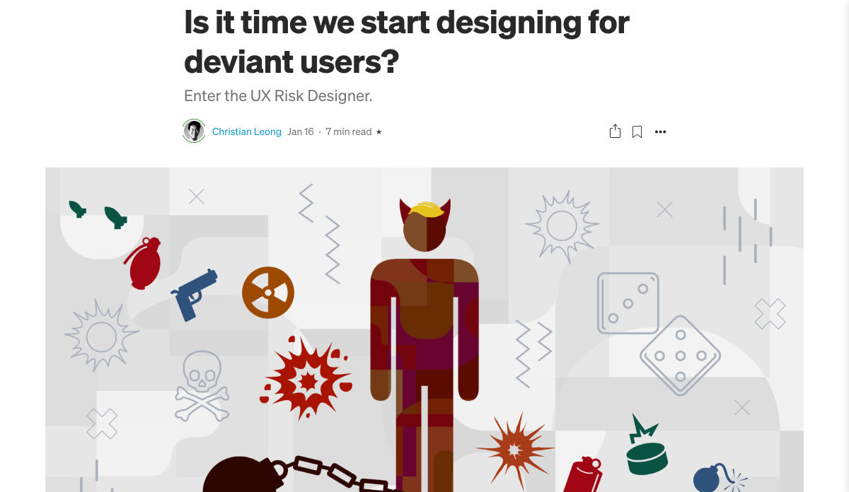
Is it Time We Start Designing for Deviant Users?

7 B2B Web Design Tips to Craft an Eye-Catching Website

Legendaria Font

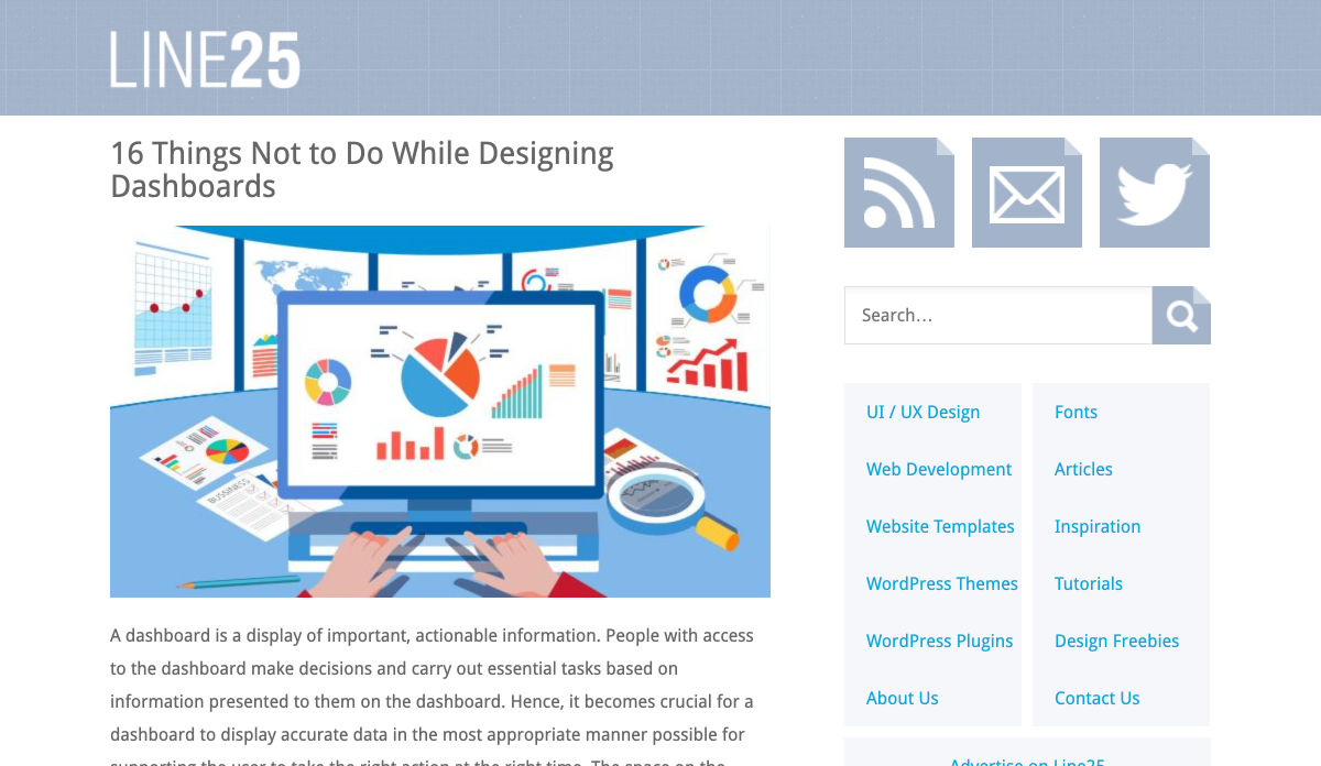
16 Things not to do While Designing Dashboards

How to Train your Design Dragon

Enterprise UX is Amazing

7 Visual Design Lessons from Dmitry Novikoff Based on Big Sur Icons

DIY UX Audit – Uncover 90% of the Usability Issues on your Website

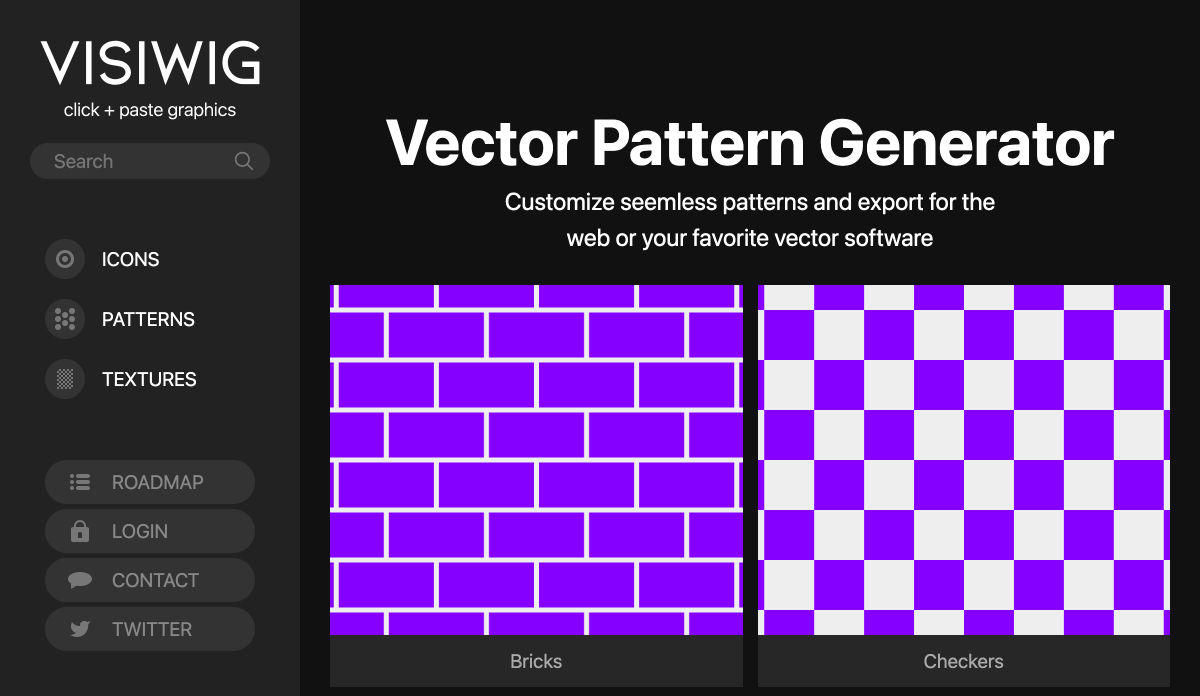
Vector Pattern Generator – Customize Seamless Patterns for the Web

The Year in Illustration 2020

Design Trends Predictions for 2021

Twenty Twenty-One Theme Review: Well-Designed & Cutting-Edge

9 Best Code Editors for Editing WordPress Files

The State of Design in 2021

Want more? No problem! Keep track of top design news from around the web with Webdesigner News.

Source

The post Popular Design News of the Week: January 18, 2021 – January 24, 2021 first appeared on Webdesigner Depot.

Categories: Designing, Others Tags:

You want minmax(10px, 1fr) not 1fr

January 22nd, 2021 No comments

There are a lot of grids on the web like this:

.grid {
  display: grid;
  grid-template-columns: repeat(3, 1fr);
}

My message is that what they really should be is:

.grid {
  display: grid;
  grid-template-columns: repeat(3, minmax(10px, 1fr));
}

Why? In the former, the minimum width of the grid column is min-content, which can be awkwardly wider than you want it to be (see: grid blowouts). In the latter, you’ve reduced the minimum to 10px (not zero, so it doesn’t disappear on you and lead to more confusion).

While it’s slightly unfortunate this is necessary, doing it leads to more predictable behavior and prevents headaches.

That’s it. That’s my whole message.

(Blog post format kiped from Kilian’s “You want overflow: auto, not overflow: scroll” which is also true.)


The post You want minmax(10px, 1fr) not 1fr appeared first on CSS-Tricks.

You can support CSS-Tricks by being an MVP Supporter.

Categories: Designing, Others Tags: