Archive

Archive for January, 2021

Servers: Cool Once Again

January 22nd, 2021 No comments

There were jokes coming back from the holiday break that JavaScript decided to go all server-side. I think it was rooted in:

  • The Basecamp gang releasing Hotwire, which looks like marketing panache around a combination of technologies. “HTML over the wire,” they say, meaning it makes the server generate and serve HTML, and leaves client-side JavaScript to things only client-side JavaScript can do.
  • The React gang Introducing Zero-Bundle-Size React Server Components, which I believe is the first step of the core project toward server-side anything.

I’m all about some marketing hype, but it’s worth noting that these are just fresh takes on already solid (dare I say old) ideas.

Turbo (“The heart of Hotwire”) is an evolution of Turbolinks, which is a terrifically simple base idea: intercept clicks on internal links. Rather than the browser doing a full page refresh, fetch the contents of the new page, plop it in place, and History.pushState() the URL. Now you’ve got a Single Page App feel, but you didn’t have to build a SPA. That’s mighty convenient if you’ve already built your app in Rails with ERB templates.

But is that actually efficient? Well, it hasn’t been particularly popular so far. The thinking has been that the network is the bottleneck, so let’s send as little as possible over the network. “As little as possible” typically translates into JSON, typically. If you get JSON on the client, now you need a templating system on the client to turn that into usable DOM. With that technique, you’re paying two costs: 1) loading a client-side library 2) data-to-DOM processing. If you sent “HTML over the wire,” you pay neither of those costs (faster), but theoretically are sending beefier payloads across the network (slower), which assumes that HTML is heavier than JSON, which is… questionable.

So… it depends. It depends on how big the payloads are and what is expected to be done with them.

You’d expect the React opinion would be: definitely use the client. But that’s not true with the new preview of server side components. The video is abundantly clear: “rendering” the components on the server is faster, particularly in nested component situations where many of the components are responsible for fetching their own data. So what comes across the network then? Is it DOM-ready HTML? Not here. From a peek at the video, it looks like the network response is some proprietary format that describes a React component. That seems important because it means the client-side JavaScript bundle doesn’t contain that component at all, and state can be passed back and forth. Lauren Tan is also clear in the video: this is kinda SSR but distinct from how something, like Next.js, does SSR today. And the point is to make the Next.js of tomorrow far better.

So: servers. They are just good at doing certain things (says the guy typing into his WordPress blog). There does seem to be some momentum toward doing less on the client, which I think most of us would agree has been taking on a bit much lately, which asset sizes doing nothing but growing and growing.

Let’s push those servers to the edge while we’re at it.


The post Servers: Cool Once Again appeared first on CSS-Tricks.

You can support CSS-Tricks by being an MVP Supporter.

Categories: Designing, Others Tags:

Ed Tech Apps: A New Boom

January 22nd, 2021 No comments

Education is the foundation of a nation’s workforce development and overall economic growth and prosperity. Furthermore, today, the education sector remains on the cusp of a computerized digital revolution, because of technology.

Despite the fact that eLearning and mobile learning (mLearning) were available out of sight for quite a while now, the ongoing pandemic has driven the whole world’s schooling framework into an uncertain remote learning experiment.

The COVID-19 pandemic not just unleashed devastation on the healthcare and economic infrastructures of more than 200 nations, yet it likewise left worldwide education in a mess. However, this presents a great chance for the Edtech industry. It’s no big surprise why VCs are progressively putting resources into Edtech startups and Edtech application advancement!

The Edtech market size

We’ve as of late seen a huge move in the learning curve, with educators and students interfacing through Edtech applications and mLearning platforms. Technology assumes a vital part of education delivery, content circulation, and the performance appraisal of students.

Normally, the Edtech area, especially Edtech application development, has seen a considerable investment and expenditure increment. HolonIQ predicts that the worldwide Edtech financing will remain at US$ 87 billion by 2030. Projections show the e-learning market overall is forecast to outperform 243 billion U.S. dollars by 2022. Indeed, the Edtech business will probably significantly increase in growth by 2025 to arrive at a net worth of US$ 350 billion – an incredible increment from being a US$ 107 billion market in 2015.

With respect to India, the pandemic has ended up being a significant driver for the nation’s Edtech sector. A report by RedSeer and Omidyar Network India expressed that by 2022, online education solutions for classes 1-12 would increase 6.3 times to arrive at a market size of US$ 1.7 billion. It further keeps up the post-K-12 market will grow 3.7 times, making a US$ 1.8 billion market.

Various factors add to the outstanding extension of India’s eLearning market and the Edtech app development scene. The fast multiplication of smartphones, expanding admittance to quality Internet services, a consistent ascent in the extra income of middle-income households, and a huge youth consumer base is significant drivers for India’s flourishing Edtech industry.

Ed-Tech Trends

With emerging technologies like AI, IoT, and AR/VR fuelling Edtech application development, teachers would now be able to customize learning experiences for students across the globe. As Internet access is entering each niche and corner of our world, the interest in inventive eLearning solutions is likewise soaring.

The greatest advantage that Edtech offers is cost-efficiency. All things considered, it is a lot simpler to give quality Internet services than set up an actual educational institute! This is the reason educational institutions and partnerships are inclined towards Edtech application development now like never before.

Whenever utilized right, technology can help defeat any issue and scaffold the learning hole during such dubious times. Here are five tech drifts that will vigorously impact the Edtech application advancement scene by 2025:

1. Artificial Intelligence

Artificial intelligence will be one of the main advancements overwhelming the Edtech sector. The most recent reports gauge that the worldwide market for AI in education will develop at a CAGR of 47%, arriving at US$ 3.68 billion by 2023.

Computer-based intelligence will be one of the fundamental progressions controlling the Edtech region. The latest reports measure that the overall market for AI in tutoring will create at a CAGR of 47%, showing up at US$ 3.68 billion by 2023.

With regards to Edtech mobile app development, AI can be utilized for content creation, customizing learning measures, performance evaluation, automating grading, and real-time communication. Besides, educational institutes can utilize AI applications like facial acknowledgment to track attendance and forestall unapproved people’s entrance into the grounds.

2. IoT

Like AI, the Internet of Things (IoT) technology holds tremendous potential to change the advanced digital learning space. For example, schools can utilize IoT sensors to share the presentation assessment reports with students’ parents/guardians. They can likewise permit guardians to monitor their child’s attendance in real-time.

By 2023, the worldwide market for IoT in education is projected to develop to US$ 11.3 billion at a CAGR of 18.8%.

3. Blockchain

Blockchain is not, at this point, restricted to the BFSI sector. Today, it is acquiring expanding fame in Edtech application development, on account of its decentralized and permanent nature. The worldwide Blockchain market size will grow from US$ 3 billion in 2020 to US$ 39.7 billion by 2025, at a CAGR of 67.3%.

Blockchain tech can take into account conveying excellent educational encounters to students. For instance, Blockchain can encourage communication among tutors and students in a safe environment and empower data sharing among colleges for student transfer, scholarships, and semester exchange. Foundations can utilize Blockchain records to store sensitive data and records safely.

4. Immersive Learning (AR/VR/XR)

Immersive Learning controlled by Augmented Reality (AR) and Virtual Reality (VR) is revolutionizing education. AR/VR tech can establish visually appealing learning conditions by fusing a blend of virtual components and situations. The best part about Immersive Learning is that it empowers learning through experience. As indicated by an Accenture report, experiential learning is an exceptionally compelling learning approach that can improve the learning quality and knowledge retention by almost 75%.

For instance, biology students utilize Immersive Learning to see theoretical ideas in 3D and recreate basic medical procedures to hone practical skills.

5. Chatbots

Chatbots are the new fury across various industries, and for what reason should education fall behind on receiving this pattern! Artificial intelligence controlled bots can comprehend the human intent behind inquiries, solicitations, and grievances, and react in like manner.

Educational institutes can integrate chatbots in their Edtech applications for an upgraded user experience. AI-enabled chatbots can take FAQs to the following level by resolving user inquiries and offering ongoing help. Since chatbots can speak with people, they can address inquiries on various issues, including course subtleties, course expenses, and so on. Aside from being amazing client assistance devices, chatbots can pave the way for secure input, both for students and teachers.

Wrapping up

Disruptive technologies have just started to change the essence of the education industry. The incorporation of arising tech patterns in the Edtech application development process delivers new and energizing learning opportunities for students and working professionals. The best part – Edtech arrangements fuelled by trendy innovations like AI, ML, IoT, Blockchain, and so on, are making learning fun, comprehensive, and reasonable for students all over.


Photo by William Iven on Unsplash

Categories: Others Tags:

useStateInCustomProperties

January 21st, 2021 No comments

In my recent “Custom Properties as State” post, one of the things I mentioned was that theoretically, UI libraries, like React and Vue, could automatically map the state they manage over to CSS Custom Properties so we could use that state right there if we wanted.

Someone should make a useStateWithCustomProperties hook or something to do that. #freeidea

Andrew Bloyce took me up on that idea.

It works just like I had hoped. The hook returns a component that is the Custom Property “boundary” and any state you pass it is mapped to those custom properties. Basic demo:

CodePen Embed Fallback

This is clever and useful already, but I’m tellin’ ya, this will be extremely useful should the concept of higher level custom properties land. The idea is that you could flip one custom property and have a whole block of styling change, which is is what we already enjoy with media queries and you know how useful those are.


The post useStateInCustomProperties appeared first on CSS-Tricks.

You can support CSS-Tricks by being an MVP Supporter.

Categories: Designing, Others Tags:

How to Play and Pause CSS Animations with CSS Custom Properties

January 21st, 2021 No comments

Let’s have a look CSS @keyframes animations, and specifically about how you can pause and otherwise control them. There is a CSS property specifically for it, that can be controlled with JavaScript, but there is plenty of nuance to get into in the details. We’ll also look at my preferred way of setting this up which gives lots of control. Hint: it involves CSS custom properties.

The importance of pausing animations

Recently, while working on the CSS-powered slideshow you’ll see later in this article, I was inspecting the animations in the Layers panel of DevTools. I noticed something interesting I’d never thought about before: animations not currently in the viewport were still running!

Maybe it’s not that unexpected. We know videos do that. Videos just go on until you pause them. But it made me wonder if these playing animations still use the CPU/GPU? Do they consume unnecessary processing power, slowing down other parts of the page?

Inspecting frames in the Performance panel in DevTools didn’t shed any more light on this since I couldn’t see “offscreen”-frames. But, when I scrolled away from my “CSS Only Slideshow” at the first slide, then waited and scrolled back, it was at slide five. The animation hadn’t paused. Animations just run and run, until you pause them.

So I began to look into how, why and when animations should pause. Performance is an obvious reason, given the findings above. Another reason is control. Users not only love to have control, but they should have control. A couple of years ago, my wife had a really bad concussion. Since then, she has avoided webpages with too many animations, as they make her dizzy. As a result, I consider accessibility perhaps the most important reason for allowing animations to pause.

All together, this is important stuff. We’re talking specifically about CSS keyframe animations, but broadly, that means we’re talking about:

  1. Performance
  2. Control
  3. Accessibility

The basics of pausing an animation

The only way to truly pause an animation in CSS is to use the animation-play-state property with a paused value.

.paused {
  animation-play-state: paused;
}

In JavaScript, the property is “camelCased” as animationPlayState and set like this:

element.style.animationPlayState = 'paused';

We can create a toggle that plays and pauses the animation by reading the current value of animationPlayState:

const running = element.style.animationPlayState === 'running';

…and then setting it to the opposite value:

element.style.animationPlayState = running ? 'paused' : 'running';
CodePen Embed Fallback

Setting the duration

Another way to pause animations is to set animation-duration to 0s. The animation is actually running, but since it has no duration, you won’t see any action.

But if we change the value to 3s instead:

CodePen Embed Fallback

It works, but has a major caveat: the animations are technically still running. The animation is merely toggling between its initial position, and where it is next in the sequence.

Straight up removing the animation

We can remove the animation entirely and add it back via classes, but like animation-duration, this doesn’t actually pause the animation.

.remove-animation {
  animation: none !important;
}

Since true pausing is really what we’re after here, let’s stick with animation-play-state and look into other ways of using it.

Using data attributes and CSS custom properties

Let’s use a data-attribute as a selector in our CSS. We can call those whatever we want, so I’m going to use a [data-animation]-attribute on all the elements where I’d like to play/pause animations. That way, it can be distinguished from other animations:

<div data-animation></div>

That attribute is the selector, and the animation shorthand is the property where we’re setting everything. We’ll toss in a bunch of CSS custom properties *(*using Emmet-abbreviations) as values:

[data-animation] {
  animation:
    var(--animn, none)
    var(--animdur, 1s)
    var(--animtf, linear)
    var(--animdel, 0s)
    var(--animic, infinite)
    var(--animdir, alternate)
    var(--animfm, none)
    var(--animps, running);
}

With that in place, any animation with this data-attribute will be perfectly ready to accept animations, and we can control individual aspects of the animation with custom properties. Some animations are going to have something in common (like duration, easing-type, etc.), so fallback values are set on the custom properties as well.

Why CSS custom properties? First of all, they can be read and set in both CSS and JavaScript. Secondly, they help significantly reduce the amount of CSS we need to write. And, since we can set them within @keyframes (at least in Chrome at the time of writing), they offer new and exiting ways to work with animations!

For the animations themselves, I’m using class selectors and updating the variables from the [data-animation]-selector:

<div class="circle a-slide" data-animation></div>

Why a class and a data-attribute? At this stage, the data-animation attribute might as well be a regular class, but we’re going to use it in more advanced ways later. Note that the .circle class name actually has nothing to do with the animation — it’s just a class for styling the element.

/* Animation classes */
.a-pulse {
  --animn: pulse;
}
.a-slide {
  --animdur: 3s;
  --animn: slide;
}

/* Keyframes */
@keyframes pulse {
  0% { transform: scale(1); }
  25% { transform: scale(.9); }
  50% { transform: scale(1); }
  75% { transform: scale(1.1); }
  100% { transform: scale(1); }
}
@keyframes slide {
  from { margin-left: 0%; }
  to { margin-left: 150px; }
}

We only need to update the values that will change, so if we use some common values in the fallback values for the data-animation selector, we only need to update the name of the animation’s custom property, --animn.

Example: Pausing with the checkbox hack

To pause all the animations using the ol’ checkbox hack, let’s create a checkbox before the animations:

<input type="checkbox" data-animation-pause />

And update the --animps property when checked:

[data-animation-pause]:checked ~ [data-animation] {
  --animps: paused;
}
CodePen Embed Fallback

That’s it! The animations toggle between played and paused when clicking the checkbox — no JavaScript required.

CSS-only slideshow

Let’s put some of these ideas to work!

I‘ve played with the

-tag a lot recently. It’s the obvious candidate for accordions, but it can also be used for tooltips, toggle-tips, drop-downs (styled -look-a-likes), mega-menus… you name it. It is the official HTML disclosure element, after all. Apart from the global attributes and global events that all HTML elements accept,

has a single open attribute, and a single toggle event. So, like the checkbox hack, it’s perfect for toggling state — but even simpler:

details[open] {
  --state: 1;
}
details:not([open]) {
  --state: 0;
}

I decided to do a slideshow, where the slides change automatically via a primary animation called autoplay, and each individual slide has its own unique secondary animation. The animation-play-state is controlled by the --animps-property. Each individual slide can have it’s own, unique animation, defined in a --animn-property:

<figure style="--animn:kenburns-top;--index:0;">
  <img src="some-slide-image.jpg" />
  <figcaption>Caption</figcaption>
</figure>

The animation-play-state of the secondary animations are controlled by the --img-animps-property. I found a bunch of nice Ken Burns-esque animations at Animista and switched between them in the --animn-properties of the slides.

Pausing an animation from another animation

In order to prevent GPU overload, it would be ideal for the primary animation to pause any secondary animations. We noted it briefly earlier, but only Chrome (at the time of writing, and it is a bit shaky) can update a CSS Custom Property from an @keyframe animation — which you can see in the following example where the --bgc-property and --counter-properties are modified at different frames:

CodePen Embed Fallback

The initial state of the secondary animation, the --img-animps -property, needs to be paused, even if the primary animation is running:

details[open] ~ .c-mm__inner .c-mm__frame {
  --animps: running;
  --img-animps: paused;
}

Then, in the main animation @keyframes, the property is updated to running:

@keyframes autoplay {
  0.1% {
    --img-animps: running; /* START */
    opacity: 0;
    z-index: calc(var(--z) + var(--slides))
  }
  5% { opacity: 1 }
  50% { opacity: 1 }
  51% { --img-animps: paused } /* STOP! */
  100% {
    opacity: 0;
    z-index: var(--z)
  }
}

To make this work in browsers other than Chrome, the initial value needs to be running, as they cannot update a CSS custom property from a @keyframe.

Here’s the slideshow, with a “details hack” play/pause-button — no JavaScript required:

CodePen Embed Fallback

Enabling prefers-reduced-motion

Some people prefer no animations, or at least reduced motion. It might just be a personal preference, but can also be because of a medical condition. We talked about the importance of accessibility with animations at the very top of this post.

Both macOS and Windows have options that allow users to inform browsers that they prefer reduced motion on websites. This enables us to reach for the prefers-reduced-motion feature query, which Eric Bailey has written all about.

@media (prefers-reduced-motion) { ... }

Let’s use the [data-animation]-selector for reduced motion by giving it different values that are applied when prefers-reduced-motion is enabled*:*

  • alternate = run a different animation
  • once = set the animation-iteration-count to 1
  • slow = change the animation-duration-property
  • stop = set animation-play-state to paused

These are just suggestions and they can be anything you want, really.

<div class="circle a-slide" data-animation="alternate"></div>
<div class="circle a-slide" data-animation="once"></div>
<div class="circle a-slide" data-animation="slow"></div>
<div class="circle a-slide" data-animation="stop"></div>

And the updated media query:

@media (prefers-reduced-motion) {
  [data-animation="alternate"] {
   /* Change animation duration AND name */
    --animdur: 4s;
    --animn: opacity;
  }
  [data-animation="slow"] {
    /* Change animation duration */
    --animdur: 10s;
  }
  [data-animation="stop"] {
    /* Stop the animation */
    --animps: paused;
  }
}

If this is too generic, and you prefer having unique, alternate animations per animation class, group the selectors like this:

.a-slide[data-animation="alternate"] { /* etc. */ }

Here’s a Pen with a checkbox simulating prefers-reduced-motion. Scroll down within the Pen to see the behavior change for each circle:

CodePen Embed Fallback

Pausing with JavaScript

To re-create the “Pause all animations”-checkbox in JavaScript, iterate all the [data-animation]-elements and toggle the same --animps custom property:

<button id="js-toggle" type="button">Toggle Animations</button>
const animations = document.querySelectorAll('[data-animation');
const jstoggle = document.getElementById('js-toggle');

jstoggle.addEventListener('click', () => {
  animations.forEach(animation => {
    const running = getComputedStyle(animation).getPropertyValue("--animps") || 'running';
    animation.style.setProperty('--animps', running === 'running' ? 'paused' : 'running');
  })
});

It’s exactly the same concept as the checkbox hack, using the same custom property: --animps, only set by JavaScript instead of CSS. If we want to support older browsers, we can toggle a class, that will update the animation-play-state.

CodePen Embed Fallback

Using IntersectionObserver

To play and pause all [data-animation]-animations automatically — and thus not unnecessarily overloading the GPU — we can use an IntersectionObserver.

First, we need to make sure that no animations are running at all:

[data-animation] {
  /* Change 'running' to 'paused' */
  animation: var(--animps, paused); 
}

Then, we’ll create the observer and trigger it when an element is 25% or 75% in viewport. If the latter is matched, the animation starts playing; otherwise it pauses.

By default, all elements with a [data-animation]-attribute will be observed, but if prefers-reduced-motion is enabled (set to “reduce”), the elements with [data-animation="stop"] will be ignored.

const IO = new IntersectionObserver((entries) => {
  entries.forEach((entry) => {
    if (entry.isIntersecting) {
      const state = (entry.intersectionRatio >= 0.75) ? 'running' : 'paused';
      entry.target.style.setProperty('--animps', state);
    }
  });
}, {
  threshold: [0.25, 0.75]
});

const mediaQuery = window.matchMedia("(prefers-reduced-motion: reduce)");
const elements = mediaQuery?.matches ? document.querySelectorAll(`[data-animation]:not([data-animation="stop"]`) : document.querySelectorAll('[data-animation]');

elements.forEach(animation => {
  IO.observe(animation);
});

You have to play around with the threshold-values, and/or whether you need to unobserve some animations after they’ve triggered, etc. If you load new content or animations dynamically, you might need to re-write parts of the observer as well. It’s impossible to cover all scenarios, but using this as a foundation should get you started with auto-playing and pausing CSS animations!

CodePen Embed Fallback

Bonus: Adding to the slideshow with minimal JavaScript

Here’s an idea to add music to the slideshow we built. First, add an audio-tag:

<audio src="/asset/audio/slideshow.mp3" hidden loop></audio>

Then, in Javascript:

const audio = document.querySelector('your-audio-selector');
const details = document.querySelector('your-details-selector');
details.addEventListener('toggle', () => {
  details.open ? audio.play() : audio.pause();
})

Pretty simple, huh?

I did a “Silent Movie” (with audio)-demo here, where you get to know my geeky past. ?

CodePen Embed Fallback

The post How to Play and Pause CSS Animations with CSS Custom Properties appeared first on CSS-Tricks.

You can support CSS-Tricks by being an MVP Supporter.

Categories: Designing, Others Tags:

What if you could cut your hosting costs by 80%? Webiny Serverless CMS makes it possible.

January 21st, 2021 No comments

Are you hosting one or more websites and are using a headless CMS? Are you hosting your CMS on a virtual machine or a container, or using a SaaS solution? If so, then you’re paying for the uptime, regardless if the server or service is serving requests or not. Essentially, you are paying for stuff you are not using. And in this article look at how how you can change that and save up to 80% of your hosting cost along the way.

Serverless — what’s that about?

If you’re new to serverless, in short, serverless is set of services you’re consuming without worrying about the underlying infrastructure. There are services for compute, like AWS Lambda that allow you to run Node.js code, services for storage like S3, database as a service like DynamoDb and many others.

The benefits of serverless are:

  1. You are billed based on your consumption
  2. There are no servers for you to manage
  3. Services scale automatically
  4. Services are more secure than your regular server

Servers are still there, but they are abstracted away — out of sight, out of mind.

Out of all the benefits, the first one plays a big role. Picture an API on a regular server or a virtual machine. If that server is not handling a new request every few seconds, there is a lot of idle time where the server is not doing anything, but you’re still paying for it.

With serverless you pay per your consumption, if your API is not handling any request at that point in time, your cost is $0. To further back this case, a research made by Deloitte found that a larger system can save anywhere between 60-80% in infrastructure costs and up to 60% in management costs just by switching to serverless.

Although serverless sounds great, there is a down side to it. It’s quite complex and time consuming to create new solutions from scratch and existing solutions are not designed for such environments. This is where Webiny comes in.

Webiny Serverless CMS

To help you adopt serverless and build websites on top of this modern infrastructure, there is one solution you can use today, for free. Webiny Serverless CMS is an open source solution that comes with a few apps, including a GraphQL-based Headless CMS.

Some of its features:

  1. GraphQL API
  2. Content versioning and modeling through a UI
  3. Multi-tenancy & Multi-language support
  4. Powerful user access control
  5. Built-in image optimization and image editor
  6. Works with existing static page generators like Gatsby and others

It’s important to note that Webiny Serverless CMS is completely free and self-hosted — all you need is an AWS account.

The system is self-hosted on top of the AWS serverless offering, and your sites will benefit from it in the following ways:

  • High-availability and fault tolerance for your API
  • 99.999999999% (11 9’s) of data durability
  • Enterprise-grade secure and scalable ACL
  • Event-driven scalability — pay for what you use
  • Great performance using a global CDN
  • DDoS Protection of your APIs

All this is in the box and it takes less than 10 minutes to get up and running.

Comparing Webiny to other solutions on the market — this is what it looks like:

Get started with Webiny Serverless CMS and stop overpaying for your infrastructure.


The post What if you could cut your hosting costs by 80%? Webiny Serverless CMS makes it possible. appeared first on CSS-Tricks.

You can support CSS-Tricks by being an MVP Supporter.

Categories: Designing, Others Tags:

How to Reach Your Audience Through Automation

January 21st, 2021 No comments

Automation is the use of software to conduct and improve audience and operational engagement to increase revenue. You should know that this approach is much more than the optimization activities and utilization of keywords and tools. Automation works by digitizing tasks that are repetitive in your business allowing you to streamline, measure workflows as well as simple activities. Automation is recommended for all professions and it proves especially valuable for web developers and designers.

What are the benefits of automation?

  • Enhanced employee productivity
  • Improved task workflow
  • Elevated conversion rates
  • Better customer relationships
  • Quick return on costs incurred during the investment

If you are running a multinational company such as a web development one or you are thinking of expanding your business, it is advisable that you hire the services of a global professional employer organization. An international PEO, such as Global PEO, or other local providers, is critical to the successful automation of activities in your organization. PEO works by merging services with human resource software to manage workers. Such organizations also free you from the stress of having to set up a legal entity to hire employees in a foreign country. They will make sure that they find the best designers and web developers for your company.

There are activities in an organization that you can automate to improve your efficiency and performance. These tasks include social media marketing, content creation, and management as well as email marketing and guest web tracking. But, how then does automation work? Here are tips on how to go about it.

Conduct needs assessment

In any organization, there are traditional ways of running things which include manually sending emails to clients and stakeholders as well as monitoring social media posts. Most of these activities aim to reach your audience with the right information on web development so that they transact with you.

When implementing automation, it is relevant to first ask yourself what you intend to achieve. Upon deciding, you ought to know that you can automate a broad range of functions such as customer surveys, design blogs, as well as data analysis. It is imperative to know that you can also perform content management and research when you leverage automation.

Familiarize with your audience

Knowing and understanding your audience is key to the success of your organization. Your audience can either be people who are using your web development services or the people you want to draw attention to through marketing. Understanding your audience’s behavior is essential to identifying what design tasks you need to automate. It also helps you know where to find customers. There are four factors that you can explore to understand your customers. These parameters include:

  • Demographic factors: This includes characteristics such as gender, age, race, career, or even the education level of your audience.
  • Behavioral factors: It has to do with identifying how customers perceive your designs. To understand these characteristics, you must assess people’s brand loyalty, mood, and their reaction to change as well as price variation.
  • Geographic characteristics: These features have to do with where your audience is and include towns, cities, countries, or continents.
  • Psychographic factors: Here, you need to assess customer beliefs, attitudes as well as values, and lifestyles.

Access to data on these characteristics will help you a great deal with your marketing automation endeavors.

Get the right tools

To pick the right tools to work with, you need to understand how you can make the most out of the instruments that you choose. These tools will help you to:

  • Manage your marketing campaigns
  • Organize and store customer data
  • Create an analysis for your customers and marketing activities
  • Integrate various touch-points including social media and email
  • Conduct campaign analytics

Some of the most sought after software that you can use include Infusionsoft, Eloqua, Teradata, IBM Marketing cloud, or Adobe Campaign. Whatever tool you choose will help you get through to your target audience with ease.

Train and assess the effectiveness

Once you introduce new tools and software, it is essential that you train your team. Working with web developers and designers who have an in-depth understanding of how automation fits into the business strategy will have your business achieving success. Although you have to gauge automation effectiveness, an annual assessment of what works and what doesn’t will suffice.

Reaching your audience as a web developer and designer is an essential step in your business strategy. This process is not easy and you need to identify an ideal time to invest in it. Marketing automation will help you to avert problems associated with poor lead conversion, unengaged audience, as well as market inefficiencies. You should know that it takes great skill to conduct market automation but the returns that are associated with it are worth the effort.

Categories: Others Tags:

6 Best Ecommerce Solutions for 2021

January 21st, 2021 No comments

It’s never been easier to set up an ecommerce store and start selling. There are a dizzying array of ecommerce solutions available in 2021, and most are feature-rich and competitively priced.

Ecommerce sites are notoriously difficult to migrate from platform to platform, so more often than not, you’ll be committed to your chosen solution for years. The key when choosing an ecommerce solution to maximize your return on investment, is to consider not just what your business needs today but what it will need tomorrow.

There are two basic approaches to ecommerce. The first is a dedicated platform that handles everything. The second is a plugin that adds ecommerce features to an existing CMS. Both approaches have benefits and drawbacks.

1. Shopify: Best for Almost Everyone

Shopify is a well-known, well-liked, and reliable dedicated ecommerce platform. As a system for getting a business off the ground and selling fast, it is peerless.

Shopify jealously guards developer access, with templates and plugins pre-vetted. Unlike some marketplaces, you can be confident that there are no hidden surprises in your shiny new store.

And because Shopify has passed the point of market saturation, it’s worthwhile for big players to provide their own plugins; credit services like Klarna and shipping companies like netParcel can be integrated with a few clicks.

The admin panel is a touch complex, as Shopify is designed to allow a single account to be linked to multiple stores. But once you’re set up and familiar with where to find everything, it’s a slick, streamlined business management system.

Whenever a client says, “we want to start selling online.” My first thought is, “Shopify.” And for 90% of clients, it’s the right choice.

And that’s where this roundup should end…except there’s still that 10% because Shopify isn’t perfect.

For a start, an all-in-one platform doesn’t suit everyone. If you already have a website you’re happy with, you’ll either need to migrate or lease a dedicated domain for your store.

Shopify’s platform is very secure, which inspires confidence in buyers, but the price of that security is a lack of flexibility in the design.

Then there’s the infamous variant limit. Shopify allows 100 variants on a product. Almost every client runs into that wall at some point. Let’s say you’re selling a T-shirt: male and female cuts are two variants; now add long or short sleeves, that’s four variants; now add seven sizes from XXS to XXL, that’s 28 variants; if you have more than three color options, you’ve passed the 100 variant limit. There are plugins that will allow you to side-step this issue, but they’re a messy hack that hampers UX for both customer and business.

Shopify should certainly be on every new store owner’s shortlist, but there are other options.

2. WooCommerce: Best for WordPress Users

If you’re one of the millions of businesses with a pre-existing site built on WordPress, then adapting it with a plugin is the fastest way to get up and running with ecommerce.

WooCommerce is regularly recommended as “Best for WordPress Users,” which is a back-handed compliment that belies the fact that WooCommerce reportedly powers 30% of all ecommerce stores. If running with the crowd appeals to you — and if you’re using WordPress, it presumably does — then you’re in the right place.

WordPress has a gargantuan plugin range. As such, there are other plugins that will allow you to sell through a WordPress site. The principle benefit of WooCommerce is that as the largest provider, most other plugins and themes are thoroughly tested with it for compatibility issues; most professional WordPress add-ons will tell you if they’re compatible with WooCommerce. If your business is benefitting from leveraging WordPress’ unrivaled ecosystem, it can continue to do so with WooCommerce.

The downside to WooCommerce is that you’re working in the same dashboard as the CMS that runs your content. That can quickly become unmanageable.

WooCommerce also struggles as inventories grow — every product added will slow things a little — it’s ideally suited to small stores selling a few items for supplementary income.

3. BigCommerce: Best for Growth

BigCommerce is an ecommerce platform similar to Shopify, but whereas Shopify is geared towards newer stores, BigCommerce caters to established businesses with larger turnovers.

The same pros and cons of a dedicated ecommerce solution that applied to Shopify also apply to BigCommerce. One of the considerable downsides is that you have less control over your front-end code. This means that you’re swapping short-term convenience for long-term performance. Templates, themes, and plugins — regardless of the platform they’re tied to — typically take 18 months to catch up with best practices, leaving you trailing behind competitors.

BigCommerce addresses this shortcoming with something Shopify does not: a headless option. A headless ecommerce platform is effectively a dedicated API for your own store.

Enabling a headless approach means that BigCommerce can be integrated anywhere, on any technology stack you prefer. And yes, that includes WordPress. What’s more, being headless means you can easily migrate your frontend without rebuilding your backend.

BigCommerce also provides BigCommerce Essentials, which is aimed at entry-level stores. It’s a good way to get your feet wet, but it’s not BigCommerce’s real strength.

If you have the anticipated turnover to justify BigCommerce, it’s a flexible and robust choice that you won’t have to reconsider for years.

4. Magento: Best for Burning Budgets

If you have a development team at your disposal and a healthy budget to throw at your new store, then Magento could be the option for you.

You can do almost anything with a Magento store; it excels at custom solutions.

Magento’s main offering is its enterprise-level solution. You’ll have to approach a sales rep for a quote — yep, if you have to ask the price, you probably can’t afford it. Magento has the track-record and the client list to appeal to boards of directors for whom a 15-strong development team is a footnote in their budget.

That’s not to say that a Magento store has to be expensive; Magento even offers a free open source option. But if you’re not heavily investing in a custom solution, you’re not leveraging the platform’s key strengths.

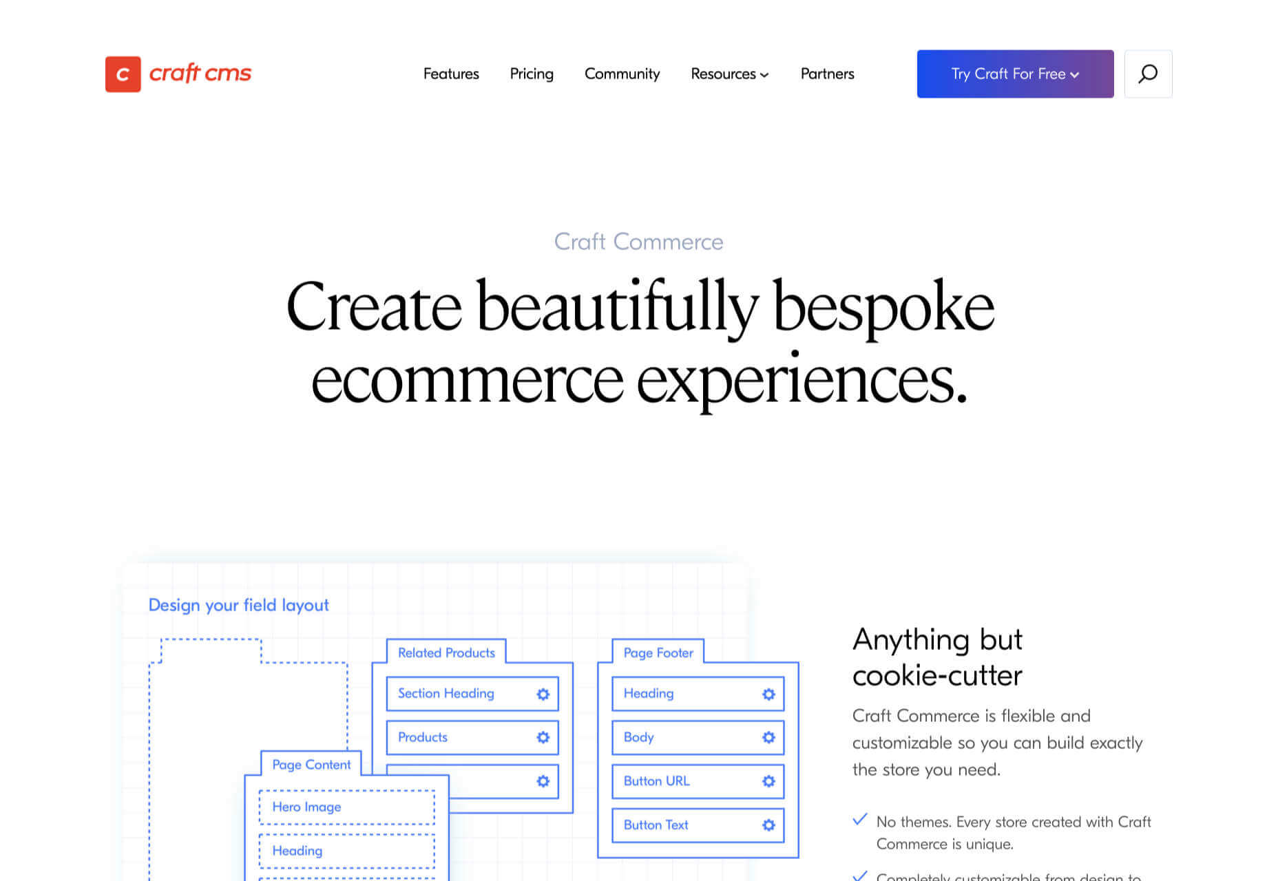
5. Craft Commerce: Best for Custom Solutions

If you’re in the market for a custom solution, and you don’t have the budget for something like Magento, then Craft Commerce is ideally positioned.

Like WooCommerce for WordPress, Craft Commerce is a plugin for Craft CMS that transforms it into an ecommerce store.

Unlike WordPress, Craft CMS doesn’t have a theme feature. Every Craft Commerce store is custom built using a simple templating language called Twig. The main benefit of the approach is that bespoke solutions are fast and relatively cheap to produce, with none of the code bloat of platforms or WordPress.

Because your site is custom coded, you have complete control over your frontend, allowing you to iterate UX and SEO.

You will need a Craft developer to set up Craft Commerce because the learning curve is steeper than a CMS like WordPress. However, once you’re setup, Craft sites are among the simplest to own and manage.

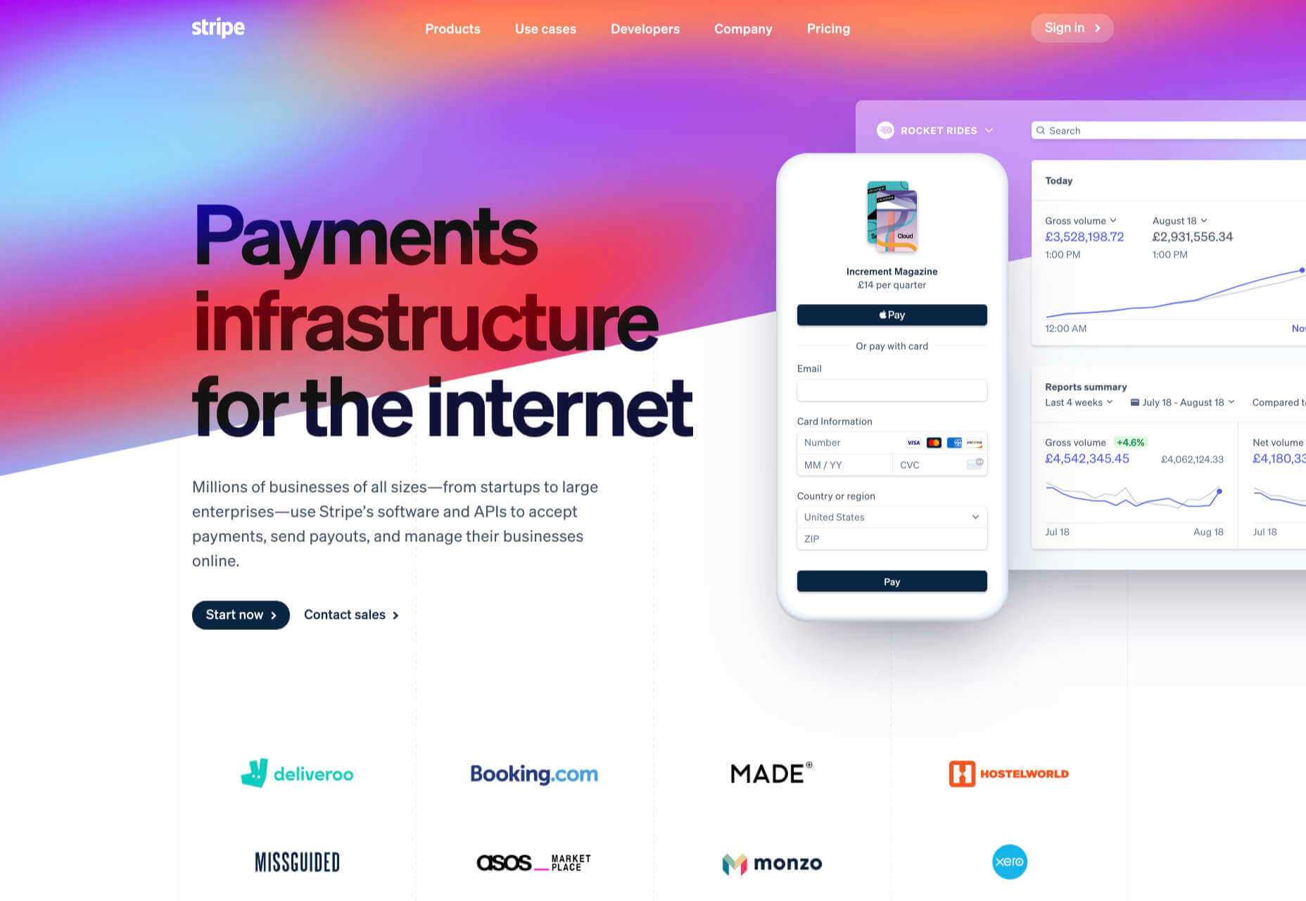
6. Stripe: Best for Outliers

Ecommerce solutions market themselves on different strengths, but the nature of design patterns means they almost all follow a similar customer journey: search for an item, add the item to a cart, review the cart, checkout. Like any business, they want to maximize their market share, which means delivering a solution that caters to the most common business models.

Occasionally a project happens along that doesn’t fit that business model. Perhaps you’re selling a product that’s uniquely priced for each customer. Perhaps you’re selling by auction. Perhaps you don’t want to bill the customer until a certain point in the future.

Whatever your reason, the greatest customization level — breaking out of the standard ecommerce journey — can be managed with direct integration with Stripe.

Stripe is a powerful payment processor that handles the actual financial transaction for numerous ecommerce solutions. Developers love Stripe; its API is excellent, it’s documentation is a joy, it’s a powerful system rendered usable by relentless iteration.

However, this approach is not for the faint-hearted. This is a completely custom build. Nothing is provided except for the financial transaction itself. Every aspect of your site will need to be built from scratch, which means hefty development costs before seeing any return on investment.

The Best eCommerce Solution in 2021

The best ecommerce solution is defined by three factors: the size of your store, the anticipated growth, and the degree of custom design and features you want or need.

Shopify is the choice of most successful small stores because you can be selling inside a day. For businesses with an existing presence and a smaller turnover, those on WordPress will be happy with WooCommerce. For larger stores planning long-term growth, BigCommerce’s headless option is ideal. Craft Commerce is a solid performer that marries low costs with flexibility for businesses that need a custom approach.

Featured image via Unsplash.

Source

The post 6 Best Ecommerce Solutions for 2021 first appeared on Webdesigner Depot.

Categories: Designing, Others Tags:

Scrollbars on Hover

January 21st, 2021 No comments

First, scrollbars are a usability and accessibility thing. Second, a rule of thumb: if an area scrolls, it should have a visible scrollbar. But the web is a big place and I like tricks, so I’m going to cover the idea of only revealing them on hover. Even macOS itself¹ hides scrollbars by default, revealing them contextually and on interaction. Same on iOS, leading to confusing momements.

All that aside, here’s a way to hide scrollbars by default, only revealing them when the element is hovered. It was created by Thomas Gladdines, who also emailed me about it:

CodePen Embed Fallback

In quick testing on my machine, it works across Chrome, Firefox, and Safari, regardless of my macOS settings. So pretty robust.

The trick is that mask covers the scrollbar! So, if you create a mask that is exactly as wide as the scrollbar (here, I’m just guessing that 17px will cover it) and super duper tall (both of which should probably be calculated by a script), it can perfectly cover the scrollbar. You can even transition the position of the mask, faking a fading in/out effect. Very clever.

Notably, this is the real scrollbar of the element, and not a faked one. Faking one could be another approach. Ben Nadel covered how Slack does that. Their trick is to force the scrollbar to render in an area hidden by overflow, and make a virtual scrollbar that mimics the native one (which you’d then have more direct control over). It’s not forcing the scrollbar either, which is something else you can do if so motivated. And nothing about this prevents you from styling the scrollbar, which might actually have some benefits like specifying the exact width of it.

  1. As I write: If your device allows gestures, scroll bars are hidden until you start scrolling. Otherwise, they’re visible. ??

The post Scrollbars on Hover appeared first on CSS-Tricks.

You can support CSS-Tricks by being an MVP Supporter.

Categories: Designing, Others Tags:

New in Chrome 88: aspect-ratio

January 20th, 2021 No comments

And it was released yesterday! The big news for us in CSS Land is that the new release supports the aspect-ratio property. This comes right on the heels of Safari announcing support for it in Safari Technology Preview 118, which released January 6. That gives us something to look forward to as it rolls out to Edge, Firefox and other browsers.

Here’s the release video skipped ahead to the aspect-ratio support:

For those catching up:

  • An aspect ratio defines the proportion of an element’s dimensions. For example, a box with an aspect ratio of 1/1 is a perfect square. An aspect ratio of 3/1 is a wide rectangle. Many videos aim for a 16/9 aspect ratio.
  • Some elements, like images and iframes, have an intrinsic aspect ratio. That means if either the width or the height is declared, the other is automatically calculated in a way that maintains its proportion.
  • Non-replaced elements, like divs, don’t have an intrinsic aspect ratio. We’ve resorted to a padding hack to get the same sort of effect.
  • Support for an aspect-ratio property in CSS allows us to maintain the aspect ratio of non-replaced elements.
  • There are some tricks for using it. For example, defining width on an element with aspect-ratio will result in the property using that width value to calculate the element’s height. Same goes for defining the height instead. And if we define both the width and height of an element? The aspect-ratio is completely ignored.

Seems like now is a good time to start brushing up on it!

Direct Link to ArticlePermalink


The post New in Chrome 88: aspect-ratio appeared first on CSS-Tricks.

You can support CSS-Tricks by being an MVP Supporter.

Categories: Designing, Others Tags:

Lightweight Form Validation with Alpine.js and Iodine.js

January 20th, 2021 No comments

Many users these days expect instant feedback in form validation. How do you achieve this level of interactivity when you’re building a small static site or a server-rendered Rails or Laravel app? Alpine.js and Iodine.js are two minimal JavaScript libraries we can use to create highly interactive forms with little technical debt and a negligible hit to our page-load time. Libraries like these prevent you from having to pull in build-step heavy JavaScript tooling which can complicate your architecture.

I‘m going to iterate through a few versions of form validation to explain the APIs of these two libraries. If you want to copy and paste the finished product here‘s what we’re going to build. Try playing around with missing or invalid inputs and see how the form reacts:

CodePen Embed Fallback

A quick look at the libraries

Before we really dig in, it’s a good idea to get acquainted with the tooling we’re using.

Alpine is designed to be pulled into your project from a CDN. No build step, no bundler config, and no dependencies. It only needs a short GitHub README for its documentation. At only 8.36 kilobytes minfied and gzipped, it’s about a fifth of the size of a create-react-app hello world. Hugo Di Fracesco offers a complete and thorough overview of what it is an how it works. His initial description of it is pretty great:

Alpine.js is a Vue template-flavored replacement for jQuery and vanilla JavaScript rather than a React/Vue/Svelte/WhateverFramework competitor.

Iodine, on the other hand, is a micro form validation library, created by Matt Kingshott who works in the Laravel/Vue/Tailwind world. Iodine can be used with any front-end-framework as a form validation helper. It allows us to validate a single piece of data with multiple rules. Iodine also returns sensible error messages when validation fails. You can read more in Matt’s blog post explaining the reasoning behind Iodine.

A quick look at how Iodine works

Here’s a very basic client side form validation using Iodine. We‘ll write some vanilla JavaScript to listen for when the form is submitted, then use DOM methods to map through the inputs to check each of the input values. If it‘s incorrect, we’ll add an “invalid” class to the invalid inputs and prevent the form from submitting.

We’ll pull in Iodine from this CDN link for this example:

<script src="https://cdn.jsdelivr.net/gh/mattkingshott/iodine@3/dist/iodine.min.js" defer></script>

Or we can import it into a project with Skypack:

import kingshottIodine from "https://cdn.skypack.dev/@kingshott/iodine";

We need to import kingshottIodine when importing Iodine from Skypack. This still adds Iodine to our global/window scope. In your user code, you can continue to refer to the library as Iodine, but make sure to import kingshottIodine if you’re grabbing it from Skypack.

To check each input, we call the is method on Iodine. We pass the value of the input as the first parameter, and an array of strings as the second parameter. These strings are the rules the input needs to follow to be valid. A list of built-in rules can be found in the Iodine documentation.

Iodine’s is method either returns true if the value is valid, or a string that indicates the failed rule if the check fails. This means we‘ll need to use a strict comparison when reacting to the output of the function; otherwise, JavaScript assesses the string as true. What we can do is store an array of strings for the rules for each input as JSON in HTML data attributes. This isn’t built into either Alpine or Iodine, but I find it a nice way to co-locate inputs with their constraints. Note that if you do this you’ll need to surround the JSON with single quotes and use double quotes inside the attribute to follow the JSON spec.

Here’s how this looks in our HTML:

<input name="email" type="email" id="email" data-rules='["required","email"]'>

When we‘re mapping through the DOM to check the validity of each input, we call the Iodine function with the element‘s input value, then the JSON.encode() result of the input’s dataset.rules. This is what this looks like using vanilla JavaScript DOM methods:

let form = document.getElementById("form");

// This is a nice way of getting a list of checkable input elements
// And converting them into an array so we can use map/filter/reduce functions:
let inputs = [...form.querySelectorAll("input[data-rules]")];

function onSubmit(event) {
  inputs.map((input) => {
    if (Iodine.is(input.value, JSON.parse(input.dataset.rules)) !== true) {
      event.preventDefault();
      input.classList.add("invalid");
    }
  });
}
form.addEventListener("submit", onSubmit);

Here’s what this very basic implementation looks like:

CodePen Embed Fallback

As you can tell this is not a great user experience. Most importantly, we aren’t telling the user what is wrong with the submission. The user also has to wait until the form is submitted before finding out anything is wrong. And frustratingly, all of the inputs keep the “invalid” class even after the user has corrected them to follow our validation rules.

This is where Alpine comes into play

Let’s pull it in and use it to provide nice user feedback while interacting with the form.

A good option for form validation is to validate an input when it’s blurred or on any changes after it has been blurred. This makes sure we‘re not yelling at the user before they’ve finished writing, but still give them instant feedback if they leave an invalid input or go back and correct an input value.

We’ll pull Alpine in from the CDN:

<script src="https://cdn.jsdelivr.net/gh/alpinejs/alpine@v2.7.3/dist/alpine.min.js" defer></script>

Or we can import it into a project with Skypack:

import alpinejs from "https://cdn.skypack.dev/alpinejs";

Now there’s only two pieces of state we need to hold for each input:

  • Whether the input has been blurred
  • The error message (the absence of this will mean we have a valid input)

The validation that we show in the form is going to be a function of these two pieces of state.

Alpine lets us hold this state in a component by declaring a plain JavaScript object in an x-data attribute on a parent element. This state can be accessed and mutated by its children elements to create interactivity. To keep our HTML clean, we can declare a JavaScript function that returns all the data and/or functions the form would need. Alpine will look for the this function in the global/window scope of our JavaScript code if we add this function to the x-data attribute. This also provides a reusable way to share logic as we can use the same function in multiple components or even multiple projects.

Let’s initialize the form data to hold objects for each input field with two properties: an empty string for the errorMessage and a boolean called blurred. We’ll use the name attribute of each element as their keys.


<form id="form" x-data="form()" action="">
  <h1>Log In</h1>

  <label for="username">Username</label>
  <input name="username" id="username" type="text" data-rules='["required"]'>

  <label for="email">Email</label>
  <input name="email" type="email" id="email" data-rules='["required","email"]'>

  <label for="password">Password</label>
  <input name="password" type="password" id="password" data-rules='["required","minimum:8"]'>

  <label for="passwordConf">Confirm Password</label>
  <input name="passwordConf" type="password" id="passwordConf" data-rules='["required","minimum:8"]'>

  <input type="submit">
</form>

And here’s our function to set up the data. Note that the keys match the name attribute of our inputs:

window.form = () => { 
  return {
    username: {errorMessage:'', blurred:false},
    email: {errorMessage:'', blurred:false},
    password: {errorMessage:'', blurred:false},
    passwordConf: {errorMessage:'', blurred:false},
  }
}

Now we can use Alpine’s x-bind:class attribute on our inputs to add the “invalid” class if the input has blurred and a message exists for the element in our component data. Here’s how this looks in our username input:

<input name="username" id="username" type="text" 
x-bind:class="{'invalid':username.errorMessage && username.blurred}" data-rules='["required"]'>

Responding to input changes

Now we need our form to respond to input changes and on blurring input states. We can do this by adding event listeners. Alpine gives a concise API to do this either using x-on or, similar to Vue, we can use an @ symbol. Both ways of declaring these act the same way.

On the input event we need to change the errorMessage in the component data to an error message if the value is invalid; otherwise, we’ll make it an empty string.

On the blur event we need to set the blurred property as true on the object with a key matching the name of the blurred element. We also need to recalculate the error message to make sure it doesn’t use the blank string we initialized as the error message.

So we’re going to add two more functions to our form to react to blurring and input changes, and use the name value of the event target to find what part of our component data to change. We can declare these functions as properties in the object returned by the form() function.

Here’s our HTML for the username input with the event listeners attached:

<input 
  name="username" id="username" type="text"
  x-bind:class="{'invalid':username.errorMessage && username.blurred}" 
  @blur="blur" @input="input"
  data-rules='["required"]'
>

And our JavaScript with the functions responding to the event listeners:

window.form = () => {
  return {
    username: {errorMessage:'', blurred:false},
    email: {errorMessage:'', blurred:false},
    password:{ errorMessage:'', blurred:false},
    passwordConf: {errorMessage:'', blurred:false},
    blur: function(event) {
      let ele = event.target;
      this[ele.name].blurred = true;
      let rules = JSON.parse(ele.dataset.rules)
      this[ele.name].errorMessage = this.getErrorMessage(ele.value, rules);
    },
    input: function(event) {
      let ele = event.target;
      let rules = JSON.parse(ele.dataset.rules)
      this[ele.name].errorMessage = this.getErrorMessage(ele.value, rules);
    },
    getErrorMessage: function() {
    // to be completed
    }
  }
}

Getting and showing errors

Next up, we need to write our getErrorMessage function.

If the Iodine check returns true, we‘ll set the errorMessage property to an empty string. Otherwise, we’ll pass the rule that has broken to another Iodine method: getErrorMessage. This will return a human-readable message. Here’s what this looks like:

getErrorMessage:function(value, rules){
  let isValid = Iodine.is(value, rules);
  if (isValid !== true) {
    return Iodine.getErrorMessage(isValid);
  }
  return '';
}

Now we also need to show our error messages to the user.

Let’s add

tags with an error-message class below each input. We can use another Alpine attribute called x-show on these elements to only show them when their error message exists. The x-show attribute causes Alpine to toggle display: none; on the element based on whether a JavaScript expression resolves to true. We can use the same expression we used in the the show-invalid class on the input.

To display the text, we can connect our error message with x-text. This will automatically bind the innertext to a JavaScript expression where we can use our component state. Here’s what this looks like:

<p x-show="username.errorMessage && username.blurred" x-text="username.errorMessage" class="error-message"></p>

One last thing we can do is re-use the onsubmit code from before we pulled in Alpine, but this time we can add the event listener to the form element with @submit and use a submit function in our component data. Alpine lets us use $el to refer to the parent element holding our component state. This means we don’t have to write lengthier DOM methods:

<form id="form" x-data="form()" @submit="submit" action="">
  <!-- inputs...  -->
</form>
submit: function (event) {
  let inputs = [...this.$el.querySelectorAll("input[data-rules]")];
  inputs.map((input) => {
    if (Iodine.is(input.value, JSON.parse(input.dataset.rules)) !== true) {
      event.preventDefault();
    }
  });
}
CodePen Embed Fallback

This is getting there:

  • We have real-time feedback when the input is corrected.
  • Our form tells the user about any issues before they submit the form, and only after they’ve blurred the inputs.
  • Our form does not submit when there are invalid properties.

Validating on the client side of a server-side rendered app

There are still some problems with this version, though some won‘t be immediately obvious in the Pen as they‘re related to the server. For example, it‘s difficult to validate all errors on the client side in a server-side rendered app. What if the email address is already in use? Or a complicated database record needs to be checked? Our form needs to have a way to show errors found on the server. There are ways to do this with AJAX, but we’ll look at a more lightweight solution.

We can store the server side errors in another JSON array data attribute on each input. Most back-end frameworks will provide a reasonably easy way to do this. We can use another Alpine attribute called x-init to run a function when the component initializes. In this function we can pull the server-side errors from the DOM into each input’s component data. Then we can update the getErrorMessage function to check whether there are server errors and return these first. If none exist, then we can check for client-side errors.

<input name="username" id="username" type="text" 
x-bind:class="{'invalid':username.errorMessage && username.blurred}" 
@blur="blur" @input="input" data-rules='["required"]' 
data-server-errors='["Username already in use"]'>

And to make sure the server side errors don’t show the whole time, even after the user starts correcting them, we’ll replace them with an empty array whenever their input gets changed.

Here’s what our init function looks like now:

init: function () {
  this.inputElements = [...this.$el.querySelectorAll("input[data-rules]")];
  this.initDomData();
},
initDomData: function () {
  this.inputElements.map((ele) => {
  this[ele.name] = {
    serverErrors: JSON.parse(ele.dataset.serverErrors),
    blurred: false
    };
  });
}

Handling interdependent inputs

Some of the form inputs may depend on others for their validity. For example, a password confirmation input would depend on the password it is confirming. Or a date you started a job field would need to hold a value later than your date-of-birth field. This means it’s a good idea to check all the inputs of the form every time an input gets changed.

We can map through all of the input elements and set their state on every input and blur event. This way, we know that inputs that rely on each other will not be using stale data.

To test this out, let’s add a matchingPassword rule for our password confirmation. Iodine lets us add new custom rules with an addRule method.

Iodine.addRule(
  "matchingPassword",
  value => value === document.getElementById("password").value
);

Now we can set a custom error message by adding a key to the messages property in Iodine:

Iodine.messages.matchingPassword="Password confirmation needs to match password";

We can add both of these calls in our init function to set up this rule.

In our previous implementation, we could have changed the “password” field and it wouldn’t have made the “password confirmation” field invalid. But now that we’re mapping through all the inputs on every change, our form will always make sure the password and the password confirmation match.

Some finishing touches

One little refactor we can do is to make the getErrorMessage function only return a message if the input has been blurred — this can make out HTML slightly shorter by only needing to check one value before deciding whether to invalidate an input. This means our x-bind attribute can be as short as this:

x-bind:class="{'invalid':username.errorMessage}"

Here’s what our functions look like to map through the inputs and set the errorMessage data now:

updateErrorMessages: function () {
  // Map through the input elements and set the 'errorMessage'
  this.inputElements.map((ele) => {
    this[ele.name].errorMessage = this.getErrorMessage(ele);
  });
},
getErrorMessage: function (ele) {
  // Return any server errors if they're present
  if (this[ele.name].serverErrors.length > 0) {
    return input.serverErrors[0];
  }
  // Check using Iodine and return the error message only if the element has not been blurred
  const error = Iodine.is(ele.value, JSON.parse(ele.dataset.rules));
  if (error !== true && this[ele.name].blurred) {
    return Iodine.getErrorMessage(error);
  }
  // Return empty string if there are no errors
  return "";
},

We can also remove the @blur and @input events from all of our inputs by listening for these events in the parent form element. However, there is a problem with this: the blur event does not bubble (parent elements listening for this event will not be passed it when it fires on their children). Luckily, we can replace blur with the focusout event, which is basically the same event, but this one bubbles, so we can listen for it in our form parent element.

Finally, our code is growing a lot of boilerplate. If we were to change any input names we would have to rewrite the data in our function every time and add new event listeners. To prevent rewriting the component data every time, we can map through the form’s inputs that have a data-rules attribute to generate our initial component data in the init function. This makes the code more reusable for additional forms. All we’d need to do is include the JavaScript and add the rules as a data attribute and we’re good to go.

Oh, and hey, just because it’s so easy to do with Alpine, let’s add a fade-in transition that brings attention to the error messaging:

<p class="error-message" x-show.transition.in="username.errorMessage" x-text="username.errorMessage"></p>

And here’s the end result. Reactive, reusable form validation at a minimal page-load cost.

CodePen Embed Fallback

If you want to use this in your own application, you can copy the form function to reuse all the logic we’ve written. All you’d need to do is configure your HTML attributes and you’d be ready to go.


The post Lightweight Form Validation with Alpine.js and Iodine.js appeared first on CSS-Tricks.

You can support CSS-Tricks by being an MVP Supporter.

Categories: Designing, Others Tags: