Archive

Archive for January, 2021

3 Ways to Improve the Humanness of Your Brand

January 12th, 2021 No comments

Few things define the 21st century as much as technology. This makes preserving a sense of the human touch an essential activity for every brand.

Businesses are working overtime to incorporate tech into their operations. Everything from customer relationship management tools to automated payroll software is redefining how we run our business.

At this point, there are a few areas of business that technology hasn’t impacted. That’s why every business owner should make a concerted effort to maintain a strong semblance of humanity in their brand.

Here are some of the best ways to help your brand improve its human touch.

1. Foster a Solid Call Center Experience

When discussing the humanness of a brand, things like sales and marketing typically come to mind. However, one of the most important areas to address is actually on the other end of the sales process.

Your customer service is an essential part of your brand’s experience. It ensures that customers remain happy. It addresses their concerns, as well. Your customer service experience is also where you can nurture things like brand loyalty, repeat business, and referrals.

If you have a call center that feels complex, calculated, and cold, it’s going to hurt your organization in the long run. Look for ways to breathe a sense of humanity back into your call center experience. For instance, you can:

  • Show that you value your customer’s time: You can do this by utilizing call center software to organize and streamline customer inquiries. This ensures that customers get connected with the right representative as quickly as possible.
  • Take advantage of opportunities for human interaction: The more you can interact with your customers in a one-on-one setting, the more human your brand will feel. One example could be implementing an interactive video option to personalize each interaction.
  • Train your employees to put the customer first: It’s important that you train your customer service reps to demonstrate active listening when interacting with a client. In addition, make sure each rep is both knowledgeable and up to date on the essential data required to answer your customers’ problems.

There are many ways to go about adding a touch of humanity into your customer service interactions. As you do so, the goal should always be to keep your customer service as personal as possible.

2. Infuse Your Company Culture With Human Attributes

Your company culture consists of a strongly held set of beliefs. These should be purposefully selected, cultivated, and shared across your organization. An ideal company culture encourages buy-in from your company’s stakeholders, leadership, employees, and customers.

If you have a well-established company culture in place, you can utilize it to perpetuate a human touch throughout your business’ outward-facing interactions. You can do this by setting up cultural standards within your organization that reinforce a sense of humanity. For example, some attributes to consider include:

  • Transparency: A company committed to honesty will reflect that in its interactions with the public. Rather than dodging questions and hiding information, a transparent organization will own up to its own mistakes and generally come across as human in its interactions.
  • Authenticity: A willingness to prioritize being genuine is one of the simplest ways to add a human touch to your brand. It encourages employees to be real with bosses, coworkers, and customers alike.
  • Customer-centric: An enterprise that puts the customer first is going to find it easy to exude a sense of humanity in its interactions. This comes through prioritizing sharing, caring, and listening to the customer.

Whatever the specific cultural touch-point may be, don’t overlook your company culture as a valuable tool in humanizing your brand.

3. Embrace a Cause

The modern concept of corporate social responsibility (CSR) has evolved in the last few years. However, it still refers to the concept of businesses embracing goals that prioritize the well-being of the environment, societies, and communities that they impact. While CSR initiatives should always put authenticity and ethics first, they can also be useful ways to show off your brand’s softer side.

For instance, consider a car manufacturer that commits to being carbon neutral by a certain point in time. This doesn’t just show that the organization is interested in preserving the environment. It also reflects a sense of compassion and care that is often lacking in a cold, heartless corporate entity.

By embracing corporate social responsibility, you can show the public — especially your customers — that you care about more than the bottom line. It’s a message that is warm, inviting, and humanitarian in nature.

Perfecting your call center experience, cultivating the right company culture, and embracing CSR initiatives are all excellent ways to improve the humanness of your company. Each one helps to introduce the human touch into your organization in a different way.

CSR initiatives create a general aura of interest in the welfare of your customers. Your company culture fosters basic human ethical behavior within your organization. A solid call center experience provides an ideal opportunity for that culture to shine out for all the world to see. Incorporating all three strategies into your company addresses its humanness from multiple angles at once. In the process, it ensures that your brand maintains a well-rounded sense of humanity no matter how much technology is being used behind the scenes.


Photo by ?? Claudio Schwarz | @purzlbaum on Unsplash

Categories: Others Tags:

Careful When Changing the Display of `summary`

January 12th, 2021 No comments

I got a very helpful bug report the other day (thanks Kilian!) about the

element in a blog post of mine not showing the default ? icon, and thus looking rather like any ol’ random

.

It wasn’t terribly hard to diagnose. I just opened the page in Firefox, inspected the element in Firefox DevTools, and played with properties and values until I saw the ? come back. The problem? I was using a (very old) copy of Normalize.css, which must have followed me through several redesigns on this site, and set…

summary {
  display: block; /* the problem */
}

If you do that, Firefox nukes the ?:

Careful not to `display: block` your

elements, lest lose the ? in Firefox. My old copy of Normalize.css had that in there. pic.twitter.com/06KHY892dT

— Chris Coyier (@chriscoyier) January 6, 2021

Way back in 2016, this was fixed by Jon Neal in Normalize:

summary {
  display: list-item;
}

In Chrome, the User Agent style for

is block, so no problem with setting it to block. But in Firefox, best I can tell, the User Agent style is list-item.

Hence Jon setting it to list-item in the current version of Normalize.

You can also see in the Firefox DevTools that the ? is applied with a ::marker pseudo element. As soon as

isn’t a list-item anymore, the ::marker disappears. I guess that makes some sense, as the spec says:

The ::marker pseudo-element represents the automatically generated marker box of a list item.

So the fact that ::marker works on block-level items in Chrome might be the bug? I dunno, but I kinda like having ::marker work on other things. As Šime Vidas once pointed out, it’s rather nice.

In Safari, there is no problem, as apparently the ? comes from “Shadow Content”???

Anyway, the Normalize idea of just forcing them to be list-item seems fine (or just don’t touch them at all).


The post Careful When Changing the Display of `summary` appeared first on CSS-Tricks.

You can support CSS-Tricks by being an MVP Supporter.

Categories: Designing, Others Tags:

Flash’s Web Tech Legacy

January 11th, 2021 No comments

Tiffany B. Brown on how Flash paved the way for some things we might think of as fairly modern web technologies:

Flash wasn’t just good for playing multimedia. It was also good for manipulating it. Using ActionScript, you could pan audio, adjusting the input for the user’s left and right speakers, perhaps when they shifted their mouse from one side of the screen to the other. Now we can do that using the Web Audio API.

Web Storage and the localStorage/ sessionStorage APIs are conceptually similar to SharedObjects, or Flash cookies. And the demand for rich web typography enabled by Flash and sIFR, helped bring us @font-face, WOFF, and web-licensed fonts.

Flash also popularized the idea of the cross-domain policy file, an XML file that specifies whether one domain can read the content and data of another. It’s a precursor to cross-origin resource sharing (CORS), which uses HTTP headers instead of an XML configuration file.

Mike Davidson had some nostolgic thoughts as well:

Most technology is transitional if your window is long enough. Cassette tapes showed us that taking our music with us was possible. Tapes served their purpose until compact discs and then MP3s came along. Then they took their rightful place in history alongside other evolutionary technologies. Flash showed us where we could go, without ever promising that it would be the long-term solution once we got there.

Direct Link to ArticlePermalink


The post Flash’s Web Tech Legacy appeared first on CSS-Tricks.

You can support CSS-Tricks by being an MVP Supporter.

Categories: Designing, Others Tags:

Animating with Lottie

January 11th, 2021 No comments

I believe animation on the web is not only fun, but engaging in such a way that it has converted site visitors into customers. Think of the “Like” button on Twitter. When you “like” a tweet, tiny colorful bubbles spread around the heart button while it appears to morph into a circle around the button before settling into the final “liked” state, a red fill. It would be much less exciting if the heart just went from being outlined to filled. That excitement and satisfaction is a perfect example of how animation can be used to enhance user experience.

This article is going to introduce the concept of rendering Adobe After Effects animation on the web with Lottie, which can make advanced animations— like that Twitter button — achievable.

Bodymovin is a plugin for Adobe After Effects that exports animations as JSON, and Lottie is the library that renders them natively on mobile and on the web. It was created by Hernan Torrisi. If you’re thinking Oh, I don’t use After Effects, this article is probably not for me, hold on just a moment. I don’t use After Effects either, but I’ve used Lottie in a project.

You don’t have to use Lottie to do animation on the web, of course. An alternative is to design animations from scratch. But that can be time-consuming, especially for the complex types of animations that Lottie is good at. Another alternative is using GIF animations, which are limitless in the types of animation they can display, but are typically double the size of the JSON files that Bodymovin produces.

So let’s jump into it and see how it works.

Get the JSON

To use Lottie, we need a JSON file containing the animation from After Effects. Luckily for us, Icons8 has a lot of free animated icons here in JSON, GIF, and After Effects formats.

Add the script to HTML

We also need to get the Bodymovin player’s JavaScript library in our HTML, and call its loadAnimation() method. The fundamentals are demonstrated here:

<div id="icon-container"></div>

<script src="https://cdnjs.cloudflare.com/ajax/libs/bodymovin/5.7.4/lottie.min.js">

<script>
  var animation = bodymovin.loadAnimation({
  // animationData: { /* ... */ },
  container: document.getElementById('icon-container'), // required
  path: 'data.json', // required
  renderer: 'svg', // required
  loop: true, // optional
  autoplay: true, // optional
  name: "Demo Animation", // optional
});
</script>

Activate the animation

After the animation has loaded in the container, we can configure it to how we want it to be activated and what action should activate it with event listeners. Her are the properties we have to work with:

  • container: the DOM element that the animation is loaded into
  • path: the relative path of the JSON file that contains the animation
  • renderer: the format of the animation, including SVG, canvas, and HTML
  • loop: boolean to specify whether or not the animation should loop
  • autoplay: boolean to specify whether or not the animation should play as soon as it’s loaded
  • name: animation name for future referencing

Note in the earlier example that the animationData property is commented out. It is mutually exclusive with the path property and is an object that contains the exported animated data.

Let’s try an example

I’d like to demonstrate how to use Lottie with this animated play/pause control icon from Icons8:

The Bodymovin player library is statically hosted here and can be dropped into the HTML that way, but it is also available as a package:

npm install lottie-web ### or yarn add lottie-web

And then, in your HTML file, include the script from the dist folder in the installed package. You could also import the library as a module from Skypack:

import lottieWeb from "https://cdn.skypack.dev/lottie-web";

For now, our pause button is in a loop and it also plays automatically:

CodePen Embed Fallback

Let’s change that so the animation is triggered by an action.

Animating on a trigger

If we turn autoplay off, we get a static pause icon because that was how it was exported from After Effects.

CodePen Embed Fallback

But, worry not! Lottie provides some methods that can be applied to animation instances. That said, the documentation of the npm package is more comprehensive.

We need to do a couple things here:

  • Make it show as the “play” state initially.
  • Animate it to the “paused” state on click
  • Animate between the two on subsequent clicks.

The goToAndStop(value, isFrame) method is appropriate here. When the animation has loaded in the container, this method sets the animation to go to the provided value, then stop there. In this situation, we’d have to find the animation value when it’s at play and set it. The second parameter specifies whether the value provided is based on time or frame. It’s a boolean type and the default is false (i.e., time-based value). Since we want to set the animation to the play frame, we set it to true.

A time-based value sets the animation to a particular point in the timeline. For example, the time value at the beginning of the animation, when it’s paused, is 1. However, a frame-based value sets the animation to a particular frame value. A frame, according to TechTerms, is an individual picture in a sequence of images. So, if I set the frame value of the animation to 5, the animation goes to the fifth frame in the animation (the “sequence of images” in this situation).

CodePen Embed Fallback

After trying different values, I found out the animation plays from frame values 11 through 16. Hence, I chose 14 to be on the safe side.

Now we have to set the animation to change to pause when the user clicks it, and play when the user clicks it again. Next, we need the playSegments(segments, forceFlag) method. The segments parameter is an array type containing two numbers. The first and second numbers represent the first and last frame that the method should read, respectively. The forceFlag is a boolean that indicates whether or not the method should be fired immediately. If set to false, it will wait until the animation plays to the value specified as the first frame in the segments array before it is triggered. If true, it plays the segments immediately.

CodePen Embed Fallback

Here, I created a flag to indicate when to play the segments from play to pause, and from pause to play. I also set the forceFlag boolean to true because I want an immediate transition.

So there we have it! We rendered an animation from After Effects to the browser! Thanks Lottie!

Canvas?

I prefer to use SVG as my renderer because it supports scaling and I think it renders the sharpest animations. Canvas doesn’t render quite as nicely, and also doesn’t support scaling. However, if you want to use an existing canvas to render an animation, there are some extra things you’d have to do.

Doing more

Animation instances also have events that can also be used to configure how the animation should act.

For example, in the Pen below, I added two event listeners to the animation and set some text to be displayed when the events are fired.

CodePen Embed Fallback

All the events are available on the npm package’s docs. With that I say, go forth and render some amazing animations!


The post Animating with Lottie appeared first on CSS-Tricks.

You can support CSS-Tricks by being an MVP Supporter.

Categories: Designing, Others Tags:

CSS Snapshot 2020

January 11th, 2021 No comments

I think it’s great that the CSS Working Group does these. It’s like planting a flag in the ground saying this is what CSS looks like at this specific point in time. They do specifically say it’s not for us CSS authors though…

This document collects together into one definition all the specs that together form the current state of Cascading Style Sheets (CSS) as of 2020. The primary audience is CSS implementers, not CSS authors, as this definition includes modules by specification stability, not Web browser adoption rate.

Remember “CSS3”? That was the closest thing we had to a “snapshot” that was designed for CSS authors (and learners). Because CSS3 was so wildly successful, we saw a short round of enthusiasm for CSS4, me included. There is zero marketing panache on that snapshot page, which is exactly what CSS4 would need to succeed. Remember, HTML5 and friends (including CSS3) even had fancy logos!

If someone were to say to me “Chris, when CSS3 came around, I boned up on all that, but I haven’t kept up with CSS since, what should I learn?” I’d say “That’s a damn fine question, developer that has a normal healthy relationship with technology.” But honestly, I might struggle to answer cohesively.

I’d say: Uhm, CSS grid for sure. Custom properties. Clipping and Offset paths I suppose. prefers-reduced-motion. I dunno. There are probably like 100 things, but there is no great single reference point to see them all together.

I’ll work on putting a list together. I don’t think I’ll have the gumption to call it CSS4, but at least I’ll be able to answer that question. Feel free to suggest ideas in the comments.


The post CSS Snapshot 2020 appeared first on CSS-Tricks.

You can support CSS-Tricks by being an MVP Supporter.

Categories: Designing, Others Tags:

Does Apple’s New Lidar Sensor a Game-Changer for AR Apps?

January 11th, 2021 No comments

Any time that there is a big tech release from Apple, users and journalists always center their attention on aspects of the gadget like size, pixel density, performance, and new features.

These characteristics are all important in their own right, but some smaller innovations tend to get overlooked and fall through the cracks.

This is what almost happened to the Lidar sensor in the iPhone 12 Pro. Visually, it is presented as a small black circle in the bottom corner of the phone’s camera unit, and you could easily mistake it for another lens or a quixotic flash panel. On the contrary, Lidar is something entirely different, and this small sensor has big implications for the future of AR.

What is Lidar?

Lidar is an acronym of sorts, standing for “light detection and ranging”. The technology centers around infrared imaging and light, with many tiny pulses being sent out and being registered when their reflections bounce back. It’s like sonar, except the waves being registered by the device aren’t acoustic, but rather light-based. By measuring the time and angles of the reflections, the Lidar device creates a 3D spatial image of how the targeted area looks.

Before we get ahead of ourselves in praising Apple’s innovative genius, we should mention that Lidar has been around for decades and is essentially 3D laser scanning, just under a different name. Still, Apple is the first major tech company to make the technology accessible to millions of consumers – first in the 2020 variants of the iPad Pro, and now with the iPhone 12 Pro.

Why this is important for AR

If you are familiar with augmented reality apps, you have probably come across those that project digital models on real-life surroundings by analyzing objects and surfaces and determining where the model could realistically be placed. Some of these apps are good at spatial accuracy, but none are perfect, and the built-in algorithms can be easily deceived with poor lighting or unusual textures. Lidar makes augmented reality much more accurate by relying on extensive sensor data instead of computed projections.

The impact of Lidar in real life

Any time that new tech comes out, it is often hyped up to be “the next big thing”, but consumers and enterprises can make a more accurate judgment call by looking at its real-life impacts, and not just marketing bluster. Here are some examples of how Lidar is already improving AR:

1. Easy measurements

Would you trust an app to make measurements of your home and its interior elements? If you answered no, you probably haven’t heard of Canvas. This mobile app makes the most of the Lidar sensor and takes measurements of home interiors (rooms, beds, accessories, etc.). It might not be accurate to the point of fractions of an inch, but it can probably save you from getting a tape measure in most cases when you need a measurement estimate.

2. Accurate digitizing of real objects

When you want to carry images of real objects over to the digital plane (e.g. for a presentation), the process can be a real hassle. First, you take the photo, then open it in an editor, cut along the edges of the targeted object, and only then carry it over. However, with the ClipDrop app that applies Lidar, you can “extract” objects from their backgrounds without having to manually trace anything. The app recognizes the edges of the object and captures it seamlessly.

3. A next-generation escape room

Escape rooms are fun, but you have to travel to select locations to enjoy them. However, with an app that scans your surroundings and determines where to project the rooms and sections of the walls, you can enjoy the experience even in your own home. ARia’s Legacy is one such app, and Lidar technology prevents the app from drawing borders or pathways for the escape room in unreachable places.

4. Bringing a new level of immersion to a childhood game

Games based on AR have already proven their worth on the market (think Pokemon Go and Wizards Unite), but Lidar makes them even better. For example, the popular children’s game “The Floor is Lava” has been reimagined in the Hot Lava app, which precisely measures and identifies the floor of a particular setting, and projects lava onto it, while leaving high objects and surfaces untouched.

So what does it all mean for AR?

As we have mentioned, built-in algorithms in AR apps can already analyze visual settings, but Lidar takes the process to the next level and leaves little room for imaging errors and discrepancies. All of this amounts to a more immersive and enjoyable experience for users. While the technology is currently supported on only two devices, all signs point to Apple continuing to invest in AR technology (including integrating it into Apple TVs and a rumored future headset).

Lidar may be nothing more than a trend and optional improvement at the moment, but if it makes its way to all forthcoming Apple devices, we could see billions of people enjoying everything advanced AR has to offer. A game-changing impact.


Photo credit; Apple.com
Creator; Mikhail Scherbatko, creative writer for Program-Ace, an award-winning IT company with a 26+ year track record of success in AR app development.

Categories: Others Tags:

4 Predictions for the Web in 2021

January 11th, 2021 No comments

The start of the year is always a good time to reassess priorities and consider new approaches, but 2021 is more of a reset than we expected this time last year. 2020 is unlikely to go down in anyone’s autobiography as the best year of their life, but it has done something positive: it’s prepared the ground for rapid change in the next 12 months.

More than any other year in our lifetimes, 2021 is set to be revolutionary, with emerging trends that will last well into the new decade. Here’s what we think you can look forward to around the next corner.

1. The End of Minimalism

Minimalism has been the de facto approach to web design for the last decade because it works.

But design reflects the zeitgeist. Where minimalism once felt clean and fresh, it’s starting to feel dull and uninspired. There have been a few false-starts breaking out of the long-term trend, but thanks to the pandemic, 2021 will be the year minimalism finally folds — at least for a while.

Prior to coronavirus-mandated lockdowns worldwide, there were already signs of a more vibrant, more decorative, more joyful approach to design. Simple typefaces have been replaced with more decorative examples — faces that use ink-traps to fake 3D effects are surprisingly popular.

trends are cyclical, and the wheel always turns

One of the biggest aspects of this blossoming trend is the move away from Material Design-style flat color not just to gradients but to multi-color gradients and even animated gradients. Even Apple, the last bastion of the clean white-box approach, jumped on the gradient bandwagon with its Big Sur branding.

One of the few things COVID-19 hasn’t slowed is the adoption of new web technology, and CSS, in particular, has had some major developments in the last year. CSS Grid is now a practical technology, and our ability to code standards-compliant designs that aren’t dependent on hierarchical boxes is greatly enhanced.

After more than a year of pretty grim news for most people, much of the world will be vaccinated over the next twelve months, and life will rapidly return to normal. The last global crisis on this scale was the 1918 influenza pandemic, and it led directly to the decade known as the Roaring Twenties.

Minimalism was already dipping in popularity — trends are cyclical, and the wheel always turns — but lockdown, or perhaps more precisely the end of lockdown, is the catalyst for significant change.

2. The Decline of WordPress

In Autumn 2020, something entirely unexpected happened: The W3C announced the platform its new web presence would be built on, and WordPress — the previous choice of the web’s steering committee — didn’t even make the list of finalists.

Due to accessibility concerns, the W3C development team opted to migrate away from WordPress to Craft CMS. The decision was met with a mixture of glee and outrage. But whether you agree with the decision or not, it’s hard to see it as anything other than yet another symptom of WordPress’ decline.

WordPress faces a triple threat: there are web builders that do an adequate job for low-end web projects; there are newer rivals like Craft that outperform WordPress as a CMS; there’s a growing interest in alternate approaches, like Jamstack.

So will it all be over for WordPress in 2021? Not even close. There are myriad reasons WordPress will continue to be the choice of designers and developers for years to come. Tens of thousands of professionals worldwide have invested their whole careers in WordPress; there are millions of themes, plugins, templates, and build processes that are tightly woven into the WordPress ecosystem. What’s more, there are millions of sites with substantial content archives powered by WordPress [WebDesignerDepot is one such site].

WordPress reportedly powers approximately 37% of the web, and it will still be the dominant CMS in 2022. But it’s unlikely to grow beyond that 37%, and by 2030 its market share will be in rapid contraction.

2020 was the high-tide mark for WordPress

But for all its faults — and it’s undeniable that WordPress is full of faults — WordPress is the best of the web; it has given a voice to millions of people, launched countless careers, and empowered entrepreneurship worldwide.

2020 was the high-tide mark for WordPress, but it’s not an extinction-level event — even the much-maligned Flash, which was killed dead in a matter of months by the first generation iPhone, limped on until a few weeks ago.

WordPress will have to find a niche and accept a smaller market share; in doing so, it will address the single biggest complaint that anyone has about WordPress: that it’s trying to do too much.

WordPress is one of the great success stories of the web. In a decade, it may have to settle for powering just 10% of the web — a level of failure most of its rivals can only dream of.

3. The Digital Currency Explosion

2021 is undoubtedly the year that cryptocurrency goes mainstream. In 2020 Bitcoin grew by almost 400%; currently valued at around $35k, conservative predictions for a December 2021 valuation are $100k, with five-year predictions as high as $1m. And Bitcoin isn’t the only cryptocurrency; the value of developer-friendly Ether has jumped by more than 50% in the first few weeks of 2021.

In the US, the incoming Biden administration is preparing a multi-trillion dollar relief package, which many believe young Americans will invest in cryptocurrency. Perhaps more importantly, large investment banks are now pumping hundreds of millions in digital currencies. PayPal and Visa are both in the advanced stages of adopting blockchain technology.

The biggest threat to the new digital economy is the volatility of cryptocurrency. You cannot price services in XRP if XRP’s dollar price could crash at any time — as it did a few weeks ago.

And so there are two routes in which this trend will unfold for ecommerce. Either pricing will remain in dollars, and the equivalent price in various cryptocurrencies will be calculated in real-time. Or, transactions will make use of stablecoins like Tether that are tied to the value of the US dollar.

Cryptocurrency is the latest gold-rush, and whether you think it’s the chance of a lifetime or yet another Ponzi scheme, it will become increasingly high-profile in ecommerce throughout 2021.

4. No More Video Calls and also More Video Calls

2020 was the year of Zoom. Its growth from bit-player to overtaking Skype is a material lesson for entrepreneurs that every obstacle is an opportunity.

every obstacle is an opportunity

Over the last year, we’ve discovered two things: meetings are more creative in person, and office costs are significantly reduced when staff work remotely.

There’s going to be a shift in the business landscape this year. Remote working will continue to be normal for years to come as businesses enjoy rent savings. Video calls will still be common for quick update meetings. But expect to travel to physical meeting places periodically for in-depth strategic planning.

Expect to see major cities with deserted office buildings and a rapid expansion of co-working spaces, especially those with meeting spaces — if WeWork can hold on a little longer, there may be light at the end of the tunnel.

As a web professional, you’re in a unique position to thrive in the new business world, even more so if you’re a freelancer. Remember, if you’re working onsite, be mindful of your physical health, and if you’re working remotely, be mindful of your mental health.

What Do You Think?

No one saw 2020 coming. Sometimes world events are outwith our control, and we have to hang on and hope it gets better. It’s been a tough 12 months, and the truth is we’re not through it yet.

But the 2020 coronavirus pandemic is the first pandemic in human history that we’ve had the technology to shorten.

2021 offers the opportunity for enormous change. Will designers look for new, more decorative approaches? Will we replace our technology stack? Will you be billing clients in Ether this year? Will you suffer the misery of a packed evening commute ever again?

Featured image via Unsplash

Source

The post 4 Predictions for the Web in 2021 first appeared on Webdesigner Depot.

Categories: Designing, Others Tags:

How to Adapt Your Warehouse with Sudden Changes in the Supply Chain

January 11th, 2021 No comments

The COVID-19 pandemic has pushed companies worldwide to adapt their warehouse operations accordingly. The dramatic changes have uncovered vulnerabilities in what many companies believed were resilient processes. With rapid changes in demand, variable access to supplies, and changing health and safety protocols, it’s extremely important to tailor your warehouse operations to rapid changes in the supply chain. Here a few tips to help you do that:

Prepare for the Unexpected

Always be prepared for unexpected changes in demand. And that means you should always be ready for practically anything you might face. Consumer purchase behavior can change instantly, so it’s advisable to be ready for both an unexpected uptick in demand and an unexpected drop. Think about expanding your inventory to incorporate items that your customers may require during a crisis like a pandemic, national calamity, and terrorist attack.

Such events can easily change how your warehouse operates. Develop contingency plans to ensure your employees understand the steps to take in times of crisis. You may have to take extra health and safety measures, concentrate on purchasing and selling new items, or adjust the process of order fulfillment to curb the spread of the disease. For easy adoption of new guidelines, it’s important to invest in employee training.

Branch Out and Deal with More Suppliers

The pandemic has forced many companies to rethink how they source their products. When the virus was ravaging through China in late 2019 and early 2020, it was almost impossible for some businesses to get the products and materials they required to meet the ever-growing demand from their customers.

You can avoid finding yourself in such a situation by branching out and working with more suppliers. The objective here is to ensure you’re not restricted to one supplier or region. Consider working with local suppliers and those working in different regions of the world. For instance, if you’re looking for a reliable supply of HVAC parts, you can partner with a supplier such as Cold Air Central or other both local and distant suppliers. That way, when the distant supplier has challenges delivering supplies that you need, the local one will step in.

Perform a Warehouse Audit

Your primary goal should be to make your warehouse as efficient as possible. And that starts with performing an operational audit. How long does it take to complete your supply chain processes? Are your products organized well? Is order picking quick and seamless? These are some of the questions you need to ask yourself when running a warehouse audit. But if you’re not confident you can do a great warehouse audit, then go ahead and outsource that task to a professional.

Be in Full Control

It’s important to be in charge of your business in times of a crisis, rather than depending on the government or other external parties. Stay on top of things as you embrace the new normal, but don’t wait for an overnight solution to your challenges. You have to put in some work to make your warehouse operations effective and resilient. You can buy additional safety equipment if your budget allows it. You can also automate some repetitive and labor-intensive processes, and choose new shipping routes to work through the crisis and outsmart your competitors.

Carry Out Thorough Employee Training

If your employees lack proper training, even the most reliable technologies and efficient processes won’t deliver value for money. Have well-structured training programs that concentrate on technology and effective utilization of available tools in place. These training programs should also emphasize safety and promote innovation.

Protect Employee Health and Safety

Keeping employees healthy and safe should be a top priority. Don’t jeopardize the health and safety of your workers just to continue delivering products and raking in profits. Instead, leverage the most recent safety information to develop effective safety measures for your warehouse. Review the nature of the activities at hand and come up with a way to minimize person-to-person contact so that you can curb the spread of the virus without compromising efficiency. Ensure there are enough hand sanitizers, face masks, and other relevant personal protection equipment in your facility to protect your employees.

Key Takeaways

The supply chain isn’t fixed. That means it can experience sudden changes. That’s why it’s important to adapt your warehouse to unexpected changes in the supply chain. The 6 aforementioned tips are a great place to start.

Categories: Others Tags:

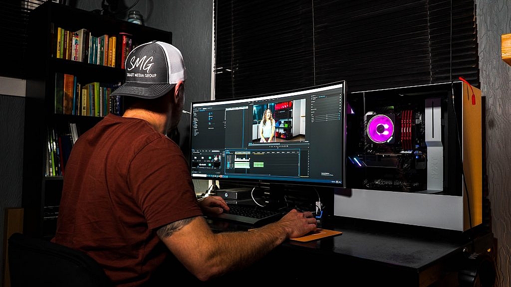
The Top Trends in Video Editing

January 11th, 2021 No comments

Video editing has improved with the advancement in technology and caters to the requirements of the audience. Creators of videos are doing all that they can to ensure that they meet the new standards.

From using the template more extensively to focusing on camera motions, light, and color, they are leaving nothing behind to ensure that they stick to the latest trends in video editing.

InVideo makes use of all the trending software and styles to give you a professional-level video. Video editing is a time-consuming thing, and it is important too. When you incorporate the latest trends in video editing, then this will ensure that your video is updated and meets the latest market trends.

Live streaming of videos will continue to be in demand

Videos are dominating YouTube and other social media platforms. When there is live streaming of videos, it helps to improve customer engagement. It has been noticed that if it is a live video, then users are more inclined to watch it as compared to a video that is pre-recorded. Users like it if they can interact with the presenter when it is a live video. The interactive features of videos are also going to be the next trend in this space now. Live streaming is popular, and this is now the best way in which you can connect with an audience. You can also adjust the content based on the requirements of the audience.

You cannot rise without a content marketing

Personalized videos are the new trend in video editing. When the brand personalizes a video, it helps to cut costs. This is also one of the best in the video marketing trend.

4K videos are popular

4K videos are on the rise in trend. Advanced images make your videos of the best quality. The 4k images are capable of offering a superior view and let you offer optimum quality videos that can be done with the latest tools of video editing.

Your videos should tell a story

Social media sites are streaming with the video story feature. Also, if you think that you can pass a message easily through a video then make use of animation to make your story even more interesting. Humans like to be said something visually. The online video editors let you create these animated videos and make them suit your business or your style.

Videos edited for mobile optimization

People are watching videos on all gadgets, and thus you need to make sure that your videos are optimized for mobile, tablet, and various other gadgets. The latest video editing tools let you show your videos on all devices.

Video editing is live

Live video editing is trending that lets you use the essential features that can capture videos at varied angles and in varied positions. Live video editing lets you edit and air the videos in real-time.

Explainer videos are popular

Explainer videos are great that are highly effective to pass on any information. They do this rapidly and easily. It could be anything like to explain how to play a game or review about a restaurant. Explainer videos have become popular with various social media users. The short length of the video is easy to share

Reduced costs

It takes very little cost to record and to produce a video. Many video editing tools let you make videos at a minimal cost. All that you need is a smartphone, a microphone, and a video editing software that lets you make attractive videos.

360° Videos is the trend

360 videos are trending today, and the low cost per video is effective and is worth investing in as it is one of the tops in the latest video editing trends.

Writing Video Content

You must transcribe your video content, so it is optimized for SEO. If you transcribe your video for YouTube, then this can help to rank the video higher. If the video transcribe is written well, then it helps the search engine to detect the keywords which let people find the relevant information.

The video can do the thing for you. You can take your videos to reach the audience by making them searchable. Add links to your video or make use of the video editors, these are some features that are provided by video editing software.

Transitions

The video software developers are now adding various effects to the videos. These transitions make your video stand out and look professional.

Summing Up

Video marketing is capturing the entire world, and it has become the biggest tool in video marketing. To promote and make your videos to rank, you need powerful tools like InVideo uses to meet the fast-paced trending in video editing.

Written content fails to capture the attention that video content can. Social media makes it easy to reach out to the target audience. YouTube lets independent video creators make videos as well. There is a huge platform to let people share their creative videos online.

However, even after making the best videos, you are not able to come into the limelight, then it is possible that your video is not good to look at. Maybe your videos are lacking professionalism which is failing to capture the required attention.

So go ahead and try out these video editing trends and incorporate them into your videos. It will let your videos stand out and also reach several viewers and make them rank higher on the search engine.


Photo by Ryan Snaadt on Unsplash

Categories: Others Tags:

Popular Design News of the Week: January 4, 2021 – January 10, 2021

January 10th, 2021 No comments

Every week users submit a lot of interesting stuff on our sister site Webdesigner News, highlighting great content from around the web that can be of interest to web designers.

The best way to keep track of all the great stories and news being posted is simply to check out the Webdesigner News site, however, in case you missed some here’s a quick and useful compilation of the most popular designer news that we curated from the past week.

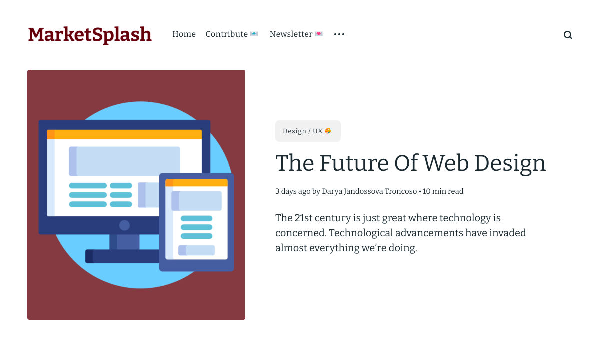
The Future of Web Design

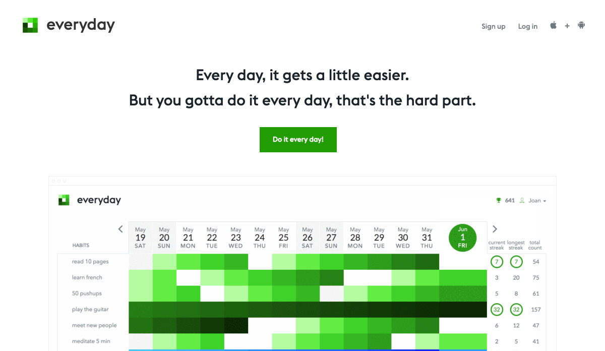
Everyday 2.0 – Simple & Beautiful Habit Tracker

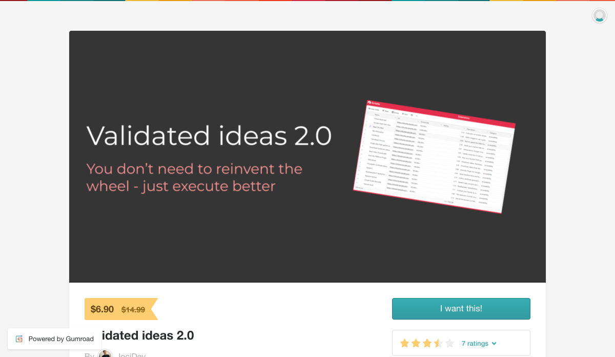
Validated Ideas 2.0 – 9,000 Popular but Poorly Executed Apps

SidePage – A Free Documentation Tool

UI Designers, do You Need to Shift Focus in 2021?

The Rise and Fall of Invision

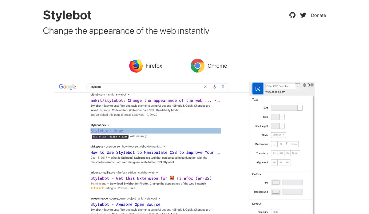
Stylebot – Change the Appearance of the Web Instantly

Front-end Predictions for 2021 and Beyond

Sketch Alternatives: Tools to Replace Sketch for your Design Needs

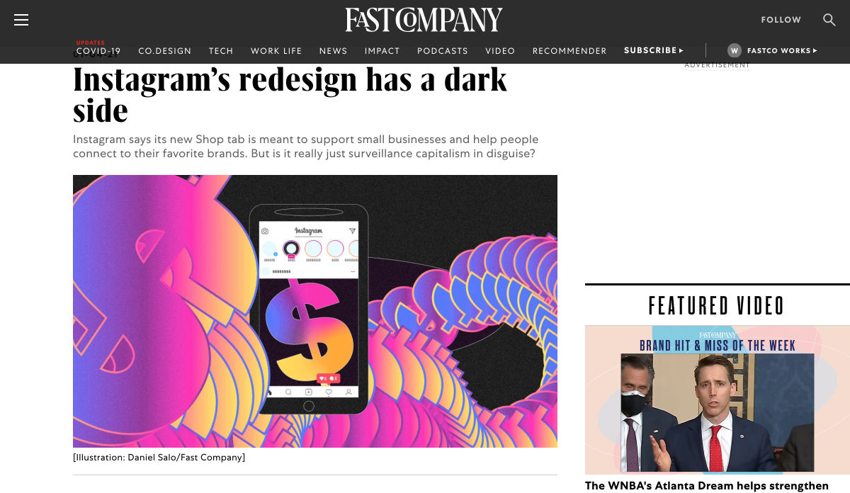
Instagram’s New Redesign has a Dark Side

What are the Top Languages for New Developers?

How to Make a Hero Image Website Design for your Main Page

Loop Design UI Kit – A Free UI Kit for Busy Designers and Startup Owners

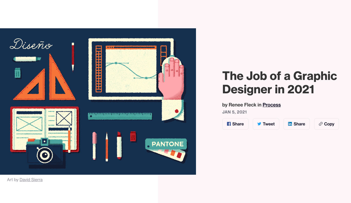
The Job of a Graphic Designer in 2021

The 30 Best Google Fonts for your Website

7 Projects You Need in your UI/UX Portfolio to Gain New Clients Quickly

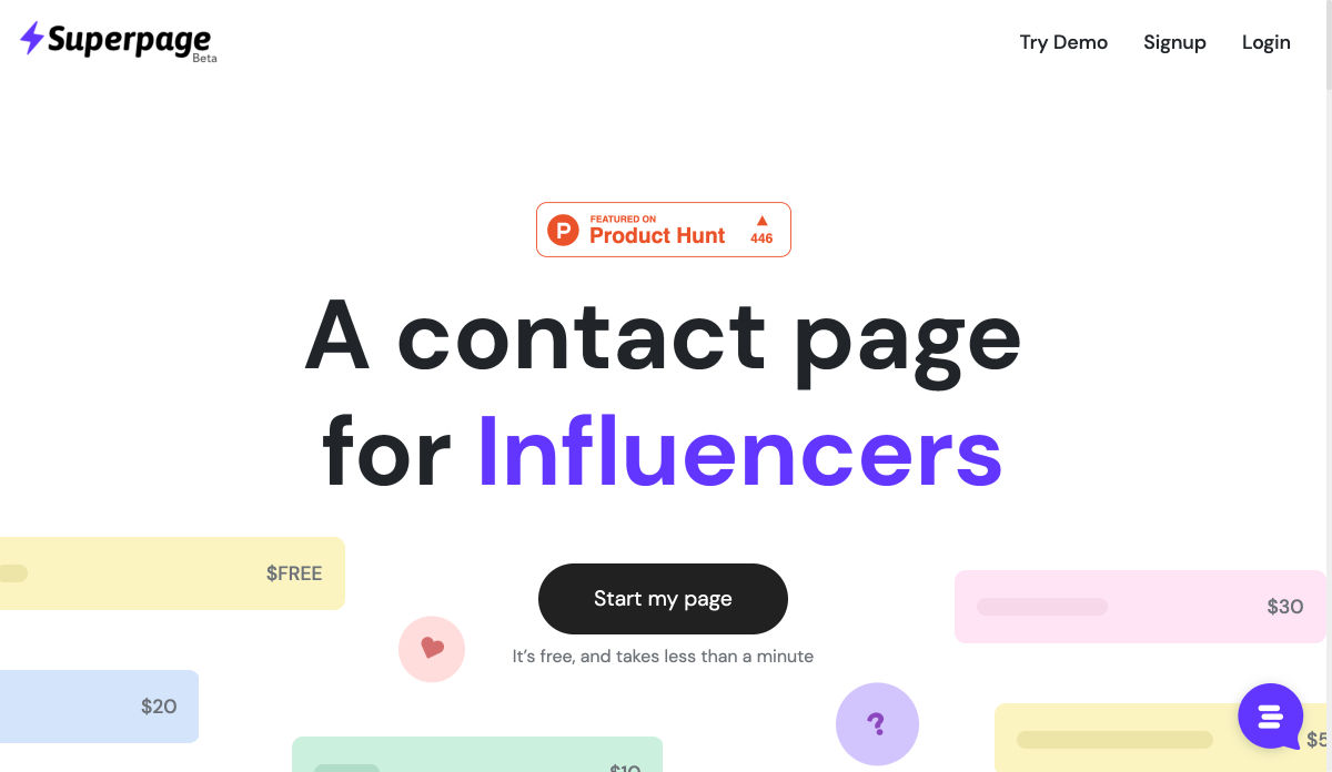
Superpage – A Contact Page for Influencers

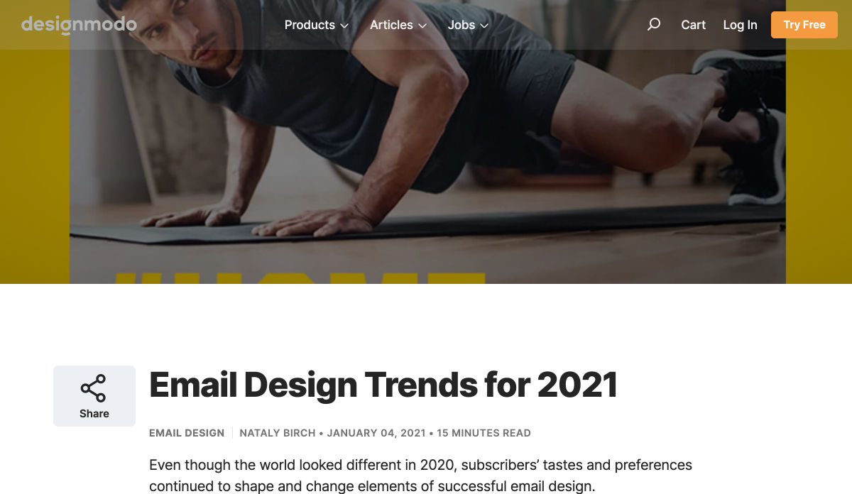
Email Design Trends for 2021

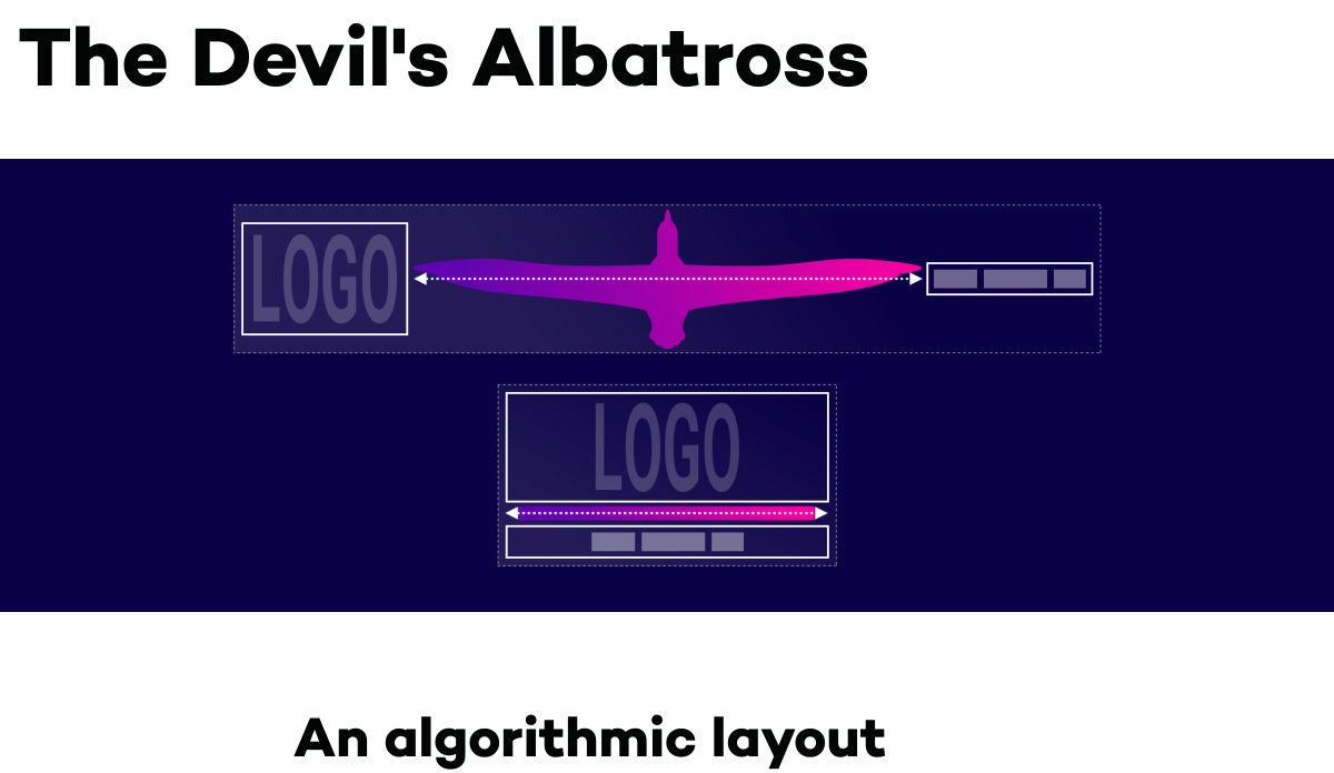
The Devil’s Albatross – An Algorithmic Layout Technique

47 Calligraphy Fonts for Adding Style and Interest to your Site

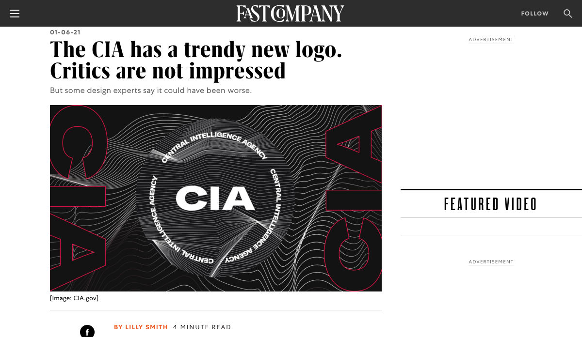
The CIA has a Trendy New Logo

Graphic Design Trends 2021 Inspired by What We all Experienced This Year

What I Use Now Instead of Google

Top 49 Must Have DevOps Tools for 2021

6 Tips for Choosing the Right Typography for your Logo Design

Want more? No problem! Keep track of top design news from around the web with Webdesigner News.

Source

The post Popular Design News of the Week: January 4, 2021 – January 10, 2021 first appeared on Webdesigner Depot.

Categories: Designing, Others Tags: