Archive

Archive for February, 2021

The Things I Add to Tailwind CSS Right Out of the Box

February 26th, 2021 No comments

In every project where I use Tailwind CSS, I end up adding something to it. Some of these things I add in every single project. I’ll share these with you, but I’m also curious what y’all are adding to your tailwind.css files.

I’ll start with myself. In each project:

  • I define -webkit-tap-highlight-color.
  • I add a bottom padding set to env(safe-area-inset-bottom).
  • I dress up unordered lists with interpuncts.

Allow me to elaborate on all three.

-webkit-tap-highlight-color

Android highlights taps on links. I’m not a fan because it obscures the element, so I turn it off for a nicer experience.

@layer base {
  html {
    -webkit-tap-highlight-color: transparent;
  }
}

@layer is a Tailwind directive. It helps avoid specificity issues by telling Tailwind which “bucket” contains a set of custom styles. It’s like pretending the cascade doesn’t exist, so there’s less to worry about when it comes to ordering CSS.

Simply removing the tap highlight color might trigger an accessibility issue since that hides an interactive cue. So, if you go this route, it’s probably a good idea (and I’m still looking for research on this if you have it) to enable :active to define provide some response to those actions. Chris has a snippet for that.

env(safe-area-inset-bottom)

This utility class handles the bottom bar on newer iPhones without the “Home” button. Without it, some elements can fall under the bar, making them unreadable and tough to tap.

@layer utilities {
  .pb-safe {
    padding-bottom: env(safe-area-inset-bottom);
  }
}

Interpuncts

I love using interpuncts with unordered lists. I won’t penalize you for looking that up. We’re basically talking about the bullet points in unordered lists. Tailwind removes them by default via Normalize. I smuggle interpuncts into each and every one of my projects.

Here’s how I go about it:

@layer utilities {
  .list-interpunct > li::before {
    content: '・';
    display: inline-block;
    float: left;
    margin: 0 0 0 -0.9em;
    width: 0.9em;
  }

  @media (min-width: 992px) {
   .list-interpunct > li::before {
      margin: 0 0 0 -1.5em;
      width: 1.5em;
    }
  }
}

We also now have ::marker to do the same thing and it’s a little easier to work with. Why am I not using it? I prefer to have control of the spacing between interpuncts and the text and I just don’t get that with ::marker. But that’s just me!

Now it’s your turn

Alright, I shared what I add to all of my Tailwind projects, so now it’s your turn. What do you add to Tailwind in your projects? Is there something you can’t do without? Let me know in the comments! I’d love ideas to start incorporating into other projects.


The post The Things I Add to Tailwind CSS Right Out of the Box appeared first on CSS-Tricks.

You can support CSS-Tricks by being an MVP Supporter.

Categories: Designing, Others Tags:

Quiz: How Well Do You Know Your Design History?

February 26th, 2021 No comments

Design is on a loop; it goes round and round, repeating the same ideas, and revisiting the same problems. If you want to know what will happen in design tomorrow, take a look at yesterday.

This week’s quiz is a jaunt through the history of design. Do you know which typeface was chosen for the American Declaration of Independence? How about the location of the first design museum? Can you attach the design motto to the designer? Take the quiz and find out…

Memphis Image by Zanone. Nike Image by Regis-Hari Bouchard. London Underground image by Alessio Cesario.

Source

The post Quiz: How Well Do You Know Your Design History? first appeared on Webdesigner Depot.

Categories: Designing, Others Tags:

An Interactive Guide to CSS Transitions

February 25th, 2021 No comments

A wonderful post by Josh that both introduces CSS transitions and covers the nuances for using them effectively. I like the advice about transitioning the position of an element, leaving the original space it occupied alone so it doesn’t result in what he calls “doom flicker.” Six hundred and fifty years ago I created CSS Jitter Man to attempt to explain that idea.

The interactive stuff is really neat and helps explain the concepts. I’m a little jealous that Josh writes in MDX — meaning he’s got Markdown and JSX at his disposal. That means these demos can be little one-off React components. Here’s a thread that Josh did showing off how valuable that can be.

Direct Link to ArticlePermalink


The post An Interactive Guide to CSS Transitions appeared first on CSS-Tricks.

You can support CSS-Tricks by being an MVP Supporter.

Categories: Designing, Others Tags:

Ensuring the correct vertical position of large text

February 25th, 2021 No comments

Tobi Reif notes how the position of custom fonts set at very large font sizes can be super different, even in the same browser across operating systems. The solution? Well, you know how there are certain CSS properties that only work within @font-face blocks? They are called “descriptors” and font-display is a popular example. There are more that are less-supported, like ascent-override, descent-override, and line-gap-override. Chrome supports them, and lo-and-behold, they can be used to fix this issue.

I really like the idea that these can be used to override the “metrics” of local (fallback) fonts to match a custom font you will load, so that, when it does, there’s little-to-no-movement. I detest FOUT (I know it’s theoretically good for performance), but I can swallow it if the text swap doesn’t move crap around so much.

Direct Link to ArticlePermalink


The post Ensuring the correct vertical position of large text appeared first on CSS-Tricks.

You can support CSS-Tricks by being an MVP Supporter.

Categories: Designing, Others Tags:

How We Improved the Accessibility of Our Single Page App Menu

February 25th, 2021 No comments

I recently started working on a Progressive Web App (PWA) for a client with my team. We’re using React with client-side routing via React Router, and one of the first elements that we made was the main menu. Menus are a key component of any site or app. That’s really how folks get around, so making it accessible was a super high priority for the team.

But in the process, we learned that making an accessible main menu in a PWA isn’t as obvious as it might sound. I thought I’d share some of those lessons with you and how we overcame them.

As far as requirements go, we wanted a menu that users could not only navigate using a mouse, but using a keyboard as well, the acceptance criteria being that a user should be able to tab through the top-level menu items, and the sub-menu items that would otherwise only be visible if a user with a mouse hovered over a top-level menu item. And, of course, we wanted a focus ring to follow the elements that have focus.

The first thing we had to do was update the existing CSS that was set up to reveal a sub-menu when a top-level menu item is hovered. We were previously using the visibility property, changing between visible and hidden on the parent container’s hovered state. This works fine for mouse users, but for keyboard users, focus doesn’t automatically move to an element that is set to visibility: hidden (the same applies for elements that are given display: none). So we removed the visibility property, and instead used a very large negative position value:

.menu-item {
  position: relative;
}

.sub-menu {
  position: absolute
  left: -100000px; /* Kicking off  the page instead of hiding visiblity */
}

.menu-item:hover .sub-menu {
  left: 0;
}

This works perfectly fine for mouse users. But for keyboard users, the sub menu still wasn’t visible even though focus was within that sub menu! In order to make the sub-menu visible when an element within it has focus, we needed to make use of :focus and :focus-within on the parent container:

.menu-item {
  position: relative;
}

.sub-menu {
  position: absolute
  left: -100000px;
}

.menu-item:hover .sub-menu,
.menu-item:focus .sub-menu,
.menu-item:focus-within .sub-menu {
  left: 0;
}

This updated code allows the the sub-menus to appear as each of the links within that menu gets focus. As soon as focus moves to the next sub menu, the first one hides, and the second becomes visible. Perfect! We considered this task complete, so a pull request was created and it was merged into the main branch.

But then we used the menu ourselves the next day in staging to create another page and ran into a problem. Upon selecting a menu item—regardless of whether it’s a click or a tab—the menu itself wouldn’t hide. Mouse users would have to click off to the side in some white space to clear the focus, and keyboard users were completely stuck! They couldn’t hit the esc key to clear focus, nor any other key combination. Instead, keyboard users would have to press the tab key enough times to move the focus through the menu and onto another element that didn’t cause a large drop down to obscure their view.

The reason the menu would stay visible is because the selected menu item retained focus. Client-side routing in a Single Page Application (SPA) means that only a part of the page will update; there isn’t a full page reload.

There was another issue we noticed: it was difficult for a keyboard user to use our “Jump to Content” link. Web users typically expect that pressing the tab key once will highlight a “Jump to Content” link, but our menu implementation broke that. We had to come up with a pattern to effectively replicate the “focus clearing” that browsers would otherwise give us for free on a full page reload.

The first option we tried was the easiest: Add an onClick prop to React Router’s Link component, calling document.activeElement.blur() when a link in the menu is selected:

const Menu = () => {
  const clearFocus = () => {
    document.activeElement.blur();
  }

  return (
    <ul className="menu">
      <li className="menu-item">
        <Link to="/" onClick={clearFocus}>Home</Link>
      </li>
      <li className="menu-item">
        <Link to="/products" onClick={clearFocus}>Products</Link>
        <ul className="sub-menu">
          <li>
            <Link to="/products/tops" onClick={clearFocus}>Tops</Link>
          </li>
          <li>
            <Link to="/products/bottoms" onClick={clearFocus}>Bottoms</Link>
          </li>
          <li>
            <Link to="/products/accessories" onClick={clearFocus}>Accessories</Link>
          </li>
        </ul>
      </li>
    </ul>
  );
}

This approach worked well for “closing” the menu after an item is clicked. However, if a keyboard user pressed the tab key after selecting one of the menu links, then the next link would become focused. As mentioned earlier, pressing the tab key after a navigation event would ideally focus on the “Jump to Content” link first.

At this point, we knew we were going to have to programmatically force focus to another element, preferably one that’s high up in the DOM. That way, when a user starts tabbing after a navigation event, they’ll arrive at or near the top of the page, similiar to a full page reload, making it much easier to access the jump link.

We initially tried to force focus on the element itself, but this didn’t work as the body isn’t something the user can interact with. There wasn’t a way for it to receive focus.

The next idea was to force focus on the logo in the header, as this itself is just a link back to the home page and can receive focus. However, in this particular case, the logo was below the “Jump To Content” link in the DOM, which means that a user would have to shift + tab to get to it. No good.

We finally decided that we had to render an interact-able element, for example, an anchor element, in the DOM, at a point that’s above than the “Jump to Content” link. This new anchor element would be styled so that it’s invisible and that users are unable to focus on it using “normal” web interactions (i.e. it’s taken out of the normal tab flow). When a user selects a menu item, focus would be programmatically forced to this new anchor element, which means that pressing tab again would focus directly on the “Jump to Content” link. It also meant that the sub-menu would immediately hide itself once a menu item is selected.

const App = () => {
  const focusResetRef = React.useRef();

  const handleResetFocus = () => {
    focusResetRef.current.focus();
  };

  return (
    <Fragment>
      <a
        ref={focusResetRef}
        href="javascript:void(0)"
        tabIndex="-1"
        style={{ position: "fixed", top: "-10000px" }}
        aria-hidden
      >Focus Reset</a>
      <a href="#main" className="jump-to-content-a11y-styles">Jump To Content</a>
      <Menu onSelectMenuItem={handleResetFocus} />
      ...
    </Fragment>
  )
}

Some notes of this new “Focus Reset” anchor element:

  • href is set to javascript:void(0) so that if a user manages to interact with the element, nothing actually happens. For example, if a user presses the return key immediately after selecting a menu item, that will trigger the interaction. In that instance, we don’t want the page to do anything, or the URL to change.
  • tabIndex is set to -1 so that a user can’t “normally” move focus to this element. It also means that the first time a user presses the tab key upon loading a page, this element won’t be focused, but the “Jump To Content” link instead.
  • style simply moves the element out of the viewport. Setting to position: fixed ensures it’s taken out of the document flow, so there isn’t any vertical space allocated to the element
  • aria-hidden tells screen readers that this element isn’t important, so don’t announce it to users

But we figured we could improve this even further! Let’s imagine we have a mega menu, and the menu doesn’t hide automatically when a mouse user clicks a link. That’s going to cause frustration. A user will have to precisely move their mouse to a section of the page that doesn’t contain the menu in order to clear the :hover state, and therefore allow the menu to close.

What we need is to “force clear” the hover state. We can do that with the help of React and a clearHover class:

// Menu.jsx
const Menu = (props) => {
  const { onSelectMenuItem } = props;
  const [clearHover, setClearHover] = React.useState(false);

  const closeMenu= () => {
    onSelectMenuItem();
    setClearHover(true);
  }

  React.useEffect(() => {
    let timeout;
    if (clearHover) {
      timeout = setTimeout(() => {
        setClearHover(false);
      }, 0); // Adjust this timeout to suit the applications' needs
    }
    return () => clearTimeout(timeout);
  }, [clearHover]);

  return (
    <ul className={`menu ${clearHover ? "clearHover" : ""}`}>
      <li className="menu-item">
        <Link to="/" onClick={closeMenu}>Home</Link>
      </li>
      <li className="menu-item">
        <Link to="/products" onClick={closeMenu}>Products</Link>
        <ul className="sub-menu">
          {/* Sub Menu Items */}
        </ul>
      </li>
    </ul>
  );
}

This updated code hides the menu immediately when a menu item is clicked. It also hides immediately when a keyboard user selects a menu item. Pressing the tab key after selecting a navigation link moves the focus to the “Jump to Content” link.

At this point, our team had updated the menu component to a point where we were super happy. Both keyboard and mouse users get a consistent experience, and that experience follows what a browser does by default for a full page reload.

Our actual implementation is slightly different than the example here so we could use the pattern on other projects. We put it into a React Context, with the Provider set to wrap the Header component, and the Focus Reset element being automatically added just before the Provider’s children. That way, the element is placed before the “Jump to Content” link in the DOM hierarchy. It also allows us to access the focus reset function with a simple hook, instead of having to prop drill it.

We have created a Code Sandbox that allows you to play with the three different solutions we covered here. You’ll definitely see the pain points of the earlier implementation, and then see how much better the end result feels!

We would love to hear feedback on this implementation! We think it’s going to work well, but it hasn’t been released to in the wild yet, so we don’t have definitive data or user feedback. We’re certainly not a11y experts, just doing our best with what we do know, and are very open and willing to learn more on the topic.


The post How We Improved the Accessibility of Our Single Page App Menu appeared first on CSS-Tricks.

You can support CSS-Tricks by being an MVP Supporter.

Categories: Designing, Others Tags:

Boost app engagement with chat, voice, and video APIs

February 25th, 2021 No comments

Sendbird is a service for helping you add social features to your app. Wanna add in-app chat? Sendbird does that. Wanna add in-app voice or video calls? Sendbird does that.

Here’s how I always think about stuff like this. Whatever the thing you are building is, you should specialize in the core of it, and not get bogged down in building essentially another product as you’re doing it. Say you want to build an app for dentists to do bookings and customer management. Please do, by the way, my dentist could really use it. You’ve got a lot of work ahead of you, the core of which is building a thing that is perfect for actual dentists and getting the UX right. In-app chat might be an important part of that, but you aren’t specifically building chat software, you’re building dentist software. Lean on Sendbird for the chat (and everything else).

To elaborate on the dentist software example for a bit, I can tell you more about my dentist. They are so eager to text me, email me, call me, even use social media, to remind me about everything constantly. But for me to communicate with them, I have to call. It’s the only way to talk to them about anything—and it’s obnoxious. If there was a dentist in town where I knew I could fire up a quick digital chat with them to book things, I’d literally switch dentists. Even better if I could click a button in a browser to call them or do a video consult. That’s just good business.

You know what else? Your new app for dentists (seriously, you should do this) is going to have to be compliant on a million standards for any dentist to buy it. This means any software you buy will need to be too. Good thing Sendbird is all set with HIPPA/HITECH, SOC 2, GDPR, and more, not to mention being hugely security-focused.

Sendbird aren’t spring chickens either, they are already trusted by Reddit, Virgin UAE, Yahoo, Meetup, and tons more.

Chat is tricky stuff, too. It’s not just a simple as shuffling a message off to another user and displaying it. Modern chat offers things like reactions, replies, and notifications. Chat needs to be friendly to poor networks and offline situations. Harder still, moderating chat activity and social control like blocking and reporting. Not only does Sendbird help with all that, their UIKit will help you build the interface as well.

Build it with Sendbird, and it’ll scale forever.

Sendbird’s client base gave us confidence that they would be able to handle our traffic and projected growth. ”

Ben Celibicic, CTO

Modern apps have modern users that expect these sort of features.


The post Boost app engagement with chat, voice, and video APIs appeared first on CSS-Tricks.

You can support CSS-Tricks by being an MVP Supporter.

Categories: Designing, Others Tags:

Ecommerce: Digital Marketing for Brand Awareness and Boosting Sales

February 25th, 2021 No comments

Have you ever wondered what it feels like to try something new? Have you ever felt like bringing in new technology and keeping up with the latest trends rather than sticking to the traditional method?

Are you worried about not understanding the latest technology and dependent on the traditional marketing structure to promote your products and boost sales? The best part of practicing digital marketing is that you need only three requisites: Strategy, capture audience attention, and generate conversions. Now, this may seem easy to read but tough to follow, so I think it’s time to learn about a few definitely helpful digital marketing tips to boost your sales.

What is Digital Marketing?

Digital Marketing is the component of marketing that utilizes the internet and online-based digital technologies such as desktop computers, mobile phones, and other digital media and platforms to promote products and services. (Source: Wikipedia). Over the years, it has received substantial recognition allowing the rapid growth of digital marketing. The term is also referred to as Online Marketing or Internet Marketing because of its constant marketing activities specifically for the web.

Digital Marketing for Brand Awareness and Boost Sales

Yes, we have learned that digital marketing is essential to create awareness and lead to increased sales. But, digital marketing also helps companies have a global presence without having to set offline stores all over the world. Digital Marketing begins from having an online presence until Call to Action (CTA), including SEO and content marketing. So, let us learn a few essential ways to create brand awareness and boost sales.

1. Set Up a Welcoming Website

The biggest mistake new companies, startups, or medium-sized companies make is that they don’t want to invest in a website. Companies believe that they should concentrate on sales and marketing rather than creating a webpage. Wrong.! Website increases a customer’s trust in you, and it is like your address. In offline marketing, customers visit your store and are sure of your authenticity, but how will you create faith and relationship in online marketing? Through Websites! Thus, creating a User-friendly, SEO-driven, and Call-to-Action website is extremely important.

Image Source

2. Content Marketing

The objective of Content Marketing is to reach your target audience by sending interactive and attractive content. Thus, ultimately leading to a specified Call to Action (CTA) such as ‘Buy Now’, ‘Read More’, ‘Learn More’, ‘Register Now’, ‘Apply Now’, and many more. Also, to keep your content engaging and interactive, few examples of types of Content Marketing are:

  • Blogs and Articles
  • Infographics
  • Ebooks
  • Podcasts
Image Source

3. Use SEO Keywords

The primary purpose of using SEO (Search Engine Optimization) keywords is to have a good ranking in search engines. Content Marketing and creating a Website are easy but creating an SEO driven website, or content is the tricky part. You have to ensure that the SEO keywords are relevant to your content and there isn’t any keyword stuffing. Also, choose the keywords wisely to help your content appear on the top of the search engine results.

“Around 75% of the consumers never read past the first page of the search results” mentioned in Hubspot

4. Strategic Email Marketing

Email Marketing is considered as an essential and effective tool to reach your customers. They help in completing a course of action (for e.g., Incomplete Shopping Cart), awareness of product updates and latest offers, greeting and engaging with customers, and much more. Remember: Include content and images/videos. Keep it short and appealing. Add Call to Action. Prepare an attractive design.

“Nearly 9 marketers out of 10 make use of Email Marketing for an organic approach of content marketing” Statistics mentioned by Oberlo.

5. eCommerce Automation

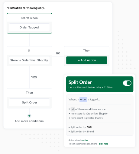
One of the most effective and certain ways to ensure smooth functioning and organized intervals of email marketing is through eCommerce automation. Let’s just say it loud, ‘eCommerce Automation makes your professional life easier. Most of the tasks are taken care of by this tool, and by setting a few triggers, you can consistently send emails to your customers. Thus, you don’t have to send hundreds of emails manually and each time prepare an email for a specific task.

For Example: You have set a trigger for ‘Send an email if incomplete payment process for existing shopping cart’. Unfortunately, eight (8) customers did not complete the payment process, and products are left in the shopping cart.

Thus, instead of you having to search such customers and send them reminder emails for each of them, eCommerce automation sets triggers and automatically sends an email asking them to complete the process.

Image Source

6. Popups and Call To Action

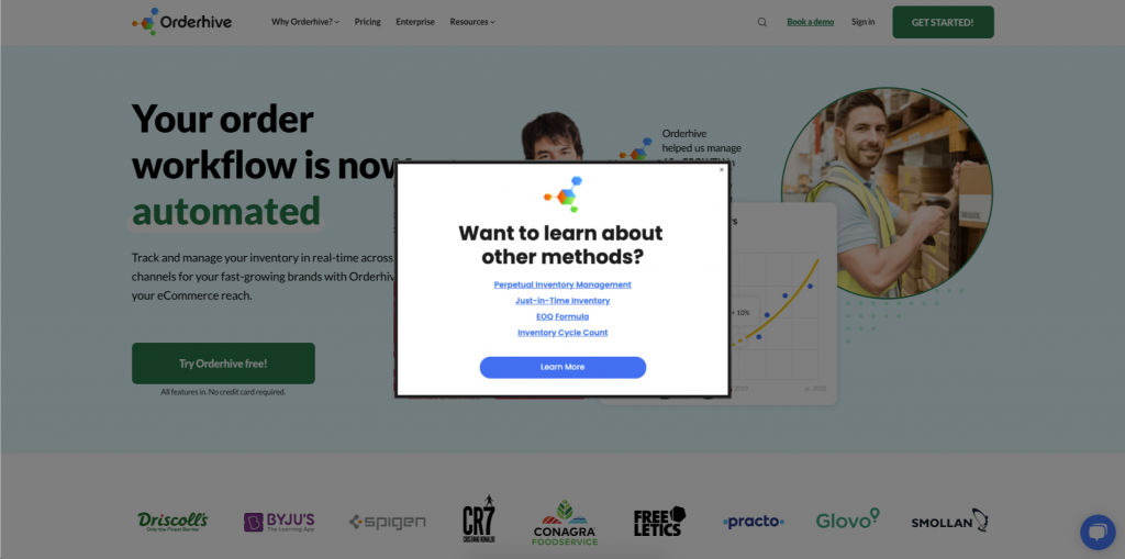
Do you keep your audience engaged? If not, you need to keep your customers informed and engaged with the company’s activities. Thus, add a popup to your website during special occasions to attract customers. Popups are a great way to attract customers, and some of the most innovative popups are: creating a giant ‘Spin to Win’ wheel, also known as ‘Gamified’ Popups, and Full-Screen Popups. Also, add relevant call to action buttons for your customers to understand their next course of action. This helps in increasing sales by encouraging customers to perform an action.

For Example: ‘Special Offer: 25% Off on account of our five (5) year anniversary. Grab this offer soon’. This is a Popup.

In the same popup, add the ‘Shop Now’ or ‘Avail this Offer’ button. This is popularly known as a Call To Action (CTA) button.

Image Source

7. Engage in Social Media Platform

Create your social media presence by creating awareness of your company through various social media platforms. A few of the most popular and most operated social media platforms are Facebook, LinkedIn, Twitter, Instagram, Pinterest, and many more. Create your company page and engage with your target audience through social media posts. Make sure to choose the right platform in lieu of your company’s interests.

For Example: LinkedIn is an exemplary platform for professional and Business-to-Business audiences, while Facebook and Twitter have more informal and casual approaches.

8. Use Paid Advertising

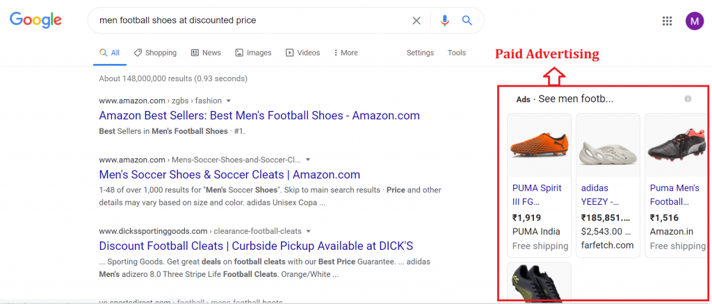
When organic methods of brand awareness are taking time, you can always try paid advertisements. Identify your target audience correctly, and with the use of Google Ads, choose the targeted keywords. Your advertisements will be displayed right on the Google search results front page with the right keyword placements. Depending on your ad, it may be placed directly below the search bar, end of the first page of the search results, or on the right side of the page.

For Example: You run a sports footwear company and want to target the ‘men’ audience needing ‘shoes’ for ‘football’ at ‘discounted price’. Your advertisement may look like this, ‘Men Football Shoes: Discounted price starting from 20% off. Buy Now.’

Conclusion

Digital Marketing is a short term with a vast and in-depth meaning towards it. It is a pure source of increasing traffic, increasing sales, and highlighting brand awareness. With the help of eCommerce automation, a few of the digital marketing activities, such as Email Marketing, become way quicker and more comfortable. You can send emails related to your customers just by setting up a few triggers. Before signing off:

  • Remember to create a successful digital marketing strategy.
  • First, make sure you have: SEO-friendly content.
  • Select your target audience.
  • Define your Call to Action and add a Call to Action button.

References

Photo by Kaleidico on Unsplash
Increase Sales with Digital Marketing
Digital Marketing to skyrocket online sales
Digital Marketing for the growth of sales and profits
Company Illustrations of a Great Content Marketing
How to Successfully Build a Social Media Presence

Categories: Others Tags:

FemTech Mobile Apps: Digitizing Women’s Healthcare

February 25th, 2021 No comments

The overall digital health market has been expanding in recent years, as technology pushed healthcare providers to offer advanced services through chatbots, healthcare apps, and online consultation.

Then came along the pandemic, which pushed more health practitioners to adopt a digital approach to healthcare to cater to the needs and demands of people while they remained confined within their homes.

Women’s health is a budding domain in the digital health market. Ever since the first-ever period-tracking app released in 2016, the segment has been on a growth spurt. Finally, FemTech players are here to successfully catch up with years and years of unmet demand.

What is FemTech?

FemTech typically refers to any women’s health products that make use of technology to bring a high level of convenience to the female user segment. From breast pumps that store data, to devices that are used to strengthen pelvic muscles and menstrual cups, FemTech has come a long way. The fastest-growing component of Femtech, however, has been FemTech Mobile Apps, which for the most part – aid in monthly cycle mapping.

Flo, Clue, My Calendar, Eve and Fertility IQ is only a handful of the FemTech Mobile apps doing the rounds right now. According to Emergen Research, the industry was valued at an astounding USD 18.75 billion as of 2019. It is expected to grow at a compounded annual growth rate of over `16% to reach a market worth of USD 60 billion by 2027.

Why are FemTech mobile apps becoming popular?

With digital transformation and mobile app development, FemTech mobile apps have been met with such popular reception because they are effectively bridging a prevalent gap in the market. Some of the benefits offered by FemTech mobile apps include:

1. Easy, on-the-go tracking

All the period ads that one sees on TV effectively showcase the stress that surrounds the five red days in a woman’s monthly cycle. Period tracking apps have alleviated the need to remember the actual date when one’s period is expected. This helps women plan their various period-related lifestyle changes and take precautions. Period tracking apps automatically tell women when to expect their next period. They also don’t need to wait to get somewhere to note down the date when their period began.

2. Privacy

Back in the day, women made doodles and scribbles on physical calendars to help remember their last cycle and pre-empt their next period. Imagine how embarrassing this must have been among siblings, not to mention how much the embarrassment is compounded in our typical Indian joint family system. While it is true that women shouldn’t be embarrassed by the natural order of nature, it is fairly common for women to want to keep such details of their lives private. Period tracking apps give women the freedom to choose privacy if they so wish.

3. Versatility

Femtech mobile apps have not only period tracking capability, but in most cases also map potential ovulation days. They track moods, overall health, water consumption, intercourse, and even exercise in some cases. This has the potential to promote holistic wellness among female users.

4. Historic data

From tracking one’s moods and noticing patterns, to offering useful data to gynecologists and noticing changes in the way one’s body behaves, the ability to retain historic data is one of the biggest benefits brought to the table by FemTech mobile apps.

5. Free of cost

A lot of these apps are completely free of cost and as a result, women of all income groups can opt for them, so long as they have smartphone access. In a way, FemTech apps are empowering women from all backgrounds to take active charge of their health and well-being.

What are the must-have features of a FemTech mobile app?

FemTech apps should offer at least some, if not all, of the following features. At the moment, the FemTech mobile app universe comprises mainly of period tracking apps that also offer ovulation insights and as a result, we will focus our attention on requirements specific to these:

1. Prediction feature

A period tracking app is fairly useless if it cannot offer a prediction on when the user is to expect her next period. The app should handle calculations – the user should not have to do her own calculations and input them into the app. The algorithm used to make the app must take this rather basic requirement into consideration.

2. One tap updates

Whether a user is time-strapped or concerned with privacy, it is imperative that the developers of FemTech apps make it easy for period start and end dates to be easily and quickly entered. A one-tap log creation feature is ideal.

3. Availability of historic data

Users should be able to access data for the past few months or the past few years or for the duration that they have been using the app. The data should not expire or disappear. Many users see this feature as one of the best things about period tracking apps. It helps them and their doctors and gynecologists track and observe changes in how their bodies evolve as they age.

4. Free and paid options

The popularity of FemTech apps can possibly be credited – at least in part – to the fact that they are free. Most app-makers seem to be monetizing them by advertisements. App developers who want to make apps chargeable might want to consider a model wherein a free version is put on the market but to unlock better or full features, a token sum or monthly sum needs to be paid. In other words, they can adopt the strategy being used by the music streaming app, Spotify.

5. 360-degree focus

App developers need to ensure that FemTech Apps cover holistic women’s health. Most of the apps on the market – as discussed earlier – effectively cover not just period tracking but overall wellbeing. Apps must have a section where the user’s frame of mind and overall health can be tracked during her period and over the course of the month. This helps the user identify patterns and make lifestyle changes if desired.

6. Security and privacy

My Calendar is called Period Tracking app on the Play Store but when it is downloaded on the user’s phone it appears simply as My Calendar. This ubiquitous name lends some amount of privacy. In addition, the option to set passwords might be appreciated by women who value their privacy. Imagine a mother who lets her children use her phone for gaming every now and then. Surely she would not like them stumbling upon the details of her period or next gynecologist visit.

Conclusion

While there are a ton of players on the market already, there is immense room for growth when it comes to FemTech mobile apps. With an anticipated growth rate of over 16% – which means that the industry will more than triple its size in six years – the domain holds ample scope for multiple players to join the fray and carve a niche for themselves. Moreover, the uptake for such apps has so far been most pronounced in developed countries. There is definitely plenty of opportunities for new markets to be tapped. Besides room for profit, there is a social angle to chasing this segment as well.

The bottom line – FemTech mobile apps can go a long way in empowering women to make informed decisions linked to their health and overall wellbeing.


Photo by Nicole Wolf on Unsplash

Categories: Others Tags:

Teaching Web Dev for Free is Good Business

February 24th, 2021 No comments

It feels like a trend (and a smart one) for tech platforms to invest in really high-quality learning material for their platform. Let’s have a gander.

Webflow University

Surely Webflow is thinking: if people invest in learning Webflow, they’ll be able to build what they need for themselves and their clients in Weblow, and they’ll stick around and be a good customer.

Jamstack Explorers

Surely Netlify is thinking: if people really grok Jamstack, they’ll build their existing and future sites using it. They’ll get comfortable using Netlify’s features to solve their problems, and they’ll stick around and be a good customer.

Salesforce Trailhead

Surely Salesforce is thinking: if we train people to learn Salesforce and build Salesforce-specific software, not only will they be a good customer, but they’ll bring more customers to us and help big companies stay good customers.

Figma Crash Course

This is not created by Figma themselves, but by Pablo Stanley, who must be thinking: I can teach people to use Figma, and along the way show them how cool and powerful Blush is, which will gain Blush good customers.

Apollo Odyssey

Surely Apollo is thinking: if y’all know GraphQL, and learned it in the context of Apollo, you probably continue using Apollo and bring it to the teams you’re on, which might make for great customers.

WP Courses

This one is an outlier because these are paid courses, but my guess is that Automattic is thinking: there is already a ton of WordPress learning material out there, why not leverage our brand and deep expertise to make content people are willing to pay for.

Git Tutorials & Training

Surely Atlassian is thinking: if we are the place where people literally learned Git, we can sprinkle in our tooling into those lessons, and you’ll use those tools for your Git workflow, which will follow you through your entire developer career. Not to mention this is good SEO juice.

GitHub does the same thing.


Helping your customers learn your platform is certainly not a new concept. The word “webinar” exists after all. It’s a funny word, but effective. For example, AWS Marketplace sponsors CodePen emails sometimes with the idea of getting people to attend webinars about certain technologies. Wanna learn about Apache Kafka? You can do that for free coming up Thursday, February 25th. Surely AWS is thinking if people learn how this technology works, they’ll use AWS and AWS Marketplace partners to spin it up when they get to using it.

Cypress publishes their webinars. Appcues publishes their webinars. It’s not rare.

What feels a new here is the idea of packaging up learning material on a microsite with a fancy design and making it feel in-line with modern learning platforms. Like you are going to some expensive code school, except you’re getting it for free.

I’m a fan of all this. It’s good marketing for companies. It’s a good learning opportunity for everyone else. It’s also very biased. Learning materials you get directly from companies is going to tell you all about how great the technology of that company is. You should know that going in, if it’s isn’t obvious.

I’m also a fan—perhaps an even bigger fan—of paying for high-quality learning material. Our learning partner, Frontend Masters, has no particular bias to technology because you’re their customer. If they help you, they succeed and you succeed as well.


The post Teaching Web Dev for Free is Good Business appeared first on CSS-Tricks.

You can support CSS-Tricks by being an MVP Supporter.

Categories: Designing, Others Tags: