Archive

Archive for February, 2021

Important Factors to Consider to Choose the Right SEO Plan

February 4th, 2021 No comments

SEO is not only an essential element but also something that masters your site professionally. Either you should have the knowledge or the best one is to hire an SEO Consultant that saves your time & SEO resources.

Building SEO helps you to attain a marketing strategy from the start. In the present market trend, SEO strategy is the first & foremost component. You must clear in mind & concise concepts, that you want to convey with the users that will convert to clients. Your webpage should be designed to give proper content to attract an audience & schedule around the key content.

An SEO strategy gives you a draft where you can measure out your SEO activities which helps you to ascertain the big picture. With a new age marketing technique, it is difficult to create brand awareness especially because of data available & rivaling competition that continues to grow and evolve.

SEO keeps on changing. Like introducing a new product or brand or redesigning your website. These search engines release new features and improve their algorithms. It should be user friendly. The factors can be divided into two categories which determine ranking & on-page & off-page.

Are you attracting Visitors? Is sale a tough one? You need a stronger call to action. Review & focus that is how the SEO plans works.

With SEO resources, your site would generate long-term results.

If you want to sustain in the market, you have to change your behavior of working not only for customers but also for progress & on-going growth. Things keep on changing at a faster speed. The user’s preferences & tastes keep on changing, & this is not because they like it, it is just there are more & more options been made available to them.

Define SEO

SEO is also known as Search Engine Optimization.

It is a process that optimizes your webpage to get traffic either unpaid or organic or natural or earned from the search results page. In other words, it alters your website designs and content that would make it more attractive to search. The main purpose of SEO is to make your site better and money-oriented so that online platforms understand what’s your site is about & circulate it to every user.

What SEO can do?

SEO optimizes your site’s search engine and rankings. This is to avoid the chances of people who try to the fake system with bad practices.

So, the content creators identify what will be the best? And that’s when SEO tools were introduced. It is designed in such a way that info collected by thousands of sites to give you tips to optimize yours.

There are multiple search engines. But the focused one is Google. It’s safe to know that if you optimize for Google, you optimize for all the search engines.

What is SEO Tool for?

It is which provides you with detailed analysis and alerts of your site be it be health or success or spam. These tools help you to remove spam or junk ones that may prevent you from rankings and visibility in SERPs.

What is SEO strategy?

SEO plan is a blueprint for your Search Engine Optimization activities.
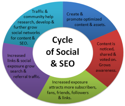
It is a plan that drives pre-qualified traffic to your website, improves conversion & boosts revenue online, visibility depending on the targets and visitors. It is vital to generate traffic, qualify leads to your website.

Mention pillars of SEO?

SEO key areas where you should consider: –

  • Keyword Content
  • Keyword Planner
  • Niche
  • Links
  • On-site SEO
  • Off-site SEO
  • User Experience
  • Social Platform

Understand the weakness & strengths which is a key factor in focusing your efforts.

Name the Important Factors?

SEO strategy takes targeted insight beyond SEO basic rulebook & good relationship with the site. Detailed step about the factors vital for planning SEO of your site. Let’s get into it.

Keyword Content

SEO experts do research to find out how many people have entered into search engines with the selected keywords. The root of SEO is keyword research & not only keywords but also keyword phrases as well. With a clear concept, you get an insight into their intent & what users look for.

Make a list of keywords that your audience is in search off. The list consists of: –

  • Brainstorm
  • Wikipedia
  • Google terms

The point is to structure the content on your webpage with 10-12 keywords or keywords phrases that are apt for your audience’s view.

Keyword Planner

The Google Keyword Planner is the busy bee of small businesses. It is made accessible to whoever has an AdWords account. It helps to analyze how many keywords were searched monthly & will also show suggested ones. Certain Keywords with a high reach will be shown in the analysis.

Niche (Content Connection)

Why do people visit your site? Therefore, writing should be excellent. Google should have the readability. Once keywords are identified, you can start building content writing. For each month select a theme based on keyword research. This ensures content enhancement much more streamlined & also recognize you as an authority who performed work within the given time with informative & easy to read. Keywords are important. But do not stuff keywords. For stuffing more of the keywords, you will be penalized by Google.

Authority Signals

Link building is important for SEO as it is more of quality versus quantity. Consider getting links from professionals & build strategy and get ideas too. When links are built on, you should point out internal pages that are highly related to keywords. When you follow this strategy, desired the rank for, you will boost your organic traffic over time.

On-Page & Off-Page

On-page factors all have to do with elements of your own site. It includes: –

  • Technical set-up
  • Quality of the content
  • User-friendliness of your site

Off-page factors like links from other sites, social media attention, and other marketing activities. You mostly target to get more links to your site. More the applicable links, high ranking in Google.

User experience

Users need to know what the website is. They should know where to click & how to navigate through your site. Beautifully designed isn’t an important one. Whereas your top priority is to create a User-friendly website first.

Social Platforms

Make sure you are active on social media pages Facebook, Pinterest & many more. Maintaining and growing a social media presence can envelop the main page in the ranking. Optimally, your webpage would pull up first, but social media channels should be up to date with content and an engaged community. Then, if the user does not click on your webpage first, at least they are greeted with the essence of your brand.

SEO Plan Review

SEO plans are flexible and require regular views to ensure optimizations where targets can be achieved. It is salient to consider the achievement of competing for other sites and outrank them in SERPs. An SEO specialist should keep track of the changes & market trends to ensure that SEO can be innovated.

Should you please the audience or Google?

This is really the essence of SEO. Is Google’s goal being to make content that can easily read and rank or is it to make content that your users will enjoy?

The answer is both. Both parts of SEO need to be perfect in their place to rank well. You should never sacrifice your user’s experience to make Google happy. Doing so will only annoy your audience, which will then, get you penalized with Google.

Besides, the main thing to be kept in mind that while ranking on Google, can help launch your business to the next level. Google will never be your paying customer. Your readers, on the other hand, might. Create content in such a way that your users will love to access it whenever they want.

Optimize that content to ensure that Google understands, why your audience loves it so much. Always make sure users are your top priority.

Final Verdict

Be sure you pay attention to rank above your competition. SEO needs not be complicated to be effective. If you mastered it, then you will be on your way to put together a solid SEO approach.

SEO’s key areas to be considered are: –

  • Structured
  • Methodical process
  • Optimization

SEO is the process of drafting, outlining & implementing steps to improve search engine rankings. It is a strategy that allows you to get more traffics.

SEO for the long run can be profit-making. Be patient enough to handle the plan. If you follow out these plans, for sure you are on a path to successful SEO. The plan is time-consuming. If you did not plan up well, you will end up flushing your money & time. Key learnings to create an SEO plan for your website, you will learn how to: –

  • Develop
  • Priorities

Plan to suit your goals


Photo by Myriam Jessier on Unsplash

Categories: Others Tags:

Algolia

February 4th, 2021 No comments

Algolia is for search. Literally any website can take advantage of Algolia-powered search. You put JSON data (“records”) in, and then you can search them at lightning speed. The magic of Algolia is that they help you with both of those things: getting data in and getting search results out.

As far as getting data in, there are all sorts of ways. The most likely situation is that you already have data somewhere and you just need to give it to Algolia. They’ve got great docs on that. You basically write an integration that updates Algolia as you update your own data. There are so many things to help with this though. Got a WordPress site? They’ve got a PHP API client and people have built plugins around it.

Got a Rails site? They have integrations for you. What about a Jamstack site? No problem, they’ve got a Netlify build plugin. So, for example, your Jekyll site can have great search.

One way, and I’ve used this myself plenty of times, is literally entering records manually. While manually typing in records isn’t particularly scalable, I like that it’s possible.

So that’s all the “getting data in” part. Now the fun part: building a search UI experience. Great news here too: there is lots of help to make this awesome.

The core of it is InstantSearch.js, which Algolia provides directly. That native version also has versions in React, Vue, and Angular (you could make it work with anything). Wanna see it work super quickly? Try their Create InstantSearchApp flow, which will spin up a search UI super quickly for you.

While you don’t have to use any particular library, I find them very easy to use, very flexible configuration-wise, and no problem to style. Wanna see? CDNjs has everything on it in an Algolia index, so here’s a Pen that connects to that and provides a search UI:

CodePen Embed Fallback

You can see in the code how I’m controlling the number of results, the template and styles the results are shown in, and what happens when a search result is selected. That’s powerful stuff.

This is just the surface of Algolia though. Algolia is a very mature platform with all kinds of bells and whistles you can take advantage of. You can tweak algorithms, you can dig into analytics, you can take advantage of AI, you can use it on native mobile apps… and all with real customer support along the way.


The post Algolia appeared first on CSS-Tricks.

You can support CSS-Tricks by being an MVP Supporter.

Categories: Designing, Others Tags:

Top 9 Tips For Optimizing Images in 2021

February 4th, 2021 No comments

The ‘need for speed’ is an essential item on every website’s bucket list these days. And why not? Enhanced speed is directly responsible for converting traffic into paying clients.

Anyone in any industry wishes to boost their website’s loading speed, providing an improved user experience. Plus, don’t forget that escalated site speeds also escalates the website’s ranking to more competitive spots on the search engine result pages and improves core web vitals. So, how can this need for speed be achieved? The answer is image optimization.

What is Image Optimization?

Image optimization is a process of delivering superior-quality images in the appropriate format, size, and resolution while keeping them at a compressed size. Image optimization, if done right, improves not only a website’s performance but also certain other metrics like:

  • Page loading speed;
  • SEO ranking;
  • Conversion rate;
  • User engagement;
  • User experience;
  • Resource download time.

However, the image optimization process can be accelerated for better efficiency if some modern tips are followed. ImageEngine, with its years of experience in the image optimization industry, has cherry-picked some tips that can help businesses in the year 2021 and beyond.

Tips for Perfect Image Optimization in 2021

In this article, the top five tips to optimize images have been outlined to help you maximize business opportunities. All the tips included are backed by comprehensive research and years of experience in the image optimization industry.

The Right Format Matters

Selecting the right image format matters a lot in the optimization process because every format is meant to serve a specific requirement.

  • JPEG: Best for still images, real-world images, and complex coloring;
  • PNG: Best for web images like logos and flat images;
  • GIF: Best for low-resolution images, animated graphics, small icons, and simple images — however, it is not advisable to go with GIF format but rather use mp4 or a webp instead;
  • TIFF: Best for high-quality and large-size print graphics;
  • WebP: A modern image format that offers superior compression while maintaining great quality.

Choosing the right format reduces bandwidth consumption for an improved webpage loading speed. However, a new format has joined the club: AVIF, that covers all the above image formats’ good qualities and surpasses even WebP while maintaining an excellent compression ratio. AVIF provides almost 50% savings in size when compared to JPEG format.

Serving images in the next generation formats like WebP and AVIF is a trending practice these days.

Go for Image Compression

Once the correct format has been selected, it becomes important to reduce the images’ size through a compression method. There are two methods of compressing images:

  1. Lossless compression: In this compression method, all the unnecessary metadata linked with the images is removed without degrading the quality. The metadata can be erased safely while exhibiting the images on a website or application.
  1. Lossy compression: In this compression method, the quality of the image is slightly reduced to accomplish a smaller size. The file size obtained in lossy conversion is lower than lossless compression, however, a naked human eye cannot highlight the difference between the original image and the lossy compressed image.

Never Skip the CDN

Image optimization and image CDNs are a match made in heaven. Website images not only need to be optimized but have to be delivered fast and easily as well. An optimized image is of no use if it cannot be transported quickly. An image CDN (Content Delivery Network) takes care of this need. It makes the rapid delivery of optimized images possible by reducing the distance between the online visitors and the servers.

The global image CDN also serves a ton of other benefits like:

  • Enabling fast global reach via cloud acceleration;
  • Audience segmentation (based on device viewport) becomes easy;
  • It saves many costs by eliminating the need to invest in separate server providers in different parts of the world;
  • Pulls down the load on the server to achieve reduced delivery cost;
  • Secure storage capacity.

The carefully engineered image CDN from ImageEngine distinguishes itself from the rest with its unique features listed below:

  • The images are optimized to be delivered 30% faster than other CDNs in the market;
  • It is easy to integrate and configure ImageEngine CDN;
  • The images are automatically optimized to the relevant format as per the user’s viewport size;
  • The images can be delivered in next-generation formats such as AVIF and WebP;
  • The images delivered have reduced size (irrespective of the format) and outstanding quality at the same time;
  • ImageEngine’s extensive global CDN network provides support for HTTP, HTTP/2, WAF, and DDoS protection.

Set-up Browser Caching

The “Leverage Browser Caching” warning displays on the Google PageSpeed Insights tool when there is no caching rule in the place, or the expiration time has been set too low. In simple terms, the warning is a suggestion to improve website speed.

Browser caching instructs the visitor’s browser to save some specific files on the visitor’s local system instead of downloading them repeatedly. For example, a visitor needs to download the logo image of a website on the first visit. However, after every subsequent visit, such a visitor would load the logo file from the website’s local cache, provided that the browser caching has been enabled. The result? Faster loading because the visitor is no longer required to get everything from the website’s server directly. Browser caching can be used for images and many other types of files like statistical resources and object data.

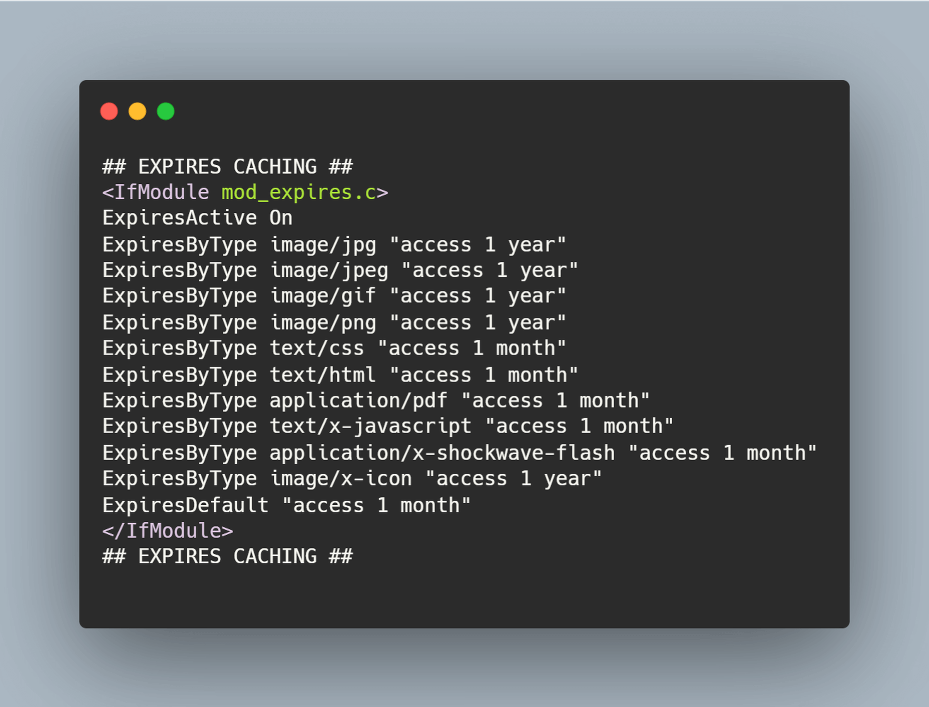
There are many ways to leverage browser caching but simply adding the following lines of code to the .htaccess file is the most effective one:

Browser caching stores the images for a decided interval of time for easy and quick accessibility. A custom timeline or industry standards can be followed for this purpose. The timeline in the above-shared code snippet is one year.

The .htaccess file can be found with the help of an FTP program for connecting to the root directory of the website’s server.

Disable Hotlinking

Hotlinking means when an individual or business copies the URL of an image, which belongs to another website, and embeds it on their website. This results in the image being displayed as if it was an owned content. Hotlinking is a next-door neighbor of copyright infringement, but despite this fact, the practice is widespread. In many cases, hotlinking is unintentional, but it can cost the original owner of the image some money. It can even affect the website’s performance if a drain of the server’s resources happens.

Optimize for Flaky Connections

If a website has a lot of content and rich images to offer, but a portion of the users visiting the website doesn’t have a reliable internet connection, then this portion of visitors would not convert. This situation is no different than any lost business opportunity. Not all website visitors have access to fast and reliable internet facilities; therefore, it is recommended to optimize image content for spotty connections.

One trusted way of optimizing the images for slow connections is compressing the images appropriately in real-time. However, even before compressing the images, it is important to determine the network speed of users visiting the page and then categorizing them into buckets based on connection types like 4G, 3G, 2G, or slow 2G.

But ImageEngine simplifies the whole compression process. It fetches and optimizes the images in the right format, dimension, and quality directly from the URL and then delivers such images on the website’s front-end via global image CDN.

Handling Responsive Images

A lot of traffic arrives from mobile devices, and as such, it is important to have the perfect strategy for responsive images.

  • If vector-based images are being used, then using SVG format would be a great way to optimize them for any viewport without worrying about sizes because SVG images are resolution-independent.
  • Using media queries for background images or images that have been produced via CSS is the best way to display smaller images to mobile devices.
  • For inline images, techniques like the srcset attribute or the picture element can be used.

srcset attribute: This attribute can be implemented on the img element for defining the images at different sizes so that the browser can select the best option based on the device characteristics like width.

picture element: This is best to be used if different images are required to be displayed based on the device’s display size.

All the aforesaid discussed options offer different ways of displaying the optimized images to visitors depending on how they view the website. MDN’s responsive image guide and Google developer’s image guide can be referred to for learning more about responsive images and using picture elements or srcset attributes.

Responsive Images

Images are required to be responsive to deliver the right optimal image for every screen size. It enhances the user experience and reduces load time. According to the browser or device in which images are viewed, images of different sizes are displayed, such as full-size, thumbnail, or featured images. To create a responsive image, you need to have different versions of the image.

The problem is to optimize a high-resolution image that looks great with details while displaying it on mobile devices; details can be missed, so instead of shrinking the image details, consider cropping or scaling down the image for mobile devices.

Advantages of responsive images:

  1. Improve the page loading speed;
  2. Increase your reach through smartphone responsive design;
  3. Increase conversion and sales rate with consistent user experience;
  4. Reduce load over the server and server memory;
  5. Boost conversations.

Client Hints

The fundamental of Client Hints is simple — the client through a device sends the server some hints regarding the requirement. The server with responsibility serves them with the right resource according to the hint. For example, with hints, browsers ask the server for 600px images for the device layout — the image to be served based on the requested parameter. Even if the client informs that data saver mode is enabled, the server delivers identical images of a lighter version. The browser and server interact through Client Hints, the job becomes readable, shorter with the same functionality.

Client Hints with ImageEngine

ImageEngine delivers images with the required – width, DPR, and Data Saver. The responsive images are created based on client hints about width and DPR and later cover the Data Saver client hint.

Optimize Images For Retina Displays

Apple coined the term “retina displays,” which display clear and densely packed pixels to provide perfect vision from an appropriate viewing distance. Now, most smartphones and desktops deliver users a high crispy viewing experience. Apple with Retina squeezed four times the pixels into the same space to create a density of 326 pixels per inch (PPI), making the displays smooth.

Why Optimize Images for Retina?

The average screen pixel density is quite low, so the web-based standard images need to include 72 PPI to cover a certain height and width.

We need to maintain the appropriate density of pixels. Otherwise, the image will cram or get stretched. As a result, a fuzzy image is created with jagged edges that distract the viewer from your brand. To solve the problem, Retina class displays came into the role. They increased image resolution, optimized high pixel density in small space, and even displayed images decently over large screens.

People these days browse from a different device; most users access images from smartphones rather than desktops. So you need to optimize the image for Retina displays.

Wrapping it up

There are many tips and tricks to optimize images, but of all these tips, using a CDN has proven to be the most effective and long-term solution for many businesses all across the globe. Image CDNs automate the optimization process for a business to focus on its core activities properly. The good thing is that it is not all expensive to integrate image CDN. It is easy to get started with and generates the results in a short space of time.

[– This is a sponsored post on behalf of ImageEngine –]

Source

The post Top 9 Tips For Optimizing Images in 2021 first appeared on Webdesigner Depot.

Categories: Designing, Others Tags:

Some Performance Blog Posts I’ve Bookmarked and Read Lately

February 3rd, 2021 No comments
  • Back/forward cache — I always assumed browsers just do fancy stuff with the back/forward buttons and us developers had very little control. Philip Walton tells us it’s critical that we understand “what makes pages eligible (and ineligible) for bfcache to maximize their cache-hit rates.” For example, if you use the unload event, the page is instantly disqualified from the cache.
  • Big picture performance analysis using Lighthouse Parade — Lighthouse only tests one page of your site. Lighthouse Parade tests all the URLs of a site, and aggregates the results.
  • Beyond fast with new performance features — Jake Archibald gets into the CSS content-visibility property (and a few other things) and how it can lead to incredible performance boosts (you use it to tell the browser that it’s straight-up OK not to render things). Right this minute, content-visiblity makes me nervous as it has issues with scrollbar jankiness and accessiblity problems. I found it a smidge confusing at first glance, and Tim Kadlec has reservations.
  • Image Decode & Visual Timings — Image performance isn’t only about the size of the image. Different formats take different amounts of time to decode and render. GIF never wins.
  • How to increase CSS-in-JS performance by 175x — The trick, readers, is shipping CSS. You can still use CSS-in-JS as you author, and have the build process create the CSS. They call that “Zero-Runtime” like Linaria.
  • Testing Performance — Kelly Sutton: “The best approach that I have found to preventing performance regressions is to employ qualitative assessments of the code.” Performance is such an unwieldy beast, that only in production will you truly know what happens.
  • Front-End Performance Checklist 2021 — If you’re going to get serious about performance this year, you’d do well to dig into Vitaly’s guide.
  • We rendered a million web pages to find out what makes the web slow — HTTP/2 is a huge indicator of good performance.

The post Some Performance Blog Posts I’ve Bookmarked and Read Lately appeared first on CSS-Tricks.

You can support CSS-Tricks by being an MVP Supporter.

Categories: Designing, Others Tags:

Going From Solid to Knockout Text on Scroll

February 3rd, 2021 No comments

Here’s a fun CSS trick to show your friends: a large title that switches from a solid color to knockout text as the background image behind it scrolls into place. And we can do it using plain ol’ HTML and CSS!

This effect is created by rendering two containers with fixed

elements. The first container has a white background with knockout text. The second container has a background image with white text. Then, using some fancy clipping tricks, we hide the first container’s text when the user scrolls beyond its boundaries and vice-versa. This creates the illusion that the text background is changing.

Before we begin, please note that this won’t work on older versions of Internet Explorer. Also, fixed background images can be cumbersome on mobile WebKit browsers. Be sure to think about fallback behavior for these circumstances.

Setting up the HTML

Let’s start by creating our general HTML structure. Inside an outer wrapper, we create two identical containers, each with an

element that is wrapped in a .title_wrapper.

<header>

  <!-- First container -->
  <div class="container container_solid">
    <div class="title_wrapper">
      <h1>The Great Outdoors</h1>
    </div>
  </div>

  <!-- Second container -->
  <div class="container container_image">
    <div class="title_wrapper">
      <h1>The Great Outdoors</h1>
    </div>
  </div>

</header>

Notice that each container has both a global .container class and its own identifier class — .container_solid and .container_image, respectively. That way, we can create common base styles and also target each container separately with CSS.

Initial styles

Now, let’s add some CSS to our containers. We want each container to be the full height of the screen. The first container needs a solid white background, which we can do on its .container_solid class. We also want to add a fixed background image to the second container, which we can do on its .container_image class.

.container {
  height: 100vh;
}

/* First container */
.container_solid {
  background: white;
}

/* Second container */
.container_image {
  /* Grab a free image from unsplash */
  background-image: url(/path/to/img.jpg);
  background-size: 100vw auto;
  background-position: center;
  background-attachment: fixed;
}

Next, we can style the

elements a bit. The text inside .container_image can simply be white. However, to get knockout text for the

element inside container_image, we need to apply a background image, then reach for the text-fill-color and background-clip CSS properties to apply the background to the text itself rather than the boundaries of the

element. Notice that the

background has the same sizing as that of our .container_image element. That’s important to make sure things line up.

.container_solid .title_wrapper h1 {
  /* The text background */
  background: url(https://images.unsplash.com/photo-1575058752200-a9d6c0f41945?ixlib=rb-1.2.1&q=85&fm=jpg&crop=entropy&cs=srgb&ixid=eyJhcHBfaWQiOjE0NTg5fQ);
  background-size: 100vw auto;
  background-position: center;
  
  /* Clip the text, if possible */
  /* Including -webkit` prefix for bester browser support */
  /* https://caniuse.com/text-stroke */
  -webkit-text-fill-color: transparent;
  text-fill-color: transparent;
  -webkit-background-clip: text;
  background-clip: text;
  
  /* Fallback text color */
  color: black;
}

.container_image .title_wrapper h1 {
  color: white;
}

Now, we want the text fixed to the center of the layout. We’ll add fixed positioning to our global .title_wrapper class and tack it to the vertical center of the window. Then we use text-align to horizontally center our

elements.

.header-text {
  display: block;
  position: fixed; 
  margin: auto;
  width: 100%;
  /* Center the text wrapper vertically */
  top: 50%;
  -webkit-transform: translateY(-50%);
      -ms-transform: translateY(-50%);
          transform: translateY(-50%);
}

.header-text h1 {
  text-align: center;
}

At this point, the

in each container should be positioned directly on top of one another and stay fixed to the center of the window as the user scrolls. Here’s the full, organized, code with some shadow added to better see the text positioning.

CodePen Embed Fallback

Clipping the text and containers

This is where things start to get really interesting. We only want a container’s

to be visible when its current scroll position is within the boundaries of its parent container. Normally this can be solved using overflow: hidden; on the parent container. However, with both of our

elements using fixed positioning, they are now positioned relative to the browser window, rather than the parent element. In this case using overflow: hidden; will have no effect.

For the parent containers to hide fixed overflow content, we can use the CSS clip property with absolute positioning. This tells our browser hide any content outside of an element’s boundaries. Let’s replace the styles for our .container class to make sure they don’t display any overflowing elements, even if those elements use fixed positioning.

.container {
  /* Hide fixed overflow contents */
  clip: rect(0, auto, auto, 0);

  /* Does not work if overflow = visible */
  overflow: hidden;

  /* Only works with absolute positioning */
  position: absolute;

  /* Make sure containers are full-width and height */
  height: 100vh;
  left: 0;
  width: 100%;
}

Now that our containers use absolute positioning, they are removed from the normal flow of content. And, because of that, we need to manually position them relative to their respective parent element.

.container_solid {
  /* ... */

  /* Position this container at the top of its parent element */
  top: 0;
}

.container_image {
  /* ... */

/* Position the second container below the first container */
  top: 100vh;
}

At this point, the effect should be taking shape. You can see that scrolling creates an illusion where the knockout text appears to change backgrounds. Really, it is just our clipping mask revealing a different

element depending on which parent container overlaps the center of the screen.

Let’s make Safari happy

If you are using Safari, you may have noticed that its render engine is not refreshing the view properly when scrolling. Add the following code to the .container class to force it to refresh correctly.

.container {
  /* ... */

  /* Safari hack */
  -webkit-mask-image: -webkit-linear-gradient(top, #ffffff 0%,#ffffff 100%);
}

Here’s the complete code up to this point.

CodePen Embed Fallback

Time to clean house

Let’s make sure our HTML is following accessibility best practices. Users not using assistive tech can’t tell that there are two identical

elements in our document, but those using a screen reader sure will because both headings are announced. Let’s add aria-hidden to our second container to let screen readers know it is purely decorative.

<!-- Second container -->
<div class="container container_image" aria-hidden="true">
  <div class="title_wrapper">
    <h1>The Great Outdoors</h1>
  </div>
</div>

Now, the world is our oyster when it comes to styling. We are free to modify the fonts and font sizes to make the text just how we want. We could even take this further by adding a parallax effect or replacing the background image with a video. But, hey, at that point, just be sure to put a little additional work into the accessibility so those who prefer less motion get the right experience.

That wasn’t so hard, was it?

CodePen Embed Fallback

The post Going From Solid to Knockout Text on Scroll appeared first on CSS-Tricks.

You can support CSS-Tricks by being an MVP Supporter.

Categories: Designing, Others Tags:

Best Practices to Prevent eCommerce Fraud

February 3rd, 2021 No comments

The opportunity of cybercriminals to attack online businesses is increasing as online shopping becomes popular. If you possess an online business, you have to protect it from fraudsters who may ruin your reputation, steal from you, and harm your brand.

What is eCommerce Fraud?

eCommerce is a commercial electronic transaction via an online store. The transactions are made from phones, laptops, desktop computers, and tablets.

eCommerce fraud is a criminal act carried out during a commercial transaction via the internet with the intention of personal or financial gain of fraudsters. eCommerce fraud is intended for online merchants, and the act is intended to be undetected.

Reasons why eCommerce fraud occurs

Ease. Fraudsters can now access a site on the dark web and purchase stolen credit cards. Before the internet era, they would steal credit cards physically from people and use them.

Obscurity. eCommerce fraud is common because it is carried out anonymously. Fraudsters do not need to steal from anyone and be captured on cameras. They only require a computer and the internet and steal at any time, any place without being seen.

They create fake email addresses that cannot reveal their true identity.

Escape. Fraudsters know that eCommerce fraud is not followed up by law like other criminal acts. The money they steal every time they carry out the crime is small compared to other crimes.

However, eCommerce fraud mostly occurs across international borders, making it difficult for police to identify their location and arrest them in other countries.

Types of eCommerce Fraud

eCommerce fraud is not only about stolen credit cards, as many people think. Here are the most common types of fraud.

1. Credit Card Fraud

Also referred to as payment fraud, the fraudster uses information from a stolen card to buy goods and services from an online merchant. The transaction defrauds the seller, who is forced to refund the purchase.

2. Affiliate Fraud

The goal of affiliate fraud is to initiate affiliate commissions. Affiliate commissions are paid to affiliates in affiliate marketing for sales they refer.

eCommerce fraudsters defraud online sellers using fake activities to initiate or inflate commissions.

3. Phishing

Also known as account takeover, fraudsters hack into accounts using phishing schemes. Online merchants offer these accounts to customers for storing their financial information, personal data, and purchase history.

An email is sent to customers to defraud them into providing their personal information such as their usernames and passwords. The fraudsters then log into the accounts and make unauthorized purchases.

4. Interception Fraud

Here, fraudsters buy products online using stolen credit cards and ship them to the cardholder’s address. After the transaction is successful, they contact the merchants before the product is shipped, and they change the shipping address to their desired address.

5. Chargeback fraud

It is also known as friendly fraud. After the buyer has purchased products online, the fraudster waits for several weeks or months then notifies their bank, claiming the transaction as unauthorized.

How to Recognize eCommerce Fraud

As an online seller, you can identify eCommerce fraud in different ways. Keep in mind that for an eCommerce fraud to be successful, it depends on the criminal’s skills. As merchants become protective of their online businesses, eCommerce fraudsters also improve their skills. Some of the common ways to identify fraud are;

Conflicting data. Check if the zip code and the city of the buyer match. Also, their IP address and their email should match.

Large orders. Fraudsters want to receive large orders before they are caught. Mostly, they will purchase an order larger than what your customer spends.

Suspicious location. If your customer buys from an IP address in America and suddenly buys from another location, it should raise a red flag.

Numerous shipping addresses. Mostly, fraudsters will buy many products and ship them to different addresses.

Practices to Prevent eCommerce fraud

1. Carry out frequent site security audits

  • Make sure your shopping cart program and plugins are updated.
  • Backup your online store regularly.
  • Strong passwords are highly recommended for admin accounts, database, CMS, and FTP access.
  • Scan your site for malware.
  • Encrypt communication between your business, suppliers, and your customers.
  • Remove all inactive plugins.

2. Track your website frequently for suspicious activities

Follow up transactions and accounts for activities like shipping information, inconsistent billing, and the physical address of your buyers. You can look for anti fraud tools that monitor IP addresses and inform you of suspicious addresses.

3. Use Fraud Protection Services

Look for service providers who will help keep your systems updated. They will inspect all your transactions and validate legal orders.

4. Verification Technology

Card Verification Technology is highly recommended to confirm that the card belongs to the rightful owner.

5. Email Authentication

The most difficult thing is detecting if a message comes from a fake email address or not. However, with email authentication, you can avoid this.

6. Pinpoint the origin of the transaction

Tracking the device being used to make an order can assist you


Photo by Jefferson Santos on Unsplash

Categories: Others Tags:

Top New CMS Plugins, February 2021

February 3rd, 2021 No comments

Welcome to our roundup of the best plugins for popular CMS, this month. We’re going to cover plugins built to enhance WordPress, Shopify, Craft CMS, and Joomla. Enjoy!

WordPress

Tutor LMS Elementor Addons

Tutor LMS Elementor Addons is a useful plugin that adds 25+ add-ons to the Elementor page builder. The plugin allows users to create custom styling and layouts for Tutor LMS courses. For this plugin to work effectively, you will have to install Tutor LMS and the Elementor Plugin. After activating all three plugins, you will be able to build single course pages using Elementor. Some of the Elementor Addons include course rating, course title, course author, course level, course duration, course thumbnail, course price, and lots more. The plugin can also be used to edit the look of your existing courses. The pro version of Elementor is not required to use this plugin. It has also been tested with top WordPress themes.

Quick Audio Player

Quick Audio Player is a customizable audio player for WordPress websites. The plugin is responsive and works with any WordPress theme. It runs seamlessly on all devices and major web browsers. Features of the plugin include an HTML5 audio player, live player editing, player poster image, rich control settings, player shortcode, player width customization, and player color customization. The player is available in different audio types including .mp3, .wav, and .ogg.

Simple Responsive WP Slider

Simple Responsive WP Slider is a lightweight slider plugin for WordPress. The plugin allows you to create and customize unlimited sliders for your website. You can use a shortcode or place the slider within Gutenberg blocks to add the slider to a webpage. Some of the features of the plugin include unlimited sliders and multiple sliders on each page. You can set custom configuration options for each slide, including the navigation and slider. Some of the basic configuration options for individual sliders include adding dots or arrows to the slides.

NutsForPress Images and Media

Images and Media is an essential plugin from NutsForPress that makes it easy to customize image and media files on WordPress. The plugin allows you to set the threshold size for images on your website and automatically resizes images that exceed that threshold upon uploading. It also allows users to set a JPEG compression level and will automatically compress JPEGs to meet that compression quality upon uploading. You can prevent GIFs from getting resized to avoid breaking their animation. The plugin can also bulk rebuild “alt title,” “description,” and “caption” for all uploaded media files. You can also bulk rebuild missing PDF preview images. They are seven custom thumbnail sizes to choose from. The plugin is fully compliant with WPML.

Ultimate Social Media Share

Ultimate Social Media Share is a lightweight and responsive plugin for WordPress that allows users to add social media share buttons and social media follow buttons to their site. The plugin is GDPR compliant and DSGVO compliant. The plugin does not collect any IP or personal data. You can insert the social buttons and icons in widgets or Gutenberg blocks. The plugin is free to use and supports 9 different languages. You can customize the plugin to suit your audience’s needs, and it is responsive on any screen, big or small. It is compatible with Gutenberg and Classic WordPress editors. Ultimate Social Media is compatible with WooCommerce, BBPress, BuddyPress, and all custom post types. You can choose from over 35 social media platforms. It is also free to use. The plugin’s social icons are Scalable Vector Graphics, meaning they are scalable to any screen size and load fast.

Wall Pricing Table

Wall Pricing Table plugin allows WordPress users to create pricing tables for their WordPress site. You can add the features of the different pricing plans and also display the price table anywhere on your site. The available fields on the pricing table are title, subtitle, price, button, and features(you can add as many as you want). You can differentiate each plan by color. The plugin is completely free to use.

Job App Manager

Job App Manager is a simple WordPress plugin that allows you to display a job application form on your website for candidates to apply with their details. A shortcode is used to display the form on any webpage on your site. After the user completes a form, they will receive a confirmation email. To find the submissions in the form, go to ‘All Submissions’ on the admin page. On the admin page, you can also search, filter, and delete forms. There is also a dashboard widget that shows the latest 5 form submissions.

Jetpack Boost

Jetpack Boost is a one-click optimization plugin that allows users to supercharge their WordPress site’s performance and SEO. Jetpack Boost is still pre-release software, so it’s advised to install the plugin on only production sites until version 1.01 is released. The pre-release version of the software has three powerful modules. The first module uses local critical CSS to generate optimized styles for your webpages. This will allow content to load faster on the screens of viewers. The second module defers non-essential Javascript. This means that the non-essential tasks show after the page loads, allowing important visual information to be seen sooner. The third module implements lazy image loading, so images load when they appear in the browser’s viewport. So if a viewer doesn’t scroll to the end of the webpage, images placed at the bottom of the page won’t load. This makes the website load faster.

Rsiltech Postcode Availability

Rsilitech postcode availability is a simple plugin that allows your customers to check shipping availability. All your customer needs to do is enter their postcode in the “check availability” section of the product details page. Other features include display delivery date in the product page, display shipping note on the product page, add postcode in the admin panel, edit postcode in the admin panel, and list postcode in the admin panel.

WPTD Video Popup

WPTD Video Popup is a simple video popup plugin for WordPress. The plugin supports both YouTube and Vimeo. Some of the plugin features include unlimited popups, retina ready, easy shortcodes for set up, and customizable width and height size for YouTube and Vimeo videos.

Easy Translate

Easy Translate allows you to translate your WordPress site into multiple languages. The plugin will translate everything on your site regardless of themes or plugin specifications. Easy Translate currently works with Polylang and WPML plugins. It uses the plugins to detect frontend language. It is easy to use and is compatible with all themes and plugins. You can translate your site to as many languages as you want. A unique feature of the plugin is that it can translate dynamic strings added by themes, WordPress, and plugins.

Shopify

ConvertOut Ambassadors

ConvertOut Ambassadors is a Shopify plugin that allows users to create an ambassador program in minutes. You don’t need any technical knowledge to get started. The plugin starts working minutes after installation. For every sale made, ConvertOut will track the commission it needs to pay to the ambassador. Payouts are made directly to the ambassador’s PayPal account.

Product Stories Convert Sales

Products Stories Convert Sale is a cool plugin that upgrades your website by giving it a trendy social network look. The plugin makes it fun and easy for customers to view products in your store. All your catalog will appear in carousel stories, just like Instagram feed stories. Coupons will also pop up in the stories to help increase sales. You will also receive real-time reports that will help you identify what your customers are interested in.

Advoz

Advoz is a Shopify plugin that allows experts to create high-quality Google, Facebook, and Instagram ads to promote your business. Once you set a weekly budget, you will receive a custom graphic or video on how the ads will run. The plugin will create ads that will drive quality leads to your store.

Craft CMS

Presence

Presence is a Craft plugin that displays the current users editing an entry. The users are displayed in the right sidebar settings when editing an entry. A default logo is set for users that do not have a profile image. Admins can review and approve the entries made.

Marketplace for Craft Commerce

Marketplace for Craft Commerce allows Craft users to turn their e-commerce sites into a marketplace. Users can add payees to products and also charge fees for your platform. You can charge a flat or percent fee. Payouts are handled via Stripe Connect.

Joomla

AA Youtube Subscribe Button

AA Youtube Subscribe Button is a Joomla module that allows you to show a Youtube subscribe button with your site’s subscriber number. It is easy to use and is fully responsive. It has cross-browser support and works with any template.

MyRealPin

MyRealPin provides a Pinterest-like look to your website. You can create your own pinboards and collaborate with friends. You can customize the Joomla extension to suit your needs.

AA Tiny Audio Player

AA Tiny Audio Player allows Joomla users to add an HTML5 audio player to their website. The extension comes with a responsive layout and supports animations. It works with .mp3, .ogg, and .wav video formats. It also works with all templates.

Featured image via Pexels.

Source

The post Top New CMS Plugins, February 2021 first appeared on Webdesigner Depot.

Categories: Designing, Others Tags:

The 3 Best Resources for Mobile App Developers

February 3rd, 2021 No comments

Whether you’re new to the world of iPhone app development or you’re an experienced developer with a history of successful projects, you can always expand your toolkit with some of the top resources for mobile app developers.

New apps, blogs, courses, subscriptions, and more are being released every year, giving developers more tools than ever to turn their ideas into a reality.

In this article, we’ll cover three of the best tools for developers to be aware of. With the industry changing so quickly, it’s critical to stay at the forefront of the latest trends in order to avoid falling behind the competition. These resources will help you improve your skills, streamline your workflow, and build even better mobile apps in 2021 and beyond.

1. iOS Dev Center

If you’re developing apps for iOS devices, the iOS Dev Center is an incredible all-in-one resource for everything you need to know about iOS development. With a deep collection of videos and text-based tutorials, you can quickly find information on almost any topic.

While this information is obviously particularly valuable for novice developers, it can be helpful to any developer regardless of their skill level. iOS developers should keep a bookmark on the iOS Dev Center for easy reference. Keep in mind that you’ll need to be part of the Apple Developer Program in order to access the Dev Center.

2. Treehouse

Treehouse is one of the most popular educational resources for mobile app developers, and their informational content covers the basics of programming all the way up to advanced development tactics. Along with iOS development, you can also learn an incredibly broad range of subjects including PHP, HTML, Java, Javascript, Python, SQL, Ruby, C#, and more—almost every language that’s in use in 2020 is available as a Treehouse course.

A Treehouse subscription costs just $14.99 per month, making it an excellent value for programming novices as well as anyone who wants to expand their horizons as a developer. You can also start with a seven-day free trial to get an idea of the service’s benefits without committing to spending any money.

3. Mobile Dev Memo

It’s impossible to keep up with every mobile app development publication on your own, and Mobile Dev Memo makes it easy to stay updated with the best content from around the industry. Along with aggregating content from other authoritative sources, Mobile Dev Memo also creates content on their own.

Whether you’re interested in app news, marketing, industry developments, or something else, Mobile Dev Memo is a great place to start looking for the best content creators. It’s the best all-in-one content platform in the mobile app development space.

The top app developers are constantly updating their approach based on the latest trends and best practices, and these resources will help you keep an ear to the ground and continually improve your own strategies. No matter where your skills are right now, you can take them to the next level in 2021 with the right resources and a commitment to improving on your existing talents.


Photo by Kelly Sikkema on Unsplash

Categories: Others Tags:

The Web is for More Than Document Viewing

February 3rd, 2021 No comments

I poked at a tweet from Ken Kocienda over the weekend:

“Water not wet” reports man standing in ocean. https://t.co/5oUUdWARTU

— Chris Coyier (@chriscoyier) January 31, 2021

I don’t know Ken, so I feel a little bad for being harsh. But I haven’t changed how I feel. Saying “Web browsers are for viewing documents” is silly to me at this point, and suggesting it’s “the biggest wrong turn in the history of computing” feels like “your career in web development is invalid” and when people dig at what I do, I notoriously don’t take it well.

The point is silly anyway. Ken posted this on Twitter-dot-com, and then followed up with a link to job postings. I hope we all can see that Ken was literally leveraging the not-just-a-document-viewer nature of the web to help spread his message and help himself. It feels like saying “cars are bad” and then getting in your car to go to the grocery store.

Ship: sailed. The web is incredibly feature-rich far beyond viewing documents. I know the argument is that this was a mistake, not that web browsers aren’t currently capable of more. If that’s true though, what would you have the web do? Start stripping away features? Should we strip browsers down to document viewers? Maybe we just hand the keys to Facebook and we’ll just do whatever they say we should (lolz).

A super-capable open web is excellent. It means we can build things on open standards on the open web rather than things on proprietary technologies in walled gardens. It’s the better place to build things. URLs alone are a reason to build on the web.

There is still nuance to getting it right though. I enjoyed Noam Rosenthal’s baby bear porridge “Should The Web Expose Hardware Capabilities?”, which begins by discussing Alex Russell’s “Platform Adjacency Theory”:

I relate with the author’s passion for keeping the open web relevant, and with the concern that going too slow with enhancing the web with new features will make it irrelevant. This is augmented by my dislike of app stores and other walled gardens. But as a user I can relate to the opposite perspective — I get dizzy sometimes when I don’t know what websites I’m browsing are capable or not capable of doing, and I find platform restrictions and auditing to be comforting.

Maybe we just take it slow and do things carefully. Good slow. Slow, like brisket.

We’re doing that now, if by accident. Google forges ahead extremely quickly. Apple says hold on there, there are security issues here. And a smidge of vice-versa. I’d point out the other forces at work, but I guess we’re kinda down to two major browser vendor players. Not to discount Mozilla, but the choices they make with the web platform don’t affect the momentum of the web all that much at the moment.


The post The Web is for More Than Document Viewing appeared first on CSS-Tricks.

You can support CSS-Tricks by being an MVP Supporter.

Categories: Designing, Others Tags: