Archive

Archive for March, 2021

How Shopify Payments Work: All You Want To Know?

March 22nd, 2021 No comments

Well, if you are planning to sell your stuff online and make money, then there are a few top eCommerce platforms that would help you out. Shopify is the name that is imagined at first while talking about an eCommerce platform.

Apart from permitting user ease while using it, the Shopify App market is altered for assisting the businesses to grow perfectly. The top assets of Shopify are its amazing features.

Even when it comes to the payment processing feature of an eCommerce platform, Shopify Payments comes into play.

Today, we are here with a post through which you are going to know everything you need about Shopify Payments. So, let’s get started.

What are Shopify Payments?

An in-built payment processor belonging to Shopify, the Shopify Payments diminishes the requirement for a 3rd-party payment solution. Still, you can use 3rd-party processors, such as Stripe and PayPal on your Shopify website, but Shopify Payments offers you numerous options to put aside all distinct account activations and dashboards that arrive with those other processors.

Easy for the customers, Shopify Payments make you available with local currencies and a plethora of widely-accepted payment methods, starting from credit cards to Apple Pay. The ease-of-use of Shopify Payments is the top reason which makes Shopify, a top-rated eCommerce platform.

How Do Shopify Payments Work?

The customers who are purchasing from the Shopify store can pick from various payment options. You must note that if you are choosing Shopify Payments, then you will receive money through such payment processors only.

For all sorts of payment options, you will get paid through Shopify Payments only. Such payment options utilize a fast checkout known as Shopify Pay that permits the users to save their credit card details, email, shipping, and billing information for rapid checkout with future payments.

The payment information of the customers is stored on Shopify servers securely, which comply with the global Payment Card Industry (PCI) Security Standards.

Benefits Of Shopify Payments

Shopify Payments comes with various benefits that will help you to decide which is the right payment processor for your online business.

1. You can track your money in real-time

We can track our sales and revenues with any payment processor, but using Shopify Payments you will get every required display in your Shopify dashboards. So, no more need to remember various passwords and clicking all-around strange 3rd-party websites only to access your financial info.

2. You’ll have support for chargeback recoveries

Being a merchant, chargebacks are usually taken as an accepted risk that you will need to deal with in time. With Shopify Payments, chargebacks are quite easy. It’s because Shopify accumulates the evidence automatically for you that supports your case. Also, Shopify generates a customized, automatic chargeback response to ease your life.

3. Your customers won’t be redirected at checkout

Just appending more steps than is required to your checkout process may not be a good thing for conversion rates. Shopify Payments eases the checkout process for customers, despite appending more steps.

Shopify Payments vs Other Payments

You are not required to use Shopify Payments only because you run your eStore through Shopify. Shopify integrates with 100+ other payment processors, embracing the giants, such as Stripe and PayPal. So, which one to pick. For that, you should know the benefits and drawbacks of every payment processor. So, let’s check out which payment processor will beat the competition.

You, Will, Need Support For Chargeback Recoveries

Well, as mentioned above, Shopify Payments permit the merchants to win the chargeback disputes and recover the lost sales. For any received chargebacks, Shopify offers the responses automatically that are custom-generated from order, shipping, to customer information of the disputed charge.

When talking about Stripe, it utilizes the machine learning technology of Radar to prevent fraud. If later a charge gets disputed, Stripe holds the caliber to repay the disputed amount along with chargeback fees.

In the case of PayPal, it favors the buyers when it comes to chargeback disputes. Also, you will be required to offer additional proof relevant to the transaction if you want any assistance.

Shopify Payments Customer Support

With Shopify Payments, you will get customer support around the clock through phone and chat options.

On the contrary, Stripe also holds various ways to connect with the customers when they emerge with any question, through chat support channels, social media, and help center, also via email support and phone.PayPal on the other edge offers various ways to revert to its customers’ questions from their team of customer support, such as a help center, community forum, social media, live chat, email, and phone support.

Shopify Payments Mobile App

Both the Shopify apps, Android and iOS are available for handling your online store.

Whereas, Stripe mobile dashboard app is also available for Android and iOS.

In the case of PayPal, you can access your account from your Android as well as an iOS phone at any time.

Your Customers Won’t Be Redirected At Checkout

As mentioned earlier, with Shopify Payments your conversion rates will not get hurt as it eases the checkout process for your customers without adding more steps.

When it comes to Stripe, it redirects your customers away from your site during the checkout process.

With PayPal, you can develop a custom checkout process that would help you in increasing your conversions.

Shopify Payments Transaction Fees

You will be charged 2.9% + $0.30 per transaction for using Shopify Payments & 2.7% for in-person payments.

Whereas, 2.9% + $0.30 per transaction for using Stripe online payments & 2.7% + $0.05 per transaction for in-person payments

Coming onto PayPal processing fees, it’s based on the revenue you generate per month. If you earn below $5k per month, then you will be charged a 3.4% + 45c transaction fee on each order.

Shopify Payments is Best For:

Shopify Payments is best for the business owners who are currently using Shopify or planning to use it to host their online store.

On the contrary, the business owners who are searching for more flexible, customizable payment solutions and don’t use Shopify as their eCommerce platform may use Stripe.

Whereas, PayPal provides an extensive suite of payment solutions for small businesses that are best for anyone demanding to start at an affordable price.

Conclusion

If you are a Shopify merchant and want to craft a positive shopping experience for your customers, at the same time need a payment gateway that is reliable, safe, offers you quick access to your money, you may pick Shopify Payments.

Well, setting up Shopify Payments is much easier, but because of this, it’s not like it’s less important. Be sure that you input your entire business details and banking information at your first sale within 21 days, otherwise, the payments will be refunded to the buyer automatically. 


Photo by Roberto Cortese on Unsplash

Categories: Others Tags:

Popular Design News of the Week: March 15, 2021 – March 21, 2021

March 21st, 2021 No comments

Everyday design fans submit incredible industry stories to our sister-site, Webdesigner News. Our colleagues sift through it, selecting the very best stories from the design, UX, tech, and development worlds and posting them live on the site.

The best way to keep up with the most important stories for web professionals is to subscribe to Webdesigner News or check out the site regularly. However, in case you missed a day this week, here’s a handy compilation of the top curated stories from the last seven days. Enjoy!

Baserow.io – Open Source Online Database

15 Psychology Principles Every Designer Should Know

Is the End Near for Flat Logo Design?

Charts.css

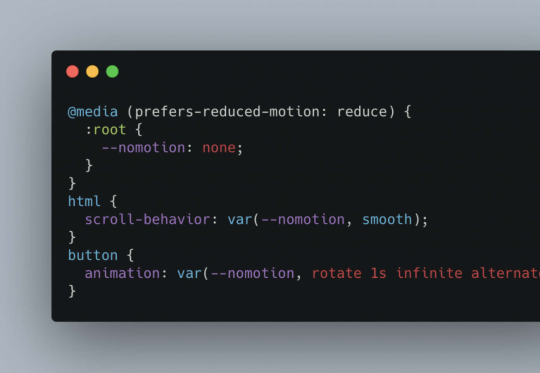
Conditional Animation With CSS Properties

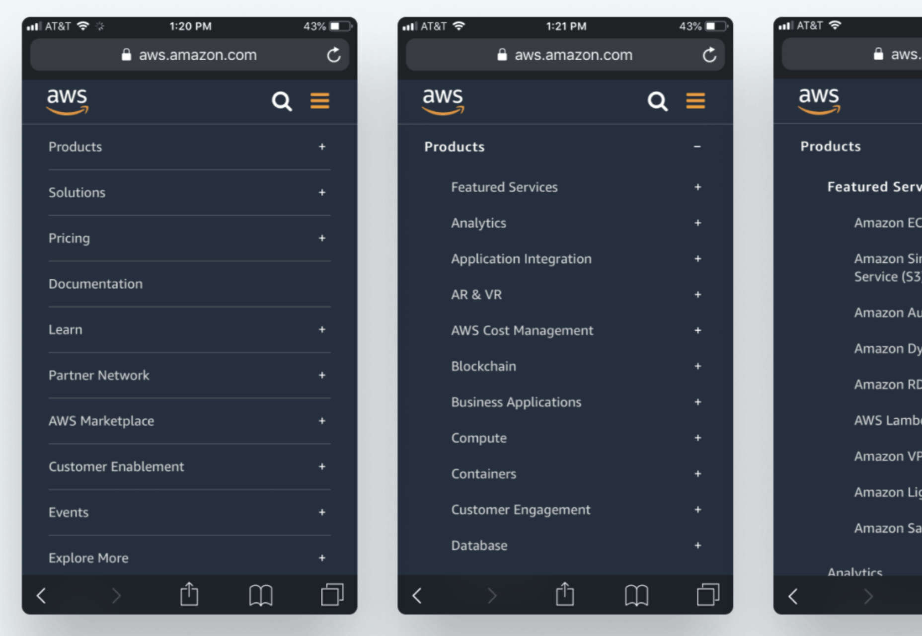
Designing Mobile Navigation

Mockuuups Studio 3.0

UI Animation Libraries and Tools

Japonisme and Its Impact on Modern Graphic Design

Why Should Type Be Fluid, Anyway?

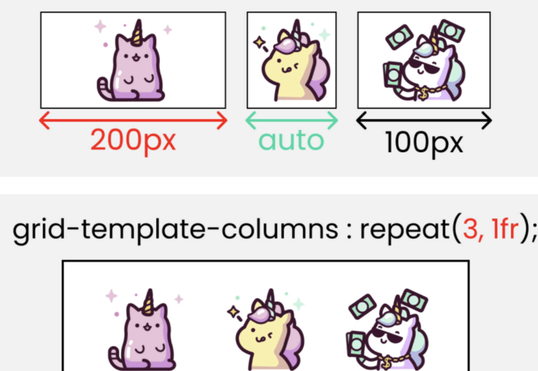
CSS Grid Cheat Sheet Illustrated

My website blunder cost me $1 million

Comics for Designers #440

Font Funnel: Choosing and Pairing Fonts in UI and Web Design

Evergreen CSS Flex Layouts With Live Demos

Source

The post Popular Design News of the Week: March 15, 2021 – March 21, 2021 first appeared on Webdesigner Depot.

Categories: Designing, Others Tags:

Platform News: Prefers Contrast, MathML, :is(), and CSS Background Initial Values

March 19th, 2021 No comments

In this week’s round-up, prefers-contrast lands in Safari, MathML gets some attention, :is() is actually quite forgiving, more ADA-related lawsuits, inconsistent initial values for CSS Backgrounds properties can lead to unwanted — but sorta neat — patterns.

The prefers-contrast: more media query is supported in Safari Preview

After prefers-reduced-motion in 2017, prefers-color-scheme in 2019, and forced-colors in 2020, a fourth user preference media feature is making its way to browsers. The CSS prefers-contrast: more media query is now supported in the preview version of Safari. This feature will allow websites to honor a user’s preference for increased contrast.

Apple could use this new media query to increase the contrast of gray text on its website
.pricing-info {
  color: #86868b; /* contrast ratio 3.5:1 */
}

@media (prefers-contrast: more) {
  .pricing-info {
    color: #535283; /* contrast ratio 7:1 */
  }
}

Making math a first-class citizen on the web

One of the earliest specifications developed by the W3C in the mid-to-late ’90s was a markup language for displaying mathematical notations on the web called MathML. This language is currently supported in Firefox and Safari. Chrome’s implementation was removed in 2013 because of “concerns involving security, performance, and low usage on the Internet.”

CodePen Embed Fallback

If you’re using Chrome or Edge, enable “Experimental Web Platform features” on the about:flags page to view the demo.

There is a renewed effort to properly integrate MathML into the web platform and bring it to all browsers in an interoperable way. Igalia has been developing a MathML implementation for Chromium since 2019. The new MathML Core Level 1 specification is a fundamental subset of MathML 3 (2014) that is “most suited for browser implementation.” If approved by the W3C, a new Math Working Group will work on improving the accessibility and searchability of MathML.

The mission of the Math Working Group is to promote the inclusion of mathematics on the Web so that it is a first-class citizen of the web that displays well, is accessible, and is searchable.

CSS :is() upgrades selector lists to become forgiving

The new CSS :is() and :where() pseudo-classes are now supported in Chrome, Safari, and Firefox. In addition to their standard use cases (reducing repetition and keeping specificity low), these pseudo-classes can also be used to make selector lists “forgiving.”

For legacy reasons, the general behavior of a selector list is that if any selector in the list fails to parse […] the entire selector list becomes invalid. This can make it hard to write CSS that uses new selectors and still works correctly in older user agents.

In other words, “if any part of a selector is invalid, it invalidates the whole selector.” However, wrapping the selector list in :is() makes it forgiving: Unsupported selectors are simply ignored, but the remaining selectors will still match.

Unfortunately, pseudo-elements do not work inside :is() (although that may change in the future), so it is currently not possible to turn two vendor-prefixed pseudo-elements into a forgiving selector list to avoid repeating styles.

/* One unsupported selector invalidates the entire list */
::-webkit-slider-runnable-track, ::-moz-range-track {
  background: red;
}

/* Pseudo-elements do not work inside :is() */
:is(::-webkit-slider-runnable-track, ::-moz-range-track) {
  background: red;
}

/* Thus, the styles must unfortunately be repeated */
::-webkit-slider-runnable-track {
  background: red;
}
::-moz-range-track {
  background: red;
}

Dell and Kraft Heinz sued over inaccessible websites

More and more American businesses are facing lawsuits over accessibility issues on their websites. Most recently, the tech corporation Dell was sued by a visually impaired person who was unable to navigate Dell’s website and online store using the JAWS and VoiceOver screen readers.

The Defendant fails to communicate information about its products and services effectively because screen reader auxiliary aids cannot access important content on the Digital Platform. […] The Digital Platform uses visual cues to convey content and other information. Unfortunately, screen readers cannot interpret these cues and communicate the information they represent to individuals with visual disabilities.

Earlier this year, Kraft Heinz Foods Company was sued for failing to comply with the Web Content Accessibility Guidelines on one of the company’s websites. The complaint alleges that the website did not declare a language (lang attribute) and provide accessible labels for its image links, among other things.

In the United States, the Americans with Disabilities Act (ADA) applies to websites, which means that people can sue retailers if their websites are not accessible. According to the CEO of Deque Systems (the makers of axe), the recent increasing trend of web-based ADA lawsuits can be attributed to a lack of a single overarching regulation that would provide specific compliance requirements.

background-clip and background-origin have different initial values

By default, a CSS background is painted within the element’s border box (background-clip: border-box) but positioned relative to the element’s padding box (background-origin: padding-box). This inconsistency can result in unexpected patterns if the element’s border is semi-transparent or dotted/dashed.

A pink and triple rectangle with rounded edges. The colors overlap in a pattern.
.box {
  /* semi-transparent border */
  border: 20px solid rgba(255, 255, 255, 0.25);

  /* background gradient */
  background: conic-gradient(
    from 45deg at bottom left,
    deeppink,
    rebeccapurple
  );
}

Because of the different initial values, the background gradient in the above image is repeated as a tiled image on all sides under the semi-transparent border. In this case, positioning the background relative to the border box (background-origin: border-box) makes more sense.

CodePen Embed Fallback

The post Platform News: Prefers Contrast, MathML, :is(), and CSS Background Initial Values appeared first on CSS-Tricks.

You can support CSS-Tricks by being an MVP Supporter.

Categories: Designing, Others Tags:

What is Gamification in Emails and How it Can Benefit Your Marketing

March 19th, 2021 No comments

Although email marketing may seem a rather still industry, it constantly undergoes changes. They may not be obvious to regular users, but email marketers today have way more tools than they would have even 2 years ago.

Gamification is one of such tools. Primarily, before live stories and streaming, game-like content was heavily used on social media to engage followers and prompt shares and likes. However, thanks to modern technologies, gamification has made its way into emails for good.

What is Gamification

Generally speaking, gamification is all dynamic activities and solutions you use to encourage deeper interaction with otherwise non-game content, like emails, webpages, learning material, etc. It can be any game-like element that presupposes taking an action to achieve some kind of fun goal. To name a few:

  • Quiz;
  • Puzzle;
  • Crossword;
  • Scramble;
  • Wheel of fortune;
  • Prize revealing;
  • Mystery solving;
  • Trivia;
  • Graphic illusion, etc.

In terms of email marketing, some gamification activities are totally autonomous and can be done straight in the email. They include a quiz and trivia (with answers below), illusion, maze, item spotting, prize finding, etc.

In the following example, edX offers to take a quiz and discover what product fits you best straight in the copy. You answer the questions, check the answers, and have your instant result. And Baked by Melissa offers to find the perfect sweets for Valentine’s Day by doing some quick choose-your-option task.

However, till recently, more complex gamification in emails only specified the task. To participate and see the result, you still had to go to the website. For instance, if you click the button Play Now in any of the below emails, you will be redirected to the webpage with the corresponding activity.

The technique is engaging as it heightens the interest and excitement, yet there is always a chance of losing people on the way from the copy to the site. However, this issue has been addressed by email designers and is expected to be solved through AMP for email.

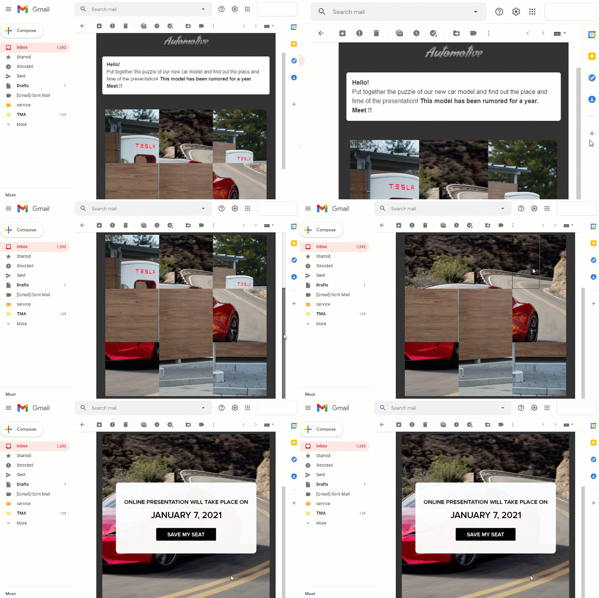
AMP (Accelerated Mobile Pages) is a technology that enables to add AMPHTML components to emails and lets users interact with dynamic content straight in the message. Take a look at the below email designed by Stripo Email Editor. It offers the recipient to do a puzzle to save a seat for the upcoming presentation. The task can be completed within the email body, and the user is notified about success instantly.

Source: Stripo

This is already a new level of interaction with your audience. Apart from being attention-catching, emails acquire the functionality of an app or even website and deliver a different experience with your campaigns. AMP-supported gamification has high potential and can give a hand in the fight for your readers’ interest.

Why to Add Gamification to Email Marketing Strategies

1. Gamification increases engagement.

The main task of gamification is to encourage a longer interaction with your emails. Game-like tasks have a higher involvement rate and increase an average email reading session.

With so much diverse content around, it’s getting harder to grab people’s attention and make them consider your offer. Most users are getting immune to regular call-to-actions and hardly respond to discounts simply because everyone around is offering them.

Marketers deal with it by experimenting with design and copywriting, and adding gamification to your marketing tools can help spark interest when no other strategies work.

2. It generates shares.

Naturally, people like sharing interesting stuff with friends. If they like your email because it was fun solving a puzzle or guessing the right word, they’re most likely to forward it to a friend or spread the word on social media.

Look at this email offering to create a Christmas card which you can later send to your friends. It definitely stands aside all those sales and free shipping offer Inboxes are typically crowded with in December. Think what email has more chances to be forwarded: a regular promo you receive all the time or a dynamic DIY card?

Source: Stripo

3. It generates clicks.

Since gamification encourages more engagement, it eventually generates more clicks. People click to play, click to reveal the mystery, click to spin the wheel, etc.

Not only do ?licks move the customer down the purchase funnel; a good click rate is important for your sender reputation, especially when you’re warming up your domain or plan to increase the campaign frequency. Clicks tell email clients that people are eager to interact with your content, and your messages are less likely to land to Spam.

4. It drives traffic to a particular webpage.

If you need to drive people to a particular page, gamification can be a way to it. You offer to do a fun activity and the corresponding call-to-action leads the person to the necessary page.

This is especially useful when you need to draw attention to a particular product category, promote an event or introduce people to your new social media account.

5. It’s relatively easy to implement.

At its basics, email gamification only requires good design skills. You create a good design in Canva, Photoshop, or any other graphic design tool, add it to the email, and provide the corresponding links to the site.

A simple trivia, quiz, or crossword is even easier to build and can be created in a drag-and-drop email editor. You drag ready blocks to the template, adjust alignment, line space, and padding between them and enjoy a smooth layout.

6. It generates email content ideas.

Brands that send regular emails 5 to 7 times a week often struggle with creativity. It’s hard to come up with a genuine idea for each message, and most end up with the good old sales or promo code offering. Gamification lets bring in some diversity and transform a common format into something new.

Look how Personalization Mall modified an Easter promo into a hunt after savings. The idea remains the same that is to offer holiday discounts but implementation differs. Instead of directly giving a promo code, the brand offers to play and win it which slightly increases its value. People tend to appreciate more those things they made an effort (even minimal) to get.

To Sum Up

Gamification can be a useful contribution to your email marketing strategies. Of course, it’s not a magic wand and it won’t generate you much following solely on its own. But combined with other tools like personalization, segmentation, user-generated content, inclusivity, accessibility, etc. it can strengthen your content, improve user experience and drive sales.

Categories: Others Tags:

API Integration Development with eCommerce Platforms

March 19th, 2021 No comments

If you’re looking for a descriptive post on how to perform a flawless API integration with the most popular eCommerce platforms out there, you’ve come to the right place.

Below, we will explore the main benefits of developing multiple eCommerce integrations and revealing all the options you can use for successfully connecting your software to the shopping platforms used by your existing and prospective customers. 

Needless to say, whether you are providing marketing automation, dropshipping automation, order, repricing, multichannel, shipping, warehouse management software, or any other similar solutions for e-merchants, it becomes crucial for you to perform solid API integrations with various shopping platforms. It can be, for example, such platforms like Magento, PrestaShop, WooCommerce, Shopify, OpenCart, Lightspeed, etc. 

The integration with different eCommerce platforms is more than necessary for software providers like you. eCommerce integration enables your solution to access the e-stores’ data relevant to your clients and work with it to provide your core functionality.

The data you can gain access to post-integration includes order, product, customer, price, shipping info, etc. Basically, after the successful building of eCommerce integration, you’ll be able to offer a broader range of services to your clients. And you’ll finally be able to tap into the power of raw data to create custom reports and enable your clients to sell more and make higher profits. Ultimately, by providing better-quality services, you’ll be able to grow your business and tap into new markets, boosting your profit and skyrocketing your company’s brand.

In this article, we are going to take a closer look at what an API is and how it works. We will show you how to differentiate between API requests and API responses. We will also explain how to perform a winning API integration with all essential eCommerce platforms.

What is API and How Does It Work? 

An API, or Application Programming Interface, is a modern set of protocols and definitions that enable seamless transmission of data between various software solutions or applications. The API can be used in numerous areas, industries, and verticals, allowing one program to pull data from another and then send new data back.

Each API contains function calls, which tell the program to collect specific types of information. For eCommerce software providers, using the API allows them to collect precious data related to e-merchant stores’ products, descriptions, orders, prices, customers, categories, and shipments located in the shopping platforms’ databases. 

So, the API enables different types of apps and software to interact with the other external services. One software can call the other program’s API and receive access to the required data of that other program. 

The Difference Between API Requests and API Responses

In simple terms, an API request represents any inquiry or call towards a server with the purpose of pulling out the needed data. There are four types of HTTP request methods that can be made with the help of API:

  • GET – allows gathering information from a specific program
  • PUT – enables updating of the data pieces
  • POST – is utilized with the purpose of creating new resources
  • DELETE – is used with the intention of deleting some resource

On the other hand, an API response is an essential piece of information you get back after making an API request. 

Whenever you request a specific type of information, the server comes back with an answer. Usually, you get the response in a data format that is easy to manipulate, such as XML or JSON.

Typically, the response depends on the actual request being made. The response can either be null if no data has been found or come back as a string or integer.

What is API Integration, and How is It Used the eCommerce Sphere?

APIs are used in countless industries and niches, such as retail, banking, transportation, or eCommerce. Pulling data from the other programs is necessary almost for any software solution.   

In the eCommerce sphere, API integration becomes a must for software providers who work with e-retailers and operate in the spheres of repricing, marketing automation, order and inventory management, shipping management, etc.

API integration with eCommerce platforms means the process of developing the connection between any eCommerce software and shopping cart solutions like Magento, Shopify, WooCommerce, etc. 

In the eCommerce sphere, API integration can be used by any type of eCommerce B2B software provider that needs to access the valuable data, grows their business, and expands into new markets. For instance, chatbot providers have to integrate their systems with shopping platforms to pull out precious data about e-stores’ products and customers to provide the functionality related to the order creation, sending tracking info, and order statuses. 

Similarly, the inventory management solutions, with the help of smoothly developed eCommerce API integration, can retrieve the data on orders, products, customers, etc., to be able to sync inventory across different platforms.

In-House Integration Development vs The Integration Via Third-Party Solution

When it comes to performing the actual API integration with eCommerce platforms, things boil down to two main options: either perform an in-house integration with your team or a team of freelancers or choose a third-party integration tool such as API2Cart. Each option comes with its set of benefits and drawbacks.

For example, an in-house development process gives you more control over the integration and allows you to perform custom data pull scenarios. However, it’s hugely time-consuming and requires a considerable budget investment. For example, the development of the connection to only one shopping platform like Shopify can take more than a month. Moreover, further integration support and upgrading also take time. Talking about the money spent, you will need to pay huge salaries to your developers responsible for the integration building, spend your budgets on services your developers need like VCS (code repository), CI/CD Services, Cloud Services, server hardware, etc. 

For most companies out there, API integration with eCommerce platforms via a third-party solution is the right way to go. One of the best solutions you can get is API2Cart. This unified shopping cart data interface allows you to seamlessly integrate your software with 40+ shopping platforms at once, without spending a lot of your money and time.

Usage of this service allows you to avoid developing a separate connection with each shopping platform used by your clients. All that you need is to integrate your software with API2Cart. After that, you will instantly gain access to the precious shopping platforms’ data you need to provide your software functionality and offer superior services to your target audience.

Conclusion

The development of reliable API integration with eCommerce platforms is necessary for different types of software providers. It is a technically complicated process that requires specific resources. However, depending on your needs, it can be implemented by your team of developers or by the other third-party solution.


Photo by Charles Deluvio on Unsplash

Categories: Others Tags:

The Mobile Performance Inequality Gap

March 18th, 2021 No comments

Alex Russell made some interesting notes about performance and how it impacts folks on mobile:

[…] CPUs are not improving fast enough to cope with frontend engineers’ rosy resource assumptions. If there is unambiguously good news on the tooling front, multiple popular tools now include options to prevent sending first-party JS in the first place (Next.jsGatsby), though the JS community remains in stubborn denial about the costs of client-side script. Hopefully, toolchain progress of this sort can provide a more accessible bridge as we transition costs to a reduced-script-emissions world.

A lot of the stuff I read when it comes to performance is focused on America, but what I like about Russell’s take here is that he looks at a host of other countries such as India, too. But how does the rollout of 5G networks impact performance around the world? Well, we should be skeptical of how improved networks impact our work. Alex argues:

5G looks set to continue a bumpy rollout for the next half-decade. Carriers make different frequency band choices in different geographies, and 5G performance is heavily sensitive to mast density, which will add confusion for years to come. Suffice to say, 5G isn’t here yet, even if wealthy users in a few geographies come to think of it as “normal” far ahead of worldwide deployment

This is something I try to keep in mind whenever I’m thinking about performance: how I’m viewing my website is most likely not how other folks are viewing it.

Direct Link to ArticlePermalink


The post The Mobile Performance Inequality Gap appeared first on CSS-Tricks.

You can support CSS-Tricks by being an MVP Supporter.

Categories: Designing, Others Tags:

axe DevTools Pro

March 18th, 2021 No comments

I’m going to try to show you some things I think are useful and important about axe™ DevTools and use as few words as possible.

axe DevTools includes a browser extension which you need no special expertise to use.

You install it from the extension directories like any other extension.

It’s a tab along with your other DevTools.

It might be all the way on the right. I like to click and drag it over by the Elements tab.

Now I can scan my page and find 57% of accessibility issues along with help in fixing them.

Here’s an on CodePen that was missing a title attribute.

The information in the extension itself is very helpful in fixing the problem, but I can also click over to Deque University to get very clear, detailed information on the problem, who it affects, and how to fix it. For the problem I found above:

Screen reader users have the option to pull up a list of titles for all frames on a page. Adding descriptive, unique titles allows users to quickly find the frame they need. If no titles are present, navigating through frames can quickly become difficult and confusing.

axe DevTools Pro unlocks Intelligent Guided™ Tests, meaning we can fix 83% of all accessibility issues.

There are many accessibility issues that a static scan of the code can’t catch. For example, does your site have a modal? If so, testing it requires some step-by-step testing. What buttons open it (because focus will need to be returned there)? Can the modal be found once open? Does it trap focus? Is it closable? These are important issues that are difficult to remember on your own and impossible to statically test for. But you’re in luck, the Intelligent Guided Tests (which you get by upgrading to axe DevTools Pro) make problems easy to suss out, because it walks you through each step.

“Get yourself axe clean before pushing.” is a company culture thing I can get behind.

You don’t commit syntax errors in code. You don’t commit poorly formatted code. Don’t commit accessibility bugs either. Open axe DevTools and get yourself axe clean before pushing up new commits.

Friends don’t let friends ship inaccessible code.


The post axe DevTools Pro appeared first on CSS-Tricks.

You can support CSS-Tricks by being an MVP Supporter.

Categories: Designing, Others Tags:

How Web Design and SEO Work Together to Drive eCommerce

March 18th, 2021 No comments

Web design and SEO are truly the backbones of any good e-commerce business model. Without a physical store, you have to rely on your website and content to create a visual and emotional experience for your customers.

Many online stores struggle to balance aesthetics with content, and their copy is either too off-putting or lacks any search optimization whatsoever.

To help you consistently outrank competitors, this guide will explore how to use intent SEO. Not only will you rank higher, but you’ll also be able to naturally multiply your revenue by targeting exactly what your customers want at any given time. Intent SEO is based on the principle that high-ranking content should match a search user’s desire. Whether they want to navigate somewhere particular or learn about a product or service, the best websites optimize to meet various forms of keywords and guide users through a seamless sales funnel. Conceptually, this all seems quite easy to understand. The difficulty comes to implementation. There are thousands of free online resources at your fingertips, and then there are reputable agencies like Granwehr.com that have the readily available expertise to make the process seamless.

The Purpose of Web Design in SEO

Web design isn’t just about looking good. Although your site should have a strong visual value that pleases your visitors and encourages them to stick around, appearance is actually only one component. Good web design is rooted in elements derived from marketing analytics, consumer psychology, and UX/UI design principles. Technical aspects, like mobile responsiveness and descriptive URLs, influence how well your site performs just as much as traditional SEO. Keywords are only as good as the site they link to, and if your website underperforms or makes it difficult for users to find what they need, you’ll ultimately wind-up losing business.

Why Web Design Is Important for SEO

Google factors your site’s architecture, meta descriptions, and content structure into its ranking. If you have a professional copywriter come up with amazing service and landing pages but a slow site with broken links, they’ll effectively cancel each other out. The biggest mistake you can make is having one person handle both the search optimization and web design aspects of your eCommerce store. These are two highly specific, specialized roles that should only be performed by their respective professionals.

By having a close team dedicated to bringing your eCommerce store to the top of search engines, you’ll find it’s much easier to pinpoint areas that need improvement. Someone who strictly builds sites may have a basic knowledge of SEO and keywords, but they aren’t equipped to develop a robust strategy that’s both efficient and adaptive; you need more than just a one-time list of keywords to reach your audience, and you need an even more detailed understanding of SEO to create an intent-driven strategy that is bolstered by a well-structured website.

What Comes First?

Both design and search engine optimization need to be considered at the same time, but your ultimate page structure and navigation should be guided by your SEO strategy. It’s easier to modify a shell than it is to overhaul an entire site, though the latter can be done as well with enough patience. Ultimately, every design choice should be made with search engine optimization in mind. If it doesn’t pass the SEO test, it’s a no-go. For example, did you know that Flash is an outdated method of coding animations or supporting embedded videos on a website? It’s no longer supported as of 2020, so having it on your site will cause it to rank lower no matter how good your keyword integration is.

Ask your designer to stick to HTML and CSS and perhaps some JavaScript. You want to avoid using too much multimedia on any given page as it slows load times and ultimately harms your score; many of the components we think makes a professional, polished site are actually bad for your rank. Simplicity can be achieved without sacrificing style by incorporating elements of contemporary minimalism. Think powerful headings, bold copy, and intentional white space.

How to Optimize for Intent SEO

Now you know that a website’s structure influences its rank in search engines, but how do you go about improving your strategy? If you can’t build a strong eCommerce site without good search engine optimization, where do you begin? It’s all about intent. There are four primary types of search intent you need to know:

  • Informational
  • Navigational
  • Transactional
  • Commercial

An informational search seeks to answer a question or provide a solution to something. People will likely use long-form keywords when performing this type of action online, so structuring your pages and title tags with appropriate variations will serve you well. A navigational search directs a user to a specific site. They may achieve this by directly inputting the URL, searching the company’s, or typing something along the lines of (your store’s name) blog. Users also go online to perform a specific action. This is known as a transactional intent. The most important transaction for an eCommerce store is to make a purchase. When buyers are ready to close a deal, you want to reach them and convert them as quickly as possible.

Lastly, commercial intent is about the investigative journey most online shoppers take before committing to a purchase. Impulse buys aside, people tend to compare products and prices before they settle on a deal. They might pay more for a product if they really support a brand, but you can’t expect everyone to land on your site to automatically become a loyal follower. For that reason, you need rich product or service descriptions that justify your price and provide value to your audience.

Your content should reflect the nature of your audience’s likely intent. This could be done by using phrases that include why, publishing how-to guides, and explaining the best way to do a particular task. All of these content formats also provide ample opportunity for you to naturally incorporate your products.

Tying Things Together

Leveraging a strong site with good SEO and social media will make your eCommerce site shine. You’ll find that the process becomes easier as your store grows and you get to know your audience better. Beyond knowing what products perform best, you’ll discover how people use them and why they matter. This allows you to further evolve your site to reflect the many applications and potential uses of your products.


Photo by Myriam Jessier on Unsplash

Categories: Others Tags:

Handling User Permissions in JavaScript

March 17th, 2021 No comments

So, you have been working on this new and fancy web application. Be it a recipe app, a document manager, or even your private cloud, you‘ve now reached the point of working with users and permissions. Take the document manager as an example: you don’t just want admins; maybe you want to invite guests with read-only access or people who can edit but not delete your files. How do you handle that logic in the front end without cluttering your code with too many complicated conditions and checks?

In this article, we will go over an example implementation on how you could handle these kinds of situation in an elegant and clean manner. Take it with a grain of salt – your needs might differ, but I hope that you can gain some ideas from it.

Let‘s assume that you already built the back end, added a table for all users in your database, and maybe provided a dedicated column or property for roles. The implementation details are totally up to you (depending on your stack and preference). For the sake of this demo, let’s use the following roles:

  • Admin: can do anything, like creating, deleting, and editing own or foreign documents.
  • Editor: can create, view, and edit files but not delete them.
  • Guest: can view files, simple as that.

Like most modern web applications out there, your app might use a RESTful API to communicate with the back end, so let’s use this scenario for the demo. Even if you go with something different like GraphQL or server-side rendering, you can still apply the same pattern we are going to look at.

The key is to return the role (or permission, if you prefer that name) of the currently logged-in user when fetching some data.

{
  id: 1,
  title: "My First Document",
  authorId: 742,
  accessLevel: "ADMIN",
  content: {...}
}

Here, we fetch a document with some properties, including a property called accessLevel for the user’s role. That’s how we know what the logged-in user is allowed or not allowed to do. Our next job is to add some logic in the front end to ensure that guests don‘t see things they’re not supposed to, and vice-versa.

Ideally, you don’t only rely on the frontend to check permissions. Someone experienced with web technologies could still send a request without UI to the server with the intent to manipulate data, hence your backend should be checking things as well.

By the way, this pattern is framework agnostic; it doesn’t matter if you work with React, Vue, or even some wild Vanilla JavaScript.

Defining constants

The very first (optional, but highly recommended) step is to create some constants. These will be simple objects that contain all actions, roles, and other important parts that the app might consist of. I like to put them into a dedicated file, maybe call it constants.js:

const actions = {
  MODIFY_FILE: "MODIFY_FILE",
  VIEW_FILE: "VIEW_FILE",
  DELETE_FILE: "DELETE_FILE",
  CREATE_FILE: "CREATE_FILE"
};

const roles = {
  ADMIN: "ADMIN",
  EDITOR: "EDITOR",
  GUEST: "GUEST"
};

export { actions, roles };

If you have the advantage of using TypeScript, you can use enums to get a slightly cleaner syntax.

Creating a collection of constants for your actions and roles has some advantages:

  • One single source of truth. Instead of looking through your entire codebase, you simply open constants.js to see what’s possible inside your app. This approach is also very extensible, say when you add or remove actions.
  • No typing errors. Instead of hand-typing a role or action each time, making it prone to typos and unpleasant debugging sessions, you import the object and, thanks to your favorite editor’s magic, get suggestions and auto-completion for free. If you still mistype a name, ESLint or some other tool will most likely yell at you until you fix it.
  • Documentation. Are you working in a team? New team members will appreciate the simplicity of not needing to go through tons of files to understand what permissions or actions exist. It can also be easily documented with JSDoc.

Using these constants is pretty straight-forward; import and use them like so:

import { actions } from "./constants.js";

console.log(actions.CREATE_FILE);

Defining permissions

Off to the exciting part: modeling a data structure to map our actions to roles. There are many ways to solve this problem, but I like the following one the most. Let’s create a new file, call it permissions.js, and put some code inside:

import { actions, roles } from "./constants.js";

const mappings = new Map();

mappings.set(actions.MODIFY_FILE, [roles.ADMIN, roles.EDITOR]);
mappings.set(actions.VIEW_FILE, [roles.ADMIN, roles.EDITOR, roles.GUEST]);
mappings.set(actions.DELETE_FILE, [roles.ADMIN]);
mappings.set(actions.CREATE_FILE, [roles.ADMIN, roles.EDITOR]);

Let’s go through this, step-by-step:

  • First, we need to import our constants.
  • We then create a new JavaScript Map, called mappings. We could’ve gone with any other data structure, like objects, arrays, you name it. I like to use Maps, since they offer some handy methods, like .has(), .get(), etc.
  • Next, we add (or rather set) a new entry for each action our app has. The action serves as the key, by which we then get the roles required to execute said action. As for the value, we define an array of necessary roles.

This approach might seem strange at first (it did to me), but I learned to appreciate it over time. The benefits are evident, especially in larger applications with tons of actions and roles:

  • Again, only one source of truth. Do you need to know what roles are required to edit a file? No problem, head over to permissions.js and look for the entry.
  • Modifying business logic is surprisingly simple. Say your product manager decides that, from tomorrow on, editors are allowed to delete files; simply add their role to the DELETE_FILE entry and call it a day. The same goes for adding new roles: add more entries to the mappings variable, and you’re good to go.
  • Testable. You can use snapshot tests to make sure that nothing changes unexpectedly inside these mappings. It’s also clearer during code reviews.

The above example is rather simple and could be extended to cover more complicated cases. If you have different file types with different role access, for example. More on that at the end of this article.

Checking permissions in the UI

We defined all of our actions and roles and we created a map that explains who is allowed to do what. It’s time to implement a function for us to use in our UI to check for those roles.

When creating such new behavior, I always like to start with how the API should look. Afterwards, I implement the actual logic behind that API.

Say we have a React Component that renders a dropdown menu:


function Dropdown() {
  return (
    <ul>
      <li><button type="button">Refresh</button><li>
      <li><button type="button">Rename</button><li>
      <li><button type="button">Duplicate</button><li>
      <li><button type="button">Delete</button><li>
    </ul>
  );
}

Obviously, we don’t want guests to see nor click the option “Delete” or “Rename,” but we want them to see “Refresh.” On the other hand, editors should see all but “Delete.” I imagine some API like this:

hasPermission(file, actions.DELETE_FILE);

The first argument is the file itself, as fetched by our REST API. It should contain the accessLevel property from earlier, which can either be ADMIN, EDITOR, or GUEST. Since the same user might have different permissions in different files, we always need to provide that argument.

As for the second argument, we pass an action, like deleting the file. The function should then return a boolean true if the currently logged-in user has permissions for that action, or false if not.

import hasPermission from "./permissions.js";
import { actions } from "./constants.js";

function Dropdown() {
  return (
    <ul>
      {hasPermission(file, actions.VIEW_FILE) && (
        <li><button type="button">Refresh</button></li>
      )}
      {hasPermission(file, actions.MODIFY_FILE) && (
        <li><button type="button">Rename</button></li>
      )}
      {hasPermission(file, actions.CREATE_FILE) && (
        <li><button type="button">Duplicate</button></li>
      )}
      {hasPermission(file, actions.DELETE_FILE) && (
        <li><button type="button">Delete</button></li>
      )}
    </ul>
  );
}

You might want to find a less verbose function name or maybe even a different way to implement the entire logic (currying comes to mind), but for me, this has done a pretty good job, even in applications with super complex permissions. Sure, the JSX looks more cluttered, but that’s a small price to pay. Having this pattern consistently used across the entire app makes permissions a lot cleaner and more intuitive to understand.

In case you are still not convinced, let’s see how it would look without the hasPermission helper:

return (
  <ul>
    {['ADMIN', 'EDITOR', 'GUEST'].includes(file.accessLevel) && (
      <li><button type="button">Refresh</button></li>
    )}
    {['ADMIN', 'EDITOR'].includes(file.accessLevel) && (
      <li><button type="button">Rename</button></li>
    )}
    {['ADMIN', 'EDITOR'].includes(file.accessLevel) && (
      <li><button type="button">Duplicate</button></li>
    )}
    {file.accessLevel == "ADMIN" && (
      <li><button type="button">Delete</button></li>
    )}
  </ul>
);

You might say that this doesn’t look too bad, but think about what happens if more logic is added, like license checks or more granular permissions. Things tend to get out of hand quickly in our profession.

Are you wondering why we need the first permission check when everybody may see the “Refresh” button anyways? I like to have it there because you never know what might change in the future. A new role might get introduced that may not even see the button. In that case, you only have to update your permissions.js and get to leave the component alone, resulting in a cleaner Git commit and fewer chances to mess up.

Implementing the permission checker

Finally, it’s time to implement the function that glues it all together: actions, roles, and the UI. The implementation is pretty straightforward:

import mappings from "./permissions.js";

function hasPermission(file, action) {
  if (!file?.accessLevel) {
    return false;
  }

  if (mappings.has(action)) {
    return mappings.get(action).includes(file.accessLevel);
  }

  return false;
}

export default hasPermission;
export { actions, roles };

You can put the above code into a separate file or even within permissions.js. I personally keep them together in one file but, hey, I am not telling you how to live your life. 🙂

Let’s digest what’s happening here:

  1. We define a new function, hasPermission, using the same API signature that we decided on earlier. It takes the file (which comes from the back end) and the action we want to perform.
  2. As a fail-safe, if, for some reason, the file is null or doesn’t contain an accessLevel property, we return false. Better be extra careful not to expose “secret” information to the user caused by a glitch or some error in the code.
  3. Coming to the core, we check if mappings contains the action that we are looking for. If so, we can safely get its value (remember, it’s an array of roles) and check if our currently logged-in user has the role required for that action. This either returns true or false.
  4. Finally, if mappings didn’t contain the action we are looking for (could be a mistake in the code or a glitch again), we return false to be extra safe.
  5. On the last two lines, we don’t only export the hasPermission function but also re-export our constants for developer convenience. That way, we can import all utilities in one line.
import hasPermission, { actions } from "./permissions.js";

More use cases

The shown code is quite simple for demonstration purposes. Still, you can take it as a base for your app and shape it accordingly. I think it’s a good starting point for any JavaScript-driven application to implement user roles and permissions.

With a bit of refactoring, you can even reuse this pattern to check for something different, like licenses:

import { actions, licenses } from "./constants.js";

const mappings = new Map();

mappings.set(actions.MODIFY_FILE, [licenses.PAID]);
mappings.set(actions.VIEW_FILE, [licenses.FREE, licenses.PAID]);
mappings.set(actions.DELETE_FILE, [licenses.FREE, licenses.PAID]);
mappings.set(actions.CREATE_FILE, [licenses.PAID]);

function hasLicense(user, action) {
  if (mappings.has(action)) {
    return mappings.get(action).includes(user.license);
  }

  return false;
}

Instead of a user’s role, we assert their license property: same input, same output, completely different context.

In my team, we needed to check for both user roles and licenses, either together or separately. When we chose this pattern, we created different functions for different checks and combined them in a wrapper. What we ended up using was a hasAccess util:

function hasAccess(file, user, action) {
  return hasPermission(file, action) && hasLicense(user, action);
}

It’s not ideal to pass three arguments each time you call hasAccess, and you might find a way around that in your app (like currying or global state). In our app, we use global stores that contain the user’s information, so we can simply remove the second argument and get that from a store instead.

You can also go deeper in terms of permission structure. Do you have different types of files (or entities, to be more general)? Do you want to enable certain file types based on the user‘s license? Let’s take the above example and make it slightly more powerful:

const mappings = new Map();

mappings.set(
  actions.EXPORT_FILE,
  new Map([
    [types.PDF, [licenses.FREE, licenses.PAID]],
    [types.DOCX, [licenses.PAID]],
    [types.XLSX, [licenses.PAID]],
    [types.PPTX, [licenses.PAID]]
  ])
);

This adds a whole new level to our permission checker. Now, we can have different types of entities for one single action. Let‘s assume that you want to provide an exporter for your files, but you want your users to pay for that super-fancy Microsoft Office converter that you’ve built (and who could blame you?). Instead of directly providing an array, we nest a second Map inside the action and pass along all file types that we want to cover. Why using a Map, you ask? For the same reason I mentioned earlier: it provides some friendly methods like .has(). Feel free to use something different, though.

With the recent change, our hasLicense function doesn’t cut it any longer, so it’s time to update it slightly:

function hasLicense(user, file, action) {
  if (!user || !file) {
    return false;
  }

  if (mappings.has(action)) {
    const mapping = mappings.get(action);

    if (mapping.has(file.type)) {
      return mapping.get(file.type).includes(user.license);
    }
  }

  return false;
}

I don’t know if it’s just me, but doesn’t that still look super readable, even though the complexity has increased?

Testing

If you want to ensure that your app works as expected, even after code refactorings or the introduction of new features, you better have some test coverage ready. In regards to testing user permissions, you can use different approaches:

  • Create snapshot tests for mappings, actions, types, etc. This can be achieved easily in Jest or other test runners and ensures that nothing slips unexpectedly through the code review. It might get tedious to update these snapshots if permissions change all the time, though.
  • Add unit tests for hasLicense or hasPermission and assert that the function is working as expected by hard-coding some real-world test cases. Unit-testing functions is mostly, if not always, a good idea as you want to ensure that the correct value is returned.
  • Besides ensuring that the internal logic works, you can use additional snapshot tests in combination with your constants to cover every single scenario. My team uses something similar to this:
Object.values(actions).forEach((action) => {
  describe(action.toLowerCase(), function() {
    Object.values(licenses).forEach((license) => {
      it(license.toLowerCase(), function() {
        expect(hasLicense({ type: 'PDF' }, { license }, action)).toMatchSnapshot();
        expect(hasLicense({ type: 'DOCX' }, { license }, action)).toMatchSnapshot();
        expect(hasLicense({ type: 'XLSX' }, { license }, action)).toMatchSnapshot();
        expect(hasLicense({ type: 'PPTX' }, { license }, action)).toMatchSnapshot();
      });
    });
  });
});

But again, there’re many different personal preferences and ways to test it.

Conclusion

And that’s it! I hope you were able to gain some ideas or inspiration for your next project and that this pattern might be something you want to reach for. To recap some of its advantages:

  • No more need for complicated conditions or logic in your UI (components). You can rely on the hasPermission function’s return value and comfortably show and hide elements based on that. Being able to separate business logic from your UI helps with a cleaner and more maintainable codebase.
  • One single source of truth for your permissions. Instead of going through many files to figure out what a user can or cannot see, head into the permissions mappings and look there. This makes extending and changing user permissions a breeze since you might not even need to touch any markup.
  • Very testable. Whether you decide on snapshot tests, integration tests with other components, or something else, the centralized permissions are painless to write tests for.
  • Documentation. You don’t need to write your app in TypeScript to benefit from auto-completion or code validation; using predefined constants for actions, roles, licenses, and such can simplify your life and reduce annoying typos. Also, other team members can easily spot what actions, roles, or whatever are available and where they are being used.

Suppose you want to see a complete demonstration of this pattern, head over to this CodeSandbox that plays around with the idea using React. It includes different permission checks and even some test coverage.

What do you think? Do you have a similar approach to such things and do you think it’s worth the effort? I am always interested in what other people came up with, feel free to post any feedback in the comment section. Take care!


The post Handling User Permissions in JavaScript appeared first on CSS-Tricks.

You can support CSS-Tricks by being an MVP Supporter.

Categories: Designing, Others Tags: