Archive

Archive for April, 2021

Flash of inAccurate coloR Theme (FART)

April 15th, 2021 No comments

There is a lot to think about when implementing a dark mode theme on a website. We have a huge guide on it. There are some very clever quick wins out there, but there are also some quite tricky things to pull off. One of those tricky things is how it’s not a dark mode “toggle” between dark and light, but really three modes you need to support: dark, light, and user system preference. That’s similar to how audio preferences work in many apps, which allow you to very specifically cohose which audio input or output you want, or just default to the system preference.

CSS and JavaScript can handle the system preference angle, via the prefers-color-scheme API, but if the user preference has changed, and that preference is now different than the user preference, you’re in the territory of “Flash of inAccurate coloR Theme” or FART. Ok ok, it’s a tounge-in-cheek acronym, but it’s potentially quite a visually obnoxious problem so I’m keeping it. It’s in the same vein that FOUT (Flash of Unstyled Text) is for font loading.

Storing a user preference means something like a cookie, localStorage, or some kind of database. If access to that data means running JavaScript, e.g. localStorage.getItem('color-mode-preference');, then you’re in FART territory, because your JavaScript is very likely running after a page’s first render, lest you’re otherwise unnecessarily delaying page render.

User preference is “dark” mode, but the system preference is “light” mode (or unset), so when the page refreshes, you get FART.

You can access a cookie with a server-side language before page-render, meaning you could use it to output something like and style accordingly, which deftly avoids FART, but that means a site that even has access to a server-side language (Jamstack sites do not, for example).

Allllll that to say that I appreciated Rob Morieson’s article about dark mode because it didn’t punt on this important issue. It’s very specifically about doing this in Next.js, and uses localStorage, but because Next.js is JavaScript-rendered, you can force it to check the user-saved preference as the very first thing it does. That means it will render correctly the the first time (no flash). You do have to turn off server-side rendering for this to work, which is a gnarly trade-off though.

I’m not convinced there is a good way to avoid FART without a server-side language or force-delayed page renders.


The post Flash of inAccurate coloR Theme (FART) appeared first on CSS-Tricks.

You can support CSS-Tricks by being an MVP Supporter.

Categories: Designing, Others Tags:

How can content marketing increase your brand awareness?

April 14th, 2021 No comments

Increased brand recognition does not happen immediately, but it is an important goal for every organization to bear in mind. One of the most dominant ways to do this is with content marketing.

Why is brand awareness critical?

Consumers’ familiarity with a business and a message is measured by brand recognition.

It’s not enough that people remember your logo because it’s unusual; it’s also vital that they recognize your brand and what it stands for.

Consumers are much more likely to buy from brands they know and trust if they are aware of them. When people are familiar with your brand, it strengthens your place in the industry.

What effect does content marketing have on brand awareness?

Good content helps your brand explain to your consumers who you are and what your name stands for, like a great resume that your boss will love.

Brand recognition isn’t just about whether or not your target audience knows your company’s name; it’s also about how well they appreciate the attributes that distinguish your company.

To make this distinction, the content should highlight the attributes that set your brand apart from the competition.

Show potential customers why they should select you over your rivals by sharing information about your business that clarifies what sets you apart from those in your industry.

You may also use a page to explain how your brand varies from those in the same category, whether it’s by the products or ingredients you use or something more personal, such as the fact that you’re open on weekends.

How will content marketing be used to raise brand awareness?

Increasing brand recognition is difficult, but you can use content marketing to accomplish your branding goals by following these seven steps.

Recognize your target market.

The first step in designing every marketing campaign is to consider your target market. Since they’re the ones you want to interact with, all of your content should be personalized to them.

To make sure you’re writing about the right people, you can answer a few critical questions about them.

Who is your audience?

The most critical piece of the brand recognition puzzle is your audience. You won’t have any buyers to help your brand image grow until you have an audience that wants your product.

As a result, you should think about who you’re going after. To assess how to organize your content and what will relate to their preferences and beliefs, consider your target audience’s demographic.

If your company makes hand-crafted bouquets for brides, for example, your target market is predominantly female. In this scenario, you’d tailor your content to cater to brides and demonstrate to them that you’re dedicated to giving them a fantastic experience by focusing on the industry.

Where does your audience spend time online?

You should also look at your target audience’s online habits.

Spend time deciding which websites and blogs your target audience frequents and how you can create content that appeals to them.

You should also look at which types of content your visitors spend the most time on your current pages. Make video a part of your brand marketing strategy if you find that they connect more with pages with videos rather than photographs.

The aim is to interact with your guests on a website by answering their needs and desires, and by researching their online habits, you’ll have data-driven insight into how to keep them coming back.

Create a content strategy

Once you’ve identified your target audience, you’ll need to formulate a plan to reach out to them.

Concentrate on your story.

Your company’s story is one of the best content subjects for raising brand recognition.

You should market your brand in a way that represents your company’s values as well as where you began, how you achieved, and what you believe. To provide a good picture of who you are as a business, keep these things at the forefront of your campaign.

This will help you develop a personal bond with your customers and show them who you are outside of your goods and services.

Choose your channels

The next step is to select which content forms you’ll use. Many can be efficient, including:

  • Web pages: When people want to learn more about a business, they go to the “About Us” section of the website. They can also find a page that defines and describes your company culture, as well as your values and working climate.
  • Posts on the blog: Blogs are one of the most effective ways to drive traffic to your website and a great way to promote your content. If you blog regularly, you can share your experience and build yourself as a trusted voice in your industry.
  • Downloadable guides: Site visitors adore something free, and knowledge is no exception. On the first page of your website, or pages related to the topics discussed in the guide, advertise a free downloadable guide.
  • Videos: Videos are another excellent form of advertising that allows potential clients to see what your business is all about. They give them a behind-the-scenes look at your business and how it operates, making them feel like they’re a member of the family.
  • Webinars: Webinars are growing in popularity because they allow you to watch and listen to information rather than reading it. This is a fantastic content marketing strategy that you can also reference in your posts on related topics.

Create a schedule

Having a content calendar in place will help you stay on track with your strategy. You’ll have a map with no roads if you don’t have it.

Make a schedule for posting new content and stick to it.

It’s critical for your company’s brand image to maintain consistency, whether in the volume of blog posts or the tone you’re writing.

Make use of your company’s blog to raise brand awareness.

There are several advantages to writing a company blog, so if you don’t already have one, we strongly encourage you to start one right away. It gives the business a voice in the industry and can be a valuable tool for increasing brand recognition.

Here are a few tips to help you create your company’s brand on the blog.

Create new, original material.

People are constantly searching for new information. It won’t help you get ahead of the game if you share the exact details as your rivals.

You must provide one type of content for your future customers to consider you a unique business.

Granted, we all know how difficult it is to come up with new ideas all of the time, but the time and effort put in is well worth it.

One choice is to break down a previously discussed subject and discuss one of the smaller components in greater depth. Find a new way to discuss something that has been done before, but not in the same way that you have.

Using fresh perspectives on industry issues will help you build your brand as forward-thinking and authoritative. You’re not facilitating brand recognition if the content isn’t one of these two items.

Another essential element of producing unique content is ensuring that the data you use is suitable. If you’re going to use content to build your brand, it has to be reliable and trustworthy for your current and future customers to trust you.

Choose subjects that will pique the audience’s curiosity.

Examine the audience’s preferences when coming up with new blog subjects. Consider writing a blog about it if any of your Twitter followers ask the same question.

This helps you demonstrate your authority and expertise on a subject you already know your audience is interested in learning.

You might also write about topics that give your readers a behind-the-scenes look at your business. You might, for example, build content that takes a behind-the-scenes look at how one of your products is created. Everyone enjoys getting the inside scoop!

Take a look at what the competitors are saying.

Investigate what kinds of blogs your rivals are publishing to see what subjects are gaining momentum.

While you can never copy the content, you can easily rework general concepts to help your rivals communicate with customers.

If your top competitor, for example, publishes a weekly blog that includes a how-to video, you may suggest posting a video or webinar weekly as well.

Participate in the community

Customers want to connect with businesses that share their values and give back to the community. This can be immensely beneficial to your content marketing campaign if you’re an involved member of your culture.

You can use your group engagement to boost brand awareness by showcasing it in several ways in your online content.

Post photos

Posting images is one of the easiest ways to link your group engagement to your content strategy. If you’ve taken part in a fundraiser or a group event, post pictures on your website and social media sites.

Post videos

Another great way to demonstrate your group involvement is through videos. If a few of your workers participated in a charity run, share a behind-the-scenes look!

Images of your team in action are ideal for showing your community engagement and conveying to consumers that you care about helping others.

Leverage Email Marketing

One of the most effective ways to keep the business in front of customers’ minds is to send email newsletters.

You can easily update them on company news, tips that will help them achieve their objectives, and content such as free business guides.

Here are some ideas for making the most of your email newsletters.

Link to your most recent content

Linking to recent content ensures that your audience does not skip any of your recent posts.

You want to make sure your target audience reads new content before you spend time making it. Otherwise, it would not be able to assist you in achieving your objectives.

To guide your audience to new posts, stories, webinars, or podcasts, for example, link to your recent content on social media or your website’s homepage.

Let your audience know you’re happy to speak with them.

Always strike up a friendly, personable, and encouraging conversation with your potential customers. 

Customers would be more likely to respond to your emails or take steps about becoming a customer if you make them feel at ease about beginning a conversation.

Encourage potential customers to reply directly to your email with any questions or suggestions you might have to increase discussion. This communicates to them that you are open to speaking with them.

Use social media to promote your content.

Facebook and Twitter are excellent outlets for supporting and reaching a broad audience with your brand-building content.

Users can easily share your content, as well as your brand, by simply clicking a button.

Since the information you share with your followers is accessible to their friends, social media sites are ideal for content marketing. By publishing, you’re allowing your content to reach an audience outside your immediate circle.

Social media is also helpful because it encourages users to express their thoughts and views, responding to building relationships with potential customers.

Analyze your results

One of the most critical aspects of your strategy is to consider and monitor your progress.

Analyzing your various marketing campaigns’ outcomes will help you figure out which tactics work and how to develop your marketing strategy in the future.

Google Analytics is an excellent tool for gaining a lot of information about how your content performs online.

You can see which pieces of content drive the most traffic and across which platforms. Apart from that, you can see charts of where your customers are coming from and what they’re clicking on your site.

Use this data to assess which types of content are most beneficial to your objectives and choose new topics using a data-driven approach.

The Takeaway

Crafting a content marketing strategy that will increase your brand awareness is not easy but definitely possible. Pay attention to the tips above and create a solid plan that will convert in the near future and will transform your brand into a real authority in your niche.

Let me know in the comments section what are your tips on increasing a brand’s awareness. 

Until the next one, keep creating content!


Photo by Tyler Franta on Unsplash

Categories: Others Tags:

8 Thank You Page Examples to Inspire your Landing Pages

April 14th, 2021 No comments

There’s a tendency in people to treat thank you pages as an afterthought (in case you don’t know, thank you page is what appears after someone signs up for something through your landing page). The truth is that thank you pages offer you yet another opportunity to nurture leads, build relationships and increase sales. 

You can use the thank you page to:

  • Set future expectations
  • Share download links
  • Share similar resources
  • Upsell on offers
  • Move them through your sales funnel
  • Guide them to relevant pages on your website

But getting a thank you page right isn’t as easy as it seems. And for this reason, I present to you some of the best thank you pages I’ve found, to help you create brilliant landing pages by yourself.

1. SalesForce

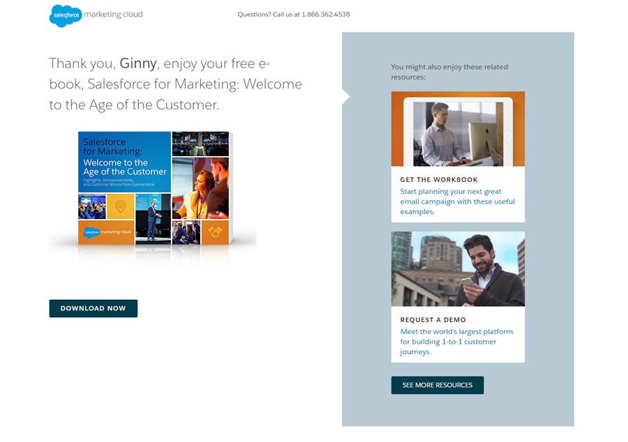
SalesForce, a giant in the CRM industry, shows the following thank-you page when someone  downloads their Marketing eBook:

The first commendable aspect of this thank you page is that it’s personalized. When you fill in the form for this eBook’s landing page, you share details like your name and email address. They use the very same information to personalized the thank you section by adding your name when thanking you.

Right below the copy, there’s a clear image of the book which lets the visitor anticipates the ebook and makes his interaction with SalesForce just that bit wee bit smoother.

And quite smartly, SalesForce has dedicated the complete right panel to a ‘related resources’ section. This is a good practice as at this point the visitor’s interest is primed in your offerings and you can use this opportunity to introduce more of your content.

Finally, they also offer a helpline number that visitors can use to clear up any sorts of issues they may have while interacting with the landing page or the thank-you page, which just improves the user experience further.

2. Simply Measured

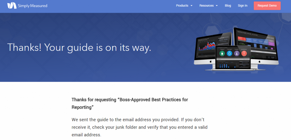
This next thank you page from Simply Measured (now Sprout Social), assures a visitor that their guide on ‘Best Practices for Reporting’ is on its way:

The thank-you page itself is quite simple. It’s got a simple heading which assures you the guide will be delivered. 

What really makes this simple thank you page stand out is the copy below the banner. Simply Measured reminds you to check your junk folder if you have trouble receiving the lead magnet in your inbox. And for good measure, because this sort of thing happens quite often.

A lot of emails do end up in the junk or spam folder so it’s a good idea to remind recipients to check these folders. This improves your email deliverability and also open rates.

3. AWeber

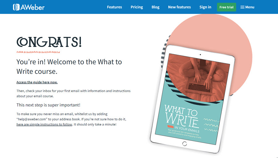
AWeber, an email marketing company, displays the following thank you page when you sign up through their landing page for an email writing course:

The thank you page starts off by congratulating you for gaining access to the guide and provides an access link right within the thank you page. This saves time for the user and they can get started with the content immediately. 

Even then AWeber lets you know they’ll send you an email that’ll have further instructions regarding the course. 

They do a great job of clearly laying the next steps for the user. Using the headline ‘This next step is super important!’ they make sure to grab your attention. They, similar to Simply Measured, ask you to white list their email address so you can receive their emails without a worry. This is a great practice.

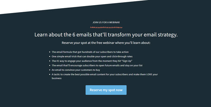
AWeber makes maximum use of the real estate provided in a thank you page by adding content below the fold also:

Knowing how a user is engaging with their content at this moment, they also add a link to their upcoming webinar which is related to the content you’ve signed up for. This allows AWeber to ‘kill two birds with one stone.’

4. All Seasons Landscaping

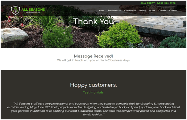
When you sign up for All Seasons Landscaping email list, this is the thank you page you see:

Keeping true to the very fundamental concept of a thank you page, the headline just says ‘Thank You’. What really makes this page worth mentioning is the addition of testimonials.

By using testimonials as social proof, you boost your subscriber’s confidence in your brand. They get to see quotes from other people who’ve had pleasant experiences with a business and that makes them feel better about their decision.

By including reviews, testimonials, and logos from other brands who are customers, you can alleviate any doubts your subscribers or customers may have. They tackle customer objections and prove that your product/service is worth their time.

5. Coppyblogger

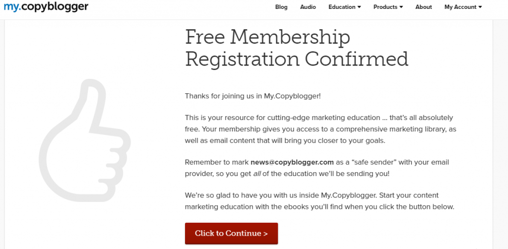
Copyblogger, a website dedicated to copywriting, displays the following thank you page upon registering with their website:

This page does a great job of explaining all the benefits one can actualize after becoming a member, you get access to their marketing library that includes guides and email content that helps bloggers more adept at their jobs.

Similar to some previous examples, this page also nudges the subscriber to mark them as safe senders so their emails get delivered without a hiccup.

To make it just that bit easier for the user, they tell you exactly which email to white list. Providing the email address here also makes it more likely to stick in your memory and makes it easier to spot Copyblogger’s emails in a cluttered inbox.

The page signs off with a strong CTA asking you to continue to follow the next steps in enjoying the Copyblogger membership experience.

6. Acquisio

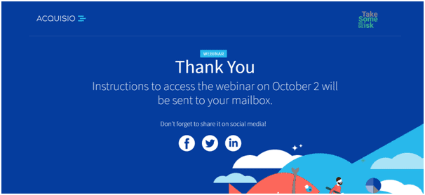
Acquisio, an AI for digital advertisers, offers the following thank you page when you sign up for one of their webinars:

This is a well-designed, minimal thank you page that offers pleasant illustrations along with a pleasing combination of blue and white: colors that tend to have a relaxing effect on the viewer.

What Acquisio does well is adding social sharing options on their thank you page. This allows the users to let their audience know that they’ll be attending a webinar, boosting their credibility and also attracting more attention for the webinar in the process.

Offering sharing options is a good way to leverage your thank you page. They increase the presence of your offers and as an e-commerce marketer/owner, you can use this space to ask people to share items they just bought with friends on social media.

7. Sally’s

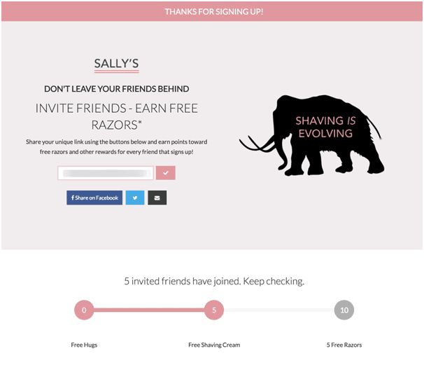
Sally’s is a cosmetics company with a diverse line of products. When you sign up for their mailing list, this is the thank you page you see:

Sally’s thank you page taps into the ever-powerful approach of word-of-mouth marketing. By incentivizing users to earn rewards by spreading the word. You can create a much larger audience for your campaigns.

Here, Sally’s using clever copy tells you quite clearly not to leave your friends behind. You’re invited to earn free razors if your friends sign-up through you.

The best part is, Sally’s keeps their approach warm and friendly by offering you free hugs even if you don’t invite anybody. And the more people you invite, the more awards you can win.

Lastly, they offering social media sharing options as well which allows people to quickly share links with their friends. Making it easy for them to send invitations and also increasing Sally’s presence on social media.

8. AdEspresso

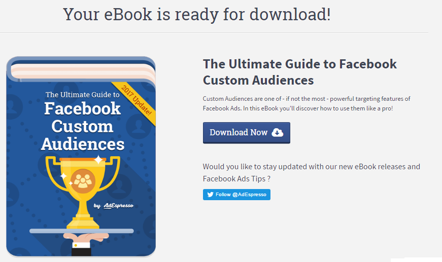
AdEspresso, an ad management tool, redirects you to the following thank you page after you sign up for an ebook:

AdEspresso’s designed an attractive graphic for the ebook, which is big enough to get your attention and give you the feeling that you’re signing up for a quality lead magnet.

The does justice to the product, and they put in some effort to convince the visitor that the book is worth the download:

“Customer Audiences are one of – if not the most powerful targeting feature of Facebook Ads. In this eBook, you will discover how to use them like a pro!”

They’ve also positioned their Twitter CTA smartly by asking a question that is likely to get a response makes it more likely that people will follow them on Twitter.

The download CTA grabs the user’s attention and allows them to get quick access to the book.

One thing that could have benefited from some changes is the font of the CTA. While the rest of the thank you page pops and uses consistent fonts, the CTA is in a different one. Not only is it inconsistent with the rest of the page but the font of the Button doesn’t convey the urgency of the action.

Signing off

As you’ve probably now seen from the examples provided that there are many uses to a thank you page and they can be employed to complete a number of tasks, from providing next steps to asking people to share your content on social media. Just remember to design your thank you page with your audience’s preference in mind and you’ll be able to do a lot with this oft-overlooked feature of digital marketing.


Photo by Kevin Butz on Unsplash
Categories: Others Tags:

Why Netlify?

April 13th, 2021 No comments

I think it’s fair to think of Netlify as a CDN-backed static file host. But it would also be silly to think that’s all it is. That’s why I think it’s smart for them to have pages like this, comparing Netlify to GitHub Pages. GitHub Pages is a lot closer to only being a static file host. That’s still nice, but Netlify just brings so much more to the table.

Need to add a functional form to the site? Netlify does that.

Need to roll back to a previous version without any git-fu? Netlify does that.

Need to make sure you’re caching assets the best you can and breaking that cache for new versions? Netlify does that.

Need a preview of a pull request before you merge it? Netlify does that.

Need to set up redirects and rewrite rules so that your SPA behaves correctly? Netlify does that.

Need to run some server-side code? Netlify does that.

Need to do some A/B testing? Netlify does that.

That’s not all, just a random spattering of Netlify’s many features that take it to another level of hosting with a developer experience that’s beyond a static file host.

This same kind of thing came up on ShopTalk the other week. Why pick Netlify when you can toss files in a S3 bucket with Cloudfront in front of it? It’s a fair question, as maybe the outcome isn’t that different. But there are 100 other things to think about that, once you do, make Netlify seem like a no-brainer.


The post Why Netlify? appeared first on CSS-Tricks.

You can support CSS-Tricks by being an MVP Supporter.

Categories: Designing, Others Tags:

Google Video Tag Position 1

April 13th, 2021 No comments
Categories: Designing, Others Tags:

GPT for Video Tag Test v1

April 13th, 2021 No comments

We (the Chrome Speed Metrics Team) recently outlined our initial research into options for making the CLS metric more fair to pages that are open for a long time. We’ve received a lot of very helpful feedback and after completing the large-scale analysis, we’ve finalized the change we plan to make to the metric: maximum session window with 1 second gap, capped at 5 seconds.

Read on for the details!

How did we evaluate the options? #
We reviewed all the feedback received from the developer community and took it into account.

We also implemented the top options in Chrome and did a large-scale analysis of the metrics over millions of web pages. We checked what types of sites each option improved, and how the options compared, especially looking into the sites which were scored differently by different options. Overall, we found that:

All the options reduced the correlation between time spent on page and layout shift score.
None of the options resulted in a worse score for any page. So there is no need to be concerned that this change will worsen the scores for your site.
Decision points

Why a session window?
In our earlier post, we covered a few different windowing strategies for grouping together layout shifts while ensuring the score doesn’t grow unbounded. The feedback we received from developers overwhelmingly favored the session window strategy because it groups the layout shifts together most intuitively.

To review session windows, here’s an example:

Read More at GPT for Video Tag Test v1

Categories: Designing, Others Tags:

Get Ready For Next Month’s Google Shakeup

April 12th, 2021 No comments

Google has been talking about the Core Web Vitals tool and the Page Experience Update for about a year now.

With the update scheduled to roll out in May 2021, now is the time to make sure your websites are prepared for it. It’s taking a lot of the best practices Google has recommended over the years and making them an official part of the search algorithm, so not taking this seriously could negatively impact your sites’ rankings.

Today, we’re going to look at everything Google has told us about the update and how to use the Core Web Vitals tool to ensure your site rankings don’t drop once it rolls out.

What We Know About the Google Page Experience Update

Google first told us about the page experience update back in May 2020. Here’s what we know about the upcoming update:

Google’s Search Algorithm Will Change in May 2021

Although there’s no specific day given, we do know that the page experience update will go live sometime in May 2021.

The Goal is to Reduce Friction on the Web

It’s not as though user experience is something that designers and developers overlook when building websites. Heck, there’s an entire disciple of UX design dedicated to it.

That said, Google hasn’t taken too hard line of an approach in enforcing its page experience suggestions, like mobile-first design, removing intrusive pop-ups, or improving page speed. With this update, though, Google is now telling every site owner that performance, accessibility, technical best practices, and SEO must be built into their websites.

Of course, the goal isn’t to create more work on your side of things. Google believes that by encouraging developers to build better web experiences that consumers will experience less friction and businesses will be more profitable as a result.

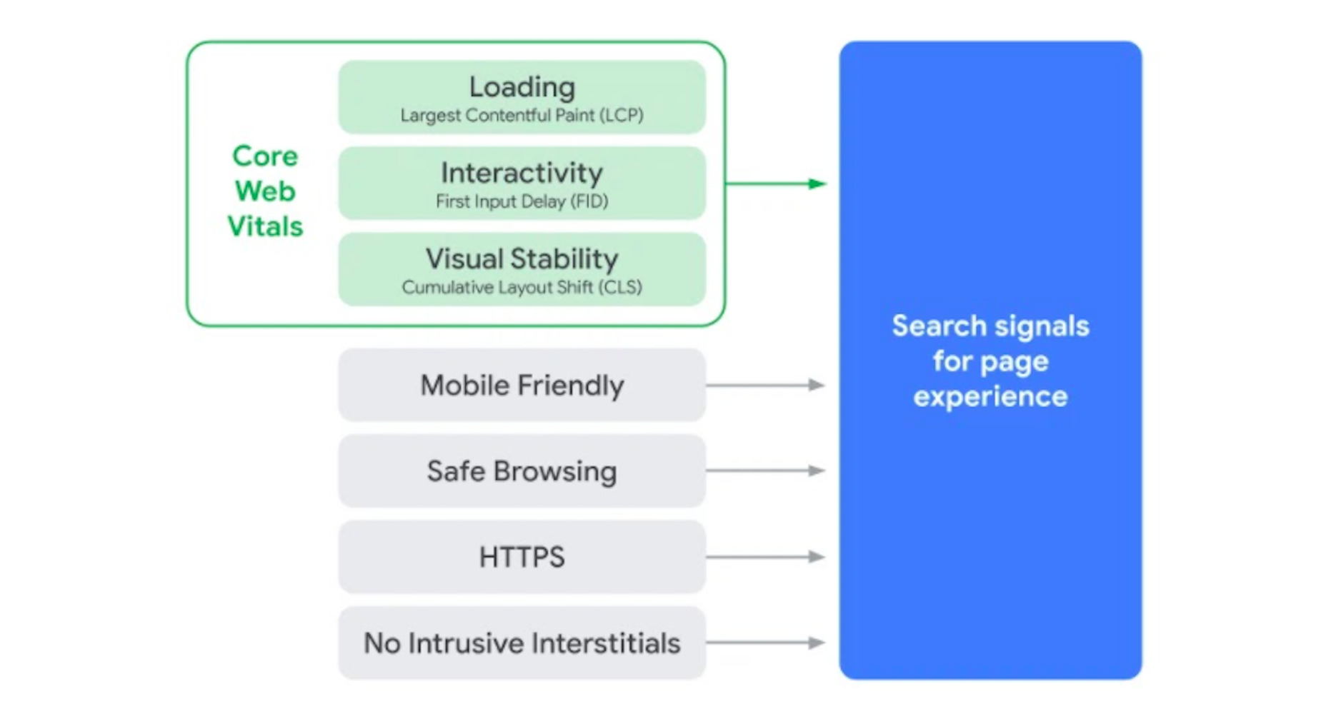
The Update Will Include Older Signals

According to Google, the page experience update is going to combine a bunch of older signals with the new Core Web Vitals:

The Core Web Vitals tool will now merge all of that data we once had to gather from various Google apps. That’ll make it more convenient for designers and developers to improve the on-page experience across a variety of areas.

The Page Experience Algorithm Will Change Over Time

Per Google:

Because we continue to work on identifying and measuring aspects of page experience, we plan to incorporate more page experience signals on a yearly basis to both further align with evolving user expectations and increase the aspects of user experience that we can measure.

So, don’t expect this to be a one-and-done thing. You’ll have to rely on the Core Web Vitals tool, and pay close attention to updates out of Google, to ensure your sites are keeping up with Google’s page experience standards.

Your Other Google Apps Have Already Been Updated with Core Web Vitals

If you hadn’t noticed, Google has already updated its other apps in anticipation of the page experience update.

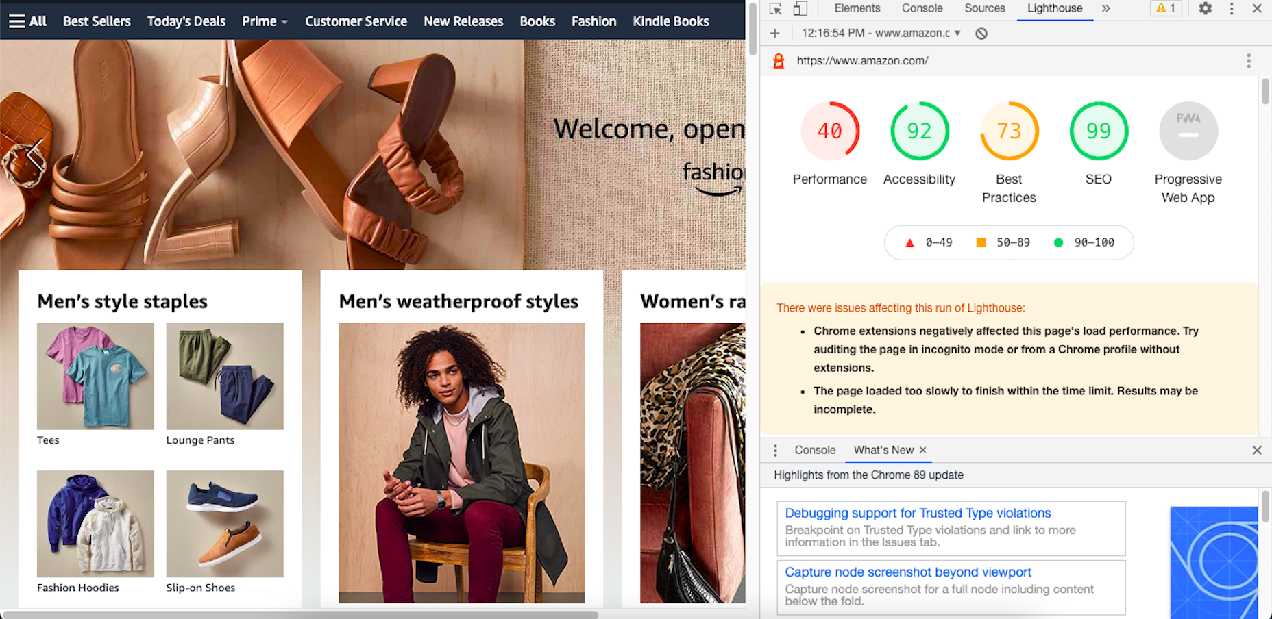
Google PageSpeed Insights, Search Console, and Lighthouse all have Core Web Vitals data in them.

Here’s an example of how Lighthouse’s report on the Amazon website now looks:

By including these metrics within the tools you’re already using, you don’t necessarily have to add the Core Web Vitals tool to your growing toolbox. That said, there are some really valuable reports in there, so I’ll show you why you may want to add it anyway.

Google’s Top Stories Will Be Affected

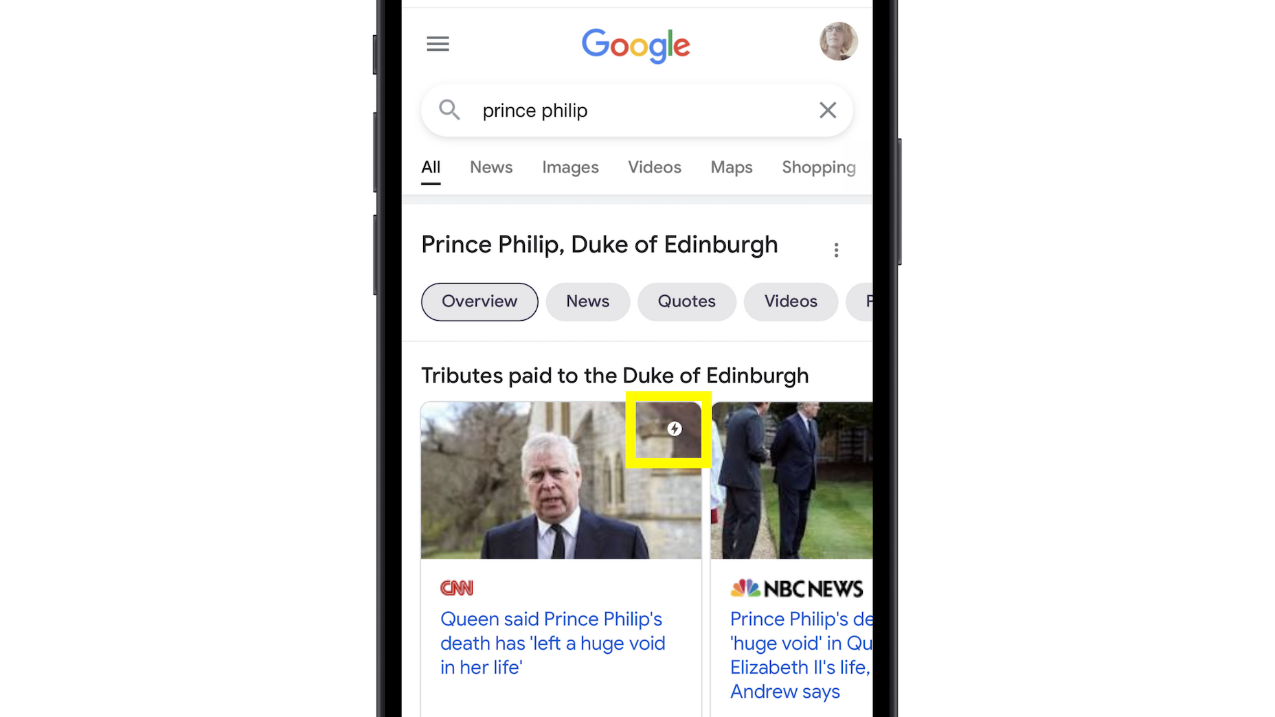
In the past when someone did a news-related search on Google, they’d see “Top Stories” results like this one:

Until now, the only pages shown here were AMP-enabled ones. 

Once the page experience update goes live, though, the AMP requirement is going away. So long as a page meets the page experience criteria along with Google News content policies, it can now rank in this section.

Google Search Results May Show a Page Experience Indicator

In the Top Stories example above, notice the AMP indicator I highlighted in yellow. Google is thinking about adding something similar to any search result that fulfills its page experience criteria.

While I think a small, eye-catching icon might draw a little more attention from Google users, I’m not sure if it’ll be that big of a deal to them. People working in this industry certainly know what that lightning bolt means, and we’ll also be the ones who recognize the page experience indicator, but I’m not convinced it’ll matter to users. 

That said, this is something Google is thinking about rolling about, so it’s something to be aware of. At the very least, you can consider it a badge of honor when showing your websites to clients and prospects who want to see what you can do for them.

Content Is Still More Important Than Page Experience

Even if a website checks off all the page experience boxes, there’s no guarantee that it’ll start to rank better than websites that haven’t. The quality and value of the content on the page still matters greatly.

Using Core Web Vitals to Measure Page Experience

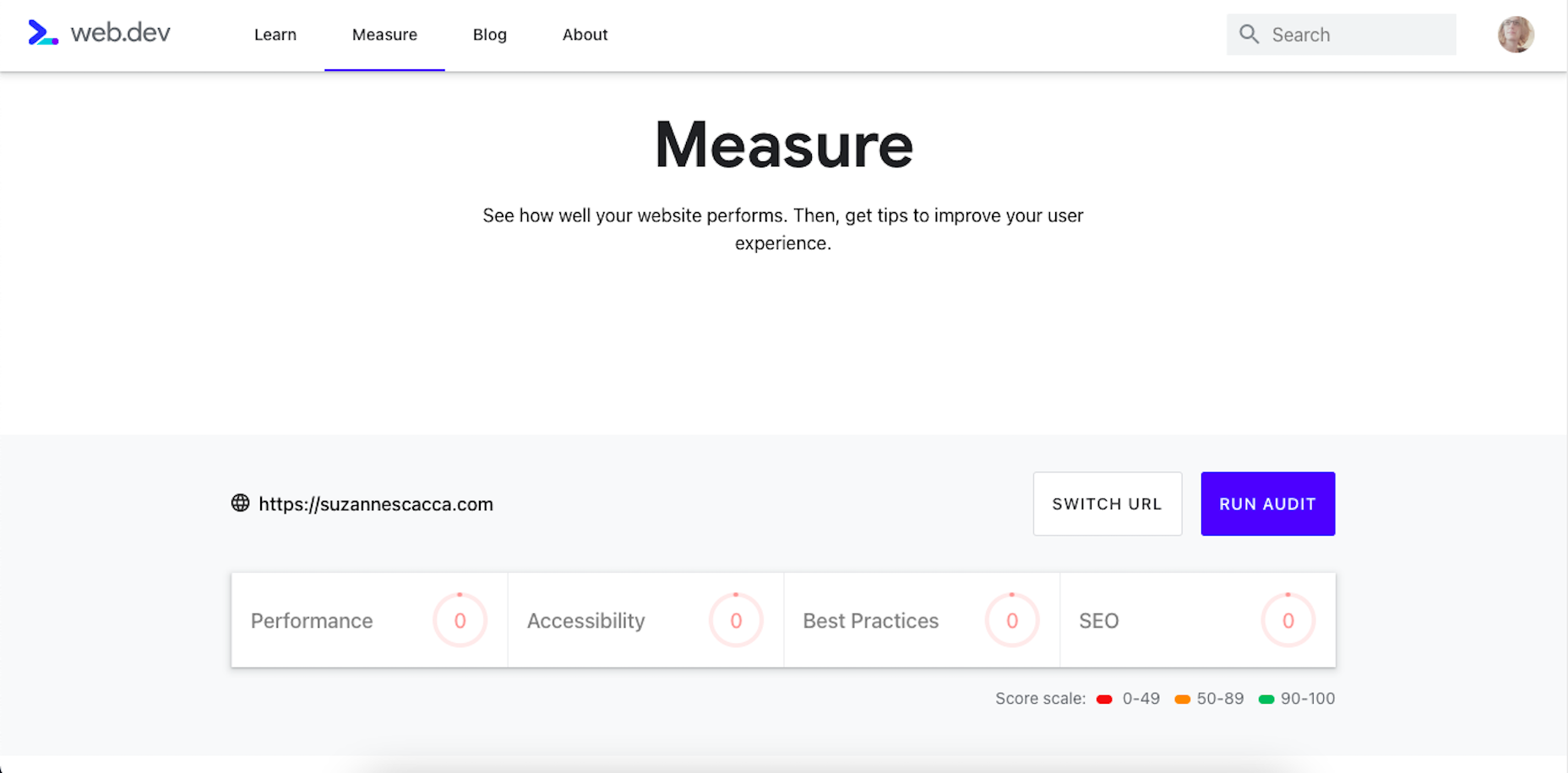
Alright, so let’s take a look at this Core Web Vitals tool. Here’s what the tool looks like when you enter the “Measure” tab:

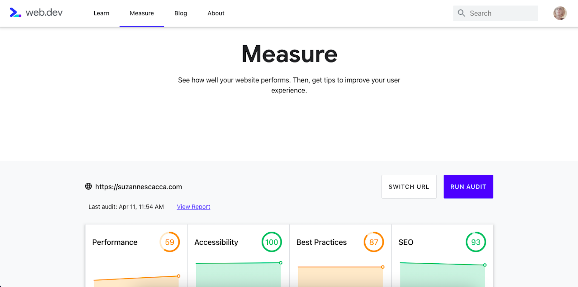
It’s like most other Google analyzer tools. You enter the URL you want to audit and let the tool run. The results then spit out something that looks like this:

Core Web Vitals are graded on four categories:

  1. Performance measures the loading speed, interactivity, and stability of the page.
  2. Best Practices focus on the technical aspects of the page, including things like having an SSL certificate and making sure images fit within the parameters of the mobile screen.
  3. SEO checks on the typical SEO signals like metadata, structured data, and so on.
  4. Accessibility reports any issues with visitors not being able to see or access parts of the page.

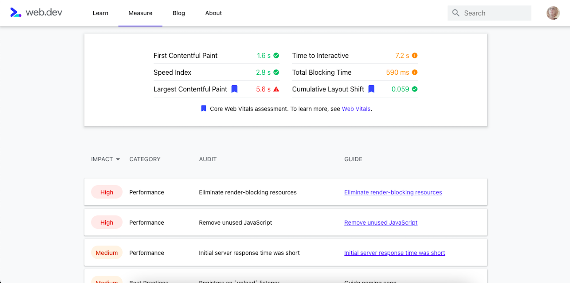
If you scroll down just a little bit on the page, there’s more data available. It mainly has to deal with the technical stuff, like page speeds and unoptimized code:

Now, this isn’t really anything new. We can get this data about load time, interactivity, and content stability from Google’s other apps.

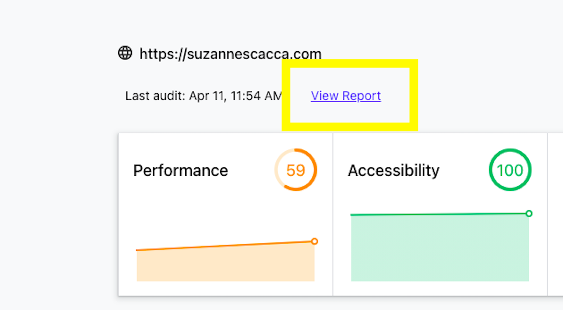
The real value is in the report, which you can access up top next to the date of your audit.

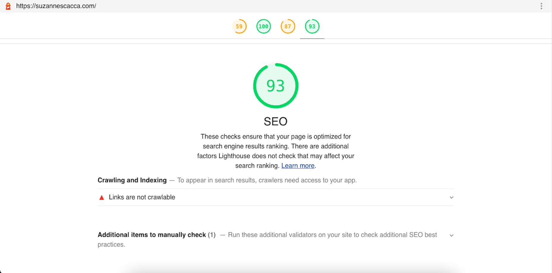
Open the report and you’ll find specific suggestions and pro tips to optimize each part of the page experience, like this SEO report:

Just like other Google tools, this one can teach you a lot about what makes one site more rankable than another. So, make sure you update your web design strategy going forward to integrate all of these ranking signals.

While you’ll have to do annual audits on your sites to see how much Google has changed the page experience signals, you’ll create less work for yourself if this baseline set of criteria are met with every site you build.

Source

The post Get Ready For Next Month’s Google Shakeup first appeared on Webdesigner Depot.

Categories: Designing, Others Tags:

11 Digital Tools that can make a Freelancer’s Life Easier

April 12th, 2021 No comments

Making $100,000 as a freelancer is not difficult. Making $100,000 and staying sane is the real challenge.

If you have been freelancing for a while, there’s a good chance that you find the above statement relatable. If, on the other hand, you are new, here’s news:

You have to wear many hats as a freelance business owner.

I use “freelance business owner” instead of “freelancer” because in order to put food on the table, a freelancer has to do almost everything a small business owner does.

Besides working on projects (duh!), freelancers have to:

  • Market themselves just like a business
  • File taxes, raise invoices, keep a track of expenses, follow up on payments, just like a business
  • Work on establishing a brand, just like a business
  • Maintain exceptional levels of personalized client servicing, just like a business

In other words, freelancers have to operate just like a business, but usually without the support of having a team working for them.

Doing all that alone, while still delighting clients with exceptional work and visible respect for deadlines is extremely challenging. 

So much so that the inability to manage all these tasks and deliver quality at the same time is perhaps the biggest barrier that stands between average freelancers and exceptional ones.

While freelancers may not have the resources that a digital marketing agency has, thankfully, in today’s time, we have tools that when used right, can enable you to squeeze out superhuman amounts of productivity from your time and efforts.

In this article, we will explore a few of the most awesome such tools. I’ve decided to categorize them into three categories. Let’s look at them in detail:

Specialised Tools

Specialised tools are the ones you need to execute your core competency. These tools vary with the varying craft of different freelancers. 

Those who work with videos will need a different set of tools than those who write ad copies. Developers and designers will require different set tools to effectively do what they do best. SEO experts will need a dependable backlink checker and content writers will need a dependable editing app.

For this reason, I will not be listing any tools under this section. As a freelancer, you may already know about the best or the most popular tools used by successful professionals in your respective field.

Even if you don’t, a series of simple Google searches ought to reveal the answer.

With that said, there are certain tools that can come in handy for all freelancers, regardless of the nature of their craft.

These will be discussed in the following sections (with my personal recommendations of the best tools):

Productivity Tools

Maintaining high levels of productivity is one of the essentials of succeeding as a freelancer. The ability to get more done in less time can be boiled down to one attribute- focus.

People like Tim Ferris (popular blogger and author of The 4-Hour Work Week) and Chris Bayley (author of Hyperfocus) have proven that with enough focus, people can produce a superhuman amount of output in a relatively small window of time.

Most productivity tools are designed to reduce distractions or restrict your access to distractions, effectively allowing you to reap maximum benefits from the resultant focus.

Most of these apps achieve this by either helping you organise your tasks and time better or by simply helping you restrict the number of things that are allowed to distract you. 

Here are examples of both:

Evernote (Organisation)

Evernote is an award-winning, extremely popular note taking app. However, the description “note taking app” gets nowhere near to explaining the exceptional organisational capabilities of Evernote. 

We’re talking about serious features like the ability to create to-do lists, manage files, manage documents like receipts, invoices, and boarding passes, and write quick notes.

One Tab (Reducing Distractions)

One Tab does exactly what the name suggests. The app allows you to create a distraction-free digital environment by remembering all the tabs you have open and then letting you choose the single tab you want to keep open.

This way, you can give your entire dedicated focus to the single open tab and when you are done with the task at hand, you can use One Tab to find all the other tabs that you had open before.

Coggle (Organisation)

Coggle is a web application that allows you to create detailed mind maps, even if you are a beginner. 

If you don’t know about them, mind maps are an excellent way to organise your thoughts and Coggle is an excellent yet incredibly intuitive and user-friendly mind map creator. 

Pomodoro Timer (Reducing Distractions)

Pomodoro Technique is a well-known productivity technique that involves splitting your time into a long and productive window followed by a short “break” window.

Pomodoro Timer allows you to do exactly that. You can choose between the traditional 25 minutes of “work time” and 5 minutes of “break time” cycles or customise them according to your comfort.

Collaboration Tools

If you are trying to survive in the world as a remote resource or professional, having access to popular and effective collaboration tools is an absolute mandate.

While many of the collaboration tools you use will fall into the category of specialised tools (like Freame.io for video producers), there are others that can prove incredibly useful for most freelancers:

Slack (Communication)

Team communication tool Slack probably needs no introduction. Still, if you don’t know about it, the tool is a Godsend when it comes to managing multiple streams of communication. You can create group chats for different projects, include different people in different groups and ensure you never miss out on any communication from a collaborator or a client.

Google Drive (Document Storing/Sharing)

Google Drive is another well-known cloud platform. It allows you to store documents and share them with anyone seamlessly. Connected apps such as the Google Docs and Google Sheets allow you to collaborate with clients and collaborators on the same document.

Marketing Tools

Marketing oneself effectively is perhaps the most important thing that successful freelancers do better than their average counterparts.

With limited resources, budget, and time, freelancers must be very careful about the marketing strategies they employ so as to produce maximum possible benefits by investing as little time and effort as possible.

Here are a few tools that will help you automate the most time-consuming parts of your marketing efforts:

GMASS (Cold Email Outreach)

Cold emails have been responsible for the beginning of several great businesses and is a widely used strategy by many successful freelancers.

With that said, cold emailing is hard. GMASS takes some of the pain out of cold emailing with its amazing features that allow you to send customised emails and automated follow-ups.

The best part is that GMASS is free to use as long as you are sending up to 50 emails a day.

ActiveCampaign (Email Marketing)

If you have an email list, email marketing can be a powerful marketing tool. ActiveCampaign allows you to create custom drip campaigns that let you automate your marketing efforts, saving you hours’ worth of work.

Zapier (Automation)

Zapier is a popular automation tool that connects with your online apps like Gmail and ActiveCampaign. It then allows you to integrate the apps and create automated workflows without having to depend on coders or having any coding expertise. Such integrations can then be used to automate repetitive tasks, letting you accomplish more with less effort.

LinkedIn Sales Navigator (Social Selling)

Sales Navigator is one of the more pricey tools on this list but if you are selling services to other businesses (something most freelancers do), it can be an incredible addition to your marketing arsenal.

Sales Navigator allows you to laser target prospects from LinkedIn’s database with customised messages and InMails.

Invoices And Documents

Producing documents like contracts and invoices, and getting them signed is one of the most mundane but most important aspects of being a freelancer.

Such documents don’t just ensure that you are getting paid for your efforts but also help you to present yourself professionally in front of prospective clients and ensure complete clarity of tasks and responsibilities associated with various projects.

In other words, taking care of the legal side of the business allows you to ensure a smooth and delightful experience for yourself and for your clients.

Some of the most popular tools used by freelancers for producing and managing legal documents and accepting digital payments are:

HelloSign (Legally-Binding Digital Signatures)

HelloSign allows you and your clients to sign legally binding contracts without having to physically be present in the same location. It accomplishes this by letting users upload their own signatures that can be used on contracts.

Payoneer (Payments)

Payoneer is a well-known online payment platform. It allows freelancers to collect online payments from clients. The clients are free to choose from a variety of payment options and freelancers can even accept payments from international clients.

Conclusion

Having the right tools will help you get more done with less effort. This doesn’t just let you improve your productive output, it also enables you to avoid complete burnout in the long run.

With those points in mind, it is safe to say that having the right “tech-stack” is just as important for freelancers as it is for online (or offline) businesses.

Did I forget to mention your favorite digital tools? Share them with me (and everyone reading this) in the comment section below!


Photo by Ewan Robertson on Unsplash
Categories: Others Tags:

Promoting Your Apps with Video Content the Right Way

April 12th, 2021 No comments

So, you’ve spent months and months programming and designing an app for your business, and now finally, it’s time for the world to use it. But wait! How can anybody download your app if they don’t know it exists? Exactly, no awareness equals no downloads!

This is where video marketing comes in

Videos are the most effective and engaging tools for brands looking to start an active conversation with their target audience. That’s why app developers tend to team up with the finest video companies out there to come up with content that captivates potential customers and prompts them to download and install!

So, in this piece, I’m going to show not only why videos are the best possible form of content to promote your app, but also let you in on some of the most useful professional tips for creating your piece.   

Let’s get started, shall we?

First of All: Why Video?

When it comes to shopping online (an app or any other product or service), it’s essential to remember that most people buy with their eyes. Audiences only trust what they can see, which explains why a video excels at turning curious visitors into happy customers.

Moreover, describing an app to someone who hasn’t tried it can be a tricky thing. Therefore, why would you try to explain how your app looks like when you can just show it to your audience using video? With a carefully crafted and engaging piece, you can showcase your app more compellingly and effectively than with any other medium. 

Even if you’re just beginning to develop your app, you need to start thinking about creative ways to communicate your creation visually! 

Consider that the initial contact most people will have with your app is going to be through a video embed on your app profile or posted on social media, so you better make a good first impression!

Best Types of Videos to Promote Your App

If you’re serious about using promotional videos in your marketing strategy (and you should!), then you have to take full advantage of the medium. This means creating different kinds of videos according to where your audience is on their customer journey. 

Here are the three most popular and successful types of video that will help you achieve this goal:

1. Awareness Stage: Explainer Video

The journey starts at the awareness stage, way before your future clients ever heard of your company and your app. For now, your target customers have identified a need or a problem and are looking for possible ways to solve it. 

Explainer videos are perfect at this stage since they are educational pieces that aim to offer valuable information. Their goal isn’t to directly sell but rather to explain to your audience how their pain point could be solved using your app. The most effective ones use animation and relatable characters to illustrate their point, like the following example.

2. Consideration Stage: Product Demo

Once your prospective customers have done a fair amount of research on the subject, they move towards the consideration stage, where they create a shortlist of options. Your goal is to make it on that list, and you can do that with a product demo that shows the benefits of using your app.

Product demos are simple and direct pieces that enlist your app’s most attractive features. By taking advantage of the awareness you’ve created during the previous stage, you can now use this video to differentiate your app from its competitors and reach the next stage of the customer journey.

3. Decision Stage: Customer Testimonial 

And we’re almost there! The last stage of the customer journey is the final stretch before downloading your app. Sometimes awareness and consideration aren’t enough, and users may look for what other people have to say about your app.

Customer testimonials are a great way to show the human side of your company since they turn the spotlight away from your app and towards the happy customers you’ve helped. People trust other people, so a good and honest review may be all it takes for your audience to finally download your app. 

Tips and Tricks to Create the Perfect Video for Your App

It doesn’t make a difference whether you’re developing a gaming or educational app; there are a few ground rules you’ll need to follow when editing your piece. And here they are:

Always start with an optimized script

When you think of a script, the first thing that comes to mind is probably a film script with dialogues and acting instructions. But your marketing video also needs a script. 

Even if your piece is going to be composed entirely of footage from your app, every second of it should be laid out on paper. Think of it as a way to structure your production process or a draft where you can state your video’s most important ideas. 

Keep it as simple and short as possible

In the age of multitasking, the time has become a treasure. And you better not waste any minute of your audience’s valuable time with a long and complex promotional video! 

As a general rule, try to keep your video short (less than 90 seconds would be perfect), and stick to a light and friendly tone for your message. 

If you feel you need more than 90 seconds to convey your message or that you have to use overly technical jargon to promote your app – and sometimes, you might – you probably should take some time to try and optimize your script first.

Show your app in action (but don’t overdo it!)

Your video is the closest thing your audience will get to experience your app before downloading it. So, you better make it count! This involves using a wide range of UI footage from your app, showcasing the different features that will make them want to use it.

But here’s an extra tip: you don’t want your audience to feel like they’ve seen everything your app has to offer. Your video should intrigue your viewers while also letting them know that they should download your app if they want the full experience.

Adding Videos to Your App Profile

Besides sharing your promotional videos on social media, you’ll want to consider that platforms like Google Play and Apple’s App Store let you add a video right on your app’s profile. Differences between these two stores are substantial, so there are a couple of technical requirements you’ll want to keep in mind.

Google Play

The main app store for Android devices offers creative freedom, so you can use any type of video you want. They don’t impose a length limit either, though they recommend your video to be between 30 secs and 2 minutes (which I would also recommend even if it wasn’t a technical requirement!). 

Plus, Google Play has a video location option, which means you can create alternative versions of your video videos in different languages. And one last technical requirement: you have to host your video through YouTube. So, first, upload your piece on that platform and then embed it on your profile. 

The App Store

The iOS platform has more strict guidelines about how your video (or “app preview”, as they call it) should look. They require your video to be 30 seconds long and only use captured footage of your app – with no animation or people interacting with the device. 

Another guideline is that videos on the App Store should be device-specific, which means you can optimize your piece’s size for different screen resolutions and offer a better experience for mobile and tablet users. And, since Apple doesn’t offer a video location option, try to limit the copy of your video to maximize engagement globally.

Wrapping Up

In this article, I’ve shown you how a content strategy based on video gives you an ideal avenue to promote an app successfully. But, as you probably know, the app industry is an ever-changing phenomenon… and so is digital marketing!

So, keep in mind that chances are this article doesn’t have the final word on video promotion. However, that’s a good thing! 

The goal was to give you a solid place to start. So that you begin to understand what videos, done right, can bring to the table in terms of app promotion.

Start using the things we’ve discussed here, and see those downloads tick up!


Photo by Wahid Khene on Unsplash
Categories: Others Tags:

How to import data from Shopify to WooCommerce

April 12th, 2021 No comments

If you find your current store no longer suitable for your business, it’s time for you to take re-platforming into consideration. Migrating data between eCommerce platforms is a tough task that requires precision.  

In case you want to migrate your Shopify store to WooCommerce to experience the open-source nature, look no further because you are in the right place. Shopify and WooCommerce are two of the biggest names in the eCommerce industry. However, due to Shopify’s hosted nature, many merchants find it cumbersome when it comes to customizability, SEO features, or even transaction fees.  And WooCommerce – an open-source platform – seems to be an ideal solution at this time. This platform is in the top-list eCommerce platform in the market because of its endless flexibility and customization. Unlike Shopify, WooCommerce allows you to have full control over your website without limitations.

In today’s article, I’ll be showing you how to import from Shopify to WooCommerce in 2 possible ways:

  • Manual migration
  • Automated migration tool

Read to the end of this article to figure out all the detailed steps to perform the migration from Shopify to WooCommerce!

Table of content

  1. Manually import Shopify to WooCommerce
    • Exporting data from Shopify
    • Importing data to WooCommerce
  2. Import using an automated tool
    • Preparation
    • Migrate with LitExtension
    • Post-migration activities
  3. Don’t have time to migrate by yourself?
  4. Final words

1. Manually import from Shopify to WooCommerce

First and foremost, manual migration is the process that you need to import from Shopify to WooCommerce using a CSV file that contains your data. This complicated process requires a high level of technical knowledge, or else, you will probably make some unwanted errors during the migration.

Exporting data from Shopify

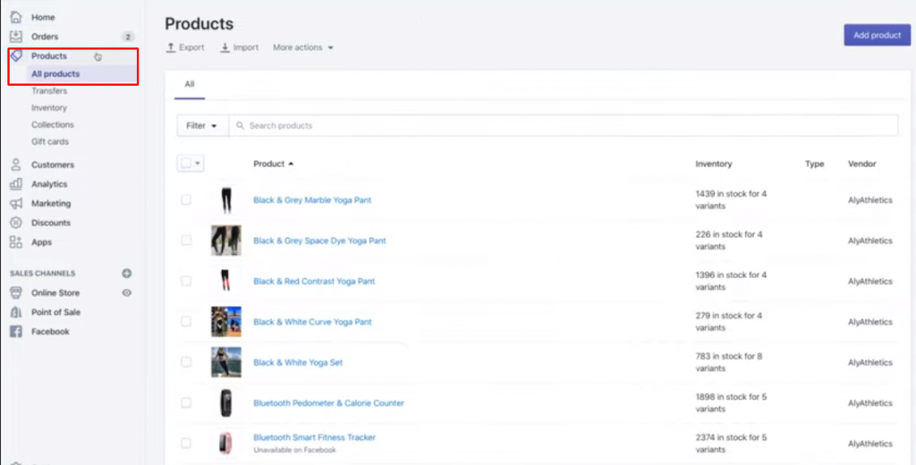
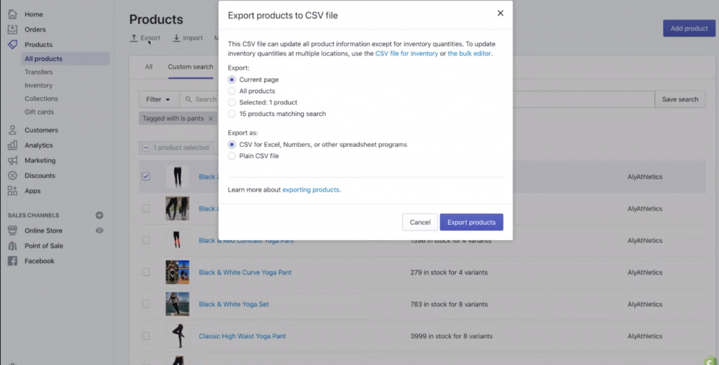
1. From your Shopify main dashboard, go to “Products” and choose “All Products”.

Note: Whenever you want to export only some of your products, you can filter your product list to view and select specific ones for export.

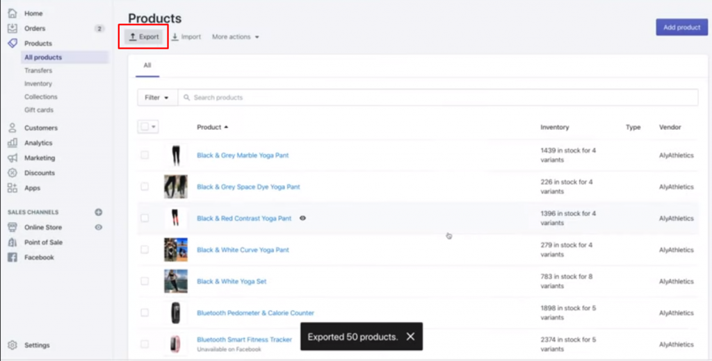
2. Select “Export”.

3. From the dialog box, choose the products you want to export and also the CSV file format which is shown as in the picture below:

4. Hit the button “Export products”.

After exporting your data, you need to check your product variants or image URLs whether they become separated. You should be careful that when you import a CSV file that has been specifically chosen, it might duplicate your existing products with bad data which cannot be recovered.

Importing data to WooCommerce

Then, you’ve already had your CSV file which contains all the necessary data to import from Shopify to WooCommerce. It’s time to add new products.

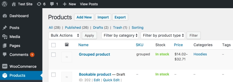
1. Go to WooCommerce’s dashboard to select “Products”.

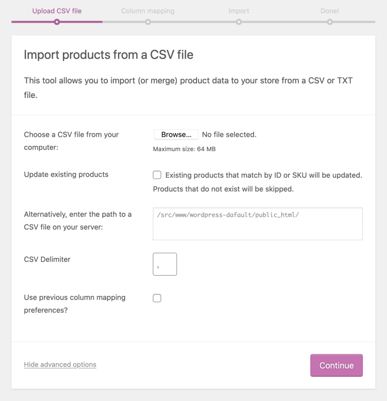
2. On the screen, choose “Import” and there will be an “Upload CSV File”.

3. Select “Choose File” to upload the CSV file in the previous step and click “Continue”.

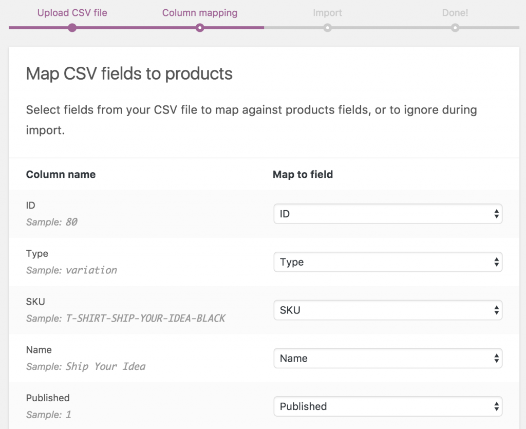
WooCommerce will automatically undertake to match your CSV to “Fields”.

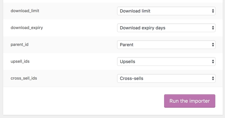
4. Use dropdown menus on the right side as in the picture below to adjust fields or indicate “Do not import”.

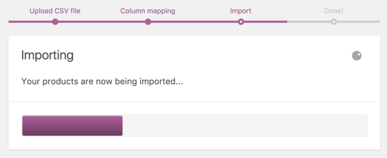
5. Click on “Run the Importer”.

6. Wait until the Importer is finished.

Keep in mind that you can’t interrupt the progress by refreshing or touching by all means.

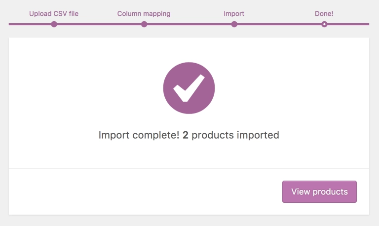
7. The last step is clicking “View products” to check the result.

While choosing manual migration, there’s no worries about the data security or migration fee at all since you have to take care of the migration yourself. However, unless you are tech-savvy, it might take you considerable time and effort to finish. Moreover, you need to understand thoroughly both platforms’ database structures to avoid incompatibility. 

Notably, Shopify only allows merchants to export a few specific entities like customers, products, orders, gift card codes, discount codes, and financial information. And WooCommerce doesn’t allow the data type that users can import to. Therefore, if you want to transfer more than just the above-mentioned data, this method is not really a good deal for you. 

2. Import using an automated tool

Another solution is to use an automated tool to import from Shopify to WooCommerce. I highly recommend using LitExtension automated tool to transfer all your data including products, customers, orders without a hitch. This is the easiest, fastest, and most secure way to migrate your data from one eCommerce platform to a more robust one. Plus, you can also experience the service with a free demo to see exactly the whole process works.

Here are some benefits that you might get while using LitExtension services:

  • Your store’s data is completely safe because LitExtension experts use SSL encryption to run the migration. 
  • LitExtension offers a very affordable price starting from $29 that you can move up to 100 products, 100 customers, 100 orders.
  • The experts assure 0% data loss with the advanced technology system and professional customer service team.

Preparation

Before taking the first step, you need to prepare a few things including backing up your data, installing WordPress, and setting up your WooCommerce store. 

1. Create data backup from Shopify

Close attention should be paid to this process, as it can ensure the security of your data in case the migration doesn’t go smoothly. To put all the data into the Shopify stock, you can follow 3 ways:

2. Install and setup WooCommerce store

If you already have a store on Shopify, moving to WooCommerce might be a big obstacle to overcome due to its open-source nature. Nevertheless, following the instructions below can easily get your job done.

Firstly, you need to choose a hosting plan and install WordPress. Many hosting companies offer pre-installs of WordPress, so make sure you check for this option whether it’s available or not. Following this guideline to install and set up your WooCommerce store.

In case you want to manually install WooCommerce using phpMyAdmin and an FTP Client, here’s a detailed tutorial video:

Migration from Shopify to WooCommerce with LitExtension

Step 1: Create a LitExtension account

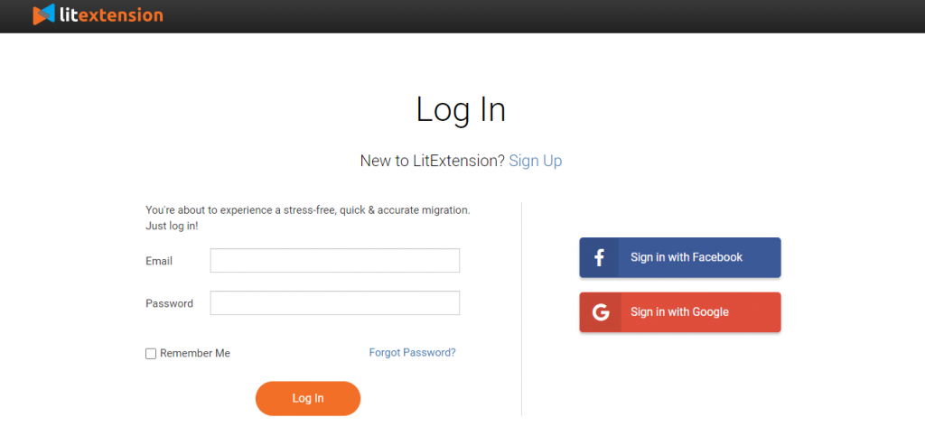
To begin with, you sure need an account. On the LitExtension homepage, you can use your Gmail or Facebook to Register an account to create a new migration.

Register/Login to LitExtension site

Step 2: Fill your Shopify and WooCommerce information

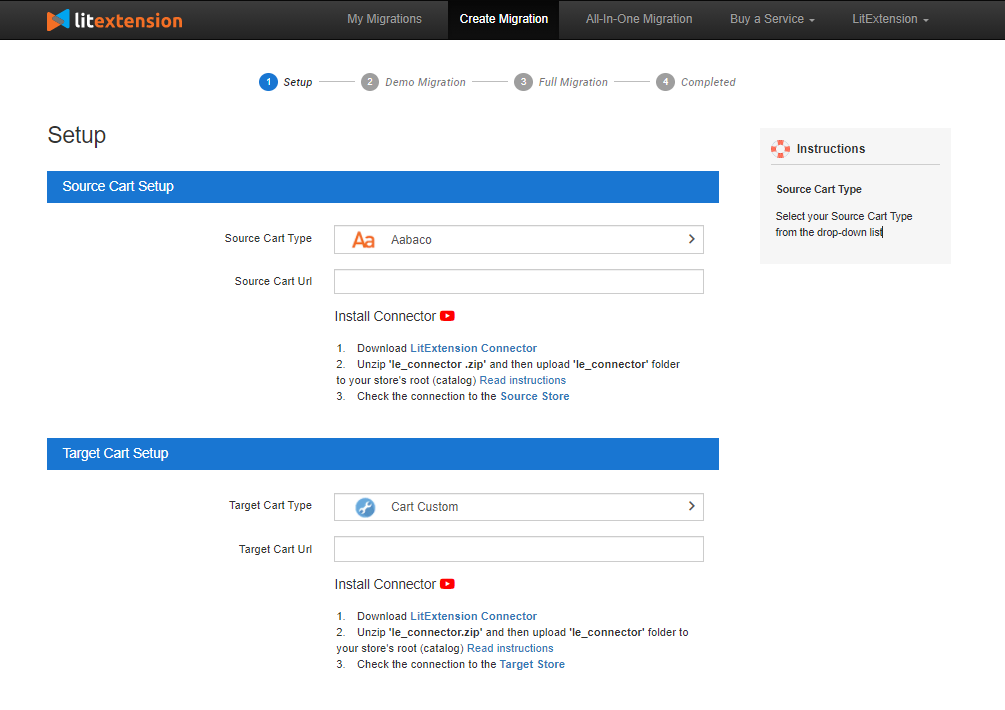
After logging in, click Create New Migration at the top right button. In the Source Cart setup step, choose Shopify as Source Cart and fill out the store URL, API key, and password. 

LitExtension has detailed instructions to guide you on how to get each information on the right side of the screen.

Filling in information

Next, set up your Target Cart by choosing WooCommerce and provide your store URL. After that, download LitExtension Connector, extract the zip file, and upload it into WooCommerce’s root folder.

Step 3: Configure Shopify to WooCommerce migration

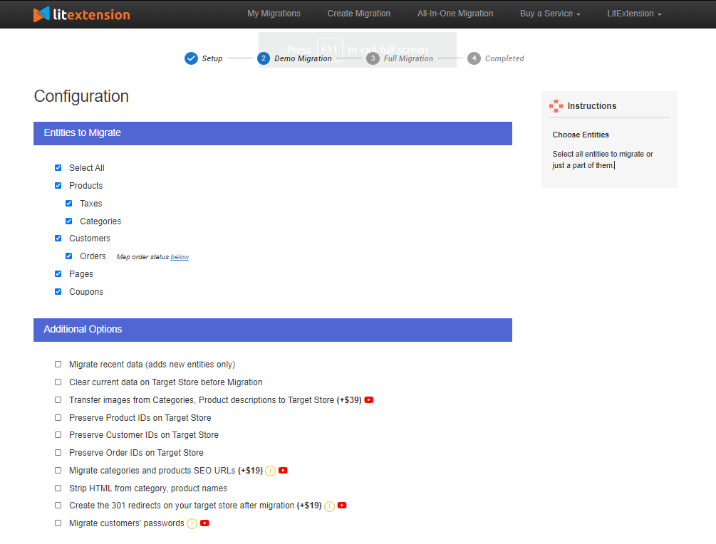
The next step is hitting the button “Next: Configure your Migration”. You can select all entities or just a part of what you want to transfer.

Select entities you want to migrate

Moreover, LitExtension also offers Additional Options to extend the migration possibility. These options include free and paid ones. You can choose every option or select a specific one such as preserving product IDs on the Target store, Strip HTML from the category, product name, and so on.

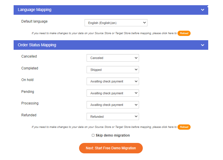
The merchants can also match Languages, Order Status, and Customer Group to display consistently in the new WooCommerce Target Store.

Step 4: Perform the migration and check results

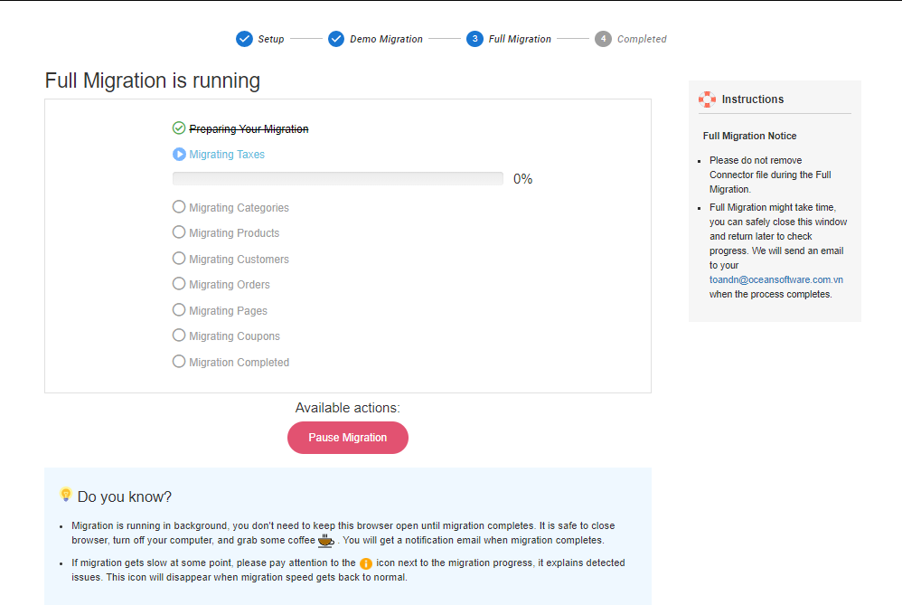
I suggest that you should try a free demo migration by clicking “Start Demo Migration”. You can only transfer 20 certain entities for your demo migration. If you decide to perform a full migration right away, you will need to make a payment first. After purchasing, your migration will be ready to start.

Once the migration starts, it will run smoothly on the server. You can safely turn off the PC while the data is being transferred. Take a break and you’ll be notified via email when the process is completed.

Step 5: Check results after the migration

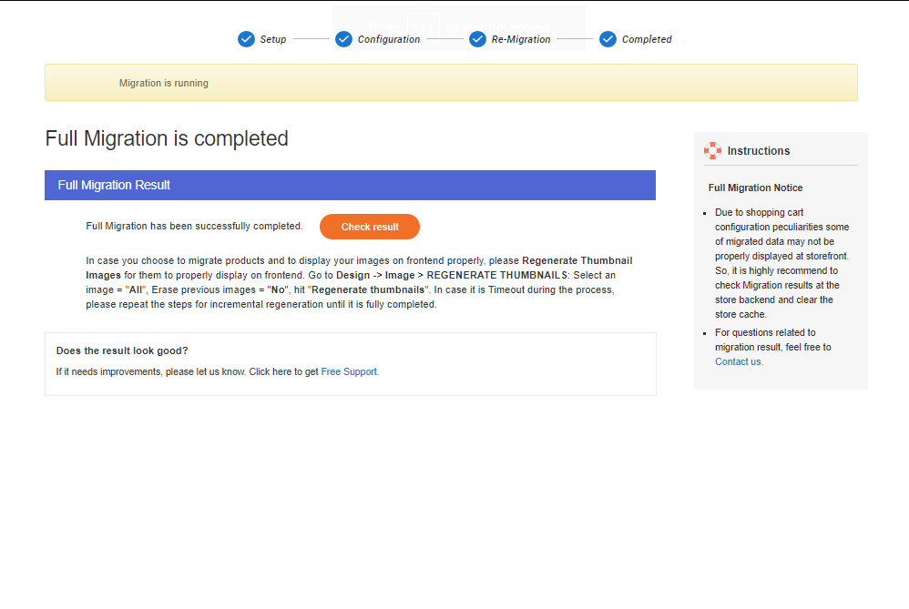
Now, you have transferred all your data to the new WooCommerce store, click on the orange button “Check result” to double-check everything. 

Please follow the list here:

  • Ensure all your data displays correctly on your frontend and backend.
  • Make sure all your data appear consistently in the onsite search, catalog, and also under the categories.
  • Check out every link in menus, header, footer, and inside the pages.
  • Try making a purchase in your new store.

Don’t know how to check the results? Click this article for more information or contact the LitExtension support team.

Post-migration activities

Here is the checklist to finish your new WooCommerce store after the migration.

1. Design themes

Choosing a new look for your new store is the priority which plays a crucial role in grabbing customers’ attention.

Unfortunately, LitExtension can’t migrate your theme and template from your Source Store. Therefore, you need to choose a new theme that looks similar to the old one or apply a completely brand new one. Go to WooCommerce’s theme store to get a suitable theme.

2. Add new extensions

Clearly, extensions can extend your website’s ability, boost your store performance and bring your visitors a better shopping experience.

Up to now, WooCommerce offers over 400 free & paid plugins for you to choose from. For each plugin, you can easily look up the detailed information to install and setup.

3. Migrate newly appearing and edited data

During the migration process, LitExtension still keeps your old Shopify store operating normally.  Thus, you still receive new orders and customers while setting up your new WooCommerce store. This is when services such as Recent Data Migration, Smart Update, and Re-migration come to help.

  • Recent data migration allows you to migrate newly added entities to the Target Store during or after the first full data migration.
  • Smart Update allows you to update data that has been modified and migrate those that recently appear in your Source Store during or after the initial full migration. 
  • Re-migration service lets you migrate your data all over again.

Don’t have time to migrate by yourself?

In case you don’t have plenty of time to import from Shopify to WooCommerce, there’s another option for you. LitExtension also provides you with the All-in-One migration full service. Your shopping cart project will be well-handled with a Personal Assistant who takes care of every step from beginning to end and supports you whenever needed.

Most importantly, the cost for the All-in-One solution is more reasonable than you might think, check out this estimator to predict the price.

Conclusion

In conclusion, you’ve already known how to import from Shopify to WooCommerce in 2 possible ways. I hope this article will help you to visualize the whole process, and help you get a pleasing experience.

Thanks for reading and good luck!


Photo by Roberto Cortese on Unsplash
Categories: Others Tags: