Archive

Archive for April, 2021

Popular Design News of the Week: April 5, 2021 – April 11, 2021

April 11th, 2021 No comments

Every day design fans submit incredible industry stories to our sister-site, Webdesigner News. Our colleagues sift through it, selecting the very best stories from the design, UX, tech, and development worlds and posting them live on the site.

The best way to keep up with the most important stories for web professionals is to subscribe to Webdesigner News or check out the site regularly. However, in case you missed a day this week, here’s a handy compilation of the top curated stories from the last seven days. Enjoy!

Designing SaaS Products in 2021

Sticky Headers: 5 Ways to Make Them Better

3 Essential Design Trends, April 2021

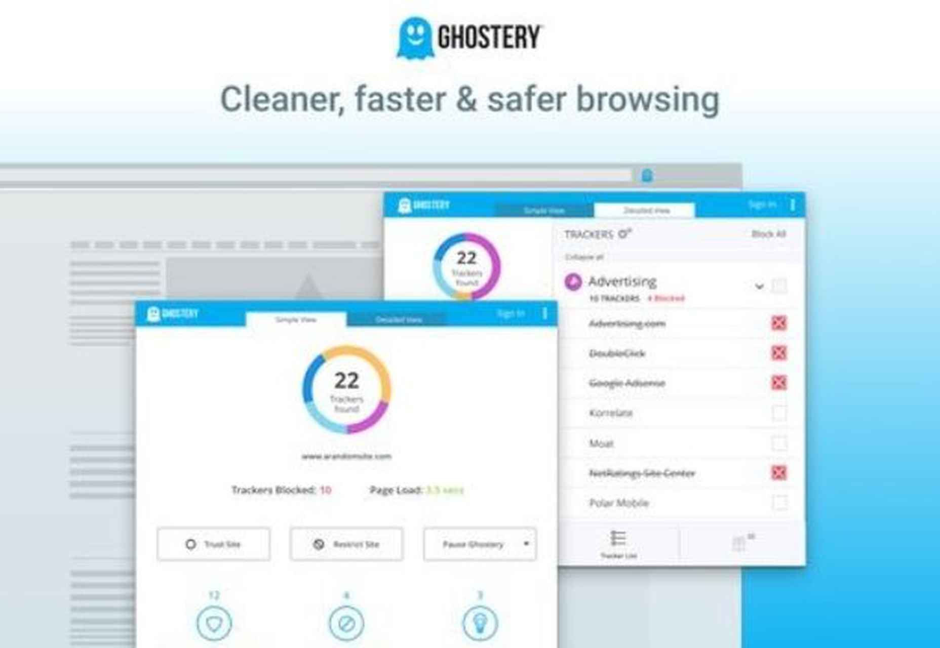
15 Best Firefox Extensions for Web Designers

7 Skills You Need To Thrive As A Web Designer In 2021

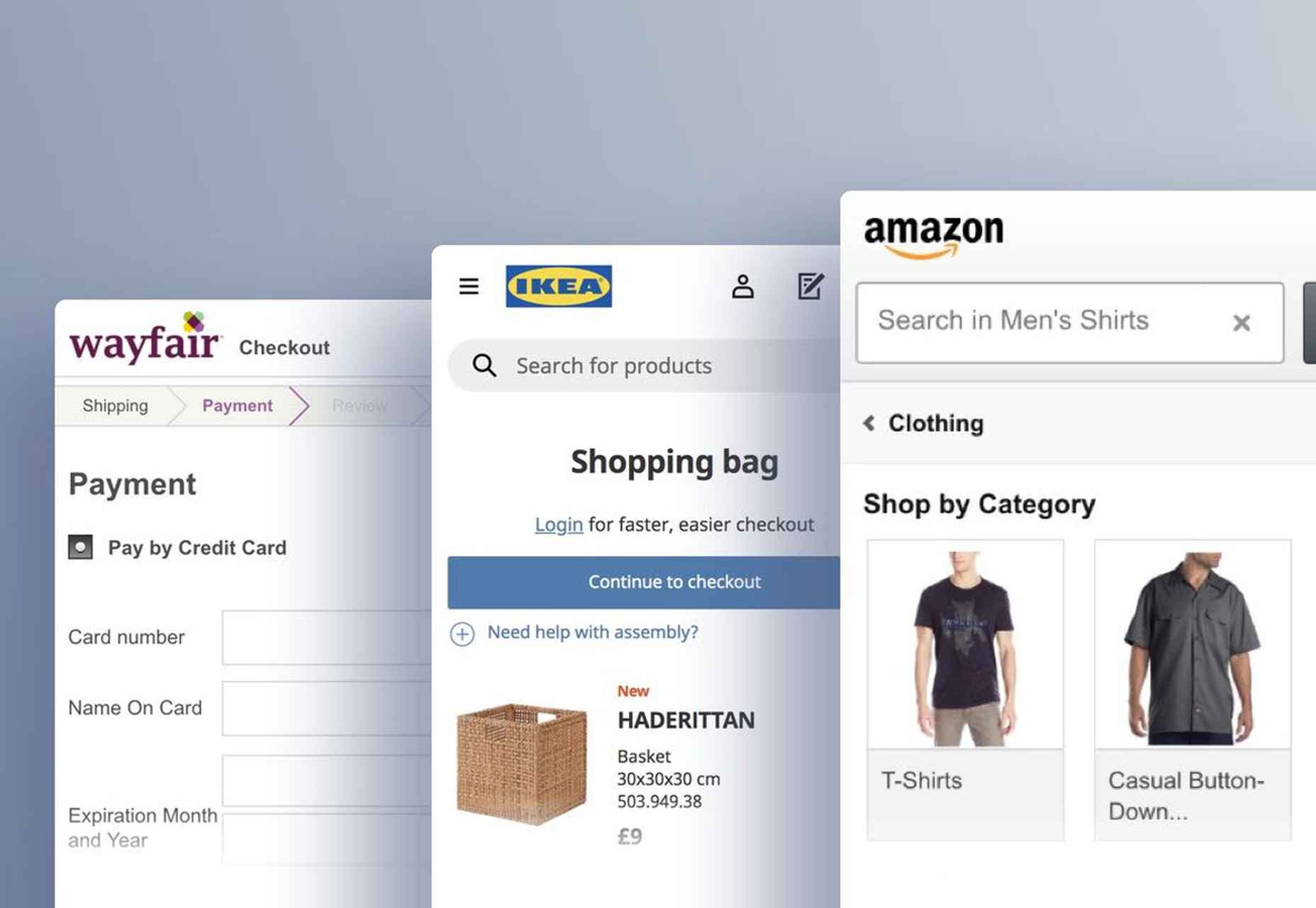
The Current State of Mobile UX (18 Common Pitfalls)

What Is UX Design?

Stop Asking For UI Design Feedback, Do This Instead

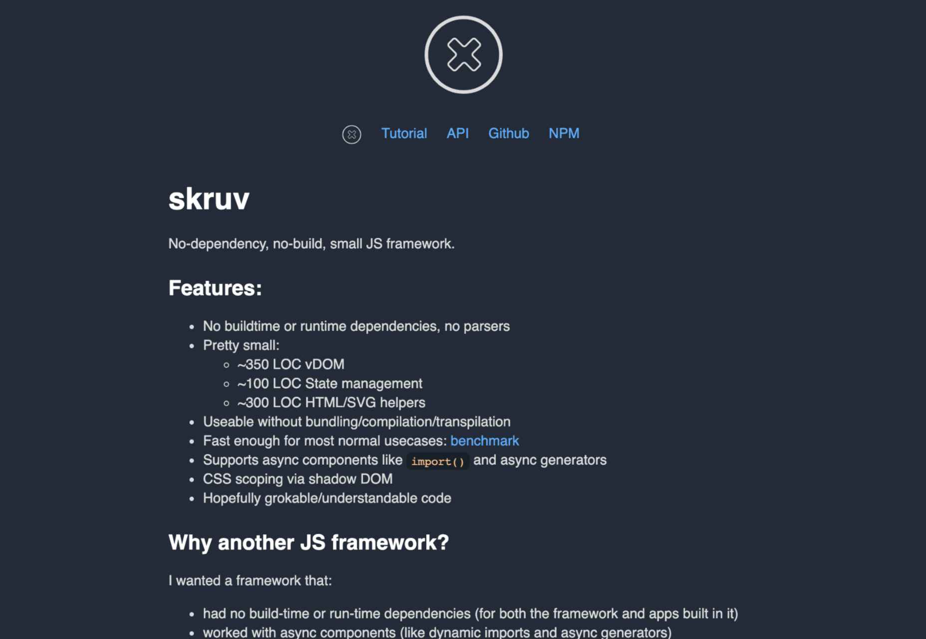
skruv: No-Dependency, No-Build, Small JS Framework

2021 Redesign or: How I Learned to Stop Art Directing and Love the Blog

15 Best CSS Auditing Tools for Developers

Top 14 Skills Every Web Designer Needs To Be Successful In 2021

The Era Of Cookie-Cutter Web Design Is Ending

Reduce Bounce Rate by Fixing These 7 Web Design Mistakes

Guide To Building A UI Design System

Source

The post Popular Design News of the Week: April 5, 2021 – April 11, 2021 first appeared on Webdesigner Depot.

Categories: Designing, Others Tags:

Stark Launches Public Library For Accessibility

April 9th, 2021 No comments

Inclusive design is all about designing sites with everyone in mind instead of designing for your own preferences. It’s an essential component in a professional-grade site and the cornerstone of a successful project.

Accessibility (A11y for short) is the technical branch of inclusive design. Accessibility is a science: it knows what markup is required to make the text available to the visually impaired; it knows the minimum button size for someone with limited motor control; it knows how complex navigation can be for someone with cognitive dysfunction. Accessibility is the engine that powers an inclusive design.

Because accessibility is so complex, it takes a huge wealth of knowledge to do it well. Luckily for you and me, there’s now a free resource you can use to brush up on your skills and improve the ROI of your site.

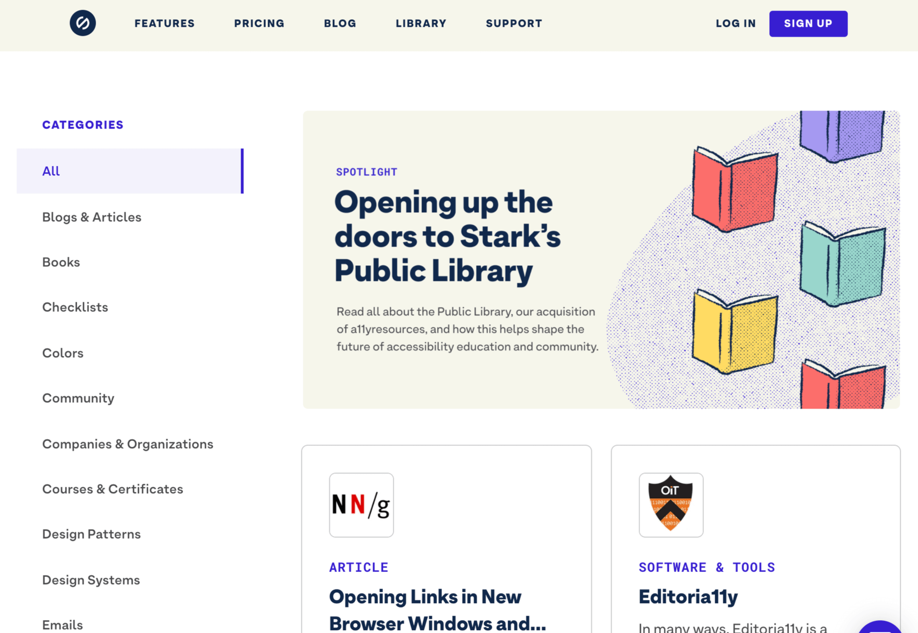
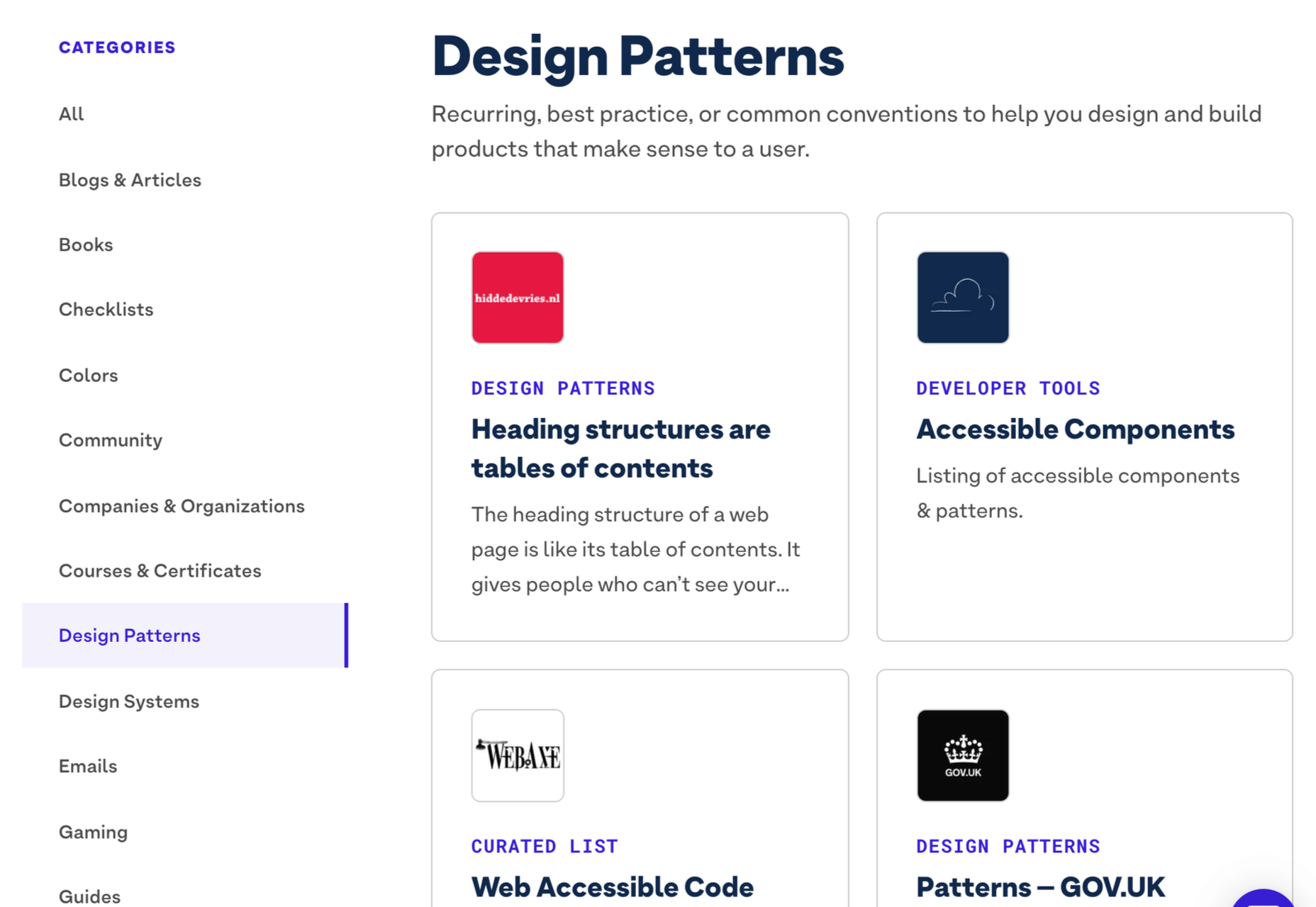
Stark has just acquired a11yresource and relaunched it as the Stark Public Library — reportedly the largest accessibility resource on the web. The library contains around a thousand different resources. You’ll find blog articles, checklists, formal courses, tools, links to web standards, and a whole lot more. As the library grows, the expectation is that Stark will add new features aimed at fostering a community.

Stark is a suite of accessibility tools for designers that integrates with XD, Sketch, and Figma. It’s free to use the basic package, and the commercial plan is $60 per year. The Public Library is free for everyone to access.

Source

The post Stark Launches Public Library For Accessibility first appeared on Webdesigner Depot.

Categories: Designing, Others Tags:

Poll: Should You Fire Good Clients?

April 9th, 2021 No comments

We all get excited about new projects; we’re daydreaming about possibilities from the first contact with a potential client. Most professionals have an established onboarding process, with contracts to sign and business assets to acquire; if you’re a coder, you probably set up a fresh new repository; if you’re a designer, you create a new project folder. All of us start imagining how the case study will look in our portfolio.

But few, if any, plan for the end of a project. Offboarding clients simply isn’t a thing. We build their site, and then one day, we don’t.

It may be that the client moves on; hopefully, you’ve done a good enough job that they can’t resist bringing you on board for their next startup. All too often, projects languish in some half-life, with occasional security patches that net you a whole $5 in service charges; is that why you got into web design? Probably not. There is the desirable option of upselling; if your client’s business grows due to your work, then more work should grow it some more.

If you’re great at startups, you’re probably not great at maintaining sites in the long term. If you’re great at maintaining sites, you’re probably not great at growing them.

For every cycle of a project’s life, there are different kinds of professionals who suit it best. And conversely, different cycles of a project suit you and your skillset better than others.

We all know that a bad client — demanding, rude, late at paying — should be fired. But what about a good client — a client who pays quickly, is friendly, professional, accommodating? Would you fire a good client if you’d outgrown the work?

Source

The post Poll: Should You Fire Good Clients? first appeared on Webdesigner Depot.

Categories: Designing, Others Tags:

5 Web Design Trends That Unfolded in 2021

April 8th, 2021 No comments

Given all the drama, panic and fear that dominated 2020, we are seeing brands tone down their usage of color in 2021. Businesses, their customers, and the population as a whole have had to make adjustments. and may have to make even more as we prepare for what will be the new normal, whatever that new normal will look like. This applies to web designers as well.

While design trends may tend to change with time, some are more or less evergreen. If they change at all, the change is slow, while newer ones may suddenly be thrust upon us.

None of the following 5 new design trends for 2021 should cause a web designer any grief. They are not radical, mind-bending conceptions. They make sense, they are not difficult to implement, and they even suggest that the new normal may be an improvement over the old one.

We’ll show you examples of websites that are already incorporating some of these new trends, together with a selection of BeTheme pre-built websites that are also onboard.

  1. Use soothing and reassuring color palettes

Strong, bold color palettes along with a variety of gradient schemes have been emphasized in recent design trends to capture a visitor’s attention.

We’ve tired of the stress, strain, and shouting associated with 2020’s “normal”, and we are more than ready to change to calmer times, and softer and more toned-down color palettes as well.

The Bellroy company’s website is an excellent example of a toned-down look. You can in fact almost smell the leather in its line of practical everyday products.

Note the toned-down background’s effect on the brightly colored object. The object still stands out, as it should do, but without shouting for your attention.

The BeSpa pre-built website’s color scheme offers another example of sending a message that is calm, inspiring, and above all, doesn’t shout to get attention.

This calm and comfortable imagery invokes pleasant, live in the moment feelings; feelings of well-being and security, and feelings that invite a visitor to explore further.

  1. Effortlessly blend physical and digital imagery

Many, including numbers of new remote workers, were stuck at home with not much to do but look at their screens in 2020. This led to a greater blending of their physical lives with the digital world.

Taking note of this change in scenery, some web designers began blending graphics and special effects with real-world images, as is the case with the fashion designer Constance Burke website:

Note the blending of real models with hand drawn sketches of real products.

The BeSki pre-built site also blends the real with the digital, but takes a vastly different approach in doing so:

Note how the snow in the hero section with its real image on the homepage blends in with the next section with its digital image, which in turn blends back into a real image section, and so on.

  1. Create friendly and more efficient online shopping experiences

In 2020 we witnessed a boom in online shopping, a trend that is likely to continue and accelerate. With more people shopping online than ever before, ecommerce sites need to present visitors with pathways to conversions that are efficient and easy to follow.

When they are in a brick and mortar store and know what they want, shoppers want to get in and out as quickly as possible. If they are not sure of exactly what they want or are just looking, they still want assistance or suggestions to help them make comparisons or selections.

Walgreens’ product page design sets a good example for what shoppers would like to see in an eCommerce website design in 2021:

Everything a prospective buyer needs to know is up front, and other useful information such as special offers, discounts, and customer ratings are above the fold. In the event a purchase is to be made, the next steps are clearly presented.

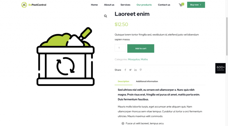
BePestControl’s pre-built site uses a similar method:

In this example, a shopper can either place a selection directly in the cart or read the additional information beneath the button before doing so. BePestControl highlights the importance of using straightforward navigation aids to make shopping a more satisfying experience in 2021.

  1. Emphasize user-controlled video content

Once upon a time video on websites was the greatest thing since warm bread, and it is still an important vehicle for providing informative content. But are today’s users thrilled with it? Not quite so much.

Most users only want to view a video if they feel the need to see it. In other words, user-controlled videos are in, and embedded autoplay videos are becoming more and more unpopular. If viewers are given the choice as to whether to view or not to view, you can expect video to make a substantial comeback this year.

This is how Payoneer has dealt with the issue:

Notice how the Watch Video button stands out against the background. Although it invites and even entices a visitor to view the video, he or she is not forced to do so. Either way, the visitor will appreciate having been given the option.

The BeOptics pre-built site uses an analogous, albeit a slightly more subtle approach:

Here, the See More botton acts as a gateway to more information and makes visitors aware that they have an opportunity to learn more instead of compelling them to do so as would be the case with an autovideo.

  1. Spend more time showing off trust builders

Although trust builders are indispensable elements in web design, finding the right ones can be a challenge. Instead of spending several minutes to size up a brick and mortar business, an online shopper will often do so in a minute or less.

Fortunately, the following trust building approaches are familiar to web designers, and they can make use of any one or of several:

  • Data visualization (e.g., charts, graphs, counters, statistic callouts)
  • Logos, whether they are a client’s, a partner’s, or media’s
  • Client or customer reviews and/or testimonials
  • Case studies/portfolios
  • Security seals (e.g., Better Business Bureau (BBB), TRUSTe, PayPal Checkout)
  • Proof of social involvement, environmental involvement, etc.

It’s simply a matter of which of these would be a good fit to a business’s website and could convince a visitor to become a valued customer.

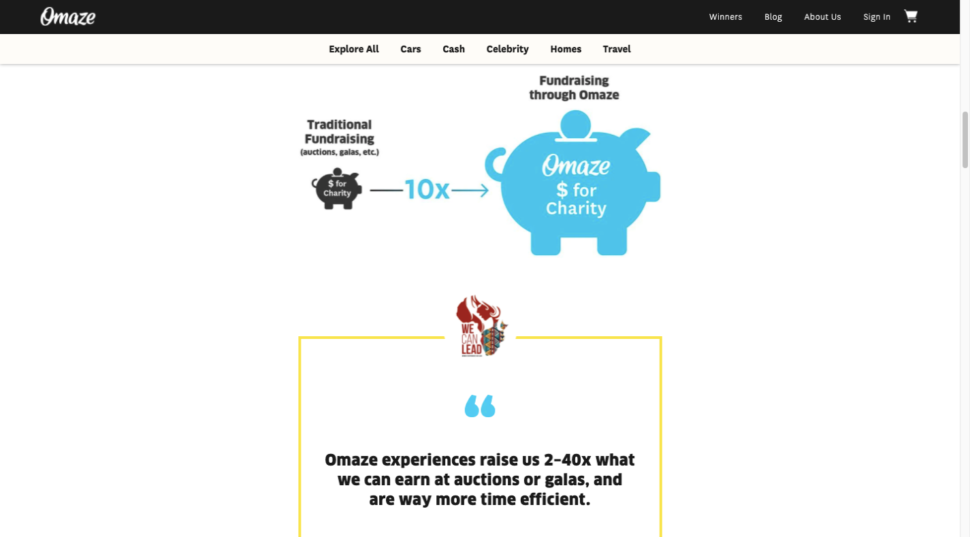
The approach taken by Omaze is to emphasize social involvement, encourage its visitors to make donations, and offer prizes when they do so.

It also brings added legitimacy to the table by reserving a space for highlighting reputable publications that have featured the organization.

Testimonials and data visualization are two additional trust building elements that Omaze puts to good use.

No matter how large or small the organization or enterprise you’re designing a website for may be, there’s always room for incorporating one or more impressive trust builders.

BePortfolio shows how you might incorporate trust builders in a portfolio site:

BePortfolio’s home page dedicates plenty of space to the following trust builders:

  • Portfolio samples
  • Satisfied customer counts
  • Testimonials and case studies
  • Client logos

Giving people a reason to trust your brand is fine, but it’s a lot better if you can give them more than enough reasons to do so.

Have you begun to use these new web design trends yet?

As we noted earlier, some trends stay with us a long time. The lifetime of others can be dictated by external events, as can be the emergence of new events such as those discussed in this article. 2020 changed the way we looked at certain things, and 2021 is changing the way we look at things again as we begin to define and understand the new normal.

Whether you want to bring existing sites up to 2021 standards or implement these new trends in your new designs, BeTheme’s 600+ pre-built websites are guaranteed to get you started in the right direction.

Read More at 5 Web Design Trends That Unfolded in 2021

Categories: Designing, Others Tags:

How Photographers Can Monetize Their Unique Skills Through Social Media

April 8th, 2021 No comments

Social media has created a whole new economy and opportunity to build a business. Whether you’re using social media as a marketing tool to promote an offline business or using it as the portal to your services, you cannot understate the value of these opportunities.

Photographers, in particular, can capitalize on this visually-driven channel. Here’s everything you need to know about how to monetize your unique photography skills on social media. 

Showcase Your Portfolio

The most straightforward application of using social media to promote your photography skills is to create an online portfolio. Use your social media channels to highlight your best work to convert customers via a session booking.

This strategy is ideal for wedding and family photographers— those who offer services to the average consumer. The secret to selling your services via social media is by taking a passive sales approach 80-90% of the time. In other words, don’t just use your platform to push sales. Instead, let your photos speak for you. Focus on nourishing your audience and building a rapport so that when you post a promotion, customers are warmed up and ready to book.

Become an Influencer

Love it or hate it, influencer marketing is the real deal. It’s expected that brands will invest upward of $15 billion annually in influencer marketing by 2022.

As a photographer, you hold the key element of successful influencer marketing: creating beautiful photos. 

Use your skill to position yourself as an influencer, securing brand partnerships and showcasing products and services with your images. Again, nourishing your audience and developing a trusting follower base is essential for success on social media. As you build your brand, remember that it only takes one poor experience to lose it all. Ensure that you’re only working with companies and products you trust.

Photo by JESHOOTS.COM on Unsplash

Work for Other Influencers

Many photographers feel more comfortable behind the camera rather than being the focal point. If you can’t imagine yourself as an influencer, consider offering your services to other influencers and brands.

Take some time to learn the nuances of social media photography and how to position yourself to brands. Offer your services as a content creator, scheduling regular photoshoots with influencers or businesses that need to fill out their content calendar. 

This business opportunity is multi-faceted. As the brand photographer, you’ll get paid for your time and skills. Furthermore, you’ll get free marketing in the form of photo credits when a brand or influencer shares their imagery online and includes attributions. Consider making tags and attributions a part of your client contract to ensure you get the credit you deserve. You can also offer a scaled-up package for those who don’t want to tag you every time.

Sell Photos to Businesses

Rather than working with brands and influencers to create custom photos, you can take a more generalized approach and sell high-quality stock photos. 

The benefit of this approach is that brands aren’t buying exclusive rights to your photo. That means you can sell the same photo numerous times. The downside is that your photos will likely sell for a nominal fee. As such, there could be some days when you only make $15 from your work.

Selling stock photos is a great side hustle on your core photography business. Depending on your niche and skillset, there’s plenty of opportunity for growth and success.

Use Affiliate Marketing

Affiliate marketing often goes hand-in-hand with being an influencer. Some brands offer a percentage of sales gained through your partnership (this is also something you can negotiate for). While this approach is profitable, you can also use the same approach to enhance your photography sales.

Consider offering an affiliate or referral marketing plan that encourages your audience to share your work and bolsters your sales. Provide a unique link to each of your affiliates to track which sessions, stock photos, etc., are sold through their efforts.

Tips for Monetizing Your Social Media

The benefit of the monetization strategies on this list is that you can choose more than one. Once you decide which approach is right for you, it’s time to consider the implementation process.

Here are some practical tips for setting up your social media for monetization success.

Get a Scheduling Tool

Consistency is everything when building a social media audience and monetizing your efforts. However, social media scheduling and management can be a full-time job. 

A social media scheduling tool like Sked Social can help you automate the scheduling process, helping you post consistently without taking up your valuable time. This tool is also great for tracking analytics and determining what’s working and what isn’t with your audience.

Post Creative Captions

While your photos will do most of the talking for your business, captions are also an important part of the social media game— for Instagram, especially.

Engagement is measured by interactions with your posts. One of those interactions is the time spent on a particular post. For Instagram, the baseline is a three-second pause. It might not seem like much but consider how quickly you can scroll through and double tap for a like.

Posting creative captions encourage viewers to slow down and spend time looking at your content. As such, your engagement and reach will increase.

Clarify Your Niche

Take some time to clarify who your ideal customer is and what specific subject matter or styles they’re interested in. For example, saying you work with influencers isn’t specific enough. Saying you work with female fitness influencers who have a goal of growing their audience helps narrow down your targeting when positioning your photography services.

Niching down won’t limit your reach as a photographer. You’ll still get followers who appreciate your craft, even if it isn’t relevant to them. However, having that targeted approach will make your following more likely to convert, as they feel a deeper connection with your content.

Engage Your Audience

Remember that posting beautiful photos, writing amazing captions, and choosing the perfect hashtags aren’t enough when trying to monetize your photography via social media. Be an active participant in conversations. Respond to your audience, ask them questions, and get to know your loyal followers.

Engaging with your audience builds trust and brand loyalty and helps boost your reach and engagement from an analytics standpoint.

Track Your Metrics

Finally, learn from the data that social media provides. Your metrics and insights can tell you what your ideal customers relate to and what subject matter you should move away from. Look for common themes, like posting times, days, and subject matter. Use this data to craft your strategy.

Final Thoughts

There are endless opportunities for monetizing your photography skills through social media. Take some time to determine which avenue speaks to you, and start posting.

Categories: Others Tags:

CSS Is, In Fact, Awesome

April 7th, 2021 No comments

You’ve seen the iconic image. Perhaps some of what makes that image so iconic is that people see what they want to see in it. If you see it as a critique of CSS being silly, weird, or confusing, you can see that in the image. If you see it as CSS being powerful and flexible, you’ve got that too. That’s what Jim Neilsen is saying here, reacting to a presentation by Hidde de Vries:

This is the power of CSS. It gives you options. Use them or don’t.

Want it to overflow visibly? It can. Want it to lop off overflowing content? It can. Want it to stretch? It can. Want it to ellipse? It can. Want it to wrap or not wrap? It can. Want to scale the type to fit? It can. If you love CSS, this is probably exactly why.

Mandy Michael has a great thread on this from a few years back:

Brandon Smith wrote about all this a few years back as well. I remain chuffed that Eric Meyer asked the original creator of the image, Steve Frank of Panic, about it and Steve once stopped by to explain the real origin:

It was 2009 and I’d spent what seemed like hours trying to do something in CSS that I already knew I could do in seconds with tables. I was trying really hard to do it with CSS because that’s what you’re supposed to do, but I just wasn’t very good at it (spoiler alert: I’m still not very good at it).

I do have a slightly better grasp on the concept of overflow now, but at the time it just blew my mind that someone thought the default behavior should be to just have the text honk right out of the box, instead of just making the box bigger like my nice, sensible tables had always done.

Anyway, I just had this moment of pure frustration and, instead of solving the problem properly, I spent 5 minutes creating a snarky mug and went back to using tables. Because that’s my signature move in times of crisis.

So, the original is indeed born out of frustration, but has nonetheless inspired many love letters to CSS. It has also certainly earned its place in CSS infamy, right alongside Peter Griffin struggling with window blinds, as one of the most iconic CSS images ever.

Direct Link to ArticlePermalink


The post CSS Is, In Fact, Awesome appeared first on CSS-Tricks.

You can support CSS-Tricks by being an MVP Supporter.

Categories: Designing, Others Tags:

SvelteKit is in public beta

April 7th, 2021 No comments

Rich Harris:

Think of it as Next for Svelte. It’s a framework for building apps with Svelte, complete with server-side rendering, routing, code-splitting for JS and CSS, adapters for different serverless platforms and so on.

Great move. I find Next.js a real pleasure to work with. I’ve hit some rough edges trying to get it to do what are probably non-standard things, but even then, I was able to get past them and have had a pretty great developer experience, while producing something that I’d like to think is going to be a pretty great user experience, too.

I always want server-side rendering. I want a blessed routing solution. I want pre-made smart solutions for common tasks and elegant solutions for hard problems. Packaging something like that up for Svelte in a core project seems very smart, just as it’s smart for Vue to have Nuxt.js. Maybe even smarter, they resisted naming it Svxt.js which was surely the right call.

Direct Link to ArticlePermalink


The post SvelteKit is in public beta appeared first on CSS-Tricks.

You can support CSS-Tricks by being an MVP Supporter.

Categories: Designing, Others Tags:

7 Skills You Need To Thrive As A Web Designer In 2021

April 7th, 2021 No comments

Web design is an ever-evolving field. Those of us that have been in the industry a long time (i.e., six months plus) have seen the launch of more products, the establishment of more ideas, and the promise of more growth than most industries see over a whole career.

While the tools we use, the terminology we employ, and the goalposts we shoot for are constantly changing, core skills are transferable and long-lasting and will ensure you not only survive in the industry but thrive in it.

These skills are characteristics that you can learn, that will help you grow in 2021, 2022, and beyond.

1. Decision Making

Life is a series of decisions, from which pair of socks to wear to which crypto to store your life savings in. Each of us has a finite amount of decision-making fuel in the day — the more decisions you make, the sooner you reach decision fatigue.

Most people burn their decision-making fuel by second-guessing themselves; they make a decision and then remake the same decision over and over as doubt creeps in.

The ability to make a decision, and stick to it, separates those people who still have the fuel to make strategic decisions after close of business and those people who can’t decide what to have for dinner.

2. Clarity of Purpose

It’s never a bad idea to brush up on design fundamentals. From color theory to typography to UI and layout, these core skills are not only beneficial to your design practice, but they help you think about design on a higher level.

Too often, designers fail to see the wood for the trees, focusing on the project at hand instead of a wider picture. The wider picture doesn’t mean your portfolio; it means the whole history, culture, and design context.

Many musicians can play multiple styles, but they tend to favor one instrument; they made a fundamental decision that freed them to explore music in greater depth

Despite the term, design fundamentals aren’t universal; they’re personal to you. For example, should you pair a script with a serif? Your answer is probably, “it depends” because you’re an awesome designer; my answer is “no,” because, for me, that is a design fundamental.

Design fundamentals can be limiting, but by providing default answers to common questions, they also free you to consider larger questions about what you’re doing and why, which leads to clarity of purpose.

Many musicians can play multiple styles, but they tend to favor one instrument; they made a fundamental decision that freed them to explore music in greater depth.

3. The Holy Trinity

The holy trinity in web design is HTML, CSS, and JavaScript. Learn what they are and what they do.

You need to understand them well enough to hold an intelligent boardroom-level conversation about them. You don’t actually need to know how to code them — although I’ve never actually met someone who knew enough about their roles to hold a strategic conversation, who didn’t also know how to code them from scratch.

I’m not talking about frameworks, libraries, or the latest build tools. Those things are just macros for coders. I’m talking about understanding the building blocks of a site, so if someone asks you whether you really need the company logo in the site footer, you can answer, and back your answer up with facts.

4. Simple Presentation

No matter what field of design you’re in, you’re going to need to present your ideas to someone who doesn’t share your knowledge. Whether you’re explaining the basics to a client or explaining your decision-making to a colleague, presenting your ideas simply is the best way to be heard.

a pitch is most effective when you exclude extraneous detail

Often, a persuasive presentation utilizes the less-is-more approach. Just as a design is finished when you’ve removed everything unnecessary, so too a pitch is most effective when you exclude extraneous detail.

Often you’ll find metaphor useful, especially if you have a passing knowledge of the person’s own area of expertise because it translates a concept into a format the person understands and is comfortable with.

“We should…because it will improve [a metric] by approximately…%” is often the most welcome language. If the person you’re selling your decision needs more detail — and they probably don’t need to know details, that’s what they have you for — they can ask.

5. Strategic SEO

SEO (Search Engine Optimisation, for the two people in the world who don’t know what that acronym stands for) is a vast field with as many sub-divisions as there are UX job titles.

There are various branches of SEO that a site needs to consider. Technical SEO is the stuff that coders do; if you’re not a coder, you can ignore that. Content SEO is the stuff that marketers do; if you’re not a marketer, you can ignore that. Strategic SEO is a macro-view of a site’s plans; everyone on every project should understand strategic SEO.

Strategic SEO covers topics like landing pages, single-page sites, whether a blog is necessary, how, if at all, social media is employed. Strategic SEO feeds all other branches of SEO. It is so fundamental that it informs the earliest decisions about a site. If you want to do more than make things look pretty, learn more about strategic SEO.

6. A Second Language

You’ve probably noticed by now that the web extends beyond your town limits. It’s a global force, which means billions of people who don’t speak the same language.

If you’re not a native-English speaker, then it’s a no-brainer to learn a little English. You don’t need to be fluent; you certainly don’t need to be poetic, but the vast majority of documentation, GUIs, blog posts, forums, conferences, and the Web itself are in English, and translation code only gets you so far.

If you are a native English speaker, then learn something relevant to your region or the industry you specialize in. It doesn’t really matter what you learn; picking up a language, and culture, makes you a more rounded human being. And provided you don’t pick something obscure, you’re opening yourself up to millions or even billions of users you were previously missing out on.

7. Saying, “No.”

It doesn’t matter whether you’re a freelancer sofa-diving for spare pennies to meet the rent or a seasoned in-house designer with targets to meet; everyone struggles to say, “no.”

The fear is that if we decline a project, or a feature request, that we won’t be asked next time; eventually, we’ll be passed over for all projects until we have no career left.

The problem is that we only have so many hours in a day. If we do too much, we end up doing it badly, so there have to be limits. Every time you say “yes,” you’re increasing the chances that you will have to say “no,” to a future opportunity that’s great for you.

By all means, decline gracefully. Do it politely. Be kind. Offer to refer the client elsewhere. But it’s better to say “no” than to have to say “no” to the perfect project because you’re over-stretched.


Featured image via Unsplash.

Source

The post 7 Skills You Need To Thrive As A Web Designer In 2021 first appeared on Webdesigner Depot.

Categories: Designing, Others Tags:

Coordinating Svelte Animations With XState

April 7th, 2021 No comments

This post is an introduction to XState as it might be used in a Svelte project. XState is unique in the JavaScript ecosystem. It doesn’t keep your DOM synced with your application state, nor does it help you with asynchrony, or streams of data; XState helps manage your application’s state by allowing you to model your state as a finite state machine (FSM).

A deep dive into state machines and formal languages is beyond the scope of this post, but Jon Bellah does that in another CSS-Tricks article. For now, think of an FSM as a flow chart. Flow charts have a number of states, represented as bubbles, and arrows leading from one state to the next, signifying a transition from one state to the next. State machines can have more than one arrow leading out of a state, or none at all if it’s a final state, and they can even have arrows leaving a state, and pointing right back into that same state.

If that all sounds overwhelming, relax, we’ll get into all the details, nice and slow. For now, the high level view is that, when we model our application as a state machine, we’ll be creating different “states” our application can be in (get it … state machine … states?), and the events that happen and cause changes to state will be the arrows between those states. XState calls the states “states,” and the arrows between the states “actions.”

Our example

XState has a learning curve, which makes it challenging to teach. With too contrived a use case it’ll appear needlessly complex. It’s only when an application’s code gets a bit tangled that XState shines. This makes writing about it tricky. With that said, the example we’ll look at is an autocomplete widget (sometimes called autosuggest), or an input box that, when clicked, reveals a list of items to choose from, which filter as you type in the input.

For this post we’ll look at getting the animation code cleaned up. Here’s the starting point:

This is actual code from my svelte-helpers library, though with unnecessary pieces removed for this post. You can click the input and filter the items, but you won’t be able to select anything, “arrow down” through the items, hover, etc. I’ve removed all the code that’s irrelevant to this post.

We’ll be looking at the animation of the list of items. When you click the input, and the results list first renders, we want to animate it down. As you type and filter, changes to the list’s dimensions will animate larger and smaller. And when the input loses focus, or you click ESC, we animate the list’s height to zero, while fading it out, and then remove it from the DOM (and not before). To make things more interesting (and nice for the user), let’s use a different spring configuration for the opening than what we use for the closing, so the list closes a bit more quickly, or stiffly, so unneeded UX doesn’t linger on the screen too long.

If you’re wondering why I’m not using Svelte transitions to manage the animations in and out of the DOM, it’s because I’m also animating the list’s dimensions when it’s open, as the user filters, and coordinating between transition, and regular spring animations is a lot harder than simply waiting for a spring update to finish getting to zero before removing an element from the DOM. For example, what happens if the user quickly types and filters the list, as it’s animating in? As we’ll see, XState makes tricky state transitions like this easy.

Scoping the Problem

Let’s take a look at the code from the example so far. We’ve got an open variable to control when the list is open, and a resultsListVisible property to control whether it should be in the DOM. We also have a closing variable that controls whether the list is in the process of closing.

On line 28, there’s an inputEngaged method that runs when the input is clicked or focused. For now let’s just note that it sets open and resultsListVisible to true. inputChanged is called when the user types in the input, and sets open to true. This is for when the input is focused, the user clicks escape to close it, but then starts typing, so it can re-open. And, of course, the inputBlurred function runs when you’d expect, and sets closing to true, and open to false.

Let’s pick apart this tangled mess and see how the animations work. Note the slideInSpring and opacitySpring at the top. The former slides the list up and down, and adjusts the size as the user types. The latter fades the list out when hidden. We’ll focus mostly on the slideInSpring.

Take a look at the monstrosity of a function called setSpringDimensions. This updates our slide spring. Focusing on the important pieces, we take a few boolean properties. If the list is opening, we set the opening spring config, we immediately set the list’s width (I want the list to only slide down, not down and out), via the { hard: true } config, and then set the height. If we’re closing, we animate to zero, and, when the animation is complete, we set resultsListVisible to false (if the closing animation is interrupted, Svelte will be smart enough to not resolve the promise so the callback will never run). Lastly, this method is also called any time the size of the results list changes, i.e., as the user filters. We set up a ResizeObserver elsewhere to manage this.

Spaghetti galore

Let’s take stock of this code.

  • We have our open variable which tracks if the list is open.
  • We have the resultsListVisible variable which tracks if the list should be in the DOM (and set to false after the close animation is complete).
  • We have the closing variable that tracks if the list is in the process of closing, which we check for in the input focus/click handler so we can reverse the closing animation if the user quickly re-engages the widget before it’s done closing.
  • We also have setSpringDimensions that we call in four different places. It sets our springs depending on whether the list is opening, closing, or just resizing while open (i.e. if the user filters the list).
  • Lastly, we have a resultsListRendered Svelte action that runs when the results list DOM element renders. It starts up our ResizeObserver, and when the DOM node unmounts, sets closing to false.

Did you catch the bug? When the ESC button is pressed, I’m only setting open to false. I forgot to set closing to true, and call setSpringDimensions(false, true). This bug was not purposefully contrived for this blog post! That’s an actual mistake I made when I was overhauling this widget’s animations. I could just copy paste the code in inputBlured over to where the escape button is caught, or even move it to a new function and call it from both places. This bug isn’t fundamentally hard to solve, but it does increase the cognitive load of the code.

There’s a lot of things we’re keeping track of, but worst of all, this state is scattered all throughout the module. Take any piece of state described above, and use CodeSandbox’s Find feature to view all the places where that piece of state is used. You’ll see your cursor bouncing across the file. Now imagine you’re new to this code, trying to make sense of it. Think about the growing mental model of all these state pieces that you’ll have to keep track of, figuring out how it works based on all the places it exists. We’ve all been there; it sucks. XState offers a better way; let’s see how.

Introducing XState

Let’s step back a bit. Wouldn’t it be simpler to model our widget in terms of what state it’s in, with events happening as the user interacts, which cause side effects, and transitions to new states? Of course, but that’s what we were already doing; the problem is, the code is scattered everywhere. XState gives us the ability to properly model our state in this way.

Setting expectations

Don’t expect XState to magically make all of our complexity vanish. We still need to coordinate our springs, adjust the spring’s config based on opening and closing states, handle resizes, etc. What XState gives us is the ability to centralize this state management code in a way that’s easy to reason about, and adjust. In fact, our overall line count will increase a bit, as a result of our state machine setup. Let’s take a look.

Your first state machine

Let’s jump right in, and see what a bare bones state machine looks like. I’m using XState’s FSM package, which is a minimal, pared down version of XState, with a tiny 1KB bundle size, perfect for libraries (like an autosuggest widget). It doesn’t have a lot of advanced features like the full XState package, but we wouldn’t need them for our use case, and we wouldn’t want them for an introductory post like this.

The code for our state machine is below, and the interactive demo is over at Code Sandbox. There’s a lot, but we’ll go over it shortly. And to be clear, it doesn’t work yet.

const stateMachine = createMachine(
  {
    initial: "initial",
    context: {
      open: false,
      node: null
    },
    states: {
      initial: {
        on: { OPEN: "open" }
      },
      open: {
        on: {
          RENDERED: { actions: "rendered" },
          RESIZE: { actions: "resize" },
          CLOSE: "closing"
        },
        entry: "opened"
      },
      closing: {
        on: {
          OPEN: { target: "open", actions: ["resize"] },
          CLOSED: "closed"
        },
        entry: "close"
      },
      closed: {
        on: {
          OPEN: "open"
        },
        entry: "closed"
      }
    }
  },
  {
    actions: {
      opened: assign(context => {
        return { ...context, open: true };
      }),
      rendered: assign((context, evt) => {
        const { node } = evt;
        return { ...context, node };
      }),
      close() {},
      resize(context) {},
      closed: assign(() => {
        return { open: false, node: null };
      })
    }
  }
);

Let’s go from top to bottom. The initial property controls what the initial state is, which I’ve called “initial.” context is the data associated with our state machine. I’m storing a boolean for whether the results list is currently open, as well as a node object for that same results list. Next we see our states. Each state is a key in the states property. For most states, you can see we have an on property, and an entry property.

on configures events. For each event, we can transition to a new state; we can run side effects, called actions; or both. For example, when the OPEN event happens inside of the initial state, we move into the open state. When the RENDERED event happens in the open state, we run the rendered action. And when the OPEN event happens inside the closing state, we transition into the open state, and also run the resize action. The entry field you see on most states configures an action to run automatically whenever a state is entered. There are also exit actions, although we don’t need them here.

We still have a few more things to cover. Let’s look at how our state machine’s data, or context, can change. When we want an action to modify context, we wrap it in assign and return the new context from our action; if we don’t need any processing, we can just pass the new state directly to assign. If our action does not update context, i.e., it’s just for side effects, then we don’t wrap our action function in assign, and just perform whatever side effects we need.

Affecting change in our state machine

We have a cool model for our state machine, but how do we run it? We use the interpret function.

const stateMachineService = interpret(stateMachine).start();

Now stateMachineService is our running state machine, on which we can invoke events to force our transitions and actions. To fire an event, we call send, passing the event name, and then, optionally, the event object. For example, in our Svelte action that runs when the results list first mounts in the DOM, we have this:

stateMachineService.send({ type: "RENDERED", node });

That’s how the rendered action gets the node for the results list. If you look around the rest of the AutoComplete.svelte file, you’ll see all the ad hoc state management code replaced with single line event dispatches. In the event handler for our input click/focus, we run the OPEN event. Our ResizeObserver fires the RESIZE event. And so on.

Let’s pause for a moment and appreciate the things XState gives us for free here. Let’s look at the handler that runs when our input is clicked or focused before we added XState.

function inputEngaged(evt) {
  if (closing) {
    setSpringDimensions();
  }
  open = true;
  resultsListVisible = true;
} 

Before, we were checking to see if we were closing, and if so, forcing a re-calculation of our sliding spring. Otherwise we opened our widget. But what happened if we clicked on the input when it was already open? The same code re-ran. Fortunately that didn’t really matter. Svelte doesn’t care if we re-set open and resultsListVisible to the values they already held. But those concerns disappear with XState. The new version looks like this:


function inputEngaged(evt) {
  stateMachineService.send("OPEN");
}

If our state machine is already in the open state, and we fire the OPEN event, then nothing happens, since there’s no OPEN event configured for that state. And that special handling for when the input is clicked when the results are closing? That’s also handled right in the state machine config — notice how the OPEN event tacks on the resize action when it’s run from the closing state.

And, of course, we’ve fixed the ESC key bug from before. Now, pressing the key simply fires the CLOSE event, and that’s that.

Finishing up

The ending is almost anti-climactic. We need to take all of the work we were doing before, and simply move it to the right place among our actions. XState does not remove the need for us to write code; it only provides a structured, clear place to put it.

{
  actions: {
    opened: assign({ open: true }),
    rendered: assign((context, evt) => {
      const { node } = evt;
      const dimensions = getResultsListDimensions(node);
      itemsHeightObserver.observe(node);
      opacitySpring.set(1, { hard: true });
      Object.assign(slideInSpring, SLIDE_OPEN);
      slideInSpring.update(prev => ({ ...prev, width: dimensions.width }), {
        hard: true
      });
      slideInSpring.set(dimensions, { hard: false });
      return { ...context, node };
    }),
    close() {
      opacitySpring.set(0);
      Object.assign(slideInSpring, SLIDE_CLOSE);
      slideInSpring
        .update(prev => ({ ...prev, height: 0 }))
        .then(() => {
          stateMachineService.send("CLOSED");
        });
    },
    resize(context) {
      opacitySpring.set(1);
      slideInSpring.set(getResultsListDimensions(context.node));
    },
    closed: assign(() => {
      itemsHeightObserver.unobserve(resultsList);
      return { open: false, node: null };
    })
  }
}

Odds and ends

Our animation state is in our state machine, but how do we get it out? We need the open state to control our results list rendering, and, while not used in this demo, the real version of this autosuggest widget needs the results list DOM node for things like scrolling the currently highlighted item into view.

It turns out our stateMachineService has a subscribe method that fires whenever there’s a state change. The callback you pass is invoked with the current state machine state, which includes a context object. But Svelte has a special trick up its sleeve: its reactive syntax of $: doesn’t only work with component variables and Svelte stores; it also works with any object with a subscribe method. That means we can sync with our state machine with something as simple as this:

$: ({ open, node: resultsList } = $stateMachineService.context);

Just a regular destructuring, with some parens to help things get parsed correctly.

One quick note here, as an area for improvement. Right now, we have some actions which both both perform a side effect, and also update state. Ideally, we should probably split these up into two actions, one just for the side effect, and the other using assign for the new state. But I decided to keep things as simple as possible for this article to help ease the introduction of XState, even if a few things wound up not being quite ideal.

Parting thoughts

I hope this post has sparked some interest in XState. I’ve found it to be an incredibly useful, easy to use tool for managing complex state. Please know that we’ve only scratched the surface. We focused on the minimal fsm package, but the entire XState library is capable of a lot more than what we covered here, from nested states, to first-class support for Promises, and it even has a state visualization tool! I urge you to check it out.

Happy coding!


The post Coordinating Svelte Animations With XState appeared first on CSS-Tricks.

You can support CSS-Tricks by being an MVP Supporter.

Categories: Designing, Others Tags:

Space Jam

April 6th, 2021 No comments

It’s certainly worth noting that the Space Jam website, which made its way into umpteen conference talks for being fabulous evidence of the web’s strength in backward compatibility, has been replaced. We could have saw that coming. Everything is remake. The original was released in 1996, making the site, which they kept online, 25 years old.

Of course, you knew folks would pull out their measuring sticks. Here’s Max Böck:

Unsurprisingly, the new site is a lot heavier than the original: with 4.673KB vs. 120KB, the new site is about 39 times the size of the old one. That’s because the new site has a trailer video, high-res images and a lot more Javascript.

That’s funny, the 25 year old site is more than 25 times smaller.

They are both websites that exist and promote a movie, so I feel like it’s fair to call that an apples-to-apples comparison. But Max levels the playing field to the time period by comparing the old site on a 1996 56kb modem and the new site on a 3G mobile network connection, which is 30× faster. When you do that, the sites are nearly neck-and-neck, with the new one being 1.3 seconds faster.

You could say that whatever we’re given, we use, sort of like how building better protective gear for athletes only makes the athletes hit harder.

Direct Link to ArticlePermalink


The post Space Jam appeared first on CSS-Tricks.

You can support CSS-Tricks by being an MVP Supporter.
Categories: Designing, Others Tags: