Archive

Archive for April, 2021

How to Generate Sales Leads: 7 Tips from Experts

April 6th, 2021 No comments
meeting

In the B2B industry, lead generation is that essential fuel that keeps the sales machine running. Sales leads can generally be found in two ways: through inbound or outbound channels. While many companies prefer inbound, claiming that outbound is out-of-date, we’ve seen that both can be effective ways to boost sales. After all, why choose one if you can have it all? 

CIENCE, a top lead generation company, has successfully built and implemented lead generation strategies for more than 1000 clients from different industries. Here’s what our industry-leading experts have to say about how to successfully generate more leads for your business.

7 Best Tips to Generate Sales Leads 

To help you better understand the sales lead generation process, CIENCE has prepared some best practices that actually work, gathered through many years of experience in the B2B lead generation industry. Here are seven tips our sales experts recommend implementing into your inbound and outbound strategies:

1. Analyze your existing clients and research your potential prospects.

The best way to begin with when generating sales leads is to find out who exactly you are looking for. Statistics show that every fourth lead you reach out to is usually completely unqualified. Imagine how much effort, money, and resources are wasted in vain instead of being dedicated to nurturing someone qualified. The question is, how to avoid making the same mistake over and over again?  

The answer is to build an Ideal Customer Profile (ICP). Based on the information received from your previous clients, create a detailed description of your perfect buyer: 

  • What is their job position? 
  • In which industry does their business operate? 
  • Where are they located? 
  • What is their revenue? 

The number of data points gathered at this stage can be as detailed as you wish. Your goal is to build precise criteria so a salesperson can identify if this prospect is worth their time and effort and has the potential to become a long-lasting client of the company.

At the second stage of your prospect analysis, figure out where exactly can you find the leads by asking these questions: 

  • Will they perfectly match your ICP? 
  • What are their needs, pains, and goals? 
  • What are their business’s main challenges? 
  • How can your service help their business? 

Based on how you answer these questions, you can now build your future outreach strategy to generate more sales leads.  

Quite often, businesses prefer to consult with a lead generation firm at the stage when finding their ICP to avoid the confusion and get started faster. CIENCE has done it multiple times for different companies. Check out this case study dedicated to ICP research for an eLearning platform to see how this process looks like from the inside.

2. Don’t give up on cold calling. 

Thanks to the dedicated supporters of inbound who actively claim that cold calling is dead, many marketers simply ignore this outbound channel, losing a bunch of opportunities. However, statistics prove that cold calling is more than alive, it is thriving and prospering: The majority of C-level managers (57%), generally the decision-makers in B2B sales, prefer to be contacted by phone; 69% of buyers have accepted a phone call from new providers in the last twelve months; and 82% of buyers have conducted a meeting with the sellers who reached out to them over the phone.

Of course, in 2021, simply reading a script in the worst telemarketing traditions of the previous century won’t generate any sales leads. To succeed at this, you have to develop a certain cold calling routine that will work best on your prospects: 

3. Make use of multichannel orchestrated outreach. 

As the saying now goes, two outreach channels are better than one. If you aim to generate more high-quality b2b leads, you can better learn how to align multiple channels into your outreach strategy.

Whatever channel you use as a primary one, inbound or outbound, they’ll generate more sales leads together than separately. Even more, the inbound conversions are always higher with the help of outbound tactics, the so-called outbound assist effect. They are not mutually exclusive, but rather complementary. 

For example, if you use content marketing as a leading strategy, consider creating a strong social media presence for your business as well; or if you choose cold calling as the main way to reach out to prospects, make sure to warm up these calls with pre-targeted ads and cold emails. If you feel like you can do more than that, consider orchestrating all the channels simultaneously, reassuring the presence and moderation of all the steps of the sales funnel.  

4. Provide a personalized experience to your prospects.

This point isn’t as much about nurturing more leads but rather improving the quality of your outreach, which consequently, will lead to generating more leads and increasing B2B sales. The modern lead generation process is all about delivering unique experiences. Smarter HQ states that 72% of consumers engage solely with personalized content. Therefore, even if you are selling air conditioners for big corporations, you should do it professionally, providing a personalized experience with regard to your client’s personal needs and preferences.

Personalization is a key to improving customer experience and generating sales leads. Again, whatever channel you use as your primary one, it will only become more efficient if you personalize it. For example, personalized cold emails receive twice as many replies as impersonalized ones; personalized websites demonstrate increased conversions and customer acquisition.

Just remember, the more data points you define about your prospect on the research stage, the easier it will be for you to personalize your outreach channels and generate more leads.

5. Optimize your website for mobile devices.

The new generation of B2B buyers are mobile-friendly. They use mobile devices at work, make purchases through mobile versions of the websites, and shift B2B online queries from their laptops to their smartphones. Moreover, B2B mobile leaders drive superior results in generating sales leads compared with mobile laggard companies.

In addition to all that, Google itself gives a higher SERP rank to mobile-friendly websites. All this means only one thing—if you want your business to stay afloat in today’s competitive conditions, make sure you optimize your website for mobile devices. This will be highly efficient for both inbound and outbound strategies.

6. Increase brand awareness with pre-targeting ads.

Pre-targeting ads are one of the most efficient outbound lead generation strategies, which aim to both nurture new customers to the webpage and increase brand awareness of the company. Usually, these types of ads pair the contact information of your potential leads with the cookie data stored from websites like Google, LinkedIn, and Adroll, and match them together. As a result, these ads are displayed not to a general audience of the website, but only to a small precisely targeted group of users who have higher chances of converting. 

Pre-targeting ads are a great way to warm up ice-cold leads before their first interaction with your SDRs. They are more cost-efficient, personalized, and effective than usual ad banners. 

7. Outsource your sales development.

Generating sales leads can be a real challenge, as it requires lots of financial and human resources, time, and dedication from the entire sales team. Sometimes, instead of hiring and training your in-house team, it makes more sense to outsource sales lead generation strategies.

They generally provide you with an in-house campaign strategist, whose job is to learn your business’s voice and brand style; a research team, who makes sure that every lead is qualified and fits your business ICP; and, of course, SDRs, who guide the prospect down the sales funnel.

If you don’t have the resources to devote a whole department to the lead generation efforts but still need to regularly gain more leads, outsourcing might become the perfect solution. It enables you to dedicate more time to complete other important business processes while entrusting lead generation to someone with years of experience in this industry. 

Gain More Leads!

Generating sales leads is an essential part of any business. Some companies can maintain their existence using inbound-only tactics. Others prefer to have multiple sources to generate sales leads simultaneously so that when one source dries out, another one shares its supplies. Smart ones simply delegate these jobs to third parties, so they have fewer tasks to worry about.

Your job as a salesperson and a marketer is to make sure your sales pipeline is always filling up with new leads. With the help of the lead generation tips above, you’re bound to get some valuable leads and create extra opportunities for your business’s growth. 

Categories: Others Tags:

How to Generate Sales Leads: 7 Tips from Experts

April 6th, 2021 No comments
meeting

In the B2B industry, lead generation is that essential fuel that keeps the sales machine running. Sales leads can generally be found in two ways: through inbound or outbound channels. While many companies prefer inbound, claiming that outbound is out-of-date, we’ve seen that both can be effective ways to boost sales. After all, why choose one if you can have it all? 

CIENCE, a top lead generation company, has successfully built and implemented lead generation strategies for more than 1000 clients from different industries. Here’s what our industry-leading experts have to say about how to successfully generate more leads for your business.

7 Best Tips to Generate Sales Leads 

To help you better understand the sales lead generation process, CIENCE has prepared some best practices that actually work, gathered through many years of experience in the B2B lead generation industry. Here are seven tips our sales experts recommend implementing into your inbound and outbound strategies:

1. Analyze your existing clients and research your potential prospects.

The best way to begin with when generating sales leads is to find out who exactly you are looking for. Statistics show that every fourth lead you reach out to is usually completely unqualified. Imagine how much effort, money, and resources are wasted in vain instead of being dedicated to nurturing someone qualified. The question is, how to avoid making the same mistake over and over again?  

The answer is to build an Ideal Customer Profile (ICP). Based on the information received from your previous clients, create a detailed description of your perfect buyer: 

  • What is their job position? 
  • In which industry does their business operate? 
  • Where are they located? 
  • What is their revenue? 

The number of data points gathered at this stage can be as detailed as you wish. Your goal is to build precise criteria so a salesperson can identify if this prospect is worth their time and effort and has the potential to become a long-lasting client of the company.

At the second stage of your prospect analysis, figure out where exactly can you find the leads by asking these questions: 

  • Will they perfectly match your ICP? 
  • What are their needs, pains, and goals? 
  • What are their business’s main challenges? 
  • How can your service help their business? 

Based on how you answer these questions, you can now build your future outreach strategy to generate more sales leads.  

Quite often, businesses prefer to consult with a lead generation firm at the stage when finding their ICP to avoid the confusion and get started faster. CIENCE has done it multiple times for different companies. Check out this case study dedicated to ICP research for an eLearning platform to see how this process looks like from the inside.

2. Don’t give up on cold calling. 

Thanks to the dedicated supporters of inbound who actively claim that cold calling is dead, many marketers simply ignore this outbound channel, losing a bunch of opportunities. However, statistics prove that cold calling is more than alive, it is thriving and prospering: The majority of C-level managers (57%), generally the decision-makers in B2B sales, prefer to be contacted by phone; 69% of buyers have accepted a phone call from new providers in the last twelve months; and 82% of buyers have conducted a meeting with the sellers who reached out to them over the phone.

Of course, in 2021, simply reading a script in the worst telemarketing traditions of the previous century won’t generate any sales leads. To succeed at this, you have to develop a certain cold calling routine that will work best on your prospects: 

3. Make use of multichannel orchestrated outreach. 

As the saying now goes, two outreach channels are better than one. If you aim to generate more high-quality b2b leads, you can better learn how to align multiple channels into your outreach strategy.

Whatever channel you use as a primary one, inbound or outbound, they’ll generate more sales leads together than separately. Even more, the inbound conversions are always higher with the help of outbound tactics, the so-called outbound assist effect. They are not mutually exclusive, but rather complementary. 

For example, if you use content marketing as a leading strategy, consider creating a strong social media presence for your business as well; or if you choose cold calling as the main way to reach out to prospects, make sure to warm up these calls with pre-targeted ads and cold emails. If you feel like you can do more than that, consider orchestrating all the channels simultaneously, reassuring the presence and moderation of all the steps of the sales funnel.  

4. Provide a personalized experience to your prospects.

This point isn’t as much about nurturing more leads but rather improving the quality of your outreach, which consequently, will lead to generating more leads and increasing B2B sales. The modern lead generation process is all about delivering unique experiences. Smarter HQ states that 72% of consumers engage solely with personalized content. Therefore, even if you are selling air conditioners for big corporations, you should do it professionally, providing a personalized experience with regard to your client’s personal needs and preferences.

Personalization is a key to improving customer experience and generating sales leads. Again, whatever channel you use as your primary one, it will only become more efficient if you personalize it. For example, personalized cold emails receive twice as many replies as impersonalized ones; personalized websites demonstrate increased conversions and customer acquisition.

Just remember, the more data points you define about your prospect on the research stage, the easier it will be for you to personalize your outreach channels and generate more leads.

5. Optimize your website for mobile devices.

The new generation of B2B buyers are mobile-friendly. They use mobile devices at work, make purchases through mobile versions of the websites, and shift B2B online queries from their laptops to their smartphones. Moreover, B2B mobile leaders drive superior results in generating sales leads compared with mobile laggard companies.

In addition to all that, Google itself gives a higher SERP rank to mobile-friendly websites. All this means only one thing—if you want your business to stay afloat in today’s competitive conditions, make sure you optimize your website for mobile devices. This will be highly efficient for both inbound and outbound strategies.

6. Increase brand awareness with pre-targeting ads.

Pre-targeting ads are one of the most efficient outbound lead generation strategies, which aim to both nurture new customers to the webpage and increase brand awareness of the company. Usually, these types of ads pair the contact information of your potential leads with the cookie data stored from websites like Google, LinkedIn, and Adroll, and match them together. As a result, these ads are displayed not to a general audience of the website, but only to a small precisely targeted group of users who have higher chances of converting. 

Pre-targeting ads are a great way to warm up ice-cold leads before their first interaction with your SDRs. They are more cost-efficient, personalized, and effective than usual ad banners. 

7. Outsource your sales development.

Generating sales leads can be a real challenge, as it requires lots of financial and human resources, time, and dedication from the entire sales team. Sometimes, instead of hiring and training your in-house team, it makes more sense to outsource sales lead generation strategies.

They generally provide you with an in-house campaign strategist, whose job is to learn your business’s voice and brand style; a research team, who makes sure that every lead is qualified and fits your business ICP; and, of course, SDRs, who guide the prospect down the sales funnel.

If you don’t have the resources to devote a whole department to the lead generation efforts but still need to regularly gain more leads, outsourcing might become the perfect solution. It enables you to dedicate more time to complete other important business processes while entrusting lead generation to someone with years of experience in this industry. 

Gain More Leads!

Generating sales leads is an essential part of any business. Some companies can maintain their existence using inbound-only tactics. Others prefer to have multiple sources to generate sales leads simultaneously so that when one source dries out, another one shares its supplies. Smart ones simply delegate these jobs to third parties, so they have fewer tasks to worry about.

Your job as a salesperson and a marketer is to make sure your sales pipeline is always filling up with new leads. With the help of the lead generation tips above, you’re bound to get some valuable leads and create extra opportunities for your business’s growth. 

Categories: Others Tags:

Gaps? Gasp!

April 6th, 2021 No comments

At first, there were flexboxes (the children of a display: flex container). If you wanted them to be visually separate, you had to use content justification (i.e. justify-content: space-between), margin trickery, or sometimes, both. Then along came grids (a display: grid container), and grids could have not-margin not-trickeried minimum gaps between grid cells, thanks to grid-gap. Flexboxes did not have gaps.

Now they can, thanks to the growing support of gap, the grid-gap successor that isn’t confined to grids. With gap, you can gap your grids, your flexboxes, and even your multiple columns. It’s gaptastic!

Gap with Grid

Let’s start where gap is the most robust: CSS Grid. Here’s a basic grid setup in HTML and CSS:

<section>
  <div>div</div>
  <div>div</div>
  <div>div</div>
  <div>div</div>
  <div>div</div>
  <div>div</div>
  <div>div</div>
</section>
section {
  display: grid;
  grid-template-rows: repeat(2,auto);
  grid-template-columns: repeat(4,auto);
  gap: 1em;
}
section div {
  width: 2em;
}
CodePen Embed Fallback

That places the grid cells at least 1em apart from each other. The separation distance can be greater than that, depending on other conditions beyond the scope of this post, but at a minimum they should be separated by 1em. (OK, let’s do one example: gap’s gaps are in addition to any margins on the grid cells, so if all the grid items have margin: 2px;, then the visual distance between grid cells would be at least 1em plus 4px.) By default, changes to the gap size causes resizing of the grid items, so that they fill their cells.

This all works because gap is actually shorthand for the properties row-gap and column-gap. The gap: 1em is interpreted as gap: 1em 1em, which is shorthand for row-gap: 1em; column-gap: 1em;. If you want different row and column gap distances, then something like gap: 0.5em 1em will do nicely.

Gap with Flexbox

Doing the same thing in a flexbox context gives you gaps, but not in quite the same way they happen in grids. Assume the same HTML as above, but this CSS instead:

section {
  display: flex;
  flex-wrap: wrap;
  gap: 1em;
}
CodePen Embed Fallback

The flexboxes are pushed apart by at least the value of gap here, and (thanks to flex-wrap) wrap to new flex lines when they run out of space inside their flex container. Changing the gap distance could lead to a change in the wrapping of the flex items, but unlike in Grid, changing gaps between flex items won’t change the sizes of the flex items. Gap changes can cause the flex wrapping to happen at different places, meaning the number of flex items per row will change, but the widths will stay the same (unless you’ve set them to grow or shrink via flex, that is).

Gap with Multi-Column

In the case of multicolumn content, there is bit of a restriction on gap: only column gaps are used. You can declare row gaps for multicolumn if you want, but they’ll be ignored.

section {
  columns: 2;
  gap: 1em;
}
CodePen Embed Fallback

Support

Support for gap, row-gap, and column-gap is surprisingly widespread. Mozilla’s had them since version 61, Chromium since version 66, and thanks to work by Igalia’s Sergio Villar, they’re coming to Safari and Mobile Safari soon (they’re already in the technology preview builds). So if your grid, flex, or multicolumn content needs a bit more space to breathe, get ready to fall into the gap!


The post Gaps? Gasp! appeared first on CSS-Tricks.

You can support CSS-Tricks by being an MVP Supporter.

Categories: Designing, Others Tags:

Jetpack Turns 10!

April 6th, 2021 No comments

(This is a sponsored post.)

Ten years! That’s a huge milestone for a project, especially one that had a pretty simple goal in mind from the start: give self-hosted WordPress sites many of the same features and functionality enjoyed by hosted WordPress.com sites.

It’s a great story. The Automattic team responsible for driving social activity in WordPress sees Jetpack as a way to expand and unify social activity across all WordPress sites, and winds up paving the way for a product that today helps more than 5 million sites with everything from security and performance to backups and integrations.

And what has Jetpack accomplished in those 10 years and 5 million sites? The numbers are staggering:

  • 122 billion blocked malicious login attempts.
    9,330,623 of those on CSS-Tricks, as we write.
  • 269 million site backups.
    Last backup of CSS-Tricks: 3 minutes ago, as we write.
  • 24 trillion images served by Jetpack CDN.
    Incredibly, a free feature of Jetpack.
  • 61.6 billion site searches.
    Try site search on this site, the latest release has really nice UI & UX improvements, like seeing the post thumbnail.
  • 50 billion related posts displayed. Related posts plugins are notoriously heavy on the server, but not when you let Jetpack do it!
  • 1.6 trillion tracked page views. Those are the numbers at work here with WordPress being some 40% of the web.
  • 2.6 billion shared social posts.
    The @css Twitter account runs itself thanks to Jetpack.

And you know CSS-Tricks is represented in those figures. Jetpack powers our search. We use it for real-time backups and downtime monitoring. It’s what helps us push content to Twitter and display related posts. We use its CDN. We even use a bunch of blocks it includes when we’re writing posts like this. We love Jetpack.

The Jetpack team launched a site celebrating 10 years. And, hey, for a super limited time, you can get 40% off the entire first year of any Jetpack plan.

Direct Link to ArticlePermalink


The post Jetpack Turns 10! appeared first on CSS-Tricks.

You can support CSS-Tricks by being an MVP Supporter.

Categories: Designing, Others Tags:

10 Ways How You Can Use AI in E-commerce

April 6th, 2021 No comments

Artificial intelligence (AI), machine learning (ML), and natural language processing (NLP) are three of the hottest technologies on the marketplace at the moment, and they power many of the tools and applications that we use on a daily basis, from Netflix and YouTube to the eCommerce stores where we spend our money.

Of course, if you’re reading this article then the chances are that you own or run an eCommerce store, and so we’re not going to dwell too much on how AI works. Instead, we’re going to take a look at how it can help you.

There are plenty of good reasons to use AI and ML in Business Communication and E-commerce, to the point at which we found it difficult to limit our list to just ten. With that said, let’s jump on in and get started.

1. A/B Tests

A/B tests are essentially scientific tests in which two different variations of a web page or other digital asset can be pitted against each other to see which one works best. Of course, you can carry out these tests manually if you want to, and so where AI really stands out is in the way in which it allows you to create and test huge numbers of variants at a time. By constantly deploying and testing new variants of your most important pages, AI can help to make ongoing tweaks and improvements to your website that continue to add value over time.

2. Chatbots

AI-powered natural language processing allows humans and machines to talk to each other much more easily and efficiently than ever before. When you talk to Alexa or Google Assistant, it’s using AI to understand what you’re saying and to formulate a response. The exact same technology can be used to power eCommerce sales assistants and chatbots that can answer customers’ questions around the clock or help direct them to the most relevant product.

3. Review translation

Building on from the last point, AI and NLP can also be used to translate reviews (and other written content) from one language to another. This might not be super relevant if you run a small, localized eCommerce store, but for those that serve an international audience, it can be a great way for you to boost conversion rates and to make your eCommerce store more profitable.

4. Personalized recommendations

Netflix uses artificial intelligence and machine learning beneath the bonnet of its powerful recommendations engine, and eCommerce stores can put AI to use to do much the same thing. By crunching the huge amounts of data that your site creates, you can use AI to identify cross-sell and upsell opportunities and make you more money.

5. Marketing automation

Marketing automation is the process of using advanced tools to automatically create and deploy high-performance marketing campaigns. You can use AI to create and deploy these campaigns, and it’s already powering most of the tools that are currently commercially available. You bring the marketing strategy and the AI brings the automation.

6. New product research

AI can be useful for product research by enabling you to parse through huge amounts of data from social networking sites and other sources and to generate insights from that data. It might not be useful for smaller eCommerce stores, but if you’re looking to add thousands of new product lines, you’re going to need some help from AI.

7. Virtual changing rooms

One of the most interesting use cases of AI in eCommerce is the rise of virtual changing rooms in which users are able to virtually try clothes on. These typically work by using AI to process the input from the user’s camera and work a little bit like a Snapchat filter, enabling people to try before they buy as they would in a physical store.

8. Image recognition

AI is used to power most modern image recognition software, and while that might not seem important to begin with, it can be super useful for eCommerce stores. For example, it can allow you to set up image search capability for customers to take advantage of. Using a fashion eCommerce store as an example again, it could allow people to search for clothes simply by uploading an image of a celebrity and searching for the closest matches to the clothes that they’re wearing.

9. Fraud protection

AI is used to power most of the anti-fraud tools that are in use throughout the eCommerce industry, and while you might not know that AI is actually there, it’s usually sitting beneath the bonnet and making things happen. eBay recently revealed that its AI can now identify 40% of online credit card fraud with “high precision”.

10. Product info conversion

AI is also pretty good at converting information from one format to another. For eCommerce stores, that means that you can put it to work when you’re importing new products at scale, using the AI to convert product information and images into whichever format you’re using for your site. For example, if products need a featured image that’s at a 16:9 resolution, an AI algorithm can make all of those changes for you.

Conclusion

Now that you know just a few of the ways that you can use artificial intelligence in eCommerce, it’s time for you to start thinking about your own company and the way that you approach new technologies like AI and machine learning.

The important thing to remember is that all of these technologies are available right now and waiting for you to take advantage of them. Even if you don’t use them, you can bet that your competitors will do. 

As you can tell, the advantages of tapping into AI far outweigh any negatives, and so if you’re not using AI for your ecommerce business but your competitors are, you’re at risk of being left behind. But if you do embrace these new technologies and your competitors don’t, you’ll leave them in the dust. Good luck.


Photo by Mike Petrucci on Unsplash

Categories: Others Tags:

15 Great Tools & Resources That You Need to Try

April 6th, 2021 No comments

There can be multiple reasons for not delivering a product on time. An example would be where progress slows down or grinds to a halt because of a client’s requirement cannot be met. It can be due to the designer who doesn’t have the right design tool for the task.

Your toolbox may be well stocked, but there may be a tool or web design resources you frequently use that simply isn’t up to the task at hand. Even though it is one that has served you well in the past.

The following 15 tools and resources for designers and agencies are the best in their respective categories. As such, they can be productivity boosters, and in some cases, life-savers.

  1. Be Theme

This multipurpose WordPress theme is tops in its class in terms of its potent array of core features and design options, together with its flexibility and user friendliness. Given that sales of this long-time favorite web design tool now exceed the 200,000 mark, you you can be assured of getting tangible value and a great return on your investment.

  • Be’s 40+ core features provide all the tools for designers and flexibility you’ll need to meet the harshest of deadlines
  • The BeTheme Muffin Builder/Admin Panel/Shortcode Generator trio lets you drag and drop your way through a task without any need to write a line of code.
  • If there is a single secret to Be’s success it would be its library of more than 600 responsive and customizable pre-built websites. They cover 30 industry sectors along with every popular website type or style.
  • Be’s Layout Generator makes it a simple task to start a page from scratch, and you can rely on this theme’s wealth of layout and other design options to see your project through.

Click on the banner to learn more about what BeTheme can do for you.

  1. Timezy Booking Software

Timezy’s brand new and modern design with easy to use dashboard and booking forms can simplify a booking operation’s workflows from beginning to end and speed up the operation by 75% or more, making it a real game-changer for service driven businesses.

Timezy:

  • Manages your appointments, services and employees
  • Automatically transmits email notifications to your customers and employees
  • Easily and fully integrates with Zoom
  • Lets you customize the Timezy Booking Form to go with your brand
  • Manages pricing, online payments, and employee’s work and vacations schedules

Timezy is still in an early phase of operation. If you would like to help shape and improve it you can do so by providing feedback, this way you can shape this software to make it even better.

Click on the banner to learn more about Timezy and to sign up and participate.

  1. wpDataTables

While there is no shortage of quality table and chart-building applications on the market, the number of those that can be counted on to do a good job for you significantly decreases if you require one or more of the following:

  • The ability to create responsive and interactive tables and charts
  • A frontend editing capability that allows tables and charts to be easily maintained
  • An ability to process extremely large amounts of data that can come in various formats and/or from various sources
  • The ability to process large amounts of data, including real-time data in minutes if not seconds
  • Conditional formatting and styling capabilities to improve table/chart readability and understandability by highlighting or color coding key information

With the wpDataTables plugin, you can do all the above and more. Additional features include advanced filters, Gravity and Formidable Forms add-ons, and a detailed user manual.

Click on the banner to learn more about this best-in-its-class tool.

  1. Uncode – Creative Multiuse & WooCommerce WordPress Theme

This pixel-perfect creative multiuse theme is particularly suitable for creative individuals and agencies. More than 80.000 sales have made it a ThemeForest best-seller.

Features include:

  • A Frontend Editor for designing in real time;
  • More than 400 Wireframe section templates and 70+ pixel perfect design concepts;
  • The WooCommerce Custom Builder that features the Single Product, Cart, Checkout, and more;

When visiting the site, be sure and visit Uncode’s inspirational library of user-created websites.

  1. LayerSlider

LayerSlider, a longtime favorite of web designers, is no longer just for creating amazing sliders. It is now a multi-use application for animation and content creation that millions of active users enjoy.

  • It’s the perfect tool for giving an old website a modern look
  • Popups with extensive animation capabilities are a unique LayerSlider feature
  • LayerSlider is all drag and drop and mobile device and SEO friendly
  1. Amelia Booking Plugin

With the Amelia WordPress booking plugin you can manage appointments, events, and employees’ schedules with a single tool.

  • There is no limit to the number of appointments, clients, or employees
  • Clients can book or change appointments online 24/7, and do not have to login to WordPress to do so
  • Amelia easily integrates with Google Calendar, Outlook Calendar, Zoom, and the Elementor page builder
  • Clients and employees have their own separate front-end panels for easy booking management
  1. 8b Website Builder

8b is brand new, easy to use, features a simple and futuristic UI, and can be used on a desktop or a mobile device whether you are at home or on the go.

  • Google AMP guarantees your site will be lightning-fast and responsive
  • 8b comes with 250+ website sections and 16 cool starter templates
  • You can link to any domain you wish

Download your own copy for free.

  1. Total WordPress Theme

Total is a flexible, fast, super user-friendly multipurpose theme that you can use to create any type of website’

  • Features you are not using won’t slow you down
  • The Dynamic Template Function and Theme Customizer give you the flexibility to design layouts and pages exactly as you want to
  • Total is Translation ready and WooCommerce and WordPress plugin friendly
  1. Dr. Link Check

Broken links are not only annoying but can hurt a site’s search engine rankings as well. Dr. Link Check saves you the trouble of having to periodically check every link on your site.

Dr. Link Check crawls through your site looking for:

  • Broken links and improper URL formatting
  • Blacklisted sites with malicious content
  • Placeholder sites that lack meaningful content
  • and generates a daily, weekly, or monthly report with its findings.
  1. Mobirise Website Builder

Mobirise is easy to use, offline, and free. This website-building tool enables you to create a fast, responsive, Google-friendly website in minutes.

  • Because Mobirise is offline, you have total control over your design
  • 4,000+ stunning website-building templates come with the package
  • Since Mobirise is drag and drop there’s zero need for coding
  • Mobirise’s Google AMP and Bootstrap 4 frameworks guarantee outstanding performance

You can download Mobirise to Windows or Mac for free.

  1. Heroic Inbox

Heroic Inbox helps business departments and teams manage their email inboxes.

Heroic Inbox:

  • encourages staff members to work together to manage email assignments and responses
  • features a snappy UI and smart workflows that makes it possible for staff members to achieve the coveted Inbox Zero status in no time at all
  • tracks key metrics to better understand team performance
  1. WHATFONTIS

WhatFontIs is the best online tool for helping you identify fonts from uploaded images in a matter of seconds. This application’s rapid search capabilities are based on its advanced font-finding AI software and its catalog of more than 700K fonts.

  • 60+ related fonts are shown for every clean uploaded image
  • WhatFontIs correctly identifies a submitted font in 90% of the cases
  • Cursive fonts can be identified as long as the letters are separated
  1. Litho – The Multipurpose HTML5 Template

The Litho responsive multipurpose HTML5 template, with its ready-made template blocks and professionally-crafted inner pages, offers an excellent starting point for any business’s website design.

  • Litho’s Bootstrap 4 framework guarantees fast performance
  • The package features 36+ home pages, 230+ ready templates, and beautiful page styles for blog, shop, gallery, and portfolio sites
  • Attractive hero sliders, interactive banners, working contact forms, and other useful website elements are included

Litho provides detailed documentation and top-of-the-line user support.

  1. XStore – The Most Customizable WooCommerce Theme Ever

A word to the wise for anyone looking for a low-cost, trouble-free way to build an online store: Don’t overlook xStore!

Here is what you get for only $39:

  • 100+ amazing shops you can customize to fit your brand
  • $500+ worth of premium plugins
  • A Single-product page builder, product filters, and a full Ajax shop

You’ll quickly discover that building an eCommerce website doesn’t have to be difficult.

  1. Goodiewebsite

GOODIE helps people and businesses get their websites reliably coded and up and running.

  • GOODIE delivers custom web design, custom WordPress development, WooCommerce development, email development, and more.
  • GOODIE supports web designers who want to connect with a reliable web developer and startups looking to test their business concepts on the web

GOODIE specialties include small websites, WordPress websites, responsive email templates, and eCommerce websites

*****

You’ve no doubt placed an impressive collection of industry tools, tips, and tricks in your designer’s toolbox. There might even be a few old favorites of yours in that collection you would be hesitant to part with and replace with something else.

You want to remain competitive it’s important to seek out and stock up on the latest and greatest design tools you can find. Even though it can be time consuming and at times frustrating to do so.

We are delighted to be able to assist you in that regard by sharing with you these top 15 tools and resources for designers and agencies. Choosing one or more will definitely help you stay on top of your design game and could even make your day.

Read More at 15 Great Tools & Resources That You Need to Try

Categories: Designing, Others Tags:

Definition Tag

April 5th, 2021 No comments

It’s . Jen Kramer is doing a #30DaysofHTML email list thing-y on Substack, which is an easy subscribe. It’s only been a few days and all of them have little gems, even for someone like me who likes to think he has a pretty decent grasp on HTML. Day 4 is .

I’m sure I could have told you that was “definition” but I certainly don’t reach for it as often as I probably should and couldn’t give you a straight answer on the perfect time to use it.

I think Jen nails that here:

<p>He is not as enamored with <dfn id="kong">King Kong</dfn> 
  who resembles an enormous gorilla-like ape that has appeared 
  in various media since 1933. </p> 

...

<p>Complaints about <a href="#kong">Kong</a> include how he 
  has no atomic fire breath.</p> 

I really like the idea of defining a term naturally and contextually within a block of text, and pointing back up to it with an anchor link if later test .

Direct Link to ArticlePermalink


The post Definition Tag appeared first on CSS-Tricks.

You can support CSS-Tricks by being an MVP Supporter.

Categories: Designing, Others Tags:

Creating a Smart Navbar With Vanilla JavaScript

April 5th, 2021 No comments

Sticky, or fixed, navigation is a popular design choice because it gives users persistent access to navigate the site. On the other hand, it takes up space on the page and sometimes covers content is a way that’s less than appealing.

A possible solution? Smart navigation.

Let’s define “smart navigation” as:

  1. Visible at the top of the page
  2. Visible when the user moves up the page (wherever they may have scrolled to)
  3. Hidden when the user moves down the page

Here’s an example of how that might work:

CodePen Embed Fallback

It‘s all the convenience of sticky positioning, with an added fullscreen benefit. This sort of smart navigation is already commonly (think of the URL bar in many mobile browsers), but is sometimes a hassle to implement without a library or plugin. So, in this article, we’ll discuss how to build one using CSS and vanilla JavaScript.

Side note: People have different definitions of what scrolling down a page means (imagine how some trackpad preferences scroll the page up when you move your fingers down). For the purposes of this article, scrolling down refers to moving towards the bottom of the page.

Let’s look at the code

Here’s some example HTML. Our smart navigation will be the

Categories: Designing, Others Tags:

Audio’s Revival: From Radio to Clubhouse – [Infographic]

April 5th, 2021 No comments

Audio marketing may have been lying dormant for the past few years, but slowly growing listenership is paving the way for more listening opportunities. Even better, with the latest social audio applications (Clubhouse, Twitter’s Spaces) listener voices can be heard. 

For decades radio was the place to listen and engage with live audio. Listeners could call in to pose questions to show hosts or request songs. With the rise in the image and video-focused digital mediums, one could imagine that the idea that voice-focused media would once again rise in popularity was simply that: an idea. A silly, perhaps even archaic, idea. 

Whether due to screen fatigue or simply the overflow of hyper-produced content, audio has seen a steady rise in popularity over the past decade. With voice-based media, there are no visuals to manipulate audiences or embellishments to draw viewers in. 

With a shockingly high number of total audio listeners, no foreseeable slow-down in future growth for podcasts or audio media, AND super fresh audio-social apps like Clubhouse igniting conversation: audio marketing looks like it’s here to stay. 

Check out this comprehensive look at Audio Marketing: From Radio to Clubhouse from Transcription Outsourcing, LLP to learn more about how audio marketing is making waves.

Categories: Others Tags:

3 Essential Design Trends, April 2021

April 5th, 2021 No comments

The best thing about writing about website design trends each month is looking at all the great sites that are being developed. Designers are stretching creatively and exploring new techniques and ways of doing things all the time.

It’s refreshing and inspiring. This month, some of those trends include a style that nods to brutalism, slide scrolling that’s interesting and fresh, and animated typography.

Here’s what’s trending in design this month…

1. Almost Brutalism

Brutalism can be a lot to handle and only really works for certain types of projects. That being said, some of the elements of brutalism can be the foundation for an interesting aesthetic.

So, it’s not surprising that an “almost brutalism” trend has emerged.

Designers are working with some of the design elements – slab fonts, simple color schemes with a lot of contrast, twitchy animation, mono typefaces, and overall design patterns that are almost over-simplified.

The result is a striking design that isn’t so harsh that it turns users away. It’s the right combination of brutalism and usability to create something with a harder-edge feel that people understand.

Good Garms uses a typewriter-style typeface, simple patterns, and one of the most streamlined designs you might find for an ecommerce store. It’s effective and makes you look because it is different.

Dockyard Social uses an unexpected color combination with high contrast, sharp shapes, and design elements, and bold slab typography to grab your attention right away. The theme continues on the scroll with new color combinations with equally brutal design elements. It feels a little tight and uncomfortable in places but still highly usable – exactly what almost-brutalism intends to do.

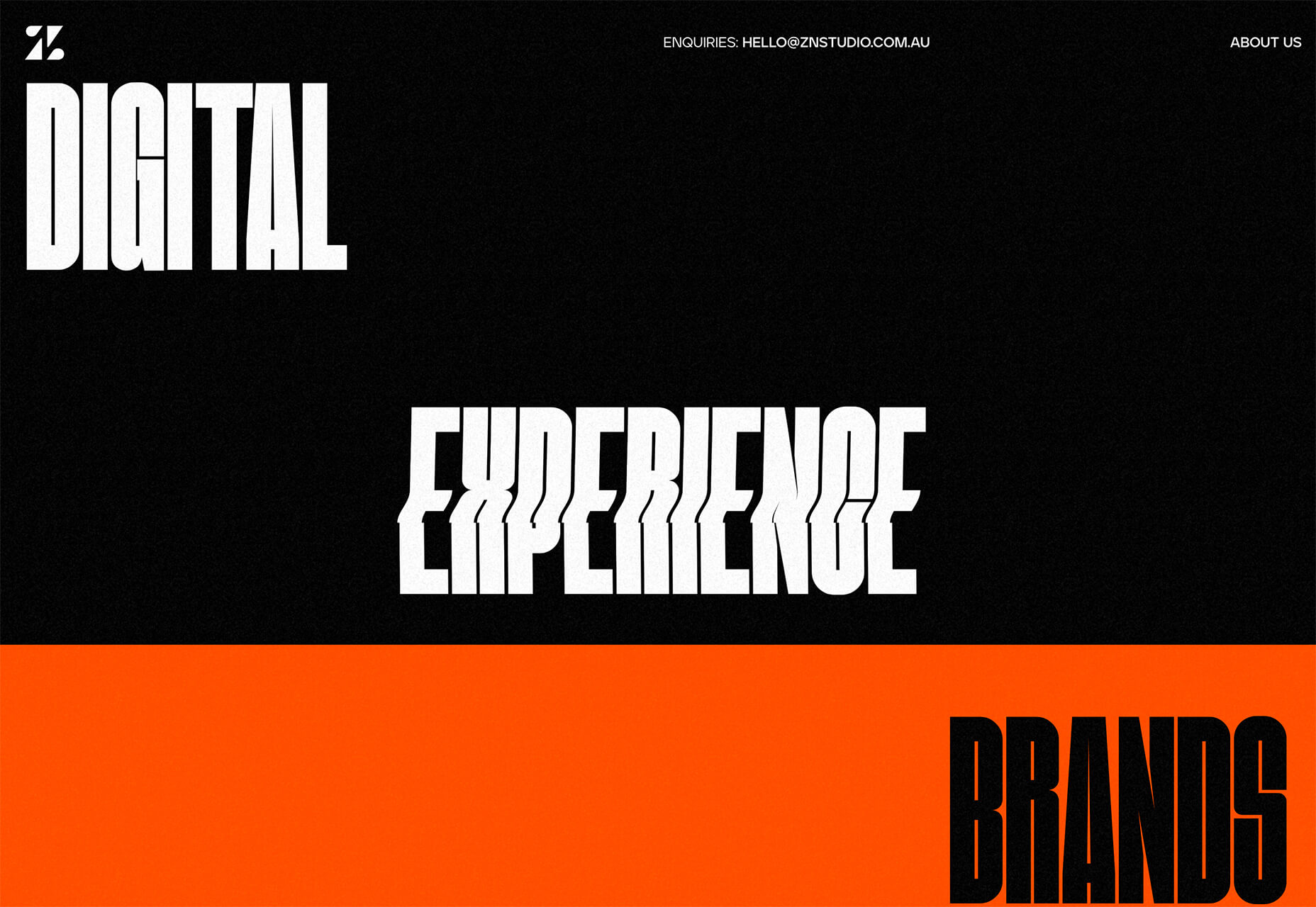
ZN Studio uses the same big, bold type elements as the previous example with a twitchy-style animation to draw you into the design. The entire design uses clever animation effects with a brutal aesthetic to keep you scrolling.


2. Beautiful Slide Scrolling

You can argue the value – or lack thereof – of website sliders as long as you want to. The reality, though, is that, for the most part, they are clunky and get in the way of the content. It’s a lazy option that keeps you from having to make a content choice.

Not with these beautiful slide-scrolling website designs.

Each of these designs uses side-scrolling as a design asset. Here’s the trick that makes it work: Slide scrolling isn’t a “feature” above a bunch of other content. It is how the content is featured.

These examples show you how to use the trend well and should get you excited about slide (or side) scrolling.

Eduardo del Fraile uses a side scroll to show different projects in his portfolio. In addition to scroll, each element also has a simple and beautiful animation that allows you to see each product he has designed. Everything about the scrolling motion is intuitive, and the site never scrolls vertically, which is where many side scrollers go wrong.

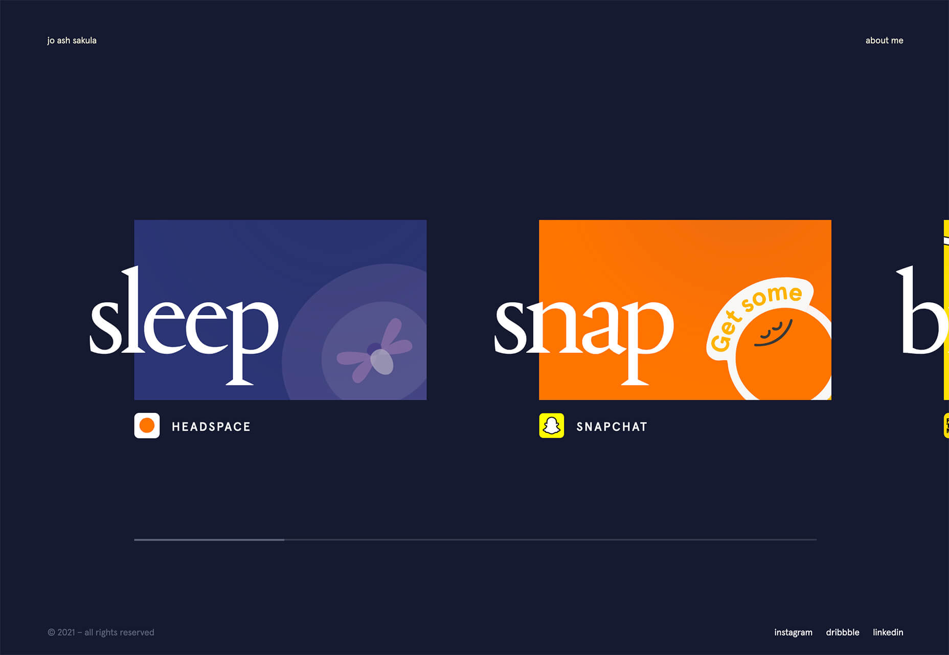
Jo Ash Sakula uses a similar concept for the side scroll here but with different design elements. The bold card elements are striking in terms of color, contrast, and design. You know the scroll will move horizontally because a third element sneaks into your field of vision on the right side. It’s simple, clean, and highly usable.

Crimea is interesting because it has an “almost brutalism” style design and uses a side-scrolling pattern. The design is bold and almost overwhelming, but the scroll works to tell a nice story with visuals and content.


3. Typography Animations

Web typography can make or break a design from font choice to size and color to animation, every detail with text elements matters.

This trend explores and pushes the boundaries of animation with text elements in website design. And it is so tricky. The difference between an amazing result and a design fail is a thin line that can be quite subjective.

Each of these examples does something unique with text and animation together to create just the right feel. The flow for each is seamless and text elements – while incorporating movement – maintain readability.

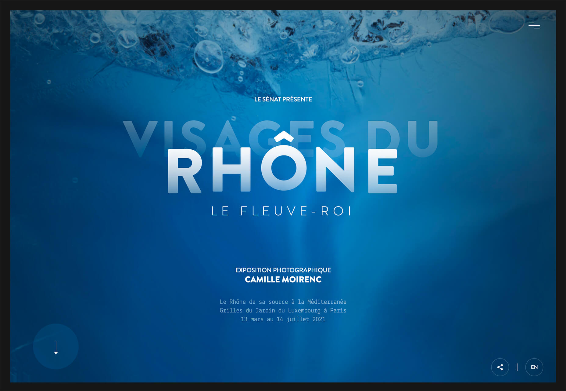
Visages Du Rhone has two layers of animation. The first happens as the words come onto the screen as the color and fade change within the letters. The second is a subtle hover state with a fluid feel for the letters that match the design’s underwater theme. What’s special about the typography animation is that it happens without distorting the letters, something many other liquid text animations do.

Poolhouse uses transparent letters with movement in a layer behind the words. What’s very neat here is the additional filtering so that the background motion still works while maintaining the integrity of each letterform. Again, the focus on keeping text readable is what sets this design apart and makes it trend-worthy.

Komnata takes a wholly different approach with letters that float and look like balloons. The motion mimics what you would expect from an element that looks and feels like something in the real world. The user doesn’t have to do anything for this motion to take place. The animation might be even more effective if the scroll and pointer did not have a tail that “draws” on the screen as a distracting element.


Conclusion

The good thing about looking at variations of different trends is that you can see the practical application and apply it to your projects. While you might not move to a full sliding scroll on your website homepage, you could use that concept in another part of the design.

Experiment, have fun and draw inspiration from trending website designs.

Source

The post 3 Essential Design Trends, April 2021 first appeared on Webdesigner Depot.

Categories: Designing, Others Tags: