Archive

Archive for August, 2021

Native Search vs. Jetpack Instant Search in Headless WordPress With Gatsby

August 18th, 2021 No comments

Have you already tried using WordPress headlessly with Gatsby? If you haven’t, you might check this article around the new Gatsby source plugin for WordPress; gatsby-source-wordpress is the official source plugin introduced in March 2021 as a part of the Gatsby 3 release. It significantly improves the integration with WordPress. Also, the WordPress plugin WPGraphQL providing the GraphQL API is now available via the official WordPress repository.

With stable and maintained tools, developing Gatsby websites powered by WordPress becomes easier and more interesting. I got myself involved in this field, I co-founded (with Alexandra Spalato), and recently launched Gatsby WP Themes — a niche marketplace for developers building WordPress-powered sites with Gatsby. In this article, I would love to share my insights and, in particular, discuss the search functionality.

Search does not come out of the box, but there are many options to consider. I will focus on two distinct possibilities — taking advantage of WordPress native search (WordPress search query) vs. using Jetpack Instant Search.

Getting started

Let’s start by setting up a WordPress-powered Gatsby website. For the sake of simplicity, I will follow the getting started instructions and install the gatsby-starter-wordpress-blog starter.

gatsby new gatsby-wordpress-w-search https://github.com/gatsbyjs/gatsby-starter-wordpress-blog

This simple, bare-bone starter creates routes exclusively for individual posts and blog pages. But we can keep it that simple here. Let’s imagine that we don’t want to include pages within the search results.

For the moment, I will leave the WordPress source website as it is and pull the content from the starter author’s WordPress demo. If you use your own source, just remember that there are two plugins required on the WordPress end (both available via the plugin repository):

  • WPGraphQL – a plugin that runs a GraphQL server on the WordPress instance
  • WPGatsby – a plugin that modifies the WPGraphQL schema in Gatsby-specific ways (it also adds some mechanism to optimize the build process)

Setting up Apollo Client

With Gatsby, we usually either use the data from queries run on page creation (page queries) or call the useStaticQuery hook. The latter is available in components and does not allow dynamic query parameters; its role is to retrieve GraphQL data at build time. None of those two query solutions works for a user’s-initiated search. Instead, we will ask WordPress to run a search query and send us back the results. Can we send a graphQL search query? Yes! WPGraphQL provides search; you can search posts in WPGraphQL like so:

posts(where: {search: "gallery"}) {
  nodes {
    id
    title
    content
  }
}

In order to communicate directly with our WPGraphQL API, we will install Apollo Client; it takes care of requesting and caching the data as well as updating our UI components.

yarn add @apollo/client cross-fetch

To access Apollo Client anywhere in our component tree, we need to wrap our app with ApolloProvider. Gatsby does not expose the App component that wraps around the whole application. Instead, it provides the wrapRootElement API. It’s a part of the Gatsby Browser API and needs to be implemented in the gatsby-browser.js file located at the project’s root.

// gatsby-browser.js
import React from "react"
import fetch from "cross-fetch"
import { ApolloClient, HttpLink, InMemoryCache, ApolloProvider } from "@apollo/client"
const cache = new InMemoryCache()
const link = new HttpLink({
  /* Set the endpoint for your GraphQL server, (same as in gatsby-config.js) */
  uri: "https://wpgatsbydemo.wpengine.com/graphql",
  /* Use fetch from cross-fetch to provide replacement for server environment */
  fetch
})
const client = new ApolloClient({
  link,
  cache,
})
export const wrapRootElement = ({ element }) => (
  <ApolloProvider client={client}>{element}</ApolloProvider>
)

SearchForm component

Now that we’ve set up ApolloClient, let’s build our Search component.

touch src/components/search.js src/components/search-form.js src/components/search-results.js src/css/search.css

The Search component wraps SearchForm and SearchResults

// src/components/search.js
import React, { useState } from "react"
import SearchForm from "./search-form"
import SearchResults from "./search-results"

const Search = () => {
  const [searchTerm, setSearchTerm] = useState("")
  return (
    <div className="search-container">
      <SearchForm setSearchTerm={setSearchTerm} />
      {searchTerm && <SearchResults searchTerm={searchTerm} />}
    </div>
  )
}
export default Search

is a simple form with controlled input and a submit handler that sets the searchTerm state value to the user submission.

// src/components/search-form.js
import React, { useState } from "react"
const SearchForm = ({ searchTerm, setSearchTerm }) => {
  const [value, setValue] = useState(searchTerm)
  const handleSubmit = e => {
    e.preventDefault()
    setSearchTerm(value)
  }
  return (
    <form role="search" onSubmit={handleSubmit}>
      <label htmlFor="search">Search blog posts:</label>
      <input
        id="search"
        type="search"
        value={value}
        onChange={e => setValue(e.target.value)}
      />
      <button type="submit">Submit</button>
    </form>
  )
}
export default SearchForm

The SearchResults component receives the searchTerm via props, and that’s where we use Apollo Client.

For each searchTerm, we would like to display the matching posts as a list containing the post’s title, excerpt, and a link to this individual post. Our query will be like so:

const GET_RESULTS = gql`
  query($searchTerm: String) {
    posts(where: { search: $searchTerm }) {
      edges {
        node {
          id
          uri
          title
          excerpt
        }
      }
    }
  }
`

We will use the useQuery hook from @apollo-client to run the GET_RESULTS query with a search variable.

// src/components/search-results.js
import React from "react"
import { Link } from "gatsby"
import { useQuery, gql } from "@apollo/client"
const GET_RESULTS = gql`
  query($searchTerm: String) {
    posts(where: { search: $searchTerm }) {
      edges {
        node {
          id
          uri
          title
          excerpt
        }
      }
    }
  }
`
const SearchResults = ({ searchTerm }) => {
  const { data, loading, error } = useQuery(GET_RESULTS, {
    variables: { searchTerm }
  })
  if (loading) return <p>Searching posts for {searchTerm}...</p>
  if (error) return <p>Error - {error.message}</p>
  return (
    <section className="search-results">
      <h2>Found {data.posts.edges.length} results for {searchTerm}:</h2>
      <ul>
        {data.posts.edges.map(el => {
          return (
            <li key={el.node.id}>
              <Link to={el.node.uri}>{el.node.title}</Link>
            </li>
          )
        })}
      </ul>
    </section>
  )
}
export default SearchResults

The useQuery hook returns an object that contains loading, error, and data properties. We can render different UI elements according to the query’s state. As long as loading is truthy, we display

Searching posts...

. If loading and error are both falsy, the query has completed and we can loop over the data.posts.edges and display the results.

if (loading) return <p>Searching posts...</p>
if (error) return <p>Error - {error.message}</p>
// else
return ( //... )

For the moment, I am adding the to the layout component. (I’ll move it somewhere else a little bit later.) Then, with some styling and a visible state variable, I made it feel more like a widget, opening on click and fixed-positioned in the top right corner.

Paginated queries

Without the number of entries specified, the WPGraphQL posts query returns ten first posts; we need to take care of the pagination. WPGraphQL implements the pagination following the Relay Specification for GraphQL Schema Design. I will not go into the details; let’s just note that it is a standardized pattern. Within the Relay specification, in addition to posts.edges (which is a list of { cursor, node } objects), we have access to the posts.pageInfo object that provides:

  • endCursor – cursor of the last item in posts.edges,
  • startCursor – cursor of the first item in posts.edges,
  • hasPreviousPage – boolean for “are there more results available (backward),” and
  • hasNextPage – boolean for “are there more results available (forward).”

We can modify the slice of the data we want to access with the additional query variables:

  • first – the number of returned entries
  • after – the cursor we should start after

How do we deal with pagination queries with Apollo Client? The recommended approach is to use the fetchMore function, that is (together with loading, error and data) a part of the object returned by the useQuery hook.

// src/components/search-results.js
import React from "react"
import { Link } from "gatsby"
import { useQuery, gql } from "@apollo/client"
const GET_RESULTS = gql`
  query($searchTerm: String, $after: String) {
    posts(first: 10, after: $after, where: { search: $searchTerm }) {
      edges {
        node {
          id
          uri
          title
        }
      }
      pageInfo {
        hasNextPage
        endCursor
      }
    }
  }
`
const SearchResults = ({ searchTerm }) => {
  const { data, loading, error, fetchMore } = useQuery(GET_RESULTS, {
    variables: { searchTerm, after: "" },
  })
  if (loading && !data) return <p>Searching posts for {searchTerm}...</p>
  if (error) return <p>Error - {error.message}</p>
  const loadMore = () => {
    fetchMore({
      variables: {
        after: data.posts.pageInfo.endCursor,
      },
      // with notifyOnNetworkStatusChange our component re-renders while a refetch is in flight so that we can mark loading state when waiting for more results (see lines 42, 43)
      notifyOnNetworkStatusChange: true,
    })
  }

  return (
    <section className="search-results">
      {/* as before */}
      {data.posts.pageInfo.hasNextPage && (
        <button type="button" onClick={loadMore} disabled={loading}>
          {loading ? "Loading..." : "More results"}
        </button>
      )}
    </section>
  )
}
export default SearchResults

The first argument has its default value but is necessary here to indicate that we are sending a paginated request. Without first, pageInfo.hasNextPage will always be false, no matter the search keyword.

Calling fetchMore fetches the next slice of results but we still need to tell Apollo how it should merge the “fetch more” results with the existing cached data. We specify all the pagination logic in a central location as an option passed to the InMemoryCache constructor (in the gatsby-browser.js file). And guess what? With the Relay specification, we’ve got it covered — Apollo Client provides the relayStylePagination function that does all the magic for us.

// gatsby-browser.js
import { ApolloClient, HttpLink, InMemoryCache, ApolloProvider } from "@apollo/client"
import { relayStylePagination } from "@apollo/client/utilities"
const cache = new InMemoryCache({
  typePolicies: {
    Query: {
      fields: {
        posts: relayStylePagination(["where"]),
      },
    },
  },
})
/* as before */

Just one important detail: we don’t paginate all posts, but instead the posts that correspond to a specific where condition. Adding ["where"] as an argument to relayStylePagination creates a distinct storage key for different search terms.

Making search persistent

Right now my Search component lives in the Layout component. It’s displayed on every page but gets unmounted every time the route changes. What if we could keep the search results while navigating? We can take advantage of the Gatsby wrapPageElement browser API to set persistent UI elements around pages.

Let’s move from the layout component to the wrapPageElement:

// gatsby-browser.js
import Search from "./src/components/search"
/* as before */
export const wrapPageElement = ({ element }) => {
  return <><Search />{element}</>
}

The APIs wrapPageElement and wrapRootElement exist in both the browser and Server-Side Rendering (SSR) APIs. Gatsby recommends that we implement wrapPageElement and wrapRootElement in both gatsby-browser.js and gatsby-ssr.js. Let’s create the gatsby-ssr.js (in the root of the project) and re-export our elements:

// gatsby-ssr.js
export { wrapRootElement, wrapPageElement } from "./gatsby-browser"

I deployed a demo where you can see it in action. You can also find the code in this repo.

The wrapPageElement approach may not be ideal in all cases. Our search widget is “detached” from the layout component. It works well with the position “fixed” like in our working example or within an off-canvas sidebar like in this Gatsby WordPress theme.

But what if you want to have “persistent” search results displayed within a “classic” sidebar? In that case, you could move the searchTerm state from the Search component to a search context provider placed within the wrapRootElement:

// gatsby-browser.js
import SearchContextProvider from "./src/search-context"
/* as before */
export const wrapRootElement = ({ element }) => (
  <ApolloProvider client={client}>
    <SearchContextProvider>
      {element}
    </SearchContextProvider>
  </ApolloProvider>
)

…with the SearchContextProvider defined as below:

// src/search-context.js
import React, {createContext, useState} from "react"
export const SearchContext = createContext()
export const SearchContextProvider = ({ children }) => {
  const [searchTerm, setSearchTerm] = useState("")
  return (
    <SearchContext.Provider value={{ searchTerm, setSearchTerm }}>
      {children}
    </SearchContext.Provider>
  )
}

You can see it in action in another Gatsby WordPress theme:

Note how, since Apollo Client caches the search results, we immediately get them on the route change.

Results from posts and pages

If you checked the theme examples above, you might have noticed how I deal with querying more than just posts. My approach is to replicate the same logic for pages and display results for each post type separately.

Alternatively, you could use the Content Node interface to query nodes of different post types in a single connection:

const GET_RESULTS = gql`
  query($searchTerm: String, $after: String) {
    contentNodes(first: 10, after: $after, where: { search: $searchTerm }) {
      edges {
        node {
          id
          uri
          ... on Page {
            title
          }
          ... on Post {
            title
            excerpt
          }
        }
      }
      pageInfo {
        hasNextPage
        endCursor
      }
    }
  }
`

Going beyond the default WordPress search

Our solution seems to work but let’s remember that the underlying mechanism that actually does the search for us is the native WordPress search query. And the WordPress default search function isn’t great. Its problems are limited search fields (in particular, taxonomies are not taken into account), no fuzzy matching, no control over the order of results. Big websites can also suffer from performance issues — there is no prebuilt search index, and the search query is performed directly on the website SQL database.

There are a few WordPress plugins that enhance the default search. Plugins like WP Extended Search add the ability to include selected meta keys and taxonomies in search queries.

The Relevanssi plugin replaces the standard WordPress search with its search engine using the full-text indexing capabilities of the database. Relevanssi deactivates the default search query which breaks the WPGraphQL where: {search : …}. There is some work already done on enabling Relevanssi search through WPGraphQL; the code might not be compatible with the latest WPGraphQL version, but it seems to be a good start for those who opt for Relevanssi search.

In the second part of this article, we’ll take one more possible path and have a closer look at the premium service from Jetpack — an advanced search powered by Elasticsearch. By the way, Jetpack Instant search is the solution adopted by CSS-Tricks.

Using Jetpack Instant Search with Gatsby

Jetpack Search is a per-site premium solution by Jetpack. Once installed and activated, it will take care of building an Elasticsearch index. The search queries no longer hit the SQL database. Instead, the search query requests are sent to the cloud Elasticsearch server, more precisely to:

https://public-api.wordpress.com/rest/v1.3/sites/{your-blog-id}/search

There are a lot of search parameters to specify within the URL above. In our case, we will add the following:

  • filter[bool][must][0][term][post_type]=post: We only need results that are posts here, simply because our Gatsby website is limited to post. In real-life use, you might need spend some time configuring the boolean queries.
  • size=10 sets the number of returned results (maximum 20).
  • with highlight_fields[0]=title, we get the title string (or a part of it) with the searchTerm within the tags.
  • highlight_fields[0]=content is the same as below but for the post’s content.

There are three more search parameters depending on the user’s action:

  • query: The search term from the search input, e.g. gallery
  • sort: how the results should be orderer, the default is by score "score_default" (relevance) but there is also "date_asc" (newest) and "date_desc" (oldest)
  • page_handle: something like the “after” cursor for paginated results. We only request 10 results at once, and we will have a “load more” button.

Now, let’s see how a successful response is structured:

{
  total: 9,
  corrected_query: false,
  page_handle: false, // or a string it the total value > 10
  results: [
    {
      _score: 196.51814,
      fields: {
        date: '2018-11-03 03:55:09',
        'title.default': 'Block: Gallery',
        'excerpt.default': '',
        post_id: 1918,
        // we can configure what fields we want to add here with the query search parameters
      },
      result_type: 'post',
      railcar: {/* we will not use this data */},
      highlight: {
        title: ['Block: <mark>Gallery</mark>'],
        content: [
          'automatically stretch to the width of your <mark>gallery</mark>. ... A four column <mark>gallery</mark> with a wide width:',
          '<mark>Gallery</mark> blocks have two settings: the number of columns, and whether or not images should be cropped',
        ],
      },
    },
    /* more results */
  ],
  suggestions: [], // we will not use suggestions here
  aggregations: [], // nor the aggregations
}

The results field provides an array containing the database post IDs. To display the search results within a Gatsby site, we need to extract the corresponding post nodes (in particular their uri ) from the Gatsby data layer. My approach is to implement an instant search with asynchronous calls to the rest API and intersect the results with those of the static GraphQL query that returns all post nodes.

Let’s start by building an instant search widget that communicates with the search API. Since this is not specific to Gatsby, let’s see it in action in this Pen:

CodePen Embed Fallback

Here, useDebouncedInstantSearch is a custom hook responsible for fetching the results from the Jetpack Search API. My solution uses the awesome-debounce-promise library that allows us to take some extra care of the fetching mechanism. An instant search responds to the input directly without waiting for an explicit “Go!” from the user. If I’m typing fast, the request may change several times before even the first response arrives. Thus, there might be some unnecessary network bandwidth waste. The awesome-debounce-promise waits a given time interval (say 300ms) before making a call to an API; if there is a new call within this interval, the previous one will never be executed. It also resolves only the last promise returned from the call — this prevents the concurrency issues.

Now, with the search results available, let’s move back to Gatsby and build another custom hook:

import {useStaticQuery, graphql} from "gatsby"

export const useJetpackSearch = (params) => {
  const {
    allWpPost: { nodes },
  } = useStaticQuery(graphql`
    query AllPostsQuery {
      allWpPost {
        nodes {
          id
          databaseId
          uri
          title
          excerpt
        }
      }
    }
  `)
  const { error, loading, data } = useDebouncedInstantSearch(params)
  return {
    error,
    loading,
    data: {
      ...data,
      // map the results
      results: data.results.map(el => {
        // for each result find a node that has the same databaseId as the result field post_id
        const node = nodes.find(item => item.databaseId === el.fields.post_id)
        return {
          // spread the node
          ...node,
          // keep the highlight info
          highlight: el.highlight
        }
      }),
    }
  }
}

I will call the useJetpackSearch within . The Gatsby-version of is almost identical as that in the Pen above. The differences are highlighted in the code block below. The hook useDebouncedInstantSearch is replaced by useJetpackSearch (that calls the former internally). There is a Gatsby Link that replaces h2 as well as el.fields["title.default"] and el.fields["excerpt.default"] are replaced by el.title and el.excerpt.

const SearchResults = ({ params, setParams }) => {
  const { loading, error, data } = useJetpackSearch(params)
  const { searchTerm } = params
  if (error) {
    return <p>Error - {error}</p>
  }
  return (
    <section className="search-results">
      {loading ? (
        <p className="info">Searching posts .....</p>
      ) : (
        <>
          {data.total !== undefined && (
            <p>
              Found {data.total} results for{" "}
              {data.corrected_query ? (
                <>
                  <del>{searchTerm}</del> <span>{data.corrected_query}</span>
                </>
              ) : (
                <span>{searchTerm}</span>
              )}
            </p>
          )}
        </>
      )}
      {data.results?.length > 0 && (
        <ul>
          {data.results.map((el) => {
            return (
              <li key={el.id}>
                <Link to={el.uri}>
                  {el.highlight.title[0]
                    ? el.highlight.title.map((item, index) => (
                        <React.Fragment key={index}>
                          {parse(item)}
                        </React.Fragment>
                      ))
                    : parse(el.title)}
                </Link>
                <div className="post-excerpt">
                  {el.highlight.content[0]
                    ? el.highlight.content.map((item, index) => (
                        <div key={index}>{parse(item)}</div>
                      ))
                    : parse(el.excerpt)}
                </div>
              </li>
            );
          })}
        </ul>
      )}
      {data.page_handle && (
        <button
          type="button"
          disabled={loading}
          onClick={() => setParams({ pageHandle: data.page_handle })}
        >
          {loading ? "loading..." : "load more"}
        </button>
      )}
    </section>
  )
}

You can find the complete code in this repo and see it in action in this demo. Note that I no longer source WordPress data from the generic WordPress demo used by Gatsby starter. I need to have a website with Jetpack Search activated.

Wrapping up

We’ve just seen two ways of dealing with search in headless WordPress. Besides a few Gatsby-specific technical details (like using Gatsby Browser API), you can implement both discussed approaches within other frameworks. We’ve seen how to make use of the native WordPress search. I guess that it is an acceptable solution in many cases.

But if you need something better, there are better options available. One of them is Jetpack Search. Jetpack Instant Search does a great job on CSS-Tricks and, as we’ve just seen, can work with headless WordPress as well. There are probably other ways of implementing it. You can also go further with the query configuration, the filter functionalities, and how you display the results.


The post Native Search vs. Jetpack Instant Search in Headless WordPress With Gatsby appeared first on CSS-Tricks. You can support CSS-Tricks by being an MVP Supporter.

Categories: Designing, Others Tags:

Quick Ways to Make a Webpage More Scannable

August 18th, 2021 No comments

In the information age, time is a valuable commodity and something people don’t want to spend too much of. As a result, the average visitor only reads about 20% of the content of a page

For web designers and developers, that means a few things: first, you need to ensure that the web pages you create are as engaging as possible; secondly, you need to find a way of making the critical information on any page stand out; thirdly, every modern designer needs to create assets that are easy for today’s fast-paced customers to use. 

Making websites more scannable is how you do your part as a designer to ensure that the customers who come to a page get the quick and convenient experiences they need. 

So, how do designers embrace scannability?

Designing for Scannability: An Introduction

At first glance, the concept of creating a website for scannability is strange. 

Most designers start their projects with the aim of making customers stay on a page for as long as possible. So it’s odd to think that you would want to make it simple for end-users to skip from one page to another on a website in a matter of seconds. 

However, scannability isn’t just about delivering information and getting users off a page. When sites are scannable, they make it quicker and easier for customers to slide down the purchasing funnel. A quicker and more convenient customer journey leads to a stronger user experience and more conversions. 

Look at Netflix, for instance. It doesn’t give interested users a ton of information on its homepage. Instead, the key USPs of the product are laid out bright and bold in the middle of the screen, along with one simple call to action: Get Started.

Designing for scannability means making it easy for users on a page to glance at a screen and instantly access all the information they need to take the next step in their buyer journey. 

There’s no needless scrolling or wondering what to do next. 

According to analyst Jacob Nielsen, scannability is essential because people look for specific things on every page they visit. 

Customers don’t read through web pages word by word. Instead, they scan through the content, plucking information out that serves their requirements. 

Questions to Ask When Designing for Scannability

So, how do you know if your web pages are scannable?

Start by asking the following questions:

  • What’s the intent of the people who arrive on this page?
  • What kind of information needs to be conveyed instantly?
  • Can the visitor see the next step in their journey immediately?

For instance, when someone arrives on the Evernote homepage, you can assume that they want to:

  • Find out about Evernote
  • Learn how to sign up
  • Jump to other pages to find out about features, and contact details

That’s why the designer behind the Evernote website placed an immediate piece of useful information at the top of the page: “Tame your work, organize your life” tells customers exactly what the entire product is all about. The brief paragraph of information underneath can provide a few more details if customers need it, then there’s an immediate call to action: Sign up for free. 

Not only does the call to action tell users what to do next, but it tells them the most important information they need straight away: it’s free. 

Scannable pages like this are useful because:

  • They help users complete their tasks quicker: Whether you want to sign up or learn more about the product, everything you need is available instantly, with no scrolling required. 
  • The bounce rate is reduced. Customers don’t get confused and hit the back button. That’s good for your client’s SEO and their bottom line. 
  • The website looks and feels more credible: Because customers get all the answers to their questions immediately, they’re more likely to trust the website. 

So, what are some of the best things you can do to make your sites as scannable as possible?

Use Visual Hierarchy

Visual hierarchy is a way of organizing the content on your website in a way that adheres to how people use the website. For instance, if you land on a blog page, you expect to see the headline first, maybe some information about the writer, and any other essential information, followed by the body content. 

Although it’s tempting for designers to try and surprise users with new visual strategies, the best way to make your content more scannable is to give end-users precisely what they expect. 

If you’re not sure what a page should look like, try checking out the competition. 

One of the most obvious visual hierarchy rules is that the main navigation should always go at the top of the page. 

Customers will expect to look at the top of the page to find navigation. They don’t want to have to scroll through your website, searching for a way to get to another page. If you want to make it as easy as possible for end-users to jump from one page to another, you can pin the navigation bar to the page so that it stays with users as they scroll. 

Maintain Negative Space

White space, negative space, or whatever you call it – is the part of your design that’s left empty. 

White space is crucial because it gives all of the objects on your page some much-needed breathing room. Without enough negative space on your pages, it’s impossible to embrace scannability because there’s too much information for a customer to take in at once. 

For instance, notice how there are big gaps of space between every element on a Forbes website post. A proper amount of negative space on your site ensures that users can quickly take in chunks of information and use that information to decide what to do next. 

To ensure there’s enough negative space on your website pages, ask yourself what the key elements visitors will notice when they come to a website. The essential items should be:

  • A title or header to confirm that the user is in the right place
  • A CTA that shows your user what to do next
  • A navigation header or menu
  • Critical information includes an introduction to what a page is about or an excerpt from the blog post they’re about to read. 
  • A visual component: A picture or image that gives context to the page. 

Anything else can usually be removed. So, for instance, if Forbes wanted to make the page above more scannable, they could easily remove the ads and social media sharing buttons.

Make the Next Step Obvious

Every page on a website exists in a hierarchy within the customer journey. 

A homepage leads customers to product pages, which leads to a checkout page, which connects to a thank-you page that sends the visitor back to another product page, and so on. 

When designing for scannability, it’s crucial to make the next step in the journey as obvious as possible. Usually, this means placing the call to action “above the fold,” where the customer can see it immediately.

Ideally, scannable pages should have just one CTA. This will stop your audience members from being confused or overwhelmed by choice. 

However, if you’ve got multiple CTAs, think about the average customer’s journey and what they’ll want access to first.

If those buttons don’t appeal to the customer, they can scroll a little further and see other “next step” options, like shopping for “self-isolation essentials” or browsing other popular product categories:

Test Every Page

Testing for scannability means examining every page and making sure that it’s as easy as possible for customers to move through the buying process as fast as they want to. 

Visit each page you design in a buyer journey and ask how quickly it would take end-users to get from point A to point B and beyond. Here are some of the common issues that might slow the customer’s journey and harm scannability:

  • Readability: Is the font legible? Is it large enough to read on all screens, including mobile devices? Legibility in the design world measures how quickly and intuitively your users can distinguish what’s going on any page. Remember that the color of the background, the amount of negative space around copy blocks, and even font pairing can impact the readability of the content. Show your pages to multiple people and time how long it takes for them to grasp the message that you’re trying to convey. 
  • Fluff: Fluff and extra features can make your pages more intriguing, but they can also slow users down. For instance, one picture at the top of a blog page can add context to the article. A slideshow of pictures stops the customer from progressing and keeps them stuck at the top of the page for longer. 
  • Words instead of numbers: According to Nielsen, eye-tracking studies show that numerals often stop the wandering eye. Numbers are compact and more regularly associated with statistics and facts, so they’re more likely to grab attention. If you want to get important points across to end users fast, use numbers, not words. 

Creating Scannable Pages

Scannability is becoming an increasingly important concept in today’s busy landscape. 

Now that more customers are browsing websites from their smartphones or checking out products on the move, designers need to think more carefully about adjusting to this agile environment. 

Scannable pages that move visitors along the buying cycle and into the next stage of the funnel will deliver better results for your clients, and therefore better outcomes for you. 

Source

The post Quick Ways to Make a Webpage More Scannable first appeared on Webdesigner Depot.

Categories: Designing, Others Tags:

5 Ways to Get More Clients as a Freelancer in 2021

August 18th, 2021 No comments

Being a freelancer is fantastic and there are multiple perks. You get to set your own hours and work wherever you want. However, if there’s one downside it’s that you have to source all your clients yourself. And as any business will tell you, without clients – there’s no business.

Because there are now more freelancers than ever before, getting more clients has become more challenging. You perhaps have to think outside the box a bit more and get creative. 

In this article, we’re going to take a look at 5 ways to get more clients as a freelancer in 2021. These tactics can be implemented by anyone regardless of what type of freelancer you are. 

1. Leverage LinkedIn to the Fullest

There are, of course, multiple “lead generation” channels a freelancer can leverage in 2021, including Facebook and email. 

But if there’s one that truly stands out among the rest at the moment, it’s LinkedIn. 

LinkedIn is a networking hub where recruiters and job seekers alike can connect. For freelancers, it’s a veritable treasure trove where you can find businesses that are looking to hire remote freelancers just like you. 

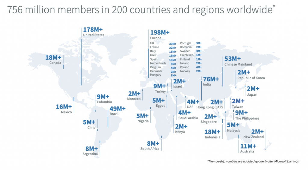
LinkedIn is used by 756 million people, with stats showing that there are at least 15 million open jobs on LinkedIn Jobs.

Image Source

Complementing these figures is the fact that almost 50% of businesses now employ at least one freelancer. This means that, if there are recruiters on LinkedIn looking for new personnel in your niche, there’s every chance they’ll hire a freelancer. 

So how can you leverage LinkedIn to get more clients as a freelancer? Here are some tips:

i. Use the Right Keywords 

Just like Google, being seen on LinkedIn requires you to work on your SEO. 

In other words, it’s the profiles that offer the most value and which have done all the right things when it comes to SEO that end up at the top of the search results. 

This means (among other things) that you need to use the right keywords that will allow your profile to pop up in the right search results.

For example, if a recruiter is looking for a freelance videographer in Manhattan, they will likely use the keyword “freelance videographer in Manhattan” in their search. Unless you’ve optimized your profile to include this keyword, you simply won’t show up in the search results. 

As a freelancer, it’s really important that you add the word “freelancer” to your profile. This will help you appear in more relevant search results, but it will also show anyone who accidentally stumbles across your profile and who is in need of a freelancer that you might be the candidate they’re looking for. 

As well as optimizing your profile, LinkedIn hashtags are handy for optimizing your updates on LinkedIn. Use niche-oriented hashtags to make your content stand out to potential new clients.

ii. Sum Up What You Do

Once a recruiter lands on your profile, the last thing they want is to be besieged by a huge, wordy profile that doesn’t really tell them anything. Instead, it’s a much smarter idea to succinctly sum up what it is that you do in one or two lines. 

Outline your services, as well as what you can do for your next client (without being too salesy), and employ bullets to break up the text. 

iii. Upload a Smart, Professional Headshot 

Profile pictures go a long way on LinkedIn. As a freelancer, it’s essential that you add one which is professional but which manages to convey what your brand is all about. 

iv. Stay Active on Your Account

Recruiters might shy away from approaching you if your profile looks inactive. To ensure more invitations to job interviews, be active. This means leaving comments on other posts, regularly updating your profile with your latest jobs, and even posting articles and news updates about your niche and business. 

2. Tighten Up Your Client Outreach 

Client outreach should form an integral part of your client-getting strategy because, sometimes, clients won’t know about you unless you make the initial approach.

And sometimes, they won’t be ready to work with you until you contact them again – and again.

In other words, client outreach requires you to be bold and persistent. 

It also requires you to be dedicated and committed to taking action.

For client outreach to be effective, you first need to identify potential leads. You can find leads on LinkedIn, as well as on Google and even Facebook. 

Then, you could create a schedule for when you’ll perform client outreach each week (otherwise it may never get done). You’ll need to come up with a good client outreach email template (which should be tweaked according to open and response rates), before sending emails and follow-up emails on specific days, and at specific times each week. 

What should an outreach email look like? 

There’s no magic bullet but here are some general rules of thumb: 

  • Keep it short and get straight to the point
  • Let the client know what you can do for them
  • Address their pain points (but don’t dwell on them too much)
  • Give them advice – solve one of their pain points now (demonstrate your expertise)
  • Personalize each email 

Your social channels are a vital outreach tool also. LinkedIn goes without saying, but again, even Facebook can be used for outreach in some circumstances.

One key rule of all outreach whether it is via email or via social media is to respond to your potential leads quickly; ‘strike while the iron is hot’ as the saying goes. Social media engagement tools allow you to respond rapidly but without having to constantly check on all your different profiles.

3. Use Testimonials 

It’s one thing if you as a freelancer say how good you are and what you can do for clients. But it’s much more advantageous if other people say it for you.

This is where client testimonials come in. Client testimonials help to build trust and confidence in your brand simply because they’re coming from outside sources other than yourself. 

Remember, it’s difficult for any of us to trust something that’s new. But it’s much easier to trust it if someone else has already used it before, and heaped praise on it. 

How can you use client testimonials? 

You can add them to your website’s landing page/homepage, as well as your social profiles (especially LinkedIn). 

Image Source

If you don’t have any testimonials at the moment and you’re not sure how to get some, the easiest way is simply to approach past, satisfied clients, and politely ask them if they’ll write you a testimonial. 

4. Create & Share Valuable Content

What does it mean to create and offer value as a freelancer? 

It means creating educational resources that help your clients solve problems before they’ve hired you. 

For example, conversion copywriter Joanne Wiebe runs a class every Tuesday called Tutorial Tuesdays, in which she teaches copywriting to potential clients. She’s giving out free information and teaching them a new skill that they can use in the future. Or, if they decide that she’s simply better than them, or that they don’t have the time, they might hire her to do their copywriting for them. 

Image Source

The idea is that you solve some of your client’s problems, but not all of them. By providing them with free, valuable content, you’re building trust and building relationships whilst demonstrating your expertise… but you’re also omitting crucial “secrets” that will encourage the client to perhaps hire you to complete jobs for them. 

Creating and offering value in this way also spreads goodwill and it helps to grow your brand and online presence. You can: 

It’s really important that, whenever you do create valuable content like this, you add a call to action somewhere in the middle and at the end. This is how you let any potential clients know that you’re available for work. 

5. Join a Freelance Marketplace 

While some freelancers might tell you that joining a freelance marketplace is a race to the bottom, these marketplaces are still one of the best ways to get more clients as a freelancer in 2021. This is because they were created specifically to connect freelancers with businesses, and many of them are used by thousands (and sometimes millions) of clients. 

There are lots of options available, too, with each marketplace serving different types of clients and freelancers. 

  • Upwork – Perhaps the most popular of all freelancer marketplaces, Upwork is currently used by a variety of companies. Budgets typically range from very small to high, and there are short and long term projects available. Both complete newbies and seasoned professionals alike are encouraged to sign up 
  • Toptal – Toptal is strictly aimed at experienced professionals who have been working in their niche for a number of years, either as a freelancer or a full-time employee. They have a screening process in place that aims to weed out unsuitable candidates, while clients include the likes of Airbnb
  • Freelancer – Freelancer is similar to Upwork in terms of its user base and flexibility. Newbies and pros can sign up, there are millions of jobs available, but where the two sites differ is that Freelancer lets you compete against other freelancers in order to land jobs 

Wrapping up 

Getting clients as a freelancer can take up a good amount of your time, which is why it’s also important that you put systems in place. Use the tips in this article but then start about creating a schedule and routine that ensures securing new clients doesn’t start to dominate your working life. 

Always remember also to not take on more work than you can manage, and to work at nurturing relationships with existing clients so that you’re not constantly looking for new ones. 

Categories: Others Tags:

DX, to Whom?

August 17th, 2021 No comments

Dave points to Sarah’s post on Developer Experience (DX) at Netlify. Part of what Sarah did there is lay out what the role means. It’s a three-part thing:

  1. Integrations Engineering (e.g. features)
  2. Developer Experience Engineering (e.g. building integrations to ensure quality end-to-end for customers)
  3. Documentation (e.g. … uh, documentation)

I like it. You gotta define the thing to do the thing. Dave, though, writes about being a consumer of DX rather than a creator of DX. Another three-parter:

  1. Is it easy? Does this technology solve a problem I have better than I’m currently doing it.
  2. Can I get help? If I have a problem, can I talk to someone? Will I talk to someone helpful or someone shitty?
  3. Is the community healthy? If I do go all-in on this, is the community toxic or nice? If applicable, do good community extensions exist?

Another favorite of mine on this subject is Shawn Wang’s Developer Exception Engineering, which agrees with the basic premise of DX, but then digs a little deeper into the “uncomfortable” (yet honest and candid) aspects. Here’s one example:

Is your pricing predictable or do your users need a spreadsheet to figure out what you are going to charge them? If charges are unexpectedly high, can developers use your software to figure out why or do they have to beg for help? Are good defaults in place to get advance warning?

I like that good DX can be born out of clarity in the uncomfortable bits. Where are the rough edges? Tell me, and you earn my trust. Hide it, and you lose it.


The post DX, to Whom? appeared first on CSS-Tricks. You can support CSS-Tricks by being an MVP Supporter.

Categories: Designing, Others Tags:

We are looking for Junior Experience Designers! (Closed)

August 17th, 2021 No comments


The hiring for this position is now officially closed!

Design Sojourn is a Design Led Innovation Consultancy that loves to inspire, impact and create better lives.

We are currently looking for smart, dynamic, self-motivated Junior Experience Designers with strong verbal/written communication skills and a natural inclination in getting things done well.

Fresh graduates, this is one for you!  Design Sojourn is known for its nurturing environment and a strong growth mindset culture.  Therefore, it is important to us that our fresh graduates have the right mindset and values. 

IRL design work is tough. Doing good design work is even tougher.  Why?  Because good design is just not about creating beautiful-looking things. The engine of a successful design contains a lot of field research, mapping processes, report writing, templates, and paperwork. Your new best friends are Excel, Powerpoint / Keynote, and Gmail. But every good designer needs to start somewhere, and this is an opportunity to learn about design from the ground up, right in the trenches, as a Junior Designer.


Junior Experience Designer Qualifications

  • An education in design from any discipline is preferred, but not required.  We have a team of multidisciplinary designers from diverse backgrounds, including those without qualifications in design.  
  • A degree or diploma is accepted. 
  • We are looking for fresh graduates that can provide evidence or demonstrate some knowledge or passion for Design.  
  • Please introduce yourself to hr [little mouse] designsojourn.com with your expected salary and a link to your CV/Portfolio. Only shortlisted candidates will be notified by email.


Unfortunately due to local employment laws, we can only accept applications from Singaporeans and PRs. This role is based in Singapore.

We look forward to hearing from you!

The post We are looking for Junior Experience Designers! (Closed) appeared first on Design Sojourn. Please click above if you cannot see this post.

Categories: Designing, Others Tags:

We are looking for Junior Experience Designers!

August 17th, 2021 No comments
we_are_hiring

We are a Design Led Innovation Consultancy that loves to inspire, impact and create better lives.

We are currently looking for smart, dynamic, self-motivated Junior Experience Designers with strong verbal/written communications skills and a natural inclination in getting things done well.

Fresh graduates, this is one for you!  Design Sojourn is known for its nurturing environment and a strong growth mindset culture.  Therefore, it is important to us that our fresh graduates have the right mindset and values.  If IRL design work is tough, good design work is even tougher.    

Junior Experience Designer Qualifications

  • Education qualifications in design from any discipline are preferred but not required.  We have a team of multidisciplinary designers from diverse backgrounds, including those without qualifications in design.  Degree or diploma accepted. 
  • We are looking for fresh graduates that can provide evidence or demonstrate some knowledge or passion for Design.  
  • Please introduce yourself to hr [little mouse] designsojourn.com with your expected salary and a link to your CV/Portfolio. Only shortlisted candidates will be notified by email.

Unfortunately due to local employment laws, we can only accept applications from Singaporeans and PRs. This role is based in Singapore.

We look forward to hearing from you!

The post We are looking for Junior Experience Designers! appeared first on Design Sojourn. Please click above if you cannot see this post.

Categories: Designing, Others Tags:

Tabs in HTML?

August 16th, 2021 No comments

You know what tabs are, Brian.

I mean… You use them every day, on every OS. Everybody knows they exist in every toolbox. All that’s left is to “just pave the cowpaths!” But when you get right down to it, it’s a lot more complicated than that.

Brian Kardell shares a bit about the progress of bringing “Tabs” to HTML. We kinda think we know what they are, but you have to be really specific when dealing with specs and defining them. It’s tricky. Then, even if you settle on a solid definition, an HTML expression of that isn’t exactly clear. There are all kinds of expressions of tabs that all make sense in their own way. Imagine marking up tabs where you put all the tabs as a row of links or buttons up top, and then a bunch of panels below that. They call that a “Table of Contents” style of markup, and it makes some kind of logical sense (“the markup looks like tabs already”). But it also has some problems, and it looks like sections-with-headers is more practical (“If you have the heading, you can build the TOC, but not vice-versa”). Spicy sections are a totally different pattern. And that’s just one problem they are facing.

I don’t envy the work, but I look forward to the progress in no small part because authoring tabs is tricky business. Not hard to do, but very hard to do right. I’ve talked in the past about how I’ve built tabs many times in jQuery where just a click handler on a row of links hides or shows some matching divs below. That “works” if you ignore accessibility entirely (e.g. how you navigate between tabs, focus management, ARIA expectations, etc).

Here’s the ShopTalk discussion and here’s a different perspective in a chat I had with Stephen on CodePen Radio where we get into our React component on CodePen.

Direct Link to ArticlePermalink


The post Tabs in HTML? appeared first on CSS-Tricks. You can support CSS-Tricks by being an MVP Supporter.

Categories: Designing, Others Tags:

Cutouts

August 16th, 2021 No comments

Jay’s conclusion is that SVG has the most benefits of all the options:

[…] my overall impression is that mask-composite remains the more flexible solution, since it becomes trivial to use any SVG shape as the mask, not just a triangle or a simple polygon. The likelihood is that you’ll want to simply export an SVG and drop it in. Engineering the inverse result as clip-path is likely to get pretty hairy quickly.

Ahmad Shadeed dug into shape “cutouts” the other day. Imagine a shape with another smaller shape carved out of it. In his typical comprehensive way, Ahmad laid out the situation well—looking at tricky situations that complicate things.

The first thing I’d think of is CSS’ clip-path, since it has that circle() syntax that seems like it a good fit, but no!, we need the opposite of what clip-path: circle() does, as we aren’t drawing a circle to be the clipping path here, but drawing all the way around the shape and then up into that second smaller circle and back out, like a bite out of a cookie. That puts us in clip-path: path() territory, which mercifully exists, and yet!, doesn’t quite get there because the path() syntax in CSS only works with fixed-pixel units which is often too limiting in fluid width layouts.

So that puts us at clip-path: url("#my-path"); (referencing an path), which is exactly where Ahmad starts this journey. But then he explores other options like a clever use of mask-image and a direct use of SVG and , which turns out to be the winner.

Ideas like this have a weird way of entering the collective front-end developer consciousness somehow. Jay wrote up a very similar journey of wanting to do a shape cutout. Again, the problem:

clip-path defines a visible region, meaning that if you want all but a tiny chunk of the button to be visible, you need to define a path or polygon which is the inverse of the original. Here’s a demo of what I mean, using Clippy:

Jay Freestone, “Cutouts with CSS Masks”

In this case, polygon() has potential because it supports % units for flexibility (also, don’t miss Ana’s idea where the unit types are mixed within the polygon for a some-fixed-some-fluid concept).

Jay’s conclusion is that SVG has the most benefits of all the options:

[…] my overall impression is that mask-composite remains the more flexible solution, since it becomes trivial to use any SVG shape as the mask, not just a triangle or a simple polygon. The likelihood is that you’ll want to simply export an SVG and drop it in. Engineering the inverse result as clip-path is likely to get pretty hairy quickly.

Direct Link to ArticlePermalink


The post Cutouts appeared first on CSS-Tricks. You can support CSS-Tricks by being an MVP Supporter.
Categories: Designing, Others Tags:

HTML is Not a Programming Language?

August 16th, 2021 No comments

HTML is not a programming language.

I’ve heard that sentence so many times and it’s tiring. Normally, it is followed by something like, It doesn’t have logic, or, It is not Turing complete,.so… obviously it is not a programming language. Like it’s case-closed and should be the end of the conversation.

Should it be, though?

I want to look at typical arguments I hear used to belittle HTML and offer my own rebuttals to show how those claims are not completely correct.

My goal is not to prove that HTML is or is not a programming language, but to show that the three main arguments used for claiming it is not are flawed or incorrect, thus invalidating the conclusion from a logical point of view.

“HTML is a markup language, not a programming language”

This statement, by itself, sounds great… but it is wrong: markup languages can be programming languages. Not all of them are (most are not) but they can be. If we drew a Venn diagram of programming languages and markup languages, it would not be two separate circles, but two circles that slightly intersect:

CodePen Embed Fallback

A markup language that operates with variables, has control structures, loops, etc., would also be a programming language. They are not mutually exclusive concepts.

TeX and LaTeX are examples of markup languages that are also considered programming languages. It may not be practical to develop with them, but it is possible. And we can find examples online, like a BASIC interpreter or a Mars Rover controller (which won the Judges’ prize in the ICFP 2008 programming contest).

While some markup languages might be considered programming languages, I’m not saying that HTML is one of them. The point is that the original statement is wrong: markup languages can be programming languages. Therefore, saying that HTML is not a programming language because it is a markup language is based on a false statement, and whatever conclusion you arrive at from that premise will be categorically wrong.

“HTML doesn’t have logic”

This claim demands that we clarify what “logic” means because the definition might just surprise you.

As with Turing-completeness (which we’ll definitely get to), those who bring this argument to the table seem to misunderstand what it is exactly. I’ve asked people to tell me what they mean by “logic” and have gotten interesting answers back like:

Logic is a sensible reason or way of thinking.

That’s nice if what we’re looking for is a dictionary definition of logic. But we are talking about programming logic, not just logic as a general term. I’ve also received answers like:

Programming languages have variables, conditions, loops, etc. HTML is not a programming language because you can’t use variables or conditions. It has no logic.

This is fine (and definitely better than getting into true/false/AND/OR/etc.), but also incorrect. HTML does have variables — in the form of attributes — and there are control structures that can be used along with those variables/attributes to determine what is displayed.

But how do you control those variables? You need JavaScript!

Wrong again. There are some HTML elements that have internal control logic and don’t require JavaScript or CSS to work. And I’m not talking about things like or – which are rudimentary control structures and have been part of the standard for decades. I’m referring to elements that will respond to the user input and perform conditional actions depending on the current state of the element and the value of a variable. Take the

/

tuple or the element as examples: when a user clicks on them, they will close if the open attribute is present, and they will open if it is not. No JavaScript required.

CodePen Embed Fallback

So just saying alone that HTML isn’t a programming language because it lacks logic is misleading. We know that HTML is indeed capable of making decisions based on user input. HTML has logic, but it is inherently different from the logic of other languages that are designed to manipulate data. We’re going to need a stronger argument than that to prove that HTML isn’t a form of programming.

“HTML is not ‘Turing complete’”

OK, this is the one we see most often in this debate. It’s technically correct (the best kind of correct) to say HTML is not Turing complete, but it should spark a bigger debate than just using it as a case-closing statement.

I’m not going to get into the weeds on what it means to be Turing complete because there are plenty of resources on the topic. In fact, Lara Schenck summarizes it nicely in a post where she argues that CSS is Turning complete:

In the simplest terms, for a language or machine to be Turing complete, it means that it is capable of doing what a Turing machine could do: perform any calculation, a.k.a. universal computation. After all, programming was invented to do math although we do a lot more with it now, of course!

Because most modern programming languages are Turing complete, people use that as the definition of a programming language. But Turing-completeness is not that. It is a criterion to identify if a system (or its ruleset) can simulate a Turing machine. It can be used to classify programming languages; it doesn’t define them. It doesn’t even apply exclusively to programming languages. Take, for example, the game Minecraft (which meets that criterion) or the card game Magic: The Gathering (which also meets the criterion). Both are Turing complete but I doubt anyone would classify them as programming languages.

Turing-completeness is fashionable right now the same way that some in the past considered the difference between compiled vs. interpreted languages to be good criteria. Yes. We don’t have to make a big memory effort to remember when developers (mainly back-end) downplayed front-end programming (including JavaScript and PHP) as not “real programming.” You still hear it sometimes, although now faded, mumbled, and muttered.

The definition of what programming is (or is not) changes with time. I bet someone sorting through punched cards complained about how typing code in assembly was not real programming. There’s nothing universal or written in stone. There’s no actual definition.

Turing-completeness is a fair standard, I must say, but one that is biased and subjective — not in its form but in the way it is picked. Why is it that a language capable of generating a Turing Complete Machine gets riveted as a “programming language” while another capable of generating a Finite State Machine is not? It is subjective. It is an excuse like any other to differentiate between “real developers” (the ones making the claim) and those inferior to them.

To add insult to injury, it is obvious that many of the people parroting the “HTML is not Turing complete” mantra don’t even know or understand what Turing-completeness means. It is not an award or a seal of quality. It is not a badge of honor. It is just a way to categorize programming languages — to group them, not define them. A programming language could be Turing complete or not in the same way that it could be interpreted or compiled, imperative or declarative, procedural or object-oriented.


So, is HTML a programming language?

If we can debase the main arguments claiming that HTML is not a programming language, does that actually mean that HTML is a programming language? No, it doesn’t. And so, the debate will live on until the HTML standard evolves or the “current definition” of programming language changes.

But as developers, we must be wary of this question as, in many cases, it is not used to spark a serious debate but to stir controversy while hiding ulterior motives: from getting easy Internet reactions, to dangerously diminishing the contribution of a group of people to the development ecosystem.

Or, as Ashley Kolodziej beautifully sums it up in her ode to HTML:

They say you’re not a real programming language like the others, that you’re just markup, and technically speaking, I suppose that’s right. Technically speaking, JavaScript and PHP are scripting languages. I remember when it wasn’t cool to know JavaScript, when it wasn’t a “real” language too. Sometimes, I feel like these distinctions are meaningless, like we built a vocabulary to hold you (and by extension, ourselves as developers) back. You, as a markup language, have your own unique value and strengths. Knowing how to work with you best is a true expertise, one that is too often overlooked.

Independent of the stance that we take on the “HTML is/isn’t a programming language” discussion, let’s celebrate it and not deny its importance: HTML is the backbone of the Internet. It’s a beautiful language with vast documentation and extensive syntax, yet so simple that it can be learned in an afternoon, and so complex that it takes years to master. Programming language or not, what really matters is that we have HTML in the first place.


The post HTML is Not a Programming Language? appeared first on CSS-Tricks. You can support CSS-Tricks by being an MVP Supporter.

Categories: Designing, Others Tags:

What is No-Code Development and Why Should You Care? The Ultimate Guide

August 16th, 2021 No comments

If you’ve been following the recent trends in software, even remotely, chances are you’ve heard about No-code development. Even though the name is pretty self-explanatory, there are still some details that make no-code development such a big word. In this article, we’ll try to delve as deep as possible into the topic and try to explain everything no-code to you.

So, hang on tight as we dive into the world of drag & drop builders, code blocks, and a brand-new industry of products made without writing a single line of code.

Meme about how programming is a complex business, promoting the ease of no-code development

No-code Software Development in a Nutshell

The logic is simple: There aren’t enough coders to meet the ever-growing demand for software development.

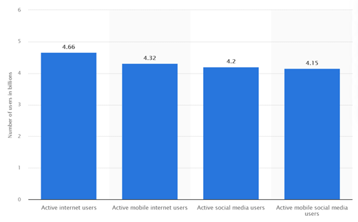
One research named Global Developer Population and Demographic Study made by Evans Data Corporation found out that currently there are 26.9 million software developers worldwide. Although this number is expected to grow, as you will see in the following chart, it is not even close enough for the global population of active internet users.

When you do the math, there are more or less 58 software developers per 10.000 active internet users. 

Sounds very few, right?

That is exactly where non-code development steps in as a viable solution. For those who want to develop new software, applications, products but don’t have the necessary technical skillset to do so, no-code offers a range of tools that help you develop functional software applications without causing a lot of work to the IT department.

All clear until this point? If so, let’s talk about how it works.

How does it work?

 Businesswomen discussing their requirements while building an inventory management system app via no-code development

What’s new? Comparison to the traditional model

Following the traditional application software building model, first, a department decides if they need a solution to make their operations more efficient, fast, productive….and so on. Later, they write down the project specs, to be sent to the developer team. That’s when the developers write the relevant code and come up with the solution (application). This is the traditional model. 

So, what’s new with this no-code development?

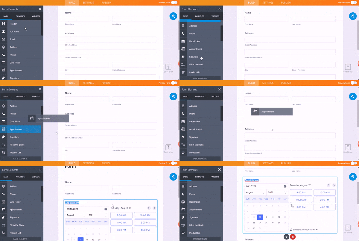
Through this new development model, once the team comes up with the idea and constructs their objectives and requirements clearly, they can immediately start working on building their application, using the no-code platform and the pre-built(coded) drag-and-drop elements and visual modules. 

Visual guide on how to incorporate the drag&drop elements into your no-code online form while using JotForm

For the sake of giving an example, let me talk briefly about JotForm’s story, the story of how a basic idea became a fully-fledged company with 10 million users. As a part of his job as a developer, the now-CEO of Jotform, Aytekin Tank, had to create online forms. However, back in 2006, there weren’t any solutions to building online forms without coding them individually. 

Then an idea popped into his mind: “What if I built a platform that works like Lego bricks that will allow me to build a form using coded patches?” That’s how JotForm’s drag & drop form builder came to be one of the first no-code platforms.

If we have some business people here reading this, I’m sure you are familiar with the term “mass customization”. Well, I can’t say that this exactly corresponds to no-code development, however, for you to internalize the concept, it might be a good example. Investopedia defines the term as “a marketing and manufacturing technique that combines the flexibility and personalization of custom-made products with the low unit costs associated with mass production.”

Following the JotForm example, each customer can create specific form templates tailored for their individual needs, using the drag & drop elements (buttons, form fields, etc.) and designing them again, according to their personal preferences.

Citizen Developers- Easing the IT Dependency

We know that in this ever-changing automated global era, one cannot avoid digitalization and that every business needs software to optimize and control the flow of people, information, and materials. But we also know that digital transformation is not an easy task and that it usually takes a team to do it.

You may have absolutely no idea about coding, you may even not have heard the word ”Html” before in your life. No worries. For those who are unfamiliar with the term, citizen developers are the end-users who are not necessarily equipped with prior programming languages or technical tools. The non-technical workforce you can say, simply put. Thanks to no-code development, these guys can assist in the development process and ease the burden on IT.  

Project Management Institute (PMI), addresses this very issue by stating that, “86 percent of IT decision-makers say the biggest challenge to digitally transform their business is too few software developers.” Through citizen developers, businesses can widen their workforce and achieve more with fewer resources, as also mentioned above.

Pros and Cons of non-code development

Pros:

Beyond question, these no-code development platforms work wonders especially when it comes to the digitalization of small businesses and entrepreneurs, keeping in mind that these people don’t necessarily have enough resources to hire developers.

Meme on how IT might sometimes end up becoming burnout, in the absence of no-code platforms.
  • Lets the employees develop their own flexible solutions, whether they are developers or not, reducing IT backlog: As mentioned before with the no-code approach to development, you don’t need to have a technical background to build what your department needs, making you free to customize the app according to your preferences. These applications are flexible by nature, allowing the user to play with the features of the application by adding/removing various prebuilt-drag&drop elements. As each department can create applications that suit their individual needs, IT can focus on tasks of key importance, thus increasing the overall productivity.
  • Faster development time: As there is no need for developers to customize the software they make for each and every department, the development time is much faster. 
  • Reduced costs: It goes without saying that developers are expensive. When you eliminate the need of hiring/outsourcing developers or at least minimize the number of developers you work with, your costs are going to be reduced significantly. 
  • Control on how data is accessed and the desired visibility amount: Since you are the creator, you have the power to decide who can have access to which data, through which channels, and if they can change it.

Cons:

Let’s face it, there is no rose without a thorn. As we keep on mentioning the miracles of no-code development, it goes without saying that there is no perfect platform and that no-code development has its shortcomings as well. At this point, you must do a thorough evaluation of the pros and cons, and decide whether adopting no-code will bring additional value to your company. Some cons include:

  • Users must be specific with their requirements while creating something: Users should always keep in mind what they might need in the future and how their requirements might change. Also because it can be a pain in the neck to go out looking for another no-code platform, users must be well-aware.
  • Templates are somehow rigid by nature: although we say “no-code”, don’t let the name fool you, of course, there is coding in the building process. The difference from the traditional models is that you, as the end-user, don’t have to use it. To achieve this, there are developers working to create the templates and to provide the best visual app creating an experience to the user. However, also by their nature, templates can limit the users in what features, etc. they want to add to their app.
  • Security issues: If the developers of the no-code platform are not from your company, you might face serious security risks in the future. Think of an example where the company gets acquired/liquidated, or even worse, hacked. 
  • Dependencies on the original vendor (might create problems in the future): Even if your vendor shares the source code with you, there is always a risk that you might not access the entire system to alter, upgrade your no-code platform. And for this very reason, switching providers may become a daunting task.
  • Designing the no-code platform in line with users’ needs is vital, so requires more planning effort: You must make sure to stick to the plan till the end, and to plan the whole no-code platform so that it provides these easy and quick solutions for the customers that we’ve been talking about here all this time. It is crucial to provide the user with the best possible visual and functional UX. Since you are not responding to different customized app requests from many people, but creating one generic platform for the customer to customize themselves, any mistake that you make during the platform development phase will affect everyone that uses your platform and the apps they make.

The 5 best examples of no-code platforms for your business

1. JotForm:

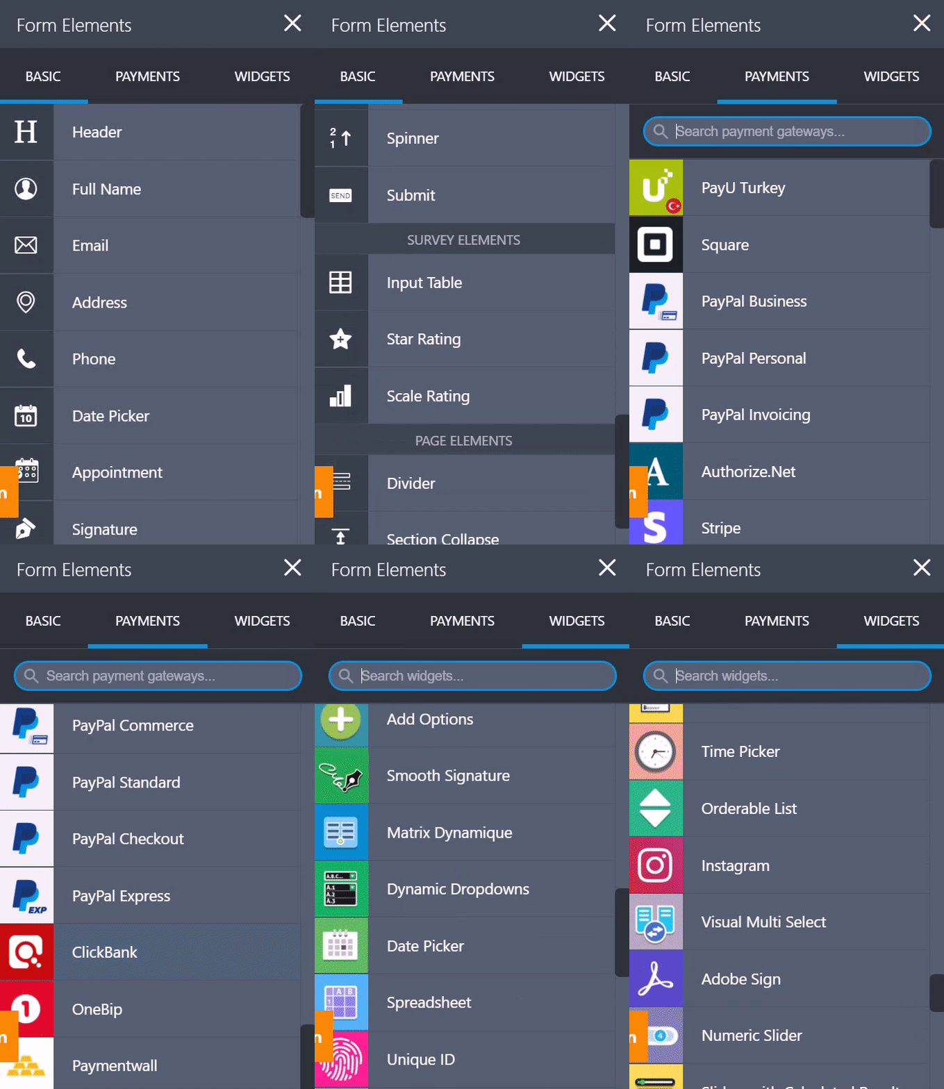
GIF visualising the , form elements of JotForm, which is a no-code platform

JotForm is a powerful web and mobile platform that provides its users with quick and easy no-code form & survey building solutions. Product order, PayPal business payment, customer registration, hotel booking, restaurant order forms, and customer satisfaction surveys are just 6 out of the 10,000+ free online form templates available worldwide. All you need to do is to sign up from the website and create your solution, using the drag-drop elements that will guide you. We highly recommend checking out the 100+ form integrations they have (with Google, Hubspot, PayPal, Airtable, and many more). Try it out, don’t be shy! Get your creative juice flowing.

2. Microsoft PowerApps:

Empowering anyone to build apps, PowerApps provides you with a wide range of tools to include in your no-code software solutions, that are designed to improve productivity. In the end, the app that you’ve created is able to automatically put data-driven information, not to mention that you can choose from app templates or build your own from scratch, adding customized features in both cases.  

3. Airtable:

Through the platform, you can analyze, enrich and simply take action on your data by choosing from the various features to include in your application. Some of these features include flowcharts, time tracker, XML import, and Google Hangouts.

4. WordPress:

Founded in 2003, WordPress is a globally known free and open-source content management system (CMS), also known as a cloud-based site builder. Without using any code, you can 1) create websites and online stores, 2) Modify your site’s design and layout, 3) add complex functionality using plugins, and more. Used by 41.4% of the top 10 million websites as of May 2021 according to Wikipedia. In fact, WordPress powers 39.5% of all websites as of 2021, quite an impressive number, right?

Final Words

That’s all folks! (End of this no-code blog article)

Obviously, the decision of whether to adopt a no-code development system or not is up to the needs of your team members and business. You may like it, or you may leave it. However, from a non-technical point of view, one can say that if you/your team is lacking the technical skills, don’t let programming get in your way. We hope that we were able to introduce you to no-code development and explain how it can boost performance and productivity in your operations. Let us know what you think below in the comments. And remember, when in doubt, say yes to no-code development!

Categories: Others Tags: