Archive

Archive for August, 2021

Serverless Functions as Proxies

August 3rd, 2021 No comments

The first time cloud functions / serverless functions clicked for me was when I saw and tried Auth0’s (now defunct) Webtask. It was a little CodePen-like IDE but you didn’t really see anything aside from code and logs. The point was to write little bits of Node when you hit the functions URL (that’s literally exactly what a serverless function is). It would even store your secrets for you, meaning that you could use the serverless function as a proxy. You hit the function, the function hits the API using your unexposed API Key secrets, the API returns data, the function then returns data, and that data is available to the client side for you to work with. The entire point was 1) you can snag data from an otherwise totally static website, and 2) your API keys are protected. Brilliant.

I still miss Webtask, but I’m sure there are better and fancier things these days. I don’t have a solid handle on the whole landscape. Even AWS has an online editor for lambdas (a “lambda” is AWS’s standards-setting implementation of what a serverless function is), but using the AWS console directly for anything isn’t usually… very good. Functions in AWS Amplify are probably a better bet there.

My guess is the proper modern way of building these things are things like…

But there are all sorts of other tools that seem pretty modern that I just can’t speak to as well, but seem good:

But what makes me think of all this, and is also in the category of things I don’t have any personal experience with, is Pipedream. I heard about it via Raymond, who has a similar story to mine:

One of the first things that intrigued me about serverless, and honestly it’s not really that novel, is the ability to build proxies to other APIs. So for example, imagine a cool API that requires authentication of some sort to use, like an API key. If you use this in client-side JavaScript, anyone can look at your code and get your key. Better services let you lock a key to a domain, but if you don’t have that option, then a simple use of serverless is to simply give you an endpoint that makes the call to the API with your key.

Raymond Camden, “Using Pipedream to Proxy Other APIs”

Pipedream looks pretty fancy:

Not only is it a web-based IDE for crafting functions, but I can trigger it a bunch of ways—a URL of course, but also on a CRON, or things like via email or RSS. Neat. Look at all the other options too. Slack? GitHub? Twitter? It’s kinda like how Zapier looks in that way, only where Zapier is entirely no-code (I think). Pipedream makes code a first-class citizen.

And it does secrets by way of account-level environment variables.

The Pipedream screen for environment variables. A dark gray sidebar is on the left with different menu options where Settings is the currently selected item in the vertical list. The right side of the screen contains the environment variable information with a paragraph defining them, an example, then a bright blue button to create a new environment variable.

So, it’s perfect for being a serverless proxy. Read Raymond’s post for actual implementation and code examples.


The post Serverless Functions as Proxies appeared first on CSS-Tricks. You can support CSS-Tricks by being an MVP Supporter.

Categories: Designing, Others Tags:

Automatic Daily GitHub Backups, Restored in Seconds

August 3rd, 2021 No comments

Any company that uses GitHub for critical applications needs a backup that can be restored quickly when needed. Cyberattacks, human errors, or a forced push are just some of the scenarios that can result in the loss of GitHub data. In the event of an emergency, you can’t be wasting time asking which developer has the most recent copy of your code. You need to restore your code, and you need it restored now.

Why do you need GitHub backups?

GitHub is a git repository hosting and version control platform, not a backup solution. GitHub, like most SaaS platforms, follows the Shared Responsibility Model. This model divides the responsibilities of users and the responsibilities of the platform, with account-level data security falling securely in the realm of users.

GitHub’s terms of service specifically states that they are “not liable to you or any third party for any loss of profits, use, goodwill, or data.” This means that the information stored in your GitHub account — all of your repositories including code, issues, pull requests, and other essential metadata — is your responsibility to back up.

Although the most common cause for data loss is human error, malicious attacks are becoming increasingly common. Recently, GitHub reported a phishing attack named SawFish which even worked against some kinds of two-factor authentication (2FA) attack, according to Sophos. Some Rewind customers also reported choosing Rewind after phishing attacks resulted in their GitHub data being stolen.Having a backup of your code protects your business’s intellectual property (IP) ensuring that your critical data is always recoverable no matter what goes wrong. 

Regular data backups and other data hygiene principles are also often required for compliance purposes. Required data hygiene may include keeping backups with consistent intervals, having offsite backups, regularly testing restores, having an audit report, and a history of data pull requests among many others. 

In-house backup solution — pros and cons

“Build vs. Buy” is a common refrain when investigating new tech tools. After all, why pay for something that you could build yourself? Developing an in-house backup solution for your GitHub repositories and metadata is an option. For teams with developer resources to spare, this can be an economical choice. However, building your own backup solution isn’t as simple as writing a backup script.

In-house backup scripts need to be written, tested, and maintained which has an indirect cost to your business. These scripts are also vulnerable to updates to the GitHub APIs. Since the GitHub API changes periodically, in-house scripts have to be updated and tested to make sure your data is still being backed up. Once you’ve backed up your data, you’ll also need to spend developer resources to figure out how you will restore it quickly in case of an emergency. This is one of the hardest capabilities to build, yet the most important. After all, what good is a data backup if you can’t use it to actually put your data back?

Another thorn to be solved is metadata. Your repo is much more than just code: pull requests, issues, commits, branches and more are all essential to your workflow. Backing up and restoring metadata isn’t the same process as backing up and restoring code. Most companies reported having difficulty with backing up and restoring metadata such as Mercado Libre, which backs up 13,000+ repositories with BackHub by Rewind. Another Rewind customer, a major player in the EdTech space, also reported that they chose Rewind because they were not able to backup their metadata which was essential for their business.  

On the other hand, the main advantage of an inhouse backup solution is that you have more control over your backups. This may be the frequency or time of the backups  among other things. However, this comes at the cost of using your developer and IT resources for developing, maintaining, and testing your in-house solution. Thus, before deciding to build an in-house backup solution, identify your needs and assess your capabilities. Consider if you need to backup your metadata and what your target for time to recovery is. Then, ensure your team has the necessary resources and time to fully develop and maintain the in-house solution. 

Why use BackHub by Rewind for GitHub backups?

BackHub by Rewind automates daily backups of your GitHub repositories, pull requests and associated metadata including:

  • Commits (including comments)
  • Issues
  • Projects
  • Releases
  • Milestones
  • Wikis

BackHub by Rewind is set-up in minutes and allows you to restore your repositories and metadata in a few clicks. As the solution works natively within GitHub, your repositories and associated metadata is directly and securely restored to your GitHub account.

When you do need to perform a data restore, simply install BackHub by Rewind’s dedicated restore app, select the date where everything worked perfectly, and click ‘restore’. Your selected repositories, including associated metadata, will then be pushed and restored directly back into your GitHub account.

BackHub by Rewind follows the security principle of least access, meaning once the app is installed, it only has “read” access to your data. This means that BackHub by Rewind cannot alter, modify, or change the code in your repository in any way. 

To restore your data, “write” access is required, and so BackHub by Rewind has a separate app used solely for data restoration that can be deleted once restoration is complete. This provides an additional layer of security and peace of mind that your code is kept safe, secure, and secret. 

BackHub by Rewind was built with enterprise compliance in mind. Enterprise plans offer advanced features such as 365 days of data retention, full account activity logs, choice of data storage location (US or Europe), and SLA with 99.9% availability. With over 2 PB of data backed up worldwide, Rewind is SOC2 Type 1 certified, and expects to receive SOC2 Type 2 by the end of 2021. 

BackHub by Rewind is a true “set it and forget it” tool, and requires no specialized technical or coding knowledge to operate. Running quietly in the background, BackHub by Rewind backs up your GitHub data everyday and allows you to restore it in a few clicks so that your development team can focus on your core product.

If you are interested in BackHub by Rewind, reach out to sales@rewind.com for a personalized demo. Or, start your free 14-day trial to test it out yourself. 

Direct Link to ArticlePermalink


The post Automatic Daily GitHub Backups, Restored in Seconds appeared first on CSS-Tricks. You can support CSS-Tricks by being an MVP Supporter.

Categories: Designing, Others Tags:

A Deep Dive on Skipping to Content

August 3rd, 2021 No comments
An open dialog with a UI for viewing different types of content on the page in a screen reader, including links, headings, form fields, buttons, and landmarks. Landmarks is selected and there are no results in the window.

While most people browsing the web on a computer use a mouse, many rely on their keyboard instead. Theoretically, using a web page with the keyboard should not be a problem — press the TAB key to move the keyboard focus from one focusable element to the next then press ENTER to activate, easy! However, many (if not most) websites tend to have a menu of links at the top of the page, and it can sometimes take a lot of presses to get to the content that you want. Take the homepage of 20min for example, one of the biggest news sites here in Switzerland. You want to read the top story? That’ll be the best part of 40 key presses — not the best best use of anyone’s time.

So, if you want keyboard users to actually use your website rather than getting bored and going somewhere else, you need to do a bit of work behind the scenes to make skipping straight to your main content quicker and easier. You can find all sorts of techniques for this scattered across the web (including here at CSS-Tricks) but most are missing a trick or two and many recommend using outdated or deprecated code. So, in this article, I’m going to take a deep dive into skipping to content and cover everything in a 2021-friendly fashion.

Two types of keyboard users

Although there are numerous differences in the exact type of keyboard or equivalent switch device that people use to navigate, from a coding point of view, we only need to consider two groups:

  • People who use the keyboard in conjunction with a screen reader — like NVDA or JAWS on a PC, or VoiceOver on a Mac — that reads the content of the screen out loud. These devices are often used by people with more severe visual impairments.
  • All other keyboard users.

Our skip-to-content techniques need to cater to both these groups while not getting in the way of all the mouse users. We will use two complementary techniques to get the best result: landmarks and skip links.

Look at a basic example

I created an example website I’m calling Style Magic to illustrate the techniques we’re covering. We’ll start off with it in a state that works fine for a mouse user but is a bit of a pain for those using a keyboard. You can find the base site and the versions for each of the techniques in this collection over at CodePen and, because testing keyboard navigation is a little tricky on CodePen, you can also find standalone versions here.

CodePen Embed Fallback

Try using the TAB key to navigate this example. (It’s easier on the standalone page; TAB to move from one link to the next, and SHIFT+TAB to go backwards.) You will find that it’s not too bad, but only because there aren’t many menu items.

If you have the time and are on Windows then as I’d also encourage you to download a free copy of the NVDA screen reader and try all the examples with that too, referring to WebAIM’s overview for usage. Most of you on a Mac already have the VoiceOver screen reader available and WebAIM has a great intro to using it as well.

Adding landmarks

One of the things that screen reading software can do is display a list of landmarks that they find on a web page. Landmarks represent significant areas of a page, and the user can pull up that list and then jump straight to one of those landmarks.

If you are using NVDA with a full keyboard, you hit INS+F7 to bring up the “Elements List” then ALT+d to show the landmarks. (You can find a similar list on VoiceOver by using the Web Item Rotor.) If you do that on example site, though, you will only be presented with an unhelpful empty list.

A disappointingly empty list of landmarks in NVDA

Let’s fix that first.

Adding landmarks is incredibly easy and, if you are using HTML5, you might already have them on your website without realizing it, as they are directly linked to the HTML5 semantic elements (

, ,

, and so on).

Here’s a before and after of the HTML used to generate the header section of the site:

<div class="bg-dark">
  <div class="content-width flex-container">
    <div class="branding"><a href="#">Style Magic</a></div>
    <div class="menu-right with-branding">
      <a href="#">Home</a>
      <!-- etc. -->
      </div>
  </div>
</div>

Becomes

<div class="bg-dark">
 <header class="content-width flex-container">    
    <section class="branding"><a href="#">Style Magic</a></section>
    <nav aria-label="Main menu" class="menu-right with-branding">
      <a href="#">Home</a>
      <!-- etc. -->
    </nav>
  </header>
</div>

The classes used remain the same, so we don’t need to make any changes at all to the CSS.

Here’s a full list of the changes we need to make in our example site:

  • The
    denoting the header at the top of the page is now a

    element.
  • The
    containing the branding is now a

    element.
  • The two
    s containing menus have been replaced with

  • The two new
  • The
    containing the main content of the page is now a element.
  • The
    denoting the footer at the bottom of the page is now a

You can see the full updated HTML on CodePen.

Let’s try that landmark list trick in NVDA again (INS+F7 then ALT+d — here’s the link to the standalone page so you can test yourself):

Open screen reader dialog window showing the landmarks on the current page, including "banner," "main," and "content info."
Hurrah for landmarks!

Great! We now have the banner landmark (mapped to the

element), Main menu; navigation (mapped to the top

Categories: Designing, Others Tags:

What is Micro-Marketing? How It Can Boost Your Business

August 3rd, 2021 No comments

As a business person, you’re always looking for new opportunities to improve your company’s standing in the marketplace.

Whether it’s creating high-quality content, adopting new marketing strategies, or brushing up current ones, you always want to fulfill your potential when it comes to advertising your company’s products. 

Not doing so can adversely impact your business image. 

When it comes to marketing your products, there are a wide array of options to choose from. Micro-marketing is one such option, and it is extremely popular amongst businesses. 

Let us expand on it further:

What is Micro-Marketing and How Does it Work?

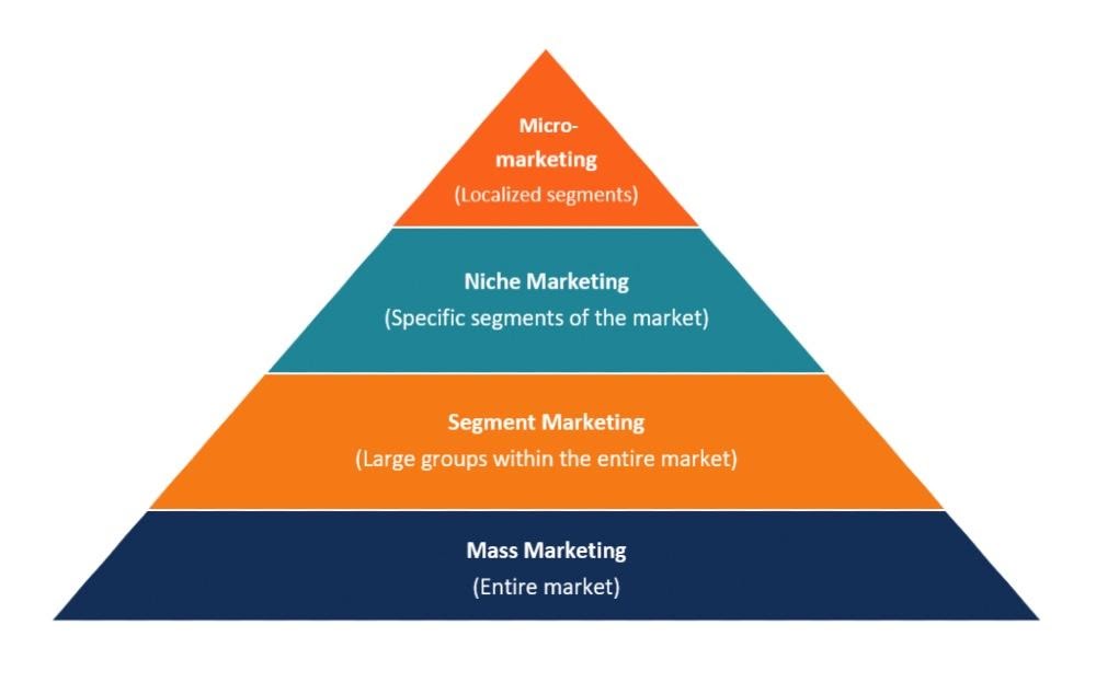
Micro-marketing is any marketing activity designed to target a specific section of your audience. You might target people based on factors including, but not limited to, age, gender, location, occupation, among others. It’s the opposite of mass marketing, which is where you run campaigns that target everyone.

Source 

To run a micro-marketing campaign, you need to understand each segment of your target audience. You need to understand the pain points of your audience, what makes them use your product or service, and their goals.

If you understand what incentivizes your audience to purchase through your company, you can run targeted marketing campaigns. Micro-marketing campaigns that address the needs of a segment of your customer demographic are more likely to convert than mass marketing campaigns that don’t.

Uber is a great example of a company that has used micro-marketing strategies to grow fast. When Uber entered a new city, they would run campaigns targeting residents in the area. For instance, when they introduced their app in rainy Vancouver, they used the weather to encourage customers to use their ride-hailing app instead of walking to a bus station in the rain.

That campaign addressed the pain points and needs of potential customers in Vancouver. Of course, the same campaign probably wouldn’t work in sunny Arizona.

Why Do Companies Use Micro-Marketing?

Micro-marketing is used by large and small businesses alike because targeted advertising campaigns have a higher conversion rate than mass marketing campaigns. It can be a great tool for large businesses to introduce new products into the market and for small businesses to create brand awareness

Countless businesses use micro-marketing to reach out to specific target sections of their customer base. Companies that run successful campaigns generally see a higher ROI (return on investment) than from a mass marketing campaign.

That’s not to say mass marketing campaigns are ineffective. They are. Both types of campaigns are used by businesses looking to grow or maintain their market share.

A nice example of a global company that successfully implemented micro-marketing strategies is Coca-Cola. In 2014, they started a “Share a Coke” campaign. Coca-Cola made a list of the most popular names in each country where they sold drinks. They printed these first names on the packaging.

Source

All thanks to this campaign, the company witnessed a 2% increase in sales in the US.

Are you wondering how to introduce a micro-marketing campaign for your business? We’ve got you covered. 

How to Run a Micro Marketing Campaign In 4 Easy Steps

Running a micro-marketing campaign isn’t as hard as you think. Just follow these four steps. With a little bit of creativity, you’ll have a campaign that generates your desired results. 

1. Create Buyer Personas

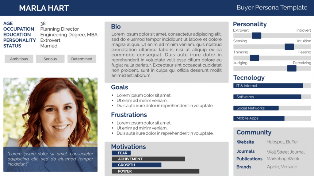
The first step to any efficient marketing campaign is to create buyer personas. These are a set of characteristics that define your ideal customer. They can help you reach your target audience. You may use qualitative and quantitative data to create buyer personas. Customer personas can be based on factors like age, gender, occupation, personal interests, and so on.

Here’s an example of a buyer persona:

Source

Keep in mind that if you’re certain about what kind of customer your micro-marketing campaign is targeting, the higher your success rate will be. That will also save you time and money. 

2. Define your campaign goals

Channel your inner creativity and research your product as much as possible when defining your campaign goals. See what inspires you about your product and incorporate that into your campaign.

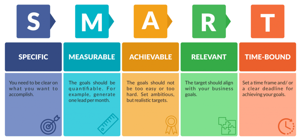
A constructive way to go about this is to create SMART goals. 

Source

Your SMART goals will give you a benchmark to assess the success of your campaign.

3. Figure out the best way to contact your target audience

You need to know how to connect with your target customers to make your micro-marketing campaign successful. Helpful factors like demographic data can help you evaluate which platforms your target audience uses most. For instance, teenagers are more likely to be active on social platforms like Instagram. 

Keep your buyer personas in mind when figuring out the best way to reach your customers. There are plenty of online tools available to do this. From online ads on platforms like Facebook or Instagram to social media platforms like Twitter, the options are endless.

For instance, if you’re an affiliate marketer, your goal might be to generate a 15% increase in sales this quarter through PPC ads. To reach those targets, you could run marketing campaigns targeting specific segments of your target audience.

Each campaign would use different messaging and marketing material to get people to click on the link. By tracking affiliate sales in Google Analytics, you can measure the effectiveness of your campaign.

4. Launch your campaign and monitor its progress

The final stage of any marketing campaign is to track and review the results. You need to track your results against the Key Performance Indicators. Any mismatch between your goals and the result will likely mean you need to adjust your campaign.

That’s not necessarily a bad thing.

Campaigns designed by great marketers fail all the time. The key to running successful marketing campaigns, though, is learning how to adapt fast when you do not see the results you want.

Bottom Line

Integrating micro-marketing strategies into your overall marketing strategy can prove to be extremely beneficial for your business. They can help your best products and services make a mark in the market. They are also cost-effective and can help you meet your business needs efficiently.

However, to get the most out of your micro-marketing campaigns, you need to implement them the right way. 

That means knowing who your target audience is, setting the right goals, and determining the platform where your audience is. It also means monitoring your campaign.

Follow these tips, and you’ll get the most out of your micro-marketing campaign. You’ll reach your marketing goals and, by extension, your business goals, too. Good luck!

Categories: Others Tags:

3 Essential Design Trends, August 2021

August 2nd, 2021 No comments

Sometimes the designs that make the most impact do a lot of unexpected things and break some of the most tried and true rules of visual theory.

Sometimes these design elements work brilliantly, and other times they are fleeting or fall flat. This month all of the examples here seem to break some conventional design rules. Here’s what’s trending in design this month…

1. Alternative Homepage Image/Video Crops

This trend breaks some traditional standards and is pretty refreshing – alternative homepage crops for images and video.

The full screen or 16:9 aspect ratio is out the window with vertical and square options that prove you can do more with your photo collection.

What’s great about this trend is that it’s super attention-getting because of the interesting use of space and imagery. Almost any design without the full-width hero header will grab your attention because it is different. These examples prove that point, and each design does it differently.

Now here’s the challenge: You have to make sure that this style has a solid fallback for mobile so that the result is equally impressive.

Janmaat Fotografie does a great job accounting for interesting photo shapes and flips the script on mobile. (Rather than what you might expect with text then photos because of the desktop placement, the photo stack uses the same shape and layering and is above the text on mobile.) The result is phenomenal.

N3 uses a very vertical image in an almost split-screen style design. It’s a sharp contrast to many of the other split screens we are accustomed to with an equal divide. The distinct shape of the image is interesting and intriguing. It’s definitely not a shape we see in website design frequently.

Bounce uses a similar split-screen effect in the opposite manner as the example above, with the tall, vertical space as an “empty” area and the right side filled with a square video. The shapes help push and pull your eyes across the screen to look at all of the elements and take in the overall design. It’s one of those ideas that if you only talked about it, you might talk yourself out of it, but here, it’s pretty striking.


2. On-Screen “Stickers”

Stickers are a design trend that has made its way from social media to website design.

These website stickers break design rules because they cover content or seem to be put on the canvas haphazardly. And that’s why they are so attention-getting!

The benefit to these stickers is that they can highlight specific items or content or help focus a call to action.

Friesday uses stickers in conjunction with hover effects to keep users interacting with the design. Multiple stickers can even pop onto the screen in the same location. The animation is simple and fun and feels like a digital sticker book.

August Eighth uses a center sticker as a call to action. It’s a true focal point in the center of the screen with an almost three-dimensional effect that lifts it off the background video. It’s a borderline dark pattern since the only way to get the box off the screen is to click through to the shopping part of the website.

EasyGreen has a bright yellow sticker in the bottom corner that feels almost like the sticker on a piece of fruit. This style and placement work well for the content and product featured. It’s bringing the digital and real-world a little closer with this design element.


3. Breaking Design “Rules”

The third trend this month is kind of a catch-all for general rule-breaking. While the other trends show certain design elements that aren’t the norm, each of these examples really tosses everything you traditionally think about design out the window. (And that’s ok.)

The trick to a rule-breaking design is that it has to be focused and simple enough to keep users interested and provide intuitive elements that tell them how to interact with the design. It’s a delicate balance.

Here’s how these sites do just that.

Supercontinent has a lot going on. At least four typefaces on the screen at a time, movement (using different shapes and aspect ratios), overlapping elements, hidden navigation, and you may even find a few more broken rules if you look closely. And somehow, it still works.

What’s pulling this design together is a key unbroken rule – the chaos is rooted in a grid system that keeps it all somewhat organized. Plus, there’s plenty of white space to keep elements from feeling crowded and overwhelming.

Source of Plastic Waste combines elements in unexpected ways. There’s no real navigation; the site is just a continuous scroll. That’s a big website usability rule broken right out of the gate. There are other design elements as well, from the “header”/logo moving to the top right corner to the almost over-designed transparent box for text elements. There are a lot of scroll elements and actions happening and layers of text on text in some of the screens.

But here’s the thing about this design. As many rules as it breaks, the story is interesting enough to keep you scrolling. The question is, how long and how far do you go without getting lost or confused.

The Debris of Attention is designed to show “bad design” with elements that are frustrating and annoying on websites. The gamified design allows you to hover on each element to remove it and clean up the design.

While this site breaks the rules on purpose, it is still an experiment in how long a user will hang on with so many visual effects happening at once.


Conclusion

While most of the time, people think about “breaking the rules” as a bad thing, that’s not always true in the design space. Sometimes breaking the rules can result in an unexpected delight.

The challenge is to make sure that when you break the rules, the design is still usable, functional, and understandable. If so, you’ve found a winning combination.

Source

The post 3 Essential Design Trends, August 2021 first appeared on Webdesigner Depot.

Categories: Designing, Others Tags:

Popular Design News of the Week: July 26 2021 – August 1, 2021

August 1st, 2021 No comments

Every day design fans submit incredible industry stories to our sister-site, Webdesigner News. Our colleagues sift through it, selecting the very best stories from the design, UX, tech, and development worlds and posting them live on the site.

The best way to keep up with the most important stories for web professionals is to subscribe to Webdesigner News or check out the site regularly. However, in case you missed a day this week, here’s a handy compilation of the top curated stories from the last seven days. Enjoy!

Amazon Has Ruined Search And Google Is In On It

7 Commandments of Good UI Design

The Paris 2024 Olympic Logo is Still Being Mocked Online

5 Challenges All Web Designers Face + How to Fix Them

Are UI Tips the New Clickbait for Designers?

How To Master Layout Design

10 Worst Design Failures of All Time

20 Best New Websites, July 2021

9 Design Thinking Tools for Turning a Creative Vision into a Usable Interface

Web Features That May Not Work As You’d Expect

Source

The post Popular Design News of the Week: July 26 2021 – August 1, 2021 first appeared on Webdesigner Depot.

Categories: Designing, Others Tags: