20 Best New Sites, September 2021
Welcome to this month’s collection of what’s making the web look good. This time out we’ve got some new brands and some rebrands, and we’ve got some good examples of branding continuity across media.
Branding continuity doesn’t just mean putting the logo in the corner and using the same colors and type. It’s about capturing the brand identity, the personality of the brand, so the user identifies it even if the logo isn’t immediately visible. Take a look at how some of these sites do it, and enjoy the collection.
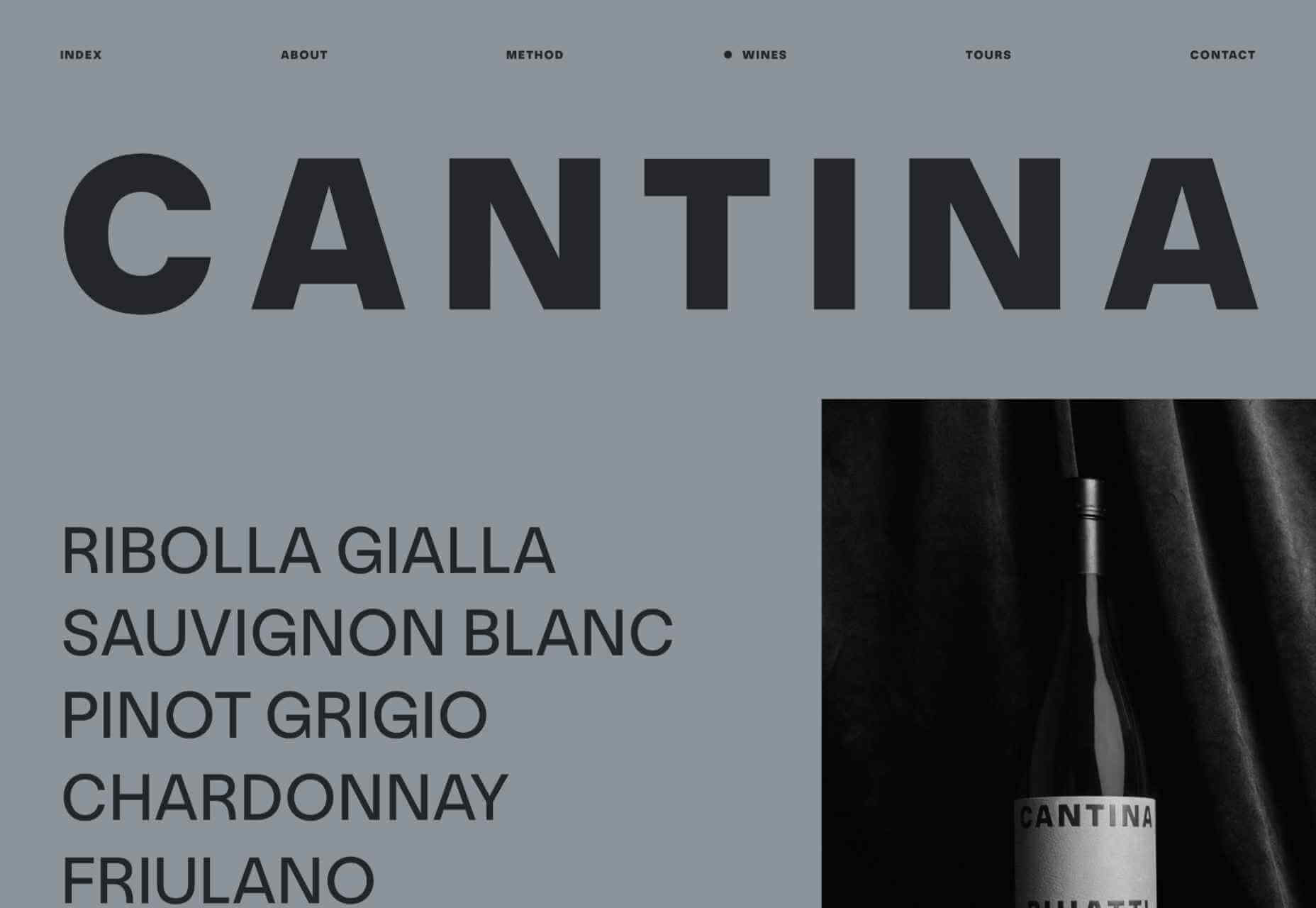
Cantina Puiatti
This site for Cantina Puiatti vineyard is almost entirely greyscale, until you get to the wines. There, a single block of color containing information stands out, perfectly matching the label on each bottle.
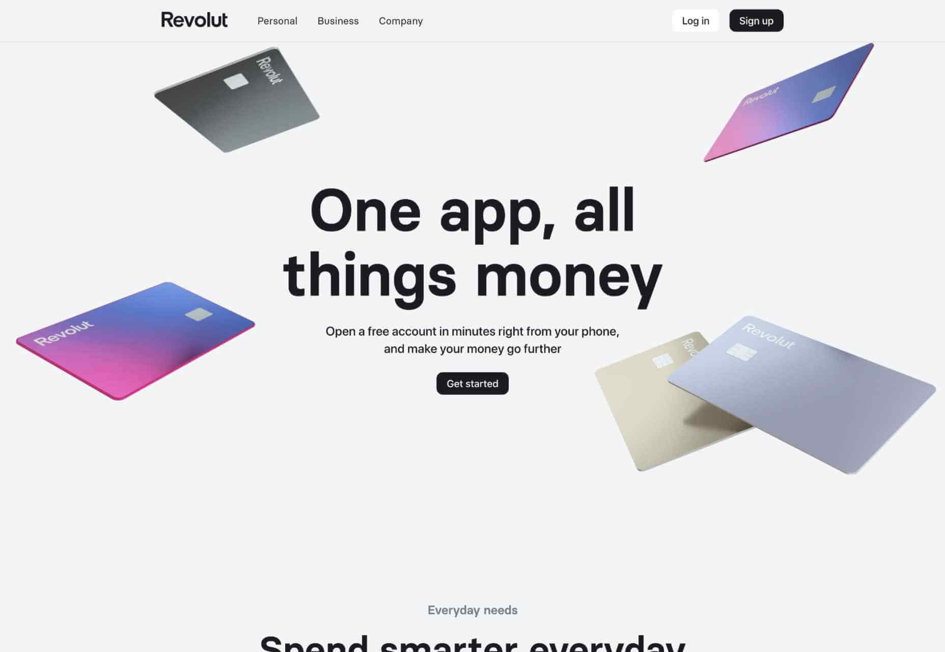
Revolut
Online banking app Revolut has a site that reflects the look and feel of the app itself, and the design works particularly well on mobile.
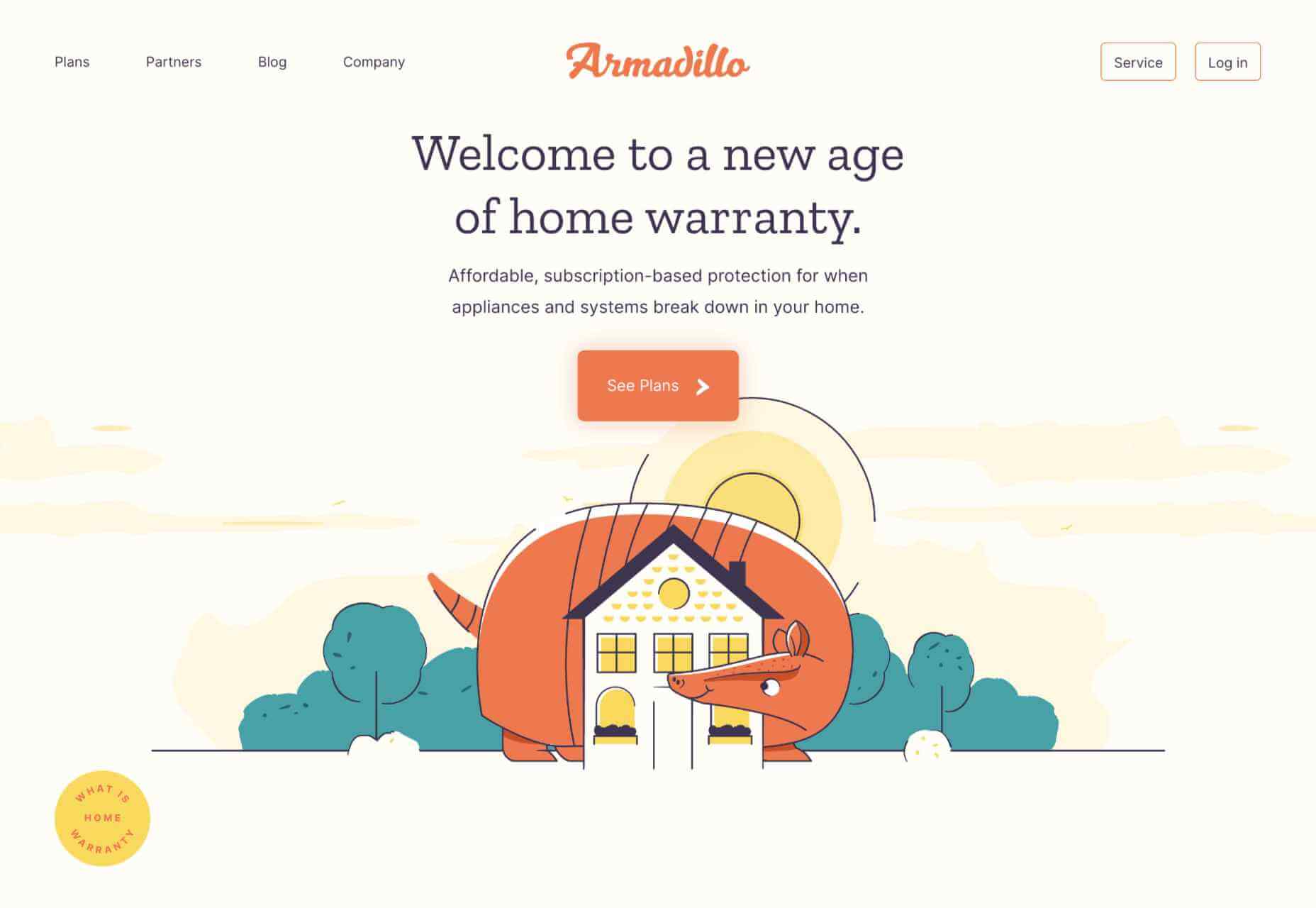
Armadillo
Home warranty providers Armadillo have gone for the friendly, non-corporate approach here. Pleasing illustrations and bite-sized text feels non-intimidating and creates an impression of security.
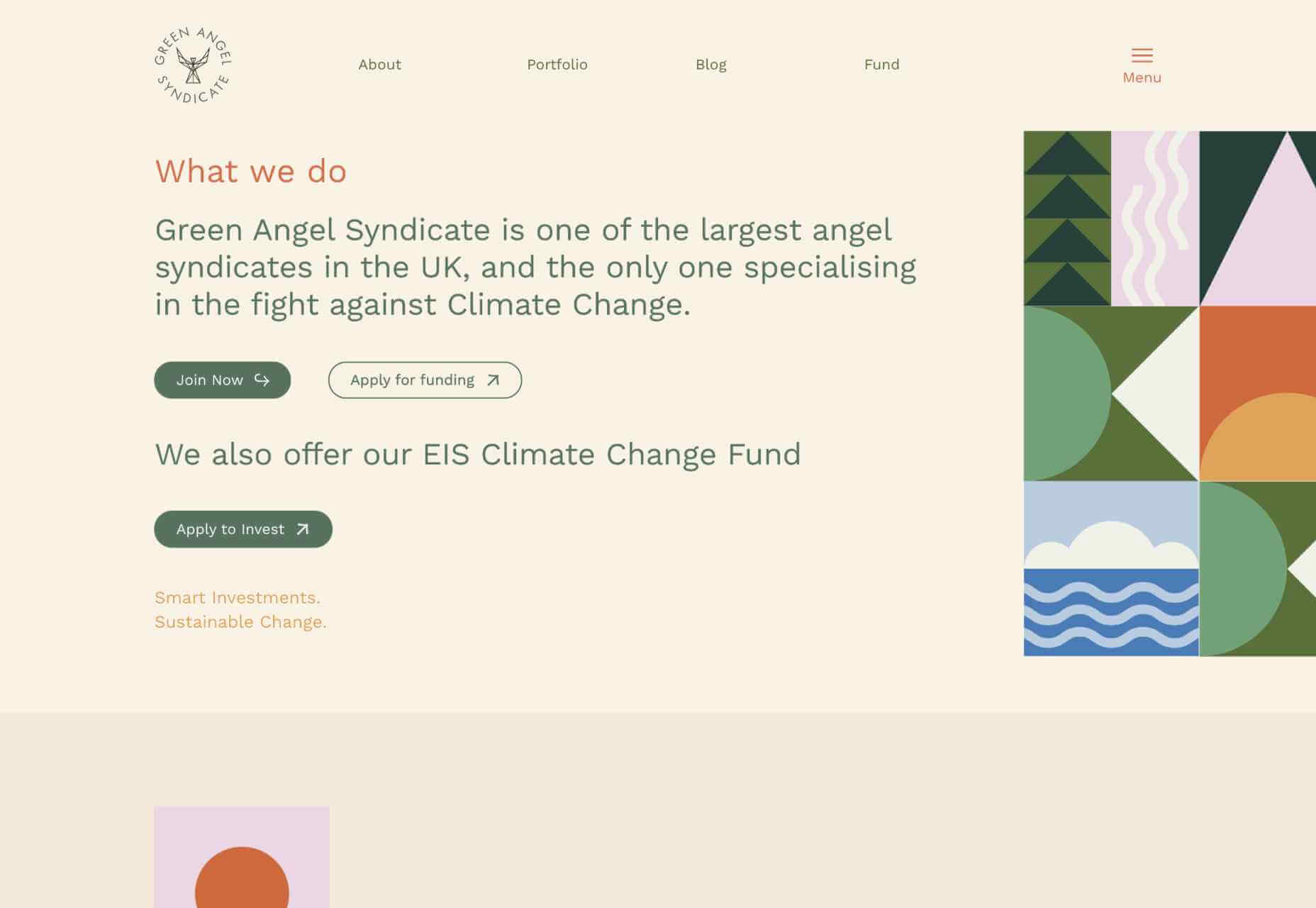
Green Angel Syndicate
Green Angel Syndicate is an angel syndicate investing in companies working to fight climate change. The palette is soft, and some colorful illustration blocks help take the corporate edge off, creating more warmth than might be expected.
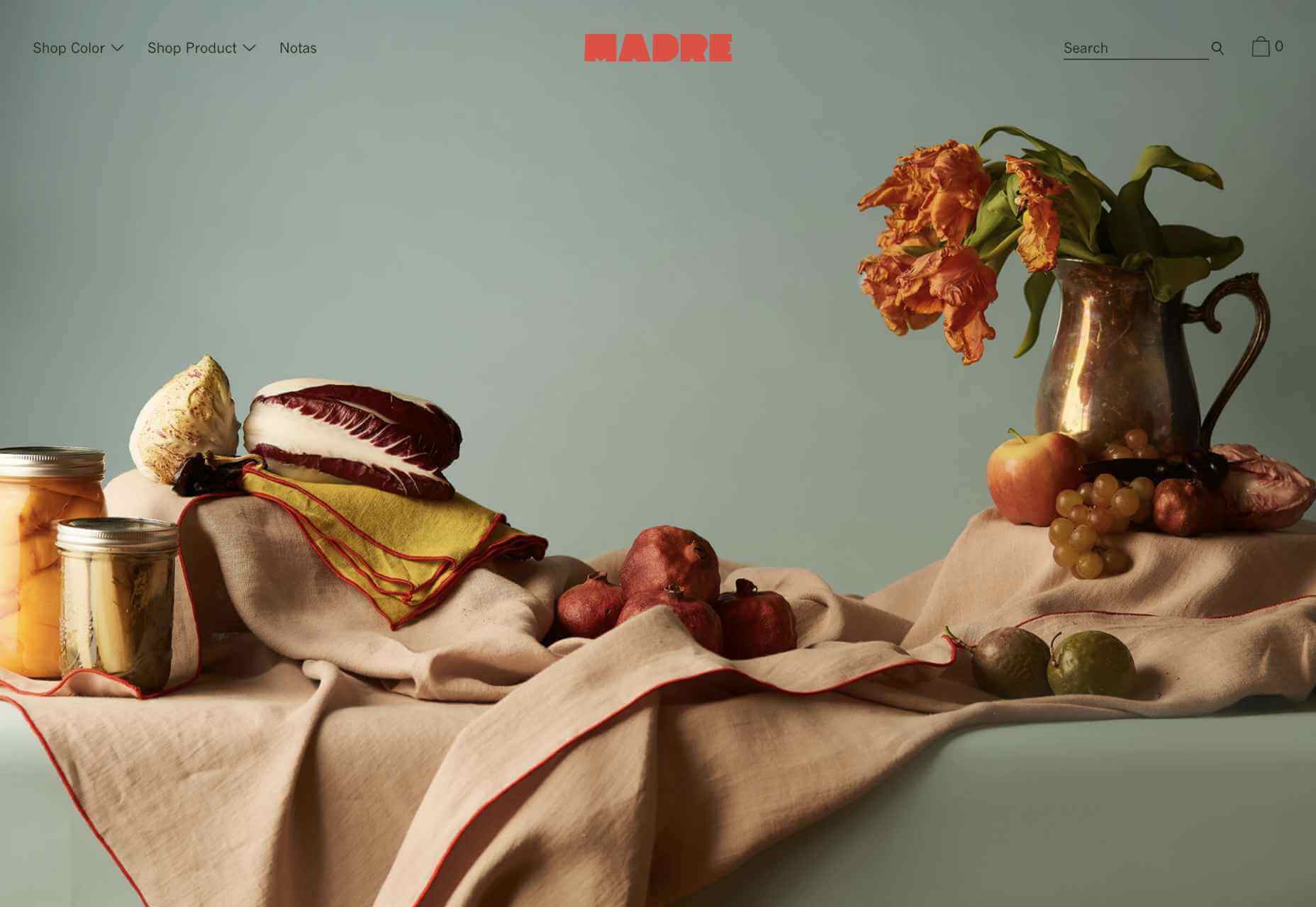
Madre
Some beautiful still-life-inspired photography features on this very simple site for home linen company Madre. The shop by color option is a nice touch.
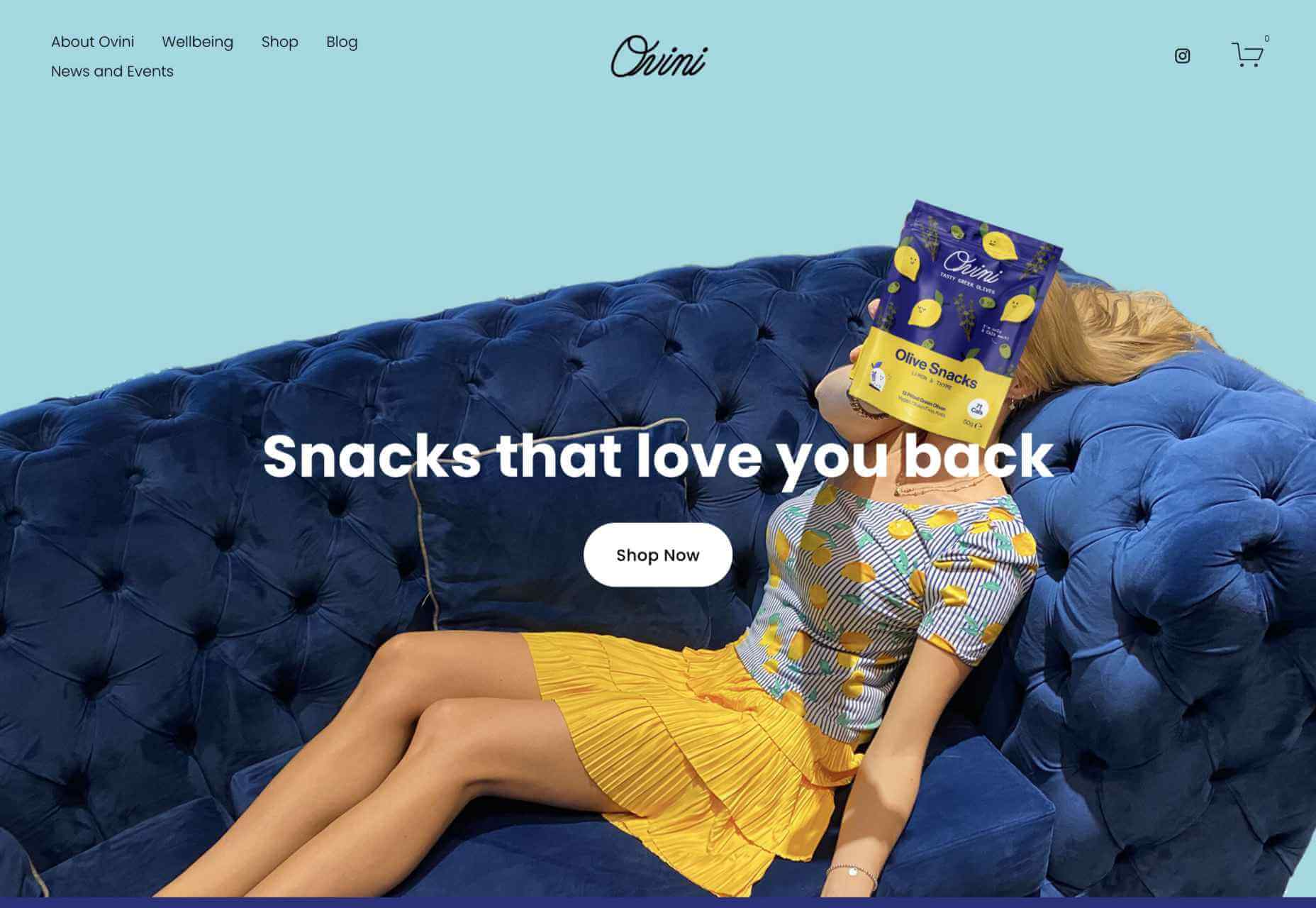
Ovini
This site for Orvini olive snacks is very simple and clean, and the animated illustration from their packaging adds just the right amount of personality.
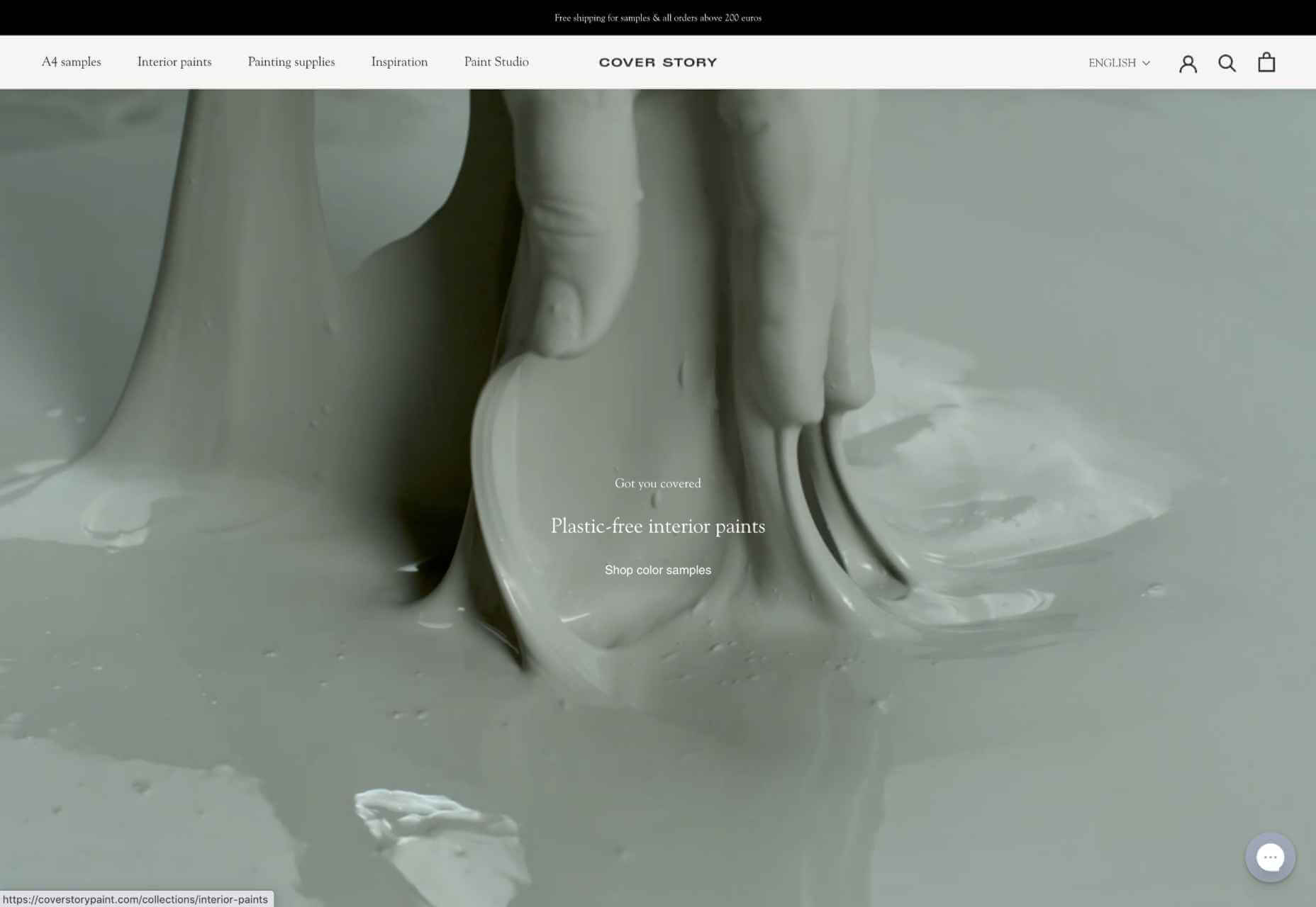
Cover Story
Cover Story makes a range of plastic-free paints. The site is very simple, allowing the user to focus on the paint colors themselves. And there’s added entertainment value in working out the writer each color is named after.
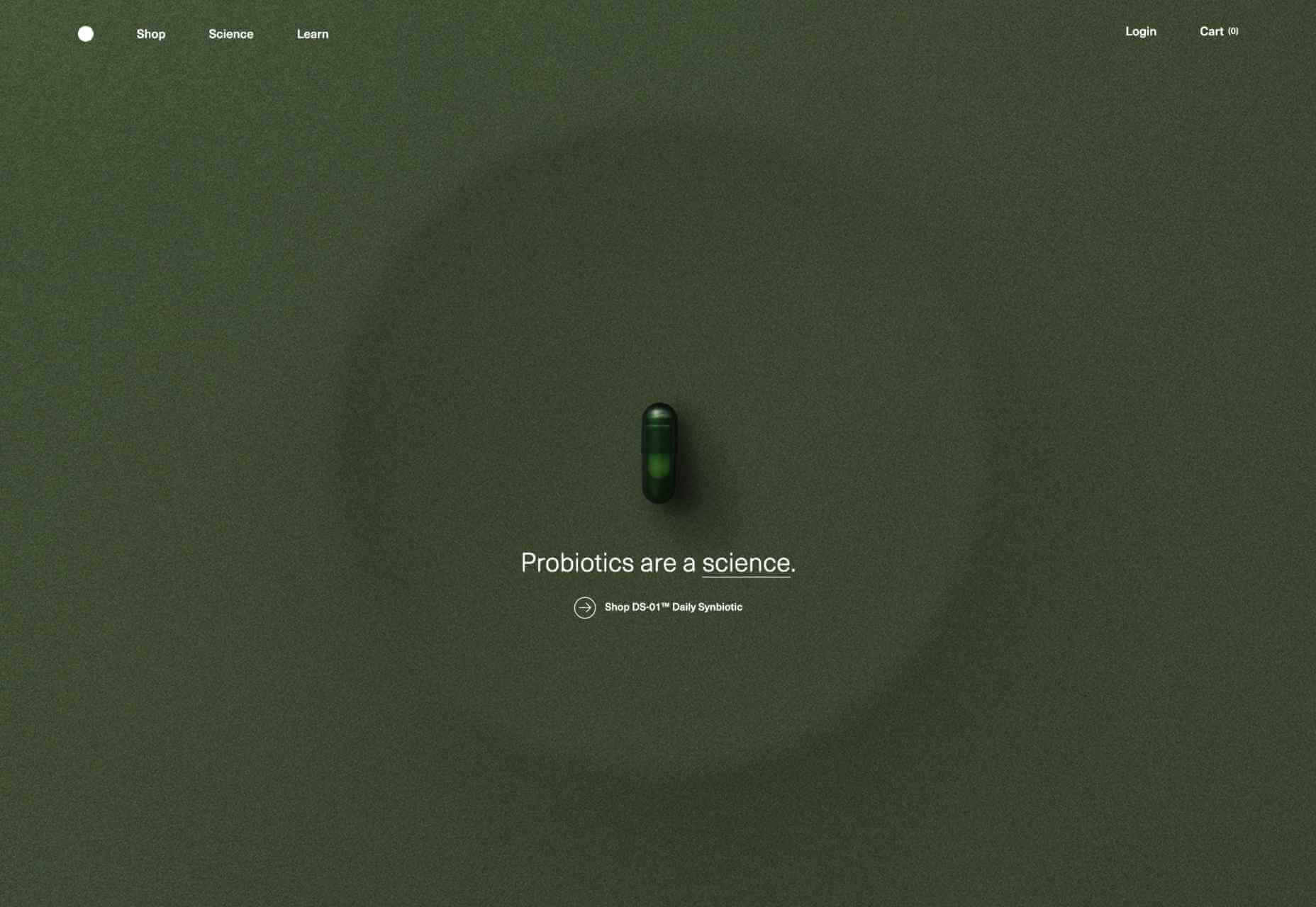
Seed
Seed offers a synbiotic supplement on a subscription. There is a lot of well-presented scientific information here, and the links to buy are strong without being pushy.
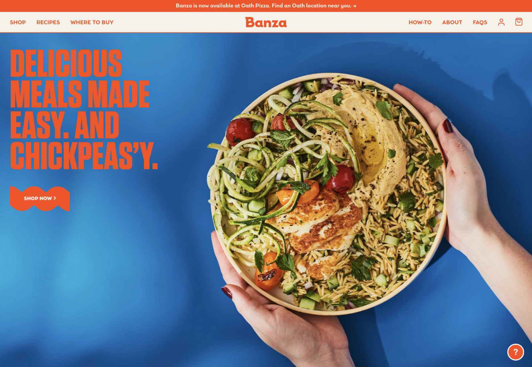
Banza
Like many in the ‘alternative’ food sector, Banza has gone for a bright, bold style with its branding, and its website matches this approach to good effect.
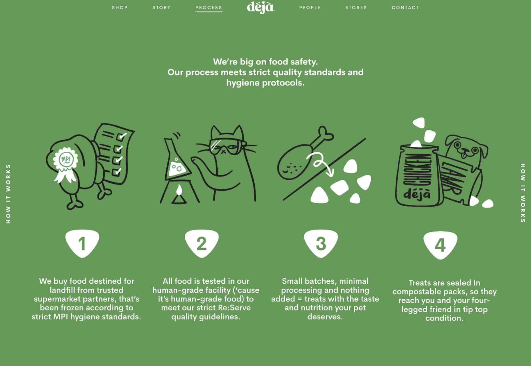
Déjà Pet Food
Déjà takes unsold human food and recycles it into pet food. The animals that feature on the packaging make an appearance here too, to add a bit of softness to the oversized type and 2 color palette.
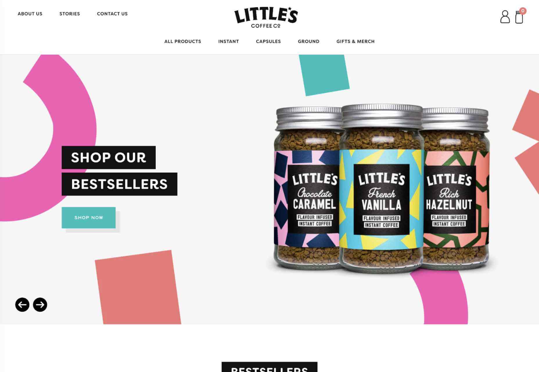
Little’s Coffee Co.
Little’s Coffee Co.’s site echoes its product labels with a scattering of similar, brightly colored graphic elements. This effectively ties the branding together without being too dominating.
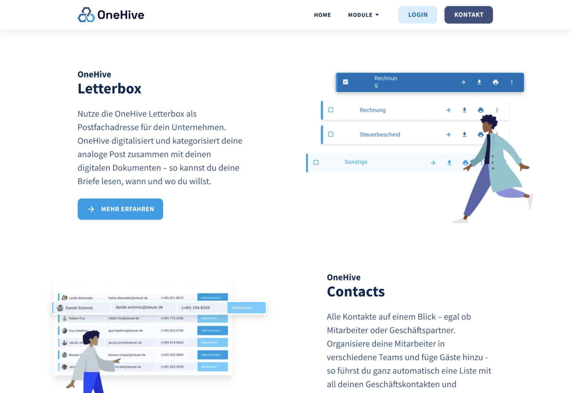
One Hive
The site for OneHive, a business management platform, takes the people-friendly approach with warmer dark blues for text in place of black and grey, and simple illustrations instead of stock photography.
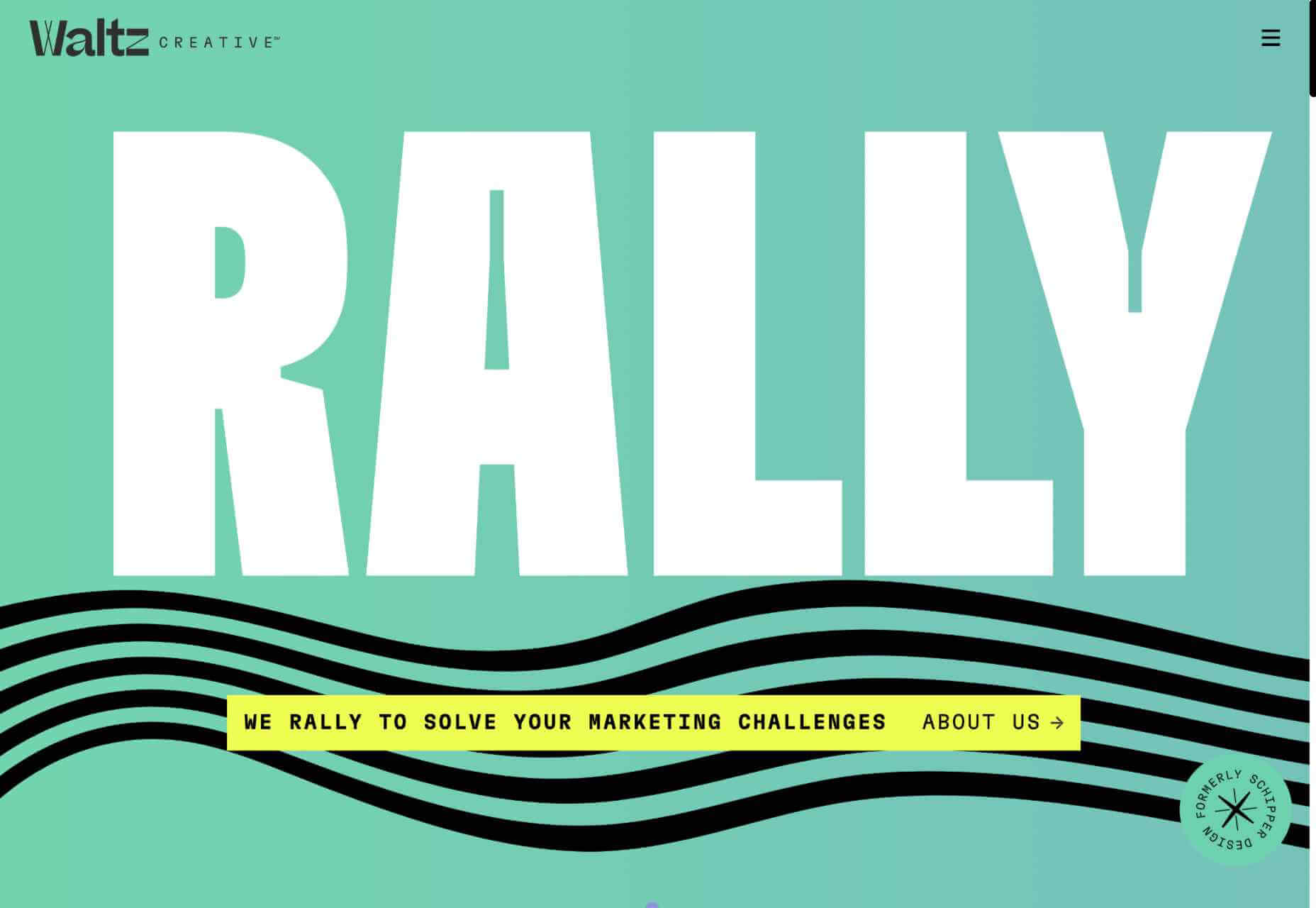
Waltz Creative
Waltz Creative is a rebranding of Schipper Design. Bright candy colors, a hint of vintage type, and some fun graphics combine to create a sense of playfulness without being frivolous.
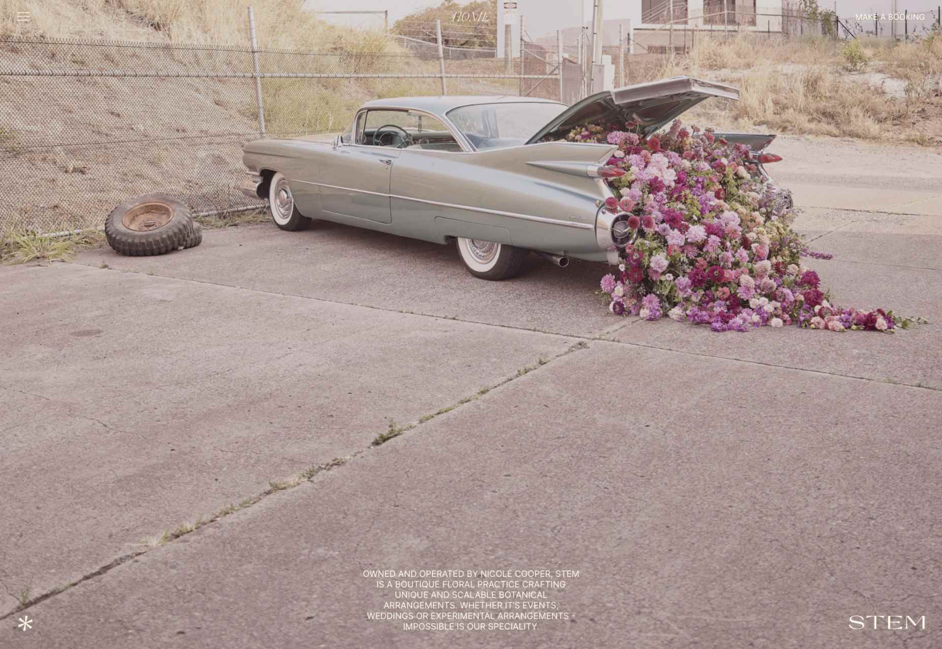
Stem Design
This portfolio site for floral designer Nicole Cooper features some exceptional photography that effectively showcases her work. There’s a nice nod to Mapplethorpe too.
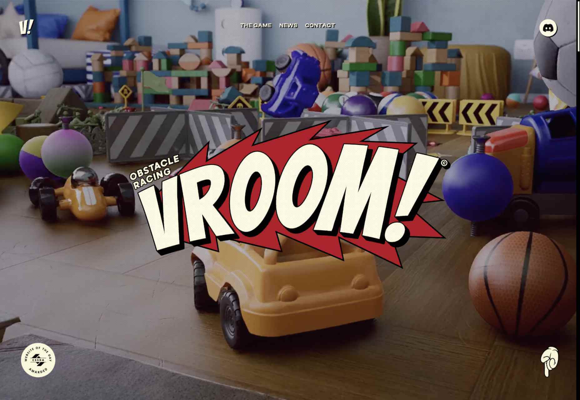
Vroom!
With its classic comic book style, this site for the forthcoming obstacle racing game Vroom creates a sense of fun appropriate to its subject.
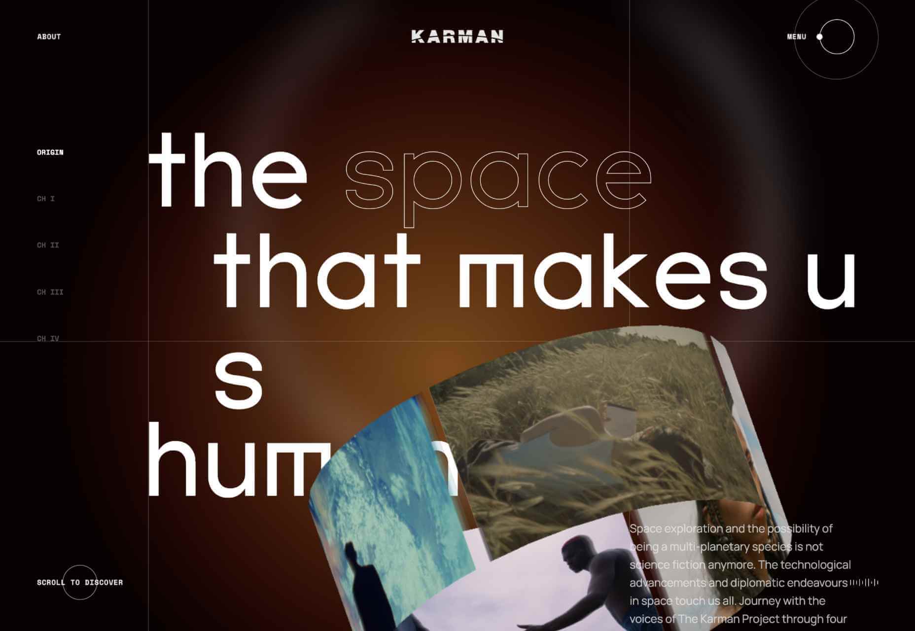
The Space That Makes Us Human
The Space That Makes Us Human is an interactive documentary experience exploring the impact space exploration could have on the future of humanity. This is one of those sites that is just a pleasure to wander around.
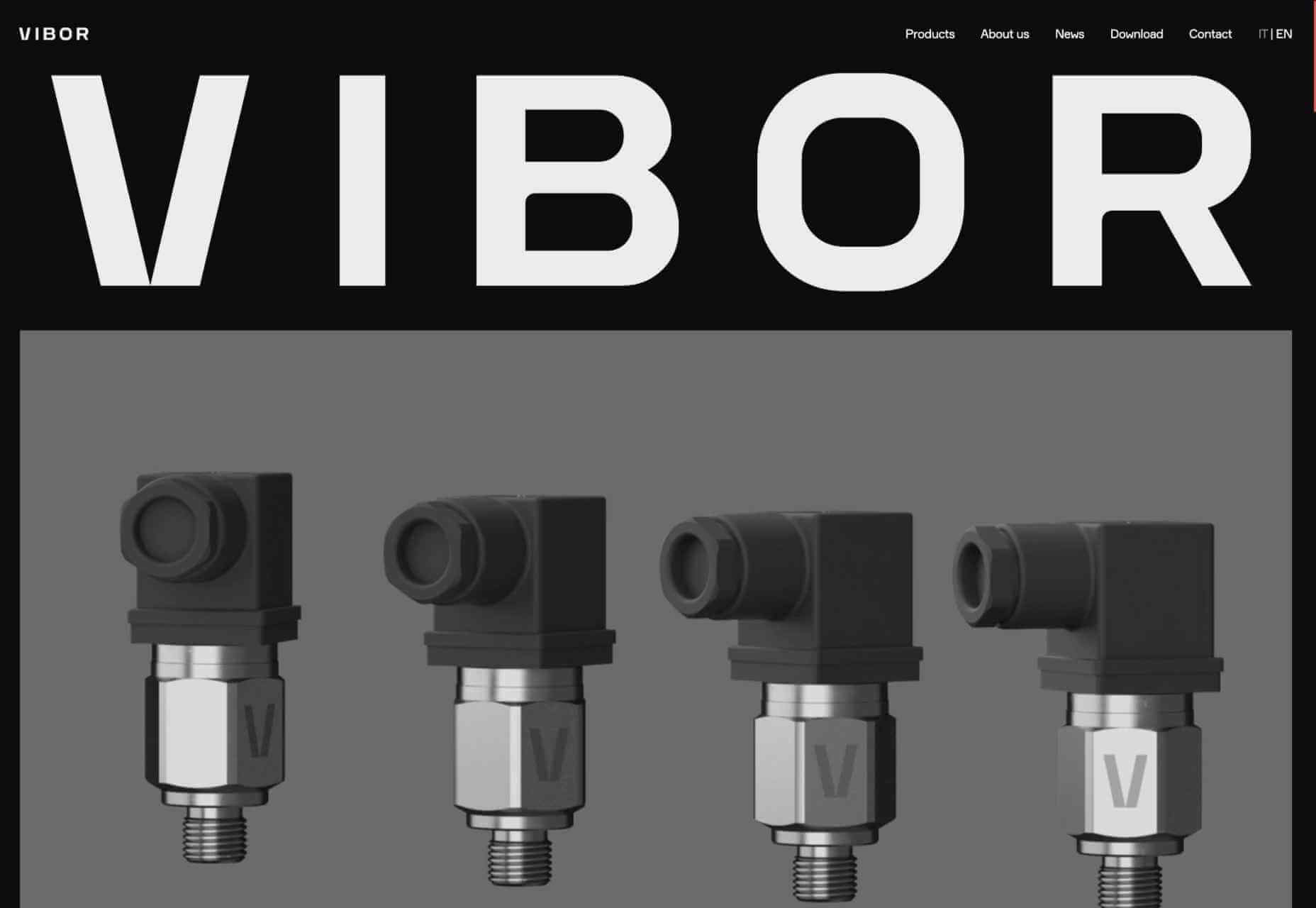
Vibor
Following a recent rebrand, Vibor’s new site brings Italian style to the world of industrial sensors with its use of black, white and greys, and accompanying grayscale images.
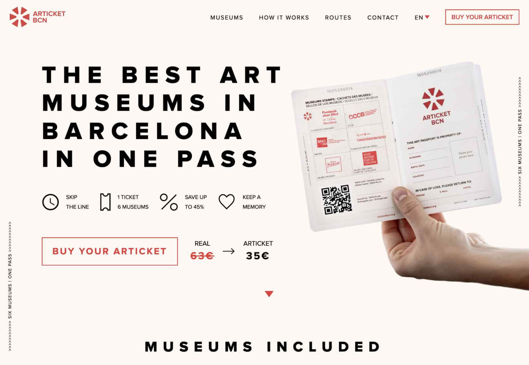
ArticketBCN
ArticketBCN is a multi-pass, or art passport, for 6 major art museums in Barcelona, designed to look like a passport. The site for it echoes the style effectively while presenting
its information clearly.
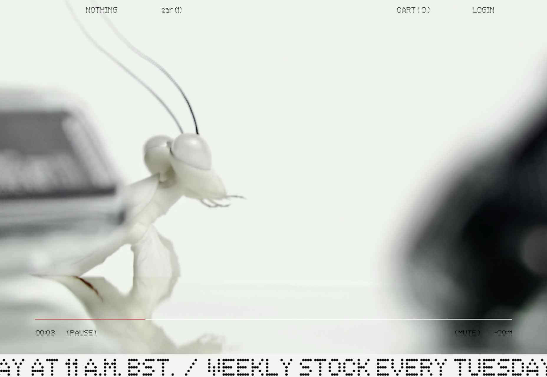
Nothing
Taking on the big guys, like Apple and Samsung, takes a lot of confidence and that confidence is apparent here on this site for Nothing’s ear(1) earbuds. And it looks even better on mobile.
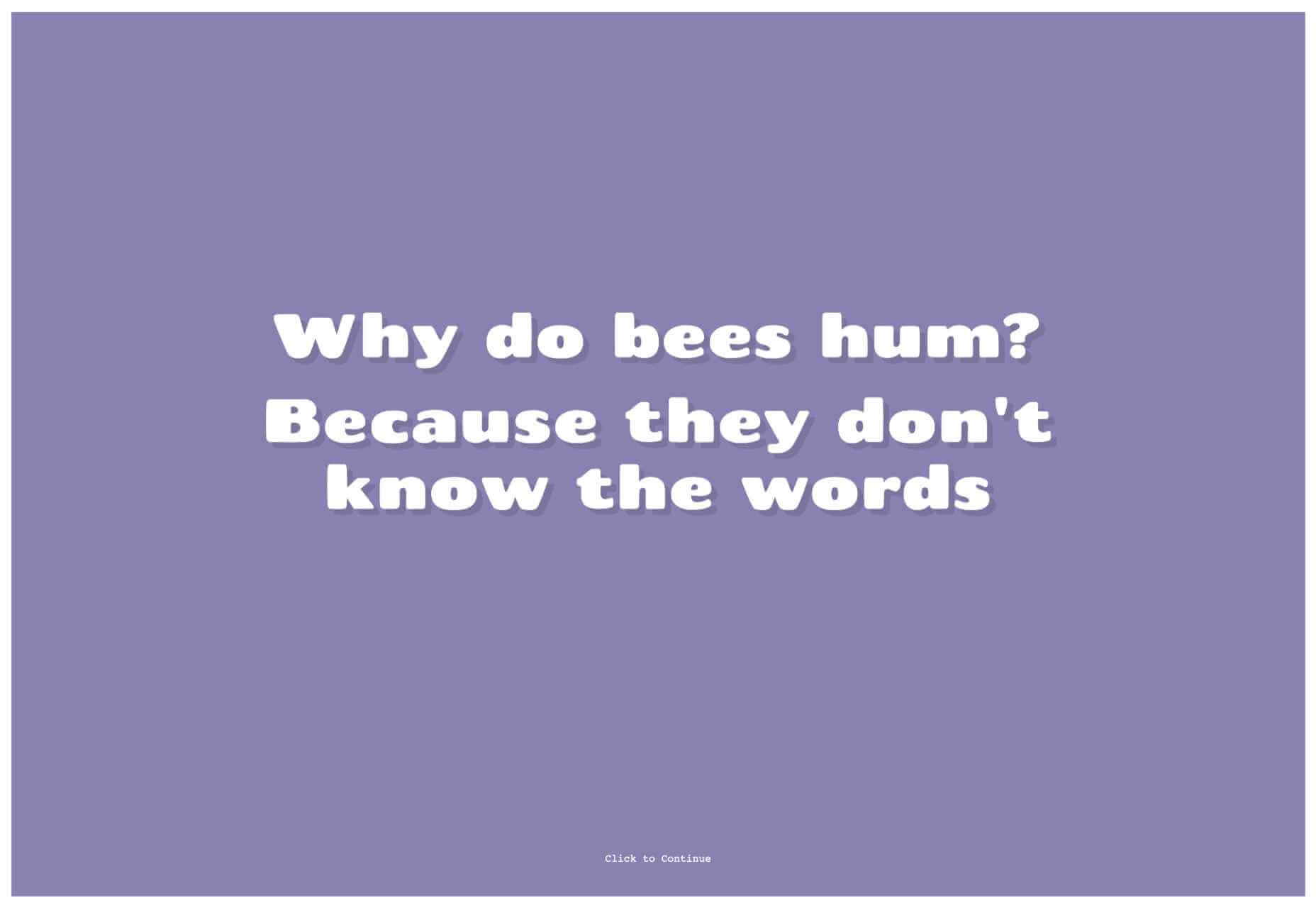
Nice One, Dad
And finally, just because it’s Monday and we could all do with a laugh (or a groan), here’s a site of nothing but dad jokes. The jokes may be terrible, but the presentation is nicely done.
The post 20 Best New Sites, September 2021 first appeared on Webdesigner Depot.
