Archive

Archive for September, 2021

Popular Design News of the Week: September 20, 2021 – September 26, 2021

September 26th, 2021 No comments

Every day design fans submit incredible industry stories to our sister-site, Webdesigner News. Our colleagues sift through it, selecting the very best stories from the design, UX, tech, and development worlds and posting them live on the site.

The best way to keep up with the most important stories for web professionals is to subscribe to Webdesigner News or check out the site regularly. However, in case you missed a day this week, here’s a handy compilation of the top curated stories from the last seven days. Enjoy!

Kraken – High-Performance Web Rendering Engine

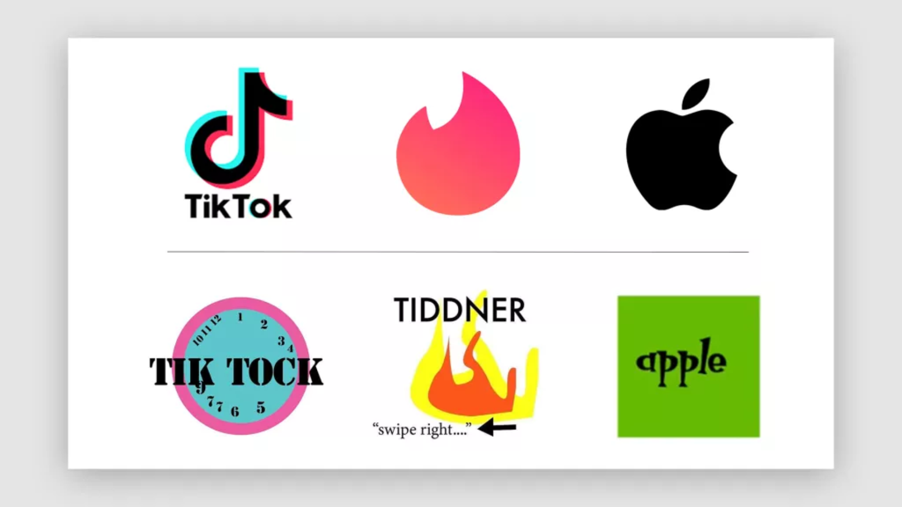
Brands Change Their Logos To Terrible New Designs

10 Web Design Trends and Predictions for 2022 and Beyond

18 Designs That Made a Big Impact in 2021

Awful Web Designs From 18 of MMA’s Top Fighters

Don’t Get Left Behind by the No-Code Wave

The Top 7 Websites to Learn Web Development Online

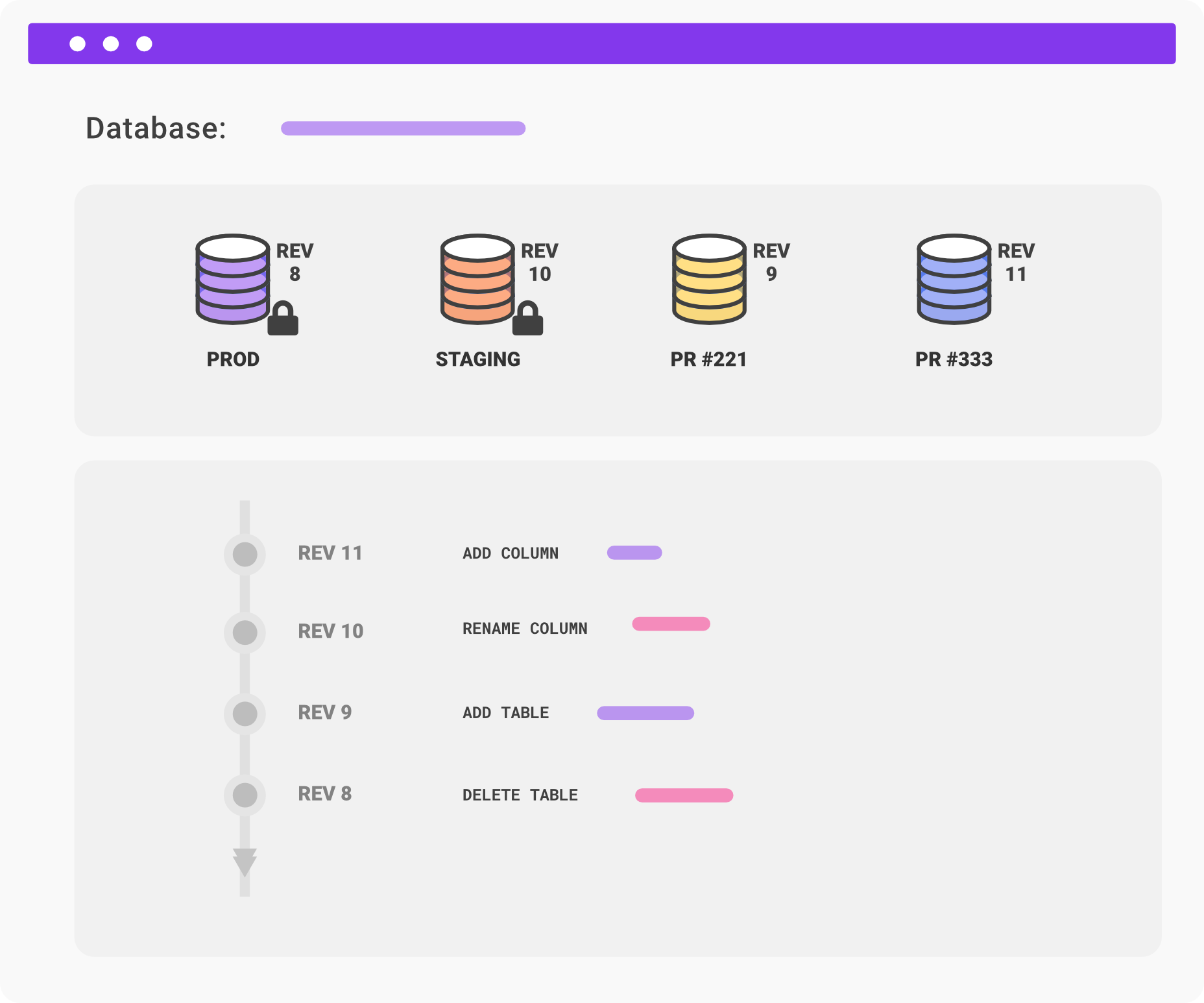
Xata – Database Service for Serverless Apps

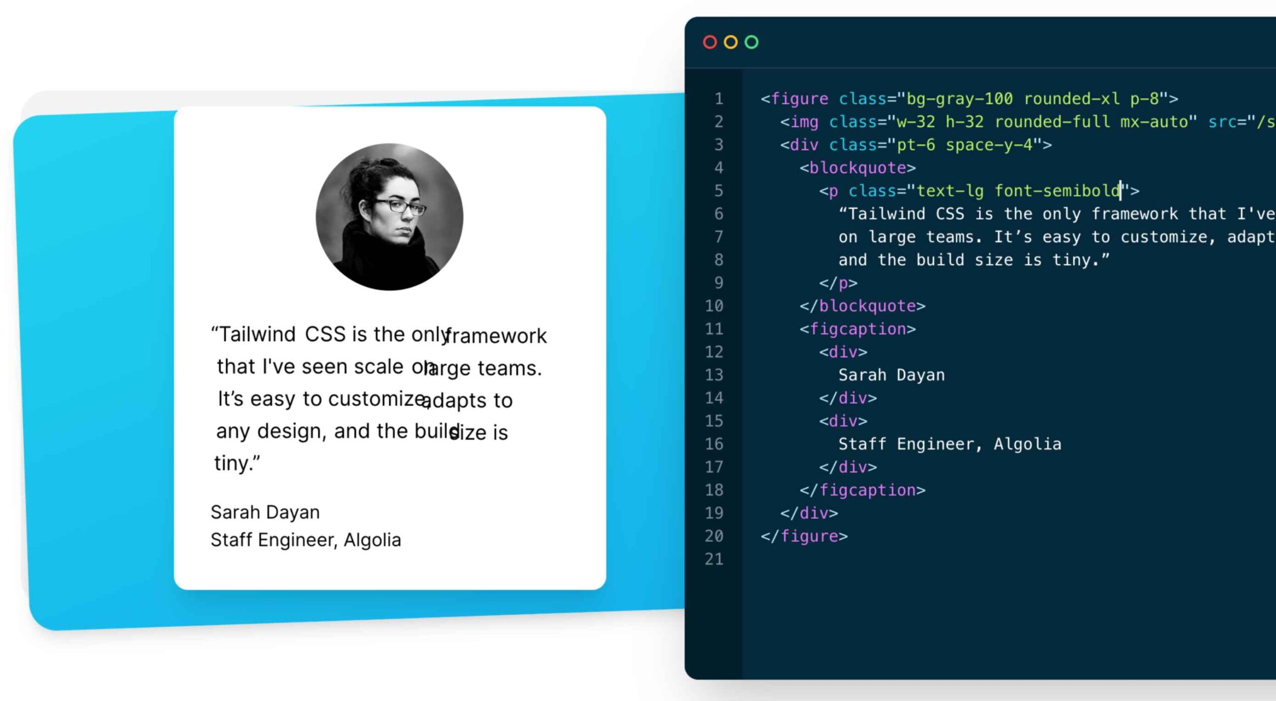
How To Optimize CSS for Peak Site Performance

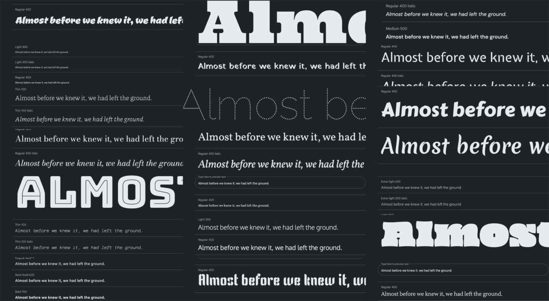
21 Exceptional Google Fonts You Probably Haven’t Discovered Yet

Source

The post Popular Design News of the Week: September 20, 2021 – September 26, 2021 first appeared on Webdesigner Depot.

Categories: Designing, Others Tags:

Systems for z-index

September 24th, 2021 No comments

Say you have a z-index bug. Something is being covered up by something else. In my experience, a typical solution is to put position: relative on the thing so z-index works in the first place, and maybe rejigger the z-index value until the right thing is on top.

The danger here is that this sets off a little z-index war. Raising a z-index value over here fixes one bug, and then causes another by covering up some other element somewhere else when you didn’t want to. Hopefully, you can reason about the situation and fix the bugs, even if it means refactoring more z-index values than you thought you might need to.

If the “stack” of z-index values is complicated enough, you might consider an abstraction. One of the problems is that your z-index values are probably sprinkled rather randomly throughout your CSS. So, instead of simply letting that be, you can give yourself a central location for z-index values to reference later.

I’ve covered doing that as a Sass map in the past:

$zindex: (
  modal     : 9000, 
  overlay   : 8000,
  dropdown  : 7000,
  header    : 6000,
  footer    : 5000
);

.header {
  z-index: map-get($zindex, header);
}

Now you’ve got a central place to manage those values.

Rafi Strauss has taken that a step further with OZMap. It’s also a Sass map situation, but it’s configured like this:

$globalZIndexes: (
  a: null,
  b: null,
  c: 2000,
  d: null,
);

The idea here is that most values are auto-generated by the tool (the null values), but you can specify them if you want. That way, if you have a third-party component with a z-index value you can’t change, you plug that into the map, and then the auto-generated numbers will factor that in when you make layers on top. It also means it’s very easy to slip layers in between others.

I think all that is clever and useful stuff — but I also think it doesn’t help with another common z-index bug: stacking contexts. It’s always the stacking context, as I’ve written. If some element is in a stacking context that is under some other stacking context, there is no z-index value possible that will bring it on top. That’s a much harder bug to fix.

Andy Blum wrote about this recently.

One of the great frustrations of front-end development is the unexpected interaction and overlapping of those same elements. Struggling to arrange elements along the z-axis, which extends perpendicularly through the computer screen towards and away from the viewer, is such a shared front-end experience that an element’s z-index can sometimes be used as a frustrate-o-meter gauging the developer’s mood.

The key to maintainable z-index values is understanding that z-index values can’t always be directly compared. They’re not an absolute measurement along an imaginary ruler extending out of the viewport; rather, they are a relative order between elements within the same stacking context.

Turns out there is a nice little debugging tool for stacking contexts in the form of a browser extension (Chrome and Firefox.) Andy gets into a very tricky situation where an RTL version of a website has a rule that uses a transform to move a video on the page. That transform triggers a new stacking context and hence a bug with an unclickable button. Gnarly.

Kinda makes me think that there could be some kinda built-in DevTools way of seeing/understanding stacking contexts. I don’t know if this is the right answer, but I’ve been seeing a leaning into “badges” in DevTools more and more. These things:

In fact, Chrome 94 recently dropped a new one for container queries, so they are being used more and more.

Maybe there could be a badge for stacking contexts? Typically what happens with badges is that you click it on and it shows a special UI. For example, for flexbox or grid it will show the overlay for all the grid lines. The special UI for stacking contexts could be color/texture coded and labelled areas showing all the stacking contexts and how they are layered.


The post Systems for z-index appeared first on CSS-Tricks. You can support CSS-Tricks by being an MVP Supporter.

Categories: Designing, Others Tags:

The Self Provisioning Runtime

September 24th, 2021 No comments

Big thoughts on where the industry is headed from Shawn Wang:

Advancements in two fields — programming languages and cloud infrastructure — will converge in a single paradigm: where all resources required by a program will be automatically provisioned, and optimized, by the environment that runs it.

I can’t articulate it like Shawn, but this all feels right.

I think of how front-end development has exploded over time with JavaScript being everywhere (see: “ooops, I guess we’re full-stack developers now”). Services have also exploded to help. Oh hiiii front-end developers! I see you can write a little JavaScript! Come over here and we’ll give you a complete database with GraphQL endpoints! And we’ll run your cloud functions! But that means there are a lot more people doing this who, in some sense, have no business doing it (points at self). I just have to trust that these services are going to protect me from myself as best they can.

Follow this trend line, and it will get easier and easier to run everything you need to run. Maybe I’ll write code like:

/*
  - Be a cloud function
  - Run at the edge
  - Get data from my data store I named "locations", require JWT auth
  - Return no slower than 250ms
  - I'm willing to pay $8/month for this, alert me if we're on target to exceed that
*/

exports.hello = (message) => {
  const name = message.data
  const location = locations.get("location").where(message.id);

  return `Hello, ${name} from ${location}`;
};

That’s just some fake code, but you can see what I mean. Right by your code, you explain what infrastructure you need to have it work and it just does it. I saw a demo of cloudcompiler.run the other day and it was essentially like this. Even the conventions Netlify offers point highly in this direction, e.g. put your .js files in a functions folder, and we’ll take care of the rest. You just hit it with a local relative URL.

I’d actually bet the future is even more magical than this, guessing what you need and making it happen.

Direct Link to ArticlePermalink


The post The Self Provisioning Runtime appeared first on CSS-Tricks. You can support CSS-Tricks by being an MVP Supporter.

Categories: Designing, Others Tags:

The Pros and Cons of Tailwind CSS

September 24th, 2021 No comments

As a utility-first CSS framework, Tailwind has rapidly become popular among developers. With its fast styling process and the freedom it offers when designing a website, it’s really no wonder why.

But how can you make sure this is the right CSS framework for your upcoming development projects? In this blog post, you’ll learn what Tailwind is, and how it differs from other frameworks like Bootstrap, or Foundation.

In addition, we will highlight the main advantages and disadvantages of the framework. By the end, you will be able to make an honest and objective assessment as to whether Tailwind is the right framework for you. So without further ado, let us dive deeper into it. 

What is Tailwind CSS?

First released in May 2019, Tailwind CSS is a front-end CSS framework. It is currently at version 2.2. Since its release, Tailwind has created quite a following. More than 260k developers have used it to enhance their design systems.

Stats like these make Tailwind one of the most popular CSS frameworks on the market, and all in less than two years. There are many reasons for this. Primarily, because its features make it the ideal choice for a wide variety of projects. Tellingly, most developers prefer it to create React projects.

The main difference between Tailwind and its competitors is that it gives developers complete control over the styling of a web application. So, is it the right CSS framework for you? To answer this question, let us take a look at Tailwind’s advantages and disadvantages.

Tailwind CSS: Pros and Cons

Tailwind CSS: Advantages

1. Control Over Styling

Tailwind is a unique CSS framework when it comes to styling web applications, meaning that Tailwind does not have a default theme that you have to use like other CSS frameworks.

For example, you can give each project a different look even if you use the same elements (color palette, size, etc.). Therefore, it’s one of the few CSS frameworks that is not opinionated on how you should style your project. 

2. Faster CSS Styling Process

There is no faster framework than Tailwind when it comes to styling HTML. As a result, you can easily create good-looking layouts by styling elements directly. This is possible because Tailwind offers thousands of built-in classes that do not require you to create designs from scratch.

Therefore, you do not have to write CSS rules yourself. These CSS classes are the main reason why building and styling with Tailwind is so fast. 

3. Responsiveness and Security 

With Tailwind’s pre-built classes, you can design the layout directly in an HTML file. This makes it a very responsive, mobile-friendly CSS framework. Apart from that, Tailwind has proven to be a stable framework since its initial release.

The framework was developed by top-notch engineers, which is why bugs and breaks are rare. 

4. Additional Features 

Tailwind CSS works in the front end of a website. For this reason, it is reasonable for developers to demand ultimate responsiveness. Well, Tailwind provides the ability to create responsive themes for your web applications and remove all unused CSS classes. With PurgeCSS, Tailwind helps you keep your final CSS as small as possible.

Tailwind CSS: Disadvantages

1. Styling and HTML are Mixed

Because you do not have to write CSS rules yourself, Tailwind works differently than most CSS frameworks. While this is great for those unfamiliar with CSS, it also means that Tailwind mixes style rules in with your HTML files.

This goes against the principle of the “separation of concerns.” Many developers prefer to separate page structure and style, claiming that classes make the Tailwind markup process verbose. 

2. It Takes Time to Learn 

Because of the built-in classes, Tailwind CSS is quite learning-intensive. Even for experienced developers, it can be a challenge to learn how to use and fully utilize the pre-built classes. But, of course, as with any other development task, practice makes perfect.

However, if you are confident and quick when it comes to writing CSS classes, Tailwind may not be the best choice for you. Even if that’s true, Tailwind generally makes CSS styling faster in the long run.  

3.  Lack of Important Components

Unlike Bulma and Bootstrap, Tailwind does not have many significant styling components. Unfortunately, this means you have to manually add features like headers, buttons, and navigation bars for web apps.

This is not a significant drawback, as experienced developers can implement these features quickly. However, you will need to spend some time doing so. 

4. Documentation 

Although Tailwind CSS has made great strides when it comes to adding guides and video tutorials, it still lags behind competitors like Bootstrap. Of course, you can always contact the developers if you have a problem.

However, keep in mind that this may take some time. For this reason, you may need to customize the framework to your needs manually.

Is Tailwind Worth Trying?

In a few words, working with Tailwind is quite different from other CSS frameworks. We have identified its main advantages and disadvantages. Based on these features, we can easily say that Tailwind is:

  • An excellent solution for developers familiar with CSS who want to speed up the creation and design process in the long run.
  • Not such a good idea if you are not familiar with CSS or do not want to spend time learning a new CSS framework. 

It becomes clear that it all depends on your personal needs and preferences. However, if saving time on CSS styling is a priority for you, you should definitely give Tailwind a try.

Regardless of whether you choose to use Tailwind or not, it’s evident that many developers use it for good reasons. Since it offers a faster styling process and is a responsive and stable framework, it’s here to stay.

Tailwind can help you save time and change the way you design websites, and so taking the time to test it out is worthwhile.

Source

The post The Pros and Cons of Tailwind CSS first appeared on Webdesigner Depot.

Categories: Designing, Others Tags:

Lessons Learned Rebuilding A Large E-Commerce Website With Next.js (Case Study)

September 24th, 2021 No comments

At our company, Unplatform, we have been building e-commerce sites for decades now. Over those years, we have seen the technology stack evolve from server-rendered pages with some minor JavaScript and CSS to full-blown JavaScript applications.

The platform we used for our e-commerce sites was based on ASP.NET and when visitors started to expect more interaction, we added React for the front-end. Although mixing the concepts of a server web framework like ASP.NET with a client-side web framework like React made things more complicated, we were quite happy with the solution. That was until we went to production with our highest traffic customer. From the moment we went live, we experienced performance issues. Core Web Vitals are important, even more so in e-commerce. In this Deloitte study: Milliseconds Make Millions, the investigators analyzed mobile site data of 37 different brands. As a result, they found that a 0.1s performance improvement can lead to a 10% increase in conversion.

To mitigate the performance issues, we had to add a lot of (unbudgeted) extra servers and had to aggressively cache pages on a reverse proxy. This even required us to disable parts of the site’s functionality. We ended up having a really complicated, expensive solution that in some cases just statically served some pages.

Obviously, this didn’t feel right, until we found out about Next.js. Next.js is a React-based web framework that allows you to statically generate pages, but you can also still use server-side rendering, making it ideal for e-commerce. It can be hosted on a CDN like Vercel or Netlify, which results in lower latency. Vercel and Netlify also use serverless functions for the Server Side Rendering, which is the most efficient way to scale out.

Challenges

Developing with Next.js is amazing, but there are definitely some challenges. The developer experience with Next.js is something you just need to experience. The code you write visualizes instantly in your browser and productivity goes through the sky. This is also a risk because you can easily get too focused on productivity and neglect the maintainability of your code. Over time, this and the untyped nature of JavaScript can lead to the degradation of your codebase. The number of bugs increases and productivity starts to go down.

It can also be challenging on the runtime side of things. The smallest changes in your code can lead to a drop in performance and other Core Web Vitals. Also, careless use of server-side rendering can lead to unexpected service costs.

Let’s have a closer look at our lessons learned in overcoming these challenges.

  1. Modularize Your Codebase
  2. Lint And Format Your Code
  3. Use TypeScript
  4. Plan For Performance And Measure Performance
  5. Add Performance Checks To Your Quality Gate
  6. Add Automated Tests
  7. Aggressively Manage Your Dependencies
  8. Use A Log Aggregation Service
  9. Next.js’s Rewrite Functionality Enables Incremental Adoption

Lesson Learned: Modularize Your Codebase

Front-end frameworks like Next.js make it so easy to get started these days. You just run npx create-next-app and you can start coding. But if you are not careful and start banging out code without thinking about design, you might end up with a big ball of mud.

When you run npx create-next-app, you will have a folder structure like the following (this is also how most examples are structured):

/public
  logo.gif
/src
  /lib
    /hooks
      useForm.js
  /api
     content.js
  /components
     Header.js
     Layout.js
  /pages
     Index.js

We started out using the same structure. We had some subfolders in the components folder for bigger components, but most of the components were in the root components folder. There is nothing wrong with this approach and it’s fine for smaller projects. However, as our project grew it became harder to reason about components and where they are used. We even found components that were no longer used at all! It also promotes a big ball of mud, because there is no clear guidance on what code should be dependent on what other code.

To solve this, we decided to refactor the codebase and group the code by functional modules (kind of like NPM modules) instead of technical concepts:

/src
  /modules 
    /catalog
      /components
        productblock.js
    /checkout
      /api
        cartservice.js
      /components
        cart.js

In this small example, there is a checkout module and a catalog module. Grouping the code this way leads to better discoverability: by merely looking at the folder structure you know exactly what kind of functionality is in the codebase and where to find it. It also makes it a lot easier to reason about dependencies. In the previous situation, there were a lot of dependencies between the components. We had pull requests for changes in the checkout that also impacted catalog components. This increased the number of merge conflicts and made it harder to make changes.

The solution that worked best for us was to keep the dependencies between the modules to an absolute minimum (if you really need a dependency, make sure its uni-directional) and introduce a “project” level that ties everything together:

/src
  /modules
    /common
      /atoms
      /lib 
    /catalog
      /components
        productblock.js
    /checkout
      /api
        cartservice.js
      /components
        cart.js
    /search
  /project
    /layout
      /components
    /templates
      productdetail.js
      cart.js
  /pages
    cart.js

A visual overview of this solution:

The project level contains the code for the layout of the e-commerce site and page templates. In Next.js, a page component is a convention and results in a physical page. In our experience, these pages often need to reuse the same implementation and that is why we have introduced the concept of “page templates”. The page templates use the components from the different modules, for example, the product detail page template will use components from the catalog to display product information, but also an add to cart component from the checkout module.

We also have a common module, because there is still some code that needs to be reused by the functional modules. It contains simple atoms that are React components used to provide a consistent look and feel. It also contains infrastructure code, think of certain generic react hooks or GraphQL client code.

Warning: Make sure the code in the common module is stable and always think twice before adding code here, in order to prevent tangled code.

Micro Front-Ends

In even bigger solutions or when working with different teams, it can make sense to split up the application even more into so-called micro-frontends. In short, this means splitting up the application even more into multiple physical applications that are hosted independently on different URLs. For example: checkout.mydomain.com and catalog.mydomain.com. These are then integrated by a different application that acts as a proxy.

Next.js’ rewrite functionality is great for this and using it like this is supported by so-called Multi Zones.
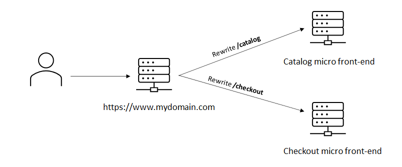
The benefit of multi-zones is that every zone manages its own dependencies. It also makes it easier to incrementally evolve the codebase: If a new version of Next.js or React gets out, you can upgrade the zones one by one instead of having to upgrade the entire codebase at once. In a multi-team organization, this can greatly reduce dependencies between teams.

Further Reading

Lesson Learned: Lint And Format Your Code

This is something we learned in an earlier project: if you work in the same codebase with multiple people and don’t use a formatter, your code will soon become very inconsistent. Even if you are using coding conventions and are doing reviews, you will soon start to notice the different coding styles, giving a messy impression of the code.

A linter will check your code for potential issues and a formatter will make sure the code is formatted in a consistent way. We use ESLint & prettier and think they are awesome. You don’t have to think about the coding style, reducing the cognitive load during development.

Fortunately, Next.js 11 now supports ESLint out of the box (https://nextjs.org/blog/next-11), making it super easy to set up by running npx next lint. This saves you a lot of time because it comes with a default configuration for Next.js. For example, it is already configured with an ESLint extension for React. Even better, it comes with a new Next.js-specific extension that will even spot issues with your code that could potentially impact the Core Web Vitals of your application! In a later paragraph, we will talk about quality gates that can help you to prevent pushing code to a product that accidentally hurts your Core Web Vitals. This extension gives you feedback a lot faster, making it a great addition.

Further Reading

Lesson Learned: Use TypeScript

As components got modified and refactored, we noticed that some of the component props were no longer used. Also, in some cases, we experienced bugs because of missing or incorrect types of props being passed into the components.

TypeScript is a superset of JavaScript and adds types, which allows a compiler to statically check your code, kind of like a linter on steroids.

At the start of the project, we did not really see the value of adding TypeScript. We felt it was just an unnecessary abstraction. However, one of our colleagues had good experiences with TypeScript and convinced us to give it a try. Fortunately, Next.js has great TypeScript support out of the box and TypeScript allows you to add it to your solution incrementally. This means you don’t have to rewrite or convert your entire codebase in one go, but you can start using it right away and slowly convert the rest of the codebase.

Once we started migrating components to TypeScript, we immediately found issues with wrong values being passed into components and functions. Also, the developer feedback loop got shorter and you get notified of issues before running the app in the browser. Another big benefit we found is that it makes it a lot easier to refactor code: it is easier to see where code is being used and you immediately spot unused component props and code. In short, the benefits of TypeScript:

  1. Reduces the number of bugs
  2. Makes it easier to refactor your code
  3. Code gets easier to read

Further Reading

Lesson Learned: Plan For Performance And Measure Performance

Next.js supports different types of pre-rendering: Static generation and Server-side rendering. For best performance, it is recommended to use static generation, which happens during build time, but this is not always possible. Think of product detail pages that contain stock information. This kind of information changes often and running a build every time does not scale well. Fortunately, Next.js also supports a mode called Incremental Static Regeneration (ISR), which still statically generates the page, but generates a new one in the background every x seconds. We have learned that this model works great for larger applications. Performance is still great, it requires less CPU time than Server-side rendering and it reduces build times: pages only get generated on the first request. For every page you add, you should think of the type of rendering needed. First, see if you can use static generation; if not, go for Incremental Static Regeneration, and if that too is not possible, you can still use server-side rendering.

Next.js automatically determines the type of rendering based on the absence of getServerSideProps and getInitialProps methods on the page. It’s easy to make a mistake, which could cause the page to be rendered on the server instead of being statically generated. The output of a Next.js build shows exactly which page uses what type of rendering, so be sure to check this. It also helps to monitor production and track the performance of the pages and the CPU time involved. Most hosting providers charge you based on the CPU time and this helps to prevent any unpleasant surprises. I will describe how we monitor this in the Lesson learned: Use a log aggregation service paragraph.

Bundle Size

To have a good performance it is crucial to minimize the bundle size. Next.js has a lot of features out of the box that help, e.g. automatic code splitting. This will make sure that only the required JavaScript and CSS are loaded for every page. It also generates different bundles for the client and for the server. However, it is important to keep an eye on these. For example, if you import JavaScript modules the wrong way the server JavaScript can end up in the client bundle, greatly increasing the client bundle size and hurting performance. Adding NPM dependencies can also greatly impact the bundle size.

Fortunately, Next.js comes with a bundles analyzer that gives you insight into which code takes up what part of the bundles.

Further Reading

Lesson Learned: Add Performance Checks To Your Quality Gate

One of the big benefits of using Next.js is the ability to statically generate pages and to be able to deploy the application to the edge (CDN), which should result in great performance and Web Vitals. We learned that, even with great technology like Next.js, getting and keeping a great lighthouse score is really hard. It happened a number of times that after we deployed some changes to production, the lighthouse score dropped significantly. To take back control, we have added automatic lighthouse tests to our quality gate. With this Github Action you can automatically add lighthouse tests to your pull requests. We are using Vercel and every time a pull request is created, Vercel deploys it to a preview URL and we use the Github action to run lighthouse tests against this deployment.

If you don’t want to set up the GitHub action yourself, or if you want to take this even further, you could also consider a third-party performance monitoring service like DebugBear. Vercel also offers an Analytics feature, which measures the core Web Vitals of your production deployment. Vercel Analytics actually collects the measures from the devices of your visitors, so these scores are really what your visitors are experiencing. At the time of writing, Vercel Analytics only works on production deployments.

Lesson Learned: Add Automated Tests

When the codebase gets bigger it gets harder to determine if your code changes might have broken existing functionality. In our experience, it is vital to have a good set of End-to-end tests as a safety net. Even if you have a small project, it can make your life so much easier when you have at least some basic smoke tests. We have been using Cypress for this and absolutely love it. The combination of using Netlify or Vercel to automatically deploy your Pull request on a temporary environment and running your E2E tests is priceless.

We use cypress-io/GitHub-action to automatically run the cypress tests against our pull requests. Depending on the type of software you’re building it can be valuable to also have more granular tests using Enzyme or JEST. The tradeoff is that these are more tightly coupled to your code and require more maintenance.

Lesson Learned: Aggressively Manage Your Dependencies

Managing dependencies becomes a time-consuming, but oh so important activity when maintaining a large Next.js codebase. NPM made adding packages so easy and there seems to be a package for everything these days. Looking back, a lot of times when we introduced a new bug or had a drop in performance it had something to do with a new or updated NPM package.

So before installing a package you should always ask yourself the following:

  • What is the quality of the package?
  • What will adding this package mean for my bundle size?
  • Is this package really necessary or are there alternatives?
  • Is the package still actively maintained?

To keep the bundle size small and to minimize the effort needed to maintain these dependencies it is important to keep the number of dependencies as small as possible. Your future self will thank you for it when you are maintaining the software.

Tip: The Import Cost VSCode extension automatically shows the size of imported packages.

Keep Up With Next.js Versions

Keeping up with Next.js & React is important. Not only will it give you access to new features, but new versions will also include bug fixes and fixes for potential security issues. Fortunately, Next.js makes upgrading incredibly easy by providing Codemods (https://nextjs.org/docs/advanced-features/codemods. These are automatic code transformations that automatically update your code.

Update Dependencies

For the same reason, it is important to keep the Next.js and React versions actual; it is also important to update other dependencies. Github’s dependabot (https://github.com/dependabot) can really help here. It will automatically create Pull Requests with updated dependencies. However, updating dependencies can potentially break things, so having automated end-to-end tests here can really be a lifesaver.

Lesson learned: Use A Log Aggregation Service

To make sure the app is behaving properly and to preemptively find issues, we have found it is absolutely necessary to configure a log aggregation service. Vercel allows you to log in and view the logs, but these are streamed in real-time and are not persisted. It also does not support configuring alerts and notifications.

Some exceptions can take a long time to surface. For example, we had configured Stale-While-Revalidate for a particular page. At some point, we noticed that the pages were not being refreshed and that old data was being served. After checking the Vercel logging, we found that an exception was happening during the background rendering of the page. By using a log aggregation service and configuring an alert for exceptions, we would have been able to spot this a lot sooner.

Log aggregation services can also be useful to monitor the limits of Vercel’s pricing plans. Vercel’s usage page also gives you insights in this, but using a log aggregation service allows you to add notifications when you reach a certain threshold. Prevention is better than cure, especially when it comes to billing.

Vercel offers a number of out-of-the-box integrations with log aggregation services, featuring Datadog, Logtail, Logalert, Sentry, and more.

Further Reading

Lesson Learned: Next.js’s Rewrite Functionality Enables Incremental Adoption

Unless there are some serious issues with the current website, not a lot of customers are going to be excited to rewrite the entire website. But what if you could start with rebuilding only the pages that matter most in terms of Web Vitals? That is exactly what we did for another customer. Instead of rebuilding the entire site, we only rebuild the pages that matter most for SEO and conversion. In this case the product detail and category pages. By rebuilding those with Next.js, performance greatly increased.

Next.js rewrite functionality is great for this. We built a new Next.js front-end that contains the catalog pages and deployed that to the CDN. All other existing pages are rewritten by Next.js to the existing website. This way you can start having the benefits of a Next.js site in a low-effort or low-risk manner.

Further Reading

What’s Next?

When we released the first version of the project and started doing serious performance testing we were thrilled by the results. Not only were the page response times and Web Vitals so much better than before, but the operational costs were also a fraction of what it was before. Next.js and JAMStack generally allow you to scale out in the most cost-efficient way.

Switching over from a more back-end-oriented architecture to something like Next.js is a big step. The learning curve can be quite steep, and initially, some team members really felt outside of their comfort zone. The small adjustments we made, the lessons learned from this article, really helped with this. Also, the development experience with Next.js gives an amazing productivity boost. The developer feedback cycle is incredibly short!

Further Reading

Categories: Others Tags:

What is Your Page Title on a Google Search Engine Results Page?

September 23rd, 2021 No comments

Whatever Google wants it to be. I always thought it was exactly what your </code> element was. Perhaps in lieu of that, what the first <code></p> <h1></code> on the page is. But recently I noticed some pages on this site that were showing a title on <abbr title="search engine results page">SERP</abbr>s that was a string that appeared nowhere at all in the source of the page.</p> <p><span></span></p> <p>When I first noticed it, I tweeted my basic findings…</p> <figure class="wp-block-embed is-type-rich is-provider-twitter wp-block-embed-twitter"> <div class="wp-block-embed__wrapper"> <blockquote class="twitter-tweet" data-width="500" data-dnt="true"> <p lang="en" dir="ltr">Where does that title come from?</p> <p>It’s not the </p> <h1> on the page, that reads:<br />backdrop-filter</p> <p>It’s not the <title> of the page, that reads:<br />backdrop-filter | CSS-Tricks <a target="_blank" href="https://t.co/xzoPcge9nT" rel="noopener">pic.twitter.com/xzoPcge9nT</a></p> <p>— Chris Coyier (@chriscoyier) <a target="_blank" href="https://twitter.com/chriscoyier/status/1428747575985942528?ref_src=twsrc%5Etfw" rel="noopener">August 20, 2021</a></p></blockquote> </div><figcaption><a target="_blank" href="https://twitter.com/chriscoyier/status/1428747575985942528" rel="noopener">The thread</a> has more info than what unfurled here. </figcaption></figure> <p>This is a known thing. Apparently, they’ve been doing this for a long time (~10 years), but it’s the first I’ve noticed it. And it’s undergone a recent change:</p> <figure class="wp-block-embed is-type-rich is-provider-twitter wp-block-embed-twitter"> <div class="wp-block-embed__wrapper"> <blockquote class="twitter-tweet" data-width="500" data-dnt="true"> <p lang="en" dir="ltr">Last week, we introduced a new system of generating titles for web pages. Here’s the rundown on how it works: <a target="_blank" href="https://t.co/tgOGR8y8Ww" rel="noopener">https://t.co/tgOGR8y8Ww</a></p> <p>— Google Search Central (@googlesearchc) <a target="_blank" href="https://twitter.com/googlesearchc/status/1430332861769416712?ref_src=twsrc%5Etfw" rel="noopener">August 25, 2021</a></p></blockquote> </div> </figure> <p>The article is pretty clear about things:</p> <blockquote class="wp-block-quote is-style-default"> <p>[…] we think our new system is producing titles that work better for documents overall, to describe what they are about, regardless of the particular query.</p> <p>Also, while we’ve gone <a target="_blank" href="https://developers.google.com/search/docs/advanced/appearance/good-titles-snippets" rel="noopener">beyond HTML text to create titles</a> for <a target="_blank" href="https://developers.google.com/search/blog/2012/01/better-page-titles-in-search-results" rel="noopener">over a decade</a>, our new system is making even more use of such text. In particular, we are making use of text that humans can visually see when they arrive at a web page. We consider the main visual title or headline shown on a page, content that site owners often place within <code><H1></code> tags or other header tags, and content that’s large and prominent through the use of style treatments.</p> <p>Other text contained in the page might be considered, as might be text within links that point at pages.</p> </blockquote> <p>The change is in response to people having sucky <code><title></code> text. Like it’s too long, too jacked up with SEO garbage (irony!), or are just plain non-descriptive. </p> <p>I’m not entirely sure how much I care just yet. </p> <p>Part of me thinks, well, <code>google.com</code> isn’t the web. As important as it is, it’s a proprietary product by a private company and they can do whatever they want within the bounds of the law. In this case, it’s clear the intention is to help: to provide titles that are <em>more</em> clear than what the original page has.</p> <p>Part of me thinks, well, that sucks that, as site owners, we have no control. If Google wanted to change the <abbr>SERP</abbr> title for every results to this website to “CSS-Tricks is a stupid website, never visit it,” they could and that’s that. </p> <p>Part of me connects this kind of work to <a target="_blank" href="https://css-tricks.com/need-catch-amp-debate/" rel="noopener">AMP</a>. AMP was basically saying, “Y’all are absolutely horrible at building performant mobile websites, so we’re going to build a strict set of rules such that you can’t screw it up anymore, and dangling a carrot of better SERP placement if you buy into the rules.” This way of creating page titles is basically saying, “Y’all are absolutely horrible at providing good titles, so we’re going to title your pages for you so you can’t screw it up anymore and we can improve our SERPs.”</p> <p>Except with AMP, you had to put in the development hours to make it happen. It was opt-in, even if the carrot was un-ignorable by content companies. This doesn’t carry the risk of burning development hours, but it’s also not something we get to opt into.</p> <hr> <p><small>The post <a target="_blank" rel="nofollow noopener" href="https://css-tricks.com/what-is-your-page-title-on-a-google-search-engine-results-page/">What is Your Page Title on a Google Search Engine Results Page?</a> appeared first on <a target="_blank" rel="nofollow noopener" href="https://css-tricks.com/">CSS-Tricks</a>. You can support CSS-Tricks by being an <a target="_blank" href="https://css-tricks.com/product/mvp-supporter/" rel="noopener">MVP Supporter</a>.</small></p> <div class="fixed"></div> </div> <div class="under"> <span class="categories">Categories: </span><span><a href="http://www.webmastersgallery.com/category/design/" rel="category tag">Designing</a>, <a href="http://www.webmastersgallery.com/category/uncategorized/" rel="category tag">Others</a></span> <span class="tags">Tags: </span><span></span> </div> </div> <div class="post" id="post-4402244"> <h2><a class="title" href="http://www.webmastersgallery.com/2021/09/23/working-with-graphql-caching/" rel="bookmark">Working With GraphQL Caching</a></h2> <div class="info"> <span class="date">September 23rd, 2021</span> <span class="author"><a href="http://www.webmastersgallery.com/author/admin/" title="Posts by admin" rel="author">admin</a></span> <span class="comments"><a href="http://www.webmastersgallery.com/2021/09/23/working-with-graphql-caching/#respond">No comments</a></span> <div class="fixed"></div> </div> <div class="content"> <p>If you’ve recently started working with <a target="_blank" href="https://graphql.org/" rel="noopener">GraphQL</a>, or reviewed its pros and cons, you’ve no doubt heard things like “GraphQL doesn’t support caching” or “GraphQL doesn’t care about caching.” And for most, that is a big deal.</p> <p>The official <a target="_blank" href="https://graphql.org/learn/caching/#gatsby-focus-wrapper" rel="noopener">GraphQL documentation</a> refers to caching techniques so, clearly, the folks behind it <em>do</em> care about caching and its performance benefits.</p> <p>The perception that GraphQL is at odds with caching is something I want to address in this post. I want to walk through different caching techniques and how to leverage cache for GraphQL queries.</p> <p><span></span></p> <h3>Getting GraphQL to cache automatically</h3> <p>Consider the following query to fetch a post and the post author:</p> <pre class="wp-block-csstricks-code-block language-javascript" data-line=""><code>query getPost { post(slug: "working-with-graphql-caching") { id title author { id name avatar } } }</code></pre> <p>The one “magic trick” that makes automatic GraphQL caching work is the <code>__typename</code> meta field that all GraphQL APIs expose.</p> <p>As the name suggests, <code>__typename</code> returns the name of the objects type. This field can even be manually added to existing queries — and most of the time, a GraphQL client, or CDN will do it for you. <a target="_blank" href="https://formidable.com/open-source/urql/" rel="noopener">urql</a> is one such GraphQL client. The server might receive a query like this:</p> <pre class="wp-block-csstricks-code-block language-javascript" data-line="3,7"><code>query getPost { post(slug: "working-with-graphql-caching") { __typename id title author { __typename id name } } }</code></pre> <p>The response with <code>__typename</code> might look a little something like this:</p> <pre class="wp-block-csstricks-code-block language-javascript" data-line=""><code>{ data: { __typename: "Post", id: 5, title: "Working with GraphQL Caching", author: { __typename: "User", id: 1, name: "Jamie Barton" } } }</code></pre> <p>The <code>__typename</code> is a critical piece of the GraphQL caching puzzle because we can now cache this result, and know it contains the Post ID 5 and User ID 1.</p> <p>Then there are libraries like <a target="_blank" href="https://www.apollographql.com/docs/react/caching/cache-configuration/" rel="noopener">Apollo</a> and <a target="_blank" href="https://relay.dev/" rel="noopener">Relay</a>, that also have some level of built-in caching we can use for automatic caching. Since they already know what’s in the cache, they can defer to the cache instead of remote APIs to fetch what the client asks for in a query.</p> <h3>Automatically invalidate the cache when there are changes</h3> <p>Imagine the post author edits the post’s title with the <code>editPost</code> mutation:</p> <pre class="wp-block-csstricks-code-block language-javascript" data-line=""><code>mutation { editPost(input: { id: 5, title: "Working with GraphQL Caching" }) { id title } }</code></pre> <p>Since the GraphQL client automatically adds the <code>__typename</code> field, the result of this mutation immediately tells the cache that Post ID 5 has changed, and any cached query result containing that post needs to be invalidated:</p> <pre class="wp-block-csstricks-code-block language-javascript" data-line=""><code>{ data: { __typename: "Post", id: 5, title: "Working with GraphQL Caching" } }</code></pre> <p>The next time a user sends the same query, the query fetches the new data from the origin rather than serving the stale result from the cache. <em>Magic!</em></p> <h3>Normalized GraphQL caching</h3> <p>Many GraphQL clients won’t cache entire query results.</p> <p>Instead, they normalize the cached data into two data structures; one that associates each object with its data (e.g. <code>Post #5: { … }</code>, <code>User #1: { … }</code>, etc.); and one that associates each query with the objects it contains (e.g. <code>getPost: { Post #5, User #1}</code>, etc.).</p> <p>See <a target="_blank" href="https://formidable.com/open-source/urql/docs/graphcache/normalized-caching/" rel="noopener">urql’s documentation on normalized caching</a> or <a target="_blank" href="https://www.apollographql.com/blog/apollo-client/caching/demystifying-cache-normalization/" rel="noopener">Apollo’s “Demystifying Cache Normalization”</a> for specific examples and use cases.</p> <h3>Caching edge cases with GraphQL</h3> <p>The one major edge case that GraphQL caches are unable to handle automatically is adding items to a list. So, if a <code>createPost</code> mutation passes through the cache, it doesn’t know which specific list to add that item to.</p> <p>The easiest “fix” for this is to query the parent type in the mutation if it exists. For example, in the query below, we query the <code>community</code> relation on <code>post</code>:</p> <pre class="wp-block-csstricks-code-block language-javascript" data-line=""><code>query getPost { post(slug: "working-with-graphql-caching") { id title author { id name avatar } # Also query the community of the post community { id name } } }</code></pre> <p>Then we can also query that community from the <code>createPost</code> mutation, and invalidate any cached query results that contain that community:</p> <pre class="wp-block-csstricks-code-block language-javascript" data-line=""><code>mutation createPost { createPost(input: { ... }) { id title # Also query and thus invalidate the community of the post community { id name } } }</code></pre> <p>While it’s imperfect, the typed schema and <code>__typename</code> meta field are the keys that make GraphQL APIs ideal for caching.</p> <p>You might be thinking by now that all of this is a hack and that GraphQL still doesn’t support traditional caching. And you wouldn’t be wrong. Since GraphQL operates via a <code>POST</code> request, you’ll need to offload to the application client and use the “tricks” above to take advantage of modern browser caching with GraphQL.</p> <p>That said, this sort of thing isn’t always possible to do, nor does it make a lot of sense for managing cache on the client. GraphQL clients make you <a target="_blank" href="https://formidable.com/open-source/urql/docs/graphcache/cache-updates/#updating-lists-or-links" rel="noopener">manually update the cache</a> for even trickier cases, but a service like GraphCDN provides a “server-like” caching experience, which also exposes a <a target="_blank" href="https://graphcdn.io/docs/how-to/purge-the-cache" rel="noopener">manual purging API</a> that lets you do things like this for greater cache control:</p> <pre class="wp-block-csstricks-code-block language-javascript" data-line=""><code># Purge all occurrences of a specific object mutation { purgeUser(id: [5]) }</code></pre> <pre class="wp-block-csstricks-code-block language-javascript" data-line=""><code># Purge by query name mutation { _purgeQuery(queries: [listUsers, listPosts]) }</code></pre> <pre class="wp-block-csstricks-code-block language-javascript" data-line=""><code># Purge all occurrences of a type mutation { purgeUser }</code></pre> <p>Now, no matter where you consume your GraphCDN endpoint, there’s no longer a need to re-implement cache strategies in all of your client-side logic on mobile, web, etc. Edge caching makes your API feel super fast, and reduces load by sharing the cache amongst your users, and keeping it away from each of their clients.</p> <p>Having recently used <a target="_blank" href="https://graphcdn.io/" rel="noopener">GraphCDN</a> on a project, it’s taken care of configuring a cache on the client or server for me, allowing me to get on with my project. For instance, I can swap out my endpoint with GraphCDN and obtain query complexity (which is coming soon), analytics, and more for free.</p> <hr class="wp-block-separator"> <p>So, does GraphQL care about caching? It most certainly does! Not only does it provide some automatic caching methods baked right into it, but a number of GraphQL libraries offer additional ways to do it and even manage it.</p> <p>Hopefully this article has given you some insight into the GraphQL caching story, and how to go about implementing it on the client, as well as taking advantage of CDNs to do it all for you. My goal here isn’t to sell you on using GraphQL on all your projects or anything, but if you are choosing between query languages and caching is a big concern, know that GraphQL is more than up for the task.</p> <hr> <p><small>The post <a target="_blank" rel="nofollow noopener" href="https://css-tricks.com/working-with-graphql-caching/">Working With GraphQL Caching</a> appeared first on <a target="_blank" rel="nofollow noopener" href="https://css-tricks.com/">CSS-Tricks</a>. You can support CSS-Tricks by being an <a target="_blank" href="https://css-tricks.com/product/mvp-supporter/" rel="noopener">MVP Supporter</a>.</small></p> <div class="fixed"></div> </div> <div class="under"> <span class="categories">Categories: </span><span><a href="http://www.webmastersgallery.com/category/design/" rel="category tag">Designing</a>, <a href="http://www.webmastersgallery.com/category/uncategorized/" rel="category tag">Others</a></span> <span class="tags">Tags: </span><span></span> </div> </div> <div class="post" id="post-4402245"> <h2><a class="title" href="http://www.webmastersgallery.com/2021/09/23/learn-how-to-build-true-edge-apps-with-cloudflare-workers-and-fauna/" rel="bookmark">Learn How to Build True Edge Apps With Cloudflare Workers and Fauna</a></h2> <div class="info"> <span class="date">September 23rd, 2021</span> <span class="author"><a href="http://www.webmastersgallery.com/author/admin/" title="Posts by admin" rel="author">admin</a></span> <span class="comments"><a href="http://www.webmastersgallery.com/2021/09/23/learn-how-to-build-true-edge-apps-with-cloudflare-workers-and-fauna/#respond">No comments</a></span> <div class="fixed"></div> </div> <div class="content"> <div class="ftpimagefix" style="float:left"><a target="_blank" href="1" rel="noopener"><img decoding="async" loading="lazy" src="https://i1.wp.com/css-tricks.com/wp-content/uploads/2021/09/1_sYt3j9oAKPbaBaNtc0exTQ.png?resize=1024%2C768&ssl=1" alt="" class="wp-image-352497" data-recalc-dims="1"></a></div> <p>(This is a <a target="_blank" href="https://css-tricks.com/advertising" rel="noopener">sponsored post</a>.)</p> <p>There is a lot of buzz around apps running on the edge instead of on a centralized server in web development. Running your app on the edge allows your code to be closer to your users, which makes it faster. However, there is a spectrum of edge apps. Many apps only have some parts, usually static content, on the edge. But you can move even more to the edge, like computing and databases. This article describes how to do that.</p> <p><span></span></p> <h3>Intro to the edge</h3> <p>First, let’s look at what the edge really is.</p> <p>The “edge” refers to locations designed to be close to users instead of being at one centralized place. Edge servers are smaller servers put on the edge. Traditionally, servers have been centralized so that there was only one server available. This made websites slower and less reliable. They were slower because the server can often be far away from the user. Say if you have two users, one in Singapore and one in the U.S., and your server is in the U.S. For the customer in the U.S., the server would be close, but for the person in Singapore, the signal would have to travel across the entire Pacific. This adds latency, which makes your app slower and less responsive for the user. Placing your servers on the edge mitigates this latency problem.</p> <figure class="wp-block-image size-full"><figcaption>Normal server architecture</figcaption></figure> <p>With an edge server design, your servers have lighter-weight versions in multiple different areas, so a user in Singapore would be able to access a server in Singapore, and a user in the U.S. would also be able to access a close server. Multiple servers on the edge also make an app more reliable because if the server in Singapore went offline, the user in Singapore would still be able to access the U.S. server.</p> <figure class="wp-block-image"><img decoding="async" src="https://lh5.googleusercontent.com/9pw4MmXn7-wDjccQBT4C3sQ4sXVorfxqvpE5bstDaO_qweHo2DgX7qhXTcqV2s9-CLrRl_DG3rlSA3ZPDBsnw2S2Ebtriu9Db4jT9f-MgEK4CbF3Rgx_3pDTZJ6Nix4fFd54rVwd=s0" alt=""><figcaption>Edge architecture</figcaption></figure> <p>Many apps have more than 100 different server locations on the edge. However, multiple server locations can add significant cost. To make it cheaper and easier for developers to harness the power of the edge, many services offer the ability to easily deploy to the edge without having to spend a lot of money or time managing multiple servers. There are many different types of these. The most basic and widely used is an edge Content Delivery Network (CDN), which allows static content to be served from the edge. However, CDNs cannot do anything more complicated than serving content. If you need databases or custom code on the edge, you will need a more advanced service.</p> <h3>Introducing edge functions and edge databases</h3> <p>Luckily, there are solutions to this. The first of which, for running code on the edge, is edge functions. These are small pieces of code, automatically provisioned when needed, that are designed to respond to HTTP requests. They are also commonly called serverless functions. However, not all serverless functions run on the edge. Some edge function providers are Lambda@Edge, Cloudflare Workers, and Deno Deploy. In this article, we will focus on Cloudflare Workers. We can also take databases to the edge to ensure that our serverless functions run fast even when querying a database. There are also solutions for databases, the easiest of which is Fauna. With traditional databases, it is very hard or almost impossible to scale to multiple different regions. You have to manage different servers and how database updates are replicated between them. Fauna, however, abstracts all of that away, allowing you to use a cross-region database with a click of a button. It also provides an easy-to-use GraphQL interface and its own query language if you need more. By using Cloudflare Workers and Fauna, we can build a true edge app where everything is run on the edge.</p> <h3>Using Cloudflare Workers and Fauna to build a URL shortener</h3> <h4>Setting up Cloudflare Workers and the code</h4> <p>URL Shorteners need to be fast, which makes Cloudflare Workers and Fauna perfect for this. To get started, clone the repository at github.com/AsyncBanana/url-shortener and set your directory to the folder generated.</p> <pre class="wp-block-csstricks-code-block language-none" data-line=""><code>git clone https://github.com/AsyncBanana/url-shortener.git cd url-shortener</code></pre> <p>Then, install wrangler, the CLI needed for Cloudflare Workers. After that, install all npm dependencies.</p> <pre class="wp-block-csstricks-code-block language-none" data-line=""><code>npm install -g @cloudflare/wrangler npm install</code></pre> <p>Then, sign up for Cloudflare workers at <a target="_blank" href="https://srv.buysellads.com/ads/long/x/T6I3KLI3TTTTTT6OY7CC4TTTTTT62AL2K6TTTTTTP4A6WYVTTTTTTBPYVR6FW74UCM66YSQJ5WA6VY7JKMDUK73JQWYE" rel="sponsored nofollow noopener">https://dash.cloudflare.com/sign-up/workers</a> and run wrangler login. Finally, to finish off the Cloudflare Workers set up, run wrangler whoami and take the account id from there and put it inside wrangler.toml, which is in the URL shortener.</p> <h4>Setting up Fauna</h4> <p>Good job, now we need to set up Fauna, which will provide the edge database for our URL shortener.</p> <p>First, <a target="_blank" href="https://srv.buysellads.com/ads/long/x/T6I3KLI3TTTTTT6OY7CC4TTTTTT6GAL2K6TTTTTTP4A6WYVTTTTTTKB2CQZUVELD5AS64KSUV7IN5ALYVMHFPR3IKMWT" rel="sponsored nofollow noopener">register for a Fauna account</a>. Once you have finished that, create a new database by clicking “create database” on the dashboard. Enter URL-Shortener for the name, click classic for the region, and uncheck use demo data.</p> <figure class="wp-block-image size-full"><img decoding="async" loading="lazy" width="462" height="575" src="https://i1.wp.com/css-tricks.com/wp-content/uploads/2021/09/1_vBbtmHQgmDv46682QOoT_A.png?resize=462%2C575&ssl=1" alt="" class="wp-image-352498" data-recalc-dims="1"><figcaption>This is what it should look like</figcaption></figure> <p>Once you create the database, click Collections on the dashboard sidebar and click “create new collection.” Name the collection URLs and click save.</p> <p>Next, click the Security tab on the sidebar and click “New key.” Next, click Save on the modal and copy the resulting API key. You can also name the key, but it is not required. Finally, copy the key into the file named <code>.env</code> in the code under <code>FAUNA_KEY</code>.</p> <figure class="wp-block-image size-full"><img decoding="async" loading="lazy" width="951" height="538" src="https://i0.wp.com/css-tricks.com/wp-content/uploads/2021/09/1_u8HExMUwmqJbxtPu2sQ52w.png?resize=951%2C538&ssl=1" alt="Black code editor with code in it." class="wp-image-352499" data-recalc-dims="1"><figcaption>This is what the .env file should look like, except with <code>API_KEY_HERE</code> replaced with your key</figcaption></figure> <p>Good job! Now we can start coding.</p> <h2>Create the URL shortener</h2> <p>There are two main folders in the code, <code>public</code> and <code>src</code>. The public folder is where all of the user-facing files are stored. <code>src</code> is the folder where the server code is. You can look through and edit the HTML, CSS, and client-side JavaScript if you want, but we will be focusing on the server-side code right now. If you look in <code>src</code>, you should see a file called <code>urlManager.js</code>. This is where our URL Shortening code will go.</p> <figure class="wp-block-image size-full"><img decoding="async" loading="lazy" width="992" height="432" src="https://i1.wp.com/css-tricks.com/wp-content/uploads/2021/09/1_v0_vsWpy2fPEn3fxv1ZPiA.png?resize=992%2C432&ssl=1" alt="" class="wp-image-352501" data-recalc-dims="1"><figcaption>This is the URL manager</figcaption></figure> <p>First, we need to make the code to create shortened URLs. in the function <code>createUrl</code>, create a database query by running <code>FaunaClient.query()</code>. Now, we will use Fauna Query Language (FQL) to structure the query. <a target="_blank" href="https://srv.buysellads.com/ads/long/x/T6I3KLI3TTTTTT6OY7CC4TTTTTT6JAL2K6TTTTTTP4A6WYVTTTTTTALV234F4BLN2MBUPMDUKR4UEYJ7CASIK77UC2LT" rel="sponsored nofollow noopener">Fauna Query Language</a> is structured using functions, which are all available under q in this case. When you execute a query, you put all of the functions as arguments in <code>FaunaClient.query()</code>. Inside <code>FaunaClient.query()</code>, add:</p> <pre class="wp-block-csstricks-code-block language-javascript" data-line=""><code>q.Create(q.Collection("urls"),{   data: {     url: url   } })</code></pre> <p>What this does is creates a new document in the collection urls and puts in an object containing the URL to redirect to. Now, we need to get the id of the document so we can return it as a redirection point. First, to get the document id in the Fauna query, put q.Create in the second argument of q.Select, with the first argument being [“ref”,”id”]. This will get the id of the new document. Then, return the value returned by awaiting FaunaClient.query(). The function should now look like this:</p> <pre class="wp-block-csstricks-code-block language-javascript" data-line=""><code>return await FaunaClient.query(   q.Select(     ["ref", "id"],       q.Create(q.Collection("urls"), {         data: {           url: url,         },       })     )   ); }</code></pre> <p>Now, if you run wrangler dev and go to <code>localhost:8787</code>, you should see the URL shortener page. You can enter in a URL and click submit, and you should see another URL generated. However, if you go to that URL it will not do anything. Now we need to add the second part of this, the URL redirect.</p> <p>Look back in <code>urlManager.js</code>. You should see a function called <code>processUrl</code>. In that function, put:</p> <pre class="wp-block-csstricks-code-block language-javascript" data-line=""><code>const res = await FaunaClient.query(q.Get(q.Ref(q.Collection("urls"), id)));</code></pre> <p>What this does is executes a Fauna query that gets the value of the document in the collection URLs with the specified <code>id</code>. You can use this to get the URL of the id in the URL. Next return <code>res.data.url.url</code>.</p> <pre class="wp-block-csstricks-code-block language-javascript" data-line=""><code>const res = await FaunaClient.query(q.Get(q.Ref(q.Collection("urls"), id))); return res.data.url.url</code></pre> <p>Now you should be all set! Just run wrangler publish, go to your workers.dev domain, and try it out!</p> <h3>Conclusion</h3> <p>Now have a URL shortener that runs entirely on the edge! If you want to add more features or learn more about Fauna or Cloudflare Workers, look below. I hope you have learned something from this, and thank you for reading.</p> <h3>Next steps</h3> <ul> <li>Further improve the speed of your URL shortener by adding caching</li> <li>Add analytics</li> <li>Read more about <a target="_blank" href="https://srv.buysellads.com/ads/long/x/T6I3KLI3TTTTTT6OY7CC4TTTTTT6IAL2K6TTTTTTP4A6WYVTTTTTTJ3N53ZMT74BVWANBKIPGQLHTWZLZ32CCKJY57RT" rel="sponsored nofollow noopener">Fauna</a></li> </ul> <p>Read more about <a target="_blank" href="https://srv.buysellads.com/ads/long/x/T6I3KLI3TTTTTT6OY7CC4TTTTTT6MAL2K6TTTTTTP4A6WYVTTTTTT742GHLFPADCCASF4ILY23Q6VMD72R7NANLKVR7T" rel="sponsored nofollow noopener">Cloudflare Workers</a></p> <hr> <p><small>The post <a target="_blank" rel="nofollow noopener" href="https://css-tricks.com/learn-how-to-build-true-edge-apps-with-cloudflare-workers-and-fauna/">Learn How to Build True Edge Apps With Cloudflare Workers and Fauna</a> appeared first on <a target="_blank" rel="nofollow noopener" href="https://css-tricks.com/">CSS-Tricks</a>. You can support CSS-Tricks by being an <a target="_blank" href="https://css-tricks.com/product/mvp-supporter/" rel="noopener">MVP Supporter</a>.</small></p> <div class="fixed"></div> </div> <div class="under"> <span class="categories">Categories: </span><span><a href="http://www.webmastersgallery.com/category/design/" rel="category tag">Designing</a>, <a href="http://www.webmastersgallery.com/category/uncategorized/" rel="category tag">Others</a></span> <span class="tags">Tags: </span><span></span> </div> </div> <div class="post" id="post-4404348"> <h2><a class="title" href="http://www.webmastersgallery.com/2021/09/23/simplifying-form-styles-with-accent-color/" rel="bookmark">Simplifying Form Styles With `accent-color`</a></h2> <div class="info"> <span class="date">September 23rd, 2021</span> <span class="author"></span> <span class="comments"><a href="http://www.webmastersgallery.com/2021/09/23/simplifying-form-styles-with-accent-color/#respond">No comments</a></span> <div class="fixed"></div> </div> <div class="content"> <div class="ftpimagefix" style="float:left"><a target="_blank" href="0" rel="noopener"><img decoding="async" src="https://cloud.netlifyusercontent.com/assets/344dbf88-fdf9-42bb-adb4-46f01eedd629/670a7ef5-7695-42fb-b7dd-eca523c5020b/1-simplifying-form-styles-accent-color.jpg"></a></div> <p>I don’t know about you, but I love it when new CSS properties arrive that make our daily lives as developers simpler and enable us to remove a whole lot of redundant code. <code>aspect-ratio</code> is one such property (recently eliminating the need for the <a target="_blank" href="https://css-tricks.com/aspect-ratio-boxes/" rel="noopener">padding hack</a>). <code>accent-color</code> just might be the next.</p> </p> <p>Styling Form Inputs</p> <p>Let’s take checkboxes. In every browser, these are styled differently by the user agent stylesheet (responsible for the browser’s default styles).</p> <p><img decoding="async" src="https://cloud.netlifyusercontent.com/assets/344dbf88-fdf9-42bb-adb4-46f01eedd629/a25eeddc-f485-44e4-b4db-fa0d259915f3/2-simplifying-form-styles-accent-color.jpg"></p> <p>Historically there hasn’t been any real way to style these inputs. Instead, many web developers resort to a well-known hack, which involves visually (but accessibly) hiding the input itself, then styling a pseudo-element on the label. (All this applies to radio buttons too.)</p> <p><img decoding="async" src="https://cloud.netlifyusercontent.com/assets/344dbf88-fdf9-42bb-adb4-46f01eedd629/a05ed1bd-3b32-47b6-bc18-2496172f807e/3-simplifying-form-styles-accent-color.jpg"></p> <h3>Accessibility</h3> <p>A pretty cool feature is that the browser will automatically determine the best color for the checkmark to ensure sufficient color contrast, using its own internal algorithms. That means no extra code styling is required to ensure our checkboxes are as accessible as they can be.</p> <p>In the following demo, we’re applying two different accent colors. If you view this in Chrome, you should see that the checkmark of the one on the left is white, while the one on the right is black. Browsers use different algorithms for this, so you may experience different results in Chrome versus Firefox.</p> <p><img decoding="async" src="https://cloud.netlifyusercontent.com/assets/344dbf88-fdf9-42bb-adb4-46f01eedd629/1a85843d-9026-437c-865c-2768db25480b/4-simplifying-form-styles-accent-color.jpg"></p> <p>We can use <code>color-scheme</code> to ensure that our checkboxes take on a light or dark style according to preference. Setting it on the root element in our CSS ensures that it applies to the whole page:</p> <pre><code>:root { color-scheme: light dark; }</code></pre> <p>This expresses the color schemes in order of preference. Alternatively we could implement it using a meta tag in our HTML:</p> <pre><code><meta name="color-scheme" content="light dark"></code></pre> <p>This is actually preferable, as it will be read by the browser immediately before the CSS file is parsed and executed — therefore could help us avoid a flash of unstyled content (FOUC).</p> <p>In our rainbow checkbox demo, you might notice that the browser also adjusts the color of some of the checkmarks when we switch the color scheme, while still maintaining sufficient contrast. Pretty cool!</p> <p><code>color-scheme</code> affects the user agent styles. If we use it without providing other background color or text color styles for the page, the default colors of the page will be inverted if the user selects a dark color scheme — so the default background color will be black, and the text color will be white. In practice, it’s quite likely we’ll want to override these with CSS. We can use <code>color-scheme</code> alongside the <code>prefers-color-scheme</code> media query. In this demo, I’m using <code>prefers-color-scheme</code> to set the text color only when a dark scheme is preferred.</p> <p>See the Pen <a target="_blank" href="https://codepen.io/smashingmag/pen/NWgMMpd" rel="noopener">accent-color with color-scheme</a> by <a target="_blank" href="https://codepen.io/michellebarker" rel="noopener">Michelle Barker</a>.</p> <p><code>color-scheme</code> can also be set on individual elements, which is useful if there are some areas in our design that we want to retain a specified color scheme, regardless of whether light or dark mode is toggled. In this demo, we have a form with a dark background even when the overall color scheme is light. We can specify a dark color scheme, to ensure our checkboxes are styled with a dark color at all times:</p> <pre><code>.dark-form { color-scheme: dark; }</code></pre> <p>See the Pen <a target="_blank" href="https://codepen.io/smashingmag/pen/JjJvvWw" rel="noopener">accent-color – showing two different colours</a> by <a target="_blank" href="https://codepen.io/michellebarker" rel="noopener">Michelle Barker</a>.</p> <p>Limitations</p> <p>As mentioned, there are several elements that are not currently affected by <code>accent-color</code>, for which this functionality would be useful. Another consideration is that we’re currently limited to only styling the checked state of the checkbox or radio button — aside from using <code>color-scheme</code>, which has some effect on the checkbox border, but doesn’t allow for full customization. It would be great to be able to style the border color and thickness for the input in its unchecked state or implement even more custom styling, such as changing the overall shape, but we’re not quite there yet. At the very least, allowing the checkbox border to inherit the body text color would be preferable.</p> <p>It would also be useful to be able to extend the use of <code>accent-color</code> to other elements beyond forms, such as video controls. Currently for a developer to create custom controls entails a significant amount of work in order to re-create the accessibility of native ones. <a target="_blank" href="https://www.smashingmagazine.com/2020/11/standardizing-select-native-html-form-controls/" rel="noopener">This excellent article</a> by Stephanie Stimac details the work being done by <a target="_blank" href="https://open-ui.org/" rel="noopener">Open UI</a> to standardize UI elements in order to make it easier for developers to style them.</p> <p>Alternatives</p> <p>An alternative way to style a checkbox or radio button is to hide default styling with <code>-webkit-appearance: none</code> and replace it with a background image. (See <a target="_blank" href="https://codepen.io/smashingmag/pen/ZEyooKx" rel="noopener">this demo</a>.) Modern browsers support this pretty well, but it has its limitations when compared to the first method of using a pseudo-element (described at the start of this article), as we can’t directly manipulate the background image with CSS (e.g. changing its color or opacity), or transition the image.</p> <p>The CSS Paint API — part of the Houdini set of CSS APIs — opens up more options for customization, allowing us to pass in custom properties to manipulate a background image. Check out <a target="_blank" href="https://css-houdini.rocks/checkboxes/" rel="noopener">this lovely demo</a> (and accompanying worklet) by Matteo. Support is currently limited to Chromium browsers.</p> <h3>Accessibility</h3> <p>We should take care to provide accessible focus styles when using hiding the default appearance of form controls. An advantage of <code>accent-color</code> is that it doesn’t hide the browser defaults, preserving accessibility.</p> <p>Browser Support</p> <p><code>accent-color</code> is currently supported in the latest versions of Chrome and Edge. It can be enabled in Firefox with the <code>layout.css.accent-color.enabled</code> flag, and is due to be supported in the next release. Unfortunately, there is no Safari support at present. That’s not to say you <em>can’t</em> start using it right away — browsers that don’t support <code>accent-color</code> will simply get the browser defaults, so it works great as progressive enhancement.</p> <p>Conclusion</p> <p>We’ve mostly talked about checkboxes and radio buttons here, as they’re among the most common form elements requiring customization. But <code>accent-color</code> has the potential to provide quick and easy styling for many of our form elements, especially where extensive customization isn’t needed, as well as allowing the browser to pick the best options for accessibility.</p> <h3>Further Reading</h3> <p>Some resources on <code>accent-color</code>, <code>color-scheme</code>, and styling form inputs:</p> <ul> <li><a target="_blank" href="https://developer.mozilla.org/en-US/docs/Web/CSS/accent-color" rel="noopener">MDN documentation</a></li> <li><a target="_blank" href="https://css-tricks.com/almanac/properties/a/accent-color/:" rel="noopener">CSS Tricks guide to accent-color</a></li> <li>Web.dev: <a target="_blank" href="https://web.dev/accent-color" rel="noopener">CSS accent-color</a></li> <li>Web.dev: <a target="_blank" href="https://web.dev/color-scheme/" rel="noopener">Improved dark mode with color-scheme</a></li> <li>Modern CSS: <a target="_blank" href="https://moderncss.dev/custom-css-styles-for-form-inputs-and-textareas/" rel="noopener">Custom CSS Styles for Form Inputs and Text Areas</a></li> <li>Modern CSS: <a target="_blank" href="https://moderncss.dev/pure-css-custom-styled-radio-buttons/" rel="noopener">Pure CSS Custom Styled Radio Buttons</a></li> </ul> <div class="fixed"></div> </div> <div class="under"> <span class="categories">Categories: </span><span><a href="http://www.webmastersgallery.com/category/uncategorized/" rel="category tag">Others</a></span> <span class="tags">Tags: </span><span></span> </div> </div> <div class="post" id="post-4401581"> <h2><a class="title" href="http://www.webmastersgallery.com/2021/09/23/how-to-choose-the-right-colour-scheme-for-your-brand/" rel="bookmark">How to Choose the Right Colour Scheme for Your Brand</a></h2> <div class="info"> <span class="date">September 23rd, 2021</span> <span class="author"></span> <span class="comments"><a href="http://www.webmastersgallery.com/2021/09/23/how-to-choose-the-right-colour-scheme-for-your-brand/#respond">No comments</a></span> <div class="fixed"></div> </div> <div class="content"> <div class="ftpimagefix" style="float:left"><a target="_blank" href="0" rel="noopener"><img decoding="async" src="https://www.noupe.com/wp-content/uploads/2021/09/unnamed-1-3.jpeg" class="attachment-large size-large wp-post-image" alt=""></a></div> <div></div> <p class="opener">Whether you’re just about to start a new project or <a target="_blank" href="https://www.noupe.com/?feed-stats-url=aHR0cHM6Ly9odWRkbGVjcmVhdGl2ZS5jb20vYmxvZy8yMDIxLzgvMDkvaG93LXRvLXJlYnJhbmQtZm9yLWdyb3d0aA%3D%3D&feed-stats-url-post-id=117267" rel="noopener">updating your existing branding</a>, it’s worth considering the impact that colour can play in communicating your brand values. In fact, studies now show that <a target="_blank" href="https://www.noupe.com/?feed-stats-url=aHR0cHM6Ly93d3cuY29sb3Jjb20uY29tL3Jlc2VhcmNoL3doeS1jb2xvci1tYXR0ZXJz&feed-stats-url-post-id=117267" rel="nofollow noopener">colour increases brand recognition by up to 80 percent</a>!</p> <p>Though you could be forgiven for thinking that brand colours are an easy choice, in reality choosing a palette for your brand was never as simple as deciding on three, four, or even five colours that look nice together. The perceived meanings behind colours play an important role when it comes to brand colouring, so learning exactly how to understand colour semiotics and then applying that to your specific brand is a recipe for success.</p> <p>The bad news is that choosing the ‘right’ set of hues is often a struggle. Fortunately, this article will help make sense of exactly how to understand colour theory, choose the colours that will work, and craft the perfect palette for your brand. Keep reading to learn more!</p> <h2><strong>1. Understand Colour Semiotics</strong></h2> <p>Colours have a special place in branding as they communicate with your customer’s hearts and minds rather than just their brains. Psychologists and philosophers have studied the meaning of colours for centuries, with some notable works by <a target="_blank" href="https://www.noupe.com/?feed-stats-url=aHR0cHM6Ly9mcmV1ZGV0YWxwc3ljaG9sb2d5LndvcmRwcmVzcy5jb20vMjAxNC8wNi8wNS90aGUtc3BlY3RydW0tb2YtcHN5Y2hvbG9naWNhbC1lZmZlY3RzLW9mLWNvbG91ci8%3D&feed-stats-url-post-id=117267" rel="nofollow noopener">Freud</a> and <a target="_blank" href="https://www.noupe.com/?feed-stats-url=aHR0cHM6Ly9jYXJsanVuZ2RlcHRocHN5Y2hvbG9neXNpdGUuYmxvZy8yMDIwLzAyLzI5L2NhcmwtanVuZy1vbi10aGUtc3ltYm9saXNtLW9mLXRoZS1jb2xvcnMtZ3JheS1ibHVlLXJlZC8jLllUZHZPWTVLZzJ3&feed-stats-url-post-id=117267" rel="nofollow noopener">Jung</a>.</p> <p>According to <a target="_blank" href="https://www.noupe.com/?feed-stats-url=aHR0cHM6Ly93d3cucGFtZWxhcnV0bGVkZ2UuY29tL3Jlc291cmNlcy9hcnRpY2xlcy90aGUtcHN5Y2hvbG9neS1vZi1jb2xvci8%3D&feed-stats-url-post-id=117267" rel="nofollow noopener">Dr Pamela Rutledge</a>, research on colour preference and meaning dates back to the first empirical study conducted by Cohn on the emotional effect of color and light in 1894. She goes on to explain that “With color we can simulate life experiences,” meaning that we can stir up real emotions and memories within the user’s unconscious mind with just the right blend of hues. </p> <p>Colour is also the element of brand identity that taps into our unconscious thought processes. In fact, <a target="_blank" href="https://www.noupe.com/?feed-stats-url=aHR0cHM6Ly9vbmxpbmVsaWJyYXJ5LndpbGV5LmNvbS9kb2kvYWJzLzEwLjEwMDIvbWFyLjQyMjAwOTA1MDI%3D&feed-stats-url-post-id=117267" rel="nofollow noopener">further research</a> goes on to show us that when entering stores, perceived “warm” colours like yellow or red can actually attract customers in or influence buying decisions! </p> <p>We recommend that you learn everything you can about colour semiotics and what each colour could mean to your target audience before diving headfirst into a palette. Take some time to consider what colour semiotics align with your brand values and what feels right. Ideally, you don’t want to have to change them later down the line! Here are some examples of common colour semiotics:</p> <ul> <li><strong>Red Could Represent</strong>: Danger, Excitement, Strength</li> <li><strong>Orange Could Represent</strong>: Friendliness, Confidence</li> <li><strong>Yellow Could Represent</strong>: Optimism, Happiness</li> <li><strong>Green Could Represent</strong>: Growth, Renewal, Nature</li> <li><strong>Blue Could Represent</strong>: Clean, Trust</li> <li><strong>Purple Could Represent</strong>: Intuition, Creativity</li> </ul> <h2><strong>2. Identify the Essence of Your Brand</strong></h2> <p>The second step when choosing your brand colours, is to identify the essence of your brand. The essence of your brand is referring to a short statement that sums up what your brand is all about. You can identify the essence of your brand by first discovering your brand identity.</p> <p>When searching for your brand essence, you will need to identify your brand goals, your USPs, and your values. A brand essence is usually described in just a few words, some great brand essence examples that you’ve probably heard of are <a target="_blank" href="https://www.noupe.com/?feed-stats-url=aHR0cHM6Ly93d3cubmlrZS5jb20vZ2Iv&feed-stats-url-post-id=117267" rel="noopener">Nike</a>’s “Innovation and Inspiration,” or <a target="_blank" href="https://www.noupe.com/?feed-stats-url=aHR0cHM6Ly93d3cuYWlyYm5iLmNvLnVrLw%3D%3D&feed-stats-url-post-id=117267" rel="noopener">Airbnb</a>’s “Belonging.” These words highlight the overall feel of both companies and serve to let customers know that they are in the right place and connected to the right services.</p> <p>When you are confident in the overall identity of your brand and can sum this up in a short and to-the-point statement, you’re ready to apply them to your brand colours. Think back to the colour semiotics we discussed before. Align colour semiotics with your industry, values, services and objectives and you will find your perfect brand palette.</p> <h2><strong>3. Study Competitor Branding</strong></h2> <p>When it comes to branding, <a target="_blank" href="https://www.noupe.com/?feed-stats-url=aHR0cHM6Ly9ibG9nLmh1YnNwb3QuY29tL21hcmtldGluZy9jb21wZXRpdGl2ZS1hbmFseXNpcy1raXQ%3D&feed-stats-url-post-id=117267" rel="noopener">competitive analysis</a> is vital. Study what colours and hues your competitors are using, how they are using them and if they are effective. Take what works and leave what doesn’t! If you’re working as part of a wider marketing team, you could even undertake in-depth competitor analysis to enhance your results even more.</p> <p>In general, we recommend that you aim for visual consistency with other companies in your sector – both those whose products you sell and those you buy from. Incorporate the colours of your suppliers and customers to convey a coherent message and enhance your brand recognition. Not only should it be evident what kind of product or service you offer, but the essence of your brand should be evident too.</p> <p>Having said that, you want to stand out from your competitors where possible too. Whether that means incorporating a different combination of colours, utilising different shades, or dabbling with contrasting colours as well as complementary colours, it is possible to keep your colours industry appropriate <em>and </em>unique from your competitors. That’s the sweet spot.</p> <h2><strong>4. Create Your Unique Brand Colour Palette</strong></h2> <p>The moment you’ve all been waiting for – choosing your brand palette. Now that you have an understanding of how different colours affect your brand image, you can get creative! Test out different tones and hues, figure out which colours complement each other, where they work best, and exactly which shades your brand palette will include. Using apps like <a target="_blank" href="https://www.noupe.com/?feed-stats-url=aHR0cHM6Ly93d3cuY2FudmEuY29tLw%3D%3D&feed-stats-url-post-id=117267" rel="nofollow noopener">Canva</a> allows you to save your brand palette and more, allowing you to easily create visual content consistent with your brand ready for your website or socials!</p> <p>Don’t be fooled! Choosing the right colour scheme for your brand is no easy task, it takes time and effort to get the perfect match that will represent what your business stands for. That’s why these tips are so important. You want to choose colours that are professional and on-brand, while also trying to ensure they look good together and stand out against competitors.</p> <h2><strong>One Final, Unofficial Step: Show Your New Brand Palette Off!</strong></h2> <p>Now that you have your brand palette ready, you can start implementing it. That means that they should be used whenever possible to help your business stand out to customers. Always use them when promoting your brand online and offline too, including on social media where they can be viewed by millions across the globe. </p> <p><em>Our top tip: remember to always keep your brand colours consistent! A confusing brand identity is sure to lose you customers!</em></p> <div class="fixed"></div> </div> <div class="under"> <span class="categories">Categories: </span><span><a href="http://www.webmastersgallery.com/category/uncategorized/" rel="category tag">Others</a></span> <span class="tags">Tags: </span><span></span> </div> </div> <div id="pagenavi"> <span class="newer"><a href="http://www.webmastersgallery.com/2021/09/" >Newer Entries</a></span> <span class="older"><a href="http://www.webmastersgallery.com/2021/09/page/3/" >Older Entries</a></span> <div class="fixed"></div> </div> </div> <!-- main END --> <!-- sidebar START --> <div id="sidebar"> <!-- sidebar north START --> <div id="northsidebar" class="sidebar"> <!-- feeds --> <div class="widget widget_feeds"> <div class="content"> <div id="subscribe"> <a rel="external nofollow" id="feedrss" title="Subscribe to this blog..." href="http://www.webmastersgallery.com/feed/"><abbr title="Really Simple Syndication">RSS</abbr></a> </div> <div class="fixed"></div> </div> </div> <!-- showcase --> <div id="text-389627311" class="widget widget_text"> <div class="textwidget"><a href="http://feeds2.feedburner.com/webmastersgallery" title="Subscribe to my feed" rel="alternate" type="application/rss+xml"><img src="http://www.feedburner.com/fb/images/pub/feed-icon32x32.png" alt="" style="border:0"/></a><a href="http://feeds2.feedburner.com/webmastersgallery" title="Subscribe to my feed" rel="alternate" type="application/rss+xml">Subscribe for latest Updates</a></div> </div><div id="text-389629461" class="widget widget_text"> <div class="textwidget"><form style="border:1px solid #ccc;padding:3px;text-align:center;" action="http://feedburner.google.com/fb/a/mailverify" method="post" target="popupwindow" onsubmit="window.open('http://feedburner.google.com/fb/a/mailverify?uri=webmastersgallery', 'popupwindow', 'scrollbars=yes,width=550,height=520');return true"><p>Enter your email address:</p><p><input type="text" style="width:140px" name="email"/></p><input type="hidden" value="webmastersgallery" name="uri"/><input type="hidden" name="loc" value="en_US"/><input type="submit" value="Subscribe" /><p>Delivered by <a href="http://feedburner.google.com" target="_blank" rel="noopener">FeedBurner</a></p></form></div> </div></div> <!-- sidebar north END --> <div id="centersidebar"> <!-- sidebar east START --> <div id="eastsidebar" class="sidebar"> <!-- categories --> <div class="widget widget_categories"> <h3>Categories</h3> <ul> <li class="cat-item cat-item-518"><a href="http://www.webmastersgallery.com/category/affiliate-programs/">Affiliate Programs</a> </li> <li class="cat-item cat-item-147"><a href="http://www.webmastersgallery.com/category/design/">Designing</a> </li> <li class="cat-item cat-item-519"><a href="http://www.webmastersgallery.com/category/domain-names/">Domain Names</a> </li> <li class="cat-item cat-item-37"><a href="http://www.webmastersgallery.com/category/e-commerce/">E-commerce</a> </li> <li class="cat-item cat-item-509"><a href="http://www.webmastersgallery.com/category/internet-directories/">Internet Directories</a> </li> <li class="cat-item cat-item-510"><a href="http://www.webmastersgallery.com/category/message-boards/">Message Boards</a> </li> <li class="cat-item cat-item-1"><a href="http://www.webmastersgallery.com/category/uncategorized/">Others</a> </li> <li class="cat-item cat-item-506"><a href="http://www.webmastersgallery.com/category/programming/">Programming</a> </li> <li class="cat-item cat-item-511"><a href="http://www.webmastersgallery.com/category/promotion-and-marketing/">Promotion and Marketing</a> </li> <li class="cat-item cat-item-534"><a href="http://www.webmastersgallery.com/category/scripts-and-programming/">Scripts and Programming</a> </li> <li class="cat-item cat-item-513"><a href="http://www.webmastersgallery.com/category/search-engines/">Search Engines</a> </li> <li class="cat-item cat-item-135"><a href="http://www.webmastersgallery.com/category/social-media/">Social Media</a> </li> <li class="cat-item cat-item-514"><a href="http://www.webmastersgallery.com/category/softwares/">Softwares</a> </li> <li class="cat-item cat-item-515"><a href="http://www.webmastersgallery.com/category/tips-and-tutorials/">Tips and Tutorials</a> </li> <li class="cat-item cat-item-338"><a href="http://www.webmastersgallery.com/category/web-hosting/">Web Hosting</a> </li> <li class="cat-item cat-item-516"><a href="http://www.webmastersgallery.com/category/webmaster-tools/">Webmaster Tools</a> </li> <li class="cat-item cat-item-501"><a href="http://www.webmastersgallery.com/category/webmaster-resources/">Webmasters Resources</a> </li> <li class="cat-item cat-item-3"><a href="http://www.webmastersgallery.com/category/web-design/">Website Design</a> </li> </ul> </div> </div> <!-- sidebar east END --> <!-- sidebar west START --> <div id="westsidebar" class="sidebar"> <!-- blogroll --> <div class="widget widget_links"> <h3>Blogroll</h3> <ul> <li><a href="http://wordpress.org/development/">Development Blog</a></li> <li><a href="http://codex.wordpress.org/">Documentation</a></li> <li><a href="http://wordpress.org/extend/plugins/">Plugins</a></li> <li><a href="http://wordpress.org/extend/ideas/">Suggest Ideas</a></li> <li><a href="http://wordpress.org/support/">Support Forum</a></li> <li><a href="http://wordpress.org/extend/themes/">Themes</a></li> <li><a href="http://planet.wordpress.org/">WordPress Planet</a></li> </ul> </div> </div> <!-- sidebar west END --> <div class="fixed"></div> </div> <!-- sidebar south START --> <div id="southsidebar" class="sidebar"> <!-- archives --> <div class="widget"> <h3>Archives</h3> <ul> <li><a href='http://www.webmastersgallery.com/2024/11/'>November 2024</a></li> <li><a href='http://www.webmastersgallery.com/2024/10/'>October 2024</a></li> <li><a href='http://www.webmastersgallery.com/2024/09/'>September 2024</a></li> <li><a href='http://www.webmastersgallery.com/2024/08/'>August 2024</a></li> <li><a href='http://www.webmastersgallery.com/2024/07/'>July 2024</a></li> <li><a href='http://www.webmastersgallery.com/2024/06/'>June 2024</a></li> <li><a href='http://www.webmastersgallery.com/2024/05/'>May 2024</a></li> <li><a href='http://www.webmastersgallery.com/2024/04/'>April 2024</a></li> <li><a href='http://www.webmastersgallery.com/2024/03/'>March 2024</a></li> <li><a href='http://www.webmastersgallery.com/2024/02/'>February 2024</a></li> <li><a href='http://www.webmastersgallery.com/2024/01/'>January 2024</a></li> <li><a href='http://www.webmastersgallery.com/2023/12/'>December 2023</a></li> <li><a href='http://www.webmastersgallery.com/2023/11/'>November 2023</a></li> <li><a href='http://www.webmastersgallery.com/2023/10/'>October 2023</a></li> <li><a href='http://www.webmastersgallery.com/2023/09/'>September 2023</a></li> <li><a href='http://www.webmastersgallery.com/2023/08/'>August 2023</a></li> <li><a href='http://www.webmastersgallery.com/2023/07/'>July 2023</a></li> <li><a href='http://www.webmastersgallery.com/2023/06/'>June 2023</a></li> <li><a href='http://www.webmastersgallery.com/2023/05/'>May 2023</a></li> <li><a href='http://www.webmastersgallery.com/2023/04/'>April 2023</a></li> <li><a href='http://www.webmastersgallery.com/2023/03/'>March 2023</a></li> <li><a href='http://www.webmastersgallery.com/2023/02/'>February 2023</a></li> <li><a href='http://www.webmastersgallery.com/2023/01/'>January 2023</a></li> <li><a href='http://www.webmastersgallery.com/2022/12/'>December 2022</a></li> <li><a href='http://www.webmastersgallery.com/2022/11/'>November 2022</a></li> <li><a href='http://www.webmastersgallery.com/2022/10/'>October 2022</a></li> <li><a href='http://www.webmastersgallery.com/2022/09/'>September 2022</a></li> <li><a href='http://www.webmastersgallery.com/2022/08/'>August 2022</a></li> <li><a href='http://www.webmastersgallery.com/2022/07/'>July 2022</a></li> <li><a href='http://www.webmastersgallery.com/2022/06/'>June 2022</a></li> <li><a href='http://www.webmastersgallery.com/2022/05/'>May 2022</a></li> <li><a href='http://www.webmastersgallery.com/2022/04/'>April 2022</a></li> <li><a href='http://www.webmastersgallery.com/2022/03/'>March 2022</a></li> <li><a href='http://www.webmastersgallery.com/2022/02/'>February 2022</a></li> <li><a href='http://www.webmastersgallery.com/2022/01/'>January 2022</a></li> <li><a href='http://www.webmastersgallery.com/2021/12/'>December 2021</a></li> <li><a href='http://www.webmastersgallery.com/2021/11/'>November 2021</a></li> <li><a href='http://www.webmastersgallery.com/2021/10/'>October 2021</a></li> <li><a href='http://www.webmastersgallery.com/2021/09/' aria-current="page">September 2021</a></li> <li><a href='http://www.webmastersgallery.com/2021/08/'>August 2021</a></li> <li><a href='http://www.webmastersgallery.com/2021/07/'>July 2021</a></li> <li><a href='http://www.webmastersgallery.com/2021/06/'>June 2021</a></li> <li><a href='http://www.webmastersgallery.com/2021/05/'>May 2021</a></li> <li><a href='http://www.webmastersgallery.com/2021/04/'>April 2021</a></li> <li><a href='http://www.webmastersgallery.com/2021/03/'>March 2021</a></li> <li><a href='http://www.webmastersgallery.com/2021/02/'>February 2021</a></li> <li><a href='http://www.webmastersgallery.com/2021/01/'>January 2021</a></li> <li><a href='http://www.webmastersgallery.com/2020/12/'>December 2020</a></li> <li><a href='http://www.webmastersgallery.com/2020/11/'>November 2020</a></li> <li><a href='http://www.webmastersgallery.com/2020/10/'>October 2020</a></li> <li><a href='http://www.webmastersgallery.com/2020/09/'>September 2020</a></li> <li><a href='http://www.webmastersgallery.com/2020/08/'>August 2020</a></li> <li><a href='http://www.webmastersgallery.com/2020/07/'>July 2020</a></li> <li><a href='http://www.webmastersgallery.com/2020/06/'>June 2020</a></li> <li><a href='http://www.webmastersgallery.com/2020/05/'>May 2020</a></li> <li><a href='http://www.webmastersgallery.com/2020/04/'>April 2020</a></li> <li><a href='http://www.webmastersgallery.com/2020/03/'>March 2020</a></li> <li><a href='http://www.webmastersgallery.com/2020/02/'>February 2020</a></li> <li><a href='http://www.webmastersgallery.com/2020/01/'>January 2020</a></li> <li><a href='http://www.webmastersgallery.com/2019/12/'>December 2019</a></li> <li><a href='http://www.webmastersgallery.com/2019/11/'>November 2019</a></li> <li><a href='http://www.webmastersgallery.com/2019/10/'>October 2019</a></li> <li><a href='http://www.webmastersgallery.com/2019/09/'>September 2019</a></li> <li><a href='http://www.webmastersgallery.com/2019/08/'>August 2019</a></li> <li><a href='http://www.webmastersgallery.com/2019/07/'>July 2019</a></li> <li><a href='http://www.webmastersgallery.com/2019/06/'>June 2019</a></li> <li><a href='http://www.webmastersgallery.com/2019/05/'>May 2019</a></li> <li><a href='http://www.webmastersgallery.com/2019/04/'>April 2019</a></li> <li><a href='http://www.webmastersgallery.com/2019/03/'>March 2019</a></li> <li><a href='http://www.webmastersgallery.com/2019/02/'>February 2019</a></li> <li><a href='http://www.webmastersgallery.com/2019/01/'>January 2019</a></li> <li><a href='http://www.webmastersgallery.com/2018/12/'>December 2018</a></li> <li><a href='http://www.webmastersgallery.com/2018/11/'>November 2018</a></li> <li><a href='http://www.webmastersgallery.com/2018/10/'>October 2018</a></li> <li><a href='http://www.webmastersgallery.com/2018/09/'>September 2018</a></li> <li><a href='http://www.webmastersgallery.com/2018/08/'>August 2018</a></li> <li><a href='http://www.webmastersgallery.com/2018/07/'>July 2018</a></li> <li><a href='http://www.webmastersgallery.com/2018/04/'>April 2018</a></li> <li><a href='http://www.webmastersgallery.com/2018/01/'>January 2018</a></li> <li><a href='http://www.webmastersgallery.com/2017/12/'>December 2017</a></li> <li><a href='http://www.webmastersgallery.com/2017/11/'>November 2017</a></li> <li><a href='http://www.webmastersgallery.com/2017/09/'>September 2017</a></li> <li><a href='http://www.webmastersgallery.com/2017/08/'>August 2017</a></li> <li><a href='http://www.webmastersgallery.com/2017/07/'>July 2017</a></li> <li><a href='http://www.webmastersgallery.com/2017/06/'>June 2017</a></li> <li><a href='http://www.webmastersgallery.com/2017/05/'>May 2017</a></li> <li><a href='http://www.webmastersgallery.com/2017/04/'>April 2017</a></li> <li><a href='http://www.webmastersgallery.com/2017/03/'>March 2017</a></li> <li><a href='http://www.webmastersgallery.com/2017/02/'>February 2017</a></li> <li><a href='http://www.webmastersgallery.com/2017/01/'>January 2017</a></li> <li><a href='http://www.webmastersgallery.com/2016/12/'>December 2016</a></li> <li><a href='http://www.webmastersgallery.com/2016/11/'>November 2016</a></li> <li><a href='http://www.webmastersgallery.com/2016/10/'>October 2016</a></li> <li><a href='http://www.webmastersgallery.com/2016/09/'>September 2016</a></li> <li><a href='http://www.webmastersgallery.com/2016/08/'>August 2016</a></li> <li><a href='http://www.webmastersgallery.com/2016/07/'>July 2016</a></li> <li><a href='http://www.webmastersgallery.com/2016/06/'>June 2016</a></li> <li><a href='http://www.webmastersgallery.com/2016/05/'>May 2016</a></li> <li><a href='http://www.webmastersgallery.com/2016/04/'>April 2016</a></li> <li><a href='http://www.webmastersgallery.com/2016/03/'>March 2016</a></li> <li><a href='http://www.webmastersgallery.com/2016/02/'>February 2016</a></li> <li><a href='http://www.webmastersgallery.com/2016/01/'>January 2016</a></li> <li><a href='http://www.webmastersgallery.com/2015/12/'>December 2015</a></li> <li><a href='http://www.webmastersgallery.com/2015/11/'>November 2015</a></li> <li><a href='http://www.webmastersgallery.com/2015/10/'>October 2015</a></li> <li><a href='http://www.webmastersgallery.com/2015/09/'>September 2015</a></li> <li><a href='http://www.webmastersgallery.com/2015/08/'>August 2015</a></li> <li><a href='http://www.webmastersgallery.com/2015/07/'>July 2015</a></li> <li><a href='http://www.webmastersgallery.com/2015/06/'>June 2015</a></li> <li><a href='http://www.webmastersgallery.com/2015/05/'>May 2015</a></li> <li><a href='http://www.webmastersgallery.com/2015/04/'>April 2015</a></li> <li><a href='http://www.webmastersgallery.com/2015/03/'>March 2015</a></li> <li><a href='http://www.webmastersgallery.com/2015/02/'>February 2015</a></li> <li><a href='http://www.webmastersgallery.com/2015/01/'>January 2015</a></li> <li><a href='http://www.webmastersgallery.com/2014/12/'>December 2014</a></li> <li><a href='http://www.webmastersgallery.com/2014/11/'>November 2014</a></li> <li><a href='http://www.webmastersgallery.com/2014/10/'>October 2014</a></li> <li><a href='http://www.webmastersgallery.com/2014/09/'>September 2014</a></li> <li><a href='http://www.webmastersgallery.com/2014/08/'>August 2014</a></li> <li><a href='http://www.webmastersgallery.com/2014/07/'>July 2014</a></li> <li><a href='http://www.webmastersgallery.com/2014/06/'>June 2014</a></li> <li><a href='http://www.webmastersgallery.com/2013/07/'>July 2013</a></li> <li><a href='http://www.webmastersgallery.com/2013/01/'>January 2013</a></li> <li><a href='http://www.webmastersgallery.com/2012/12/'>December 2012</a></li> <li><a href='http://www.webmastersgallery.com/2012/08/'>August 2012</a></li> <li><a href='http://www.webmastersgallery.com/2012/07/'>July 2012</a></li> <li><a href='http://www.webmastersgallery.com/2012/06/'>June 2012</a></li> <li><a href='http://www.webmastersgallery.com/2012/05/'>May 2012</a></li> <li><a href='http://www.webmastersgallery.com/2012/04/'>April 2012</a></li> <li><a href='http://www.webmastersgallery.com/2012/01/'>January 2012</a></li> <li><a href='http://www.webmastersgallery.com/2011/11/'>November 2011</a></li> <li><a href='http://www.webmastersgallery.com/2011/06/'>June 2011</a></li> <li><a href='http://www.webmastersgallery.com/2011/03/'>March 2011</a></li> <li><a href='http://www.webmastersgallery.com/2011/02/'>February 2011</a></li> <li><a href='http://www.webmastersgallery.com/2011/01/'>January 2011</a></li> <li><a href='http://www.webmastersgallery.com/2010/12/'>December 2010</a></li> <li><a href='http://www.webmastersgallery.com/2010/11/'>November 2010</a></li> <li><a href='http://www.webmastersgallery.com/2010/09/'>September 2010</a></li> <li><a href='http://www.webmastersgallery.com/2010/07/'>July 2010</a></li> <li><a href='http://www.webmastersgallery.com/2010/06/'>June 2010</a></li> <li><a href='http://www.webmastersgallery.com/2010/05/'>May 2010</a></li> <li><a href='http://www.webmastersgallery.com/2010/02/'>February 2010</a></li> <li><a href='http://www.webmastersgallery.com/2009/12/'>December 2009</a></li> <li><a href='http://www.webmastersgallery.com/2009/08/'>August 2009</a></li> <li><a href='http://www.webmastersgallery.com/2009/07/'>July 2009</a></li> <li><a href='http://www.webmastersgallery.com/2009/06/'>June 2009</a></li> <li><a href='http://www.webmastersgallery.com/2009/05/'>May 2009</a></li> <li><a href='http://www.webmastersgallery.com/2009/04/'>April 2009</a></li> <li><a href='http://www.webmastersgallery.com/2009/03/'>March 2009</a></li> </ul> </div> <!-- meta --> <div class="widget"> <h3>Meta</h3> <ul> <li><a href="http://www.webmastersgallery.com/wp-login.php">Log in</a></li> </ul> </div> </div> <!-- sidebar south END --> </div> <!-- sidebar END --> <div class="fixed"></div> </div> <!-- content END --> <!-- footer START --> <div id="footer"> <a id="gotop" href="#" onclick="MGJS.goTop();return false;">Top</a> <a id="powered" href="http://wordpress.org/">WordPress</a> <div id="copyright"> Copyright © 2009-2024 Webmasters Gallery </div> <div id="themeinfo"> Theme by <a href="http://www.neoease.com/">NeoEase</a>. Valid <a href="http://validator.w3.org/check?uri=referer">XHTML 1.1</a> and <a href="http://jigsaw.w3.org/css-validator/check/referer?profile=css3">CSS 3</a>. </div> </div> <!-- footer END --> </div> <!-- container END --> </div> <!-- wrap END --> </body> </html>