Archive

Archive for September, 2021

Fine-tuning the relationship between branding and marketing

September 10th, 2021 No comments

Your business has no doubt invested a lot of time into many facets of its operations. Two of those will undoubtedly be your branding and your marketing. 

One of these is how your brand looks. The other is how that image is presented to the world. 

And when you look at it like this, it’s easy to see how the two are related. But in reality, brand owners, marketing managers, and other specialists rarely understand how the two work in unison. 

There are many examples of small and medium enterprises that have perfected how their branding and marketing communications complement each other. In this article, we will take a look at a few of them and why they work so well. 

Why marketing and branding need each other

When your brand looks good, it’s a lot easier to spread its name, message, values, and products. That being said, looking ‘good’ is a very subjective term. Knowing what your ideal customer defines as ‘looking good’ is critical – and knowing your ideal customer is a crucial part of marketing any brand. 

Source: Concrete Jungle

Already we can see how branding and marketing are overlapping. 

When your brand has a design system that’s echoed over several channels, you make it easier to appeal to that ideal customer. Marketing channels like social media, your website, as well as letterheads and email signatures, should have your brand’s imagery. 

Consider for a moment the role of packaging in an eCommerce brand. 
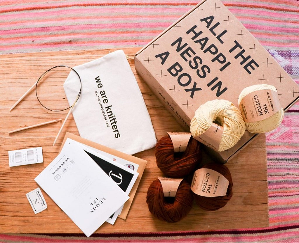
A small boutique selling apparel made from locally sourced and organic materials may use those values in its marketing and branding. The area that the materials are sourced from may be part of the marketing message, the same with the fact that those materials are organic and no chemicals have been used to process them. 

Such a brand can implement eco friendly packaging to bolster further their commitment to using environmentally friendly materials. This move can support their marketing efforts and create another branding opportunity. 

The values of these actions amalgamate to help your customer ‘feel’ what your business stands for. Your branding is a pathway to present that ‘feel’ to your customers, while your marketing helps you find more customers to ‘feel’ your brand. 

When effective branding is implementing by a stable business build around a good product, your customer is in a prime position to remember your product and why it’s different from your competitors. 

Quality branding helps your User Generated Content, too. 

Simply put, User-Generated Content is pictures, reviews, videos, and such featuring your product, created by your customers. Without going into too much detail, it’s a fantastic way for trusted content creators to spread your brand’s name around their engaged audience. It is also excellent at proving that your business is real and it creates a good product. 

Take, for example, unboxing videos. 

Unboxing videos are:

Pretty impressive numbers for a video that’s little more than your product being taken out of a box. 

Video source

Video marketing, in the form of unboxing videos a perfect example of marketing (user-generated content) overlapping with branding (customised small business supplies). 

This is a perfect example of how good branding (quality packaging) enhances your marketing efforts (user-generated content).

The rewards are simply more significant and more long-term when marketing and branding work together. 

Consider the following word: Nike.

What first comes to mind?

  • the goddess of victory
  • The US anti-air defence missile system from the 60s
  • ‘Just do it’

It’s the tick, Air Jordan’s, and sport that comes to your mind. 

The fact that ‘just do it (Nike’s marketing) and the tick (branding) is the first thing that enters your mind is proof that both elements are working in unison. 

Subway. 

  • A form of mass transport, often used underground in urban populations
  • ‘Eat Fresh’

Just another example of how your brand can use these two creatures side by side. 

Using your branding for marketing purposes

Hemp Juice is a manufacturer of CBD oils. This market has exploded since society has been made more aware of the therapeutic benefits of cannabis. Regulations have also been changed to allow the product to be taxed and sold. 

The brand has gone in a unique direction with its branding. When many competitors have taken the cold and sterile medical/clinical approach to branding, Hemp Juice uses warm colours, round shapes, and informal copywriting. 

They take this approach as they know that their target audience doesn’t necessarily need the ‘medical’ image to be convinced of the product’s effectiveness. This is because Hemp Juice’s audience is more than likely already familiar with such a product. 

Hemp Juice’s branding strategy complements its marketing when we take a look at its use of colour. 

The company sells several types of oils in the same tincture bottles, yet each formula has a different strength and is designed to have a different effect on the user. 
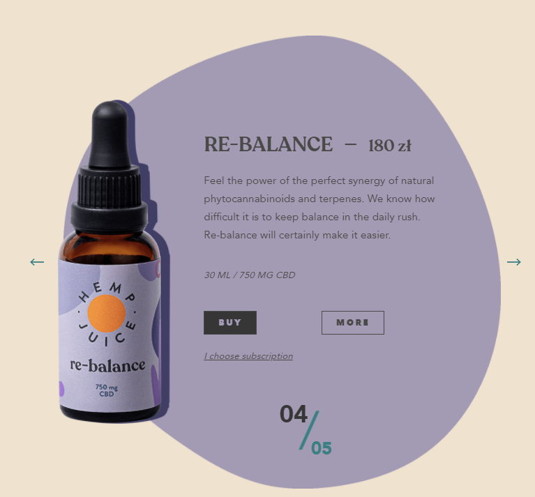
On retail store shelves, the array of colours pop and stand out, drawing in the potential customer’s eye – a great retail marketing tactic. 

For their eCommerce store, it’s a quick and easy way for users to understand that ‘this colour has this effect’ – a great way to speed up the buying process. 

Here we see how good branding complements both online and offline marketing. 

Social media marketing and branding

Nearly 4 billion (yes, with a ‘B’) have access to and use social media. With consumers in the US and Europe now wanting to keep their money in local communities and move away from large corporations, the power of social media marketing has never had the potential it does today. 

In other words, social media is a marketing channel that’s ripe for your business’ branding. 

However, you’ll only garner notoriety and brand recognition on social media if you create the right content, speak to the right people and present your brand with the right imagery. 

This is a great moment to remind you, whether you’re a marketing manager, brand owner, or budding entrepreneur, that ‘branding’ consists of much more than a fancy logo and sleek colour palette. 

Your branding is your word choice, the vocabulary used in your messaging, and it’s the tone you use when writing blog content. It’s the faces and body language of the presenters in your video content and all the greetings your customer service staff use. 

Tailoring your ‘branding’ to the right marketing channel, whether a social media platform or not, is crucial. 

LinkedIn, a social media channel more tuned for a B2B brand, is obviously a lot more professional than, for example, Instagram. This, therefore, dictates the way that you use your tone of voice to communicate a message. Similarly, a flash sale of 15% off probably won’t get much traction on LinkedIn. Instead, it’s a channel ripe for your brand to talk about challenges your industry faces, present your businesses’ values, and attract a different type of customer. 

Mr Fothergills is a British retailer of seeds, bulbs, and other plant varieties. 

They use Instagram, a very visual social media channel, to present the quality of their products and explain how to get the most out of their products and general gardening tips, and sharing the content of their other customers. 

The tone of voice is consistent on all posts, as are the responses to any comments left. The content shows off the high quality of their products, and overall, it’s very appealing to look at as you scroll through your Instagram feed. The content is tailored to that medium, while the marketing presents the brand’s values. 

Mr Fothergills’ LinkedIn tells a different story. 
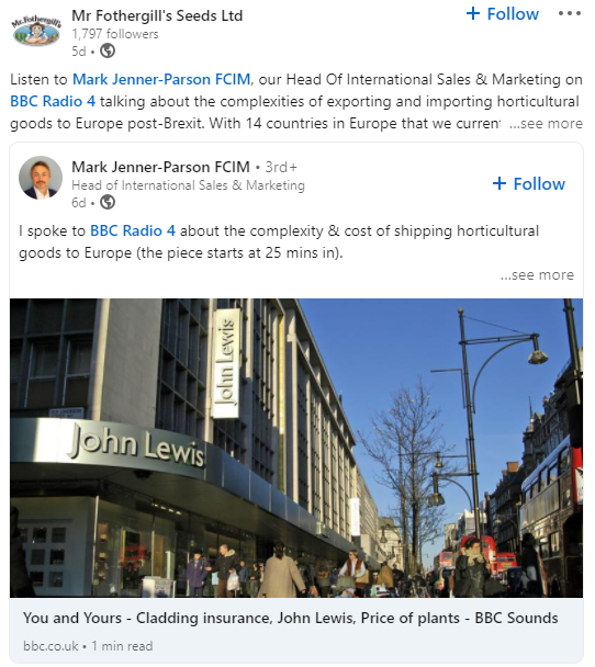
Here, they discuss content involving the export of goods to Europe post-Brexit. This is something that has an effect on the company’s B2B or enterprise clients. They still communicate with a friendly and open tone of voice, creating that consistent marketing message. Their values are still focused on a quality product, again showing that the company uses its branding effectively in their marketing efforts. 

Fine-tuning your word use and the messages you push in all marketing channels, not just social media, is core to making your branding help your marketing. 

Branding, your image, customer loyalty, and marketing

It’s much cheaper, easier, and faster to get a customer to buy from you again, rather than convince a customer to buy from you for the first time. This is where the power of customer loyalty really starts to make an impact on your bottom line. 

Good branding and marketing, accompanied by a great product, naturally create and foster customer retention. As a result of the above, your brand’s name stays in the customer’s mind, and they’re more satisfied with your brand. 

This retention rests heavily on the trust that your branding and marketing initially built between you and that customer. Consumers often remember how they first heard about your brand!

When marketing to reactivate past buyers, consider a different message to build that relationship. If your product competes on price and tries to be the lowest, add more value to the sale to increase average cart spend and live time value. You can do this in the form of buy one get one free or an extended warranty. 

Remember, though; it’s hard to change your brand’s image at this point. Suppose your brand is seen as one of high quality and rugged durability. In that case, it’s going to be challenging to make a customer start to see you as affordable, accessible to everyone, and produced en masse. 

The way that you promote incentives to reactivate past customers can also affect your image. If your brand prides itself on elegance, luxury, exclusivity, and opulence, a flash sale with 20% off everything will more than likely undermine that image. 

Branding and marketing symbiosis

Every customer-facing channel of your business is prime for your branding and marketing efforts to spread your products, name, values, and morals. Making your branding complement your marketing efforts and vice versa isn’t particularly hard, but not many brands consider the symbiotic relationship between the two. 

At the end of the day, your marketing efforts are never really done, and your branding can continuously evolve and change should your buyers’ sentiment also shift.

Categories: Others Tags:

Improve Largest Contentful Paint (LCP) on Your Website With Ease

September 9th, 2021 No comments

(This is a sponsored post.)

Optimizing the user experience you offer on your website is essential for the success of any online business. Google does use different user experience-related metrics to rank web pages for SEO and has continued to provide multiple tools to measure and improve web performance.

In its recent attempt to simplify the measurement and understanding of what qualifies as a good user experience, Google standardized the page’s user experience metrics.

These standardized metrics are called Core Web Vitals and help evaluate the real-world user experience on your web page.

Largest Contentful Paint or LCP is one of the Core Web Vitals metrics, which measures when the largest content element in the viewport becomes visible. While other metrics like TTFB and First Contentful Paint also help measure the page experience, they do not represent when the page has become “meaningful” for the user.

Usually, unless the largest element on the page becomes completely visible, the page may not provide much context for the user. LCP is, therefore, more representative of the user’s expectations.As a Core Web Vital metric, LCP accounts for 25% of the Performance Score, making it one of the most important metrics to optimize.

Checking your LCP time

As per Google, the types of elements considered for Largest Contentful Paint are:

  • elements
  • elements inside an element
  • elements (the poster image is used)
  • An element with a background image loaded via the url() function (as opposed to a CSS gradient)
  • Block-level elements containing text nodes or other inline-level text elements children.

Now, there are multiple ways to measure the LCP of your page.

The easiest ways to measure it are PageSpeed Insights, Lighthouse, Search Console (Core Web Vitals Report), and the Chrome User Experience Report.

For example, Google PageSpeed Insights in its report indicates the element considered for calculating the LCP.

What is a good LCP time?

To provide a good user experience, you should strive to have a Largest Contentful Paint of 2.5 seconds or less on your website. A majority of your page loads should be happening under this threshold.

Now that we know what is LCP and what our target should be let’s look at ways to improve LCP on our website.

How to optimize Largest Contentful Paint (LCP)

The underlying principle of reducing LCP in all of the techniques mentioned below is to reduce the data downloaded on the user’s device and reduce the time it takes to send and execute that content.

1. Optimize your images

On most websites, the above-the-fold content usually contains a large image which gets considered for LCP. It could either be a hero image, a banner, or a carousel. It is, therefore, crucial that you optimize these images for a better LCP.

To optimize your images, you should use a third-party image CDN like ImageKit.io. The advantage of using a third-party image CDN is that you can focus on your actual business and leave image optimization to the image CDN.

The image CDN would stay at the edge of technology evolution, and you always get the best possible features with minimum ongoing investment.

ImageKit is a complete real-time image CDN that integrates with any existing cloud storage like AWS S3, Azure, Google Cloud Storage, etc. It even comes with its integrated image storage and manager called the Media Library.

Here is how ImageKit can help you improve your LCP score.

1. Deliver your images in lighter formats

ImageKit detects if the user’s browser supports modern lighter formats like WebP or AVIF and automatically delivers the image in the lightest possible format in real-time. Formats like WebP are over 30% lighter compared to their JPEG equivalents.

2. Automatically compress your images

Not just converting the image to the correct format, ImageKit also compresses your image to a smaller size. In doing so, it balances the image’s visual quality and the output size.

You get the option to alter the compression level (or quality) in real-time by just changing a URL parameter, thereby balancing your business requirements of visual quality and load time.

3. Provide real-time transformations for responsive images

Google uses mobile-first indexing for almost all websites. It is therefore essential to optimize LCP for mobile more than that for desktop. Every image needs to be scaled down to as per the layout’s requirement.

For example, you would need the image in a smaller size on the product listing page and a larger size on the product detail page. This resizing ensures that you are not sending any additional bytes than what is required for that particular page.

ImageKit allows you to transform responsive images in real-time just by adding the corresponding transformation in the image URL. For example, the following image is resized to width 200px and height 300px by adding the height and width transformation parameters in its URL.

4. Cache images and improve delivery time

Image CDNs use a global Content Delivery Network (CDN) to deliver the images. Using a CDN ensures that images load from a location closer to the user instead of your server, which could be halfway across the globe.

ImageKit, for example, uses AWS Cloudfront as its CDN, which has over 220 deliver nodes globally. A vast majority of the images get loaded in less than 50ms. Additionally, it uses the proper caching directives to cache the images on the user’s device, CDN nodes, and even its processing network for a faster load time.

This helps to improve LCP on your website.

2. Preload critical resources

There are certain cases where the browser may not prioritize loading a visually important resource that impacts LCP. For example, a banner image above the fold could be specified as a background image inside a CSS file. Since the browser would never know about this image until the CSS file is downloaded and parsed along with the DOM tree, it will not prioritize loading it.

For such resources, you can preload them by adding a tag with a rel= "preload" attribute to the head section of your HTML document.

<!-- Example of preloading -->
<link rel="preload" src="banner_image.jpg" />

While you can preload multiple resources in a document, you should always restrict it to above-the-fold images or videos, page-wide font files, or critical CSS and JS files.

3. Reduce server response times

If your server takes long to respond to a request, then the time it takes to render the page on the screen also goes up. It, therefore, negatively affects every page speed metric, including LCP. To improve your server response times, here is what you should do.

1. Analyze and optimize your servers

A lot of computation, DB queries, and page construction happens on the server. You should analyze the requests going to your servers and identify the possible bottlenecks for responding to the requests. It could be a DB query slowing things down or the building of the page on your server.

You can apply best practices like caching of DB responses, pre-rendering of pages, amongst others, to reduce the time it takes for your server to respond to requests.

Of course, if the above does not improve the response time, you might need to increase your server capacity to handle the number of requests coming in.

2. Use a Content Delivery Network

We have already seen above that using an image CDN like ImageKit improves the loading time for your images. Your users get the content delivered from a CDN node close to their location in milliseconds.

You should extend the same to other content on your website. Using a CDN for your static content like JS, CSS, and font files will significantly speed up their load time. ImageKit does support the delivery of static content through its systems.

You can also try to use a CDN for your HTML and APIs to cache those responses on the CDN nodes. Given the dynamic nature of such content, using a CDN for HTML or APIs can be a lot more complex than using a CDN for static content.

3. Preconnect to third-party origins

If you use third-party domains to deliver critical above-the-fold content like JS, CSS, or images, then you would benefit by indicating to the browser that a connection to that third-party domain needs to be made as soon as possible. This is done using the rel="preconnect" attribute of the tag.

<link rel="preconnect" href="https://static.example.com" />

With preconnect in place, the browser can save the domain connection time when it downloads the actual resource later.

Subdomains like static.example.com, of your main website domain example.com are also third-party domains in this context.

You can also use the dns-prefetch as a fallback in browsers that don’t support preconnect. This directive instructs the browser to complete the DNS resolution to the third-party domain even if it cannot establish a proper connection.

4. Serve content cache-first using a Service Worker

Service workers can intercept requests originating from the user’s browser and serve cached responses for the same. This allows us to cache static assets and HTML responses on the user’s device and serve them without going to the network.

While the service worker cache serves the same purpose as the HTTP or browser cache, it offers fine-grained control and can work even if the user is offline. You can also use service workers to serve precached content from the cache to users on slow network speeds, thereby bringing down LCP time.

5. Compress text files

Any text-based data you load on your webpage should be compressed when transferred over the network using a compression algorithm like gzip or Brotli. SVGs, JSONs, API responses, JS and CSS files, and your main page’s HTML are good candidates for compression using these algorithms. This compression significantly reduces the amount of data that will get downloaded on page load, therefore bringing down the LCP.

4. Remove render-blocking resources

When the browser receives the HTML page from your server, it parses the DOM tree. If there is any external stylesheet or JS file in the DOM, the browser has to pause for them before moving ahead with the parsing of the remaining DOM tree.

These JS and CSS files are called render-blocking resources and delay the LCP time. Here are some ways to reduce the blocking time for JS and CSS files:

1. Do not load unnecessary bundles

Avoid shipping huge bundles of JS and CSS files to the browser if they are not needed. If the CSS can be downloaded a lot later, or a JS functionality is not needed on a particular page, there is no reason to load it up front and block the render in the browser.

Suppose you cannot split a particular file into smaller bundles, but it is not critical to the functioning of the page either. In that case, you can use the defer attribute of the script tag to indicate to the browser that it can go ahead with the DOM parsing and continue to execute the JS file at a later stage. Adding the defer attribute removes any blocker for DOM parsing. The LCP, therefore, goes down.

2. Inline critical CSS

Critical CSS comprises the style definitions needed for the DOM that appears in the first fold of your page. If the style definitions for this part of the page are inline, i.e., in each element’s style attribute, the browser has no dependency on the external CSS to style these elements. Therefore, it can render the page quickly, and the LCP goes down.

3. Minify and compress the content

You should always minify the CSS and JS files before loading them in the browser. CSS and JS files contain whitespace to make them legible, but they are unnecessary for code execution. So, you can remove them, which reduces the file size on production. Smaller file size means that the files can load quickly, thereby reducing your LCP time.

Compression techniques, as discussed earlier, use data compression algorithms to bring down the file size delivered over the network. Gzip and Brotli are two compression algorithms. Brotli compression offers a superior compression ratio compared to Gzip and is now supported on all major browsers, servers, and CDNs.

5. Optimize LCP for client-side rendering

Any client-side rendered website requires a considerable amount of Javascript to load in the browser. If you do not optimize the Javascript sent to the browser, then the user may not see or be able to interact with any content on the page until the Javascript has been downloaded and executed.

We discussed a few JS-related optimizations above, like optimizing the bundles sent to the browser and compressing the content. There are a couple of more things you can do to optimize the rendering on client devices.

1. Using server-side rendering

Instead of shipping the entire JS to the client-side and doing all the rendering there, you can generate the page dynamically on the server and then send it to the client’s device. This would increase the time it takes to generate the page, but it will decrease the time it takes to make a page active in the browser.

However, maintaining both client-side and server-side frameworks for the same page can be time-consuming.

2. Using pre-rendering

Pre-rendering is a different technique where a headless browser mimics a regular user’s request and gets the server to render the page. This rendered page is stored during the build cycle once, and then every subsequent request uses that pre-rendered page without any computation on the server, resulting in a fast load time.

This improves the TTFB compared to server-side rendering because the page is prepared beforehand. But the time to interactive might still take a hit as it has to wait for the JS to download for the page to become interactive. Also, since this technique requires pre-rendering of pages, it may not be scalable if you have a large number of pages.

Conclusion

Core Web Vitals, which include LCP, have become a significant search ranking factor and strongly correlate with the user experience. Therefore, if you run an online business, you should optimize these vitals to ensure the success of the same.

The above techniques have a significant impact on optimizing LCP. Using ImageKit as your image CDN will give you a quick headstart.

Sign-up for a forever free account, upload your images to the ImageKit storage, or connect your origin, and start delivering optimized images in minutes.


The post Improve Largest Contentful Paint (LCP) on Your Website With Ease appeared first on CSS-Tricks. You can support CSS-Tricks by being an MVP Supporter.

Categories: Designing, Others Tags:

Why AI is Critical to the Future of Customer Engagement

September 9th, 2021 No comments

Artificial Intelligence (AI) is arguably the most talked-about technology in the recent decade.

While there are still several AI-based solutions still in the development stage, there are several others that are helping businesses, as well as customers, save time, effort, and expenses. In this article, we will discuss some of the solutions powered by AI that are helping Customer Engagements in various ways.

Quick Introduction to Artificial Intelligence

AI is a branch of computer science aimed at enabling machines to replicate human intelligence to collect and process information. And even to make decisions. AI inhibits traits, such as intelligence, problem-solving skills and is able to learn much quicker than humans.

Depending on the overall capabilities, AI can further be classified into Narrow AI, General AI, and Super AI. Its usability can vary from virtual voice assistance (Google OK, Alexa, Siri, etc.) for individual users to a set of complex functionalities that can empower some of the key business functions. A report predicts that the AI market size will reach US$ 270 billion by the end of 2027.

Impact on Digital Mediums

There is hardly any industry that AI has not touched yet. Across industries, AI has fully replaced some of the human tasks and most of it has been in the digital segments. A greater dependency on computers and a large amount of available data is the core reason that makes AI more impactful for digital mediums.

Various digital platforms from SaaS businesses to social media are using AI in various formats to transform the user experience while adding efficiency with time and expenses. The kind of ads that are shown to users on social media, filters suggested in the photo editing app, songs that music service recommends, and the way chatbots interact with users are personalized and unique for each user based on their previous interactions or available data. The manual effort in these customizations is minimal and mostly limited to R&D, which AI delivers most of the execution on its own. At the end of the user or customer, this experience is supposed to be more impressive and satisfying.

Use Case and impact on Customer Engagement

Customer engagement is probably the most crucial element for the cloud contact center; so much that several business experts claim it to be more important than the product or service they offer. Obviously, such crucial roles will not shy away from adopting the technologies that promise to improvise the operations. Hence, we already have several use cases of AI in customer engagement.

1. Virtual Assistance

AI is being used as personal assistants like Alexa, Amazon Echo, Siri, etc. which can perform the daily tasks for us and when we talk with them they will find an answer and reply like a human. AI-Powered assistants like this have not only attracted customers but it does change the way of living for Humans. 

2. Customer Service

Customers need better service and they do have options in the market so if you are not adopting according to their requirements then sadly you have to shut your business. We have seen AI-Powered chatbots in messaging apps such as skype, slack, Facebook messenger. The chatbot market size is to grow from US$2.9 billion in 2020 to US$10.5 billion by 2026. Many Brands have their own chatbots such as Nestle has NINA, HDFC Bank has EVA which is considered as the most advanced chatbot, SBI Cards has ILA, and Alibaba has ALiMe.

3. Customer Relationship Management (CRM) Software

AI-enabled tools and software have more capabilities. We have seen the use of AI in CRM’s where AI collects the information and predicts the customer’s need or requirement. Digital marketers also use Google Analytics or Google search console for pulling the data and suggesting or predicting the next possible move for you.

4. Computer vision/AR/VR

Integration of AI in computer vision transformed the computers into supercomputers and analyzing vehicles has been so easy that it helped law enforcement officers to put a penalty on breaking rules. Augmented reality & Virtual Reality is already using AI & have the potential to revolutionize the world with their amazing functions.

AI in Future of Customer Engagement

Even with a massive impact on the customer experience across industries and sizes, there is a lot where AI is yet to make a significant impact. Here are some of the key reasons why AI is going to play a crucial role in the future of customer engagement.

1. A better understanding of customers

Without a doubt, understanding the customer is the core of your customer engagement quality. Interestingly, customer’s requirements and expectations from the brand are growing at an unprecedented rate and most brands are just trying to catch up instead of planning ahead of time.

AI’s contribution in this aspect is probably going to be the most important. With the available data and analysis, it can help businesses predict the upcoming trends faster. Utilizing which brands can understand their customers better and uplift their contact centers and other touchpoints better.

2. Proactive approach in query resolution

In the near future, it is highly unlikely that there will be a system where customers have zero queries/issues with the brand. However, it is always possible for businesses to find out ways to resolve the queries faster. Chatbots and voice bots are assisting in that by automating replies to standard queries from the customers. However, AI has the potential of going a step further and answering complex queries as well.

AI should not be limited to answering the queries, but it can even take certain actions to automate the process further. Human intervention can be reduced to the approval step only. This will minimize the load on your agents, who can spend their time addressing more humane requirements of the customers.

3. Hyper-personalization with effective compliance adherence

Knowing customers better to help them better is something that every business wants and that can be achieved by collecting and processing customer data appropriately. However, data sharing and utilization is a genuine concern for customers. AI can bring in the much-needed compliance adherence in the system to address these concerns of the customers. It will enable a safer environment for the customers while enhancing the trust in the brands.

Wrapping Up Thoughts

While some may say that the growth and implementation of Artificial Intelligence are not as much as it was expected some years back, there is no doubt that AI has turned into a resource that no business can afford to ignore. There seems to be a massive potential in AI technology and the faster you adapt it for your customer engagement, the more rewarding it will be for your business.

Categories: Others Tags:

Don’t attach tooltips to document.body

September 8th, 2021 No comments

Here’s Atif Afzal on using a

that is permanently on the page where tooltips are added/removed and how they perform vastly better than plopping those same tooltips right into the . It’s not really discussed, but the reason you put them that high-up in the DOM is so you can absolutely position them exactly where you need to on the page without having to deal with hidden overflow or relative parents and the like.

To my amazement, just having a separate container without even adding the [CSS] contain property fixed the performance. The main problem now, was to explain it. First I thought this might be some internal browser heuristic optimizing the Recalculate Style, but there is no black magic and I discovered the reason.

The trick is to avoid forced recalculations of style:

[…] The tooltip container is not visible in the page, so modifying it doesn’t invalidate the complete page render tree. If the tooltip container would have been visible in the page, then the complete render tree would be invalidated but in this case only an independent subtree was invalidated. Recalculating Style for a small subtree of 3 doesn’t take a lot of time and hence is faster.

Looks like popper.js was used here, so you have to be smart about it. We use toast messages on CodePen, and it’s the only third-party component we use at the moment: react-hot-toast. I checked it, and not only do we tuck the messages in a

of our own, but the library itself does that, so I think we’re in the clear.


The post Don’t attach tooltips to document.body appeared first on CSS-Tricks. You can support CSS-Tricks by being an MVP Supporter.

Categories: Designing, Others Tags:

The Top 6 Common Mistakes That Increase Website Loading Time

September 8th, 2021 No comments

In this day and age on the internet, users have no patience for websites with poor loading speeds or substandard performance.

Half a second can make a world of difference on whether or not someone stays on your site. Website conversion rates drop by an average of 4.42% with each second of load time according to a study by Portent. Simply put, allowing your website to be bogged down by oversized images, unoptimized files, or shoddy design can be the downfall of any website in 2021. 

Topics like optimization, compression, and content delivery networks can be a pain to master. Add on top of that Google’s new Core Web Vitals implementation that every web professional is scrambling to understand and you’ve got yourself a lot of homework to guarantee your website ranks well. Your users expect your web pages to load fast, and they won’t stick around if they don’t. It’s important to know what to avoid when building your site in order for it to perform. With that in mind, let’s take a look at the top five common mistakes that increase website loading time.

1. A low score on Google’s Core Web Vitals

Google started to roll out its new search ranking metrics, referred to as Core Web Vitals, in mid-June 2021. These metrics are designed to help web professionals and site owners optimize websites for a streamlined user experience. Each one of the Core Web Vitals provides the desired benchmark for a specific factor, based on the user experience of an average site visitor.

The Core Web Vitals are three metrics that Google has identified as crucial in affecting website load time and search ranking. The first is Largest Contentful Paint, which is calculated by the time it takes for a page’s main content to load, with the ideal measurement being faster than 2.5 seconds. First Input Delay is the second metric. This is the time it takes for a page to become interactive, with the ideal measurement being under 100 milliseconds.

The final vital statistic is the Cumulative Layout Shift. It’s frustrating to website users when an entire site seems to change its layout just as they’re about to click on a link. This is due to a site being designed with a complete disregard for Cumulative Layout Shift. The amount of unexpected shift in the visual layout of page content should be less than 0.1%.
Describing the finer details of Google’s Core Web Vitals can easily make up an entire article on its own. There are many resources online that can further assist you in making sure your websites meet all of Google’s desired benchmarks, but understanding how they affect your website’s load time before starting a build can go a long way in avoiding complex site changes in the future.

2. Images that are not optimized properly

Do you remember back in the early 2000s when dial-up internet was still a thing and websites would load a huge image painfully slow down your screen? We may have much faster internet today, but this issue surprisingly persists on websites that are not designed properly. All of the images you use on your site need to be resized and compressed to reduce their total file size. This immediately improves how fast they load on your website. The other key to making sure your images load rapidly is to use modern file formats that are optimized for website loading speed. These file types include Google’s WebP, JPEG XR, and AVIF. And I know what you’re saying, what about good ol’ JPGs or PNGs? Despite their popularity, JPGs and PNGs are terribly slow to load if they are not optimized and are no longer the standard. You’ll begin to see their use in web design be phased out more in the coming years as more web professionals catch on that they’re old news. Which leads us to…

3. Files that are not minified and compressed

When designing a website, it is crucial that you minify the files you use in your design whenever possible. Minification means removing all the extra spaces, line breaks, comments, and just about anything else that is non-essential for your users to see. After putting your files through minification, it is critical that you compress them to further optimize loading time. When a browser visits your website, you want the file to be zipped up for quick delivery by using GZIP or Brotli. Compressing all of your files into a ZIP archive will go a long way in making sure your website moves quickly. Think of it as a way of packaging files together at once.

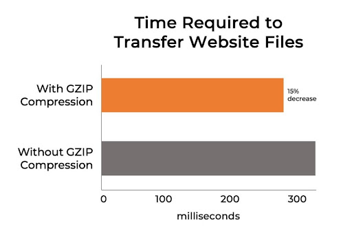
For example, when you’re moving between houses, you don’t pick up things one at a time as you move; you neatly package them to make moving everything at once much easier and faster. The same applies to zipping files for rapid delivery on your website. The graph below can provide insight into how compression affects site speed. Once you begin to minify and compress your files, you’ll notice a world of difference in website loading time. 

4. Not deferring or delaying the loading of JavaScript

The saying, “Do your hardest task first” does not apply in the world of web design. In fact, the phrase would be the opposite, “Do your hardest task last.” When designing for rapid load times, you want to place any type of JavaScript used on your site towards the end of the page or bottom of the HTML.

You should prioritize content at the top of your website such as the navigation menu, header, and hero image. It’s clever to move all of your slow and complex JavaScript to the bottom of the page to make sure all of the content up top loads immediately. There may be some critical pieces of JavaScript that need to load earlier, but deferring most of it will benefit your website’s loading time. This way you save all of the stuff that is rough on your website’s loading time to be loaded after the site visitor has a chance to get started browsing.

5. Forgetting to load JavaScript and CS files asynchronously

Why would you do one task at a time when you have the ability to multitask? This is the mindset in play when deferring or asynchronously loading your JavaScript and CS files. JavaScript is an essential part of any modern web application, and the way you decide to load it has a direct impact on your website’s load speed. Novice web professionals are notorious for failing to load JavaScript and CS files asynchronously, which can really bog down your website’s loading time. Loading everything simultaneously, on the other hand, allows your browser to download everything in parallel — rather than in stages. This results in a much faster website load time. 

6. Disregarding a CDN

It is vital that you leverage a CDN when designing your website for speed. According to a study by BuiltWith, over 41% of the top 10,000 websites are using a CDN, and it’s easy to see why. A CDN, or Content Delivery Network, has servers all over the world. When a user goes to your website that utilizes a CDN, the server closest to your location will be used. Since the server is local, your internet connection and download times to that CDN will be much faster. A great analogy for how a CDN works is to think of when you play online video games. When you play a video game online you choose the server closest to your location to speed up loading and avoid lag. The same exact process applies to how CDNs operate.

A million little errors can truly add up and slow down a website that would otherwise load in an instant. It’s easy for your website to get bogged down by common mistakes in web design, but avoiding these six major bungles will help guarantee that your website is lighting fast. 
Categories: Others Tags:

7 Ways to Use Gamification in Marketing Campaigns 

September 8th, 2021 No comments

We all want a little more fun and games in our lives. So, why not add some gamification to your next interactive content campaign?

By 2025, the gamification market is expected to witness a massive 30.1% growth rate, with global sales revenue reaching around $32 billion

That’s because gamification adds more entertainment to the website experience and gets audiences engaged. The idea behind gamification is to bring game mechanics into the design of a website or piece of content. There are many different ways to do this. 

Some companies add hidden achievements and bonuses to their blogs that customers can collect by visiting every page and reading their content. Others allow readers to collect points for leaving comments or play games to win potential prizes. 

Used correctly, gamification is a fantastic way to connect with your audience and increase engagement levels. So, how can you use gamification in interactive content?

The Evolution of Gamification 

Elements of gamification have appeared in everything from marketing campaigns to web design and even eCommerce strategies. 

In 2014, an Apple App Store review of more than 100 health apps even found that gamification elements in applications led to greater participation and higher user ratings. In other words, customers are more likely to get involved with an activity that includes gamification components. 

While gamification can take on many different forms, the aim for most companies is to create an environment where customers can feel more invested in their interactions with the website. For example, if you win a point every time you comment on a blog post, and you can trade those points in for prizes, you have more of a desire to keep commenting. 

The promise of being able to “accomplish” things with pieces of interactive content and websites also appeals to the competitive part of our psychology that pushes us to keep doing things in exchange for the promise of a kind of reward. 

Many companies have generated a lot of enthusiasm for their brands through leaderboards, time events, and similar experiences. For example, just look at how popular McDonalds becomes each year when the monopoly game rolls out as part of the purchasing experience. 

People buy more items than they usually would during McDonald’s Monopoly just for the opportunity to win. This same boost in engagement benefits your content strategy too. 

6 Ways to Add Gamification to Your Content

There’s no one right way to gamify your website or your marketing content. The method you choose will depend heavily on your audience and the kind of experience they respond best to. 

The key to success is finding a way to grab your customer’s attention and hold onto it. Here are some of the tried and tested strategies to explore:

1. Create an Actual Game Experience 

When it comes to incorporating gamification into your website design and content, you don’t necessarily need to be clever. You can be extremely straightforward and just design an actual game. For instance, to help attract more people to the American Army, the US created a war simulator that potential applicants could play on Steam. 

The game aimed to introduce young people who might consider a career in the military to what that job might be like. If the kids liked what they saw on Steam, they could visit the military website and learn more. 

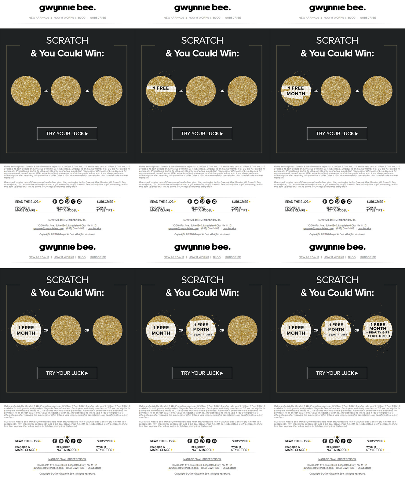
For companies who can’t afford to build an entire fully-featured game, something a little smaller can be just as engaging. For instance, rather than using a standard pop-up with a discount code to entice customers to buy the rental service, Gwynnie Bee created a scratch card. People could scratch the spaces using their smartphone or computer cursor and win money off. 

The great thing about the interactive content from Gwynnie Bee is that it encouraged potential visitors to connect with the business in a lucrative way. To use the scratch card, you first had to give your email address. This meant the company could build its email list while delighting consumers. 

When designing a game experience for your marketing campaign, remember:

  • Get the right support: Designing a great game is tough, particularly if you want something more complicated than a scratch card. Don’t take the risk of creating something that doesn’t work properly; hire a developer. 
  • Promote the experience: Make sure everyone knows about your new game. Share screenshots on social media and talk about it in your email campaigns. 
  • Focus on fun: Remember, games are supposed to be fun. Measure the reactions of your audience to ensure they’re having a good time. 

2. Design a Loyalty or Reward Program

Loyalty is one of the most valuable things your audience can give you. So why not reward them for it? Loyalty programs are fantastic tools for business growth and engagement. They give you a way to turn one-off clients into repeat customers and advocates for your brand. 

How you choose to reward your customers (and when) is up to you. Some companies might give customers points every time they share a post on social media or comment on a blog. This encourages more engagement with your brand. 

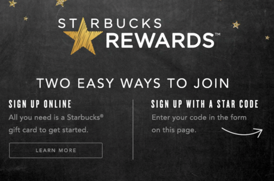
On the other hand, you might just let your customers earn rewards for every purchase they make. This is a strategy that Starbucks uses with its reward program.

As customers increase their spending with Starbucks, they get the reward of extra points that they can put towards future purchases. This keeps customers coming back for more and may even entice some clients to buy Starbucks when they otherwise wouldn’t. 

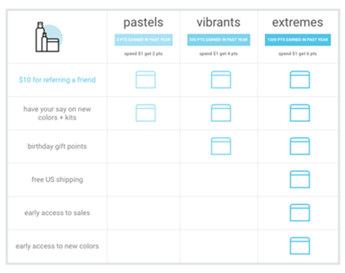
The oVertone company is another excellent example of a brand using gamified rewards with its marketing strategy. The loyalty program breaks down into tiers, where users can see how much they need to spend to ascend to the next level. New rewards and perks appear with each level. 

Remember, when building a loyalty program:

  • Make your customers feel special: Ensure that your audience feels good about being one of the lucky few in your loyalty program. Give discounts and offers they can’t get elsewhere.
  • Keep them informed: Make it easy for your customers to see what they need to do to get their next reward, so they keep coming back for more. 
  • Mix things up sometimes: To stop the experience from getting boring, roll out things like “double points” days and bonuses for your most active customers. 

3. Encourage Customer Interaction

The biggest benefit of gamification is that it encourages and increases customer interaction. You can give rewards to participants that comment on your blog posts, for instance, or share your posts on social. The customer benefits from the reward, while you get the advantage of a better business presence. 

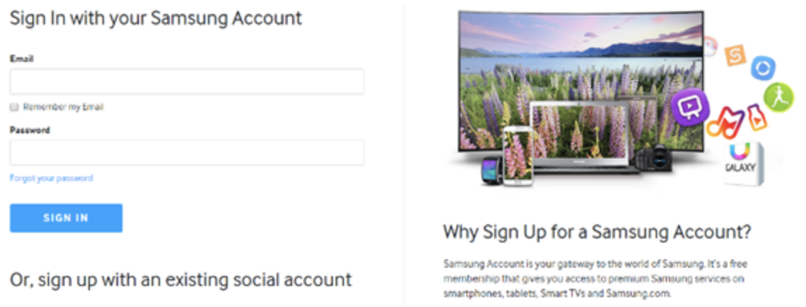
Samsung drives interaction with gamification with a function on its website that allows customers to discuss issues and watch videos. The most active participants get a badge for their efforts. 

If your business structure requires a lot of engagement from your audience, then using gamification elements can encourage them to stick with you for longer rather than losing interest. For instance, language learning software Duolingo has a four-point gamification strategy for its users.

Duolingo knows that learning a new language takes a lot of time, so it asks users to set small specific goals instead. The smaller tasks bring users back regularly, and consistent users gain rewards. There’s even a progress bar to help you track your progress compared to other customers. 

Gamification gives your customers another reason to keep coming back and connecting with your brand. That makes a lot of sense for companies that rely on long-term relationships with customers, like Duolingo and other teaching brands, for instance. Remember:

  • Make it simple: People will only want to interact with your brand if it’s easy to do so. Make it clear what you want your customer to do and what they need to do next. 
  • Reward every action: Keep people coming back for more by rewarding them for their actions, even if it’s just with a gold star or digital sticker. 
  • Nudge inactive customers: If a client gets involved in your interactive content, then stops participating, send an email reminding them why they should come back. 

4. Run Contests and Offer Prizes

Probably one of the easiest ways to use gamification in your advertising campaigns is with a competition. Contests and competitions have been around since the dawn of business. They’re a useful way for companies to collect information from customers, particularly if you ask your clients to sign up to your site with an email address to get involved. 

Competitions are also a way to push your audience into doing positive things for your company. For instance, you could run a competition where consumers share a social media post and tag a friend to enter. Or you could have a competition that asks your clients to refer a friend to get involved. 

When KIND, a healthy snack company, wanted to connect with its customers and create a new product, it didn’t just do market research. Instead, the company created the “Raise the Bar” contest to let customers cast a vote for which flavor they wanted to see next.

When 123ContactForm wanted to engage its audience, it gave people the chance to win one of three platinum subscriptions for 6 months. 

Contests are naturally exciting and fun to take part in. They’re an opportunity to get your audience excited, and you don’t need to give anything huge away either. Just make sure that the prize you offer is something that your audience will be interested in. 

A few more pro tips include:

  • Generate hype first: Don’t just launch a contest out of nowhere; get people excited about the idea with announcement blogs, social media posts, and emails. 
  • Give people a lot of ways to get involved: If people can’t take part in the competition on social media, let them do something on your website instead. 
  • Follow up after the win: When someone does win something from your website, follow up with that winner and post pictures in the form of a blog/case study. This will generate more hype for your brand and get people excited about the next event. 

5. Get Your Audience Feeling Competitive

No matter how much they might deny it, most people are at least a little competitive. So when you’re implementing a gamification campaign into your content and marketing efforts, it pays to tap into that sense of competition. All you need to do is find a way to encourage your followers to compete. 

The best example of a company that did this particularly well is Nike. Nike and the Run Club app teamed up to motivate people to get involved with healthy activities. The app allowed users to customize and build their ideal training program based on their athletic level. 

At the same time, you could also win badges and trophies to share with your running community. The more you took part in challenges on the app, the more you could potentially win. 

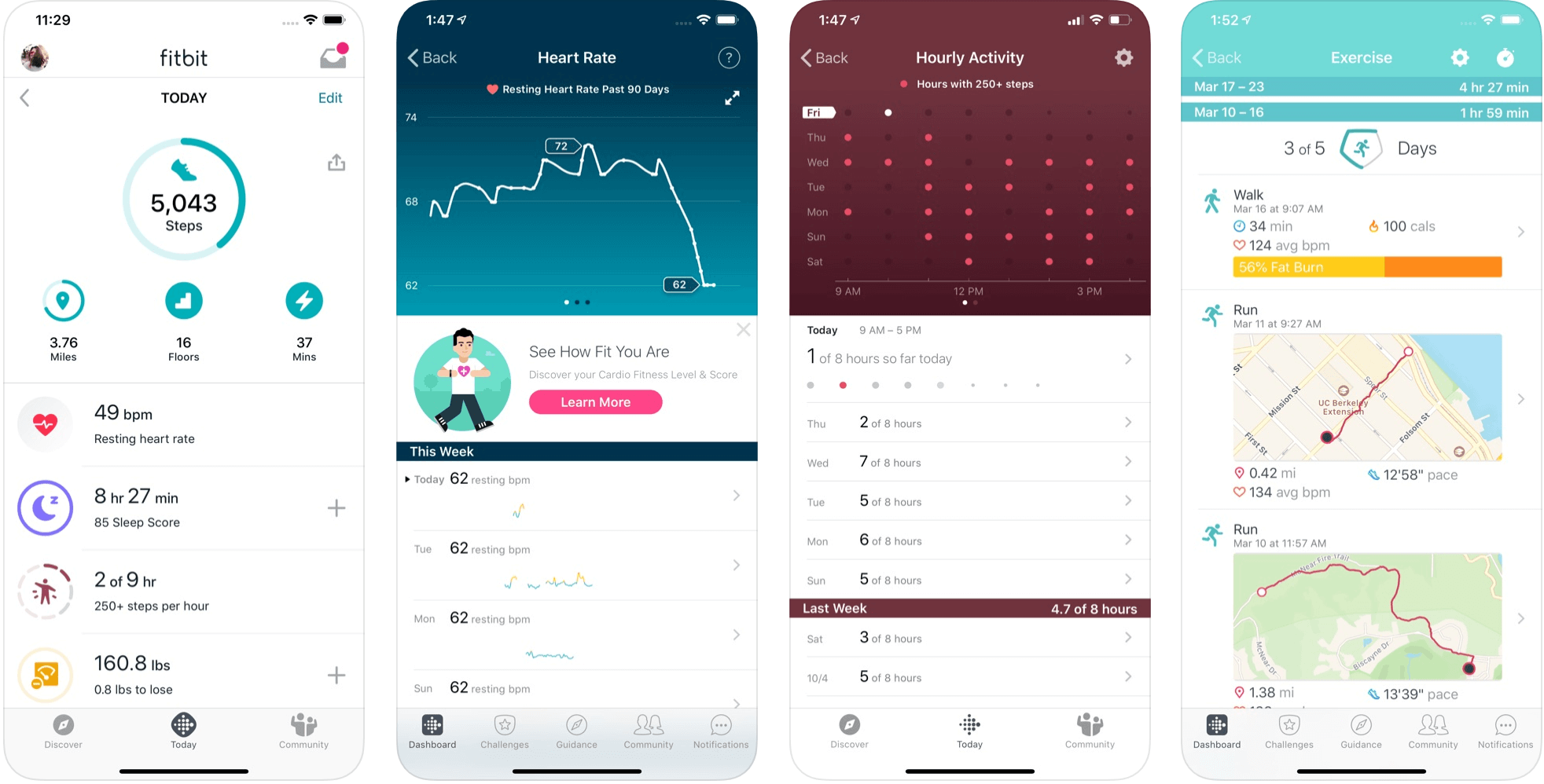
The Fitbit application has a similar way of keeping customers engaged. When you download Fitbit, you can access information about your exercise strategies and potentially track your progress towards your goals. However, there are also measurable achievements to earn – like a badge when you first walk 500 miles. 

Users on Fitbit can also find their friends using the same app and compete with them in various challenges. 

To successfully add a competition to your gamification strategy, remember:

  • It needs to be social: People will be more inclined to get involved if they show off their achievements. So make sure that people can showcase their accomplishments. 
  • Make people want to win: There needs to be a reason to get to the top of the leaderboard. You might offer people discounts or exclusive prizes if they accomplish certain goals. 
  • Show progress: Prompt people to keep working on reaching their targets by showing them how close they are to success. 

6. Make Boring Content Seem More Interesting

Some content is naturally more engaging than others. If you want to showcase some important information or data, you might create a whitepaper or a report. Unfortunately, the result can be a relatively bland piece of content.

With elements of gamification, you can make the experience a lot more engaging and interesting. Sites like Daytum.com allow users to turn personal stats and information into charts that showcase information in engaging ways. You can allow your users to track their progress through the report and rack up points as they go. 

Adding subtle elements to otherwise clinical and less interesting information is a wonderful way to make the experience more exciting. The more enticed your customers are by your content, the more likely it is that you’ll sell them on your business. 

Gamify Your Marketing Strategy

Gamification isn’t a new concept, but it’s one that many companies and designers can begin to take advantage of these days. Thanks to more advanced browsers and smartphones, customers can more fully enjoy the interactive elements of websites and content campaigns. 

As your audience dives deeper into the digital world, they expect more unique experiences from you. Gamification can make any website or marketing experience more memorable. It’s time to take advantage. 

Source

The post 7 Ways to Use Gamification in Marketing Campaigns  first appeared on Webdesigner Depot.

Categories: Designing, Others Tags:

The Story Behind TryShape, a Showcase for the CSS clip-path property

September 8th, 2021 No comments
A blue square with its starting point located at a zero zero position on a chart with x and y axes.
Initial coordinates(0,0) with x-axis and y-axis

Now let’s use the circle() value to create a circular shape. We can specify the position and radius of the circle using this value. For example, to clip a circular shape at the coordinate position (70, 70) with a radius of 70px, we can specify the clip-path property value as:

clip-path: circle(70px at 70px 70px)

So, the center of the circle is placed at the coordinate (70, 70) with a 70px radius. Now, only this circular region is clipped and shown on the element. The rest of the portion of the element is hidden to create the impression of a circle shape.

A blue circle on a grid with an x and y axis. The circle starts at the zero zero position and its center is located at 70 px and 70px. A zoomed in area shows the clipping path, which is also located at 70x and 70px.
The center of the circle is placed at (70, 70) coordinates with a 70px x 70px area clipped. Hence the full circle is shown.

Next, what if we want to specify the position at (0,0)? In this case, the circle’s center is placed at the (0,0) position with a radius of 70px. That makes only a portion of the circle visible inside the element.

The center of a blue circle is placed at the 0,0 coordinates with a 70px by 70px area clipping the bottom-left region of the circle.
The center of the circle is placed at (0, 0) coordinates with a 70px x 70px area clipping the bottom-left region of the circle.

Let’s move on to use the other two essential values, inset() and polygon(). We use an inset to define a rectangular shape. We can specify the gap that each of the four edges may have to clip a region from an element. For example:

clip-path: inset(30px)

The above clip-path value clips a region by leaving out the 30px values from element’s edges. We can see that in the image below. We can also specify a different inset value for each of the edges.

The inset() function allows us to clip and area from the outside edge of a shape.

Next is the polygon() value. We can create a polygonal shape using a set of vertices. Take this example:

clip-path: polygon(10% 10%, 90% 10%, 90% 90%, 10% 80%)

Here we are specifying a set of vertices to create a region for clipping. The image below shows the position of each vertex to create a polygonal shape. We can specify as many vertices as we want.

A square with four points inside of it located at 10% by 10%, 90% by 10%, 10% by 80% and 90% by 90%, creating the clipped area.
The polygon() function allows us to create polygonal shapes using the set of vertices passed to it.

Next, let’s take a look at the ellipse() and the url() values. The ellipse() value helps create shapes by specifying two radii values and a position. In the image below, we see an ellipse at the position where the radii is at (50%,50%) and the shape is 70px wide and 100px tall.

A blue blue against a light blue background. The ellipse is 70 pixels wide and 100 pixels tall and it's radius is centered at 50% 50%.
We need to specify two radii values and a position to create an ellipse.

url() is a CSS function to specify the clip-path element’s ID value to render an SVG shape. Please take a look at the image below. We have defined a SVG shape using clipPath and path elements. You can use the ID value of the clipPath element as an argument to the url() function to render this shape.

Showing the SVG code for a heart-shaped path and the actual heart next to it in blue.
Here, we are creating a heart shape using the url() function

Additionally, we can use the path values directly in the path() function to draw the shape.

Showing a line of CSS code for the clip-path property filled in with the code of an SVG path inside the path function. The result is below the code, a parabolic curve that's filled in blue.
Here we are creating a curvy shape using the path() function.

Alright. I hope you have got an understanding of different clip-path property values. With this understanding, let’s take a loot at some implementations and play around with them. Here is a Pen for you. Please use it to try adding, modifying values to create a new shape.

CodePen Embed Fallback

Let’s talk about TryShape

It’s time to talk about TryShape and its background story. TryShape is an open-source application that helps create, export, share, and use any shapes of your choice. You can create banners, circles, arts, polygons and export them as SVG, PNG, and JPEG files. You can also create a CSS code snippet to copy and use in your application.

TryShape is built using the following framework and libraries (and clip-path, of course):

  • CSS clip-path: We’ve already discussed the power of this awesome CSS property.

I love shapes, especially colorful ones! Shapes on websites are in the same category of helpfulness as background colors, images, banners, section separators, artwork, and many more: they can help us understand context and inform our actions through affordances.

A few months back, I built an application to engage my 7-year old daughter with mathematics. Apart from basic addition and subtraction, my aim was to present questions using shapes. That’s when I got familiar with the CSS clip-path property, a reliable way to make shapes on the web. Then, I ended up building another app called, TryShape using the power of clip-path.

I’ll walk you through the story behind TryShape and how it helps create, manage, share, and export shapes. We’ll cover a lot about CSS clip-path along the way and how it helped me quickly build the app.

Here are a few important links:

First, the CSS clip-path property and shapes

Imagine you have a plain piece of paper and a pencil to draw a shape (say, a square) on it. How will you proceed? Most likely, you will start from a point, then draw a line to reach another point, then repeat it exact three more times to come back to the initial point. You also have to make sure you have opposite lines parallel and of the same length.

So, the essential ingredients for a shape are points, lines, directions, curves, angles, and lengths, among many others. The CSS clip-path helps specify many of these properties to clip a region of an HTML element to show a specific region. The part that is inside the clipped region is shown, and the rest is hidden. It gives an ocean of opportunities to developers to create various shapes using clip-path property.

Learn more about clipping and how it is different from masking.

The clip-path values for shape creation

The clip-path property accepts the following values for creating shapes:

  • circle()
  • ellipse()
  • inset()
  • polygon()
  • A clip source using url() function
  • path()

We need to understand the basic coordinate system a bit to use these values. When applying the clip-path property on an element to create shapes, we must consider the x-axis, y-axis, and the initial coordinates (0,0) at the element’s top-left corner.

Here is a div element with its x-axis, y-axis, and initial coordinates (0,0).

Initial coordinates(0,0) with x-axis and y-axis

Now let’s use the circle() value to create a circular shape. We can specify the position and radius of the circle using this value. For example, to clip a circular shape at the coordinate position (70, 70) with a radius of 70px, we can specify the clip-path property value as:

clip-path: circle(70px at 70px 70px)

So, the center of the circle is placed at the coordinate (70, 70) with a 70px radius. Now, only this circular region is clipped and shown on the element. The rest of the portion of the element is hidden to create the impression of a circle shape.

A blue circle on a grid with an x and y axis. The circle starts at the zero zero position and its center is located at 70 px and 70px. A zoomed in area shows the clipping path, which is also located at 70x and 70px.
The center of the circle is placed at (70, 70) coordinates with a 70px x 70px area clipped. Hence the full circle is shown.

Next, what if we want to specify the position at (0,0)? In this case, the circle’s center is placed at the (0,0) position with a radius of 70px. That makes only a portion of the circle visible inside the element.

The center of a blue circle is placed at the 0,0 coordinates with a 70px by 70px area clipping the bottom-left region of the circle.
The center of the circle is placed at (0, 0) coordinates with a 70px x 70px area clipping the bottom-left region of the circle.

Let’s move on to use the other two essential values, inset() and polygon(). We use an inset to define a rectangular shape. We can specify the gap that each of the four edges may have to clip a region from an element. For example:

clip-path: inset(30px)

The above clip-path value clips a region by leaving out the 30px values from element’s edges. We can see that in the image below. We can also specify a different inset value for each of the edges.

The inset() function allows us to clip and area from the outside edge of a shape.

Next is the polygon() value. We can create a polygonal shape using a set of vertices. Take this example:

clip-path: polygon(10% 10%, 90% 10%, 90% 90%, 10% 80%)

Here we are specifying a set of vertices to create a region for clipping. The image below shows the position of each vertex to create a polygonal shape. We can specify as many vertices as we want.

A square with four points inside of it located at 10% by 10%, 90% by 10%, 10% by 80% and 90% by 90%, creating the clipped area.
The polygon() function allows us to create polygonal shapes using the set of vertices passed to it.

Next, let’s take a look at the ellipse() and the url() values. The ellipse() value helps create shapes by specifying two radii values and a position. In the image below, we see an ellipse at the position where the radii is at (50%,50%) and the shape is 70px wide and 100px tall.

A blue blue against a light blue background. The ellipse is 70 pixels wide and 100 pixels tall and it's radius is centered at 50% 50%.
We need to specify two radii values and a position to create an ellipse.

url() is a CSS function to specify the clip-path element’s ID value to render an SVG shape. Please take a look at the image below. We have defined a SVG shape using clipPath and path elements. You can use the ID value of the clipPath element as an argument to the url() function to render this shape.

Showing the SVG code for a heart-shaped path and the actual heart next to it in blue.
Here, we are creating a heart shape using the url() function

Additionally, we can use the path values directly in the path() function to draw the shape.

Showing a line of CSS code for the clip-path property filled in with the code of an SVG path inside the path function. The result is below the code, a parabolic curve that's filled in blue.
Here we are creating a curvy shape using the path() function.

Alright. I hope you have got an understanding of different clip-path property values. With this understanding, let’s take a loot at some implementations and play around with them. Here is a Pen for you. Please use it to try adding, modifying values to create a new shape.

CodePen Embed Fallback

Let’s talk about TryShape

It’s time to talk about TryShape and its background story. TryShape is an open-source application that helps create, export, share, and use any shapes of your choice. You can create banners, circles, arts, polygons and export them as SVG, PNG, and JPEG files. You can also create a CSS code snippet to copy and use in your application.

TryShape is built using the following framework and libraries (and clip-path, of course):

  • CSS clip-path: We’ve already discussed the power of this awesome CSS property.
  • Next.js: The coolest React-based framework around. It helped me create pages, components, interactions, and APIs to connect to the back-end database.
  • HarperDB: A flexible database to store data and query them using both SQL and No-SQL interactions. TryShape has its schema and tables created in the HarperDB cloud. The Next.js APIs interact with the schema and tables to perform required CRUD operations from the user interface.
  • Firebase: Authentication services from Google. TryShape uses it to get the social login working using Google, GitHub, Twitter, and other accounts.
  • react-icons: One shop for all the icons for a React-based application
  • date-fns: The modern, lightweight library for date formatting
  • axios: Making the API calls easy from the React components
  • styled-components: A structured way to create CSS rules from react components
  • react-clip-path: A homegrown module to handle clip-path property in a React app
  • react-draggable: Make an HTML element draggable in a React app. TryShape uses it to adjust the position of shape vertices.
  • downloadjs: Trigger a download from JavaScript
  • html-to-image: Converts an HTML element to image (including SVG, JPEG, and PNG)
  • Vercel: Best for hosting a Next.js app

Creating shapes in TryShape using CSS clip-path

Let me highlight the source code that helps create a shape using the CSS clip-path property. The code snippet below defines the user interface structure for a container element (Box) that’s 300px square. The Box element has two child elements, Shadow and Component.

<Box 
  height="300px" 
  width="300px" 
  onClick={(e) => props.handleChange(e)}>
  { 
    props.shapeInformation.showShadow && 
    <Shadow 
      backgroundColor={props.shapeInformation.backgroundColor} 
      id="shapeShadow" /> 
  }
  <Component 
    formula={props.shapeInformation.formula} 
    backgroundColor={props.shapeInformation.backgroundColor} 
    id="clippedShape" />
</Box>

The Shadow component defines the area that is hidden by the clip-path clipping. We create it to show a light color background to make this area partially visible to the end user. The Component is to assign the clip-path value to show the clipped area.

See the styled-component definitions of Box, Shadow, and Component below:

// The styled-components code to create the UI components using CSS properties

// The container div
const Box = styled.div`
  width: ${props => props.width || '100px'};
  height: ${props => props.height || '100px'};
  margin: 0 auto;
  position: relative;
`;

// Shadow defines the area that is hidden by the `clip-path` clipping
// We show a light color background to make this area partially visible.
const Shadow = styled.div`
  background-color: ${props => props.backgroundColor || '#00c4ff'};
  opacity: 0.25;
  position: absolute;
  top: 10px;
  left: 10px;
  right: 10px;
  bottom: 10px;
`;

// The actual component that takes the `clip-path` value (formula) and set
// to the `clip-path` property.
const Component = styled.div`
  clip-path: ${props => props.formula}; // the formula is the clip-path value
  background-color: ${props => props.backgroundColor || '#00c4ff'};
  position: absolute;
  top: 10px;
  left: 10px;
  right: 10px;
  bottom: 10px;
`;
An illustration of a blue box with its inset clip points drawing another square that indicates the visible area of the shape in a darker blue.
The components to show a shape(both visible and hidden areas) after the clipping.

Please feel free to look into the entire codebase in the GitHub repo.

The future scope of TryShape

TryShape works well with the creation and management of basic shapes using CSS clip-path in the background. It is helpful to export the shapes and the CSS code snippets to use in your web applications. It has the potential to grow with many more valuable features. The primary one will be the ability to create shapes with curvy edges.

To support the curvy shapes, we need the support of the following values in TryShape:

  • a clip source using url() and
  • path().

With the help of these values, we can create shapes using SVG and then use one of the above values. Here is an example of the url() CSS function to create a shape using the SVG support.

<div class="heart">Heart</div>
<svg>
  <clipPath id="heart-path" clipPathUnits="objectBoundingBox">
    <path d="M0.5,1
      C 0.5,1,0,0.7,0,0.3
      A 0.25,0.25,1,1,1,0.5,0.3
      A 0.25,0.25,1,1,1,1,0.3
      C 1,0.7,0.5,1,0.5,1 Z" />
  </clipPath>
</svg>

Then, the CSS::

.heart {
  clip-path: url(#heart-path);
}
It produces a heart shape like this.

Now, let’s create a shape using the path() value. The HTML should have an element like a div:

<div class="curve">Curve</div>

In CSS:

.curve {
  clip-path: path("M 10 80 C 40 10, 65 10, 95 80 S 150 150, 180 80");
}

Before we end…

I hope you enjoyed meeting my TryShape app and learning about the idea that leads to it, the strategies I considered, the technology under the hood, and its future potential. Please consider trying it and looking through the source code. And, of course, feel free to contribute to it with issues, feature requests, and code.

Before we end, I want to leave you with this short video prepared for the Hashnode hackathon where TryShape was an entry and finally in the list of winners. I hope you enjoy it.

Let’s connect. You can @ me on Twitter (@tapasadhikary) with comments, or feel free to follow.


The post The Story Behind TryShape, a Showcase for the CSS clip-path property appeared first on CSS-Tricks. You can support CSS-Tricks by being an MVP Supporter.

Categories: Designing, Others Tags:

Fire SVG animations (SMIL) when the SVG is visible

September 7th, 2021 No comments

When requirements read “when visible” your brain should go straight to IntersectionObserver. That’s exactly what Zach is doing here to kick off an animation when it scrolls into view.

Except this animation is an SVG SMIL animation: an situation. SMIL animations have some kinda cool things they can do, like begin when another animation ends, which is something CSS doesn’t help with that much. Turns out SMIL has a JavaScript API as well, so it’s possible to kick off the animation on demand that way, while also respecting prefers-reduced-motion.

Also check this out:

.querySelectorAll(`:scope [begin="indefinite"]`);

That :scope thing is new to me.

Direct Link to ArticlePermalink


The post Fire SVG animations (SMIL) when the SVG is visible appeared first on CSS-Tricks. You can support CSS-Tricks by being an MVP Supporter.

Categories: Designing, Others Tags:

How to Grow Your Small Business with Affiliate Marketing

September 7th, 2021 No comments

As a small business owner, you’re always looking for ways to raise brand awareness and increase your sales. But scaling a business is hard in today’s competitive market.

If you’re the sole owner, it means you’re doing everything yourself, from updating your website to managing your social media campaigns.

But what if you could have publishers in your industry promote your business? How much of an impact would that have on your bottom line?

This is where affiliate marketing comes in — a type of performance-based strategy that you can leverage to generate more sales.

This article will take an in-depth look at what affiliate marketing is and how you can use this strategy to grow your small business.

What is Affiliate Marketing?

Let’s cover the basics before we dive into specifics.

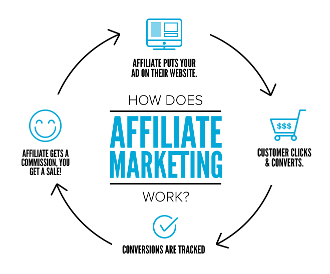
Affiliate marketing is when other people (or affiliates) promote your products or services. They earn commissions for sales they bring in, which gives them a strong incentive to continue promoting your company.

Source

Affiliates are typically publishers and content creators — bloggers, social media influencers, YouTubers, etc. Anyone with an audience or community can become an affiliate for your small business.

Let’s look at an example to illustrate this further.

SimpleMoneyLyfe is a publisher that provides personal financial advice. The company regularly posts articles on topics like investing, making money, and credit repair.

In addition, it also helps its audience make informed decisions by writing in-depth reviews of various financial services.


Similarly, affiliate marketing allows you to develop relationships with publishers who can promote your products or services. Because you’re paying based on performance, it’s a cost-effective way to spread the word about your business.

Given these benefits, it’s not surprising that more companies are pouring money into their affiliate programs

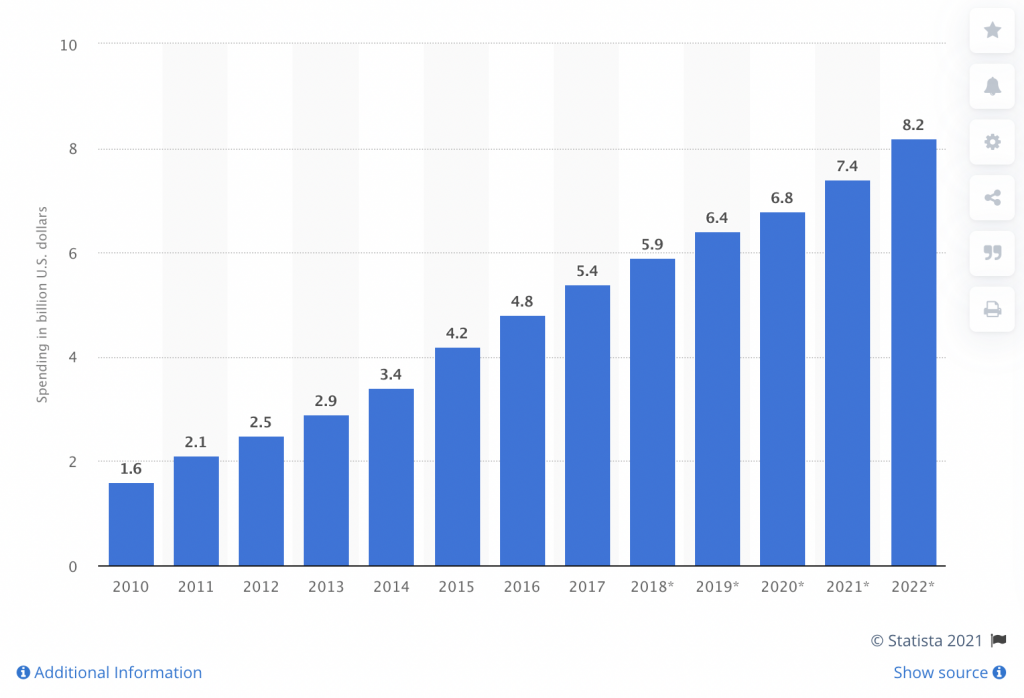
In fact, affiliate marketing spending is projected to reach $8.2 billion by 2022.

Source

That figure will only continue to grow as more companies use this marketing strategy to increase sales.

Now let’s look at how you can use affiliate marketing to grow your business.

1. Decide Whether to Create an Affiliate Program

First, you’ll need an affiliate program to manage and pay your affiliate. There are two options to get started:

  • Host your own affiliate program
  • Join an affiliate network

Each has its advantages and disadvantages.

With a little technical know-how, you can create your own affiliate program. This allows you to manage your affiliates directly without having to pay any middleman fees. But unless you have a strong brand, you may have trouble attracting publishers.

You can also join an affiliate network. These are companies that act as intermediates between merchants and affiliates. These networks can drive more publishers to your program but have higher initial costs.

Which option you choose will depend on your budget and goals. You can always join an affiliate network and move your program in-house later (something that Amazon did with its Associate’s Program).

2. Build a Strong Commission Structure

Affiliates earn commissions on sales they bring to your company. But you’ll have a hard time getting publishers to promote your company with a weak commission structure.

How much should you offer affiliates? That depends on factors like your industry, profit margins, and the products you sell. 

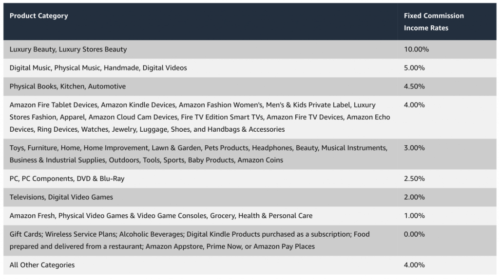
However, commission rates for physical products are typically between 5% and 15%. They also tend to be much higher for software products. 

Here’s the commission structure that Amazon offers for its affiliate program:

Source

Offering a high commission rate can help you attract quality publishers. Of course, you still want to generate a profit for your efforts. 

Think about your customer lifetime value (CLV) and factor in your cost of goods sold (COGS) to develop a solid commission structure.

3. Provide Marketing Creatives

Publishers can add affiliate links to their content to track clicks and earnings. But to drive more traffic to your product pages and raise brand awareness, you’ll want to provide creatives.

Creatives are promotional materials that affiliates can add to their site (or online platform) to promote your business. 

Examples include:

  • Product images
  • Banner ads
  • Videos
  • Pre-written copy
  • Email templates
  • Landing pages
  • Widgets
  • Reports

Create different kinds of marketing assets and make sure they have clear branding. Add them to your affiliate resource center, so publishers can quickly download the ones they need.

4. Increase Your Conversion Rates

Publishers are already doing a lot of the heavy lifting by driving traffic to your site. It’s your job to make sure your product pages are optimized for conversions.

For example, if your affiliate program pays for new leads, make sure to include signup forms on your landing pages. This will help you bring in more leads (and make your affiliates happy).

This page promoting the best PEO companies adds a form to its landing page to get visitors to fill in their contact details.

Source

The form also has contrasting colors, which helps it stand out from other elements on the page. Experiment with your product pages and consider running A/B tests to improve your conversion rates.

5. Reach Out to Publishers

Attracting affiliates can be challenging in the beginning. To gain more traction, take a more proactive approach and reach out directly to publishers.

Here are a few places to start:

  • Bloggers: Reach out to bloggers in your industry. If they’re promoting products similar to yours, there’s a good chance they’ll promote your products or services too.
  • Influencers: Partnering with social media influencers is an effective strategy to attract quality publishers. You can pay per post or offer commissions on sales they make.
  • YouTubers: More people are watching videos to inform their purchases. Working with a popular YouTuber can help you drive more sales.

6. Work With Coupon Sites

Leveraging coupon sites can be a great way to attract new customers. These types of sites help consumers find deals online by organizing coupons from different brands.

You provide a promo code, and a coupon site adds it under a relevant category. Anyone searching for a deal can save on their purchase, and the coupon site earns a commission.

Even offering a small discount like 10% off for a limited time can be incredibly effective at bringing in more first-time purchases. Just be sure that you’re not undercutting yourself and losing money.

Final Thoughts

There’s no shortage of marketing strategies you can use to grow your small business. 

But one of the most effective is affiliate marketing. Partnering with publishers in your industry can drive targeted traffic to your site and generate more sales for your small business.

Follow the tips as detailed here to get started. These include creating an affiliate program or joining an affiliate network, providing marketing creatives, and reaching out directly to publishers for partnerships.

Categories: Others Tags:

11 Most Advanced Shipping Plugins for WooCommerce

September 7th, 2021 No comments

Shipping is one of the most important aspects of an eCommerce business. Customers are directly influenced by the shipping services you provide in your store, based on which they will make decisions on future purchases. 

Some issues customers encounter on shipping may not be in your control as it also depends upon the carrier service you have chosen and other logistic processes. As a store owner, it is your responsibility to minimize these issues and provide your customers a hassle-free shipping experience by delivering the products as per the estimated delivery date.

Fortunately, WooCommerce allows you to make all your shipments properly and systematically with the help of additional plugins and extensions. You can choose a plugin or extension as per your shipping requirements. Since there are so many plugins available in the WooCommerce market, you can choose the essential ones by analyzing their features and efficiency.

In order to make your task easier, I have come up with 10 WooCommerce advanced shipping plugins you can install on your WooCommerce store. They are:

  1. ELEX WooCommerce Shipping Calculator, Purchase Shipping Label & Tracking for Customers
  2. ELEX EasyPost (FedEx, UPS, Canada Post & USPS) Shipping & Label Printing Plugin for WooCommerce
  3. WooCommerce Advanced Shipping
  4. WooCommerce ShipStation Gateway
  5. Table Rate for WooCommerce by Flexible Shipping – Pro
  6. Advanced Shipment Tracking for WooCommerce
  7. WooCommerce Conditional Shipping Pro
  8. WooCommerce Weight Based Shipping
  9. Order Delivery Date Pro for WooCommerce
  10. WooCommerce Print Invoices & Packing lists
  11. AfterShip Order Tracking and Shipment Notifications for WooCommerce

ELEX WooCommerce Shipping Calculator, Purchase Shipping Label & Tracking for Customers

This advanced premium plugin will help you to feature a shipping calculator on a dedicated page in your WooCommerce store, which will be very helpful for your customers to calculate shipping rates and choose a feasible shipping rate based on the cost and delivery days. In addition to that, they can print the labels and get the tracking information in a couple of clicks. 

You can provide the shipping services of FedEx, UPS, USPS, and Canada Post using your EasyPost API. Customers can enter the sender and receiver’s address and contact details, and create packages by entering their weight and dimensions. Using these data, this advanced plugin will calculate all available shipping services of selected carriers, from which they can choose one. Admin can set a handling charge and can add a percentage or fixed price adjustment on shipping carrier services for adding them on the cart total price that must be paid by the customers.

Price: Single site subscription plan starts at $79.

ELEX EasyPost (FedEx, UPS, Canada Post & USPS) Shipping & Label Printing Plugin for WooCommerce

This all-inclusive shipping plugin is the most efficient method of integrating the shipping rates of FedEx, USPS, Canada Post, and UPS into your WooCommerce Store. The ELEX EasyPost Shipping Method Plugin allows you to automate shipping using EasyPost APIs by displaying shipping rates on the cart/checkout page, paying postage, and printing labels all from within your WooCommerce Store.

With the help of this plugin, you can show real-time shipping rates and estimated delivery dates to your customers when they add products to their cart and on the checkout page. The plugin fetches UPS, USPS, Canada Post, or FedEx postage prices from your EasyPost account based on product weight, box dimensions, shipment location, and other factors. It also enables you to generate and print shipping labels and track orders from the WooCommerce Order Admin page. 

Price: Single site subscription plan starts at $69

Note: EasyPost offers limited free services, exceeding which they charge a membership fee. To know more: EasyPost pricing

WooCommerce Advanced Shipping

With this premium shipping plugin, you can set multiple shipping rates by configuring different conditions based on the total amount on the shopping cart, weight and dimensions of packages, shipping country, state, and so on. You can create unlimited shipping methods and assign shipping prices that must be only applicable for specific user roles.

Instead of using third-party shipping rates, you can create your own table rate shipping based on the conditions you have created. The main advantage of using this plugin is its user-friendly interface. Even though you do not have much experience in handling the technical side, you can configure the conditions and set shipping rates with its simple dashboard.

Price: Starts at $18.

WooCommerce ShipStation Gateway

This free shipping plugin will definitely help you save time by importing and exporting orders. You can also use this plugin for batch label creations and even to communicate with the customers!

An advantage of this plugin is its high flexibility to work well for small to large scale businesses. You can print the labels wirelessly and connect with your printer remotely using the ShipStation Connect option. You can access all these features using its mobile app (available for both Android and iOS), which is totally free.

Table Rate for WooCommerce by Flexible Shipping – Pro

This WooCommerce shipping plugin allows you to create shipping rules based on different parameters like quantity, weight, and so on. You can also create shipping methods with unique names in this plugin. Also, you can use its hide shipping method option, if you require to hide specific shipping methods based on certain conditions.

Additionally, you will be able to import or export all your shipping methods and can edit them from a spreadsheet as per requirements. Admin can set a handling fee, which will be charged along with the shipping rate from customers.

Price: Single site subscription starts at $79.

Advanced Shipment Tracking for WooCommerce

This free WooCommerce shipment tracking plugin helps you configure an option for your customers to easily track their shipments. This plugin supports 250+ default shipping carriers by providing their tracking information. If you could not find a shipment carrier you are using in your store in the default list, you can add it seamlessly. 

The tracking information will be passed to the customers along with the order completion email, which will also include details such as the shipping carrier name and the date. You can sync your shipping carriers to this plugin, which will automatically update the tracking status for the customers. In addition to these, you can customize the template, layout, font, etc., of the order emails.

WooCommerce Conditional Shipping Pro

This advanced plugin is used to restrict all available shipping methods in your store using various conditions for setting shipping costs. Rather than adding custom shipping methods, it works on the existing default shipping methods like free, flat rate, and local pickup along with the other shipping methods from third-party plugins.

So, it will work smoothly on your store as it focuses only on the available shipping methods rather than creating new shipping methods which may lead to compatibility issues with the shipping zones in your store. You can configure the conditions based on package volume, product volume, cart subtotal, etc., for increasing, decreasing, or setting a new value to the shipping cost. You can also set a ‘no shipping methods available’ message for certain conditions.

Price: Starts at $49 for the single-site subscription.

WooCommerce Weight Based Shipping

As the name suggests, this plugin allows you to set shipping rates based on product weights by setting conditions. You can set these conditions based on weight, order destinations, and subtotal ranges. It supports all shipping zones in WooCommerce which will not cause any compatibility issues.

You can also set shipping costs based on specific shipping classes with this plugin. Also, you can even set free shipping for orders reaching a minimum threshold price.

Price: Starts at $19.

Order Delivery Date Pro for WooCommerce

This advanced WooCommerce shipping plugin will help you to manage the delivery and local pickup of your products. You can create delivery schedules by shipping methods, classes, locations, and specific products, etc. Admin can set a delivery date and time slot which will be visible for the customers in the front end. 

You can set the delivery days, working days, and holidays seamlessly for the accurate configuration of delivery date and time. And, with this plugin, the admin or customers can seamlessly reschedule the delivery date and time slot. In addition to these, you can send reminders to your customers before delivery.

Price: Starts at $99.

WooCommerce Print Invoices & Packing lists

This plugin allows you to seamlessly manage the order invoices in your store. You can individually or print order documents in bulk directly from the WooCommerce Orders page. The customers can access the invoices from the ‘My Accounts’ page of your store.

You can customize the format of your invoice template and format with this plugin. You can print or email the invoices of multiple orders at a time for seamlessly processing bulk orders together. You can also configure it to automatically email packing lists to store admin.

Price: Starts at $79.

AfterShip Order Tracking and Shipment Notifications for WooCommerce

This free WooCommerce shipping plugin will help you get tracking details of multiple orders in your store with a couple of clicks. It supports 800+ shipping carriers including DHL, UPS, USPS, etc. This plugin mainly focuses on customer’s post-purchase experience which will help you to increase the additional purchases in the future.

It will automatically import all tracking numbers, so you can access them all in one place. Admin can filter the shipments based on the date, destinations, statuses, etc. Furthermore, you can generate a tracking page for each individual order, which will be redirected to your store’s page rather than third-party carriers’ pages. There is also an option to customize the look and feel of the tracking page on your store.

Conclusion

I hope this article helped you to get an idea of essential WooCommerce shipping plugins, which will make your shipping and fulfillment experience smooth and efficient. Go through their product pages and get a quick demo, if available to get a detailed understanding of a plugin before choosing it for your store.

Categories: Others Tags: