Archive

Archive for October, 2021

13 Powerful Ways to Use Google Trends for SEO

October 8th, 2021 No comments

Google Trends is a free analytics tool offered by Google.

Website and business owners, marketers, and SEO agencies use Google Trends to understand the relative search frequency of keywords and topics for a determined period. This information helps in shortlisting keywords to optimize the website for search engines and improve the ranking. 

1. Research Keywords with High Search Volume 

Almost 71% of keywords that have more than 10,000 monthly searches consist of one or two words. Google Trends will provide data (a graph) of the search volume over the year. Similarly, you can get data for previous years by changing the filters. It will help compare the growth/ decline of a keyword in the long term and choose the correct keywords for your website. 

2. Identify Related Keywords 

One of the notable advantages of using Google Trends is its ability to show related keywords for a topic, with increasing popularity and search volume. Keywords with an extensive search volume have ‘breakout’ written against them, which means that the popularity has increased by more than 5000%. 

Breakout keywords give you the chance to snatch the top rank in less time. But they can also end up as fads and leave you with stale content. The trick is to find the apt balance so that even if the popular keywords go extinct, you can still repurpose the content for other keywords. Google Trends shows the exact increase in search volume and the order of popularity of the keywords. 

3. Filter the Keywords 

The settings offered by Google Trends can be used to narrow down the keyword search and identify the ones that are a perfect fit for your website. Always start with the short-tail keywords with global popularity, and then start filtering the results to see how the trends change based on various factors. 

The time setting will show the periods for which the keyword was popular. For example, terms like swimsuits are seasonal and show a higher spike during the respective season. Further, narrow it down based on region/ country. The summer season comes in different months in the southern hemisphere and the northern hemisphere. Finally, get the trends for the keyword during the last four hours and in your local area. 

4. Get New Topics for Content 

Do you know that 8% of the searches are phrased as questions? ‘How to,’ ‘what is,’ ‘why is,’ ‘when did,’ etc., are some common question phrases used by people. The advanced search feature of Google Trends is a great way to discover keywords and new topics to generate content. 

There’s also a section on the left side of the table, and it shows the related topics or queries for the keyword you entered. As you dig through this section, you’ll come across ideas for new topics that are currently popular among users. Based on the primary results, you can fine-tune the keywords for every topic that grabs your attention.  

5. Understand the Niche Market 

Knowing the trends in your niche is vital if you want your website to rank at the top. Google Trends is the right tool to track the trends in the niche, and it also helps you identify niches adjacent to yours. This way, you can expand into related markets and improve visibility. 

Do you want to know the trends for the last 12 months? Maybe for the past two years? Or do you want to see the graph of a seasonal keyword? Google Trends will give you all the details with a few clicks. It’s natural for the graph to have highs and lows. But the overall search volume should be stable and fit within a range. 

6. Align Marketing Plans with Seasonal Trends

If you are an FMCG seller, you’ll need to make the best of seasonal trends. Google Trends can help plan the online and offline marketing strategies for the season. Sales usually start in advance, so set the time filter accordingly. Don’t ignore the off-season sales, either. 

For example, a women’s apparel store aims to sell bikinis for summer and pajamas during autumn. The marketing campaign and website optimization should start at least a couple of months in advance. If trends show that search volume is high from March to September, you should begin sometime in January, and your website will be at the top when the peak season arrives. 

7. Sort Topics and Niche Based on Location 

Local SEO is a must for local businesses. How else will people from the area know about your business? Google Trends allows you to sort topics and niches for the various regions. What works for a majority of the global audiences may or may not work for your local audience, right? 

For example, the preferences of the New Yorkers would be different from what a Californian or a Floridian would prefer. Go local, and get the trends for your target location. Search for popular topics in the area and plan your content. You can target your social media ads appropriately and get better results. 

8. What Are Your Competitors Doing? 

How can we forget the competitors? Google Trends helps here too. Do you want to know how a competitor is performing for the same keyword? You can compare your brand’s performance and the competitors to see how the overall graph has been. 

How many times did the other business get ahead of you? When did it, and how long did it take for you to take over? Google Trends allows you to compare up to five keywords of competitors. Many SEO agencies use this to understand the differences between your marketing strategies and find ways to get you to the top of the charts. 

9. Advanced Search Is Your Best Friend 

We’ve mentioned Google Trends Advanced Search Options before. Let’s elaborate on them now. The tool has five great options that’ll help you race ahead of your competitors and grab the market share. 

  • Web search is the default option 
  • Google Shopping 
  • Image Search 
  • News Search
  • YouTube search 

Yes, there are the same options we see on the default SERP page. Users looking for images choose the image search to get the neverending list of images for the keyword, and so on. 

Do you know that not many people use these options on Google Trends? That gives an added advantage to capture the users’ attention and gain more visibility on the SERPs. 

10. Optimize the Videos for YouTube 

Google Trends is definitely not limited only to optimizing your website. It can also help with the content for social media platforms. YouTube is termed the second-largest search engine on the internet, and it’s the next best place to rank higher. YouTube has videos and text (in the post descriptions), where you can use the keywords to boost your brand. A quick search on YouTube will fetch you the most-used keywords for the topic. 

 Now enter this keyword in Google Trends and look at the graph. Adjust the time filter to have a comprehensive view of the search volume for the keyword. Look for when the videos have been posted and start planning content accordingly. 

11. Discover the Best Time to Place Google Shopping Ads 

As mentioned earlier, Google Trends reports can help identify the right time to place ads. In 2018, 76% of the ad revenue in the US was spent on Google Shopping. Google is the largest search engine, and placing an ad here is sure to bring website traffic. 

However, you should know which keywords to target, which demographics to choose, and how long to run the ad to increase the conversion rate. Luckily, Google Shopping ads are comparatively less expensive. By using the data generated by Google Trends, you can find a cost-effective way to reach the audience. Use the local search reports for better results.  

13. Use Real-Time Data 

What if you want to know the general trends on the internet without using any keywords? Google Trends gives you real-time data for the last 24 hours. The graph shows which topics are currently trending among the users. The category dropdown will narrow the topics to your niche. 

What about location-wise trends? Simply get the geographical area to your desired location. It helps brainstorm for new posts or make use of existing ones. 

Whether it’s a blog post, tweet, or a meme, you can post using the trending topics to your advantage and promote your website. Turn these topics into questions and add them to the website or start a conversation on social media. 

14. Search for Trending Social Media Hashtags 

Brand promotions don’t need to be limited to their niche. Having an opinion about the latest topic is also a way to promote the brand, especially on social media. Look for the top trending hashtags and pick your favorites. 

It’s easy to find trending hashtags on Twitter. But it’s difficult to details from Facebook and Instagram. Google Trends can be used to collect hashtag trends from all social media platforms. 

The aim is to be visible on the internet and ensure that customers remember the brand. Choose topics with care. The move can backfire if you take a wrong stand and alienate your existing customers. 

How to use Google Trends to Create SEO-friendly Content? 

1. Identify the Best Long-Tail Keywords for the Content 

Ranking for high-density popular keywords is not easy. There’s a lot of competition from websites around the world. However, you have an intelligent way to rank higher for the keywords from your niche. 

Long-tail keywords have lesser search volume and are easy to rank on the first search results page. These keywords are more specific and bring the target audience to the website. Long-tail keywords also play a role in increasing the conversion rate. A keyword with three or more words is known as a long-tail keyword. 

For example, ‘women’s apparel’ is a popular short-tail keyword and is hard to rank high. The long-tail versions would be ‘black skirt for women,’ ‘women’s dresses mermaid cut,’ etc. 

2. LSI Keywords Can Change the Game 

LSI is Latent Semantic Indexing where the keywords are contextually related to popular keywords and can be used as a replacement in the content. LSI keywords improve the quality of your text by reducing the number of times the same keyword is repeated. 

When you search for a keyword, the LSI keywords will show up under related topics/ queries. Google Trends helps you identify repeated LSI keywords to enhance the content on your site. The semantic connection between the topic, keywords, and niche will boost your SEO results. Your webpage ranks higher on the SERPs. For example, the LSI keywords for baking supplies would be baking pan, tin, cake stand, silicon molds, ramekins, sprinkles, confetti, etc. 

3. Understand Unpopular Content 

We know that all trends are not popular. But they can be used to our advantage if we plan carefully. Google Trends will give us the details of trending topics globally, regionally, and locally. You can identify seasonal trends and optimize the content to join the bandwagon and make the most of it. 

At the same time, you can also work reverse and look for unpopular content in the area or for the duration. Sometimes, you’ll notice an unexpected spike for a topic or keyword. Content that’s usually unpopular might see an increase in demand for a short time. 

Catering to this demand will push your website up the search results and increase visibility. And since it’s an uncommon trend, there won’t be much competition either. 

4. Right Topic at the Right Time 

Optimizing the content will improve the brand authority. But knowing which topics to choose and when is crucial if you want to ace the SEO game. The trending topics and themes can be identified through Google Trends. Using this data, you can schedule posts and social media promotions for your business. 

For example, September and October are the right time for topics related to fall, Halloween, etc. You can reshare old posts and create new ones on these themes. If your niche is lifestyle blogging, you can write about fall cleaning, home decorations, using seasonal fruits and veggies, dressing for fall events, and so on. 

Google Trends & SEO FAQs 

1. What is Google Trends, and how is it used? 

Google Trends is a free analytical tool provided by Google for SEO and digital marketing purposes. It is used to find the relative frequency of a keyword for a given duration. This tool is used to compare keywords and discover relevant topics in the niche. Google Trends helps streamline content marketing and SEO strategies. Marketers and SEO agencies regularly use Google Trends. 

2. Is there any contrast between Google Trends and Google Keyword Tool? Which one is more accurate?  

Yes, both are two different free SEO tools provided by Google. 

Google Trends shows the relative numbers of how popular a keyword/ topic is. It shows the frequency of keywords based on time and search density. 

Google Keyword Tool provides accurate numbers of how many times a keyword has been used for searches. It shows the details for local and global searches.  

3. Can I use Google Trends for digital marketing?

Yes, you can use Google Trends for digital marketing. Though you should also use other SEO tools, Google Trends can help identify the trending topics on the internet so that you can optimize your content accordingly. It increases your chances to rank higher on the SERPs and gain more visibility. The overlay feature of Google Trends is handy in identifying topics of interest. 

Categories: Others Tags:

10 Best Bootstrap Free and Premium Admin Templates in 2021

October 8th, 2021 No comments

The importance of a dashboard cannot be overstated. It is an essential part of every web application, organization, and any place where data is crucial. It plays a vital role in decision-making.

However, building a dashboard from scratch is a time-consuming process that might even cost you a lot of money. This is where dashboard templates come in. Check out some of the best Bootstrap admin templates that you can find in 2021.

Most of the dashboards featured in this template will have both free and premium versions. You can try out the free templates first, to see if it’s the right one for you. The premium version of the templates will have more features, layout options, UI components, widgets, and more. 

The best admin panel templates in 2021:

  1. Star Admin 2
  2. AdminLTE
  3. CoreUI
  4. Material Dashboard Pro
  5. SB Admin 2
  6. Volt
  7. Flexy Bootstrap
  8. Vibe
  9. Focus
  10. Flash Able

Star Admin 2

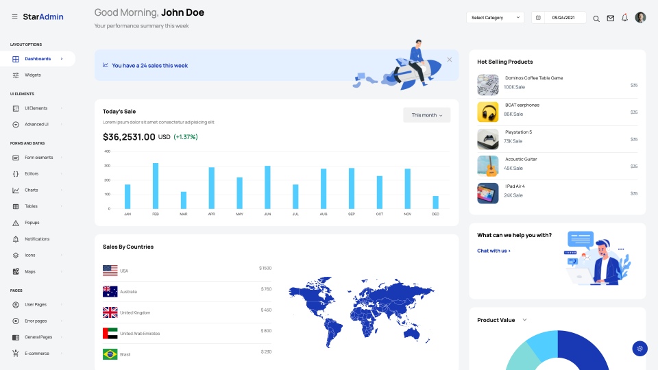
Star Admin 2 is a modern admin dashboard template built with Bootstrap 5. This is a revamped version of the all-time popular, the original Star Admin. This dashboard template comes with many pre-built layout options and example pages that you can customize easily. The code is super simple to understand. You can literally set up and customize your dashboard within minutes when you use Star Admin 2. The free version comes with an MIT license, which means you can use it anywhere you like. The premium version comes with a ton of extra features, layouts, UI components, and so much more. Not to mention the access to free lifetime product updates and 12 months of premium customer support. Check out Star Admin 2 now:

Free version of Star Admin 2
Premium version of Star Admin 2

AdminLTE

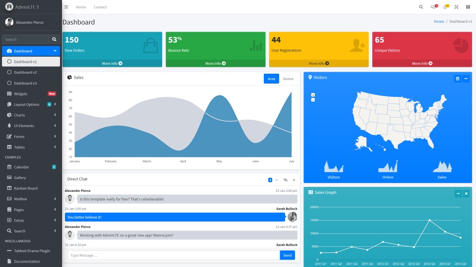
AdminLTE is a well-designed dashboard template built on top of Bootstrap. The design is simple. A lot of thought and research has been put into this template and it is obvious. Check out this template using the links below:

Free version of AdminLTE

CoreUI Admin Template

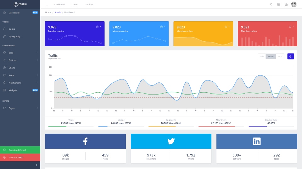
CoreUI is a free Bootstrap 4 admin template. This admin template is extremely popular for obvious reasons. The design is clean, the code is well-written and it comes loaded with features. You also get customer support with this free template. CoreUI is very beginner-friendly, you don’t need any design skills to work with and customize this template. CoreUI Admin Template has been designed to save time.

You can get CoreUI using the links below:

Free version of CoreUI
Premium version of CoreUI

Material Dashboard

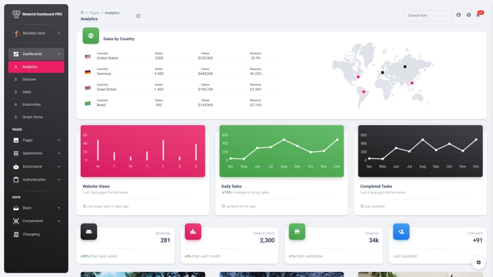
Material Admin is an admin dashboard templat built with Bootstrap 4. This template has been designed following Google’s Material Design guidelines. The dashboard looks like a bunch of sheets of paper which flow and slide amongst each other. This gives it the unique “material” look. The free version comes with an MIT license, use it on any project you want! Check out the free and premium versions of Material Dashboard using the links below:

Free version of Material Dashboard
Premium version of Material Dashboard

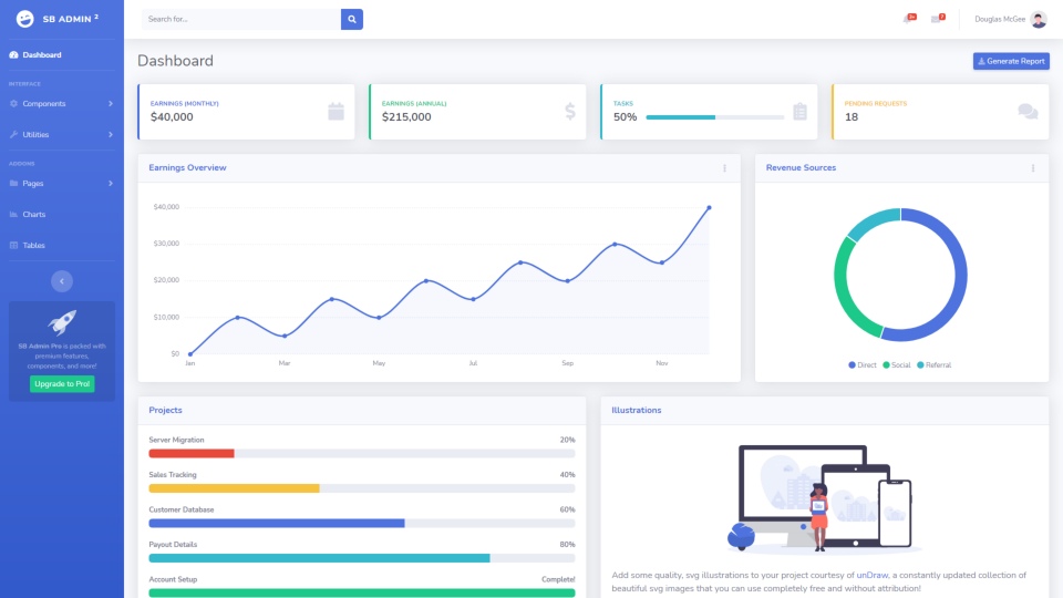
SB Admin 2

This is a free admin template built with Bootstrap 4. SB Admin 2 has a clean and simple design that can be customized easily to suit your needs. This template’s design is a mix of material and flat design. It also has minimal bloat code. The premium version of this template comes loaded with extra features, UI components and a lot more!

Check out SB Admin 2 for free using the link below:

Free version of SB Admin 2
Premium version of SB Admin 2

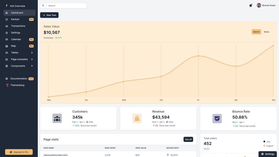
Volt

Volt is an open-source admin dashboard template built with Bootstrap 5. This template comes with more than 100 components, 11 sample pages and more. Volt features a simple design, and the template is light. It can be easily customized. It is rare to see a free template with these many features. The free version comes with an MIT license. Volt also comes with detailed documentation that you can refer as you customize the template.

Check out the free and premium versions of Volt using the links below:

Free version of Volt
Premium version of Volt

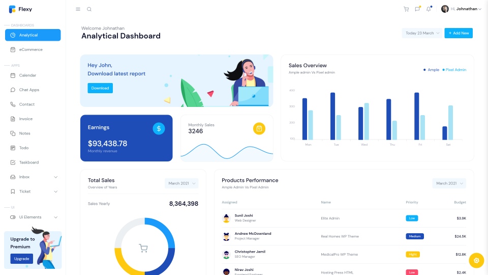
Flexy Admin Lite

This is a very simple admin template built with Bootstrap 5. If you’re looking for a modern dashboard design that is super clean and minimalistic, Flexy is the dashboard for you. The premium version of this template has many different layout options and a lot of extra features. It also comes in a beautiful dark mode, apart from the standard theme!

You can get Flexy Admin Lite using the links below:

Free version of Flexy
Premium version of Flexy

Vibe

Vibe is a simple dashboard that you should definitely check out. It may have limited features, but it has a professional-looking dashboard design that you can customize to fit your branding needs. It is built with Bootstrap 4 and is a perfect choice if you want a simple dashboard template.

Free version of Vibe

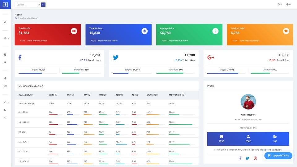
Focus

Focus is a lightweight admin dashboard template with a clean dashboard design. This admin template shines in the area of data visualization. There are many different chart options that you can use for the best data visualization possible. It’s a good dashboard for analytics too. Focus also has many other widgets that you can use to create the perfect dashboard. Check out Focus using the links below:

Free version of Focus 

Flash Able

Flash Able claims to be the most comprehensible admin template ever. This template is built on top of Bootstrap and has many feature-rich pages and components. The code is developer-centric and is easy to work with. The template is regularly updated, which ensures that you always get the best versions possible.

Flash Able renders fast and is responsive. It also allows you to choose and change between the different color options available.

Free version of Flash Able
Premium version of Flash Able


These are some of the best admin templates built with Bootstrap that you can get in 2021. All of these dashboard templates have been used by thousands of developers from all over the world. Pay attention to the license options available. Most of the free templates mentioned here, comes with an MIT license. This means you can use it on any project you want, with no hassle. Hopefully, you’ve found a great dashboard that works for you!

Categories: Others Tags:

Cloud Engineering: Testing Best Practices to Follow

October 8th, 2021 No comments

The introduction of cloud technology was one of the most significant technological shifts that have happened over the past two decades. Cloud engineering has not only enabled ISVs to reduce the costs involved with infrastructure but has shown a whole new perspective to scale the business technology reforms.   

From the shortening of time to market with the software, infrastructure, or industry-leading platforms, cloud testing services have helped companies to deal with unpredictable spikes in demand for innovation.  

Growth Statistics & Risks  

As per the statistics shared by findstack,  

  • 81 percent of enterprises have laid out a multi-cloud strategy or are either in progress  
  • 67 percent of all enterprise infrastructure would be on the cloud by the end of 2021  
  • 82 percent of the workload is likely to reside on the cloud in the near future  
  • AWS owns the largest market share for cloud computing at 32 percent.  

And with all such scope for expansion and growth, cloud computing is likely to be the base of future IT infrastructure. Nevertheless, despite having so many advantages, cloud computing or cloud engineering is a risk-ridden process. From regulatory guidelines to compliance issues, legal instructions, security, system uptime, and all the expense made on upgrade and migration, cloud demand some serious quality assurance.  

Therefore, the idea of preventing any kind of pitfalls on the way to cloud migration or adopting cloud-based services, the organizations need to involve some quality benchmarks and strong testing practices with their existing engineering operations. In other words, the need to support the high-demand delivery models of cloud testing needs immediate attention when it comes to quality.  

Like any other software, the implementation of cloud-based services also demands short release cycles that too along with hotfixes and feature enhancements that can help meet end-user goals. Besides, the success parameters for a cloud-based service can be defined as availability, performance, and scalability potential delivered over a stable internet connection.  

Besides, meeting all these parameters demands a QA process that can meet the highest benchmarks of product architecture. Moreover, the implementation of the cloud demands higher maintainability from the service provider in order to overcome the high cost of ownership.   

Cloud Testing Best Practices  

Since the only way to achieve such goals with cloud engineering is to stick with some of the most significant cloud engineering testing best practices that can help yield success with cloud migration key elements integrated to the business models. Let us quickly jump on understanding the most important practices that make it to a successful cloud engineering business model.  

An Iterative Approach  

The first step to achieve a great cloud engineering project is opting for an iterative approach as you plan to build a project. Though you may consider taking on a big-bang approach that involves hundreds of parameters and quality aspects to meet at the earliest stages of the project, an iterative approach could help you keep things simplified. Moreover, an iterative approach is usually fostered with respect to agile methodologies, which means greater scope for practicing new techniques, rapid check on errors, and even faster error removal with the ease of working on any failed agendas.   

Plan Early Data Migration  

When your business operations rely on cloud technology, your migration requirements for scalability or any system updates should never come into the way of the customer operations. Therefore, the immediate step that you need to follow after planning the process is to jump on the data migration. This might need you to gather all the team of engineers, developers, testers, and technical stakeholders to intervene and develop a strategy that could help with customer data migration early in the development lifecycle.  

Measure Cloud Infrastructure  

Once you are done shaping your cloud data migration strategy as per the iterative approach and agile practices, you need to jump on evaluating the existing cloud infrastructure. It will help you learn the suitability of the existing system for rationalizing the development goals and understand the need for scalability on the existing technical framework to create the required test infrastructure. Some of the most significant benefits of measuring your cloud infrastructure include saving on resources, better resource utilization, and overall improvement on time to market.  

Decide The Test Plans  

When working on a cloud project that needs to align with the futuristic business requirements of the customers, it is vital that everything must be tested well in time. Once you are done working on the idea of measuring cloud infrastructure scalability requirements, make sure you start working on integrating test cycles into your project. As it needs you to accommodate functionality, availability, performance, reliability, & security, make sure you have sufficient bandwidth to manage all the test cycles.   

Establish Delivery Control  

Since testing needs to be done in a controlled environment, establishing control on delivery operations is even more crucial with cloud engineering. This might need you to foster integrations like the use of project life cycle management tools that can help have the advantage to trace the project. The traceability and visibility requirements allow you to have all the command you need to check the project under test for optimum delivery.   

Continuous Integration  

Cloud testing services are mission-critical when you need to establish a stable, secure, and performance-oriented cloud engineering project. Therefore, the right approach to testing should involve running smoke tests on every daily build that on success should be moved to regression. On top of that, your test teams should focus on running a CI/CD (Continuous Integration/Continuous Development) Pipeline to ensure that all the parts of the project should align with each other. Moreover, continuous integration into the cloud testing process allows you to attain the highest quality benchmarks overcoming any potential flaws.   

Automation Is A Must  

Things have changed a lot with time. Earlier, there was no such struggle with the launch of technical solutions as only a few major brands were there to embrace the requirements of the business enthusiasts. However, the modern business environment is highly dependent on cloud technology, and for no surprise, most business organizations these days have their own team of engineers to take on development, testing, and deployment.   

Cutting it short, the modern business environment needs faster solutions that come from quick scalability and faster launches. Since testing every single component for efficiency in the cloud can be tricky, automating the QA infrastructure setup could help prevent all the extra provisioning time while collaborating with the right cloud testing services provider can help prevent all the downtime.   

Regression Test Suite Automation   

Last but not least, you need to ensure that all the regression test suites must be automated to their full capacity. This would help your team to focus on the most significant issues with the development process while you can automate regression test suites to work on all the repetitive tasks. Moreover, you can hire testers for cloud testing to help you with the automation of regression test suites while reducing all the unwanted delays to the release cycle.   

Concluding it all…  

Cloud engineering is one of the most complex technical operations to foster, and it gets even more complicated when testing comes into the picture. The right balance of automation and manual testing on the way to define cloud migration key elements could turn to be a pain for the developers when not done with the right approach.   

However, having all the essential knowledge on the best practices could help execute the entire process seamlessly. In the above article, we tried discussing some of the most important testings best practices that are user-friendly and could help you yield success with your cloud engineering ventures.   

All The Best!  

Categories: Others Tags:

Writing Your Own Code Rules

October 7th, 2021 No comments

There comes a time on a project when it’s worth investing in tooling to protect the codebase. I’m not sure how to articulate when, but it’s somewhere after the project has proven to be something long-term and rough edges are starting to show, and before things feel like a complete mess. Avoid premature optimization but avoid, uh, postmature optimization.

Some of this tooling is so easy to implement, it is often done right up-front. I think of Prettier here, a code formatter that keeps your code in shape, usually right as you are coding. There are whole suites of tools you can put in that “as-you-are-coding” bucket, like accessibility linting, compatibility linting, security linting, etc. Webhint bundles a bunch of those together and is probably worth a look.

Then there is tooling that protects your code via more code that you have to write. Tests are the big player here, which can even be set up to run as you code. They are about making sure your code does what it is meant to do, and as such, deliver a hell of a lot of value.

Protecting your code with more code that you write is where I wanted to go with this, not with traditional tests, but with custom linting rules. I thought about it as two different posts about custom linting crossed my desk recently:

I was interested as a user of both ESLint and Stylelint in my main codebase. But fair warning, I found the process for writing custom rules in both of those pretty difficult. You gotta know you way around an Abstract Syntax Tree. It’s nothing like if (rules.find.selector.startsWith("old")) throw("Deprecated selector.") or something easy like that.

I found this all related to an interesting question that came my way:

I work on a development team working on an old project, and we want to get of rid many of our oldest and buggiest CSS selectors. For example, one of us might open a HTML file and see an element with a class name of deprecated-selector, our goal is to have our IDE literally mark it as a linting error and say like “This is a deprecated selector, use .ui-fresh__selector instead”.

The first thing I thought of was a custom Stylelint rules that would look for selectors that your team knows to be deprecated and warn you. But unfortunately, Stylelint is for linting CSS and it sounds like the main issue here is HTML. I know html-inspector had a way to write your own rules, but it’s getting a bit long in the tooth so I don’t know if there is success to be found there or not.


The post Writing Your Own Code Rules appeared first on CSS-Tricks. You can support CSS-Tricks by being an MVP Supporter.

Categories: Designing, Others Tags:

Developer Decisions For Building Flexible Components

October 7th, 2021 No comments

Blog posts that get into the whole “how to think like a front-end developer” vibe are my favorite. Michelle Barker nails that in this post, and does it without sharing a line of code!

We simply can no longer design and develop only for “optimal” content or browsing conditions. Instead, we must embrace the inherent flexibility and unpredictability of the web, and build resilient components. Static mockups cannot cater to every scenario, so many design decisions fall to developers at build time. Like it or not, if you’re a UI developer, you are a designer — even if you don’t consider yourself one!

There are a lot of unknowns in front-end development. Much longer than my little list. Content of unknown size and length is certainly one of them. Then square the possibilities with every component variation while ensuring good accessibility and you’ve got, well, a heck of a job to do.

Direct Link to ArticlePermalink


The post Developer Decisions For Building Flexible Components appeared first on CSS-Tricks. You can support CSS-Tricks by being an MVP Supporter.

Categories: Designing, Others Tags:

7 UX Principles to Boost SERPs

October 7th, 2021 No comments

User experience is one of the most important principles of web design. There’s no doubt that you focus on UX with every page you design on the web, whether it’s a portfolio, a profile page, or an entire website. 

Unfortunately, what many experts forget is that UX doesn’t just apply to digital pages. That means that you need to discover the right UX strategies for everything from your website homepages to your email marketing messages and even your listings on Google. 

Today, we’re going to explore ways you can apply UX principles to your client’s image on search engines. 

Why Your Search Engine Listing Matters

Let’s start with the basics…

89% of customers start their purchasing process with a search engine. 

That means that whether you’re creating a portfolio to sell your services or building a website for a client, the first connection a customer has with your design isn’t on the homepage.

Developers and designers know that first impressions count when it comes to succeeding online. However, they assume that those first impressions happen on a social media channel, a landing page, or a home page. 

The truth is that most of the time, you’re driving a specific experience for an end-user before you even realize it. Before you can wow an audience with a beautiful site design or a fantastic CTA offer, you need to convince them to click on your Google link.

Just as UX on a website is all about giving your audience what they need in an informed and strategic manner, UX in search engine results works the same way. 

How to Make Your Search Listing Stand Out with UX

So, how do you begin to apply the principles of UX to your Google Search results?

It’s much easier than you’d think. 

Step 1: Show Immediate Value 

Delivering an excellent experience on a website often means providing end-users with the information they need as quickly as possible. Imagine designing a landing page; you wouldn’t want your audience to scroll forever to find what they need. Instead, you’d make sure that the value of the page was immediately apparent. 

When creating an image for your search engine listing, you’ll need to take the same approach. This often means thinking carefully about two things:

  • Your headline
  • Your meta description

Around 8 out of 10 users say that they’ll click a title if it’s compelling. That means that before you do anything else to improve your SEO strategy, you need to make sure that the title of your web page is going to grab the audience’s attention. 

The best titles deliver instant value.

Immediately, these titles tell the audience exactly what they’re going to get when they click onto the page. The promise drives action, while clarity highlights the informed nature of the brand. 

The great thing about using an excellent title for a page is that it doesn’t matter where you’re ranked on the search results. Whether you’re number 2 or number 5, your customers will click if they find something they want. 

It’s just like using a CTA on a landing page. Make sure your titles are:

  • Informative: Show your audience value immediately
  • Optimized for mobile: Remember, your audience might not see your full title on some screens. That means that you need to make the initial words count.
  • Easy to read: Keep it short, simple, and straightforward. Speak the end-user’s language

Step 2: Build Trust with Your URLs

Trust factors are another essential part of good UX

When designing a website for a new brand, you know that it’s your job to make visitors feel at ease. Even in today’s digital world, many customers won’t feel comfortable giving their money or details to a new company. 

Within the website that you design, you can implement things like trust symbols, reviews, and testimonials to enhance brand credibility. In the search engines, it all starts with your URL. 

Search-friendly URLs that highlight the nature of the page will put your audience’s mind at ease. When they click on a page about “What is SEO” in the SERPs, they want to see an URL that matches, not a bunch of numbers and symbols

Use search-friendly permalink structures to make your listing seem more authoritative. This will increase the chances of your customer clicking through to a page and make them more likely to share the link with friends. 

Once you decide on a link structure, make sure that it stays consistent throughout the entire site. If a link doesn’t appear to match the rest of the URLs that your audience sees for your website, they may think they’re on the wrong page. That increases your bounce rate. 

Step 3: Be Informative with Your Meta Description

To deliver excellent UX on a website, you ensure that your visitor can find all the answers to their most pressing questions as quickly as possible. This includes providing the right information on each page and using the correct navigational structure to support a visitor’s journey. 

In the SERPs, you can deliver that same informative experience with a meta description. Although meta descriptions often get ignored, they can provide a lot of value and help you or your client make the right first impression. 

To master your meta descriptions:

  • Use the full 160 characters: Make the most of your meta description by providing as much useful information as you can within that small space. 
  • Include a CTA: Just as CTAs help guide customers through the pages on a website, they can assist with pulling in clicks on the SERPs. A call to action like “read about the” or “click here” makes sense when you’re boosting your search image. 
  • Focus on value: Concentrate on providing your customers with an insight into what’s in it for them if they click on your listing.

Don’t forget that adding keywords to your meta description is often helpful too. Keywords will boost your chances of a higher ranking, but they’ll also show your audience that they’re looking at the right result. 

Step 4: Draw the Eye with Rich Snippets

You’ve probably noticed that the search engine result pages have changed quite a bit in the last couple of years. As Google strives to make results more relevant and informative, we’ve seen the rise of things like rich snippets. Rich snippets are excellent for telling your audience where to look. 

On a website, you would use design elements, like contrasting colors and animation, to pull your audience’s attention to a specific space. In search engines, rich snippets can drive the same outcomes. The difference is that instead of telling a visitor what to do next on a page, you’re telling them to click on your site, not a competitor’s. 

When Google introduced rich snippets, it wanted to provide administrators with a way of showcasing their best content. Rich snippets are most commonly used today on product and contact pages because they can show off reviews. 

Install a rich snippet plugin into your site if you’re a WordPress user or your client is. When you enter the content that you need into the website, use the drop-down menu in your Rich snippet tool to configure the snippet.

Ideally, you’ll want to aim for the full, rich snippet if you want to stand out at the top of the search results. Most featured snippets have both text and an image. You need to access both of these by writing great content and combining it with a relevant image. 

Step 5: Provide Diversity (Take Up More of the Results)

As a website designer or developer, you’ll know that different people will often be drawn to different things. Some of your visitors might immediately see a set of bullet-points and use them to search for the answer to their question. Other visitors will want pictures or videos to guide them. So, how do you deliver that kind of diversity in the SERPS?

The easiest option is to aim to take up more of the search result pages. Google now delivers a bunch of different ways for customers to get the answers they crave. When you search for “How to use Google my Business” on Google, you’ll see links to blogs, as well as a list of YouTube Videos and the “People Also Ask” section. 

Making sure that you or a client has different content rankings for the same keywords can significantly improve any customer’s experience on the search engines. Often, the process of spreading your image out across the SERPs is as simple as creating some different kinds of content. 

To access the benefits of video, ask your client to create YouTube videos for some of their most commonly asked questions or most covered topics. If you’re helping with SEO marketing for your client, then make sure they have an FAQ page or a way of answering questions quickly and concisely on articles, so they’re more likely to appear in “People Also Ask”.

Step 6: Add Authority with Google My Business

Speaking of Google My Business, that’s another excellent tool for improving UX in the search results. It allows business owners to manage how information appears in the search results. 

With this service, you can manage a company’s position on Google maps, the Knowledge Graph, and any online reviews. Establishing a company’s location is one of the most important things you can do to help audiences find a business quickly. Remember, half of the customers that do a local search on a smartphone end up visiting the store within the same day. 

Start by setting up the Google Business listing for yourself or your client. All you need to do is hit the “Start Now” button and fill out every relevant field offered by Google. The more information you can add to Google My Business, the more your listing will stand out. Make sure you:

  • Choose a category for a business, like “Grocery store.”
  • Load up high-quality and high-resolution images
  • Ensure your information matches on every platform
  • Use a local number for contact
  • Encourage reviews to give your listing a five-star rating

Taking advantage of a Google My Business listing will ensure that your audience has all the information they need to make an informed decision about your company before they click through to the site. This means that you or your client gets more warm leads and fewer people stumbling onto your website that might not want to buy from you. 

Step 7: Use Structured Data Markup to Answer Questions

If you’re already using rich snippets in your Google listings, you should also have a plan for structured schema markup. Schema markup on Google tells the search engines what your data means. This means that you can add extra information to your listings that will more accurately guide your customers to the support they need. 

Providing additional schema markup information to your listings gives them an extra finishing touch to ensure that they stand out from the competition. For example, you might add something like a “product price” to a product page or information about the product’s availability.

Alternatively, you could provide the people who see a search result with other options. This could be an excellent option if you’re concerned that some of the people who might come across your listing might need slightly different information. 

For instance, you can ask Google to list other pages along with your search results that customers can “jump to” if they need additional insights.

Baking structured data into your design process when you’re working on a website does many positive things. First, it makes the search engine’s job easier so that you can ensure that you or your client ranks higher. Additionally, it means that your web listings will be more thorough and valuable.

Since UX is all about giving your audience the best possible experience with a brand, that starts with making sure they get the information they need in the search results. 

Constantly Improve and Experiment

Remember, as you begin to embed elements of UX into your search engine listings, it’s essential to be aware of relevant evolutions. Ultimately, the needs of any audience can change very rapidly. Paying attention to your customers and what kind of links they click on the most will provide you with lots of valuable data. You can use Google analytics to A/B test things like titles, pictures, featured snippets, and other things that may affect UX. 

At the same time, it’s worth noting that the Google search algorithms are constantly changing too. Running split tests on different pages will give you an insight into what your customers want. However, you’ll need to keep an eye on the latest documentation about Google Search if you want to avoid falling behind the competition. 

Like most aspects of exceptional UX, mastering your SERP position isn’t a “set it and forget it” strategy. Instead, you’ll need to work on constantly expanding your knowledge if you want to show clients that you can combine UX and SEO effectively. 

Make sure you have plenty of tools set up to offer reports and insights into the kind of changes that you may need to make to align with search engine expectations. 

Making the Most of UX in the SERPS

It’s easy to forget that there’s more to UX than making your buttons clickable on mobile devices or ensuring that scrolling feels smooth. For a designer or developer to deliver excellent UX for a brand, they need to consider every interaction that a company and customer has. 

This means starting with the way a website appears when it’s listed on the search engines most of the time. Getting your SEO listing right doesn’t just boost your chances of a good ranking. This strategy also improves your reputation with your audience and delivers more meaningful moments in the buyer journey. 

Don’t underestimate the power of UX in SERPs. 


Featured image via Pexels.

Source

The post 7 UX Principles to Boost SERPs first appeared on Webdesigner Depot.

Categories: Designing, Others Tags:

CSS in TypeScript with vanilla-extract

October 7th, 2021 No comments

vanilla-extract is a new framework-agnostic CSS-in-TypeScript library. It’s a lightweight, robust, and intuitive way to write your styles. vanilla-extract isn’t a prescriptive CSS framework, but a flexible piece of developer tooling. CSS tooling has been a relatively stable space over the last few years with PostCSS, Sass, CSS Modules, and styled-components all coming out before 2017 (some long before that) and they remain popular today. Tailwind is one of a few tools that has shaken things up in CSS tooling over the last few years.

vanilla-extract aims to shake things up again. It was released this year and has the benefit of being able to leverage some recent trends, including:

  • JavaScript developers switching to TypeScript
  • Browser support for CSS custom properties
  • Utility-first styling

There are a whole bunch of clever innovations in vanilla-extract that I think make it a big deal.

Zero runtime

CSS-in-JS libraries usually inject styles into the document at runtime. This has benefits, including critical CSS extraction and dynamic styling.

But as a general rule of thumb, a separate CSS file is going to be more performant. That’s because JavaScript code needs to go through more expensive parsing/compilation, whereas a separate CSS file can be cached while the HTTP2 protocol lowers the cost of the extra request. Also, custom properties can now provide a lot of dynamic styling for free.

So, instead of injecting styles at runtime, vanilla-extract takes after Linaria and astroturf. These libraries let you author styles using JavaScript functions that get ripped out at build time and used to construct a CSS file. Although you write vanilla-extract in TypeScript, it doesn’t affect the overall size of your production JavaScript bundle.

TypeScript

A big vanilla-extract value proposition is that you get typing. If it’s important enough to keep the rest of your codebase type-safe, then why not do the same with your styles?

TypeScript provides a number of benefits. First, there’s autocomplete. If you type “fo” then, in a TypeScript-friendly editor, you get a list of font options in a drop down — fontFamily, fontKerning, fontWeight, or whatever else matches — to choose from. This makes CSS properties discoverable from the comfort of your editor. If you can’t remember the name of fontVariant but know it’s going to start with the word “font” you type it and scroll through the options. In VS Code, you don’t need to download any additional tooling to get this to happen.

This really speeds up the authoring of styles:

It also means your editor is watching over your shoulder to make sure you aren’t making any spelling mistakes that could cause frustrating bugs.

vanilla-extract types also provide an explanation of the syntax in their type definition and a link to the MDN documentation for the CSS property you’re editing. This removes a step of frantically Googling when styles are behaving unexpectedly.

Writing in TypeScript means you’re using camel-case names for CSS properties, like backgroundColor. This might be a bit of a change for developers who are used regular CSS syntax, like background-color.

Integrations

vanilla-extract provides first-class integrations for all the newest bundlers. Here’s a full list of integrations it currently supports:

  • webpack
  • esbuild
  • Vite
  • Snowpack
  • NextJS
  • Gatsby

It’s also completely framework-agnostic. All you need to do is import class names from vanilla-Extract, which get converted into a string at build time.

Usage

To use vanilla-Extract, you write up a .css.ts file that your components can import. Calls to these functions get converted to hashed and scoped class name strings in the build step. This might sound similar to CSS Modules, and this isn’t by coincidence: the creator of vanilla-Extract, Mark Dalgleish, is also co-creator of CSS Modules.

style()

You can create an automatically scoped CSS class using the style() function. You pass in the element’s styles, then export the returned value. Import this value somewhere in your user code, and it’s converted into a scoped class name.

// title.css.ts
import {style} from "@vanilla-extract/css";

export const titleStyle = style({
  backgroundColor: "hsl(210deg,30%,90%)",
  fontFamily: "helvetica, Sans-Serif",
  color: "hsl(210deg,60%,25%)",
  padding: 30,
  borderRadius: 20,
});
// title.ts
import {titleStyle} from "./title.css";

document.getElementById("root").innerHTML = `<h1 class="${titleStyle}">Vanilla Extract</h1>`;

Media queries and pseudo selectors can be included inside style declarations, too:

// title.css.ts
backgroundColor: "hsl(210deg,30%,90%)",
fontFamily: "helvetica, Sans-Serif",
color: "hsl(210deg,60%,25%)",
padding: 30,
borderRadius: 20,
"@media": {
  "screen and (max-width: 700px)": {
    padding: 10
  }
},
":hover":{
  backgroundColor: "hsl(210deg,70%,80%)"
}

These style function calls are a thin abstraction over CSS — all of the property names and values map to the CSS properties and values you’re familiar with. One change to get used to is that values can sometimes be declared as a number (e.g. padding: 30) which defaults to a pixel unit value, while some values need to be declared as a string (e.g. padding: "10px 20px 15px 15px").

The properties that go inside the style function can only affect a single HTML node. This means you can’t use nesting to declare styles for the children of an element — something you might be used to in Sass or PostCSS. Instead, you need to style children separately. If a child element needs different styles based on the parent, you can use the selectors property to add styles that are dependent on the parent:

// title.css.ts
export const innerSpan = style({
  selectors:{[`${titleStyle} &`]:{
    color: "hsl(190deg,90%,25%)",
    fontStyle: "italic",
    textDecoration: "underline"
  }}
});
// title.ts
import {titleStyle,innerSpan} from "./title.css";
document.getElementById("root").innerHTML = 
`<h1 class="${titleStyle}">Vanilla <span class="${innerSpan}">Extract</span></h1>
<span class="${innerSpan}">Unstyled</span>`;

Or you can also use the Theming API (which we’ll get to next) to create custom properties in the parent element that are consumed by the child nodes. This might sound restrictive, but it’s intentionally been left this way to increase maintainability in larger codebases. It means that you’ll know exactly where the styles have been declared for each element in your project.

Theming

You can use the createTheme function to build out variables in a TypeScript object:

// title.css.ts
import {style,createTheme } from "@vanilla-extract/css";

// Creating the theme
export const [mainTheme,vars] = createTheme({
  color:{
    text: "hsl(210deg,60%,25%)",
    background: "hsl(210deg,30%,90%)"
  },
  lengths:{
    mediumGap: "30px"
  }
})

// Using the theme
export const titleStyle = style({
  backgroundColor:vars.color.background,
  color: vars.color.text,
  fontFamily: "helvetica, Sans-Serif",
  padding: vars.lengths.mediumGap,
  borderRadius: 20,
});

Then vanilla-extract allows you to make a variant of your theme. TypeScript helps it ensure that your variant uses all the same property names, so you get a warning if you forget to add the background property to the theme.

Image of VS Code where showing a theme being declared but missing the background property causing a large amount of red squiggly lines to warn that the property’s been forgotten

This is how you might create a regular theme and a dark mode:

// title.css.ts
import {style,createTheme } from "@vanilla-extract/css";

export const [mainTheme,vars] = createTheme({
  color:{
    text: "hsl(210deg,60%,25%)",
    background: "hsl(210deg,30%,90%)"
  },
  lengths:{
    mediumGap: "30px"
  }
})
// Theme variant - note this part does not use the array syntax
export const darkMode = createTheme(vars,{
  color:{
    text:"hsl(210deg,60%,80%)",
    background: "hsl(210deg,30%,7%)",
  },
  lengths:{
    mediumGap: "30px"
  }
})
// Consuming the theme 
export const titleStyle = style({
  backgroundColor: vars.color.background,
  color: vars.color.text,
  fontFamily: "helvetica, Sans-Serif",
  padding: vars.lengths.mediumGap,
  borderRadius: 20,
});

Then, using JavaScript, you can dynamically apply the class names returned by vanilla-extract to switch themes:

// title.ts
import {titleStyle,mainTheme,darkMode} from "./title.css";

document.getElementById("root").innerHTML = 
`<div class="${mainTheme}" id="wrapper">
  <h1 class="${titleStyle}">Vanilla Extract</h1>
  <button onClick="document.getElementById('wrapper').className='${darkMode}'">Dark mode</button>
</div>`

How does this work under the hood? The objects you declare in the createTheme function are turned into CSS custom properties attached to the element’s class. These custom properties are hashed to prevent conflicts. The output CSS for our mainTheme example looks like this:

.src__ohrzop0 {
  --color-brand__ohrzop1: hsl(210deg,80%,25%);
  --color-text__ohrzop2: hsl(210deg,60%,25%);
  --color-background__ohrzop3: hsl(210deg,30%,90%);
  --lengths-mediumGap__ohrzop4: 30px;
}

And the CSS output of our darkMode theme looks like this:

.src__ohrzop5 {
  --color-brand__ohrzop1: hsl(210deg,80%,60%);
  --color-text__ohrzop2: hsl(210deg,60%,80%);
  --color-background__ohrzop3: hsl(210deg,30%,10%);
  --lengths-mediumGap__ohrzop4: 30px;
}

So, all we need to change in our user code is the class name. Apply the darkmode class name to the parent element, and the mainTheme custom properties get swapped out for darkMode ones.

Recipes API

The style and createTheme functions provide enough power to style a website on their own, but vanilla-extract provides a few extra APIs to promote reusability. The Recipes API allows you to create a bunch of variants for an element, which you can choose from in your markup or user code.

First, it needs to be separately installed:

npm install @vanilla-extract/recipes

Here’s how it works. You import the recipe function and pass in an object with the properties base and variants:

// button.css.ts
import { recipe } from '@vanilla-extract/recipes';

export const buttonStyles = recipe({
  base:{
    // Styles that get applied to ALL buttons go in here
  },
  variants:{
    // Styles that we choose from go in here
  }
});

Inside base, you can declare the styles that will be applied to all variants. Inside variants, you can provide different ways to customize the element:

// button.css.ts
import { recipe } from '@vanilla-extract/recipes';
export const buttonStyles = recipe({
  base: {
    fontWeight: "bold",
  },
  variants: {
    color: {
      normal: {
        backgroundColor: "hsl(210deg,30%,90%)",
      },
      callToAction: {
        backgroundColor: "hsl(210deg,80%,65%)",
      },
    },
    size: {
      large: {
        padding: 30,
      },
      medium: {
        padding: 15,
      },
    },
  },
});

Then you can declare which variant you want to use in the markup:

// button.ts
import { buttonStyles } from "./button.css";

<button class=`${buttonStyles({color: "normal",size: "medium",})}`>Click me</button>

And vanilla-extract leverages TypeScript giving autocomplete for your own variant names!

You can name your variants whatever you like, and put whatever properties you want in them, like so:

// button.css.ts
export const buttonStyles = recipe({
  variants: {
    animal: {
      dog: {
        backgroundImage: 'url("./dog.png")',
      },
      cat: {
        backgroundImage: 'url("./cat.png")',
      },
      rabbit: {
        backgroundImage: 'url("./rabbit.png")',
      },
    },
  },
});

You can see how this would be incredibly useful for building a design system, as you can create reusable components and control the ways they vary. These variations become easily discoverable with TypeScript — all you need to type is CMD/CTRL + Space (on most editors) and you get a dropdown list of the different ways to customize your component.

Utility-first with Sprinkles

Sprinkles is a utility-first framework built on top of vanilla-extract. This is how the vanilla-extract docs describe it:

Basically, it’s like building your own zero-runtime, type-safe version of Tailwind, Styled System, etc.

So if you’re not a fan of naming things (we all have nightmares of creating an outer-wrapper div then realising we need to wrap it with an . . . outer-outer-wrapper ) Sprinkles might be your preferred way to use vanilla-extract.

The Sprinkles API also needs to be separately installed:

npm install @vanilla-extract/sprinkles

Now we can create some building blocks for our utility functions to use. Let’s create a list of colors and lengths by declaring a couple of objects. The JavaScript key names can be whatever we want. The values will need to be valid CSS values for the CSS properties we plan to use them for:

// sprinkles.css.ts
const colors = {
  blue100: "hsl(210deg,70%,15%)",
  blue200: "hsl(210deg,60%,25%)",
  blue300: "hsl(210deg,55%,35%)",
  blue400: "hsl(210deg,50%,45%)",
  blue500: "hsl(210deg,45%,55%)",
  blue600: "hsl(210deg,50%,65%)",
  blue700: "hsl(207deg,55%,75%)",
  blue800: "hsl(205deg,60%,80%)",
  blue900: "hsl(203deg,70%,85%)",
};

const lengths = {
  small: "4px",
  medium: "8px",
  large: "16px",
  humungous: "64px"
};

We can declare which CSS properties these values are going to apply to by using the defineProperties function:

  • Pass it an object with a properties property.
  • In properties, we declare an object where the keys are the CSS properties the user can set (these need to be valid CSS properties) and the values are the objects we created earlier (our lists of colors and lengths).
// sprinkles.css.ts
import { defineProperties } from "@vanilla-extract/sprinkles";

const colors = {
  blue100: "hsl(210deg,70%,15%)"
  // etc.
}

const lengths = {
  small: "4px",
  // etc.
}

const properties = defineProperties({
  properties: {
    // The keys of this object need to be valid CSS properties
    // The values are the options we provide the user
    color: colors,
    backgroundColor: colors,
    padding: lengths,
  },
});

Then the final step is to pass the return value of defineProperties to the createSprinkles function, and export the returned value:

// sprinkles.css.ts
import { defineProperties, createSprinkles } from "@vanilla-extract/sprinkles";

const colors = {
  blue100: "hsl(210deg,70%,15%)"
  // etc.
}

const lengths = {
  small: "4px",
  // etc. 
}

const properties = defineProperties({
  properties: {
    color: colors,
    // etc. 
  },
});
export const sprinkles = createSprinkles(properties);

Then we can start styling inside our components inline by calling the sprinkles function in the class attribute and choosing which options we want for each element.

// index.ts
import { sprinkles } from "./sprinkles.css";
document.getElementById("root").innerHTML = `<button class="${sprinkles({
  color: "blue200",
  backgroundColor: "blue800",
  padding: "large",
})}">Click me</button>
</div>`;

The JavaScript output holds a class name string for each style property. These class names match a single rule in the output CSS file.

<button class="src_color_blue200__ohrzop1 src_backgroundColor_blue800__ohrzopg src_padding_large__ohrzopk">Click me</button>

As you can see, this API allows you to style elements inside your markup using a set of pre-defined constraints. You also avoid the difficult task of coming up with names of classes for every element. The result is something that feels a lot like Tailwind, but also benefits from all the infrastructure that has been built around TypeScript.

The Sprinkles API also allows you to write conditions and shorthands to create responsive styles using utility classes.

Wrapping up

vanilla-extract feels like a big new step in CSS tooling. A lot of thought has been put into building it into an intuitive, robust solution for styling that utilizes all of the power that static typing provides.

Further reading


The post CSS in TypeScript with vanilla-extract appeared first on CSS-Tricks. You can support CSS-Tricks by being an MVP Supporter.

Categories: Designing, Others Tags:

4 Ways to Improve Your Marketing Strategy in a Crowded Space

October 7th, 2021 No comments

Marketing is already a complicated subject. Between traditional models and countless online options, coming up with a competent strategy can be a challenge.

Marketing in a crowded space only makes things worse. Every dollar spent goes up against your competitors’ equally thought out promotional investments.

If you’re operating in a crowded industry, here are a few tips to help you hone your marketing strategy and improve your advertising efforts.

1. Work on Your Brand

In a crowded space a great sale, a lower price, or even a stellar product won’t keep you in business all on its own. You also need to have a clear identity. If you want to beat out the competition, start by considering your own brand image.

Do you have a clear identity as an organization? This should include a few important things, such as:

  • A fleshed-out mission statement that reflects what you want to accomplish as a business.
  • A clear vision of how to reach your mission and goals.
  • A well-defined set of ethics that your company operates under.

Having these things in place can help you form a solid brand image. It enables you to engage in company-wide corporate social responsibility (CSR) initiatives. It also helps you maintain a consistent voice and tone throughout all of your marketing activities. This can have a synergistic impact on the effectiveness of each campaign that you run.

In other words, having a clear brand image is a cornerstone of marketing success. It gives you a clear blueprint to follow as you make organizational decisions. As Bob Goldwater, founder of the Birth Injury Lawyers Group, puts it, “Your messages have to match your methods.” Goldwater adds that you must focus on building your values into every aspect of your business plan.

2. Review Your USP

Entrepreneur.com defines a unique selling proposition (USP) as “the factor or consideration presented by a seller as the reason that one product or service is different from and better than that of the competition.” 

A clear USP is an essential part of standing out in a crowded marketplace. Your USP is the foundational element of what sets you apart from the competition. 

It doesn’t matter if your USP comes from your product, your customer service, your user experience, or anything else. Regardless, you should always know what your USP is.

This isn’t a one-time deal, either. If you want to maintain a competitive advantage in a busy marketplace, make sure to revisit your USP on a regular basis. Consider if it’s still relevant to your business, your customers, and your industry. 

If it is, make sure it’s still at the heart of your marketing efforts. If it isn’t, take steps to realign your USP with your customers’ pain points and then have your marketing adapt to your new selling point.

3. Get Creative

Creativity is a vital part of successful marketing. Marketing guru Ed McCabe explained that “creativity is one of the last remaining legal ways of gaining an unfair advantage over the competition.” 

To up the ante even further, creativity receives an additional premium when it takes place in a crowded space. Consider how tech giants like Google and Apple manage to stay ahead of the competition through perpetual innovation.

Of course, novelty doesn’t have to be restricted to cutting-edge industries like tech. When it comes to marketing, you can breathe a fresh dose of creativity into even the most mundane products, businesses, and industries.

Technology is often a catalyst for the best creativity. For instance, social media, email, and websites provide an endless source of marketing opportunities. Often the business that is able to take advantage of potential options like these in the most unique manner is the one that can rise above the white noise and catch the eye of consumers.

One of the best ways to maintain creative control over your marketing is to bring it in-house. Ever since the Great Recession, companies have been consolidating their marketing by bringing it back into their own control. 

For many, this was a cost-cutting move at first. However, they soon discovered that an in-house marketing department doesn’t just reduce overhead. It also provides an exceptional level of control over the tone, message, and overall creativity of the marketing content itself.

4. Maintain a Growth Mindset

A growth mindset is a crucial survival factor for any modern business. Stanford University professor Carol Dweck defines individuals with a growth mindset as those “who believe their talents can be developed (through hard work, good strategies, and input from others.)”

Every aspect of an organization’s operation should be willing to look at change and growth as positives that can give a company an advantage. This includes marketing. 

Just because you have a marketing strategy that worked in the past doesn’t mean it will do so in the future. Even if you managed to get attention, generate leads, or bring in revenue using a certain marketing formula, that doesn’t mean it’s going to remain the best option.

Brands that are fighting for visibility in a crowded space must always be ready to capitalize on growth-related things like change, development, and innovation. This should take place thoughtfully and with structure — i.e. don’t charge ahead without a second thought. Nevertheless, companies that can harness the power of cutting-edge marketing options stand the best chance of staying in the limelight over time.

Marketing is an ever-changing part of any business. Strategies, tools, and objectives change on a regular basis. This can make it difficult to maintain any marketing strategy. If you’re up against stiff competition, things can be even more challenging.

Fortunately, there are ways to overcome a marketing deficit. From powerful branding to maintaining a clear USP, pursuing fresh in-house creativity, and embracing a growth mindset, there are many ways to maintain an edge over the competition. 

The primary factor is taking the time to hone your marketing efforts on a regular basis. So consider the four suggestions above and review your own marketing strategy. From there, figure out where you can make improvements in the name of outshining your competitors and making a lasting impression on your target audience.

Categories: Others Tags:

Top AngularJS Frameworks to Watch Out in 2021

October 7th, 2021 No comments

AngularJS, an open-source, front-end development framework, is ideal for developing single-page applications and enterprise-level app solutions.

This framework has MVVM and MVC (Model View Controller) foundational layouts to simplify the testing and development processes of applications. 

AngularJS is also a part of the MEAN stack, which consists of MongoDB, Express.js, AngularJS, and Node.js. 

Some of the top benefits of AngularJS development include flexible development, high speed, and excellent performance. Let’s jot down the top AngularJS frameworks with their special features. 

Top Ten AngularJS Frameworks for the Year 2021 and Beyond

Angular UI Bootstrap

It is one of the most reputed front-end development platforms. It is created at the highest point of the Bootstrap platform. AngularUI Bootstrap framework has local HTML coding and other capabilities. The AngularUI Bootstrap supports the native AngularJS platform. 

As a result, AngularUI Bootstrap has zero conditions on jQuery and is ready to be utilized with the AnularJS platform. Simply put, this framework has the goodness of both the Angular platform and Bootstrap to build appealing UI for user-friendly web applications. 

Supersonic

It is a crossover UI framework consists of online parts, CSS, and JavaScript that can be used with any major framework. Supersonic is also named as a skeptic framework. It helps developers work on HTML-based applications and supports the AngularJS framework. Supersonic works alongside AppGyver. 

The majority of the API does not work on a mobile site or Vanilla Cordova application. This framework permits its users to interpret HTML components alongside CSS segments. Also, app developers can utilize its parts that map HTML to contact natural APIs with ease.  

Mobile Angular UI

It is also a famous framework that comprises Bootstrap and AngularJS. When you hire AngularJS developers for building hybrid applications, they can use the Mobile Angular UI framework for organizing HTML5 mobile apps. 

This framework is considered a mobile app development framework for several reasons. One of them is- it has crucial mobile parts like switches, sidebars, overlays, and scrollable regions that are missing in Bootstrap 3. 

What’s more, as it revolves around AngularJS, there is no need for any bootstrap.js or jQuery conditions. This makes Mobile Angular UI a quicker and lightweight framework. Also, it accompanies a CSS record that enables developers to change their web applications into the mobile version.

Ionic

It is one of the most popular front-end frameworks for AngularJS to build mobile and web applications. It is an optimized and advanced app development framework with instructions of Angular to support the CSS3 and HTML-powered application deployment. Ionic is an open-source software development kit (SDK) for developing a productive UI. 

What’s more, Ionic supports some UI library components to build hybrid and interactive applications for touch-sensitive devices. Today, many companies use the Ionic framework to build customized apps that can seamlessly work across different platforms. 

Angular Material

Angular Material is basically a UI-based component library for AngularJS developers. It is inspired by Google’s Material Design concept. Apart from offering 30 UI services, Angular Material offers components to build functional, attractive, and consistent web pages. 

Another advantage of the Angular Material library is it facilitates developers to stick to modern web design principles including device independence, browser portability, and graceful degradation. 

As a result, AngularJS developers can come up with a flexible and faster website. Features like ARIA support, built-in ink, and hover effects are useful for enhancing the user experience

UI Grid

This framework was known as ng-grid before and is developed in AngularJS completely. It has no dependency on jQuery. UI Grid revolves around a central grid module whereas its traits exist as Angular directives and modules. 

This framework contains a component of Angular UI Suite like Angular UI Bootstrap. This component exhibits data in grids for all AngularJS-powered apps. 

Developers can use this framework to function with and manage vast sets of data with grid characteristics like grouping, sorting, filtering, paging, exporting, edit in place, column pinning, etc.

Radian

This framework is built upon Asynchronous Module Definitions (AMD) and intended to be dynamic and powerful. Web developers prefer this framework for its capacity to build applications with intricate functionality and desired features in a relatively short time. 

The Radian framework supports files like JADE, CoffeeScript, and SAAS. As a fast, reliable, and scalable framework, developers can rely on the Radian framework for their design projects. It is a robust framework for developing high-end enterprise-grade applications. 

LumX

It is a fully flexible front-end framework based on Google Material Design. It enables developers to build customized UIs as per Google guidelines. It relies on Angular JS to support the development of web applications based on the MVC design pattern. It also uses jQuery for improving the performance of web-based applications. 

However, it is fair to mention that there is no need to use the jQuery plugins separately while using LumX components. Here, both Bourbon and Neat provide customization in design applications for better and smooth functionality. 

Videogular

Videogular is useful for creating video-based web or mobile applications using HTML5. It has excellent features like bindable properties, plugins, cue point system, and themes suitable for making video-based applications. Videogular has started gaining ground in the eCommerce and retail sector where product videos and customer testimonials play a vital role in growing business. The online education sector can also be a big beneficiary of video-based web and mobile applications. 

Suave UI

Suave UI is useful for developing web UI with the help of AngularJS. It has CSS definitions like layered elements, form elements, grid, and colored buttons. Suave UI makes it easier for developers to build different UI components through these CSS definitions. 

The UI components of Suave UI are contained in bundle files so that developers need not include them separately while making the web application.   

Wrapping Up

AngularJS is evolving at a rapid pace with advancing technology. When you have a requirement for a web application or a mobile app, you can consult the AngularJS development company and choose the most suitable framework from this list.

Categories: Others Tags:

Websites We Like: MD Nichrome

October 6th, 2021 No comments

Here’s a beautiful website: it’s a type specimen for Mass-Driver’s ever-so-lovely type family MD Nichrome. There’s a ton of nifty animations and graphics explaining all the features inside…

If you’re wondering how those animations work, they’re actually styled elements.

There’s lots of great graphic design touches as well, such as how the letters below trail off and fade away…

That little bit of CSS is neat. It makes sure that each

stays on a single line with white-space, then sets hidden overflow on them so the heading trails off. The fading is courtesy of a linear gradient that incorporates transparency. The gradient is actually a mask-image in this case. That’s a good reminder that CSS gradients are images generated by the browser.

h1 {
  white-space: nowrap;
  overflow: hidden;
  -webkit-mask-image: linear-gradient(to right, black 75%, transparent);
}

In the image above you can also see how Mass-Driver is advertising the OpenType features of the font. That’s stuff like fractions or alternate letters that gives your text superpowers. By default, these sections show what the feature is, but when you hover over them they do the following:

.element {
  font-feature-setting: unset;
}

I don’t think I’ve ever used unset before but this is a great place to use it—show what the feature looks like up front and then when you hover show what the default is. Smart stuff.

But the part that caught my eye—besides the kick ass typography—is the background. It’s made up of two parts: a shimmery animation that makes the page look like paper, and the gradient that’s stacked on top of it. And after digging around in DevTools I realized that shimmering effect is a PNG image where the background-position property moves the picture around slightly to animate it like a GIF. It’s hard to see in pictures, so here’s a copycat demo I made with the opacity turned off to make it easier to see:

CodePen Embed Fallback

See that lovely fuzziness? It gives the background a kind of… texture… that I haven’t seen for a long time, perhaps since around 2008 when everyone was trying to make buttons look like real, analog buttons on the web. Geoff covered the same sort of technique a while back where you can get a deep dive into how it works.

The other part of the design of this website is the gradient in the background. How are those so smooth? Well, Rutherford Craze, the designer behind this ingenious bit of web design, made a thread explaining how he got this effect to work in the browser. He created a gradients tool that lets you create a similar effect:

Rutherford writes:

Conventional CSS gradients plot a straight line through colour space, interpolating directly from the start to the end colour. This tool applies the principles of bézier curves, the basis of digital fonts, to this operation.

By introducing ‘control points’ along the gradient, you can more finely control the interpolation and produce a smoother end result. The tool then samples this ‘bézier gradient’ to produce a linear gradient you can work with in CSS.

What Rutherford is describing above is what’s known as the “Gray Dead Zone” of gradients, where often in a linear gradient there’s this gray color that forms in the middle.

Another small detail that I almost didn’t catch was the sticky navigation: when you first load the website you just see the logo with nothing else, but then as you scroll you’ll see the nav and it locks into place:

Notice how sticky positioning is also used later on to demonstrate the font’s glyphs.

CSS makes this sort of thing so easy. Declare sticky positioning on the element, then offset the stickiness if the element should start sticking at a certain spot.

.sticky-thing {
  position: sticky;
  top: 75px;
}

Since they want you to focus on the letters first and not all the rest of the UI, it makes a ton of sense to put the navigation off to one side, only when you need it. And this makes the overall design feel incredibly focused and straightforward, barely worth commenting on at all perhaps, but when most websites are so full of distractions then I think it’s worth celebrating quiet websites like these.


The post Websites We Like: MD Nichrome appeared first on CSS-Tricks. You can support CSS-Tricks by being an MVP Supporter.

Categories: Designing, Others Tags: