Archive

Archive for November, 2021

Quickly Get Alerted to Front-End Errors and Performance Issues

November 11th, 2021 No comments

(This is a sponsored post.)

Measuring things is great. They say what you only fix what you measure. Raygun is great at measuring websites. Measuring performance, measuring errors and crashes, measuring code problems.

You know what’s even better than measuring? Having a system in place to notify you when anything significant happens with those measurements. That’s why Raygun now has powerful alerting.

Let’s look at some of the possibilities of alerts you can set up on your website so that you’re alerted when things go wrong.

Alert 1) Spike in Errors

In my experience, when you see a spike in errors being thrown in your app, it’s likely because a new release has gone to production, and it’s not behaving how you expected it to.

You need to know now, because errors like this can be tricky. Maybe it worked just fine in development, so you need as much time as you can get to root out what the problem is.

Creating a customized alert situation like this in Raygun is very straightforward! Here’s a quick video:

Alert 2) Critical Error

You likely want to be keeping an eye on all errors, but some errors are more critical than others. If a user throws an error trying to update their biography to a string that contains an emoji, well that’s unfortunate and you want to know about it so you can fix it. But if they can’t sign up, add to cart, or check out — well, that’s extra bad, and you need to know about it instantly so you can fix it as immediately as possible. If your users can’t do the main thing they are on your website to do, you’re seriously jeopardizing your business.

With Raygun Alerting, there are actually a couple ways to set this up.

  1. Set up the alert to watch for an Error Message containing any particular text
  2. (and/or) Set up the alert to watch for a particular tag

Error Message text is a nice catch-all as you should be able to catch anything with that. But tagging is more targetted. These tags are of your own design, as you send them over yourself from your own app. For example in JavaScript, say you performed some mission-critical operation in a try/catch block. Should the catch happen, you could send Raygun an event like:

rg4js('send', {
  error: e,
  tags: ['signup', 'mission_critical'];
});

Then create alerts based on those tags as needed.

Alert 3) Slow Load Time

I’m not sure most people think about website performance tracking as something you tie real time alerting to, but you should! There is no reason a websites load time would all the sudden nose dive (e.g. change from, say 2 seconds to 5 seconds), unless something has changed. So if it does nose dive, you should be alerted right away, so you can examine recent changes and fix it.

With Raygun, an alert like this is extremely simple to set up. Here’s an example alert set up to watch for a certain load time threshold and email if there is ever a 10 minute time period in which loading times exceed that.

Setting up the alert in Raygun
Email notification of slowness

If you don’t want to be that aggressive to start with loading time, try 4 seconds. That’s the industry standard for slow loading. If you never get any alerts, slowly notch it down over time, giving you and your team progressively more impressive loading times to stay vigilant about.

Aside from alerts, you’ll also get weekly emails giving you an overview of performance issues.

Alert 4) Core Web Vitals

The new gold-standard web performance metrics are Core Web Vitals (which we’ve written about how Raygun helps with before) (CWV) because they measure things that really matter to users, as well as are an SEO ranking factor for Google. Those are two big reasons to be extra careful with them and set up alerts if your website breaks acceptable thresholds you set up.

For example, CLS is Culumative Layout Shift. Google tells us CLS under 0.1 is good and above 0.25 is bad. So why don’t we shoot for staying under 0.1?

Here we’ve got an alert where if the CLS creeps up over 0.1, we’ll be alerted. Maybe we accidentally added some new content to the site (ads?) that arrive after the page loads and push content around. Perhaps we’ve adjusted a layout in a way that makes things more shifty than they were. Perhaps we’ve updated our custom fonts such that when the load they cause shifting. If we’re alerted, we can fix it the moment we’re aware of it so the negative consequences don’t stick around.

Conclusion

For literally everything that you measure that you know is important to you, there should be an alerting mechanic in place. For anything website performance or error tracking related, Raygun has a perfect solution.


The post Quickly Get Alerted to Front-End Errors and Performance Issues appeared first on CSS-Tricks. You can support CSS-Tricks by being an MVP Supporter.

Categories: Designing, Others Tags:

Don’t Snore on CORS

November 10th, 2021 No comments

Whatever, I just needed a title. Everyone’s favorite web security feature has crossed my desk a bunch of times lately and I always feel like that is a sign I should write something because that’s what blogging is.

The main problem with CORS is that developers don’t understand CORS. The basic concept of it is supposed to be easy: don’t run code across origins. Meaning if I, at css-tricks.com, try to fetch some JavaScript from an external URL, like any-other-website.com, the browser will just stop it by default. You’ll see an error in the console. Not allowed.

Unless, that is, the other website sends a header that specifically allows this. My domain can be whitelisted or there could be a wildcard that allows it. There is way more detail here (like preflighting and credentials) and, as ever, the MDN article does a good job on that front.

What have traditionally been hair-pulling moments for me are when CORS seems to behave inconsistently. Two requests will go through and a third will fail, which seems inexplicable, but was reproducible. (Perhaps there was a load balancer involved with half-cached headers? Who knows.) Or I’m trying to use a proxy and the proxy stops working. I can’t even remember all the examples, but I bet I’ve been in meetings trying to debug CORS issues over 100 times in my life.

Anyway, those times where CORS have crossed my desk recently:

  • This video, Learn CORS In 6 Minutes, has 10,000 likes and seems to have struck a chord with folks. A non-ironic npm install cors was the solution here.
  • You have to literally tell servers to have the correct headers. So, similar to the video above, I had to do that in a video about Cloudflare Workers, where I used cross-origin (but you don’t have to, which is actually a very cool feature of Cloudflare Workers).
  • Jake’s article “How to win at CORS” which includes a playground.
  • There are browser extensions (like ones for Firefox and Chrome) that yank in CORS headers for you, which feels like a questionable workaround, but I wouldn’t blame anybody for using in development.

The post Don’t Snore on CORS appeared first on CSS-Tricks. You can support CSS-Tricks by being an MVP Supporter.

Categories: Designing, Others Tags:

Image CDNs: How Edge Computing Provides a Faster Low Code Image Solution

November 10th, 2021 No comments

Many websites today use some type of traditional Content Delivery Network (CDN), which means improvements in website load times, decreases in bandwidth, and better redundancy and security. But not everything is optimized, specifically when it comes to images, and image CDNs can help with that! 

Traditional vs. Image CDNs

A traditional CDN treats images as static. If you want to tailor images to better match various mobile device types, then you need to create many variants of each image and upload them to your web server. It also means you must develop responsive code that will tell the server and CDN which image variant to deliver. This is clunky, time-consuming, and inefficient. For a large website, the amount of code needed can be astronomical. Using this static image model, there’s just no realistic way for each image to be effectively sized and compressed for every possible device model – at this point, there are thousands of them. The combination of these two unfortunate factors leads to potentially slow load times and poor UX caused by oversized images delivered to mobile devices.

So what is an image CDN? An image CDN builds on the traditional CDN model with the addition of device detection and image optimization. Instant detection of the device model and browser requesting the images is done right at the device-aware edge server (true edge computing!) Additional information, including screen resolution and dimension, pixels per inch, and support for next-gen image formats (such as WebP, JPEG 2000/JP2, and AVIF), provides even more details crucial for superior image optimization. Using this information derived from device-aware edge servers, the image CDN optimizes each image and serves the perfect version for each device and resolution, meaning users get the finest webpage experience faster.

A Bit About the Edge (Whoa, Living on the Edge?)

With a single server website, a web request would have to travel from the requestor, back to the origin server (wherever that was geographically located), be processed, and then travel back to the requestor. Depending on the physical distance between the requestor and the origin server, this could introduce a great deal of latency, which means lag time on page loads. 

A traditional content delivery network (CDN) is a global network of servers that optimizes web performance by using the node geographically closest to the user for faster delivery of assets. It takes static content like images and stores them on the edge. But usually, these edge servers are relatively simple in terms of their role in business processes. They mostly index, cache, and deliver content. And traditional CDNs like to keep edge servers simple because of concerns over CPU usage, storage, and scalability.

But what if these edge servers could also provide computing power that enhances performance and business processes? This is called edge computing. Slowly, CDNs are starting to open their edge servers to allow enterprises to deploy apps/services on the edge. Likewise, Cloud computing networks (e.g., AWS, Azure, Google Cloud) provide virtualized server capacity around the world for those who want to use geographically distributed servers. In a sense, Edge Computing is a marriage of the CDN (where edge servers synchronize/work with each other) and Cloud computing (where servers are open to applications). 

Edge computing is a fascinating concept, but what is the killer app that will enhance business processes and improve website performance? The addition of device detection to edge computing provides the ability to transform from delivery of static images to a new model where images are dynamic and tailored exactly to devices. 

Edge computing is computing that is done in a geographically distributed space, with many servers located at or near the source of the web request. This reduction in bandwidth and latency leads to fast processing times, increased site speed, and improved customer experience. And edge computing doesn’t require new infrastructure — it leverages the networks of existing providers to create Points of Presence (POP) around the globe. 

The Edge Servers are…Aware?

Device-aware edge servers, like those used by the ImageEngine image CDN, take edge computing to a new level. Device detection is actually one of the use cases where edge computing really shines. Normally, the edge server would have to send a Javascript query to the device to figure out any information about a requesting device’s model, browser, operating system. But with a device-aware edge server, the User Agent string is captured and decoded. This contains all of the information necessary for device detection without the need for any back and forth – a definite speed improvement. So you’re starting ahead of the game! 

Each time a new request comes to the device-aware edge server, the image is processed by that server (meaning optimized for that specific device parameters) and stored right there in cache, primed for future use. This is done in three stages: changing image size based on device resolution, compressing the image using an image optimization tool, and selecting the most efficient file format for the device. 

If the device-aware edge server has already processed a request from a similar device model before, then it can serve the device-optimized image from its edge cache, leading to a lightning-fast server response — and ImageEngine’s device-aware edge servers can serve up cached images 98% of the time! Not only is there geographical proximity because of the distributed global POP network, but the smaller size of the optimized image compared to the full-sized original cuts up to 80% off the image payload. This can cut up to several seconds off page load times. When almost 70% of people say that page speed influences their likelihood of making a purchase, every single second counts! 

Some image CDNs detect the device information and group the devices into “buckets” of similar types and serve an image based on that type. While this is certainly an advancement over a traditional CDN, and works passably well for some common devices, it still isn’t a truly optimal solution. There are so many variants of browser, screen size,  resolution, etc., even among very similar devices, that images are still often oversized (too large payloads) and lead to poor load speed. A true image CDN, such as ImageEngine, serves the perfect image for every device, every time.

So Now You Want To Get Started (Don’t Worry, It’s Really Simple)

One of the best things about the ImageEngine image CDN is the ease of integration – and it can integrate into any platform that supports a 3rd-party CDN. All you need is to sign up for an account and receive a delivery address during your two (yes, 2!) minute signup process. This delivery address is used to redirect image traffic for optimization and superior delivery performance. Next, you’ll have to make some slight adjustments to img tags on your website, but that’s really all the work you’ll need to do. There are no DNS changes during a standard (generic delivery address) integration. You read that right, none at all. Contrast that to a traditional CDN integration, where there is just no way around some messing around in the DNS – in fact, usually some fairly extensive DNS changes. 

This low-code, virtually no code, integration saves you time. It saves you money. It saves you the hassle of putting multiple team members on a new project. And it means that you can be up and running in about 15 minutes with a standard install. You can be serving optimized images to your site visitors at blazing fast speeds before lunch! And don’t worry, ImageEngine has an experienced integration support team available to answer any questions you might have. 

There’s also no issue with adding the ImageEngine image CDN on top of an existing CDN. Traditional CDNs may have security features that you may prefer to keep for your site. It requires slightly more integration but provides the same benefits of a solo ImageEngine implementation — screaming fast image load times and perfectly optimized images from device-aware edge servers. All that is recommended is that the ImageEngine image CDN actually serve the images directly, not simply process them, to get maximum benefits.

Adopt an Image CDN and See The Benefits

We’ve learned that image CDNs bring numerous benefits to your site AND your business. Using device-aware edge servers, image CDNs provide measurably better UX to your visitors. Pages load potentially seconds faster with perfectly optimized images, meaning your customers get to the heart of your message right away, and you don’t lose potential sales. 

Image CDNs are actually 30%+ faster than most traditional CDNs, improving site speed accordingly. From an SEO perspective, that’s huge! And your SEO gets an additional boost from the improvement to your Largest Contentful Paint scores (which can help you gain valuable rank on Google’s SERPs). Implementation is simple and fast. You get all this, plus cost savings: since you have smaller payloads because of the fully optimized images, you’re delivering fewer gigabytes of data.

Source

The post Image CDNs: How Edge Computing Provides a Faster Low Code Image Solution first appeared on Webdesigner Depot.

Categories: Designing, Others Tags:

Quick and Dirty Bootstrap Overrides at Runtime

November 10th, 2021 No comments

Oh, Bootstrap, that old standard web library that either you hate or you spend all your time defending as “it’s fine, it’s not that bad.” Regardless of what side you fall on, it’s a powerful UI framework that’s everywhere, most people know the basics of it, and it gives you extremely predictable results.

For better or worse, Bootstrap is opinionated. It wants you to construct your HTML a certain way, it wants you to override styles a certain way, it wants to be built from core files a certain way, and it wants to be included in websites a certain way. Most of the time, unless you have a coworker who writes Bootstrap badly, this is fine, but it doesn’t cover all use cases.

Bootstrap wants to be generated server-side and it does not like having its styles overridden at runtime. If you’re in a situation where you want some sort of visual theme feature in your application, what Bootstrap wants you to do is generate separate stylesheets for each theme and swap out stylesheets as you need. This is a great way to do it if you have pre-defined themes you’re offering to users. But what if you want user-defined themes? You could set up your app to run Sass and compile new stylesheets and save them to the server, but that’s a lot of work—plus you have to go talk to the back-end guys and DevOps which is a bunch of hassle if you only want to, say, swap out primary and secondary colors, for example.

So this is where I was.

I’m building a multi-user SaaS app using Django and Vue with a fixed layout, but also a requirement to be able to change the branding colors for each user account with an automatic default color theme. There is another requirement that we don’t re-deploy the app every time a new user is added. And, finally, every single back-end and DevOps dev is currently swamped with other projects, so I have to solve this problem on my own.

Since I really don’t want to compile Sass at runtime, I could just create stylesheets and inject them into pages, but this is a bad solution since we’re focusing on colors. Compiled Bootstrap stylesheets render out the color values as explicit hex values, and (I just checked) there are 23 different instances of primary blue in my stylesheet. I would need to override every instance of that just for primary colors, then do it again for secondary, warning, danger, and all the other conventions and color standardizations we want to change. It’s complicated and a lot of work. I don’t want to do that.

Luckily, this new app doesn’t have a requirement to support Internet Explorer 11, so that means I have CSS variables at my disposal. They’re great, too, and they can be defined after loading a stylesheet, flowing in every direction and changing all the colors I want, right? And Bootstrap generates that big list of variables in the :root element, so this should be simple.

This is when I learned that Bootstrap only renders some of its values as variables in the stylesheet, and that this list of variables is intended entirely for end-user consumption. Most of the variables in that list ate not referenced in the rest of the stylesheet, so redefining them does nothing. (However, it’s worth a note that better variable support at runtime may be coming in the future.)

So what I want is my Bootstrap stylesheet to render with CSS variables that I can manipulate on the server side instead of static color values, and strictly speaking, that’s not possible. Sass won’t compile if you set color variables as CSS variables. There are a couple of clever tricks available to make Sass do this (here’s one, and another), but they require branching Bootstrap, and branching away from the upgrade path introduces a bit of brittleness to my app that I’m unwilling to add. And if I’m perfectly honest, the real reason I didn’t implement those solutions was that I couldn’t figure out how to make any of them work with my Sass compiler. But you might have better luck.

This is where I think it’s worth explaining my preferred workflow. I prefer to run Sass locally on my dev machine to build stylesheets and commit the compiled stylesheets to the repo. Best practices would suggest the stylesheets should be compiled during deployment, and that’s correct, but I work for a growing, perpetually understaffed startup. I work with Sass because I like it, but in what is clearly a theme for my job, I don’t have the time, power or spiritual fortitude to integrate my Sass build with our various deployment pipelines.

It’s also a bit of lawful evil self-defense: I don’t want our full-stack developers to get their mitts on my finely-crafted styles and start writing whatever they want; and I’ve discovered that for some reason they have a terrible time getting Node installed on their laptops. Alas! They just are stuck asking me to do it, and that’s exactly how I want things.

All of which is to say: if I can’t get the stylesheets to render with the variables in it, there’s nothing stopping me from injecting the variables into the stylesheet after it’s been compiled.

Behold the power of find and replace!

What we do is go into Bootstrap and find the colors we want to replace, conveniently found at the top of your compiled stylesheet in the :root style:

:root {
  --bs-blue: #002E6D;
  --bs-indigo: #6610F2;
  --bs-purple: #6F42C1;
  --bs-pink: #E83E8C;
  --bs-red: #DC3545;
  --bs-orange: #F2581C;
  --bs-yellow: #FFC107;
  --bs-green: #28A745;
  --bs-teal: #0C717A;
  --bs-cyan: #007DBC;
  --bs-white: #fff;
  --bs-gray: #6c757d;
  --bs-gray-dark: #343a40;
  --bs-gray-100: #f8f9fa;
  --bs-gray-200: #e9ecef;
  --bs-gray-300: #dee2e6;
  --bs-gray-400: #ced4da;
  --bs-gray-500: #adb5bd;
  --bs-gray-600: #6c757d;
  --bs-gray-700: #495057;
  --bs-gray-800: #343a40;
  --bs-gray-900: #212529;
  --bs-primary: #002E6D;
  --bs-brand: #DC3545;
  --bs-secondary: #495057;
  --bs-success: #28A745;
  --bs-danger: #DC3545;
  --bs-warning: #FFC107;
  --bs-info: #007DBC;
  --bs-light: #fff;
  --bs-dark: #212529;
  --bs-background-color: #e9ecef;
  --bs-bg-light: #f8f9fa;
  --bs-primary-rgb: 13, 110, 253;
  --bs-secondary-rgb: 108, 117, 125;
  --bs-success-rgb: 25, 135, 84;
  --bs-info-rgb: 13, 202, 240;
  --bs-warning-rgb: 255, 193, 7;
  --bs-danger-rgb: 220, 53, 69;
  --bs-light-rgb: 248, 249, 250;
  --bs-dark-rgb: 33, 37, 41;
  --bs-white-rgb: 255, 255, 255;
  --bs-black-rgb: 0, 0, 0;
  --bs-body-rgb: 33, 37, 41;
  --bs-font-sans-serif: system-ui, -apple-system, Segoe UI, Roboto, Helvetica Neue, Arial, Noto Sans, Liberation Sans, sans-serif, Apple Color Emoji, Segoe UI Emoji, Segoe UI Symbol, Noto Color Emoji;
  --bs-font-monospace: SFMono-Regular, Menlo, Monaco, Consolas, Liberation Mono, Courier New, monospace;
  --bs-gradient: linear-gradient(180deg, rgba(255, 255, 255, 0.15), rgba(255, 255, 255, 0));
  --bs-body-font-family: Source Sans Pro;
  --bs-body-font-size: 1rem;
  --bs-body-font-weight: 400;
  --bs-body-line-height: 1.5;
  --bs-body-color: #212529;
  --bs-body-bg: #e9ecef;
}

Grab the value for, say, --bs-primary, the good ol’ Bootstrap blue. I use Gulp to compile my stylesheets, so let’s take a look at the Sass task function for that in the gulpfile.js:

var gulp = require('gulp');
var sass = require('gulp-sass')(require('sass'));
var sourcemaps = require('gulp-sourcemaps');

function sassCompile() {
  return gulp.src('static/sass/project.scss')
  .pipe(sourcemaps.init())
  .pipe(sass({outputStyle: 'expanded'}))
  .pipe(sourcemaps.write('.'))
  .pipe(gulp.dest('/static/css/'));
}
exports.sass = sassCompile;

I want to copy and replace this color throughout my entire stylesheet with a CSS variable, so I installed gulp-replace to do that. We want our find-and-replace to happen at the very end of the process, after the stylesheet is compiled but before it’s saved. That means we ought to put the pipe at the end of the sequence, like so:

var gulp = require('gulp');
var sass = require('gulp-sass')(require('sass'));
var sourcemaps = require('gulp-sourcemaps');
var gulpreplace = require('gulp-replace');
function sassCompile() {
  return gulp.src('static/sass/project.scss')
    .pipe(sourcemaps.init())
    .pipe(sass({outputStyle: 'expanded'}))
    .pipe(sourcemaps.write('.'))
    .pipe(gulpreplace(/#002E6D/ig, 'var(--ct-primary)'))
    .pipe(gulp.dest('static/css/'));
}
exports.sass = sassCompile; 

Compile the stylesheet, and check it out.

:root {
  --bs-blue: var(--ct-primary);
  --bs-indigo: #6610F2;
  --bs-purple: #6F42C1;
  --bs-pink: #E83E8C;
  --bs-red: #DC3545;
  --bs-orange: #F2581C;
  --bs-yellow: #FFC107;
  --bs-green: #28A745;
  --bs-teal: #0C717A;
  --bs-cyan: #007DBC;
  --bs-white: #fff;
  --bs-gray: #6c757d;
  --bs-gray-dark: #343a40;
  --bs-gray-100: #f8f9fa;
  --bs-gray-200: #e9ecef;
  --bs-gray-300: #dee2e6;
  --bs-gray-400: #ced4da;
  --bs-gray-500: #adb5bd;
  --bs-gray-600: #6c757d;
  --bs-gray-700: #495057;
  --bs-gray-800: #343a40;
  --bs-gray-900: #212529;
  --bs-primary: var(--ct-primary);
  --bs-brand: #DC3545;
  --bs-secondary: #495057;
  --bs-success: #28A745;
  --bs-danger: #DC3545;
  --bs-warning: #FFC107;
  --bs-info: #007DBC;
  --bs-light: #fff;
  --bs-dark: #212529;
  --bs-background-color: #e9ecef;
  --bs-bg-light: #f8f9fa;
  --bs-primary-rgb: 13, 110, 253;
  --bs-secondary-rgb: 108, 117, 125;
  --bs-success-rgb: 25, 135, 84;
  --bs-info-rgb: 13, 202, 240;
  --bs-warning-rgb: 255, 193, 7;
  --bs-danger-rgb: 220, 53, 69;
  --bs-light-rgb: 248, 249, 250;
  --bs-dark-rgb: 33, 37, 41;
  --bs-white-rgb: 255, 255, 255;
  --bs-black-rgb: 0, 0, 0;
  --bs-body-rgb: 33, 37, 41;
  --bs-font-sans-serif: system-ui, -apple-system, Segoe UI, Roboto, Helvetica Neue, Arial, Noto Sans, Liberation Sans, sans-serif, Apple Color Emoji, Segoe UI Emoji, Segoe UI Symbol, Noto Color Emoji;
  --bs-font-monospace: SFMono-Regular, Menlo, Monaco, Consolas, Liberation Mono, Courier New, monospace;
  --bs-gradient: linear-gradient(180deg, rgba(255, 255, 255, 0.15), rgba(255, 255, 255, 0));
  --bs-body-font-family: Source Sans Pro;
  --bs-body-font-size: 1rem;
  --bs-body-font-weight: 400;
  --bs-body-line-height: 1.5;
  --bs-body-color: #212529;
  --bs-body-bg: #e9ecef;
}

Cool, OK, we now have an entire stylesheet that wants a variable value for blue. Notice it changed both the primary color and the “blue” color. This isn’t a subtle technique. I call it quick-and-dirty for a reason, but it’s fairly easy to get more fine-grained control of your color replacements if you need them. For instance, if you want to keep “blue” and “primary” as separate values, go into your Sass and redefine the $blue and $primary Sass variables into different values, and then you can separately find-and-replace them as needed.

Next, we need to define our new default variable value in the app. It’s as simple as doing this in the HTML head:

<link href="/static/css/project.css" rel="stylesheet">
<style>
  :root {
    --ct-primary: #002E6D;
  }
</style>

Run that and everything shows up. Everything that needs to be blue is blue. Repeat this process a few times, and you suddenly have lots of control over the colors in your Bootstrap stylesheet. These are the variables I’ve chosen to make available to users, along with their default color values:

--ct-primary: #002E6D;
--ct-primary-hover: #00275d;
--ct-secondary: #495057;
--ct-secondary-hover: #3e444a;
--ct-success: #28A745;
--ct-success-hover: #48b461;
--ct-danger: #DC3545;
--ct-danger-hover: #bb2d3b;
--ct-warning: #FFC107;
--ct-warning-hover: #ffca2c;
--ct-info: #007DBC;
--ct-info-hover: #006aa0;
--ct-dark: #212529;
--ct-background-color: #e9ecef;
--ct-bg-light: #f8f9fa;
--bs-primary-rgb: 0, 46, 109;
--bs-secondary-rgb: 73, 80, 87;
--bs-success-rgb: 40, 167, 69;
--bs-info-rgb: 0, 125, 188;
--bs-warning-rgb: 255, 193, 7;
--bs-danger-rgb: 220, 53, 69;
--bs-light-rgb: 248, 249, 250;
--bs-dark-rgb: 33, 37, 41;
--bs-white-rgb: 255, 255, 255;
--bs-black-rgb: 0, 0, 0;
--bs-body-rgb: 33, 37, 41;

Now the fun begins! From here, you can directly manipulate these defaults if you like, or add a second :root style below the defaults to override only the colors you want. Or do what I do, and put a text field in the user profile that outputs a :root style into your header overriding whatever you need. Voilà, you can now override Bootstrap at runtime without recompiling the stylesheet or losing your mind.

This isn’t an elegant solution, certainly, but it solves a very specific use case that developers have been trying to solve for years now. And until Bootstrap decides it wants to let us easily override variables at runtime, this has proven to be a very effective solution for me.


The post Quick and Dirty Bootstrap Overrides at Runtime appeared first on CSS-Tricks. You can support CSS-Tricks by being an MVP Supporter.

Categories: Designing, Others Tags:

cleanup.pictures

November 10th, 2021 No comments

Nice domain, eh? Does just what it says on the tin: cleans up pictures. You draw over areas of the image you want cleaned up, and it does its best using weird science. It’s like Photoshop’s Spot Healing Brush, only a single-use free website. Much like the amazing remove.bg which is an equally amazing single-use websites (and domain name).

To Shared LinkPermalink on CSS-Tricks


The post cleanup.pictures appeared first on CSS-Tricks. You can support CSS-Tricks by being an MVP Supporter.

Categories: Designing, Others Tags:

Detecting Specific Text Input with HTML and CSS

November 9th, 2021 No comments

Louis Lazaris breaks down some bonafide CSS trickery from Jane. The Pen shows off interactivity where:

  1. You have to press a special combination of keys on a keyboard.
  2. Then type a secret password.

From there, a special message pops up on the screen. Easily JavaScript territory, but no, this is done here entirely in HTML and CSS, which is wild.

CodePen Embed Fallback

A lot of little known features and tricks is combined here to pull this off, like HTML’s accesskey and pattern attributes, as well as :not(), :placeholder-shown, and :valid in CSS—not to mention the custom property toggle trick.

That’s… wow. And yet, look how very little code it is.

To Shared LinkPermalink on CSS-Tricks


The post Detecting Specific Text Input with HTML and CSS appeared first on CSS-Tricks. You can support CSS-Tricks by being an MVP Supporter.

Categories: Designing, Others Tags:

VideoPress for WordPress

November 9th, 2021 No comments

(This is a sponsored post.)

The leade here is that VideoPress makes video on WordPress way better. VideoPress is a part of Jetpack. And now, if VideoPress is the only thing you care about from the Jetpack world, you can pay for it à la carte as low as $4.77/month. Or, get it included in the Jetpack Complete plan.

Lemme get into it, so you can see all of what VideoPress does for you.

Optimized, CDN-Hosted Video

When you drag-and-drop a video file onto the WordPress editor (even without VideoPress), it will upload and display just like an image will. Video files are generally much larger files than images, so right off the bat, you might run into file size limits. Your WordPress host likely limits upload size between 4-128 MB. Video can easily be bigger than that. With VideoPress you’ve got up to 5 GB per file to work with (although they recommend 1 GB or lower for the best uploading success). You get 1 TB of total storage.

Even if you manage to host hundreds-of-megabyte video files yourself, that’s a heck of a lot of bandwidth for your own servers to be serving. Video is really meant to be served from servers tuned for video distribution, which is exactly what you get on VideoPress. It’s kind of like having your own personal YouTube or Vimeo, where the videos become embeds that come from a host service rather than hosted yourself, which is particularly ideal for video.

For performance reasons alone, VideoPress is worth it. You likely know that images are hard. Between WordPress and Jetpack, image handling on your website is extremely good (images are optimized, CDN-hosted, served with srcset/sizes, lazy-loaded, etc.). VideoPress makes video handling extremely good with the same features as well as some features really unique to video, like streaming video with adaptive bitrate streaming optimized for mobile.

Feature-Rich, Add-Free, Customizeable Player

So in a way, yes, you get a video player that is like what you’d get with YouTube. You get additional features like playback speed control, picture-in-picture, full-screen, volume control, etc.

That’s a lot better than a native element that you get by default. But unlike a YouTube player, there is no ads, potentially showing things you don’t want your visitors seeing on your site.

Here’s an example

In an extremely meta move, here’s an embedded VideoPress video of Dave and I talking… about VideoPress:

That video is just over 1 GB as I uploaded it!

Mobile “Posters”

With the native HTML tag, on mobile browsers, you see literally nothing in the space the video renders unless you provide an image poster attribute on the video. That’s… fine, but it’s an awful lot of work to have to hand-craft an image for every video you ever post anywhere. I’d much rather have the video automatically show the first frame or some computer-chosen frame. You get that with VideoPress, so your videos on mobile look much nicer without having to do any work.

Getting all meta again, showing a screenshot of this very post in order to show off the mobile posters.

This seems like a tiny thing, but to me it’s not. I really like having a zero-effort way to make videos on mobile look good by default. The play button is maybe a little enormous but I’ll live.

There is nothing to learn

You just flip the switch to turn it on.

Flipping this switch in your Jetpack Settings is all that is required to use VideoPress.

Then with videos you upload, VideoPress takes over and does its thing. Your videos are uploaded to the VideoPress cloud for serving from there, but also uploaded to your WordPress media library, so you’ll always have the canonical version.

Here’s how it works:

Shortcodes

Another neat tidbit: once the video uploads, VideoPress generates a shortcode you can use to plop the video anywhere.

It’s available with a Jetpack Complete plan or à la carte.

You can start using VideoPress right away if you already have a Jetpack Complete plan. Or, it’s available as an à la carte offering at just an $4.77 per month.

If you go for the Jetpack Complete plan you’ll also gain access to a ton more goodies, like real-time site backups, automated security scans, A complete CRM, spam protection, and Jetpack Search — all of which we use right here on CSS-Tricks.


The post VideoPress for WordPress appeared first on CSS-Tricks. You can support CSS-Tricks by being an MVP Supporter.

Categories: Designing, Others Tags:

React Suspense: Lessons Learned While Loading Data

November 9th, 2021 No comments

Suspense is React’s forthcoming feature that helps coordinate asynchronous actions—like data loading—allowing you to easily prevent inconsistent state in your UI. I’ll provide a better explanation of what exactly that means, along with a quick introduction of Suspense, and then go over a somewhat realistic use case, and cover some lessons learned.

The features I’m covering are still in the alpha stage, and should by no means be used in production. This post is for folks who want to take a sneak peek at what’s coming, and see what the future looks like.

A Suspense primer

One of the more challenging parts of application development is coordinating application state and how data loads. It’s common for a state change to trigger new data loads in multiple locations. Typically, each piece of data would have its own loading UI (like a “spinner”), roughly where that data lives in the application. The asynchronous nature of data loading means each of these requests can be returned in any order. As a result, not only will your app have a bunch of different spinners popping in and out, but worse, your application might display inconsistent data. If two out of three of your data loads have completed, you’ll have a loading spinner sitting on top of that third location, still displaying the old, now outdated data.

I know that was a lot. If you find any of that baffling, you might be interested in a prior post I wrote about Suspense. That goes into much more detail on what Suspense is and what it accomplishes. Just note that a few minor pieces of it are now outdated, namely, the useTransition hook no longer takes a timeoutMs value, and waits as long as needed instead.

Now let’s do a quick walkthrough of the details, then get into a specific use case, which has a few lurking gotchas.

How does Suspense work?

Fortunately, the React team was smart enough to not limit these efforts to just loading data. Suspense works via low-level primitives, which you can apply to just about anything. Let’s take a quick look at these primitives.

First up is the boundary, which takes a fallback prop:

<Suspense fallback={<Fallback />}>

Whenever any child under this component suspends, it renders the fallback. No matter how many children are suspending, for whatever reason, the fallback is what shows. This is one way React ensures a consistent UI—it won’t render anything, until everything is ready.

But what about after things have rendered, initially, and now the user changes state, and loads new data. We certainly don’t want our existing UI to vanish and display our fallback; that would be a poor UX. Instead, we probably want to show one loading spinner, until all data are ready, and then show the new UI.

The useTransition hook accomplishes this. This hook returns a function and a boolean value. We call the function and wrap our state changes. Now things get interesting. React attempts to apply our state change. If anything suspends, React sets that boolean to true, then waits for the suspension to end. When it does, it’ll try to apply the state change again. Maybe it’ll succeed this time, or maybe something else suspends instead. Whatever the case, the boolean flag stays true until everything is ready, and then, and only then, does the state change complete and get reflected in the UI.

Lastly, how do we suspend? We suspend by throwing a promise. If data is requested, and we need to fetch, then we fetch—and throw a promise that’s tied to that fetch. The suspension mechanism being at a low level like this means we can use it with anything. The React.lazy utility for lazy loading components works with Suspense already, and I’ve previously written about using Suspense to wait until images are loaded before displaying a UI in order to prevent content from shifting.

Don’t worry, we’ll get into all this.

What we’re building

We’ll build something slightly different than the examples of many other posts like this. Remember, Suspense is still in alpha, so your favorite data loading utility probably doesn’t have Suspense support just yet. But that doesn’t mean we can’t fake a few things and get an idea of how Suspense works.

Let’s build an infinite loading list that displays some data, combined with some Suspense-based preloaded images. We’ll display our data, along with a button to load more. As data renders, we’ll preload the associated image, and Suspend until it’s ready.

This use case is based on actual work I’ve done on my side project (again, don’t use Suspense in production—but side projects are fair game). I was using my own GraphQL client, and this post is motivated by some of the difficulties I ran into. We’ll just fake the data loading in order to keep things simple and focus on Suspense itself, rather than any individual data loading utility.

Let’s build!

Here’s the sandbox for our initial attempt. We’re going to use it to walk through everything, so don’t feel pressured to understand all the code right now.

Our root App component renders a Suspense boundary like this:

<Suspense fallback={<Fallback />}>

Whenever anything suspends (unless the state change happened in a useTransition call), the fallback is what renders. To make things easier to follow, I made this Fallback component turn the entire UI pink, that way it’s tough to miss; our goal is to understand Suspense, not to build a quality UI.

We’re loading the current chunk of data inside of our DataList component:

const newData = useQuery(param);

Our useQuery hook is hardcoded to return fake data, including a timeout that simulates a network request. It handles caching the results and throws a promise if the data is not yet cached.

We’re keeping (at least for now) state in the master list of data we’re displaying:

const [data, setData] = useState([]);

As new data comes in from our hook, we append it to our master list:

useEffect(() => {
  setData((d) => d.concat(newData));
}, [newData]);

Lastly, when the user wants more data, they click the button, which calls this:

function loadMore() {
  startTransition(() => {
    setParam((x) => x + 1);
  });
}

Finally, note that I’m using a SuspenseImg component to handle preloading the image I’m displaying with each piece of data. There are only five random images being displayed, but I’m adding a query string to ensure a fresh load for each new piece of data we encounter.

Recap

To summarize where we are at this point, we have a hook that loads the current data. The hook obeys Suspense mechanics, and throws a promise while loading is happening. Whenever that data changes, the running total list of items is updated and appended with the new items. This happens in useEffect. Each item renders an image, and we use a SuspenseImg component to preload the image, and suspend until it’s ready. If you’re curious how some of that code works, check out my prior post on preloading images with Suspense.

Let’s test

This would be a pretty boring blog post if everything worked, and don’t worry, it doesn’t. Notice how, on the initial load, the pink fallback screen shows and then quickly hides, but then is redisplayed.

When we click the button that’s loads more data, we see the inline loading indicator (controlled by the useTransition hook) flip to true. Then we see it flip to false, before our original pink fallback shows. We were expecting to never see that pink screen again after the initial load; the inline loading indicator was supposed to show until everything was ready. What’s going on?

The problem

It’s been hiding right here in plain sight the entire time:

useEffect(() => {
  setData((d) => d.concat(newData));
}, [newData]);

useEffect runs when a state change is complete, i.e., a state change has finished suspending, and has been applied to the DOM. That part, “has finished suspending,” is key here. We can set state in here if we’d like, but if that state change suspends, again, that is a brand new suspension. That’s why we saw the pink flash on initial load, as well subsequent loads when the data finished loading. In both cases, the data loading was finished, and then we set state in an effect which caused that new data to actually render, and suspend again, because of the image preloads.

So, how do we fix this? On one level, the solution is simple: stop setting state in the effect. But that’s easier said than done. How do we update our running list of entries to append new results as they come in, without using an effect. You might think we could track things with a ref.

Unfortunately, Suspense comes with some new rules about refs, namely, we can’t set refs inside of a render. If you’re wondering why, remember that Suspense is all about React attempting to run a render, seeing that promise get thrown, and then discarding that render midway through. If we mutated a ref before that render was cancelled and discarded, the ref would still have that changed, but invalid value. The render function needs to be pure, without side effects. This has always been a rule with React, but it matters more now.

Re-thinking our data loading

Here’s the solution, which we’ll go over, piece by piece.

First, instead of storing our master list of data in state, let’s do something different: let’s store a list of pages we’re viewing. We can store the most recent page in a ref (we won’t write to it in render, though), and we’ll store an array of all currently-loaded pages in state.

const currentPage = useRef(0);
const [pages, setPages] = useState([currentPage.current]);

In order to load more data, we’ll update accordingly:

function loadMore() {
  startTransition(() => {
    currentPage.current = currentPage.current + 1;
    setPages((pages) => pages.concat(currentPage.current));
  });
}

The tricky part, however, is turning those page numbers into actual data. What we certainly cannot do is loop over those pages and call our useQuery hook; hooks cannot be called in a loop. What we need is a new, non-hook-based data API. Based on a very unofficial convention I’ve seen in past Suspense demos, I’ll name this method read(). It is not going to be a hook. It returns the requested data if it’s cached, or throws a promise otherwise. For our fake data loading hook, no real changes were necessary; I simple copy-and-pasted the hook, then renamed it. But for an actual data loading utility library, authors will likely need to do some work to expose both options as part of their public API. In my GraphQL client referenced earlier, there is indeed both a useSuspenseQuery hook, and also a read() method on the client object.

With this new read() method in place, the final piece of our code is trivial:

const data = pages.flatMap((page) => read(page));

We’re taking each page, and requesting the corresponding data with our read() method. If any of the pages are uncached (which really should only be the last page in the list) then a promise is thrown, and React suspends for us. When the promise resolves, React attempts the prior state change again, and this code runs again.

Don’t let the flatMap call confuse you. That does the exact same thing as map except it takes each result in the new array and, if it itself is an array, “flattens” it.

The result

With these changes in place, everything works as we expected it to when we started. Our pink loading screen shows once on their initial load, then, on subsequent loads, the inline loading state shows until everything is ready.

Parting thoughts

Suspense is an exciting update that’s coming to React. It’s still in the alpha stages, so don’t try to use it anywhere that matters. But if you’re the kind of developer who enjoys taking a sneak peek at upcoming things, then I hope this post provided you some good context and info that’s useful when this releases.


The post React Suspense: Lessons Learned While Loading Data appeared first on CSS-Tricks. You can support CSS-Tricks by being an MVP Supporter.

Categories: Designing, Others Tags:

Creating A Social Media Funnel: A Step-By-Step Guide

November 9th, 2021 No comments

Social media is a channel to engage with your target audience and build a community around your brand.

To build a relationship with your audience, you need to do more than just share social media content. You need to develop that relationship by connecting with your audience across multiple channels.

That’s where a social media funnel comes into play. 

This step-by-step guide will teach you everything you should know about creating and refining a social media funnel. 

Identify Your Target Audience

Before kicking off your marketing campaign, spend time defining your target audience. There are approaches you can take. Start by creating a simple customer persona that represents your ideal customer. 

The customer persona contains a mixture of demographic information, geographical locations, and qualitative data. It looks like this:

Source

You can build upon your customer persona using a tool like SightX. 

Creating a customer persona is critical because your funnel needs to align with your audience’s interests and pain points. The more you know your audience, the more likely you’ll design a social media funnel that converts. Also, using a social media marketing proposal can help you generate more followers and increase brand awareness. It is an additional way to get your message out there.

Design Your Marketing Funnel

Once you’re clear on your target audience, start picturing your hypothetical funnel. In general, a social media marketing funnel will aim to generate sales or other conversions.

The conversion could be getting people to follow you on another social media channel, sign up to your email list, or something else. You’ll generally send the visitor from social media to a landing page to achieve this.

Draw the basic outline of your social media funnel. Keep it simple.

Source

Don’t add upsells and complicated features at this stage until you test your funnel. You can add these things after testing and validating.

To generate that conversion, you need to provide something your target audience would find valuable—for example, you might provide a content upgrade or promise valuable information through a webinar. You’ll have to use webinar platforms for this.

Shopify, an eCommerce platform, uses webinars a lot. Check out their Facebook post on an upcoming webinar on eCommerce:

The goal, however, isn’t just to get people to the Shopify website and to sign up for the webinar. Once you click on the social media link to register, you’re directed to a landing page, which will take you to something like this when you click on the sign-up button:

Notice that Shopify asks for your email address. Then there’s that disclaimer that you agree to receive Shopify’s marketing emails when you enter your email address. In other words, Shopify’s goal is also to build its email list.

You can also offer an incentive like a discount. Or maybe you’ll offer a tripwire product to get people to buy something before offering the actual product or service you want to promote.

Once you’re happy with your funnel, it’s time to create your marketing and sales material.

Create Your Social Media Marketing Funnel

Your social media marketing funnel should be simple to start with. You need to create content for social media and a landing or sales page where you generate your conversion.

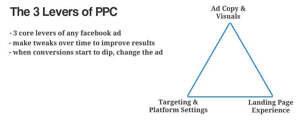
Whether you’re using paid ads or sharing content organically, there are three levers to your marketing funnel. You have the targeting, ad copy and visuals, and the landing page experience. The better you can align these three, the more likely you’ll create a successful social media funnel.

Source

Your social media copy will need to stand out in a busy social feel. To get the conversion to occur on your landing page, your social copy and the landing page copy need to align. You also want to provide a smooth user experience, which means your branding needs to be on point. 

Let me illustrate with an example from Walmart.

Walmart’s goal for this social media post appears to be two-fold: to promote its newest collaboration for increased brand awareness and get people to the Walmart website, to hopefully get them to make a purchase. 

When you click on the link, you’re directed to the Walmart website:

Notice how the copy and the visuals on social media and the website align? 

But how do you create good social media copy? Here are some tips:

  • Consider the scrolling experience: You need to make a person stop scrolling and focus on your social media content.
  • Simplify: Define the point you want to make.
  • Test and revise: Update and revise your content using data to track the effectiveness of your social media content.

Creating a successful landing page, meanwhile, is difficult. You create the first version of your page based on intuition. If you don’t have much experience creating sales or landing pages, use a proven template and update the copy and imagery.

Source

Finally, set up a tracking pixel on your landing page. You want to gather as much information about your audience as possible from the start. That way, if you want to kick off a paid retargeting campaign, you can do so fast.

Test Your Funnel 

Once your social media funnel is in play, analyze how the page is performing. You’ll want to track how people engage with your social media content and review the landing page experience and conversion rate.

There are tools you can use to monitor social media and landing page experience. Most channels have comprehensive analytics data you can review. For landing pages, you can use tools like heatmaps and screen recordings to see what people do on your sales or landing page.

Make changes to your social media funnel if things aren’t going to plan. Optimize your funnel for conversions. Once you’re satisfied with the results, start building out your funnel. For example, by running social media retargeting ads, setting up effective email campaigns using email templates, creating upsells, among others.

This ad by Alienware is running on Instagram. The visuals are eye-catching. 

The imagery aligns with the target audience’s interest. It is designed to grab the attention of someone interested in technical specifications and hardware. Click on the link, and you are taken to the following landing page.

Notice that the tagline is repeated once more on the landing page. The visual branding of the page is consistent with the ad. 

At the top of the page are a countdown timer and special offer. That’s an effective way to create Fear Of Missing Out (FOMO), which boosts conversions. The page is also optimized for mobile. That’s critical as most people browse Instagram through their phones.

Here’s another example of a social media funnel, this time from Ray-Ban. 

The presentation is in line with the interests of the target audience. Both the image and copy generate interest, too.

When you click on the link, you’re taken to this landing page. 

The landing page presents another photo of the same glasses. That serves to nurture the initial interest that caused the click-through to the website. 

The 20% off promo code at the top of the page provides a powerful incentive to browse the catalog. The warning of limited stock provides the buyer with a feeling of FOMO. It’s an effective method of boosting conversions.

Aim For Customer Engagement & Retention

The ideal outcome in a successful social media funnel would be a perpetual cycle of customer retention

Introducing social media to your marketing funnel is about more than pushing sales. It’s also about generating conversions and engagement. Social media is about building a personal community around your brand, constantly developing a stronger relationship with your audience. 

Satisfied customers are likely to re-enter the funnel with a smooth customer experience, appealing brand tone, and powerful branding. Alternatively, they may go on to recommend your business to their friends and family. 

Be prepared for the possibility that a customer -who is not yet converted- might decide to look up your company at a later date, bypassing the social media stage. So, it’s best to ensure your website is appearing high in search results. 

There are many ways to rank higher in Google search results. One proven strategy is link building through guest posts. Your team can produce guest posts, or you can turn to an external guest post service for support.

In Closing

The secret to a successful social media funnel is to come prepared. 

Know your audience before starting. Building a customer persona will allow you to refine your marketing content, catering to your audience’s specific needs or interests. 

Pay attention to how your audience is interacting with your social media channels. Don’t be afraid to make changes to your content if user engagement is low. If a marketing campaign has no traction, be ready with a replacement. 

Make sure the transition to your landing or splash page is seamless. If you don’t have much experience creating sales or landing pages, you can use a template to get you started.

Follow these tips, and your social media funnel will generate the best results.

Categories: Others Tags: