Archive

Archive for November, 2021

Creating A Social Media Funnel: A Step-By-Step Guide

November 9th, 2021 No comments

Social media is a channel to engage with your target audience and build a community around your brand.

To build a relationship with your audience, you need to do more than just share social media content. You need to develop that relationship by connecting with your audience across multiple channels.

That’s where a social media funnel comes into play. 

This step-by-step guide will teach you everything you should know about creating and refining a social media funnel. 

Identify Your Target Audience

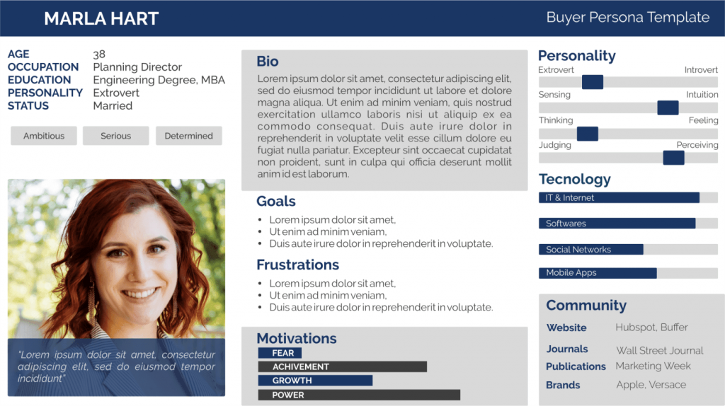
Before kicking off your marketing campaign, spend time defining your target audience. There are approaches you can take. Start by creating a simple customer persona that represents your ideal customer. 

The customer persona contains a mixture of demographic information, geographical locations, and qualitative data. It looks like this:
Source

You can build upon your customer persona using a tool like SightX. 

Creating a customer persona is critical because your funnel needs to align with your audience’s interests and pain points. The more you know your audience, the more likely you’ll design a social media funnel that converts. Also, using a social media marketing proposal can help you generate more followers and increase brand awareness. It is an additional way to get your message out there.

Design Your Marketing Funnel

Once you’re clear on your target audience, start picturing your hypothetical funnel. In general, a social media marketing funnel will aim to generate sales or other conversions.

The conversion could be getting people to follow you on another social media channel, sign up to your email list, or something else. You’ll generally send the visitor from social media to a landing page to achieve this.

Draw the basic outline of your social media funnel. Keep it simple.

Source

Don’t add upsells and complicated features at this stage until you test your funnel. You can add these things after testing and validating.

To generate that conversion, you need to provide something your target audience would find valuable—for example, you might provide a content upgrade or promise valuable information through a webinar. You’ll have to use webinar platforms for this.

Shopify, an eCommerce platform, uses webinars a lot. Check out their Facebook post on an upcoming webinar on eCommerce:

The goal, however, isn’t just to get people to the Shopify website and to sign up for the webinar. Once you click on the social media link to register, you’re directed to a landing page, which will take you to something like this when you click on the sign-up button:

Notice that Shopify asks for your email address. Then there’s that disclaimer that you agree to receive Shopify’s marketing emails when you enter your email address. In other words, Shopify’s goal is also to build its email list.

You can also offer an incentive like a discount. Or maybe you’ll offer a tripwire product to get people to buy something before offering the actual product or service you want to promote.

Once you’re happy with your funnel, it’s time to create your marketing and sales material.

Create Your Social Media Marketing Funnel

Your social media marketing funnel should be simple to start with. You need to create content for social media and a landing or sales page where you generate your conversion.

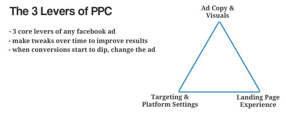
Whether you’re using paid ads or sharing content organically, there are three levers to your marketing funnel. You have the targeting, ad copy and visuals, and the landing page experience. The better you can align these three, the more likely you’ll create a successful social media funnel.
Source

Your social media copy will need to stand out in a busy social feel. To get the conversion to occur on your landing page, your social copy and the landing page copy need to align. You also want to provide a smooth user experience, which means your branding needs to be on point. 

Let me illustrate with an example from Walmart.

Walmart’s goal for this social media post appears to be two-fold: to promote its newest collaboration for increased brand awareness and get people to the Walmart website, to hopefully get them to make a purchase. 
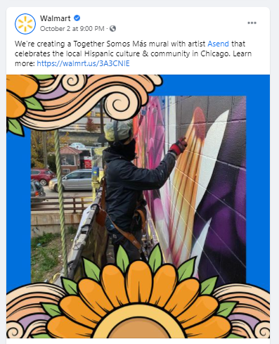
When you click on the link, you’re directed to the Walmart website:

Notice how the copy and the visuals on social media and the website align? 

But how do you create good social media copy? Here are some tips:

  • Consider the scrolling experience: You need to make a person stop scrolling and focus on your social media content.
  • Simplify: Define the point you want to make.
  • Test and revise: Update and revise your content using data to track the effectiveness of your social media content.

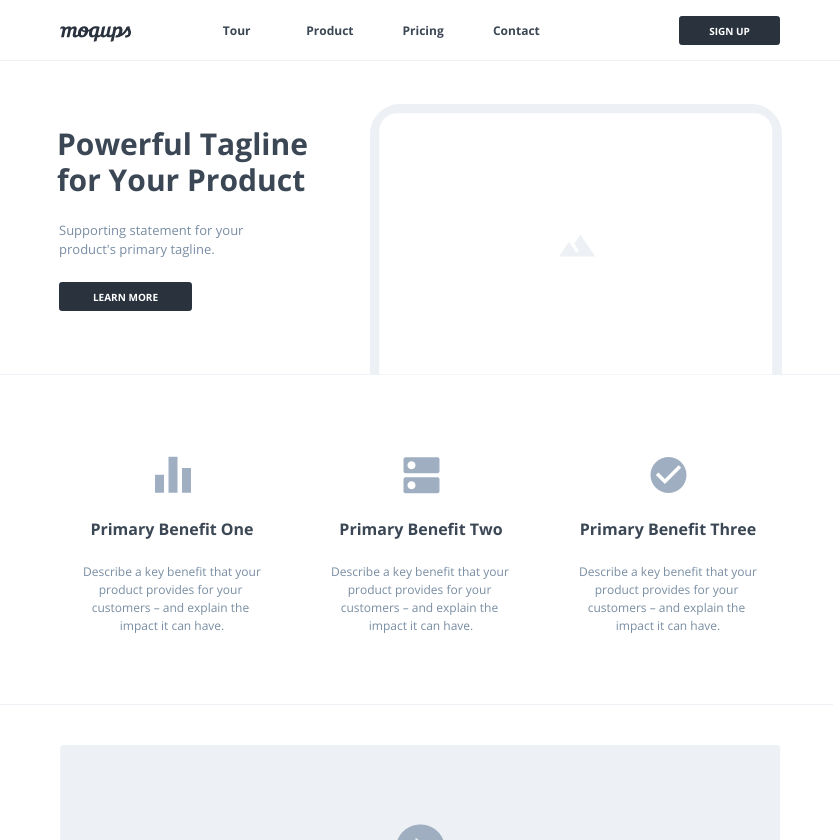
Creating a successful landing page, meanwhile, is difficult. You create the first version of your page based on intuition. If you don’t have much experience creating sales or landing pages, use a proven template and update the copy and imagery.
Source

Finally, set up a tracking pixel on your landing page. You want to gather as much information about your audience as possible from the start. That way, if you want to kick off a paid retargeting campaign, you can do so fast.

Test Your Funnel 

Once your social media funnel is in play, analyze how the page is performing. You’ll want to track how people engage with your social media content and review the landing page experience and conversion rate.

There are tools you can use to monitor social media and landing page experience. Most channels have comprehensive analytics data you can review. For landing pages, you can use tools like heatmaps and screen recordings to see what people do on your sales or landing page.

Make changes to your social media funnel if things aren’t going to plan. Optimize your funnel for conversions. Once you’re satisfied with the results, start building out your funnel. For example, by running social media retargeting ads, setting up effective email campaigns using email templates, creating upsells, among others.

This ad by Alienware is running on Instagram. The visuals are eye-catching. 

The imagery aligns with the target audience’s interest. It is designed to grab the attention of someone interested in technical specifications and hardware. Click on the link, and you are taken to the following landing page.
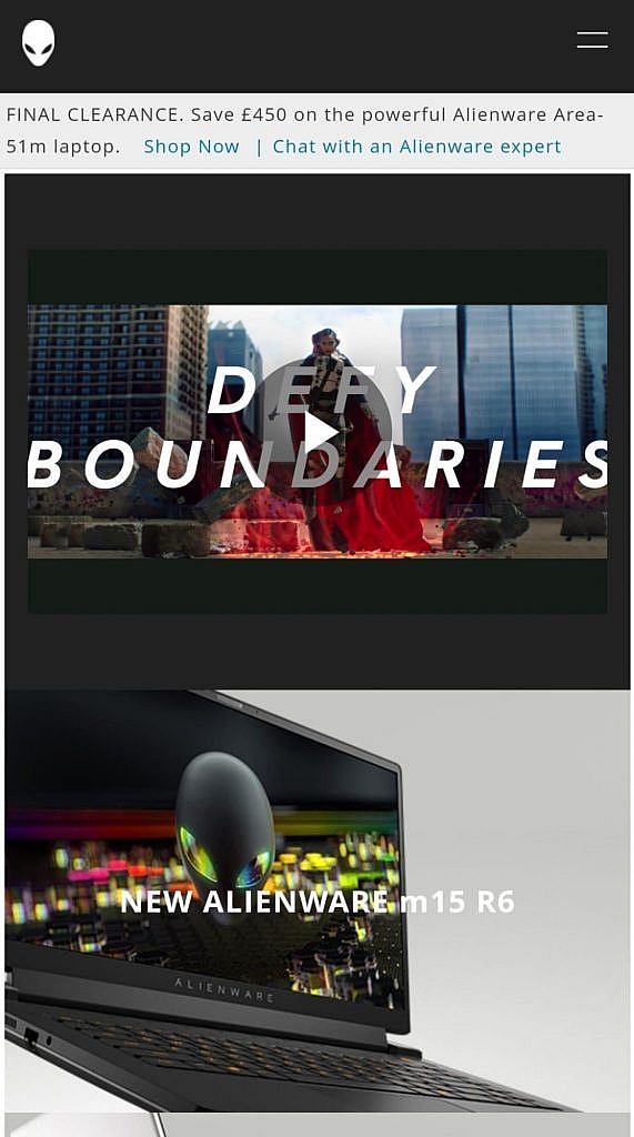
Notice that the tagline is repeated once more on the landing page. The visual branding of the page is consistent with the ad. 

At the top of the page are a countdown timer and special offer. That’s an effective way to create Fear Of Missing Out (FOMO), which boosts conversions. The page is also optimized for mobile. That’s critical as most people browse Instagram through their phones.

Here’s another example of a social media funnel, this time from Ray-Ban. 
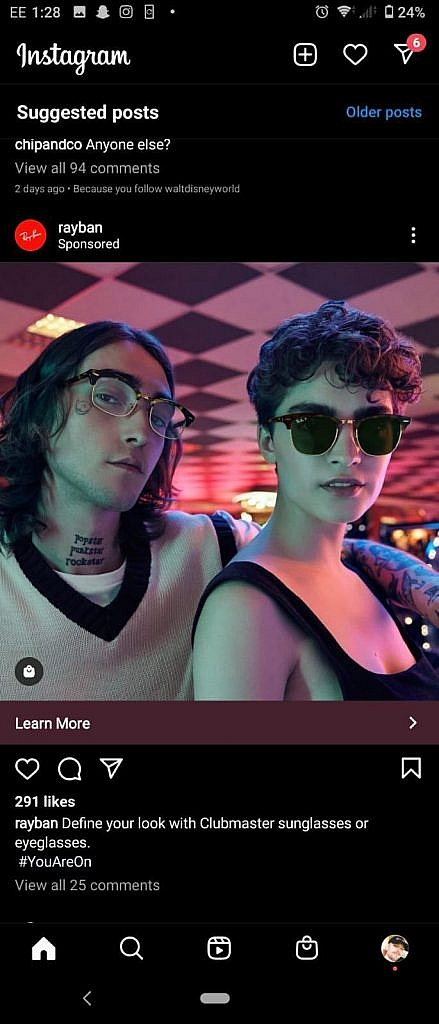
The presentation is in line with the interests of the target audience. Both the image and copy generate interest, too.

When you click on the link, you’re taken to this landing page. 
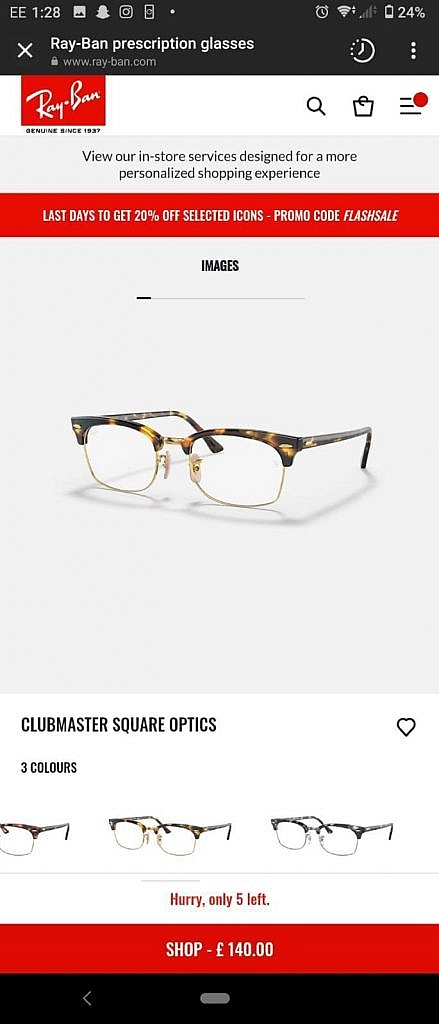
The landing page presents another photo of the same glasses. That serves to nurture the initial interest that caused the click-through to the website. 

The 20% off promo code at the top of the page provides a powerful incentive to browse the catalog. The warning of limited stock provides the buyer with a feeling of FOMO. It’s an effective method of boosting conversions.

Aim For Customer Engagement & Retention

The ideal outcome in a successful social media funnel would be a perpetual cycle of customer retention

Introducing social media to your marketing funnel is about more than pushing sales. It’s also about generating conversions and engagement. Social media is about building a personal community around your brand, constantly developing a stronger relationship with your audience. 

Satisfied customers are likely to re-enter the funnel with a smooth customer experience, appealing brand tone, and powerful branding. Alternatively, they may go on to recommend your business to their friends and family. 

Be prepared for the possibility that a customer -who is not yet converted- might decide to look up your company at a later date, bypassing the social media stage. So, it’s best to ensure your website is appearing high in search results. 

There are many ways to rank higher in Google search results. One proven strategy is link building through guest posts. Your team can produce guest posts, or you can turn to an external guest post service for support.

In Closing

The secret to a successful social media funnel is to come prepared. 

Know your audience before starting. Building a customer persona will allow you to refine your marketing content, catering to your audience’s specific needs or interests. 

Pay attention to how your audience is interacting with your social media channels. Don’t be afraid to make changes to your content if user engagement is low. If a marketing campaign has no traction, be ready with a replacement. 

Make sure the transition to your landing or splash page is seamless. If you don’t have much experience creating sales or landing pages, you can use a template to get you started.

Follow these tips, and your social media funnel will generate the best results.

Categories: Others Tags:

CSS Grid Can Do Auto Height Transitions

November 8th, 2021 No comments

Bonafide CSS trick alert! Nelson Menezes figured out a new way (that only works in Firefox for now) that is awfully clever.

Perhaps you know that CSS cannot animate to auto dimensions, which is super unfortunate. Animating from zero to “whatever is necessary” would be very helpful very often. We’ve documented the available techniques. They boil down to:

  • Animate the max-height to some more than you need value, which makes timing easing imprecise and janky.
  • Use JavaScript to measure the final size and animate to that, which means… using JavaScript.

Nelson’s technique is neither of those, nor some transform-based way with visual awkwardness. This technique uses CSS Grid at its core…

.expander {
  display: grid;
  grid-template-rows: 0fr;
  transition: grid-template-rows 1s;
}

.expander.expanded {
  grid-template-rows: 1fr;
}

Unbelievably, in Firefox, that transitions content inside that area between 0 and the natural height of the content. There is only a little more to it, like hiding overflow and visibility to make it look right while maintaining accessibility:

CodePen Embed Fallback

That’s wonderful. Let’s get some stars on this issue and maybe Chrome will pick it up. But of course, even better would be if auto height transitions just started working. I can’t imagine that’s totally outside the realm of possibility.


The post CSS Grid Can Do Auto Height Transitions appeared first on CSS-Tricks. You can support CSS-Tricks by being an MVP Supporter.

Categories: Designing, Others Tags:

Does the Next Generation of Static Site Generators Make Building Sites Better?

November 8th, 2021 No comments

Just ran across îles, a new static site generator mostly centered around Vue. The world has no particular shortage of static site generators, but it’s interesting to see what this “next generation” of SSGs seem to focus on or try to solve.

îles looks to take a heaping spoonful of inspiration from Astro. If we consider them together, along with other emerging and quickly-evolving SSGs, there is some similarities:

  • Ship zero JavaScript by default. Interactive bits are opt-in — that’s what the islands metaphor is all about. Astro and îles do it at the per-component level and SvelteKit prefers it at the page level.
  • Additional fanciness around controls for when hydration happens, like “when the browser is idle,” or “when the component is visible.”
  • Use a fast build tool, like Vite which is Go-based esbuild under the hood. Or Rust-based swc in the case of Next 12.
  • Support multiple JavaScript frameworks for componentry. Astro and îles do this out of the box, and another example is how Slinkity brings that to Eleventy.
  • File-system based routing.
  • Assumption that Markdown is used for content.

When you compare these to first-cohort SSGs, like Jekyll, I get a few feelings:

  1. These really aren’t that much different. The feature set is largely the same.
  2. The biggest change is probably that far more of them are JavaScript library based. Turns out JavaScript libraries are what really what people wanted out of HTML preprocessors, perhaps because of the strong focus on components.
  3. They are incrementally better. They are faster, the live reloading is better, the common needs have been ironed out.

The post Does the Next Generation of Static Site Generators Make Building Sites Better? appeared first on CSS-Tricks. You can support CSS-Tricks by being an MVP Supporter.

Categories: Designing, Others Tags:

Protect Your Design Clients From These 6 Easy Mistakes

November 8th, 2021 No comments

As a web designer, you’re responsible for a lot of things. Your client is relying on you to ensure that their website is user-friendly, accessible, eye-catching, and even good enough on the back-end to capture the attention of the search engines. 

However, what many business leaders and clients don’t realize is that they also have a part to play in ensuring that they get the right results from their site; there’s more to the client and contractor relationship than an exchange of funds. 

Today, we’re going to examine some of the most common mistakes that clients make when they begin working with a website designer for the first time. After all, when a client makes a mistake, it’s up to you to show them how to get back on track. 

Client Mistake 1: Providing Minimal Insight

Creativity, for the most part, is the responsibility of the designer in any web-building project. You know best what you can do for a client. 

When you’re discussing an upcoming project with a business owner, you can walk them through concepts like dark mode design or strategies for digital accessibility. However, you’re still reliant on your client to let you know if there’s anything specific they need. 

An insufficient brief in a web design project usually means that you waste time on a project because you have to go back and forth multiple times, making updates and edits. Getting a brief ironed out properly from day one can reduce misunderstandings and mistakes. 

To get your client started, ask them to share some details like:

  • Who’s the target audience? Do they have a user persona they can share?
  • What specific features does the site need? Landing pages, forms, widgets, etc.?
  • Competitor sites they like: What do they appreciate about those designs?
  • Brand colors and assets: What kind of hues and shades should you use?
  • Technical feature requirements: Does the site need to have its own app, integrate with APIs, or have a checkout solution, for instance?

Client Mistake 2: Underestimating The Workload

Perhaps one of the most common mistakes that clients make when seeking help from a designer is that they have no idea how much work it will take to create the kind of site they want. If they haven’t provided a great brief in the first place, they might not have had a chance to see all the work they’re asking for written down. Walking your client through the brief process can help here. 

On the other hand, if your client has already provided a brief, along with an unrealistic deadline for completion, you might need to have a discussion with them about what you need to do. Walking your client through some of the processes involved in creating their website could give them an insight into how long it will realistically take to bring their ideas to life. 

Additionally, ensuring that your customers fully understand the amount of work you’re taking on could also mean that they can better grasp why you’re charging a certain price for your services. That brings us neatly to the next mistake…

Client Mistake 3: Not Having The Right Budget

Pricing your design services can be a complicated process for web designers. You need to make sure that you’re charging enough to cover the cost of things like essential software and hardware for your company. At the same time, with so many other designers out there, you also need to ensure that your costs are competitive. 

After you’ve gone through the hard work of figuring out what your pricing structure should be, you also need to be capable of justifying that expense to your client. It’s common for many customers to go into their work with a web designer expecting that they’ll be able to get an entire website, blog, and app for less than a couple of hundred dollars. 

Make sure that your client is aware of your pricing immediately to avoid any confusion. If possible, have a pricing page on your website or portfolio which highlights the cost of different packages and precisely what your clients are going to get. 

If your customers can see the value in your services and even equate to an hourly workload or skillset, they might be better equipped to set the proper budget. 

Client Mistake 4: Making Too Many Technology Decisions

You’ll find that you work with many different types of client during your time as a web designer. Sometimes, you’ll have people who come to you not really knowing what they want or need. This means that you may need to spend some time speaking to them about their expectations and discussing what’s possible. 

On the other hand, there’s always a chance that you could work with a client who thinks that they should be making all of the decisions themselves. While it’s true that your client should have some control over things like the style of their website and what features it has, it’s up to you to make technical decisions like what kind of tools you’re going to use. 

If your client tries to dictate everything you do and how you’re going to do it, this could make it difficult for you to deliver your best work. Explain your processes to your customer in advance and find out why they want you to use specific technology. 

For instance, if your client wants to use a specific kind of website builder because they’ve heard it’s “the best,” you can explain what you like most about the product you’re already using. 

Client Mistake 5: Being Too Attached To An Idea

This is a problem that happens in a lot of creative industries. A client goes out and finds something that they like on another website. It might be an attractive landing page or a specific checkout process. They’re so excited by what they see there that they refuse to compromise on that idea when working with their designer – even if the concept isn’t suitable. 

For instance, your client might come to you wanting a website that’s full of dynamic animations and videos. However, if they only have a limited amount of bandwidth from their hosting provider, this could mean that they end up with a slow site that aggravates their customers. 

The best thing you can do when this happens is to present the issue to your client in a way that they can understand. For instance, if you’re worried something will slow down their website, talk to them about how speed is essential to good customer experience. You could even share some page speed stats like: if a page takes more than 3 seconds to load, over half of all visitors will abandon it. 

Seeing the stats for themselves could mean that your clients are more likely to change their minds. 

Client Mistake 6: Working With The Wrong Designer

Finally, one of the biggest mistakes any client can make is working with the wrong website designer. There are a lot of professionals out there, each with their unique skills to offer in things like UX design, ecommerce page creation, and so much more. However, it’s not always easy to know what you need as a business owner getting online for the first time. 

The good news for web design clients is that there’s a lot of information out there that you can use to get informed fast. The bad news for designers is that this means you’re going to need to work at keeping your skills on the cutting edge if you want to attract the widest selection of customers. 

To ensure that you’re more likely to be the right designer for your customers, stay up to date with the latest web design standards, and check out what’s trending in your industry. Webinars, articles, and even TED talks can be an excellent way to brush up your knowledge and make your portfolio much more appealing. 

Strengthen Your Client/Designer Relationships 

Succeeding as a web designer isn’t just about building a robust portfolio full of excellent websites where you can showcase your skills. While it’s true that you need to stay on the cutting edge with your design talents, you also need to make sure that you can create positive relationships with every client that comes to you. 

Like designers, clients can make mistakes too, but not knowing what they want, trying to take too much control, or simply failing to understand the scope of a product. Rather than letting those mistakes hold you back, prove your mettle as a designer by helping your clients navigate these issues. The result will be more streamlined project experiences, happier customers, and better reviews for your company. 


Featured image via Unsplash.

Source

The post Protect Your Design Clients From These 6 Easy Mistakes first appeared on Webdesigner Depot.

Categories: Designing, Others Tags:

Popular Design News of the Week: November 1, 2021 – November 7, 2021

November 7th, 2021 No comments

Every day design fans submit incredible industry stories to our sister-site, Webdesigner News. Our colleagues sift through it, selecting the very best stories from the design, UX, tech, and development worlds and posting them live on the site.

The best way to keep up with the most important stories for web professionals is to subscribe to Webdesigner News or check out the site regularly. However, in case you missed a day this week, here’s a handy compilation of the top curated stories from the last seven days. Enjoy!

Fresh Resources for Web Designers and Developers

The Metaverse is BS

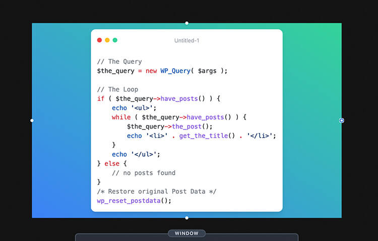
8 JavaScript Set Methods You Should Master Today

7 Web Design Tips To Improve Your Site

Visual Git

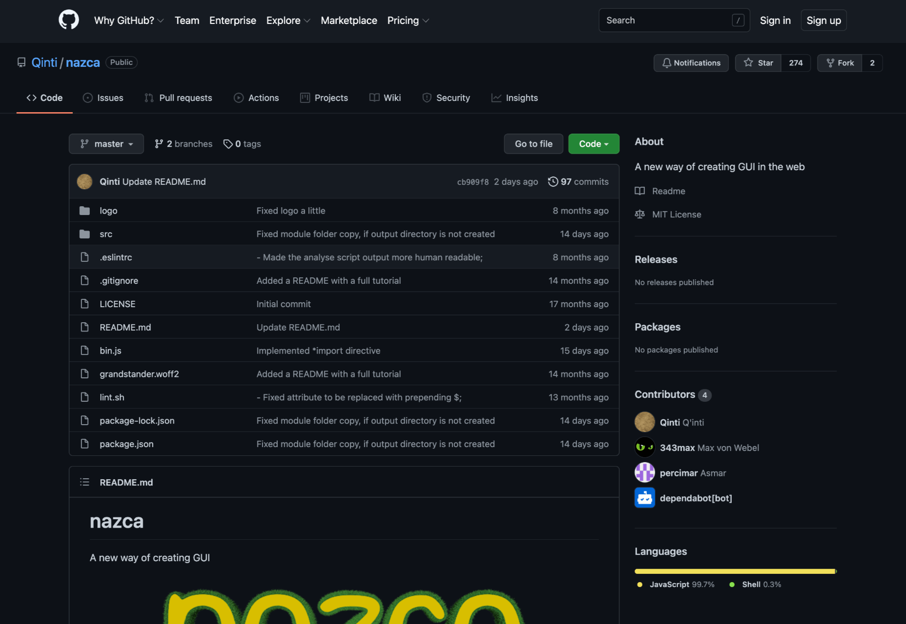
Nazca – New GUI for the Web

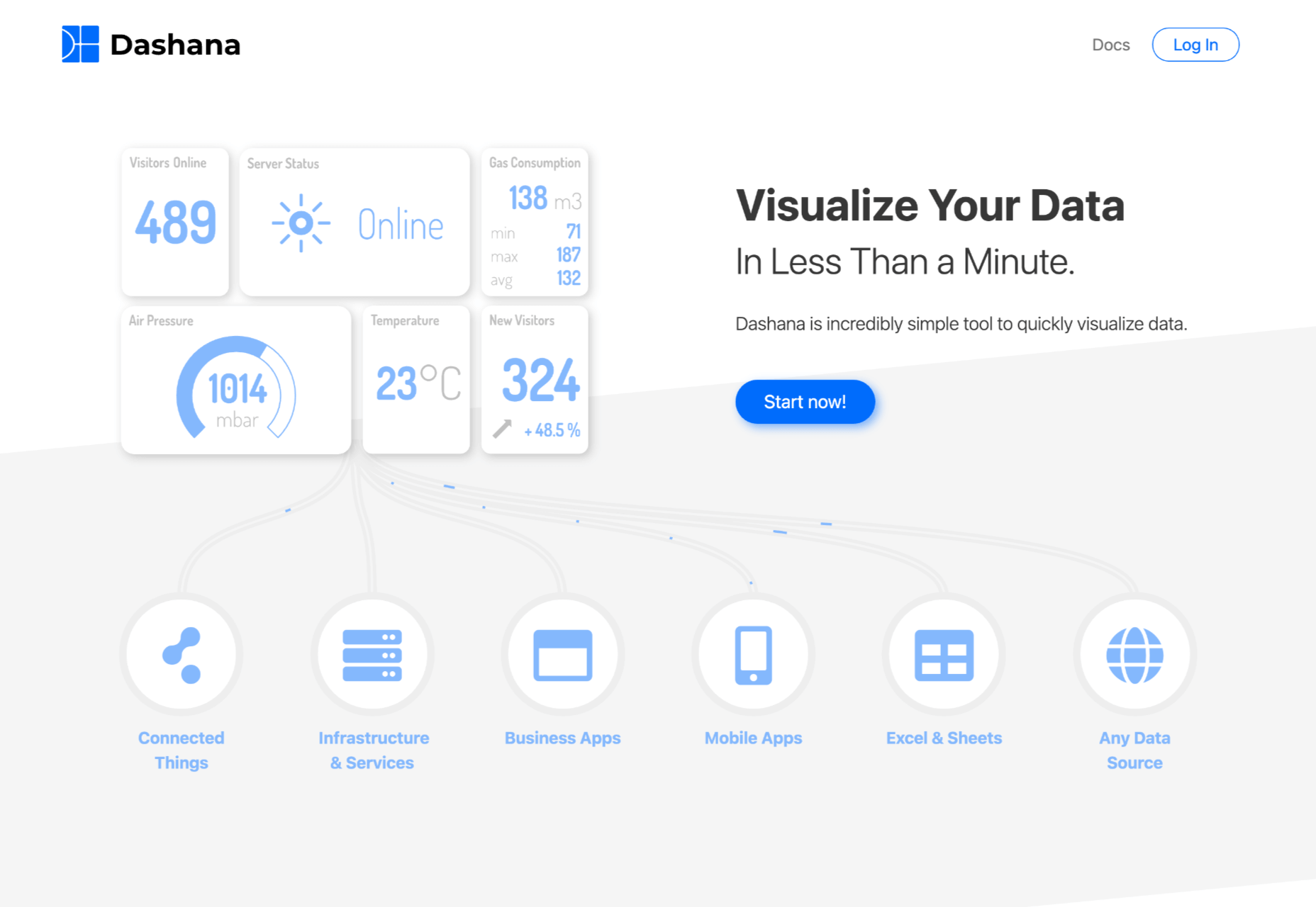
Dashana – Visualize your Data in Less than a Minute

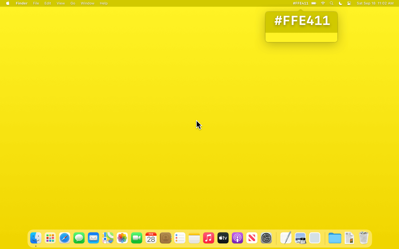
Color Peeker – Color Code in the Menu Bar

Bootstrap V4.6.1

Why We Love FIFA’s New Women’s World Cup 2023 Logo

Source

The post Popular Design News of the Week: November 1, 2021 – November 7, 2021 first appeared on Webdesigner Depot.

Categories: Designing, Others Tags:

Favicons: How to Make Sure Browsers Only Download the SVG Version

November 5th, 2021 No comments

Šime Vidas DM’d me the other day about this thread from subzey on Twitter. My HTML for favicons was like this:

<!-- Warning! Typo! -->
<link rel="icon" href="/favicon.ico" size="any">
<link rel="icon" href="/favicon.svg" type="image/svg+xml">

The attribute size is a typo there, and should be sizes. Like this:

<!-- Correcxt -->
<link rel="icon" href="/favicon.ico" sizes="any">
<link rel="icon" href="/favicon.svg" type="image/svg+xml">

And with that, Chrome no longer double downloaded both icons, and instead uses the SVG alone (as it should). Just something to watch out for. My ICO file is 5.8kb, so now that’s 5.8kb saved on every single uncached page load, which feels non-trivial to me.

Šime noted this in Web Platform News #42:

SVG favicons are supported in all modern browsers except Safari. If your website declares both an ICO (fallback) and SVG icon, make sure to add the sizes=any attribute to the ICO  to prevent Chrome from downloading and using the ICO icon instead of the SVG icon (see Chrome bug 1162276 for more info). CSS-Tricks is an example of a website that has the optimal icon markup in its  (three  elements, one each for favicon.ico, favicon.svg, and apple-touch-icon.png).

That’s note about CSS-Tricks is a bit generous in that it’s only correct because my incorrectness was pointed out ahead of time. I think the root of my typo was Andrey’s article, but that’s been fixed. Andrey’s article is still likely the best reference for the most practical favicon markup.


The post Favicons: How to Make Sure Browsers Only Download the SVG Version appeared first on CSS-Tricks. You can support CSS-Tricks by being an MVP Supporter.

Categories: Designing, Others Tags:

Yes, Design Systems Do Improve Developer Efficiency and Design Consistency

November 5th, 2021 No comments

One of the toughest things about being someone who cares deeply about design systems is making the case for a dedicated design system. Folks in leadership will often ask you to prove the value of it. Why should we care about good front-end development and consistency? Sure, sure, sure, they say—everyone wants a flashy design system—but is it worth the cost?

That question is tough because developer productivity, front-end quality, and even accessibility to some extent, are all such nebulous things. In contrast, this is one of the smartest things about Google’s Core Web Vitals because it puts a number on the problem and provides very actionable things to do next.

When it comes to design systems, we don’t really have metrics that we can point to and say “Ah, yes, I need to put folks on the design systems team so that we can push our design system up from a bad score of 60/100.” It would be neat if we did, but I don’t think we ever will.

Enter Sparkbox. They wanted to fix this by testing how much faster their eight developers were in a little test. They got their devs to make a form, by hand, and then do it again using IBM’s Carbon design system, which they’d never used before.

The results are super interesting:

Using a design system made a simple form page 47% faster to develop versus coding it from scratch. The median time for the scratch submissions was 4.2 hours compared to the 2 hour median time for Carbon submissions. The Carbon timing included the time the developers spent familiarizing themselves with the design system.

Now imagine if those devs were familiar with Carbon’s design system! If that was the case, I imagine the time to build those forms would be way, way faster than those initial results.

To Shared LinkPermalink on CSS-Tricks


The post Yes, Design Systems Do Improve Developer Efficiency and Design Consistency appeared first on CSS-Tricks. You can support CSS-Tricks by being an MVP Supporter.

Categories: Designing, Others Tags:

How to Create an Animated Chart of Nested Squares Using Masks

November 5th, 2021 No comments

We have many well-known chart types: bar, donut, line, pie, you name it. All popular chart libraries support these. Then there are the chart types that do not even have a name. Check out this dreamt-up chart with stacked (nested) squares that can help visualize relative sizes, or how different values compare to one another:

What we’re making

Without any interactivity, creating this design is fairly straightforward. One way to do it is is to stack elements (e.g. SVG elements, or even HTML divs) in decreasing sizes, where all of their bottom-left corners touch the same point.

But things get trickier once we introduce some interactivity. Here’s how it should be: When we move our mouse over one of the shapes, we want the others to fade out and move away.

We’ll create these irregular shapes using rectangles and masks — literal with and elements. If you are entirely new to masks, you are in the right place. This is an introductory-level article. If you are more seasoned, then perhaps this cut-out effect is a trick that you can take with you.

Now, before we begin, you may wonder if a better alternative to SVG to using custom shapes. That’s definitely a possibility! But drawing shapes with a can be intimidating, or even get messy. So, we’re working with “easier” elements to get the same shapes and effects.

For example, here’s how we would have to represent the largest blue shape using a .

<svg viewBox="0 0 320 320" width="320" height="320">
  <path d="M320 0H0V56H264V320H320V0Z" fill="#264653"/>
</svg>

If the 0H0V56… does not make any sense to you, check out “The SVG path Syntax: An Illustrated Guide” for a thorough explanation of the syntax.

The basics of the chart

Given a data set like this:

type DataSetEntry = {
  label: string;
  value: number;
};

type DataSet = DataSetEntry[];

const rawDataSet: DataSet = [
  { label: 'Bad', value: 1231 },
  { label: 'Beginning', value: 6321 },
  { label: 'Developing', value: 10028 },
  { label: 'Accomplished', value: 12123 },
  { label: 'Exemplary', value: 2120 }
];

…we want to end up with an SVG like this:

<svg viewBox="0 0 320 320" width="320" height="320">
  <rect width="320" height="320" y="0" fill="..."></rect>
  <rect width="264" height="264" y="56" fill="..."></rect>
  <rect width="167" height="167" y="153" fill="..."></rect>
  <rect width="56" height="56" y="264" fill="..."></rect>
  <rect width="32" height="32" y="288" fill="..."></rect>
</svg>

Determining the highest value

It will become apparent in a moment why we need the highest value. We can use the Math.max() to get it. It accepts any number of arguments and returns the highest value in a set.

const dataSetHighestValue: number = Math.max(
  ...rawDataSet.map((entry: DataSetEntry) => entry.value)
);

Since we have a small dataset, we can just tell that we will get 12123.

Calculating the dimension of the rectangles

If we look at the design, the rectangle representing the highest value (12123) covers the entire area of the chart.

We arbitrarily picked 320 for the SVG dimensions. Since our rectangles are squares, the width and height are equal. How can we make 12123 equal to 320? How about the less “special” values? How big is the 6321 rectangle?

Asked another way, how do we map a number from one range ([0, 12123]) to another one ([0, 320])? Or, in more math-y terms, how do we scale a variable to an interval of [a, b]?

For our purposes, we are going to implement the function like this:

const remapValue = (
  value: number,
  fromMin: number,
  fromMax: number,
  toMin: number,
  toMax: number
): number => {
  return ((value - fromMin) / (fromMax - fromMin)) * (toMax - toMin) + toMin;
};

remapValue(1231, 0, 12123, 0, 320); // 32
remapValue(6321, 0, 12123, 0, 320); // 167
remapValue(12123, 0, 12123, 0, 320); // 320

Since we map values to the same range in our code, instead of passing the minimums and maximums over and over, we can create a wrapper function:

const valueRemapper = (
  fromMin: number,
  fromMax: number,
  toMin: number,
  toMax: number
) => {
  return (value: number): number => {
    return remapValue(value, fromMin, fromMax, toMin, toMax);
  };
};

const remapDataSetValueToSvgDimension = valueRemapper(
  0,
  dataSetHighestValue,
  0,
  svgDimension
);

We can use it like this:

remapDataSetValueToSvgDimension(1231); // 32
remapDataSetValueToSvgDimension(6321); // 167
remapDataSetValueToSvgDimension(12123); // 320

Creating and inserting the DOM elements

What remains has to do with DOM manipulation. We have to create the and the five elements, set their attributes, and append them to the DOM. We can do all this with the basic createElementNS, setAttribute, and the appendChild functions.

Notice that we are using the createElementNS instead of the more common createElement. This is because we are working with an SVG. HTML and SVG elements have different specs, so they fall under a different namespace URI. It just happens that the createElement conveniently uses the HTML namespace! So, to create an SVG, we have to be this verbose:

document.createElementNS('http://www.w3.org/2000/svg', 'svg') as SVGSVGElement;

Surely, we can create another helper function:

const createSvgNSElement = (element: string): SVGElement => {
  return document.createElementNS('http://www.w3.org/2000/svg', element);
};

When we are appending the rectangles to the DOM, we have to pay attention to their order. Otherwise, we would have to specify the z-index explicitly. The first rectangle has to be the largest, and the last rectangle has to be the smallest. Best to sort the data before the loop.

const data = rawDataSet.sort(
  (a: DataSetEntry, b: DataSetEntry) => b.value - a.value
);

data.forEach((d: DataSetEntry, index: number) => {
  const rect: SVGRectElement = createSvgNSElement('rect') as SVGRectElement;
  const rectDimension: number = remapDataSetValueToSvgDimension(d.value);

  rect.setAttribute('width', `${rectDimension}`);
  rect.setAttribute('height', `${rectDimension}`);
  rect.setAttribute('y', `${svgDimension - rectDimension}`);

  svg.appendChild(rect);
});

The coordinate system starts from the top-left; that’s where the [0, 0] is. We are always going to draw the rectangles from the left side. The x attribute, which controls the horizontal position, defaults to 0, so we don’t have to set it. The y attribute controls the vertical position.

To give the visual impression that all of the rectangles originate from the same point that touches their bottom-left corners, we have to push the rectangles down so to speak. By how much? The exact amount that the rectangle does not fill. And that value is the difference between the dimension of the chart and the particular rectangle. If we put all the bits together, we end up with this:

CodePen Embed Fallback

We already added the code for the animation to this demo using CSS.

Cutout rectangles

We have to turn our rectangles into irregular shapes that sort of look like the number seven, or the letter L rotated 180 degrees.

If we focus on the “missing parts” then we can see they cutouts of the same rectangles we’re already working with.

We want to hide those cutouts. That’s how we are going to end up with the L-shapes we want.

Masking 101

A mask is something you define and later apply to an element. Typically, the mask is inlined in the element it belongs to. And, generally, it should have a unique id because we have to reference it in order to apply the mask to an element.

<svg>
  <mask id="...">
    <!-- ... -->
  </mask>
</svg>

In the tag, we put the shapes that serve as the actual masks. We also apply the mask attribute to the elements.

<svg>
  <mask id="myCleverlyNamedMask">
    <!-- ... -->
  </mask>
  <rect mask="url(#myCleverlyNamedMask)"></rect>
</svg>

That’s not the only way to define or apply a mask, but it’s the most straightforward way for this demo. Let’s do a bit of experimentation before writing any code to generate the masks.

We said that we want to cover the cutout areas that match the sizes of the existing rectangles. If we take the largest element and we apply the previous rectangle as a mask, we end up with this code:

<svg viewBox="0 0 320 320" width="320" height="320">
  <mask id="theMask">
    <rect width="264" height="264" y="56" fill=""></rect>
  </mask>
  <rect width="320" height="320" y="0" fill="#264653" mask="url(#theMask)"></rect>
</svg>

The element inside the mask needs a fill value. What should that be? We’ll see entirely different results based on the fill value (color) we choose.

The white fill

If we use a white value for the fill, then we get this:

Now, our large rectangle is the same dimension as the masking rectangle. Not exactly what we wanted.

The black fill

If we use a black value instead, then it looks like this:

We don’t see anything. That’s because what is filled with black is what becomes invisible. We control the visibility of masks using white and black fills. The dashed lines are there as a visual aid to reference the dimensions of the invisible area.

The gray fill

Now let’s use something in-between white and black, say gray:

It’s neither fully opaque or solid; it’s transparent. So, now we know we can control the “degree of visibility” here by using something different than white and black values which is a good trick to keep in our back pockets.

The last bit

Here’s what we’ve covered and learned about masks so far:

  • The element inside the controls the dimension of the masked area.
  • We can make the contents of the masked area visible, invisible, or transparent.

We have only used one shape for the mask, but as with any general purpose HTML tag, we can nest as many child elements in there as we want. In fact, the trick to achieve what we want is using two SVG elements. We have to stack them one on top of the other:

<svg viewBox="0 0 320 320" width="320" height="320">
  <mask id="maskW320">
    <rect width="320" height="320" y="0" fill="???"></rect>
    <rect width="264" height="264" y="56" fill="???"></rect>
  </mask>
  <rect width="320" height="320" y="0" fill="#264653" mask="url(#maskW320)"></rect>
</svg>

One of our masking rectangles is filled with white; the other is filled with black. Even if we know the rules, let’s try out the possibilities.

<mask id="maskW320">
  <rect width="320" height="320" y="0" fill="black"></rect>
  <rect width="264" height="264" y="56" fill="white"></rect>
</mask>

The is the dimension of the largest element and the largest element is filled with black. That means everything under that area is invisible. And everything under the smaller rectangle is visible.

Now let’s do flip things where the black rectangle is on top:

<mask id="maskW320">
  <rect width="320" height="320" y="0" fill="white"></rect>
  <rect width="264" height="264" y="56" fill="black"></rect>
</mask>

This is what we want!

Everything under the largest white-filled rectangle is visible, but the smaller black rectangle is on top of it (closer to us on the z-axis), masking that part.

Generating the masks

Now that we know what we have to do, we can create the masks with relative ease. It’s similar to how we generated the colored rectangles in the first place — we create a secondary loop where we create the mask and the two rects.

This time, instead of appending the rects directly to the SVG, we append it to the mask:

data.forEach((d: DataSetEntry, index: number) => {
  const mask: SVGMaskElement = createSvgNSElement('mask') as SVGMaskElement;

  const rectDimension: number = remapDataSetValueToSvgDimension(d.value);
  const rect: SVGRectElement = createSvgNSElement('rect') as SVGRectElement;

  rect.setAttribute('width', `${rectDimension}`);
  // ...setting the rest of the attributes...

  mask.setAttribute('id', `maskW${rectDimension.toFixed()}`);

  mask.appendChild(rect);

  // ...creating and setting the attributes for the smaller rectangle...

  svg.appendChild(mask);
});

data.forEach((d: DataSetEntry, index: number) => {
    // ...our code to generate the colored rectangles...
});

We could use the index as the mask’s ID, but this seems a more readable option, at least to me:

mask.setAttribute('id', `maskW${rectDimension.toFixed()}`); // maskW320, masW240, ...

As for adding the smaller rectangle in the mask, we have easy access the value we need because we previously ordered the rectangle values from highest to lowest. That means the next element in the loop is the smaller rectangle, the one we should reference. And we can do that by its index.

// ...previous part where we created the mask and the rectangle...

const smallerRectIndex = index + 1;

// there's no next one when we are on the smallest
if (data[smallerRectIndex] !== undefined) {
  const smallerRectDimension: number = remapDataSetValueToSvgDimension(
    data[smallerRectIndex].value
  );
  const smallerRect: SVGRectElement = createSvgNSElement(
    'rect'
  ) as SVGRectElement;

  // ...setting the rectangle attributes...

  mask.appendChild(smallerRect);
}

svg.appendChild(mask);

What is left is to add the mask attribute to the colored rectangle in our original loop. It should match the format we chose:

rect.setAttribute('mask', `url(#maskW${rectDimension.toFixed()})`); // maskW320, maskW240, ...

The final result

And we are done! We’ve successfully made a chart that’s made out of nested squares. It even comes apart on mouse hover. And all it took was some SVG using the element to draw the cutout area of each square.

CodePen Embed Fallback

The post How to Create an Animated Chart of Nested Squares Using Masks appeared first on CSS-Tricks. You can support CSS-Tricks by being an MVP Supporter.

Categories: Designing, Others Tags:

Introducing Svelte, and Comparing Svelte with React and Vue

November 4th, 2021 No comments

Josh Collingsworth is clearly a big fan of Svelte, so while this is a fun and useful comparison article, it’s here to crown Svelte the winner all the way through.

A few things I find compelling:

One of the things I like most about Svelte is its HTML-first philosophy. With few exceptions, Svelte code is entirely browser-readable HTML and JavaScript. In fact, technically, you could call Svelte code as a small superset of HTML.

And:

Svelte is reactive by default. This means when a variable is reassigned, every place it’s used or referenced also updates automatically. (React and Vue both require you to explicitly initialize reactive variables.)

I do find the component format nice to look at, like how you just write HTML. You don’t even need a around it, or to return anything. I imagine Astro took inspiration from this in how you can also just chuck a tag in there and scope styles if you want. But I think I prefer how the “fenced” JavaScript at the top only runs during the build by default.


P.S. I really like Josh’s header/footer random square motif so I tried to reverse engineer it:

CodePen Embed Fallback

To Shared LinkPermalink on CSS-Tricks


The post Introducing Svelte, and Comparing Svelte with React and Vue appeared first on CSS-Tricks. You can support CSS-Tricks by being an MVP Supporter.

Categories: Designing, Others Tags:

Fixing the Drift in Shape Rotations

November 4th, 2021 No comments

Steve Ruiz calls this post an “extra-obscure edition of design tool micro-UX,” but I find it fascinating! If you select a bunch of elements in a design tool, then rotate then, then later select those same elements and try to rotate them back, you’ll find they have “drifted” a bit from the original location.

It’s because the selection of elements needs to rotate around a center (the transform-origin, in CSS parlance), but where that center is located is calculated differently post-rotation. The trick, if any particular design tool cares to fix it:

[…] here’s the fix: once a user starts a rotation, we hold onto the the center point; if the user rotates again, we re-use that same point; and we only give it up once the user makes a new selection.

There’s a related tweet thread.

To Shared LinkPermalink on CSS-Tricks


The post Fixing the Drift in Shape Rotations appeared first on CSS-Tricks. You can support CSS-Tricks by being an MVP Supporter.

Categories: Designing, Others Tags: