Archive

Archive for December, 2021

Honor prefers-color-scheme in the CSS Paint API with Custom Properties

December 27th, 2021 No comments
An 8-bit illustration landscape of a forest with scattered pine trees and a jagged river running through the green land.

One of the coolest things I’ve been messing with in the last couple years is the CSS Paint API. I love it. I did a talk on it, and made a little gallery of my own paint worklets. The other cool thing is the prefers-color-scheme media query and how you can use it to adapt to a user’s preference for light or dark modes.

Recently, I found out that I can combine both of these really cool things with CSS custom properties in such a way that a paint worklet’s appearance can be tailored to fit the user’s preferred color scheme!

Setting the stage

I’ve been overdue for a website overhaul, and I decided to go with a Final Fantasy II theme. My first order of business was to make a paint worklet that was a randomly generated Final Fantasy-style landscape I named overworld.js:

A randomly generated 8-bit style landscape, made possible by the CSS Paint API!

It could use a bit more dressing up—and that’s certainly on the agenda—but this here is a damn good start!

After I finished the paint worklet, I went on to work on other parts of the website, such as a theme switcher for light and dark modes. It was then that I realized that the paint worklet wasn’t adapting to these preferences. This might normally be a huge pain, but with CSS custom properties, I realized I could adapt the paint worklet’s rendering logic to a user’s preferred color scheme with relative ease!

Setting up the custom properties for the paint worklet

The state of CSS these days is pretty dope, and CSS custom properties are one such example of aforementioned dopeness. To make sure both the Paint API and custom properties features are supported, you do a little feature check like this:

const paintAPISupported = "registerProperty" in window.CSS && "paintWorklet" in window.CSS`

The first step is to define your custom properties, which involves the CSS.registerProperty method. That looks something like this:

CSS.registerProperty({
  name,             // The name of the property
  syntax,           // The syntax (e.g., <number>, <color>, etc.)
  inherits,         // Whether the value can be inherited by other properties
  initialValue      // The default value
});

Custom properties are the best part of using the Paint API, as these values are specified in CSS, but readable in the paint worklet context. This gives developers a super convenient way to control how a paint worklet is rendered—entirely in CSS.

For the overworld.js paint worklet, the custom properties are used to define the colors for various parts of the randomly generated landscape—the grass and trees, the river, the river banks, and so on. Those color defaults are for the light mode color scheme.

The way I register these properties is to set up everything in an object that I call with Object.entries and then loop over the entries. In the case of my overworld.js paint worklet, that looked like this:

// Specify the paint worklet's custom properties
const properties = {
  "--overworld-grass-green-color": {
    syntax: "<color>",
    initialValue: "#58ab1d"
  },
  "--overworld-dark-rock-color": {
    syntax: "<color>",
    initialValue: "#a15d14"
  },
  "--overworld-light-rock-color": {
    syntax: "<color>",
    initialValue: "#eba640"
  },
  "--overworld-river-blue-color": {
    syntax: "<color>",
    initialValue: "#75b9fd"
  },
  "--overworld-light-river-blue-color": {
    syntax: "<color>",
    initialValue: "#c8e3fe"
  }
};

// Register the properties
Object.entries(properties).forEach(([name, { syntax, initialValue }]) => {
  CSS.registerProperty({
    name,
    syntax,
    inherits: false,
    initialValue
  });
});

// Register the paint worklet
CSS.paintWorklet.addModule("/worklets/overworld.js");

Because every property sets an initial value, you don’t have to specify any custom properties when you call the paint worklet later. However, because the default values for these properties can be overridden, they can be adjusted when users express a preference for a color scheme.

Adapting to a user’s preferred color scheme

The website refresh I’m working on has a settings menu that’s accessible from the site’s main navigation. From there, users can adjust a number of preferences, including their preferred color scheme:

The color scheme setting cycles through three options:

  • System
  • Light
  • Dark

“System” defaults to whatever the user has specified in their operating system’s settings. The last two options override the user’s operating system-level setting by setting a light or dark class on the element, but in the absence of an explicit, the “System” setting relies on whatever is specified in the prefers-color-scheme media queries.

The hinge for this override depends on CSS variables:

/* Kicks in if the user's site-level setting is dark mode */
html.dark { 
  /* (I'm so good at naming colors) */
  --pink: #cb86fc;
  --firion-red: #bb4135;
  --firion-blue: #5357fb;
  --grass-green: #3a6b1a;
  --light-rock: #ce9141;
  --dark-rock: #784517;
  --river-blue: #69a3dc;
  --light-river-blue: #b1c7dd;
  --menu-blue: #1c1f82;
  --black: #000;
  --white: #dedede;
  --true-black: #000;
  --grey: #959595;
}

/* Kicks in if the user's system setting is dark mode */
@media screen and (prefers-color-scheme: dark) {
  html {
    --pink: #cb86fc;
    --firion-red: #bb4135;
    --firion-blue: #5357fb;
    --grass-green: #3a6b1a;
    --light-rock: #ce9141;
    --dark-rock: #784517;
    --river-blue: #69a3dc;
    --light-river-blue: #b1c7dd;
    --menu-blue: #1c1f82;
    --black: #000;
    --white: #dedede;
    --true-black: #000;
    --grey: #959595;
  }
}

/* Kicks in if the user's site-level setting is light mode */
html.light {
  --pink: #fd7ed0;
  --firion-red: #bb4135;
  --firion-blue: #5357fb;
  --grass-green: #58ab1d;
  --dark-rock: #a15d14;
  --light-rock: #eba640;
  --river-blue: #75b9fd;
  --light-river-blue: #c8e3fe;
  --menu-blue: #252aad;
  --black: #0d1b2a;
  --white: #fff;
  --true-black: #000;
  --grey: #959595;
}

/* Kicks in if the user's system setting is light mode */
@media screen and (prefers-color-scheme: light) {
  html {
    --pink: #fd7ed0;
    --firion-red: #bb4135;
    --firion-blue: #5357fb;
    --grass-green: #58ab1d;
    --dark-rock: #a15d14;
    --light-rock: #eba640;
    --river-blue: #75b9fd;
    --light-river-blue: #c8e3fe;
    --menu-blue: #252aad;
    --black: #0d1b2a;
    --white: #fff;
    --true-black: #000;
    --grey: #959595;
  }
}

It’s repetitive—and I’m sure someone out there knows a better way—but it gets the job done. Regardless of the user’s explicit site-level preference, or their underlying system preference, the page ends up being reliably rendered in the appropriate color scheme.

Setting custom properties on the paint worklet

If the Paint API is supported, a tiny inline script in the document applies a paint-api class to the element.

/* The main content backdrop rendered at a max-width of 64rem.
   We don't want to waste CPU time if users can't see the
   background behind the content area, so we only allow it to
   render when the screen is 64rem (1024px) or wider. */
@media screen and (min-width: 64rem) {
  .paint-api .backdrop {
    background-image: paint(overworld);
    position: fixed;
    top: 0;
    left: 0;
    width: 100%;
    height: 100%;
    z-index: -1;

    /* These oh-so-well-chosen property names refer to the
       theme-driven CSS variables that vary according to
       the user's preferred color scheme! */
    --overworld-grass-green-color: var(--grass-green);
    --overworld-dark-rock-color: var(--dark-rock);
    --overworld-light-rock-color: var(--light-rock);
    --overworld-river-blue-color: var(--river-blue);
    --overworld-light-river-blue-color: var(--light-river-blue);
  }
}

There’s some weirdness here for sure. For some reason, that may or may not be the case later on—but is at least the case as I write this—you can’t render a paint worklet’s output directly on the element.

Plus, because some pages can be quite tall, I don’t want the entire page’s background to be filled with randomly generated (and thus potentially expensive) artwork. To get around this, I render the paint worklet in an element that uses fixed positioning that follows the user as they scroll down, and occupies the entire viewport.

All quirks aside, the magic here is that the custom properties for the paint worklet are based on the user’s system—or site-level—color scheme preference because the CSS variables align with that preference. In the case of the overworld paint worklet, that means I can adjust its output to align with the user’s preferred color scheme!

Not bad! But this isn’t even that inventive of a way to control how paint worklets render. If I wanted, I could add some extra details that would only appear in a specific color scheme, or do other things to radically change the rendering or add little easter eggs. While I learned a lot this year, I think this intersection of APIs was one of my favorites.

Categories: Designing, Others Tags:

Popular Design News of the Week: December 20, 2021 – December 26, 2021

December 26th, 2021 No comments

Every day design fans submit incredible industry stories to our sister-site, Webdesigner News. Our colleagues sift through it, selecting the very best stories from the design, UX, tech, and development worlds and posting them live on the site.

The best way to keep up with the most important stories for web professionals is to subscribe to Webdesigner News or check out the site regularly. However, in case you missed a day this week, here’s a handy compilation of the top curated stories from the last seven days. Enjoy!

Logo Design Trends 2022: The Future of Logos

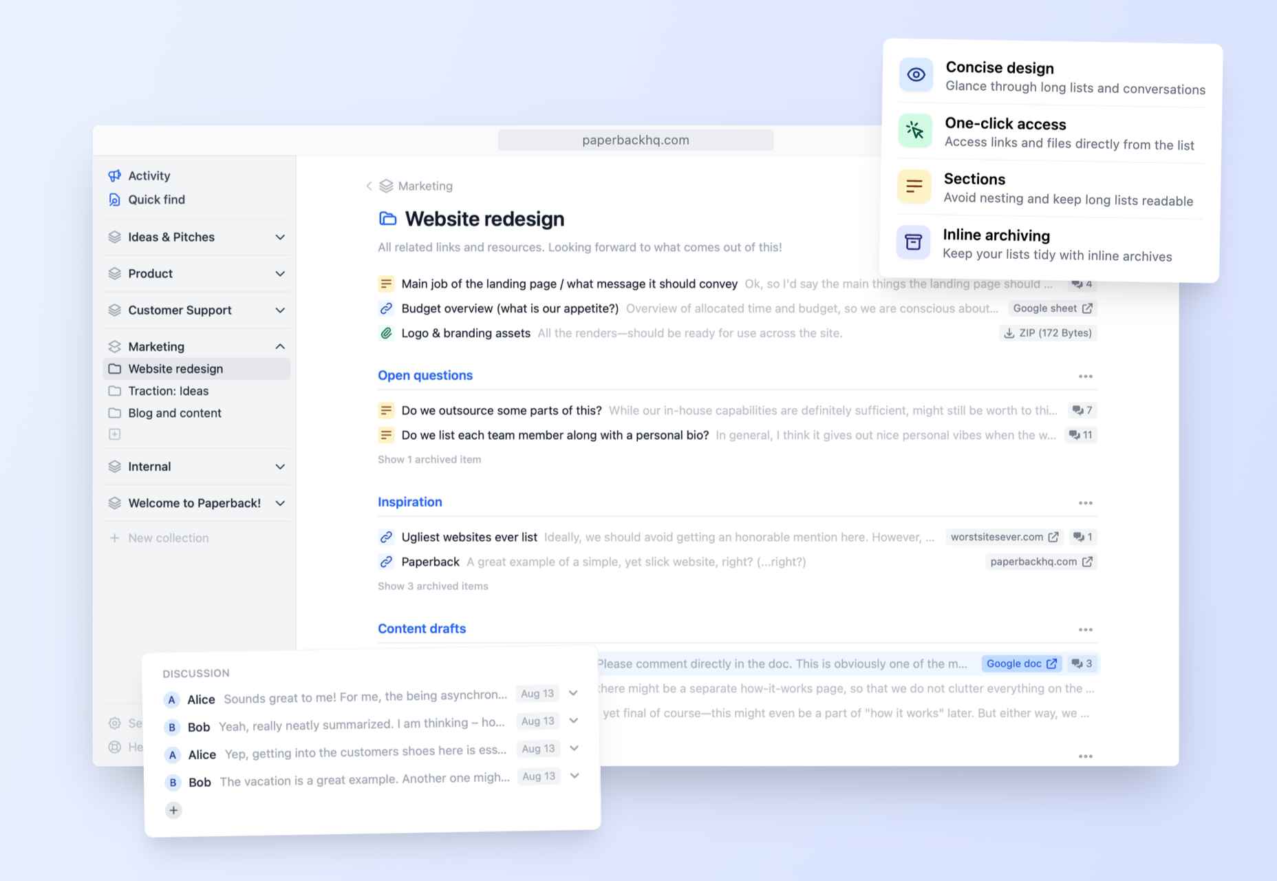
Paperback – Simpler and Tidier Alternative to Wiki Pages

10 Captivating Examples of the Liquid Metal Effect in Web Design

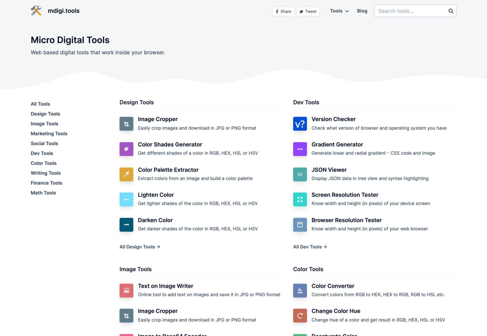
Micro Digital Tools

Master Typography for Free with Google Fonts Knowledge

Windows 11 Officially Shuts Down Firefox’s Default Browser Workaround

40+ Most Notable Big Name Brands That are Using WordPress

Pixel Patterns

Top Web Design and UI Trends for 2022

WordPress 5.9 Delayed Until January 2022

Source

The post Popular Design News of the Week: December 20, 2021 – December 26, 2021 first appeared on Webdesigner Depot.

Categories: Designing, Others Tags:

The Case for Building More Dynamic Landing Pages

December 24th, 2021 No comments

According to Klipfolio research, users spend on average 52 seconds on a webpage. With minimal time to impress, you must consider how to best help your consumers understand what your product or service does and why they should care about it. It’s not enough to describe your value – great landing pages will go the extra step and show this as well.

One powerful method to do this is by providing a real-life, responsive teaser to show what your product looks like, how it works, and what value it can create. This means incorporating specific elements from your functional, responsive product into the landing page. However, this should be a “mini-product experience” that users can experiment with rather than a freemium version of your product. If done well, the dynamics will pay off in captivating users for longer, increasing their consideration time, and driving your conversion rate as a result.

Building more dynamic landing pages through product experience can change the game completely. These are some strategies to consider.

“Ask & Alter” for Greater Personalization

“Ask & alter” is valuable for services with multiple potential value propositions for different audiences. The simple fix here is to have a pop-up box that asks the visitor which profile they are (and alternatively a few more questions). You can then trigger the page to alter according to their input, ensuring a more customized experience and increasing their chance of conversion. By doing this, you’re taking the onus off the consumer to figure out what’s relevant to them, eliminating any potential confusion.

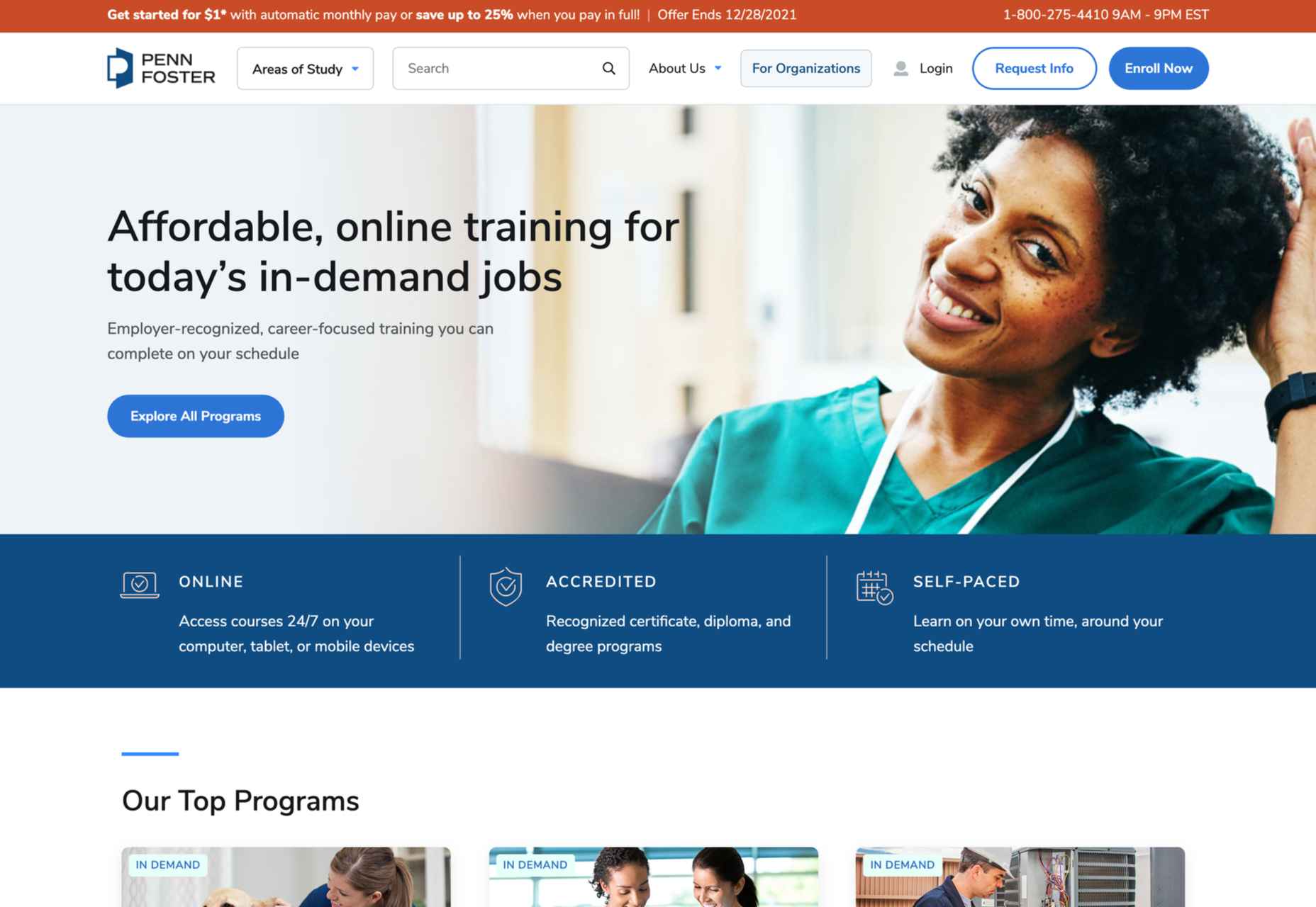
A great example of this is the Penn Foster University website. It has a developed UX optimized for organizations, high school degree seekers, and upskillers alike. Each has an entirely different, carefully designed interface, matching the diverse needs of visitors. For example, while a high schooler might enjoy browsing the career pathways section, an upskiller is likely to search specific career fields. Such distinction is key to consider, as intentional and strategic user experience can raise conversion rates by as much as 400%.

Real-Time Demos to Hook the User

Real-time demos mean that you take a full instance or version of your product that is clickable and responsive and embed it into the flow of your landing page. This way, the user can get a quick “test drive,” and you easily communicate the value that would otherwise be abstract or difficult for the user to imagine or even visualize. Additionally, users always want to know how a product could personally impact them, and live demos offer them a hands-on experience.

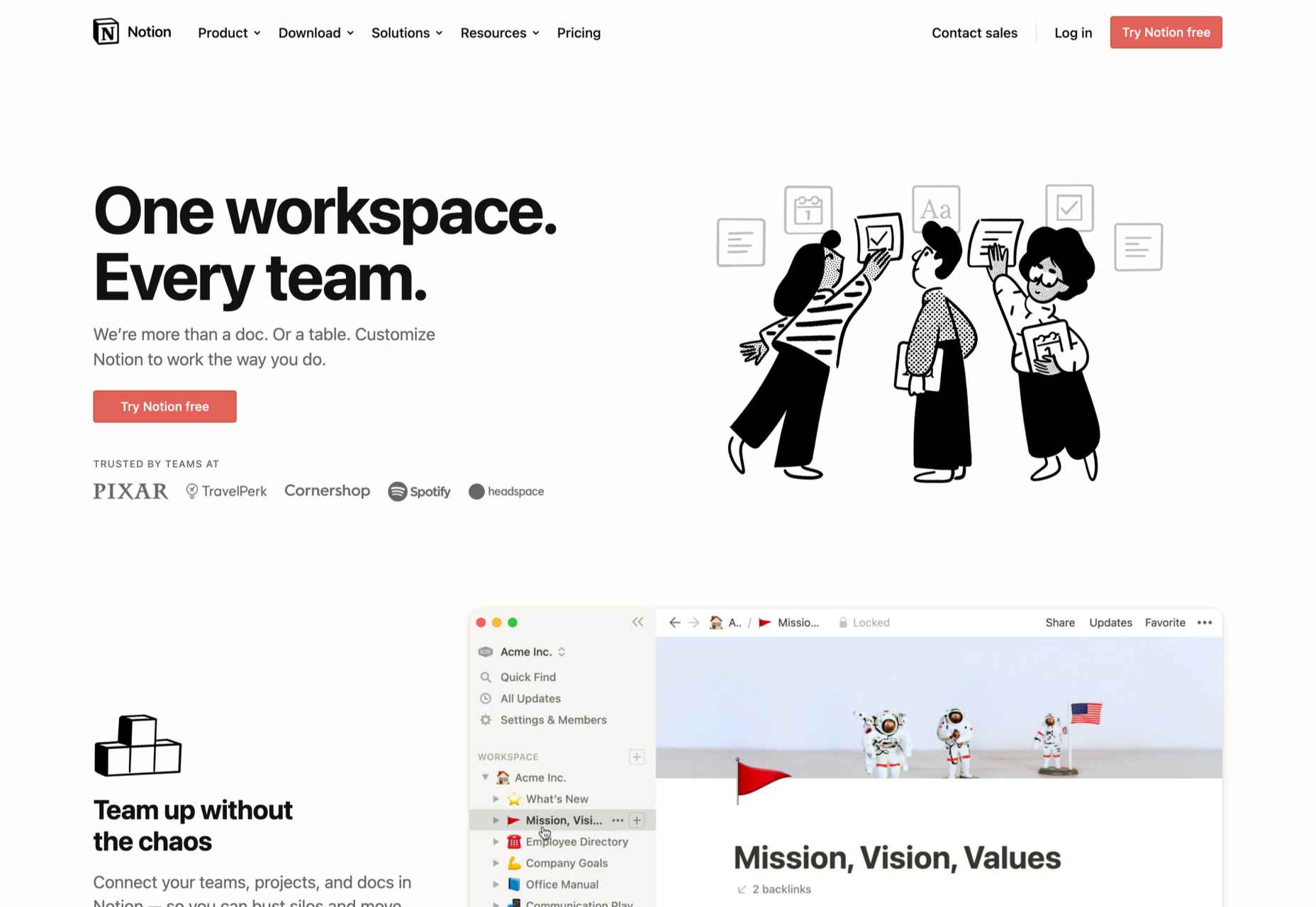
Companies incorporating live demos have proven the power to engage a user’s curiosity and create a strong link with their products or services. Notion, for instance, uses a “templates” section with pre-built pages that can be easily opened and browsed through without needing to register or download anything. This product’s beauty lies in the simplicity and efficiency it offers, rather than overwhelming a user with a self-promotional copy. Even a simple live demo like that can help build considerable trust in the product and encourage users to make a high-value purchase.

Calculators Provide Value

Despite their simplicity, calculators can increase audience engagement by 38%. Their main benefit is undoubtedly providing a personalized solution to users’ actual needs and expectations. ROI and savings calculators can be particularly interesting, especially when they speak of value that isn’t easy to calculate or when the user wouldn’t intuitively know that there are savings to be had by using a particular product.

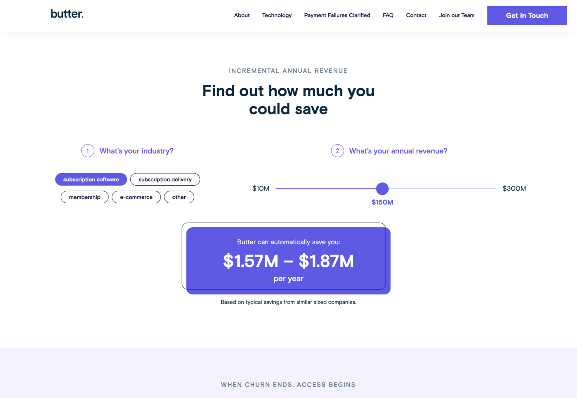
Butter Payment, uses this tool very effectively. As its customers necessarily don’t know they have an involuntary churn problem that is worth solving for, it uses a calculator on its site to demonstrate the problem and enumerate the value-add to potential customers.

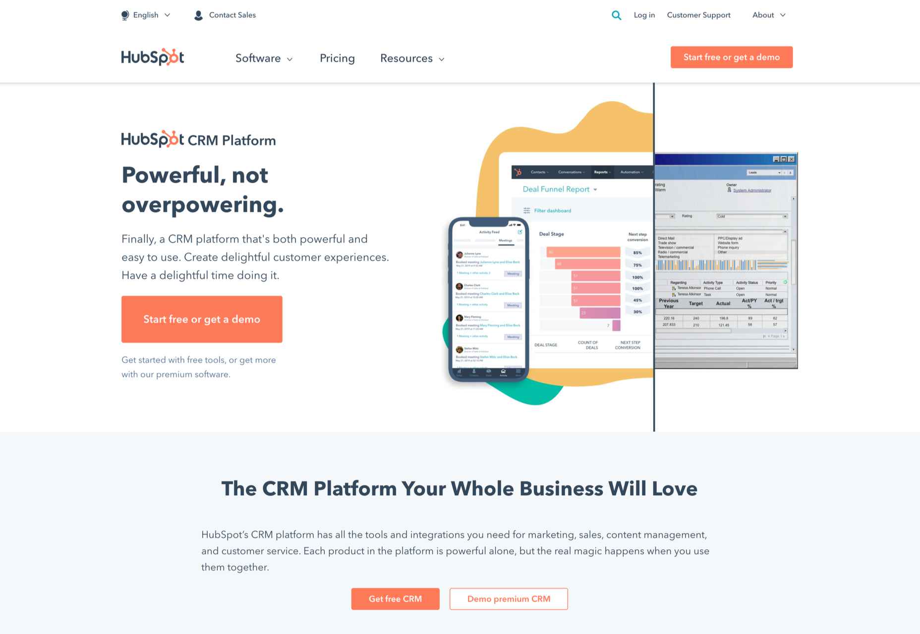
HubSpot, too, has mastered the tool: Its Ad ROI Calculator visually presents the results that its software can bring. Then, HubSpot’s interactive website grader directs the user towards its comprehensive marketing offerings. It is this graphic visualization that companies must adopt to communicate real value.

The Charm of Experiential Interaction

Interactive design is said to drive the responsiveness and real-time interaction of a site through the roof. By incorporating an interactive or experiential page, even if it’s not directly on your landing page, you can craft a unique experience aimed at leaving a lasting, meaningful impression of your product or service.

Calm’s “Do Nothing for two minutes” is a simple yet effective way to show users the value of meditation in their daily life and lead them to download the app.

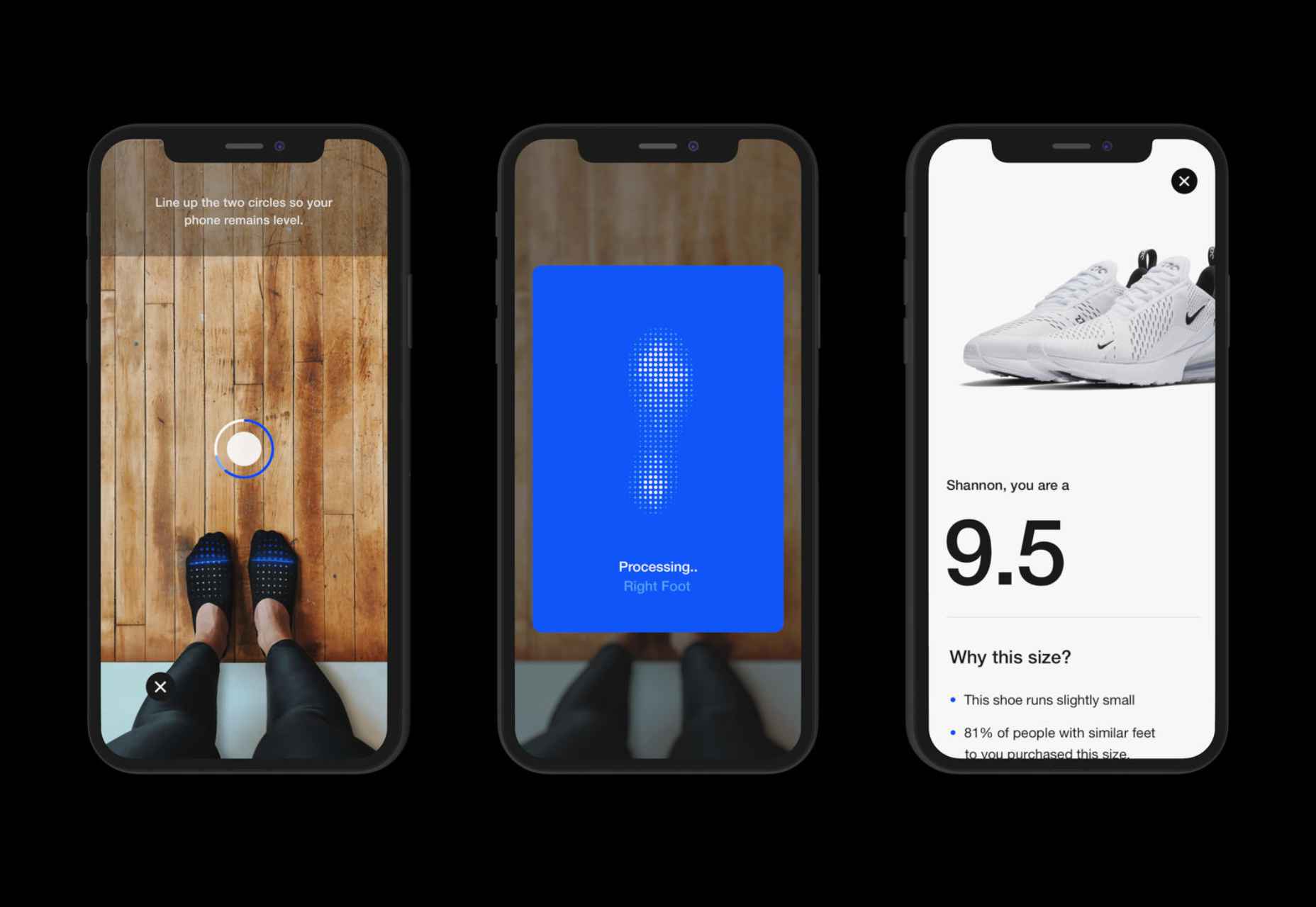
But it works great for consumer products, too: Nike’s Digital Foot Measurement tool is another excellent feature, allowing users to “try shoes on” with their cameras and scan their feet for the right measurement through AR.

Videos are Attention Magnets

Considering that viewers absorb some 95% of the message while watching videos, compared to only 10% when reading text, there’s no reason why you should avoid incorporating videos into your landing pages. Beyond that, videos can be incredibly straightforward: Insert a graphic illustration or real imagery to explain the product, show the step-by-step process, and convey value with raw, unfiltered footage.

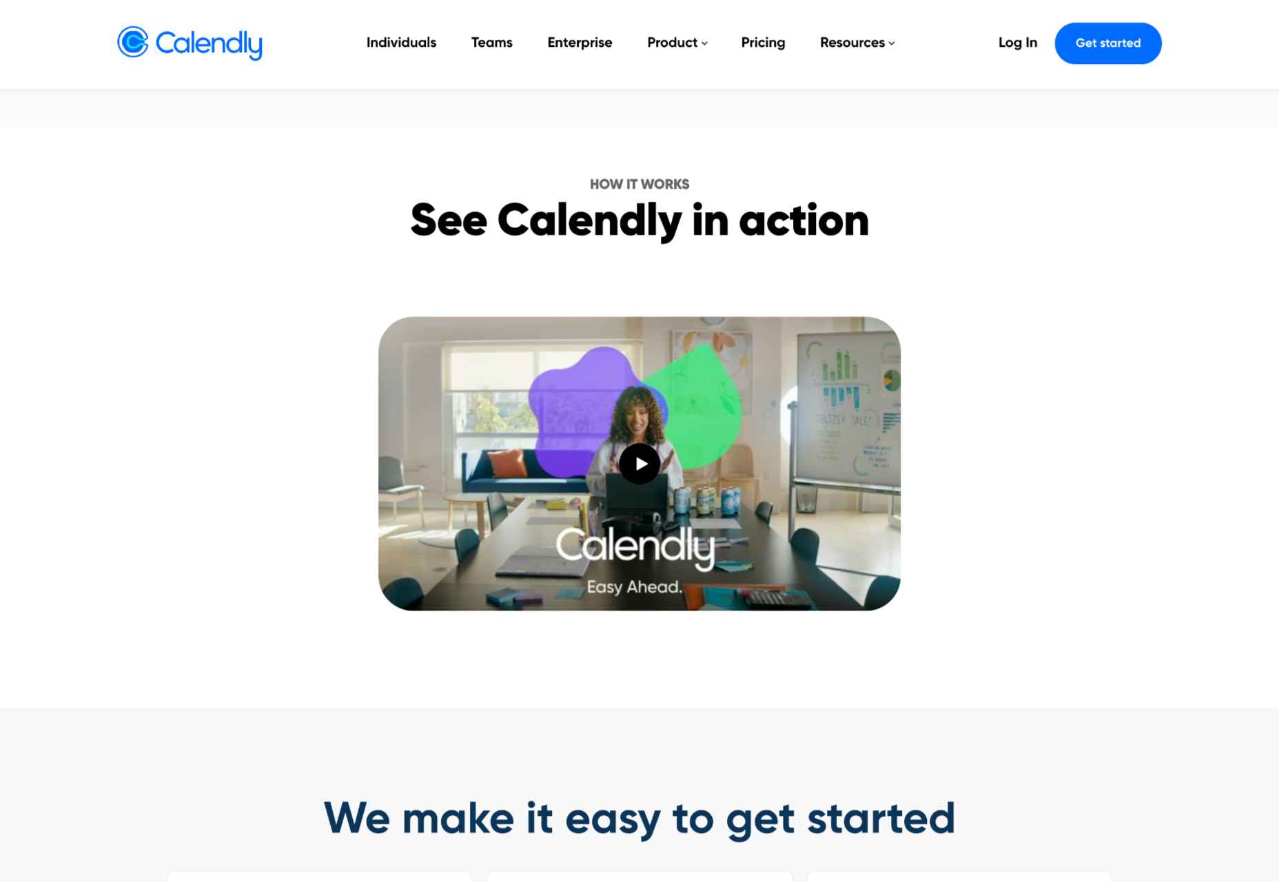
Calendly, for example, has various videos on its landing page, including a 56-second, upbeat, colorful clip showing how simple it is to get started with the product.

Guiding GIFs to Visualize Product Features

As small animations, GIFs represent the perfect middle ground between images and videos. They allow you to show users the value your product adds, providing an engaging glimpse into the actual interface. The small scope of GIFs is both a limitation and a benefit: You can only show a particular feature of your product but can also focus on triggering an exact user emotion.

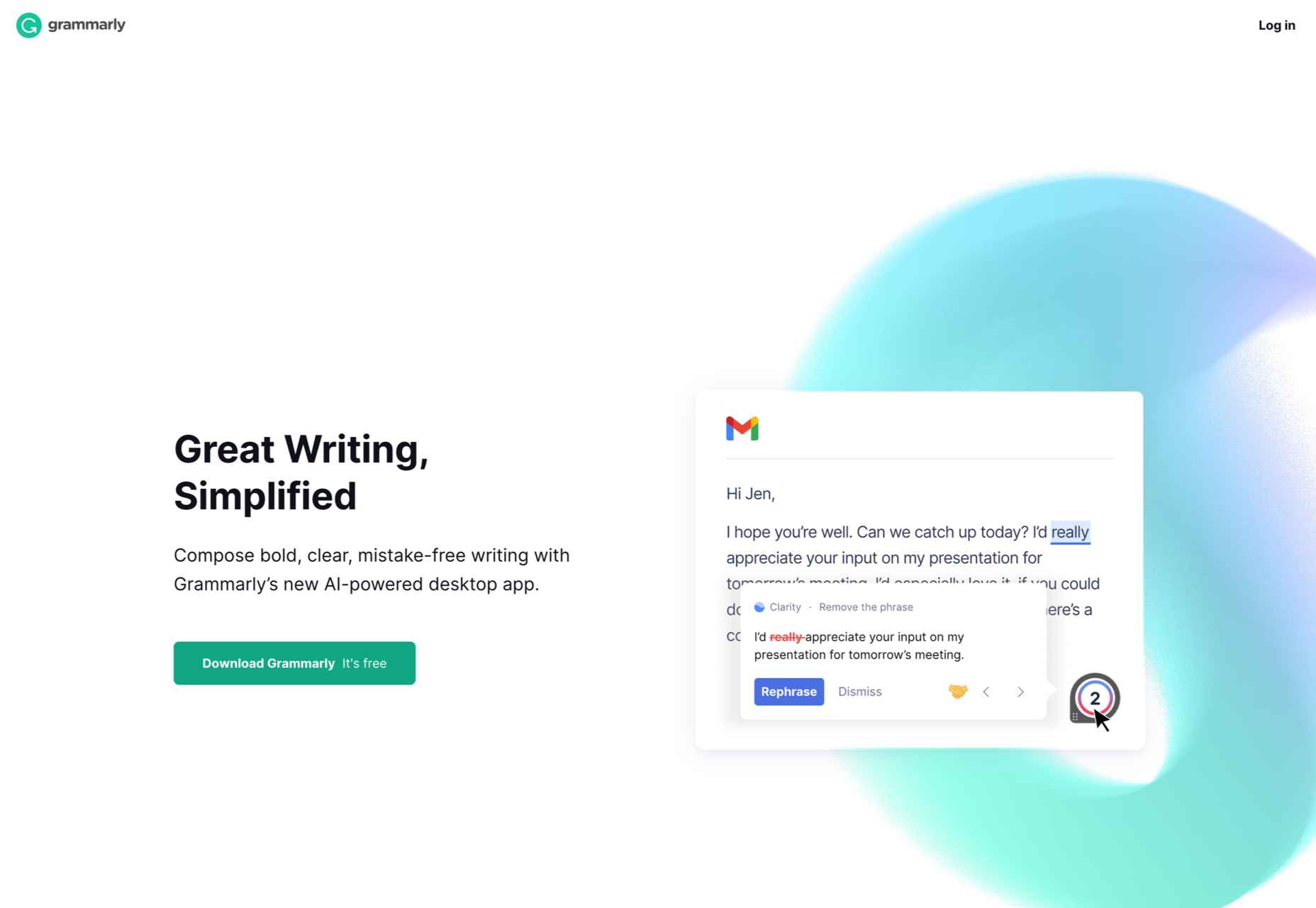
Grammarly, a grammar correction tool, relies on GIFs to give users a taste of their UX. With a quick overview of the product’s functionality across popular platforms, including email and social media, users can see exactly how the product can make their everyday lives easier. And by incorporating GIFs into the right side of the landing page, the scrolling experience of the user isn’t disrupted.

Interactive product experiences can both entertain and tackle pain points, adding dynamics to an otherwise static page. Particularly when customizing based on user attributes, the key benefit of these features is that the users engaging with them are likely the same people interested in the paid product. To ensure that the product experience doesn’t directly compete with the primary offering, clearly differentiate it and guide the user towards a direct call to action.

Source

The post The Case for Building More Dynamic Landing Pages first appeared on Webdesigner Depot.

Categories: Designing, Others Tags:

Care for the Text

December 24th, 2021 No comments

How do you make a great website? Everyone has an answer at the ready: Flashy animations! The latest punk-rock CSS trick! Gradients! Illustrations! Colors to pack a punch! Vite! And, sure, all these things might make a website better. But no matter how fancy the application is or how dazzling the technology will ever be under the hood, a great website will always require great text.

So, whenever I’m stuck pondering the question: “how do I make this website better?” I know the answer is always this:

care for the text.

Without great writing, a website is harder to read, extremely difficult to navigate, and impossible to remember. Without great writing, it’s hardly a website at all. But it’s tough to remember this day in and day out—especially when it’s not our job to care about the text—yet each and every

tag and

Categories: Designing, Others Tags:

Web Design Tips & Tricks Every Designer Should Follow

December 24th, 2021 No comments

Designing a website from scratch is really a daunting task, but thanks to google, sites helped many developers and business owners in creating a simple website. Many experienced developers and web designers use Google sites to design creative, highly responsive sites for their clients. 

If you’re also a web designer and don’t know where to begin, then this blog is for you. If you’re planning to design a highly scalable site, check out these web design tips and tricks to get you a better site in no time.

Everyone wants to do everything on their own, even designing a website. So, we come with some easy tips and tricks that you can practice to create an excellent website for your business. But before moving further, let’s first understand why you need a business website these days. 

The reason why your business needs a website

It’s not a surprise that you landed on this blog for knowing the reason why businesses need a website because you’re not alone in who is looking for the answer. Well, so here we have listed some of the most practical reasons why your business should have a website: 

Today, a website acts as the first layer of your business, and the end-users interact with it in this digital era. Companies that do not have websites are somewhere lacking from their competitors. So, why a website is that much crucial these days :

1. Attract customers online

Website is an online store of your business that gathers the attention of new leads and converts them into potential customers. Users keep on searching for products and services online, and a website helps users find your products and services online. If you don’t have a website, you send all of them a message that your business is stuck in the Dark Ages or that you are not interested in finding new clients.

2. Increase brand awareness 

Businesses online are successful because they know how to pitch their client’s interests and raise brand awareness amongst them. The online platform acts as a messaging platform and shapes the perception of your online business in a way your social media channels cannot provide. You can also influence people to perceive your products and services through online promotion and offering them attractive deals. Having a website creates an official presence for your company on the Internet, and you are now less dependent on other sources talking about you.

3. The website is more accessible than traditional press advertising

Even still, many small businesses rely on offline marketing modes, including newspaper ads, billboards advertising, flexes, and posters that have limited reach and can empty your pockets too. Online advertising with the help of the website and social media marketing is a much more effective and stable way of getting more customers at very affordable prices. 

4. Increase business credibility 

Attracting customers through a professional website is a professional approach to meet customer expectations and add instant credibility to your business. People trust businesses that are using both offline and online modes to promote their services. In fact, 56% of people said they would not trust a company without a website. Having a good website instantly boosts your credibility as a legitimate business. A website can help showcase your expertise and improve the positioning of your business.

I hope these reasons are enough for you to understand the value of a website for your business growth. So let’s move further and know some easy tips to create your business website on your own. 

Tips and tricks for website designing

The methods of creating websites keep on changing due to emerging technology and cutting-edge high-tech tools. Every year Google updates its algorithms, and websites that meet its standards always rank higher on search engines. So, it is better to hire a web design agency for highly scalable and responsive website designs. But if you’re planning to design on your own should follow these tips: 

1. Settle on minimal designs

Many developers and designers always get attracted by bright colors and an overabundance of the clutter of elements on the website. It can sometimes drive users away from your website and deliver the right message to your customers. Websites with lots of design elements can also make your website heavy and can increase your website loading time. It is better to settle on minimal designs, avoid the clutter of elements. In other words, keep it as simple as possible. It helps users understand your message correctly, increase your website loading speed, enhance your website performance, and reduce your designing cost. 

If we look at the latest trends, websites with a single or two to three web pages are doing great on search engines. This is because light websites crawl easily on search engine pages, load faster on mobile devices and are the reason why they appear top on SERPs. 

2. Prioritize user experience

Of course, your goal is to make the website stunning but attractive. But considering the design is not enough if you want to generate traffic and leads online. Remember that your ultimate goal in designing a website is to inform, educate, and offer your customers the best user experience. If a website meets all these standards, then nothing can stop you from achieving top positions on search engines. Make sure your website content is readable, include call-to-action, provide easy navigation, and also track the website loading speed regularly to improve the user experience of your website. 

3. Engaging content

Content plays a key role in informing, educating, and telling users about your products and services. Therefore invest time in creating high-quality, engaging content for your website. Quality content attracts users and motivates them to perceive your products and services by providing them complete, detailed information about your products. 

4. High-quality user interface

Websites full of content can drive users’ attention away. Grab their attention with attractive visuals, including photos, videos, infographics, designing elements, etc. It keeps your users engaging and helps them understand your business better. 

5. Run multiple testings before making it live

Don’t skip the testing phase after completing the whole designing process if you want your website to perform well on search engines. It helps track the performance of your website, identify design flaws and errors, and give you a chance to improve it before it’s live. It is the most crucial step among all designing processes that need special attention. 

Conclusion: 

These are some basic tips that you need to keep in mind while designing websites for your business. Also, there are many other things that you need to consider when designing a website. If you want another article on web design, comment below. 

The post Web Design Tips & Tricks Every Designer Should Follow appeared first on noupe.

Categories: Others Tags:

How to Set up a Video Editing Business

December 24th, 2021 No comments

Video editing involves much more than simply taking raw footage and adding graphics, changing text, or changing the overall look. If you’ve worked on video editing, you know a lot of work goes into it. 

Visualizing the final output to work backwards and putting elements in place requires organization with detailed attention. Given how many businesses today are exploring video marketing and therefore looking for editing services, it can be a lucrative business idea if you wish to expand on it.

In recent years, scores of small businesses have been approaching video marketing services for help connecting with their audiences, growing their followings, and optimizing for multiple platform algorithms with practical, polished, and relevant video content.  

How Videos Marketing Drives Growth for Small Businesses

Online video demand has grown in the last few years, with a record watch time of 100 minutes per day in 2021. It’s also grown as an industry to $61 billion in 2021. This surge from users and the industry calls for better services from existing and new video service providers. With more eyeballs on videos, it has become all the more important to attract the right audience with relevant and high-quality content.

And because video makes it easy to attract visual learners, it’s a great tool, especially when the audience is new and wants to know, like, and trust the brand. Video creates the instant ability to connect with a business and understand the content better.

Because video has a longer shelf life on social media, spending time creating videos gives a business better exposure and good ROI. It also encourages more views, shares, and engagement, building momentum for the brand.

When a business actively builds video content, more people can enter a sales funnel, leading to more conversions and customers. If you’re wondering if video editing is indeed profitable, there are quite a few reasons you should go ahead.

What Makes Video Editing a Lucrative Business? 

Video editing has yet to see its peak demand, considering it’s still catching up with most businesses worldwide. Therefore, it’s an excellent time to enter the industry and make your mark. And it’s equally lucrative because of the following reasons.

  • Recurring business: Marketers are constantly in need of new content. Very few businesses need only one video. They need a steady stream of new content flowing to their social media platforms. That’s where you can leverage your expertise and position yourself as the ideal service provider. You get to build authority and attract continuous work. Recurring revenue makes your business viable even if you are new.
  • High barrier to entry: Video editing calls for specialized skills, as practitioners need to understand the business beyond aesthetics. It requires good problem-solving skills, self-motivation, attention to detail, prioritization, and, most important, organizational skills to keep things together, especially when the workload increases.
  • Scalable: Once you set up a workflow, you don’t have to do it by yourself. You can scale up by hiring skilled video editors and scale up your production. Even if you want to bring new video editors on board, you can train and upskill them to meet your expectations.

Build a Client Acquisition Strategy   

1. Inbound and Outbound  

Once you have set up your video editing business, client acquisition is essential to keep going. It lets you create awareness about your business and connect with other like-minded business owners who could be potential clients or business collaborators. Approach this with an inbound and outbound strategy that lets you automate client acquisition (inbound) to an extent and the rest where you actively reach out to potential clients (outbound).

A small business often operates as a single owner or with a limited staff. When they need video editing, they’ll look for experts who can deliver quality videos.

Try social media platforms to reach out to them. Instagram is an ideal platform to find small companies that need video content and also where you can promote your business via video. Find such small businesses with an existing Instagram presence and reach out to them over email.

Instagram can also work for your business to acquire your clients. So, create content on video marketing and how it can help your audience. Create videos to make it engaging. It will also create a positive impression about your work quality and build credibility and authority.

And while you’re at it, don’t forget to engage with potential clients and their content to give you potential visibility. Also, check your statistics regularly to see how your content fares in the eyes of your audience and if you need to tweak your content to improve your reach.

Another way to acquire clients is to use hosted platforms like blogs. Use content to build a case for video as a marketing medium. Tell readers how videos help build loyalty, engagement, conversions and help create a community of raving fans.

When you invest time in educating your readers, it extends your brand value and helps people know how you can solve their pain points concerning video marketing and editing.

2. Build a Scalable Framework to Edit Videos   

Once you have your client acquisition set up, create a scalable framework to edit videos. While you train your first hires, keep in mind that you’ll need more people on the team to scale further with time. For this, create exhaustive documentation on how to go about editing videos. Keep it concise, even while noting down all relevant details right up to the last point. So, include specific dos and don’ts, checklists, and SOPs. It makes it easy for your team to follow through with little intervention.

Set up your systems to hire external people who can operate as your outsourced team or contractors for work overflow. Alternatively, outsource your hosting or other specific modules to third parties. Build this team that can take up orders and deliver within TAT.

Experiment with multiple contractors and build a small trusted pool you can always rely on. This way, you don’t have to incur costs on hiring more team members, but you can create a credible team to fall back on when work piles up.

A scalable framework is possible with the right tools to speed up your work without compromising on quality. Tools that are simple, easy to use, and let your team get started quickly. You might rely on different tools to do various tasks, but you can also look at tools that don’t have all the bells and whistles and are sufficient to scale.

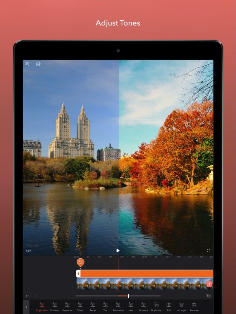
There are many tools in the market, and you can try a handy one like Videoleap that works on iPhone and iPad. It makes video editing easy, lets you add effects, text and stickers, and gives a professional feel to your videos.

3. Diversifying Income 

  • Editing Videos for Clients: Editing videos for clients is one way to increase your income. It’s an active way to put your skills to use and get paid in exchange for your service. However, even in a scalable framework, your income potential is limited to the number of hours you can invest in multiple projects, limiting your earning capacity. However, you can diversify your income by using your existing knowledge in video editing.
  • Online course for video editing: A passive way to bring in income is to use your video editing skills to teach others through an online course. When you package your video editing knowledge as an online course, it gives you recurring returns. It’s a limited-time effort that helps build credibility, establishes your authority, improves customer experience, and brings new clients besides money from courses.
  • Content monetization: Video editing is a popular search topic. Investing in a content strategy could be financially appealing. You may start a blog or a YouTube channel teaching your followers the trick of the trade, and monetize via ad networks or affiliate marketing.
  • Social Media Partnership: Social media partnerships are another way to diversify your income and partner with brands.  In this way, you get to introduce your audience to the brand value and engage in shared audiences between your business and the partner. When you do so, you’re expanding your reach and making it easy for people to know what you do and how you can help.
  • Video Editing as a Service: Pricing your services differently is also another revenue stream. Here you look at offering subscription pricing to clients instead of charging by the hour. It creates predictable income streams, making it easy to provide value-based pricing instead of time-based.

Conclusion

When you’re looking at your skills to build a business, video editing is a profitable avenue considering the market demand and large user base. What also works in your favor is the multiple opportunities for recurring revenue, a high barrier to entry, and one that’s scalable. And when you plan your client acquisition strategy to grow your business, factor in inbound and outbound avenues that can allow a steady stream of clients.

Also, consider social media platforms like Instagram to nurture and engage clients. And when you have repeat and new clients approaching you for work, set up workflows and systems so that your team is equipped to take on more work. Provide adequate documentation and use tools to ensure a smooth workflow.

While you’re at it, don’t forget to consider an alternate source of income to fall back on in case your business slows down. Online courses, social media collaborations, and subscription pricing are excellent opportunities for growing your video editing income streams.

The post How to Set up a Video Editing Business appeared first on noupe.

Categories: Others Tags:

Remember You Are Not the User

December 23rd, 2021 No comments

One thing people can do to make their websites better is to remember that you are not representative of all your users. Our life experiences and how we interact with the web are not indicative of how everyone interacts with the web.

We must care about accessibility.

Some users rely on assistive technology to navigate web pages. 

We must care about multi-language support.

Layouts that make sense to me, as a native English speaker (a right-to-left language) don’t necessarily make sense in Arabic (a left-to-right language) and can’t simply be swapped from a content perspective.

We must care about common/familiar UX paradigms.

What may be obvious to you may not be obvious to other users.

Take the time to research your key user markets and understand how these users expect your website or product to function. Don’t forget accessibility. Don’t forget internationalization. And don’t forget that you are not the representation of all users.

Categories: Designing, Others Tags:

Web Design For Beginners: A Step-By-Step Tutorial

December 23rd, 2021 No comments

Your website serves as the first thing potential customers see when they get in touch with your brand. A well-designed website highlights your services and unique selling propositions (USP), resulting in higher conversion rates, and more sales for your business.

A lot of people confuse web design with web development. While web development deals with the backend development of the site, web design has more to do with how your website appears—layout, colors, copy, and site functionality. If you’re just starting as a web designer, this tutorial will show you how to design websites. 

Get the brand guidelines

Designing a website is often part of a brand-building process. Most brands start with a logo, a tagline, fonts, and colors. These elements vary according to the brand’s personality and the image it wants to convey to the public.

If your brand was a person, what would they be like? Would he be that uncle who is the life of the party or your refined cousin who sips martinis? Translating this to your website, what color, layout, and fonts should your brand contain?

For example, your brand’s primary color is navy blue. Determine what other colors you’d like to pair with that blue. For most brands, two tones are enough. Assess the color wheel, and choose a partnering complementary or analogous color. For example, blue goes with yellow, orange, or purple, depending on the effect you’re looking for. When you’ve decided on your brand colors, get the hex code for those colors, and stick to them.

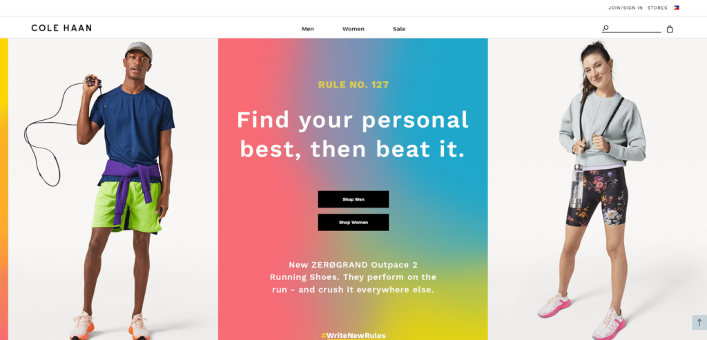
The example from Tostitos below shows how its website uses well-defined visual elements to define the brand’s personality. The main colors revolve around blue and red, and the website uses the same fonts for the menu and the copy.

Source: 99 Designs

Finally, your brand tone is the voice of your personality. What kinds of phrases does your personality use? Apply that to your copy. Should your writing be formal, casual, exciting, academic? These are things to consider with brand tone. 

Define your sitemap

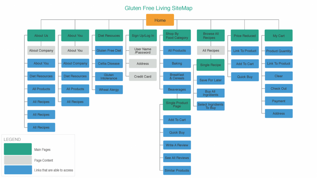
Once you’ve defined your branding, you need to create a sitemap, which is comparable to a building’s blueprint. A sitemap provides a general overview of your website. It outlines the content that will appear on every page of your website. For instance, if your website sells gluten-free products, its sitemap might look like this:

Source: Uplers

This type of sitemap is also known as an HTML sitemap. It displays the structure and hierarchy of the different pages on your website and how a user can navigate through them. For example, a user interacts with the homepage first, chooses a category, then clicks on the pages within that category. 

For bigger sites with upwards of 500 pages, sitemaps help search engines run through these websites and index their content. This results in optimized SEO for bigger and more complex sites.

Research your competitors

A general business rule is to research your competitors to know how you’ll stand out from them. That same rule also applies to marketing collateral such as websites.

When researching your competitors, you should know the following:

  • Do you have a lot of competitors?
  • What keywords are they ranking for?
  • How well are they ranking for those keywords?
  • Unique selling points

Assessing the keywords your competitors are ranking for helps you strategically decide your SEO. Do you want to compete with them for that keyword, or do you want to hop on a different search query where you have higher chances of the ranking?

Cole Haan Website

If the search term “leather shoes for sale” shows a lot of competing domains, you might want to optimize your content for a different search term. Good ones would be “handmade leather shoes for sale” or “affordable leather shoes for sale.”

However, if you’re daring enough to compete for competitive search queries, look at the highest-ranking commercial domains. Assess the content on their page, then try to replicate that with your branding and USP.

Consider the latest web trends

Keeping an eye on the latest web trends will help your website stay relevant and ensure that it doesn’t look dated. 

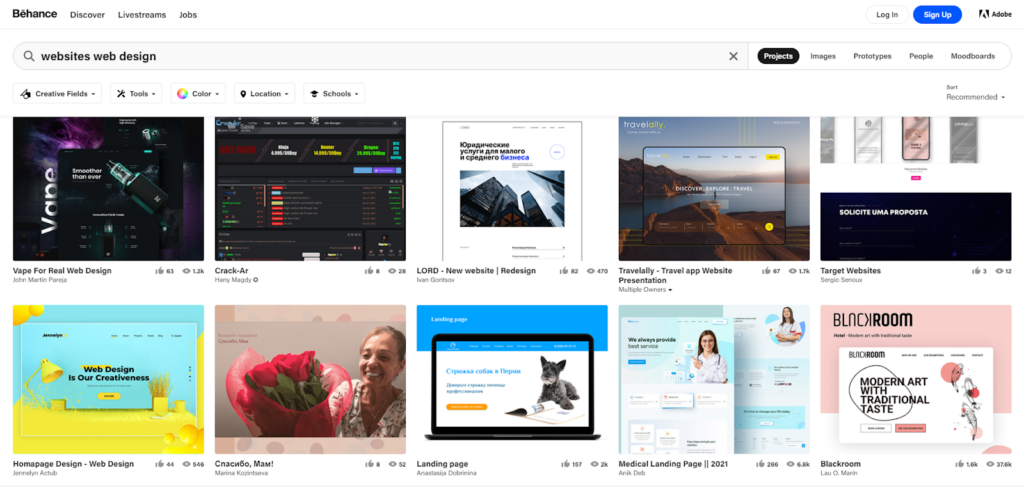
You may take web design inspiration from the following sources:

  • Competitors’ websites
  • Adobe Behance
  • Pinterest
  • Creator Communities (i.e., Reddit, Discord)

If you feel iffy about taking inspiration from outside sources, you can remind yourself that there are no fully-original ideas—only existing ones that come with a new twist. In fact, many of these trends, such as adaptive design, exist because they work with users. 

Adobe Behance

However, you don’t need to hop on every trend out there—just the ones that might be useful to your business. If a trend doesn’t fit your brand personality or doesn’t help your website function better, you shouldn’t feel compelled to apply it to your site.  

Create your wireframes

Creating a wireframe allows you to see what your website will look like from the user end. It lets you see some rough edges in the design that wouldn’t be visible on paper. You may easily sketch one up, or draft it in Photoshop.

Source: TheWebsiteArchitect

The wireframe accelerates the web design process since it allows non-web designers to see your work without going live yet. This gives you optimal insight from different departments on what needs to be reworked. By creating wireframes, you can play around with different combinations of web elements without the expense and hassle of rework.

Every page should have a wireframe—your homepage, your about page, your contact us page, all those pages. You may even lay out your wireframes according to your sitemap on a corkboard. Connect the linking pages with red yarn to help collaborators fully visualize the mocked-up website.

After a couple of meetings with key personnel, you should have your final wireframes drafted. 

Consider the User Experience (UX)

Key things to remember when optimizing your website’s UX

  • Visually showcase USPs and features
  • Use images and contrasting colors to highlight CTAs
  • Make it easy to navigate

The process of navigating your website should be like flipping through a brochure or a menu. Particular types of typography call out key features, while images visually entice the viewer to a product or service.

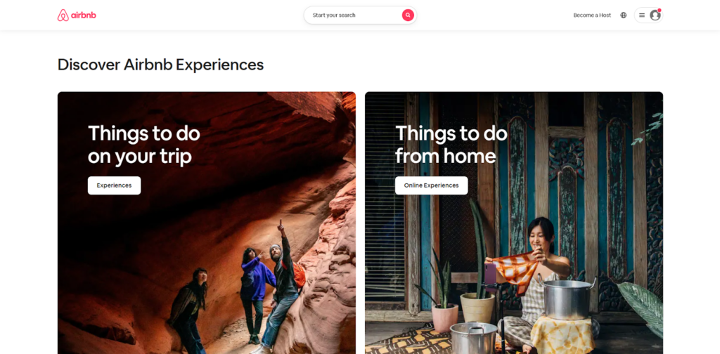
Airbnb Website

You’ll notice in the example above that most of the key elements are organized together. For example, the call-to-action (CTA) button is located right under the copy. The copy is also laid out to mimic the way a user’s eyes scan and understand text—in this case, from left to right and top to bottom. The website’s UX will also include the things that happen after the user clicks on the CTA. 

When the user reaches the footer of your homepage, he should have a visual idea of what your business does, and what sets you apart from the competition.

Set your KPIs and make updates if needed

Once you’ve gotten a web design agency to bring your wireframes to life, you must see to it that you’re consistently monitoring your website. You may monitor these KPIs with Google Analytics and heatmap software.

KPIs differ depending on the objectives of the company. However, most web designers consider these the most important metrics to track:

  • Heatmaps
  • Scroll Distance
  • Bounce Rate
  • Returning Visitors

One can argue that daily traffic is also a KPI of a performing website, but a marketing campaign more influences that than the website itself.

Source: Hotjar

Seeing where users are hovering and clicking is a healthy indicator of what elements in your website draw attention. Heatmaps show this.

Looking into how far the average visitor scrolls determines your web page’s scannability, whether it’s too text-heavy or simply not engaging enough to be scrolled further. 

A bounce rate is people who enter a restaurant, then leave as if they’ve entered the wrong restroom. A high bounce rate on your website may indicate poor page load time or a non-inviting homepage.

Source: CrazyEgg

Returning visitors are a healthy indicator, especially if you don’t have a retargeting campaign in play. This means that something in your website must be striking a chord in your audience, making them come back for more.

Whether you’re editing the copy, the readability of the font, or the types of media, these KPIs will help you pinpoint what to improve.

Wrapping up

Creating a website is an absolute necessity for businesses in today’s online world.

When creating your website, stick to brand guidelines. What’s your brand color, personality, and tone? These should translate to the overall experience of your website via fonts, design elements, media, and copy.

Next, create your sitemap. This will serve as your blueprint. Then, research your competitors and assess the quality of their websites. Know what search terms your competitors are ranking for so you can strategize whether to hop on another search term or compete with them for that same search term. Look into trends as well to keep your website looking fresh, relevant, and up to date with the current competition in the industry.

Then, create wireframes for your website. This will help you visualize the user-end of your website and gather insights from other departments. Once your website is up, track your site performance against your KPIs.

Following these steps will get you a foothold on the digital online platform and ensure your business generates sales.

The post Web Design For Beginners: A Step-By-Step Tutorial appeared first on noupe.

Categories: Others Tags:

Personalize it!

December 23rd, 2021 No comments
Screenshot of the website on the left with a dark blue-gray background and white text, and DevTools open on the right with the rendering panel open and the emulate CSS media type dropdown options open.

Ensuring accessibility is a clear path to making your website better. When you make your site accessible, you grow your audience, improve the experience for all people using it (not just those with accessibility needs), and you get SEO benefits as well.

Along the same lines, preference-query customization is another great opportunity to give your users a personalized experience that speaks to them and is more enjoyable to use.

One preference query you can take advantage of is prefers-reduced-motion. This preference means that your users would prefer a web experience without flashy, quick animations. You can write your styles in a way that supports this preference, and then write a media query for those who don’t have this preference set to get your “louder” interactive experience:

CodePen Embed Fallback

Another preference to consider is a user’s preferred color scheme. While most sites today use a light theme by default, dark themes have been a top request over the past few years, especially for browsing the web at night. Providing a customized theming that aligns with your user’s preferences is another way to improve your user’s experience. 

You can do this efficiently by using CSS custom properties, and adjusting those custom property values with the prefers-color-scheme media feature. If you use general values like background, text, and highlight, you can update your values all in one place.

CodePen Embed Fallback

Don’t forget to use the color-scheme property as well to automatically get some theme conversion from the browser. Setting this property tells the browser what color themes (light, dark, or both) the page supports. In turn, the browser will automatically convert form controls and browser UI like scrollbars to the correct theme as well:

CodePen Embed Fallback

In this demo, even though I’m not setting the text color for my color themes, since I told the browser the site supports both light and dark themes with color-scheme: light dark in the :root, it automatically switches the typeface from black to white.

You can test your dark theme without changing your system settings in Chrome DevTools under the “Rendering” panel. This illustration shows the site houdini.how in its dark mode:

Another bonus to creating a dark theme is the battery life savings you’re providing your users. In  a Pixel 6 Lab study, it was found that for an OLED screen, a dark theme saves 11% in power consumption. 

So now you’re respecting your user’s accessibility needs, preferences, and battery life, which is a pretty great way to make your website better for your users.

Categories: Designing, Others Tags:

Why Ember?

December 22nd, 2021 No comments

There was a time when I’d write React, Angular, and Ember as a kind of generic grouping of three major JavaScript frameworks. And maybe just because three is a nice number, that became React, Vue, and Angular over time, thanks to Vue having shot up in popularity over the years. Ember, in my view, has always been a bit of an underdog, but not because it isn’t actively developed, doesn’t offer a great modern web development story, or doesn’t have a strong community of super fans.

Melanie Sumner put together this splash page as a reminder to folks out there that Ember is still a compelling choice:

Ember is a JavaScript framework that provides everything you need to build a modern web application. While there are lots of reasons to use Ember, the number one reason is this: you’ll gain developer productivity by escaping the churn of the hype cycle.

I guess just because it was originally named Amber doesn’t mean it’s trapped in amber.

To Shared LinkPermalink on CSS-Tricks

Categories: Designing, Others Tags: