Archive

Archive for December, 2021

7 Effective Methods to Identify and Meet Customer Needs

December 14th, 2021 No comments

Customer satisfaction is the foundation of every good business that wants to survive long-term.

The mistake a lot of companies make is thinking that once they get a client, their job is done but keeping the client is where the battle really begins.

This is why it is no surprise that customer experience is the top priority for business professionals.
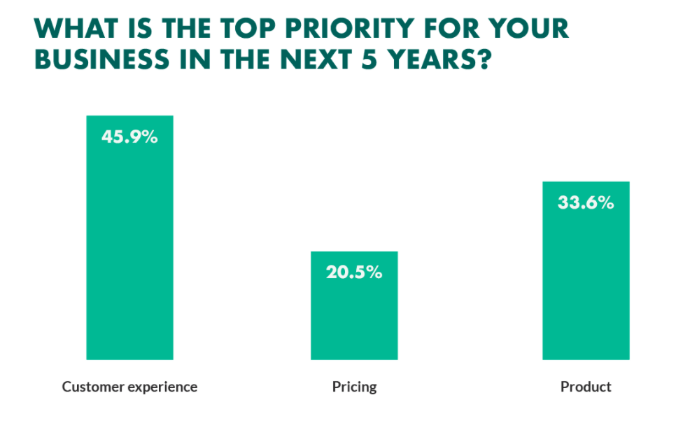
Image Source

To that end, let us talk about a couple of ways your company can identify and meet customer needs.

1. VOC Surveys

Voice of Customer surveys gives your company the opportunity to understand exactly what your customers are looking for from the right people- your customers. You can use a combination of surveys, interviews, and focus groups to figure out exactly what could work for your customers. This is what is going to invariably help you improve your products and services. Plus, help you make more money by targeting the right people with exactly what they’re looking for.

A good way to survey your ideal audience is to use an email marketing software or survey service to reach them. This company helps you conduct market research by connecting you with the right people to take your survey. You can choose your ideal audience based on things like gender, age, income, and more which will help you target the right survey respondents.

Another simple way of finding out what your customers are looking for or why they’ve taken an action, such as booking a demo or downloading a piece of content, is using thank you page.

In a thank you page survey, you can ask a customer what they’re looking to achieve; for example, if you sell software and potential customer books a demo, you could ask them a simple question after they book a demo such as ‘what’s the biggest problem you’re looking to solve by using our product?’ A question such as this can give you insights into why new prospects are looking to use your product and the problems they are hoping your product/solution will solve for them. 

These insights can be invaluable when you’re looking for new ways to position your product or improve the messaging around the product’s capabilities, benefits, and features.

2. Know what your competition is doing

Your competition is not just someone you want to beat in the rat race, they are also a great source for ideas and tips. Chances are the people who are tempting your customers to switch sides are doing something right.

Take a look at their company and view it from the eyes of a potential customer- Do they have a great feedback section? Do they use live chat support? If you go through their customer journey, what part convinces you to make a purchase?

Each one of your competitors can teach you something. Depending on how much time and resources you have, you may want to conduct an in-depth analysis of your competitors. This analysis/audit should include finding out your competitors:

  • Weaknesses and strengths 
  • Unique features 
  • User ratings/Customer satisfaction 
  • Their USP or mission 
  • Any key features that are unique to the competitor your auditing

For example, if you were a law firm, you would go to the websites of law firms within your area or your domain of expertise. Let us look at the Allen Law Firm website to bring in some ideas:
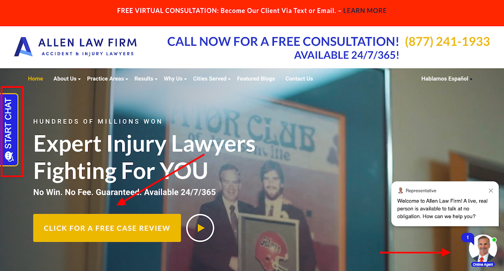
The moment you look at the homepage, you find three: a chatbot button for easy communication, a free case review to bring leads into the sales funnel, and a blue ‘start chat’ button that works as a great CTA.

You can also look through your competitors’ online reviews to see if their customers highlight anything in particular about the customer support they provide; this can help you discover positive things your competitors are doing that you can make part of your own processes or things to avoid.

Competitive analysis can also help give you product or feature ideas that could benefit your customers and further ideas that can help grow your business. 

3. Consistent customer communication

Your company’s job is not over once you have sold your product; you also need to keep in touch with your customers once they receive it. This means sending them a follow-up email asking them if they enjoyed your service or even updating them about potential available discounts.

If a customer has had a good experience with a product or service, you could ask them to leave a review, ask them for a case study or testimonial or even ask if they would be willing to refer a potential new customer your way.

If you can prioritize your customer service and satisfaction to the point where you’re getting regular referrals and strong social proof from your customers, your business is more than likely heading in the right direction, and research backs this up. Research suggests that after having a positive experience with a company, 77% of customers would then recommend that company to a friend, while research from Mckinsey suggests that satisfied customers are more likely to upgrade or add services and less likely to cancel.

Depending on the business you’re running, you may also want to arrange regular catch-up calls with your customer.

For example, if you’re running a SaaS business, a great way to keep in touch with customers is to have your customer success team/account managers arrange weekly, biweekly, monthly, or quarterly calls with customers (particularly high-value customers). You can use these calls as an opportunity to check-in with customers to see how your software is working for them, troubleshoot any potential issues and introduce them to new features. 

These calls can also be profitable for your business; if your customers are happy with the service, they are receiving, and can be used as a chance to introduce new offers, products, and upgrades that the customer may be interested in. Positive, happy customers are more likely to become referring, upgrading, lifelong customers. 

4. Focus on your USP

Every company excels at something and focusing on what you excel at is vital. Instead of being a jack of all trades, try mastering one.

This is especially true if you are a smaller company like LawRank

LawRank is a great SEO company and one of the reasons they are great is because they have narrowed down their ideal customer base to only cater to law sites and focus on SEO for lawyers. They rank for their targeted keywords, they are great at what they do, and people who visit their site can immediately see what their domain of expertise is which leads to more trust. They also have a great blog where customers can upgrade their SEO knowledge by themselves.

Once you figure out what your USP is, you can build on that and give your customer the best possible service. With so many choices out there, your current and potential customers are likely faced with a daunting task when they’re trying to decide which option in your industry deserves their time, money, and trust. A strong USP helps to ensure that your business becomes the one they choose. 

A strong USP also helps to instill a sense of confidence in your business with potential customers. Another excellent example of a company that uses its USP well is amzpathfinder.

Instead of trying to enter the oversaturated advertising market, amzpathfinder only focuses on Amazon advertising and excels at it. Here are some of ??their customer reviews.

5. Observe customer behavior

The way you observe the behavior of your customers will depend on the type of business you’re running. If your business operates online, there are a few simple ways you can use to observe the behavior of your customers, including:

  • Keep an eye and read the reviews your customers give you. 
  • Regularly review and respond to any comments your customers are leaving on your social media or company blog.
  • Implement tools such as Google Analytics to get insights into how your prospects and customers are finding your website and what their demographics look like. 
  • Keep up to date with trends in your industry. 

6. Look back on your own experiences

Whether it’s going for a nice meal or buying something online, we all tend to remember good and bad customer experiences, and your own personal experiences can serve as a good source of inspiration when you’re looking for ways to meet your customer’s own needs better. 

The golden rule applies when it comes to customer service, treat people as you’d like to be treated. This can be as simple as making sure all of your customer service staff remain positive and understanding in their interactions with customers. More than half of Americans have scrapped a planned purchase or transaction because of bad service, while 33% of Americans say they’ll consider switching companies after just a single instance of poor service, with one in three consumers stating they’ll happily pay more for a higher level of service.  

You should also do your best to ensure that customer response times stay consistent. 66% of adults say that the most important thing a company can do is value their time. Ways of doing this include using AI-powered chatbots on your site to ensure your customers get instantaneous responses whenever they get in contact, having a strong knowledge base, and continually training your customer support staff to enable them to serve your customers best.

7. Talk to your staff

Your staff, particularly those who deal with your customers on a day-to-day basis, are well placed to give insights and feedback about any prominent behaviors or trends your customers are showing. You could gather this information by regularly asking your staff about how their conversations and dealings with customers are going and if there are any stand-out trends, they are noticing.

For example, if you wanted to get feedback on one of your products, you could ask your staff what experiences your customers are having with the particular product and what they like and dislike about it. This feedback could come from word of mouth feedback, from customer surveys or interviews, or if a customer has had a particularly good experience with your product, a case study, which could then be used to promote the product further. 

Your customer-facing staff are an invaluable resource that you should utilize to get a clear understanding of your customer’s hopes, dreams, frustrations, and feelings towards the products and services that you are offering. 

Wrapping it up 

Your customers are the lifeblood of your business. Regularly identifying customer needs and meeting those needs can be one of the most simple and effective ways of helping your business stand out in a crowded marketplace. If you can ensure strong customer service, effective customer resolutions, and positive customer experiences, you’ll not only delight your existing customers but also establish a long-term, profitable growth channel for your business.

The post 7 Effective Methods to Identify and Meet Customer Needs appeared first on noupe.

Categories: Others Tags:

CSS-Tricks Chronicle XLI

December 13th, 2021 No comments

And many more on the way!

We’ve been running

Ya know, I used to do one of these posts after making a few podcast appearances I hadn’t had a chance to link up yet, so I could share them. As fate would have it, I haven’t been on many podcasts (other than my own) lately. One exception! I was on Episode 33 of That Tech Show a few months back where I got to chat with Chris Addams and Samuel Gregory. We got into all kinds of stuff, including me sounding off on whether or not CSS is relevant anymore (c’mon!).


CodePen

The vast majority of my time, as ever, is dedicated to CodePen. We’re in one of those long tunnels exploring and building the future of CodePen, which has been very satisfying so far. For a long time, we’ve felt pulled in too many different directions to make serious progress on anything next-gen, but have gotten past that and found focus. But that also means we aren’t doing that many public releases and, thus, can’t talk about them on CodePen Radio like we normally do.

So instead, I’ve been using new episodes to talk to awesome people from the CodePen community I’ve always wanted to, like:

And many more on the way!

We’ve been running CodePen Challenges consistently as well, and I happen to know November 2021 was the highest participation month ever, so those have been doing a good job of stirring up ideas in people’s heads.

ShopTalk

We’re perilously close to episode 500 at ShopTalk and should hit that mark early next year. We’ve been like clockwork this year, publishing a new audio podcast every single week. Some recent favorites:

The biggest thing we’ve done in recent history at ShopTalk Show is launched new Video episodes. Their home is here. Some recent favorites:

Like and subscribe on YouTube.

Serverless

We’ve had this microsite, The Power of Serverless for Front-End Developers, for a while now. I originally wrote it in Gatsby but now have rewritten it in Astro kinda just for kicks—mostly to re-acquaint myself with the site, kick Astro’s tires, and kinda clean house. I find the re-written site much easier to understand.

What I’ve ripped out for now is NetlifyCMS. Not because I didn’t like it, but because I just didn’t have time to get it re-configured. If you’d like to contribute to it, the repo is here. If it’s content in the form of adding a service to one of the categories, the whole site is built from Markdown files in folders. So you just chuck one of those in there as a Pull Request (along with a logo image) and that’s about it.

But wouldn’t it be neat to make Pull Requests right from a static form right on the site? I should try that.

Conferences

The conferences microsite has a very sad three conferences on it as I write. I don’t think conferences have quite bounced back yet. I’d love to see ones that are happening added to the site. Pull Requests welcome, but also feel free to just email me or whatever. I don’t really have any quite lined up myself, although I’m slowly plucking at a new deck mostly as I’m starting to feel nostalgic for the days of conferences.

Categories: Designing, Others Tags:

Exciting New Tools For Designers, Holidays 2021

December 13th, 2021 No comments

The year’s winding down as everyone segues into a much-needed holiday R&R. But that doesn’t mean there aren’t some awesome new tools and resources for website design projects.

Check them out, and hit the ground running in January. Here’s what’s new for designers this holiday period. Enjoy!

Fancy Border Radius Generator

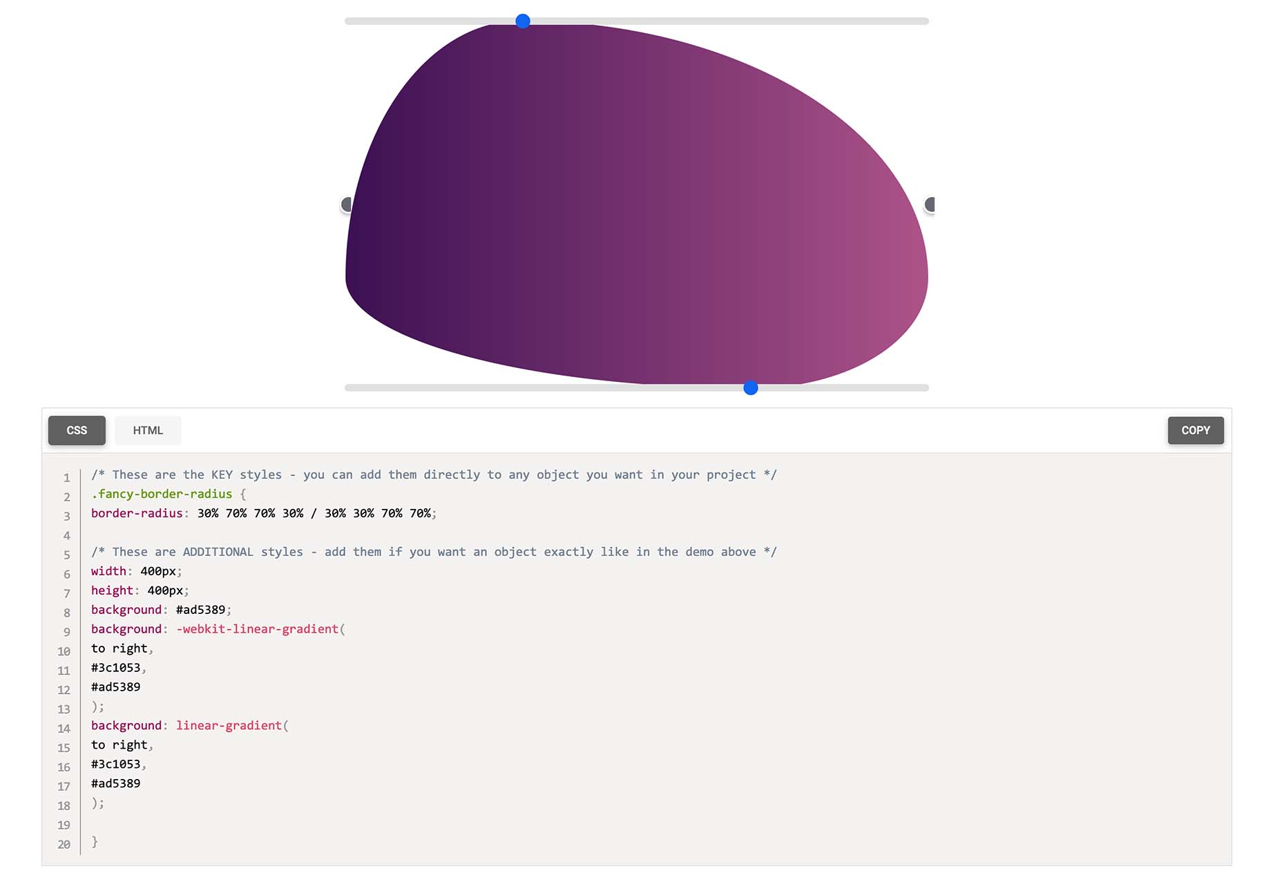
Fancy Border Radius Generator is a fun tool that allows you to create exciting shapes for elements. Use the included templates or create your own border shapes and then export the CSS/HTML for a variety of uses.

Pulsetic

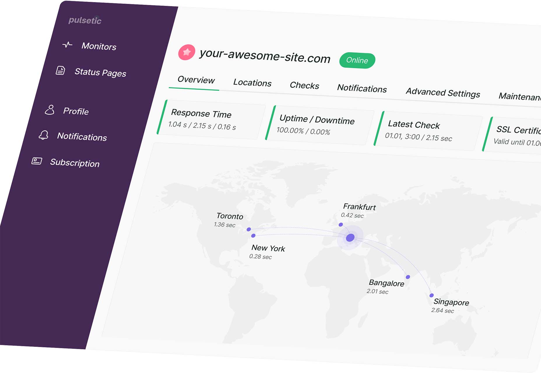
Pulsetic answers the question: “Is your website down?” Get website downtime alerts by phone call, SMS, email, or Slack. Create beautiful status pages and incident management reports and keep visitors (and your team) updated.

Ffflux SVG Generator

Ffflux SVG Generator makes it easy to generate fluid and organic-feeling gradients. You can use the resulting graphics as backgrounds to elements on a page to give a colorful fluid look to page elements. Choose colors and styles, then save or copy your SVG for use.

Fable

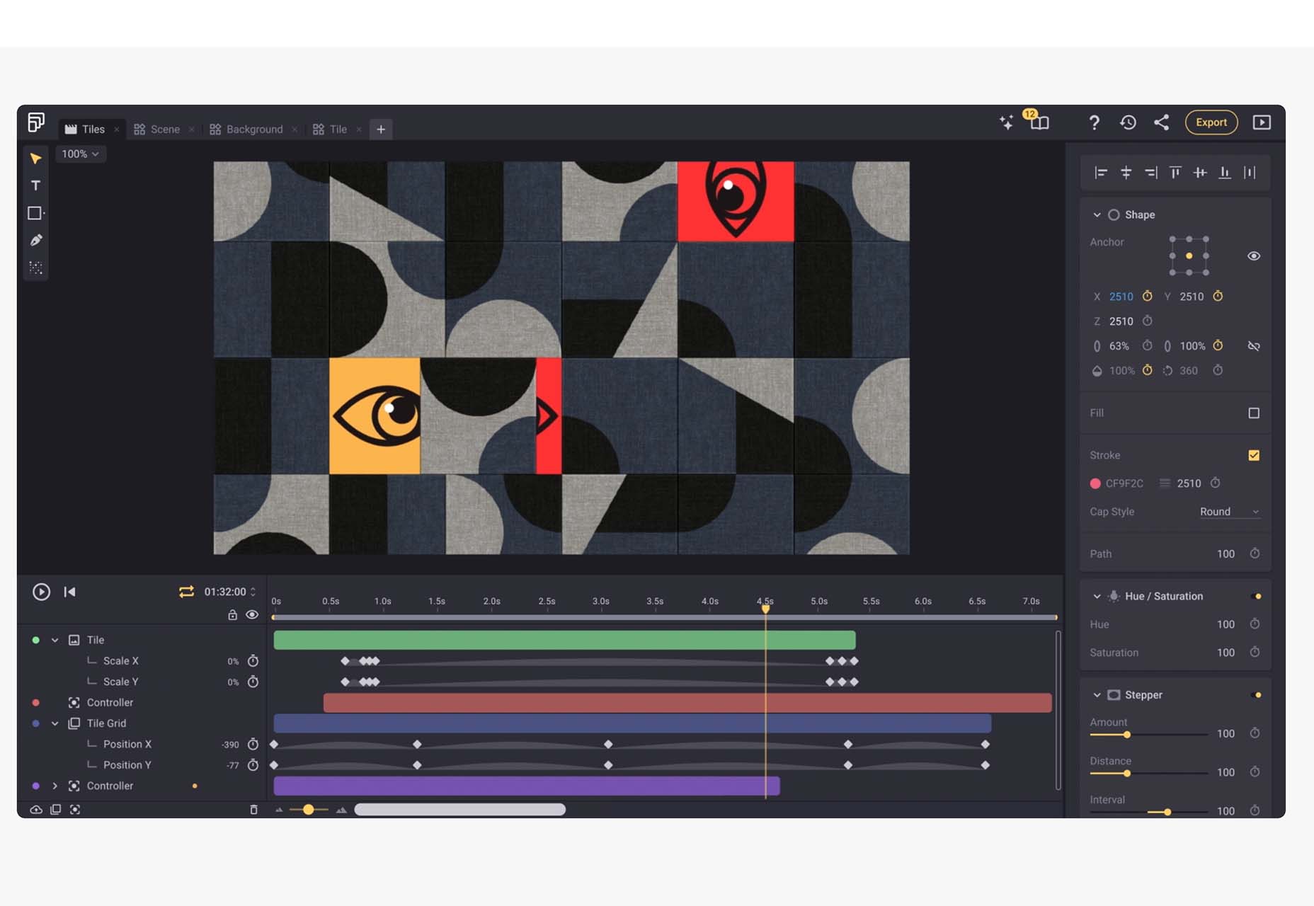
Fable is a web-based motion design platform to help you tell moving stories. It’s designed to be easy enough for beginners to use but has tools that even the most experienced motion designers can appreciate. This is a premium tool, but you can try it free.

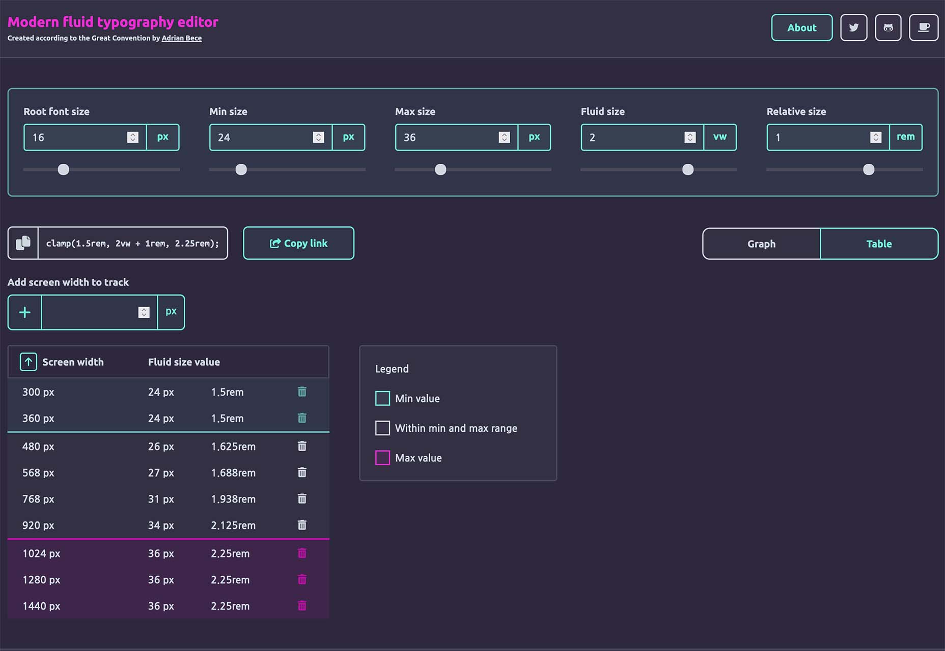
Modern Fluid Typography Editor

Modern Fluid Typography Editor takes the guesswork out of sizing and scale for type sizes on different screens. Set a few preferences and see ranges your type styles should fall in. This typography calculator is visual and easy to use.

Emoji to Scale

Emoji to Scale is a fun look at emojis in a real-world relationship to each other. Make sure to also note the Pokemon to Scale project, which is just as much fun.

Page Flip Text Effect

Page Flip Text Effect is a fun and straightforward PSD asset that adds a nice element to design projects. Everyone can use some fun, colorful animation, right?

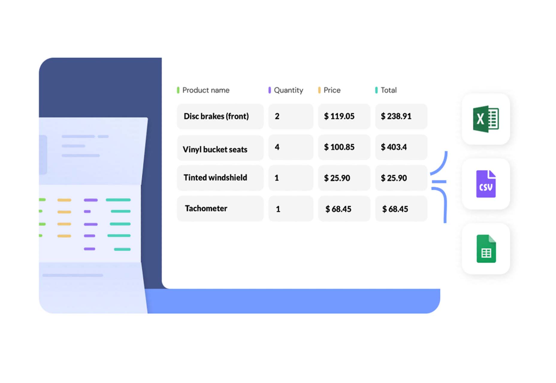
Nanonets

Nanonets is a practical tool for automated table extraction. You can snag tables from PDFs, scanned files, and images. Then capture relevant data stored in tabular structures on any document and convert to JSON Excel, or CSV and download.

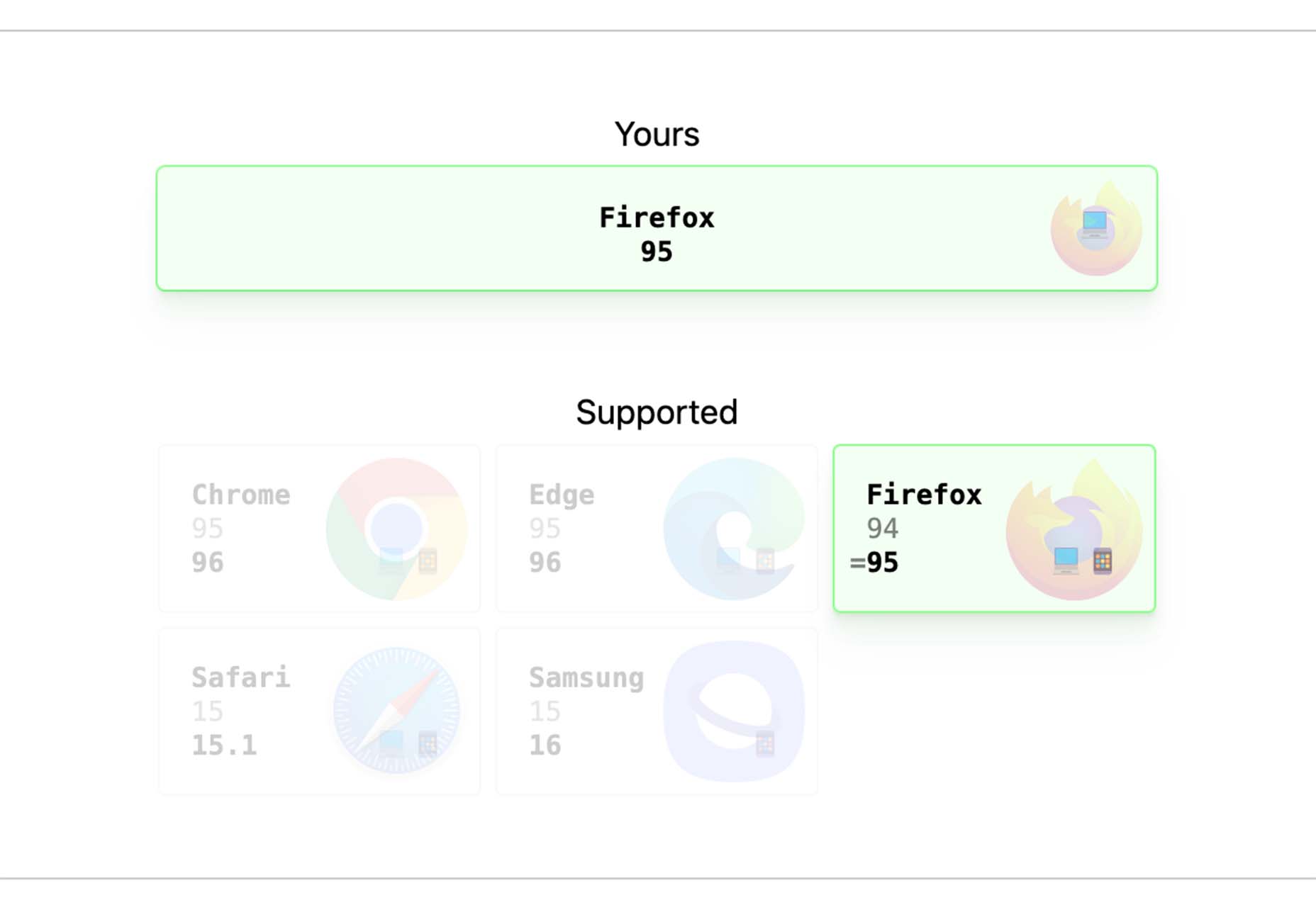
Browsers.page

Browsers.page shows browser name and version, matched with a list of the browsers you support as a company or project. It’s a visual reminder to update if you are working with some browser lag. It’s a free tool and includes a frontend API.

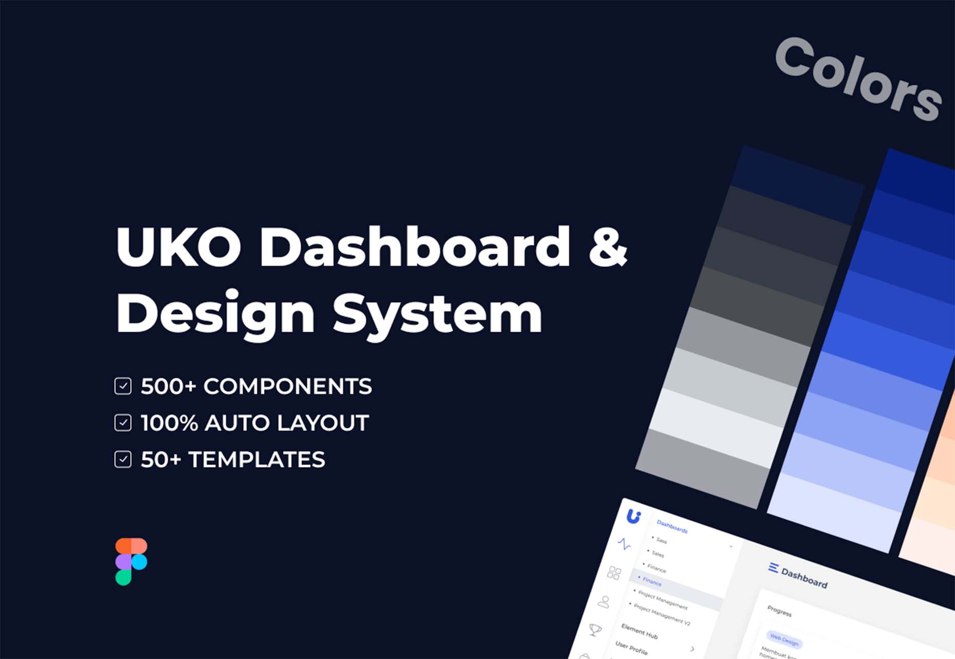
UKO UI

UKO UI is a Figma dashboard and design system bundle packed with components and pages to build from. It’s free for personal use.

Floating UI

Floating UI is a low-level library for positioning “floating” elements like tooltips, popovers, dropdowns, menus, and more. Since these types of elements float on top of the UI without disrupting the flow of content, challenges arise when positioning them. It exposes primitives, which enable a floating element to be positioned next to a given reference element while appearing in view for the user.

Style-Dictionary-Play

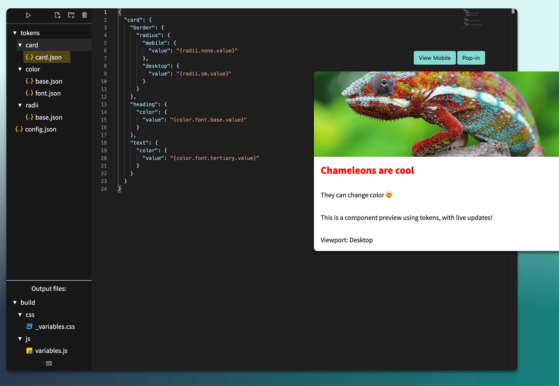
Style-Dictionary-Play lets you experiment with a style dictionary in your browser with a live preview and mobile and desktop views. It’s an open-source tool and allows for URL project sharing, and you can use it without logging in or signing up.

Airplane Runbooks

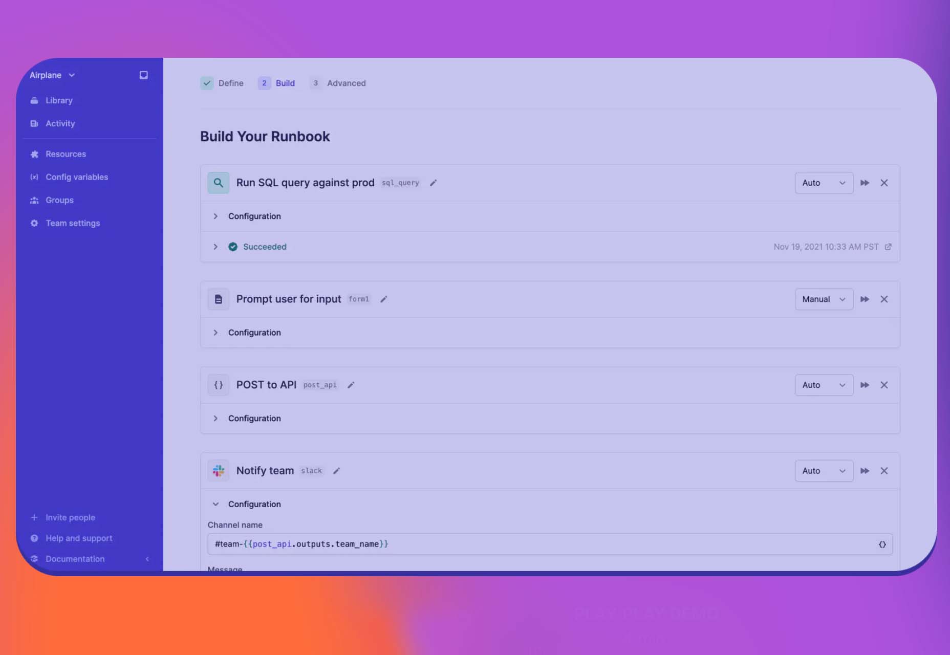
Airplane Runbooks makes it easy to turn small amounts of code into complex internal workflows. Model onboarding flows, admin operations, cron-like schedules, and more and share with your team. It’s like Zapier but for first-party operations that touch prod data.

Shoelace

Shoelace is a forward-thinking library of web components that works with any framework. It’s fully customizable – and has a dark mode. It’s built with accessibility in mind, and the open-source tool is packed with components.

Tutorial: Coloring with Code

Coloring with Code is an excellent tutorial by the team at Codrops that will help you create beautiful, inspiring, and unique color palettes/combinations, all from the comfort of your favorite text editor. It’s practical and easy to follow along as you work through the steps on your own.

Stytch

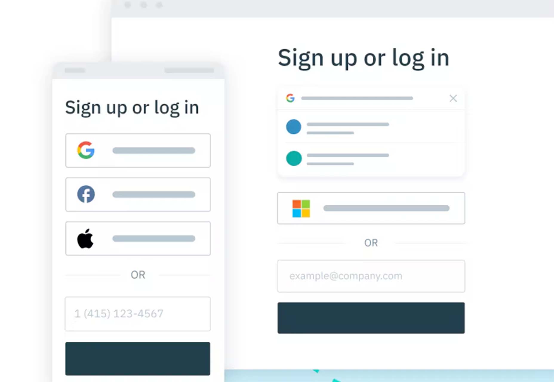
Stytch is a full-stack authentication and authorization platform whose APIs make it simple to seamlessly onboard, authenticate and engage users. Improve security and user experience by going passwordless with this premium tool.

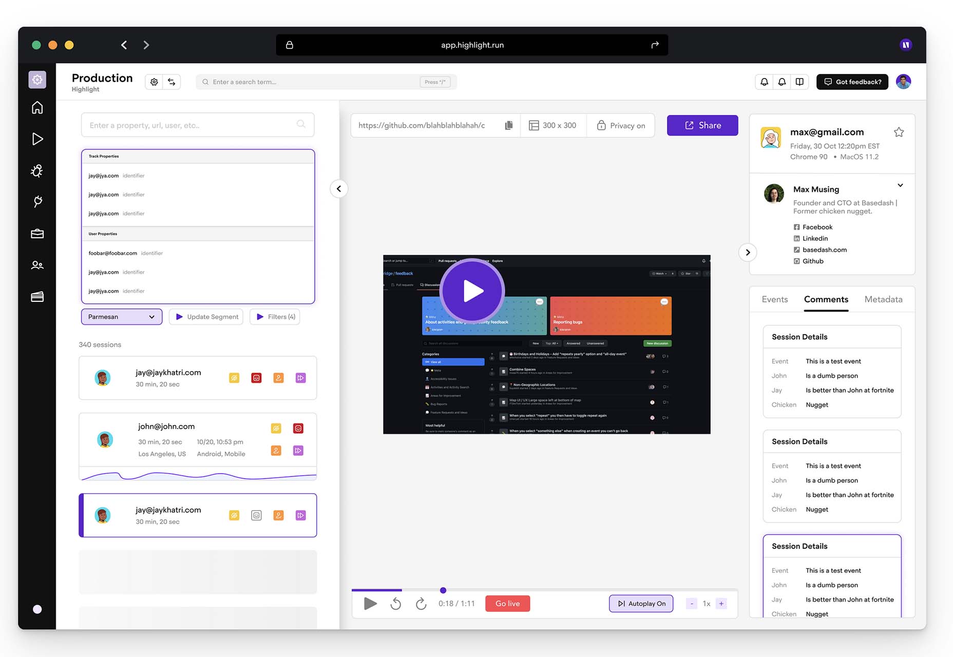
Highlight

Highlight keeps web apps stable. With pixel-perfect session replay, you’ll get complete visibility into issues and interactions that are slowing down users. You can start using this premium tool in minutes, and it works on every framework.

Source

The post Exciting New Tools For Designers, Holidays 2021 first appeared on Webdesigner Depot.

Categories: Designing, Others Tags:

Popular Design News of the Week: December 6, 2021 – December 12, 2021

December 12th, 2021 No comments

Every day design fans submit incredible industry stories to our sister-site, Webdesigner News. Our colleagues sift through it, selecting the very best stories from the design, UX, tech, and development worlds and posting them live on the site.

The best way to keep up with the most important stories for web professionals is to subscribe to Webdesigner News or check out the site regularly. However, in case you missed a day this week, here’s a handy compilation of the top curated stories from the last seven days. Enjoy!

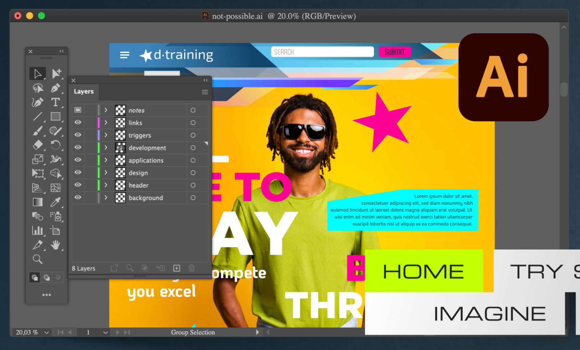
Svija – A Website Builder Based on Adobe Illustrator

13 Graphic Design Trends for 2022: Retro Uprise & Bold Ideas

Designers’ Pick: Best Google Fonts for 2022

7 Apps We Couldn’t Live Without in 2021

Mistakes I Made While Learning Web Development as a Beginner

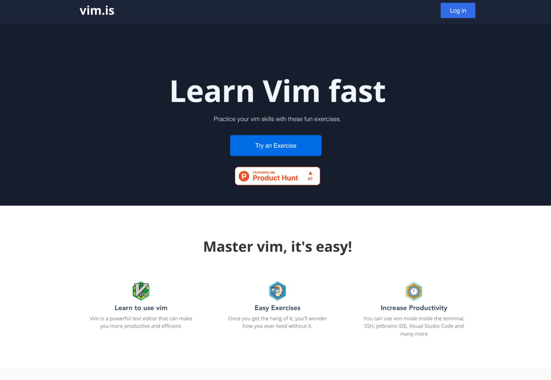
Interactive Vim Exercises

34 HTML Tabs Examples for Web Development

How to Reset a Single Git File and Why

Google Fonts Knowledge

Dark UI Design: Principles and Best Practices

Source

The post Popular Design News of the Week: December 6, 2021 – December 12, 2021 first appeared on Webdesigner Depot.

Categories: Designing, Others Tags:

Pantone Color of the Year 2022

December 10th, 2021 No comments

At this time every year, Pantone announces its choice for Color of the Year for the coming 12 months. The last year has been uncertain, to say the least, and although a tentative optimism seems to be piercing the general gloom, it’s difficult to see how that can be expressed in color.

On this occasion, for the first time, Pantone has elected to create a brand new color for its Color of the Year. Normally colors are chosen from Pantone’s extensive swatch books, so this new shade either reflects new beginnings or Pantone’s design team has been underemployed in the last year.

In either case, the shade created for 2022 is Very Peri. It’s a lilac — a bit more blue than violet, but still on the warm end of the spectrum.

The color feels a little retro — like the color of one of Jerry’s shirts in Seinfeld — and also spring-like — fields of bluebells leap to mind.

Pantone describes the color as having a “courageous presence,” but for that, I tend to think of neons; something with a little more saturation.

In fact, looking back over the past few years of Pantone colors, a soft purple (or adjoining shades) has traditionally been a safe choice for Pantone. 2014 was Radiant Orchid (lilac), 2016 was Rose Quartz and Serenity (pastel pink and blue respectively), 2018 was Ultra Violet (purple).

If Pantone was looking for a genuinely “courageous” choice, it should perhaps have reissued 2020’s Classic Blue, and called a do-over on the last couple of years.

Occasionally the Pantone Color of the Year has hinted at something more than a single shade. 2019’s Living Coral felt like attention was being drawn to the horrifying state of our ocean. Designers didn’t adopt the shade en masse, but environmentally conscious design has certainly become more prominent.

As we complain about homogenous design, is it right to even nominate a single color of the year? If what we’re lacking in the design industry is diversity, shouldn’t we ignore a color trend? (The irony of that question is not lost on me.)

In that spirit, rather than dishing out another bland lilac for 2022, Pantone should have presented us with Pure White #FFFFFF. A blank page to do with what we will. That would have been courageous.

Source

The post Pantone Color of the Year 2022 first appeared on Webdesigner Depot.

Categories: Designing, Others Tags:

The Invisible JavaScript Backdoor

December 8th, 2021 No comments

An interesting (scary) trick of an nearly undetectable exploit. Wolfgang Ettlinger:

What if a backdoor literally cannot be seen and thus evades detection even from thorough code reviews?

I’ll post the screenshot of the exploit from the post with the actual exploit circled:

If you were really looking super closely you’d probably see that, but I can see how it would be easy to miss as it would avoid any linting problems and doesn’t mess up syntax highlighting at all. Then the way this code is written, the commands are executed:

Each element in the array, the hardcoded commands as well as the user-supplied parameter, is then passed to the exec function. This function executes OS commands.

They consider it worthy of change:

The Cambridge team proposes restricting Bidi Unicode characters. As we have shown, homoglyph attacks and invisible characters can pose a threat as well.

Categories: Designing, Others Tags:

How to Prepare for the Immersive Web

December 8th, 2021 No comments

Websites as we know them are going to change very soon. The days of text, images, and basic interactions in a 2D browser window have served us well, but virtual, augmented, and mixed reality experiences are getting better all the time. Developers and designers need to think beyond the browser window and prepare for an immersive future.

Many have been very skeptical about VR and AR in the past because despite grand promises about what they would achieve, they’ve mostly failed to deliver on the scale that the industry hoped for.

But it’s different this time: industry leaders like Meta, Apple, and Microsoft are pursuing a range of different mixed reality projects; they see the opportunity and are dropping hints about what’s next.

In a survey from Perkins Coie LLP and the XR Association, nearly 9 in 10 respondents said that by the year 2025, immersive technologies—including augmented reality, virtual reality, and mixed reality — will be as ubiquitous as mobile devices.

That’s a bold prediction, but it could be our new reality.

Use Cases

VR and AR aren’t a logical fit for every website, and that’s fine. There’s no need to force an immersive experience on something better suited to a standard viewing experience.

But when they’re done right, 3D experiences can add a lot to your website. Check out the demo experience from Mozilla, the 3D tours from Matterport, and the immersive storytelling from Within.

Here are a few areas where these technologies shine:

  • Retail – VR can be used to provide a virtual showroom where customers browse through products. AR can even bring the products into your home by showing you how a piece of furniture will fit in your room, what a painting will look like on your wall, or in Apple’s case, how a product will look on your desk.
  • News – Coverage of events can be enriched by providing a 360-degree view and placing viewers in the center of the story.
  • Training – AR can generate virtual overlays over physical equipment so employees can have hands-on training that’s more effective.

Define Your Platform

Adding immersive experiences to your website will require various skills based on what you’re trying to create. Whether you’re new to web development or are a seasoned developer with many years of experience, the main difference from classic web development is that you’re switching from a 2D to a 3D experience. Development in VR/AR is much closer to developing 3D video games than creating web applications.

First of all, you need to decide on the hardware that you’re building for. Are your viewers mainly using computers, smartphones, or a headset like the Oculus Quest? Each hardware category offers a different set of capabilities for what’s possible.

Next, when we look at 3D engines and frameworks on the market, some big names like Unity, Unreal Engine, and CRYENGINE stand out. Most of these engines were spun out of game development and are based on programming languages like C, C++, or C#. While very powerful, they’re overkill for anyone trying to create a basic immersive web experience.

The good news for web developers is that the WebXR Device API is an open standard specified by the W3C with a JavaScript API that makes immersive experiences possible in the browser. So if you already have a background in web development, you can use your knowledge of JavaScript to get started.

There are some useful frameworks and platforms that make working with WebXR more convenient:

  • A-Frame – A web framework for building 3D experiences.
  • React 360 – A framework for the creation of interactive 360-degree experiences that run in the web browser. As the name already suggests, it builds on React and reuses the concepts you already know.
  • Amazon Sumerian – A managed service that lets you create and run 3D, AR, and VR applications. Since it’s integrated into the AWS ecosystem, it’s also possible to add AI-enabled elements into your generated world.

Create Your Content

No one wants to read long blocks of text in 3D. Since we’re talking about visual experiences, it’s logical that the emphasis should be on creating content that is pleasing to the eye and interesting to look at. What works on a normal website probably isn’t going to feel natural in a 3D environment, so you need to decide what visuals you should create to suit the format.

What high-resolution images and assets do you need? Can you add videos? How about 360-degree videos? Will viewers just be looking at something, or will they be able to interact with it?

You also can’t forget about sound because it’s a critical part of immersive experiences. What music and sounds should you create to make the content come alive?

Not everyone is going to have the latest and greatest device or 5G coverage. The requirements for bandwidth and transmission quality are much higher with 3D content. A few milliseconds of latency can go unnoticed on a typical website, but in a VR/AR setting, it can make the experience laggy or unusable.

Try to optimize your content to be the highest quality it can be within a reasonable file size. If the experience starts to suffer from too many assets downloading at the same time, it’s better to create a more streamlined experience that maintains a high performance rate.

It’s important to consider your hosting infrastructure, as well. This shouldn’t be a big problem, but it is worth mentioning that you need to add new content types to your configurations, and your CDN needs to support these new types, too.

Make Your Content Flexible

When we’re talking about getting your website ready for immersive experiences, we’re not just talking about having people scroll through your regular website in VR. That isn’t compelling for your audience.

The idea is to take some content that’s already on your website and separate it from the presentation layer so you can use it in a 3D environment or any other platform that you want. Classic content management takes place in silos, which means you cannot easily reuse the content from your website.

This separation can be achieved by using a classic database, but if you want developers and content teams to collaborate, a headless CMS is front-end agnostic and more user friendly.

Start Experimenting Today

Building 3D content experiences may seem intimidating, but as we’ve seen, you likely already have the web development skills necessary to get started and try out some different ideas.

What you build today will prepare you for the 3D future of tomorrow.


Featured image via Pexels.

Source

The post How to Prepare for the Immersive Web first appeared on Webdesigner Depot.

Categories: Designing, Others Tags:

Spicy Sections

December 7th, 2021 No comments

What if HTML had “tabs”? That would be cool, says I. Dave has been spending some of his time and energy, along with a group of “Tabvengers” from OpenUI, on this. A lot of research leads to a bit of a plot twist:

Our research showed there are a lot of variations for what makes up a tab control. There’s a lot of variations in markup patterns as well. There’s variations written in operating systems, video games, jQuery, React components, and web components. But we think we’ve boiled some of this ocean and have come to a decent consensus on what might make for a good  element… and it isn’t !!!

It kinda comes down to design affordances. Sure, the type of UI that looks like literal paper manilla folders is one kind of design affordance. But it’s functionally similar to a one-at-a-time accordion. And accordions are fairly similar to

/

elements — so maybe the most helpful thing HTML could do is allow us to use different design affordances, and perhaps even switch between them as needed (say, at different widths).

Then the question is, what HTML would support all those different designs? That actually has a pretty satisfying answer: regular ol’ header-based semantic HTML, so like:

<h2>Header</h2>
<p>Content</p>

<h2>Header</h2>
<p>Content</p>

<h2>Header</h2>
<p>Content</p>

Which means…

  1. The base HTML is sound and can render just fine as one design choice
  2. The headers can become a “tab” it that particular design
  3. The headers can become a “summary” in that particular design

This is the base of what the Tabvengers are calling . Just wrap that semantic HTML in the web component, and then use CSS to control which type of design kicks in when.

<spicy-sections>
  <h2>Header</h2>
  <p>Content</p>

  <h2>Header</h2>
  <p>Content</p>

  <h2>Header</h2>
  <p>Content</p>
</spicy-sections>
spicy-sections {
  --const-mq-affordances:
    [screen and (max-width: 40em) ] collapse |
    [screen and (min-width: 60em) ] tab-bar;
  display: block;
}

Brian Kardell made up an example:

CodePen Embed Fallback

I made one as well to get a feel for it:

CodePen Embed Fallback

Here’s a video in case you’re in a place you can’t easily pop over and resize a browser window to get a feel yourself:

This is a totally hand-built Web Component for now, but maybe it can ignite all the right conversations at the spec-writing and browser-implementing levels such that we get something along these lines in “real” HTML and CSS one day. I’d be happy about that, as that means fewer developers (including me) having to code “tabs” from scratch, and probably screw up the accessibility along the way. The more of that, the better.

If you’d like to hear more about all this, check out ShopTalk 486 at 15:17. And if you’re interested in more about Web Components and how they can be gosh-darned useful, not only for things like this, but much more in Dave’s recent talk HTML with Superpowers.

Categories: Designing, Others Tags:

Test Your Product on a Crappy Laptop

December 7th, 2021 No comments
A grizzled British soldier smiling back at the camera, holding a Brodie helmet with a large hole punched in it. Black and white photograph.

There is a huge and ever-widening gap between the devices we use to make the web and the devices most people use to consume it. It’s also no secret that the average size of a website is huge, and it’s only going to get larger.

What can you do about this? Get your hands on a craptop and try to use your website or web app.

Craptops are cheap devices with lower power internals. They oftentimes come with all sorts of third-party apps preinstalled as a way to offset its cost—apps like virus scanners that are resource-intensive and difficult to remove. They’re everywhere, and they’re not going away anytime soon.

As you work your way through your website or web app, take note of:

  • what loads slowly,
  • what loads so slowly that it’s unusable, and
  • what doesn’t even bother to load at all.

After that, formulate a plan about what to do about it.

The industry average

At the time of this post, the most common devices used to read CSS-Tricks are powerful, modern desktops, laptops, tablets, and phones with up-to-date operating systems and plenty of computational power.

Granted, not everyone who makes websites and web apps reads CSS-Tricks, but it is a very popular industry website, and I’m willing to bet its visitors are indicative of the greater whole.

In terms of performance, the qualities we can note from these devices are:

  • powerful processors,
  • generous amounts of RAM,
  • lots of storage space,
  • high-quality displays, and most likely a
  • high-speed internet connection

Unfortunately, these qualities are not always found in the devices people use to access your content.

Survivor bias

British soldiers in World War I were equipped with a Brodie helmet, a steel hat designed to protect its wearer from overhead blasts and shrapnel while conducting trench warfare. After its deployment, field hospitals saw an uptick in soldiers with severe head injuries.

Source: History Daily

Because of the rise in injuries, British command considered going back to the drawing board with the helmet’s design. Fortunately, a statistician pointed out that the dramatic rise in hospital cases was because people were surviving injuries that previously would have killed them—before the introduction of steel the British Army used felt or leather as headwear material.

Survivor bias is the logical error that focuses on those who made it past a selection process. In the case of the helmet, it’s whether you’re alive or not. In the case of websites and web apps, it’s if a person can load and use your content.

Lies, damned lies, and statistics

People who can’t load your website or web app don’t show up as visitors in your analytics suite. This is straightforward enough.

However, the “use” part of “load and use your content” is the important bit here. There’s a certain percentage of devices who try to access your product that will be able to load enough of it to register a hit, but then bounce because the experience is so terrible it is effectively unusable.

Yes, I know analytics can be more sophisticated than this. But through the lens of survivor bias, is this behavior something your data is accommodating?

Blame

It’s easy to go out and get a cheap craptop and feel bad about a slow website you have no control over. The two real problems here are:

  1. Third-party assets, such as the very analytics and CRM packages you use to determine who is using your product and how they go about it. There’s no real control over the quality or amount of code they add to your site, and setting up the logic to block them loading their own third-party resources is difficult to do.
  2. The people who tell you to add these third-party assets. These people typically aren’t aware of the performance issues caused by the ask, or don’t care because it’s not part of the results they’re judged by.

What can we do about these two issues? Tie abstract, one-off business requests into something more holistic and personal.

Bear witness

I know of organizations who do things like “Testing Tuesdays,” where moderated usability testing is conducted every Tuesday. You could do the same for performance, even thread this idea into existing usability testing plans—slow websites aren’t usable, after all.

The point is to construct a regular cadence of seeing how real people actually use your website or web app, using real world devices. And when I say real world, make sure it’s not just the average version of whatever your analytics reports says.

Then make sure everyone is aware of these sessions. It’s a powerful thing to show a manager someone trying to get what they need, but can’t because of the choices your organization has made.

Craptop duty

There are roughly 260 work days in a year. That’s 260 chances to build some empathy by having someone on your development, design, marketing, or leadership team use the craptop for a day.

You can run Linux from a Windows subsystem to run most development tooling. Most other apps I’m aware of in the web-making space have a Windows installer, or can run from a browser. That should be enough to do what you need to do. And if you can’t, or it’s too slow to get done at the pace you’re accustomed to, well, that’s sort of the point.

Craptop duty, combined with usability testing with a low power device, should hopefully be enough to have those difficult conversations about what your website or web app really needs to load and why.

Don’t tokenize

The final thing I’d like to say is that it’s easy to think that the presence of a lower power device equals the presence of an economically disadvantaged person. That’s not true. Powerful devices can become circumstantially slowed by multiple factors. Wealthy individuals can, and do, use lower-power technology.

Perhaps the most important takeaway is poor people don’t deserve an inferior experience, regardless of what they are trying to do. Performant, intuitive, accessible experiences on the web are for everyone, regardless of device, ability, or circumstance.

Categories: Designing, Others Tags:

Inertia

December 7th, 2021 No comments

I’ve always like Jeremy’s categorization of developer tools:

I’ve mentioned two categories of tools for web development. I still don’t know quite what to call these categories. Internal and external? Developer-facing and user-facing?

The first category covers things like build tools, version control, transpilers, pre-processers, and linters. These are tools that live on your machine—or on the server—taking what you’ve written and transforming it into the raw materials of the web: HTML, CSS, and JavaScript.

The second category of tools are those that are made of the raw materials of the web: CSS frameworks and JavaScript libraries.

It’s a good way to think about things. There is nuance though, naturally. Sass is the first category since Sass never goes to users, it only makes CSS that goes to users. But it can still affect users because it could make CSS that is larger or smaller based on how you use it.

Jeremy mentions Svelte as a library where the goal is essentially compiling as much of itself away as it can before code goes to users. Some JavaScript is still there, but it doesn’t include the overhead of a developer-facing API. The nuance here is that Svelte can be used in such a way that all JavaScript is removed entirely. For example, SvelteKit can turn off it’s hydration entirely and do pre-rendering of pages, making a site that entirely JavaScript-free (or at least only opting in to it where you ask for it).

On React:

I know there are ways of getting React to behave more like a category one tool, but it is most definitely not the default behaviour. And default behaviour really, really matters. For React, the default behaviour is to assume all the code you write—and the tool you use to write it—will be sent over the wire to end users.

I think that’s fair to say, but it also seems like the story is slowly starting to change. I would think widespread usage is far off, but Server Components seem notable here because they are coming from the React team itself, just like SvelteKit is from the Svelte team itself.

And on Astro:

[…] unlike Svelte, Astro allows you to use the same syntax as the incumbent, React. So if you’ve learned React—because that’s what you needed to learn to get a job—you don’t have to learn a new syntax in order to use Astro.

I know you probably can’t take an existing React site and convert it to Astro with the flip of a switch, but at least there’s a clear upgrade path.

This isn’t just theoretically true, it’s demonstrably true!

I just converted our little serverless microsite from Gatsby to Astro. Gastby is React-based, so all the componentry is already built as React components. The Pull Request is messy but it’s here. I converted some of it to .astro files, but left a lot of the componentry largely untouched as .jsx React components. But React does not ship on the site to users. JavaScript is almost entirely removed from the site, save for some hand-written vanilla JavaScript for very light interactivity.

So there is some coin-flipping stuff happening here. Coin merging? Astro to me feels very much like a developer-facing tool. It helps me. It uses the Vite compiler and is super fast and pleasant to work with (Astro has rough edges, for sure, as it’s pre 1.0, but the DX is largely there). It scopes my styles. It lets me write SCSS. It lets me write components (in many different frameworks). But it also helps the user here. No more JavaScript bundle on the site at all.

I guess that means Astro doesn’t change the categories—it’s a developer-facing tool. It just happens to take what would be a user-facing tool (even Svelte) and makes them almost entirely developer-facing.


And just because I’ve had a couple of other Astro links burning a hole in my pocket, Flavio has a good intro tutorial and here’s Drew McLellan and Matthew Phillips chatting Astro on a recent Smashing Podcast.

Categories: Designing, Others Tags: