Archive

Archive for January, 2022

What Were the Hottest Front-End Tools in 2021?

January 17th, 2022 No comments
Screenshot of the Open Props homepage which outlines three things that make it a useful front-end tool, including design tokens, consistent components, and useful in any framework.

Another year has passed and once again I’ve had the privilege of going through the Web Tools Weekly newsletter archives from the past 12 months to hunt down the front-end tools that readers found to be the most interesting during 2021. So, to kick off 2022, I’ve compiled a list of the 60 most popular tools. I’m sure there are at least one or two listed here that you can start using in your front-end projects today.

Some of these front-end tools are super-practical, while others probably only made this list due to curiosity (which I base on the number of unique clicks). And since many of the tools that make my year-end lists are pretty new, I think this is a good indicator of the kinds of front-end tools that will be popular in the coming year.

Counting down from the top!

Table of contents


60. Open Props

Open Props provides a set of hand-crafted design tokens made up of CSS custom properties. I can see this sort of thing being much more common due to the use of this particular CSS feature. These allow you to drop in small collections of useful groups of custom properties, like animations.css, borders.css, fonts.css, zindex.css, etc, with more coming soon. Or you can just use the main Open Props file to grab everything at once.

This is definitely one front-end tool to keep an eye on and maybe even a good one to contribute to if you want to help build the library of tokens available.

59. NextUI

A modern React library that uses Stitches, a popular CSS-in-JS solution, and includes light and dark UI components out-of-the-box along with a default color palette that might be good for quickly building landing pages or other content that’s not initially tied to any branding.

It’s currently listed as being in Alpha stage of development, so this is another one worth keeping tabs on in the coming year.

58. Dopefolio

If you’re looking for an easy way to put together your own developer portfolio, Dopefolio is a quick solution that’s optimized for SEO and has strong Lighthouse scores out-of-the-box.

The live demo gives you an idea of what it looks like (responsive and all) and it includes a color picker component so you can live-test your own preferred primary color for the template.

57. Vizzu

This is a unique one that made this year’s list of front-end tools. Vizzu an open-source JavaScript library for creating animated data stories and visualizations. Maybe this is popular due the apparent need for creating and embedding medical data nowadays.

This library allows you to easily build static data charts, animated charts, and data stories. You can see some live examples of the animated charts or data stories, which include a data story showing which guest character had the most lines throughout the run of the TV series Friends.

56. 10015 Tools

I seem to find a handful of these types of front-end tools every year. 10015 Tools is a collection of front-end tools rather than one single tool. It includes text tools, image tools, CSS tools, coding tools (e.g. minifiers), color tools, social media tools, and a few others under a miscellaneous category.

This is definitely one of the more comprehensive all-in-one solutions I’ve seen, so I’m sure you’ll find a few useful front-end tools here you can come back to.

55. Snoweb

Icon sets are always popular and I come across at least a dozen new ones every year. This one includes optimized SVG icons, many of which have a built-in animated effect when you hover over the icon (like the open/close envelope icon).

Like many icon websites, you can search by keyword or filter by category, one of which is a “brand” category with icons for Twitter, Facebook, Vimeo, YouTube, Snapchat, etc.

54. Tails

Here’s the first Tailwind-based tool to make the list; something that’s been a trend the past few years as Tailwind continues to grow in popularity. This front-end tool a drag-and-drop page builder for projects using Tailwind CSS.

It includes two free “blocks” for each of the 15 categories, so there’s a decent amount of free stuff here and you can unlock the rest for a monthly fee.

53. MapLibre

This open-source mapping library launched in March and has grown in popularity throughout the year. It includes a JavaScript library as well as an SDK for displaying maps inside of iOS and Android apps.

The docs include a bunch of examples that use JavaScript, if you want to see what’s possible with the web-based front-end tools.

52. SVG Repo

SVG Repo makes the list based on sheer numbers alone. It’s a repository of more than 300,000 free, optimized, SVG-based graphics and icons most of which are licensed for commercial use.

Each icon you select tells you what type of license it falls under. You can search by keyword and “save” icons to your favorites for later use (no login required).

51. Animated Backgrounds

This one made the top 60 this year but probably isn’t the most practical front-end tool of the bunch. Like I said at the outset, some stuff gets clicked on just out of sheer curiosity. It’s a gallery of animated backgrounds, sourced from various CodePen demos.

The gallery is useful in that it displays the backgrounds as pre-recorded videos so you don’t have to worry about all the demos loading and crashing your browser tab. Use these sparingly, if ever, as they often use heavy amounts of JavaScript and CSS.

50. Pico.css

This is a different type of CSS framework compared to what’s popular nowadays. It’s kind of like an anti-Tailwind tool and more of a starter CSS file (like a reset) than a full-fledged framework.

Pico.css provides elegant default styles on all native HTML elements (which you can preview here) without the need to add swaths of classes to your markup — and the whole thing is less than 10kb minified and gzipped.

49. Coding Fonts

Coding fonts seem to be an exciting new trend of late, and CSS-Tricks has taken advantage of that with this little interactive info app.

Select a font on the left to display example code, typeface info (ligatures, italics, etc.), cost (most are free), along with options to display example code for HTML, CSS, or JavaScript.

48. UI-Neumorphism

This React library is based on the old skeumorphism trend that apparently went out of style a number of years ago. Is this trend making a comeback? Probably not. In fact, this React library is about two years old even though I shared it for the first time this past year.

The library includes a slew of different components that all implement “neumorphism” look. Interesting to look at, but might not fit many projects.

47. Beautiful CSS Buttons

Just about every app or website needs buttons, so a collection like this always seems to do well. Many of these are different from what you probably have seen elsewhere.

A lot of the buttons include interesting hover effects and you can easily copy and paste the HTML and CSS for any single button directly on the page.

46. Shaper

This interactive tool lets you fiddle with various UI settings live on the page to build different page elements. Once you’ve tweaked things as you like, you can grab the code, which uses CSS custom properties.

You can switch between demo view and “specs” view (i.e. the code along with other useful info). This tool has a particular focus on typography along with the rest of the UI styles, which is an important part of getting a layout looking right.

45. Prestige

This is a text-based HTTP client in the browser — like Postman but without an interface. It allows you to define requests in plain text, which you can optionally save as a Gist. It includes isolated cookie management, and has both dark and light modes.

As the author explains, “I built Prestige because I needed an app like this when working […] and playing with external APIs.”

44. HTML.cafe

This is probably the simplest tool in the entire list. HTML.cafe is more or less a poor-man’s CodePen, for lack of a better term. I wouldn’t think people would be interested in this sort of thing, since there are already powerful tools that already do what it does. Nonetheless, it’s a really simple HTML editor with live preview.

There are no separate CSS or JavaScript windows like there are CodePen, but you can easily include those in or elements if you wish. I think the best use of this tool might be for teachers helping students who are completely unfamiliar with HTML, as this gets all the complexities out of the way.

43. Charts.css

This front-end tool is sort of like a cross between Tailwind CSS and Chart.js. In short, Charts.css is a CSS framework that lets you use utility classes to build charts using HTML and CSS.

You can create bar charts, line charts, multi-dataset charts, percentage columns, and 3D bar charts. And best of all, the charts are accessible, responsive, and easy to customize to your branding needs.

42. Buttons Generator

“Buttons Generator” is probably a bit of a misnomer, since the page doesn’t exactly let you “generate” buttons. Like the previous buttons resource, this is a gallery of buttons built with HTML and CSS.

They’re divided up by category, include some neat hover or click effects, and you can click any button to copy the code to your clipboard.

41. Doodad Pattern Generator

This interactive tool allows you to build your own patterned backgrounds that you can export in a variety of formats. You can use the “shuffle” button to generate a random pattern, or select from various category styles. You can also edit colors, filters, and various transforms.

The export dialog lets you save patterns and load previously-saved ones via Local Storage. Export your patterns as JPEG, PNG, inline SVG, SVG file, or CSS background.

40. Kaboom

Every year I come across at least one or two new JavaScript game libraries, and this is the one that made this year’s list. It looks to have a fairly elegant and easy-to-use API and includes a healthy set of components, events, and other built-in functions.

There’s a handy playground to get your feet wet with using it and an introductory tutorial to get started.

39. Skuawk

If you want an alternative to Unsplash, which is likely one of your go-to sources for free stock images, this collection of beautiful public domain images might be a good option with some gorgeous photos.

There are 16 categories of images from various photographers that have all allowed their images to be used under a CC0 license (i.e. do whatever you want).

38. Glassmorphism CSS Generator

This is an online generator that lets you build a “glassmorphism” effect on a page element — kind of like frosted glass. This tool is apparently supposed to be part of a larger UI library that will incorporate this sort of effect on a number of different UI components.

Whatever the case, I like this effect more than the “neumorphism” one and apparently my audience agrees.

37. Kalia

This is one of three VS Code tools that made the list. It’s an attractive color scheme you can use for your VS Code setup.

The extension lists only about 800 installs so far, which is surprising, but it has a nice pastel color look that I think many will enjoy.

36. AdminJS

If you’re a Node developer, this is an open-source admin panel that can be added to a Node.js app. It will generate a UI for you, based on data you’ve added from almost any database, allowing you and your team to manage your app’s content.

You can try it out using this example app, which is based on MongoDB and Postgres.

35. Pancake

Here’s another game engine to build cross-platform HTML5-based 2D games. This one got a lot of traction when I first shared it. While it made the list,it seems to require Python during the build step after you write the game.

The basic API uses plain JavaScript and you can view lots of neat little examples here.

34. Mosaic Lite

I find lots of dashboard templates built with different front-end technologies. This one is made with Tailwind and React and includes optional chart components built with Chart.js.

Like other similar templates, this can be used for SaaS products, admin dashboards, and more. You can view a live demo.

33. Iconduck

Here’s another great source for open-source icons, this one offering well over 100,000 icons that are searchable by keyword and are all available for use in commercial projects.

The site includes ability to like and save icons and icon collections for later use (requires cookies, but no login).

32. Luxa CSS

This is a CSS library that was actually released in mid-to late 2020, but I shared it for the first time in 2021. It’s described as a “minimalist” CSS framework.

Luxa CSS includes some base styles, along with various components, helpers, and layout styles, which you can view in the docs or by checking out this CodePen collection.

31. Glitter

Glitter was definitely one of the strangest — yet coolest — front-end tools I came across over the past year and it seems to have drawn a lot of interest even though it’s as simple as any tool gets.

It’s a generator that produces text in a glitter-like style, which you can save as SVG. Definitely not for 99% of your projects, but a pretty cool text effect.

30. Components AI

When I originally shared this one, I was sharing the theme builder alone, which is what got it on this list. But it’s worth sharing the entire set of 15+ tools.

In addition to the theme builder, there’s a syntax highlighter builder, gradient and shadow tools, SVG pattern generators, animated backgrounds, and lots more.

29. Unicode Arrows

This is pretty straightforward. Unicode Arrows a one-stop location to copy and paste — you guessed it — Unicode arrows along with each arrow’s associated hex code.

Unicode Arrows

Not much else to say about this one except that the site lets you buy Unicode arrow jewellery. Not that a bunch of coding nerds would be interested in that, no way.

28. Type Scale Clamp Generator

This is not the first tool to attempt to generate a type scale for you, but it’s a relatively new one that incorporates CSS’s clamp() function.

The front-end tool allows you to select a range, font, preview text, and you can even test the responsiveness (though I don’t see how useful that latter feature is, considering this is just text).

27. AnimXYZ

This one is described as “the first composable CSS animation toolkit” with support for Vue and React. What that means exactly is that you don’t have to write any keyframes. It seems to be kind of like Tailwind for animations, since you’re only using HTML classes.

In addition to adding classes, the values are built entirely using CSS variables. That means you can customize the values as you wish by modifying the variables themselves.

26. Frontend Toolkit

Here’s another all-in-one tools solution that includes more than 20 tools for doing various coding and image-related tasks.

It includes tools for CSS, JSON, favicons, SVG, image compression, npm, regex, and more.

25. colorpalettes.earth

Here’s one that’s unique in the list and may inspire some cool designs. This tool displays color palettes sourced from images of nature (taken from Unsplash) that are included on the site, with new palettes added regularly.

Click any image and you’ll get a modal with access to the hex value for each of the colors that make up the image-derived palette.

24. Uncut

Adding to the diversity of this list, here’s a typeface catalogue that currently features 90 typefaces with a focus on contemporary, or modern, type.

All fonts included are open-source, so you’re free to use them in personal and commercial projects.

23. Lowdefy

Building internal tools seems to be a hot thing nowadays and this is one solution you might want to look into that lets you build your tools by writing YAML.

It’s described as an “open-source low-code framework to build web apps, admin panels, BI dashboards, workflows, and CRUD apps with ease.”

22. JavaScript Booster

This is a VS Code extension that aims to help you, as the it says on the tin, boost your JavaScript, TypeScript, and React coding productivity. The extension adds a light bulb icon at certain points in your code, indicating that you can instantly trigger predefined code refactorings.

Some examples include converting a regular function to an arrow function, flip an if-else construct, along with some React-specific refactorings.

21. Layout Patterns

This is one of the most recent additions to Google Developers’ web.dev resource that I’m assuming will continue to grow in the coming year.

It includes a number of UI patterns “built using modern CSS APIs.” In other words, it’s a very forward-thinking collection of CSS examples, but should be used with caution since some of the technologies incorporated may not have full browser support yet.

20. Baseline Background Remover

Admittedly, AI-based background remover tools have been a dime-a-dozen recently. This one is free and works really well from my brief testing with it.

You can upload an image of up to 5MB and it will accept JPEG and PNG files. The resulting image is downloaded as JPEG. Seems like the only thing missing from it is the ability to download the result as a transparent PNG, or with a custom background color.

19. Theatre.js

Here’s another animation library, but this time a JavaScript solution that allows you to animate DOM elements or WebGL using a convenient visual editor that works along with the code you write.

This is a really powerful tool that’s hard to encapsulate in just a few paragraphs. There’s a lenghty chapter-based video used throughout the docs that really helps if you want to get familiar with it.

18. Transition.css

Drop-in CSS libraries are always popular and I’ll usually find at least one or two good ones each year. This one includes some neat CSS transitions you probably haven’t seen elsewhere.

You can try them out right on the page. My favourites are the ones that incorporate some hesitation in the animation, for an added uniqueness.

17. The Component Gallery

This is sort of a catch-all for design systems as it features component examples sourced from real design systems built in various technologies — React, CSS, Angular, Vue, etc. — by various brands, including eBay, Goldman Sachs, GOV.UK, and lots more.
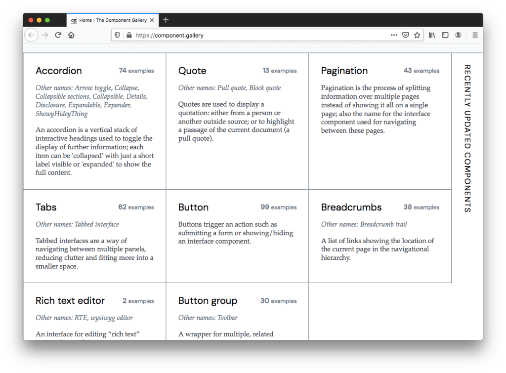
It works as a handy reference for anyone building their own design system, as you can compare the same components across the existing systems included here.

16. party.js

This is a fun and unique JavaScript library that lets you add particle effects to a web page, specifically confetti and sparkles.

You’ll only use this in very specific circumstances, but it’s nice that you can customize the particle shapes, number of particles, spread, and so on.

15. Headless UI

In the words of Nacho Libre, now we’re really getting down to the nitty gritty. This UI component library was released in late 2020 and has already amassed more than 12,000 stars on GitHub.

The components (dropdown menu, tabs, popover, etc.) are “headless.” That doesn’t mean their capa was detated; it means they’re unstyled so that you can brand them as you please. They’re also fully accessible, designed to integrate with Tailwind CSS, and are compatible with React and Vue. That’s right — this one hits almost every front-end buzzword for 2022.

14. Turbo

This is another one that did well throughout 2021 after a late 2020 release. It’s billed as “the speed of a single-page web application without having to write any JavaScript.”

In brief, Turbo is a library that lets you take advantage of four main features: Turbo Drive, Turbo Frames, Turbo Streams, and Turbo Native. These use web components to add single-page app-like performance and interactivity to your pages without the need to reinvent the wheel with heavy custom scripts.

13. tidy.js

This is a library of data-related JavaScript functions specifically for “tidying up” your data.

It includes 70+ functions under different categories (tidying, grouping, math, sequencing, etc.) and you can mess around with the different features using this playground.

12. Tail-Kit

This is the first Tailwind UI kit on the list of top front-end tools, and it’s a doozy. It has more than 250 open-source components that are compatible with React, Vue, and Angular.

There are components categorized under Elements, Forms, Commerce, Navigation, Sections, and Lists, or you can use from a number of templates, categorized under Dashboards, Landing Pages, and Error Pages.

11. Tailwind Components

And here’s another Tailwind UI kit, again featuring open-source components and templates under 13 more refined categories, along with an “awesome” category that includes free but premium components.

This site is more or less a directory of various community-contributed Tailwind components, rather than a cohesive set of UI elements like other kits.

10. Pikaday

A JavaScript date picker cracks the top 10 tools of the year in 2021 — who would have thunk it? It seems to check all the boxes necessary for a date picker component: No dependencies, lightweight, and uses modular CSS for styling.

Like a few other front-end tools on this list, this isn’t a new tool. It’s been around for a while, but I first shared it in 2021 and it amazingly ended up in this year’s top 10.

9. HTML Boilerplates

This is a practical little online HTML generator that lets you customize the type of HTML starter template you want to generate, providing toggle options for what to include. This is probably most useful for generating a quick template for a landing page or demo.

In all honesty, I think it would be good if the tool was updated to use a few more modern options, but for a simple HTML starting point this gets the job done.

8. Whirl

Here’s another CSS animation library, this time specifically a collection of animations for use as loading spinners. It includes 100+ animated loaders, some of which are really neat and unique.

I like how the animations in the list (which you can try right on the page) are categorized as pseudo-element, single element, and multi-element. The best one by far is the “pong” animation, though I question whether anyone would correctly classify that as indicative of “content loading”!

7. Riju

Imagine if CodePen and JSFiddle had a baby, then you chopped that baby into 224 pieces. That’s what Riju is — a fast online playground for just about every programming language.

I can’t imagine there’s any coding language you’d want to play around with that’s missing here and most of it is stuff that you don’t normally associate with running in the browser.

6. DevUI

This is an Angular toolkit that’s suitable for enterprise-level apps and includes components, icons, an admin dashboard template, and a design system for styling and branding.

I’m guessing this made the top 10 list of front-end tools because I didn’t specifically mention at first that it is for Angular apps (which isn’t clear on the home page either). Nonetheless, I did specify that it’s for enterprise-level projects, and that seemed to grab the attention of many.

5. Pollen

This library works as a foundation for your own design system, and its practicality is evident in its use of CSS custom properties.

It provides you with low-level design tokens that you can easily customize and extend. Modules include Typography, Layout, UI, Grid, and Colors. I’m guessing there will be more added to this, so it’s one to keep an eye on in the coming year.

4. AlterNight

Developers love VS Code, dark mode, and plugins. Combine those three things, and you have a great little front-end tool.

AlterNight is a beautiful VS Code theme and has a modest ~3,000 installs so far, but it was able to crack the top five in this year’s list.

3. UIsual

Here’s a collection of front-end templates, but with a bit of a twist that I think many seemed to appreciate: they’re greyscale.

The set currently includes eight templates with diverse layouts. With the lack of any color-based branding, these are a good option to customize to your own needs without looking like every other landing page out there.

2. Supabase UI

Here’s yet another open-source component library, this one for React and designed specifically for the Supabase product (an open-source Firebase alternative).

It’s Tailwind-ready and I should also point out that it’s still in early development. Nonetheless, it was popular enough to make it to number 2 on this list.

1. CSS Layout Generator

This was the most-clicked tool in my newsletter over the past year. It’s a full-featured CSS and JSX generator for producing different kinds of layouts using the CSS Grid Layout syntax.

Click on any of the five layout styles, and you’ll come to an interactive online editor that lets you mess around with various CSS Grid features like rows, columns, row gap, column gap, direction, grid alignment, and lots more. There’s quite a bit to play around with here, and apparently the tool will later include the Flexbox syntax for some of the examples.

What were your favorite front-end tools of 2021?

That wraps up this year’s list of most interesting front-end tools. I hope you found something here you can bookmark or start using in a new project. It’s pretty cool that this list contained such a variety of tools — there were UI kits, animation libraries, a stock photo site, image tools, and more.

Are there front-end tools not mentioned in this list that you enjoyed discovering over the past year? Feel free to drop it in the comments. You can also subscribe to my newsletter for more front-end tools in 2022 and feel free to hit me up if you’ve built something yourself that you’d like to share in a future issue.


What Were the Hottest Front-End Tools in 2021? originally published on CSS-Tricks. You should get the newsletter and become a supporter.

Categories: Designing, Others Tags:

The Case Against UX Testing

January 17th, 2022 No comments

Picture a dark office, blinds drawn. Picture a UX designer smoking a cigar. See the light filtered through the smoke whipped to fog by a spinning ceiling fan. Watch as the UX designer sits at a desk and considers the website.

The UX designer has devised a series of tests to determine if a green button is better than a red button. One of them involves tipping a tortoise onto its back. He looks the website over carefully and says, “Describe in single words, only the good things that come to mind about your mother.”

The website pauses, sweating under pressure, then replies, “Let me tell you about my mother…”

BLAM! The website pulls the trigger of an unseen gun, and the UX designer collapses, leaving the project to be rebuilt from scratch in Material by Harrison Ford, with overuse of Post-its delegated to Edward James Olmos.

Who Does UX Testing Actually Serve?

In the past’s bleak dystopian future (1982’s Blade Runner was set in 2019) no one benefitted from asking the wrong questions. And little has changed.

Designing any test to verify UX is fraught with as many complications as administering the test. Questions are skewed by bias, conscious or otherwise, and competing agendas. Even with something as apparently simple as a split test, the potential for distortion is immense.

When planned by a designer, a UX test offers little benefit to a client; the benefit is to the designer, who can then say their ideas are validated (or not).

Imagine hiring a developer to code a website, only to discover that the developer didn’t know CSS and expected to be paid to learn it before completing the work. You would hire someone else because that developer isn’t qualified.

From a client’s perspective, a UX designer should know, through experience, whether a green button is better than a red button. Designing an elaborate test to split-test the button color serves little purpose other than indemnifying the designer against mistakes.

The ROI of UX Testing

It’s widely accepted that there is substantial ROI (Return On Investment) from UX testing. We’ve all heard apocryphal stories about sites that split-tested their checkout and improved retention by 5%.

I’m going to go out on a limb and say that without user testing, that site could have improved its checkout retention by 4.9% simply by hiring a competent, experienced designer. But what about the remaining 0.1%? Well, for most sites, 0.1% represents very little profit. And the cost of recovering it via testing far exceeds the benefits.

When a company the size of Amazon, Netflix, Spotify, or Google split tests a website, it can afford to allocate $25k for user testing because it stands to gain 0.1%, and that represents far more than $25k. To meet the same 0.1% improvement, a small business has to design and run the same tests, incurring the same costs. But in the case of a small business, $25k could eat up all of its profits.

UX testing almost always works. But it is only profitable at scale.

If a good UI designer with a grounding in UX can improve checkout retention by 4.9%, tripling the project budget for just 0.1% more is a tough sell. Bluntly, that $25k is better spent on advertising.

What UX Designers Can Learn From Psychiatry

We all have the tendency to think we’re unique. It’s a survival trait attributed to our prehistoric brain. That belief in uniqueness is particularly strong in highly competitive people. We all think our site, our side-project, our approach are original. And we’re all wrong.

When a psychiatrist sits down with a patient, they have two immediate goals: categorize that patient into an established diagnosis, and assess the severity of the condition. It may be that the patient is depressed or anxious or even suffering from a potentially more debilitating condition like schizophrenia. What the psychiatrist is not trying to do, is define a new illness.

Occasionally — perhaps once per decade — a genuinely unusual patient will present themselves, and a new form of illness is considered. New treatments are found and tested. These treatments are rarely developed on behalf of individual patients; doctors work with grants from governments, medical schools, or the pharmaceutical industry and publish their results.

The vast majority of websites face similar problems. They deal with similar demographics, work within a similar culture, and deal with similar technology. As such, they can be categorized in the same manner a psychiatrist categorizes patients.

The key to delivering successful UX solutions is not UX testing in individual cases, but rather UX research, examining similar projects, and cribbing their solutions. If you categorize a project accurately, you’ll find a solution readily available.

Replacing User Testing With UX Best Practices

Your client doesn’t need to pay for UX testing to benefit from it. Enterprise sites, government sites, and even personal projects will test UX patterns. Sites like Shopify or Stripe will user-test their checkout processes at scale and enable companies to benefit from the results by adopting their platforms.

If you’re currently testing designs for small business, one of two things is true: either you’re wasting your client’s money investigating a problem someone else has already solved, or you’re designing something so original that it has no precedent (and you probably shouldn’t be).

Designers should be opinionated. Designers should know UX best practices and how they apply to a range of scenarios. Designers should be capable of making an educated guess. Designers should be self-validating.

Once or twice in your career, you may find a legitimate need to test something. However, the vast majority of the time, the correct answer is to tip the tortoise back onto its feet and choose whichever color button has the higher contrast.


Featured image: Still of Brion James in Blade Runner. Copyright Warner Bros. Entertainment

Source

The post The Case Against UX Testing first appeared on Webdesigner Depot.

Categories: Designing, Others Tags:

Popular Design News of the Week: January 10, 2022 – January 16, 2022

January 16th, 2022 No comments

Every day design fans submit incredible industry stories to our sister-site, Webdesigner News. Our colleagues sift through it, selecting the very best stories from the design, UX, tech, and development worlds and posting them live on the site.

The best way to keep up with the most important stories for web professionals is to subscribe to Webdesigner News or check out the site regularly. However, in case you missed a day this week, here’s a handy compilation of the top curated stories from the last seven days. Enjoy!

5 UX Tricks You Must Know in 2022

Clay.css

This Might Just Be the Worst Logo We’ve Ever Seen

14 CSS Reveal Animations

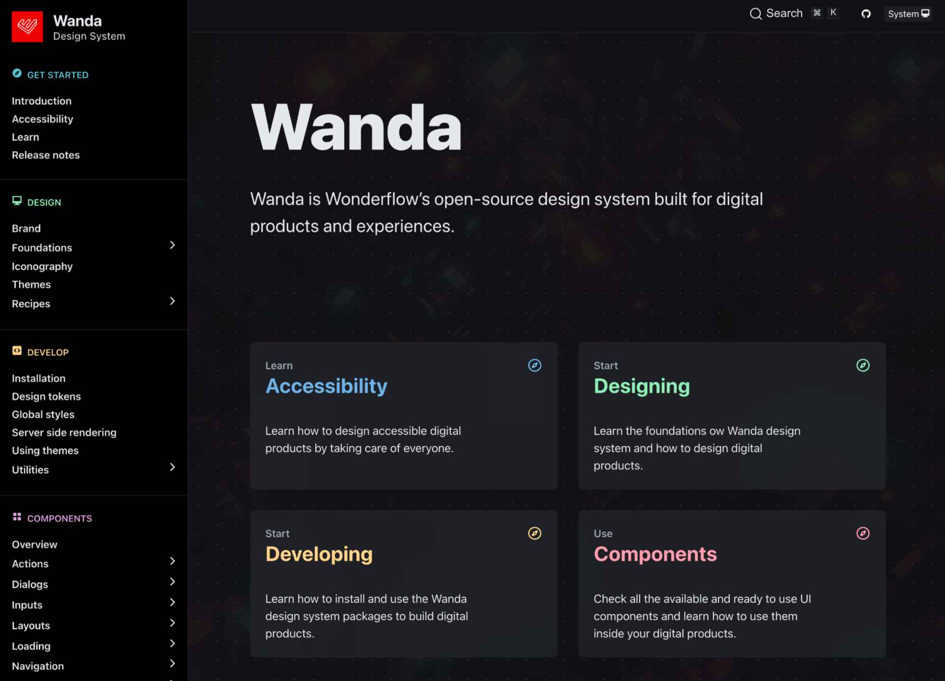
Wanda Design System

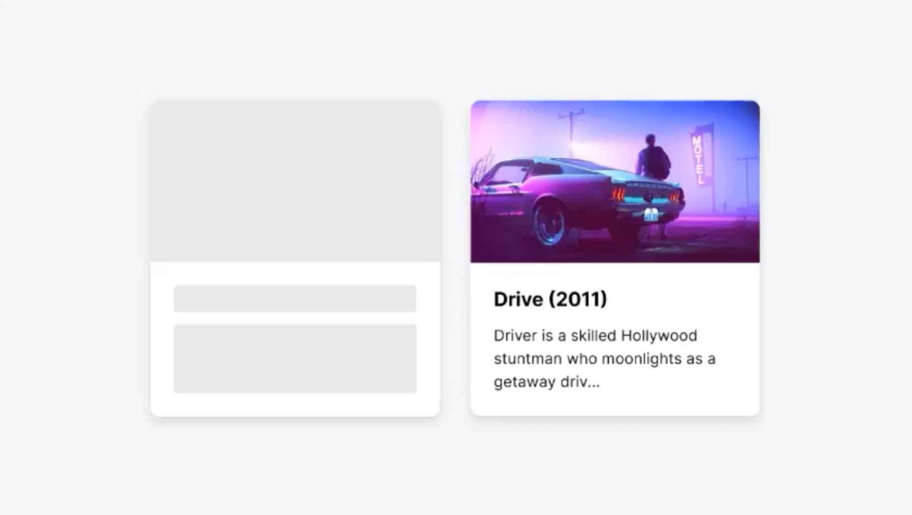
10 CSS Skeleton Loadings

The 9 Best Coding Games to Build your Programming Skills

PHP in 2022

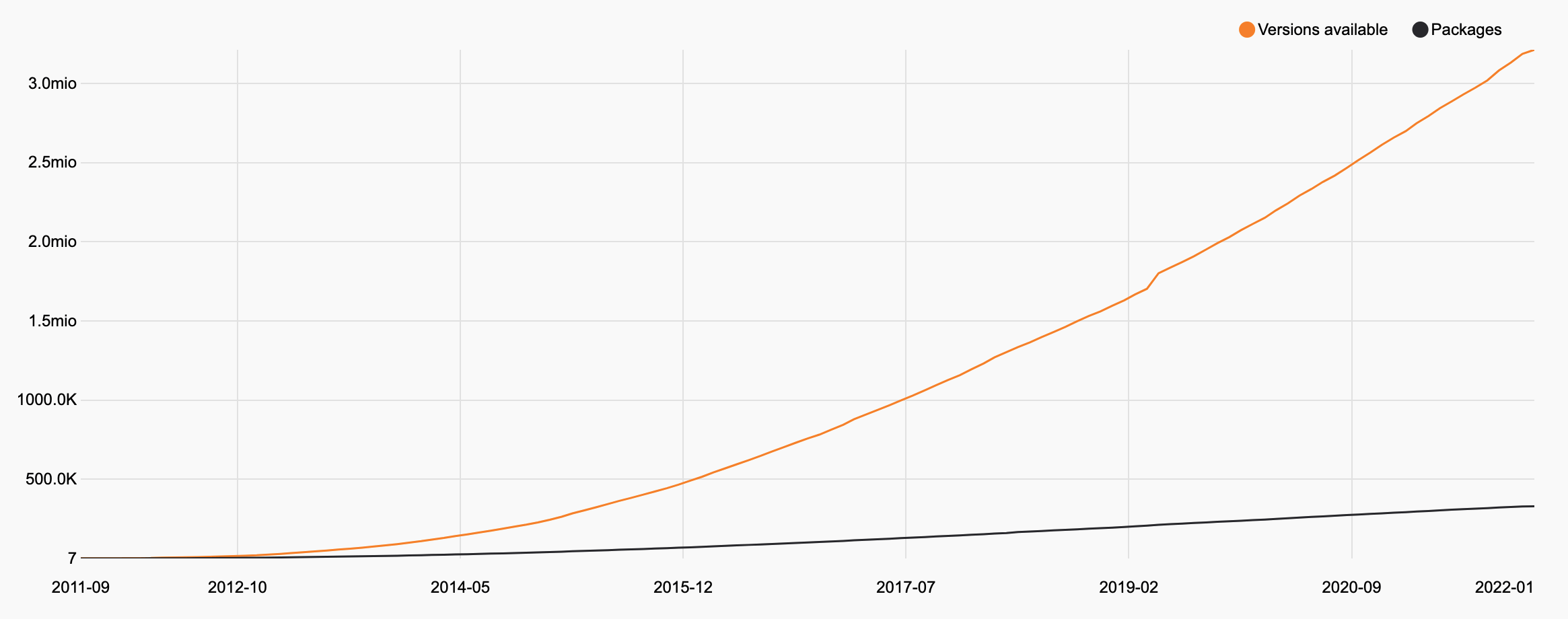
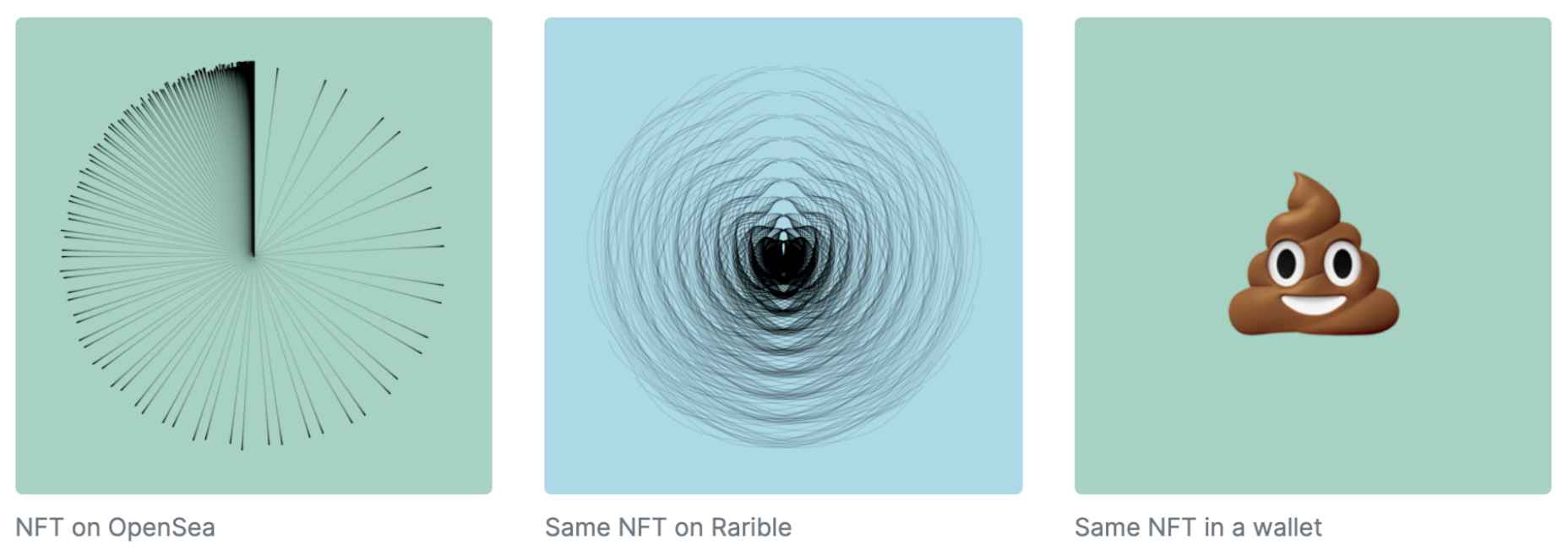
My First Impressions of Web3

Minimator

Source

The post Popular Design News of the Week: January 10, 2022 – January 16, 2022 first appeared on Webdesigner Depot.

Categories: Designing, Others Tags:

Using the CSS Me Not Bookmarklet to See (and Disable) CSS Files

January 15th, 2022 No comments
Screenshot of a Chrome browser window showing the CSS Me Not bookmarklet circled in red just below the address bar, Below that is a table injected above the CSS-Tricks website showing six stylesheets including an action to disable a sheet, the sheet's media, the sheet's host, and the sheet's name.

Stoyan is absolutely correct. As much as we all love CSS, it’s still an important player in how websites load and using less of it is a good thing. He has a neat new bookmarklet called CSS Me Not to help diagnose unnecessary CSS files, but we’ll get to that in a moment.

The [problem] is that CSS is in the critical path, it blocks rendering and often even JavaScript execution. We love CSS, it’s magic, it can do unbelievable feats and fix broken UIs and manipulate images and draw amazing pictures. We love CSS. We just want… less of it, because of its inherently blocking nature.

Sometimes our sites use entire stylesheets that are simply unnecessary. I hate to admit it, but WordPress is a notorious offender here, loading stylesheets for plugins and blocks that you might not even really be using. I’m in that position on this site as I write. I just haven’t found the time to root out a couple of little stylesheets I don’t need from loading.

Stoyan created a quick bookmarklet called CSS Me Not to see all those CSS files. The big benefit, of course, is that it lets you know what you’re up against.

You could find these stylesheets in DevTools as well, but the CSS Me Not bookmarklet makes it extra easy and has a killer bonus feature: turning off those stylesheets. Testing the bookmarklet here on CSS-Tricks, I can see four stylesheets that WordPress loads (because of settings and plugins) that I know I don’t need.

If you wanted to do this in DevTools instead, you could filter your Network requests by CSS, find the stylesheet that you want to turn off, right-click and block it, and re-load.

DevTools window screenshot with the Network panel open and the select menu open on a listed stylsheet with the option to block the request URL highlighted in bright blue.

I’ve been fighting this fight for ages, dequeuing scripts and styles in WordPress that I don’t want.

Removing totally unused stylesheets is an obvious win, but there is the more squirrely issue of removing unused CSS. I mention in that post the one-true-way of really knowing if any particular CSS is unused, which is attaching a background-image to every selector and then checking the server logs after a decent amount of production time to see which of those images were never requested. Stoyan corroborates my story here:

UnCSS is sort of a “lab”. The “real world” may surprise you. So a trick we did at SomeCompany Inc. was to instrument all the CSS declarations at build time, where each selector gets a 1×1 transparent background image. Then rummage through the server logs after a week or so to see what is actually used.


Using the CSS Me Not Bookmarklet to See (and Disable) CSS Files originally published on CSS-Tricks. You should get the newsletter and become a supporter.
Categories: Designing, Others Tags:

Mondrian Art in CSS From 5 Code Artists

January 14th, 2022 No comments

Mondrian is famous for paintings with big thick black lines forming a grid, where each cell is white, red, yellow, or blue. This aesthetic pairs well with the notoriously rectangular web, and that hasn’t gone unnoticed over the years with CSS developers. I saw some Mondrian Art in CSS going around the other day and figured I’d go looking for others I’ve seen over the years and round them up.

Vasilis van Gemert:
What if Mondrian used CSS instead of paint?

Many people have tried to recreate a work of art by Mondriaan with CSS. It seems like a nice and simple exercise: rectangles are easy with CSS, and now with grid, it is easy to recreate most of his works. I tried it as well, and it turned out to be a bit more complicated than I thought. And the results are, well, surprising.

Jen Simmons Lab:
Mondrian Art in CSS Grid

I love how Jen went the extra mile with the texture. Like most of these examples, CSS grid is used heavily.

Mondrian Art in CSS Grid from Jen Simmons. Includes rough grungy texture across the entire piece.
CodePen Embed Fallback

Jen Schiffer:
var t;: Piet Mondrian

I started with Mondrian not because he is my favorite artist (he is not), or that his work is very recognizeable (it is), but because I thought it would be a fun (yes) and easy start (lol nope) to this project.

Mondrian Art in CSS randomized 12 times in a 4 by 3 grid of boxes. A bright yellow header is above the grid bearing the site title: var t.
CodePen Embed Fallback

Riley Wong:
Make Your Own Mondrian-Style Painting with Code

There is a 12-step tutorial on GitHub.

CodePen Embed Fallback

Adam Fuhrer:
CSS Mondrian

Generative Piet Mondrian style art using CSS grid.

Screenshot of a full page Mondrian art example. There is a refresh button centered at the bottom of the page.

John Broers:
CSS Mondriaan Grid

An example of Mondrian Art in CSS with a "Generate New" option. The example is a square box with plenty of padding around it on the white background page.

Mondrian Art in CSS From 5 Code Artists originally published on CSS-Tricks. You should get the newsletter and become a supporter.
Categories: Designing, Others Tags:

How to Build Your First Custom Svelte Transition

January 14th, 2022 No comments
An animated example of a custom Svelte transition showing a to do list. An item is typed and animated into the list of items when entered. Clicking a done button animates the item out of view.

The Svelte transition API provides a first-class way to animate your components when they enter or leave the document, including custom Svelte transitions. By default, the transition directive uses CSS animations, which generally offer better performance and allow the browser’s main thread to remain unblocked. The API is as simple as this: . You can also specify in or out directives which are uni-directional transitions, only running when the element is mounted or unmounted.

Example of a working Svelte transition (jump to demo)

Svelte offers a runtime svelte/transition package that ships with seven prepackaged Svelte transition functions, all of which can be dropped in and tweaked to your heart’s desire. Pairing this with the svelte/easing package, allows for a wide swath of interactions, without writing any of the transition code yourself. Play around with different transitions and easing functions to get a feel for what is possible.

Looking for instructions on how to get started with Svelte? We have a solid overview for you to check out.

The Svelte Custom Transition API

If you need even more control than what the Svelte Transition API offers out of the box, Svelte permits you to specify your own custom transition function, as long as you adhere to a few conventions. From the docs, here’s what the custom transition API looks like:

transition = (node: HTMLElement, params: any) => {
  delay?: number,
  duration?: number,
  easing?: (t: number) => number,
  css?: (t: number, u: number) => string,
  tick?: (t: number, u: number) => void
} 

Let’s break it down. A transition function takes a reference to the DOM node where the transition directive is used and returns an object with some parameters that control the animation and, most importantly, a css or tick function.

The css function’s job is to return a string of CSS that describes the animation, typically including some kind of transform or opacity change. Alternatively, you can opt to return a tick function, which lets you control every aspect of the animation with the power JavaScript, but pays a performance penalty since this type of transition does not use CSS animations.

Both the css and tick functions take two parameters called (t, u) by convention. t is a decimal number that travels from 0.00 to 1.00 while the element is entering the DOM and from 1.00 back to 0.00 when the element is leaving. The u parameter is the inverse of t or 1 - t at any given moment. For example, if you return a string of transform: scale(${t}), your element would smoothly animate from 0 to 1 on enter, and vice versa on exit.

These concepts may seem a bit abstract, so let’s solidify them by building our own custom Svelte transition!

Building your first custom Svelte transition

First, let’s set up some boilerplate that allows us to toggle an element’s existence in the DOM using a Svelte #if block. Remember, Svelte transitions only run when an element is actually leaving or entering the DOM.

<script>
  let showing = true
</script>

<label for="showing">
  Showing
</label>
<input id="showing" type="checkbox" bind:checked={showing} />

{#if showing}
  <h1>Hello custom transition!</h1>
{/if}

You should be able to toggle the checkbox and see our element starkly appear and disappear in place.

Next, let’s set up our custom Svelte transition function and get it wired up to our element.

<script>
  let showing = true
  // Custom transition function
  function whoosh(node) {
    console.log(node)
  }
</script>

<label for="showing">
  Showing
</label>
<input id="showing" type="checkbox" bind:checked={showing} />

{#if showing}
  <h1 transition:whoosh>Hello custom transition!</h1>
{/if}

Now, if you toggle the checkbox, you will see the

element logged to the console. This proves we have the custom transition connected properly! We won’t actually use the DOM node in our example, but it’s often useful to have access to the element to reference its current styles or dimensions.

For our element to do any animation at all, we need to return an object that contains a css (or tick) function. Let’s have our css function return a single line of CSS that scales our element. We’ll also return a duration property that controls how long the animation takes.

<script>
  function swoop() {
    return {
      duration: 1000,
      css: () => `transform: scale(.5)`
    }
  }
  let showing = true
</script>

<!-- markup -->

We’ve got something moving! You will notice our element jumps straight to .5 scale when toggling the checkbox. This is something, but it would feel much better if it smoothly transitioned. That’s where the (t, u) parameters come in.

<script>
  function swoop() {
    return {
      duration: 1000,
      css: (t) => `transform: scale(${t})`
    }
  }
  let showing = true
</script>

<!-- markup -->

Now we are talking! Remember, t rolls smoothly from 0.00 to 1.00 when an element enters, and vice versa when it leaves. This allows us to achieve the smooth effect we want. In fact, what we just wrote is essentially the built-in scale transition from the svelte/transition package.

Let’s get a little bit fancier. To live up to our custom Svelte transition’s namesake, swoop, let’s add a translateX to our transform, so that our element zooms in and out from the side.

I want to challenge you to attempt the implementation first before we continue. Trust me, it will be fun! Assume that we want to translate to 100% when the element is leaving and back to 0% when it enters.

[waiting…]

How did it go? Want to compare answers?

Here’s what I got:

css: (t, u) => `transform: scale(${t}) translateX(${u * 100}%);`

It’s okay if you have something different! Let me break down what I did.

The key thing here is the usage of the second parameter in the css function. If we think about our animation while the element is entering the screen, we want to end up at scale(1) translateX(0%), so we can’t use unaltered t for both the scale and the transform. This is the convenience behind the u parameter — it is the inverse of t at any given moment, so we know it will be 0 when t is 1! I then multiplied u by 100 to get the percentage value and tacked on the % sign at the end.

Learning the interplay between t and u is an important piece of the custom transition puzzle in Svelte. These two parameters enable a world of dynamism for your animations; they can be divided, multiplied, twisted, or contorted into whatever needs you have.

Let’s slap my favorite svelte/easing function on our transition and call it a day:

<script>
  import { elasticOut } from 'svelte/easing'
  function swoop() {
    return {
      duration: 1000,
      easing: elasticOut,
      css: (t, u) => `transform: scale(${t}) translateX(${u * 100}%)`
    }
  }
  let showing = true
</script>

<label for="showing">
  Showing
</label>
<input id="showing" type="checkbox" bind:checked={showing} />

{#if showing}
  <h1 transition:swoop>Hello custom transition!</h1>
{/if}

Wrapping up

Congratulations! You can now build a custom Svelte transition function. We have only scratched the surface of what is possible but I hope you feel equipped with the tools to explore even further. I would highly recommend reading the docs and going through the official tutorial to gain even more familiarity.


How to Build Your First Custom Svelte Transition originally published on CSS-Tricks. You should get the newsletter and become a supporter.

Categories: Designing, Others Tags:

6 Low-Code platforms to watch in 2022

January 14th, 2022 No comments

Low-Code platforms are the future of enterprise application development. They provide a much quicker and efficient way to build applications without any coding knowledge. 

Low-Code platforms are quickly transforming the way companies do business. They are not only able to lower the time and cost of software development but also offer a more agile and streamlined process to get applications built and deployed.  

These platforms power the digital transformation of many organizations by providing a vehicle for the rapid development and deployment of web and mobile applications. 

The main benefits of using Low-Code platforms include:  

  • improved collaboration between business users and IT departments 
  • faster time to market for new features 
  • lower development costs and  
  • increased accuracy of digital products. 

We predict that 2022 will be the year for changing up your business and accelerating digital transformation with a Low-Code platform. 

Here are some leading Low-Code platforms that you should watch out for in 2022 and beyond:  

Microsoft Power Apps 

Microsoft PowerApps is a Low-Code platform that helps people quickly create intuitive applications without being a software developer. This platform lets users create custom apps from ready-made templates for various types of devices. 

It’s an easy way to make powerful mobile or web applications without coding skills. These app templates are straightforward to use and come with pre-built features for various business needs without having to hire developers. Microsoft Power Apps helps you develop smartphone apps, tablet apps, web interfaces for all kinds of purposes. This includes both internal and customer-facing apps. 

This solution has many features that help organizations streamline operations, improve customer service, and enhance employees’ productivity.  

Microsoft Power Apps are available on all popular devices and platforms, which makes it simple for anyone to use them. The users can also easily deploy their apps in the cloud or store them on Azure. 

Appian 

Appian is another Low-Code platform for building and delivering business applications. The platform incorporates a visual, drag-and-drop interface, role-based security features, integrated enterprise data access, and built-in logic. 

Appian’s platform allows customers to create interactive mobile apps, customer self-service applications, custom web portals, content management systems (CMS), and others. 

Appian also provides a robust API for connecting your app with other IT systems, enabling you to automate processes across your organization. With Appian’s API Toolbox, it’s easy to upload data from external sources or integrate data from other applications into your application. The Appian software is used by many large enterprises in banking and financial services, telecommunications, healthcare, and government. 

Comidor 

Comidor couldn’t be missing from the list of the best Low-Code platforms to watch in the upcoming year. Comidor Low-Code platform assists businesses in automating their workflows and business processes and developing cutting-edge Low-Code applications. Create your own custom applications with the Low-Code Application Builder or browse the Comidor application marketplace for pre-existing apps that can help you streamline your overall business operations. Anyone in your organization can create and manage custom applications using a user-friendly environment, regardless of coding experience. Drag-and-drop functionality, reusability of pre-built application templates, connection with workflow diagrams, cloud-native architecture, and real-time data analysis are only some of the powerful features Comidor offers to users. 

What’s more, the Comidor platform can handle all your demanding automation and development needs, by incorporating intelligent automation capabilities, like RPA and AI/ML, achieving thus end-to-end automation in one convenient, integrated platform. 

Outsystems 

Outsystems is a platform that helps you quickly create enterprise-grade mobile, web, and desktop software that can be deployed either on devices or on the cloud.  

The platform integrates all aspects of the enterprise in one collaborative environment to help enterprises succeed in this new era of digital business transformation. In essence, it allows business users to design, develop, deploy and manage their apps without any coding skills needed. 

It features a drag & drop user interface, no coding required for developing enterprise applications, visual modeling of processes and data, database connection to any database type. Outsystems also provides a web-based IDE and an API for building, deploying, and managing applications. 

It is used by enterprises in various industries around the world including healthcare, finance, retail, telecommunications, and others. 

Mendix  

Mendix is an all-in-one Low-Code development platform that allows developers and business users to build software applications while collaborating throughout the entire application development lifecycle. This cloud-based platform leverages Artificial Intelligence, integrates with external systems and databases to transfer data, and delivers end-to-end automation. 

Low-Code platforms, which use a visual, model-driven approach, eliminate the need for coding and bridge the gap between the IT and Business departments of an organization. Mendix combines Low-Code and No-Code development, while at the same time, putting a special emphasis on the integrated collaboration, the cloud-native architecture, as well as the intuitive drag-and-drop development that provides users with an engaging visual interface. 

Genexus 

Genexus is a Low-Code software development that automates and makes simpler the creation and evolution of enterprise applications. This agile platform is powered by Artificial Intelligence and combines multiple technologies to offer multi-experience solutions to users. By integrating any application with external and internal systems, the Genexus platform allows continuous information processing. 

The whole Genexus suite includes besides the Low-Code application development environment, collaboration tools, BPM capabilities, to model, automate, and optimize processes and workflows, and finally reporting and analytics. This platform covers a whole spectrum of automation capabilities to simplify software development. 

Sum up  

Businesses are seeking to reduce development costs, increase productivity, and improve team collaboration. Low-Code development platforms offer the benefits of code-free solutions like rapid deployment, no coding skills required, no upfront cost for capital expenditure, and quick time to market. To summarize, it is obvious that Low-Code development platforms are the new wave of the future of software development. Since Low-Code development platforms enable non-technical business analysts to create applications without writing code, so they don’t need programming knowledge at all, we understand why these platforms are a disruptive force in the digital economy. Additionally, the skyrocketing cost of traditional development makes Low-Code platforms become the way forward. Not only do they save time and money, but they also provide more flexibility than ever before.

The post 6 Low-Code platforms to watch in 2022 appeared first on noupe.

Categories: Others Tags:

A Practical Tip For Using Sass Default Parameters

January 13th, 2022 No comments

Sass offers functions and mixins that accept parameters. You can use Sass default parameters, that is, parameters that have a value even if you don’t provide them when the function or mixin is called.

Let’s focus on mixins here. Here’s the syntax of a mixin:

@mixin foo($a, $b, $c) {
  // I can use $a, $b, and $c in here, but there is a risk they are null
}

.el {
  @include foo(1, 2, 3);

  // if I tried to do `@include foo;`
  // ... which is valid syntax... 
  // I'd get `Error: Missing argument $a.` from Sass
}

It’s safer and more useful to set up default parameters in this Sass mixin:

@mixin foo($a: 1, $b: 2, $c: 3) {
}

.el {
  // Now this is fine
  @include foo;

  // AND I can send in params as well
  @include foo("three", "little", "pigs");
}

But what if I wanted to send in $b and $c, but leave $a as the Sass default parameter? The trick is that you send in named parameters:

@mixin foo($a: 1, $b: 2, $c: 3) {
}

.el {
  // Only sending in the second two params, $a will be the default.
  @include foo($b: 2, $c: 3);
}

A real-life example using Sass default parameters

Here’s a quick-y mixin that outputs what you need for very basic styled scrollbars (Kitty has one as well):

@mixin scrollbars(
  $size: 10px,
  $foreground-color: #eee,
  $background-color: #333
) {
  // For Google Chrome
  &::-webkit-scrollbar {
    width: $size;
    height: $size;
  }
  &::-webkit-scrollbar-thumb {
    background: $foreground-color;
  }
  &::-webkit-scrollbar-track {
    background: $background-color;
  }

  // Standard version (Firefox only for now)
  scrollbar-color: $foreground-color $background-color;
}

Now I can call it like this:

.scrollable {
  @include scrollbars;
}

.thick-but-otherwise-default-scrollable {
  // I can skip $b and $c because they are second and third
  @include scrollbars(30px);
}

.custom-colors-scrollable {
  // I can skip the first param if all the others are named.
  @include scrollbars($foreground-color: orange, $background-color: black);
}

.totally-custom-scrollable {
  @include scrollbars(20px, red, black);
}

I’m just noting this as I had to search around a bit to figure this out. I was trying stuff like sending empty strings or null as the first parameter in order to “skip” it, but that doesn’t work. Gotta do the named parameter approach.


A Practical Tip For Using Sass Default Parameters originally published on CSS-Tricks. You should get the newsletter and become a supporter.
Categories: Designing, Others Tags:

test 123

January 13th, 2022 No comments

test 123

The post test 123 appeared first on noupe.

Categories: Others Tags:

Test 3

January 13th, 2022 No comments

Test 3

The post Test 3 appeared first on noupe.

Categories: Others Tags: