Jetpack Features We Love and Use at CSS-Tricks
Low Code vs. No code – The Similarities & Differences
In a recent study conducted in August 2021, some mind-boggling statistics regarding global software and application development have come to light.
Enterprise software clocked a global spend of $5.2 trillion, while this number for mobile-based applications till the second quarter was $34 billion. These figures only mean one thing – the global consumption of software and applications is on the rise, and there is a need to meet this demand at the back end by ramping up the Software Development Life Cycle.
According to a report published by Evans Data Corporation, currently, there are only about 27 million professional developers in the world – which, if you pitch against the global demand of software and applications, isn’t much. Casting this data through a prism, there simply aren’t enough development professionals available for enterprises to hire! This has created a colossal vacuum between skill and demand in the SDLC universe.
A pressing need for a simpler SDLC has reared its head, necessitating the creation of tools that non-developers or novice developers can utilize to create software and applications that are just as fluid and functional as developed by any professional.
The result can be seen in No Code and Low Code platforms that allow the production of software and applications with minimal or only basic coding requirements. In addition, the interface allows for a drag-and-drop or flowcharting mechanism to achieve desired functions and performance from the resultant software. For someone not well-versed in the coding universe, such an interface is a blessing for it allows them to put together a full-fledged software with barely any coding involved, and fairly quickly too.

What exactly is Low Code and No Code? Let’s tackle that one by one.
What is Low Code?
Explained in very basic terms, a Low Code platform allows for software or application development by means of presenting the users with ready widgets of code to drag and assemble into a flowchart, workflow, or process diagram that the software would ultimately execute. It is like building with Lego blocks – only that users have chunks of code instead of blocks to piece together the entire software or application. So, for example, if the user wishes to provide a burger menu with dropdown options in software, there is a code module for it that the user merely needs to drag to the right place on the working canvas and drop it.

While it is an immeasurable convenience for novices, professional developers prefer Low Code just as much. It allows them to make time for a differentiating creative twist on their software while leaving all the heavy footwork to the Low Code platform.
Unlike a No Code, you do get to “see” some packets of code on the screen as you apply it to your software-in-progress in Low Code. No Code is a purely aesthetic name developed for marketing purposes targeted towards the code-inept audience. Although there isn’t any code to “see” on the screen – it is always present, running in the background.
Here are a few examples of Low Code tools.
Examples of Low Code Tools
- Zoho Creator: Sports routine automation and flexible hosting.
- Middleware: Middleware provides a smart load balancer, service discovery, and containerized system to autonomous scale cloud applications for high availability and performance.
- OutSystems: Provides Native support and real-time monitoring.
- Fyle: An expense management software that automates all pre-accounting processes and connects with accounting software for Financial analysis and reporting.
Low Code does have some high-utility advantages.
Advantages of Low Code
Low Code has several other offerings with the convenience of not having to code too much to build software.
- The speed of SDLC is phenomenal. For someone with a bit of coding background, putting together a sample software within a matter of days (or sometimes even half a day) is a significant achievement made possible with Low Code.
- One-click deployment takes away all the stress and strain involved with the concept of Launch Day. To test the final product, all the developer (user) has to do is click it into existence.
- High ROI at Low Risk can be expected from Low Code platforms. With these platforms, you get built-in integrations, security protocols, and cross-platform support that are robust and reliable.
Like every coin has a flip side, there are certain limitations to Low Code.
Limitations of Low Code
Although laced heavily with advantages, Low Code falls short of certain enterprise-level expectations from a good SDLC platform that should have been addressed from the get-go.
- For one, it doesn’t account for scalability or high performance. Basically, anything outside of the developmental sphere is practically out of the scope of Low Code.
- Secondly, it isn’t exactly plug-and-play. There is a learning curve involved, and it is a complicated one – which may work to beat the whole purpose at first glance, but if you relentlessly keep at it, you may get there one day.
This paves the way for its fraternal twin, the No Code.
What is No Code?
Rather than being something that exists separately, No Code has been marketed as such because of the “invisibility” of its code instead of the actual “absence” of it. Nothing can run without code – No Code simply ensures that those who don’t understand it don’t have to deal with it visually. Rendering everything to a pure widget and module-based interface, No Code is just another version of quick software and application development tool/platform.

Using No Code requires absolutely no knowledge of software or application development, being what it is. Enterprises equip their employees and teams with No Code platforms to quickly create prototypes or samples from their concepts, enabling them to speed up the development process without needing any niche skills.
Let’s see some examples.
Examples of No Code
- Code2: Server-free platform with access to APIs, plugins, databases, etc.
- Thinkific: Or any modern online course platform
- Bubble: Automatic backups, over 800 plugins, and real-time monitoring.
- Jotform: Create an app without coding, use tons of free templates to customize them and download your apps onto any platform.
- Sender: An easy-to-use email marketing platform with great integration capabilities.
- Outranking: AI Writer & SEO Tool for Content Optimization.
If you are thinking of getting No Code, have a look at some of its advantages.
Advantages of No Code
The fact that No Code can help a team quickly whip up a solution rather than having to wait for the IT team to take months building it makes No Code the perfect go-to tool for quick reviews. Since it requires no prior knowledge of coding, it is a highly easy-to-use platform for creating immediate or specialized applications of software for internal or team-specific purposes.
Limitations of No Code
Since No Code is so easy to use, it may create a condition called Shadow-IT, which means the unsupervised creation of apps or software that may end up bypassing company protocols can cause compliance problems. In addition, it may use up resources unnecessarily.
No Code v/s Low Code: Which One to Choose?
This choice to choose between Low Code and No Code can be guided by the purpose you intend for the product to have. If you are looking for a solution that helps your team navigate a process issue or solve a problem related to a project, go for No Code, as it enables anyone to create limited utility software or app. On the other hand, when faced with a mission-critical software release that serves a functional purpose for the entire business, Low Code is the better option as it produces a more capable, grounded, and well-rounded product.
Conclusion
According to a Gartner report, by the end of 2024, Low Code can be expected to account for 65% of the developmental process in the software realm. The globe relies on smart solutions today, and not everyone needs to be a skilled coder to create a solution for themselves.
The post Low Code vs. No code – The Similarities & Differences appeared first on noupe.
CSS-Based Fingerprinting
Fingerprinting is bad. It’s a term that refers to building up enough metadata about a user that you can essentially figure out who they are. JavaScript has access to all sorts of fingerprinting possibilities, which then combined with the IP address that the server has access to, means fingerprinting is all too common.
You don’t generally think of CSS as being a fingerprinting vector though, and thus “safe” in that way. But Oliver Brotchie has documented an idea that allows for some degree of fingerprinting with CSS alone.
Think of all the @media queries we have. We can test for pointer type with any-pointer. Imagine that for each value, we request a totally unique background-image from a server. If that image was requested, we know those @media queries were true. We can start to fingerprint with something like this:
.pointer {
  background-image: url('/unique-id/pointer=none')
}

@media (any-pointer: coarse) {
  .pointer {
    background-image: url('/unique-id/pointer=coarse')
  }
}

@media (any-pointer: fine) {
  .pointer {
    background-image: url('/unique-id/pointer=fine')
  }
}
Combine that with the fact that we can test for a dark mode preference with prefers-color-scheme, the fingerprint gets a bit clearer. In fact, it’s the current draft for CSS user prefer media queries that Oliver is most concerned about:
Not only will the upcoming draft make this method scalable, but it will also increase its precision. Currently, without alternative means, it is hard to conclusively link every request to a specific visitor as the only feasible way to determine their origin, is to group the requests by the IP address of the connection. However, with the new draft, by generating a randomised string and interpolating it into the URL tag for every visitor, we can accurately identify all requests from said visitor.
There are tons more. We can make media queries that are 1px apart and request a background image for each, perfectly guessing the visitor’s window size. There are probably a dozen or more exotic media queries that are rarely used, but are useful specifically to fingerprinting with CSS. Combine that with @supports queries for all sorts of things to essentially guess the exact browser. And combine that with the classic technique of testing for installation of specific local fonts, and you have a half-decent fingerprinting machine.
@font-face
  font-family: 'some-font'
  src: local(some font), url('some/url/some-font')

.some-font
  font-family:'some-font'
The generated CSS to do it is massive (here’s the Sass to generate it), but apparently it’s heavily reduced once we can use custom properties in URLs.
I’m not heavily worried about it, mostly because I don’t disable JavaScript and JavaScript is so much more widely capable of fingerprinting already. Plus, there are already other types of CSS security vulnerabilities, from reading visited links (which browsers have addressed), keylogging, and user generated inline styles, among others that folks have pointed out in another article on the topic.
But Oliver’s research on fingerprinting is really good and worthy of a look by everyone who knows more about web security than I do.
CSS-Based Fingerprinting originally published on CSS-Tricks
5 Big Web Design Predictions for 2022
Every year, at this time, blogs like this one like to try and predict what’s going to happen in the year ahead. It’s a way of drawing a line under the archive and starting afresh. A rejuvenation that, as humans, we find life-affirming.
Ten years ago, I would have had high confidence in these predictions — after all I was eventually right about SVG adoption, even if it took a decade. But the last few years have shown that web design is tightly interwoven with the muggle world, and that world is anything but predictable.
So as we look at what might occur in the next year (or five), think of it less as a set of predictions and more as a wishlist.
Last Year’s Predictions
When I write this post every January, I like to keep myself honest by glancing back at the previous year’s predictions to gauge how accurate (or not) my predictions have been.
Last year I predicted the long-term trend for minimalism would end, WordPress would decline, cryptocurrency would go mainstream, and then hedged my bets by saying we’d make both more and fewer video calls.
Gradients, maximalism, and the nineties revival pulled us away from minimalism. It’s still popular, just not as dominant.
WordPress is still the biggest CMS in the world and will continue to be for some time. But the relentless grind of no-code site builders at the low end, and being outperformed by better CMS at the high end, mean that WordPress has passed its peak.
Over-inflated predictions for BitCoin reaching $100k by December 2021 turned out to be a damp squib. In the end, Bitcoin only tripled in value in 2021. However, with micro-tipping and major tech companies moving into the arena, it’s clear digital currency arrived in the public consciousness in 2021.
And how could I be wrong about more but also fewer video calls? So I’m calling that my first clean sweep ever. With that heady boast, let’s take a look at the next twelve months.
What Not to Expect in 2022
Do not expect the Metaverse to be significant in anything but marketing speak. Yes, the hardware is slowly becoming more available, but the Metaverse in 2022 is like playing an MMORPG on PS5: theoretically, great fun, until you discover that absolutely none of your friends can get their hands on a console.
Ignore the blog posts predicting a noughties-era retro trend. All those writers have done is looked at the nineties-era trend and added a decade. Fashions aren’t mathematical; they’re poetic. Retro happens when people find a period that rhymes with present-day hopes and fears. After the last couple of years, if we revisit a decade, it’s likely to be the late-forties.
Finally, don’t expect seismic change. Material design, parallax scrolling, and jQuery are still with us and are still valid choices under the right circumstances. Trends aren’t neat; they don’t start in January and conclude in December.
5 Web Design Predictions for 2022
Predictions tend to be self-fulfilling. So we’ve limited ourselves to five trends that we believe are either positive or, at worst harmless. Of course, there are no guarantees, but if these come to pass, we’ll be in good shape for 2023.
1. The Blockchain is Coming
Underpinning the cryptocurrency industry are blockchains. In simple terms, they’re a set of data that can be appended to but can’t be edited or deleted. Think of it as version control for data.
As with most technology, the first wave has been a way to make a fast buck. However, the exciting development is blockchain technology itself and the transformative nature of the approach. For example, Médecins Sans Frontières reportedly stores refugees’ medical records on the blockchain.
Imagine the Internet as a set of data, editable for a micro-fee, and freely accessed by anyone anywhere. Instead of millions of sites, a single, secure, autonomous source of truth. Someone somewhere’s working on it.
2. Positivity & Playfulness & A11y
Even before world events descended into an endless tirade of grim news, time was running out for dull, corporate, geometric sans-serif design.
We added gradients, we added personality, we embraced humor. And contrary to the established business logic, we still make money. Over the past few years, there have been extraordinary efforts by designers and developers to examine, test, and champion accessibility, and thanks to them, inclusive design is no longer reliant on the lowest common denominator.
In 2022 you can get experimental without obstructing 10%+ of your users.
3. Everything Green
Green is a fascinating color, the primary that isn’t (except in RGB, when it is).
Green has the same visual weight as blue, is substantially more flexible, and yet to date, has been radically underutilized in digital design.
Green has a prominent cultural association with the environment. At a time when tech companies are desperate to emphasize their ethical credentials, marketing companies will inevitably begin promoting a brand color shift to green as a quick fix for all those dumped chemicals, strip mines, and plastic-filled seas.
We’ve already seen earthy hues acquire popular appeal. At the other end of the vibrancy scale, neons are popular. Green spans both approaches with everything from calm sages to acidic neons.
In 2022, if you’re looking for a color to capture the moment, look to green.
4. Hero Text
A picture is supposed to be worth 1000 words, although I’m not sure anyone has actually tried to measure it. The problem is that sites increasingly rely on stock images, so the 1000 words that we’re getting may or may not accurately reflect 100% of our message.
In 2022, a handful of well-chosen words will be worth more than an image, with hero images taking a back seat to large hero text. This is aided by a number of minor trends, the most notable of which is the willingness of businesses to look beyond the geometric sans-serif to a more expressive form of typography.
Reading through the prediction posts on sites other than this, almost everyone agrees on large hero text replacing images, which virtually guarantees it won’t happen. Still, at the start of 2022, this seems to be the direction we’re taking.
5. Bring the Noise
One of the unexpected consequences of the past couple of years has been a renewed connection with nature. The effortless complexity in nature is endlessly engaging.
We’ve already begun to popularise gradients — there are no flat colors in nature — and the next logical step is the addition of noise.
In visual terms, noise is the grainy texture that sits so beautifully in vector illustrations. Noise has dipped in and out of trends for years, hampered a little by the leap in file size it creates. However, with WebP and Avif file types, noise is now usable on production sites.
Designing in 2022, when in doubt, throw some noise at it.
Featured image via Unsplash.
The post 5 Big Web Design Predictions for 2022 first appeared on Webdesigner Depot.
The 10 Best Mobile Collaboration Apps For Your Business During Social Distancing Period
Ever since the first pandemic lockdowns, companies around the world have made the shift towards remote work.
However, running a business comes with its own set of challenges that need to be addressed if you want to continue growing.
While communication and flexibility are certainly a part of it, having the right collaboration apps in your tool stack is also essential. Today, we’re going to walk you through ten apps that can help make collaboration a lot more seamless for you and your team.
Top 10 Remote Collaboration Apps
Workpuls
Workpuls is one of the most granular employee monitoring tools out there since it lets you see the productivity levels of each individual team member. You’ll also be able to see if their productivity has risen or fallen compared to the previous period.
Outside of real-time monitoring and custom reports, you’ll also be able to assign tasks and see which projects take the longest to complete. If you go for the pricier Automatic Time Mapping tier then you’ll even be able to automate the process entirely.
Paid plans range from $8/month to $15/month depending on which features you need for your use case. There are also custom quotes for enterprise customers and annual discounts on all plans that will help you reduce the overall cost.
Chanty
A unique benefit that Chanty has over other team collaboration software is its Teambook feature. This lets you view all pinned messages, shared files, and upcoming tasks in a single place so you don’t have to jump around different areas on the platform.
Furthermore, you’ll be able to view the full message history without upgrading to a paid subscription, unlike other freemium options. In terms of meetings, the tool has 4K capabilities and can support up to 1,000 simultaneous participants.
As if all that wasn’t good enough, Chanty is also free forever. There is a business plan with extra features like video conferencing, expanded storage, dedicated support lines, and unlimited integrations but that only costs $3/month if you bill annually.
Jotform Apps
Jotform apps is a no-code app builder that will help you get your business’s app working seamlessly. It will change how your business receives and sends information while helping you go mobile and save you wait times and development costs. Working remotely may have some challenges, but using an app builder to create a collaboration app will allow your team to collaborate on incoming and outgoing communications in your own workspace.
It provides safe and easy communication between team members while also tracking your data. Serving as a huge collaboration hub, any updates made to your app takes effect in real time and doesn’t need rebuilds or installs. You can utilize Jotform Apps to hire remotely, request work from teammates, host webinars and even coordinate virtual team happy hours!
All these features for absolutely free! You can upgrade your plan and get more features depending on what your team needs. They have a ton of pricing options to choose from.
Asana
Most people who have used Asana are already familiar with its intuitive, minimalistic UI and seamless workflows. That said, you might not know that Asana actually has a Chrome extension that lets you add tasks directly through your browser toolbar.
Users also get access to over 100 integrations such as Microsoft Teams, Salesforce, Adobe Creative Cloud, Jira Cloud, Office 365, Google Workspace, Slack, Zapier, HubSpot, JotForm, and so many more.
Asana’s freemium tier is probably more than enough for most casual users but it is worth noting that their paid subscriptions are a bit more expensive than the competition, starting at $13.50/month.
ProofHub
ProofHub is an all-in-one project planner. It’s similar to Basecamp in that the feature suite is priced at a fixed-cost basis meaning you’ll be able to add as many team members as you want without having to worry about additional per-user fees.
There are tons of features like Gantt charts, time tracking, file sharing/versioning, group chats, and project templates. You’ll also be able to use integrations like Freshbooks, Dropbox, Google Calendar, and more. ProofHub even has multilingual support for nine languages.
Considering you’ll only be paying $50/month for all these features (or $99/month on the Ultimate Plan) it’s hard to argue with the value that ProofHub provides. You’ll also get 15GB worth of storage on the Essential plan or 100GB if you decide to go for the Ultimate Control plan.
Brosix
Brosix isn’t the newest or most popular communication solution on the market but it offers privacy, security, and affordability in a well-rounded package. In fact, teams of three people or less will be able to use the Startup plan which is totally free.
One of Brosix’s main selling points is its emphasis on security. Your private team network encrypts all data transfers to ensure your communications remain secure while the P2P file sharing functionality keeps your sensitive documents from falling into the wrong hands.
Brosix even lets you set security levels that determine what data a team member can access. Finally, you’ll be able to manage team activities, user permissions, and the network status from your web control panel which serves as the perfect admin dashboard.
HelpCrunch
With the goal of being the definitive customer communication platform, HelpCrunch lets you create knowledge base articles, create custom pop-ups, set up auto-messages, and track customer tickets with ease.
It’s incredibly easy to tweak the resources you create with HelpCrunch in every way except CSS. That said, the Basic plan is a bit limiting since you can only create one widget so we’d recommend going for the Pro tier if you plan to scale your business up in the near future.
The HelpCrunch dashboard has also received praise from users since it makes it easier to access all core features from a single place. Other positive reviews focused on the rapid setup and high-quality customer support.
Apploye
Apploye may have started out as a time tracking app but its native functionality is so diverse that the platform is comparable to full-blown collaboration suites. The tool also has payroll, invoicing, and time tracking features so you can stay on top of the financial side of things.
Where Apploye truly shines is in employee monitoring which is a challenge that most remote teams deal with. You’ll be able to see which apps people are using, the URLs they visit, and preview their activity through periodic screenshots that trigger every 10 minutes.
With prices ranging from $4/month to $7/month — not to mention the 50% off discount for annual billing — it’s easy to see why this affordable tool has been making waves in the remote collaboration space.
Time Doctor
Time Doctor is much more than a time tracker since it also has payroll, web usage monitoring, breaks tracking, detailed analytics, and alerts that remind employees to stay off social media when possible. That said, the time tracking itself is quite impressive as well.
You’ll be able to see the idle time for every team member in real-time, allowing you to step in if you see someone stuck on a task. Time Doctor also has a work-life balance feature currently in beta that helps employees identify issues that may be impacting their productivity.
To top it all off, Time Doctor has over 60 integrations for you to choose from including Salesforce, Trello, Freshdesk, QuickBooks, and more — making it extremely easy to add to your tool stack.
nTask
nTask is an all-in-one project planner that streamlines everything from resource allocation to setting campaign milestones. Its budgeting features may not be as complex as a dedicated solution but they should be more than enough for most standard use cases.
Users can also choose between Kanban boards or Gantt charts depending on their preferences and the project type. Those looking for communication features won’t be disappointed either since nTask has a team chat and dedicated workspaces.
The free plan offers 100 MB worth of storage and accommodates up to five team members which makes it a good starter option. nTask’s paid tiers range from $4/month to $12/month for each user, with perks like 5 GB to 10 GB in storage and advanced reporting.
Conclusion
As you can see, there are many tools that can make your remote collaboration experience a more positive and stress-free one. If you consider your specific needs, find the right features, and avoid going over budget then you’ll be well on your way to crafting the ideal tool stack.
That’s all for today but feel free to leave a comment below if you have any favorite apps that you think we should’ve covered. After all, Noupe is the webworkers magazine so we’re always excited to hear your opinions. Until then, stay safe!
The post The 10 Best Mobile Collaboration Apps For Your Business During Social Distancing Period appeared first on noupe.
Popular Design News of the Week: December 27, 2021 – January 2, 2022
Every day design fans submit incredible industry stories to our sister-site, Webdesigner News. Our colleagues sift through it, selecting the very best stories from the design, UX, tech, and development worlds and posting them live on the site.
The best way to keep up with the most important stories for web professionals is to subscribe to Webdesigner News or check out the site regularly. However, in case you missed a day this week, here’s a handy compilation of the top curated stories from the last seven days. Enjoy!
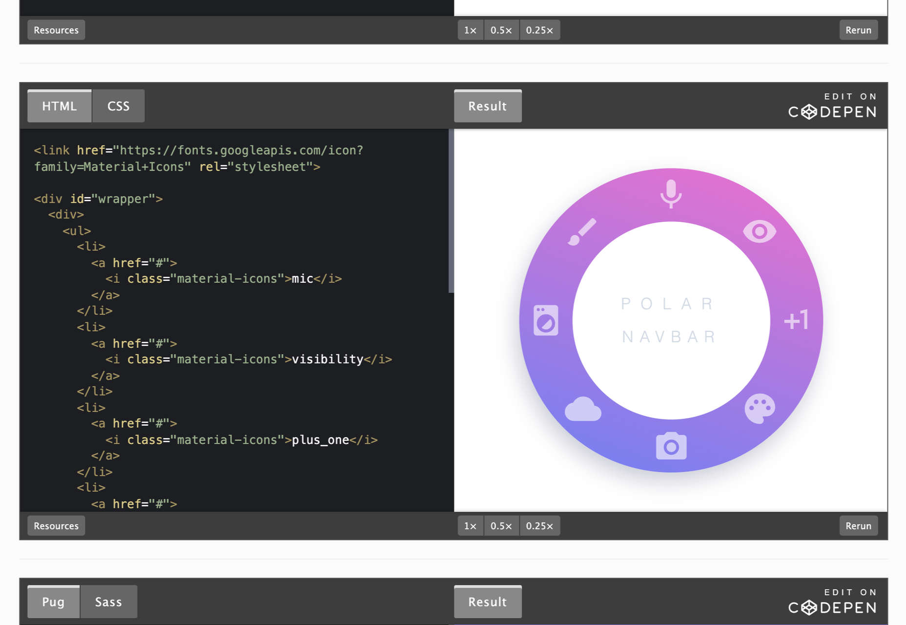
Pure CSS NavBar Responsive Examples
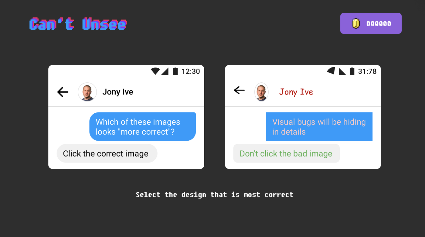
A List of Games for Bored (and Curious) Designers
Free Black and White Images
5 Exciting Web Design Trends for 2022
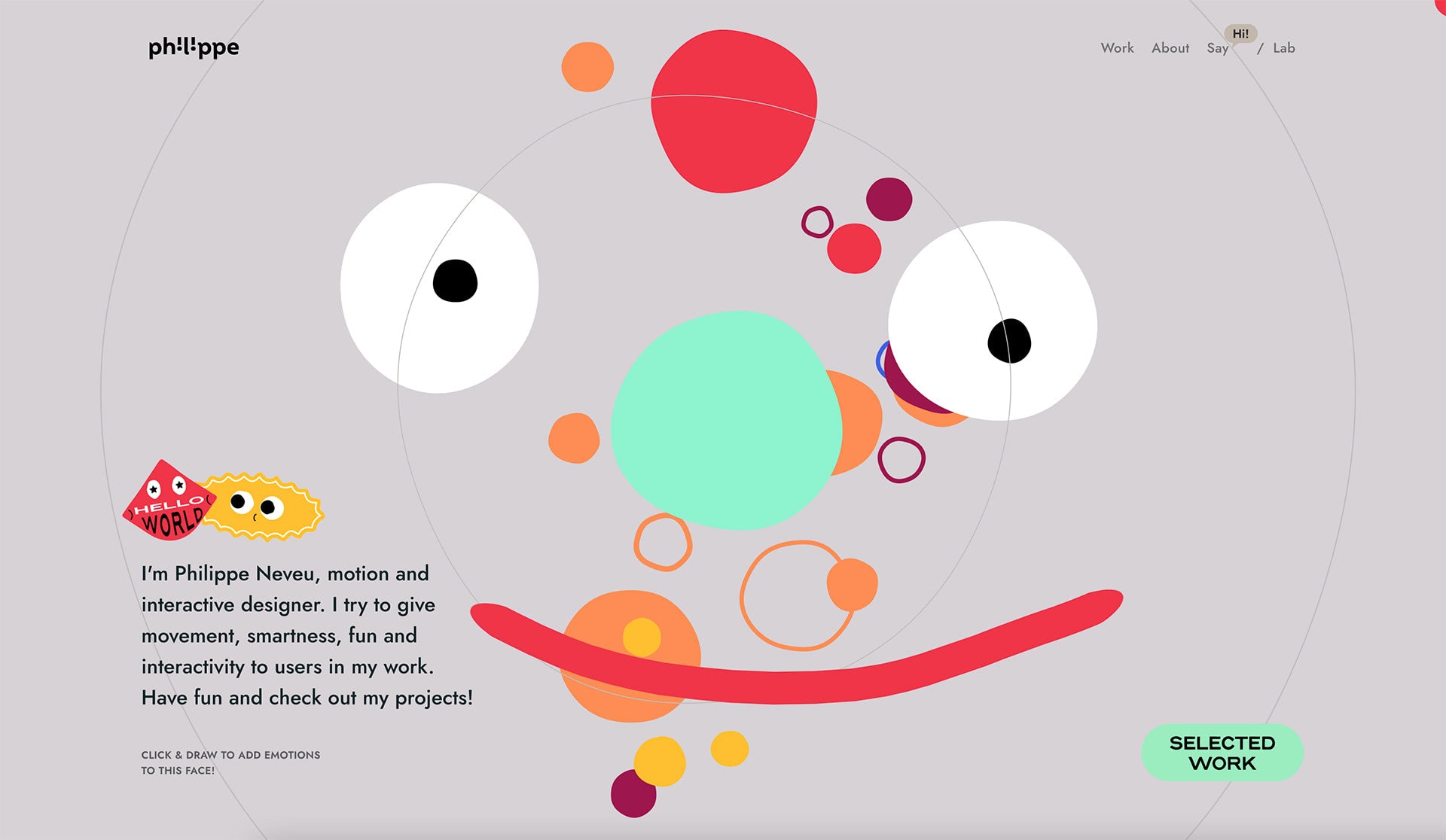
22 Inspiring Web Design Trends for 2022
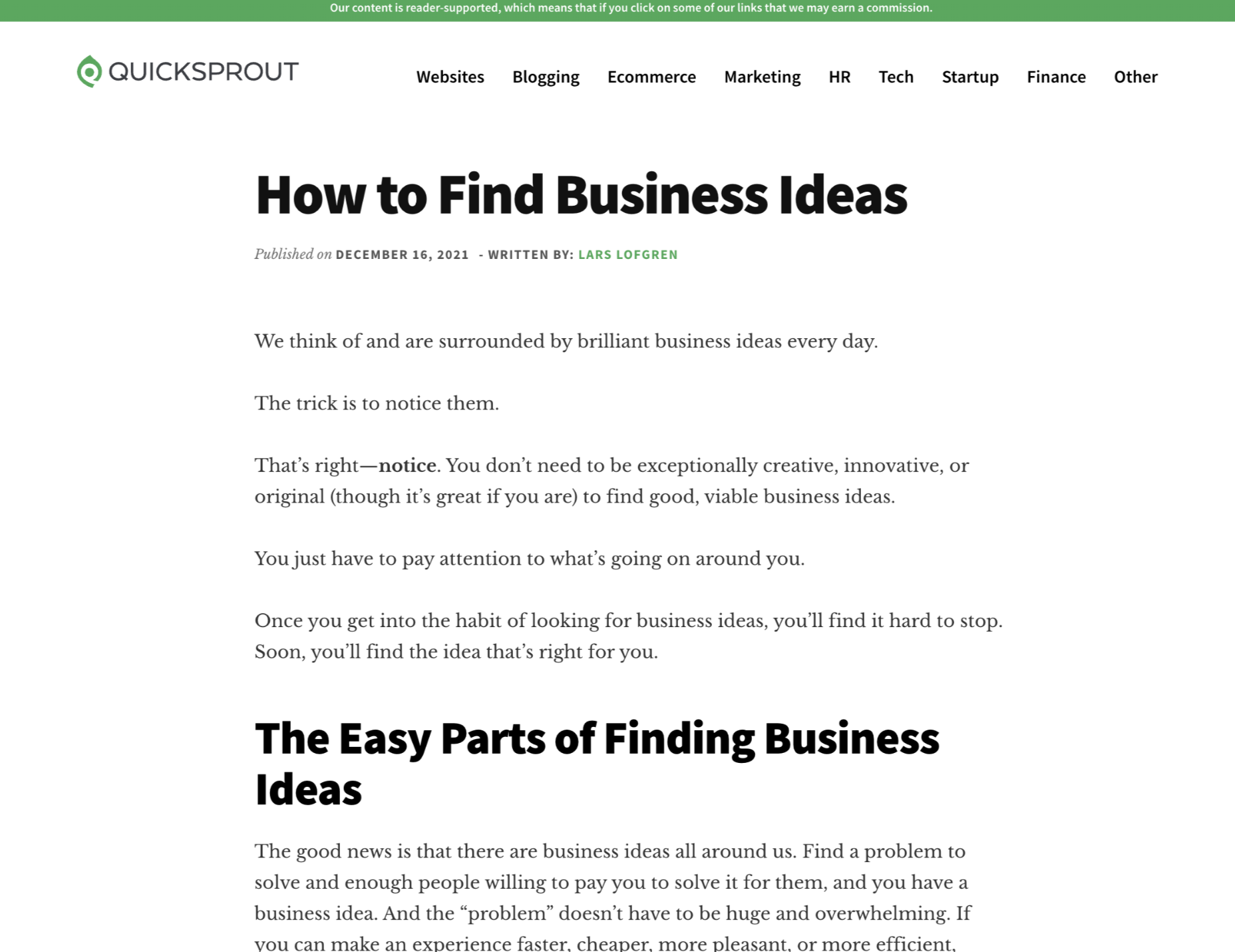
How to Find Business Ideas
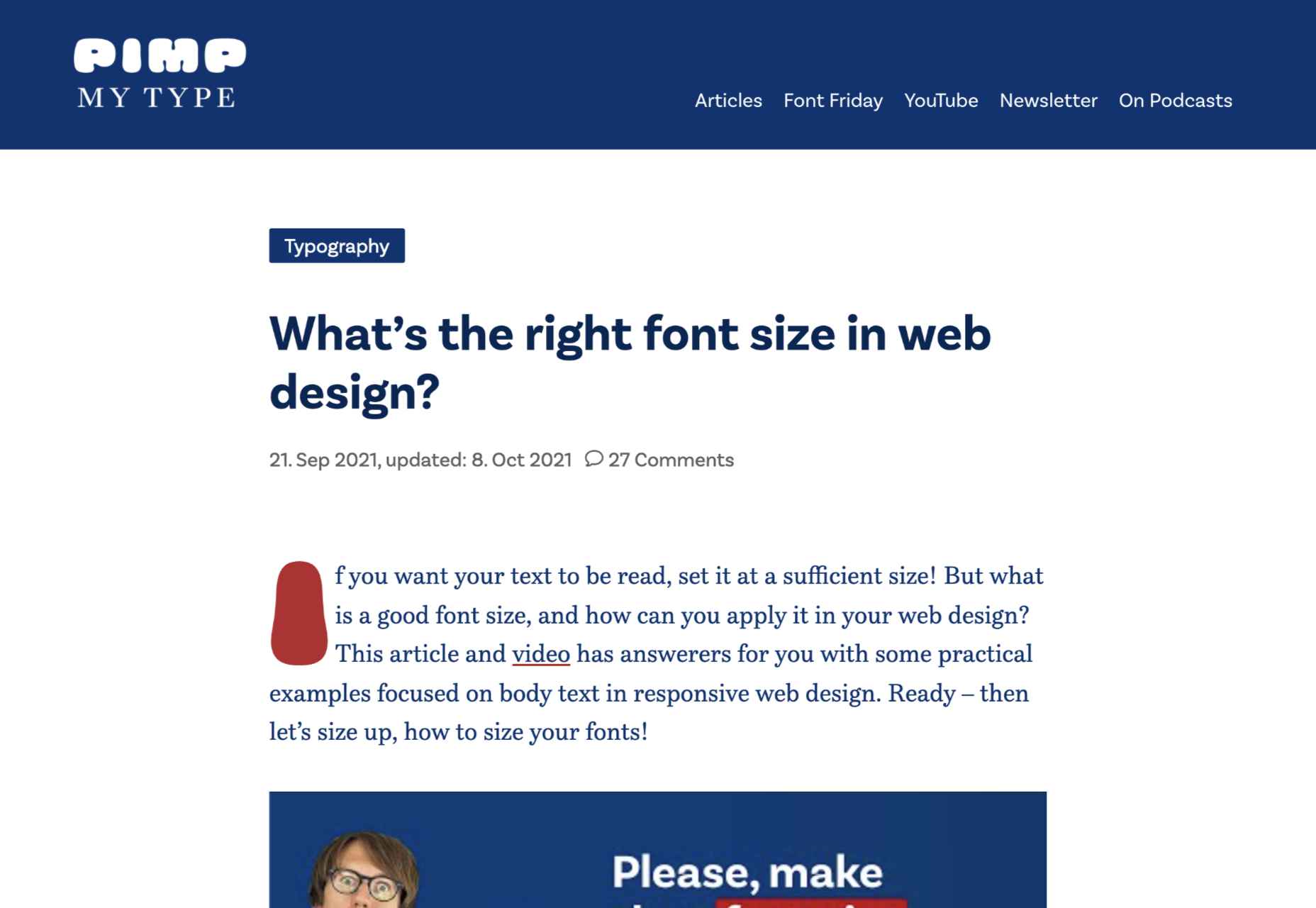
What’s the Right Font Size in Web Design?
Unbelievable 100-year-old Font Can Be Read Both Backwards and Forwards
Top Web Design and UI Trends for 2022
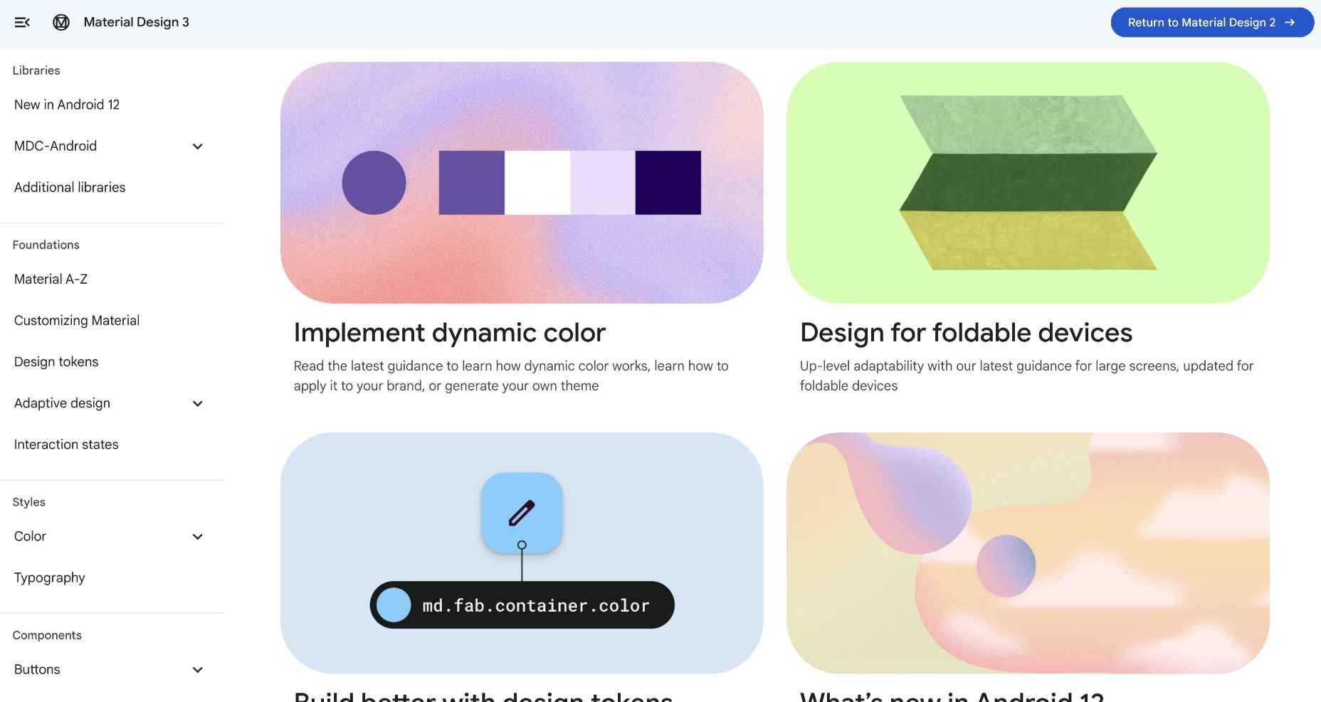
Material Design 3
The post Popular Design News of the Week: December 27, 2021 – January 2, 2022 first appeared on Webdesigner Depot.


