Archive

Archive for January, 2022

Context-Aware Web Components Are Easier Than You Think

January 21st, 2022 No comments
Two renderings of the web component side-by-side, the left is a human, and the right is a zombie.

We’ll start by creating a web component called . Every person after the apocalypse is either a human or a zombie and we’ll know which one based on a class — either .human or .zombie — that’s applied to the parent element of the component. We won’t do anything fancy with it (yet), but we’ll add a shadowRoot we can use to attach a corresponding image based on that classification.

customElements.define(
  "postapocalyptic-person",
  class extends HTMLElement {
    constructor() {
      super();
      const shadowRoot = this.attachShadow({ mode: "open" });
    }
}

Our HTML looks like this:

<div class="humans">
  <postapocalyptic-person></postapocalyptic-person>
</div>
<div class="zombies">
  <postapocalyptic-person></postapocalyptic-person>
</div>

Inserting people with connectedCallback

When a is loaded on the page, the connectedCallback() function is called.

connectedCallback() {
  let image = document.createElement("img");
  if (this.parentNode.classList.contains("humans")) {
    image.src = "https://assets.codepen.io/1804713/lady.png";
    this.shadowRoot.appendChild(image);
  } else if (this.parentNode.classList.contains("zombies")) {
    image.src = "https://assets.codepen.io/1804713/ladyz.png";
    this.shadowRoot.appendChild(image);
  }
}

This makes sure that an image of a human is output when the is a human, and a zombie image when the component is a zombie.

CodePen Embed Fallback

Be careful working with connectedCallback. It runs more often than you might realize, firing any time the element is moved and could (baffling-ly) even run after the node is no longer connected — which can be an expensive performance cost. You can use this.isConnected to know whether the element is connected or not.

Counting people with connectedCallback() when they are added

Let’s get a little more complex by adding a couple of buttons to the mix. One will add a , using a “coin flip” approach to decide whether it’s a human or a zombie. The other button will do the opposite, removing a at random. We’ll keep track of how many humans and zombies are in view while we’re at it.

<div class="btns">
  <button id="addbtn">Add Person</button>
  <button id="rmvbtn">Remove Person</button> 
  <span class="counts">
    Humans: <span id="human-count">0</span> 
    Zombies: <span id="zombie-count">0</span>
  </span>
</div>

Here’s what our buttons will do:

let zombienest = document.querySelector(".zombies"),
  humancamp = document.querySelector(".humans");

document.getElementById("addbtn").addEventListener("click", function () {
  // Flips a "coin" and adds either a zombie or a human
  if (Math.random() > 0.5) {
    zombienest.appendChild(document.createElement("postapocalyptic-person"));
  } else {
    humancamp.appendChild(document.createElement("postapocalyptic-person"));
  }
});
document.getElementById("rmvbtn").addEventListener("click", function () {
  // Flips a "coin" and removes either a zombie or a human
  // A console message is logged if no more are available to remove.
  if (Math.random() > 0.5) {
    if (zombienest.lastElementChild) {
      zombienest.lastElementChild.remove();
    } else {
      console.log("No more zombies to remove");
    }
  } else {
    if (humancamp.lastElementChild) {
      humancamp.lastElementChild.remove();
    } else {
      console.log("No more humans to remove");
    }
  }
});

Here’s the code in connectedCallback() that counts the humans and zombies as they are added:

connectedCallback() {
  let image = document.createElement("img");
  if (this.parentNode.classList.contains("humans")) {
    image.src = "https://assets.codepen.io/1804713/lady.png";
    this.shadowRoot.appendChild(image);
    // Get the existing human count.
    let humancount = document.getElementById("human-count");
    // Increment it
    humancount.innerHTML = parseInt(humancount.textContent) + 1;
  } else if (this.parentNode.classList.contains("zombies")) {
    image.src = "https://assets.codepen.io/1804713/ladyz.png";
    this.shadowRoot.appendChild(image);
    // Get the existing zombie count.
    let zombiecount = document.getElementById("zombie-count");
    // Increment it
    zombiecount.innerHTML = parseInt(zombiecount.textContent) + 1;
  }
}

Updating counts with disconnectedCallback

Next, we can use disconnectedCallback() to decrement the number as a humans and zombies are removed. However, we are unable to check the class of the parent element because the parent element with the corresponding class is already gone by the time disconnectedCallback is called. We could set an attribute on the element, or add a property to the object, but since the image’s src attribute is already determined by its parent element, we can use that as a proxy for knowing whether the web component being removed is a human or zombie.

disconnectedCallback() {
  let image = this.shadowRoot.querySelector('img');
  // Test for the human image
  if (image.src == "https://assets.codepen.io/1804713/lady.png") {
    let humancount = document.getElementById("human-count");
    humancount.innerHTML = parseInt(humancount.textContent) - 1; // Decrement count
  // Test for the zombie image
  } else if (image.src == "https://assets.codepen.io/1804713/ladyz.png") {
    let zombiecount = document.getElementById("zombie-count");
    zombiecount.innerHTML = parseInt(zombiecount.textContent) - 1; // Decrement count
  }
}
CodePen Embed Fallback

Beware of clowns!

Now (and I’m speaking from experience here, of course) the only thing scarier than a horde of zombies bearing down on your position is a clown — all it takes is one! So, even though we’re already dealing with frightening post-apocalyptic zombies, let’s add the possibility of a clown entering the scene for even more horror. In fact, we’ll do it in such a way that there’s a possibility any human or zombie on the screen is secretly a clown in disguise!

I take back what I said earlier: a single zombie clown is scarier than even a group of “normal” clowns. Let’s say that if any sort of clown is found — be it human or zombie — we separate them from the human and zombie populations by sending them to a whole different document — an jail, if you will. (I hear that “clowning” may be even more contagious than zombie contagion.)

And when we move a suspected clown from the current document to an , it doesn’t destroy and recreate the original node; rather it adopts and connects said node, first calling adoptedCallback then connectedCallback.

We don’t need anything in the document except a body with a .clowns class. As long as this document is in the iframe of the main document — not viewed separately — we don’t even need the instantiation code. We’ll include one space for humans, another space for zombies, and yes, the clowns’s jail… errr… of… fun.

<div class="btns">
  <button id="addbtn">Add Person</button>
  <button id="jailbtn">Jail Potential Clown</button>
</div>
<div class="humans">
  <postapocalyptic-person></postapocalyptic-person>
</div>
<div class="zombies">
  <postapocalyptic-person></postapocalyptic-person>
</div>
<iframe class="clowniframeoffun” src="adoptedCallback-iframe.html">
</iframe>

Our “Add Person” button works the same as it did in the last example: it flips a digital coin to randomly insert either a human or a zombie. When we hit the “Jail Potential Clown” button another coin is flipped and takes either a zombie or a human, handing them over to jail.

document.getElementById("jailbtn").addEventListener("click", function () {
  if (Math.random() > 0.5) {
    let human = humancamp.querySelector('postapocalyptic-person');
    if (human) {
      clowncollege.contentDocument.querySelector('body').appendChild(document.adoptNode(human));
    } else {
      console.log("No more potential clowns at the human camp");
    }
  } else {
    let zombie = zombienest.querySelector('postapocalyptic-person');
    if (zombie) {
      clowncollege.contentDocument.querySelector('body').appendChild(document.adoptNode(zombie));
    } else {
      console.log("No more potential clowns at the zombie nest");
    }
  }
});

Revealing clowns with adoptedCallback

In the adoptedCallback we’ll determine whether the clown is of the zombie human variety based on their corresponding image and then change the image accordingly. connectedCallback will be called after that, but we don’t have anything it needs to do, and what it does won’t interfere with our changes. So we can leave it as is.

adoptedCallback() {
  let image = this.shadowRoot.querySelector("img");
  if (this.parentNode.dataset.type == "clowns") {
    if (image.src.indexOf("lady.png") != -1) { 
      // Sometimes, the full URL path including the domain is saved in `image.src`.
      // Using `indexOf` allows us to skip the unnecessary bits. 
      image.src = "ladyc.png";
      this.shadowRoot.appendChild(image);
    } else if (image.src.indexOf("ladyz.png") != -1) {
      image.src = "ladyzc.png";
      this.shadowRoot.appendChild(image);
    }
  }
}

Detecting hidden clowns with attributeChangedCallback

Finally, we have the attributeChangedCallback. Unlike the the other three lifecycle callbacks, we need to observe the attributes of our web component in order for the the callback to fire. We can do this by adding an observedAttributes() function to the custom element’s class and have that function return an array of attribute names.

static get observedAttributes() {
  return [“attribute-name”];
}

Then, if that attribute changes — including being added or removed — the attributeChangedCallback fires.

Now, the thing you have to worry about with clowns is that some of the humans you know and love (or the ones that you knew and loved before they turned into zombies) could secretly be clowns in disguise. I’ve set up a clown detector that looks at a group of humans and zombies and, when you click the “Reveal Clowns” button, the detector will (through completely scientific and totally trustworthy means that are not based on random numbers choosing an index) apply data-clown="true" to the component. And when this attribute is applied, attributeChangedCallback fires and updates the component’s image to uncover their clownish colors.

I should also note that the attributeChangedCallback takes three parameters:

  • the name of the attribute
  • the previous value of the attribute
  • the new value of the attribute

Further, the callback lets you make changes based on how much the attribute has changed, or based on the transition between two states.

Here’s our attributeChangedCallback code:

attributeChangedCallback(name, oldValue, newValue) {
  let image = this.shadowRoot.querySelector("img");
  // Ensures that `data-clown` was the attribute that changed,
  // that its value is true, and that it had an image in its `shadowRoot`
  if (name="data-clown" && this.dataset.clown && image) {
    // Setting and updating the counts of humans, zombies,
    // and clowns on the page
    let clowncount = document.getElementById("clown-count"),
    humancount = document.getElementById("human-count"),
    zombiecount = document.getElementById("zombie-count");
    if (image.src.indexOf("lady.png") != -1) {
      image.src = "https://assets.codepen.io/1804713/ladyc.png";
      this.shadowRoot.appendChild(image);
      // Update counts
      clowncount.innerHTML = parseInt(clowncount.textContent) + 1;
      humancount.innerHTML = parseInt(humancount.textContent) - 1;
    } else if (image.src.indexOf("ladyz.png") != -1) {
      image.src = "https://assets.codepen.io/1804713/ladyzc.png";
      this.shadowRoot.appendChild(image);
      // Update counts
      clowncount.innerHTML = parseInt(clowncount.textContent) + 1;
      zombiecount.innerHTML = parseInt(zombiecount.textContent) - 1;
    }
  }
}
CodePen Embed Fallback

And there you have it! Not only have we found out that web component callbacks and creating context-aware custom elements are easier than you may have thought, but detecting post-apocalyptic clowns, though terrifying, is also easier that you thought. What kind of devious, post-apocalyptic clowns can you detect with these web component callback functions?


Another aspect of web components that we haven’t talked about yet is that a JavaScript function is called whenever a web component is added or removed from a page. These lifecycle callbacks can be used for many things, including making an element aware of its context.

Article series

The four lifecycle callbacks of web components

There are four lifecycle callbacks that can be used with web components:

  • connectedCallback: This callback fires when the custom element is attached to the element.
  • disconnectedCallback: This callback fires when the element is removed from the document.
  • adoptedCallback: This callback fires when the element is added to a new document.
  • attributeChangedCallback: This callback fires when an attribute is changed, added or removed, as long as that attribute is being observed.

Let’s look at each of these in action.

Our post-apocalyptic person component

We’ll start by creating a web component called . Every person after the apocalypse is either a human or a zombie and we’ll know which one based on a class — either .human or .zombie — that’s applied to the parent element of the component. We won’t do anything fancy with it (yet), but we’ll add a shadowRoot we can use to attach a corresponding image based on that classification.

customElements.define(
  "postapocalyptic-person",
  class extends HTMLElement {
    constructor() {
      super();
      const shadowRoot = this.attachShadow({ mode: "open" });
    }
}

Our HTML looks like this:

<div class="humans">
  <postapocalyptic-person></postapocalyptic-person>
</div>
<div class="zombies">
  <postapocalyptic-person></postapocalyptic-person>
</div>

Inserting people with connectedCallback

When a is loaded on the page, the connectedCallback() function is called.

connectedCallback() {
  let image = document.createElement("img");
  if (this.parentNode.classList.contains("humans")) {
    image.src = "https://assets.codepen.io/1804713/lady.png";
    this.shadowRoot.appendChild(image);
  } else if (this.parentNode.classList.contains("zombies")) {
    image.src = "https://assets.codepen.io/1804713/ladyz.png";
    this.shadowRoot.appendChild(image);
  }
}

This makes sure that an image of a human is output when the is a human, and a zombie image when the component is a zombie.

CodePen Embed Fallback

Be careful working with connectedCallback. It runs more often than you might realize, firing any time the element is moved and could (baffling-ly) even run after the node is no longer connected — which can be an expensive performance cost. You can use this.isConnected to know whether the element is connected or not.

Counting people with connectedCallback() when they are added

Let’s get a little more complex by adding a couple of buttons to the mix. One will add a , using a “coin flip” approach to decide whether it’s a human or a zombie. The other button will do the opposite, removing a at random. We’ll keep track of how many humans and zombies are in view while we’re at it.

<div class="btns">
  <button id="addbtn">Add Person</button>
  <button id="rmvbtn">Remove Person</button> 
  <span class="counts">
    Humans: <span id="human-count">0</span> 
    Zombies: <span id="zombie-count">0</span>
  </span>
</div>

Here’s what our buttons will do:

let zombienest = document.querySelector(".zombies"),
  humancamp = document.querySelector(".humans");

document.getElementById("addbtn").addEventListener("click", function () {
  // Flips a "coin" and adds either a zombie or a human
  if (Math.random() > 0.5) {
    zombienest.appendChild(document.createElement("postapocalyptic-person"));
  } else {
    humancamp.appendChild(document.createElement("postapocalyptic-person"));
  }
});
document.getElementById("rmvbtn").addEventListener("click", function () {
  // Flips a "coin" and removes either a zombie or a human
  // A console message is logged if no more are available to remove.
  if (Math.random() > 0.5) {
    if (zombienest.lastElementChild) {
      zombienest.lastElementChild.remove();
    } else {
      console.log("No more zombies to remove");
    }
  } else {
    if (humancamp.lastElementChild) {
      humancamp.lastElementChild.remove();
    } else {
      console.log("No more humans to remove");
    }
  }
});

Here’s the code in connectedCallback() that counts the humans and zombies as they are added:

connectedCallback() {
  let image = document.createElement("img");
  if (this.parentNode.classList.contains("humans")) {
    image.src = "https://assets.codepen.io/1804713/lady.png";
    this.shadowRoot.appendChild(image);
    // Get the existing human count.
    let humancount = document.getElementById("human-count");
    // Increment it
    humancount.innerHTML = parseInt(humancount.textContent) + 1;
  } else if (this.parentNode.classList.contains("zombies")) {
    image.src = "https://assets.codepen.io/1804713/ladyz.png";
    this.shadowRoot.appendChild(image);
    // Get the existing zombie count.
    let zombiecount = document.getElementById("zombie-count");
    // Increment it
    zombiecount.innerHTML = parseInt(zombiecount.textContent) + 1;
  }
}

Updating counts with disconnectedCallback

Next, we can use disconnectedCallback() to decrement the number as a humans and zombies are removed. However, we are unable to check the class of the parent element because the parent element with the corresponding class is already gone by the time disconnectedCallback is called. We could set an attribute on the element, or add a property to the object, but since the image’s src attribute is already determined by its parent element, we can use that as a proxy for knowing whether the web component being removed is a human or zombie.

disconnectedCallback() {
  let image = this.shadowRoot.querySelector('img');
  // Test for the human image
  if (image.src == "https://assets.codepen.io/1804713/lady.png") {
    let humancount = document.getElementById("human-count");
    humancount.innerHTML = parseInt(humancount.textContent) - 1; // Decrement count
  // Test for the zombie image
  } else if (image.src == "https://assets.codepen.io/1804713/ladyz.png") {
    let zombiecount = document.getElementById("zombie-count");
    zombiecount.innerHTML = parseInt(zombiecount.textContent) - 1; // Decrement count
  }
}
CodePen Embed Fallback

Beware of clowns!

Now (and I’m speaking from experience here, of course) the only thing scarier than a horde of zombies bearing down on your position is a clown — all it takes is one! So, even though we’re already dealing with frightening post-apocalyptic zombies, let’s add the possibility of a clown entering the scene for even more horror. In fact, we’ll do it in such a way that there’s a possibility any human or zombie on the screen is secretly a clown in disguise!

I take back what I said earlier: a single zombie clown is scarier than even a group of “normal” clowns. Let’s say that if any sort of clown is found — be it human or zombie — we separate them from the human and zombie populations by sending them to a whole different document — an jail, if you will. (I hear that “clowning” may be even more contagious than zombie contagion.)

And when we move a suspected clown from the current document to an , it doesn’t destroy and recreate the original node; rather it adopts and connects said node, first calling adoptedCallback then connectedCallback.

We don’t need anything in the document except a body with a .clowns class. As long as this document is in the iframe of the main document — not viewed separately — we don’t even need the instantiation code. We’ll include one space for humans, another space for zombies, and yes, the clowns’s jail… errr… of… fun.

<div class="btns">
  <button id="addbtn">Add Person</button>
  <button id="jailbtn">Jail Potential Clown</button>
</div>
<div class="humans">
  <postapocalyptic-person></postapocalyptic-person>
</div>
<div class="zombies">
  <postapocalyptic-person></postapocalyptic-person>
</div>
<iframe class="clowniframeoffun” src="adoptedCallback-iframe.html">
</iframe>

Our “Add Person” button works the same as it did in the last example: it flips a digital coin to randomly insert either a human or a zombie. When we hit the “Jail Potential Clown” button another coin is flipped and takes either a zombie or a human, handing them over to jail.

document.getElementById("jailbtn").addEventListener("click", function () {
  if (Math.random() > 0.5) {
    let human = humancamp.querySelector('postapocalyptic-person');
    if (human) {
      clowncollege.contentDocument.querySelector('body').appendChild(document.adoptNode(human));
    } else {
      console.log("No more potential clowns at the human camp");
    }
  } else {
    let zombie = zombienest.querySelector('postapocalyptic-person');
    if (zombie) {
      clowncollege.contentDocument.querySelector('body').appendChild(document.adoptNode(zombie));
    } else {
      console.log("No more potential clowns at the zombie nest");
    }
  }
});

Revealing clowns with adoptedCallback

In the adoptedCallback we’ll determine whether the clown is of the zombie human variety based on their corresponding image and then change the image accordingly. connectedCallback will be called after that, but we don’t have anything it needs to do, and what it does won’t interfere with our changes. So we can leave it as is.

adoptedCallback() {
  let image = this.shadowRoot.querySelector("img");
  if (this.parentNode.dataset.type == "clowns") {
    if (image.src.indexOf("lady.png") != -1) { 
      // Sometimes, the full URL path including the domain is saved in `image.src`.
      // Using `indexOf` allows us to skip the unnecessary bits. 
      image.src = "ladyc.png";
      this.shadowRoot.appendChild(image);
    } else if (image.src.indexOf("ladyz.png") != -1) {
      image.src = "ladyzc.png";
      this.shadowRoot.appendChild(image);
    }
  }
}

Detecting hidden clowns with attributeChangedCallback

Finally, we have the attributeChangedCallback. Unlike the the other three lifecycle callbacks, we need to observe the attributes of our web component in order for the the callback to fire. We can do this by adding an observedAttributes() function to the custom element’s class and have that function return an array of attribute names.

static get observedAttributes() {
  return [“attribute-name”];
}

Then, if that attribute changes — including being added or removed — the attributeChangedCallback fires.

Now, the thing you have to worry about with clowns is that some of the humans you know and love (or the ones that you knew and loved before they turned into zombies) could secretly be clowns in disguise. I’ve set up a clown detector that looks at a group of humans and zombies and, when you click the “Reveal Clowns” button, the detector will (through completely scientific and totally trustworthy means that are not based on random numbers choosing an index) apply data-clown="true" to the component. And when this attribute is applied, attributeChangedCallback fires and updates the component’s image to uncover their clownish colors.

I should also note that the attributeChangedCallback takes three parameters:

  • the name of the attribute
  • the previous value of the attribute
  • the new value of the attribute

Further, the callback lets you make changes based on how much the attribute has changed, or based on the transition between two states.

Here’s our attributeChangedCallback code:

attributeChangedCallback(name, oldValue, newValue) {
  let image = this.shadowRoot.querySelector("img");
  // Ensures that `data-clown` was the attribute that changed,
  // that its value is true, and that it had an image in its `shadowRoot`
  if (name="data-clown" && this.dataset.clown && image) {
    // Setting and updating the counts of humans, zombies,
    // and clowns on the page
    let clowncount = document.getElementById("clown-count"),
    humancount = document.getElementById("human-count"),
    zombiecount = document.getElementById("zombie-count");
    if (image.src.indexOf("lady.png") != -1) {
      image.src = "https://assets.codepen.io/1804713/ladyc.png";
      this.shadowRoot.appendChild(image);
      // Update counts
      clowncount.innerHTML = parseInt(clowncount.textContent) + 1;
      humancount.innerHTML = parseInt(humancount.textContent) - 1;
    } else if (image.src.indexOf("ladyz.png") != -1) {
      image.src = "https://assets.codepen.io/1804713/ladyzc.png";
      this.shadowRoot.appendChild(image);
      // Update counts
      clowncount.innerHTML = parseInt(clowncount.textContent) + 1;
      zombiecount.innerHTML = parseInt(zombiecount.textContent) - 1;
    }
  }
}
CodePen Embed Fallback

And there you have it! Not only have we found out that web component callbacks and creating context-aware custom elements are easier than you may have thought, but detecting post-apocalyptic clowns, though terrifying, is also easier that you thought. What kind of devious, post-apocalyptic clowns can you detect with these web component callback functions?


Context-Aware Web Components Are Easier Than You Think originally published on CSS-Tricks. You should get the newsletter and become a supporter.

Categories: Designing, Others Tags:

5 best examples of eCommerce dashboards to help you take control of your business

January 21st, 2022 No comments

Being an entrepreneur means you must keep a lot of things under control. You have to always know what is going on in sales, marketing, finance, inventory, and other aspects of your business.

Moreover, you probably use a myriad of tools to run them. Switching between a CRM, marketing automation software, Google Analytics, Accounting System and your eCommerce back-end won’t provide a clear picture of how your business is doing. 

Wouldn’t it be great to have one screen showing the most important information about your business? eCommerce dashboards are here to give you this opportunity.

What is a dashboard and why do you need it?

eCommerce dashboard is a visual representation of up-to-date data (metrics and KPIs) important for the business. It helps to analyze the main indicators to improve the results. Dashboards are different from other analytics tools because they give insights on the most vital data. Thanks to dashboards you can check the vitals of your business any time you want and not just during your monthly reports.

This becomes possible because they accumulate real-time (or near real-time) data. With the help of a well-tuned dashboard, you can quickly spot and fix problems and see if your company is effective or not. It takes less time and effort to check a dashboard than to dig into monthly reports and collect info manually. 

Dashboards provide statistics on different areas of your online store, including, but not limited to monthly sales, website traffic, and marketing campaigns. You can compare data by any period of time: days, months, or even years. 

Let’s look at the most popular examples of dashboards for eCommerce.

5 eCommerce dashboards examples

We’ve prepared five examples of dashboards that will help you run your store. Keep in mind that there are no universal solutions that can fit everyone. The best solution for you depends on the complexity and scale of your business: are you going to create a marketplace or a small online store? How many product categories and markets are you going to cover? All of this will impact the types and number of KPIs you will have to track. 

Store overview

The overview dashboard shows the performance of the store across all major areas of the business like sales, marketing, inventory, and others. This type of dashboards enables you to see the most important metrics of your business on one screen. 

Goal: to get a snapshot of your store performance.

KPI examples: 

  • Total sales
  • Sales by product, marketing channel, geography, etc.
  • Traffic
  • Average order value
  • Conversion rate
  • Repeat customer rate
  • Customer Lifetime Value

Dashboard Example: 

Store overview dashboard

Google Analytics for eCommerce

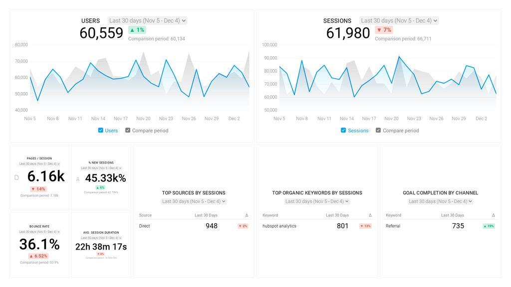
Google Analytics is the number one tool for analyzing website traffic. It also provides a lot of information which makes it difficult to digest. That is why you need a Google Analytics eCommerce dashboard that will show only the most meaningful data for your online store. 

Goal: to check your website’s most current statistics.

KPI examples:

  • Unique visitors
  • Average session duration
  • Bounce rate 
  • Time on site
  • Goal completions 
  • Traffic sources
  • Top pages
  • Top keywords

Dashboard Example: 

Google Analytics dashboard

Sales

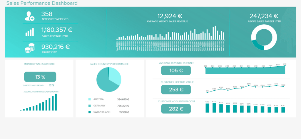
eCommerce sales dashboard shows KPIs like total sales, as well as sales by product, marketing channel, location etc. This is a functional strategic tool that allows getting an instant overview of your sales to pinpoint any problem as soon as it occurs. It organizes the most precise and recent data related to commercial success.

Goal: to see current sales performance and compare it to your sales target.

KPI examples: 

  • Total sales
  • Sales target
  • Average order value
  • Lead conversion rate
  • Up-sell and cross-sell rates
  • Profit margin per product

Dashboard Example: 

Sales dashboard

Marketing

eCommerce marketing dashboards present vital KPIs in digital marketing to track channel and campaign results in real-time. These KPIs include traffic sources, macro and micro conversions, leads, ROI of marketing channels and campaigns, etc. The information is collected from such channels: Google Analytics, email marketing tools, CRM, social media, and others. 

Goal: to see how effective your marketing is in real-time. 

KPI examples: 

  • Traffic
  • Leads
  • Sales
  • Conversion rate
  • Conversions by channel
  • Customer acquisition cost (total and by channel)

Dashboard Example: 

Marketing dashboard

Finance

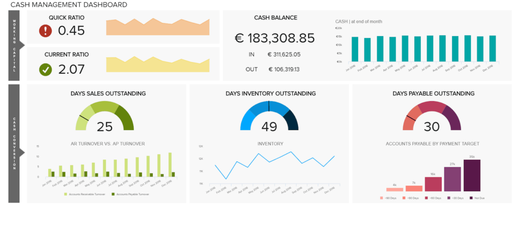
This dashboard focuses on your budget and analyzes existing assets, profit and expenses, cash flow, income, and other financial indicators. It allows you to see the current figures and financial details to get helpful insights and increase the cost-efficiency of your business.

Goal: to see the current financial state and overall profitability of the business.

KPI examples:

  • Revenue
  • Net profit
  • Gross / Net profit margin
  • Cash balance
  • Working capital
  • Cost of goods sold

Dashboard Example: 

Finance dashboard

Wrapping up

To sum up, eCommerce metrics dashboards are useful tools that help track your business performance on a daily basis. They can either provide an overview of the entire business or may cover different areas from SEO to finances. 

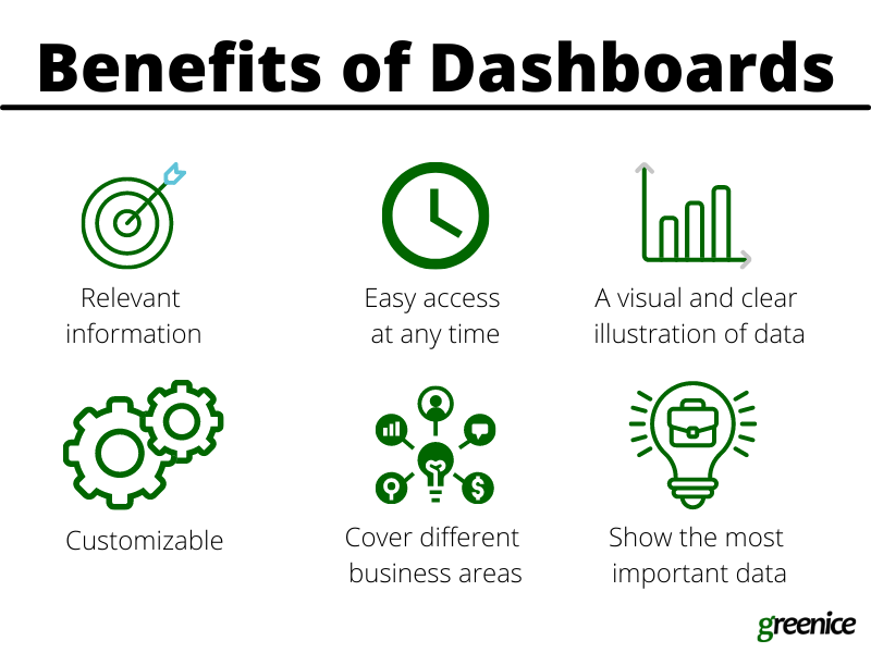
The fundamental advantage is that you can check your KPIs any time, not just once a month when you prepare your reports. This will help to detect and fix problems almost on the spot. Another advantage is that dashboards are visual tools that allow you to digest information easily. Additionally, they are customizable and can show the indicators which you need the most.

In this article, we shed some light on what dashboards are and why they matter. We also gave examples of dashboards that might be helpful for your eCommerce business. Give these tools a try and get a clearer picture of how your store is doing.

The post 5 best examples of eCommerce dashboards to help you take control of your business appeared first on noupe.

Categories: Others Tags:

How to Get Started with the MVP Workflow

January 20th, 2022 No comments

Few things are more important to a web designer or developer’s chances of success than having the proper workflow. The term “workflow” applies to the set of standardized steps you or your company uses to create, test, and deploy designs or products.

Over the years, as development processes have evolved, so too have the workflows experts use to bring their ideas to life. The MVP workflow, or “Minimum Viable Product” strategy, is one of the most popular options in 2022.

Here’s what you need to know about the MVP workflow and how it differs from some of the other standard workflows developers may be used to.

What is the Designer/Developer Workflow?

As mentioned above, the designer/developer workflow is a series of steps used by experts in the web design world to achieve a creative goal. The process includes the steps taken to start a project, evolve it, and finish it. Since software is never developed without tools, the technology you’ll access throughout the development process is also considered in most workflows.

An example of a standard development workflow might look like this:

  • Scaffolding: This is the stage wherein you start your new web project, creating a git repo, downloading libraries, preparing file structures, and completing other tasks to make sure your product is ready to roll out into the world.
  • Develop: This is where you’ll spend most of your time writing code for your application or website. The development process may include various specific tools and support from other staff members.
  • Test: In this stage, you examine the functionality of your code to determine if everything works as it should. If there are errors or issues, you can go back and develop fixes to the potential problems. Your code may go through the development/test process several times before you can move to the next stage.
  • Integrate: This is when you merge the code for your part of the development process with the rest of the team. You can also integrate your code into websites and existing apps at this point. If you’re working solo, you can skip this process.
  • Optimize: You prepare all your assets for use on a production server during the optimization stage. Files are generally optimized to ensure your visitors can view your site easily or access your applications with ease.
  • Deploy: In the deployment stage, developers push code and assets up into the server and allow for changes to be viewed by the public.

What is MVP? (Minimum Viable Product)

Now you know what a developer workflow looks like, you can begin to assess the concept of the “MVP” workflow. The term “MVP” stands for Minimum Viable Product.

The idea of “Minimum Viable Product” applies to a range of industries, from education to healthcare and government entities. This term comes from lean start-up practices and focuses heavily on the value of learning and changing during the development process.

When you adapt your workflow to focus on an MVP, you’re essentially adjusting your focus to a point where you can create a stripped-back version of something new – like an app or a website. The MVP is built just with the core features (the minimum), so you can bring the idea to market and test it as quickly as possible.

For instance, if your goal were to create an attractive new website for a client, an MVP would focus on implementing the crucial initial tools, and nothing else. While you may create checkout pages, product pages, and other aspects of the site, you wouldn’t populate it with content or start experimenting with bonus widgets and apps.

So, how does this offer a better alternative to the standard workflow?

Simply put, an MVP workflow is quick, agile, and easy. The idea is you can validate key concepts with speed, fail quickly, and learn just as fast. Rather than having to build an entire app and almost start over from scratch every time you find an error, you can race through the iteration and development process.

MVP workflows are also highly appealing to start-ups and entrepreneurs hoping to validate ideas without a massive amount of upfront investment.

Examples of MVP Workflows

Still confused? The easiest way to understand how an MVP workflow works is to look at an example.

Let’s start with a conceptual example. Say you were building a voice transcription service for businesses. The desired features of this product might include the ability to download transcription, translate them into different languages, and integrate them into AI analytics tools.

However, using the MVP approach, you wouldn’t try to accomplish all of your goals with your software at once. Instead, you’d focus on something simple first – like the ability to download the transcripts. Once you confirm you can do that, you can start a new workflow for the next most important feature for the app.

One excellent example of a company with an MVP approach is Airbnb. The entrepreneurs behind this unicorn company, Joe Gebbia and Brian Chesky, didn’t have a lot of cash to build a business with at first. They had to use their own apartment to validate the idea of creating a website where people could share their available “space” in a home or apartment with the public.

To begin, Airbnb only created a very basic website, published photos of their property, and waited to see the results. After discovering people were genuinely interested in renting another person’s home, the company was able to begin experimenting with new ideas to make a site where people could list their properties for travelers.

The Pros and Cons of an MVP Workflow

There are a lot of benefits to the MVP workflow – particularly when it comes to gaining agility and developing new products quickly. However, there are downsides too.

Pros

  • With an MVP approach, you can maximize your learning opportunities and create a more innovative, successful product at speed. You get to test every step of the way.
  • You release iterations or versions of your product quickly, which means you discover problems faster, allowing you to quickly solve these issues.
  • You build on the benefits of customer fans, “evangelists” in the marketplace who are keen to help your product or service grow.
  • An MVP gives you more freedom to try out unique ideas and “risks” you might otherwise avoid with a traditional workflow.
  • Because you’re focusing on creating only the “minimum viable product,” you don’t have to spend a fortune on initially setting up your workflows.

Cons

  • Agile work with an MVP flow requires a lot of effort in collecting constant feedback from customers and releasing iterations.
  • You’ll need to dedicate yourself to releasing many small and frequent product releases on a tight schedule.
  • You might have to revise the functionality of your product or app a number of times.

Creating Your MVP Workflow

If you believe an MVP workflow might be effective for you, the first step is defining your “Minimum Viable Product.” The app, website, or product you design needs to align with your team’s strategic goals, so think about what your company is trying to achieve at this moment – before you get started. If you have limited resources, or specific purposes, like improving your reputation as a reliable company, now might not be the right time to develop a new MVP.

Ask what purpose your minimum viable product will serve and what kind of market you’re going to be targeting. You’ll need to know your target customer to help you test the quality and performance of each iteration of your MVP. Once you know what your ideal “product” is, ask yourself what the most important features will be.

You can base these decisions on things like:

  • User research
  • Competitive analysis
  • Feedback from your audience

For example, if you’re producing an AI chatbot that helps companies to sort through customer inquiries, the most important “initial feature” may be the ability to integrate that bot into existing websites and apps owned by the company.

MVP Approach Guidelines

Once you have your hierarchy of most valuable features for your minimum viable product, you can translate this into an action plan for development. Remember, although you’re focusing on the “minimum” in development, your product still needs to be “viable.” In other words, it still needs to allow your customer to achieve a specific goal.

  • Review your features: Reviewing your prioritized product requirements and the minimum level of functionality you can deliver with each of these “features.” You need to ensure you’re still providing value to your customer with anything you produce.
  • Build your solution: Build your minimum set of features for the product or service. Remember to build only what is required. You can use methodologies like the agile or waterfall method to help guide your team during this process.
  • Validate your solution: Release your offering into the market, and ensure you have tools in place to gather feedback from early adopters. Use beta programs, focus groups, and market interviews to understand how your solution works for your customers and where you can improve on your current offer.
  • Release new iterations: Based on what you learn from your target audience, release improvements to your product quickly. Use your validation strategies to collect information from your audience with each release.
  • Review again: Go back to your product requirements and desired features and start the process over again, this time focusing on the next most valuable functionality. Over time, the value of your minimum viable product will increase.

Using the MVP Workflow Approach

While the MVP workflow approach might not be the right solution for every development or design team, it can work very effectively in the right circumstances. The MVP approach doesn’t minimize the importance of understanding market problems and delivering value. Instead, the focus is on delivering quick value that gradually increases and evolves over time.

As many developers and designers know, the most useful form of product validation in most cases is real-world validation. When your customers have had an opportunity to use a product on a day-to-day basis, they can provide much more effective feedback.

Just keep in mind that committing to the MVP approach also means changing your workflow and committing to iterations – otherwise, other features may never be completed. You’ll need to be willing to work quickly and in small bursts without getting too heavily caught up in one feature or functionality.


Featured image via Pexels.

Source

The post How to Get Started with the MVP Workflow first appeared on Webdesigner Depot.

Categories: Designing, Others Tags:

Top 9 WordPress Plugins (2022 edition)

January 20th, 2022 No comments

WordPress powers more than 42% of the web, making it by far the world’s most popular website platform. This platform has the tools needed to build any type of website. They include themes that serve to make building high-quality sites easier. Also, cool WordPress plugins that add special features and functionalities that themes often lack.

The right plugin can do wonders for a website’s design and performance. But with more than 42,000 essential WordPress plugins to choose from, finding the “best” plugin to satisfy a particular need can be a time-consuming task. It is one that has no guarantee of being successful.

Finding just the right plugin is best left up the experts, those people in the back room that are very good at comparing one thing against another.

What those experts have found as we enter 2022 is simply amazing. Perhaps one or more of these 9 top WordPress plugins will be exactly what you’ve been looking for.

  1. Amelia

Amelia is an automated booking system that can flawlessly manage an unlimited number of appointment bookings for an unlimited number of business clients.

Amelia can manage appointments for multiple locations and does so using a single insightful dashboard from a single platform.

A WordPress website design that utilizes the Amelia plugin’s features and functionalities can completely streamline a business’s booking operations.

  • Clients can make or change appointment bookings online at any hour of the day
  • They can request appointments with specific employees
  • They can receive reminders and follow-ups and be notified of forthcoming special events or learning sessions online
  • They can also make any payments due online, or pay deposits for appointments and events
  • Businesses can schedule training or educational sessions, or other events and sell packages of services online
  • Booking forms can be customized to fit a business’s brand

Amelia’s time and money-saving automated booking system is ideal for service-oriented businesses like beauty parlors, gyms, health and fitness centers, training centers, and barbershops.

Click on the banner to see how Amelia can help you leverage your business.

  1. wpDataTables

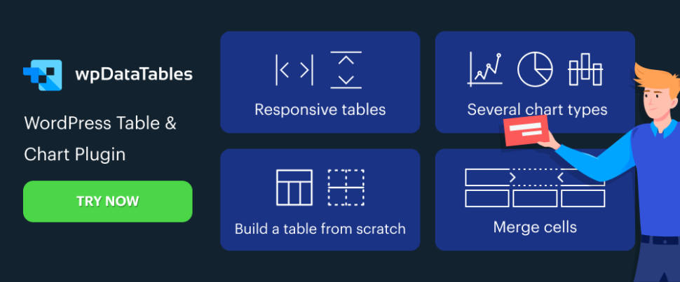
You’re tasked with building a responsive, interactive, and maintainable table, the task must be completed relatively quickly, and you’ve got several million rows of data to process. When you start to think seriously about seeking a new line of work, you hear about wpDataTables, an absolute workhorse when it comes to creating tables and charts from massive amounts of data quickly.

This powerful WordPress plugin –

  • can process data from multiple sources using multiple formats
  • can highlight key data and color code essential data in both tables and charts
  • can help users build tables manually, from spreadsheet or database data, or a real-time MySQL database
  • wpDataTables features a large amount of data sorting and filtering options. It also provides ready access to Chart.js, HighCharts, and Google Charts libraries.

Click on the banner to see what 50,000+ satisfied users already know. 

  1. LayerSlider

The LayerSlider plugin has been on the market for more than a decade. Following web design trends and customer demand, the developers have elevated LayerSlider’s functionality and ease of use to new heights.

LayerSlider 7 has just made its debut. This is the biggest update yet, and by far the most exciting. With this release, LayerSlider has evolved into a powerful tool to dazzle your website visitors with eye-catching web design and effects.

  • LayerSlider 7 introduces a powerful, totally redesigned project editor that is a joy to work with and gives users the ability to design anything without limits
  • Users can also design popups with stunning effects. Popups can be used to grab visitors’ attention with adverts, store messages, newsletters, and similar solutions
  • With a growing selection of templates and Add-Ons, LayerSlider continues to offer an all-in-one solution for every need

LayerSlider 7 is well worth a closer look. Click on the banner to do precisely that.

  1. Essential Grid

A gallery is often meant to be the focal point of a website, but from a design standpoint it is all too often treated just like any other website page.

Essential Grid can give your website gallery a shot in the arm with its –

  • features that let you display products, videos, and portfolios as you always meant them to be displayed
  • variety of screen layout options coupled with row, column, and spacing adjustments
  1. TheDock

As a web designer you’ve probably found website building easier when you use a website theme. You might even have given some thought to creating your own theme(s), but you don’t believe you have the skills to do so.

TheDock plugin’s visual editor changes all that.

  • It runs as a plugin and writes the code for you.
  • TheDock-created themes are always responsive.
  • You can edit theme design, layout, and architecture without writing a line of code.
  1. Slider Revolution

The Slider Revolution plugin is designed to help web designers incorporate healthy doses of spice and flair into their websites – and impress their clients by doing so.

  • Slider Revolution takes into account today’s over-the-top web design demands
  • The 25+ addons and 200+ website and slider templates that are included are designed to impress
  • Slider Revolution users can also import dynamic content from the web

Customers can look forward to receiving one-on-one support.

  1. Tablesome – Advanced WordPress Table Plugin

Tablesome is a data table plugin that enables its users to create tables they can embed in their website pages or posts.

  • Tablesome’s drag and drop feature can be used to manually sort or reorder tabular data
  • A table can be partially or fully duplicated to create a new table

Tablesome stores Contact Form 7 submissions and stored data can be uploaded to external sources such as Google Sheets, MailChimp, etc.

  1. Wordlift

The WordLift SEO plugin helps web designers improve their websites’ search engine capabilities by working with them to create custom AI-powered Knowledge Graphs.

The designers can use their Knowledge Graphs to –

  • enhance their websites’ expertise, trustworthiness, and authority
  • help Google understand website content
  • lead website visitors to content that is most likely to keep them engaged

WordLift also serves as an SEO knowledge and training partner for its users.

  1. Heroic Inbox

Incorporate the Heroic Inbox plugin’s features into your company’s website and you’ll be able to manage all of your company’s emails from shared inboxes.

  • A third party platform is not required. All email inboxes can be managed from your company’s website.
  • Past customer email communications can be displayed on a sidebar to support customer-company dialogs.

Heroic Inbox tracks key company and team performance metrics.

*****

Having just the right plugin in hand can do amazing thing for a website’s performance and capabilities. But with so many useful WordPress plugins to choose from, searching for the “best” plugin to scratch an itch or satisfy a particular need can be a time-consuming if not hopeless task. The one that has no guarantee of being successful.

This is an area that is best left up to those who have the expertise to locate the top WordPress plugin(s) in a given category. They are recommended to web designers and interested businesses. The experts’ pick of the top WordPress plugins for 2022 is what you see in this post.

Read More at Top 9 WordPress Plugins (2022 edition)

Categories: Designing, Others Tags:

What should someone learn about CSS if they last boned up during CSS3?

January 19th, 2022 No comments

“CSS3” was a massive success for CSS. A whole bunch of stuff dropped essentially at once that was all very terrific to get our hands on in CSS. Gradients, animation/transition, border-radius, box-shadow, transformwoot! And better, the banner name CSS3 (and the spiritual umbrella “HTML5”) took off and the industry was just saturated in learning material about it all. Just look at all the “CSS3”-dubbed material that’s been published around here at CSS-Tricks over the years.

No doubt loads of people boned up on these technologies during that time. I also think there is no doubt there are lots of people that haven’t learned much CSS since then.

So what would we tell them?

Some other folks have speculated similarly. Scott Vandehey in “Modern CSS in a Nutshell” wrote about his friend who hasn’t kept up with CSS since about 2015 and doesn’t really know what to learn. I’ll attempt to paraphrase Scott’s list and what’s changed since the days of CSS3.

Preprocessors are still widely used since the day of CSS3, but the reasons to use them have dwindled, so maybe don’t even bother. This includes more newfangled approaches like polyfilling future features. This also includes Autoprefixer. CSS-in-JS is common, but only on projects where the entire workflow is already in JavaScript. You’ll know when you’re on a relevant project and can learn the syntax then if you need to. You should learn Custom Properties, Flexbox, and Grid for sure.

Sounds about right to me. But allow me to make my own list of post-CSS3 goodies that expands upon that list a smidge.

What’s new since CSS3?

And by “CSS3” let’s say 2015 or so.


.card {
  display: grid;
  grid-template-columns:
    150px 1fr;
  gap: 1rem;
}
.card .nav {
  display: flex;
  gap: 0.5rem;
}

Layout

You really gotta learn Flexbox and Grid if you haven’t — they are really cornerstones of CSS development these days. Even more so than any feature we got in CSS3.

Grid is extra powerful when you factor in subgrid and masonry, neither of which is reliable cross-browser yet but probably will be before too long.

html {
  --bgColor: #70f1d9;
  
  --font-size-base: 
    clamp(1.833rem, 2vw + 1rem, 3rem);
  --font-size-lrg:
    clamp(1.375rem, 2vw + 1rem, 2.25rem);
}

html.dark {
  --bgColor: #2d283e;
}

CSS Custom Properties

Custom properties are also a big deal for several reasons. They can be your home for design tokens on your project, making a project easier to maintain and keep consistent. Color theming is a big use case, like dark mode.

You can go so far as designing entire sites using mostly custom properties. And along those lines, you can’t ignore Tailwind these days. The approach of styling an entire site with classes in HTML strikes the right chord with a lot of people (and the wrong chord with a lot of people, so no worries if it doesn’t jive with you).

@media 
  (prefers-reduced-motion: reduce) {
  * {
    animation-duration: 0.001s !important;
  }
}

@media 
  (prefers-color-scheme: dark) {
  :root {
    --bg: #222;
  }
}

Preference Queries

Preference queries are generally @media queries like we’ve been using to respond to different browsers sizes for year, but now include ways to detect specific user preferences at the OS level. Two examples are prefers-reduced-motion and prefers-color-scheme. These allow us to build interfaces that more closely respect a user’s ideal experience. Read Una’s post.

.block {
  background: 
    hsl(0 33% 53% / 0.5);

  background:
    rgb(255 0 0);

  background:
    /* can display colors 
       no other format can */
    color(display-p3 0.9176 0.2003 0.1386)

  background:
    lab(52.2345% 40.1645 59.9971 / .5);}

  background:
    hwb(194 0% 0% / .5);
}

Color Changes

The color syntax is moving to functions that accept alpha (transparency) without having the change the function name. For example, if you wanted pure blue in the CSS3 days, you might do rgb(0, 0, 255). Today, however, you can do it no-comma style (both work): rgb(0 0 255), and then add alpha without using a different function: rgb(0 0 255 / 0.5). Same exact situation for hsl(). Just a small nicety, and how future color functions will only work.

Speaking of future color syntaxes:

body {
 font-family: 'Recursive', sans-serif;
 font-weight: 950;
 font-variation-settings: 'MONO' 1, 'CASL' 1;
}

Variable Fonts

Web fonts became a big thing in CSS3. Now there are variable fonts. You might as well know they exist. They both unlock some cool design possibilities and can sometimes be good for performance (like no longer needing to load different font files for bold and italic versions of the same font, for example). There is a such thing as color fonts too, but I’d say they haven’t seen much popularity on the web, despite the support.

.cut-out {
  clip-path: polygon(25% 0%, 75% 0%, 100% 50%, 75% 100%, 25% 100%, 0% 50%);
}
.mask {
  mask: url(mask.png) right bottom / 100px repeat-y;
}
.move-me {
  offset-path: path('M 5 5 m -4, 0 a 4,4 0 1,0 8,0 a 4,4 0 1,0 -8,0');
  animation: move 3s linear infinite;
}

@keyframes move {
  100% { 
    offset-distance: 100%;
  }
}

Paths

SVG has also exploded since CSS3. You can straight up crop any element into shapes via clip-path, bringing SVG-like qualities to CSS. Not only that, but you can animate elements along paths, float elements along paths, and even update the paths of SVG elements.

These all feel kind of spirtually connected to me:

  • clip-path — allows us to literally crop elements into shapes.
  • masks — similar to clipping, but a mask can have other qualities like being based on the alpha channel of the mask.
  • offset-path — provides a path that an element can be placed on, generally for the purpose of animating it along that path.
  • shape-outside — provides a path on a floated element that other elements wrap around.
  • d — an SVG’s d attribute on a can be updated via CSS.
.disable {
  filter: 
    blur(1px)
    grayscale(1);
}

.site-header {
  backdrop-filter: 
    blur(10px);
}

.styled-quote {
  mix-blend-mode: 
    exclusion;
} 

CSS Filters

There is a lot of image manipulation (not to mention other DOM elements) that is possible these days directly in CSS. There is quite literally filter, but its got friends and they all have different uses.

These all feel kind of spirtually connected to me:

  • filter — all sorts of useful Photoshop-like effects like brightness, contrast, grayscale, sautration, etc. Blurring is a really unique power.
  • background-blend-mode — again, evocative of Photoshop in how you can blend layers. Multiply the layers to darken and combine. Overlay to mix the background and color. Lighten and darken are classic effects that have real utility in web design, and you never know when a more esoteric lighting effect will create a cool look.
  • backdrop-filter — the same abilities you have with filter, but they only apply to the background and not the entire element. Blurring just the background is a particularly useful effect.
  • mix-blend-mode — the same abilities you have with background-blend-mode, but for the entire element rather than bring limited to backgrounds.
import "https://unpkg.com/extra.css/confetti.js";
body {
  background: paint(extra-confetti);
  height: 100vh;
  margin: 0;
}

Houdini

Houdini is really a collection of technologies that are all essentially based around extending CSS with JavaScript, or at least at the intersection of CSS and JavaScript.

  • Paint API — returns an image that is built from APIs and can be controlled through custom properties.
  • Properties & Values API / Typed OM — gives types to values (e.g. 10px) that would have otherwise been strings.
  • Layout API — create your own display properties.
  • Animation API

Combined, these make for some really awesome demos, though browser support is scattered. Part of the magic of Houdini is that it ships as Worklets that are pretty easy to import and use, so it has the potential to modularize powerful functionality while making it trivially easy to use.

my-component {
  --bg: lightgreen;
}

:host(.dark) { 
  background: black; 
}

my-component:part(foo) {
  border-bottom: 2px solid black;
}

Shadow DOM

The Shadow DOM comes up a bit if you’ve played with and the element. The “cloned” element that comes through has a shadow DOM that has limitations on how you can select “through” it. Then, when you get into , it’s the same ball of wax.

If you find yourself needing to style web components, know there are essentially four options from the “outside.” And you might be interested in knowing about native CSS modules and constructible stylesheets.

The CSS Working Group

It’s notable that the CSS working group has its own way of drawing lines in the sand year-to-year, noting where certain specs are at a given point in time:

These are pretty dense though. Sure, they’re great references and document things where we can see what’s changed since CSS3. But no way I’d send a casual front-end developer to these to choose what to learn.

Yeah — but what’s coming?

I’d say probably don’t worry about it. 😉

The point of this is catching up to useful things to know now since the CSS3 era. But if you’re curious about what the future of CSS holds in store…

  • Container queries will be a huge deal. You’ll be able to make styling choices based on the size of a container element rather than the browser size alone. And it’s polyfillable today.
  • Container units will be useful for sizing things based on the size of a container element.
  • Independant transforms, e.g. scale: 1.2;, will feel more logical to use than always having to use transform.
  • Nesting is a feature that all CSS preprocessor have had forever and that developers clearly like using, particularly for media queries. It’s likely we’ll get it in native CSS soon.
  • Scoping will be a way to tell a block of CSS to only apply to a certain area (the same way CSS-in-JS libraries do), and helps with the tricky concept of proximity.
  • Cascade layers open up an entirely new concept of what styles “win” on elements. Styles on higher layers will beat styles on lower layers, regardless of specificity.
  • Viewport units will greatly improve with the introduction of “relative” viewport lengths. The super useful ones will be dvh and dvw, as they factor in the actual usable space in a browser window, preventing terrible issues like the browser UI overlapping a site’s UI.

Bramus Van Damme has a pretty good article covering these things and more in his “CSS in 2022” roundup. It looks like 2022 should be a real banner year for CSS. Perhaps more of a banner year than the CSS3 of 2015.


What should someone learn about CSS if they last boned up during CSS3? originally published on CSS-Tricks. You should get the newsletter and become a supporter.
Categories: Designing, Others Tags:

10 Top WordPress Themes for 2022

January 18th, 2022 No comments

If you’re looking for a WordPress theme for your 2022 projects, it never hurts to see what the experts consider to be the best of the bunch. That’s not to say that experts don’t have their favorites. They often do, and we are no different.

We’ve tried, successfully, we believe, to avoid any biases we may have in compiling what we believe to be the 10 top WordPress themes going into 2022.

Working with a WordPress theme has the advantage of giving you a great starting point. It makes it much easier to create an attractive website that will charm any visitors who stop by and convince them to linger awhile.

Another advantage of using a theme can be its cost-effectiveness. Most of the popular WordPress themes are reasonably priced, they save you time, and they can save you money as well.

The main problem you’re apt to encounter is finding the right one since many of them are out there. You could spend hours and hours making comparisons among a host of candidates that appear to be reliable and easily customizable. Or you could select from among the following 10 top WordPress themes, all of which are guaranteed to give you your money’s worth and more. 

1. BeTheme – The Biggest Multipurpose WordPress Theme with 650+ Pre-Built Websites

BeTheme justifiably lays claim to being the biggest WordPress and WooCommerce theme of all for several reasons.

  • BeTheme’s 40+ core features give its users a complete tool kit to work with that includes 650+ pre-built websites and tons of design elements, aids, and options.
  • A 240,000+ customer base also contributes to making this the biggest WordPress theme of them all.

It’s not just about size, of course. Performance is all-important, and BeTheme has it in spades thanks to:

  • The Muffin Live Builder lets users edit live content visually and create, save, and restore design elements, blocks, and sections.
  • The WooCommerce Builder helps users design engaging shop and single product layouts and is packed with customer-centric features and options.
  • Full Elementor compatibility, with 30+ unique design elements and 120+ dedicated pre-built websites.
  • Assurance that every website is 100% responsive.
  • The Muffin Builder: this old standby is more intuitive than any other page builder on the market.
  • Regular Updates, plus BeTheme purchasers also receive free lifetime updates.

Click on the banner. There’s much, much more to see.

2. Total WordPress Theme

Total is aptly named because of the tools it gives its users; tools that include a premium page builder, demo and template libraries, an assortment of design and layout options, and cool navigation features.

  • The premium page builder is an extended version of the popular WPBakery frontend drag and drop page builder. Slider Revolution, another premium design aide, also comes with the package.
  • Design options include more than 500 live customizer options and 100+ customizable builder blocks, page builder block animation capabilities, custom backgrounds, and custom title backgrounds.
  • Layout options range from boxed and full-width and dynamic layouts to page and post designs and one-page site layouts.
  • Header styles, local scroll menus, and mobile menu styles contribute to website navigation capabilities.

Total is easy to set up and work with, plus it is 100% responsive. Click on the banner to find out more.

3. WoodMart

WoodMart is a premium WordPress theme that has been designed from the ground up to enable its users to create superlative WooCommerce online stores. WoodMart doesn’t require the use of multiple plugins as the most important tools, and features users simply must have come right out of the box.

They include:

  • For starters, a supply of 70+ demo layouts, 370 premade sections, plus an extensive template library for Elementor and WP Bakery.
  • A powerful Theme Settings Panel with a graphics interface to make changes quickly and easily.
  • AJAX techniques that guarantee the super-fast loading that is so important with multi-product pages and galleries.

WoodMart-built websites are search engine friendly, multilanguage ready, 100% responsive, and RTL and retina ready, and GDPR compliant.

Click on the banner to see what your WooCommerce store could look like.

4. TheGem – Creative Multi-Purpose & WooCommerce WordPress Theme

TheGem is the best-selling theme on ThemeForest, which isn’t surprising since its multiplicity of features has led to it being called the Swiss Army Knife of WordPress themes.

Key features include –

  • 400+ beautiful websites and templates for any purpose or niche.
  • TheGem Blocks with its 300+ pre-designed section templates to speed up your workflow – a genuine game-changer.
  • Elementor and WPBakery page builders.
  • An outstanding collection of WooCommerce templates for any shop type.

5. Uncode – Creative & WooCommerce WordPress Theme 

Uncode is a pixel-perfect theme packed with dozens of advanced and unique features designed to produce a pixel-perfect website.

These features include:

  • An enhanced Page Builder with a juiced-up Frontend editor
  • A WooCommerce Custom Builder
  • A wireframes plugin for importing 550+ professionally designed section templates

Uncode has sold more than 85,000 copies to date. It is the ideal WordPress theme for building an impressive blog, portfolio, eCommerce, and magazine sites.

6. Rey Theme for WooCommerce

eCommerce is said to rest on four pillars – filtering, search, navigation, and presentation. This WooCommerce-oriented WordPress theme fully addresses each one. Rey lets you experience design, innovation, and performance in ways you could only dream of before.

There’s:

  • The powerful and popular Elementor page builder with built-in features supplemented with Rey’s extra spices.
  • Ajax navigation, including infinite loading.

Rey is multilanguage-ready, obviously responsive, SEO friendly, developer-friendly, and performance-oriented.

7. Avada Theme

One easy way to know you’ve picked the right theme is to select Avada, the #1 best-selling theme of all time, a popular theme that is loved by 450,000+ happy users.

  • Avada’s Fusion Theme Options, Fusion Page Options, and Fusion Builder will give you more than enough flexibility, while its 40+ free eye-candy demos provide the inspiration.
  • Avada also gives you easy access to some of the most popular premium plugins.

And that’s just the beginning.

8. Impeka – Creative Multipurpose WordPress Theme

This simply impeccable WordPress theme is filled with potential for the advanced user and, at the same time, easy for a beginner to use. Using Impeka simply involves:

  • Selecting Elementor, Gutenberg, or an enhanced WPBakery as your page builder.
  • Using WooCommerce to build your online shop.
  • Sifting through a multitude of features that include the Mega Menu and Footer and Popup builders.

Your website will be super-attractive, lightning-fast, fully responsive, and SEO perfected.

9. Litho – Multipurpose Elementor WordPress Theme

This popular multipurpose WordPress theme is built with Elementor, the world’s #1-page builder.

  • Litho can be used to build websites of any type and for any business niche.
  • It is excellent for building portfolio, blog, and eCommerce websites.
  • There are 37+ home pages, 200+ creative elements, and 300+ templates to get you started and assist you along the way.

Litho-built websites are fast loading and deliver healthy SEO results.

10. XStore – Best Premium WordPress WooCommerce Theme for eCommerce

You can start with one of XStore’s more than 110 amazing pre-built shops, or start from scratch and let Elementor or WPBakery and more than 550 pre-built blocks help you along the way, together with:

  • $559 worth of premium plugins.
  • A Live Ajax theme option.
  • A header builder and a single product page builder.
  • A built-in WooCommerce email builder.

You can get this complete and highly customizable WooCommerce theme for an amazing $39.

One of the benefits of using WordPress is the number of great WordPress themes you can work with. Whatever your niche, your target audience, or your skill level may be, there’s a premium WordPress theme out there that looks and feels as though it was made, especially with you in mind.

If you’re planning to create a fresh and beautiful website for 2022, or you want to completely rebuild an existing one, or simply make some design changes, this roundup of the most popular and the best WordPress themes in the market is meant for you. And we really mean it!


This is a sponsored post.

Source

The post 10 Top WordPress Themes for 2022 first appeared on Webdesigner Depot.

Categories: Designing, Others Tags:

Top 15 Ways A Social Media Assistant Can Boost Up Your Business!

January 18th, 2022 No comments

Are you confused about hiring a social media assistant? Do you think it will be costly to hire a virtual assistant to manage your social media? 

If you have these questions in mind, brace yourself because you are on the right track, asking the right questions. You just have not found the answers yet. So let’s begin by understanding who is a social media assistant?

A social media assistant is a professional who helps you enhance your brand presence online. They can bridge the gap between your brand and targeted audience through creative online content. The content ranges from a 4-word caption to short video content. 

You must have seen the Instagram posts of some catchy brands, Nike, Spotify to name a few. A creative and experienced team of social media managers has led these US-based brands to widespread social media attention.

But, the question remains – 

Why Should You Hire A Social Media Virtual Assistant? 

Credit: Unsplash

Firstly, a dedicated resource for your social media can organize your posting schedule and put up regular content on your social media handles. Secondly, social media reach and growth does not come with an on/off switch. It requires a stellar, power-packed strategy to build a brand’s social handles. An expert can assist your company with that. 

These are just two aspects; a social media virtual assistant can holistically benefit your brand. Here are the 15 ways a social media assistant can boost up your business. 

1. Conducting Research

Market research and being on top of current events give you an advantage over your competitors. A hefty amount of research and data is essential if you want to make good content-related decisions. However, as a startup founder, you may not get the time to do the proper research yourself. Instead, you can use the services of a social media virtual assistant who can undertake daily research on your behalf and offer you condensed insights that you can utilize to develop a strategy.

2. Coming up with Stellar Strategies 

A significant portion of the job is done when you have an excellent social media marketing strategy at your disposal. When you hire a social media manager, you can ask them for inputs while forming the strategy. Moreover, you can get some valuable insights from an experienced professional. 

3. Sending Regular Updates On Pages

According to a report by Forbes, 90% of startups fail. It is primarily because one person cannot supervise everything in a company, from accounts to administration to social media. Many startups have an Instagram page, but gradually they fail to put up content regularly. You can hire a virtual social media assistant to post content on your brand’s social handles regularly. 

4. Content Curation

Before content creation, you have to engage in content consumption. Your social media presence can boost with well-curated, seamless content that takes time. Do yourself a favor and delegate the task to a social media manager who can curate and create original content.

5. Building New Social Media Pages From Scratch

Social media is an agile space. Today’s viral content may go irrelevant tomorrow; you never know! A social media remote assistant preempts the need for new and relevant content. They accordingly prepare the new and trendy social media handles for your brand. 

6. Engaging the Audience

Benchmark Email keeps Starbucks on Number 2 for audience engagement. Here’s are the lines from the “what you can learn” section – 

“No effort is too small when it comes to social engagement. Give your brand a voice in the conversation, and when a follower wants to interact with you, interact in return.”

Audience engagement can ultimately lead to increased sales. But to do that, you need a dedicated resource who can reply to the comments and tags on your posts. 

7. Consistent Promotions

The face of your brand identity is your products and services. Promoting them regularly and strategically informs the audience about them. If the content is informational and adds value to the knowledge of readers, they make the purchase. 

A social media virtual assistant can tackle this job well – infusing promotions and valuable content, along with other engaging content. 

8. Tracking the Metrics

When you do not track your growth, it may seem at one point that all your efforts are wasted. A trackable road map is essential to reach your destination. Similarly, knowing the critical metrics of your social handles is important. 

An experienced social media manager is always aware of different tools and analytics to monitor the engagement of your posts & other parameters. Additionally, growing numbers work as a motivator for professionals, especially on widely-used platforms like Instagram. You can use Instagram Analytics tools to trace your growth. 

9. Creating Short Videos

Short-form video content – Reels, Youtube Shorts has taken the brands pages on social media by the storm. The content requires short visuals of 30 or 60 seconds. 

A social media assistant can identify the latest reel trends and ideate a short script for the video. Lately, many popular brands have started using short-form videos to put out product information and connect with younger audiences.

10. Prioritizing Customer Preferences

Customer understanding is the strongest pillar of a business. If you are well-aware of your customer preferences and can translate them into content, your business can grow massively. 

But, in this hustle of content creation, customer preferences are never fixed. People may flood a post with likes on a good day and can leave it abandoned on a bad day. To deal with such dynamic behavior, you should hire a remote assistant for social media. The individual can check and compare multiple platforms to analyze consumer/ audience preferences and strategize accordingly. 

11. Handling Queries

When you consistently post engaging and informational content, your audience grows. Soon after, they start to convert into your customers because, gradually, trust builds. 

Between these two steps, a crucial point is queries. The audience likes to enquire and know more about the products & services, before buying them. An expert social media virtual assistant can tactfully handle the questions to strengthen the chances of conversion. 

Additionally, if your DMs are full and you lack time to attend to them, a social media assistant can be a tremendous support. 

 12. Addressing Grievances 

As a growth-seeking and responsible entrepreneur, you can never overlook the complaints and feedback of your customers. However, you may start to delay them for other priorities. But always keep in mind that addressing grievances is part of customer satisfaction. Hire a social media assistant who can take down the suggestions and feedback & handle complaints on your behalf. 

13. Tackling Lewd Comments

Social media is not always fun and inviting space. When you have someone to watch the comments, it becomes easier to interact with customers. However, some comments are scandalous in nature and need to be neutralized. Your social media virtual assistant can reply to such comments and showcase your brand in a customer-friendly light. 

Taking a cue from this, a social media planning assistant can help you formulate neutral content, free of any political stand or agitating material. 

14. Help You Execute All Your Plans

Every business owner has plans for their company and business flow. Gradually, these plans tend to take a back seat as the roles and responsibilities of a founder increase. A social media VA can support you in developing your plans regarding social media so that you can keep the core business decisions at the center of your workdays. 

15. Put Up the Good Client Reviews

Happy customers pave the way for a happy organization. Clients provide their reviews when they find the services fulfilling. Your social media handles are fit to showcase these reviews. When you hire a social media virtual assistant, they can do this task. With their experience, these professionals know how to use client reviews better to improve sales. Numbers indicate that more than 70% of customers only prefer to purchase after reading the reviews. 

These are the ways a social media virtual assistant can help you flourish your business. They can take command of your brand’s social media handles, so you can utilize your time better and focus on your startup. The question that remains is – 

Why Should You Trust a Virtual Assistant to Build Your Social Media?

Credit: Unsplash

Because a Virtual Assistant for Social Media can excellently do the job while saving costs, you have to pay them based on hours they spend on your work.

When you hire a remote assistant from an outsourcing agency such-

  • You get to work with a pre-assessed and pre-interviewed individual. You can skip the process of filtering and hiring a suitable candidate.
  • A pre-trained and experienced individual works with you. So, you do not have to worry about their training and start with work delegation directly. Additionally, you can start by checking their work samples and handing them a project. 
  • You can hire a Virtual Assistant within minutes to build your social media. Just book a free consultation and hire a social media manager. 

The role of a social media assistant transcends the 15 ways mentioned above. They act as a bridge between your audience and all that your brand is & stands for. The best part is that with remote assistants, you can kickstart your social media without any delay. No hectic training. No Employee Insurance Cost. No tantrum of Casual Leaves. No Employee Management. In short, you enjoy all benefits of a full-time social media assistant without any liabilities.

The post Top 15 Ways A Social Media Assistant Can Boost Up Your Business! appeared first on noupe.

Categories: Others Tags:

Making a Site Work Offline Using the VitePWA Plugin

January 18th, 2022 No comments

The VitePWA plugin from Anthony Fu is a fantastic tool for your Vite-powered sites. It helps you add a service worker that handles:

  • offline support
  • caching assets and content
  • prompting the user when new content is available
  • …and other goodies!

We’ll walk through the concept of service workers together, then jump right into making one with the VitePWA plugin.

New to Vite? Check out my prior post for an introduction.

Table of Contents

  1. Service workers, introduced
  2. Versioning and manifests
  3. Our first service worker
  4. What about offline functionality?
  5. How service workers update
  6. A better way to update content
  7. Runtime caching
  8. Adding your own service worker content
  9. Wrapping up

Service workers, introduced

Before getting into the VitePWA plugin, let’s briefly talk about the Service Worker itself.

A service worker is a background process that runs on a separate thread in your web application. Service workers have the ability to intercept network requests and do… anything. The possibilities are surprisingly wide. For example, you could intercept requests for TypeScript files and compile them on the fly. Or you could intercept requests for video files and perform an advanced transcoding that the browser doesn’t currently support. More commonly though, a service worker is used to cache assets, both to improve a site’s performance and enable it to do something when it’s offline.

When someone first lands on your site, the service worker the VitePWA plugin creates installs, and caches all of your HTML, CSS, and JavaScript files by leveraging the Cache Storage API. The result is that, on subsequent visits to your site, the browser will load those resources from cache, rather than needing to make network requests. And even on the first visit to your site, since the service worker just pre-cached everything, the next place your user clicks will probably be pre-cached already, allowing the browser to completely bypass a network request.

Versioning and manifests

You might be wondering what happens with a service worker when your code is updated. If your service worker is caching, say, a foo.js file, and you modify that file, you want the service worker to pull down the updated version, the next time a user visits the site.

But in practice you don’t have a foo.js file. Usually, a build system will create something like foo-ABC123.js, where “ABC123” is a hash of the file. If you update foo.js, the next deployment of your site may send over foo-XYZ987.js. How does the service worker handle this?

It turns out the Service Worker API is an extremely low-level primitive. If you’re looking for a native turnkey solution between it and the cache API, you’ll be disappointed. Basically, the creation of your service worker needs to be automated, in part, and connected to the build system. You’d need to see all the assets your build created, hard-code those file names into the service worker, have code to pre-cache them, and more importantly, keep track of the files that are cached.

If code updates, the service worker file also changes, containing the new filenames, complete with hashes. When a user makes their next visit to the app, the new service worker will need to install, and compare the new file manifest with the manifest that’s currently in cache, ejecting files that are no longer needed, while caching the new content.

This is an absurd amount of work and incredibly difficult to get right. While it can be a fun project, in practice you’ll want to use an established product to generate your service worker — and the best product around is Workbox, which is from the folks at Google.

Even Workbox is a bit of a low-level primitive. It needs detailed information about the files you’re pre-caching, which are buried in your build tool. This is why we use the VitePWA plugin. It uses Workbox under the hood, and configures it with all the info it needs about the bundles that Vite creates. Unsurprisingly, there are also webpack and Rollup plugins if you happen to prefer working with those bundlers.

Our first service worker

I’ll assume you already have a Vite-based site. If not, feel free to create one from any of the available templates.

First, we install the VitePWA plugin:

npm i vite-plugin-pwa

We’ll import the plugin in our Vite config:

import { VitePWA } from "vite-plugin-pwa"

Then we put it to use in the config as well:

plugins: [
  VitePWA()

We’ll add more options in a bit, but that’s all we need to create a surprisingly useful service worker. Now let’s register it somewhere in the entry of our application with this code:

import { registerSW } from "virtual:pwa-register";

if ("serviceWorker" in navigator) {
  // && !/localhost/.test(window.location)) {
  registerSW();
}

Don’t let the code that’s commented out throw you for a loop. It’s extremely important, in fact, as it prevents the service worker from running in development. We only want to install the service worker anywhere that’s not on the localhost where we’re developing, that is, unless we’re developing the service worker itself, in which case we can comment out that check (and revert before pushing code to the main branch).

Let’s go ahead and open a fresh browser, launch DevTools, navigate to the Network tab, and run the web app. Everything should load as you’d normally expect. The difference is that you should see a whole slew of network requests in DevTools.

That’s Workbox pre-caching the bundles. Things are working!

What about offline functionality?

So, our service worker is pre-caching all of our bundled assets. That means it will serve those assets from cache without even needing to hit the network. Does that mean our service worker could serve assets even when the user has no network access? Indeed, it does!

And, believe it or not, it’s already done. Give it a try by opening the Network tab in DevTools and telling Chrome to simulate offline mode, like this.

Screenshot of the DevTools UO to simulate an offline connection with the select menu open. The No throttling option is currently checked but the Offline option is highlighted in light blue.
The “No throttling” option is the default selection. Click that and select the “Offline” option to simulate an offline connection.

Let’s refresh the page. You should see everything load. Of course, if you’re running any network requests, you’ll see them hang forever since you’re offline. Even here, though, there are things you can do. Modern browsers ship with their own internal, persistent database called IndexedDB. There’s nothing stopping you from writing your own code to sync some data to there, then write some custom service worker code to intercept network requests, determine if the user is offline, and then serve equivalent content from IndexedDB if it’s in there.

But a much simpler option is to detect if the user is offline, show a message about being offline, and then bypass the data requests. This is a topic unto itself, which I’ve written about in much greater detail.

Before showing you how to write, and integrate your own service worker content, let’s take a closer look at our existing service worker. In particular, let’s see how it manages updating/changing content. This is surprisingly tricky and easy to mess up, even with the VitePWA plugin.

Before moving on, make sure you tell Chrome DevTools to put you back online.

How service workers update

Take a closer look at what happens to our site when we change the content. We’ll go ahead and remove our existing service worker, which we can do in the Application tab of DevTools, under Storage.

Screenshot showing the Storage panel of DevTools. The DevTools menu is a panel on the left and the app usage is displayed in a panel on the right, showing that 508 kilobytes of data total is used, where 392 kilobytes are cached and 16.4 are service workers. A button to clear site data is below the Usage stats with a deep blue label and a light gray background.

Click the “Clear site data” button to get a clean slate. While I’m at it, I’m going to remove most of the routes of my own site so there’s fewer resources, then let Vite rebuild the app.

Look in the generated sw.js to see the generated Workbox service worker. There should be a pre-cache manifest inside of it. Mine looks like this:

A dark mode screenshot showing a list of eight asset urls inside of a precacheAndRoute function.

If sw.js is minified, run it through Prettier to make it easier to read.

Now let’s run the site and see what’s in our cache:

Let’s focus on the settings.js file. Vite generated assets/settings.ccb080c2.js based on the hash of its contents. Workbox, being independent of Vite, generated its own hash of the same file. If that same file name were to be generated with different content, then a new service worker would be re-generated, with a different pre-cache manifest (same file, but different revision) and Workbox would know to cache the new version, and remove the old when it’s no longer needed.

Again, the filenames will always be different since we’re using a bundler that injects hash codes into our file names, but Workbox supports dev environments which don’t do that.

Since the time writing, the VitePWA plugin has been updated and no longer injects these revision hashes. If you’re attempting to follow along with the steps in this article, this specific step might be slightly different from your actual experience. See this GitHub issue for more context.

If we update our settings.js file, then Vite will create a new file in our build, with a new hash code, which Workbox will treat as a new file. Let’s see this in action. After changing the file and re-running the Vite build, our pre-cache manifest looks like this:

Now, when we refresh the page, the prior service worker is still running and loading the prior file. Then, the new service worker, with the new pre-cache manifest is downloaded and pre-cached.

A DevTools screenshot showing a table of pre-cached assets processed by the VitePWA plugin and Workbox.
The new pre-cached manifest is displayed in the list of cached assets. Notice that both versions of our settings file are there (and both versions of a few other assets were affected as well): the old version, since that’s what’s still being run, and the new version, since the new service worker has pre-cached it.

Note the corollary here: our old content is still being served to the user since the old service worker is still running. The user is unable to see the change we just made, even if they refresh because the service worker, by default, guarantees any and all tabs with this web app are running the same version. If you want the browser to show the updated version, close your tab (and any other tabs with the site), and re-open it.

The same DevTools screenshot of pre-cached assets, but now only displaying new assets instead of duplicates.
The cache should now only contain the new assets.

Workbox did all the legwork of making this all come out right! We did very little to get this going.

A better way to update content

It’s unlikely that you can get away with serving stale content to your users until they happen to close all their browser tabs. Fortunately, the VitePWA plugin offers a better way. The registerSW function accepts an object with an onNeedRefresh method. This method is called whenever there’s a new service worker waiting to take over. registerSW also returns a function that you can call to reload the page, activating the new service worker in the process.

That’s a lot, so let’s see some code:

if ("serviceWorker" in navigator) {
  // && !/localhost/.test(window.location) && !/lvh.me/.test(window.location)) {
  const updateSW = registerSW({
    onNeedRefresh() {
      Toastify({
        text: `<h4 style='display: inline'>An update is available!</h4>
               <br><br>
               <a class='do-sw-update'>Click to update and reload</a>  `,
        escapeMarkup: false,
        gravity: "bottom",
        onClick() {
          updateSW(true);
        }
      }).showToast();
    }
  });
}

I’m using the toastify-js library to show a toast UI component to let users know when a new version of the service worker is available and waiting. If the user clicks the toast, I call the function VitePWA gives me to reload the page, with the new service worker running.

A toast component screenshot with white text and a slight background gradient that goes from light blue on the left to bright blue on the right. It reads: an update is available! Click to update and reload.
Now when we have pending updates, a nice toast component pops up on the front end. Clicking it reloads the page with the new content in there.

One thing to remember here is that, after you deploy the code to show the toast, the toast component won’t show up the next time you load your site. That’s because the old service worker (the one before we added the toast component) is still running. That requires manually closing all tabs and re-opening the web app for the new service worker to take over. Then, the next time you update some code, the service worker should show the toast, prompting you to update.

Why doesn’t the service worker update when the page is refreshed? I mentioned earlier that refreshing the page does not update or activate the waiting service worker, so why does this work? Calling this method doesn’t only refresh the page, but it calls some low-level Service Worker APIs (in particular skipWaiting) as well, giving us the outcome we want.

Runtime caching

We’ve seen the bundle pre-caching we get for free with VitePWA for our build assets. What about caching any other content we might request at runtime? Workbox supports this via its runtimeCaching feature.

Here’s how. The VitePWA plugin can take an object, one property of which is workbox, which takes Workbox properties.

const getCache = ({ name, pattern }: any) => ({
  urlPattern: pattern,
  handler: "CacheFirst" as const,
  options: {
    cacheName: name,
    expiration: {
      maxEntries: 500,
      maxAgeSeconds: 60 * 60 * 24 * 365 * 2 // 2 years
    },
    cacheableResponse: {
      statuses: [200]
    }
  }
});
// ...

  plugins: [
    VitePWA({
      workbox: {
        runtimeCaching: [
          getCache({ 
            pattern: /^https://s3.amazonaws.com/my-library-cover-uploads/, 
            name: "local-images1" 
          }),
          getCache({ 
            pattern: /^https://my-library-cover-uploads.s3.amazonaws.com/, 
            name: "local-images2" 
          })
        ]
      }
    })
  ],
// ...

I know, that’s a lot of code. But all it’s really doing is telling Workbox to cache anything it sees matching those URL patterns. The docs provide much more info if you want to get deep into specifics.

Now, after that update takes effect, we can see those resources being served by our service worker.

DevTools screenshot showing the resources that are loaded by the browser. There are four jpeg images.

And we can see the corresponding cache that was created.

DevTools screenshot showing the new cache instance that is stored in Cache Storage. It includes all of the cached images.

Adding your own service worker content

Let’s say you want to get advanced with your service worker. You want to add some code to sync data with IndexedDB, add fetch handlers, and respond with IndexedDB data when the user is offline (again, my prior post walks through the ins and outs of IndexedDB). But how do you put your own code into the service worker that Vite creates for us?

There’s another Workbox option we can use for this: importScripts.

VitePWA({
  workbox: {
    importScripts: ["sw-code.js"],

Here, the service worker will request sw-code.js at runtime. In that case, make sure there’s an sw-code.js file that can be served by your application. The easiest way to achieve that is to put it in the public folder (see the Vite docs for detailed instructions).

If this file starts to grow to a size such that you need to break things up with JavaScript imports, make sure you bundle it to prevent your service worker from trying to execute import statements (which it may or may not be able to do). You can create a separate Vite build instead.

Wrapping up

At the end of 2021, CSS-Tricks asked a bunch of front-end folks what one thing someone cans do to make their website better. Chris Ferdinandi suggested a service worker. Well, that’s exactly what we accomplished in this article and it was relatively simple, wasn’t it? That’s thanks to the VitePWA with hat tips to Workbox and the Cache API.

Service workers that leverage the Cache API are capable of greatly improving the perf of your web app. And while it might seem a little scary or confusing at first, it’s nice to know we have tools like the VitePWA plugin to simplify things a great deal. Install the plugin and let it do the heavy lifting. Sure, there are more advanced things that a service worker can do, and VitePWA can be used for more complex functionality, but an offline site is a fantastic starting point!


Making a Site Work Offline Using the VitePWA Plugin originally published on CSS-Tricks. You should get the newsletter and become a supporter.
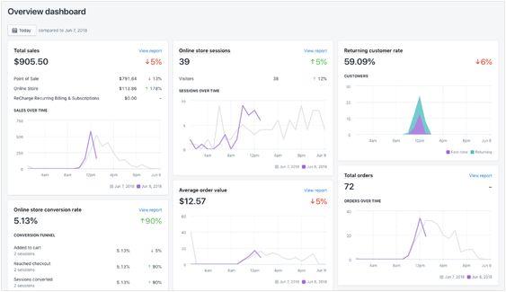
Categories: Designing, Others Tags: