7 Mobile App Retention Strategies for Healthcare You Should Try in 2022
Did you know, 25% of apps downloaded by mobile app users are used only once after their installation?
With an estimated 53,000+ health apps floating around us, making users stay glued around to experience your app is a tedious task. Although the health and wellness mobile app category has the highest rates of download, a high percentage of them struggle to retain active users over time.
So the question is, how would you make your healthcare app stand out and prevent app abandonment?
Increased abandonment is often because the app does not lead users to value quickly enough after they open the app. Initial interest is what keeps them coming back for more, and it relies on onboarding, personalization and encouraging in-app messaging. Try out these mobile app retention strategies for healthcare if you’re struggling to increase retention.
#1. Optimize onboarding experience
One of the primary steps to accelerate your app’s user experience is – application onboarding. You have barely a few seconds to make a good impression of your app. So, make sure that your app’s onboarding process is spot-on. Do not bombard users with multiple in-app messages right after the login process.
Here’s how you can enhance your app’s user onboarding experience: keep it short, show your app’s key features and how the onboarding screen deals with the progress bar.
The key point here is to keep your users engaged, informed and excited to explore your app without frustrating them with unwanted popups and messages.
One of the best ways to bend the retention curve is to target the new initial days of usage and in particular the first visit – Andrew Chen.
Here’s what you should avoid while optimizing your app onboarding process:
- Do not ask users to rate and review the app before they complete the onboarding process.
- Do not force users to sign in or subscribe to any feature before they check out the app and use it for a few days.
Let’s take the example of the meditation app Headspace and its user-friendly onboarding process. It offers a step-by-step guide to users to meditate along with leveraging custom options to change the session length.
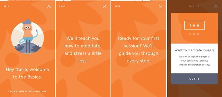
Don’t want to meditate now? No worries! You can skip the guide and explore the app. How convenient.
#2. Use gamification to enhance engagement
Gamification focuses on applying game mechanisms to non-game contexts to engage audiences and inject fun into otherwise mundane activities along with generating motivation and cognitive benefits.
Gamification in healthcare has attracted a great deal of attention because of increased access to healthcare, lack of adherence to treatment and the rise of wearable devices.
Involving gamification features in your mobile app makes using your healthcare mobile app fun, interactive and rewarding. Majorly, these incentives can be in the form of accumulating points or getting a free subscription; something that encourages users to take action.
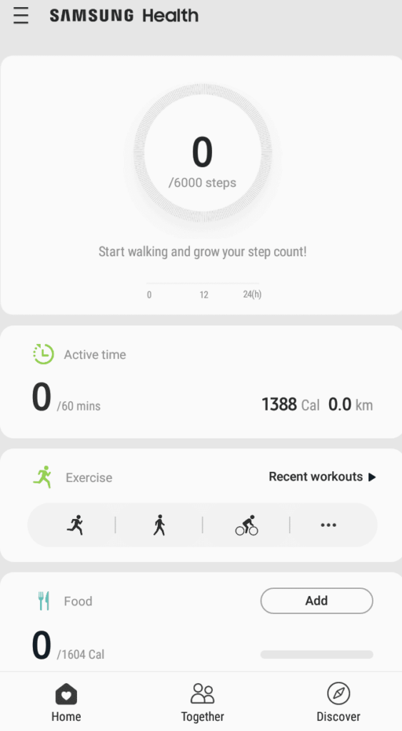
Samsung Health offers a personalized workout opportunity to its users to help them reach their potential personal goals.
Here’s how gamification can be an essential feature of your healthcare app:
- Set clear goals to keep the users moving forward.
- Visualize progress to reinforce user motivation.
- Reward positive behavior to keep users coming back.
- Trigger personalized notifications to keep users engaged or to remind them of the next actions to take.
#3. Personalized the app for different niches
If your app targets multiple user groups, the question here is, can targeting specific groups of users help increase your healthcare app’s user retention?
Think about the different users your app targets and multiple use-cases that can be created for each of them.
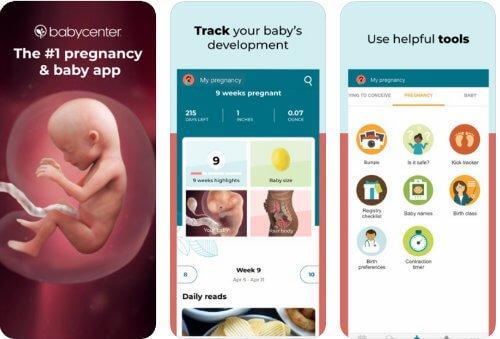
For example, you can create a unique pregnancy app for expecting mothers that keeps a track of their baby’s progress, nutrients needed, pre-pregnancy workout, and more.
The mobile app retention strategy here is clear: creating a personalized app for different niche users and providing a personalized user experience.
#4. Make your navigation smooth
It’s critical to get the navigation right since your user retention will directly correlate with how users navigate through your healthcare app.
Remember, users come to your app to accomplish certain tasks. If they fail to identify what they’re looking for, they’ll uninstall your app and switch to your competitor’s app. So, how can your healthcare mobile app retain users with great UX/UI?
Make sure to keep the action simple and obvious while the user journey progresses. The icons should be marked and visible by keeping the taps and interactions minimum to accomplish a task.
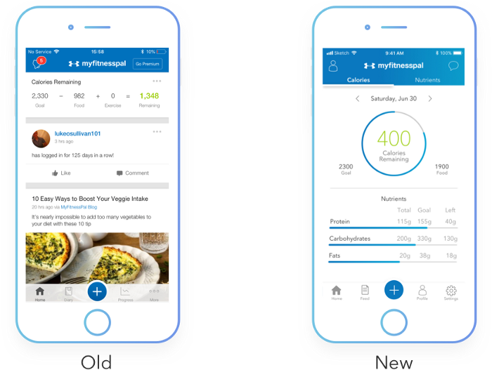
MyFitnessPal’s app reduces the number of steps needed for a user to finish their primary goal. The redesigned screen helps users track the calories left to be consumed to hit the goal along with detailed nutrient information on the go.
Common mistakes to avoid while designing your app’s navigation are:
- Make sure that your app flow needs less interaction and is simple to understand.
- Keep navigation icons and gestures familiar. Avoid using too many or very few menu options.
- Do not hide important navigation links.
- Ensure a simple, user-friendly and smooth journey for app users.
#5. Ensure frustration-free gesture
Measuring gesture UX has become a crucial aspect of mobile apps since the time iPhone shifted from the home button and android devices adapted full-screen gestures. Making your gesture smooth and user-friendly is a key aspect of the app’s overall user experience.
But working on usability gestures, one of the most underrated aspects is – identifying your target audience. We often forget to identify for whom we are designing the app.
Does your target audience include people moving from one place to another (such as a food ordering app) or senior citizens who consult doctors on virtual calls (mHealth or telemedicine apps)?
Make sure that your app’s UI and gestures are optimized to their levels.

A perfect example of touch heatmaps.
For a better user experience, do not forget to place your key elements within the thumb’s reach. To analyze gesture-based usability, touch heatmaps are the best tool to monitor physical gestures and not just the interaction ones.
#6. Use of in-app messages
When used correctly, in-app messages relieve user frustrations and deliver personalized and contextual messaging where and when it matters the most.
So what are in-app messages? They are a direct line of communication between you and your users. You can send them while the user engages with your web or mobile app.
The different ways to use in-app messaging for your healthcare app development include:
- Patient-physician 1:1 chat
- Medical reports shared directly in the conversation
- Patient centric-group conversations
- Medication reminders
- Chatbots
Telemedicine platforms, mHealth apps, telehealth apps and healthcare software commonly use in-app messages to make user communication relevant and effective.
#7. Retention email marketing
Customer retention is complex, and no single strategy will solve user churn completely. That said, email is still the most effective channel to engage inactive users and bring them back to use your app.
Now you may be thinking, why use emails to retarget app users? The reasons are:
- Users prefer brands to show up in their inbox as it’s less obstructive compared to notifications. They are shared with active and inactive app users over email.
- Email marketing has a jaw-dropping ROI of 122%, higher than any other channel (yes even search and social fall behind).
- Using a CRM such as EngageBay, emails can be personalized for specific customer segments. Segmented email campaigns have a 100% higher click-through rate than generic campaigns!
Some triggered email messages to boost retention for your healthcare mobile app include:
- Welcome email
- Abandoned cart email
- Upselling and cross-selling email
- Special occasion email
- Discount and sales campaigns
- Referral email
- Re-engagement email

Lastly, update your app at regular intervals
Update your mobile app with new features and personalized content to keep users hooked.
To update your app, keep a track of users’ behavior, gather feedback and see what major updates would entice a user to stay glued to your app. Another way is to keep an eye on your competitor’s offering and offer the better, improved, or updated version of it.
P.S. What else can you do to retain your app users?
- Consult your users and ask them what they like about your healthcare app and what else can be done to craft a better mobile experience.
- Do not surprise them with the hidden charges. Have transparent pricing.
- Keep your user’s data safe and secured.
- Focus on connectivity by integrating wearable technology.
Healthcare mobile app retention strategies: A little planning goes a long way
Retention is not a quick fix, rather, a well-thought strategy that revolves around the entire user journey.
With these mobile app retention strategies for healthcare, you can show customers you understand them and care about their experience with your app.
The post 7 Mobile App Retention Strategies for Healthcare You Should Try in 2022 appeared first on noupe.
