Archive

Archive for April, 2022

Conversational Commerce: How It’s Affecting Website UX and 3 Ways To Optimize Your Website For It

April 22nd, 2022 No comments

It’s no secret that we’re a society that favors instant gratification. Although it has its time and place, most of us don’t have the patience to wait for an email response anymore – we want answers right here, right now. 

Because of this, brands are increasingly looking at how they communicate with their customers. Many are turning away from the standard channels, and are instead looking towards the new kid on the block: conversational commerce.

Fast, efficient, and capable of boosting sales in new and exciting ways, conversational commerce is fast finding its footing in the ecommerce world – and it looks like it’s here to stay. 

Below, we’ll dive deeper into what conversational commerce is, the benefits it can bring to your website UX, and how to make sure your website is fully optimized to support it. 

What Is Conversational Commerce?

It’s a good question, and if you had an Alexa or a Google Home sitting next to you, they’d be able to tell you the answer in a heartbeat. 

As it is, we’re happy to fill in. Simply put, conversational commerce is when voice assistants and messaging services intersect with – and often improve – the sales process. 

You may not realize it, but conversational commerce has probably already made its mark on your daily life. Perhaps you’ve had a discussion with a customer service assistant using a customer service live chat, or maybe you’ve replenished your coffee supply through your smart speaker. You might even have used a chatbot to create a personalized outfit for yourself. 

If you can’t live without your voice assistant, don’t worry. You’re not the only one! A third of the United States’ total population uses voice search regularly, and 1.4 billion people currently use chatbots. It was predicted that by the end of 2021, 85% of interactions would be handled by virtual assistants, and with COVID still driving the online retail space, it’s no surprise that experts estimate that by 2025, voice and chat technologies will be bringing in around $290 billion.

Sources: Statista, eMarketer, Smallbizgenius, Juniper Research

For anyone working in the commerce space, the data speaks volumes: if you aren’t using conversational commerce, you should be. Its popularity is on the rise, and users are increasingly looking for ways to bring conversation into their everyday shopping experiences.

How Does Conversational Commerce Affect Website UX?

The increased functionality provided by voice search, live chat, and chatbots all contribute towards a shopping experience that feels more 3D. But what is it specifically about conversational commerce that appeals to users so much?

1. It’s Convenient

Nowadays, anything that makes something faster and easier is going to be a winner. Being able to write your shopping list whilst changing the baby’s nappy or doing chores is multi-tasking at its finest – and conversational commerce helps with that. 

Voice search, particularly, is all around us. On our phones, our smart speakers, and even our watches. This means there’s always going to be something within hearing distance to deal with your customers’ requests. 

Similarly, having a live chat or chat box function on a page means that your users can get answers in seconds, rather than having to actively search for phone numbers or email addresses

Ultimately, conversational commerce takes out the middleman and streamlines the sales process. 

2. It Delivers a More Personalized Experience

When it comes to marketing, personalization isn’t new, but delivering a truly personalized experience when shopping online has always presented somewhat of a challenge. Conversational commerce solves this. 

By its very definition, conversation is a personal thing. Using it in your ecommerce strategy allows you to provide options for customers to access a completely tailored experience at every stage of their buying journey.

Conversational commerce strategies give each user access to more information on products, as well as provide a way to upsell new options and add-ons that they might not have considered before. 

Overall, conversational commerce is a little like adding a bespoke personal shopping experience to your website. And who doesn’t love to feel special now and again?

3. It Provides a Higher Level of Customer Service

Did you know that 81% of millennials experience anxiety when they know they need to make a phone call? This, combined with the fact that 91% of consumers globally prefer real-time assistance, means that old-fashioned methods of customer service are on the way out. 

Luckily, conversational commerce is there to fill the gap. Whether you’re looking for a faster way of providing customer assistance, or you want to deliver a more personalized offering, live chat and chatbots are both excellent ways of leveling up your customer help and support. Voice search also has its part to play here, giving answers to your users’ queries in a matter of seconds. 

The best part about using conversational commerce in customer service is that it offers a more interactive way for customers to speak directly to brands in real-time. It ensures that service is faster and more targeted, with no pesky wait times. 

How to Optimize Your Website for UX

One thing that’s for sure is that conversational commerce isn’t going anywhere, and over the coming years, it’s only going to mature and settle fully into its position within the industry. 

Now you know what it is and you know the benefits, there’s only one question that remains: how can you optimize your website for conversational commerce if you’re not using it already? 

Below, we’ll cover the optimization steps for all three methods of conversational commerce, so your website will be primed for a symbiotic conversational commerce-UX relationship.

Optimizing for Voice Search

Optimizing your website for voice search is pretty similar to optimizing for search engines. That’s because digital assistants use search engine snippets to find their answers. So, the higher you are in the rankings, the better.

Below, you’ll find some tips to make sure your website is ready for voice search:

  • Make use of structured data – This helps Google to find where the answer to a question is on your page. You could add an FAQ section to help with this.
  • Use a conversational tone in your content – This means making sure that your tone of voice reflects the way users will phrase their questions.
  • Optimize for mobile – All smartphones come with a digital voice assistant, so it makes sense to tick this box as firmly as possible!
  • Use long-tail keywords in your copy and titles – When asking questions, users will often use full sentences. Using long-tail keywords will help you to target more niche queries because of this. 
  • List your business locally – Lots of users use digital assistants to find local businesses. Make sure your website contains lots of regional indicators so you can be found more easily. 

Adding Live Chat to Your Website

Adding live chat to your website is as simple as clicking a few buttons. No, really. You’ll need to sort out staffing and operation hours yourself, but the actual technicalities behind getting your live chat up and running are pretty straightforward.

The process depends on which type of website you have, but generally, one of the three options below will work for you:

  • Use external platforms – There are plenty of third-party platforms that provide this service, such as Olark, Sendinblue, and Livechat. These platforms usually come with an additional monthly cost of around $16/month and above. 
  • Use inbuilt website builder appsWebsite builders are one of the easiest ways to create a website, and they make it simple to add a live chat function, too. Usually, these services are provided by an external platform, but you can integrate them with your website through an app.
  • Use a CMS plugin – If you built your website with a CMS, plugins are your answer. Usually, there are plenty to choose from and they work in the same way as an app integration would.  

Adding An AI Chatbot to Your Website

Similar to live chat boxes, many businesses find chatbots more convenient for the simple fact that they’re run by an AI and don’t require staffing. This means that you can have them running 24/7 if you like. 

When it comes to adding one to your site, the process is very similar to adding live chat:

  • Use an inbuilt function provided by your website builder – Most website builders come with inbuilt chatbot functionality, so all you need to do is insert it into your website design. If your builder doesn’t offer this, you could choose to install an app instead.
  • Use a CMS plugin – There are always tons of apps in a CMS plugin library, so you should have a ton of choices when choosing a chatbot app. Once you’ve picked one, simply click to integrate it with your website. 
  • Hire a UX designer or developer – If you’d rather take a hands-off approach, you could hire a UX designer or developer to do it for you. This is an especially good idea if you want a more complex live chat system, which might not be provided by apps and plugins. 

Summary

As with all things, one era ends and another begins – in this case, the time of conversational commerce is nigh.

Not only does conversational commerce make for a more convenient shopping experience for your customers, but the extra layers of personalization and more interactive customer support options it offers are largely responsible for boosting and driving sales.

The good news is that if you aren’t already using conversational commerce as part of your sales strategy, this is easy to rectify.  Whether you want to use one conversational commerce strategy or all three, you’ll be on your way to success faster than we can say, ‘Alexa, what’s the weather like today?’

The post Conversational Commerce: How It’s Affecting Website UX and 3 Ways To Optimize Your Website For It appeared first on noupe.

Categories: Others Tags:

How will iOS App Development Change in the Near Future??

April 22nd, 2022 No comments

The fact that one day in the near future, Smartphone Users will surpass a subscription number of several hundred million. With China, India, and the United States being the top-most countries with the highest smartphone users, the worldwide smartphone subscription has surpassed 6,500 billion. With 3.74 million non-gaming Apps and over 1 million gaming Apps, the iOS App Store has become the second-largest App Store after Google Play Store. Well, who can now question the popularity of iOS App Development?

Apple.Inc has left no business success story coupled with App Development. From Facebook Messenger, Kik, to ASL App, and Chegg eReader, these are a few successful iOS Apps. 

So, if you’re an aspiring entrepreneur looking to turn around your Business with an iOS App, let us familiarise you with iOS app development trends, and also what the future beholds.

The future of iOS App Development

Apple.Inc brings you limitless possibilities to develop and launch your Apps. The Platform offers iOS, iPadOS, macOS, tvOS, and even watchOS to provide a unique user experience. Now, these cutting-edge technologies together bring unique capabilities to help you develop a seamless and intuitive experience. 

Let’s dig further into the most advanced facets of iOS and how it can help you build Futuristic Apps. 

User Data Protection

iOS App Development is incomplete without a user’s data protection facility. Now, iOS provides this protection by encrypting the files of the app on the disk. This Data Protection feature forbids any unauthorized access to the App files.

There are four levels of Data Protection, namely, 

  • No protection
  • Complete until first user authentication (Default) 
  • Complete unless open
  • Complete

If no protection level is specified, iOS Applies the default one automatically. 

Grow your iOS App with CloudKit

From efficient syncing to simple monitoring and management, CloudKit is the easiest way to build and grow your App. iCloud keeps everything updated across different devices and the web. And as and when your user base grows, you get 1 PB (petabyte) of storage for the Public Data of your App. 

CloudKit offers a comprehensive set of features to help you build powerful Cloud Apps including; 

  • Automatic syncing 
  • Encrypted Data 
  • Protected Privacy 
  • Automation 

Organize your Apps in containers so that their data doesn’t tangle up with others! 

Near Field Communication (NFC) Tag Reading

Core NFC is an essential aspect of iOS App Development. The app can read the physical environment and real-world object tags to provide users with more information about them. The app can read NFC tags of types 1 through 5 available in the NFC Data Exchange Format (NDEF). 

Core NFC is available on devices that support Near Field Communication. 

AI-Powered Siri

Siri is an intelligent assistant that users can do things with just their voice. Siri handles user interactions, including voice recognition, language recognition, and other user requests. 

Try commanding the following to Siri to see what this advanced feature can do for a matchless user experience with your iOS App. 

“Send a text to Macey Smith using MyTextApp.”

“Start my daily aerobic workout fromMyWorkout App.”

Add 1 Almond Milk, Wheat bread, and Eggs to my grocery list in MyListApp.” 

Suggested Shortcut APIs paired with Siri bring convenient shortcuts right to the user’s Lock Screen! The conversational feature lets Shortcuts get more things done. Say, if the users say “Order Takeout,” Siri would ask a follow-up question like “Which Order should I takeout,” and then present the order from a Food Ordering App!

Siri will also display visual information for ease of use!

ARKit 5

In recent versions, Apple has made significant progress with Augmented Reality. ARKit 5 allows one to create AR Experiences for specific places and even in the neighborhood. 

The new, improved features of ARKit 5 include Motion Tracking and Face tracking. Face Tracking extends support to the Front-Facing Camera for any iPhone Model with an A12 Bionic chip and later. With the TrueDepth Camera, one can track up to three faces simultaneously, such as in iOS apps like Memoji and Snapchat. 

Location Anchor is available in only selected cities for iPhone Models iPhone XS, iPhone XS Max, iPhone XR, and later versions. Specific cities or places such as famous landmarks with Location Anchor support allow users to move and see virtual objects from different perspectives. 

iBeacon

iBeacon opens limitless opportunities. It implements Bluetooth Low Energy (BLE) technology standards, enabling exchanging information by receiving signals from beacons within nearby distances. 

iBeacon is beneficial for iOS App Development for industries like Retail, Hospital, Education, Entertainment, Real Estate, and Digital Advertising. This feature can help your business to: 

  • Deliver a more personalized experience 
  • Gather instant feedback about User’s Experience 
  • Gather information about products in their proximity 
  • Let’s Businesses acquire customers and retain them 

Core Machine Learning (ML)

iOS App integrated with Core Machine Learning (ML) delivers fast performance. With just a few lines of code, the iOS App Developers can develop an App with intelligent features. Easy to add pre-built machine learning features are facilitated by Core ML-powered APIs. 

A few Machine Learning features include object detection with images and video, analysis of language, and sound classification with just a few code lines! 

Easy IoT iOS App Development

The IoT industry is growing exponentially, making people’s life easier. One can build an IoT App on iOS in just a few easy steps! Suppose you’re building a native, hybrid, or cross-platform app. In that case, the first few steps include working with Xcode and Swift, choosing an Application Enabled Platform, coding the front-end and back-end, using the IoT Framework, and finally launching it on the Apple App Store! 

Well, that’s how iOS App Development happens! 

Wrapping Up:

It’s crucial to keep up with the trend so that you don’t go obsolete! So, while you’re working on your iOS App, try to include the market-trending features into your App Development. Thus, this shift to developing iOS Apps is taking App Development to the next step. Avail the best iOS App Development Services by contacting the right company or developer at the right time. 

So, hire an iOS developer by checking that the chosen App Development Service Provider has relevant experience designing and developing the app! Artistic minds never hurt anyone. Also, look out for developers who hold the caliber of thinking out of the box and developing robust, effective, and customized iOS Mobile Applications. Most importantly, make sure that the developers put forth a cost-effective quote for their user-friendly iPhone App. 

Technical soundness is yet another App success catalyst. Whereas, in the end, quick delivery of high-quality products is reasoned to bring the greatest outturns! 

Employ these futuristic and groundbreaking features and build a next-gen App today! 

The post How will iOS App Development Change in the Near Future?? appeared first on noupe.

Categories: Others Tags:

10 Best Places to Find Website Themes in 2022

April 22nd, 2022 No comments

Whether you are a designer looking for the best themes for your clients or a new website/blog owner, there are numerous theme marketplaces to cover your needs.

CMS (content management systems) like WordPress, Shopify, and Wix offer built-in theme collections. But there are also trusted third-party marketplaces for themes.

Most beginners are pretty overwhelmed when it comes to choosing a website theme. With thousands of themes to choose from, this is more than understandable. In this article, we will first highlight all you need to consider before selecting a template/theme for your website.

By the end of this 5-minute read, you will also know which are the best third-party and CMS-based marketplaces for both free and premium themes.

How to Choose the Best Theme for Your Website 

You might consider many parameters when choosing a theme for a blog or website. To narrow down the options and find a theme that suits your needs and preferences, you can:

  1. Make a list of the features you need (integrated page builder, SEO optimization, browser compatibility, translation capability, number of columns, etc.).
  2. Pay attention to responsiveness — nowadays, you should opt for mobile-friendly themes only. 
  3. Opt for lightweight, simple themes — such templates are usually more powerful as they do not affect the speed of your website.
  4. Make sure that the theme has the visual appearance you want — find the themes that match your branding elements (colors, logo, industry, etc.).
  5. Keep readability in mind — a font that is difficult to read will affect readability (especially on mobile devices) and ultimately hurt your website traffic.  
  6. Test the themes before you start customizing them — even (most) premium themes offer a trial period, which you should take advantage of; it will save you time and money.

Following these simple steps will ensure that the theme you choose will benefit your website in the long run. Now that we have analyzed that let us look at the best places to find themes in 2022.

5 Best Third-Party Theme Marketplaces

1. ThemeForest

If you are looking for a comprehensive list of premium themes, ThemeForest from Envato is just what you need. The marketplace offers thousands of pre-built templates and themes for pretty much everything: from responsive WordPress themes to the best-selling templates for eCommerce websites on platforms like Shopify.

2. Creative Market

Although ThemeForest offers a vast selection of themes, Creative Market is simply the best choice for non-WordPress themes. The platform includes an analytic filter section to select the CMS you use, file type, price range, and much more.

Tumblr, Drupal, Bootstrap, and Joomla are just a few examples of the specified templates available.

3. Template Monster

The same goes for our next suggestion, the Template Monster website. This third-party marketplace offers some of the best themes, plugins, and graphics that you can use to improve the look and performance of your website. From WordPress and WooCommerce templates to themes created for the Shopify platform, nothing is left out.

4. StudioPress

StudioPress marketplace allows you to find the best theme for your website through a comprehensive sorting feature. You can sort your search by your niche, the features you need, the layout (columns), and the template’s developer. Even though StudioPress offers its own theme (Genesis Pro), the marketplace also includes numerous third-party themes.

5. CSSIgniter

Our final third-party provider is CSSIgniter, one of the most well-known marketplaces for WordPress website owners and developers. This site offers demos for numerous themes, from minimalist, very popular templates (especially for blogs) like Olsen to comprehensive WooCommerce themes like Amaryllis. 

This way, you can try out the premium themes before choosing one that suits your needs. Note that CSSIgniter only offers themes for the WordPress CMS.

5 Best CMS-Based Theme Marketplaces

1. WordPress Themes

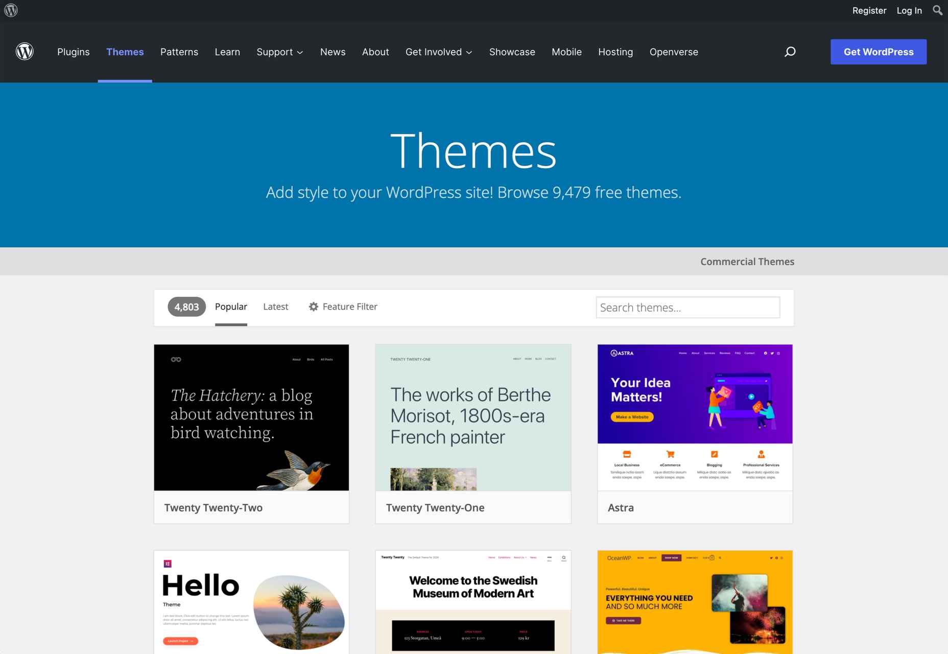
Although all third-party marketplaces mentioned above offer a wide selection of premium themes, it can be challenging to find free themes for your website. If that’s what you are looking for, there’s simply nothing better than WordPress’ built-in theme marketplace.

The WordPress marketplace contains more than 4,000 free and premium themes for you to choose from.

2. Shopify Themes

According to statistics, Shopify is the second most popular CMS, after WordPress. So, it should come as no surprise that the eCommerce platform has an integrated marketplace where you can find numerous free and premium themes.

So, if you are looking for a beautiful template for your Shopify-based store, you should check out the Shopify platform first.

3. Wix Website Templates

Like WordPress and Shopify, Wix has had a marketplace for themes since day one. Keep in mind that when you build your site through Wix, you do not have as many options for finding third-party themes as you do with WordPress. Still, you can find many premium and free themes on the Wix website to solve this problem.

4. BigCommerce Themes & Templates

BigCommerce is one of the most popular CMS on the market, tailored for professionals. On the website, you can find numerous free and premium themes, and you can find the best one based on your industry.

5. Squarespace Themes

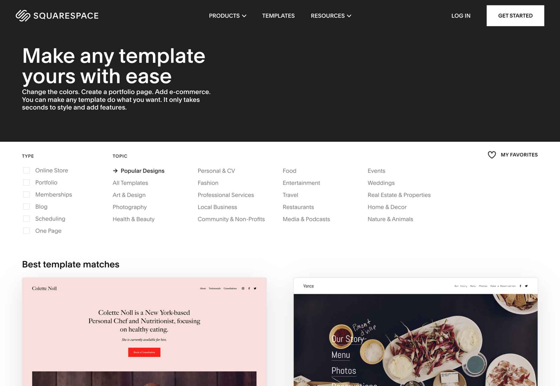
Last but not least, we have Squarespace’s official theme marketplace. With a comprehensive filter section, it’s straightforward to find a great theme on Squarespace. If your website or blog is built with Squarespace CMS, there is nothing better than this.

Wrap Up

Of course, the list of places to find themes for your website in 2022 could go on forever. But if you know what you’re looking for in terms of layout and features, choosing the best theme will instantly become easier.

Besides, the providers mentioned above prove the most trustworthy and offer the variety you need for your final selection.

You should probably look at third-party marketplaces like ThemeForest and Creative Market if you need a premium theme. On the other hand, CMS-based theme marketplaces are the best option for those who are looking for the best free themes.

Source

The post 10 Best Places to Find Website Themes in 2022 first appeared on Webdesigner Depot.

Categories: Designing, Others Tags:

Essential Tips for Creating Your Employee Handbook

April 22nd, 2022 No comments

Is your organization struggling to maintain a healthy flow in its communication structure? If so, you might want to start by ensuring that you and your team are on the same wavelength when it comes to your company’s goals. Like John Rampton says,

“I’ve made it clear that I have an open-door policy – which means that the employee can tell me anything that is on their mind.”

One way to do that is by creating an employee handbook, clearly stating the company policies, objectives, and regulations that will act as a binder to keep everyone on the right track. Let’s dive deeper into the conversation to understand this better. But first, let’s sift through a few basics.

  • Why You Need an Employee Handbook
    • Laying down the right expectations
    • Welcoming new employees
    • Comes in handy while resolving disputes
    • Harboring a positive work atmosphere
  • Sections You Need in the Employee Handbook
    • Welcome message
    • Company introduction
    • All things legal
    • Finances, rewards, and recognition
  • Final Thoughts

Why You Need an Employee Handbook

The most important function of an employee handbook is to streamline the communication between an employer and employee and to encourage a transparent business model.

This helps new employees get comfortable with the company structure and aids the existing workforce to be better at communicating their issues and doubts. 

Here are a few other benefits of having an employee handbook.

1. Laying down the right expectations

Your employees need to be well versed on their roles and responsibilities and should also be in a position to accept full accountability for their actions.

An employee handbook manages that by being a valuable resource of information regarding policies, roles, missions, values, and objectives. It proactively ensures that:

  • The employer and the employee are on the same page in terms of roles and expectations.
  • There’s a smooth flow of communication between hierarchies.
  • Employees feel comfortable and confident while voicing their issues.
  • Everyone feels valued and equal in the organization.

More often than not, you might come across an uncomfortable situation with your employees, especially if you deal with a remote workforce. An employee handbook comes to your rescue in such situations by becoming your ally in clearing up bad air and making things seamless and positive at the workplace.

2. Welcoming new employees

When a new employee joins the team, their head is full of questions you might not have the right answers to.

But, with the help of an employee handbook, they can easily navigate these doubts and will also be in a much better position to understand the company structure.

Additionally, it also helps in:

  • Laying down important company policies
  • Talking about expected employee behavior
  • Making legal and financial terms transparent
  • Helping a new employee understand how to communicate between hierarchies
  • Talking about the person of interest in case of a dispute
  • Laying down essential company clauses

Apart from maintaining a smooth onboarding process, an employee handbook also clearly demarcates the policies regarding exit procedures that ensure an employee bids goodbye to the organization on a positive note. 

3. Comes in handy while resolving disputes

While working on a team, a difference of opinion is inevitable. In a situation like this, an employee handbook acts as your gospel truth by outlining all the intricacies involved when it comes to legal matters.

It tells you how to proceed, keeping in mind the interests of both parties involved and the first step in the process. 

Here’s what you need to include in this section to ensure that things are handled smoothly.

  • Compliances and state laws
  • Non-disclosure agreements
  • Legalities associated with employee contracts
  • Labor laws
  • Social media policies
  • Policies related to the use of technology

This is also an important document to establish credibility for your company, since it talks about you as an established, law-abiding institution that believes in being fair in all its undertakings.

4. Harboring a positive work atmosphere

For your employees to contribute to the company in the best way possible, they need a clear headspace free of any communication conflicts.

An employee handbook holds relevance here by streamlining the process of communication and touching on deep topics related to grievances, legalities, organizational goals, and objectives.

This reassures your employees, and they can concentrate better on their work. This leads to a workplace that fosters a community of motivated employees who work with twice the determination.

Drafting a company handbook requires in-depth research and a lot of time. It is recommended to create personalized emails for your employees, asking them for their valuable insights, and to use those to direct your handbook content accordingly. You can use a drag-and-drop email builder to save time.

Now that you’re set in the right direction, let’s find out about some essential information you need to add as part of your employee handbook.

Sections You Need in the Employee Handbook

There is no hard and fast rule as to what you need to include in an employee manual, but there are a few things that need a spot right on the front pages.

Let’s help you get those on point.

1. Welcome message

A welcome message is essentially a short and crisp statement from a senior-level leader, welcoming employees, new and old, to explore the handbook further.

This message goes a long way in connecting employees at all levels with their leadership and making their ideas more accessible.

Here’s what you need to do to ensure that this message is absolutely on point.

  • Keep the language simple and easy to understand.
  • Use first-person language and direct the content to the employees.
  • Use a positive tone and make the message sound happy and warm.
  • Keep it short and crisp.

This is the first thing employees will read as soon as they have access to the handbook; ensure that it’s error-free and engaging so they feel compelled to read the rest. 

You can also use this space to take your new joiners through their first-day journey, like how Valve does it in their handbook.

2. Company introduction

The next section you need to draft relates to introducing your company more extensively by talking about policies, teams, and so on. This is the section that will come in handy while managing grievances and disputes. 

Also, it is the most referred-to section in the entire book; therefore, it is recommended to take proper guidance while drafting it.

A few things to cover here are:

  • Brand image guidelines
  • Mission and vision statement
  • Team structure, project management principles, and office hours
  • Company culture (take hints from Netflix’s culture page)
  • Divisions between teams
  • Onboarding and exiting procedures
  • Documentations
  • Privacy statements
  • Leave and absence policies

Every organization is different, so this section may vary from company to company. You need to understand what structure suits your company best and then take it from there. 

3. All things legal

Cover all the legalities in this section to maintain the utmost transparency and to safeguard your company’s interest in case there’s a dispute with an employee or even a stakeholder.

Here’s an idea of what you need to cover here:

  • Equal opportunity clause
  • Disability clause
  • Diversity and Inclusion statement
  • Corporate Social Responsibility
  • State and national policies
  • Workplace harassment clause

Talk about each of these points in-depth and cover every angle. Use an expert’s guidance to draft your legal section, as it needs to be error-free or it might backfire. 

Circulate the same over an email using a good email marketing tool so everyone has access to it as a separate document. 

Pro tip: Consider the software you’re using while employing this technique to avoid hang-ups. For example, if the majority of the team uses iOS, use an email client for Mac for seamless distribution.

4. Finances, rewards, and recognition

Apart from your work culture and workplace infrastructure, this space is one of the main reasons an employee chooses you over another opportunity. 

Be as descriptive as you can be, and make this the most appealing section of the entire book. This is also a good time to talk about any incentive and employee recognition programs you have in place to further motivate your employees to perform better.

It is recommended to break the information in this section into smaller parts so everything is laid out in a clear fashion, leaving no room for confusion.

You can add an extra section to the list wherein you can talk about all the employee benefits you offer, like medical insurance, financial aid, tax rebates, and so on. Just keep in mind that the more information you share in your handbook, the better.

Leverage technology to have a copy of the handbook mailed to your employees, and ask for a necessary acknowledgment receipt so you know that they’ve read and received it and are aware that such a document exists.

Final Thoughts

All the above points will get you going in the right direction of drafting your employee handbook. 

However, your first step is to determine how you want to present it, what kind of language you want, where you want your content to be directed, and most importantly, what information you are comfortable sharing. 

Once you have it figured out, make sure you take the time you need to hire the right person for the job, and you’re all set. Just keep updating the handbook as and when new policies come into play, and always stay on top of things.

The post Essential Tips for Creating Your Employee Handbook appeared first on noupe.

Categories: Others Tags:

Testing The CLI The Way People Use It

April 22nd, 2022 No comments

Thousands of tools for the command-line interface (CLI) are out there, without exaggeration. They serve all kinds of purposes. Yarn is one of the most used CLIs in the world, bringing ease to the package management of millions of projects. Others are narrower in scope, serving as a way to communicate with a particular tool such as Webpack (webpack-cli) or TypeScript (tsc).

Every CLI serves its purpose, but they all have one thing in common: the interface part of the name. While it might seem odd or mystifying to the less technical people out there, it is one of the most common ways in which people communicate with and control programs. It’s especially odd when we remember that it’s the oldest way that people have interacted with a computer that didn’t involve plastic punch cards or uploading a program into the computer through some other means.

While people have come up with all kinds of ways to test web and other applications, CLI tools have been overlooked in this area for the most part. Today, we’ll touch on end-to-end testing of these tools, go through patterns to follow, and introduce a library to solve some of the issues we encounter along the way.

CLI Tools And Why You Need One

Before digging in, we should talk about creating a CLI tool in the first place. After all, to test a CLI, we would usually need to create one first. Forget for a moment about all of the tools used by millions of people, and focus instead on the use case of creating your own CLI. A couple of questions would need to be answered: Why would you do that, and how would you do that?

I spend most of my work-time at Pipedrive, a healthy-paced growing company with a little under a thousand employees as of the time of writing. Putting this into perspective is important.

Even a single person or a small team can suffer tremendously from a suboptimal repetitive process. Losing an hour a day is tremendously wasteful and often leads people to hating the task and everything connected to it. However, what makes the problem worse is scale. The more a task is repeated or the higher the number of people repeating the task, the bigger the problem becomes.

With a thousand people and several hundreds of engineers involved, any repetitive task could grow into ridiculous proportions. It would leak development resources, always a scarce commodity, no matter the position of your company.

That’s one of the main problems Pipedrive has been focusing on a lot lately, having grown to the decent size it is. We’ve been optimizing reusable things, cutting out repetitive work, and ideally getting rid of the need to reinvent the wheel between teams altogether.

That’s where the CLIs come in. It’s a powerful tool for optimizing repetitive work: It’s cheap to create, and it can access or run pretty much anything you need, from reading and writing to the file system to directly accessing remote databases. Your imagination truly is the limit. I’ve been involved in creating several CLI tools in the past year or two, but not only in this time period, nor the biggest of them at Pipedrive.

I’ve worked on my own open-source CLI tool in the past. The tool might not be the most used, but it does save a lot of time by testing the implementation of the Swup library on a website, which is an incredibly time-consuming task when done manually. The point is that you don’t have to be a thousand-person company to benefit from your own CLI tool.

Designing The CLI For Testing

Now that we’ve established why one would need an own CLI tool, let’s get into the how. Plenty of guides exist around the internet on how to build your own CLI. That’s mainly the reason why we’ll skip this topic altogether. Instead, let’s focus on something more specific: designing the CLI so that it can be easily tested.

Ideally, each part of the CLI would be a standalone task that you can run and evaluate without running the CLI program. Most libraries, or templates of the sort, that are meant for building CLIs are designed that way already. That might be a conscious design of the creators, but it might just be an accidental byproduct of the purpose of the CLI in running specific, often small tasks.

Enough talking. Let’s throw some code examples into the mix. One of the most popular libraries, if not the most, for building CLI tools is Commander. It’s also one of the simplest tools, meaning that it doesn’t add much abstraction on top, and it mainly simplifies the definition and reading of possible options. A contrived example of a CLI would look something like the following:

const { Command } = require('commander');
const program = new Command();

const print = (string) => {
  console.log(string);
}

program
  .name('my-cli')
  .description('CLI to show off some cool stuff')
  .version('1.0.0');

program.command('print')
  .description('Print a string')
  .argument('<string>', 'string to print')
  .action(print);

program.parse();

The example nicely shows how Commander simplifies the management of what the CLI should run at all. For us, the important thing to notice is the line containing the definition of the action called for the print print command — in other words, the function called when the CLI is executed by running my-cli print hello!.

This is important because the actual handler of this command is a standalone function — that is, a function that can be imported, executed, mocked, or anything in between, without touching any other part of the program. In fact, this particular handler is something we could call a pure function, because it doesn’t have any side effects and it always returns the same output for the same input. However, even for non-pure functions, any side effects that could touch the file system, an external API, or whatnot can be mocked, making the testing powerful and replicable for more complex functions, too.

Make It About The User

We went through how separate parts of a CLI can be tested. Now let’s consider a different approach. Just as unit tests are usually accompanied by other more complex tests for your typical apps, the same approach and arguments can be used for the CLI. While testing separate parts of a program is always advisable, bringing automated tests much closer to the user’s use cases does have its charm.

It is not-so-coincidentally the same philosophy is followed by the Testing Library. It brings the flows that we use for testing a step closer to the way the code is used by its users. Thanks to this popular library, many people are so used to the idea that it might even seem obvious, although the same pattern with CLIs is not that common.

The more your tests resemble the way your software is used, the more confidence they can give you.

That’s a short but representative line from Testing Library’s documentation. Let’s unpack this idea. There are simply so many moving pieces in even the smallest programs. Every piece has the potential to break. These moving pieces could be anything. Let’s consider external dependencies as an example. They are usually trusted to follow semantic versioning, but there is always room for mistakes and accidental breaking by maintainers. This probability is significantly higher these days considering that a typical JavaScript project has hundreds of dependencies. These dependencies are not tested in our tests, and they are often mocked up altogether when unit testing.

The same applies to code that might be partially untested or to a scenario that just wasn’t considered.

That’s a technical perspective, but an even better description would be more fundamental. I, as developer of the program, don’t care whether some subpart gets called once or twice or that the values are different. My main concern is the business logic — that the program does for the user what I intend it to do.

If the program is supposed to create a file on disk, then that’s what we need to make sure works as expected. If the program does some other operation based on user input, then — you guessed it — that is what we need to make sure works.

In a sense, it’s a shift away from programming logic altogether, moving closer to the business use cases, because those are what matter at the end of the day.

From Idea To Implementation

As is usual with projects, now that we’ve established our reasoning, we can move to the practical part of the implementation. The goal is clear by now: allow testing of a CLI tool, resembling the way users use it as closely as possible.

In this section, let’s focus on the most interesting part of the task, which is how we would like the tests to look like. We’ll skip the implementation of the API for the most part, because that consists of technical problems that we can solve anytime.

Conveniently, all of the below-mentioned functionality is provided by a library that we’ve put together for today’s purpose. It’s named CLI Testing Library, which is not exactly creative, but given the similarities in philosophy to Testing Library, it aptly describes what it provides. The library is certainly in the early stages, but it’s been used to test code in production so far without issues. As mentioned, the implementation is not something we will dig into, but it can be reviewed on GitHub, and it is a fairly small code base.

Basic Execution

Thanks to the nature of the program we are testing, it’s quite simple to assume what we would like to do in the test: run a shell command that would run the program in a separate process, just as the CLI would be executed by the user in the terminal. For a moment, we can assume that the program is simple and does not require any further input from the user other than the initial options. Considering all of that, we can imagine that the ideal API might look something like this:

await execute('node my-cli.js my-first-command');

This looks sufficient for the basic use of executing a program and waiting for it to finish. The most obvious thing we would like to know is whether the program has finished successfully. CLI tools use exit codes for that, whereby the general convention is that anything above 0 represents an unsuccessful run of some sort. It’s similar to HTTP codes, with 200 being the equivalent of ultimate success. Such a code could definitely be captured and returned from our API execution, to later be compared:

const { exitCode } = await execute('node my-cli.js my-first-command');

That will surely do for a convenient basic API to run an end-to-end CLI test. Before moving on to the other points, let’s spice it up a little with some additional useful information, like the stdout and stderr of the program. In case you’re not familiar with these terms, they’re outputs you’d see in the console as a user, and these differ only in the purpose of the outputted text: default or error.

It would certainly be helpful to check whether the program printed what it was meant to, having finished successfully. Perhaps that’s what our program was meant to do after all, just print something. A simple extension of our existing API would suffice for that.

const { exitCode, stdout, stderr } = await execute('node my-cli.js my-first-command');

console.log(exitCode); // 0
console.log(stdout); // ["Hello worlds!"]
console.log(stderr); // []

With that, let’s call this our first iteration of the CLI Testing Library. We can execute a program, give it parameters, wait for it to finish, and evaluate some basic outcomes.

User Input

While executing a program and waiting for it to finish is sufficient for a basic program, a little more thought needs to be put into the implementation of a program with which the user can interact. A classic scenario would be asking the user to input text or select an option.

We can certainly get inspired by the Node.js API, which provides an exec function, fairly comparable to our own execute function described above, but it also provides a spawn method, which creates a process but in this case also allows for further interaction with the process after its creation. Not only will we have to use most of the same logic under the hood for our testing library, but because CLIs are always creating a process, we can also get inspired by Node.js for our own library’s API.

Let’s consider a basic scenario of the CLI asking only for text input from the user. For this trivial program alone, we’ll require several utilities. First, we need to wait for the actual input trigger (in other words, an instruction from the CLI to write some text). This instruction will be printed out in the stdout, mentioned earlier, so we would likely want to wait for a specific text question. Let’s call that waitForText, which would accept a string, and we’ll search for it any time the CLI program outputs a new line.

Next, it’s time to input the text that the program is asking for. In this case, we’ll have to interact with stdin under the hood, which is the input equivalent of stdout. Let’s call this utility writeText. Just like the previous utility function, it will accept a string.

Once the text is inputted into the process “console”, we would usually have to confirm it by pressing a key, such as “Enter”. That’s yet another interaction utility we can introduce, for pressing specific keys. Under the hood, we would also use stdin, of course, but let’s not concern ourselves with that. Let’s call it pressKey, which will accept the name of the key.

Now that the task is done, there is just one thing left to do: wait for the program to finish before we can evaluate whether it was executed successfully, and so on. waitForFinish is the obvious name for this. With all that in mind, we can imagine something like the following:

const { waitForText, writeText, pressKey, waitForFinish } = await spawn(
    'node my-cli ask-for-name'
);

await waitForText('What is your name?');
await writeText('Georgy');
await pressKey('Enter');
await waitForFinish();

With the code above, we can simulate the whole interaction of the user with the program. We can also accompany the spawn helper with some more information such as exit code, stdout, or stderr, just like we did for execute. For spawn, the ideal format might be a bit different — perhaps get’ers would be best because the values will be dynamic throughout the program’s execution, and these get’ers could technically be called any time. getStdout, getStderr, or getExitCode will do the trick.

const { getExitCode, getStdout, getStderr, waitForText, writeText, pressKey, waitForFinish } = await spawn(
    'node my-cli ask-for-name'
);

await waitForText('What is your name?');
await writeText('Georgy');
await pressKey('Enter');
await waitForFinish();

console.log(getExitCode());  // 0
console.log(getStdout());  // ["What is your name?", "Georgy", "Your name is Georgy"]
console.log(getStderr());  // []

With that, we’ve covered the main idea of testing more complex interactive CLI programs.

Enclosed And Independent Environment

Now that we’re deep into testing the CLI program by actually running the CLI, we should cover an important part of any test: its independence of other tests and test runs. Test frameworks usually support tests being run in parallel, in band, or the like, but that doesn’t mean we should limit ourselves to one of those. Each and every run, unless built otherwise, should be completely independent of everything else.

With your usual code, this is simple in most cases, but with the CLI and end-to-end tests, things can get tricky really quickly. The main problem is that the CLI often works with its surroundings. It might read some configuration files, generate other files, or manipulate the file system in some way. This means that each test needs to have its own temporary space on disk where the test use case can be prepared, with any files that might be needed for the test run. The same file-system space also needs to be cleaned up later so that nothing is left behind after each test run.

Creating a folder on disk is essential for any engine, and so it is for Node.js, one of the more mature engines. It even provides functionality for creating temporary folders somewhere on disk, wherever appropriate for the given operating system. The same functionality also gives us the path of the folder on disk so that it can be cleaned up when needed. Fortunately, we can easily use this cross-platform temporary-folder functionality for our test runs.

Let’s get back to our library API. It’s clear that each test should have some sort of prepare and cleanup stages. Something like the following would cover that, allowing for completely independent test runs:

const { execute, cleanup } = await prepareEnvironment();

const { exitCode } = await execute('node my-cli.js my-first-command');

await cleanup();

Now that we have a dedicated test-run root folder, we can create all kinds of helpers to manipulate this enclosed disk environment. Reading files, creating files and folders, making sure a file exists, listing a folder’s contents — all of these and many more helpers related to disk manipulation are already provided by the Node.js process itself. All we have to do is wrap them so that the root directory used is the temporary one we have created.

const {
  makeDir,
  writeFile,
  readFile,
  removeFile,
  removeDir,
  exists,
  ls,
} = await prepareEnvironment();

await makeDir('./subfolder');
await writeFile('./subfolder/file.txt', 'this will be file content');

const folderContent = await ls('./');
console.log(folderContent); // ["subfolder"]

const doesFileExists = await exists('./subfolder/file.txt');
console.log(doesFileExists); // true

const content = await readFile('./subfolder/file.txt');
console.log(content); // this will be file content

await removeFile('./subfolder/file.txt');
await removeDir('./subfolder'); // removes folder with any content

We should consider another thing related to cleanup. From the perspective of test execution, it’s completely unclear what are the contents of the CLI program itself. With end-to-end tests, we’re only concerned with what it does, not with the implementation. That means we cannot be sure what the subprocess contains or does, meaning that it can leave things hanging when executed. When the cleanup function is called in our test runs, we know that we’re done with testing. This means that part of the cleanup function could be a forceful teardown of anything that remains open or running.

Systems Differences

More caveats arise when it comes to differences in systems and shells. The library already makes several normalization steps, described below.

It might be surprising, but even on a single system, different runs can produce a different stdout array of outputted lines. In some cases, lines might be missing, and in others, they might be there. Combined with the fact that the array will likely be used in combination with snapshots, this is unacceptable and needs to be normalized. In our case, always getting rid of empty lines would be a sufficient solution.

A similar thing needs to be done with all of those special symbols used by the shell — for example, the ones used to make the output in the correct color. These symbols can differ across shell engines with the same program; so, removing them from the output will simplify things.

There is another small but real use case with a system’s special symbols. For whatever reason, in one type of system, they might be clearly visible as a special character in the output, and in another, they might be completely invisible. Two identical strings not being considered the same would lead to an insanely annoying debugging situation. Again, deleting these is the way to go.

Last but not least, in the previous section we talked about creating a separate file-system space. The full path of the current execution folder will often be used in the CLI output. The same goes for the home directory of the system’s current user. Both paths could be part of the output and would cause a test failure in different environments. These need to be normalized so that they are not different in the CLI output in different systems and runs. We can replace these with something more generic, such as {base} and {home}, making it easily identifiable that a path is one of those special folders on disk.

Mocking

Let’s be honest: Whatever we want to test and however close we want to get to the use case that the user sees, from time to time there will simply be a use case where we’ll need to make some compromise.

A good example is the CLI running with some dependency on an external web API. Each run would be affected by an external force. Moreover, it would depend not only on the API itself, but also on the internet connection and possibly some other factors, such as a VPN connection. That would compromise the requirement of reproducible runs, which is crucial for testing. So, we would need to sacrifice the integrity of the CLI program in such a case.

There is no library-integrated way to solve that. Remember that the library concerns itself with executing a process and the things around it. It doesn’t touch or understand the underlying CLI in any way. That’s why the following is more of a technique that can be used to mock parts of the executed CLI.

For the mocks to take effect on any part of the CLI program’s code, they need to be a part of the program itself — that is, be a part of one process. There is only one reasonable solution to this: make the mock a part of the CLI. Any other solution would have to be specific and invasive with regard to how the child processes are being executed in the system. That’s not something we could simply implement in a library and cover all possible use cases. It would also make the test run inconsistent with the production run in a way that is not easily controlled by the CLI’s author.

Instead, let’s focus on the program extension that was mentioned. After all, the CLI being tested will usually also be the CLI being developed, so making another entry point with the mocks included should be fairly doable. The example below mocks a response received from Axios, assuming that the CLI uses Axios for this request.

// mock-and-run.js
import axios from 'axios';
import MockAdapter from 'axios-mock-adapter';

const mock = new MockAdapter(axios);

mock.onGet('http://example.com/').reply(200, 'mocked response');

require('./index');  // include the CLI entry

Once we have that, we can just run the CLI the same way we would without the mocks, except that the CLI won’t be making any actual external requests, and it will always get a reproducible mocked response for the request code.

const { exitCode } = await execute('node mock-and-run.js my-first-command');

Conclusion

Many would argue that testing is the core of quality software and long-term sustainability. Different kinds of testing bring different kinds of benefits. Remember that, as with any other testing, end-to-end testing is an additional kind of testing at our disposal, not a replacement. The same surely applies to CLI testing.

With end-to-end tests, we can be even more confident that the program we’re testing will do exactly what we want it to do, and won’t be broken by some mistakes only affecting runtime, like the ones that can pop up after updating dependencies.

The power of CLI testing lies in its flexible nature. Whenever we’re testing a program with the JavaScript library, we are certainly not restricted to Node.js programs. After all, we are executing a shell command; so, as long as the environment is able to execute the program as a process, any language will do.

Recommended Reading: Powerful Terminal And Command-Line (CLI) Tools For Modern Web Development written by Louis Lazaris

Categories: Others Tags:

8 Best URL Shorteners

April 21st, 2022 No comments

Do you know how many people visited your website last month? 

How many of them came from the ads you ran on Facebook or the latest newsletter? 

Is your social media strategy working to bring traffic to your website? 

No business in the digital world can thrive without tracking web traffic and understanding data and analytics. Tracking the source of your website is important to understand the effectiveness of your marketing efforts while maintaining the branding for your business. 

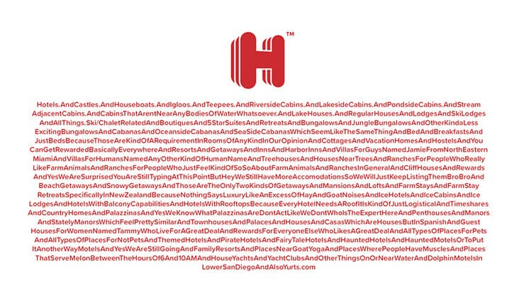
For example, How many times have you shared a link like this? 

Source: Guinness Book Of World Record (Longest URL in History of the Internet)

Now, imagine typing it or posting it on your timeline. 

Doesn’t it throw you off? 

Link shorteners not only add to the experience of your brand but also bring valuable insights which you can use for your digital strategy.

But what technical skill level do you have to be at to understand the analytics of web traffic?

The answer is you can understand the data and analytics yourself, irrespective of your technical skill level. The easiest way is to URL shortener and link tracking service.

What are URL Shorteners? 

URL shorteners are one of the necessary tools for your online marketing and traffic tracking.

If you want to shrink long and bulky URLs to short and limited characters, URL shorteners are your go-to tools. These shortened URLs send the user to the same page or website where the original link was meant to direct them. But, in addition to shortening, these tools help you track analytics like clicks, retargeting, UTM parameters, and audience analytics. 

However, the functionality and features of URL shorteners differ according to their feature sets. With numerous options available online, you should be looking at the value-added features each tool is offering rather than just link shortening. 

The more capable a URL shortener is, the more insights it can bring for you, thus helping you strategize accordingly. 

There are 2 types of URL shorteners available online. Some only shorten the links and converts a cluttered link into a short and crisp link. But, the more advanced ones offer link-tracking analytics with each shortened link. This way you can evaluate which kind of content, ad or platform is performing best to bring in the traffic from a specific link. 

From creating short, branded & aesthetic URLs to tracking and retargeting features, the URL shortener tool is an essential tool to understand your audience and the performance of the content. 

But, which tool is best for you out there?

How to choose a URL Shortener? 

The tool selection will be based on your objectives but some overarching goals for all online businesses will be the same. Therefore, we have listed brief evaluation criteria which you can use while selecting the best URL shortener. However, the selection of any tool greatly depends on your goals and needs 

1. URL Branding: 

A URL shortener takes some long, unwieldy links and turns them into a shorter, easy-to-share ones. It allows you to create short links for your digital content or online store which you can also share on the marketing collateral such as banners, posters, business cards, etc. The short links on the print ads will be easy to type and consumers are more likely to type a few characters on their devices when they can’t directly click on the link. It enhances and unifies your online and offline experience, by bringing offline customers to your online platforms too. 

One of the very smart branding techniques that marketers are now implementing is the use of branded links. From your own links to curated content, advanced URL shorteners allow you to add your own domain in shortened links. For example, LinkedIn shows shortened links on its platform as lnkd.in/fghjk. Thi way LinkedIn controls the link branding on its own platform. The New York Times shortens the links of its articles to nyti.ms/sample to share on different platforms.

2. Shareability: 

Social media apps and messaging apps allow only a certain character limit for a post. Only sharing links might take up more characters but won’t add any context for the reader. The best practice is to use URL shorteners for fitting your copy and URL within the same character limit. This can bring in the data about your content and the audience who are clicking on your links through social media platforms.

3. Data & Analytics: 

The URL shortening tool also provides data and analytics for the shortened links. For each shortened link, the dashboard of the tool can share multiple insights and data points. Some of the examples include information about the devices your users used to access the link, the country they were located in, the number of times they clicked on the link, the platform they saw the link on, and much more. These features can vary according to the tool and the plans. Data and analytics are essential for evaluating and strategizing your content. 

4. Customization:

One way to see which ad creative or platform performs best to bring in the traffic is to customize the same link for different platforms or ads. This approach is basically used for A/B testing. The same link customized for different creatives and platforms will give you separate analytics and you can then evaluate which set performed the best. Not just that the bulk customization of links allows you to group multiple links in a single link. 

Best URL Shorteners:

  1. Bitly for all-around individual and business use
  2. Replug for all-around individual and business use 
  3. Rebrandly for branded links 
  4. PixelMe for retargeting 
  5. BL.INK for enterprise businesses 
  6. TinyURL for fast and anonymous short URLs
  7. Shorby for Instagram users 
  8. Ow.ly for Hootsuite user 

1. Bitly

If you only shorten the links occasionally, then you can use Bitly even without creating an account. 

It is one of the best URL shorteners because of its freemium package. The freemium package allows you to create upto 1000 short links for 30 days. However, if you are including link shortening strategies heavily in your digital marketing strategies, then you need a premium plan which offers you to create 10,000+ branded links along with detailed data ad analytics to see the performance of these links. 

Price:  Free; $29/month (Basic); $199/month (Premium); Custom (Enterprise)

2. Replug

Replug is one of the top-rated link management tools for digital marketers. It is an all-in-one link management tool, from shortening long links to short branded links, adding retargeting pixels, tracking engagement matrices, and much more. 

Replug shortens complex and unattractive long URLs to branded and recognizable short links. This unique feature will not only add credibility to your branding but will also help you track the performance of your links in different campaigns and platforms.

But, what makes Replug better than other tools?

Replug is one of the most appreciated all-in-one link management tools among marketers for its feature set. Some of the most loved features by its users are listed below: 

Features:

Custom Domains for Branded Links:

Branded links will help you add more credibility to your digital communication. It will build trust in your audience, thus leading to a higher number of clicks and traffic. 

Replug allows you to add your domain name to create and shorten the links with your own brand identity. The custom domain integration in Replug is just a matter of a few clicks. With a custom domain, you can replace rpl.co to YourBrandName.co. 

Every link you share on social media, newsletter, or any campaign is an opportunity for a brand to imprint in your audience’s memory. You can also share the shortened link from other websites or any online resources with your audience. 

Branded links can improve your CTR by 39%.

Source: nDash 

You can download their Chrome Extension, making it very convenient to shorten the URL on the go!

Retargeting:

Nurturing your audience and potential customers across the funnel is very crucial as it leads to increased sales. Replug allows you to configure your campaigns for retargeting your audience on Facebook, LinkedIn, Pinterest, Quora, Twitter and Google. You can add the pixel ID of these platforms in Replug and let Replug handle the conversion of your visitors to buyers. It will only show the content to people who have interacted with your content previously, thus helping you spend your ads budget more efficiently. 

Lead Generation: 

Replug helps you with lead generation in 2 ways: one is by audience retargeting campaigns, and the second is by adding call-to-action buttons with the curated content. Another fun fact about using this tool is that you can share 3rd party links and shorten them with your branded links. You can also add Call-to-actions to your curated content. 

This will help you acquire leads through the opt-in form that appears on top of your content. Call to Action at different touchpoints of the online and digital audience can improve the sales for the business.

Its UTM builder allows you to add code snippets and labels to your links. 

UTM parameters are intelligent parameters where you can record and get insights into the performance of your campaigns, CTAs, and channels. 

Furthermore, You can record your Web Traffic through Google Analytics. Thus, evaluating your efforts across different platforms gives you deep insights into which channel you should invest in more. 

Instagram, Twitter, and several other social media platforms only allow you to add one bio link, but what if your user wants of exploring your brand through LinkedIn and another wants to buy the product. 

But, How will you choose which one to prefer?

The answer is, you don’t have to choose. 

With Replug’s bio-landing pages feature, you can add all your updated links to a bio landing page, with a customizable layout, where you can add all your updated links. 

You can multiple links to your service and brand such as products, videos, other social networks, and websites.

It allows you to add 10 teammates to different brands and assign different roles for optimized team management. 

This is an excellent feature for improved workflow and aligning your team on the performance. Very few link shortening tools have this feature. 

The QR code generator of Replug allows you to generate a Smart QR code with every branded link. This adds to your marketing mix. You can also promote your online source offline by getting those QR codes printed on flyers, cards, or posters. 

Insights and Data: 

You can make informed decisions for your brand with more than 10 data points in Replug. It not only shortens your links but also tracks engagement matrices of the content your share. You can analyze KPIs such as Click performance, Conversion, Unique Clicks, Visitors by country, Visitors by source, and many more. You can use these insights and analytics to make informed decisions for your retargeting campaigns. 

Integrations: 

Replug integrates with more than 30 platforms. Thus, allowing you to manage your social media, email marketing, lead generation, retargeting and creating a custom audience for your campaigns. 

Price: 

  • $19/month for Basic Package
  • $49 / month for their most popular Professional Package
  • $79/month for Agency Package 

3. Rebrandly

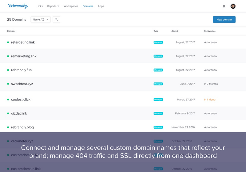
While Rebrandly is a great URL shortener like all other URL shorteners, it has a unique appeal for its customers. It not only brands your links, but it can also track the performance metrics and integrate with 50 other platforms.

Rebrandly is a great choice for small businesses. Their UTM builder and custom URL slugs in the free version can be a great start for small businesses who are new to link shortening strategies. 

Features: 

Rebrandly includes the features for tracking the popularity of each link, demographics and analytics about the audience, and automatic QR code generation too.

From link management to traffic routing, multiple domain management and training and support, Rebrandly makes sure that its feature sets are easy to understand and use. 

But what if you are an enterprise or work with large teams?

One of the unique features offered by Rebrandly is the team management feature within the tool where your teams can coordinate and see the performance of shortened links.  

Price: 

  • $29/month for Starter Package
  • $89/month for the Popular 
  • $499/month Premium 

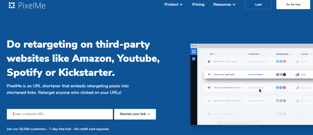
4. Pixel Me

PixelMe is an URL shortener that embeds retargeting pixels from Facebook, Adwords, Linkedin and more into shortened links. You can track your brand your links, track & share your own branded short URLs. 

Features: 

PixelMe allows you to build retargeting audiences from any link. You can send people to third-party platforms (e.g. Youtube, Kickstarter, Spotify etc.) from paid ads and then retarget all those people.

With its Amazon attribution feature, you can track your conversions.

Like Replug, it also allows you have a micro landing page for your links. 

You can also add multiple ad platforms, like other tools, for retargeting your audience on different platforms. 

Price

  • $29/month for Starter Package 
  • $69/month for Growth Package 
  • $149/month for Scale Package 

5. BL.INK

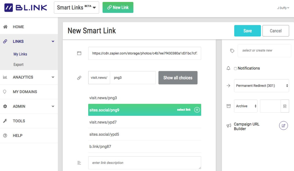
Bl.NK allows you to customize the shortened links with relevant keywords instead of random characters.

BL.INK is best for enterprise businesses with an established link shortening strategy and the feature set of BL.INK will add more value to its strategy right away.  

Features

The most popular features of BL.INK includes data and analytics. It reports the data points which include the information about clicks for example date, time, device, and geographical location. It also allows you to integrate Google Analytics and Adobe to streamline the process. You can bulk edit your links in BL.INK. However, the only limitation for small users is that you cannot use the tool without signing up. Other than that, it only tracks a limited number of links for its low-tier subscription packages. 

Bl.INK offers five subscription tiers based on the number of links you’d like to create and track. 

Price:

  • $48/month for Expert Package
  • $99/month for SMB 
  • $299/month for Team Package

6. TinyURL

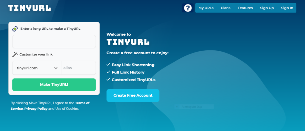
Anyone who wants to shorten the link once in a while without signing up for a tool, TinyURL would be a great choice for them. 

The simplicity of use and quickness of the platform makes it one of the best link shortening tools. 

Image Source

Features: 

It allows you to add the custom alias right away. However, if you don’t have a custom alias, the shortened link will be like “tinyurl.com/ertyh”.

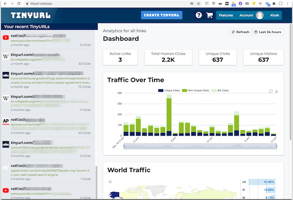
The simplicity of the tool doesn’t mean it is any less than its competitors. It allows you to track key metrics and analytics for your links after you sign up. 

Even for a one-time project, you can see the detailed analytics of your campaign. However, the downside of the free plan is that it only tracks the analytics of one URL at a time. For more URLs and their analytics, you have to subscribe to the paid plan.

Price

  • Free 
  • $9.99/month for Pro 
  • $99/month (Bulk 100K) 

7. Shorby

Shorby is a versatile tool. From link shortening to adding a customized page for all the links to your profile. When you want to add multiple links.

Image Source

The way Shorby works is that you add all the links you want to share with your audience on Shorby and then it generates a single link for all those links. You can now share that link on your profile. The user can click on that link to find the relevant link to your post from there. 

It is the ideal tool for platforms where you can’t add links in descriptions and the bio only allows you to add one link at a time. You can all the related links in Shorby and then share them in Insta bio. 

You can use ShorbyURLs to navigate your audience to new content, podcast episodes, YouTube uploads, and so on.

Price

  • $15/month for Rocket plan 
  • $29/month for Pro plan 

8. Ow.ly

Ow.ly has been developed by a popular social media management tool called HootSuite. This link shortening tool is integrated into every Hootsit free account. It enables you to distribute your links and their performance directly into the HootSuite platform and allows you to post every single link you post to other social media profiles. 

Image Source

People who are already using Hootsuite for social media management can make better use of this link shortener than other tools. However, the one limitation to this tool is that there is no information available about its features. Hootsuite has an inbuilt UTM builder, but the link shortening tool cannot be used alone. 

Thus, making other options more robust if you don’t have a Hootsuite account already. 

Price:

Free for Hootsuite Users

Conclusion: 

Do your thorough research before investing in a link shortening tool. The reason is once you have started using one link shortening tool it’ll be difficult to transfer data from one tool to another. Even if you do you’ll do so, you’ll lose a holistic image of how your strategy has evolved over time. However, if you use link shortening tools occasionally then you can use any link shortening tool. 

Link shortening strategies can help you design an integrated marketing strategy, combining both digital and conventional marketing strategies. Shortened links are easy to type, therefore you can also use these on your print ads and posters. These will also enable you to tackle the character limit challenge on different platforms. 

But using a URL shortener will help you streamline your strategy by giving you a holistic overview of the performance of your marketing efforts on different platforms along with deep insights into your audience. Therefore, it is necessary that you evaluate your strategies for better traffic and lead generation.

The post 8 Best URL Shorteners appeared first on noupe.

Categories: Others Tags:

Most Popular Social Media Channels for Small Businesses and How to Use Them

April 20th, 2022 No comments

It’s 2022. Whether or not your small business can benefit from social media is no longer a question. All of us understand how much social media benefits businesses, big and small. If you are not using social media in your marketing, you are missing out.

What Social Media Should I Use for My Small Business? 

The only question left for you to ask yourself is what social media platform you should choose for your business. And we are here to help you answer that question. Each of the major social media platforms has a specific way it works and engages. It’s important to choose the right one, especially if you can’t afford to cover them all.

The Big 5 Social Media for Small Business 

The five giants of social media for small businesses are Facebook, Instagram, LinkedIn, Twitter, and TikTok. The way social media for small businesses works is you either manage your social media on your own or hire a digital marketing agency or manager to do it for you. If you opt for the first one, here’s what you should know.

#1 Facebook Is Still Running High

Facebook is still the social media that generates the most revenue for small businesses. It has 1 billion users per day and convenient features like paid ads and marketplace. So, if you are going to choose just one social media for your business, choose this one. Pretty much anything can sell on Facebook from custom jewelry to candles to restaurants and services.

How to Use It

What’s great about Facebook is that it gives you lots of options. You can share updates on your business, new products, and promotions via statuses, photos, or videos. Use it for all of that and take advantage of its great targeting feature for your paid ads. As for how often you should post, you can post 2 times a week or even every other day for more engagement.

#2 Instagram Is Thriving

Instagram has a fast-growing user base and is thriving. It’s a favorite of young people – millennials especially. What rocks on Instagram? Visuals. It’s a highly aesthetic social media. You can post photos, videos, reels (very popular), and stories. It’s especially useful for businesses that sell fashion, cosmetics, jewelry, and stuff like that.

How to Use It

When it comes to Instagram, visuals are of extreme importance, as we said. Visuals are important in general but even more so on Instagram. So, make sure you have a beautiful and unique design that will capture the attention of viewers. Also, tell a story and include light and relatable stuff about your business and team members. Post around 3 times a week.

#3 LinkedIn Is Great for B2B Marketing

LinkedIn is THE place to be for businesses and professionals and the great place to network. It’s the best option for B2B companies. It’s also the place where you can find top professionals to employ and where your employees can be your brand ambassadors and promoters.

How to Use It

As LinkedIn is a professional environment, the people and businesses that follow you there will want to see updates and info about business-related stuff. Keep your posts informative and educational and use this network to bring your business closer to potential customers but also employees. Share some tips and insights about your industry to show off your expertise. 

#4 Twitter Lets You Be In the Moment

With over 500 million tweets published daily, Twitter sure is one fast-paced environment. It’s where those clever, educated, and artsy types hand around and it can get controversial from time to time. Twitter stuff is also most likely to end up in the mainstream media as it’s a platform that often discusses current events and trending topics.

How to Use It

Similar to LinkedIn, Twitter is great for pushing out informational posts and news about your business. But you can also allow yourself some lighthearted and fun posts. Twitter is also a social media platform where posting multiple times a day is encouraged. Keep those tweets short and light and keep them coming!

#5 TikTok Is the Rage Among the Youth

TikTok is the most popular social media network for younger generations. And one with the best organic reach! If your target audience is the youth and you want to sell something to them, here’s where you should go. Create a TikTok profile but also engage in influencer marketing as the younger generations respond well to that.

How to Use It

Short, fast-paced videos rock on TikTok. That’s how you should craft your content. Posting frequently as well as using the popular filters and sounds is also important. You can show anything there. From your production to packing and shipping products to how someone uses them. As for influencers, choose the ones your target audience likes and trusts the most.

Social Media Will Grow Your Business

Social media marketing can really do wonders, especially for a small business. It’s an investment that will pay off in many ways. Your business will be viewed as reliable and professional, you will reach increasingly more people, build a brand, and get more customers. You will see the ROI, you just need to be patient.

Don’t Be Afraid to Ask For Help

Another thing you’ll need in order to see that precious ROI is hard work. If you don’t have the time or the knowledge to rock your social media marketing, find someone who does. There are many digital marketing agencies out there that offer a hands-free service and bring their content writers, designers, social media managers, and AI tools for a decent fee. Don’t be afraid to ask for help!

The post Most Popular Social Media Channels for Small Businesses and How to Use Them appeared first on noupe.

Categories: Others Tags:

Adding Tailwind CSS to New and Existing WordPress Themes

April 20th, 2022 No comments
Showing a Tailwind CSS component on the front end of a WordPress theme.

In the 15 or so years since I started making WordPress websites, nothing has had more of an impact on my productivity — and my ability to enjoy front-end development — than adding Tailwind CSS to my workflow (and it isn’t close).

When I began working with Tailwind, there was an up-to-date, first-party repository on GitHub describing how to use Tailwind with WordPress. That repository hasn’t been updated since 2019. But that lack of updates isn’t a statement on Tailwind’s utility to WordPress developers. By allowing Tailwind to do what Tailwind does best while letting WordPress still be WordPress, it’s possible to take advantage of the best parts of both platforms and build modern websites in less time.

The minimal setup example in this article aims to provide an update to that original setup repository, revised to work with the latest versions of both Tailwind and WordPress. This approach can be extended to work with all kinds of WordPress themes, from a forked default theme to something totally custom.

Why WordPress developers should care about Tailwind

Before we talk about setup, it’s worth stepping back and discussing how Tailwind works and what that means in a WordPress context.

Tailwind allows you to style HTML elements using pre-existing utility classes, removing the need for you to write most or all of your site’s CSS yourself. (Think classes like hidden for display: hidden or uppercase for text-transform: uppercase.) If you’ve used frameworks like Bootstrap and Foundation in the past, the biggest difference you’ll find with Tailwind CSS is its blank-slate approach to design combined with the lightness of being CSS-only, with just a CSS reset included by default. These properties allow for highly optimized sites without pushing developers towards an aesthetic built into the framework itself.

Also unlike many other CSS frameworks, it’s infeasible to load a “standard” build of Tailwind CSS from an existing CDN. With all of its utility classes included, the generated CSS file would simply be too large. Tailwind offers a “Play CDN,” but it’s not meant for production, as it significantly reduces Tailwind’s performance benefits. (It does come in handy, though, if you want to do some rapid prototyping or otherwise experiment with Tailwind without actually installing it or setting up a build process.)

This need to use Tailwind’s build process to create a subset of the framework’s utility classes specific to your project makes it important to understand how Tailwind decides which utility classes to include, and how this process affects the use of utility classes in WordPress’s editor.

And, finally, Tailwind’s aggressive Preflight (its version of a CSS reset) means some parts of WordPress are not well-suited to the framework with its default settings.

Let’s begin by looking at where Tailwind works well with WordPress.

Where Tailwind and WordPress work well together

In order for Tailwind to work well without significant customization, it needs to act as the primary CSS for a given page; this eliminates a number of use cases within WordPress.

If you’re building a WordPress plugin and you need to include front-end CSS, for example, Tailwind’s Preflight would be in direct conflict with the active theme. Similarly, if you need to style the WordPress administration area — outside of the editor — the administration area’s own styles may be overridden.

There are ways around both of these issues: You can disable Preflight and add a prefix to all of your utility classes, or you could use PostCSS to add a namespace to all of your selectors. Either way, your configuration and workflow are going to get more complicated.

But if you’re building a theme, Tailwind is an excellent fit right out of the box. I’ve had success creating custom themes using both the classic editor and the block editor, and I’m optimistic that as full-site editing matures, there will be a number of full-site editing features that work well alongside Tailwind.

In her blog post “Gutenberg Full Site Editing does not have to be full,” Tammie Lister describes full-site editing as a set of separate features that can be adopted in part or in full. It’s unlikely full-site editing’s Global Styles functionality will ever work with Tailwind, but many other features probably will.

So: You’re building a theme, Tailwind is installed and configured, and you’re adding utility classes with a smile on your face. But will those utility classes work in the WordPress editor?

With planning, yes! Utility classes will be available to use in the editor so long as you decide which ones you’d like to use in advance. You’re unable to open up the editor and use any and all Tailwind utility classes; baked into Tailwind’s emphasis on performance is the limitation of only including the utility classes your theme uses, so you need to let Tailwind know in advance which ones are required in the editor despite them being absent elsewhere in your code.

There are a number of ways to do this: You can create a safelist within your Tailwind configuration file; you can include comments containing lists of classes alongside the code for custom blocks you’ll want to style in the block editor; you could even just create a file listing all of your editor-specific classes and tell Tailwind to include it as one of the source files it monitors for class names.

The need to commit to editor classes in advance has never held me back in my work, but this remains the aspect of the relationship between Tailwind and WordPress I get asked about the most.

A minimal WordPress theme with a minimal Tailwind CSS integration

Let’s start with the most basic WordPress theme possible. There are only two required files:

  • style.css
  • index.php

We’ll generate style.css using Tailwind. For index.php, let’s start with something simple:

<!doctype html>
<html lang="en">
  <head>
    <?php wp_head(); ?>
    <link rel="stylesheet" href="<?php echo get_stylesheet_uri(); ?>" type="text/css" media="all" />
  </head>
  <body>
    <?php
    if ( have_posts() ) {
      while ( have_posts() ) {
        the_post();
        the_title( '<h1 class="entry-title">', '</h1>' );
        ?>
        <div class="entry-content">
          <?php the_content(); ?>
        </div>
        <?php
      }
    }
    ?>
  </body>
</html>

There are a lot of things a WordPress theme should do that the above code doesn’t — things like pagination, post thumbnails, enqueuing stylesheets instead of using link elements, and so on — but this will be enough to display a post and test that Tailwind is working as it should.

On the Tailwind side, we need three files:

  • package.json
  • tailwind.config.js
  • An input file for Tailwind

Before we go any further, you’re going to need npm. If you’re uncomfortable working with it, we have a beginner’s guide to npm that is a good place to start!

Since there is no package.json file yet, we’ll create an empty JSON file in the same folder with index.php by running this command in our terminal of choice:

echo {} > ./package.json

With this file in place, we can install Tailwind:

npm install tailwindcss --save-dev

And generate our Tailwind configuration file:

npx tailwindcss init

In our tailwind.config.js file, all we need to do is tell Tailwind to search for utility classes in our PHP files:

module.exports = {
  content: ["./**/*.php"],
  theme: {
    extend: {},
  },
  plugins: [],
}

If our theme used Composer, we’d want to ignore the vendor directory by adding something like "!**/vendor/**" to the content array. But if all of your PHP files are part of your theme, the above will work!

We can name our input file anything we want. Let’s create a file called tailwind.css and add this to it:

/*!
Theme Name: WordPress + Tailwind
*/

@tailwind base;
@tailwind components;
@tailwind utilities;

The top comment is required by WordPress to recognize the theme; the three @tailwind directives add each of Tailwind’s layers.

And that’s it! We can now run the following command:

npx tailwindcss -i ./tailwind.css -o ./style.css --watch

This tells the Tailwind CLI to generate our style.css file using tailwind.css as the input file. The --watch flag will continuously rebuild the style.css file as utility classes are added or removed from any PHP file in our project repository.

That’s as simple as a Tailwind-powered WordPress theme could conceivably be, but it’s unlikely to be something you’d ever want to deploy to production. So, let’s talk about some pathways to a production-ready theme.

Adding TailwindCSS to an existing theme

There are two reasons why you might want to add Tailwind CSS to an existing theme that already has its own vanilla CSS:

  • To experiment with adding Tailwind components to an already styled theme
  • To transition a theme from vanilla CSS to Tailwind

We’ll demonstrate this by installing Tailwind inside Twenty Twenty-One, the WordPress default theme. (Why not Twenty Twenty-Two? The most recent WordPress default theme is meant to showcase full-site editing and isn’t a good fit for a Tailwind integration.)

To start, you should download and install the theme in your development environment if it isn’t installed there. We only need to follow a handful of steps after that:

  • Navigate to the theme folder in your terminal.
  • Because Twenty Twenty-One already has its own package.json file, install Tailwind without creating a new one:
npm install tailwindcss --save-dev
  • Add your tailwind.config.json file:
npx tailwindcss init
  • Update your tailwind.config.json file to look the same as the one in the previous section.
  • Copy Twenty Twenty-One’s existing style.css file to tailwind.css.

Now we need to add our three @tailwind directives to the tailwind.css file. I suggest structuring your tailwind.css file as follows:

/* The WordPress theme file header goes here. */

@tailwind base;

/* All of the existing CSS goes here. */

@tailwind components;
@tailwind utilities;

Putting the base layer immediately after the theme header ensures that WordPress continues to detect your theme while also ensuring the Tailwind CSS reset comes as early in the file as possible.

All of the existing CSS follows the base layer, ensuring that these styles take precedence over the reset.

And finally, the components and utilities layers follow so they can take precedence over any CSS declarations with the same specificity.

And now, as with our minimal theme, we’ll run the following command:

npx tailwindcss -i ./tailwind.css -o ./style.css --watch

With your new style.css file now being generated each time you change a PHP file, you should check your revised theme for minor rendering differences from the original. These are caused by Tailwind’s CSS reset, which resets things a bit further than some themes might expect. In the case of Twenty Twenty-One, the only fix I made was to add text-decoration-line: underline to the a element.

With that rendering issue resolved, let’s add the Header Banner Component from Tailwind UI, Tailwind’s first-party component library. Copy the code from the Tailwind UI site and paste it immediately following the “Skip to content” link in header.php:

Pretty good! Because we’re now going to want to use utility classes to override some of the existing higher-specificity classes built into the theme, we’re going to add a single line to the tailwind.config.js file:

module.exports = {
  important: true,
  content: ["./**/*.php"],
  theme: {
    extend: {},
  },
  plugins: [],
}

This marks all Tailwind CSS utilities as !important so they can override existing classes with a higher specificity. (I’ve never set important to true in production, but I almost certainly would if I were in the process of converting a site from vanilla CSS to Tailwind.)

With a quick no-underline class added to the “Learn more” link and bg-transparent and border-0 added to the dismiss button, we’re all set:

Showing a Tailwind CSS component in the front end of a WordPress theme, but with more refined styles for the buttons and links.

It looks a bit jarring to see Tailwind UI’s components merged into a WordPress default theme, but it’s a great demonstration of Tailwind components and their inherent portability.

Starting from scratch

If you’re creating a new theme with Tailwind, your process will look a lot like the minimal example above. Instead of running the Tailwind CLI directly from the command line, you’ll probably want to create separate npm scripts for development and production builds, and to watch for changes. You may also want to create a separate build specifically for the WordPress editor.

If you’re looking for a starting point beyond the minimal example above — but not so far beyond that it comes with opinionated styles of its own — I’ve created a Tailwind-optimized WordPress theme generator inspired by Underscores (_s), once the canonical WordPress starter theme. Called _tw, this is the quick-start I wish I had when I first combined Tailwind with WordPress. It remains the first step in all of my client projects.

If you’re willing to go further from the structure of a typical WordPress theme and add Laravel Blade templates to your toolkit, Sage is a great choice, and they have a setup guide specific to Tailwind to get you started.


However you choose to begin, I encourage you to take some time to acclimate yourself to Tailwind CSS and to styling HTML documents using utility classes: It may feel unusual at first, but you’ll soon find yourself taking on more client work than before because you’re building sites faster than you used to — and hopefully, like me, having more fun doing it.


Adding Tailwind CSS to New and Existing WordPress Themes originally published on CSS-Tricks. You should get the newsletter.

Categories: Designing, Others Tags:

Psychology in Web Design: How to Use it Right

April 20th, 2022 No comments

We all know that psychology is a powerful tool. When used correctly, it can influence and persuade people to take action. In the world of web design, this is extremely important.

If you want to create an effective website that converts visitors into customers, you need to leverage web design psychology. Keep reading to find out more.

What Is Web Design Psychology?

Your website design shouldn’t just make your website pretty. It should impress your visitors, hold their attention, and lead them to action.

That’s where web design psychology comes in. Each color, typeface, and space has a psychological significance, helping people connect to your website. These elements trigger subconscious reactions, which you must leverage to get that desired action.

It takes seconds for people to decide whether your website has all the choices and information you need. Web design psychology helps you, the designer, understand these subconscious processes and how to harness them.

The Benefits of Using Psychology in Web Design

The primary benefit of leveraging psychology in web design is talking to people in their language. It’s also talking in your language and finding common ground. That’s how you can build trust.

You want to use familiar colors and patterns, elements that make you stand out but also connect to people. You need visitors to understand what your website is about and where they can get more info quickly. Then, you have to push the right triggers. Comic Sans, for example, is a superb trigger, and we’ll discuss it below. Color, space, and lines also create a specific impact on how people perceive your website.

More importantly, all these elements set the tone for visitors’ engagement with your website.

How to Use Psychology in Web Design

Now you understand why knowing the basics of human psychology is essential in web design. Let’s see how you can leverage it!

1. Arrangement

Gestalt psychology shows how these elements below influence your visitors:

  • Similarity — people perceive similar objects as the same or at least part of the same concept.
  • Proximity — things close to each other are perceived as part of the same group.
  • Continuity — you want your visitor’s gaze to move naturally from one element to another.
  • Closure — an object that’s not entirely closed is still perceived as a whole because people’s brains will always fill in the gaps.
  • Figure and ground — people simplify images into the main objects they’re looking at (the figure) and the other elements (background).

The Target Jobs website is an excellent example here because:

  • Similar objects are grouped: notice how the first three images show happy young people in diverse professional environments. This placement suggests that Target can help anyone find their dream job.
  • These pictures are placed near specific keywords: the young people laughing are placed right next to the CTA “Explore opportunities.” Thus, Target Jobs is associated with your happiness and your future chances.
  • The colors, font, and spaces enable a smooth transition: users are directed to keep scrolling down, going from one section of the webpage to the next. Also, notice how each section has its own theme, centered on Target Jobs’ benefits.
  • The contrasting colors (orange, white, purple, etc.) leverage the figure-and-ground technique: therefore, focusing on one section makes the others become part of the background. The benefit here is that your attention isn’t split into a million pieces; you can focus on one thing at a time and understand what Target Jobs is trying to tell you.

2. Shapes

Each shape has a different subconscious association:

  • Triangles and squares represent professionalism, strength, and power.
  • Circles, ovals, and ellipses symbolize relationships, love, and unity.
  • Horizontal lines give a sensation of calm and community.
  • Vertical lines represent strength and action.

Just look at the AT&T website. Everything showcases community and tranquility, from the round logo to the horizontal lines delimiting each section.

But this website is anything but dull. Notice how each CTA button (“learn more,” “enroll now”) is followed by a tiny arrow. This shape uses a square angle split into two acute angles by the arrow’s body. As such, although small, the arrow suggests action and strength. Besides, the sections are arranged in squares, again a symbol of decision and power.

3. Space

No matter what industry your business is part of, space is essential in web design. Don’t clutter your web pages even if your natural impulse is squeezing in as much information as possible.

Use plenty of white space and try to have a minimalistic approach. Identify the unique selling point on each page and help people focus on that.

Check out the DOGUE webpage. White spaces separate each essential element, so each section is presented clearly. The first thing you notice is the title and the image with the happy dogs. Then, your gaze moves to the slogan on the right-hand side. After that, you notice the sections below that huge “Dogue.” The next part of the website highlights the company’s services (e.g., groom, dine, play, etc.). Notice how each service is represented through a quick, easy-to-get keyword. Besides, the images depict these keywords perfectly. Even better, these images have whitish-grey backgrounds that blend with the white spaces between them. So although the website is more crowded than others, you won’t perceive it as messy or unclear.

SendInBlue, an email marketing service, uses a similar white space approach to their design, and it works great because website visitors can find what they want with much more ease, and it generally looks much cleaner.

4. Color

The right colors can attract attention, maintain interest and even lead to action. Besides, color increases brand recognition by 80%.

Here’s the bare minimum you have to consider:

  • Your purpose — what do you want visitors to do when they land on your page? For example, if you want visitors to fill out a form, you might want to use a color that stands out and is easy to see. Although blue is the safest choice because it’s most liked, red elicits more action.
  • Your audience — cultures have different associations with color. For example, in the Western world, white represents purity. However, white is associated with death and mourning in Asia.
  • The mood you want to create — do you want your website to be professional? Relaxing and calming? Exciting and energetic?  How do you want your brand to be perceived?

The Moat front page is a fantastic example of color:

  • The purple and orange create a delicious contrast that points visitors in the right direction. Notice how each CTA is orange — an action-eliciting color.
  • Purple suggests calmness, bravery, and wisdom. It’s an excellent hue for your background because it’s so stabilizing.

Lending Bee Singapore uses color and white space to showcase user-generated content on its webpage:

Another excellent example of combining different colors to build trust is Identity Guard’s website, which provides identity theft protection services. As you can see on the website, they use a minimalistic white color combined with green, which is the official color at Trustpilot (one of the most popular review directories). This color selection helps to highlight the veracity of reviews along with the mention that these reviews are taken from Trustpilot.

5. Typefaces

A good web design is like a good outfit: it should be eye-catching but not too over the top.

The same is true of typefaces.

While a website should use various typefaces to add interest, it’s essential to use them in moderation. Too many different typefaces can be overwhelming and make your site look cluttered.

Instead, focus on using a few critical typefaces throughout your site, and use variations (like bold or italics) to add visual interest. For example, you might want to use a serif typeface for your headlines and a sans serif typeface for your body text.

Beyond simply looking good, fonts can also be used to guide users towards taking specific actions. For example, Sans-serif fonts like Arial or Helvetica are generally considered to be more readable online, making them a good choice for body text. On the other hand, scripts and decorative fonts are better suited for headlines or calls to action, as they help draw attention to essential elements on the page.

Marvel’s Captain Marvel page looks like something a 10-year-old would have designed in the 1990s. This web page is horrible from the glitters, gifs, crowded space, and the abominable Comic Sans typeface.

And that’s the point; avoiding plot-spoilers, Captain Marvel is linked to the 90s, and the retro look is part of that message. The moral of the webpage is that sometimes you have to be brave and break the rules if you want to convey a certain feeling to your audience. Marvel manages to do that with its simple design that acts as a time machine into the long-long-loooong past nineties.

Wrap Up

If you want to keep your website visitors’ attention, maintain interest and lead to action, it’s essential to use the design principles above. By leveraging space, typefaces, arrangement, shapes, and colors in your web design, you can create a website that is both visually appealing and effective at getting your message across.

However, these principles are just guidelines. You should stay brave and use your intuition. Remember that the point of web design is speaking to your audience using their language.

Source

The post Psychology in Web Design: How to Use it Right first appeared on Webdesigner Depot.

Categories: Designing, Others Tags:

Productivity Tips And Tools For A More Efficient Workflow

April 20th, 2022 No comments

Sometimes it’s the little productivity hacks that turn out to be the most precious. A shortcut or tool that saves only a few seconds of your time but that makes you wonder how you could have gotten along without it.

In this post, we compiled productivity tips and tools to help you in your day-to-day work. You’ll find shortcuts to speed up routine tasks, tools and cheatsheets to enhance your development workflow, as well as ideas and little helpers to stay organized and improve communication with your team. Only things we found useful and that we hope will make your workflow more efficient, too.

By the way, if you’re up for some more timesavers, we also published posts with useful front-end boilerplates and starter kits, VS Code extensions, and Figma plugins. Enjoy!

Table of Contents

Below you’ll find an alphabetical list of things covered in this post. But you can just scroll down to explore them one by one, too, of course.

Shortcuts

A Command Bar Interface To Speed Things Up

Opening a new GitHub issue, searching Slack messages, showing your calendar schedule and jumping on a Zoom call — the Slapdash command bar makes daily tasks like these a lot quicker. It works similarly to Spotlight on Mac, except it also supports your cloud apps.

To open Slapdash, just type Command + J on Mac or Ctrl + J on Windows and Linux, and start typing. The partial name of the Notion document you want to open, for example, or type in “create” to open a new GitHub issue directly from inside the command bar. You can also build custom commands that you and your team might need to speed up common worflows — for customer lookup, entering something into a database, or searching company records, for example.

Next-Level Browser Tabs

When you browse the web, do you prefer to open links in a new tab? If so, you might already have heard of the keyboard shortcut Cmd/Ctrl + Click to open a new tab. However, you still need to navigate to the tab. That’s where the good old Shift key comes in: Just hit Cmd/Ctrl + Shift + Click, and the browser automatically puts focus on the new tab! Thanks to Stefan Judis for sharing!

Too many open tabs? OneTab helps reduce tab clutter. The browser extension (available for Chrome and Firefox) converts all your open tabs into a list. When you need to access them again, you can either restore them individually or all at once. In case you want to share your tabs with others or keep them for future reference, OneTab also comes with a feature that lets you upload the list into a web page. Less clutter, less CPU load.

MacOS Screen Capture Tips

If you’re on a Mac and are frequently taking screenshots, Corey Ginnivan has 14 useful tips for you that take your screen capturing workflow to the next level. After all, the macOS screen capture feature is much more powerful than you might have thought.

Corey posted 14 tweets, each with a shortcut, tip, or trick. He starts off with the classic of capturing the entire screen and moves on to some more advanced features. Did you know, for example, that Cmd + Ctrl + Shift + 4 captures a selection to your clipboard so that you can paste the image right where you need it, to a design tool, for example? Or that you can remove that annoying floating thumbnail that appears on your screen every time you’ve taken a screenshot? To do so, hit Cmd + Shift + 5 and deselect “Show Floating Thumbnail” in “Options”. Gold!

App Productivity Hacks

How often do you find yourself lost between menus and features of your text editing applications? For VS Code and DevTools, we’ve learned to love Cmd/Ctrl + Shift + P, a keyboard shortcut that prompts a command palette with a smart autocomplete and search. If you are editing text in Google Docs or Dropbox Paper, and find yourself lost within all the features and settings, there is a shortcut to save you plenty of hassle as well.

For Google Docs or Sheets, Option/Alt + / brings up search where you can start typing features, fonts or any other fine controls. And in Dropbox Paper, the shortcut / opens a search area to look for your documents. In general, take a look at all the keyboard shortcuts for your favorite tool — chances are high that a handy keyboard shortcut is waiting for you there as well.

For more handy shortcuts like these be sure to also check out productivity.so. Curated by Lukas Klinser and Dennis Müller, the library collects productivity hacks that help you uncover the hidden 1% in your favorite tools. Each tip comes with a short explanation, sometimes even with a video of how it works and which apps on which platforms support it. Productivity superpowers for every day.

Development Workflow

Setting Up A Development Workflow On Mac

Setting up a development environment on a new computer can be confusing, not only if you’re new to programming. Together with contributors from the web community, Sourabh Bajaj published a comprehensive guide that helps you get the job done with ease.

The guide is a reference for everyone who wants to set up an environment or install new languages or libraries on a Mac. From Homebrew to Node, Python, C++, Ruby, and a lot more, it takes you step by step through everything you need to know to get things up and running. Contributions to the guide are welcome.

AI-Powered Code Completion For Mac

Have you ever wished you could code without having to worry about memorizing function calls and other basic syntax? Well, good news, Kite makes it possible. The tool uses the latest developments in machine learning to offload repetitive parts of programming and support you with fast, context-aware completions of your code.

Available for free for Mac, Kite works with 16 code editors and 16 languages to help you code faster and stay in the flow. In fact, it’s possible to cut keystrokes by as much as 47%. Kite also includes documentation lookup for Python that lets you view Python docs with just one click or mouse-hover.

View Source Code On Mobile

The keyboard shortcut to view the source code of a page is every developer’s best friend, right? Well, at least on desktop devices. Viewing the source on mobile usually involves quite some fiddling around. If you’ve been looking for a simple solution for when you’re on the go, Adam Newbold’s site View Source is for you.

To view a page’s source code, paste the URL into the search bar of View Source, and it’ll fetch and display the source code for you — with syntax highlighting and numbered lines. You can even define if you want to wrap lines or tidy the markup for a better overview. One for the bookmarks.

Debugging Tools And Strategies

How do you debug code? Often it’s quite difficult to isolate a problem although it’s staring right at you. Adrian Bece has written a detailed guide to debugging CSS/JS, and Sarah Drasner has featured some debugging tips and tricks that you might find useful.

For mobile, we can use Eruda, a console for mobile browsers that logs and exposes error messages and allows you to navigate the DOM tree and shows performance metrics. For React, we can measure and profile React performance, and when using DevTools, we can use a detailed dive-into profiling with DevTools. This should cover quite a few debugging issues for sure.

Page Speed Monitoring Made Easy

Are you looking for a web performance tool that provides you with all the necessary metrics in a developer-friendly way? Well, then Treo is worth taking a closer look at. Powered by Lighhouse, Treo lets you monitor your page speed with carefully crafted data visualizations that make it easy to make sense of the results.

Treo audits your pages in a stable, isolated environment, and while traditional web performance metrics are often technical and don’t reflect your customer’s journey, Treo puts special focus on user experience metrics. To represent your customers, you can also configure CPU power and network and choose between nine locations worldwide to avoid network latency and geo barriers. If you’re curious to see what this looks like in practice, be sure to check out the live demos.

Single-Purpose Online Tools

Often it’s the little tools and helpers that become indispensable in our workflows, whether it’s color contrast checkers, file converters, text comparers, image optimizers, or hash generators. If you are looking to enhance your web dev toolkit, Tiny Helpers is bound to have the tool you need. The site collects free single-purpose online tools that help you with anything from accessibility to APIs, performance, regular expressions, and security. Ffffuel, SVG generators and CSS generators are other collections of helpful tools.

If you’re a Windows user, DevToys is a swiss army knife of 21+ tools to master your daily tasks. The app works offline and includes a Json to Yaml and Yaml to Json converter, a hash generator, JWT decoder, Regex tester, URL encoder, and much more. And to give your workflow an extra productivity boost, DevToys automatically detects the best tool that fits your clipboard content.

Testing Forms With Dummy Data

Testing forms can be a time-consuming process, but, luckily, it’s a task that can easily be automated. The browser extension Fake Filler, for example, was built to do just that.

Available for Chrome and Firefox, Fake Filler helps you test your forms quickly and efficiently by filling all form inputs with dummy data and randomly selecting radio buttons, dropdown menus, and checkboxes. The tool supports the maxlength property and ignores CAPTCHA, hidden, disabled, and readonly fields. A great little addition to any developer’s digital toolkit.

Maintaining Product Copy

How do you and your team handle and maintain product copy? Do you have a strategy to keep everything in one place so that everyone involved always has the newest copy at hand? Or is your product copy scattered across documents, mockups, and tickets? In this case, Ditto could be worth taking a closer look at.

Ditto provides a single place to manage product copy in all of its stages. You can create a reusable text component library, manage text in mockups, track all copy changes, and review and discuss edits. Two-way Figma sync makes sure that the right copy is always in your mockups, while Ditto’s API, CLI, and SDKs allow developers to fetch up-to-date copy and integrate it into their build processes. No more back-and-forth, no more copy-and-paste.

Encoding Code Reviews

Code reviews can bring along communication issues if a team doesn’t have established standards. To solve this, Netlify’s UX team developed a shared terminology that adds nuance to the feedback and helps everyone involved to better understand where the feedback fits into the larger picture.

The Feedback Ladder, as Netlify’s approach is called, is based on the idea of living in a house that is still being built: There are different kinds of inconveniences (mountain, boulder, pebble, sand, and dust) and each one has a different level of impact on your day-to-day life in the house. Dust, for example, does not impede life in the house, while a boulder blocking the door needs to be taken care of to not block the work from moving forward. The metaphors are easy to remember and can be used to concisely encode the severity of feedback. Clever!

Organization & Communication

Reviewing Websites Live

We all know the drill: You are working on a project and want to gather feedback from teammates, clients, stakeholders. What follows is a back-and-forth of countless emails, Slack messages, calls, and maybe even Google spreadsheets to gather opinions from everyone involved. To make collecting feedback more efficient, Pastel offers a visual approach to reviewing and commenting on a website live.

All you need to do is share the unique Pastel link with your clients and teammates, and within seconds, they can click to leave comments with their thoughts and suggestions — without having to create an account. Pastel collects the comments for you, along with information on browser and screen size details. And if you’re making changes to the site in the meantime, no worries, they will be automatically updated in every Pastel link, too.

Open-Source Screen Recorder

If you’ve been looking for a free and easy-to-use tool to record your screen, it might be hard to find something more powerful than Alyssa X’s open-source screen recorder Screenity.

No matter if you want to give contextual feedback on a project, provide detailed explanations, or showcase your product to potential customers, Screenity offers a number of practical features to capture, annotate, and edit your recordings — without any time limit. You can draw on the screen and add text and arrows, for example, highlight clicks and focus on the mouse, push to talk, and much more. Screenity is available for Chrome.

Fuss-Free Scheduling

Despite the most straightforward tools, sometimes it takes a meeting to clarify things with team members or clients. And, well, we all know how difficult it can be to find a date and time that works for everyone involved. If you want to skip the hassle of back-and-forth emails, Calendly has got your back.

To schedule a meeting, let Calendly know your availability preferences and send guests your Calendly link. They can pick the time they prefer and the event is added to your calendar — without any calendar conflicts. Reminders go out automatically, and in case the meeting needs to be rescheduled, Calendly takes care of that, too.

Doodle uses a similar approach to help you quickly discover who’s available when, no matter the calendar system they are using or the timezone they are in. A great little detail if you need to wrangle a group of busy people: In Doodle, participants can select “if need to be” dates, i.e. dates they can make work if necessary.

Making Time For What Really Matters

Some workdays are quite fragmented: First the daily standup with your teammates, then a call here, a meeting there, and the work that would require actual focus time is jammed somewhere in between the scheduled appointments. Clockwise is here to change that. The smart calendar assistant is available as a Chrome extension and frees up blocks of uninterrupted time to help you focus on what matters.

To make the most out of your workday, Clockwise learns your meeting behavior and identifies how your schedule could be improved — based on your preferences, of course. It automatically moves meetings to optimize your calendar, resolves meeting conflicts, and even syncs with your personal calendar to ensure that you don’t miss important personal commitments. To maximize your team’s productivity, Clockwise can even coordinate meetings across schedules and move them to the least disruptive time.

Document-Based Meetings

In many companies, meetings don’t enjoy a good reputation. Very often they are running late, the discussed agenda round-mails haven’t been read in time, and, well, there really are just too many of them. So how do we organize meetings in a way that they are productive while making sure that everyone is aligned?

While a common outcome of a meeting is a document with a summary, at Amazon, meetings don’t happen without a document prepared ahead of time. In “The Document Culture at Amazon”, Justin Garrison highlights the process from start to finish. The meeting starts with a silent reading of a well-prepared meeting document, with everyone taking notes and adding questions silently.

Reading the document is a part of the scheduled meeting time: nobody is expected to find their own time to read ahead of time, and the document is fresh in everyone’s mind. The document could be a one-pager or six-pager or PRFAQs for products that don’t exist yet. To eliminate distractions, all notes at Amazon are added on paper on printouts, and then discussed, but it could be digital with notifications and applications turned off. An interesting way to challenge the way we usually run those lengthy meetings, and make sure everyone is on the same page.

Making Email Better

Overflowing inboxes, spam with backlink requests, people emailing you on a Friday afternoon and following up on Monday morning — there are a lot of things that make dealing with email unpleasant. However, since there is no getting around email, there’s only one solution: Let’s improve the situation together. With that in mind, Chris Coyier started “Email is Good”, a site about email productivity.

“Email is Good” takes a look at things that make emails annoying, tips and ideas on how we can do better, as well as little anecdotes that everyone can relate to. A great opportunity to reflect on how each one of us deals with email and the reactions that our email habits might provoke on the recipient’s side.

Git

Finding Git Commands Made Easy

Do you know the git command to commit all staged changes? Or the one to compare two commits and output the result to a file? And what about the command that lets you clone an existing repo along with submodules into the current directory? No worries if you don’t know the answers right off the bat, Git Command Explorer is here to step in.

Designed to help you find the git commands you need without spending a lot of time digging through the web, Git Command Explorer uses a simple dropdown system that makes your search for the right command more efficient. Just select what you want to do from the dropdowns, and the tool provides you with the code snippet which you can copy and paste right away.

If you prefer a good ol’ cheatsheet, Git log features common ways to use the Git log to track what changed or search for commits. Git Branch cheatsheet shows how to list branches, create new ones, rename and switch branches, as well as delete them.

Need something slightly more advanced? Atlassian’s Git cheatsheet goes into more detail around Git basics, undoing changes, rewriting Git history, Git branches and remote repositories, and GitHub Cheat Sheet shows how to inspect and compare, track path changes, share and update, ignore patterns, and add temporary commits.

A Terminal UI For Git Commands

Git is super powerful, but often it seems that a lot of rather simple tasks can be unnecessarily hard to do. Interactive rebasing that requires you to edit a TODO file in your editor, for example. Or using a command line program to stage a part of a file. Frustrated by things like these, Jesse Duffield built lazygit.

lazygit is a simple terminal UI for Git commands that makes completing tasks a lot faster and more straightforward — no matter if it’s staging lines, amending old commits, stashing selected files, fixing merge conflicts, or checking out of a branch without stashing changes.

Creating .gitignore Files With Ease

A .gitignore file in your repository’s root directory tells Git which files and directories to ignore when you make a commit. If you’re looking for an easy way to create such a file, gitignore.io has got you covered.

The site features both a graphical and a command line method of creating a .gitignore for your operating system, programming language, or IDE. Let’s say you’re on a Mac and want to ignore Node files in your Node.js application, for example. Just enter “Node” and “macOS” inside the search bar, and the site will create a template file that ignores macOS and Node files. Alternatively, you can copy the shell command to create an alias for your terminal and create the file right there.

Automating Log Messages

When it comes to log messages, the turbo-console-log extension has got your back. It automates the operation of writing meaningful log messages and inserts them automatically.

All you need to do is select the variable which you want to debug, press Ctrl + Alt + L, and the log message will be inserted in the next line. Keyboard shortcuts let you comment, uncomment, or delete all log messages from the current document.

From GitHub To VS Code, In One Second

Once you’ve discovered a code snippet on GitHub, what if you want to start working with it in your project immediately? Instead of cloning the repo and finding that file that you need, you can use Github1s. Just add 1s after github in the URL, press Enter, and the repo, or a single file, will open straight in VS Code.

You can also use a bookmarklet to quickly switch between github.com and github1s.com, access private repositories, and there are plenty of browser extensions that are listed on the project page as well. If you need an alternative, Gitpod is a slightly more advanced option, which also allows you to start an online development environment, run parallel workspaces, and work on the codebase collaboratively.

Terminal

Autocomplete For The Terminal

How often do you have to find just the right directory with ls in your Terminal? How often do you forget just the right flag for a git operation? Or perhaps you get lost in the scripts/ folder a bit more often than you’d like to?

Fig brings VS Code-style autocomplete to your existing Terminal, along with hints and suggestions for your commands. The best part is that everyone can add support to their own favorite CLI tool, and you can specify just the completion spec you need for your work.

There is also oh my zsh (Linux, Windows, Mac), with plenty of helpers, plugins, and themes to improve your CLI experience. Also, take a look at some useful plugins and improved setup, ranging from better syntax highlighting to listing contents of directories in tree-like format.

Get Stuff Done With The Command Line

For some, the command line is a coder’s best friend, to others it might feel more like a daunting enemy. Fact is, there are a lot of awesome things you can do with terminal. Marcel Bischoff curates a list that is jam-packed with useful command line apps.

The list covers everything from automation and backup to encryption, productivity, version control, and much more that is bound to make a developer’s life easier. Even games are featured to sweeten up a long coding session. Your favorite command line app isn’t part of the list yet? You are highly encouraged to contribute to it, of course.

Command Line Love

It’s not uncommon for technical documentation to be dry and intimidating, especially for people who are just getting started with a new tool. That can get quite frustrating especially when the manual is difficult to read or the explanations are verbose and lack examples. But there are manuals that do better.

Dash Dash takes the Unix (Linux, BSD, macOS) open-source manual pages and sets the content in a beautiful type and layout. It provides not only explanations of all commands, but also search, examples and TL;DR sections. Also, “The Art of Command Line” takes you on a journey to Command Line from basics to system debugging. And if you are up for advanced command line techniques, cmdchallenge prompts you to solve tasks with a single line of bash.

Coding Cheatsheets

Front-End Vocab And Cheatsheets

You might have been there before. Just when you are working on a tight deadline, you need to look up something quickly. Perhaps you’ve forgotten the right property for vertical alignment in Flexbox or perhaps you are missing just the right command for your Terminal.

SheCodes Coding Tools provides a searchable reference list for everything JavaScript, with variables, strings, structures and all kinds of attributes. Codecademy features a comprehensive overview of front-end cheatsheets, grouped, structured, and packed with ready-to-use examples.

For CSS, you will never go wrong with CSS Tricks Almanac, and you can also look up CSS vocabulary, gathered by Ville V. Vanninen.

JavaScript Operator Lookup

Let’s be honest, it can be hard to wrap one’s head around JavaScript operators, especially if you’re still new to the language and need to make sense of all those ampersands, dashes, equal signs, and other glyphs that cross your way in JavaScript code. Josh W. Comeau built a little tool that helps you make sense of them all — for good.

The Operator Lookup lets you enter a JavaScript operator or pick one of the 50 given operators to learn more about it. For every operator, Josh gives a brief explanation of what it does and shows how it is used in a code example. A friendly tool that makes operators feel a lot less daunting.

Learn Regex The Easy Way

Regular expressions are super powerful. Essentially a group of characters or symbols, they help us define patterns — to replace text within a string, validate forms, extract a substring from a string based on a pattern match, and much more.

If you haven’t gotten around to wrapping your head around Regex yet or are looking for a cheatsheet to help you define different kinds of patterns, Zeeshan Ahmad’s guide “Learn Regex The Easy Way” is for you. It covers everything from the very basics of how a regular expression works to more advanced tasks.

Finding The Right HTML Tag

Let’s say you want to collect data from the user, you have a list of options to choose from, more than seven even, and the user can select several of these options. Which HTML tag do you use? Benjamin Holfve’s tool What the tag?! helps you find the HTML tag that suits your goals, not only in this situation but whenever you’re unsure about what’s the best one to use.

To narrow down your search, the tool confronts you with several statements about what you want to achieve with the HTML tag you’re looking for. With each answer, the picture becomes clearer, so that you get a clear recommendation after just a few steps.

Find Unicode Characters By Drawing Them

You’ve forgotten the name of a specific Unicode character but you don’t have time to scroll through endless lists to find the glyph you’re looking for? Shapecatcher provides a clever solution to the problem: You draw the character with your mouse, and the tool finds the most similar unicode characters for you.

To retrieve the glyphs that come closest to your sketch, more than 10,000 of the most important characters are compared against your sketch and analyzed for similarities. Please note that Japanese, Korean, and Chinese characters are not supported yet.

Licenses Summarized At A Glance

Too long, didn’t read. That’s the reaction many of us have when it comes to licenses or terms of service. However, sometimes there’s no getting around them. TLDRLegal might help you in those cases.

The site summarizes popular open source and software licenses at a glance, giving short and concise information on what can be done, what cannot, and what’s necessary to keep in mind. The summaries are peer-reviewed, the most visible licenses even checked by a lawyer.

Wrapping Up

We hope you discovered some nuggets in this post that’ll come in handy in your day-to-day work. Maybe you have a favorite productivity hack or tool that we haven’t listed but that is too good not to be shared? Please don’t hesitate to let us know in the comments below. We’d love to hear about it!

Categories: Others Tags: