Archive

Archive for April, 2022

Adding CDN Caching to a Vite Build

April 4th, 2022 No comments
CloudFront CDN Distributions screen.

Content delivery networks, or CDNs, allow you to improve the delivery of your website’s static resources, most notably, with CDN caching. They do this by serving your content from edge locations, which are located all over the world. When a user browses to your site, and your site requests resources from the CDN, the CDN will route that request to the nearest edge location. If that location has the requested resources, either from that user’s prior visit, or from another person, then the content will be served from cache. If not, the CDN will request the content from your underlying domain, cache it, and serve it.

There are countless CDNs out there, but for this post we’ll be using AWS CloudFront. We’ll look at setting up a CloudFront distribution to serve all our site’s assets: JavaScript files, CSS files, font files, etc. Then we’ll see about integrating it into a Vite build. If you’d like to learn more about Vite, I have an introduction here.

Setting up a CloudFront CDN distribution

Let’s jump right in and set up our CloudFront CDN distribution.

For any serious project, you should be setting up your serverless infrastructure with code, using something like the Serverless Framework, or AWS’s CDK. But to keep things simple, here, we’ll set up our CDN using the AWS console.

Head on over to the CloudFront homepage. At the top right, you should see an orange button to create a new distribution.

The creation screen has a ton of options, but for the most part the default selections will be fine. First and foremost, add the domain where your resources are located.

CloudFront CDN distribution creation screen.

Next, scroll down and find the Response headers policy dropdown, and choose “CORS-With-Preflight.”

CloudFront response headers settings.

Lastly, click the Create Distribution button at the bottom, and hopefully you’ll see your new distribution.

CloudFront CDN distribution overview screen.

Integrating the CDN with Vite

It’s one thing for our CDN to be set up and ready to serve our files. But it’s another for our site to actually know how to request them from our CDN. I’ll walk through integrating with Vite, but other build systems, like webpack or Rollup, will be similar.

When Vite builds our site, it maintains a “graph” of all the JavaScript and CSS files that various parts of our site import, and it injects the appropriate tags, tags, or import() statements to load what’s needed. What we need to do is tell Vite to request these assets from our CDN when in production. Let’s see how.

Open up your vite.config.ts file. First, we’ll need to know if we’re on the live site (production) or in development (dev).

const isProduction = process.env.NODE_ENV === "production"; 

This works since Vite sets this environment variable when we run vite build, which is what we do for production, as opposed to dev mode with hot module reloading.

Next we tell Vite to draw our assets from our CDN like so, setting the base property of our config object:

export default defineConfig({
  base: isProduction ? process.env.REACT_CDN : "",

Be sure to set your REACT_CDN environment variable to your CDN’s location, which in this case, will be our CloudFront distribution’s location. Mine looks something (but not exactly) like this:

https://distributiondomainname.cloudfront.net

Watch your VitePWA settings!

As one final piece of cleanup, if you happen to be using the VitePWA plugin, be sure to reset your base property like this:

VitePWA({
  base: "/",

Otherwise, your web.manifest file will have invalid settings and cause errors.

Let’s see the CDN work

Once you’re all set up, browse to your site, and inspect any of the network requests for your script or CSS files. For starters, the protocol should be h2.

Showing the assets served via CDN caching in DevTools. Each file name includes a unique random string of letters and numbers.

From there, you can peek into the response headers of any one of those files, and you should see some CloudFront data in there:

Screenshot of a response header.

Cache busting

It’s hard to talk about CDNs without mentioning cache busting. CDNs like CloudFront have functionality to manually “eject” items from cache. But for Vite-built assets, we get this “for free” since Vite adds fingerprinting, or hash codes, to the filenames of the assets it produces.

So Vite might turn a home.js file into home-abc123.js during a build, but then if you change that file and rebuild, it might become home-xyz987.js. That’s good, as it will “break the cache,” and the newly built file will not be cached, so the CDN will have to turn to our host domain for the actual content.

CDN caching for other static assets

JavaScript, CSS, and font files aren’t the only kinds of assets that can benefit from CDN caching. If you have an S3 bucket you’re serving images out of, consider setting up a CloudFront distribution for it as well. There are options specifically for S3 which makes it a snap to create. Not only will you get the same edge caching, but HTTP/2 responses, which S3 does not provide.

Advanced CDN practices

Integrating a CDN here was reasonably straightforward, but we’re only enjoying a fraction of the potential benefits. Right now, users will browse to our app, our server will serve our root HTML file, and then the user’s browser will connect to our CDN to start pulling down all our static assets.

Going further, we would want to serve our entire site from a CDN. That way, it can communicate with our web server as needed for non-static and non-cached assets.

Conclusion

CDNs are a great way to improve the performance of your site. They provide edge caching and HTTP/2 out of the box. Not only that, but they’re reasonably easy to set up. Now you have a new tool in your belt to both set up a CDN and integrate it with Vite.


Adding CDN Caching to a Vite Build originally published on CSS-Tricks. You should get the newsletter.

Categories: Designing, Others Tags:

20 Best New Sites, April 2022

April 4th, 2022 No comments

This month’s collection of the best new sites released in the previous four weeks might seem like a mixed bag, but if you look carefully you’ll see distinct themes emerging. Full-page images and videos are back with a vengeance, and designers are embracing large-scale 20th century-inspired typography from Art Nouveau to ’80s corporate.

Here are the sites that grabbed us this month. Enjoy!

I Killed a Cactus

I Killed a Cactus is a beautifully rendered 3D site that guides the less-horticulturally inclined of us in the best ways to care for our houseplants.

Aris Hotel

After a couple of years in which travel has been restricted, we’re itching to get moving again, and this elegant site for Aris Hotel is steering us in the direction of Crete.

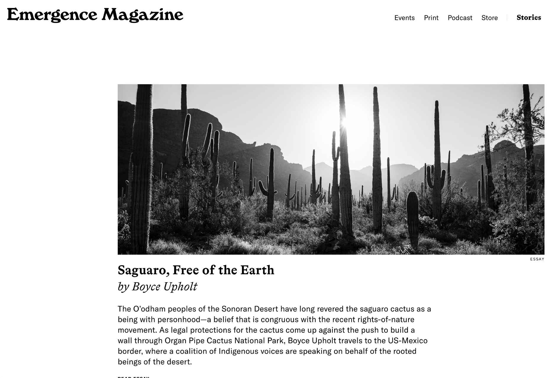
Emergence Magazine

With excellent writing and great photography, Emergence Magazine is dedicated to stories that intertwine ecology and spirituality. Its bold typography epitomizes its ethos.

Milton Textiles

Milton is a textiles manufacturer with an eye for design. Its site showcases its art-inspired collection with big, bold, colorful photography.

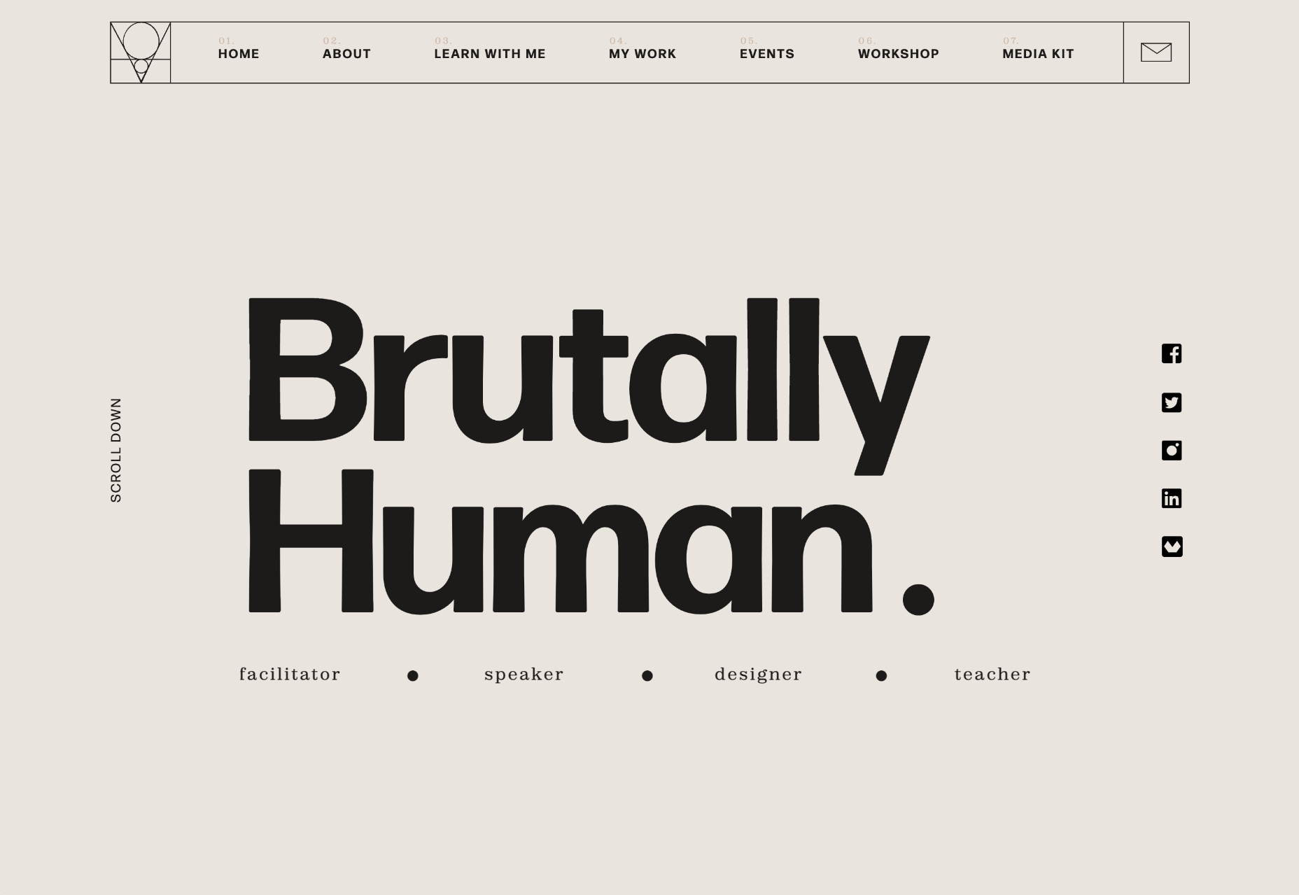
Brutally Human

Brutally Human is the one-page portfolio/pitch of designer Stanley Vaganov. He has an impressive client list, and his site exudes the confidence that comes with that.

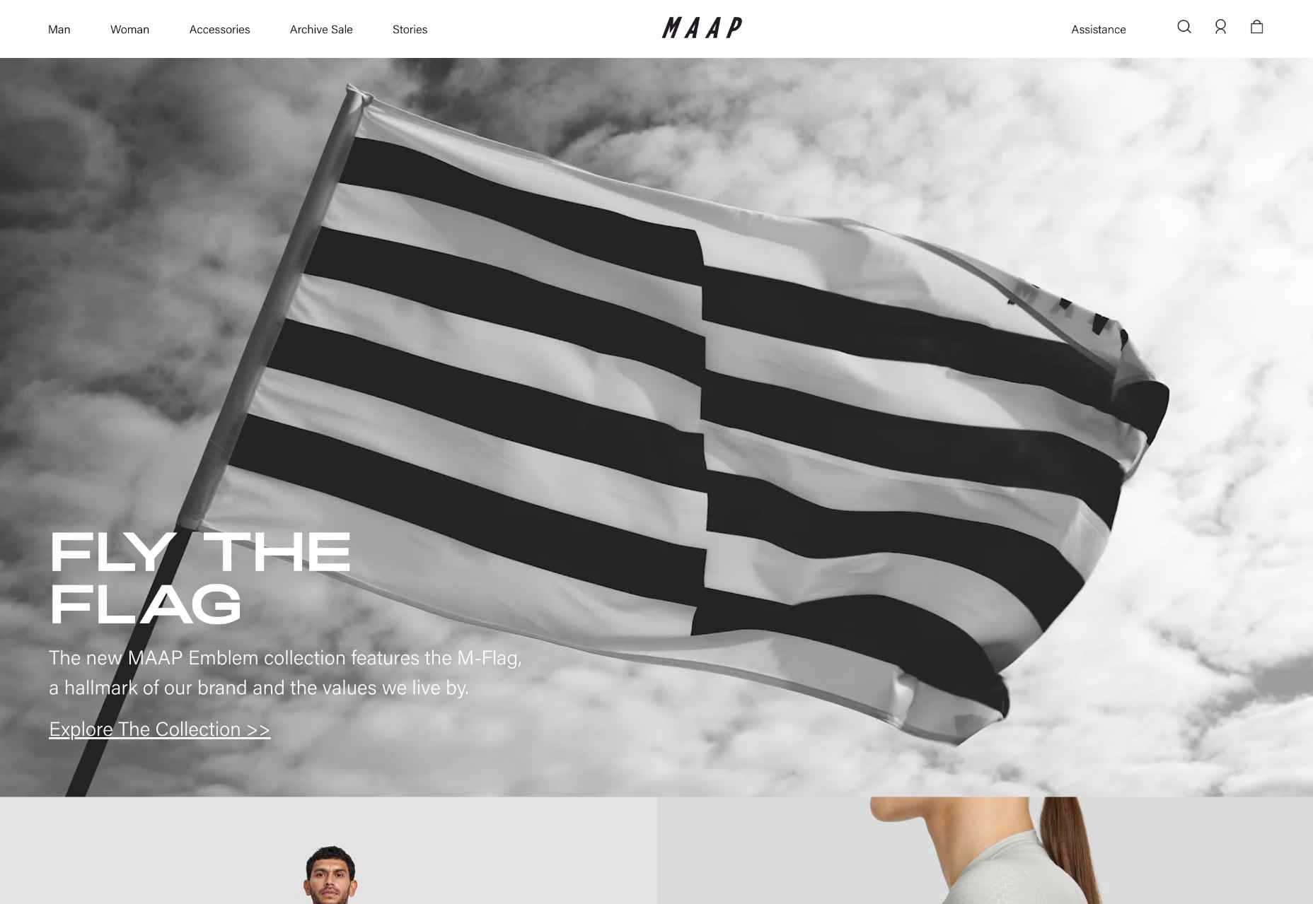
MAAP

MAAP uses a billowing flag to grab your attention as soon as you land on the site. The whole site is clean, efficient, and cool; exactly what you’d expect from a cycling apparel company.

Diabla

Outdoor furniture is typically presented as minimal and sophisticated. Diabla throws surrealism into the mix by introducing brand colors to its large-scale photography.

Steffie de Leeuw

The site for designer and artist Steffie de Leeuw features large typography that appears to be woven through layers of intricate illustration.

Garden Eight

What could be better than Garden Eight’s gaggle of 3D-rendered cartoon creatures floating around a page, twisting and transforming into new shapes?

Circus Shanghai

The site for Circus Shanghai uses a rich mid-century illustration to reference both the solar system and the Chinese flag; it’s an arresting combination.

Moooi

Ever inventive, the new micro-site for Moooi asks you to defy gravity with an engaging scroll through collages based on its product range.

Josephmark

More full-page motion, this time for design studio Josephmark. The site blends rich colors with a brutalist layout and minimalist typography to create its own identity.

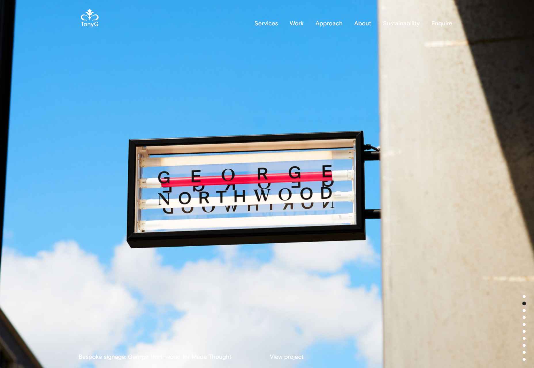
Tony G

We love the infinite scroll on the homepage for creative agency Tony G. It’s a great way to add a slideshow to your homepage without the flaws of slideshows.

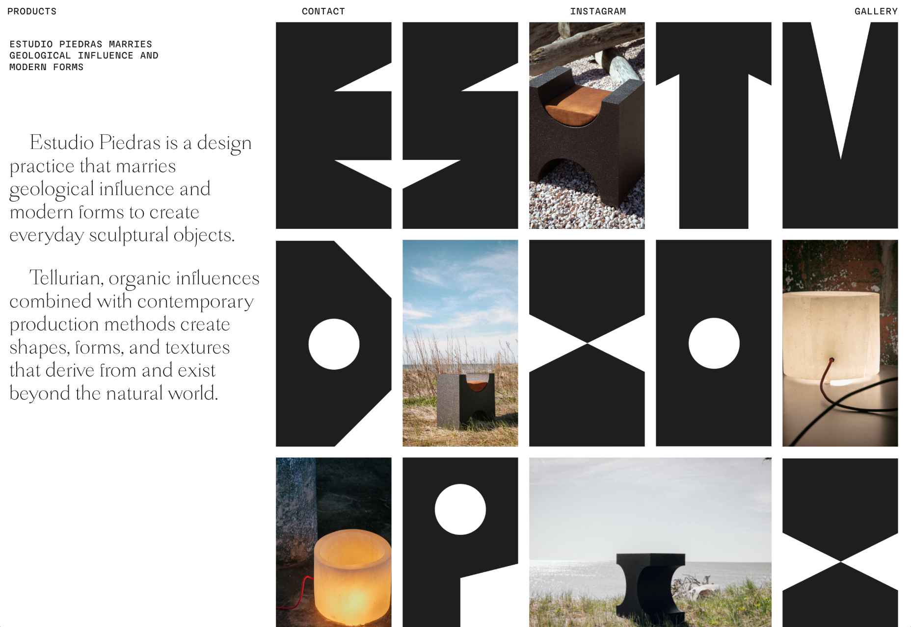
Estudio Piedras

This site for furniture design studio Estudio Piedras uses bold lettering mixed with product shots. The straightforward site is punchy and mimics the solidity of the materials used.

The Fleur

The Fleur is a botanical encyclopedia of fictional flowers that Ondre Jzunka has created as NFTs on the Ethereum blockchain.

Gloutir

Gloutir is the site for a “subscription-based workhorse design and development studio” that breaks all the rules of typography, and yet somehow it works.

Sophias

The rich blue and bright cream of the site for Sophias urban bistro and city garden echoes the welcoming real-world interiors and ties the brand together.

Lucalem

Lucalem is the portfolio site of designer and developer Lucas De Melo. A little more fun than the typical freelancer’s site, it features a disturbingly phallic character.
Soft Power

Soft Power is a creative design studio with an eye-popping list of international clients. Its advertising-style site uses a trendy glitch effect expertly.

Aather

Pastel colors and subtle textures evoke a calm mood, ideal for candle company Aather. It’s challenging to visually present smell, but this site does it well.

Source

The post 20 Best New Sites, April 2022 first appeared on Webdesigner Depot.

Categories: Designing, Others Tags:

Popular Design News of the Week: March 28, 2022 – April 3, 2022

April 3rd, 2022 No comments

Every day design fans submit incredible industry stories to our sister-site, Webdesigner News. Our colleagues sift through it, selecting the very best stories from the design, UX, tech, and development worlds and posting them live on the site.
The best way to keep up with the most important stories for web professionals is to subscribe to Webdesigner News or check out the site regularly. However, in case you missed a day this week, here’s a handy compilation of the top curated stories from the last seven days. Enjoy!”

People Think the New Buick Logo Looks Like, Erm, Lots of Things

Color Morph – Randomly Generate Mesh Gradients

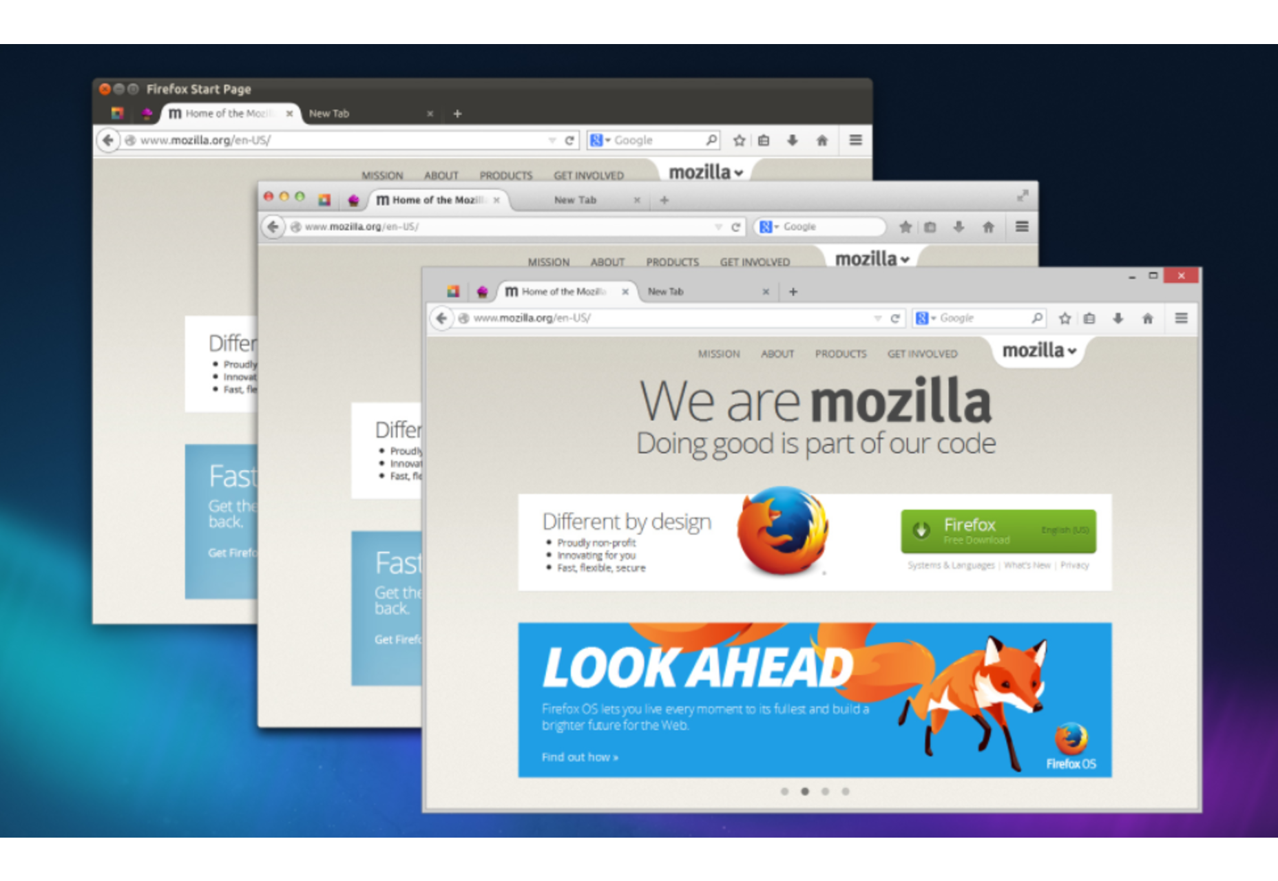
Firefox UI/UX History

The Ultimate Guide to an Effective UI Design

HTML Starter Template – A Basic HTML5 Boilerplate for Index.html

Top 6 Trends in Product Development You Need to Know

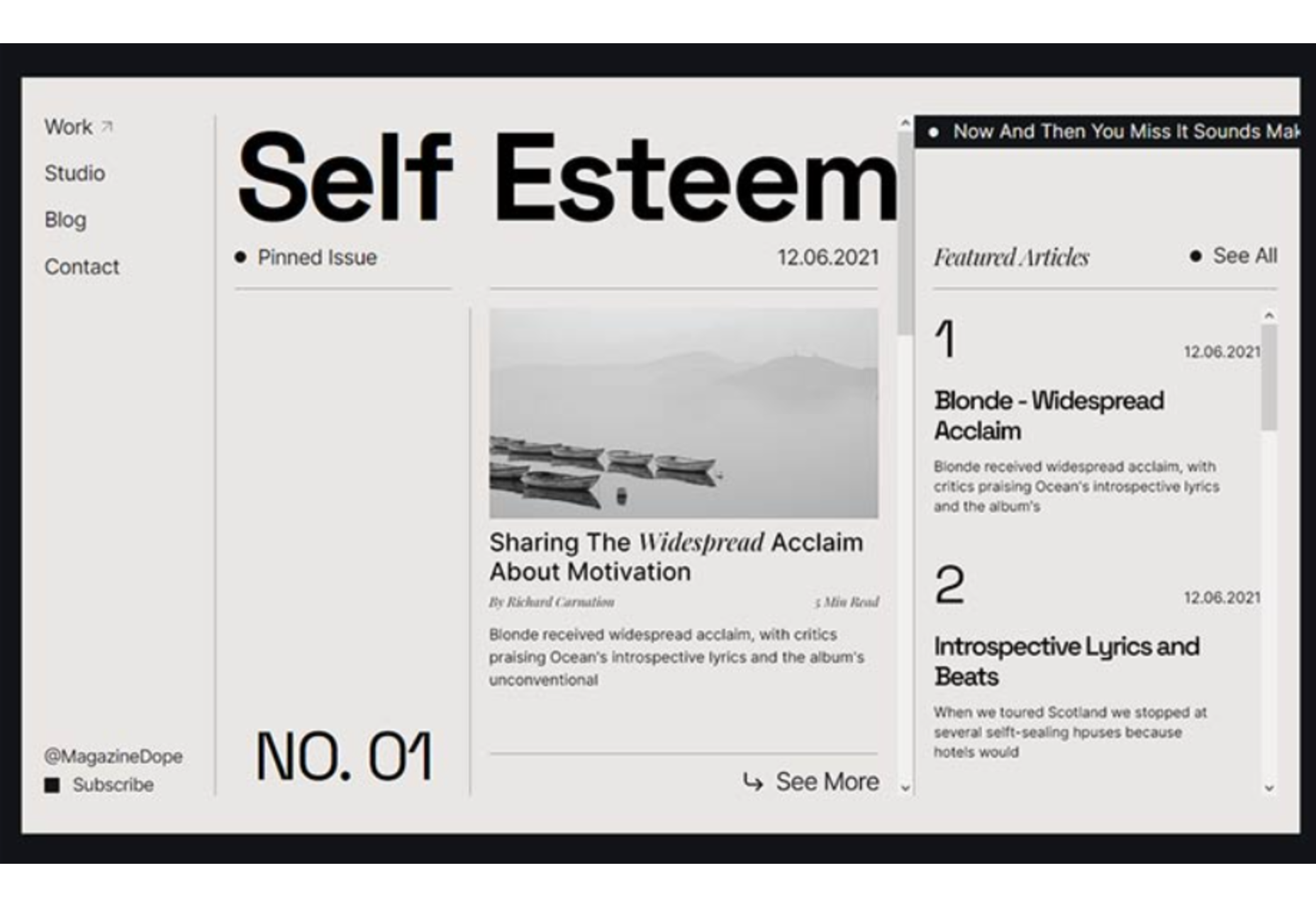
8 CSS & JavaScript Snippets for Creating Modern Blog Layouts

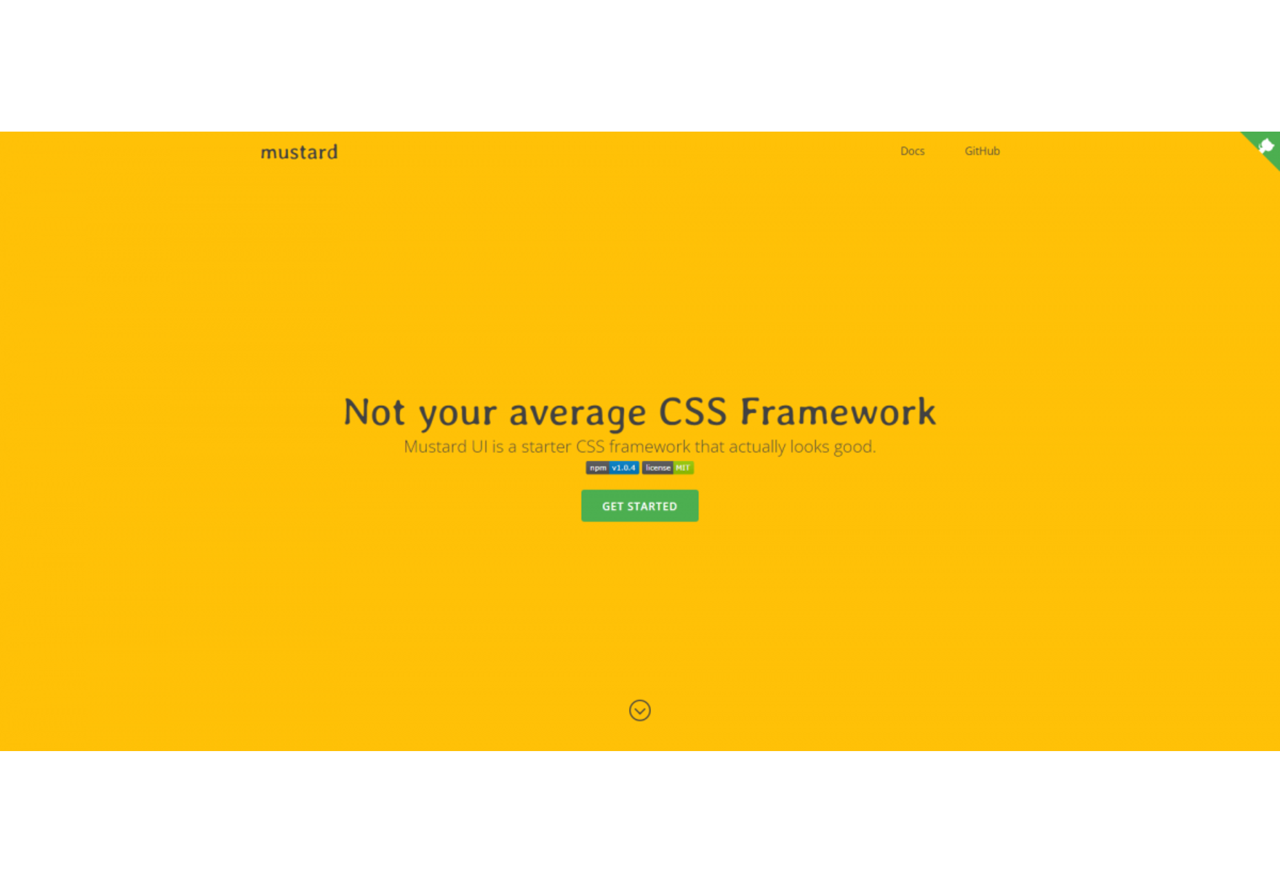
Minimal CSS Frameworks: 10 Great Choices

Design Resources – Download Free Design Resources for Figma, Adobe XD Etc

Typebot: A Conversational Form Builder that You Can Self-host

Fonts & Layouts – 50 Web Layouts with Different Font Combinations in Figma

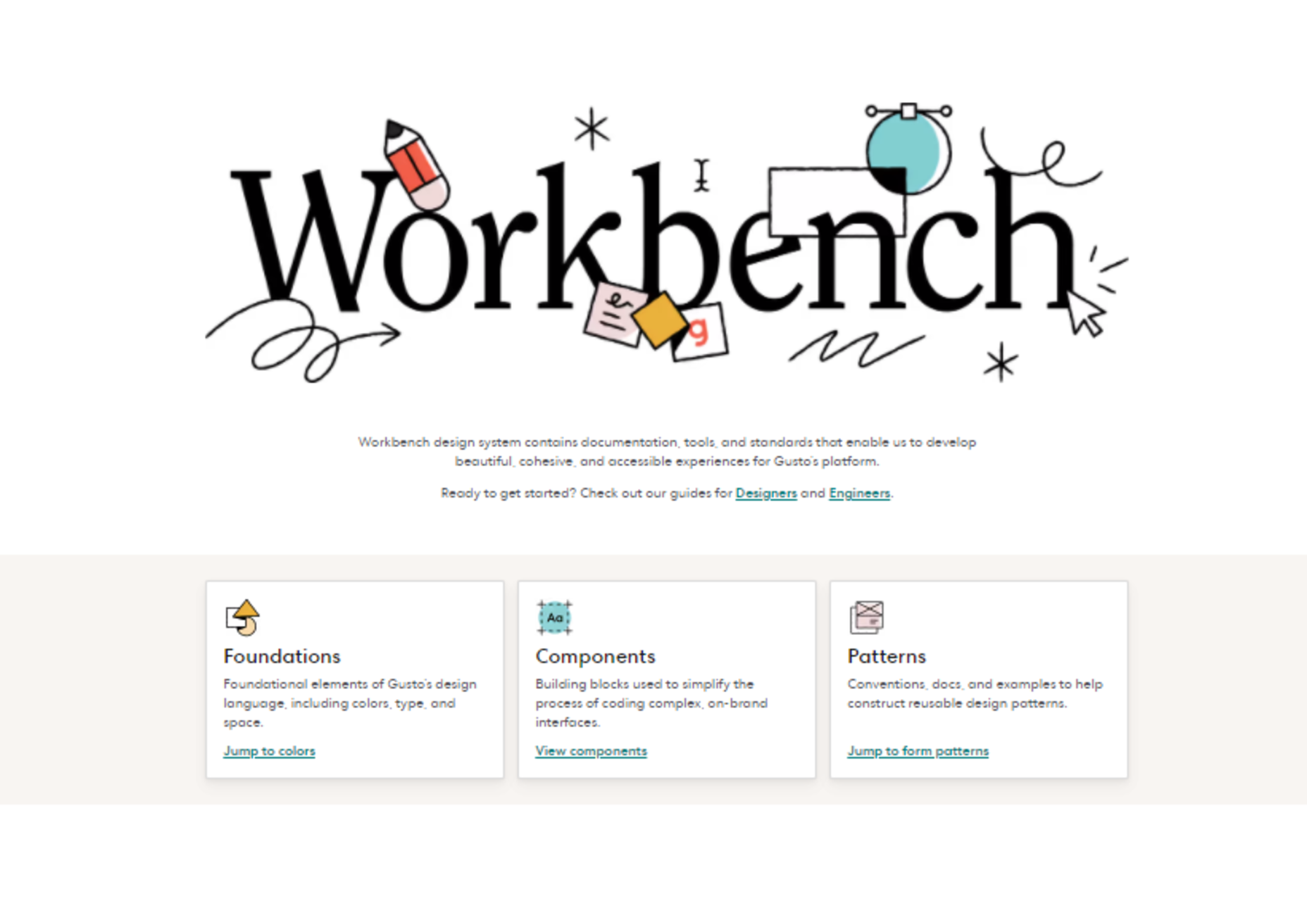
Workbench Design System

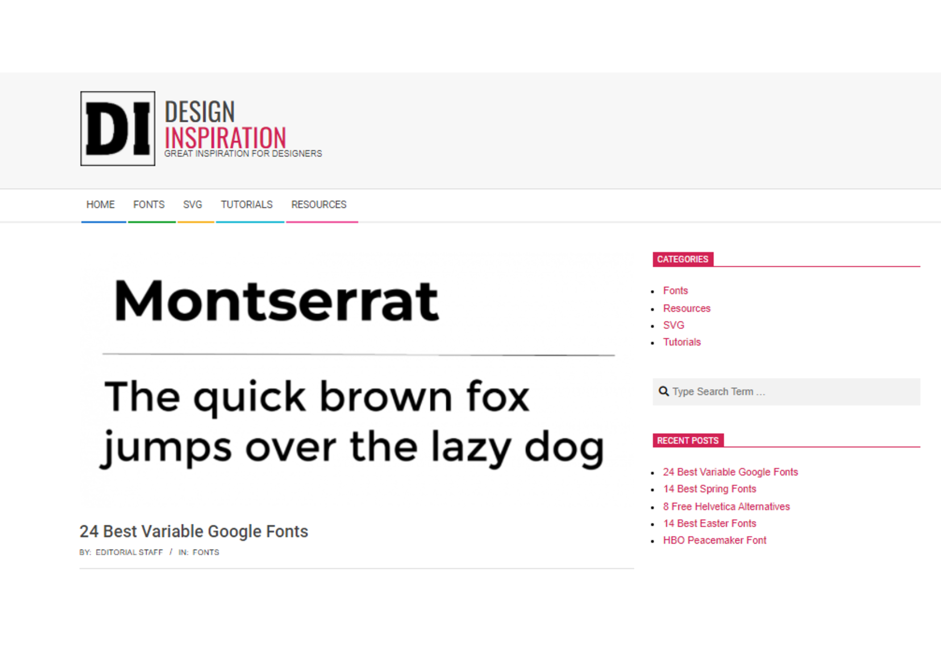
24 Best Variable Google Fonts

Source

The post Popular Design News of the Week: March 28, 2022 – April 3, 2022 first appeared on Webdesigner Depot.

Categories: Designing, Others Tags:

PureNFT Disrupts the NFT Market

April 1st, 2022 No comments

Combining minimalist aesthetics with the ongoing trend for digital art, PureNFT is an awesome new app that lets anyone break into the lucrative NFT market.

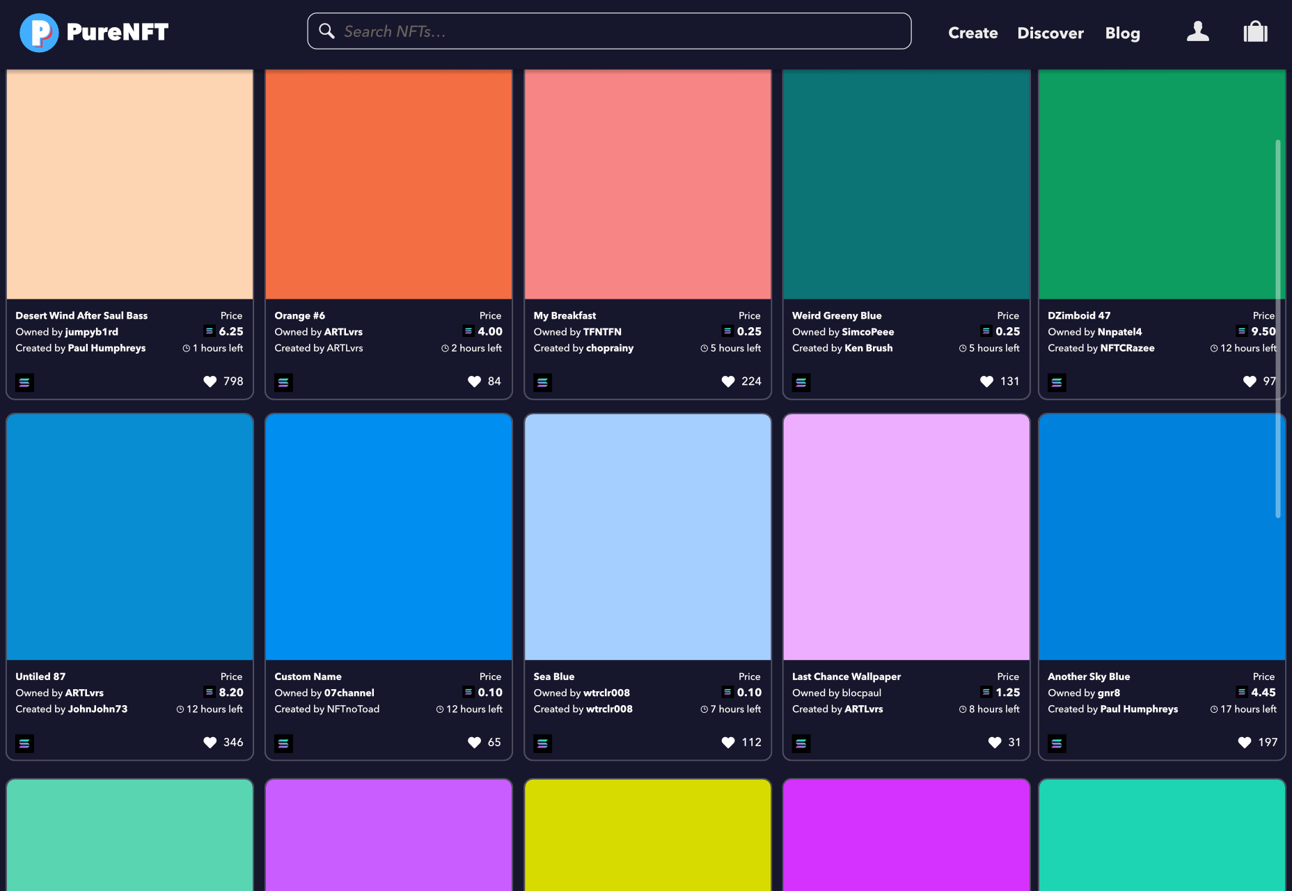
The app aims to lower the bar for prospective NFT creators by creating a minimal artwork from a single-pixel captured anywhere on your viewport. You can mint your NFT directly in the app — the process of recording your artwork on the blockchain — and list it for free on PureNFT’s dedicated marketplace.

Using PureNFT’s ArtPicker tool, hover the tool over any part of your screen, click a pixel to generate your NFT, and then click the “Mint Now” button to mint it. The app will upscale the pixel to a solid-color artwork with an ultra-high resolution of 5,000 x 5,000px. On the pro plan, PureNFT will automatically generate a 250 x 250px thumbnail to ensure your artwork isn’t pirated.

One of the best features of PureNFT is that you don’t need any drawing ability to break into the exciting NFT trend. Just point your mouse at a pixel and click, and the app will generate a pure high-resolution version of the pixel for you.

Unlike most marketplaces that favor Ethereum, PureNFT is powered by the Solana blockchain, which is far more energy-efficient, and, consequently, environmentally friendly. Despite this, PureNFT’s tokens are platform-agnostic, which means you can mint them on the native platform and then transfer them to popular marketplaces like OpenSea and Rarible.

The potential for NFTs created with PureNFT is limitless. You can literally click any pixel, mint it as an NFT, and wait for the money to start rolling in.

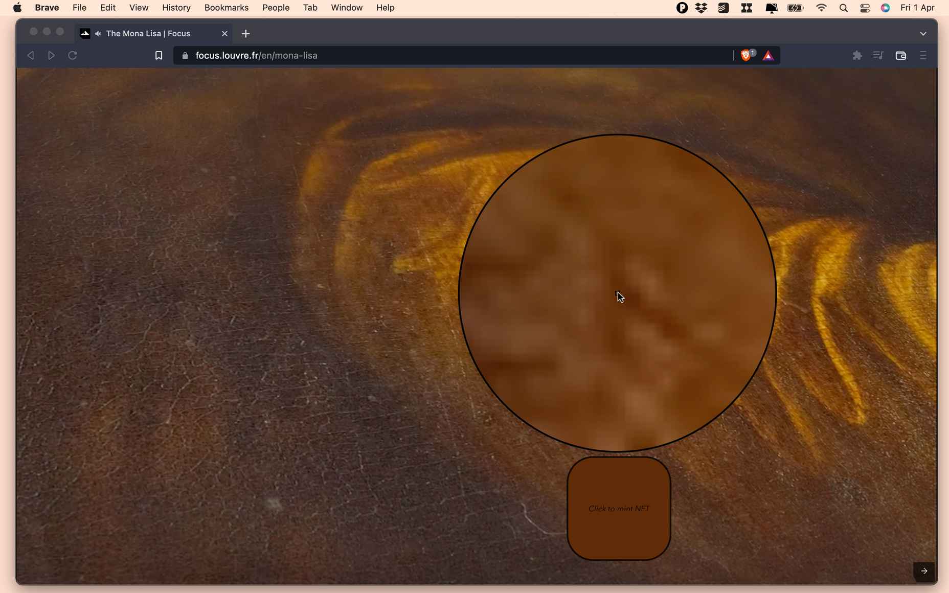
NFTs are a hugely popular way of monetizing artwork, but they are limited in scope; you can only sell one unique NFT of the Mona Lisa, and even then, you have to be the Louvre to do it. But with PureNFT, anyone can visit Wikipedia and open an image of the Mona Lisa that is 7,479 x 11,146px. That translates to 83.3 million potential NFTs; if each pixel sells for an average of $1,000, you might make enough to buy the actual Mona Lisa!

Minting an NFT on PureNFT currently costs 1 SOL (approximately $125 at the time of writing). The first NFT minted by PureNFT — an azure pixel from an unknown screen grab — has an asking price of 375 SOL (approximately $46,875 at the time of writing), but not all PureNFT users have been so lucky, with some early beta users complaining of returns as low as 300%. Nonetheless, the potential for substantial financial gains is evident.

According to Brendan Lewes, co-founder and CTO of PureNFT, the team is interested in introducing AI-powered automation in the near future: Imagine an automated tool searching for popular images, breaking them down into pixels, minting them, and selling them for you, while you live your life. NFT mining could be the next big area of crypto.

However, automation isn’t likely to come anytime soon, according to Lewes:

For now, we’re focussed on maintaining a stable platform. But…we’re super excited about the journey we’re on, and [co-founder Max Schriebport ] and I can’t wait to see where it take us.

PureNFT is currently in beta on macOS, Windows, and iOS, with an Android version on the way. There’s a free plan that allows you to preview up to 5 NFTs, and pro plans start at $399/month.

Source

The post PureNFT Disrupts the NFT Market first appeared on Webdesigner Depot.

Categories: Designing, Others Tags:

What a Call to Action is and Examples of CTAs That Convert

April 1st, 2022 No comments

Creating compelling calls to action (CTA) is integral to web design. It’s not enough to make well-organized, visually appealing landing pages anymore. You need to compel your visitors to click.

Whether you’re still trying to figure out what a call to action is or find some good call-to-action examples, we’ll help you. 

The call-to-action examples we’ll show you are from multiple industries. So whether you work in digital marketing or customer service, you will find a CTA that converts. 

Here’s what we’ll cover:

  • What Is a Call to Action?
  • The Most Common Call-to-Action Methods
  • Action Words You Can Use for CTAs
  • 10 Call-to-Action Examples (Based on Your Industry)
  • Final Thoughts: What a Call to Action Is and Examples of CTAs That Convert

What Is a Call to Action?

HubSpot makes clear what a call to action is. Incorporating videos, bold colors, and words like free to catch users' attention.
Image Source

ALT: HubSpot makes clear what a call to action is. Incorporating videos, bold colors, and words like free to catch users’ attention.

A call to action (CTA) is an element on your website that encourages a specific action from a website visitor. That could be a button prompting users to download an e-book, a form that helps them subscribe to your newsletter, or a popup that asks for their email.
CTAs are subject to design trends just like any other part of web design. Best practices and patterns change with customer demand. What works today won’t necessarily remain evergreen, so keeping an eye on changes is important.

You also want to track the performance of your CTAs to know which pages are performing best and determine if your CTAs convert well. A good conversion rate varies by industry, but an analysis from Wordstream found an average of 2.35%.

A simple way to get an idea of how your CTAs are performing is by comparing your website’s current conversion rates against your site’s previous performance and direct competitors. 

For example, if you previously converted 5% of visitors on a specific page and it has now dropped to 2%, it might be a sign that your CTA needs updating. 

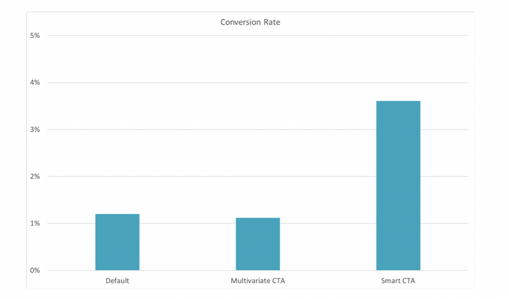
It’s also worth noting that not all CTAs are created equal. While you may be familiar with simple CTAs that promote the same information on each page, consider looking into “smart CTAs” that offer personalized actions based on user information. 

What is a call to action? A call to action asks users to take the next step, and personalizing your CTA can convince them to take it.
Image Source

HubSpot found that smart CTAs converted 202% more leads than a default CTA. Don’t just whip together a quick button and call it a day. Working on your CTAs can lead to a huge jump in sales if you put in the work.

The Most Common Call-to-Action Methods

The right call to action example depends on your goal. You’ll need different CTAs for marketing, sales, customer service, and other departments. 

Whenever you make a new call to action, make sure you define the goal so you can choose the best one for the job.

With that in mind, let’s dive into the standard CTA methods. 

Buttons

An email showcasing an example of a call to action with a button and relevant photos.
Booking.com promotional email. 

The classic CTA. A call to action button stands out from the text and images on your homepage and invites the user to click it. These are mostly used for website calls to action, but recently, they’ve been gaining popularity in emails. 

Buttons easily adapt to mobile devices, so you can be sure your visitors see your CTA button whether they’re on a computer or a smartphone. And no, button color is not more important than its copywriting.

Convert a Lead

One of the top reasons for using a CTA is making a sale or working on lead generation. Placing CTAs on pricing pages, at the end of your list of features, and other relevant areas can help drive your target audience down the sales funnel.

You can use buttons, forms, popups, or other CTAs to close sales. You may want to experiment with a variety of these on different pages.

Submit a Survey or Form

Jotform helps you quickly create a call-to-action to help you get the information you need.
Image Source 

Forms are great for when you need more information from visitors. Find out what industry they work in, get an email address, and possibly even a budget.

You can quickly come up with a customizable form with Jotform to collect the information you need and sync it with other tools you use for and on your website.

Social Media

Social media can be the platform where you place CTAs or the goal. 

For instance, you can ask website visitors to share your blog posts on social media to focus on increasing engagement and interactions. 

Social media can also work as a funnel to qualify your leads if you do the opposite. 

Sharing content, encouraging comments, finding spots to link back to your website, and peppering your profile with links leading to your website or contact information are excellent ways to encourage social media followers to reach out.

Videos

Video continues to grow as an essential marketing tool. Wyzowl’s 2022 State of Video Marketing found 86% of marketers said video helped them generate leads. 

You can position videos with your social media, next to a button on your website, and add them near CTAs on blog posts. Check out our post on video marketing for more ideas on how to incorporate videos.

Newsletters

These have become more popular as creating newsletters is now more accessible and requires less coding.

A newsletter can target specific email subscribers and be tailored to specific audiences. You can run A/B tests on your CTAs and track click-through rates (CTRs) to see how your newsletter performs.

Even better, you can use a newsletter builder to save time and keep your design on brand.

Action Words You Can Use for CTAs

The words you add to calls to action are limited, so you need to make the most of them. You’ll want to consider your goal before clicking publish carefully, so here are some examples of action phrases to match different intents. 

Purchase Intent

If you want your CTA to focus on making sales, make it clear. “Add to Cart,” “Buy Now,” and “Try Free Now” let customers know they will be buying a product or trying a free version of it.

You can use words like “Now” and “Only” to add a sense of urgency, encouraging customers to buy now rather than later, but be careful about using this tactic on premium sales.

Subscription-Based

Call-to-action examples from HubSpot. Two CTAs with different intents, one for free tools and another for testing premium ones.
Image Source 

Subscription services work well when paired with demos. For example, calls to action for these plans should offer free trials. That way, potential customers can understand what they’re signing up for.

You’ll frequently see words like “Demo,” “Subscribe,” “Try,” and “Today” to offer fast results and promise a good value proposition.

Educational

For calls to action on educational pieces, use words that convey how it can help your audience. “Learn More,” “Find Out How,” and “Check It Out” are popular examples that promise to educate users.

You still gain something from these CTAs, usually an email address, or you might eventually offer a tool that addresses something in the information you provide, but the main goal here isn’t sales.

10 Call-to-Action Examples (Based on Your Industry)

These call-to-action examples will help you determine what converts in your industry or niche. Take a look at the email, social media, and website calls to action these companies use to convert more visitors.

If you have a specific department in mind, scroll ahead to see examples for customer service, sales, and more.

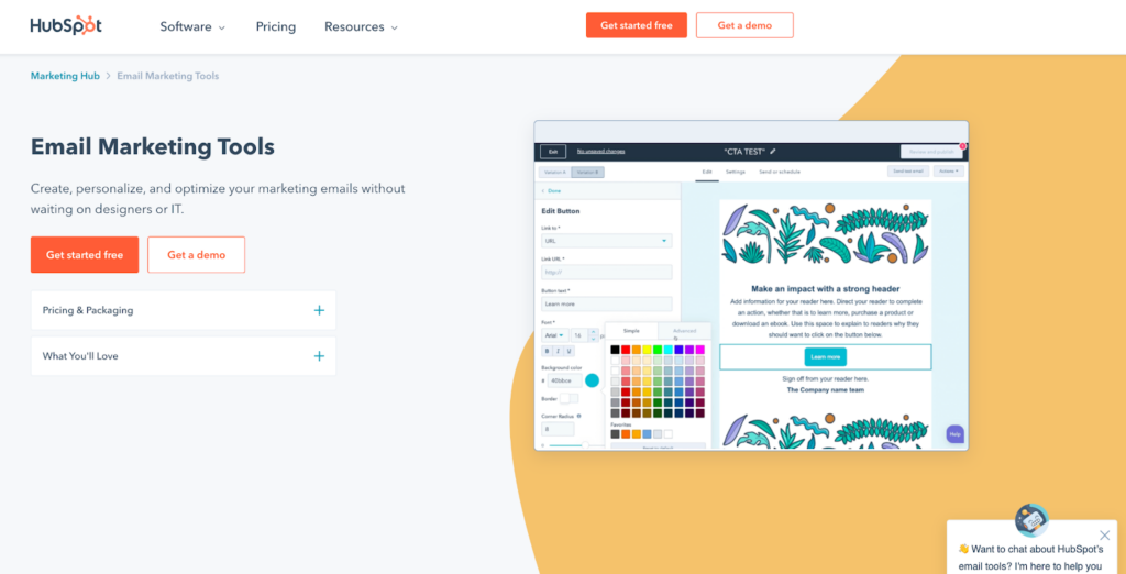
HubSpot’s website call to action for email marketing tools. White space, contrasting colors, and multiple CTAs help convert here.
Image Source

Marketing CTA Examples

  1. Market Study — This is an area where HubSpot shines. Its annual State of Marketing Report collects data from thousands of marketers worldwide. HubSpot collects that information to understand the wants and needs of its customers and constantly improve its software based on the results.

    You can use a form to ask existing customers for feedback or ask potential customers what they would like to see more of.

Facebook ad call-to-action example. The ads are web-responsive to give you the best bang for your buck.
Image Source 
  1. Social Media Ad Placement — Social media advertising has evolved quickly. A look at Facebook’s recent options shows simple picture ads, video, carousel, and in-messenger options. 

    You can change your CTA depending on your campaign target. The carousel ad above works great for different photos of an Airbnb property, but an e-book might do better with a single photo ad.

    Do note that Google Ads perform differently from social media options. Unlike Facebook or Twitter, with Google, you’ll want to manage your ad spending with optimized meta tags and an Ad Manager to keep track of KPIs.

Sales CTA Examples

  1. Sales Email Template — Working with templates can save you time, especially for frequently used emails. Creating a sales email template you can customize with data from your customer relationship management (CRM) software helps sales staff and customers keep things flowing.

    Add a CTA that lets customers quickly schedule a meeting with a rep.

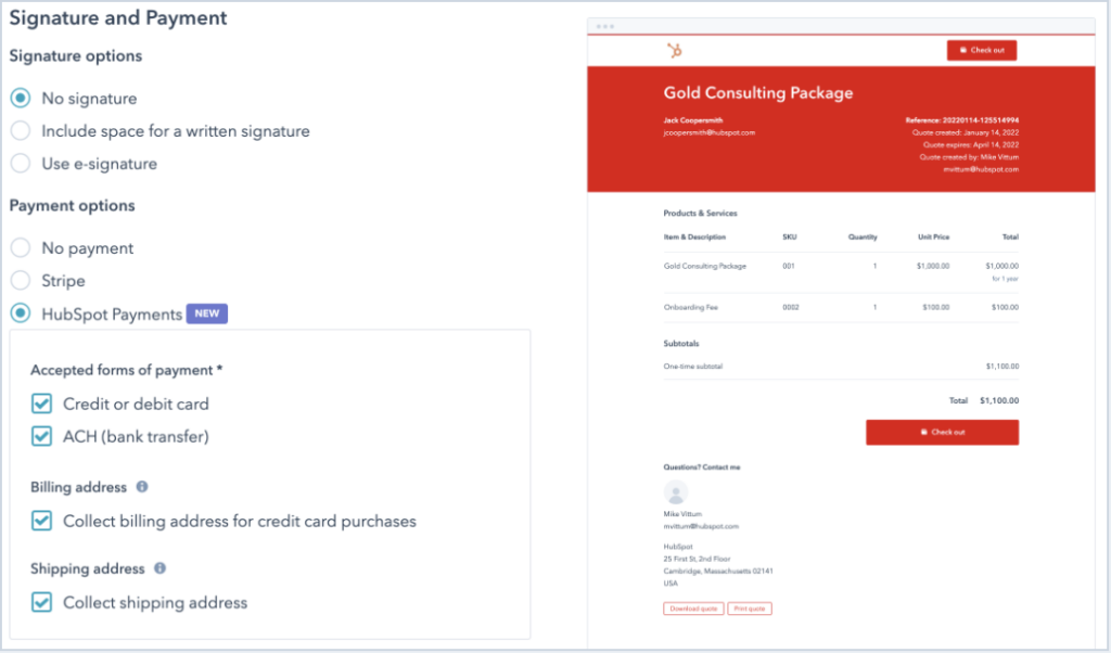
A customizable quote that configures quickly and lets you add a CTA to convert sales faster.
Image Source 
  1. Configure, Price, Quote (CPQ) — When you work with large purchases, you often need to offer customized quotes for each customer.

    Use CPQ software that lets you integrate with different payment options so you can add CTAs to your quotes directly. That reduces the steps a customer needs to take to complete their purchase.

  2. Popups — Yes, popups may be old-fashioned, but they do work. Sumo found an average conversion rate of 3.09% from its user’s popup CTAs. 

    It’s important to use a popup that doesn’t detract too much from your visitor’s experience, so think about this popular tactic’s style, placement, and timing. 

Image Source 

Customer Service CTA Examples

  1. Post-Churn Feedback — Did you lose a customer recently? That is a learning opportunity if you can find out why.

    Exit intent forms can help you discover why a customer is unsubscribing from your email list, abandoning their cart, or canceling service.

  2. Post-Service Feedback — Are you trying to reduce churn? Try working on your service before customers leave. Asking clients for feedback after a customer service interaction is a great time as the experience is fresh on their minds.

    Issue tracking software can help you see every customer’s interaction with your staff and compare their feedback to your data.

Miscellaneous CTA Examples 

A website call to action from Jotform provides multiple ways for users to sign up, making it quick and easy.
Image Source 
  1. E-commerce Sales Example — E-commerce sales generally rely on getting new customers frequently. Online stores often use social proof or reviews to encourage customers to click “buy now.”

    They may also offer multiple ways to sign up, saving customers time and letting them use their preferred services.

  2. RSVP for an Event — Offering a webinar or live event? Work with a calendar plugin to make it easy for users to “Reserve a Spot” and add it to their schedule.
  3. Video in Action — Remember when we said videos were the future of marketing? You can incorporate your CTA in a video in more than one way.

    Include a mention in the script, have a button or link near the video as a next step, and if possible, encourage social sharing as well.

Image Source

Final Thoughts: What a Call to Action Is and Examples of CTAs That Convert

A call to action should compel your webpage visitors or email subscribers to continue on their buyer’s journey. That could mean learning more about your product, signing up for a free trial, or taking another desired action that helps both of you.

By following good design practices and personalizing your calls to action by industry or goal, you’ll create higher converting pages that drive sales.
You can work in a compelling call to action with Jotform. Jotform’s templates are already optimized to convert, and they help you add a form to your website in minutes.

The post What a Call to Action is and Examples of CTAs That Convert appeared first on noupe.

Categories: Others Tags: