3 Quick Tricks to Boost Customer Retention
Acquiring a new customer is difficult, but retaining an existing one is even more challenging. Yet, statistics show that efforts focused on retention bring way more value.
For instance, according to SmallBizGenius, 82% of companies agree that customer retention is cheaper than acquisition. Apart from that, 65% of a company’s revenue comes from existing clients, and increasing the investment in retention by only 5% already gives you a boost in profits by 25% to 95%. Impressive, right?
So what should you do to reach such results?
One component that impacts brand-client relationships is website design. This article will give you three design tricks that will encourage your customers to come back to your site more and more.
1. Rethink Your Website Structure
It is hard to imagine a website visitor who would spend more than five minutes (usually it’s way less) trying to figure out the navigation system on your website. If you have a loaded, complex site structure, you will not retain a customer.
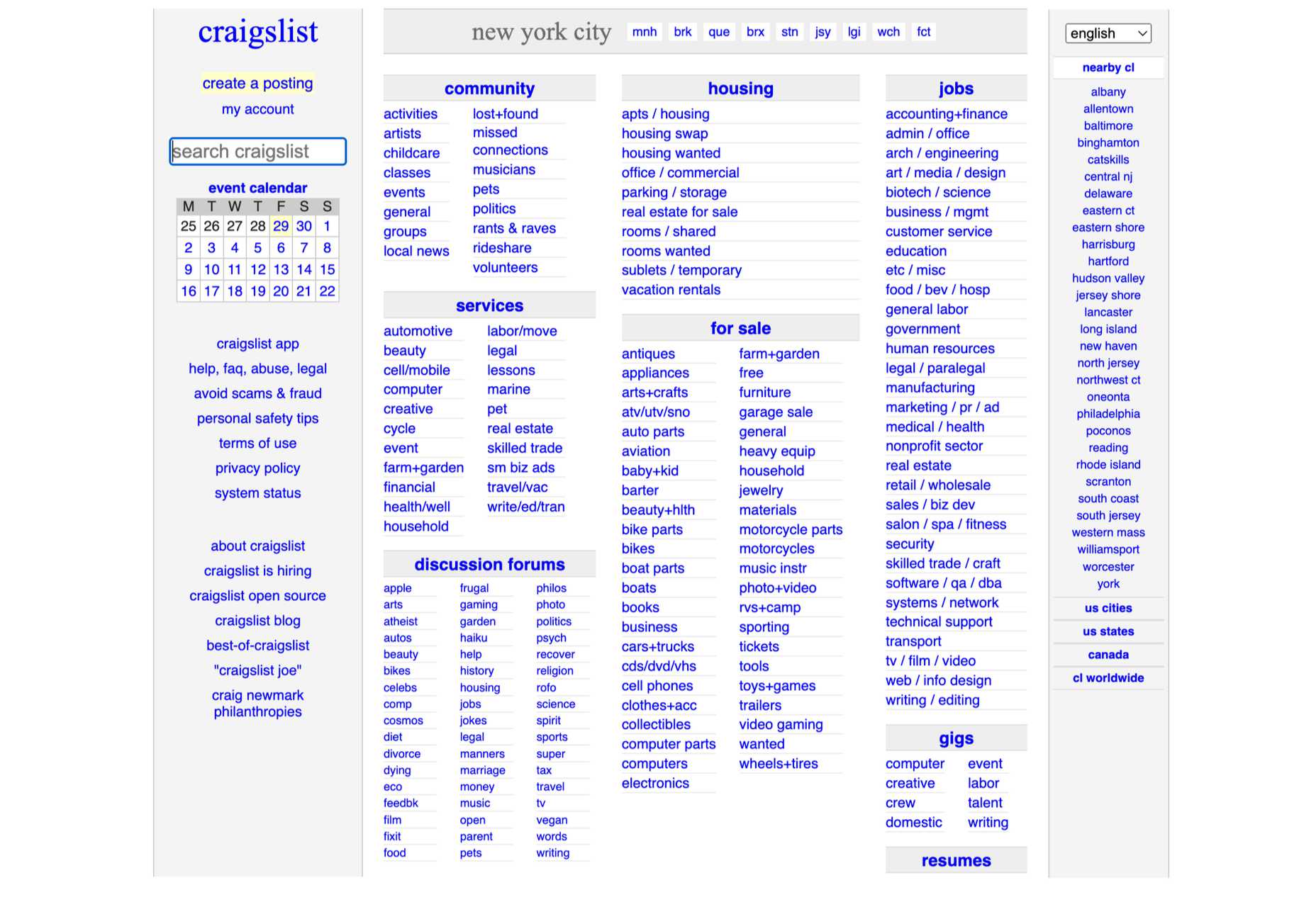
Take Craigslist, for instance. Its navigation is not user-friendly, not to mention that it took over 30 seconds to load when the acceptable average load time should be no more than 1.7 seconds:
Here’s what proper website navigation presupposes:
- Subordination should not go deeper than three levels.
- A website should include eight horizontal categories max.
- The structure should be symmetrical.
- The menu should not be overstuffed with too many locations.
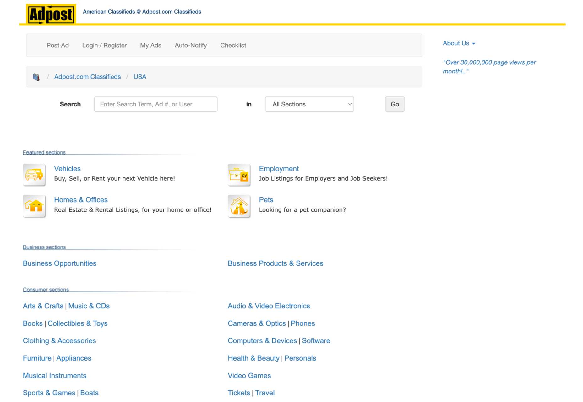
Since we mentioned Craigslist, let’s take a look at its competitor AdPost, which has a better website structure:
Instead of listing all the product categories on the front page, like Craigslist, AdPost added them to the search menu, thus making the design more user-friendly and making the navigation cleaner.
2. Make Your Site Multilingual
If you have visitors coming to your website from around the world, you should not assume they know English. A survey by Weglot found some interesting results regarding the attitude of buyers to shopping on international websites:
- 52% of websites are in English, but English reaches only 25% of global users.
- 56% of visitors say the website information in their language is more important than the price.
- 73% of customers say they prefer to shop on sites in their own language.
So, there is no doubt that having your website localized to several languages can increase customer retention, especially considering the last stat.
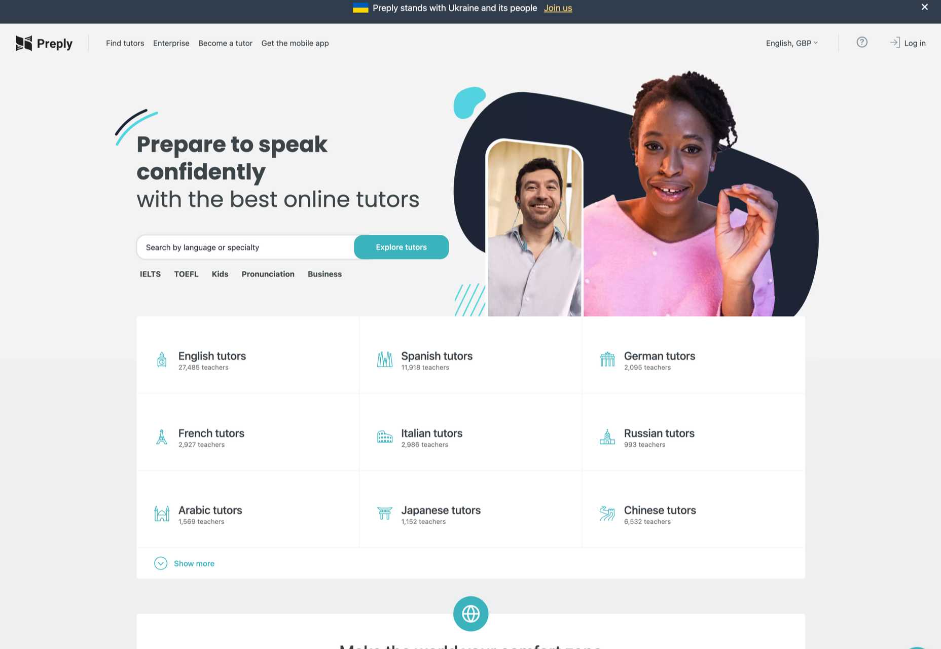
To understand the proper practices of making a website multilingual, look at the examples of the best language learning apps. For instance, Preply has a drop-down menu where you can choose from multiple language options, including Polish, Ukrainian, German, and many more:
Translating your website to different languages will help the visitor understand the value of your product better. However, before you invest in localization, make sure you study the data on customer behaviors to understand which languages your audience speaks.
3. Invest in Custom Illustrations
Some companies don’t bother much with designing their websites, especially when it comes to custom elements, such as visuals. However, research has shown that the focus on branding in website design increases customer commitment and e-loyalty, as a result.
Moreover, in the world of billions of websites, you need something that would help your business stand out. And custom illustrations are among those features that contribute to your site’s uniqueness.
Just take a quick look at the Emiozaki Web site. It includes personalized illustrations and animation created in the form of a tablet that substitutes the navigation menu:
This website reflects the brand’s tone and style, and animation adds emotion to UX. Apart from that, it’s also an excellent example of structuring a website.
Or, if you would like an example of a less loaded design, take a look at this personal portfolio by Victoire Douy. It also includes animations that add interactivity to the design. For instance, you can play with the shadow of the girl’s hand:
So, if you want your website to attract more customers and encourage them to hang out for longer, take the creative approach. Hiring an illustrator is, of course, costly, but it will help your site stand out.
Wrapping Up
As you can see, you’ll have to put in a lot of work to bring forward website design that increases online customer retention. You just have to employ our three best practices. Let’s quickly recap them:
- Rethink your website structure; it should make the navigation easier.
- Consider making your site multilingual; you’ll retain more international visitors.
- Invest in custom illustrations to help consumers differentiate your brand from your competitors.
The post 3 Quick Tricks to Boost Customer Retention first appeared on Webdesigner Depot.


