Archive

Archive for May, 2022

9 Ways To Drive Traffic To Your WordPress Blog

May 20th, 2022 No comments

WordPress has made it easy for everyone to launch a blog, but even though launching a blog isn’t a difficult task any longer, driving traffic to your blog certainly is!

In this article, I’ll share some tried and tested strategies that have worked well for my clients’ blogs. You do not have to be an expert or a marketing guru to get traffic to your WordPress website. Follow the helpful tips I share in this article and watch the visitors start pouring in.

Tip 1: Use Powerful Headlines

The first thing related to your blog that a user reads in the search engine results is your article headlines. Of course, nobody wants to click on a boring article title. But a powerful headline stands out from the rest and gets you more clicks. 

In most themes, your article headlines are translated into meta titles for the pages. Meta titles indicate the topic of your articles to Google and other search engines. 

Tip 2: Build an Email List

Consider offering your visitors a newsletter signup form through which they can subscribe and get notified about new posts on your blog. You can offer them an incentive for free to persuade them to subscribe to your blog. It can be anything from an e-book, membership, useful templates, or an e-course. 

Building an email list gives access to the inboxes of your visitors. You can share your blog content with this prospective audience every time you post a new article. This will help you get consistent traffic to your WordPress blog.

Tip 3: Use Free Giveaways and Contests

Free giveaways work as an incentive for your WordPress blog visitors. To offer an entry to your blog’s free giveaway, you can ask your visitors for an email subscription, comment on your blog posts, share it on their social media channels, and ask for other such things. 

The trick is to think about the actions of your visitors that will increase traffic to your blog and provide them with one or multiple giveaway entries for such actions. 

Tip 4: Optimize For Keywords

All successful bloggers optimize their content for keywords. You need to perform proper keyword research to find sentences and words that your target audience is typing in Google and other top search engines. 

Instead of guessing the keywords for your articles, consider using some helpful tools like SEMrush’s Keyword Magic Tool and Google Ads Keyword Planner. This way, you can find the terms people are genuinely interested in and the keywords that do not have too much competition.

You must ensure to choose the keywords that have some excellent traffic volume but, at the same time, have less competition. Such keywords will help in the better ranking of each of your articles.

Tip 5: Optimize WordPress Site Speed

It has been proven that loading time is a ranking factor for SEO, as Google tends to assume that fast sites are high-quality sites.

Signing up for a hosting provider specializing in WordPress guarantees you get the best optimization features for your WordPress site. However, that alone is not enough because you need a hosting provider that can also handle a high volume of visitors.

Optimizing your WordPress website will help in the faster loading of your blog pages. Images are generally the biggest culprit in slowing down your website. So you must first optimize them through an image optimization plugin like Smush, Imagify, or Optimus. 

Enabling caching on your WordPress blog will considerably improve its speed. You can store your website data locally with caching, thereby reducing your server load to a large extent. Your website will, therefore, load faster on your visitors’ end, especially when they are repeat visitors.

Tip 6: Take Advantage of Social Media

Try building your presence on some of the top platforms like Facebook, Instagram, Twitter, LinkedIn, and Pinterest. Post multiple times a day on these websites and share your blog articles.

You must also include social sharing buttons with your blog posts to make sharing easier for your audience. It will allow your blog visitors to share your post on different social platforms. This dramatically increases the chances of your blog post going viral.

Tip 7: Internal Linking Strategy

The only key here is to link articles that are closely related to each other. Your visitors might be interested in such related content and read more of your blog posts, thereby increasing your page views. It also increases the chances of visitors sharing your blog content since they find it valuable.

Tip 8: Be a Guest Blogger

Guest blogging involves creating content for other websites for mutual benefits. It helps you establish your authority in the blogging world while attracting more visitors to your WordPress website. 

Becoming a guest blogger allows you to spread the word about your blog to a new set of audiences and bring in organic traffic. It expands your work portfolio and helps build or enhance your online reputation.

Tip 9: Pay for Traffic

Consider using Google Ads, Facebook Ads, Microsoft advertising, and other top advertising platforms when paying to bring traffic to your blog. Be aware of your blog audience and use the most suitable criteria to target it. 

I’d recommend setting a weekly budget for paid ads and tracking the ad performance at the end of the week.

If you are satisfied with the traffic results, use the same criteria for the next week. On the other hand, if the ad performance is not as per your expectations, try different criteria to reach your target audience.

Conclusion

Getting traffic to your WordPress blog is an incentive for all the hard work that you do in creating content and managing your website. It builds a name for your blog and improves its search engine ranking. All this leads to better user engagement and revenue.


Featured image via Pexels.

Source

The post 9 Ways To Drive Traffic To Your WordPress Blog first appeared on Webdesigner Depot.

Categories: Designing, Others Tags:

Inline Image Previews with Sharp, BlurHash, and Lambda Functions

May 19th, 2022 No comments

Don’t you hate it when you load a website or web app, some content displays and then some images load — causing content to shift around? That’s called content reflow and can lead to an incredibly annoying user experience for visitors.

I’ve previously written about solving this with React’s Suspense, which prevents the UI from loading until the images come in. This solves the content reflow problem but at the expense of performance. The user is blocked from seeing any content until the images come in.

Wouldn’t it be nice if we could have the best of both worlds: prevent content reflow while also not making the user wait for the images? This post will walk through generating blurry image previews and displaying them immediately, with the real images rendering over the preview whenever they happen to come in.

So you mean progressive JPEGs?

You might be wondering if I’m about to talk about progressive JPEGs, which are an alternate encoding that causes images to initially render — full size and blurry — and then gradually refine as the data come in until everything renders correctly.

This seems like a great solution until you get into some of the details. Re-encoding your images as progressive JPEGs is reasonably straightforward; there are plugins for Sharp that will handle that for you. Unfortunately, you still need to wait for some of your images’ bytes to come over the wire until even a blurry preview of your image displays, at which point your content will reflow, adjusting to the size of the image’s preview.

You might look for some sort of event to indicate that an initial preview of the image has loaded, but none currently exists, and the workarounds are … not ideal.

Let’s look at two alternatives for this.

The libraries we’ll be using

Before we start, I’d like to call out the versions of the libraries I’ll be using for this post:

Making our own previews

Most of us are used to using  tags by providing a src attribute that’s a URL to some place on the internet where our image exists. But we can also provide a Base64 encoding of an image and just set that inline. We wouldn’t usually want to do that since those Base64 strings can get huge for images and embedding them in our JavaScript bundles can cause some serious bloat.

But what if, when we’re processing our images (to resize, adjust the quality, etc.), we also make a low quality, blurry version of our image and take the Base64 encoding of that? The size of that Base64 image preview will be significantly smaller. We could save that preview string, put it in our JavaScript bundle, and display that inline until our real image is done loading. This will cause a blurry preview of our image to show immediately while the image loads. When the real image is done loading, we can hide the preview and show the real image.

Let’s see how.

Generating our preview

For now, let’s look at Jimp, which has no dependencies on things like node-gyp and can be installed and used in a Lambda.

Here’s a function (stripped of error handling and logging) that uses Jimp to process an image, resize it, and then creates a blurry preview of the image:

function resizeImage(src, maxWidth, quality) {
  return new Promise<ResizeImageResult>(res => {
    Jimp.read(src, async function (err, image) {
      if (image.bitmap.width > maxWidth) {
        image.resize(maxWidth, Jimp.AUTO);
      }
      image.quality(quality);

      const previewImage = image.clone();
      previewImage.quality(25).blur(8);
      const preview = await previewImage.getBase64Async(previewImage.getMIME());

      res({ STATUS: "success", image, preview });
    });
  });
}

For this post, I’ll be using this image provided by Flickr Commons:

Photo of the Big Boy statue holding a burger.

And here’s what the preview looks like:

Blurry version of the Big Boy statue.

If you’d like to take a closer look, here’s the same preview in a CodeSandbox.

Obviously, this preview encoding isn’t small, but then again, neither is our image; smaller images will produce smaller previews. Measure and profile for your own use case to see how viable this solution is.

Now we can send that image preview down from our data layer, along with the actual image URL, and any other related data. We can immediately display the image preview, and when the actual image loads, swap it out. Here’s some (simplified) React code to do that:

const Landmark = ({ url, preview = "" }) => {
    const [loaded, setLoaded] = useState(false);
    const imgRef = useRef<HTMLImageElement>(null);
  
    useEffect(() => {
      // make sure the image src is added after the onload handler
      if (imgRef.current) {
        imgRef.current.src = url;
      }
    }, [url, imgRef, preview]);
  
    return (
      <>
        <Preview loaded={loaded} preview={preview} />
        <img
          ref={imgRef}
          onLoad={() => setTimeout(() => setLoaded(true), 3000)}
          style={{ display: loaded ? "block" : "none" }}
        />
      </>
    );
  };
  
  const Preview: FunctionComponent<LandmarkPreviewProps> = ({ preview, loaded }) => {
    if (loaded) {
      return null;
    } else if (typeof preview === "string") {
      return <img key="landmark-preview" alt="Landmark preview" src={preview} style={{ display: "block" }} />;
    } else {
      return <PreviewCanvas preview={preview} loaded={loaded} />;
    }
  };

Don’t worry about the PreviewCanvas component yet. And don’t worry about the fact that things like a changing URL aren’t accounted for.

Note that we set the image component’s src after the onLoad handler to ensure it fires. We show the preview, and when the real image loads, we swap it in.

Improving things with BlurHash

The image preview we saw before might not be small enough to send down with our JavaScript bundle. And these Base64 strings will not gzip well. Depending on how many of these images you have, this may or may not be good enough. But if you’d like to compress things even smaller and you’re willing to do a bit more work, there’s a wonderful library called BlurHash.

BlurHash generates incredibly small previews using Base83 encoding. Base83 encoding allows it to squeeze more information into fewer bytes, which is part of how it keeps the previews so small. 83 might seem like an arbitrary number, but the README sheds some light on this:

First, 83 seems to be about how many low-ASCII characters you can find that are safe for use in all of JSON, HTML and shells.

Secondly, 83 * 83 is very close to, and a little more than, 19 * 19 * 19, making it ideal for encoding three AC components in two characters.

The README also states how Signal and Mastodon use BlurHash.

Let’s see it in action.

Generating blurhash previews

For this, we’ll need to use the Sharp library.


Note

To generate your blurhash previews, you’ll likely want to run some sort of serverless function to process your images and generate the previews. I’ll be using AWS Lambda, but any alternative should work.

Just be careful about maximum size limitations. The binaries Sharp installs add about 9 MB to the serverless function’s size.

To run this code in an AWS Lambda, you’ll need to install the library like this:

"install-deps": "npm i && SHARP_IGNORE_GLOBAL_LIBVIPS=1 npm i --arch=x64 --platform=linux sharp"

And make sure you’re not doing any sort of bundling to ensure all of the binaries are sent to your Lambda. This will affect the size of the Lambda deploy. Sharp alone will wind up being about 9 MB, which won’t be great for cold start times. The code you’ll see below is in a Lambda that just runs periodically (without any UI waiting on it), generating blurhash previews.


This code will look at the size of the image and create a blurhash preview:

import { encode, isBlurhashValid } from "blurhash";
const sharp = require("sharp");

export async function getBlurhashPreview(src) {
  const image = sharp(src);
  const dimensions = await image.metadata();

  return new Promise(res => {
    const { width, height } = dimensions;

    image
      .raw()
      .ensureAlpha()
      .toBuffer((err, buffer) => {
        const blurhash = encode(new Uint8ClampedArray(buffer), width, height, 4, 4);
        if (isBlurhashValid(blurhash)) {
          return res({ blurhash, w: width, h: height });
        } else {
          return res(null);
        }
      });
  });
}

Again, I’ve removed all error handling and logging for clarity. Worth noting is the call to ensureAlpha. This ensures that each pixel has 4 bytes, one each for RGB and Alpha.

Jimp lacks this method, which is why we’re using Sharp; if anyone knows otherwise, please drop a comment.

Also, note that we’re saving not only the preview string but also the dimensions of the image, which will make sense in a bit.

The real work happens here:

const blurhash = encode(new Uint8ClampedArray(buffer), width, height, 4, 4);

We’re calling blurhash‘s encode method, passing it our image and the image’s dimensions. The last two arguments are componentX and componentY, which from my understanding of the documentation, seem to control how many passes blurhash does on our image, adding more and more detail. The acceptable values are 1 to 9 (inclusive). From my own testing, 4 is a sweet spot that produces the best results.

Let’s see what this produces for that same image:

{
  "blurhash" : "UAA]{ox^0eRiO_bJjdn~9#M_=|oLIUnzxtNG",
  "w" : 276,
  "h" : 400
}

That’s incredibly small! The tradeoff is that using this preview is a bit more involved.

Basically, we need to call blurhash‘s decode method and render our image preview in a canvas tag. This is what the PreviewCanvas component was doing before and why we were rendering it if the type of our preview was not a string: our blurhash previews use an entire object — containing not only the preview string but also the image dimensions.

Let’s look at our PreviewCanvas component:

const PreviewCanvas: FunctionComponent<CanvasPreviewProps> = ({ preview }) => {
    const canvasRef = useRef<HTMLCanvasElement>(null);
  
    useLayoutEffect(() => {
      const pixels = decode(preview.blurhash, preview.w, preview.h);
      const ctx = canvasRef.current.getContext("2d");
      const imageData = ctx.createImageData(preview.w, preview.h);
      imageData.data.set(pixels);
      ctx.putImageData(imageData, 0, 0);
    }, [preview]);
  
    return <canvas ref={canvasRef} width={preview.w} height={preview.h} />;
  };

Not too terribly much going on here. We’re decoding our preview and then calling some fairly specific Canvas APIs.

Let’s see what the image previews look like:

In a sense, it’s less detailed than our previous previews. But I’ve also found them to be a bit smoother and less pixelated. And they take up a tiny fraction of the size.

Test and use what works best for you.

Wrapping up

There are many ways to prevent content reflow as your images load on the web. One approach is to prevent your UI from rendering until the images come in. The downside is that your user winds up waiting longer for content.

A good middle-ground is to immediately show a preview of the image and swap the real thing in when it’s loaded. This post walked you through two ways of accomplishing that: generating degraded, blurry versions of an image using a tool like Sharp and using BlurHash to generate an extremely small, Base83 encoded preview.

Happy coding!


Inline Image Previews with Sharp, BlurHash, and Lambda Functions originally published on CSS-Tricks. You should get the newsletter.

Categories: Designing, Others Tags:

What Even Is Web Design in 2022?

May 18th, 2022 No comments

The term “web design” refers to the process of planning, organizing, and editing content online. On the surface, it seems like a simple enough concept. However, the reality is what we consider “web design” can change over time, influenced by our perception of the “web.” 

In 2022, a professional web designer might create custom websites from scratch, but they may also be responsible for: 

  • UX Design: Creating elements focused on user experience
  • App design: Building digital components of a website or online experience.
  • Theme design: Creating visual tools for supplementing web design. 

Web design isn’t just about making a site look attractive anymore. The definition goes beyond the aesthetic to include a complete consideration of the functionality, performance, and abilities of countless assets we engage within the digital world.

What is Web Design? The Definition Today

Web design is the practice responsible for creating a website’s overall look and feel or web asset (such as web and mobile apps). It involves the process of planning and building elements of your project, from structure and layout choices to graphics and presentation. 

Web design has various components that work together to create the final “experience” of a website, including graphic design, interface design, user experience design, search engine optimization, content creation, etc. These elements determine how a web asset looks, feels and performs on various devices. 

Though the definition of web design in 2022 has evolved, it’s still different from web development, which refers to the actual coding which makes a website work. When you’re building a website, you’ll need web design and web development. 

Elements of Web Design in 2022 

When designing a website, modern designers need to consider two overlapping concepts: the overall appearance of the website and its functionality. The proper connection between these elements will maximize the site’s overall performance and usability, and make a design more memorable (for all of the right reasons). 

Let’s break down the elements of web design into its visual and functional components.

Visual Elements of Web Design

Visual elements of web design influence how a design looks. The various visual components of a design should still follow the basic principles of graphic design. In other words, designers should be thinking about contrast, balance, unity, and alignment simultaneously. The visual elements of web design include: 

  • Written copy and fonts: A website’s appearance and the text on the site often go hand in hand. Designers need to work together with content writers to ensure written copy makes sense structurally and uses the correct fonts for legibility. 
  • Colors: Colors for web design are usually chosen based on factors like color psychology, which demonstrates a color’s ability to affect how someone feels, and branding. Most brands have specific colors they use consistently throughout their visual assets; this helps create a sense of cohesion and unity in designs.
  • Layout and spacing: Layout and spacing influence how content is arranged in an app, website, or another visual asset. The right layout helps to create a visual hierarchy, guiding a viewer through a page and drawing their attention to the correct information in order. Spacing helps to separate components on a page and create legibility. 
  • Images, icons, and shapes: Images, icons, and shapes help convey significant amounts of information. The right ideas and icons can strengthen a brand message, direct a customer’s attention using a web app, and bring context to a design. 
  • Videos and animations: Videos and animations are becoming increasingly common in today’s web design strategies. Videos can include 360-degree videos, which help immerse someone in a space, video streams, and short content clips.

Functional Elements of Web Design

Functional elements in web design are the practical components designers need to consider to ensure websites and assets work as they’re supposed to. A website, app, or any other web asset needs to function correctly to be accessible to users.

Functional elements of web design may include:

  • Navigation: The navigation elements of a website or app are among the main components determining whether a site is functioning properly and ensuring a good user experience. Audiences need to be able to move around the app or website quickly. 
  • User interactions: Your site visitors may have multiple ways of communicating with your web app or website, depending on their device. You’ll need to make sure people can scroll and swipe on smartphones and tablets and click on desktops. If your website has VR or AR elements, you’ll also need to consider these immersive components in your design.
  • Speed and performance: While web development elements can also influence a web design’s speed or performance, it’s also essential for a designer to show elements of the composition don’t weigh down the functionality. Designs need to load quickly and correspond with the demands of browsers on various devices.
  • Structure: A website’s structure plays a critical role in user experience and SEO requirements. Users need to easily navigate through a website without encountering any issues like getting lost or ending up on broken pages.
  • Compatibility: A good design should look perfect on all devices, from a wide range of browsers to the various devices users might leverage today. 

What Does Good Web Design Look Like in 2022?

More than ever, achieving high-quality web design is crucial to success in any industry or landscape. More than half of the world’s population is active online. If you’re not appealing to this audience correctly, you’re missing out on endless opportunities.

Notably, while elements of good web design can be subjective, such as which themes or colors someone might prefer for their website, the underlying foundations of strong web design are the same for everyone in 2022.  

Good web design is any design that looks good, performs as it should, and delivers the best possible experience to your target audience. Effective web design should include components like:

  • Effective use of white space for organization and structure.
  • Clearly presented choices and navigation options for the user.
  • Clear calls to action to drive user activities from one page to another.
  • Limited distractions and a straightforward user journey. 
  • No clutter or unnecessary components irrelevant to the needs of the user. 
  • Responsive, flexible design accessible on any browser or device.
  • High-quality content and images are designed to hook a reader’s attention.
  • Appropriately sized fonts and legible typography.
  • A good balance between images and text on a page. 

Other elements like eye-catching imagery and professional photography can help your web design stand out. Using the right building blocks, like a strong color palette and the right shapes or icons in your design is helpful. 

Of course, there is some scope for variation in good web design. A web designer in 2022 needs to be able to adapt their use of the various essential elements of design to suit a specific target audience or the unique identity of a brand.

What Doesn’t Work for Web Design in 2022?

Just as web design elements seem to appear consistently in all excellent examples, there are also parts of web design we’ve left behind over the years. Simpler, more straightforward designs have replaced cluttered spaces, flashing images, and endless animations. 

The focus in 2022 is on creating an experience that’s simple, engaging, and intuitive, capable of speaking to the right audience without confusion or being visually overwhelming. In most cases, some of the top components to avoid include:

  • Clunky performance: Non-responsive website design, slow pages, and other examples of clunky functionality are a no-go in 2022. Websites need to be quick and responsive.
  • Distracting content: Flashing images, animations, and complex backgrounds are a thing of the past for a good reason. Websites today need to be clean, simple, and clear. Any elements which don’t add to the value of the design should be removed.
  • Generic content: Filler text, irrelevant stock photos, unclear buttons, and links can be removed from today’s website designs. A web design should be specific to the audience’s needs and the brand’s identity. Generic components don’t work.

Creating Web Designs in 2022

Today, the underlying definition of web design has a lot of similarities to the definition we’ve known for several years already. Creating a great website or web asset still requires focusing on user experience, aesthetic appeal, and functionality. However, today’s web designers generally have more components and different devices. 

Web design in 2022 is about creating high-quality experiences for customers that can support various environments and devices. The best web designs are aesthetically appealing, functionally reliable, and capable of adhering to the latest trends in web creation, like augmented reality, 360-degree video, and ultra-high resolution. 


Featured image via Pexels.

Source

The post What Even Is Web Design in 2022? first appeared on Webdesigner Depot.

Categories: Designing, Others Tags:

How does CRM software manage your business?

May 18th, 2022 No comments

Businesses aim to establish enduring relationships, particularly with customers. Believingly, if you are managing it well, then you surely will grow. In the era of digitization, CRM software has marked its presence. The reason is simply its features that confirm its positive outcome for businesses.  It has the magic that manages customers efficiently and assures higher ROI. 

What is CRM software?

CRM is Customer Relationship Management software that enables businesses to handle, organize and track their connections with customers.  The system assists them to store the data, like customer behavior. From here, you can have an idea of how long they are with you, what they have purchased, what their feedback or reviews were, etc. In addition to this, you can find out the areas of improvement for more sales, higher transactions, etc. Collectively, all these practices tend to enhance the marketing and sales process. The software functions by keeping track of the actions and behavior of existing and probable customers from the email marketing campaigns, social media, and business sites. Moreover, it directs the customers via buying or sales funnel with emails or notifying the salesperson regarding customers’ preferences.

Effective Features of CRM Software

Customer Management

The major benefit of customer relationship management software is that it enhances the relationship of businesses with customers. From simply keeping a tab on the general contacts, it saves the essential data such as previous interactions, buying history, and demographics on every channel.

Moreover, it authorizes the others in the businesses to use the information when required. Every single communication of staff members with customers ensures customer satisfaction. If you are able to provide the best services, then, they could be your loyal customers. 

In case there is a higher turnover in business, then, it can harm everything from brand value to sales, etc. While using the CRM solution, there will be automation in customer support, sentiment analysis and behavior tracking, etc. From all these provisions, you can find out and acknowledge the queries beforehand so that they should not be problems in future.  Hence, a CRM system helps you to boost customer satisfaction and confirms their future visit. 

Business process automation

There are many benefits or features of CRM software that make it a valuable asset. However, the most important one is automation. Basically, it is the benefit that streamlines the business processes. To give you a glance:

  • It saves the time that is spent on emailing and lead nurturing with SMS campaigns. 
  • Regular and customer-oriented communication considering commerce, sales, marketing and service via personalized automation. 
  • Capturing leads with customer metrics you fix. Therefore, you can give priority to the terms for confirming the leads to work on.

The CRM software allows the business to spend extra time on generating campaigns that keep well with the audience, monitor data and strategies according to analytics, etc.  

Reports and Analytics

There are several reliable CRM software in the market that let you eye on business insights. Of course, checking them the other way around is not authentic. Additionally, with this, you can compute almost everything regarding customer sentiments, whether you are able to fulfill their expectations or not or if the performance of the sales team is up to the mark or the outcome from the last organized campaign. 

The software lets you make dashboards for customer data management according to various demographics, characteristics and lead qualification automation. However, it lets you target particular parts of customers with various marketing campaigns for higher influence. 

What’s more? The reports will support businesses to understand the forecast accurately and eliminate the guesswork. From insights of customers to sales performance, pipeline, and forecast from data reports, you can make the next right movement, and therefore, boost customer service. 

Integrated Calendar

Nowadays, almost every CRM software has a feature of calendar integration. It believes to transform the sale process into effective and easy.  Indeed, calendar management is absolute to manage meetings, events, schedules and resources. Additionally, with this feature, you can integrate the customer’s profile details with events to check when and with whom you are scheduled next. 

There are systems with a feature of meeting schedules with which a convenient time can be finalized. Rather than long emails, various dates and times can be proposed to various customers by email. However, let them choose a convenient time.  When the date is confirmed, a confirmation email will be received by all and the meeting schedule can be added to the calendar in simple one click. 

Easy email integration

You can send multiple customers or leads simply from your CRM solution effortlessly.  Several software providers in the market integrate an email integration feature into the system.  However, its benefit is not only limited to messages. But, the email correspondences are connected with the customer’s profile. This act quickly shows when the customer is approached and who has done this. 

Few customer management software is there that have email customer integration such as Gmail and Outlook. Email synchronization among the email services and Customer Relationship Management Software results in satisfied customer communication. 

Lead Management

The right method of lead capturing and nurturing, examining their behaviors and services, authorizing them and giving the required attention to turn them into business opportunities is what we call lead management. 

The feature supports the businesses to manage and classify the leads to control the follow-ups and boost engagement.  Usually, the process begins with automatic lead capturing data. Then, the solution starts tracking the behaviors and activities of the lead, such as the website page they have searched and communication you have lately.  Later on, the leads distribute to the suitable department or sales executive, according to their interest, location or other defined factors. 

Concluding Remarks

While looking for the suitable features of CRM software, you may come across some that you have not known before. See, not every business size is the same; some businesses require a comprehensive set of features. 

With so many options out there in the market, look out for the software that has the required functionality you require. Pick the one that fits your budget, business niche, customer base, etc. 

So, have you used any management software before? What difference do you think it has given to your business? Are you satisfied with it? Let us know your thoughts on it!

The post How does CRM software manage your business? appeared first on noupe.

Categories: Others Tags:

Best Link Building Companies 2022 Edition ( The Editor’s List )

May 18th, 2022 No comments

Today, link building is one of the most effective ways to increase your search engine ranking. But what is link building? How do we do it? Are there any nuances we should know about before we start? 

Once upon a time, when we didn’t know Google, and search engines like Yahoo dominated the playing field, your page ranking was solely based on the content.  Then in one fell swoop, Google changed it all with its PageRank Algorithm! 

Link building, put simply is building one-way hyperlinks to your page, aiming to increase your visibility on search engines.  Think about it this way, the more you hear about a product or service, the more curious you get.  When the person who mentions that product is someone you trust, it’s easier to get interested.  Google’s PageRank Algorithm does something similar.  As your page gets mentioned more and more, Google starts to trust your content more, and your domain authority and SERP results increase.  

So how do we do this? Should I take the phone and start calling website owners, and bloggers? Email them? No matter what your industry is, here are a few basics you need to know about link building;

  • There isn’t a place for low-quality link building techniques in a long-term, successful organic link building strategy. 
  • While there are technical aspects to link building, it’s mainly about marketing.  Outreach is a primary element of building high quality links.  
  • According to Google, links are essential.  Your page rank is directly related to the pages linking to you. The more high quality sites linking to you, the higher your credibility 
  • Site authority is as important as the links themselves.  Sometimes, it’s better to have 5 links from high authority sites than 50 from low quality pages, or one link from 10 different sites instead of 40 from the same site.  

It’s almost impossible to rank on Google with the content alone.  You need quality backlinks on top of quality content to rank.  While it might look like a manageable job at first glance, you might need to look into working with a great link building company to build a strong link profile. We scoured the internet to look for the best link building companies, that help their clients increase their domain authority, and SERP rankings using different methodologies.  

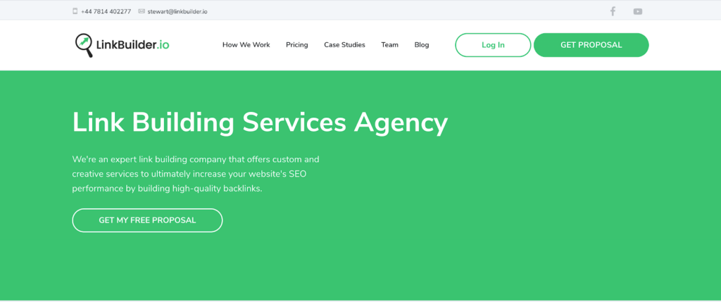
Linkbuilder.io

Linkbuilder.io is one of the best-known global white-hat link building agencies. They create case-by-case strategies, keeping in mind industry, and competitors, to build a successful link building strategy.  

Their process starts by analyzing the competitors, keywords, existing links, and content, to understand the current status. Once that’s done, they work on a custom link building strategy to help them with prospecting, outreach, and relationship development.  

If you’re looking for a team of professionals, who show results to work with you, Linkbuilder.io would be one of our first picks. 

Page One Power 

Page One Power is another strong link building company. They start their process from the viewpoint each site has unique needs to build a successful link building strategy. They develop their campaigns based on their research and KPIs to meet the specific needs of their clients and acquire the best links possible.  

They create content that high authority sites would want to link to, in their clients’ niche, and use their extensive research to determine what would create the best impact and build their strategy on that.  

After you reach out to them, they will set up a 15-minute discovery call to understand your pain points and where you are regarding SEO, set up a proposal, and assign your project manager who will be working with you. 

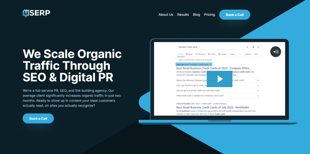
uSERP

uSERP is a full service digital PR, SEO, and link building company, focusing on high quality link building on their strategy. They believe in quality over quantity when it comes to backlinks, focusing on +60 DR backlinks for their clients.  Using different modalities on link building, they use white-hat, outreach and content-driven processes.  They believe links aren’t built, they are earned through creating unique, relevant content.  

They offer services to start-ups, solopreneurs, and enterprise companies, working with some of the big guns like Monday.com, Robinhood, ActiveCampaign, Hotjar, and Freshworks.

The Upper Ranks

Upper Ranks is a link building agency that covers everything from manual outreach to broken link building. They’re specializing in delivering quality leads at scale.  They have a team of experts, focusing on helping their clients increase their SERP ratings.  

Rhino Rank

Rhino Rank is a link building company registered in the UK, providing guest posts and curated links for their clients.  They have a two-step process, where they analyze and identify the pages based on your niche, and then reach out to the website owners to secure either link placement or guest posts for their clients.  

They’re serving 200+ agencies globally, including Forbes, and The Huffington Post.  Their services start from $35

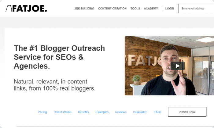
FatJoe

FatJoe is another great link building company that impresses us with its results.  Not only do they have the usual white-hat outreach services, they also have a white label feature, where you can also sell their services under your name.  

As we mentioned, having great content isn’t effective if other bloggers or websites don’t know it exists.  FatJoe is a great ally in blogger outreach.  Their experts identify blogs relevant to your niche and reach out directly to evaluate suitable opportunities, create content and report their efforts.  

Their services start from $45 for acquiring links from websites with DA’s between 10 and 50.  

Siege Media

Siege Media is a content marketing agency, focusing on SEO. They say they’re generating links at the scale that Google loves. They crate and rank content to drive quality links, business value, and brand recognition.  Knowing one-off traffic spikes to your website won’t have a lasting impact, their philosophy is building assets that will generate links consistently. A link generation engine that will only need you to feed new content over time.  

They’re working with dot com giants like Trip Advisor, Airbnb, and Zillow, however, we couldn’t find much information regarding their pricing. 

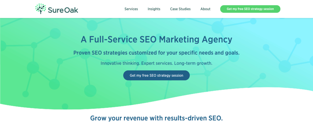
Sure Oak

Sure Oak is a Search Engine Optimization company, that offers stellar link building services.  They help their clients with custom link building, digital PR, and EDU link building.  

What caught our eye when looking into Seige Media is their EDU link building feature.  They create scholarship links to acquire backlinks from reputable, high DA universities. Getting even one backlink from a reputable university website would increase the authority of your website in the eyes of Google. 

From The Future

From the Future, is another digital marketing agency that excels in link building.  They help their clients with a number of services to speed up lead generation, growth, and customer acquisition.  

They test out different link types depending on your campaign to get the best results, reporting their progress monthly, 

Higher Visibility

HigherVisibilty is another marketing agency that offers link building services to their clients.  They use white-hat link building strategies to increase the visibility of their clients and increase their authority by acquiring high quality links from high DA websites.  

Their team uses digital PR, outreach services, and unique content development to increase their client’s domain authority in the eyes of Google. They report their progress and results monthly, detailing the links they’ve generated, and how the campaign is going.

Conclusion

The times of buying low-quality bulk links from marketplaces are long gone.  Now is the time for high authority, relevant links.  It might be hard to understand with all the constant changes but by now we all know Google’s Page Rank Algorithm puts more value on quality over quantity when it comes to backlinks.  

If you’re looking to increase your SERP rankings, building backlinks is an inescapable part of your strategy. It needs to be done, and it needs to be done right. It might look easy at first glance, but building links take a lot of time and effort. From prospecting to outreach, to content creation it is a long process.  That’s why we believe it’s best to leave it to experts.  Working with a link building company will save you time and energy to work on other parts of your strategy.  

Link building companies work with SEO, outreach and content experts to create a unique link building strategy, choose the best websites to contact and build relationships with, and implement and report the results of their services to you. We hope this list helps you choose the best link building company for your needs. 

The post Best Link Building Companies 2022 Edition ( The Editor’s List ) appeared first on noupe.

Categories: Others Tags:

Top 11 Content Marketing Agencies ( The Editor’s List )

May 17th, 2022 No comments

Content marketing is a strategic approach to marketing that focuses on brand awareness and creating and distributing valuable content to attract an audience. In the modern era of the internet, traditional marketing is losing value over time. Content marketing agencies can generate more revenue and cost less than traditional marketing.

Companies that have a digital business cannot overlook the importance of having a strong online presence. If you want to increase the performance of your site, attract a userbase on social media, or get more clicks through search engines, you will surely benefit from letting professionals handle the work.

Developing the perfect content marketing strategy is not easy. That’s why it’s crucial to choose the right agency that aligns with your goals and objectives. We’ve compiled a list of all the content marketing agencies that we think will help you engage your audience with content that supports not only your brand but also become a service that you can trust your audience with. You can be sure that we weren’t not influenced in any way by the companies on this list. These are just some that we have gotten to know and trust over the years.

Fractl

Fractl is a company that uses a mix of technical SEO, content generation, and digital PR strategies to help businesses improve their organic search results. They generate engaging, data-driven content that can earn you traffic and links from trusted publishers on the web. Basically, they drive organic search growth.

Column Five

Column Five specializes in content marketing for SaaS startups in the growth stage. They assist teams in scaling their marketing efforts. They have a unique approach to content as they use the power of storytelling to increase engagement and create meaningful experiences for users. They are a very determined group of professionals who want to put out consistent content that is fit for your brand.

Brafton

Brafton is an all-out, full-service content marketing agency. From creating to distributing, they will lift your brand to new marketing heights. They have many happy clients who tell their stories about how working with them led to faster sales, higher engagement, and tangible ROI. 

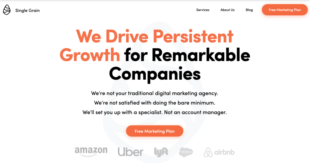
Single Grain

Single Grain is an agency that is known for creating high-quality content that converts. They believe that conversion is not just a science but an art. It requires talented writers and knowledge of new SEO tactics. Anyone can write a blog post, but a great-performing article requires a team of sophisticated copywriters, editors, graphic designers, and marketers. Single Grain suggests that they offer it all.

Foundation Inc

Foundation focuses on B2B content development, creation, and distribution. They work with ambitious B2B businesses that are rapidly expanding. Their services include many forms of content such as copywriting, blog writing, 

Scripted

Scripted is a service that helps you find and hire freelance writers to improve your content. Their SmartMatch Technology makes it easy to find the perfect writer for your business. They categorize their freelance writers by industry, skill set, and experience so you can find a suitable writer that fits your content creation needs. Quality content generation can become difficult when your organization is growing fast and moving into new areas. Hiring a copywriter can lessen your burden and allow you to scale up quickly while making sure your content is improving your SEO.

Over The Top SEO

OTT SEO offers top-of-the-line content management for your website. Creating content is just a small part of the whole process. Once your content is out there for the world to see, someone must be on call at all times to regularly update your content so it won’t devalue over time. OTT creates the content for you and manages it afterwards. Especially when it comes to social media accounts. Those need to be updated all the time so you can keep your audience engaged.

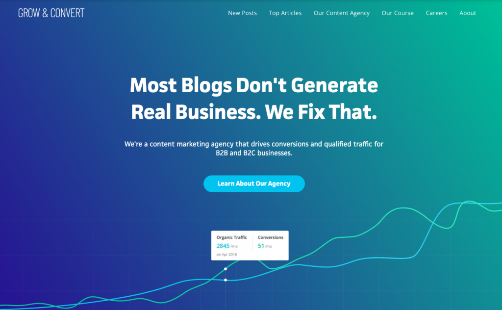
Grow and Convert

If you are looking to completely outsource your content creation and management, Grow and Convert can do it for you. They take over your company blog and produce quality content to bring leads and boost conversion. Your strategy will be taken care of as well as your promotion phase. Think of them as an extension of your marketing team. They have over a decade of experience in content marketing and have many clients who are founders of digital marketing companies.

WebFX

One of the biggest full-scale marketing agencies is WebFX. It is currently one of the most visited sites in the industry. They are so huge that you can get services ranging from website design to social media services and content marketing strategies. It is mainly geared towards professionals and large companies who want to focus their efforts on other objectives and let WebFX confidently handle their SEO approach.

Thrive

Thrive Internet Marketing Agency includes SEO content-creating services you can use to boost conversions. They will help you with video marketing so you can share your brand’s story with your audience and capture their attention. They also dabble in content writing so you can hand off that part of your workflow over to them too. Thrive has tons of services to choose from and they have been boosting their user’s sites for over 15 years. 

SocialSEO 

SocialSEO is used by many small businesses that want to improve their local SEO and improve local search results. Large businesses tend to focus more on competitive keywords. They specialize in PPC, SEO, and social media. They have been fully committed to helping clients improve their rank in search engines and market their brand. Organize your digital strategy with their content experts and see your brand excel in your industry.

Conclusion

We hope this list helps you to choose the correct content marketing agency for your business. Whether you choose to outsource your content or keep it in-house, These agencies are the best at what they do and you won’t regret using them. As you research all of these companies, you will find that they slightly differ from one another and you can use them each individually for a specific part of your content strategy. 

Content marketing is a powerful approach to SEO and the more comfortable you are with the content that you put out, the more likely people will be to click on your page. Start generating leads and traffic while also focusing on the core aspects of your organization with the help of a professional content marketing agency.

The post Top 11 Content Marketing Agencies ( The Editor’s List ) appeared first on noupe.

Categories: Others Tags:

The career path for a web developer in 2022

May 17th, 2022 No comments

Web development trends are uprising in the marketplace. There has been a huge demand for web developers in the market. Now the question is, what should be the career path of an aspiring web developer? As a beginner, one must have a lot of questions in mind. What are the skills required? From where can one learn the skills? How long would it take to land a job? Is freelancing an option? 

So, in today’s article, we are going to talk about the basics of web development and what should be the career path of a web developer in 2022. If you are looking for frontend web developer jobs or backend jobs, this article will clear out a lot of your queries. 

Who is a web developer?

A web developer is someone who builds websites. There are different roles that a web developer can have. For example: 

  1. Front End Developer
  2. Back End Developer
  3. Full-Stack Developer

Career Path of Web Development – How to become a Developer?

The steps to becoming a web developer are not very complicated. All that you need is time, effort, and patience. Overall, it is your journey of becoming a web developer right from scratch. 

1. Learn the basics of Web Development

You need to know the basics of frontend development. Having sound knowledge of HTML and CSS are also necessary. Learning these is quite easy. You would need a week to brush up on the basics. So, one needs to know how to frame the web page’s structure so that it is clear how to create a great interface. 

It is also essential to know about the working of the web. Many materials and resources will help you learn about it. 

2. Select a kind

So once you are aware of the basics, you will be curious to know how to build a website. At this point, you will have to face questions such as whether you want to be a frontend developer or a backend developer. By now, you should know the difference between a front-end developer and back end developer. So you will have to decide whether you want to be involved in designing an interface or if you want to work at the backend. It is considerably easy to work in the front end, but you must know about user experience and ways of improving user experience. Again, if you are working as a backend developer, you have to know everything about the backend servers and other relevant operations of scripts. As a full-stack developer, you must have sound knowledge about both frontend and backend development. Basically, a full-stack developer has complete knowledge about building a website. 

3. Select a Language

Now before we talk about the list of programming languages that have applications in web development, we would like to talk about the various markup languages such as HTML, CSS, and Javascript. These are the most common programming languages, which makes them suitable for one to build projects. An ample number of languages are available, and each one comes with a set of features. These languages are: 

  1. Javascript
  2. Python
  3. PHP
  4. Ruby
  5. C#
  6. Swift
  7. Kotlin

Your primary focus needs to be on CSS, HTML, and javascript. Once you gain enough knowledge and have got a few demos, you can move ahead for specialization. You also have to know about SQL if you have to work with databases at the backend. It is not difficult, and many courses can help you learn about databases.

4. Process of Learning Web Development

Now comes the real question of learning about web development. There is no end to the courses that we need to learn as a part of web development implementation. While most of these courses are free, though many offer certification programs, you can get them as a token of appreciation or referral from employees. However, what mainly matters is your knowledge. So, there is no problem as long as you have enough knowledge. You can learn and implement it through your work. 

5. Build Projects on Web Development

Once you know about the basics of web development and languages such as HTML, CSS, Javascript, and other design and structures, you need to start working on various projects. It does not have to be something very complicated. But one must emphasize trying out something new. As you keep learning, such projects will become a part of your portfolio. You can present these during your interviews which will help showcase your talent. You will be sure that your interviewers would like to know more about your specialization and development process. As you keep learning, try working on real-life projects. This will help you build a handful of projects and take up challenges. As you keep solving these, you get to learn more and more. So, basically, you will be honing your skills with every new project and every new challenge. 

6. Apply for Positions

Once you have got a portfolio of projects, you do have a good chance of getting recognized in the web development industry. You can apply to every small and large business. But always remember to keep learning on the go. As you keep working on projects, there is no end to learning as new developments happen every now and then.

How to Become a Web Developer in a short duration of time?

There are a number of platforms where you learn coding in the minimal time possible. Most of these have different teaching methodologies and provide you with hands-on experience for an easy learning process. So as you keep learning, you will, by default, get ready for a job in less than three months. Most people come from a technology background or have a high degree before coming to this field. However, it might be possible that you come from a completely different background. The good thing is you can still excel in this domain. You can either learn in a self-paced environment, or you can learn from scratch or take up courses and degree programs.

Conclusion

So, if you seriously want to be a web developer, you will have to hone your skills first. Prepare yourself and gain enough experience before you look for clients or sit for an interview. If needed, work with experts for no payment just to learn. This will give you a chance to improve your skills and land a good job.

The post The career path for a web developer in 2022 appeared first on noupe.

Categories: Others Tags:

Improving Icons for UI Elements with Typographic Alignment and Scale

May 17th, 2022 No comments
Screenshot of the site messaging element. It is overlayed with a red-dashed line indicating the icon's top edge and a blue-dashed line indicating the text's topmost point. The red-dashed line is slightly higher than the blue-dashed line.

Utilizing icons in user interface elements is helpful. In addition to element labeling, icons can help reinforce a user element’s intention to users. But I have to say, I notice a bit of icon misalignment while browsing the web. Even if the icon’s alignment is correct, icons often do not respond well when typographic styles for the element change.

I took note of a couple real-world examples and I’d like to share my thoughts on how I improved them. It’s my hope these techniques can help others build user interface elements that better accommodate typographic changes and while upholding the original goals of the design.

Example 1 — Site messaging

I found this messaging example on a popular media website. The icon’s position doesn’t look so bad. But when changing some of the element’s style properties like font-size and line-height, it begins to unravel.

CodePen Embed Fallback

Identified issues

  • the icon is absolutely positioned from the left edge using a relative unit (rem)
  • because the icon is taken out of the flow, the parent is given a larger padding-left value to help with overall spacing – ideally, our padding-x is uniform, and everything looks good whether or not an icon is present
  • the icon (it’s an SVG) is also sized in rems – this doesn’t allow for respective resizing if its parent’s font-size changes

Recommendations

Indicating the issues with aligning the icon and typography.

We want our icon’s top edge to be at the blue dashed line, but we often find our icon’s top edge at the red dashed line.

Have you ever inserted an icon next to some text and it just won’t align to the top of the text? You may move the icon into place with something like position: relative; top: 0.2em. This works well enough, but if typographic styles change in the future, your icon could look misaligned.

We can position our icon more reliably. Let’s use the element’s baseline distance (the distance from one line’s baseline to the next line’s baseline) to help solve this.

Screenshot of the site messaging element. It is overlayed with arrows indicating the baseline distance from the baseline of one line to the next line's baseline.
Calculating the baseline distance.

Baseline distance is font-size * line-height.

We’ll store that in a CSS custom property:

--baselineDistance: calc(var(--fontSize) * var(--lineHeight));

We can then move our icon down using the result of (baseline distance – font size) / 2.

--iconOffset: calc((var(--baselineDistance) - var(--fontSize)) / 2);

With a font-size of 1rem (16px) and line-height of 1.5, our icon will be moved 4 pixels.

  • baseline distance = 16px * 1.5 = 24px
  • icon offset = (24px16px) / 2 = 4px

Demo: before and after

CodePen Embed Fallback

Example 2 – unordered lists

The second example I found is an unordered list. It uses a web font (Font Awesome) for its icon via a ::before pseudo-element. There have been plenty of great articles on styling both ordered and unordered lists, so I won’t go into details about the relatively new ::marker pseudo-element and such. Web fonts can generally work pretty well with icon alignment depending on the icon used.

CodePen Embed Fallback

Identified issues

  • no absolute positioning used – when using pseudo-elements, we don’t often use flexbox like our first example and absolute positioning shines here
  • the list item uses a combination of padding and negative text-indent to help with layout – I am never able to get this to work well when accounting for multi-line text and icon scalability

Recommendations

Because we’ll also use a pseudo-element in our solution, we’ll leverage absolute positioning. This example’s icon size was a bit larger than its adjacent copy (about 2x). Because of this, we will alter how we calculate the icon’s top position. The center of our icon should align vertically with the center of the first line.

Start with the baseline distance calculation:

--baselineDistance: calc(var(--fontSize) * var(--lineHeight));

Move the icon down using the result of (baseline distance – icon size) / 2.

--iconOffset: calc((var(--baselineDistance) - var(--iconSize)) / 2);

So with a font-size of 1rem (16px), a line-height of 1.6, and an icon sized 2x the copy (32px), our icon will get get a top value of -3.2 pixels.

  • baseline distance = 16px * 1.6 = 25.6px
  • icon offset = (25.6px32px) / 2 = -3.2px

With a larger font-size of 2rem (32px), line-height of 1.2, and 64px icon, our icon will get get a top value of -12.8 pixels.

  • baseline distance = 32px * 1.2 = 38.4px
  • icon offset = (38.4px64px) / 2 = -12.8px

Demo: before and after

CodePen Embed Fallback

Conclusion

For user interface icons, we have a lot of options and techniques. We have SVGs, web fonts, static images, ::marker, and list-style-type. One could even use background-colors and clip-paths to achieve some interesting icon results. Performing some simple calculations can help align and scale icons in a more graceful manner, resulting in implementations that are a bit more bulletproof.

See also: Previous discussion on aligning icon to text.


Improving Icons for UI Elements with Typographic Alignment and Scale originally published on CSS-Tricks. You should get the newsletter.

Categories: Designing, Others Tags:

Exciting New Tools for Designers, May 2022

May 16th, 2022 No comments

The underlying theme of this month’s collection of new tools and resources is development. Almost every tool here makes dev a little easier, quicker, or plain fun. There are a few great tutorials in the mix to help you get into the spirit of trying new things and techniques.

Here’s what is new for designers this month…

Cryptofonts

Cryptofonts is a huge open-source library of icons that represent cryptocurrencies. There are more than 1,500 CSS and SVG elements in the collection. Cryptofonts includes all scalable vector icons that you can customize by size, color, shadow, or practically anything else. They work with Sketch, Photoshop, Illustrator, Adobe XD, Figma, and Invision Studio, and there’s no JavaScript.


Reasonable Colors

Reasonable Colors is an open-source color system for building accessible and beautiful color palettes. Colors are built using a coded chart. Each color comes in six numbered shades. The difference between their shade numbers can infer the contrast between any two shades. The differences correspond to WCAG contrast ratios to help you create an accessible palette. This is a smart project and a valuable tool if you work on projects where color contrast and accessibility are essential (which is all of them).


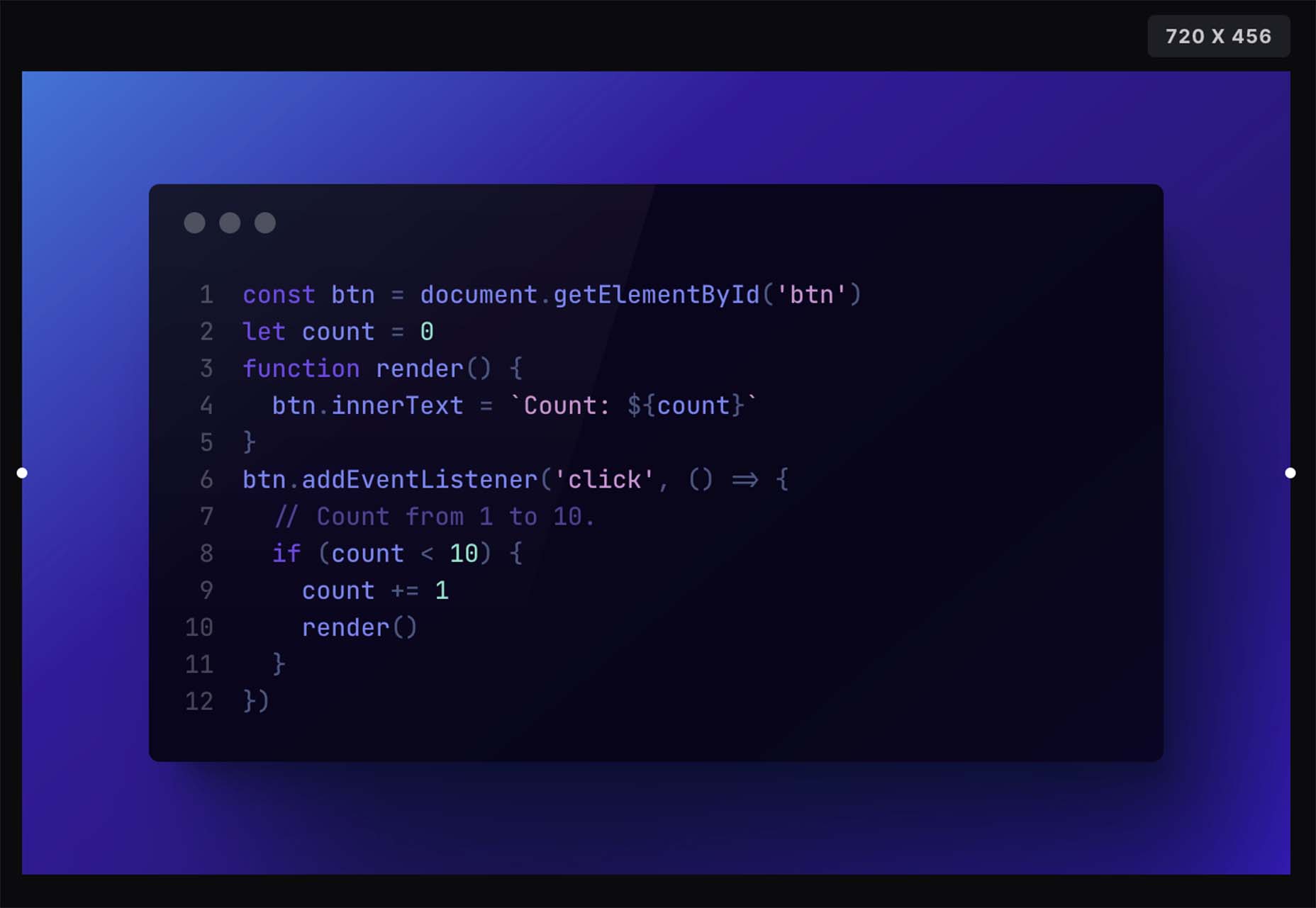
Chalk.ist

Chalk.ist is a fun tool to make your code snippets look amazing. Add your code (there’s a vast language selector), pick some colors and backgrounds, and then download it as a shareable image. Your code has never looked so beautiful!


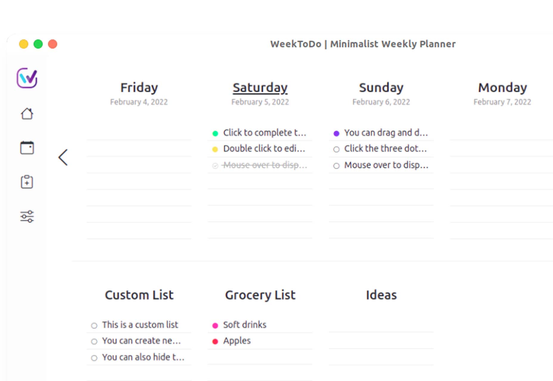
WeekToDo

WeekToDo is a free minimalist weekly planner. Improve productivity by defining and managing your week and life easily and intuitively. Plus, this tool is focused on privacy with data that is stored on your computer (in your web browser or the application). The only person who has access to it is you.


Bio.Link

Bio.Link is a tool that collects all your links – from social media to blog posts to any other kind of link you want to share. It’s free to use, includes 15 design themes, visitor stats, and is super fast.


Spacers

Spacers are a set of three-dimensional space characters that you can use in projects. Characters are in multiple poses and ultra high-def formats to play with.

11ty

11ty is a super simple, static website generator. Try it for small projects and read the documentation to see everything you can do with this tool.

Scrollex

Scrollex is a react library that lets you build beautiful scroll experiences using minimal code. You can create scroll animations in all kinds of combinations – vertical, horizontal, almost anything you want to try. The documentation is fun and easy to understand if you’re going to see how it works.

GetCam

GetCam is an app that lets you turn your smartphone into a webcam for your computer. It works with any iPhone and a Mac or Windows computer. It works with most video conference and streaming tools as well as browser-based apps.

Flatfile

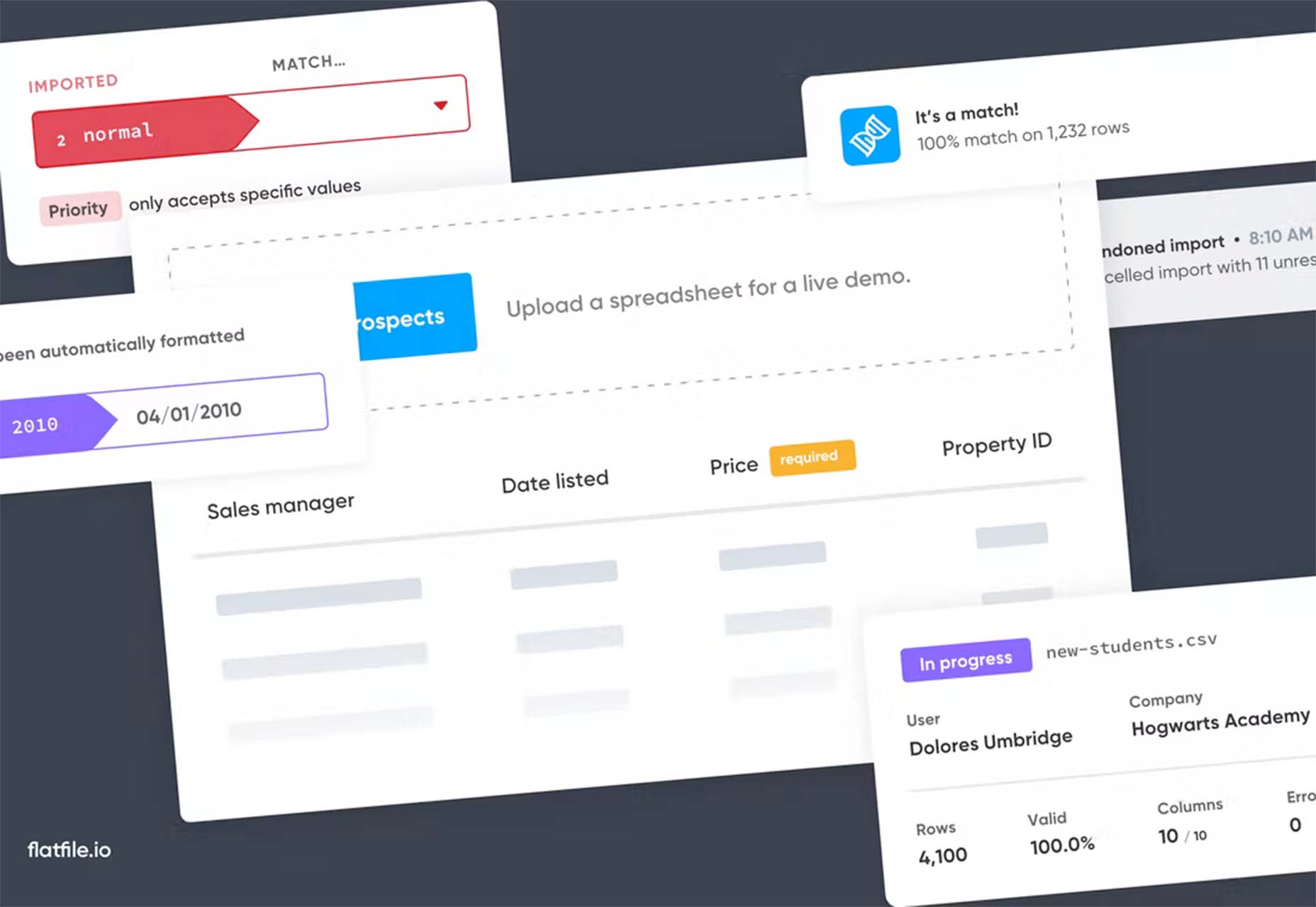
Flatfile is a data onboarding platform that intuitively makes sense of the jumbled data customers import and transforms it into the format you rely on. You won’t have any more messy spreadsheets or have to build a custom tool.

Loaders

Loaders is a collection of free loaders and spinners for web projects. They are built with HTML, CSS, and SVG and are available for React and copypasta.

Lexical

Lexical is an extensible JavaScript web text-editor framework emphasizing reliability, accessibility, and performance. It’s made for developers, so you can easily prototype and build features with confidence. Combined with a highly extensible architecture, Lexical allows developers to create unique text editing experiences that scale in size and functionality.

Picture Perfect Images with the Modern img Element

This tutorial is a primer on why the img element is such a powerful tool in your development box. Images are so prominent that they are part of the most important content in over 70% of pages on both mobile and desktop, according to the largest contentful paint metric. This post takes you through how to better optimize and improve core web vitals simultaneously.

Building a Combined CSS-Aspect-Ratio-Grid

Building a Combined CSS-Aspect-Ratio-Grid provides two solutions for creating the title effect. You can define an aspect ratio for the row or use Flexbox with a little flex grow magic. Learn how to try it both ways.

QIndR

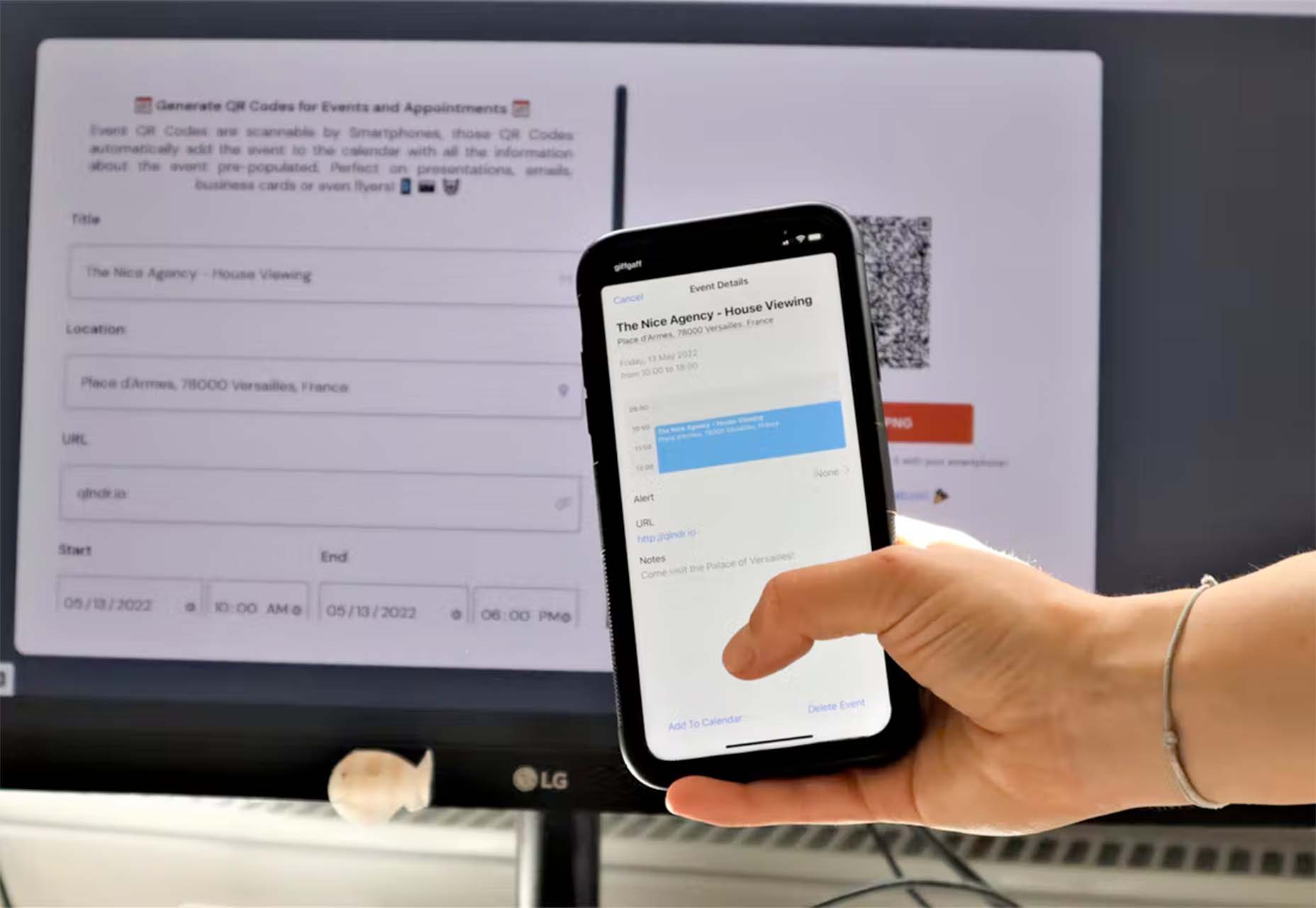
QIndR is a QR code generator made for events and appointments. The form is designed to capture your event information so you can quickly build and use a QR code for listings and even allow users to add it to their calendars! It’s super quick and easy to use.

On-Scroll Text Repetition Animation

On-Scroll Text Repetition Animation shows you how to create an on-scroll animation that shows repeated fragments of a big text element. This is a fun and easy lesson that you can use right away.

Eight Colors

Eight Colors won’t do anything for your productivity, but it is a fun game that you may not be able to stop playing. It is a block-shifting game with the goal to shift circular blocks to reach the target given.

Creative Vintage

Creative Vintage is a pair of typefaces including a thin script and vintage slab serif (with rough and smooth styles). The pair is designed to work together for various uses or can be used independently.

Hardbop

Hardbop is a vintage-style typeface with a lot of personality. It would work great for display, and the family includes seven full-style character sets.

Kocha

Kocha is a funky ligature-style typeface perfect for lighter design elements, including logos or packaging. It includes clean and rough versions.

Magnify

Magnify is a large font family with 16 styles and plenty of fun alternates. You can use it straight or with the more funky styles that create less traditional character forms.

Stacker

Stacker is a fun and futuristic style font with a triple outline style. Use it for display when you really want to make an impression.

Source

The post Exciting New Tools for Designers, May 2022 first appeared on Webdesigner Depot.

Categories: Designing, Others Tags:

How to Use Your Digital Calendar More Efficiently

May 16th, 2022 No comments

Digital calendars, while extremely useful, can be underutilized. This is largely due to there being an overwhelming amount of digital calendars, each with their own uniquely efficient features. These features may include software integrations, personalized customizations, automated scheduling and shared calendars.

The efficiency features below are discussed in detail to give you a better understanding of just how helpful each of them can be. Besides easing the stress that busy schedules can cause, these features will also help you get more out of your digital calendar. After all, spending less time on scheduling gives you more time to do the things you love. So, here are a few simple ways to use your digital calendar more efficiently.

Utilize Software Integration Features

Software integration features are a must if you want to make the most of your digital calendar and free up some time. In a world of software integrations, why not utilize all that is available at your disposal? The more you can take advantage of automation, the more time you can free up for yourself and others.

Let’s say the calendar you use is Outlook Calendar. Microsoft Cortana, an AI software that is included in many Microsoft devices, integrates with that. Furthermore, by integrating Cortana, you can verbally schedule events to your Outlook Calendar. There are many other software integrations that are compatible with Outlook Calendar as well, like ScheduleOnce, Calendar, and QuickBooks. 
Implement Customizations

For the same reasons we adjust our rearview mirrors, we should also adjust our calendars so we can see what we need to in order to navigate successfully. Calendar customizations are a creative way to combine your schedule with your personal preferences so you can have what you need to be successful. 

Many digital calendars offer unique customizations; like being able to set color themes, customize notification settings, and even view the weather. These are just a few of the many customizations a digital calendar could offer. Honestly, customizations can really be a game-changer.

Consider Collaboration Options

Collaborating with others by means of sharing your schedule, for example, allows you to dodge the communication mishaps altogether. When you share your calendar, others can see your availability, and vice versa. Shared calendars are great for large-scale scheduling purposes, like work meetings, sporting events, class schedules, and other recurring events that thrive on successful collaboration.

Shared calendars are also useful for the times you’re only scheduling events with one or two other people. This is because you can simply see when they are busy and won’t need to ask. Just as you can see when they are busy, you can also see when they are free. This way, you can easily coordinate events with them during a mutually convenient time slot to avoid scheduling errors. Being able to share your calendar enables planning to go so much more smoothly.

Wrapping Up

No matter which type of digital calendar you decide to use, there are always some hacks to help you streamline events with ease. Moreover, by implementing the seemingly endless quantity of features available to you, you will be well on your way to utilizing your digital calendar more efficiently.

Overall, just know the impact your calendar has on your time, and understand what it is capable of when used to its fullest. While there are many digital calendars available to choose from, the most important thing to consider is how to choose one that will enable you to be as efficient as possible with your time. 

The post How to Use Your Digital Calendar More Efficiently appeared first on noupe.

Categories: Others Tags: