Archive

Archive for June, 2022

How Content Scoring Can Help Generate Revenue

June 22nd, 2022 No comments

Content marketing has become an increasingly popular way for brands to promote themselves. It is subtle and generates more leads than traditional marketing. 

However, it is vital to analyze how effective those methods are when trying new methods. So, how do companies determine the ROI of their content creation methods?

That is where content scoring comes in. By scoring your content, you can assess how well it is performing and how to improve it. 

In this blog, we look at what content scoring is and how well-designed scoring systems help generate revenue

What is Content Scoring?

Under content scoring, individual pieces of the content are tracked to see how they would perform in generating and converting leads. How high your content scores determine its true potential as a promotion. 

Your content score is highly subjective as different content types suit different customers. For example, a beginner would be more attracted to blog posts, whereas qualified prospects would look for case studies or analysis. 

Thus, once you recognize your target audience, you can determine what type of content you are aiming for. Some essential components have to be included in articles and depend on the type of article. The better you integrate those components, the better your content scores. 

How Does Content Scoring Help Your Company?

You cannot improve what you do not measure. 

As marketers continue to rely on content marketing, it is crucial to find out what is working and what isn’t. Content scoring streamlines content generation processes. It also ensures that you can achieve your marketing goals most efficiently. 

Some ways in which content scoring helps companies are:

1. Providing Actionable Insights

Content scoring helps you and your team pre-determine the quality of an article. So, you no longer have to rely on guesswork to assess whether an article is ready for publishing or not. 

Moreover, tracking page views and optimizing content helps you see what kind of articles are preferred. You can leverage this knowledge to determine when to publish what article.

2. Creating High-Quality Content

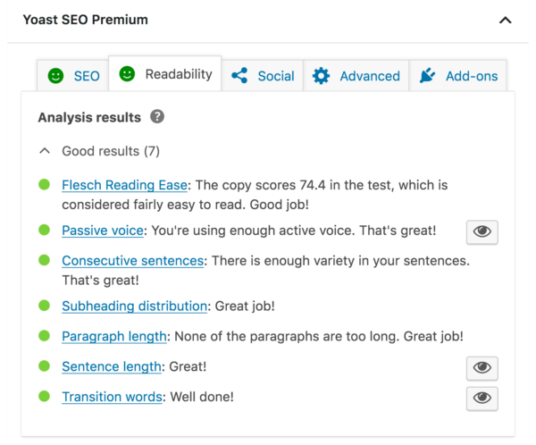
Content scoring tools and systems are designed to see how well your article will perform. 

Articles with good scores:

  • Have a high readability score
  • Use active voice as much as possible
  • Have even subheading distribution
  • Use an ideal amount of transition words
  • Maintain an ideal keyword density for SEO

Most content scoring tools are designed to explain why you may have a low score. Hence, you can use these tools to improve the quality of your article. 
Source: blog.hubspot.com

3. Establishing Brand Image and Leadership

As more and more companies invest in content marketing, there is an astonishing amount of content available on the internet. To stand out, your content has to be of very high quality. 

Besides, scoring your content helps you establish consistency and increase reach enough for your brand to become associated with the target keyword. 

Also, high-quality content is more engaging for your audience. It compels audiences to keep your business on top of their minds every time they see the keyword. 

Developing a Scoring Methodology

There are a plethora of different scoring processes out there. Some are simple; others not so much. So, how do you tell a suitable scoring method apart from a bad one? And how do you develop a good one to maximize ROI?

When you begin scoring a piece of released content, you can score it based on downloads, page visits, or bounce rates. 

However, how well a released piece of content does in those criteria cannot assess the quality of the to-be-published ones. 

These criteria may help you understand where you stand, but they do not tell you how to improve your standing. In content scoring, you need methods that will help you improve. Thus, a suitable scoring methodology will encourage appropriate action.

Take a look at some of the scoring methods that help you evaluate the quality of content that is about to be published:

1. Flesch Readability Score 

The Flesch readability score has a formula based on total words, sentences, and syllables. It evaluates the ease with which your content can be read. 

Moreover, higher readability scores are preferred. They point towards more easily readable articles, and clarity is always good for audience engagement. 

To get better readability scores, reduce the length of your sentences and words. Simplicity is key.

2. Search Engine Optimization (SEO)

Optimized articles contain the ideal density of keywords throughout your article. Hence, they appear more efficiently when a user searches for the keyword. 

Some of the best tips for optimizing a keyword in your article are:

  • Include relevant primary and secondary keywords throughout your article
  • Optimize your page title and meta description by using primary keywords
  • Write quality content that is not plagiarized to make it more engaging

How to Make Your Content Score Higher?

Content is a crucial part of the relationship between a business and its customers. Some of the ways to make your content score higher are:

  • Creating high-quality content means making it as engaging as possible for your audience. You should identify your target audience and write articles that appeal to their understanding level and goals to achieve this. 
  • Using targeted keywords and distributing them throughout your article makes finding them on the web more accessible. It also optimizes your articles and helps your audience associate your brand name with the keywords.
  • Using an active voice as much as possible helps create more engaging articles. 
  • Writing shorter sentences and easy-to-understand language helps improve the readability of your articles. The readability score shows whether your article is appropriate for the age range of your target audience. 
  • Optimize your article titles to capture more attention. Shorter titles or titles that include numbers have higher click-through rates. 

Final Words

Scoring your content will instantly give your content marketing strategies the boost they need to generate better revenue. 

Content scoring helps you analyze your articles before publishing. Hence, you can estimate how much attention it will attract and the leads it will generate. Content marketing is a powerful tool that can often convert leads as well. 

Thus, with the correct scoring systems, your business booms with high revenue returns.

The post How Content Scoring Can Help Generate Revenue appeared first on noupe.

Categories: Others Tags:

7 UX Laws You’Re Probably Getting Wrong

June 20th, 2022 No comments

UX laws are an invaluable tool, providing guidelines for designers that ensure we don’t have to continually reinvent the wheel when crafting experiences for the web.

However, UX laws tend to be devised by scientists and psychologists — people who are more than comfortable with the exceptions and allowances of academic language. By the time they filter down to us in the trenches, the language has invariably been over-simplified, and the wisdom behind the idea diluted.

Today we’re going to look at seven well-known and commonly cited rules of UX design that too many designers get wrong.

1. Jakob’s Law

Jakob’s Law, named for the UX researcher Jakob Nielsen, states that users spend most of their time on other sites and as a result prefer sites that work the same way as the sites they already know.

Jakob’s Law has often been used to limit experimentation and encourage the adoption of common design patterns in the name of usability.

However, the word ‘prefer’ is hugely loaded. While it’s true that a user will more easily understand a familiar design pattern, they do not necessarily prefer familiar experiences.

It has been widely proved that new experiences boost our mood and that new experiences improve our memory. If your goal is a memorable site that leaves users with a positive impression, introducing novelty is a sound decision.

2. Goal Gradient Hypothesis

The Goal Gradient Hypothesis assumes that the closer users are to their goal, the more likely they are to complete it.

It’s an attractive theory, especially in e-commerce, where it is often used to justify simplifying the initial purchase process and postponing complexity to move users along the funnel — a typical example is leaving shipping charges until the final step.

However, anyone who has studied e-commerce analytics will know that cart abandonment is a huge issue. In North America, shopping cart abandonment is as high as 74%.

We don’t always know what the user’s goals are, and they may not match ours. It may be that users are treating your shopping cart as a bookmark feature, it may be that they have a last-minute change of heart, or they may be horrified by the shipping charges.

While providing a user with an indication of their progress is demonstrably helpful, artificially inflating their proximity to your preferred goal may actually hinder conversions.

3. Miller’s Law

Never in the whole of human history has any scientific statement been as misunderstood as Miller’s Law.

Miller’s Law states that an average person can only hold seven, plus or minus two (i.e., 5–9) items in their working memory. This has frequently been used to restrict UI navigation to no more than five items.

However, Miller’s Law does not apply to items being displayed. While it’s true that too many options can lead to choice paralysis, a human being is capable of considering more than nine different items.

Miller’s Law only applies to UI elements like carousels, which have been widely discredited for other reasons.

4. Aesthetic-Usability Effect

Edmund Burke once said, “Beauty is the promise of happiness.” That belief is central to the Aesthetic-Usability Effect, which posits that users expect aesthetically pleasing designs to be more usable.

Designers often use this as a justification for grey-on-grey text, slick animations, and minimal navigation.

Critical to understanding this is that just because users expect a design to be usable does not mean that it is or that they will find it so. Expectations can quickly be dashed, and disappointment often compounds negative experiences.

5. Peak-End Rule

The Peak-End Rule states that users judge an experience based on how they felt at the peak and the end, rather than an average of the experience.

Designers commonly use the Peak-End Rule to focus design resources on the primary goal of each experience (e.g. adding an item to a cart) and the closing experience (e.g. paying for the item).

However, while the Peak-End Law is perfectly valid, it cannot apply to open experiences like websites when it is impossible to identify a user’s starting or ending point.

Additionally, it is easy to see every interaction on a website as a peak and even easier to make assumptions as to which peak is most important. As such, while designing for peaks is attractive, it’s more important to design for exceptions.

6. Fitts’ Law

In the 1950s, Paul Fitts demonstrated that the distance to, and size of a target, affect the error rate of selecting that target. In other words, it’s harder to tap a small button and exponentially harder to tap a small button that is further away.

UX designers commonly apply this law when considering mobile breakpoints due to the relatively small viewport. However, mobile viewports tend not to be large enough for any distance to affect tap accuracy.

Fitts’ Law can be applied to desktop breakpoints, as the distances on a large monitor can be enough to have an impact. However, the majority of large viewports use a mouse, which allows for positional corrections before tapping.

Tappable targets should be large enough to be easily selected, spaced sufficiently, and tab-selection should be enabled. But distance has minimal impact on web design.

7. Occam’s Razor

No collection of UX laws would be complete without Occam’s Razor; unfortunately, this is another law that is commonly misapplied.

Occam’s Razor states that given any choice, the option with the least assumptions (note: not necessarily the simplest, as it is often misquoted) is the correct choice.

In an industry in which we have numerous options to test, measure, and analyze our user interfaces, you shouldn’t need to make assumptions. Even when we don’t need extensive UX testing, we can make decisions based on other designers’ findings.

Occam’s Razor is a classic design trap: the key to avoiding it is to recognize that it’s not your assumptions that matter, it’s the users’. As such, Occam’s Razor applies to a user’s experience, not a design process.

Source

The post 7 UX Laws You’Re Probably Getting Wrong first appeared on Webdesigner Depot.

Categories: Designing, Others Tags:

6 In-demand Marketing Skills for Your Design CV

June 20th, 2022 No comments

In today’s tech-savvy world, being a great designer is not all about being a whiz at tools such as Adobe Photoshop and Adobe Illustrator.

The job is getting increasingly demanding, as businesses creating a marketing strategy fight to stay on their toes to catch the most eyeballs and attract viable leads. Customers are getting increasingly drawn to digital media, which includes websites, social media, mobile applications and more. With more channels – that’s interactive design, websites, among many others – a business or marketing team needs a designer adept in a variety of tools and software to captivate its audience. This doesn’t mean that traditional media is obsolete – it simply points toward the importance of a designer updating their arsenal of skills.

Whether you’re a designer looking for your next big opportunity or an agency sourcing for new blood, we’ve put together some tips for you. Read on to find out more about essential in-demand marketing skills for any design CV. 

1. UI Design

Also known as User Interface Design, UI design is about making visuals well laid-out. You’re likely to be looking at a product of UI design now – that button you clicked on, the sliding carousel on the homepage of the last website you visited, and simply any item on the screen you’ve interacted with. Other examples of elements UI design is needed are an app’s color palette, a website’s custom animation, or color-coding on project management platforms.

A job description for a user interface designer is exciting – your work will be transformational, and you will be expected to translate high-level requirements into beautiful, intuitive, and functional user interfaces through design. 

Technical skills you will need include the following: 

  • Visual design skills
  • Hands-on experience creating wireframes, storyboards, user flows, process flows, and site maps
  • Visual design and wireframing tools
  • Understanding of basic front-end languages (HTML, CSS, and JavaScript) for rapid prototyping
  • Experience with the Agile/Scrum development process
  •  Knowledge of the latest UI techniques, trends, and technologies

2. UX Design 

UX design is everywhere – from the layout of a supermarket, the ergonomics of a vehicle to more designer-specific areas such as a hotel’s online booking experience, a software’s user onboarding experience, and even a password reset prompt. Short for User Experience Design, UX Design refers to the process of creating a system that offers users a great experience. For example, a UX designer is in charge of considering every little detail and element that shapes the user’s experience, and how easy it is for a user to complete tasks. 

According to global online education provider Coursera, some technical areas you will need to have knowledge in including the following: 

  •  Prototyping, wireframing, user flows, mockups
  • Visual design and design software
  • User research and usability testing
  • Agile
  • Information architecture 
  • Application development

3. Web Design

Today, many businesses recognize the value of having an online presence, and most of them will have company websites, or are looking into setting up one. Website design skills are therefore increasingly in demand. Depending on your client or creative agency you join, the expectations of your skill level can differ. For example, some graphic design roles involve a significant amount of website design responsibilities, while others only require you to tweak a few lines of code here and there. 

Some web design skills that can make your resume stand out include:

  • Hypertext Markup Language (HTML)
  • Cascading Style Sheets (CSS)
  • Responsive Design
  • Front-end Development 

4. Basic Coding Skills 

Like most projects, designing a software, application or website requires close collaboration and mutual understanding among teammates. While designers don’t have to possess professional-level coding skills, it is good practice for them to understand the basics of such technologies. Having knowledge of coding helps web designers to better visualize the websites and applications they work on, and how their work will affect their teammates. For example, when a designer knows how coding work, mistakes or delays can be avoided – the designer would know which design solutions cannot be encoded with the use of HTML/CSS, saving the web developer precious time. 

As a designer, you may find foundational knowledge in some of the following coding languages useful. 

  • HTML
  • CSS
  • JavaScript

As well as basic coding skills, learning about Google Analytics (soon to become Google Analytics 4,) and Google’s Search Console will help you understand the impact of your coding on a website’s performance.

5. Interactive Media 

This form of media has been increasingly popular in recent years. Recognized as being more engaging, interactive media involves actively engaging viewers and users through mediums such as text, animations, moving images, and videos. 

While you will not be expected to be highly proficient in skills such as 3D animation, videography, Virtual Reality (VR), or Augmented Reality (AR), having basic skills will be beneficial for your CV and employment prospects. For example, graphic designers are often tasked to create simple interactive media for social media – this includes media such as gifs and basic video animations. Interactive media can also include website design, and can sometimes be undertaken by designers. 

6. Typography 

As a designer, you don’t only work with visuals – you will need to be adept at making copy easy to read. Here’s where typography comes in. Simply put, it’s the art of arranging text in your artwork so that it is readable and aesthetically pleasing. You’ll see typography work in advertisements, banners, billboards, signs, and even letterheads. As many copywriters can attest to it, graphic design work isn’t simply about copying and pasting text into a ready design template – a designer also needs to read and understand the copywriter’s message to best make the copy shine!

Make Your Design CV Stand Out In this digital age, as well as a business landscape that is constantly evolving and becoming more demanding, being proactive in brushing up on new media skills, or looking out for skills that are in demand is essential. In your resume, you can also include a section where you highlight some of your achievements as a designer, and how soft skills come into play. Some soft skills you can highlight are project management, building client relationships, ideation, research, presentation, and branding. With all these in place, you will have a design CV filled with essential skills that will give you an edge in the recruitment process.

The post 6 In-demand Marketing Skills for Your Design CV appeared first on noupe.

Categories: Others Tags:

The Five Keys To Success On E-Commerce Marketplace Platforms

June 20th, 2022 No comments

According to 2019 statistics, the eCommerce marketplace platform is becoming increasingly popular, with online retail sales predicted to account for 13.7 percent of worldwide retail sales by the end of the year. So it would help if you are looking for a specialist who will teach you how to build a marketplace.

The data clearly shows that retail business owners prefer online selling to increase sales. For example, according to US news outlets, retail businesses such as Toys “R” Us, Claire, and others shuttered their physical storefronts in 2018 due to a decrease in the number of purchasers.

The eCommerce industry is experiencing severe competition as more retailers focus on online selling. Thus, to find a niche for your e-commerce store, you must use different techniques while keeping the most critical aspects of effective hacking in mind.

What is a marketplace?

An online marketplace is an e-commerce website in which several third parties supply product or service information. Online marketplaces are the most common sort of multichannel eCommerce and can help to streamline the manufacturing process. If you are interested in creating a marketplace, continue reading.

You do not need to own any goods in building an online marketplace. E-commerce marketplace software, also called multi-vendor marketplaces, enables users to create and manage digital storefronts that host product and services listings from multiple vendors.

Keys to Success

Here are five factors to consider if you create an online marketplace for you and your clients.

Design

Items must be adequately designed for e-commerce to have a sustainable e-commerce revenue stream. This means they fulfill marketplace retailer profitability targets once shipping costs to the final customer are included. Because many e-commerce orders only contain one item, the profit for each item must “stand on its own.”

“Larger pack sizes can encourage stock-up behavior and help push the transaction up to $10 to $15—the point at which the shipping economics often improve for any particular item,” according to the Boston Consulting Group. Manufacturers may need to adjust pack sizes, engage in co-packing, or innovate to minimize weight. Laundry detergent pods and single-serve coffee, for example, appear to have been on the digital shelf for a long time. Still, they were born to be better built for e-commerce profitability and success.

Finally, things must have packaging that displays the distinguishing features and stands out in search results.

Have a Purposeful Assortment Strategy

Amazon, Walmart, Target, and other marketplaces compete fiercely, so firms must recognize and prepare for pricing wars. To avoid the pricing “race to the bottom,” which erodes brand value and perception, assortment techniques that provide a differentiated assortment for each store are typical. While it was formerly considered best practice to offer as much variety online (more type = more traffic = more sales), the tide has shifted, and distinction is making a comeback.

There are several levels of distinction:

  • The producer sells the same variety across markets under an undifferentiated assortment strategy. The disadvantage of this method is that e-commerce marketplace retailers will price match, resulting in price and margin compression.
  • The consumer brand delivers some differentiated assortment to each e-commerce marketplace platform in a partially differentiated assortment approach. These techniques guard against cross-marketplace pricing conflicts while preserving some retailer and consumer brand margins.
  • Each retailer’s consumer brand selection is unique in a fully distinct assortment approach. This protects against retailer pricing wars and preserves both retailer and customer brand profits.

Multichannel Marketing

Now that all major e-commerce marketplaces have their advertising platforms, it’s critical to approach the ad platforms with a well-thought-out plan. Creating a Facebook and Instagram business page can boost your brand’s online presence. While there is no one-size-fits-all solution for distributing time and advertising dollars, there are certain essential questions to consider:

  • Where is my consumer buying, and how can I provide them with a branded experience?
  • Which platform is accelerating my growth, and which platform do I want to accelerate my growth on?
  • What are my profit targets for each market?
  • Where does my advertising work best? How does my marketplace advertising influence my physical store? Is there a “first mover” advantage with advertising platforms?
  • How does my advertising approach interact with my direct-to-consumer website strategy, if I have one?

The pandemic has sped e-commerce sales growth, but it has also accelerated marketplace expansion and promotion by several years. It can be an unfamiliar environment for a consumer brand accustomed to a largely brick-and-mortar business model. However, brand makers may successfully and sustainably navigate the cross-platform e-commerce waters by employing key principles that scale well across marketplaces – design for online, retail readiness, a deliberate assortment strategy, and coordinated pricing and distribution.

SEO

Being SEO-friendly is critical to your success if you build a marketplace.

Make your site SEO-friendly: You must create a search engine-friendly website to rank high in search engines. Purchase Commerce, for example, is an SEO-friendly e-commerce marketplace software that makes it simple to generate extensive product descriptions while also allowing visibility in search engines when people search for those things.

Use relevant keywords: Tools like Keyword Planner and UberSuggest can help you determine your store’s long-tail purchase intent keywords. Including these keywords in the product description will help it rank higher in search engines.

Mobile responsiveness: To assist your mobile users, you should also examine the responsiveness of your website. That is, your site should be accessible or supported by mobile devices.

Easy Checkout Process

If you build a marketplace, it should have an easy checkout process.

Add save list buttons: ‘Add to Cart’ and ‘Add to Wishlist’ buttons are important features in your store. These buttons assist clients in adding the things they desire. You can make them predominantly crimson to make them more appealing.

Checkout on a single page: You can create a one-page checkout option to save your customers’ time. Personal information, billing statements, and shipping information are provided on a single page. As a result, customers may swiftly check out their merchandise.

Third-party shipping method integration: You can add a third-party shipping method to your store. The third-party member is responsible for delivering the products securely and on schedule to the clients.

Conclusion

Everyone who wants to start their eCommerce firm can find a place in the digital market. You may use these successful eCommerce methods to differentiate yourself from your competitors and achieve success in your eCommerce business.

The E-commerce marketplace model allows companies to internationalize their business. It creates transparency in availability, stock levels, and prices. It is a great way for customers to compare prices. It allows your company to function 24/7.

The days of brick-and-mortar stores ruling the retail industry are long gone. Because the digital landscape is here to stay, internet retailers are the greatest selling place. However, making it big online is far more difficult than it appears. And many e-commerce marketplace platforms struggle to stand out in such a crowded market.

Customers who don’t understand how to use your website, hidden shipping prices, uncertain product value, bad navigation, and other factors are to fault. Fortunately, you can regain control of your e-commerce store.

The post The Five Keys To Success On E-Commerce Marketplace Platforms appeared first on noupe.
Categories: Others Tags:

Popular Design News of the Week: June 13, 2022 – June 19, 2022

June 19th, 2022 No comments

Every day design fans submit incredible industry stories to our sister-site, Webdesigner News. Our colleagues sift through it, selecting the very best stories from the design, UX, tech, and development worlds and posting them live on the site.

The best way to keep up with the most important stories for web professionals is to subscribe to Webdesigner News or check out the site regularly. However, in case you missed a day this week, here’s a handy compilation of the top curated stories from the last seven days. Enjoy!

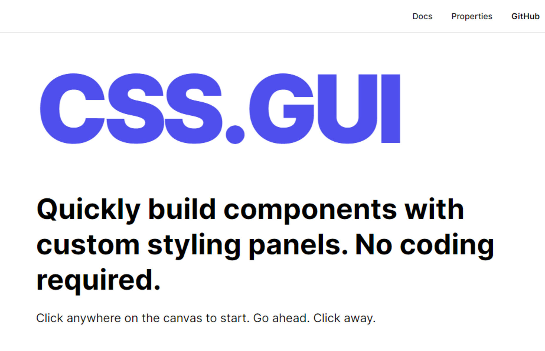
CSS.GUI – Open Source Visual Editor for CSS

Meet Web Push

Mobile-First CSS: Is it Time for a Rethink?

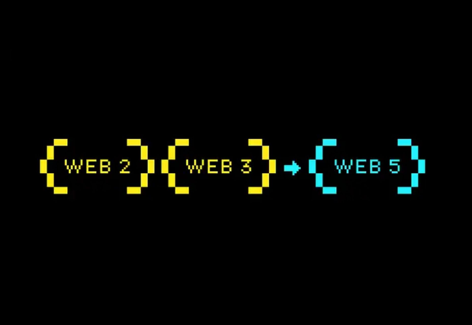
Web5 Is Here, Goodbye Web3? TBD

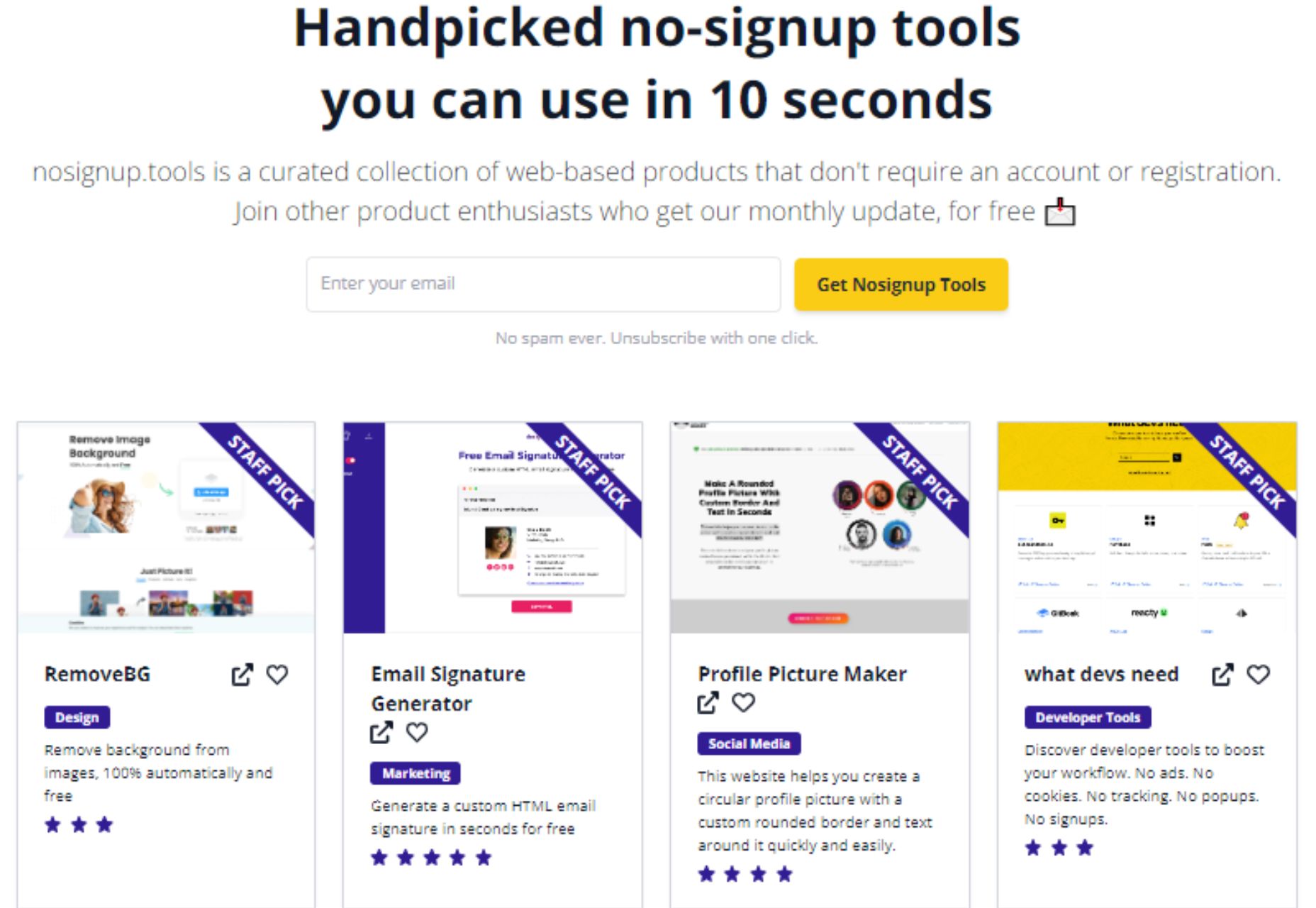
Nosignup.tools – Free Web Apps that Don’t Require Signup

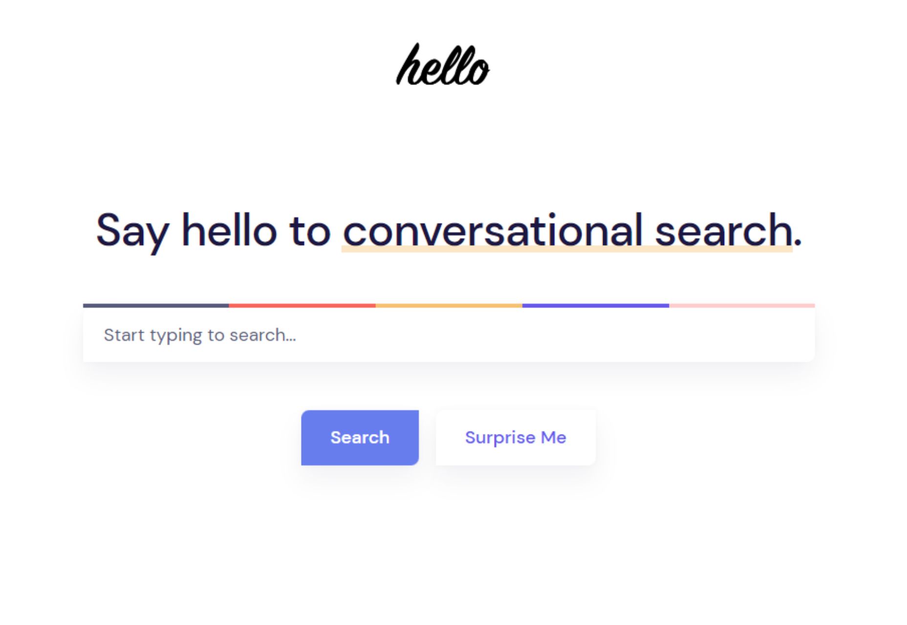
Hello – The Best Search Engine for Software Developers

Exciting New Tools for Designers, June 2022

Adobe Plans to Make Photoshop on the Web Free to Everyone

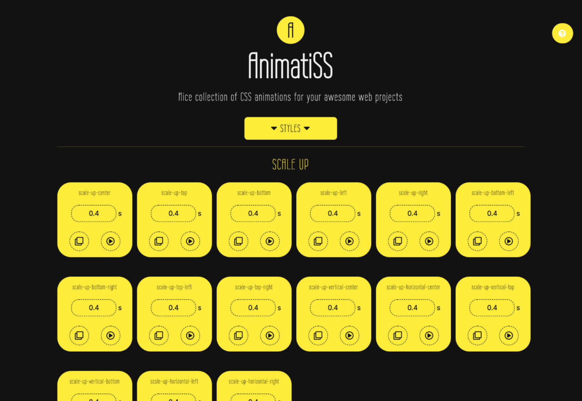
8 CSS Snippets that Demonstrate the Power of Shadow Effects

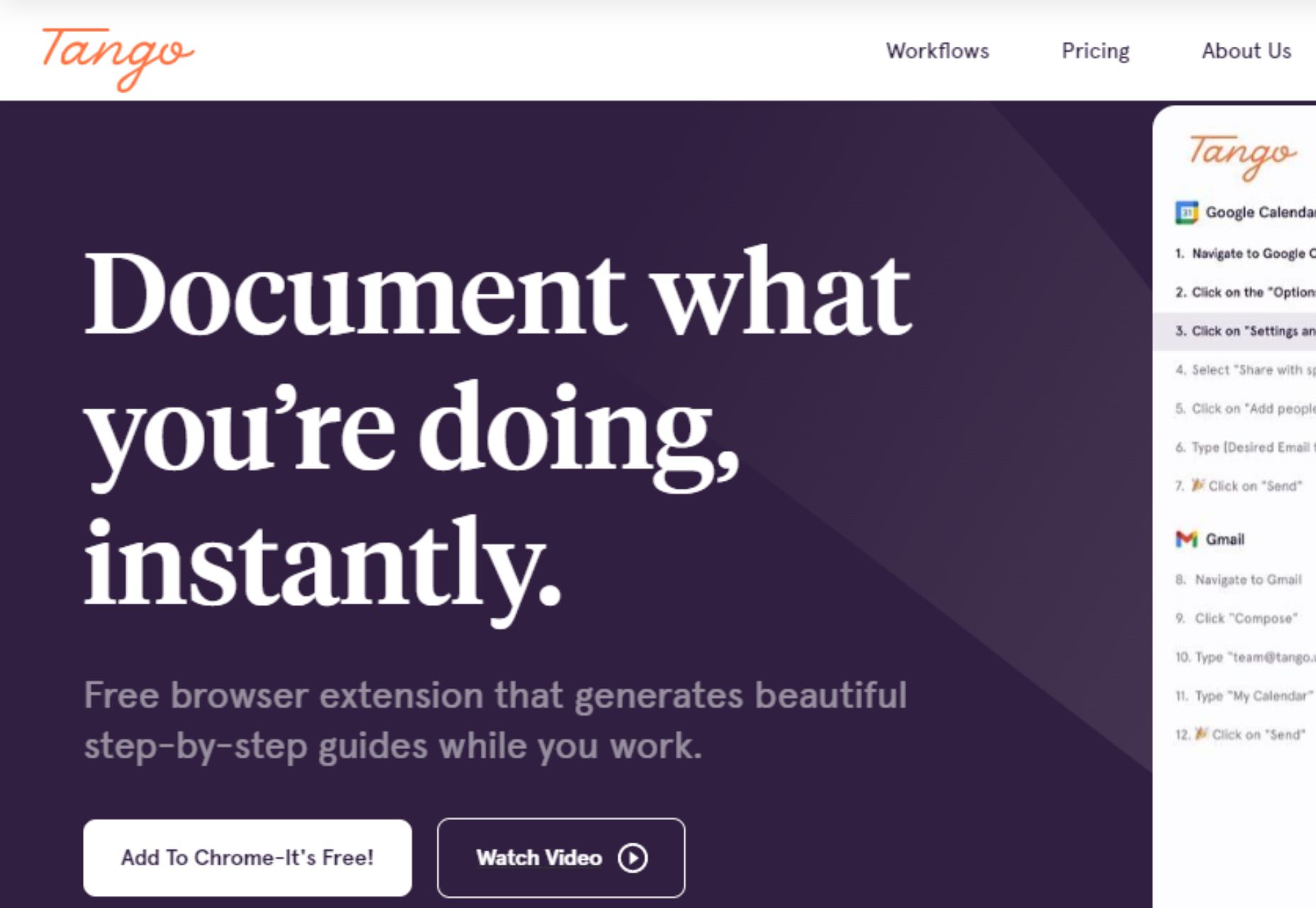
Tango 2.0 – Automatically Generate Step-by-step Guides for your Team

Understanding the Template Element in HTML

Random Emoji Generator – Have Fun with Emojis

Source

The post Popular Design News of the Week: June 13, 2022 – June 19, 2022 first appeared on Webdesigner Depot.

Categories: Designing, Others Tags:

How To Become a Designer Who Codes

June 17th, 2022 No comments

The topic of whether or not designers should learn to code is probably the most debated one in the industry. There are numerous forum threads and blog posts supporting both sides. Additionally, the steps to actually learning how to code are not always so clear. In this featured post we will run through some important steps to becoming a designer who codes along with the many benefits of combining your design skills with coding knowledge.

Introduction

Some say that a professional should have one focus only and not spread themselves too thin. Their main argument is – a jack of all trades can’t have a deep understanding of every field they operate in, so they can’t be a true professional.

Others believe that in the modern world, a multi-skilled professional is a huge benefit for business and there shouldn’t be any obstacles for a designer to get as many valuable skills as they deem necessary. After all, knowledge is power.

Should designers learn to code?

In this neverending debate on whether a designer should be able to code, we are definitely on the “yes” side. In this post, we will share our arguments on why being a designer who codes is great for everyone involved and give you a few tips on how to become one.

What kind of designers would benefit from learning programming languages or coding?

If you are a web designer, UX designer, game designer, or app designer, then you will definitely expand your ability to design and open additional opportunities in your current vocation.

How to become a designer who codes

Learning to code might seem like an impossible thing to do. The code looks gibberish, and the task of learning to understand it seems boring and tedious. Yes, it won’t be a walk in the park. But it won’t be as difficult as you imagine. With enough motivation, you can master the basics of any programming language you choose in mere weeks.

Image credit: Adobe Stock

6 Tips On How to Learn Coding For Designers:

1. Choose the language your developer uses for your current project

There’s no sense in learning a programming language if you can’t apply it in your daily routine. Besides, when you have a professional developer sitting next to you can ask questions and get useful tips. 

2. Study every day from reputable sources

Just like your design education, learning to code will take a little sacrifice and effort. But then again, all good things usually do, right?

You don’t have to spend 8 hours on it every day. But investing 30 minutes into your coding studies each day will do wonders for your skill level. Consistency is the key. 

Additionally, you don’t have to spend a ton of money. We understand that sometimes the budget for learning extra design skills can be non-existent, especially if you’re between projects. Having affordable and free options is what we will touch on, but that will be in the section below entitled – What programming languages can I benefit from?

3. Practice more

Coding is a practical skill. Learning the theory without applying it won’t do anything for you. So make sure to practice. Select courses that offer an 80 to 20 practice-theory ratio and don’t skip the exercises.

4. Study and analyze the professionally written code

“Hacking” someone else’s code is a brilliant learning technique. You can reverse engineer the project you are designing for, test each line, and get a clear picture of how it works. The best thing here is – you can ask the developer who works on it to explain the things you can’t grasp on your own.

5. Follow the communities

The greatest thing about the coding industry is the community each programming language has around it. There are numerous forums, Reddit threads, video blogs, and websites where you can find like-minded people to share knowledge and ask questions.

The communities are where you find the best tips, code snippets, new techniques, and other immensely useful info. Besides, if you are stuck, you can always ask for help. Here are the most popular websites where you can find coding communities:

6. Reward yourself

As we’ve already established – learning to code is not a walk in the park, especially when you are a designer with a full-time job or a freelancer overwhelmed with projects. There will be times when you get frustrated and lose motivation. That’s inevitable. Rewarding yourself for successfully completing milestones will make the learning process much more enjoyable. And it is guaranteed to keep up the motivation!

Why learning to code is a good idea for designers

The design industry is ever-evolving and competitive. In this environment, a professional has to maintain their edge, become more agile, strive to progress, and seek to innovate. The alternative is stagnation.

Why learning to code is a good idea for designers

Image credit: Adobe Stock

Top 4 Reasons Designers Should Consider Learning How to Code:

1. Learning to code will enrich your designs

As a professional designer, you know that the best solutions are found when you think outside the box. To be able to do that, you need to learn new things, get new experiences, and broaden your horizons.

Imagine if you could view things from a different perspective. Through the eyes of a developer, for example. Learning to think like a frontend developer will allow you to discover fresh solutions to old problems and consider your designs more objectively.

2. You will become a better collaborator

Understanding the scope of work and specifications is not everything the designer role requires. Well, at least not for the truly good designers. The truly good designers are always great empaths. They empathize with the end-users and create better designs. They empathize with their colleagues and collaborate better. This empathy allows them to create better products and move forward in their careers.

With the key developer skills under your belt, you will be able to speak with the developers in their language. This will allow you to easily overcome the common discrepancy between what the designer imagined and what the developer can actually deliver.

Even if you don’t code on a daily basis, understanding the technical possibilities, you can design knowing exactly how your vision will be implemented. You can work faster and collaborate better.

3. You will be able to streamline and automate processes

The modern world of technology and innovation is very fast-paced. If you work slowly and do everything by hand, you are doing it wrong.

With the coding skills in your arsenal, you can write your own scripts to automate the most tedious and repetitive tasks.

4. You will have a competitive advantage in the job market

Having a unique and desired skillset in your industry will help you to stand out among the crowd and give you a competitive edge which ultimately provides more opportunities.

Design and development are becoming more and more intertwined each year. Adding coding to your CV will allow you to meet this market demand and get an advantage over those designers who can boast only the industry-specific skills and tools like Photoshop, Sketch, and Figma. Besides, multi-skilled designers stand out as versatile team players.

What programming languages can I benefit from?

The choice of which programming language to learn largely depends on the industry you’re currently working in. Obviously, a web designer would need a different set of skills compared to an app designer or a game designer.

What programming languages can I benefit from?

Image credit: Adobe Stock

How many programming languages are there?

Around the globe, there are literally hundreds of different types of programming languages and as we stated, they are industry-specific. So, for our web design friends, you should stick with HTML, CSS, JavaScript, and Java.

The Programming Languages You Should Start With

HTML and CSS

HTML and CSS are the building materials for websites. HTML provides the structure, and CSS tells the browsers how the structure and its elements should look. You do not need to become a full-fledged coder. Learning both languages to the extent of being able to code a basic one-page website will be enough. Though if you often practice and put some effort into it, you will be able to code up any web design you can imagine soon enough.

These languages are rather easy to learn, especially on the basic level. There are plenty of free and premium online courses you can study at. There’s a great introductory course at Khan Academy and a pretty easy, but very informative workshop from LearnUX.io we recommend. These two resources should be enough for you to get started.

JavaScript

JavaScript is the programming language that makes your websites interactive. It’s responsible for the way the elements react to the users’ actions. UX designers can use JavaScript for prototyping. 

You can start learning JavaScript basics at Khan academy. And if you’ve already mastered the basics of HTML and CSS, you can continue your education with the course on building websites with all three languages at Pluralsight.

Java

Java is an object-oriented, general-purpose language. It is one of those programming languages that can be found everywhere, from your favorite mobile app to the microwave oven in your kitchen. Learning Java basics will allow you to understand how the apps and products you design can function and which of your ideas can and can’t be fulfilled. Of course, if you put a lot of time and effort into studying, you will be able to code apps and mobile games yourself. But for your day-to-day design work, the basic understanding and the ability to read the code will be enough.

Java is considered to be one of the easiest programming languages to master. You can learn to code with CodeGym, and the 1200 practical Java exercises the course offers.

Wrapping Up

Becoming a designer who codes is not an easy path, but the benefits are definitely worth the time and effort you’ll put into it. Choose the right language, apply the knowledge you get in your day-to-day tasks, and you will see how your design career sky-rockets!

The post How To Become a Designer Who Codes first appeared on WebDesignDev.

The post How To Become a Designer Who Codes appeared first on WebDesignDev.


How To Become a Designer Who Codes was first posted on June 17, 2022 at 12:07 pm.
©2022 “WebDesignDev“. Use of this feed is for personal non-commercial use only. If you are not reading this article in your feed reader, then the site is guilty of copyright infringement. Please contact me at jc@ventureupwards.com

Categories: Others, Programming Tags:

How To Become a Designer Who Codes

June 17th, 2022 No comments

The topic of whether or not designers should learn to code is probably the most debated one in the industry. There are numerous forum threads and blog posts supporting both sides. Additionally, the steps to actually learning how to code are not always so clear. In this featured post we will run through some important steps to becoming a designer who codes along with the many benefits of combining your design skills with coding knowledge.

Introduction

Some say that a professional should have one focus only and not spread themselves too thin. Their main argument is – a jack of all trades can’t have a deep understanding of every field they operate in, so they can’t be a true professional.

Others believe that in the modern world, a multi-skilled professional is a huge benefit for business and there shouldn’t be any obstacles for a designer to get as many valuable skills as they deem necessary. After all, knowledge is power.

In this neverending debate on whether a designer should be able to code, we are definitely on the “yes” side. In this post, we will share our arguments on why being a designer who codes is great for everyone involved and give you a few tips on how to become one.

What kind of designers would benefit from learning programming languages or coding? If you are a web designer, UX designer, game designer, or app designer, then you will definitely expand your ability to design and open additional opportunities in your current vocation.

How to become a designer who codes

Learning to code might seem like an impossible thing to do. The code looks gibberish, and the task of learning to understand it seems boring and tedious. Yes, it won’t be a walk in the park. But it won’t be as difficult as you imagine. With enough motivation, you can master the basics of any programming language you choose in mere weeks.

Image credit: Adobe Stock

6 Tips On How to Learn Coding For Designers:

1. Choose the language your developer uses for your current project

There’s no sense in learning a programming language if you can’t apply it in your daily routine. Besides, when you have a professional developer sitting next to you can ask questions and get useful tips. 

2. Study every day from reputable sources

Just like your design education, learning to code will take a little sacrifice and effort. But then again, all good things usually do, right?

You don’t have to spend 8 hours on it every day. But investing 30 minutes into your coding studies each day will do wonders for your skill level. Consistency is the key. 

Additionally, you don’t have to spend a ton of money. We understand that sometimes the budget for learning extra design skills can be non-existent, especially if you’re between projects. Having affordable and free options is what we will touch on, but that will be in the section below entitled – What programming languages can I benefit from?

3. Practice more

Coding is a practical skill. Learning the theory without applying it won’t do anything for you. So make sure to practice. Select courses that offer an 80 to 20 practice-theory ratio and don’t skip the exercises.

4. Study and analyze the professionally written code

“Hacking” someone else’s code is a brilliant learning technique. You can reverse engineer the project you are designing for, test each line, and get a clear picture of how it works. The best thing here is – you can ask the developer who works on it to explain the things you can’t grasp on your own.

5. Follow the communities

The greatest thing about the coding industry is the community each programming language has around it. There are numerous forums, Reddit threads, video blogs, and websites where you can find like-minded people to share knowledge and ask questions.

The communities are where you find the best tips, code snippets, new techniques, and other immensely useful info. Besides, if you are stuck, you can always ask for help. Here are the most popular websites where you can find coding communities:

6. Reward yourself

As we’ve already established – learning to code is not a walk in the park, especially when you are a designer with a full-time job or a freelancer overwhelmed with projects. There will be times when you get frustrated and lose motivation. That’s inevitable. Rewarding yourself for successfully completing milestones will make the learning process much more enjoyable. And it is guaranteed to keep up the motivation!

Why learning to code is a good idea for designers

The design industry is ever-evolving and competitive. In this environment, a professional has to maintain their edge, become more agile, strive to progress, and seek to innovate. The alternative is stagnation.

Why learning to code is a good idea for designers

Image credit: Adobe Stock

Top 4 Reasons Designers Should Consider Learning How to Code:

1. Learning to code will enrich your designs

As a professional designer, you know that the best solutions are found when you think outside the box. To be able to do that, you need to learn new things, get new experiences, and broaden your horizons.

Imagine if you could view things from a different perspective. Through the eyes of a developer, for example. Learning to think like a frontend developer will allow you to discover fresh solutions to old problems and consider your designs more objectively.

2. You will become a better collaborator

Understanding the scope of work and specifications is not everything the designer role requires. Well, at least not for the truly good designers. The truly good designers are always great empaths. They empathize with the end-users and create better designs. They empathize with their colleagues and collaborate better. This empathy allows them to create better products and move forward in their careers.

With the key developer skills under your belt, you will be able to speak with the developers in their language. This will allow you to easily overcome the common discrepancy between what the designer imagined and what the developer can actually deliver.

Even if you don’t code on a daily basis, understanding the technical possibilities, you can design knowing exactly how your vision will be implemented. You can work faster and collaborate better.

3. You will be able to streamline and automate processes

The modern world of technology and innovation is very fast-paced. If you work slowly and do everything by hand, you are doing it wrong.

With the coding skills in your arsenal, you can write your own scripts to automate the most tedious and repetitive tasks.

4. You will have a competitive advantage in the job market

Having a unique and desired skillset in your industry will help you to stand out among the crowd and give you a competitive edge which ultimately provides more opportunities.

Design and development are becoming more and more intertwined each year. Adding coding to your CV will allow you to meet this market demand and get an advantage over those designers who can boast only the industry-specific skills and tools like Photoshop, Sketch, and Figma. Besides, multi-skilled designers stand out as versatile team players.

What programming languages can I benefit from?

The choice of which programming language to learn largely depends on the industry you’re currently working in. Obviously, a web designer would need a different set of skills compared to an app designer or a game designer.

What programming languages can I benefit from?

Image credit: Adobe Stock

How many programming languages are there?

Around the globe, there are literally hundreds of different types of programming languages and as we stated, they are industry-specific. So, for our web design friends, you should stick with HTML, CSS, JavaScript, and Java.

The Programming Languages You Should Start With

HTML and CSS

HTML and CSS are the building materials for websites. HTML provides the structure, and CSS tells the browsers how the structure and its elements should look. You do not need to become a full-fledged coder. Learning both languages to the extent of being able to code a basic one-page website will be enough. Though if you often practice and put some effort into it, you will be able to code up any web design you can imagine soon enough.

These languages are rather easy to learn, especially on the basic level. There are plenty of free and premium online courses you can study at. There’s a great introductory course at Khan Academy and a pretty easy, but very informative workshop from LearnUX.io we recommend. These two resources should be enough for you to get started.

JavaScript

JavaScript is the programming language that makes your websites interactive. It’s responsible for the way the elements react to the users’ actions. UX designers can use JavaScript for prototyping. 

You can start learning JavaScript basics at Khan academy. And if you’ve already mastered the basics of HTML and CSS, you can continue your education with the course on building websites with all three languages at Pluralsight.

Java

Java is an object-oriented, general-purpose language. It is one of those programming languages that can be found everywhere, from your favorite mobile app to the microwave oven in your kitchen. Learning Java basics will allow you to understand how the apps and products you design can function and which of your ideas can and can’t be fulfilled. Of course, if you put a lot of time and effort into studying, you will be able to code apps and mobile games yourself. But for your day-to-day design work, the basic understanding and the ability to read the code will be enough.

Java is considered to be one of the easiest programming languages to master. You can learn to code with CodeGym, and the 1200 practical Java exercises the course offers.

Wrapping Up

Becoming a designer who codes is not an easy path, but the benefits are definitely worth the time and effort you’ll put into it. Choose the right language, apply the knowledge you get in your day-to-day tasks, and you will see how your design career sky-rockets!

The post How To Become a Designer Who Codes appeared first on Web Design Dev.


How To Become a Designer Who Codes was first posted on June 17, 2022 at 12:07 pm.
©2022 “Web Design Dev“. Use of this feed is for personal non-commercial use only. If you are not reading this article in your feed reader, then the site is guilty of copyright infringement. Please contact me at jc@ventureupwards.com

Categories: Others, Programming Tags:

Single Element Loaders: The Dots

June 17th, 2022 No comments

We’re looking at loaders in this series. More than that, we’re breaking down some common loader patterns and how to re-create them with nothing more than a single div. So far, we’ve picked apart the classic spinning loader. Now, let’s look at another one you’re likely well aware of: the dots.

Dot loaders are all over the place. They’re neat because they usually consist of three dots that sort of look like a text ellipsis (…) that dances around.

Article series

  • Single Element Loaders: The Spinner
  • Single Element Loaders: The Dots — you are here
  • Single Element Loaders: The Bars — coming June 24
  • Single Element Loaders: Going 3D — coming July 1

Our goal here is to make this same thing out of a single div element. In other words, there is no one div per dot or individual animations for each dot.

CodePen Embed Fallback

That example of a loader up above is made with a single div element, a few CSS declarations, and no pseudo-elements. I am combining two techniques using CSS background and mask. And when we’re done, we’ll see how animating a background gradient helps create the illusion of each dot changing colors as they move up and down in succession.

The background animation

Let’s start with the background animation:

.loader {
  width: 180px; /* this controls the size */
  aspect-ratio: 8/5; /* maintain the scale */
  background: 
    conic-gradient(red   50%, blue   0) no-repeat, /* top colors */
    conic-gradient(green 50%, purple 0) no-repeat; /* bottom colors */
  background-size: 200% 50%; 
  animation: back 4s infinite linear; /* applies the animation */
}

/* define the animation */
@keyframes back {
  0%,                       /* X   Y , X     Y */
  100% { background-position: 0%   0%, 0%   100%; }
  25%  { background-position: 100% 0%, 0%   100%; }
  50%  { background-position: 100% 0%, 100% 100%; }
  75%  { background-position: 0%   0%, 100% 100%; }
}

I hope this looks pretty straightforward. What we’ve got is a 180px-wide .loader element that shows two conic gradients sporting hard color stops between two colors each — the first gradient is red and blue along the top half of the .loader, and the second gradient is green and purple along the bottom half.

The way the loader’s background is sized (200% wide), we only see one of those colors in each half at a time. Then we have this little animation that pushes the position of those background gradients left, right, and back again forever and ever.

When dealing with background properties — especially background-position — I always refer to my Stack Overflow answer where I am giving a detailed explanation on how all this works. If you are uncomfortable with CSS background trickery, I highly recommend reading that answer to help with what comes next.

In the animation, notice that the first layer is Y=0% (placed at the top) while X is changes from 0% to 100%. For the second layer, we have the same for X but Y=100% (placed at the bottom).

CodePen Embed Fallback

Why using a conic-gradient() instead of linear-gradient()?

Good question! Intuitively, we should use a linear gradient to create a two-color gradients like this:

linear-gradient(90deg, red 50%, blue 0)

But we can also reach for the same using a conic-gradient() — and with less of code. We reduce the code and also learn a new trick in the process!

Sliding the colors left and right is a nice way to make it look like we’re changing colors, but it might be better if we instantly change colors instead — that way, there’s no chance of a loader dot flashing two colors at the same time. To do this, let’s change the animation‘s timing function from linear to steps(1)

CodePen Embed Fallback

The loader dots

If you followed along with the first article in this series, I bet you know what comes next: CSS masks! What makes masks so great is that they let us sort of “cut out” parts of a background in the shape of another element. So, in this case, we want to make a few dots, show the background gradients through the dots, and cut out any parts of the background that are not part of a dot.

We are going to use radial-gradient() for this:

.loader {
  width: 180px;
  aspect-ratio: 8/5;
  mask:
    radial-gradient(#000 68%, #0000 71%) no-repeat,
    radial-gradient(#000 68%, #0000 71%) no-repeat,
    radial-gradient(#000 68%, #0000 71%) no-repeat;
  mask-size: 25% 40%; /* the size of our dots */
}

There’s some duplicated code in there, so let’s make a CSS variable to slim things down:

.loader {
  width: 180px;
  aspect-ratio: 8/5;
  --_g: radial-gradient(#000 68%, #0000 71%) no-repeat;
  mask: var(--_g),var(--_g),var(--_g);
  mask-size: 25% 40%;
}

Cool cool. But now we need a new animation that helps move the dots up and down between the animated gradients.

.loader {
  /* same as before */
  animation: load 2s infinite;
}

@keyframes load {      /* X  Y,     X   Y,    X   Y */
  0%     { mask-position: 0% 0%  , 50% 0%  , 100% 0%; } /* all of them at the top */
  16.67% { mask-position: 0% 100%, 50% 0%  , 100% 0%; }
  33.33% { mask-position: 0% 100%, 50% 100%, 100% 0%; }
  50%    { mask-position: 0% 100%, 50% 100%, 100% 100%; } /* all of them at the bottom */
  66.67% { mask-position: 0% 0%  , 50% 100%, 100% 100%; }
  83.33% { mask-position: 0% 0%  , 50% 0%  , 100% 100%; }
  100%   { mask-position: 0% 0%  , 50% 0%  , 100% 0%; } /* all of them at the top */
}

Yes, that’s a total of three radial gradients in there, all with the same configuration and the same size — the animation will update the position of each one. Note that the X coordinate of each dot is fixed. The mask-position is defined such that the first dot is at the left (0%), the second one at the center (50%), and the third one at the right (100%). We only update the Y coordinate from 0% to 100% to make the dots dance.

Here’s what we get:

CodePen Embed Fallback

Now, combine this with our gradient animation and magic starts to happen:

CodePen Embed Fallback

Dot loader variations

The CSS variable we made in the last example makes it all that much easier to swap in new colors and create more variations of the same loader. For example, different colors and sizes:

CodePen Embed Fallback

What about another movement for our dots?

CodePen Embed Fallback

Here, all I did was update the animation to consider different positions, and we get another loader with the same code structure!

The animation technique I used for the mask layers can also be used with background layers to create a lot of different loaders with a single color. I wrote a detailed article about this. You will see that from the same code structure we can create different variations by simply changing a few values. I am sharing a few examples at the end of the article.

Why not a loader with one dot?

CodePen Embed Fallback

This one should be fairly easy to grok as I am using the same technique but with a more simple logic:

CodePen Embed Fallback

Here is another example of loader where I am also animating radial-gradient combined with CSS filters and mix-blend-mode to create a blobby effect:

CodePen Embed Fallback

If you check the code, you will see that all I am really doing there is animating the background-position, exactly like we did with the previous loader, but adding a dash of background-size to make it look like the blob gets bigger as it absorbs dots.

If you want to understand the magic behind that blob effect, you can refer to these interactive slides (Chrome only) by Ana Tudor because she covers the topic so well!

Here is another dot loader idea, this time using a different technique:

CodePen Embed Fallback

This one is only 10 CSS declarations and a keyframe. The main element and its two pseudo-elements have the same background configuration with one radial gradient. Each one creates one dot, for a total of three. The animation moves the gradient from top to bottom by using different delays for each dot..

Oh, and take note how this demo uses CSS Grid. This allows us to leverage the grid’s default stretch alignment so that both pseudo-elements cover the whole area of their parent. No need for sizing! Push the around a little with translate() and we’re all set.

More examples!

Just to drive the point home, I want to leave you with a bunch of additional examples that are really variations of what we’ve looked at. As you view the demos, you’ll see that the approaches we’ve covered here are super flexible and open up tons of design possibilities.

CodePen Embed Fallback

Next up…

OK, so we covered dot loaders in this article and spinners in the last one. In the next article of this four-part series, we’ll turn our attention to another common type of loader: the bars. We’ll take a lot of what we learned so far and see how we can extend them to create yet another single element loader with as little code and as much flexibility as possible.

Article series

  • Single Element Loaders: The Spinner
  • Single Element Loaders: The Dots — you are here
  • Single Element Loaders: The Bars — coming June 24
  • Single Element Loaders: Going 3D — coming July 1

Single Element Loaders: The Dots originally published on CSS-Tricks. You should get the newsletter.

Categories: Designing, Others Tags:

Quiz: The Infuriating IE Quiz

June 17th, 2022 No comments

This week, Microsoft officially ended support for Internet Explorer.

Victorious in the first browser war with then-rival Netscape Navigator, IE was only finally surpassed by Google’s Chrome. Whereas once huge numbers of sites would warn users to switch to IE, by the end Microsoft’s biggest app was a virtual pariah.

Over the course of its lifetime, Internet Explorer has revolutionized the web with its freeware model and support for emerging technologies. But how much do you really know about it? Let’s find out…

Source

The post Quiz: The Infuriating IE Quiz first appeared on Webdesigner Depot.

Categories: Designing, Others Tags:

De-Mystifying IndieWeb on a WordPress Site

June 14th, 2022 No comments

Well, sheesh. I opened a little can of worms when sharing Miriam’s “Am I on the IndieWeb yet?” with a short post bemoaning my own trouble getting on the IndieWeb train. But it’s a good can of worms.

I think it was something like the next day after publishing that short post that David Shanske reached out and offered to help wrap my head around IndieWeb and the components that it comprises. And gosh dang if it wasn’t ridiculously helpful! So much so that I’d like to link you up to a new post David wrote after we talked, then summarize things here as best as I can because (1) it’s helpful to write things down and (2) have a reference for later.

Yes, IndieWeb is confusing.

David had actually helped someone get their WordPress site all set up with IndieWeb powers. That person, too, was struggling to understand how the various pieces fit together. So, David already had this top of mind when Miriam and I were writing.

“IndieWeb” is a new term for many folks and that’s where a lot of confusion breeds. Is it a framework? A philosophy? A set of standards? Depending on which one it is, the expectations shift as far as what it looks like to be a part of it.

It’s sort of all of the above. And that needs to be solidified a bit. There’s nothing inherently confusing about IndieWeb itself once you view it through those different lenses. After reading David’s post my understanding is that IndieWeb is more of a set of protocols. Sorta like working with structured data or OpenGraph in markup. There’s nothing to install per se, but there are standards for how to integrate them into your work.

Your identity powers IndieWeb. In other words, your site establishes your identity and can be used to do lots of things, like:

  • Notify other IndieWeb-supported sites when they are mentioned
  • Receive notifications from other IndieWeb sites when you are mentioned
  • Fetch information from a mention and format it for display
  • Authenticate your identity through your own website (a là a Google sign-in button but connected to your site)
  • …among other things.

If that sorta sounds like pingbacks, well, it sorta is. But much more robust and maintained.

It’s different (and perhaps easier) to implement IndieWeb features on WordPress than it is a static site.

The big difference is that WordPress provides a lot of the requirements needed to do IndieWeb-y things. I like how David explains it:

The IndieWeb implementation on WordPress is a [series] of building blocks that you can or cannot choose to use, which is what makes it wonderful, but sometimes confusing. WordPress has a philosophy of decisions, not options. But the IndieWeb is all about options…about building the features that are right for you.

Those building blocks are plugins that you install to add IndieWeb protocols and technologies to WordPress. It’s awesome those are readily available because that takes a a lot of the work out of things. Running a static site, though, you’re on the hook for establishing most of that yourself.

David’s post is 100% focused on the WordPress implementation. Your mileage may vary, but you will certainly walk away with a better idea of what protocols are available and how they fit together after reading his post — and hopefully this one as well.

The IndieWeb WordPress plugin establishes your identity.

I thought it was doing so much stuff behind the scenes, but it’s a lot more simple than that:

The plugin by itself handles establishing your identity as the IndieWeb sees it. It offers an h-card template and widget. H-Card is the markup for marking up information about a person or place. So, this is an element many people opt to put on their site anyway.

So, really, it’s possible to get the same sort of thing by correctly marking up a WordPress theme. The convenience here is that you get a handy little template that’s marked up to support the h-card open format and a widget to drop it into a theme’s widget area.

Here’s a super detailed example of the h-card markup pulled from the documentation for Microformats2:

<div class="h-card">
  <img class="u-photo" alt="photo of Mitchell"
       src="https://webfwd.org/content/about-experts/300.mitchellbaker/mentor_mbaker.jpg"/>
  <a class="p-name u-url"
     href="http://blog.lizardwrangler.com/" 
    >Mitchell Baker</a>
 (<a class="u-url" 
     href="https://twitter.com/MitchellBaker"
    >@MitchellBaker</a>)
  <span class="p-org">Mozilla Foundation</span>
  <p class="p-note">
    Mitchell is responsible for setting the direction and scope of the Mozilla Foundation and its activities.
  </p>
  <span class="p-category">Strategy</span>
  <span class="p-category">Leadership</span>
</div>

See those class names? Classes like .h-card, u-photo, p-name, etc. all provide contextual meaning for a person’s identity which it then parsed as JSON:

{
  "items": [{ 
    "type": ["h-card"],
    "properties": {
      "photo": ["https://webfwd.org/content/about-experts/300.mitchellbaker/mentor_mbaker.jpg"],
      "name": ["Mitchell Baker"],
      "url": [
        "http://blog.lizardwrangler.com/",
        "https://twitter.com/MitchellBaker"
      ],
      "org": ["Mozilla Foundation"],
      "note": ["Mitchell is responsible for setting the direction and scope of the Mozilla Foundation and its activities."],
      "category": [
        "Strategy",
        "Leadership"
      ]
    }
  }]
}

The plugin isn’t doing the sending, receiving, or parsing. Instead, it provides a WordPress site with a way to verify your identity in the markup.

Not all WordPress themes support Microformats

If you scratched your head first time you saw “Microformats” like I did, David defines it nicely:

[…] Microformats…a way of marking up HTML to allow elements to be identified. It is one of several ways of doing this, but is a very simple and readable one, which is why it is popular in the IndieWeb community.

The problem, as David continues, is that many themes aren’t marked up in a Microformats-friendly way — which is what the Microformats2 plugin is designed to fix. That said, David is quick to call out that the plugin is extremely limited in how it accomplishes this, and he recommends instead marking up a theme by hand.

According to David, the next major release of the Webmention plugin will likely include smarter ways of detecting content and images it can use and formatting them for Microformats2 support.

Webmentions send and receive notifications.

OK, so if you’ve established your identity through your site so you are discoverable, and your site is marked up for h-card support using Microformats2. Great! You still need something in the middle working as an operator that sends and receives notifications. In other words, when another site mentions you — called a Webmention — the site mentioning you needs a way to support sending that mention to you, and your site needs a way to accept it (or vice versa).

That’s what the Webmention plugin is for. It’s also probably the source of most of my IndieWeb confusion. I thought it was formatting data and needed an additional service to send and receive it. Nope! It’s actually sending and receiving the data rather than creating the mention. Back to David:

Back when it was built, the plugin handled only the business of receiving and sending webmentions, not handling display to any degree. Semantic Linkbacks, a separate plugin handled that for not only webmentions, but the older pingback and trackback protocols.

So, the Webmention plugin is communicating notifications. Meanwhile, another plugin called Semantic Linkbacks is what handles the data. And what the heck are Semantic Linkbacks?

Semantic Linkbacks fetch and handle data.

Semantic Linkbacks is another plugin that handles another piece of the process. There’s no way I can explain it better than David already does:

Semantic Linkbacks takes a webmention, which is a notification that another site has linked to something on your site, fetches the other site, and tries to render a display of the information. How that is done can vary from just a profile photo (if it can find one), to interpreting it as a full comment.

It does this using Microformats.

I expected that the main IndieWeb plugin was already doing this since it handles other markup. But it only provides the template and widget to get your identity on your site. Once the Semantic Linkbacks plugin fetches an incoming webmention, it takes the data, formats it, then attempts to display it.

Sounds like the plugin will be somewhat merged with (or replaced by) an upcoming version of the Webmention plugin:

Since many people are not inclined, or not comfortable modifying a theme, the new version of Webmentions will include several different alternative ways to try to find an image or summary to display…from OpenGraph (which Facebook and Twitter use to display URLs provided to it) to detecting the WordPress REST API version of a page and using that to get the author name and profile image. None of them will provided as much context as Microformats, but the experience will still be something worth installing.

That’s certainly nice as it taps into the WordPress REST API for the JSON response and formats that for display.

Brid.gy is a service to help display interactions.

A Webmention can be an interaction, say someone likes your post on Twitter or retweets it.

Differentiating a like from a repost from a comment from a whatever needs to happen, and you’d need to implement the Twitter (or whatever) API to draw those distinctions.

That’s something you can certainly do! But if you’d rather plug and play, one of the IndieWeb community members made a service called Brid.gy. You create an account, hook up your site, and give app permissions to the service… then you’re done!

What Brid.gy has done is essentially implement the APIs for Twitter, Facebook, Instagram, and others, so that when it detects that a post in those services that interacts with your syndicated post, a Webmention is sent to your site and goes through the process of publishing on your own site.

There’s so much more!

Quick hits:

  • IndieAuth: This is a protocol based on OAuth 2. The plugin establishes an endpoint in the WordPress REST API that can be used to authenticate your identity through your own self-hosted site — essentially your own Google sign-in button but without establishing that endpoint yourself or needing to rely on a separate hosted API.
  • Micropub: For those who use WordPress but prefer a different editor can install the Micropub plugin. This adds an endpoint that allows you to publish content to your site and using a Micropub-supported editor create items in a Microformats2 feed, giving you way more options for writing content outside of the WordPress Block Editor.
  • Simple Location: David wrote this plugin and I was super impressed when he demoed it for me. The idea is it pulls in data from your current location that can used for everything from displaying the weather at the time you wrote a post, to creating an entire archive of posts on an embedded map based on the post location. I’d honestly love to see something like this baked directly into WordPress.

The updated flow

I attempted to make an illustration that outlines the various pieces in my last post, but let’s try again with an updated understanding of what’s happening:

Outlining the flow between an IndieWeb enabled site and a site that mentions it.
(Full size)

Is this all making sense?

High fives to David for both reaching out and taking the time to show me what it looks like to implement IndieWeb on WordPress. I can’t claim I fully understand all the nuances, but I at least feel like I have a decent grasp of the pieces — the philosophy, protocols, and tech — that are required to make it happen.

I’d like to turn it around to you! Does this help clarify things for you? Is there anything you’re struggling to understand? Think you’re able to configure a WordPress site with IndieWeb features now? Let’s take it to the comments!


De-Mystifying IndieWeb on a WordPress Site originally published on CSS-Tricks. You should get the newsletter.

Categories: Designing, Others Tags: